11. Dashboarding with Power View and 3D Map
In This Chapter
Creating a Power View Dashboard
Replicating Charts Using Multiples
Animating a Scatter Chart over Time
Some Closing Tips on Power View
Analyzing Geographic Data with 3D Map
Chapter 10, “Mashing Up Data with Power Pivot,” introduces the Power Pivot Data Model and the Vertipaq engine. If you have the Pro Plus edition of Excel 2016, you have the Power View add-in, which creates interactive dashboard elements from your Power Pivot data. You can combine pivot charts, maps, and pivot tables on an interactive canvas.
Caution
Power BI Desktop, which was introduced in Chapter 8, “Sharing Pivot Tables with Others,” is a better implementation of the features introduced in Power View. The Excel team would love to replace Power View in Excel with Power BI Desktop. Consequently, they’ve removed the Insert Power View Sheet icon from the Excel 2016 ribbon. If you want to use Power View in Excel 2016, you will have to customize the Quick Access Toolbar or customize the ribbon to add the Insert Power View Sheet icon.
All editions of Excel 2016 include the 3D Map feature, which you can use to animate your pivot tables over time on a map. This feature was previously released as an add-in for Excel 2013 called Power Map.
Preparing Data for Power View
When you are adding data to the Data Model for Power Pivot, you simply need to add the data tables and create the relationships. Power View has a few extra features that require you to properly categorize certain data fields.
The data set for this chapter is 10 years of fictitious book sales data. The main Fact table reports quarterly sales data by city and title. There are more than 400,000 records in the Fact table. Three smaller lookup tables provide category information:
![]() The Geography table provides City, State, and Region.
The Geography table provides City, State, and Region.
![]() The Products table maps the ProdID to Title, List Price, Category, Version of Excel, Level, and other category information. Power View is particularly good at letting you visualize how one category relates to another category, hence the desire to add many categories.
The Products table maps the ProdID to Title, List Price, Category, Version of Excel, Level, and other category information. Power View is particularly good at letting you visualize how one category relates to another category, hence the desire to add many categories.
![]() You need to create a date table that converts daily dates to years and quarters. Yes, you could add 411,000 formulas in the Power Pivot grid with the
You need to create a date table that converts daily dates to years and quarters. Yes, you could add 411,000 formulas in the Power Pivot grid with the =YEAR() function, but it is faster to use a date lookup table. To create the Dates table, copy the column of 411,000 dates in Excel to a new worksheet. Use Data, Remove Duplicates to get a unique list of daily dates. A new Year column comes from the =YEAR() function. The new Quarter column requires a VLOOKUP from MONTH() to convert to a quarter number. After you have the date columns, convert formulas to values and add this table to your model.
Consider adding a path to an image file for each product. If you store a link to a product image, you can add that image to your dashboard. This is a cool feature. If your company sells online, there is probably already a folder with a collection of image files. If you are lucky, there is a consistent naming convention where product 123 has an image called http://www.yourco.com/images/p123.jpg. In my sample data set, I learned we aren’t very consistent at MrExcel.com. There were 28 products with 28 different naming conventions for the images. Note that the image files can be stored locally or on the Web. C:Artworkimage.jpg works fine as an image URL. So does http://www.mrexcel.com/image.jpg.
You can also add a column for URL to the product page on your website. This is not as cool as showing images, however. Power View doesn’t use a URL shortener, so the entire URL ends up showing in your report.
After adding your tables to Power Pivot and defining relationships, you should perform these extra steps to make your Power View experience better:
1. Format your numeric columns in Power Pivot. This matters in Power View. With a regular pivot table, if you format the underlying data and add it to the pivot table, you have to reformat it in the pivot table. The Power View people make it hard to change the numeric format in the dashboard, but they make up for it by respecting the numeric format that you define in Power Pivot. For the columns that you will be using in the report (such as Revenue and Profit), select the entire column. In the Power Pivot window, choose the Home tab and then Format as Currency. Select Decrease Decimal twice to get rid of the decimal places. Repeat for the numeric fields that you will likely include in the dashboard. For a Quantity field, use the Comma icon in the Formatting group to add commas. Even if all of your detail rows are in the 1–100 range, they will eventually total up to more than 1,000, so add the thousands separator now.
2. Select the DateTable tab in Power Pivot. On the Design tab, open the Mark as Date Table drop-down and then choose the redundant Mark as Date Table command. You have to specify which column contains a date field and contains only unique dates.
3. If you do not see an Advanced tab in the Power Pivot window, open the File drop-down and choose Switch to Advanced Mode. Note that the File drop-down does not actually say File; it is a gray tab with a worksheet icon that appears to the left of the Home tab.
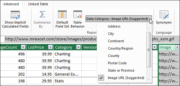
4. Go to the Advanced tab in the Power Pivot window. In the Data Category drop-down field, mark as many columns as you can with a data category. In Figure 11.1, select the entire ImagePath column and choose the data category Image URL. Starting in Excel 2016, Excel suggests data categories for certain fields. Make sure the suggestions are correct before accepting them. Here are examples of data categories you can use with the sample data set:
![]() Mark the web page column with the category Web URL.
Mark the web page column with the category Web URL.
![]() Mark the City column with the category City.
Mark the City column with the category City.
![]() The data has both State and State Abbreviation columns. Mark both of these columns with the category State or Province.
The data has both State and State Abbreviation columns. Mark both of these columns with the category State or Province.
![]() Mark the Product Name category with the category Product. Note that Product is not in the drop-down. You have to choose More Categories, All and then choose Product.
Mark the Product Name category with the category Product. Note that Product is not in the drop-down. You have to choose More Categories, All and then choose Product.
5. Select the Year field in the Dates table. On the Design tab, choose Summarize By and change from Default to Do Not Summarize. This prevents Power View from attempting to offer Sum of Year every time you add Year to a new element in Power View.
When you are done defining the relationships and the categories, close the Power Pivot window to return to Excel.
Creating a Power View Dashboard
A Power View dashboard looks like just another worksheet in a workbook. Go to the Insert tab in the ribbon and choose Power View. A new worksheet is inserted to the left of the current worksheet. The worksheet is given a name such as Power View1, Power View2, and so on. You can right-click the sheet tab to delete it just as you would a worksheet. You can drag to move it to a new location, just like a worksheet.
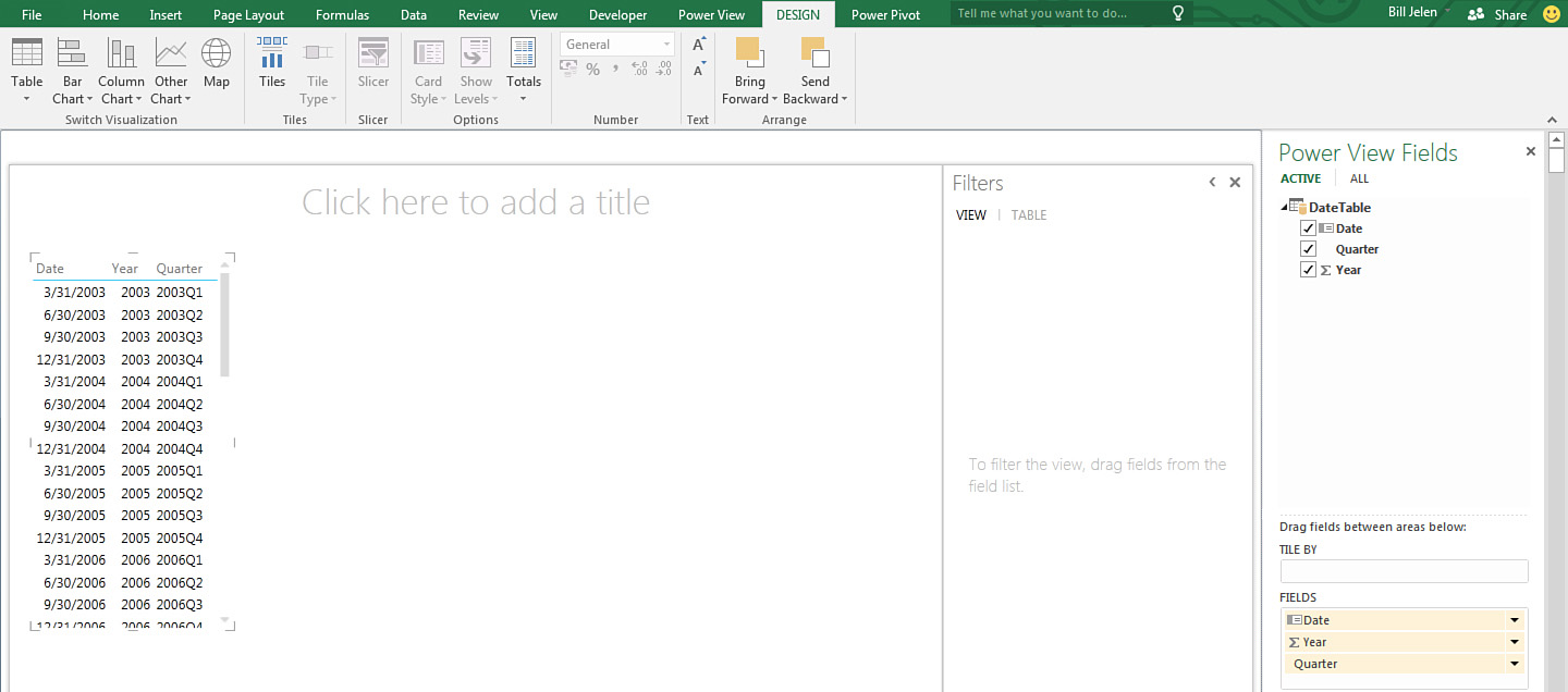
The Power View window contains a Power View Fields list, sort of like the PivotTable Fields list, on the right side. A large canvas appears on the left. This canvas initially contains a table element, which you will delete later. A collapsible Filters panel appears to the right of the canvas (see Figure 11.2).
Perhaps having a completely blank canvas seems too intimidating, so Excel 2016 starts each Power View canvas with one table element. The data in the table seems to be based on which table was last active in Excel. You should delete this table before you go any further, by following these steps:
1. Click inside the table on the Power View canvas. Four angle brackets appear in each corner of the table.
2. Press the Delete key on the keyboard. The table is deleted. The Power View Fields list now shows all of the tables instead of the one selected table.
The Power View Fields list is far more flexible than the PivotTable Fields list. The top is similar, with an expandable list of tables that you can limit to just active tables or show all tables.
Caution
The areas at the bottom of the Fields list change dramatically as you change a dashboard element from a table to a chart to a map to a scatter chart. Expect areas to come and go.
Caution
Be careful to watch for new contextual ribbon tabs that appear to the right of the Power View tab. Inexplicably, Microsoft did not group the related contextual tabs under a Power View Tools grouping, so you might not notice that tabs labeled Formatting, Text, and Analyze come and go as you select various items.
When I first started working with Power View, I was hoping that formatting would appear on the Power View tab, but the command I needed was usually on a tab just to the right of the Power View tab in the ribbon. With Power Pivot, the usual action is to click the Power Pivot icon in the Excel ribbon to get to the Power Pivot window and more tabs. This does not work in Power View; instead, clicking the Power View icon inserts a new blank worksheet.
Every New Dashboard Element Starts as a Table
Expand the Geography table in the Fields list and choose Region. That field flies over to a new element on the canvas. Every new element starts as a table. This is just a starting point. After the table is on the canvas, you can use the Switch Visualization group on the Design tab to change to one of three kinds of tables, one of three kinds of bar charts, a columns chart, a pie chart, a line chart, a scatter chart, or a map.
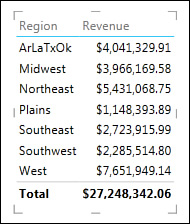
You might build a dashboard with eight dashboard elements, but there will be only one Fields list and one Filters pane no matter what. The active element has four gray corner icons and four edge icons. Any changes that you make to the Fields list are applied to the active element. Right now, with your first table, this is a great feature. Check the Revenue box, and your one active element becomes a table showing revenue by region (see Figure 11.3).
With multiple elements on the dashboard, not paying attention to which element is the active element leads to the frequent use of Undo. I often think, “I am staring right at the element that I want to add the field to, but somehow, Power View can’t read my mind.”
Subtlety Should Be Power View’s Middle Name
I am frequently accused of being a control freak. When I look at the table in Figure 11.3, three things come screaming into my head: Where is the sort icon? Where is the Filter icon? How can I right-justify the Revenue heading? Here are some answers:
![]() First, there is no sort icon. To sort by Revenue, click the Revenue heading. The first click sorts smallest to largest. Click again to sort largest to smallest. A little blue triangle appears next to the Revenue heading to let you know that the report is sorted by that column.
First, there is no sort icon. To sort by Revenue, click the Revenue heading. The first click sorts smallest to largest. Click again to sort largest to smallest. A little blue triangle appears next to the Revenue heading to let you know that the report is sorted by that column.
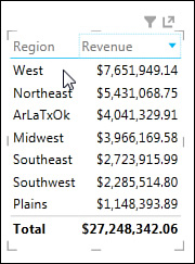
![]() Second, the filter and pop-out icons are invisible until the mouse pointer is above the table. After you hover over the table, the icons appear above the table (see Figure 11.4).
Second, the filter and pop-out icons are invisible until the mouse pointer is above the table. After you hover over the table, the icons appear above the table (see Figure 11.4).
![]() You can’t right-align a heading. The icons on the Home tab do not function in Power View. There are a lot of very basic settings that are still missing in Power View. There is a Power View tab with an icon where you can change the font, the text size, and the background.
You can’t right-align a heading. The icons on the Home tab do not function in Power View. There are a lot of very basic settings that are still missing in Power View. There is a Power View tab with an icon where you can change the font, the text size, and the background.
Converting a Table to a Chart
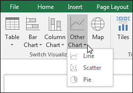
With the first table selected, you see a Design tab in the ribbon. The left group in this tab is called Switch Visualization. You have 13 choices in 4 drop-downs and the Map icon. The Column Chart drop-down offers Stacked, 100% Stacked, and Clustered Column options. The Other Chart drop-down offers Line, Scatter, and Pie options (see Figure 11.5).
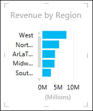
For now, choose a stacked bar chart. The element stays exactly the same size, and Power View tries to fit a chart in that small area. It doesn’t fit, as you can see in Figure 11.6.
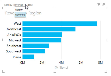
Click one of the eight resize handles and stretch the element frame until the chart looks good. As shown in Figure 11.7, you now have additional controls at the top left to control the sort order. The pop-out icon makes the element full screen temporarily. Say that you have 10 small elements on the dashboard. You can click the pop-out icon to make 1 of the small elements full screen. After the element is full screen, you can click a pop-out icon to return the element to the original size.
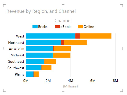
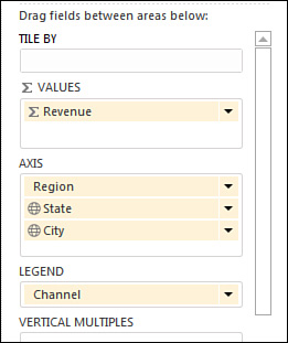
In the Fields list, drag the Channel field to the Legend area. The chart becomes a stacked bar chart showing book sales broken out as the channels Online, eBook, and Bricks (see Figure 11.8).
While a chart is selected, a Layout tab displays in the ribbon. Using the Layout tab, you can move the legend to the top, add data labels, or change the type of horizontal axis.
Adding Drill-down to a Chart
The current chart has Region as an Axis field. Drag the State field and drop it as a second Axis field. Optionally, add City as a third Axis field. After you make this change, nothing appears different in the chart. However, you’ve now created a hierarchy that you can drill into.
Double-click the bar for the Southwest region. The chart is replaced with a chart showing Arizona, Colorado, Utah, and New Mexico. Double-click the bar for Arizona to reveal a list of Arizona cities (see Figure 11.9). After you use drill-down, an arrow appears at the top right for drill-up.
Beginning a New Element by Dragging a Field to a Blank Spot on the Canvas
To add a new element to the dashboard, you drag a field from the Fields list and drop it in a blank portion of the canvas. As with the first element, this element starts as a small table. You can switch it to a chart, resize it, and add more fields. Keep adding new elements as necessary.
You can also create a new element by copying and pasting an existing element. If you have designed one chart, right-click that chart and choose Copy. Click in a blank area of the canvas and paste. You can now change the fields in the Fields list to change the chart.
The next bit is magic.
Filtering One Chart with Another One
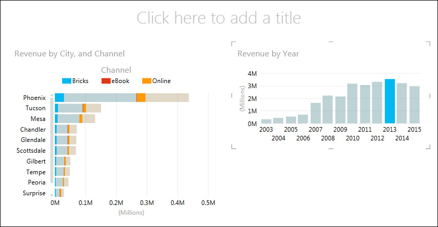
In Figure 11.10, two charts appear on the canvas. The right chart shows revenue by year. The left chart shows revenue by channel by region.
If you click on any part of any chart, all the other charts will be filtered to the same element. Click the 2013 column in the right chart, and the left chart is faded except for the 2013 revenue.
To return to the unfiltered report, click the 2013 column a second time.
Adding a Real Slicer
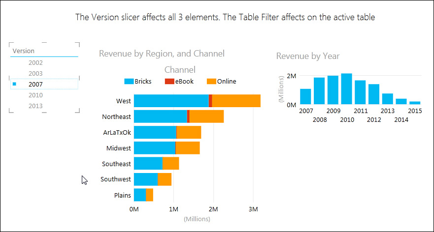
The slicers in Power View look different from regular slicers, but they act the same way. To create a slicer, drag a field to a blank area of the canvas. That field starts out as a new table. Go to the Design tab of the ribbon and choose Slicer. The table is converted to a Power View slicer (see Figure 11.11).
Notice these differences from a regular slicer:
![]() A colored square next to an item means the item is selected.
A colored square next to an item means the item is selected.
![]() You click an item to select that one item.
You click an item to select that one item.
![]() To select multiple items, you have to Ctrl+click the other items.
To select multiple items, you have to Ctrl+click the other items.
![]() The slicer is always one column. You cannot rearrange the slicers in Power View as you can in a regular pivot table.
The slicer is always one column. You cannot rearrange the slicers in Power View as you can in a regular pivot table.
![]() An eraser icon appears in the top right of the slicer. This is the Clear Filter icon. It is equivalent to the Funnel with X icon in a regular slicer.
An eraser icon appears in the top right of the slicer. This is the Clear Filter icon. It is equivalent to the Funnel with X icon in a regular slicer.
Understanding the Filters Pane
The last two sections showed you how to filter the canvas. You can also filter by using the Filters pane. The Filters pane always includes the category View. If a table or chart is selected, there will be the category Chart or Table.
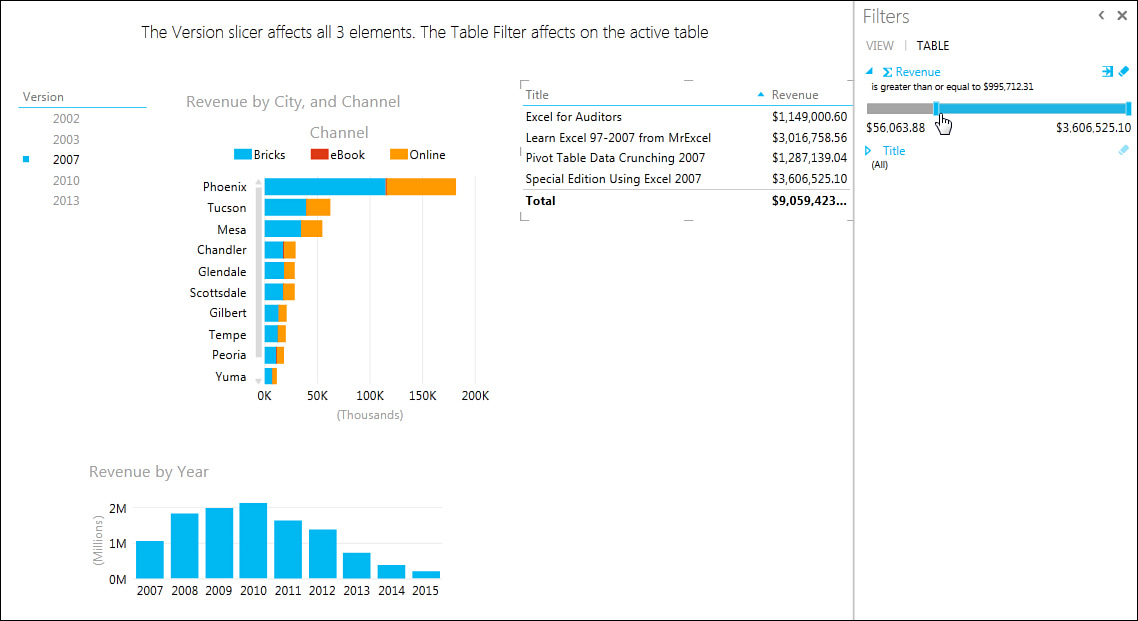
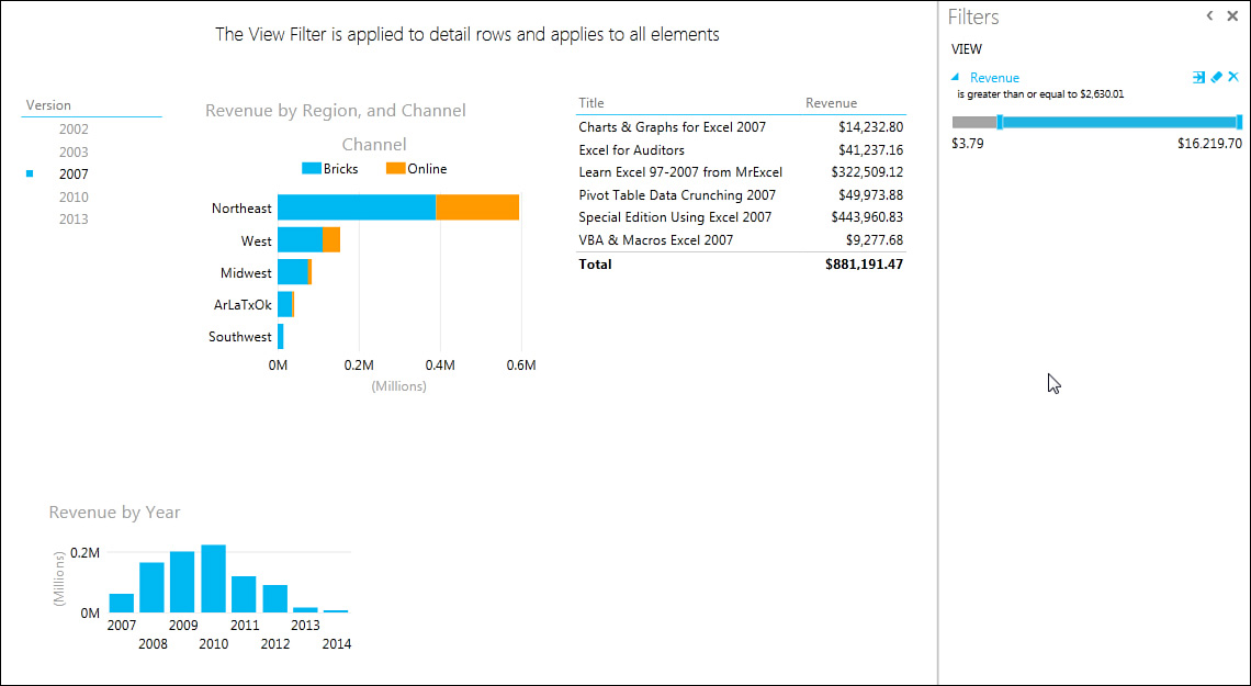
Although these different filters are on the same Filters pane, they act very differently. Consider Figure 11.12. The Version slicer in the top-left corner is affecting all three elements in the dashboard.
Figure 11.12 A Table filter applies only to the active table and is applied to the aggregate values in the table.
Select the top-right table and click the Filter icon to open the Table category in the Filters panel. The Table category lists all the fields currently in the active table. When you filter to ask for items over $1 million, the filter is applied at the aggregate level. After the 2007 version Slicer filter was applied but before the Table filter was applied, the top-right table contained 10 titles, for a total of $11.3 million. The Table filter looks at those 10 summary items and gives you only the 4 titles with more than $1 million in sales (see Figure 11.12).
Caution
The range slider in the Filters pane is very easy to use, but it is nearly impossible to get it to stop exactly on $1,000,000. If you hold the mouse button down on the blue slider and use the left/right arrow keys, you can nudge the slider. It still will not stop exactly at $1,000,000. You can click the blue arrow to the right of the Revenue filter to open a form where you can type in the exact value 1,000,000.
Here are the differences between the Table filter and the View filter:
![]() The View filter affects all elements on the canvas.
The View filter affects all elements on the canvas.
![]() The View filter starts out blank. You have to drag a field from the Fields list onto the Filters pane.
The View filter starts out blank. You have to drag a field from the Fields list onto the Filters pane.
![]() The View filter is applied to the individual detail records in the data set. By filtering for revenue greater than approximately $2,500, Power View goes back to the original 411,000 rows of data and looks for records where the revenue on the individual line item is greater than $2,500. It is tough to sell 100 computer books in one city in one quarter. The results here are likely tied to seminar or conference purchases (see Figure 11.13).
The View filter is applied to the individual detail records in the data set. By filtering for revenue greater than approximately $2,500, Power View goes back to the original 411,000 rows of data and looks for records where the revenue on the individual line item is greater than $2,500. It is tough to sell 100 computer books in one city in one quarter. The results here are likely tied to seminar or conference purchases (see Figure 11.13).
Figure 11.13 A View filter is applied to the underlying records and affects all elements on the canvas.
This last distinction of the filter applying at the detail level is not obvious.
Using Tile Boxes to Filter a Chart or a Group of Charts
The Power View Fields list offers a field called Tile By. Using it is another way to filter an element on the dashboard.
To use Tile By, select one chart or table element that you want to filter. Find the field you want to filter in the Fields list. You can drag the field to the Tile By area at the bottom of the Fields list. Alternatively, you can hover over the field, open the drop-down, and choose Add as Tile By.
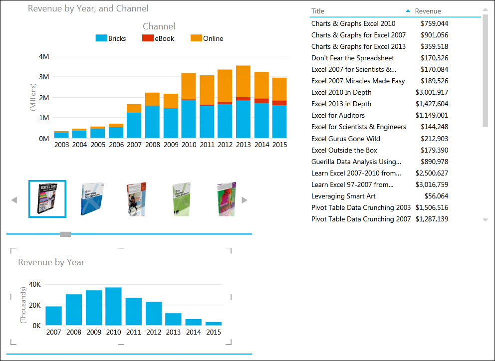
If you choose a regular field, the tiles appear as words. In Figure 11.14, the Image field has been added as a file.
Figure 11.14 Only the elements between the tile boundary lines are filtered by the tile category filters.
The filter appears as tiles across the top of the chart. Notice the thick blue lines above and below the chart. These lines tell you that only the one chart between the lines is affected by the tiles (see Figure 11.14).
Tiles are cool. They provide a way to filter one chart and not the other charts. But I can already hear what you’re thinking: You want to have two charts controlled by Tile 1 and another chart controlled by Tile 2. Fortunately, you can do this.
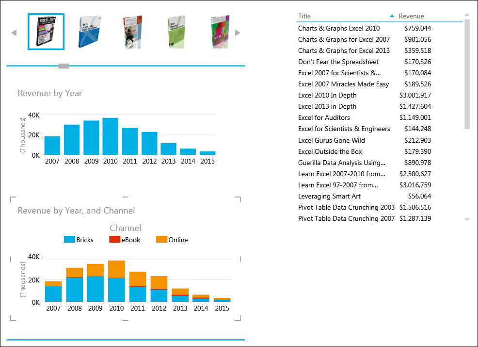
In Figure 11.14, right-click an element that is outside the boundary and choose Cut. Click anywhere inside the tile boundary lines, right-click, and paste. The result will inevitably be messy, with two charts right on top of each other.
Drag the tile box up and drag the bottom boundary line to add some room. Then individually move the two charts so they fit. It is tricky to find the correct boundary box to drag. The result is shown in Figure 11.15. Both of these charts are within the boundary lines, so they are both controlled by the tiles at the top. The table outside the boundary lines is not affected by the tiles.
Replicating Charts Using Multiples
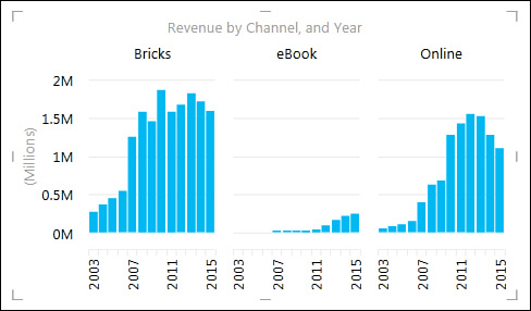
Say that you have a chart element that shows revenue by year. You could add a new field to the Legend area in order to create a stacked or clustered column chart. Alternatively, you could drag the new field to the Vertical Multiples or Horizontal Multiples field to cause Power View to replicate the chart for each value in that field. In Figure 11.16, the revenue chart appears as three charts based on the Channel field dropped in the Horizontal Multiples field.
Note
When you have only a few categories, there is no difference between dropping a field in Vertical Multiples and dropping it in Horizontal Multiples. If you chose a field with nine values and a Vertical Multiple, Power View uses three rows of three columns. In this example, both the horizontal multiple and vertical multiple appear as one row by three columns. The Multiples group on the Layout tab offers Grid Height and Grid Width settings where you can control the number of rows and columns used.
Showing Data on a Map
As you probably know, Microsoft owns Bing. Bing maps are pretty cool. Because Microsoft owns Bing, Microsoft seems to have free rein to use the Bing API as much as it wants to, and that is evident with the Map feature.
In a blank section of the Power View canvas, build a table showing revenue by state. With the table active, go to the Design tab in the ribbon and choose Map from the Switch Visualization category.
A warning appears that Excel has to send a list of states to Bing. I am trying to think of a case where you would care. If you were working for a secret government agency and you were mapping the location of where the Atomic Energy Commission stores the remains of alien UFO crashes, and you think that some random person at Bing Maps is a UFO conspiracy theorist, then maybe you would care. However, I have to believe that Bing Maps is getting a million requests a day, and the odds of anyone figuring out that your list is of UFO storage sites instead of the location of Starbucks stores is slim.
After a few seconds of geocoding, a map displays. By default, the Revenue field becomes the size of the bubble in each state. When you click the map, icons let you zoom in or zoom out. Click the map and drag with the hand icon to center the map to a new position.
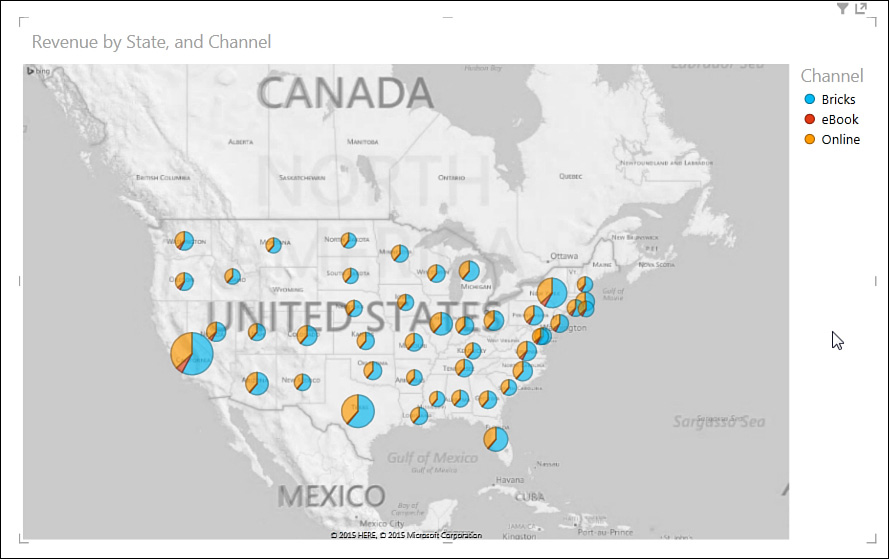
In Figure 11.17, the Channel field has been moved to the Color area. Excel creates a pie chart in each state, showing the relative percentage of sales by channel. Apparently, eBooks are doing better in California than in Arizona and New Mexico (though it’s hard to see that on the printed page).
Using Images
What if you could populate a pivot table with pictures of the people or items? Tables in Power View allow the display of pictures. You can display pictures in all three types of tables: table, matrix, and card view.
To insert a picture, a column in your data needs to contain a URL that points to each image or a path and filename that point to the image on your computer.
Add the Image URL field to your table. After a quick warning that Excel is getting the pictures from external sources, the images show up in the table.
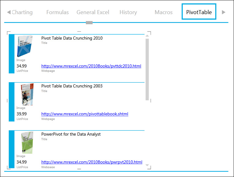
Pictures also work in Card View. To switch a table to Card View, go to Design, Switch Visualizations, Table, Card View. This view presents the field title for each field in every card. Figure 11.18 shows a Card View with a tile by category.
Changing a Calculation
Multiple calculations are available for fields you add to an element. You can change numeric fields from Sum to Average, Min, Max, or Count. In addition, you can use Count Distinct and Count Non Blank for text fields.
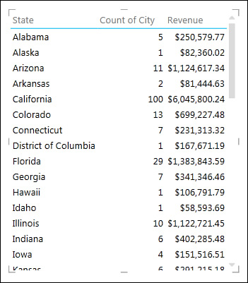
In Figure 11.19, the table shows the states and then the number of distinct cities with sales in those states. Build a table like this with State, City, and Revenue. At the bottom of the Power View Fields list, open the drop-down for City and choose Count (Distinct).
Another useful calculation option occurs when Power View summarizes a field that should not be summarized. For example, the product table has a ProductTier field with numeric values from 1 to 5. If you add this to a report, Power View might try to sum the Tier field when you want it to categorize by that field. Hover over the field at the bottom of the Fields list. Choose Do Not Summarize as the calculation.
Animating a Scatter Chart over Time
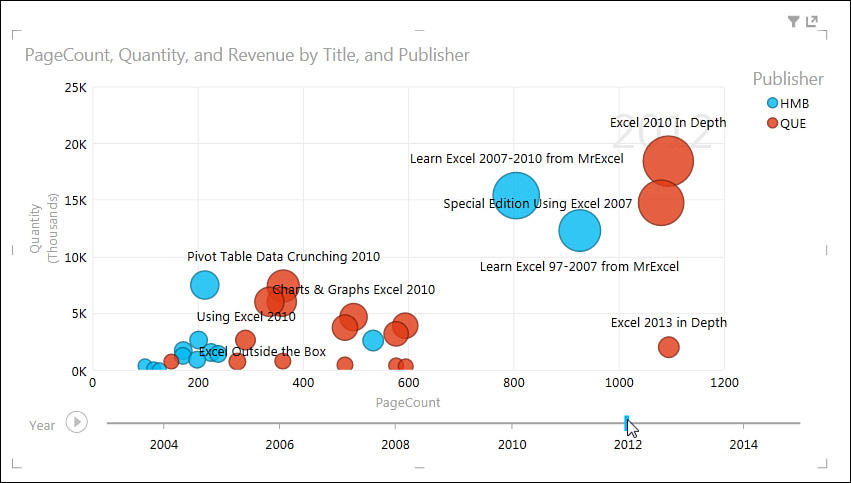
To create a great scatter chart, you need three or four numeric fields that are related. Drag the first field to a blank section of the canvas. Choose Design, Switch Visualizations, Other Charts, Scatter.
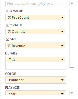
Figure 11.20 shows the details of the choices available in the Fields list when you are creating a scatter chart:
![]() Any numeric field for the x-axis.
Any numeric field for the x-axis.
![]() Any numeric field for the y-axis.
Any numeric field for the y-axis.
![]() Optionally, an area to control the size of the data point.
Optionally, an area to control the size of the data point.
![]() A Details area. For every unique value in the Details area, you get one point in the scatter chart.
A Details area. For every unique value in the Details area, you get one point in the scatter chart.
![]() Optionally, a Color area. Each point is colored according to values in this field.
Optionally, a Color area. Each point is colored according to values in this field.
![]() A Play Axis area.
A Play Axis area.
If you add a field to the Play Axis area, a scrubber control appears along the bottom of the chart (see Figure 11.21). You can drag the marker left or right to see the chart at various points in time, or you can click the Play button to watch the chart animate.
The Play Axis area is the key to having the chart animate. Unfortunately, at this time, only the scatter chart offers a Play Axis area. You cannot animate column charts, bar charts, pie charts, or tables.
![]() To learn about using Power Map to animate data on maps, see “Analyzing Geographic Data with 3D Map,” p. 261.
To learn about using Power Map to animate data on maps, see “Analyzing Geographic Data with 3D Map,” p. 261.
![]() Be careful when clicking on charts. Click in the white space to select a chart. If you inadvertently click one of the chart columns, you’ve just filtered everything else on the canvas.
Be careful when clicking on charts. Click in the white space to select a chart. If you inadvertently click one of the chart columns, you’ve just filtered everything else on the canvas.
![]() The Fields list has headings for Active and All. If you just created a little chart with two fields, it is likely that the Fields list is now in Active mode, which means you see only the tables used in that chart. This is alarming because all your other tables and fields are missing. Don’t be alarmed. Click All at the top of the Fields list, and they all come back.
The Fields list has headings for Active and All. If you just created a little chart with two fields, it is likely that the Fields list is now in Active mode, which means you see only the tables used in that chart. This is alarming because all your other tables and fields are missing. Don’t be alarmed. Click All at the top of the Fields list, and they all come back.
![]() Don’t be afraid to try new charts or tables. Create something. If it doesn’t look good, right-click and select Cut. No harm. I am surprised how snappy and efficient Power View is. I have been demonstrating Power View using 411,000 records in five charts and animating over time for a few years and have not had one crash.
Don’t be afraid to try new charts or tables. Create something. If it doesn’t look good, right-click and select Cut. No harm. I am surprised how snappy and efficient Power View is. I have been demonstrating Power View using 411,000 records in five charts and animating over time for a few years and have not had one crash.
Analyzing Geographic Data with 3D Map
3D Map allows you to build a pivot table on a three-dimensional globe of the Earth. Provided that your data has any geographic field such as Street, City, State, or Zip Code, you can plot the data on a map.
Once the data is on the map, you can fly through the data, zooming in to study a city or zooming back out to a 50,000-foot view. You can either use 3D Map to interactively study the data or build a tour from various scenes and render that tour as a video for distribution to people who do not have 3D Map.
Note
The 3D Map feature was known as an add-in called Power Map in Excel 2013 and also formerly known as GeoFlow. If you have previously used Power Map or GeoFlow, you can find that functionality in Excel 2016 as 3D Map.
Preparing Data for 3D Map
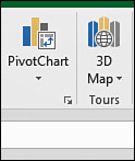
Although 3D Map uses the Power Pivot Data Model, there is no need to load your data into Power Pivot. You can just select one cell from a data set with a geographic field such as Country, State, County, City, Street, or Zip Code. On the Insert tab, in the Tours group, choose 3D Map, as shown in Figure 11.22.
3D Map converts the current data set to a table and loads it to the Power Pivot Data Model before launching 3D Map. This step might take 10 to 20 seconds as Power Pivot is loaded in the background.
3D Map converts the data to latitude and longitude by using Bing Maps. If your data is outside the United States, you should include a field for country code. Otherwise, Paris will show up in Kentucky, and Melbourne will show up on the east coast of Florida.
There are three special types of geographic data that 3D Map can consume:
![]() 3D Map can deal with Latitude and Longitude as two separate fields. Note that west and south values should be negative.
3D Map can deal with Latitude and Longitude as two separate fields. Note that west and south values should be negative.
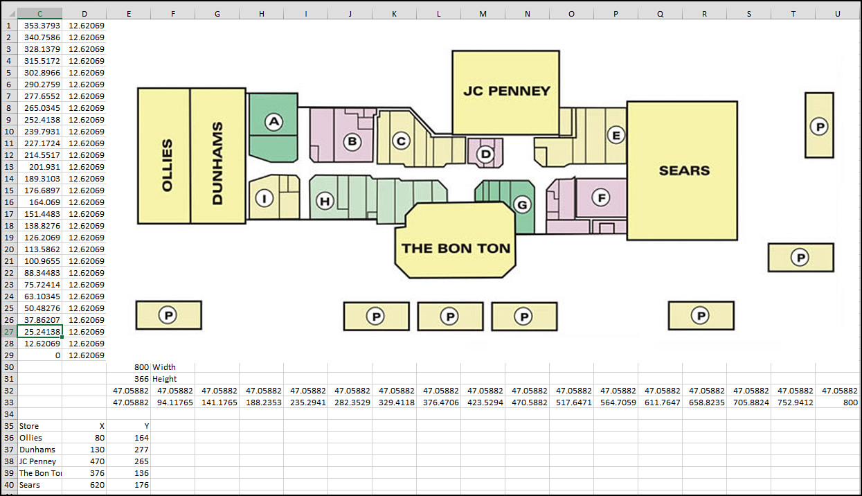
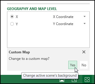
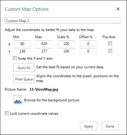
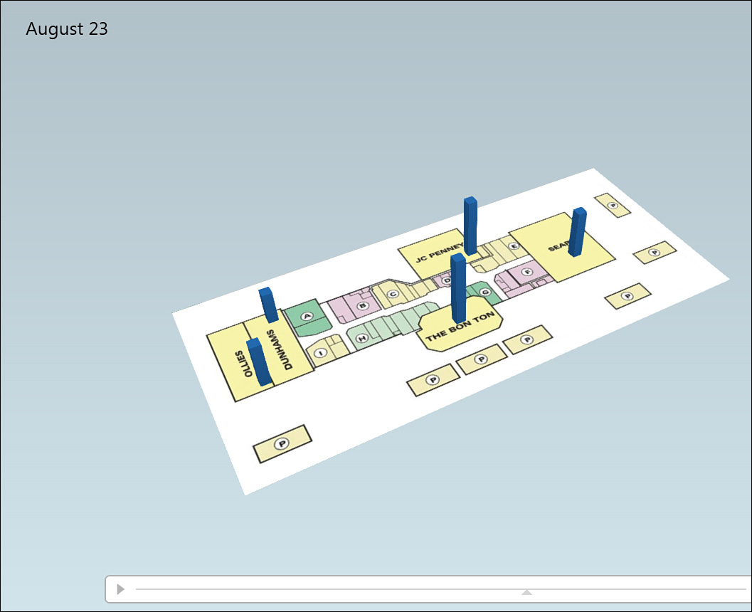
![]() It is possible to plot the data not on a globe but on a custom map such as the floor plan for an airport or a store. In this case, you need to provide x and y data, remembering that x runs across the map, starting with 0 at the left edge, and y starts at 0 at the bottom edge.
It is possible to plot the data not on a globe but on a custom map such as the floor plan for an airport or a store. In this case, you need to provide x and y data, remembering that x runs across the map, starting with 0 at the left edge, and y starts at 0 at the bottom edge.
![]() 3D Map now allows for custom shapes. You need to have a KML or SHP file describing the shapes. The names in your data set should match values in the KML file.
3D Map now allows for custom shapes. You need to have a KML or SHP file describing the shapes. The names in your data set should match values in the KML file.
Although you don’t have to preload the data into the Power Pivot Data Model, you can take that extra step if you need to define relationships between tables.
Geocoding Data
The process of locating points on a map is called geocoding. When you first launch 3D Map, you have to choose the geographic fields. If you’ve used meaningful headings such as City or State, 3D Map auto-detects these fields.
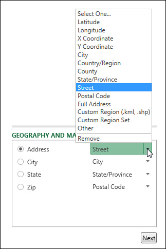
In the Choose Geography section, place a check next to each geographic field. In the Geography and Map Level section, choose a field type for each of the geographic fields (see Figure 11.23).
Tip
Fields such as “123 Main Street” should be marked as Street. Fields such as “123 Main Street, Akron, OH” should be marked as Full Address. Marking “123 Main Street” as an address will lead to most of your data points placed in the wrong state.
Choose one of your geographic fields as the map level. If you choose State, you will get one point per state. If you choose Address, you will get one point for each unique address.
After you’ve chosen the geographic fields, click Next in the lower-right corner.
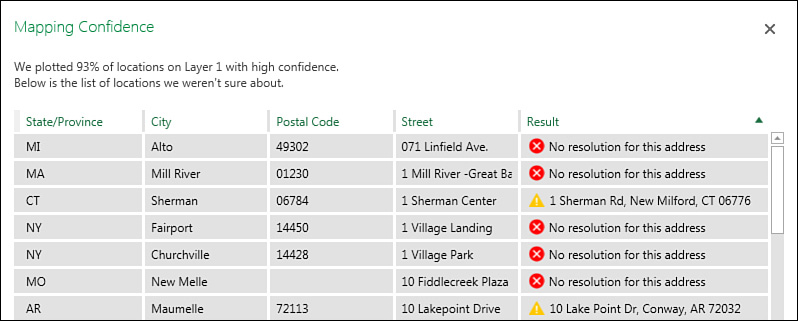
It takes a short while for 3D Map to complete the geocoding process. When it is finished, a percentage appears in the top of the PivotTable Fields list. Click this percentage to see a list of data points that could not be mapped (Figure 11.24). Items with a red X are not going to appear on the map. Items with a yellow ! are going to appear at the address shown.
Note
When an address is not found, there is currently no tool to place that data point on the map. Other mapping tools such as MapPoint would give you choices such as using a similar address or even adding the point to the center of the zip code. But 3D Map currently simply advises you to add more geographic fields to the original data set.
Building a Column Chart in 3D Map
3D Map offers five types of layers: Stacked Column, Clustered Column, Bubble, Heat Map, and Region. The processes for building Stacked Column and Clustered Column layers are similar:
1. Choose either the Clustered Column or Stacked Column icon in the bottom half of the Layer pane. Height, Category, and Time areas appear.
2. Drag a numeric field to the Height area. Use the drop-down arrow at the right edge of the field to choose Sum, Average, Count Not Blank, Count Distinct, Max, Min, or No Aggregation.
3. If you want the columns to be different colors, drag a field to the Category area. A large legend covers up the map. Click the legend, and resize handles appear. Right-click the legend and choose Edit to control the font, size, and color.
4. To animate the map over time, drag a date or time field to the Time area. Right-click the large time legend and customize how the dates and times appear.
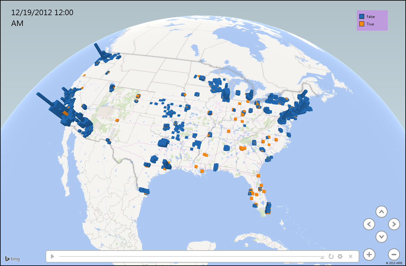
Figure 11.25 shows an initial map using a clustered column chart.
Navigating Through the Map
Initially, the zoom level is set to show all of your data points. You might discover that a few outliers cause the map to be zoomed out too far. For example, if you are analyzing customer data for an auto repair shop, you might find a few customers who stopped in for a repair while they were driving through on vacation. If 98% of your customers are near Charlotte, North Carolina, but three or four customers from New York and California are in the data set, the map will show everything from New York to California.
You can zoom in or out by using the + or – icons in the lower right of the map. You can use the mouse wheel to quickly zoom in or out.
As you start to zoom in, you might realize that you are zooming in on the wrong section of the map. Click and drag the map to re-center it. Or double-click any white space on the map to center the map at that point while zooming in.
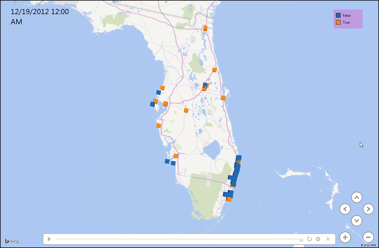
Figure 11.26 shows a map zoomed in to show Florida.
By default, you usually look straight down on the map, but it is easier to see the height of each column if you tip the map. Use the up arrow and down arrow icons on the map to tip the map up or down. Or use the Alt key and the mouse: Hold down Alt and drag the mouse straight up to tip the map so that you are viewing the map from a point closer to the ground.
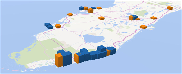
Hold down Alt and drag the mouse straight down to move the vantage point higher. When you hold down Alt and drag the mouse left or right, you rotate the view left or right. Figure 11.27 shows Miami from a lower vantage point, as you would see the points from the Atlantic Ocean.
Labeling Individual Points
In many data sets, you see unusual data points. To see the details about a particular data point, hover over the point’s column, and a tooltip appears, with identifiers for the data point. When you move away from the column, the tooltip is hidden.
If you are building a tour, you might want to display an annotation or a text box on a certain point. An annotation includes a custom title and the value of any fields you choose—or it can include a picture. A text box includes just text.
Right-click any point and choose Annotation or Text Box to build the label.
Building Pie or Bubble Charts on a Map
A bubble chart plots a single circle for each data point. The size of the circle tells you about the data point. If you add a Category field, the circle changes to a pie chart, with each category appearing as a wedge in the pie chart.
Unlike with column charts, you will likely want your bubble markers to be an aggregate of all points in a state or city. To change the level for a map, click the Pencil icon to the right of Geography at the top of the Layer pane. Then change the level to State and click Next. Drag a numeric field to the size area. Drag a text field to the category area.
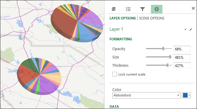
You might need to adjust the size of the bubbles or pie charts. There are four symbols across the top of the Layer pane. The fourth symbol is a Settings gear-wheel icon. Click it and choose Layer Options. Slicers appear that let you change the opacity, size, thickness, and colors used (see Figure 11.28).
Using Heat Maps and Region Maps
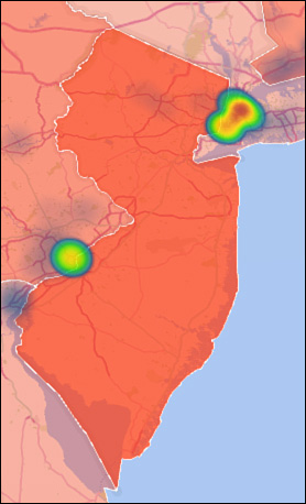
3D Maps also offers heat maps and shaded region maps. A heat map is centered on an individual point and shows varying shades of green, yellow, and red to show intensity. A region map fills an outline with the same color and is useful for showing data by country, state, or county.
Figure 11.29 shows a map with two layers: One layer is a region map by state, and the other layer is a heat map by city.
You might want to create region maps for shapes other than state or country. There are many free SHP or KML files available on the Internet. You can have 3D Map import these custom regions and then shade those areas on the map. To import a custom region, use Import Regions from the 3D Map ribbon.
Exploring 3D Map Settings
There are a number of useful settings in 3D Map. Here are some of my favorites:
![]() Aerial Photography Map—If you will be zooming in to the city level, you can show an aerial photograph over the map. Use the Themes drop-down in 3D Map and choose the second theme.
Aerial Photography Map—If you will be zooming in to the city level, you can show an aerial photograph over the map. Use the Themes drop-down in 3D Map and choose the second theme.
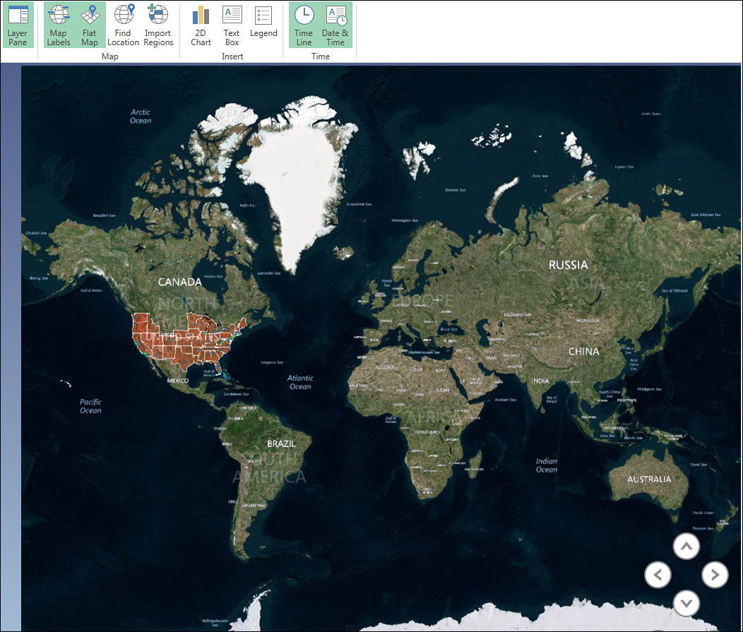
![]() Add Map Labels—Click the Map Labels icon in the ribbon to add labels to the map. If you are zoomed completely out, the labels will be country names. As you zoom in, the labels change to states, cities, and even street names. Note that labels are an all-or-nothing proposition. You cannot easily show some labels and not others.
Add Map Labels—Click the Map Labels icon in the ribbon to add labels to the map. If you are zoomed completely out, the labels will be country names. As you zoom in, the labels change to states, cities, and even street names. Note that labels are an all-or-nothing proposition. You cannot easily show some labels and not others.
![]() Flat Map—If you want to see the entire Earth at one time, use the Flat Map icon in the 3D Map ribbon.
Flat Map—If you want to see the entire Earth at one time, use the Flat Map icon in the 3D Map ribbon.
Figure 11.30 shows a flat map with labels added and aerial photography.
Fine-Tuning 3D Map
There are situations where the defaults used by 3D Map are not the best. Here are troubleshooting methods for various situations.
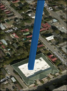
By default, each column in a column chart takes up a fair amount of space on the map. For example, if you plot every house on your street, each column takes up about one city block. You won’t be able to make out the detail for each house. Click the Settings gear-wheel icon and then Layer Options. Change the Thickness setting to 5% or 10%. 3D Map makes each column very narrow (see Figure 11.31).
3D Map looks great on a huge 1080p monitor. If you are stuck on a tiny laptop, though, you should hide the Tour and Layer panes by using the icons in the 3D Map ribbon.
Most legends start out way to large. You can either resize them or right-click and choose Hide to remove them altogether.
The Funnel icon in the Layer pane allows you to add filters to any field. 3D Map cannot render 5,000 check boxes, so you might have to use the Search utility within the filters to find items to show or hide.
When you hover over a data point, the resulting tooltip is called a data card. You can customize what appears in the card by selecting Layer Options from the gear-wheel menu and then clicking the icon below Customize Data Card.
To combine different map types, add a layer using the Add Layer icon. Each layer can be shown at a different geography. You might have a column chart by city on Layer 1 and a region chart by state on Layer 2. The Layer Manager allows you to show and hide various layers.
Animating Data over Time
You can add a date or time field to any map layer. A time scrubber appears at the bottom of the map. Grab the scrubber and drag it left or right to show the data at any point in time. Use the Play button on the left side of the scrubber to have 3D Map animate the entire time period.
When you add the date or time field to the Time area, a small clock icon appears above the field. There are three choices in this drop-down menu:
![]() Data Shows for an Instant—The data appears when the time scrubber reaches this date, but then the data disappears once the scrubber passes the date.
Data Shows for an Instant—The data appears when the time scrubber reaches this date, but then the data disappears once the scrubber passes the date.
![]() Date Accumulates over Time—This option is appropriate for showing how ticket sales happened. If you sold 10 tickets on Monday and then another 5 tickets on Tuesday, you would want the map to show 15 tickets on Tuesday.
Date Accumulates over Time—This option is appropriate for showing how ticket sales happened. If you sold 10 tickets on Monday and then another 5 tickets on Tuesday, you would want the map to show 15 tickets on Tuesday.
![]() Data Stays Until It Is Replaced—Say that you have a list of housing sales for the past 30 years. If a house sold for $200,000 in 2001 and then for $225,000 in 2005, you would want to show $200,000 for all points from 2001 until the end of 2004.
Data Stays Until It Is Replaced—Say that you have a list of housing sales for the past 30 years. If a house sold for $200,000 in 2001 and then for $225,000 in 2005, you would want to show $200,000 for all points from 2001 until the end of 2004.
To control the speed of the animation, click the gear-wheel icon in the Layer pane and choose Scene Options. The Speed slider in the Time section controls how fast the time will change. Watch the Scene Duration setting at the top of this panel to see how long it will take to animate through the entire period covered by the data set.
You can use the Start Date and End Date drop-downs to limit the animation to just a portion of the time period.
Building a Tour
You can use a tour in 3D Map to tell a story. Each scene in the tour can focus on a section of the map, and 3D Map will automatically fly from one scene to the next.
As you have been experimenting in 3D Map, you have been working on Scene 1 in the Tour pane. If you click the gear-wheel icon and then Scene Options, you will see that the default scene duration is 10 seconds, with a default transition duration of 3 seconds. Therefore, when you play a tour, this first scene lasts 10 seconds. The time to fly to the next scene takes 3 seconds.
Once you have the timing correct for the first scene, you can add a second scene by selecting Home, New Scene, Copy Scene 1. Customize the second scene to zoom in on a different section of the country or to show a different view of the map.
Say that you want to have the first scene show the data accumulate over time and then you want the next three scenes to zoom in to three interesting parts of the country. You have to remove the Time field from the Layer pane at the start of Scene 2, or the entire timeline will animate again.
Alternatively, perhaps you want to zoom in to an area at a particular part of the timeline. In this example, you might have these scenes:
![]() You start with an establishing shot that shows the whole country at the beginning of the time period. Use the Scene Options and set both the start and end date to the earliest date in the data set. By using the same date for start and end, the opening scene will not animate over time.
You start with an establishing shot that shows the whole country at the beginning of the time period. Use the Scene Options and set both the start and end date to the earliest date in the data set. By using the same date for start and end, the opening scene will not animate over time.
![]() You then have a scene that animates over part of the timeline, perhaps 1971 to 1995.
You then have a scene that animates over part of the timeline, perhaps 1971 to 1995.
![]() Next is a scene that zooms in to Florida in 1995. Use Scene Options to set the start and end date to December 31, 1995, to prevent the data from re-animating.
Next is a scene that zooms in to Florida in 1995. Use Scene Options to set the start and end date to December 31, 1995, to prevent the data from re-animating.
![]() Finally, you have a scene that is a copy of Scene 2 but with the date range changed from 1996 to 2018.
Finally, you have a scene that is a copy of Scene 2 but with the date range changed from 1996 to 2018.
Tip
Note that annotations and text boxes will appear throughout one scene and through the transition to the next scene. If you have a 6-second scene and a 20-second transition, the text box will appear for all 26 seconds. You might want to go to the extra effort to break this up as a 6-second scene with the text box and a 0-second transition, followed by a 1-second scene with no text box and a 20-second transition.
To have the map constantly moving, change the Effect drop-down to something other than No Effect. For example, with Circle or Figure 8, the camera flies in an arc above the scene. Depending on how long the scene lasts, you may not get a complete circle. Adjust the Effect speed to increase the chances of finishing the circle.
Click Play Tour to hide all panels and play the tour in full-screen mode. Drag the mouse over the tour to reveal Play and Pause buttons at the bottom of the screen. Press the Esc key to go back to 3D Map.
Creating a Video from 3D Map
To share a tour with others, you can use 3D Map to render a video. Build a tour first and then click Create Video. You can choose from three video resolutions and add a sound track.
Note
Note that rendering a several-minute tour in full HD resolution can take more than an hour on a fast PC.
Next Steps
Chapter 12, “Enhancing Pivot Table Reports with Macros,” introduces you to simple macros you can use to enhance your pivot table reports.

