
Chapter 2
Performing Large-Scale Data Analysis
In This Chapter
![]() Analyzing worksheet data with pivot tables and pivot charts
Analyzing worksheet data with pivot tables and pivot charts
![]() Analyzing worksheet data with the PowerPivot and Power View add-ins
Analyzing worksheet data with the PowerPivot and Power View add-ins
![]() Analyzing data visually over time with Power Map
Analyzing data visually over time with Power Map
![]() Analyzing data trends in a visual forecast worksheet
Analyzing data trends in a visual forecast worksheet
The subject of this chapter is performing data analysis on a larger scale in Excel 2016 worksheets, often with visual components that enable you and your users to immediately spot developing trends. The primary Excel tool for performing such large-scale analysis on your worksheet data is the pivot table and its visual counterpart, the pivot chart. Pivot tables enable you to quickly summarize large amounts of data revealing inherent relationships and trends, whereas pivot charts enable you to easily visualize these connections.
In addition, you have access to Excel’s PowerPivot and Power View add-ins when you need to perform analysis on really large data models whose tables contain really huge amounts of data. Finally, Excel 2016 offers you two brand new data analysis features designed to help you quickly identify significant indicators of your business’s health and well-being: Power Map, which produces stunning, interactive 3-D maps animating data over time, and Forecast Sheet, which generates worksheets showing developing trends in your data.
Creating Pivot Tables
Pivot table is the name given to a special type of data summary table that you can use to analyze and reveal the relationships inherent in the data lists that you maintain in Excel. Pivot tables are great for summarizing particular values in a data list or database because they do their magic without making you create formulas to perform the calculations. Unlike the Subtotals feature, which is another summarizing feature (see Book VI, Chapter 1 for more information), pivot tables let you play around with the arrangement of the summarized data — even after you generate the table. (The Subtotals feature only lets you hide and display different levels of totals in the list.) This capability to change the arrangement of the summarized data by rotating row and column headings gives the pivot table its name.
Pivot tables are also versatile because they enable you to summarize data by using a variety of summary functions (although totals created with the SUM function will probably remain your old standby). You can also use pivot tables to cross-tabulate one set of data in your data list with another. For example, you can use this feature to create a pivot table from an employee database that totals the salaries for each job category cross-tabulated (arranged) by department or job site. Moreover, Excel 2016 makes it easy to create pivot tables that summarize data from more than one related data list entered in the worksheet or retrieved from external data in what’s known as a Data Model. (See Book VI, Chapter 2 for more on relating data lists and retrieving external data.)
Excel 2016 offers several methods for creating new pivot tables in your worksheets:
- Quick Analysis tool: With all the cells in the data list selected, click the Quick Analysis tool and then select your pivot table on the Tables tab of its drop-down palette.
- Recommended PivotTables button: With the cell pointer in one of the cells of a data list, click the Recommended PivotTables button on the Insert tab and then select your pivot table in the Recommended PivotTables dialog box.
- PivotTable button: With the cell pointer in one of the cells of a data list, click the PivotTable button on the Insert tab and then use the Create PivotTable dialog box to specify the contents and location of your new table before you manually select the fields in the data source to use.
Pivot tables with the Quick Analysis tool
Excel 2016 makes it simple to create a new pivot table using a data list selected in your worksheet with its new Quick Analysis tool. To preview various types of pivot tables that Excel can create for you on the spot using the entries in a data list that you have open in an Excel worksheet, simply follow these steps:
Select all the data (including the column headings) in your data list as a cell range in the worksheet.
 If you’ve assigned a range name to the data list, you can select the column headings and all the data records in one operation simply by choosing the data list’s name from the Name box drop-down menu.
Click the Quick Analysis tool that appears right below the lower-right corner of the current cell selection.
Doing this opens the palette of Quick Analysis options with the initial Formatting tab selected and its various conditional formatting options displayed.
Click the Tables tab at the top of the Quick Analysis options palette.
Excel selects the Tables tab and displays its Table and PivotTable option buttons. The Table button previews how the selected data would appear formatted as a table. The other PivotTable buttons preview the various types of pivot tables that can be created from the selected data.
To preview each pivot table that Excel 2016 can create for your data, highlight its PivotTable button in the Quick Analysis palette.
As you highlight each PivotTable button in the options palette, Excel’s Live Preview feature displays a thumbnail of a pivot table that can be created using your table data. This thumbnail appears above the Quick Analysis options palette for as long as the mouse or Touch pointer is over its corresponding button.
When a preview of the pivot table you want to create appears, click its button in the Quick Analysis options palette to create it.
Excel 2016 then creates the previewed pivot table on a new worksheet that is inserted at the beginning of the current workbook. This new worksheet containing the pivot table is active so that you can immediately rename and relocate the sheet as well as edit the new pivot table, if you wish.
Figures 2-1 and 2-2 show you how this procedure works. In Figure 2-1, I’ve highlighted the fourth suggested PivotTable button in the Quick Analysis tool’s option palette. The previewed table in the thumbnail displayed above the palette shows the salaries subtotals and grand totals in the Employee Data list organized whether or not the employees participate in profit sharing (Yes or No).

Figure 2-1: Previewing the pivot table created from the selected data in the Quick Analysis options palette.
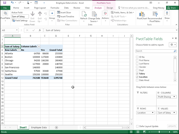
Figure 2-2: Previewed pivot table created on a new worksheet with the Quick Analysis tool.
Figure 2-2 shows you the pivot table that Excel created when I clicked the highlighted button in the options palette in Figure 2-1. Note this pivot table is selected on its own worksheet (Sheet1) that’s been inserted in front of the Employee Data worksheet. Because the new pivot table is selected, the PivotTable Fields task pane is displayed on the right side of the Excel worksheet window and the PivotTable Tools context tab is displayed on the Ribbon. You can use the options on this task pane and contextual tab to then customize your new pivot table as described in the “Formatting a Pivot Table” section later in this chapter.
Note that if Excel can’t suggest various pivot tables to create from the selected data in the worksheet, a single Blank PivotTable button is displayed after the Table button in the Quick Analysis tool’s options on the Tables tab. You can select this button to manually create a new pivot table for the data as described later in this chapter.
Recommended pivot tables
If creating a new pivot table with the Quick Analysis tool (described in the previous section) is too much work for you, you can quickly generate a pivot table with the new Recommended Pivot Tables command button. To use this method, follow these three easy steps:
Select a cell in the data list for which you want to create the new pivot table.
Provided that the data list has a row of column headings with contiguous rows of data as described in Book VI, Chapter 1, this can be any cell in the table.
Click the Recommended PivotTables command button on Insert tab of the Ribbon or press Alt+NSP.
Excel displays a Recommended PivotTables dialog box similar to the one shown in Figure 2-3. This dialog box contains a list box on the left side that shows samples of all the suggested pivot tables that Excel 2016 can create from the data in your list.
- Select the sample of the pivot table you want to create in the list box on the left and then select OK.

Figure 2-3: Creating a new pivot table from the sample pivot tables displayed in the Recommended PivotTables dialog box.
As soon as you select OK, Excel creates a new pivot table following the selected sample on its own worksheet inserted in front of the others in your workbook. This pivot table is selected on the new sheet so that the Pivot Table Fields task pane is displayed on the right side of the Excel worksheet window and the PivotTable Tools contextual tab is displayed on the Ribbon. You can use the options on this task pane and contextual tab to then customize your new pivot table as described in the “Formatting a Pivot Table” section later in this chapter.
Manually created pivot tables
Creating pivot tables with the Quick Analysis tool or the Recommended PivotTables button on the Insert tab is fine provided that you’re only summarizing the data stored in a single data list that’s stored in your Excel worksheet.
When you want your pivot table to work with data from fields in more than one (related) data table or with data stored in a data table that doesn’t reside in your worksheet as when connecting with an external data source (see Book VI, Chapter 2), you need to manually create the pivot table.
Creating a pivot table with local data
To manually create a new pivot table using a data list stored in your Excel workbook, simply open the worksheet that contains that list (see Book VI, Chapter 1) you want summarized by the pivot table, position the cell pointer somewhere in the cells of this list, and then click the PivotTable command button on the Ribbon’s Insert tab or press Alt+NVT.
Excel then selects all the data in the list indicated by a marquee around the cell range before it opens a Create PivotTable dialog box similar to the one shown in Figure 2-4, where the Select a Table or Range option is selected. You can then adjust the cell range in the Table/Range text box under the Select a Table or Range option button if the marquee does not include all the data to be summarized in the pivot table.
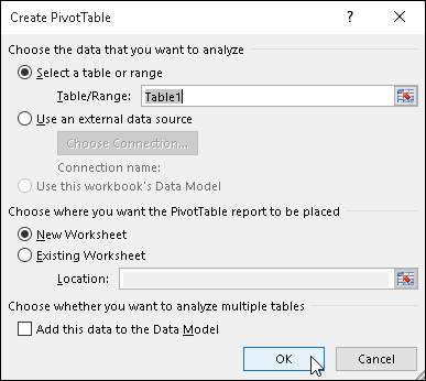
Figure 2-4: Indicate the data source and pivot table location in the Create PivotTable dialog box.
By default, Excel builds the new pivot table on a new worksheet it adds to the workbook. If you want the pivot table to appear on the same worksheet, select the Existing Worksheet option button and then indicate the location of the first cell of the new table in the Location text box. (Just be sure that this new pivot table isn’t going to overlap any existing tables of data.)
If the list you’ve selected in the Table/Range text box is related to another data list in your workbook and you want to be able to analyze and summarize data from both, be sure to select the Add This Data to the Data Model check box at the bottom of the Create PivotTable dialog box before you click OK. (See Book VI, Chapter 2 for details on creating relationships between data lists using key fields.)
Creating a pivot table from external data
If you’re creating a pivot table using external data not stored in your workbook, you want to locate the cell pointer in the first cell of the worksheet where you want the pivot table before opening the Create PivotTable dialog box by selecting the PivotTable button on the Insert tab.
When the cell pointer’s in a blank cell when you open the Create PivotTable dialog box, Excel automatically selects the Use an External Data Source option as the data source and the Existing Worksheet option as the location for the new pivot table. To specify the external data table to use, you then click the Choose Connections button to open the Existing Connections dialog box, where you select the name of the connection you want to use before you click the Open button. (See Book VI, Chapter 2 for information on establishing connections with external database tables.)
Excel then returns you to the Create PivotTable dialog box, where the name of the selected external data connection is displayed after the Connection Name heading. You can then modify the location settings, if need be, before creating the new pivot table by clicking OK. Note that the Add This Data to the Data Model check box is automatically selected (and cannot be deselected) — the relationships between the data tables in the source database specified by the external data connection are automatically reflected in fields displayed in the Field list for the new pivot table.
Constructing the new pivot table
After you indicate the source and location for the new pivot table in the Create PivotTable dialog box and click its OK button, the program adds a placeholder graphic (with the text, “To build a report, choose fields from the PivotTable Field List”) indicating where the new pivot table will go in the worksheet while at the same time displaying a PivotTable Fields task pane on the right side of the Worksheet area. (See Figure 2-5.)

Figure 2-5: A new pivot table displaying the blank table grid and the PivotTable Fields List task pane.
This PivotTable Fields task pane is divided into two areas: the Choose Fields to Add to Report list box with the names of all the fields in the data list you selected as the source of the table preceded by an empty check box at the top, and an area identified by the heading, Drag Fields Between Areas Below, which is divided into four drop zones (FILTERS, COLUMNS, ROWS, and VALUES) at the bottom.
To complete the new pivot table, all you have to do is assign the fields in the PivotTable Fields task pane to the various parts of the table. You do this by dragging a field name from the Choose Fields to Add to Report list box to one of the four areas (or drop zones) in the Drag Fields Between Areas Below section at the bottom of the task pane:
- FILTERS for the fields that enable you to page through the data summaries shown in the actual pivot table by filtering out sets of data — they act as the filters for the report. So, for example, if you designate the Year Field from a data list as a report filter, you can display data summaries in the pivot table for individual years or for all years represented in the data list. They appear at the top of the report above the columns and rows of the pivot table.
- COLUMNS for the fields that determine the arrangement of data shown in the columns of the pivot table — their entries appear in the table’s column headings.
- ROWS for the fields that determine the arrangement of data shown in the rows of the pivot table — their entries appear in the table’s row headings.
- VALUES for the fields whose data are presented in the cells in the body of the pivot table — they are the values that are summarized in the last row and column of the table (totaled by default).
You can also add fields to the new pivot table simply by selecting the check box in front of the field name. Keep in mind when you use this method to build your pivot table that if Excel identifies the field as text, it automatically adds it to the ROWS area and when it identifies the field as numeric, the program adds it to the VALUES area. To remove a field from the pivot table, simply clear its check box in the PivotTable Fields task pane.
To better understand how you can use these various areas in a pivot table, look at a completed pivot table in Figure 2-6. For this pivot table, I dragged these fields in the employee data list to the following areas in the PivotTable Fields task pane:
- Gender field contains F (for female) or M (for male) to indicate the employee’s gender — to the FILTERS area.
- Location field contains the names of the various cities with corporate offices — to the COLUMNS area.
- Dept field contains the names of the various departments in the company — to the ROWS area.
- Salary field contains the annual salary for each employee — to the VALUES area.

Figure 2-6: A completed pivot table after adding the fields from the employee data list to its various sections.
As a result, this pivot table now displays the sum of the salaries for both the men and women employees in each location (across the columns) and then presents these sums by their department (in each row).
As soon as you create a new pivot table (or select the cell of an existing table in a worksheet), Excel selects the Analyze tab of the PivotTable Tools contextual tab added to the end of the Ribbon. Among the many groups on this tab, you find the Active Field group, which contains the following useful command buttons:
- Active Field text box indicating the pivot table field that is active in the worksheet
- Field Settings button to open the Field Settings dialog box, where you can change various settings for the pivot table field that’s active in the worksheet
- Drill Down and Drill Up buttons to display lower levels with detail data (Drill Down) or high levels with summary data (Drill Up) in a chart or matrix in Power View (see “Using the PowerPivot and Power View Add-Ins” later in this chapter for details)
- Expand Field and Collapse Field buttons to hide and redisplay the expand (+) and collapse (–) buttons in front of particular Column Fields or Row Fields that enable you to temporarily remove and then redisplay their particular summarized values in the pivot table
Formatting a Pivot Table
Excel 2016 makes formatting a new pivot table you’ve added to a worksheet as quick and easy as formatting any other table of data or list of data. All you need to do is click a cell of the pivot table to add the PivotTable Tools contextual tab to the end of the Ribbon and then click its Design tab to display its command buttons.
The Design tab on the PivotTable Tools contextual tab is divided into three groups:
- Layout group to add subtotals and grand totals to the pivot table and modify its basic layout
- PivotTable Style Options group to refine the pivot table style you select for the table using the PivotTable Styles gallery to the immediate right
- PivotTable Styles group containing the gallery of styles you can apply to the active pivot table by clicking the desired style thumbnail
Refining the pivot table layout and style
After selecting a style from the PivotTable Styles gallery on the Design tab on the PivotTable Tools contextual tab, you can then refine the style using the command buttons in the Layout group and the check boxes in the PivotTable Style Options group.
The Layout group on the Design tab contains the following four command buttons:
- Subtotals to hide the display of subtotals in the summary report or have them displayed at the top or bottom of their groups in the report
- Grand Totals to turn on or off the display of grand totals in the last row or column of the report
- Report Layout to modify the display of the report by selecting between the default Compact Form and the much more spread-out Outline Form (which connects the subtotals across the columns of the table with lines or shading depending on the table style selected) and Tabular Form (which connects the row items in the first column and the subtotals across the columns of the table with gridlines or shading depending on the table style selected)
- Blank Rows to insert or remove a blank row after each item in the table
The PivotTable Style Options group contains the following four check boxes:
- Row Headers to remove and then re-add the font and color formatting from the row headers of the table in the first column of the table applied by the currently selected pivot table style
- Column Headers to remove and then re-add the font and color formatting from the column headers at the top of the table applied by the currently selected pivot table style
- Banded Rows to add and remove banding in the form of gridlines or shading (depending on the currently selected pivot table style) from the rows of the pivot table
- Banded Columns to add and remove banding in the form of gridlines or shading (depending on the currently selected pivot table style) from the columns of the pivot table
Figure 2-7 shows the original pivot table created from the employee data list after making the following changes:
- Adding the Years of Service field as a second row field and then closing the PivotTable Fields task pane
- Selecting the Banded Rows check box in the PivotTable Style Options group on the Design contextual tab
- Choosing the Show in Outline Form option from the Report Layout command button’s drop-down menu in the Layout group of the Design tab
- Choosing the Insert Blank Line after Each Item option from the Blank Rows command button’s drop-down menu in the Layout group of the Design tab
- Choosing the Show All Subtotals as Bottom of Group option from the Subtotals command button’s drop-down menu in the Layout group of the Design tab
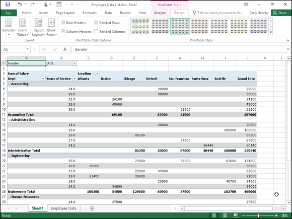
Figure 2-7: Revised pivot table in the Outline Form with an extra blank row between each item in the pivot table.
Formatting the parts of the pivot table
Even after applying a table style to your new pivot table, you may still want to make some individual adjustments to its formatting, such as selecting a new font, font size, or cell alignment for the text of the table and a new number format for the values in the table’s data cells.
You can make these types of formatting changes to a pivot table by selecting the part of the table to which the formatting is to be applied and then selecting the new formatting from the appropriate command buttons in the Font, Alignment, and Number groups on the Home tab of the Ribbon.
Applying a new font, font size, or alignment to the pivot table
You can modify the text in a pivot table by selecting a new font, font size, or horizontal alignment. To make these formatting changes to the text in the entire table, select the entire table before you use the appropriate command buttons in the Font and/or Alignment group on the Home tab. To apply these changes only to the headings in the pivot table, select only its labels before using the commands on the Home tab. To apply these changes only to the data in the body of the pivot table, select only its cells.
To help you select the cells you want to format in a pivot table, use the following Select items on the Actions command button’s drop-down list:
- Click a cell in the pivot table in the worksheet and then click the Select drop-down button in the Actions group on the Analyze tab under the PivotTable Tools contextual tab (Alt+JTW).
- On the Select submenu, you can do the following:
- Click the Label and Values option to select the cells with the row and column headings and those with the values in the table.
- Click the Values option to select only the cells with values in the table.
- Click the Label option to select only the cells with the rows and column headings in the table.
- Click the Entire Table option on the Select submenu to select all the pivot table cells, including the Report Filter cells.
- Click the Enable Selection option to be able to select single rows or columns of the pivot table by clicking it with the mouse or Touch pointer.
You can also use the following hot keys to select all or part of your pivot table:
- Alt+JTWA to select the label cells with the row and column headings as well as the data cells with the values in the body of the pivot table
- Alt+JTWV to select only the data cells with the values in the body of the pivot table
- Alt+JTWL to select only the label cells with the row and column headings in the pivot table
- Alt+JTWT to select the entire table, that is, all the cells of the pivot table including those with the Report Filter
You can use the Label and Values, Values, and Labels options on the Select button’s drop-down menu and their hot key equivalents only after you have selected the Entire Table option to select all the cells.
 Use Live Preview to preview the look of a new font or font size on the Font or Font Size drop-down menu in the Font group on the Ribbon’s Home tab.
Applying a number format to the data cells
When you first create a pivot table, Excel does not format the data cells in the table that contain the values corresponding to the field or fields you add to the VALUES area in the PivotTable Fields task pane and the subtotals and grand totals that Excel adds to the table. You can, however, assign any of the Excel number formats to the values in the pivot table in one of two manners.
In the first method, you select the entire table (Alt+JTWT), then select only its data cells in the body of the pivot table (Alt+JTWV), and then apply the desired number format using the command buttons in the Number group of the Home tab of the Ribbon. For example, to format the data cells with the Accounting number format with no decimal places, you click the Accounting Number Format command button and then click the Decrease Decimal command button twice.
You can also apply a number format to the data cells in the body of the pivot table by following these steps:
Click the name of the field in the pivot table that contains the words “Sum of” and then click the Field Settings button in the Active Field group of Analyze tab to open the Summarize Values By tab of the Value Field Settings dialog box.
In my Employee example pivot table, this field is called Sum of Salary because the Salary field is summarized. Note that this field is located at the intersection of the Column and Row Label fields in the table.
- Click the Number Format button in the Value Field Settings dialog box to open the Number tab of the Format Cells dialog box.
- Click the type of number format you want to assign to the values in the pivot table on the Category list box of the Number tab.
- (Optional) Modify any other options for the selected number format such as Decimal Places, Symbol, and Negative Numbers that are available for that format.
- Click OK twice — the first time to close the Format Cells dialog box and the second to close the Value Field Settings dialog box.
Sorting and Filtering the Pivot Table Data
When you create a new pivot table, you’ll notice that Excel automatically adds AutoFilter buttons to the Report Filter field as well as the labels for the Column and Row fields. These AutoFilter buttons enable you to filter out all but certain entries in any of these fields, and in the case of the Column and Row fields, to sort their entries in the table.
When you add more than one Column or Row field to your pivot table, Excel adds collapse buttons (–) that you can use to temporarily hide subtotal values for a particular secondary field. After clicking a collapse button in the table, it immediately becomes an expand button (+) that you can click to redisplay the subtotals for that one secondary field.
Filtering the report
Perhaps the most important AutoFilter buttons in a pivot table are the ones added to the Report Filter field(s). By selecting a particular option on the drop-down lists attached to one of these AutoFilter buttons, only the summary data for that subset you select is then displayed in the pivot table itself.
For example, in the example pivot table (refer to Figure 2-6) that uses the Gender field from the employee data list as the Report Filter field, you can display the sum of just the men’s salaries by location and department in the body of the pivot table simply by clicking the Gender field’s filter button and then selecting M from the drop-down list before you click OK. Likewise, you can view the summary of the women’s salaries by selecting F from this filter button’s drop-down list. To later redisplay the summary of the salaries for all the employees, you then reselect the (All) option from this list before you click OK.
Excel then displays M in the Gender Report Filter field instead of the default (All) and replaces the standard drop-down button icon with a cone-shaped filter icon, indicating that the field is currently being filtered to show only some of the values in the data source.
Filtering individual Column and Row fields
The AutoFilter buttons on the Column and Row fields enable you to filter particular groups and, in some cases, individual entries in the data source. To filter the summary data in the columns or rows of a pivot table, click the Column or Row field’s filter button and start by deselecting the check box for the (Select All) option at the top of the drop-down list to clear its check mark. Then, select the check boxes for all the groups or individual entries whose summed values you still want displayed in the pivot table to put check marks back in each of their check boxes before you click OK.
As when filtering a Report Filter field in the table, Excel replaces the standard drop-down button icon displayed in the particular Column or Report field with a cone-shaped filter icon. This icon indicates that the field is currently being filtered and only some of its summary values are now displayed in the pivot table. To redisplay all the values for a filtered Column or Report field, you need to click its filter button and then select the (Select All) option at the top of its drop-down list before you click OK.
Figure 2-8 shows the original sample pivot table after formatting the values (with a number format that uses a comma as a thousands separator and displays zero decimal places) and then filtering its Gender Filter Report Field to women by selecting F (for Female) and its Dept Row Field to Accounting, Administration, and Human Resources.
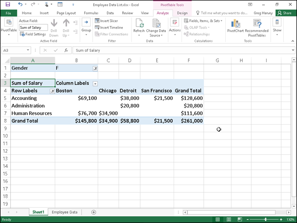
Figure 2-8: The pivot table after filtering the Gender Filter Report field and the Dept Row field.
Notice in Figure 2-8 that after filtering the pivot table by selecting F in the Gender Filter Report field and selecting Accounting, Administration, and Human Resources departments as the only Dept Row fields, the filtered pivot table no longer displays salary summaries for all of the company’s locations. (Santa Rosa, Seattle, and Atlanta locations are missing.) You can tell that the table is missing these locations because there are no women employees in the three selected departments and not as a result of filtering the Location Column Labels field because its drop-down button still uses the standard icon and not the cone filter icon now shown to the right of the Gender Filter Report and Dept Row Labels fields.
Slicing the pivot table data
Excel 2016 supports slicers, a graphic tool for filtering the data in your pivot table. Instead of having to filter the data using the check boxes attached to an item list on the drop-down menus on a field’s AutoFilter button, you can use slicers instead. Slicers, which float as graphic objects over the worksheet, not only enable you to quickly filter the data in particular fields of a pivot table, but also enable you to connect slicers to multiple pivot tables or to a pivot table and a pivot chart you’ve created.
To use slicers on a pivot table, click one of the table’s cells and then click the Insert Slicer button in the Filter group of the table’s Analyze tab. Excel then displays an Insert Slicers dialog box containing a list of all the fields in the current pivot table. You then select the check boxes for all the fields you want to filter the pivot table for before you select OK.
Excel then displays a slicer for each field you select in the Insert Slicers dialog box. Each slicer appears as a rectangular graphic object that contains buttons for each entry in the particular pivot table field. You can then filter the data in the pivot table simply by clicking the individual entries in the slicer for all the values you still want displayed in the table. To display values for multiple, nonconsecutive entries in a particular field, you hold down the Ctrl key as you click entries in its slicer. To display values of multiple consecutive values, you click the first entry in its slicer and then hold the Shift key as you click the last entry you want included.
Figure 2-9 shows you the pivot table for the employee data list after I used three slicers to filter it. The first slicer is for the Gender field, where I selected M so that only the records for the men are displayed in the pivot table. The second slicer is for the Dept field, where I clicked the Engineering item to display only the men’s salaries in Engineering. The third and final slicer is for the Location field, where I selected the Chicago, San Francisco, and Seattle locations (by holding down the Ctrl key as I clicked their buttons in the Location slicer). As a result, the employee data pivot table is now filtered so that you see only the salary totals for the men in the Engineering departments at the Chicago, San Francisco, and Seattle offices.
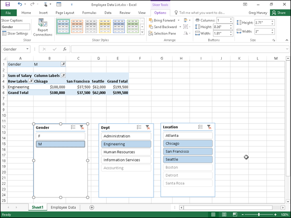
Figure 2-9: Employee pivot table showing the men’s salaries in the Engineering department in Chicago, San Francisco, and Seattle.
Because slicers are graphic objects, when you add them to your worksheet, the program automatically adds an Options tab under a Slicer Tools contextual tab to the Ribbon. This Options tab contains many of the same graphic controls that you’re used to when dealing with standard graphic objects such as shapes and text boxes, including a Slicer Styles drop-down gallery and Bring Forward, Send Back, and Selection Pane that you can use to format the currently selected slicer. You can also use the Height and Width options in the Buttons and Size groups to modify the dimensions of the slicer and the buttons it contains. Finally, you can use the Report Connections command button to open the Report Connections dialog box, where you can connect additional pivot tables to the currently selected slicer.
To move a slicer, you click it to select it and then drag it from somewhere on its border using the black-cross pointer with an arrowhead. To deselect the items you’ve selected in a slicer, click the button in the upper-right corner of the slicer with a red x through the filter icon. To get rid of a slicer (and automatically redisplay the PivotTable Fields task pane), select the slicer and then press the Delete key.
Using timeline filters
Excel 2016 also enables you to filter your data with its timeline feature. You can think of timelines as slicers designed specifically for date fields that enable you to filter data out of your pivot table that doesn’t fall within a particular period, thereby allowing you to see timing of trends in your data.
To create a timeline for your pivot table, select a cell in your pivot table and then select the Insert Timeline button in the Filter group on the Analyze contextual tab under the PivotTable Tools tab on the Ribbon. Excel then displays an Insert Timelines dialog box displaying a list of pivot table fields that you can use in creating the new timeline. After selecting the check box for the date field you want to use in this dialog box, click OK.
Figure 2-10 shows you the timeline I created for the sample Employee Data list by selecting its Date Hired field in the Insert Timelines dialog box. As you can see, Excel created a floating Date Hired timeline with the years and months demarcated and a bar that indicates the time period selected. By default, the timeline uses months as its units, but you can change this to years, quarters, or even days by clicking the time units’ drop-down button immediately below the filter icon in the upper-right corner of the timeline and then selecting the desired time unit.
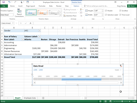
Figure 2-10: Employee pivot table using a timeline filter to show the salaries for employees hired during the period 1995 through 1999.
For Figure 2-10, I selected the Years option as the timeline’s unit and then selected the period 1995 through 1999 so that the pivot table shows the salaries by department and location for only employees hired during this four-year period. I did this simply by dragging the timeline bar in the Date Hired timeline graphic so that it begins at 1995 and extends just up to 2000. And should I need to filter the pivot table salary data for other hiring periods, I would simply modify the start and stop times by dragging the timeline bar in the Date Hired timeline.
Sorting the pivot table
You can instantly reorder the summary values in a pivot table by sorting the table on one or more of its Column or Row fields. To re-sort a pivot table, click the AutoFilter button for the Column or Row field you want to use in the sort and then click either the Sort A to Z option or the Sort Z to A option at the top of the field’s drop-down list.
Click the Sort A to Z option when you want the table reordered by sorting the labels in the selected field alphabetically, or, in the case of values, from the smallest to largest value, or, in the case of dates, from the oldest to newest date. Click the Sort Z to A option when you want the table reordered by sorting the labels in reverse alphabetical order (Z to A), values from the highest to smallest, and dates from the newest to oldest.
Modifying the Pivot Table
As the term pivot implies, the fun of pivot tables is being able to rotate the data fields by using the rows and columns of the table, as well as to change what fields are used on the fly. For example, suppose that after making the data list’s Location field the pivot table’s Column Labels Field, and its Dept field the Row Labels Field, you now want to see what the table looks like with the Dept field as the Column Labels Field and the Location field as the Row Labels Field.
No problem: All you have to do is open the PivotTable Fields task pane (Alt+JTL) and then drag Location from the COLUMNS area to the ROWS area and then drag Dept from the ROWS to COLUMNS. Voilà — Excel rearranges the totaled salaries so that the rows of the pivot table show the location grand totals, and the columns now show the departmental grand totals. Figure 2-11 shows this new arrangement for the pivot table.

Figure 2-11: Pivoting the table so that Dept is now the Column Labels Field and Location the Row Labels Field.
In fact, when pivoting a pivot table, not only can you rotate existing fields, but you can also add new fields to the pivot table or assign more fields to the table’s COLUMNS and ROWS areas.
Figure 2-12 illustrates this situation. This figure shows the same pivot table after making a couple of key changes to the table structure. First, I added the Profit Sharing field as a second Report Filter field by dragging it to the FILTERS area in the PivotTable Fields task pane. Then, I made Location a second Row Labels Field by dragging it from the COLUMNS area to the ROWS area. Finally, for this figure, I changed the setting in the Gender Report Filter from the default of All to M and changed the Profit Sharing Report Filter to Yes.
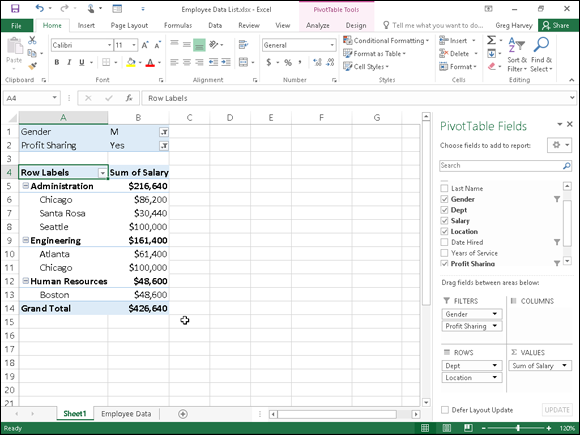
Figure 2-12: The pivot table after adding Profit Sharing as another Report Filter and making both the Dept and Location Row Fields.
As a result, the modified pivot table shown in Figure 2-12 now shows the salary totals for all the men in the corporation arranged first by their department and then by their location. Because I added Profit Sharing as a second Report Filter, I can see the totals for just the men or just the women who are or aren’t currently enrolled in the profit sharing plan simply by selecting the appropriate Report Filter settings.
Changing the summary functions
By default, Excel uses the good old SUM function to total the values in the numeric field(s) that you add to the VALUES area, thereby assigning them to the data cells in the body of the pivot table. Some data summaries require the use of another summary function, such as the AVERAGE or COUNT function.
To change the summary function that Excel uses, you open the Field Settings dialog box for one of the fields that you use as the data items in the pivot table. You can do this either by clicking the Value Field Settings option on the field’s drop-down menu in the VALUES area in the PivotTable Fields task pane (Alt+JTL) or by right-clicking the field’s label and then selecting Value Field Settings on its shortcut menu.
After you open the Value Field Settings dialog box for the field, you can change its summary function from the default Sum to any of the following functions by selecting it on the Summarize By tab:
- Count to show the count of the records for a particular category (note that COUNT is the default setting for any text fields that you use as Data Items in a pivot table)
- Average to calculate the average (that is, the arithmetic mean) for the values in the field for the current category and page filter
- Max to display the largest numeric value in that field for the current category and page filter
- Min to display the smallest numeric value in that field for the current category and page filter
- Product to display the product of the numeric values in that field for the current category and page filter (all nonnumeric entries are ignored)
- Count Numbers to display the number of numeric values in that field for the current category and page filter (all nonnumeric entries are ignored)
- StdDev to display the standard deviation for the sample in that field for the current category and page filter
- StdDevp to display the standard deviation for the population in that field for the current category and page filter
- Var to display the variance for the sample in that field for the current category and page filter
- Varp to display the variance for the population in that field for the current category and page filter
After you select the new summary function to use on the Summarize By tab of the Value Field Settings dialog box, click the OK button to have Excel apply the new function to the data presented in the body of the pivot table.
Adding Calculated Fields
In addition to using various summary functions on the data presented in your pivot table, you can create your own Calculated Fields for the pivot table. Calculated Fields are computed by a formula that you create by using existing numeric fields in the data source. To create a Calculated Field for your pivot table, follow these steps:
Click any of the cells in the pivot table and then select the Calculated Field option from the Fields, Items, & Sets button’s drop-down list on the Analyze tab or press Alt+JTJF.
The Fields, Items, & Sets command button is found in the Calculations group on Analyze tab on the PivotTable Tools contextual tab.
Excel opens the Insert Calculated Field dialog box similar to the one shown in Figure 2-13.
Enter the name for the new field in the Name text box.
Next, you create the formula in the Formula text box by using one or more of the existing fields displayed in the Fields list box.
Click the Formula text box and then delete the zero (0) after the equal sign and position the insertion point immediately following the equal sign (=).
Now you’re ready to type in the formula that performs the calculation. To do this, insert numeric fields from the Fields list box and indicate the operation to perform on them with the appropriate arithmetic operators (+, -, *, or /).
Enter the formula to perform the new field’s calculation in the Formula text box, inserting whatever fields you need by clicking the name in the Fields list box and then clicking the Insert Field button.
For example, in Figure 2-13, I created a formula for the new calculated field called Bonus that multiplies the values in the Salary Field by 2.5 percent (0.025) to compute the total amount of annual bonuses to be paid. To do this, I selected the Salary field in the Fields list box and then clicked the Insert Field button to add Salary to the formula in the Formula text box (as in =Salary). Then, I typed *0.025 to complete the formula (=Salary*0.025).
When you finish entering the formula for your calculated field, you can add the calculated field to the PivotTable Fields task pane by clicking the Add button. After you click the Add button, it changes to a grayed-out Modify button. If you start editing the formula in the Formula text box, the Modify button becomes active so that you can click it to update the definition.
Click OK in the Insert Calculated Field dialog box.
This action closes the Insert Calculated Field dialog box and adds the summary of the data in the calculated field to your pivot table.

Figure 2-13: Creating a calculated field for a pivot table.
After you finish defining a calculated field to a pivot table, Excel automatically adds its name to the field list in the PivotTable Fields task pane and to the VALUES area thereby assigning the calculated field as another Data item in the body of the pivot table.
If you want to temporarily hide a calculated field from the body of the pivot table, click the name of the calculated field in the field list in the PivotTable Fields task pane (Alt+JTL) to remove the check mark from its check box in the field list. Then, when you’re ready to redisplay the calculated field, you can do so by clicking its check box in the field list in the PivotTable Fields task pane again to put a check mark back into it.
Changing the pivot table options
You can use the PivotTable Options dialog box (shown in Figure 2-14) to change the settings applied to any and all pivot tables that you create in a workbook. You open this dialog box by clicking the PivotTable command button on the PivotTable Tools tab’s Analyze tab followed by the Options menu item on the Options drop-down button or by simply pressing Alt+JTTT.
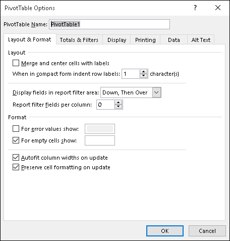
Figure 2-14: Modifying the pivot table options in the PivotTable Options dialog box.
The PivotTable Options dialog box contains the following six tabs:
- Layout & Format with options for controlling the various aspects of the layout and formatting of the cells in the pivot table
- Totals & Filters with options for controlling the display of the subtotals and grand totals in the report, and filtering and sorting the table’s fields
- Display with options for controlling the display items in the table and the sorting of the fields in the PivotTable
- Printing with options for controlling print expand and collapse buttons when displayed in the pivot table, and print titles with the row and column labels on each page of the printout
- Data with options for controlling how the data that supports the pivot table is stored and refreshed
- Alt Text with options for adding alternate, text-based titles and descriptions of the information in the pivot table for those with vision impairments who then hear the title and description read aloud
Perhaps the most important pivot table option is the Classic PivotTable Layout (Enables Dragging of Fields in the Grid) check box option on the Display tab. When you select this check box, Excel lets you rearrange the fields within the pivot table simply by dragging their icons onto the desired part of the table (Table Filter, Column Labels, or Row Labels). The program also lets you add fields to the pivot table by dragging them from the field list in the PivotTable Fields task pane and dropping them on the part of the table to which they are to be added.
Creating Pivot Charts
Instead of generating just a plain old boring pivot table, you can spice up your data summaries quite a bit by generating a pivot chart to go along with a supporting pivot table. To create a pivot chart from your pivot table, simply follow these two steps:
Click the PivotChart command button in the Tools group on the Analyze tab under the PivotTable Tools contextual tab or press Alt+JTC.
Excel opens the Insert Chart dialog box where you can select the type and subtype of the pivot chart you want to create. (See Book V, Chapter 1.)
- Click the thumbnail of the subtype of chart you want to create in the Insert Chart dialog box and then click OK.
As soon as you click OK after selecting the chart subtype, Excel inserts an embedded pivot chart into the worksheet containing the original pivot table. This new pivot chart contains drop-down buttons for each of the four different types of fields used in the pivot chart (Report Filter, Legend Fields, Axis Fields, and Values). You can use these drop-down buttons to sort and filter the data represented in the chart. (See “Filtering a pivot chart” later in this chapter for details.)
In addition, Excel replaces the PivotTable Tools on the Ribbon with a PivotChart Tools contextual tab. This PivotChart Tools tab is then further subdivided into three tabs: Analyze, Design, and Format, which is automatically selected.
Moving a pivot chart to its own sheet
Although Excel automatically creates all new pivot charts on the same worksheet as the pivot table, you may find customizing and working with the pivot chart easier if you move the chart to its own chart sheet in the workbook. To move a new pivot chart to its own chart sheet in the workbook, follow these steps:
Click the Analyze tab under the PivotChart Tools contextual tab to bring its tools to the Ribbon and then click the Move Chart command button or press Alt+JTV.
Excel opens the Move Chart dialog box.
- Click the New Sheet option button in the Move Chart dialog box.
- (Optional) Rename the generic Chart1 sheet name in the accompanying text box by entering a more descriptive name there.
- Click OK to close the Move Chart dialog box and open the new chart sheet with your pivot chart.
Figure 2-15 shows a clustered column pivot chart after moving the chart to its own chart sheet in the workbook.
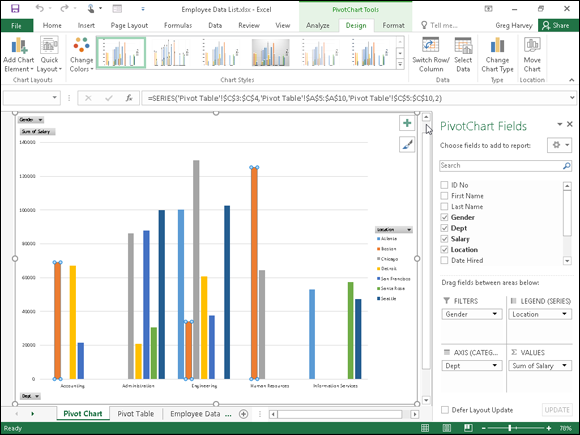
Figure 2-15: Clustered column pivot chart moved to its own Pivot Chart sheet.
Filtering a pivot chart
When you graph the data in a pivot table using a typical chart type such as column, bar, or line that uses both an x- and y-axis, the Row labels in the pivot table appear along the x- or category-axis at the bottom of the chart and the Column labels in the pivot table become the data series that are delineated in the chart’s legend. The numbers in the Values field are represented on the y- or value-axis that goes up the left side of the chart.
When you generate a new pivot chart, Excel adds drop-down list buttons to each of the types of fields represented. You can then use these drop-down buttons in the pivot chart itself to filter the charted data represented in this fashion like you do the values in the pivot table. Remove the check mark from the (Select All) or (All) option and then add a check mark to each of the fields you still want represented in the filtered pivot chart.
Click the following drop-down buttons to filter a different part of the pivot chart:
- Report Filter to filter which data series are represented in the pivot chart
- Axis Fields (Categories) to filter the categories that are charted along the x-axis at the bottom of the chart
- Legend Fields (Series) to filter the data series shown in columns, bars, or lines in the chart body and identified by the chart’s legend
Formatting a pivot chart
The command buttons on the Design and Format tabs attached to the PivotChart Tools contextual tab make it easy to further format and customize your pivot chart. Use the Design tab buttons to select a new chart style for your pivot chart or even a brand-new chart type and further refine your pivot chart by adding chart titles, text boxes, and gridlines. Use the Format tab’s buttons to refine the look of any graphics you’ve added to the chart as well as select a new background color for your chart.
To get specific information on using the buttons on these tabs, see Book V, Chapter 1, which covers creating charts from regular worksheet data. The Chart Tools contextual tab that appears when you select a chart you’ve created contains the same Design and Format tabs with comparable command buttons.
Using the Power Pivot and Power View Add-Ins
The PowerPivot add-in, first introduced in Excel 2010, enables you to efficiently work with and analyze large datasets (such as those with hundreds of thousands or even millions of records) has been made a much more integral part of Excel 2016. In fact, the Power Pivot technology that makes it possible for Excel to easily manage massive amounts of data from many related data tables is now part and parcel of Excel 2016 in the form of its Data Model feature. This means that you don’t even have to trot out and use the Power Pivot add-in in order to be able to create Excel pivot tables that utilize tons of data records stored in multiple, related data tables. (See Book VI, Chapter 2 for details.)
If you do decide that you want to use Power Pivot in managing large datasets and doing advanced data modeling in your Excel pivot tables, instead of having to download the add-in from the Microsoft Office website, you can start using Power Pivot simply by activating the add-in as follows:
Choose File ⇒ Options ⇒ Add-Ins or press Alt+FTAA.
Excel opens the Add-Ins tab of the Excel Options dialog box with Excel Add-Ins selected in the Manage drop-down list.
Click the Manage drop-down list button and then select COM Add-Ins from the drop-down list before you select the Go button.
Excel displays the COM Add-Ins dialog box that contains (as of this writing) the following COM (Component Object Model) add-ins: Inquire, Microsoft Power Map for Excel, Microsoft Power Pivot for Excel, and Microsoft Power View for Excel.
Select the check box in front of Microsoft Office Power Pivot for Excel 2016 and then click OK.
Excel closes the COM Add-Ins dialog box and returns you to the Excel 2016 worksheet window that now contains a Power Pivot tab at the end of the Ribbon.
If the Power Pivot tab doesn’t appear at the end of the Excel 2016 Ribbon after loading the Microsoft Power Pivot for Excel Com Add-in as outlined in these steps, open the Customize Ribbon tab of the Options dialog box (Alt+FTC). Chances are that the Power Pivot check box under the Main tabs list box on the right hand side is not checked, and all you have to do is to click this check box to put a checkmark in it. After you do this and click OK to close the Options dialog box, you should see the Power Pivot tab immediately to the right of the View tab on the Ribbon.
Keep in mind that the Excel Power Pivot add-in is available in Office 2016 Professional Plus edition as well as all editions of Office 365, except for Small Business. However, PowerPivot is not supported in Excel 2016 running on the RT versions of the Microsoft Surface tablet. Sorry, but you have to have the Microsoft Surface 3 or 3 Pro tablet with Windows 8 or 10 in order to install and use the Power Pivot add-in.
Data modeling with Power Pivot
Power Pivot makes it easy to perform sophisticated modeling with the data in your Excel pivot tables. To open the Power Pivot for Excel window, you click the Manage button in the Data Model group on the Power Pivot tab shown in Figure 2-16 or press Alt+BM.

Figure 2-16: Opening the Power Pivot for Excel window with the Manage button on the Power Pivot Ribbon tab.
If your workbook already contains a pivot table that uses a Data Model created with external data already imported in the worksheet (see Book VI, Chapter 2 for details) when you select the Manage button, Excel opens a Power Pivot for Excel window similar to the one shown in Figure 2-17. This window contains tabs at the bottom for all the data tables that you imported for use in the pivot table. You can then review, filter, and sort the records in the data in these tables by selecting their respective tabs followed by the appropriate AutoFilter or Sort command button. (See Book VI, Chapter 1 for details.)
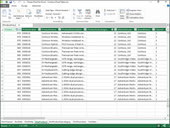
Figure 2-17: The Power Pivot window with tabs for all the data tables imported into Excel when creating the workbook’s pivot table.
If you open the Power Pivot for Excel window before importing the external data and creating your pivot table in the current Excel workbook, the Power Pivot window is empty of everything except the Ribbon with its three tabs: Home, Design, and Advanced. You can then use the Get External Data button on the Home tab to import the data tables that make your Data Model.
The options attached to the Power Pivot Get External Data button’s drop-down menu are quite similar to those found on the Get External Data button on the Excel Data tab:
- From Database to import data tables from a Microsoft SQL Server, Microsoft Access database, or from a database on a SQL Server Analysis cube to which you have access
- From Data Service to import data tables from a database located on the Windows Azure Marketplace or available via an OData (Open Data) Feed to which you have access
- From Other Sources to open the Table Import Wizard that enables you to import data tables from databases saved in a wide variety of popular database file formats, including Oracle, Teradata, Sybase, Informx, and IBM DB2, as well as data saved in flat files, such as another Excel workbook file or even a text file
- Existing Connections to import the data tables specified by a data query that you’ve already set up with an existing connection to an external data source (see Book VI, Chapter 2 for details)
After you select the source of your external data using one of the options available from the Power Pivot window’s Get External Data button, Excel opens a Table Import Wizard with options appropriate for defining the database file or server (or both) that contains the tables you want imported. Be aware that, when creating a connection to import data from most external sources (except for other Excel workbooks and text files), you’re required to provide both a recognized username and password.
If you don’t have a username and password but know you have access to the database containing the data you want to use in your new pivot table, import the tables and create the pivot table in the Excel window using the Get External Data button’s drop-down menu found on the Data tab of its Ribbon and then open the Power Pivot window to use its features in doing your advanced data modeling.
 You cannot import data tables from the Windows Azure Marketplace or using an OData data feed using the Get External Data command button in the Power Pivot window if Microsoft.NET Full Framework 4.0 or higher is not already installed on the device running Excel 2016. If you don’t want to or can’t install this very large library of software code describing network communications on your device, you must import the data for your pivot tables from these two sources in the Excel program window, using the appropriate options on its Get External Data button’s drop-down menu found on the Data tab of its Ribbon.
Switching between the Data View and Diagram View
Diagram View is among the most useful features for data modeling offered by the Excel 2016 PowerPivot add-in. When you switch from the default Data View to Diagram View either by clicking the Diagram View button on the Ribbon or the Diagram button in the lower-right corner to the right of the Display button, all the data tables used in the Data Model are graphically displayed in the PowerPivot window. (See Figure 2-18.)
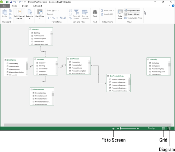
Figure 2-18: Switching from Data View to Diagram View in the Power Pivot for Excel window.
Each data table graphic object is labeled by name on its title bar and displays within it a list of all its fields. To see all the fields within a particular table, you may have to resize it by dragging the mouse or Touch pointer at its corners or midpoints. To avoid obscuring a data table below when enlarging a table located above it to display more of its fields, you can move either the upper or lower data table out of the way by dragging it by its title bar.
In addition to graphic representations of all data tables in the current Data Model, the Diagram View shows all existing relationships between them. It does this by drawing connecting lines between each of the related tables. The data table containing the primary key field is indicated by a dot at the end of its connecting line and the table containing the foreign key by an arrowhead at the end of its line. To see the name of the key field in each related table, simply click the connecting line: Power Pivot then selects the fields in both tables indicated by surrounding them with blue outlines.
Not only can you easily review the relationships between data tables in Diagram View, but you can also modify them. The most usual way is to create relationships between unrelated tables by locating their key fields and then literally drawing a line between the tables. To locate fields shared by two data tables in the Power Pivot diagram in either a one-to-one or one-to-many relationship, you can expand the data table graphics to display the entire list of their fields as well as use the Zoom slider at the top of the window beneath the Ribbon to zoom in and out on the tables. (To see all the tables at once, click the Fit to Screen button to the immediate left of the Zoom slider.)
In addition to visually locating shared fields, you can also use PowerPivot’s search feature (by clicking the Find button on the Home tab) to search for particular field names. When you locate two tables that share a field that might work as a key field, you can relate them simply by dragging a line from the potential key field in one table to the key field in the other. When you release the mouse button or remove your finger or stylus on a touchscreen device, Excel draws a blue outline between the tables indicating the new relationship based on the two shared fields.
If the shared fields don’t represent a one-to-one or one-to-many relationship (see Book VI, Chapter 2 for details) because the values in one or both are not unique, Excel displays an alert dialog box indicating that the PowerPivot is not able to establish a relationship between your tables. In such a case, you are forced to find another data table in the Data Model that contains the same field, but this time with unique values (that is, no duplicates). If no such field exists, you’ll be unable to add to the table in question to the Data Model and, as a result, your Excel pivot table won’t be able to summarize its data.
To make it easier to draw the line that creates the relationship between two data tables with a shared key field, you should position the tables near one another in the Diagram View. Remember that you can move the data table graphic objects around in the Power Pivot for Excel window simply by dragging them by their title bars.
Adding calculated columns courtesy of DAX
DAX stands for Data Analysis Expression and is the name of the language that Power Pivot for Excel uses to create calculations between the columns (fields) in your Excel Data Model. Fortunately, creating a calculation with DAX is more like creating an Excel formula that uses a built-in function than it is like using a programming language such as VBA or HTML.
This similarity is underscored by the fact that all DAX expressions start with an equal sign just like all standard Excel formulas and that as soon as you start typing the first letters of the name of a DAX function you want to use in the expression you’re building, an Insert Function–like drop-down menu with all the DAX functions whose names start with those same letters appears. And as soon as you select the DAX function you want to use from this menu, PowerPivot not only inserts the name of the DAX function on the PowerPivot Formula bar (which has the same Cancel, Enter, and Insert Function buttons as the Excel Formula bar), but also displays the complete syntax of the function, showing all the required and optional arguments of that function immediately below the Formula bar.
In addition to using DAX functions in the expressions you create for calculated columns in your Data Model, you can also create simpler expressions using the good old arithmetic operators that you know so well from your Excel formulas (+ for addition, – for subtraction, * for multiplication, / for division, and so on).
To create a calculated column for your Data Model, PowerPivot must be in Data View. (If you’re in Diagram View, you can switch back by clicking the Data View command button on the Power Pivot window’s Home tab or by clicking the Grid button in the lower right corner of the PowerPivot window.) When Power Pivot for Excel is in Data View, you can create a new calculated field by following these steps:
- Click the tab of the data table in the Power Pivot window to which you want to add the calculated column.
Click the Add button on the Design tab of the Power Pivot Ribbon.
Power Pivot adds a new column at the end of the current data table with the generic field name, Add Column.
Type = (equal sign) to begin building your DAX expression.
PowerPivot activates its Formula bar where it inserts the equal to sign.
Build your DAX expression on the Power Pivot Formula bar more or less as you build an Excel formula in a cell of one of its worksheets.
To use a DAX function in the expression, click the Insert Function button on the Power Pivot Formula bar and select the function to use in the Insert Function dialog box (which is very similar to the standard Excel Insert Function dialog box except that it contains only DAX functions). To define an arithmetic or text calculation between columns in the current data table, you select the columns to use by clicking them in the data table interspersed with the appropriate operator. (See Table 1-1 in Book III, Chapter 1 for a complete list of operators.)
To select a field to use in a calculation or as an argument in a DAX function, click its field name at the top of its column to add it to the expression on the Power Pivot Formula bar. Note that Power Pivot automatically encloses all field names used in DAX expressions in a pair of square brackets as in
=[UnitPrice]*[Quantity]where you’re building an expression in an extended price calculated column that multiplies the values in the UnitPrice field by those in the Quantity field of the active data table.
- Click the Enter button on the Power Pivot Formula bar to complete the expression and have it calculated.
As soon as you click the Enter button, Power Pivot performs the calculations specified by the expression you just created, returning the results to the new column. (This may take several moments depending upon the number of records in the data table.) As soon as Power Pivot completes the calculations, the results appear in the cells of the Add Column field. You can then rename the column by double-clicking its Add Column generic name, typing in the new field name, and pressing Enter.
After creating a calculated column to your data table, you can view its DAX expression simply by clicking its field name at the top of its column in the Power Pivot Data View. If you ever need to edit its expression, you can do so simply by clicking the field name to select the entire column and then click the insertion point in the DAX expression displayed on the PowerPivot Formula bar. If you no longer need the calculated column in the pivot table for its Data Model, you can remove it by right-clicking the column and then selecting Delete Columns on its shortcut menu. If you simply want to hide the column from the Data View, you select the Hide from Client Tools item on this shortcut menu.
Keep in mind that DAX expressions using arithmetic and logical operators follow the same order of operator precedence as in regular Excel formulas. If you ever need to alter this natural order, you must use nested parentheses in the DAX expression to alter the order as you do in Excel formulas. (See Book III, Chapter 1 for details.) Just be careful when adding these parentheses that you don’t disturb any of the square brackets that always enclose the name of any data table field referred to in the DAX expression.
Creating visual reports with Power View
Power View is another COM (Component Object Model) add-in that comes with most versions of Excel 2016. This add-in works with Power Pivot for Excel 2016 to enable you to create visual reports for your Excel Data Model.
To use the Power View add-in to create a visual report for the Data Model represented in your Excel pivot table, click the Power View button on the Insert tab of the Excel Ribbon. Excel then opens a new Power View sheet (with the generic sheet name, Power View1) while at the same time displaying a Power View tab on the Ribbon and the Power View Fields task pane on the right-hand side of the window. (See Figure 2-19.)

Figure 2-19: Using the Map feature in Power View to compare sales by country.
You then select the fields from related tables listed in the Power View Fields task pane that you want visually represented in the Power View report. Power View then displays the data for the selected fields graphically as small tables on the Power View worksheet, while at the same time selecting a Design tab on the Ribbon that contains a Switch Visualization group with these options:
- Table to represent the selected dataset in the Power View sheet in the default tabular view after applying one of the other visualization options to the dataset
- Bar Chart to represent the selected dataset in the Power View sheet as some sort of bar chart
- Column Chart to represent the selected dataset in the Power View sheet as some sort of column chart
- Other Chart to represent the selected dataset in the Power View sheet as some other type of chart
- Map to represent the selected dataset in the Power View sheet as different sized circles on a map of the world
Figure 2-19 shows a prime example of the kind of visual report that you might want to create with the Power View add-in. The map on this Power View worksheet shows the total sales geographically with different sized circles that represent the relative sales in that region. When you position the mouse or Touch pointer on one of the circles in this Power View report, Excel displays a text box containing the name of the region followed by the total amount of its sales.
To create this Power View report, you simply select the SalesAmount field in the FactSales data table as well as the ZipCode field in the related Range data table. (These two tables are related in a one-to-many relationship using a StoreKey field that is primary in FactSales data table and foreign in the Range data table.)
After selecting these two fields in the Power View Fields task pane of the Power View worksheet by clicking their field names after expanding their tables in the list, I created the visual report shown in Figure 2-19 simply by clicking somewhere in the table to select it and then clicking the Map option in the Switch Visualization group of the Design tab and then replacing the generic, Click Here to Add a Title, with the Aggregated Sales by Country label shown there.
Using the Power Map feature
Power Map is the name of an exciting new visual analysis feature in Excel 2016 that enables you to use geographical, financial, and other types of data along with date and time fields in your Excel data model to create animated 3-D map tours.
To create a new animation for the first tour in Power Map, you follow these general steps:
- Open the worksheet that contains the data for which you want to create the new Power Map animation.
Position the cell cursor in one of the cells in the data list and then click Insert ⇒ Map ⇒ Open Power Map (Alt+NSMO) on the Excel Ribbon.
Excel opens a Power Map window with a new Tour (named Tour 1) with its own Ribbon with a single Home tab similar to the one shown in Figure 2-20. This window is divided into three panes. The Layer pane on the right contains an outline of the default Layer 1 with three areas: Data, Filters, and Layer Options. The Data area in the Layer Pane is automatically expanded to display a Location, Height, Category, and Time list box. The central pane contains a 3-D globe on which your data will be mapped. A floating Field List containing fields in the selected Excel data model initially appears over this 3-D globe. The left Tour Editor pane contains thumbnails of all the tours and their scenes animated for your data model in Power Map (by default, there is just one scene marked Scene 1 when you create your first tour).
Drag fields from the floating Field List to the Location, Height, Category, and Time list boxes in the Layer Pane to build your map.
Drag the geographical fields whose location data are to be represented visually on the globe map and drop them into the Location list box in the Layer Pane. Power Map displays data points for each location field for your animation on the 3-D globe as you drop it into the Location list box. The program associates the selected location field with a geographical type in the drop-down list box to the right of the field name in the Location list box in the Layer pane. You can modify the type by selecting its drop-down button, if necessary. Just keep in mind that each location field needs to have a unique geographical type.
You also add fields from the floating Field List that you want depicted in the animation to the Height, Size, or Value list boxes (depending upon the type of visualization selected) as follows:
- Add values you want represented in the type of chart displayed on the 3-D map to the Height list box. By default, Excel uses the Sum function for value fields, but you can change this function to Average, Count, Maximum, Minimum, or No Aggregation by clicking its drop-down button in the Location list box.
- Add data fields that you want to appear as categories in the legend for the Power Map animation to Category list box. The items in this field are automatically added to a floating legend in the 3-D map if your chart type has a legend.
- Add date and time fields to the Time list box to set the time element for your Power Map animation. By default, Power Map does not associate the fields you add here to any time unit. You can specify the time unit by selecting Second, Minute, Hour, Day, Month, Quarter, or Year from the the field’s drop-down list button in the Time list box.
Select the type of visualization by clicking its icon under the Data heading in the Layer Pane: Stacked Column (default), Clustered Column, Bubble, Heat Map, or Region.
Power Map now displays data points for your Height, Size, or Value data on the 3-D globe appropriate to the type of visualization selected along with a floating legend for the data values (organized by any fields used as categories) in the center pane of the Power Map window. At the bottom of the map, you see a Time Line control with a play button that enables you to play and control the animation (see Figure 2-20).
- (Optional) Click the Map Labels button on the Ribbon to add country and city names to the maps on your 3-D globe.
(Optional) Click the Close the Layer Pane button and Close the Tour Editor button to hide the display of Layer and Tour Editor panes, respectively.
Now, your 3-D globe with the Layer 1 legend on the right side and animation timeline below fill the entire window below the Power Map Ribbon. Note that you can redisplay the Layer pane and the Tour Editor pane in the Power Map window at anytime by clicking the Layer Pane or Tour Editor Ribbon buttons, respectively.
(Optional) Drag the Layer 1 legend so that it’s not obstructing your 3-D globe. You can also resize the legend by selecting it and then dragging its sizing handles. If the Time Line animation control is obstructing key areas of the globe, you can hide it by clicking its Close button.
You can redisplay the Time Line control at anytime by clicking the Time Line button in the Time group on the Power Map Ribbon. Note that you can’t reposition or resize the Time Line control when it is displayed and that you can play your animation by clicking the Play Tour button on the Ribbon when the Time Line control is hidden.
(Optional) Drag the globe to display the area of the world with the locations you want to watch when you play your animation or use the Rotate Left (Shift+@--left), Rotate Right (Shift+@--right), Tilt Up (Shift+@--up), or Tilt Down (Shift+@--down) buttons to bring this area into view. Then, click the Zoom In (Shift+ +) or Zoom Out (Shift + -) to bring the area closer into view or further away.
Once you have the viewing window beneath the Power Map Ribbon positioned the way you want it when viewing your animation, you are ready to play the 3-D map tour you’ve created.
Click the Play Tour button on the Ribbon or the Play button on the Time Line control (if it’s still visible).
When you click the Play Tour button on the Ribbon, Power Map automatically hides the Tour Editor and Layer pane along with the Time Line control if they are still visible at that time. You can pause the animation by clicking the Pause button that appears in a cluster of controllers in a bar at the bottom of the screen or by pressing the spacebar on your keyboard. When you’re finished watching the animation, return to the regular editing view of Power Map by clicking the Go Back to Edit View button (the one with the arrow pointing left at the very beginning of the bar at the bottom of the screen) or press the Esc key on your keyboard.
- Click the Close button in the far right corner of the Power Map title bar to close Power Map and return to your Excel worksheet and then save the workbook (Ctrl+S) to save your Power Map tour as part of the workbook file.

Figure 2-20: Power Map window with new Clustered Column 3-D animation for visualizing the quantities ordered of various Northwind items between July1996 and May 1998 at various locations in western Canada and United States.
After you create your initial animation tour for the data model in your Excel workbook, you can always replay it simply by reopening it in Power Map and clicking Play Tour on its Ribbon. To reopen the tour when the workbook with the data model is open in Excel, select Insert ⇒ Map ⇒ Open Power Map on the Excel Ribbon (Alt+NSMO) and then click the Tour 1 button at the top of the Launch Power Map dialog box.
Once the tour is open in Power Map, you can also edit it. You can change the appearance of the 3-D globe in your animation by selecting a new theme by clicking the Themes button in Scene group of the Power Map Ribbon and then selecting a thumbnail on this button’s drop-down palette. You can flatten 3-D globe to make it two-dimensional by clicking the Flat Map button in the Map group of the Ribbon.
You can also add new layers to your original scene that animate a different data set over the same or a different set of date and time values. To add a new layer, click the Add Layer button in the Layer group of the Power Map Ribbon and then define the type of visualization and the fields to use in your data model for the location, analysis, and time (following the same steps as outlined earlier for creating the initial layer of the first scene of a new tour). After you add a new layer (automatically named Layer 1) to your original scene, Power Map shows the legends for both Layer 1 and 2 (which often overlap and need to be separated manually). Power Map also shows the data points for each layer’s location, analysis, category, and time fields when you play the animation.
If you want to see the animation for just one of the layers in your scene, you hide all the other layers before you play the animation. To do this, click the Layer Manager button at far left on the top of the Layer Pane and then click the Show or Hide Layer button (the one with the CBS eyeball icon) in front of the name of all layers you don’t want to view in the animation.
In addition to adding new layers to a scene, you can also add entirely new scenes to your tour that use a copy of the active scene, a new 3-D globe world, or a custom map with an entirely new background. To create a new scene, click the New Scene button in the Scene group of the Power Map Ribbon and then click Copy Scene, World Map, or New Custom Map options on its drop-down menu. After you select the type of scene, you then define the animation for the new scene using the steps you followed earlier in creating the opening animation for the first layer in the first scene of the tour. To play the animations you add to the layers of any new scene you add to your Power Map tour, you simply click the Scene thumbnail in the Tour Editor pane before you click the Play Tour button on the Ribbon or the Play button on its Time Line controller.
Use the Create Video and Capture Screen buttons in the Tour group of the Power Map Ribbon to share completed animations with your colleagues and clients. Click Capture Screen to take a static picture of the visualization displayed on your 3-D globe that Excel saves in the Office Clipboard. Once in the Clipboard, you can use the Paste feature (Ctrl+V) to paste the graphic into a worksheet after you close Power Map and return to Excel.
Click the Create Video button to create a video of the animation for the currently selected scene and layer(s) in your tour. When you click this button, Power Map opens a Create Video dialog box where you choose the quality of the video selecting one of the following option buttons: Presentation & HD Displays (largest size and best quality at 1080 pixels), Computers and Tablets (medium size and quality at 720 pixels), or Quick Export & Mobile (lowest quality and smallest size at 320 pixels). If you want an existing music or narration file to accompany the animation, click the Soundtrack Options button and then select the sound file and the playback options followed by Apply before you click the Create button to make the video. Power Map then generates a video of the currently selected animation saved as .mp4 video file in your device’s default Video folder. You can then save this video file to a folder on your OneDrive or Dropbox to share with colleagues or clients. You can also play the video on your device using its default video player.
Creating Forecast Worksheets
The new Forecast Sheet feature in Excel 2016 makes it super easy to turn a worksheet containing historical financial data into a remarkable visual forecast worksheet. All you do is open the worksheet with your historical data, position the cell cursor in one of its cells, and then click the Forecast Sheet button on the Data Tab of the Ribbon (Alt+AFC).
Excel then selects all the historical data in the surrounding worksheet table (which typically includes a column for dates as well as one for the related financial data) while at the same time opening the Create Forecast Worksheet dialog box (similar to the one shown in Figure 2-21).

Figure 2-21: Defining the options for a new line chart that shows historical and projected sales in the Create a Forecast Worksheet dialog box.
By default, Excel selects a line chart to visually depict the trends in its forecast, but, if you wish, you can have the program use a column chart instead. Simply click the Column Chart icon to the immediate right of the Line Chart icon at the top of the Create Forecast Worksheet dialog box.
In addition to selecting the type of chart to be used in the forecast worksheet, you can also control the date at which the forecast chart ends. You do this by selecting a new date in the Forecast End text box that appears below the preview of the embedded line or column chart. For example, in Figure 2-21, my historical data table includes annual sales for the years 2000 through 2015, and Excel automatically uses this data to extend the forecast end date out four years to 2019. If I wanted to extend the forecast beyond this end date, I would simply enter the new year into the Forecast End text box (or select one with the spinner buttons).
Beneath the Forecast End text box in the Create Forecast Worksheet dialog box, you find an Options button that when clicked (as shown in Figure 2-21) expands the dialog box to include the following options:
- Forecast Start enables you to select a starting date in the historical data later than the one Excel automatically selects (which is the first date in the worksheet table).
- Confidence Interval allows you to select a new degree confidence that Excel uses to set the Lower- and Upper Confidence Bound line in the forecast when using the default line chart.
- Seasonally changes from the Detect Automatically to Set Manually option where you can enter or select a new value indicating the number of points in the values range of your data table that are part of a recurring seasonal pattern. When Excel can’t automatically detect seasonality in your worksheet data, a warning appears (shown in Figure 2-21) that so advises you and suggests that you select the Set Manually option button (and leave the default setting at zero) to get better results in the forecast.
- Include Forecast Statistics has Excel include a table of forecast accuracy metrics and smoothing factors in the resulting forecast worksheet.
- Timeline Range modifes the cell range containing the date values in your historical data (by default, Excel selects all these values it identifies in the current worksheet table).
- Values Range modifies the cell range containing the financial values in your historical data (by default, Excel selects all these values it identifies in the current worksheet table).
- Fill Missing Points Using to have Excel automatically fill in any missing data points it finds in the worksheet table in the forecast chart using either interpolation or zeros.
- Aggregate Duplicates Using modifies the statistical function.
After selecting all the desired options in the Create Forecast Worksheet dialog box, you have only to click the Create button to have Excel create a new forecast worksheet. This new sheet contains a formatted data table that combines your historical data with the forecast values as well as an embedded line or column chart (depending upon your selection) depicting the trend in both the historical and forecast values.
Figure 2-22 shows the brand new forecast worksheet that the Excel Forecast Sheet feature created for me using the original historical sales data shown in Figure 2-21 after I selected Set Manually option button with the setting at zero and selected the Include Forecast Statistics check box before clicking Create in the Create Forecast Worksheet dialog box. As you can see, Excel placed this new forecast worksheet (named Sheet1) before the worksheet containing my historical data (named Annual Sales).

Figure 2-22: Worksheet with embedded line chart depicting historical and forecast sales created with the Forecast Sheet feature.
Note that in order to display all the forecast values in the new formatted data table in Figure 2-22, I repositioned and resized the embedded line chart so that it fits nicely in the lower-right corner before taking the screenshot. If I wanted, I could move this chart to its own chart sheet before saving the new forecast table and chart as part of the Historical and Forecast Sales workbook.