
C H A P T E R 3
Item Plug-Ins
Now that you know what plug-ins can do and their components, it's time to build your first plug-in. Don't worry if you're still a bit confused about how they work. This chapter will help answer most of your questions. Since it is the first plug-in in this book, everything will be defined in detail.
This chapter is broken up into four main sections. The first section, “Business Problem,” describes what the plug-in is supposed to do. In the second section, you will build your first plug-in. This section will walk through each step and include some hints and tips. The third section, “Events,” describes an advanced feature for plug-ins. The last section summarizes this chapter.
 Note The plug-in that is built in this chapter was taken from a free, open source plug-in available from
 http://apex-plugin.com. This chapter will walk you through how it was built step-by-step.
Business Problem
One of the first mistakes people tend to make when creating plug-ins is to think about cool features and whiz-bang functionalities that their plug-in will have. Then they get so deep into the code that they eventually forget the problem that they're trying to resolve. The end result is either a failed attempt at building a plug-in or a plug-in that does a lot of things but not what it was initially intended to do.
Since there are a lot of moving parts with plug-ins, it's highly recommended that you take a step back and explicitly state what business problem you're trying to solve. This is a key step since you can always refer back to that statement and see if the work you're doing is going toward solving that business problem.
Note Explicitly writing down your business problem may sound like an excerpt from a project management book, but it is an important step for building plug-ins. Since plug-ins have so many components, it's easy to get sidetracked. Having a statement that you refer to will help keep you on track.
Example Scenario
The example in this chapter is built around the need for dynamic constraints on the values entered into a date field. The current date item allows you to select a min and max date, as shown in Figure 3-1. These constraints can be either static dates or references to a variable using the &ITEM_NAME.(substitution string) notation.
Note For more information about the &ITEM_NAME notation mentioned earlier, and about different methods to reference variables, please read the following article: http://www.talkapex.com/2011/01/variables-in-apex.html.
Regardless of how you define the min/max constraints for a date field, they are calculated once when the page is loaded. As a result, the date constraints don't dynamically change as the user is working on the page.

Figure 3-1. Standard date item settings
A classic example of when you would want dynamic min/max date constraints is when booking return airplane tickets. You normally select the date you're leaving on and then select the date you're coming back on. When you select the return date, you can't select any dates before the date you leave on, as shown in Figure 3-2. The current min/max date options in the standard APEX date picker don't support this functionality.

Figure 3-2. Dynamic min/max date when booking tickets
Solution Requirements
To get around the static min/max date issue, you're going to create a dynamic from/to date picker. The new date picker will have the following functionality:
- Restrict the to date when a from date is selected; for example, suppose you selected 20-Jan-2010 as your from date. When a user selects a date from the to date picker, he or she can't select anything before 20-Jan-2010 (i.e., the user can't select any dates from before 19-Jan-2010).
- Restrict the from date when a to date is selected; see the previous example in reverse.
- Allow developers to select when the calendar is displayed
- Support multiple date formats; date formats do not need to be the same for both the from and to dates.
- Back-end validation that dates are valid dates (if “execute validations” is set to yes)
- Back-end validation that from date is less than or equal to the to date
Building the Item Plug-In
Now that the business requirements have been defined, it's time to start building the new date picker plug-in. This plug-in will cover some of the most common features that you may encounter when building an item-type plug-in. If at any point you want to verify anything, an example application, covering all plug-ins in this book, is available on Apress's web site. (See the catalog page for this book at http://apress.com/ 9781430235033.)
Note This chapter's example will use external JavaScript files as part of the plug-in. To make things easier, the example assumes that you have read/write access to a web server that will allow you to modify the JavaScript files. If you don't have such access, you'll need to either obtain access or create a local web server. An example of how to install Apache, a free, open source web server, is covered in the Debugging & Tools chapter.
Creating the Plug-In and a Test Page
The first thing that you'll need to do is create the plug-in. The process is exactly the same as covered in the previous chapter except for the following changes:
- Name: ClariFit From To Date Picker
- Internal Name:
COM.CLARIFIT.FROMTODATEPICKER
The plug-in type should be an item plug-in type. Once you have created the blank plug-in, the Name region should look like Figure 3-3. Everything else should remain the same with the default settings.

Figure 3-3. From/to date picker initial setup
The next thing that you'll need to do is create and compile an empty PL/SQL package in your schema. This package will be used to develop the from/to date picker item plug-in and the other plug-ins in this book. The code for the empty package, pkg_apress_plugins, is as follows:
CREATE OR REPLACE PACKAGE pkg_apress_plugins AS


END pkg_apress_plugins;

/


CREATE OR REPLACE PACKAGE BODY pkg_apress_plugins as


END pkg_apress_plugins;

/
Note Storing the plug-in code in a package makes it easier/faster to develop. Once the plug-in is completed, you can store the code directly in the plug-in or move to another package.
Create a page to see how the changes you make in the plug-in affect the page item. Here are the steps to follow to do that:
- Create a new blank page. Number it as Page 10, and name it From/To Date Picker.
- Create a new page item and select Plug-ins, as shown in Figure 3-4.

Figure 3-4. The Create Page Item wizard: Selecting the item type
- Select ClariFit From To Date Picker and click the Next button, as shown in Figure 3-5.

Figure 3-5. The Create Page Item wizard: Selecting the plug-in
- On the Display Position and Name page, enter the values, as shown in Figure 3-6.

Figure 3-6. The Create Page Item wizard: Selecting the display position and name
- On the Source page, enter DD/MM/YYYY as the format mask, and click the Create Item button to complete the wizard.
- Create another item by repeating steps 1 through 5 with the following changes:
- Item name: P10_TO_DATE
- Format mask: DD-MON-YYYY
Initial Configuration
Before writing any code for the plug-in, it is useful to configure the plug-in. There are usually two things that should be setup right away: the file prefix and the standard attributes. As you develop a plug-in, you can easily change these settings.
The file prefix defines the location for third-party files such as JavaScript and CSS files. The default value is #PLUGIN_PREFIX#, which references files that are directly attached to the plug-in. When developing plug-ins, it is usually easier to work on files that you have read/write access to. You can use a corporate development web server or a local webserver. This example, and all examples in this book, will reference a local webserver (covered in Chapter 8). It is assumed that you set the web server's home directory to c:www.
The following steps will point the file prefix to a local directory for development purposes (if using a different web server, change the URL accordingly):
- Create a directory called
c:wwwFromToDatePicker. - Edit the plug-in and scroll down to the Settings region. Set the File Prefix field to
http://localhost/FromToDatePicker/, as shown in Figure 3-7.
Figure 3-7. Settings: File Prefix field
Standard attributes define what standard options are available for the application developer to use. To start, check the options as shown in Figure 3-8.

Figure 3-8. Choosing standard attributes
Including JavaScript Code
The next thing to do is add the JavaScript code to display the calendar and add constraints so the from and to dates are within a valid range. To display the date picker, you'll use jQuery UI date picker, which is the same tool that APEX uses for the standard date picker. The main difference is that you'll add additional support for the date restrictions.
Note You can get more information about the jQuery UI date picker from http://jqueryui.com/demos/datepicker/.
There are two components to adding JavaScript to a plug-in. The first is to write some JavaScript files with the plug-in. The second is to integrate the JavaScript code with the plug-in.
The first step is to write the JavaScript code to support the from and to date pickers. The easiest way to do this is to create a simple HTML file and build a proof of concept. This is a very important step since things can become complex when integrating into a plug-in. In order to save time, you will not need to do this step in this book; however, it is highly recommended when creating your own plug-ins from scratch.
Note This section will cover all the JavaScript code required for the plug-in. When creating plug-ins, you will probably develop and modify your JavaScript code throughout the process rather than all in one go, as it needs to align with both the plug-in options and the PL/SQL code.
To create the external JavaScript file for this plug-in, create an empty file in c:wwwFromToDatePicker called jquery.ui.clarifitFromToDatePicker_1.0.0.js. Edit the file in your text editor, and add the following code (this is included in the downloadable files):
/**

 * ClariFit FromTo Date Picker for APEX

 * Plug-in Type: Item

 * Summary: Handles automatically changing the min/max dates

 *

 * Depends:

 *  jquery.ui.datepicker.js

 *  $.console.js  - http://code.google.com/p/js-console-wrapper/

 *

 * Special thanks to Dan McGhan (www.danielmcghan.us) for his JavaScript help

 *

 * ^^^ Contact information ^^^

 * Developed by ClariFit Inc.

 * http://www.clarifit.com

 * [email protected]

 *

 * ^^^ License ^^^

 * Licensed Under: GNU General Public License, version 3 (GPL-3.0) - http://www.opensource.org/licenses/gpl-3.0.html

 *

 * @author Martin Giffy D'Souza - www.talkapex.com

 */

(function($){

 $.widget('ui.clarifitFromToDatePicker', {

  // default options

  options: {

    //Information about the other date picker

    correspondingDatePicker: {

dateFormat: '',  //Need other date format since it may not be the same as current date format

id: '',

value: ''

      }, //Value during page load

    //Options for this date picker
datePickerAttrs: {
autoSize: true,
buttonImage: '', //Set by plugin attribute
buttonImageOnly: true,
changeMonth: true,
changeYear: true,
dateFormat: 'mm/dd/yy', //Default date format. Will be set by plugin
showAnim: '', //By default disable animation
showOn: 'button'},
datePickerType: '', //from or to
},
/**
* Init function. This function will be called each time the widget is referenced with no
parameters
*/
_init: function(){
var uiw = this;
//For this plug-in there's no code required for this section
//Left here for demonstration purposes
$.console.log(uiw._scope, '_init', uiw);
}, //_init
/**
* Set private widget variables
*/
_setWidgetVars: function(){
var uiw = this;
uiw._scope = 'ui.clarifitFromToDatePicker'; //For debugging
uiw._values = {
shortYearCutoff: 30, //roll over year
};
uiw._elements = {
$otherDate: null
};
}, //_setWidgetVars
/**
* Create function: Called the first time widget is associated to the object
* Does all the required setup, etc. and binds change event
*/
_create: function(){
var uiw = this;
uiw._setWidgetVars();
var consoleGroupName = uiw._scope + '_create'; $.console.groupCollapsed(consoleGroupName);
$.console.log('this:', uiw);
$.console.log('element:', uiw.element[0]);
varelementObj = $(uiw.element),
otherDate,
minDate = '',
maxDate = ''
;
//Get the initial min/max dates restrictions
//If other date is not well formatted, an exception will be raised
try{
otherDate = uiw.options.correspondingDatePicker.value != '' ?
$.datepicker.parseDate(uiw.options.correspondingDatePicker.dateFormat,
uiw.options.correspondingDatePicker.value, {shortYearCutoff: uiw._values.shortYearCutoff}) :
''
minDate = uiw.options.datePickerType == 'to' ? otherDate : '',
maxDate = uiw.options.datePickerType == 'from' ? otherDate : ''
uiw._elements.$otherDate = $('#' + uiw.options.correspondingDatePicker.id);
}
catch (err){
$.console.warn('Invalid Other Date', uiw);
}
//Register DatePicker
elementObj.datepicker({
autoSize: uiw.options.datePickerAttrs.autoSize,
buttonImage: uiw.options.datePickerAttrs.buttonImage,
buttonImageOnly: uiw.options.datePickerAttrs.buttonImageOnly,
changeMonth: uiw.options.datePickerAttrs.changeMonth,
changeYear: uiw.options.datePickerAttrs.changeYear,
dateFormat: uiw.options.datePickerAttrs.dateFormat,
minDate: minDate,
maxDate: maxDate,
showAnim: uiw.options.datePickerAttrs.showAnim,
showOn: uiw.options.datePickerAttrs.showOn,
//Events
onSelect: function(dateText, inst){
var extraParams = { dateText: dateText, inst: inst },
$this = $(this)
;
$this.trigger('change'), // Need to trigger change event so that other date is updated
$this.trigger('plugineventonselect', extraParams); // Trigger Plugin Event: pluginEventOnSelect if something is listening to it
}
});
elementObj.bind('change.' + uiw.widgetEventPrefix, function(){
// Sets the min/max date for related date element
// Since this function is being called as an event, "this" refers to the DOM object and
not the widget "this" object // uiw references the UI Widget "this"
$.console.log(uiw._scope, 'onchange', this);
var $this = $(this),
optionToChange = uiw.options.datePickerType == 'from' ? 'minDate' : 'maxDate',
selfDate = $.datepicker.parseDate(uiw.options.datePickerAttrs.dateFormat, $this.val(),
{shortYearCutoff: 30})
;
uiw._elements.$otherDate.datepicker('option', optionToChange,selfDate); //Set the
min/max date information for related date option
}); //bind
$.console.groupEnd(consoleGroupName);
},//_create
/**
* Removes all functionality associated with the clarifitFromToDatePicker
* Will remove the change event as well
* Odds are this will not be called from APEX.
*/
destroy: function() {
var uiw = this;
$.console.log(uiw._scope, 'destroy', uiw);
$.Widget.prototype.destroy.apply(uiw, arguments); // default destroy
// unregister datepicker
$(uiw.element).datepicker('destroy'),
}//destroy
}); //ui.clarifitFromToDatePicker
})(apex.jQuery);
It is important to understand some of the techniques used. Here are some of the main points for the foregoing code:
- In the filename,
jquery.ui.clarifitFromToDatePicker_1.0.0.js, a version number (_1.0.0) was added to the end of the file. This was done to prevent browser caching on updates to the file. The next time a modification is made to the file, just update the version number in the filename. - The overall structure of the JavaScript file uses the jQuery UI Widget Factory framework. The jQuery UI Widget Factory framework is covered in the Debugging & Tools chapter toward the end of this book. This framework is not required when developing plug-ins, but it does make things easier to manage in the long run.
- The entire function is wrapped at the beginning so that you can use the
$jQuery notation. If the function was not wrapped, you could still use the$notation but may run into namespacing issues. If you did not want to wrap your function, you could useapex.jQueryinstead of$. - The code was instrumented using Console Wrapper, a free, opensource wrapper for Console. Console Wrapper has tight integration with APEX and, by default, will be enabled only when APEX is run in debug mode. For more information, please visit
http://code.google.com/p/js-console-wrapper/. options: Options that can be set by the calling function; some of these options will be setup as plug-in attributes so APEX developers can explicitly configure them._create: This instantiates the jQuery UI date picker for the input element and sets the initial date restrictions based on other dates.plugineventonselect: In the_createfunction, there's a call to$(this).trigger('plugineventonselect', extraParams). This triggers a custom event thatcan be used when creating a dynamic action. An additional configuration (covered later) is required._onChangeHandler: When a date is changed, this function will be called. It will change the min/max date restriction for the other date.
Since jquery.ui.clarifitFromToDatePicker_1.0.0.js references Console Wrapper, you will also need to copy the console wrapper file to c:wwwFromToDatePicker. $console_wrapper_1.0.3.js is included with this book, or you can download it from http://code.google.com/p/js-console-wrapper/.
For now you will not need to include the JavaScript file directly in the plug-in since you'll be referencing the copy on the web server. If there are any bugs in the code, it is much easier to debug. At the end of this chapter, you will bundle the JavaScript directly into the plug-in.
Adding Custom Attributes
Adding custom attributes can be done at any time while developing a plug-in. You'll tend to know some of the attributes right away and then add some additional attributes as you finalize the plug-in.
Based on the JavaScript code, there are two attributes that will be required: icon image location and when to show the calendar. To create the icon image location attribute, do the following:
- Edit the plug-in and scroll to the Custom Attributes region.
- Click the Add Attribute button, as shown in Figure 3-9.

Figure 3-9. Adding an attribute
- Fill in the Name region as in Figure 3-10. Since the icon image location will probably be the same throughout the application, it should be an application-level attribute.

Figure 3-10. Custom attribute: Name
- In the Settings region, set the Type field to Text, and Required field to Yes, as shown in Figure 3-11.

Figure 3-11. Custom attribute: Settings
- In the Default Value region, enter &IMAGE_PREFIX.asfdcldr.gif, as shown in Figure 3-12. This will leverage the calendar icon image that APEX uses for standard date pickers.

Figure 3-12. Custom attribute: Default value
- Since this attribute is not dependent on other attributes, you do not need to modify the Condition region.
- In the Help Text region, enter Default image to use for calendar icon. This help text will be displayed when a developer clicks the attribute label.
- If you want, enter some comments in the Comments region. Once finished, click the Create button.
Creating the Show On attribute is similar to creating the icon image location application attribute, but with some slight modifications. The following steps outline the process. (Only figures for new steps are shown.)Figures for the other steps are essentially the same as before.
- Edit the plug-in and scroll to the Custom Attributes region.
- Click the Add Attribute button, as shown in Figure 3-9.
- In the Name region, set the following values:
Scope: Component
Attribute:1
Display Sequence:10
Label: Show On
Since this attribute may change for each instance of the date picker, it'll be a component-level attribute. The attribute number is unique based on the scope. Once an attribute has been created, the attribute number cannot be changed. - In the Settings region, set the following values:
Type: Select List
Required: Yes - The next logical step is to add a value for the list of values. The catch is that if you click the Add Value button it will submit the page and save the custom attribute. Since you set this as a required attribute, you need to define a default value first. In the Default Value region, set the default value to “focus”.
- You can now add values to the list of values. In the List of Values region, click the Add Value button, as shown in Figure 3-13.

Figure 3-13. Custom attribute: List of values
- Enter the values, as shown in Figure 3-14, for the LOV entry form. Click the Create and Create Another button when complete.

Figure 3-14. Custom attribute: Adding LOV value
- Repeat step 6 for:
Sequence:20
Display Value: Button
Return Value: button - Repeat step 6 for:
Sequence:30
Display Value: Both
Return Value: both
Instead of clicking the Create and Create Another button, just click the Create button.
When you go back to edit the plug-in, the new application custom attribute now appears in the Settings region on the plug-in page, as shown in Figure 3-15. If you edit P10_FROM_DATE, which uses this plug-in, you should notice the new Show On setting that you just created, as shown in Figure 3-16.

Figure 3-15. Application-level custom attribute

Figure 3-16. Component-level custom attribute
There are two other component-level custom attributes that need to be created for the plug-in. They are to select the type of date (from/to) and corresponding date item. To create these custom attributes, do the following:
- To simplify things, only items that need to be changed from their default state or key fields will be listed.
- Add a new custom attribute.
- Name:
Scope: Component
Attribute: 2
Display Sequence: 20
Label: Date Type - Settings:
Type: Select List
Required: Yes - Default Value:
Default Value: from - Check the Return To Page check box located in the top right corner of the page, as shown in Figure 3-17, and click the Create button.

Figure 3-17. Return to Page check box
- You will now need to add the following values for the list of values:
Sequence: 10
Display Value: From Date
Return Value: from
and
Sequence: 20
Display Value: To Date
Return Value: to - Add a new custom attribute. This attribute will be to select the corresponding date item.
- Name:
Scope: Component
Attribute: 3
Display Sequence: 30
Label: Corresponding Date Item - Settings:
Type: Page Item
Required: Yes - Click the Create button to complete this step.
If you go back and edit P10_FROM_DATE, you'll notice two additional attributes in the Settings region, as shown in Figure 3-18. If you click the Apply Changes button in the top right corner, you'll get a “Value must be specified” error, as shown in Figure 3-19. This happens since you couldn't define a meaningful default value when creating the Corresponding Date Item attribute. To resolve this issue, enter P10_TO_DATE in Corresponding Date Item. You should also update P10_TO_DATE and set Date Type to To Date and Corresponding Date Item to P10_FROM_DATE.

Figure 3-18. P10_FROM_DATE settings

Figure 3-19. Missing setting value
Note If you deploy a plug-in and need to add additional attributes, you should be aware of the consequences of having a required attribute with no default value. If no default value is set and the APEX developer upgrades the plug-in without modifying each instance of the plug-in, unhandled behavior may occur with negative results. As much as possible, when updating a plug-in, try to include a meaningful default value.
Rendering Function
Similar to the test plug-in that you created in the previous chapter, if you run Page 10, you will get the error shown in Figure 3-20. This is because no render function has been defined. In this section, you will define the render function so that the items display and work properly.

Figure 3-20.“No render function” error message
The render function is a PL/SQL function that writes the HTML code onto the page. For now store the render function in the package that you previously created, PKG_APRESS_PLUGINS. First create the entry in the package specification:
- Open
pkg_apress_plugins.pksin your SQL editor. - Edit the plug-in and scroll to the Callbacks region. Click the Render Function Name label to bring the pop-up help, as shown in Figure 3-21.

Figure 3-21. Render function help text
- Copy the item type plug-in render function interface header and paste it into
pkg_apress_plugins.pks, as shown in Figure 3-22.
Figure 3-22. Item type interface
- Name/rename the function to
f_render_from_to_datepicker, and include a semicolon at the end of the return line so that the package specification can compile. - Compile
pkg_apress_plugins.pks.
The next thing to do is to create a function in the package body and enter some standard code that is useful in all plug-ins. Copy the following code into pkg_apress_plugins.pkb:
  FUNCTION f_render_from_to_datepicker (

p_item                IN apex_plugin.t_page_item,

p_plugin              IN apex_plugin.t_plugin,

p_value               IN VARCHAR2,

p_is_readonly         IN BOOLEAN,

p_is_printer_friendly IN BOOLEAN )

    RETURN apex_plugin.t_page_item_render_result


  AS

    -- APEX information

v_app_idapex_applications.application_id%TYPE := v('APP_ID'),

v_page_idapex_application_pages.page_id%TYPE := v('APP_PAGE_ID'),


    -- Main plug-in variables

    v_result apex_plugin.t_page_item_render_result; -- Result object to be returned

    v_page_item_name VARCHAR2(100);  -- Item name (different than ID)

    v_html VARCHAR2(4000); -- Used for temp HTML


    -- Application Plugin Attributes


    -- Item Plugin Attributes


    -- Other variables


  BEGIN
-- Debug information (if app is being run in debug mode)
IF apex_application.g_debug THEN
apex_plugin_util.debug_page_item (p_plugin => p_plugin,
p_page_item =>p_item,
p_value => p_value,
p_is_readonly =>p_is_readonly,
p_is_printer_friendly =>p_is_printer_friendly);
END IF;
-- handle read only and printer friendly
IF p_is_readonly OR p_is_printer_friendly THEN
-- omit hidden field if necessary
apex_plugin_util.print_hidden_if_readonly (p_item_name => p_item.name,
p_value => p_value,
p_is_readonly =>p_is_readonly,
p_is_printer_friendly =>p_is_printer_friendly);
-- omit display span with the value
apex_plugin_util.print_display_only (p_item_name => p_item.NAME,
p_display_value =>p_value,
p_show_line_breaks => FALSE,
p_escape => TRUE, -- this is recommended to help prevent XSS
p_attributes =>p_item.element_attributes);
ELSE
NULL; -- Need to fill this in
END IF; -- f_render_from_to_datepicker
RETURN v_result;
END f_render_from_to_datepicker;
This code can be used for any type of item plug-in as it includes some debug code, print code, and standard variables. It does not include anything that will actually render the item in normal mode.
The render function returns a variable called v_result, which is of type apex_plugin.t_page_item_render_result. For more information, refer to the APEX API documentation.
The next step is to link the function that you just created with the plug-in. To link the render function with the plug-in, edit the plug-in and enter pkg_apress_plugins.f_render_from_to_datepicker in the Render Function Name field, as shown in Figure 3-23.

Figure 3-23. Adding render function
If you run Page 10 again, no errors should appear, like Figure 3-24.

Figure 3-24. From/to date picker with blank rendering
As Figure 3-24's caption states, the region is blank as nothing was displayed. The next set of steps will create the HTML input element so it displays on the screen. To do so, replace NULL; -- Need to fill this in with the following code:
-- Not read only

-- Get name. Used in the "name" form element attribute which is different than the "id" attribute

v_page_item_name := apex_plugin.get_input_name_for_page_item (p_is_multi_value => FALSE);


-- SET VALUES


-- OUTPUT


-- Print input element

v_html := '<input type="text" id="%ID%" name="%NAME%" value="%VALUE%" autocomplete="off">';

v_html := REPLACE(v_html, '%ID%', p_item.name);

v_html := REPLACE(v_html, '%NAME%', v_page_item_name);

v_html := REPLACE(v_html, '%VALUE%', p_value);


sys.htp.p(v_html);


-- JAVASCRIPT


-- Tell apex that this field is navigable

v_result.is_navigable := TRUE;
To summarize the foregoing code, it prints an input element and then tells APEX that it's a navigable item. The attribute autocomplete is set to off on the input element to prevent a list of values being displayed when the user focuses on the field.
When defining the HTML code, mnemonics are used and then replaced for their appropriate values. This is a technique that John Scott showed at ODTUG Kscope 11 to make things easier when writing the HTML code. You do not need to use this technique, but it does make reading the code a bit easier. Of course, if your application needs to be as performant as possible, you may want to use a concatenated string and forgo the extra calls to the REPLACE function.
Note It is important to include the NAME attribute in the input element, as it is used in the form submission, and not the element's ID attribute. In general the ID is used as reference when the page is displayed and the NAME attribute is referenced from the server.
If you refresh Page 10, it will look like Figure 3-25 (note: if the item labels do not appear, then edit each item and add the label). You could submit the form, and APEX would process the items as a regular item.

Figure 3-25. From/to date picker with input elements
If you click either date field, nothing happens. They currently behave like regular text input fields. This is because you haven't linked the JavaScript code with the plug-in yet. Before including the JavaScript code in your plug-in, you need to create some variables to reference the custom attributes. Add the following code in the variable declaration section of the PL/SQL function:
...

-- Application Plugin Attributes

v_button_img apex_appl_plugins.attribute_01%type := p_plugin.attribute_01;


-- Item Plugin Attributes

v_show_on apex_application_page_items.attribute_01%type := lower(p_item.attribute_01); -- When to show date picker. Options: focus, button, both

v_date_picker_type apex_application_page_items.attribute_01%type := lower(p_item.attribute_02); -- from or to

v_other_item apex_application_page_items.attribute_01%type := upper(p_item.attribute_03); --

Name of other date picker item


-- Other variables

-- Oracle date formats different from JS date formats

v_orcl_date_format_maskp_item.format_mask%type; -- Oracle date format: http://www.techonthenet.com/oracle/functions/to_date.php

v_js_date_format_maskp_item.format_mask%type; -- JS date format: http://docs.jquery.com/UI/Datepicker/formatDate

v_other_js_date_format_maskapex_application_page_items.format_mask%type; -- This is the other datepicker's JS date format. Required since it may not contain the same format mask as this date picker

...
Instead of using a variable name like v_attr_01 for application- and component-level attributes, use meaningful variable names. This serves various purposes. It makes things easier for other developers to modify the plug-in. There is also a chance that the attributes may change throughout the lifespan of the plug-in.
The other variables are there to manage the date formats. The from/to date picker allows for each item to contain different date formats. Note that it is highly unlikely that each item would contain different formats, but it is a possibility since the items are independent of each other.
To set the format masks for the dates, replace the section, starting with the code here. This code uses an undocumented function that converts an Oracle date format to a JavaScript date format.
...

-- SET VALUES


-- If no format mask is defined, use the system-level date format

v_orcl_date_format_mask := nvl(p_item.format_mask, sys_context('userenv','nls_date_format'));


-- Convert the Oracle date format to JS format mask

v_js_date_format_mask := wwv_flow_utilities.get_javascript_date_format(p_format => v_orcl_date_format_mask);


-- Get the corresponding date picker's format mask

selectwwv_flow_utilities.get_javascript_date_format(p_format => nvl(max(format_mask), sys_context('userenv','nls_date_format')))

intov_other_js_date_format_mask

fromapex_application_page_items

whereapplication_id = v_app_id

andpage_id = v_page_id

anditem_name = upper(v_other_item);

...
Note Prior to APEX 4.1, you would need to include the following line in the foregoing code to handle substitution strings: v_button_img := apex_application.do_substitutions(v_button_img);. This is no longer necessary since you can declaratively tell APEX to replace substitution strings, as shown in Figure 3-9.
To integrate the JavaScript functionality, add the following code (excluding the “…”) to the section, starting with the code shown here.
...

-- JAVASCRIPT


-- Load javascript Libraries

apex_javascript.add_library (p_name => '$console_wrapper', p_directory =>

p_plugin.file_prefix, p_version=> '_1.0.3'), -- Load Console Wrapper for debugging

apex_javascript.add_library (p_name => 'jquery.ui.clarifitFromToDatePicker', p_directory =>

p_plugin.file_prefix, p_version=> '_1.0.0'), -- Version for the date picker (in file name)


-- Initialize the fromToDatePicker
v_html :=
'$("#%NAME%").clarifitFromToDatePicker({
correspondingDatePicker: {
%OTHER_DATE_FORMAT%
%ID%
%VALUE_END_ELEMENT%
},
datePickerAttrs: {
%BUTTON_IMAGE%
%DATE_FORMAT%
%SHOW_ON_END_ELEMENT%
},
%DATE_PICKER_TYPE_END_ELEMENT%
});';
v_html := replace(v_html, '%NAME%', p_item.name);
v_html := REPLACE(v_html, '%OTHER_DATE_FORMAT%',
apex_javascript.add_attribute('dateFormat', sys.htf.escape_sc(v_other_js_date_format_mask)));
v_html := REPLACE(v_html, '%DATE_FORMAT%', apex_javascript.add_attribute('dateFormat',
sys.htf.escape_sc(v_js_date_format_mask)));v_html := replace(v_html, '%ID%',
apex_javascript.add_attribute('id', v_other_item));
v_html := replace(v_html, '%VALUE_END_ELEMENT%', apex_javascript.add_attribute('value',
sys.htf.escape_sc(v(v_other_item)), false, false));
v_html := replace(v_html, '%BUTTON_IMAGE%', apex_javascript.add_attribute('buttonImage',
sys.htf.escape_sc(v_button_img)) );
v_html := replace(v_html, '%SHOW_ON_END_ELEMENT%', apex_javascript.add_attribute('showOn',
sys.htf.escape_sc(v_show_on), false, false));
v_html := replace(v_html, '%DATE_PICKER_TYPE_END_ELEMENT%', apex_javascript.add_attribute('datePickerType',
sys.htf.escape_sc(v_date_picker_type), false, false));
apex_javascript.add_onload_code (p_code => v_html);
...
The first thing that the foregoing code does is load two different JavaScript libraries. The first is the Console Wrapper. As previously discussed in this chapter, it will allow you to include enhanced debugging in your JavaScript code. The second file is the custom JavaScript file that handles the from and to date picking functionalities.
Both of the file load calls include the file name, a directory, and a version parameter. The file name is the file prefix, not including the version number or the file extension. APEX assumes that the file has the .js extension. If it does not use the standard .js extension, you can use the p_skip_extension parameter. Referencing p_plugin.file_prefix for the directory is the best option as it allows APEX developers to define where the files are coming from rather than having to modify the PL/SQL code. That's it! You've officially built a functional plug-in.
To test that things are working, perform the following steps:
- Go back to Page 10 (refresh if you already had it open). You'll notice that the two date pickers have slightly different widths, as shown in Figure 3-26. This is because the JavaScript code automatically resizes the fields to the appropriate widths based on the format mask. To change this feature, or make it configurable, search the JavaScript file for the
autoSizeoption and change it to your desired size.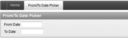
Figure 3-26. Date picker dynamic widths
- Click in the From Date field, and select August 10, 2011 from the calendar, as shown in Figure 3-27.

Figure 3-27. From Date calendar selector
- Click in the To Date field, and you'll notice that the calendar restricts you from picking anything before August 10, 2011, as shown in Figure 3-28.

Figure 3-28. To Date calendar selector
- To demonstrate how the different custom attributes can change the item, modify P10_TO_DATE and change the Show On field to Button, as shown in Figure 3-29. Click the Apply Changes button to save your modification.

Figure 3-29. Altering custom attribute
- If you refresh Page 10 again, you'll notice that the To Date field has an icon beside it, as shown in Figure 3-30. The calendar will be displayed only when the button is pressed.

Figure 3-30. Modified To Date field
The JavaScript file that you created included a lot of debug/instrumentation code to output to the Console window. If you run the application in debug mode and view the Console window, it should look like Figure 3-31. Having this extra information can be very useful when resolving issues that you may encounter while developing a plug-in.

Figure 3-31. Console output
Adding a Validation Function
Now that the date picker is rendering the calendar correctly, we need to ensure that the dates are valid. Developers could manually create a validation for each instantiation of the plug-in item. This would require a lot of extra, redundant work. Item plug-ins allow plug-in developers to include validations as part of the item. As you can imagine, this can save a lot of time if the plug-in is used many times.
Before looking at the validation function, it's important to see what happens without a validation function. To simulate this, do the following:
- Edit Page 10.
- Right-click the From/To Date Picker region, and select Create Region Button, as shown in Figure 3-32.

Figure 3-32. Create Region Button option
- Enter SUBMIT for the Button Name and Submit for the Label, as shown in Figure 3-33. Click the Next button to continue.
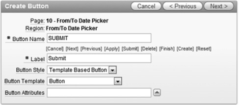
Figure 3-33. Create Button: Button attributes
- On the Display Properties page, set the Alignment field to Left and click the Next button.
- On the Action When Clicked page, leave the default values, as shown in Figure 3-34, and click the Create Button button to complete the wizard.

Figure 3-34. Create Button: Action When Clicked values
- Create a new page PL/SQL process called Convert To Date to Oracle Date, as shown in Figure 3-35. Click the Next button.

Figure 3-35. Create Page Process region
- On the next page, enter the following code in the Enter PL/SQL Page Process text area. This code is some dummy code that will convert the text date into an Oracle date. It will fail if the date format is invalid.
DECLARE

v_format_maskapex_application_page_items.format_mask%type;

v_date date;

BEGIN


  -- Get format mask

  SELECT format_mask

  INTO v_format_mask

  FROM apex_application_page_items

  WHERE application_id= :app_id

  AND page_id= :app_page_id

  AND item_name = 'P10_TO_DATE';


  -- Convert text date to Oracle date

  -- This will fail if P10_TO_DATE has an invalid date format

IF :p10_to_date IS NOT NULL THEN

v_date := to_date(:p10_to_date, v_format_mask);

  END IF;


END; - Click the Create Process button to complete the wizard.
- To test the new function and see what happens when no validations occur on the date item, run Page 10 and click the To Date input element. Enter abc, as shown in Figure 3-36.

Figure 3-36. Invalid to date
- Clicking the Submit button will trigger the page process to run. You will get an error like Figure 3-37 rather than a user-friendly error.

Figure 3-37. Invalid date error message
Going back to the plug-in requirements, there are two different validations that must occur:
- Back-end validation that dates are valid dates (if “execute validations” is set to yes)
- Back-end validation that the from date is less than or equal to the to date
The first step to creating a validation function is to get the validation function header and modify the package specification (pks) file. To get the validation function header, do the following:
- Edit the From/To Date Picker plug-in.
- In the Callbacks region, click the Validation Function Name label. This will display the pop-up help, as shown in Figure 3-38.

Figure 3-38. Validation function spec
- Copy the spec header and paste it into
pkg_apress_plugins.pks. Name the functionf_validate_from_to_datepicker. The full function header should look like the following code block inpkg_apress_plugins.pks:...
FUNCTION f_validate_from_to_datepicker (
p_item in apex_plugin.t_page_item,
p_plugin in apex_plugin.t_plugin,
p_value IN VARCHAR2 )
RETURN apex_plugin.t_page_item_validation_result;
... - Modify
pkg_apress_plugins.pkband add the following code at the end of the package. The function shown here shares some very similar aspects when compared to the render function—for example, similar variable declarations and the debug information. Note that this function is not complete yet.v_resultallows you to set the error message and some additional attributes. Refer to the APEX documentation for all the available options....
FUNCTION f_validate_from_to_datepicker (
p_item IN apex_plugin.t_page_item,
p_plugin IN apex_plugin.t_plugin,
p_value IN VARCHAR2 )
RETURN apex_plugin.t_page_item_validation_result
AS
-- Variables
v_orcl_date_formatapex_application_page_items.format_mask%type; -- oracle date format
v_date date;
  -- Other attributes

v_other_orcl_date_formatapex_application_page_items.format_mask%type;

v_other_date date;

v_other_labelapex_application_page_items.label%type;

v_other_item_valvarchar2(255);


 -- APEX information

v_app_idapex_applications.application_id%type := v('APP_ID'),

v_page_idapex_application_pages.page_id%type := v('APP_PAGE_ID'),


  -- Item Plugin Attributes

v_date_picker_type apex_application_page_items.attribute_01%type := lower(p_item.attribute_02); -- from/to

v_other_item apex_application_page_items.attribute_01%type := upper(p_item.attribute_03); -- item name of other date picker


  -- Return

  v_result apex_plugin.t_page_item_validation_result;


BEGIN

  -- Debug information (if app is being run in debug mode)

  IF apex_application.g_debug THEN

apex_plugin_util.debug_page_item (p_plugin                => p_plugin,

p_page_item             =>p_item,

                                      p_value                 => p_value,

p_is_readonly           => FALSE,

p_is_printer_friendly   => FALSE);

  END IF;


  -- If no value then nothing to validate


  -- Check that it's a valid date


  -- Check that from/to date have valid date range

  -- Only do this for From dates


  -- No errors

  RETURN v_result;


END f_validate_from_to_datepicker;

... - To register the validation function, modify the plug-in and enter pkg_apress_plugins.f_validate_from_to_datepicker in the Validation Function Name field, as shown in Figure 3-39.

Figure 3-39. Registering validation callback function
If you run Page 10 and try to submit an invalid date, you'll get the same error that you saw in Figure 3-37. The validation function that you added was just a skeleton function. In the next few steps, you'll fill in the blank sections to include all the necessary code to add all the validations.
The first thing to do is exit the validation if the value is null. You can do this since each item has a general APEX attribute called Value Required, which will handle null entries. To ignore null values, add the following code below the comment.
...

-- If no value then nothing to validate

IF p_value IS NULL THEN

  RETURN v_result;

END IF;

...
The next check is to ensure that the current item's date is a valid date. This check will leverage the APEX dictionary to find the current item's date format and convert the item using that format mask. Add the following code below the comment.
...

-- Check that it's a valid date

SELECT nvl(MAX(format_mask), sys_context('userenv','nls_date_format'))

  INTO v_orcl_date_format

  FROM apex_application_page_items

  WHERE item_id = p_item.ID;


IF NOT wwv_flow_utilities.is_date (p_date =>p_value, p_format =>v_orcl_date_format) THEN

v_result.message := '#LABEL# Invalid date';

  RETURN v_result;

ELSE

v_date := to_date(p_value, v_orcl_date_format);

END IF;

...
In the foregoing code, when setting the error message, #LABEL# is used. If you do not include this, the error message will not include the name of the item. If the error message is displayed only in the notification area, it would be difficult for the user to decipher where the error occurred.
You can set the location of the error message in the v_result object by setting the display_location attribute. If you do not set this value, it will use the application's default display location. To set the default location, go to Shared Components Edit Definition and scroll to the Error Handling region, as shown in Figure 3-40.

Figure 3-40. Modifying the Default Error Display Location field
There's still one last check to include in the validation function to ensure that the from date is less than or equal to the to date. In order to do this, you need to run the validation only once (i.e., not on both date item validations). In this case, the validation will check for a valid date range only on the from date item. Modify the code and add the following.
...

-- Check that from/to dates have valid date range

-- Only do this for From dates


-- At this point the date exists and is valid.

-- Only check for "from" dates so error message appears once

IF v_date_picker_type = 'from' THEN


  IF LENGTH(v(v_other_item)) > 0 THEN

    SELECT nvl(MAX(format_mask), sys_context('userenv','nls_date_format')), MAX(label)

      INTO v_other_orcl_date_format, v_other_label

      FROM apex_application_page_items

     WHERE application_id = v_app_id

       AND page_id = v_page_id

       AND item_name = upper(v_other_item);


v_other_item_val := v(v_other_item);


    IF wwv_flow_utilities.is_date (p_date =>v_other_item_val, p_format =>v_other_orcl_date_format) THEN

v_other_date := to_date(v_other_item_val, v_other_orcl_date_format);

    END IF;


  END IF;


  -- If other date is not valid or does not exist, then no stop validation.

  IF v_other_date IS NULL THEN
RETURN v_result;
END IF;
-- Can now compare min/max range.
-- Remember "this" date is the from date. "other" date is the to date
IF v_date>v_other_date THEN
v_result.message := '#LABEL# must be less than or equal to ' || v_other_label;
v_result.display_location := apex_plugin.c_inline_in_notification; -- Force to display inline only
RETURN v_result;
END IF;
END IF; -- v_date_picker_type = from
...
Note In this plug-in, the JavaScript code does a lot of front-end validation to ensure that the date ranges are valid, but it's still highly recommended to validate all data on the server using PL/SQL. A second check to validate all data at the serverside using PL/SQL is highly recommended so that clients will not be able to send deliberately incorrect data to the server.
The foregoing code does some straightforward validation. The thing to note is that it is explicitly setting the display location on the line that starts with v_result.display_location. The following steps demonstrate how the new error looks:
- Run Page 10 and enter August 10, 2011 for both dates, as shown in Figure 3-41.

Figure 3-41. Same from and to date
- If you try to manually modify the to date to be less than the from date, the JavaScript code will automatically correct the dates. To work around this, you'll need to remove the jQuery UI plug-in that is applied to one of the dates. To do this, open the Console window and run the following code:
The output from the Console window (if running the app in debug mode) should look like Figure 3-42.
$('#P10_FROM_DATE').clarifitFromToDatePicker('destroy'),
Figure 3-42. jQuery UI destroy output
- You can now manually modify the from date. Set it to 13/08/2011, as shown in Figure 3-43.

Figure 3-43. Invalid date range
- Click the Submit button. You should now get an error message like Figure 3-37,which checks that the date range is invalid.
Wrapping Up
Now that your plug-in is working properly, there are a few things to do before publishing it for others to use. If using the plug-in for internal purposes only, you may not need to change anything since you can reference a corporate web server and PL/SQL packages. These steps are there only if you're planning to release it publically or cannot guarantee that the APEX application will have access to a specific web server and PL/SQL packages.
The first step is to move the PL/SQL code from pkg_apress_plugins directly into the plug-in. The following steps will move the code from the package into the plug-in:
- Edit the plug-in.
- Scroll down to the Source region, and copy the functions
f_render_from_to_datepickerandf_validate_from_to_datepickerfrompkg_apress_plugins.pkbinto the PL/SQL Code text area, as shown in Figure 3-44.
Figure 3-44. Embedding PL/SQL code in the plug-in
- Go to the Callbacks region, and remove
pkg_apress_pluginsfrom the render and validation function names, as shown in Figure 3-45. Click the Apply Changes button to save your changes.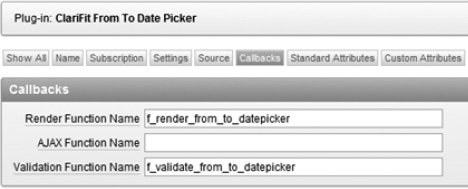
Figure 3-45. Updating call back functions
The plug-in is now running code that is embedded in your plug-in rather than from the package. You want to do this as one of the last steps since it can be more cumbersome and annoying to modify the PL/SQL in the plug-in rather than in a package where you can leverage all the features in a PL/SQL editor.
The last step is to embed the JavaScript files that were stored on a local web server. The following steps describe how to embed the JavaScript files in your plug-in:
- Edit the plug-in and scroll down to the Files region, as shown in Figure 3-46, and click the Upload New File button.

Figure 3-46. Plug-in Files region
- This will open a new page. Click the Choose File button, as shown in Figure 3-47.

Figure 3-47. Upload New File region
- Select
C:wwwFromToDatePicker$console_wrapper_1.0.3.js, as shown in Figure 3-48. Click the Upload button to upload the file.
Figure 3-48. Selecting a file
- Repeat steps 2 and 3 for
C:wwwFromToDatePicker jquery.ui.clarifitFromToDatePicker_1.0.0.js. - The Files region should now look like Figure 3-49.

Figure 3-49. Files region with uploaded files
- Go to the Settings region, and change the File Prefix field to #PLUGIN_PREFIX#, as shown in Figure 3-50. By changing the File Prefix field to #PLUGIN_PREFIX#, APEX will reference the embedded files rather than files on your web server.

Figure 3-50. Plug-in Settings region
Events
Events allow you to declaratively link JavaScript events triggered from a plug-in to a dynamic action. In the JavaScript file, a specific line was added to handle custom APEX events, as shown here:
$(this).trigger('plugineventonselect', extraParams);
Events can be a bit confusing at first, so the best way to explain them is through a demonstration. The first thing that you need to do is register the event in the plug-in.
- Edit the plug-in, and go to the Events region, shown in Figure 3-51. Click the Add Event button.

Figure 3-51. Plug-in Events region
- Clicking the Add Event button refreshes the page and adds a new row in the Events region. Set the Name to On Select Date and the Internal Name to plugineventonselect, as shown in Figure 3-52.
The name can be anything you want (i.e., it is used more as a display name that other developers will see). The internal name is the same name that you used in the JavaScript trigger function and is case-sensitive.
Figure 3-52. Registering the plugineventonselect event
- Click the Apply Changes button to save your modifications.
Now that the event has been registered with the plug-in, it can be leveraged throughout the application. The following example demonstrates how a dynamic action will use the plug-in.
- Edit Page 10. Right-click P10_FROM_DATE and select Create Dynamic Action, as shown in Figure 3-53.

Figure 3-53. Adding a dynamic action
- On the Implementation page, select the Advanced option, as shown in Figure 3-54, and click the Next button.

Figure 3-54. Dynamic action: Implementation
- Enter Display Selected Value in the Name field, as shown in Figure 3-55. Click the Next button.

Figure 3-55. Dynamic action: Identification
- The When section determines when the dynamic action will be fired. In the Event list, select On Select Date [ClariFit From To Date Picker], as shown in Figure 3-56. This is the event that we previously registered/created in the plug-in.

Figure 3-56. Dynamic action: When
- In the True Action page, set the Action to Execute JavaScript Code. Uncheck the Fire On Page Load checkbox. In the Code text area, enter window.alert('You selected: ' + this.data.dateText);.Figure 3-57 shows the required change on this page. Click the Next button to continue.
Note that the variabledateTextwas defined in our JavaScript code in theextraParamsvariable.
Figure 3-57. Dynamic action: True Action
- On the Affected Elements page, do not select a Selection Type. Click the Create button to create the dynamic action.
To trigger the dynamic action, run Page 10. Select a from date, and an alert window should display the selected date like Figure 3-58.

Figure 3-58.A dynamic action in action
This example highlights how to include events in your JavaScript, register them with the plug-in, and use them throughout the rest of your APEX application. Of course, you can do more elegant and meaningful things with events, but this example was kept simple to highlight how everything integrates.
Summary
This chapter covered many things, including callback functions, custom attributes, how to develop locally, and finally how to bundle a plug-in so it can be used anywhere. There are still a lot of things to learn about plug-ins, and they will be covered in the following chapters.