
C H A P T E R 4
Dynamic Action Plug-Ins
Dynamic actions were introduced to APEX starting in version 4.0. When they were first introduced, they were one of the most popular new features included in the release, alongside plug-ins. Dynamic actions allow APEX developers to declaratively define actions based on browser events.
This chapter will cover the basics of dynamic actions, including an example and how they work. If you are familiar with dynamic actions, you are still encouraged to read over the basics section, as the rest of the chapter assumes that you've covered this section. Following the background information, this chapter will build a dynamic action plug-in.
About Dynamic Actions
Since dynamic actions are relatively new to APEX, it is important that you have a good understanding of how they work. This section will describe what dynamic actions are and how they work.
The easiest way to explain a dynamic action is to create and use one. As an example, this section will walk you through creating a dynamic action that will print “hello world” on the screen. Follow along with the example on your own machine. Going through the simple process of creating this dynamic action will help you grasp what they are and why they are so useful.
To setup this example, you'll need to create a new page as follows:
- Create a new blank page, Page 20, called Dialog, with a blank HTML region called My Region.
- On Page 20, create a new region button called Trigger Dynamic Action. In the Create Button wizard, on the Action When Clicked page, set the Action field to Defined by Dynamic Action, as shown in Figure 4-1.

Figure 4-1. Create Button: Action When Clicked page
- If using an older theme (pre APEX 4.1), you may get the same error as Figure 4-2. An ID is required on the button for APEX to link the dynamic action to. The following steps cover how to add an ID to the button.

Figure 4-2. Button ID error message
- Exit the Create Button wizard and go to Shared Components. Click the Templates link, under the User Interface region, as shown in Figure 4-3.

Figure 4-3. User Interface region
- Select the default Button template (highlighted by the check mark in the Default column), as shown in Figure 4-4.

Figure 4-4. Selecting the default Button template
- In the Normal Template region, change the code from
<button value="#LABEL#" onclick="#LINK#" class="button-

gray" type="button" #BUTTON_ATTRIBUTES#>
to
<button value="#LABEL#" onclick="#LINK#" class="button-

gray" type="button" #BUTTON_ATTRIBUTES# id=”#BUTTON_ID#”>
The only difference is that
id=”#BUTTON_ID#”was added to the tag. - Click the Apply Changes button to save your changes.
- Repeat steps 1 and 2, and you should no longer get the Button ID error message.
- Exit the Create Button wizard and go to Shared Components. Click the Templates link, under the User Interface region, as shown in Figure 4-3.
- Select the default options for the remainder of the wizard, and create the button.
- On the Page Edit page, right-click the new button that you added and select Create Dynamic Action, as shown in Figure 4-5.

Figure 4-5. Create Dynamic Action context option
- In the Name field, enter Test. Click the Next button to continue.
- On the When page, ensure that the Event field is set to Click. Leave the rest of the default options, and click the Next button.
Note that the Condition option is not a “standard” APEX condition. Standard APEX conditions are executed while the page is being generated, which determine if the object should be rendered on the page. Dynamic action conditions are runtime conditions that will be evaluated in the browser when a browser event is triggered (in this case, the button being clicked). It will be evaluated each time the dynamic action is triggered.
- Dynamic actions have true and false actions, which are based on the dynamic action condition. If no condition is specified, as in this example, only the true action will be run.
The Action select list on the True Action page lists all the available actions to perform. They are grouped into categories. Categories are there for organization purposes only and do not affect a dynamic action's functionality.
For this example, set the Action field to Alert, which is under the Notification category, as shown in Figure 4-6.

Figure 4-6. Dynamic action True Action page
- Uncheck the Fire on Page Load checkbox, and enter Hello World in the Text box, as shown in Figure 4-7. Click the Next button to continue.

Figure 4-7. Dynamic action alert text
- Click the Create button on the Confirm screen to complete the wizard.
- Run Page 20, and click the Trigger Dynamic Action button. You should see a JavaScript alert window popup, as shown in Figure 4-8.

Figure 4-8. JavaScript alert window
How Dynamic Actions Work
As you can now see, it's really easy to use dynamic actions. But what actually happens behind the scenes? This section will discuss in detail how dynamic actions work. It's important to fully understand how they work, as you'll need to know this information when creating your own dynamic actions.
Dynamic actions can be broken up into two sections: drivers and actions. Drivers define when the dynamic action should be executed, and actions define what action should be run. Figure 4-9 is a flowchart of how a dynamic action works.

Figure 4-9. Dynamic action flowchart
In the previous example, the driver was the button click. Since there was no condition, the only action was showing the alert message box. When you create a dynamic action plug-in, you're actually creating something that will be run as an action.
Since dynamic actions are run on the front end, all the information that the action needs to perform is actually available when the action is executed. To demonstrate the available information, modify the Test dynamic action that you previously created:
- On the Page 20 edit page, right-click the Alert action and select Edit from the context menu, as shown in Figure 4-10.

Figure 4-10. Edit Alert action
- In the Identification region, change the Action field from Alert to Execute JavaScript Code, as shown in Figure 4-11. When doing so, you'll notice that a new region appears called Affected Elements.

Figure 4-11. Action Identification region
- In the Execution Options region, uncheck the Fire On Page Load box.
- In the Settings region, enter the following into the Code text area:
console.log(this); - Configure the Affected Elements region as shown in Figure 4-12.

Figure 4-12. Action Affected Elements region
Affected Elements allows an APEX developer to select which elements on the page will be affected by the action. In this example, it will be all the tabs on the page; however, since the JavaScript code is just displaying an object, nothing will actually happen to the tabs.
- Click the Apply Changes button to save your modifications.
- Run Page 20, and open the Console window in Firefox. You can also view the console output in other browsers, such as Google Chrome or Safari. Viewing the console output in Firefox is a popular technique among developers as it offers a lot of details and additional third-party plug-ins/tools to help speed up development.
 Note If you are unfamiliar with the browser console, Chapter 7describes it in detail.
 - Click the Trigger Dynamic Action button. Figure 4-13 shows what the Console window is currently displaying.

Figure 4-13. Firefox Console window
- If you drill down on the Object hyperlink (which represents the
thisdynamic action object), you will see the following objects:
Figure 4-14. Dynamic action
thisobject
The dynamic action this object contains five elements: action, affectedElements, browserEvent, data, and triggeringElement. The following list describes each of these elements:
action: Theactionelement contains a list of attributes that describe the action as shown in Figure 4-15. Theaction,affectedElements,affectedElementsType,affectedRegionId,eventResult,executeOnPageInit, andstopExecutionOnErrorattributes are automatically set by APEX. In the PL/SQL code that generates the action plug-in, you can define theajaxIdentifieras well as attributes 01~15. Note that these attributes are not the same as the custom attributes that you create as part of the plug-in. They are defined directly within the plug-in PL/SQL code. This will be covered in detail in the example plug-in later in this chapter.
Figure 4-15. Dynamic action
this—action
affectedElements:affectedElementsis an array of elements that should be modified/used by the action. In this example, it is the three tabs at the top of the page, which represent the three elements (0, 1, and 2) in the array, as shown in Figure 4-16. This means that in your JavaScript code you should reference theaffectedElementsarray rather than hard-code objects that should be modified.Referencing the
affectedElementsobject rather than a hard-coded value is one of the toughest things to get over when first working with dynamic actions. It does take some getting used to, but you should be comfortable with this notion after a while of working with dynamic actions.
Figure 4-16. Dynamic action
this—affectedElements
browserEvent: ThebrowserEventattribute is the event that triggered the dynamic action to fire. In Figure 4-17, you can see that the element that caused the dynamic action to fire was the button.
Figure 4-17. Dynamic action
this—browserEvent
browserEvent.currentTarget: This represents the target element to listen onthat was defined by the APEX developer.browserEvent.target(not shown in Figure 4-17) represents the exact object that triggered the event. The difference between the two is subtle, and in this example they appear to be the same, but there is a difference. Suppose you change the driver for the dynamic action from a click of the button to a click of the region, as shown in Figure 4-18. Run the page, and click the Trigger Dynamic Action button. ThebrowserEvent.currentTargetwould be the div element (representing the region), and thebrowserEvent.targetwould be the button element (representing the exact object that was clicked).
Figure 4-18. Modifying the dynamic action driver
browserEvent.type(not shown in Figure 4-17):This highlights that it was a click event that triggered this dynamic action.
data: Thedataattribute contains additional data that can be passed by the event handler. An example of this was covered in the previous chapter in the “Events” section.
triggeringElement:triggeringElementis the DOM object that the dynamic action listener was applied to. This is the same thing asbrowserEvent.currentTarget.
The dynamic action this object is a very important object since the entire JavaScript portion of the dynamic action relies on its information. In the following example, you'll use some of the elements discussed earlier in your dynamic action. If you get confused with some of the JavaScript code, you should come back to review this section.
Example Business Problem
When creating an application, developers need to create pop-up windows for users to view and modify data. Since some browsers prevent web pages from using traditional pop-up windows (and they're annoying), you need to create a dialog/modal pop-up window. An example of such a window is the label help dialog window in APEX, as shown in Figure 4-19.

Figure 4-19. APEX label help dialog window
The following is a list of requirements for this dynamic action plug-in:
- Allow for modal and non-modal dialog windows.
- Dialog window can be moved around the page by the user.
- Support multiple dialog windows at the same time.
- Dialog window must be selected for Region, DOM object, or jQuery Selector.
- For modal windows, background color and opacity must be the same across the entire application.
- Ability to hide the dialog window on page load (i.e., user wants to see the information only as a modal window)
- Allow the end user to hit the ESC key to close the modal window.
- Option to restore the dialog window to its previous non-dialog window state—for example, if it was hidden before, it should be hidden after.
Building the Dynamic Action Plug-In
Now that the business requirements have been defined, you can start creating the dynamic action plug-in. To start, create a new plug-in with the attributes listed here. Follow the same process as in the preceding chapter. Once you are finished, click the Create button to save the plug-in.
- Name: ClariFit Dialog
- Internal Name: COM.CLARIFIT.APEXPLUGIN.APEX_DIALOG
- Type: Dynamic Action
- Category: Effect
Again, the category has no real impact on the plug-in. All it does is control where the dynamic action is listed when a developer is implementing a dynamic action.
Note Some of the steps that were covered in detail in the previous chapter are common to both types of plug-ins. The following process will not include screenshots for those common steps.
Initial Configuration and Setup
Just like the first plug-in that you created, there are some housekeeping items that you need to perform. The first is to create a directory on your web server that will host the necessary web files while developing this application and modify the plug-in file prefix.
- Create a directory called
c:wwwApexDialog. - Modify the plug-in. In the Settings region, set the File Prefix field to
http://localhost/ApexDialog/. - Click the Apply Changes button to save your changes.
Before creating a test scenario on Page 20, you will need to configure the standard attributes for this plug-in. Referring to the requirements, the affected elements for this plug-in must be selected. They can be only for Region, DOM object, or jQuery Selectors. To meet these requirements, modify the plug-in and set the standard attributes options as in Figure 4-20.
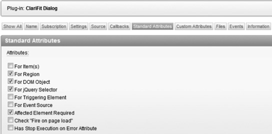
Figure 4-20. Plug-in standard attributes
As with all plug-ins, you'll need to reference a PL/SQL function(s) to manage the plug-in. The following steps will define the PL/SQL function for the plug-in and create a corresponding empty PL/SQL function in pkg_apress_plugins. The code for the function will be covered later on in this chapter.
- Modify the plug-in. In the Callbacks region, set the Render Function Namefield to
pkg_apress_plugins.f_render_dialog. Since this plug-in does not require any AJAX calls, you can leave the AJAX Function Name field empty. - The next thing to do is to define and create an empty PL/SQL function. To obtain the function spec, click the Render Function Name label. Scroll down to the bottom of the help text, and copy the function header information, as shown in Figure 4-21.
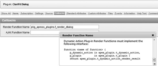
Figure 4-21. Render Function Name help
- Modify the package spec for
pkg_apress_plugins, and paste the code at the end. Name the functionf_render_dialog. In SQL Developer, it should look like Figure 4-22(note that the other functions have been collapsed).
Figure 4-22.
pkg_apress_plugins.f_render_dialogpackage spec - Create the function
f_render_dialogin the package body, which simply returns an empty result variable, as shown in Figure 4-23 (note that the other functions have been collapsed). You will fill in the rest of the function later in this chapter.
Figure 4-23.
pkg_apress_plugins.f_render_dialogpackage body (minimal)
The next thing to do is to modify Page 20 so that you can test the plug-in as you develop it. The following steps will remove some of the unnecessary things from Page 20 and create the necessary test items.
- Edit Page 20, and delete the Test dynamic action.
- Delete the TRIGGER_DYNAMIC_ACTION button.
- Create a new HTML region with the following configuration:
Title: My Form
Sequence: 20
All other options should be left to the default settings. In the My Form region, create the following items, button, and page branch:
- Create three Text Field page items in the My Form region called P20_A, P20_B, and P20_C.
- Create a region button called Submit in the My Form region using the default configurations. Set its position in the bottom left of the region.
- Create a page branch (On Submit: After Processing, After Computation, Validation, and Processing)that branches back to Page 20. On the Branch Conditions page, set the When Button Pressed field to SUBMIT (submit).
- If you run Page 20 now, it should look like Figure 4-24.

Figure 4-24. Page 20 with three items
- Create a new Report (Classic Report) region with the following configurations:
Title: Employee Report
Sequence: 30
Query:SELECT * FROM emp
Rows per Page: 5 - If you run Page 20 now, it should look like Figure 4-25.

Figure 4-25. Page 20 with report
- You will add the buttons to trigger the dynamic actions after setting up the custom attributes, so that you can see how the custom attributes are displayed in the Dynamic Action Creation wizard.
Custom Attributes
Just like the From/To Date picker item plug-in, this plug-in requires some custom attributes. Both application- and component-level attributes are necessary.
The following list describes the attributes that are required for the plug-in given the set of requirements. Create each of the following attributes using the same process as described in the preceding chapter. Refer back to that chapter if you need to refresh your memory on the process.
- Scope: Application
Attribute: 1
Label: Background Color
Type: Text
Required: No
Display Width: 10
This value is not required since it will use the default jQuery UI theme color that is defined with the APEX theme.
- Scope: Application
Attribute: 2
Label: Background Opacity
Type: Select List
Required: Yes
Default: 0.3
LOVs:
- Display Value: 10%
Return Value: 0.1 - Display Value: 20%
Return Value: 0.2 - … 30%~90%
- Display Value: 100%
Return Value: 1
- Display Value: 10%
- Scope: Component
Attribute: 1
Label: Modal
Type: Yes/No
Default: Y
The Yes/No value is a special type of select list that will return either Y or N. Since there are only two possible values, there is no required field. If no value is entered for the Default Value, N will be used.
- Scope: Component
Attribute: 2
Label: Close on Escape
Type: Yes/No
Default: Y - Scope: Component
Attribute: 3
Label: Dialog Title
Type: Text
Required: No
Translatable: Yes
If the Translatable option is set to Yes, the value of the attribute will be included in the list of phrases to translate in multi-language applications.
- Scope: Component
Attribute: 4
Label: Hide Affected Elements on Page Load
Type: Yes/No
Default: Y - Scope: Component
Attribute: 5
Label: On Close Visible State
Type: Select List
Required: Yes
Default: prev
LOVs:
Display Value: Previous (default)
Return Value: prevDisplay Value: Show
Return Value: showDisplay Value: Hide
Return Value: hide
To confirm your changes, modify the plug-in and go to the Settings region. Figure 4-26shows the two application-level attributes that are now available. Figure 4-27 shows the entire list of custom attributes for this plug-in.
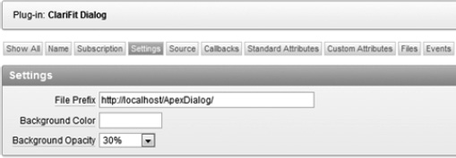
Figure 4-26. Custom application attributes

Figure 4-27. Dialog plug-in custom attributes
If you encountered any issues creating the custom attributes, please refer to the sample application that comes with this book. The help text was excluded from the foregoing descriptions, but they are included in the sample applications.
Now that the custom attributes have been defined, when you use this plug-in in a dynamic action, you will see the component-level custom attributes in the Settings page (wizard) or Settings region. The following steps create two buttons that leverage this dynamic action plug-in:
- Edit Page 20. Create a region button called Dialog My Form. On the Action When Clicked page, set the Action field to Defined by Dynamic Action, as shown in Figure 4-1.
- Create another button with the same attributes, but change its name to Dialog Emp Report. This button will be used to trigger the dialog window for the Employee Report region.
- Run Page 20. It should now look like Figure 4-28. Note that the buttons' positions have been set to the bottom left of the region to help with the screenshots in this book. If you used the default option, they will be in the top right corner of the My Region region.
If you click either of the buttons, nothing happens, as there are no dynamic actions registered to them. This will be done in the next step.

Figure 4-28. Buttons added to My Region
- Create a dynamic action on the DIALOG_MY_FORMbutton. Here are the steps to follow:
- Edit Page 20. Right-click the DIALOG_MY_FORM button, and select the Create Dynamic Action option from the context menu, as shown in Figure 4-29.

Figure 4-29. Create Dynamic Action option for DIALOG_MY_FORM button
- On the Identification page, set the Name field to Dialog Window. Click the Next button to continue.
- Use the default options on the When page, as shown in Figure 4-30. Click the Next button to continue.

Figure 4-30. Default When options
- On the True Action page, set Action to ClariFit Dialog [Plug-in]. Modify the settings so that they are the same as Figure 4-31. These settings are the custom attributes that you just added to the plug-in. Click the Next button to continue.

Figure 4-31. Dialog plug-in settings
- On the Affected Elements screen, set the Selection Typefield to Region and the Regionfield to My Form(1) 20. Click the Create button to complete the wizard.
- Edit Page 20. Right-click the DIALOG_MY_FORM button, and select the Create Dynamic Action option from the context menu, as shown in Figure 4-29.
- Create a dynamic action on the DIALOG_EMP_REPORTbutton. These steps are very similar to the previous steps with some slight modifications, and are as follows:
- Right-click the DIALOG_EMP_REPORT button, and select the Create Dynamic Actionoption from the context menu.
- On the Identification page, set the Namefield to Modal Window. Click the Next button to continue.
- Use the default options on the When page. Click the Next button to continue.
- On the True Action page, set Action to ClariFit Dialog [Plug-in]. Use the default plug-in settings, and click the Next button to continue.
- On the Affected Elements screen, set the Selection Typefield to Region and the Regionfield to Employee Report (1) 30. Click the Create button to complete the wizard.
- If you go back to the Page 20 edit page, it should look like Figure 4-32. In Figure 4-32, the tree elements for the buttons have been expanded to show all the dynamic action information.

Figure 4-32. Page 20 dynamic actions
If you run Page 20, it will load but the buttons won't do anything, as the PL/SQL code is not complete nor is there any JavaScript code. You may also notice some JavaScript errors when the page loads. These errors will go away when you finish coding the render function and the JavaScript code.
Render Function
Now that everything is set up, there are two key pieces missing for this dynamic action plug-in: the PL/SQL render function and the JavaScript code. This section will display all the PL/SQL code and give a full analysis based on the line numbers. The line numbers don't start at 1 since there's code from a previous plug-in in this chapter.
Note In the previous chapter, the JavaScript section was before the PL/SQL render function, whereas this chapter covers the render function first and then the JavaScript code. Developing a plug-in usually involves an iterative approach. Once you get the base functionality working, you will probably work with both sets of code at the same time.
Copy the following code (excluding the line numbers) into the package body for pks_apress_plugins. An analysis of the code follows.
227 ...

228

229 FUNCTION f_render_dialog (

230   p_dynamic_action IN apex_plugin.t_dynamic_action,

231   p_plugin         IN apex_plugin.t_plugin )

232   RETURN apex_plugin.t_dynamic_action_render_result

233 AS

234   -- Application Plugin Attributes

235   v_background_color apex_appl_plugins.attribute_01%TYPE := p_plugin.attribute_01;

236   v_background_opacity apex_appl_plugins.attribute_01%TYPE := p_plugin.attribute_02;

237

238   -- DA Plugin Attributes

239   v_modal apex_application_page_items.attribute_01%TYPE := p_dynamic_action.attribute_01; -- y/n

240   v_close_on_esc apex_application_page_items.attribute_01%TYPE := p_dynamic_action.attribute_02; -- y/n

241   v_title apex_application_page_items.attribute_01%TYPE := p_dynamic_action.attribute_03; -- text

242   v_hide_on_load apex_application_page_items.attribute_01%TYPE := upper(p_dynamic_action.attribute_04); -- y/n

243   v_on_close_visible_state apex_application_page_items.attribute_01%type := lower(p_dynamic_action.attribute_05); -- prev, show, hide

244

245   -- Return

246   v_result apex_plugin.t_dynamic_action_render_result;

247

248   -- Other variables

249   v_html varchar2(4000);

250   v_affected_elements apex_application_page_da_acts.affected_elements%type;

251   v_affected_elements_type apex_application_page_da_acts.affected_elements_type%type;

252   v_affected_region_id apex_application_page_da_acts.affected_region_id%type;

253   v_affected_region_static_id apex_application_page_regions.static_id%type;

254

255   -- Convert Y/N to True/False (text)

256   -- Default to true

257   FUNCTION f_yn_to_true_false_str(p_val IN VARCHAR2)

258   RETURN VARCHAR2

259   AS

260   BEGIN
261 RETURN
262 CASE
263 WHEN p_val IS NULL OR lower(p_val) != 'n' THEN 'true'
264 ELSE 'false'
265 END;
266 END f_yn_to_true_false_str;
267
268 BEGIN
269 -- Debug information (if app is being run in debug mode)
270 IF apex_application.g_debug THEN
271 apex_plugin_util.debug_dynamic_action (
272 p_plugin => p_plugin,
273 p_dynamic_action => p_dynamic_action);
274 END IF;
275
276 -- Cleanup values
277 v_modal := f_yn_to_true_false_str(p_val => v_modal);
278 v_close_on_esc := f_yn_to_true_false_str(p_val => v_close_on_esc);
279
280 -- If Background color is not null set the CSS
281 -- This will be done only once per page
282 IF v_background_color IS NOT NULL THEN
283 v_html := q'!
284 .ui-widget-overlay{
285 background-image: none ;
286 background-color: %BG_COLOR%;
287 opacity: %OPACITY%;
288 }!';
289
290 v_html := REPLACE(v_html, '%BG_COLOR%', v_background_color);
291 v_html := REPLACE(v_html, '%OPACITY%', v_background_opacitiy);
292
293 apex_css.ADD (
294 p_css => v_html,
295 p_key => 'ui.clarifitdialog.background'),
296 END IF;
297
298 -- JAVASCRIPT
299
300 -- Load javascript Libraries
301 apex_javascript.add_library (p_name => '$console_wrapper', p_directory => p_plugin.file_prefix, p_version=> '_1.0.3'), -- Load Console Wrapper for debugging
302 apex_javascript.add_library (p_name => 'jquery.ui.clarifitDialog', p_directory => p_plugin.file_prefix, p_version=> '_1.0.0'),
303
304 -- Hide Affected Elements on Load
305 IF v_hide_on_load = 'Y' THEN
306
307 v_html := '';
308
309 SELECT affected_elements, lower(affected_elements_type), affected_region_id,
aapr.static_id310 INTO v_affected_elements, v_affected_elements_type, v_affected_region_id, v_affected_region_static_id
311 FROM apex_application_page_da_acts aapda, apex_application_page_regions aapr
312 WHERE aapda.action_id = p_dynamic_action.ID
313 AND aapda.affected_region_id = aapr.region_id(+);
314
315 IF v_affected_elements_type = 'jquery selector' THEN
316 v_html := 'apex.jQuery(""' || v_affected_elements || '"").hide();';
317 ELSIF v_affected_elements_type = 'dom object' THEN
318 v_html := 'apex.jQuery(""#' || v_affected_elements || '"").hide();';
319 ELSIF v_affected_elements_type = 'region' THEN
320 v_html := 'apex.jQuery(""#' || nvl(v_affected_region_static_id, 'R' ||
v_affected_region_id) || '"").hide();';
321 ELSE
322 -- unknown/unhandled (nothing to hide)
323 raise_application_error(-20001, 'Unknown Affected Element Type'),
324 END IF; -- v_affected_elements_type
325
326 apex_javascript.add_onload_code (
327 p_code => v_html,
328 p_key => NULL); -- Leave null so always run
329 END IF; -- v_hide_on_load
330
331 -- RETURN
332 v_result.javascript_function := '$.ui.clarifitDialog.daDialog';
333 v_result.attribute_01 := v_modal;
334 v_result.attribute_02 := v_close_on_esc;
335 v_result.attribute_03 := v_title;
336 v_result.attribute_04 := v_on_close_visible_state;
337
338 RETURN v_result;
339
340 END f_render_dialog;
341
342 ...
Hereis an explanation of key passages in the preceding code listing:
234–243: Application- and component-level custom attributes; remember to use meaningful names to describe them rather than their attribute number. It may also be helpful to put a comment on expected values when applicable so that other developers know what values to expect.
250–253: Variables to store the affected elements; generally, in dynamic action plug-ins, this information is required only in the JavaScript code (which can be referenced in the
thisobject). Due to the requirement of hiding the object on page load, the affected element is required here. This will be discussed further in the code analysis.257–266: Inline function to convert Y/N values to true/false (string) values; this is not required, but if you need to convert some of the same types, attributes creating inline functions can save time.
270–274: Standard debugging code; you can instrument the rest of your function with more debugging code but at a minimum including this debug statement.
280–296: This code sets the background color and opacity for modal windows. This is a page-level setting (i.e., will be the same for all the modal windows).
You could use
htp.pto output the code; however, it would be run for each instance of this plug-in. In the example, it would be run twice because there aretwo instances of the same plug-in on the page. Since it needs to be run only once, there's a parameter calledp_key(line 295). If this key has already been used, the code will not be reprinted. If the key is null, it will always be used.300–302: Load JavaScript files.
304–329: This is a unique block of code. One of the custom attributes allows an APEX developer to hide the affected region on page load. Since the dynamic action code is run only when it is triggered, additional steps are required to find the affected elements and explicitly hide them once the page is loaded.
On lines 316, 318, and 320, the JavaScript references the
apex.jQuerynamespace rather than $. This ensures that it is actually referencing the jQuery code rather than a different JavaScript library.On line 328,
p_keyis set toNULL(default value). This means that the code will always be run. SinceNULLis the default value, you don't need to explicitly reference it if you don't need it.331–336: Defines the return object; the first thing you'll notice is that there's no explicit call to actually “run” any JavaScript code to trigger your plug-in like an item plug-in. Instead, all you need to do is define the JavaScript function name. This function should not take in any parameters, as all the values that you need are available in the dynamic action
thisobject (discussed earlier in this chapter).Lines 333–336 set attributes that are available in the
this.actionJavaScript object. These attributes are not the same as custom (application and component) attributes. These attributes are passed as strings, so you should ensure that you convert any non-string values to strings when setting them. This is why the Y/N values (v_modalandv_close_on_esc) are converted to string true/false values rather than Oracle Boolean values.
JavaScript
Similar to the previous section, this section will list the JavaScript code and then break down each section. Before continuing, you'll need to download and copy $console_wrapper_1.0.3.js and jquery.ui.clarifitDialog_1.0.0.js into c:wwwApexDialog (or the appropriate web server directory) for this plug-in to work. These files are available in the source code files that accompany this book. Since the previous chapter covered how to embed JavaScript files directly into your plug-in, this chapter will not do so. You are encouraged to review the previous chapter (see the “Wrapping Up” section) and embed the JavaScript files on your own.
Here is a complete listing of jquery.ui.clarifitDialog_1.0.0.js followed by a breakdown of each section. When reading through this code, you should start to notice how everything nicely meshes together.
001 /**

002  * ClariFit jQuery UI Dialog

003  * Plug-in Type: Dynamic Action

004  * Summary: Displays a jQuery UI Dialog window for affected elements

005  *

006  * Depends:

007  *  jquery.ui.dialog.js

008  *  $.console.js  - http://code.google.com/p/js-console-wrapper/

009  *

010  * Notes:

011  * Object to be shown in Dialog window needs to be wrapped in order to preserve its

position in DOM

012  * See: http://forums.oracle.com/forums/thread.jspa?messageID=3180532 for more

information.

013  *

014  * ^^^ Contact information ^^^

015  * Developed by ClariFit Inc.

016  * http://www.clarifit.com

017  * [email protected]

018  *

019  * ^^^ License ^^^

020  * Licensed Under: GNU General Public License, version 3 (GPL-3.0) -

www.opensource.org/licenses/gpl-3.0.html

021  *

022  * @author Martin Giffy D'Souza - www.talkapex.com

023  */

024 (function($){

025  $.widget('ui.clarifitDialog', {

026   // default options

027   options: {

028     //Configurable options in APEX plugin

029     modal: true,

030     closeOnEscape: true,

031     title: '',

032     persist: true, //Future option, no affect right now

033     onCloseVisibleState: 'prev' //Restore objects visible state once closed

034   },

035

036   /**

037    * Init function. This function will be called each time the widget is referenced with

no parameters

038    */

039   _init: function(){

040     var uiw = this;

041     var consoleGroupName = uiw._scope + '._init';

042     $.console.groupCollapsed(consoleGroupName);

043
044 //Find the objects visible state before making dialog window (used to restore if
necessary)
045 uiw._values.beforeShowVisible = uiw._elements.$element.is(':visible'),
046 $.console.log('beforeShowVisible: ', uiw._values.beforeShowVisible);
047
048 //Create Dialog window
049 //Creating each time so that we can easily restore its visible state if necessary
050 uiw._elements.$element.dialog({
051 modal: uiw.options.modal,
052 closeOnEscape: uiw.options.closeOnEscape,
053 title: uiw.options.title,
054 //Options below Can be made configurable if required
055 width: 'auto',
056 //Event Binding
057 beforeClose: function(event, ui) { $(this).trigger('cfpluginapexdialogbeforeclose',
{event: event, ui: ui}); },
058 close: function(event, ui) {
059 //Destroy the jQuery UI elements so that it displays as if dialog had not been
applied
060 uiw._elements.$element.dialog( "destroy" );
061
062 //Move out of wrapper and back into original position
063 uiw._elements.$wrapper.before(uiw._elements.$element);
064
065 //Show only if previous state was show
066 if ((uiw._values.beforeShowVisible && uiw.options.onCloseVisibleState == 'prev')
|| uiw.options.onCloseVisibleState == 'show'){
067 uiw._elements.$element.show();
068 }
069 else {
070 uiw._elements.$element.hide();
071 }
072
073 //Trigger custom APEX Event
074 uiw._elements.$element.trigger('cfpluginapexdialogclose', {event: event, ui: ui});
075 },
076 create: function(event, ui) { $(this).trigger('cfpluginapexdialogcreate', {event:
event, ui: ui}); }
077 });
078
079 //Move into wrapper
080 uiw._elements.$wrapper.append(uiw._elements.$element.parent('.ui-dialog'));
081
082 $.console.groupEnd(consoleGroupName);
083 }, //_init
084
085 /**
086 * Set private widget variables
087 */
088 _setWidgetVars: function(){
089 var uiw = this;
090 091 uiw._scope = 'ui.' + uiw.widgetName; //For debugging
092
093 uiw._values = {
094 wrapperId : uiw.widgetName + '_' + parseInt(Math.random()*10000000000000000),
//Random number to identify wrapper
095 beforeShowVisible: false //Visible state before show
096 };
097
098 uiw._elements = {
099 $element : $(uiw.element[0]), //Affected element
100 $wrapper : null
101 };
102
103 }, //_setWidgetVars
104
105 /**
106 * Create function: Called the first time widget is associated to the object
107 * Does all the required setup, etc. and binds change event
108 */
109 _create: function(){
110 var uiw = this;
111
112 uiw._setWidgetVars();
113
114 var consoleGroupName = uiw._scope + '._create';
115 $.console.groupCollapsed(consoleGroupName);
116 $.console.log('this:', uiw);
117 $.console.log('element:', uiw.element[0]);
118
119 //Create wrapper so that we keep object in its current place on the DOM
120 uiw._elements.$element.wrap('<div id="' + uiw._values.wrapperId + '"/>'),
121 uiw._elements.$wrapper = $('#' + uiw._values.wrapperId);
122 $.console.log('wrapperId: ', uiw._values.wrapperId);
123
124 $.console.groupEnd(consoleGroupName);
125 },//_create
126
127 /**
128 * Removes all functionality associated with the clarifitDialog
129 * Will remove the change event as well
130 * Odds are this will not be called from APEX.
131 */
132 destroy: function() {
133 var uiw = this;
134
135 $.console.log(uiw._scope, 'destroy', uiw);
136 $.Widget.prototype.destroy.apply(uiw, arguments); // default destroy
137 // unregister datepicker
138 uiw._elements.$element.dialog( "destroy" )
139 }//destroy
140 }); //ui.clarifitDialog
141142 $.extend($.ui.clarifitDialog, {
143 /**
144 * Function to be called from the APEX Dynamic Action process
145 * No values are passed in
146 * "this" is the APEX DA "this" object
147 */
148 daDialog: function(){
149 var scope = '$.ui.clarifitDialog.daDialog';
150 var daThis = this; //Note that "this" represents the APEX Dynamic Action object
151 $.console.groupCollapsed(scope);
152 $.console.log('APEX DA this: ' , daThis);
153
154 //Set options
155 var options = {
156 modal: daThis.action.attribute01 === 'false' ?false : true,
157 closeOnEscape: daThis.action.attribute02 === 'false' ?false : true,
158 title: daThis.action.attribute03,
159 onCloseVisibleState: daThis.action.attribute04
160 };
161
162 for(var i = 0, end = daThis.affectedElements.length; i < end; i++){
163 $.console.log('Dialoging: ', daThis.affectedElements[i]);
164 $(daThis.affectedElements[i]).clarifitDialog(options);
165 }//for
166
167 $.console.groupEnd(scope);
168 }//daDialog
169
170 });//Extend
171
172 })(apex.jQuery);
Here is an explanation of key passages in the preceding JavaScript code listing:
001–023: Plug-in comment and license information; always spend the extra few minutes and include some notes about the code. You'll be thankful in the long run.
024+172: Namespacing the jQuery variable name, which was discussed in the previous chapter; if you do not use this technique, you should reference
apex.jQueryinstead of$.025–140: jQuery UI Widget Factory code for this plug-in
033:
onCloseVisibleStatedefines what to do with the dialog window once it's closed. This code supports it going back to its previous state (default option), always showing, or always hiding.050–077: Display the dialog window; stores the visible state of the object before it is converted to a dialog window. This is necessary to restore the window as defined by one of the plug-in's custom attributes.
This code also supports custom event binding. For example, line 057 will trigger a custom event, which other APEX dynamic actions can leverage. This is defined in the Events region in the plug-in.
On line 080, the element is moved into a wrapper. This is to ensure that the page items remain in the same order that they were loaded on the page. For more information, see the forum posting at the beginning of the file.
085–103: Set private variables for the widget; note that, though they appear to be private variables, if end users really wanted to modify them, they could.
105–140: Create function that creates a wrapper for the affected element; the
_initfunctionrequires the wrapper to protect the order of the object in the DOM.142–170: This is static code that acts as the middle man between the call from APEX and the UI Widget.
daDialogdoes not require any parameters since it obtains all the necessary information from thethisobject.The variable
daThisrefers to the dynamic actionthisvariable, which contains everything about the dynamic action.Lines 156–159 reference the dynamic action attributes. Again, these are not the same as the plug-in's custom attributes. They are defined in the returned PL/SQL object.
Since the dynamic actions attributes are passed as strings, they need to be explicitly converted to JavaScript objects (when applicable). Lines 156–157 convert attributes from strings to JavaScript Booleans.
Line 162 references the
affectedElementsto apply the JavaScript code to. The JavaScript code does not necessarily care if the affected element(s) is a region or a jQuery Selector, etc. APEX gives it an array of objects to work with.
Testing It Out
Since you have completed all the code and configuration, and built a good test page, it's time to test your plug-in. To start, refresh Page 20. It should look like Figure 4-33. The most noticeable difference is that the Employee report is hidden since it was one of the plug-in's configuration options.

If you click the Dialog My Form button, the My Form region now becomes a dialog window, as shown in Figure 4-34. Since it is not a modal window, you can click outside of the dialog window. When you close the dialog window, it will go back to its original position and visibility state.

Figure 4-34. My Form dialog window
If you click the Dialog Emp Report button, the Employee Report region will appear as a modal window, like Figure 4-35. When you close the modal window, it will disappear.

Figure 4-35. Employee Report modal window
You are encouraged to modify each of the dynamic actions plug-in settings to see how they affect the outcome.
Summary
This chapter covered what dynamic actions are and how they work. Dynamic actions declaratively let APEX developers define and implement front-end events.
Compared to items, dynamic actions can be a bit more complex, which can make them difficult to understand. It is important to have a solid understanding of their internal mechanisms before developing a plug-in.
You may also start to notice some similarities between dynamic action and item plug-ins, such as the render function, JavaScript code, and custom attributes. Having these similarities helps when you are learning the APEX plug-in architecture.