Chapter 1. Purpose And Principles

In the 1960s, the NYC subway system was a maze of mismatched signage and broken wayfinding. With no clear unifying language, travelers were getting lost. The New York City Transit Authority hired Massimo Vignelli and Bob Noorda to design a solution.
Vignelli and Noorda spent several years underground, watching the flow of passengers getting on and off trains and moving through stations. They studied people’s habits. What paths did people take? When and where did they look for information?
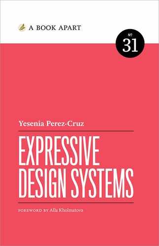
The resulting New York City Transit Authority Graphics Standards Manual (Fig 1.1) was an impressively detailed set of specifications for designing and constructing signage, guided by strong user-centered principles (Fig 1.2).
The level of detail in this 185-page manual is impressive, and the principles that guided the work are even more so. Through the unified design language, Vignelli and Noorda aimed to help orient people within the subway environment, so they could get to where they needed to go, quickly.
Design systems create better products when they provide both unity and cohesion. Unity means that things feel complete—all of your brand elements work together as one.
But unity doesn’t guarantee cohesion. Cohesion is the quality that makes your user interfaces easy to understand across the experience. Vignelli and Noorda created unity with a consistent visual language for signage, but they enabled cohesive experiences by defining where that signage should be placed for commuters to receive the right information at the right time. If they had only addressed the visual inconsistencies in the signage without also considering the behaviors of subway riders, people would still be getting lost underground.
Unity is easier to accomplish than cohesion, because it can be solved by creating tools: style guides, brand languages, shared components. Cohesion is more complicated because it can’t be solved with a tool alone. In order to create products that feel cohesive, you need to align teams around a shared definition of how your brand should look, feel, and behave. That’s why it’s important to set a purpose and establish principles.

Setting a Purpose
If you’re proposing a design system at your company, you may get resistance. Why is a design system worth the effort? Why would we take time away from shipping product features to create a system? Busy teams pushing on their individual product roadmaps may not understand (or care) about why creating a design system will help them be more efficient. If you can demonstrate the value that a design system will have for your internal team and your end users, then you improve your chances of getting buy-in.
Design systems are all about alignment. Early on, you need to align your team around why a design system matters. You can do this by defining a purpose statement for your design system.
Finding your purpose statement
Your purpose statement describes what your team is trying to achieve with the design system. It answers four questions:
- What is the goal for our design system?
- Why is that goal important?
- How will the design system help us?
- Who is the design system for?
Imagine your organization answers those questions like this:
- What is the goal? Our design system will free up more time for innovation and creativity.
- Why is it important? If we don’t increase our innovation, our product could grow stagnant and be surpassed by a competitor.
- How will it help us? By resolving common, recurring situations with repeatable patterns so product teams can focus on new problems.
- Who is it for? Our internal product teams.
This purpose statement is all about driving innovation. The resulting design system might focus on tooling that would allow teams to rapidly prototype. You would be able to measure the design system’s success if the products grew more innovative over time.
Here’s another way to answer those questions:
- What is the goal? Our design system will make the quality of our products better for our audiences.
- Why is it important? If our audiences are met with confusing, inconsistent workflows, we’ll lose their trust.
- How will it help us? By unifying the people that are creating our products through shared tools, guidelines, and principles.
- Who is it for? Our internal product teams, in service of our audiences.
This purpose statement is more focused on improving the user experience than on innovation. The resulting design system would also focus more on aligning teams, encouraging people to talk and share internally. You would know if this design system was successful by doing usability testing before and after it was implemented to see if user experiences felt more cohesive.
To find your purpose statement, bring key stakeholders together to answer these four key questions, and then discuss the results as a group. You may find that while there’s agreement that a design system is important, there’s disagreement on the goal or why it’s important. Getting aligned on exactly what you want to accomplish—and how you’ll know you’ve succeeded—will set the design system on the right path from the beginning.
Defining your purpose statement up front helps you prioritize and make decisions later on. If you have to choose between building an average experience that only uses reusable components or an excellent experience that requires new or adjusted components, how will you decide?
The best way to answer these questions is to listen to your users.
Listening to users
Like Vignelli and Noorda, we need to go underground and pay attention to user needs and behaviors. Successful design systems need to serve many audiences: designers, developers, content strategists, products managers, and, of course, end users. Interviewing these users will help you set a purpose.
Talking to the people who will be using the design system you’re creating is key to making a design system they will actually use. The biggest thing you can gain from this is finding out what they need and what to focus your efforts on.
Set up some interviews with the users of your design system. Be sure to talk to people from different disciplines, as well as people with different levels of experience.
Uncover problems:
- What are their biggest pain points?
- Where are they currently duplicating their efforts in inefficient ways?
- Where is communication between designers and engineers starting to break down?
Uncover goals:
- What would a design system help them achieve?
- What information do they need from a style guide?
- How would they want this information presented?
- What rationale would they need in order to trust the information in a style guide?
These questions are very tool-focused. They’ll help you understand how tools like component libraries and style guides can make a team’s work more efficient.
But they won’t help you understand how a design system can help improve alignment and collaboration. To understand this, you need to dig into how teams are currently working. Even if your team doesn’t have a documented style guide, it has systems. These systems are the habits teams develop over time. It’s important to dig into these questions as well.
- How are different disciplines currently collaborating?
- How do teams define quality?
- How do teams know if they’re aligned?
- How do teams define good design?
- How do you know if work is ready to ship?
- What resources and documentation already exist?
These questions will give you a baseline understanding about how aligned your team currently is. If people have inconsistent definitions of good design, for example, that misalignment is probably reflected in your products.
It’s also important to understand how your design system will benefit your product’s customers. In Chapter 2, we’ll talk about how to create a map of your ecosystem to help you identify how to prioritize your work in a way that will help end users.
Creating Aligning Principles
Designing products requires making hundreds of decisions quickly. A small team can rely on tribal knowledge to ensure that those decisions are consistent. But as teams grow, the ability to make aligned, consistent decisions becomes harder. Your products won’t feel cohesive if everyone is working from a different definition of “quality.” To address this, we need to create a shared framework for decision-making. These are our design principles.
Design principles are a set of guidelines your team can follow throughout their design process in order to create more aligned experiences. Well-written design principles create alignment, speed up decision-making, and increase the quality of your team’s output. While shared components and visual styles help teams align on how their brand should look, shared principles help teams align on how their brand should behave.
Effective principles
Teams can sink a lot of time into creating principles, perhaps because the idea of a “principle” feels permanent. You won’t be carving these principles into stone! Principles can and do change. What’s most important is that your principles reflect the purpose you’ve defined and the values you want to embody today, and that everyone building and using the design system is aligned on them. The process of creating your principles should be inclusive and shaped by all of the people you hope will adopt those principles.
Effective design principles should be:
- Specific and opinionated
- Grown from within your team
- Decision-making tools
Specific and opinionated
There are two types of principles: universal and specific (http://bkaprt.com/eds/01-01/). Universal principles are broadly applicable and can be used for all kinds of design. “Delightful” and “simple” are examples of universal principles. By contrast, specific principles map directly to a specific product and are used to align teams around a common language. To create expressive design systems, you need specific principles.
Have you ever gone into a design critique and heard the feedback, “But that doesn’t feel like us?” The point of creating principles is to codify what it means to create a product that feels like your company. What decisions would your company make that other companies wouldn’t?
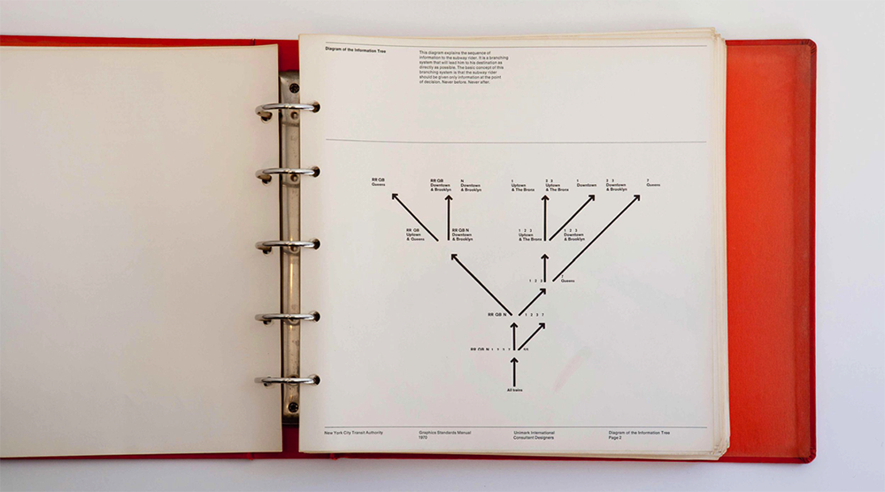
These principles should not only be specific to your product, but should also embody the qualities you want your user experience to have. Take, for example, Intercom’s principle of “Designing conversations, not transactions” (http://bkaprt.com/eds/01-02/). A transaction feels cold, robotic, formal—like submitting a help request into a void. A conversation, on the other hand, feels warm, human, helpful. This principle starts to tell me how the product should feel (Fig 1.3), and steers designers on that team away from building experiences that feel formal and disconnected from their users.
Grown from within your team
Principles should feel like they’re aligned with your team values and your product’s purpose, not unfamiliar to them. Start with principles that are already baked into your culture and how your team works. You want your principles to feel true to your organization.
As designer Mark Boulton describes it:
All you do is be mindful of when the team repeats design desires. This could be several members of the team say the same thing in a slightly different way, or that you keep circling around and around a problem but struggle to articulate it. By being mindful at all times to this a team can quickly pull together principles that are derived from doing the work on their particular problem rather than principles which are imposed on the work. (http://bkaprt.com/eds/01-03/)
Team members need to believe in these principles in order for them to be useful. The principles should feel like a conversation among team members—not something that has been imposed on them. When you’re interviewing your internal team, pay attention to how they define “good design.” What themes emerge? If several people mention the importance of making experiences clear and efficient, you may want to codify that as a principle, like “Clear over clever.” Often, these principles already exist within people’s minds, but need some work to define and document.
Decision-making tools
Good design principles help your team make decisions faster. Without clear benchmarks, design reviews can become subject to whim and opinion. Principles give structure to design feedback so you can make sound decisions more efficiently.
Salesforce’s JD Vogt explains how design principles helped their team make decisions more quickly:
It became clear that we lacked a framework for up-leveling and accelerating the discussion. We needed a way for everyone in the room to grok the intention, so we could align on the path forward. We needed prioritized principles to guide our communication and decision making.
We started to use these principles when discussing designs amongst ourselves. When creating designs, we’d consciously remind ourselves that the experiences we were creating should be clear, efficient, consistent, and beautiful. When reviewing design options, we’d run it through the same gauntlet. With practice, it became easier to rationalize a decision and pick a path forward.” (http://bkaprt.com/eds/01-04/)
Good design principles can help your team get better at justifying decisions, articulating that justification, and connecting back to your purpose and values at every turn.
Establishing your principles
You don’t want to create principles in a vacuum and then drop them on your team. Instead, bring people together to craft principles collaboratively.
Start by holding a principles workshop, either in person or remotely. The benefit of developing these principles in a workshop is that it generates momentum across your organization.
- Choose a cross-disciplinary team. You want to focus on alignment across teams, not just individuals. Bring together a representative group of designers, engineers, researchers, content strategists, and other key stakeholders.
- Gather your materials. If you’re running this workshop in person, you’ll need Post-its, Sharpies, and dot-voting stickers. If you’re running this workshop remotely, you can use any digital card-sorting tool with video conferencing. I like to use Trello for this exercise, because the cards are sortable and feel tactile.
- Establish your goals. Set up the meeting by establishing the purpose. Explain what principles are and how they help. Share examples of effective principles. I’ve found it useful to share examples of effective principles and how they are reflected in products.
- Brainstorm principles. Have everyone jot down one idea for a principle per Post-it note (if meeting in person) or Trello card (if meeting remotely)—one principle per card! Give people enough time to generate five or six cards.
- Converge and theme. Participants can take turns reading their principles aloud and sticking the Post-its on walls. As the workshop facilitator, you can start to group these Post-its into themes (or designate other workshop members to do so). You can use this same process remotely on Trello by grouping cards in the same lanes.
- Rank and vote. Have your team vote on the principles that resonate most with them. Which ones feel most like your company? If you’re meeting in person, you can use dot-voting: give everyone three dot stickers and ask them to place them on the principles that resonate with them the most. If you’re running this workshop remotely, team members can join Trello cards to “vote.” Talk about the principles that got the most votes as a group. Why did they resonate?
Ideally, you will leave this workshop with a long list of principles that have been grouped into themes and rated. The next step is making the principles short and memorable. I’ve found that once you go over five principles, people start forgetting them. Aim for five principles and focus on making the language as clear as possible. Then prepare to share them more broadly so the principles get used.
Using your principles
Design principles can be considered a tool, just like a UI kit. They should be applied throughout the design process in order to create better experiences. Design your principles with adoption in mind.
Pilot principles with teams
One way to treat principles like a tool is to soft-launch them with a few product teams. Test your principles with a handful of teams at different stages in their process. How will the principles help the teams decide on a strategy or refine an implementation? Get insights from these teams about how easy it was (or wasn’t) to use the principles. Did they feel tangible enough to apply to their work? These insights will help you refine your principles before you release them more broadly.
Make them stick
Principles will only be effective if they become part of your team’s shared language. Get people excited about them! Posters can keep principles in everyone’s sight (Fig 1.4). If you have remote employees that can’t see posters in an office, creating desktop wallpapers for work computers can help those employees feel included.

At Shopify, principles became a topic of weekly discussion in our team’s UX Slack channel. We would discuss, say, what it meant for a product to feel “crafted” and share examples of other products, digital or not, that exemplified that principle. This helped reinforce our principles among team members and added more nuance to our understanding.
Turn your principles into decision-making tools
Put your principles into practice by coming up with tools that make it easier to apply them. For example, you could create a design review template that has the principles baked in, or scorecards for teams to measure themselves against the principles in project retrospectives.
In “Design Doesn’t Scale,” Stanley Wood describes how the team at Spotify created an acronym from their design principles:
Looking for more ways to define quality, we recently began asking if a design is “in TUNE”, an acronym to measure all parts of the experience, including how it feels to use Spotify. This is helping to shape a strong narrative around the emotive aspects of our experience, and be mindful that the interface is the brand.
- Tone. Are we using the right kind of tone of voice for our brand?
- Usable. Is it accessible to everyone?
- Necessary. Is that functionality really needed?
- Emotive. Does it feel good to use? Feel like somebody cares? (http://bkaprt.com/eds/01-05/)
These aren’t the typical kinds of tools you might expect to come out of a design system, but they are important because they give teams a shared definition of quality. We’ll only be able to build better products faster if we can define what “better” means to us.
These principles will also come in handy when teams need to diverge meaningfully from something in the system. If they need to create a new pattern, aligning to the principles will improve the chances of this new pattern feeling aligned with the rest of the product.
A Strong Foundation
Your principles will evolve over time. As your product grows and business changes, some of your old principles may no longer seem relevant. Give yourself space to revisit and evaluate whether your principles still work for you.
Even though component libraries and style guides are the most visible outcomes of a system, it’s important to start with your purpose. A design system that has a solid purpose and principles, even with just a handful of components, will be more cohesive and dynamic than a system with hundreds of components but no shared purpose, principles, or foundation.
Now that we’ve discussed how to define your system’s purpose and keep teams aligned towards that purpose, let’s talk about the process behind a design system.