Updated 7/2/08
The Halo skin, which is the default look and feel of Flex, is very professional, but it may not be right for your application. Changing the look and feel of the controls, the containers, the layout, the fonts, and colors en masse is called reskinning. The idea is that you implement the functionality of your application in ActionScript and MXML, and then define the text, colors, images, and so on using Flex CSS.
In this chapter, I use skins downloaded primarily from the ScaleNine Flex skin archive (http://scalenine.com) to change the look and feel of all of the Flex controls.
Skins usually come packaged in a .zip or .tar.gz file. So the first step is to extract all of the files from these archives. From there you need to add any CSS, PNG, AS, TTF, or SWC files to your Flex application. The following list explains these types of files and their relationship to the skinning of your application:
CSS: The CSS tells the Flex framework what fonts, style settings, images, and programmatic skins to apply to which controls.
PNG, JPG: These are the image files that the CSS skins apply to the controls.
AS, SWC: These files contain the ActionScript classes that define the programmatic skins applied to the controls.
SWF: SWF files contain extra classes or Flash assets that the skin will be using to modify the display of the Flex controls.
TTF: These are the font files used by the skin.
To make sure everything compiles properly, you need to ensure the file hierarchy is maintained between the compressed file that you downloaded and where the files sit in your Flex project.
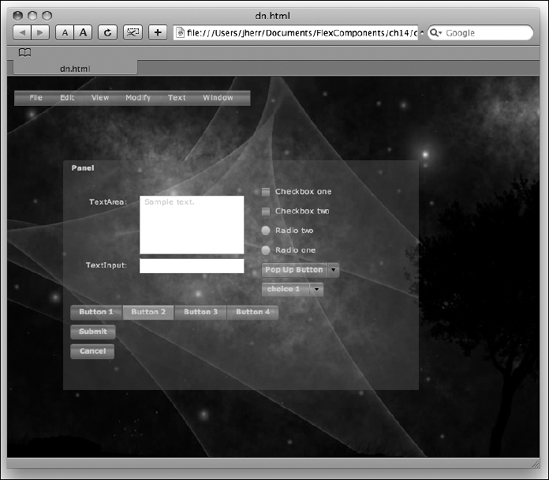
To try out these different skins, I'll use the same form (or pretty close to the same form) with all of the different skins.
This simple example form, which contains a window panel and several example controls, is shown here:
<?xml version="1.0" encoding="utf-8"?>
<mx:Application xmlns:mx="http://www.adobe.com/2006/mxml"
  layout="absolute" width="800" height="600">

<mx:MenuBar x="10" y="20" width="339">
<mx:dataProvider>
  <mx:String>File</mx:String>
  <mx:String>Edit</mx:String>
<mx:String>View</mx:String>
<mx:String>Modify</mx:String>
<mx:String>Text</mx:String>
<mx:String>Window</mx:String>
</mx:dataProvider>
</mx:MenuBar>
<mx:Panel id="panel1" x="80" y="120" width="510" height="330"
layout="vertical" title="Panel" paddingTop="30" paddingLeft="10">
<mx:HBox paddingBottom="5" paddingLeft="5" paddingRight="5"
paddingTop="5">
<mx:Form>
<mx:FormItem label="TextArea:">
<mx:TextArea height="84" width="150">
<mx:text><![CDATA[ Sample text. ]]></mx:text>
</mx:TextArea>
</mx:FormItem>
<mx:FormItem label="TextInput:">
<mx:TextInput width="150"/>
</mx:FormItem>
</mx:Form>
<mx:VBox>
<mx:CheckBox label="Checkbox one" />
<mx:CheckBox label="Checkbox two" />
<mx:RadioButton label="Radio two" groupName="radiogroup1" />
<mx:RadioButton label="Radio one" groupName="radiogroup1" />
<mx:PopUpButton label="Pop Up Button"/>
<mx:ComboBox>
<mx:dataProvider>
<mx:String>choice 1</mx:String>
<mx:String>choice 2</mx:String>
<mx:String>choice 3</mx:String>
<mx:String>choice 4</mx:String>
</mx:dataProvider>
</mx:ComboBox>
</mx:VBox>
</mx:HBox>
<mx:ToggleButtonBar selectedIndex="1">
<mx:dataProvider>
<mx:String>Button 1</mx:String>
<mx:String>Button 2</mx:String>
<mx:String>Button 3</mx:String>
<mx:String>Button 4</mx:String>
</mx:dataProvider>
</mx:ToggleButtonBar>
<mx:Button label="Submit" />
<mx:Button label="Cancel"/>
</mx:Panel>
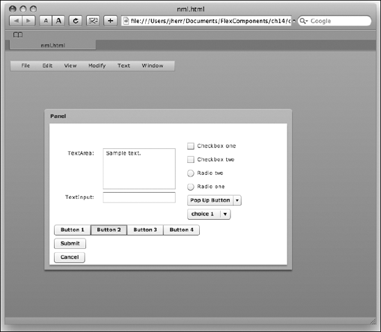
</mx:Application>When you bring this up from Flex Builder 3, you see something like Figure 14-1.
From here, we are going to apply the newly downloaded skin to the application to see just how it looks.
The first skin we are going to look at is the Blue Plastic Flex skin (http://fleksray.org/Flex_skin.html#Blue%20Plastic). As with all of the skins, we need to make some minor modifications to the application code to make the best use of the skin. This can be seen in the following application code:
<?xml version="1.0" encoding="utf-8"?>
<mx:Application xmlns:mx="http://www.adobe.com/2006/mxml"
  xmlns:ext="nl.wv.extenders.panel.*" horizontalScrollPolicy="off"
 verticalScrollPolicy="off"
  layout="absolute" width="864" height="554"
  backgroundImage="blueglass.jpg">
<mx:Style source="blue_plastic.css"/>

<ext:ReflectionManager id="reflection"  target="{panel1}"
  width="{this.panel1.width}"
  height="{(this.panel1.height / 100) * 50}" fadeFrom="0.35"
  fadeTo="0" blur="0.3"/>
...

<ext:SuperPanel id="panel1"
  x="80" y="120" width="510" height="330"
  showControls="true" enableResize="true"
  layout="vertical" title="Panel" paddingTop="30" paddingLeft="10">
...
</ext:SuperPanel>

</mx:Application>
The application tag now includes the blueglass.jpg background image. We have also included the blue_plastic.css file, which defines this skin. To wrap the whole thing, we've added a ReflectionManager tag that gives the whole application a reflection.
You can check out the result in Figure 14-2.
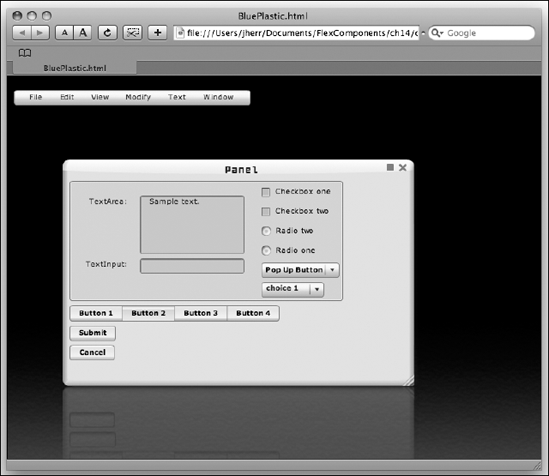
Personally I'm not all that happy with the soft look of the panel. But I really like the reflected image. The ReflectionManager that comes packaged with this skin could come in very handy.
To give a feel for what the CSS for a skin looks like, I've included some of the CSS code here:
TextArea {
  focusSkin: Embed(source="blue_plastic.swf", symbol="focus");
  borderSkin: Embed(source="blue_plastic.swf", symbol="layout one");
  paddingLeft: 8;
  paddingRight: 4;
}
AccordionHeader
{
  disabledSkin: Embed(source="blue_plastic.swf",
    symbol="Button_disabledSkin");
  downSkin: Embed(source="blue_plastic.swf", symbol="Button_downSkin");
  overSkin: Embed(source="blue_plastic.swf", symbol="Button_overSkin");
  selectedDisabledSkin: Embed(source="blue_plastic.swf",
  symbol="Button_disabledSkin");
  selectedDownSkin: Embed(source="blue_plastic.swf",
  symbol="Button_downSkin");
  selectedOverSkin: Embed(source="blue_plastic.swf",
  symbol="Button_overSkin");
  selectedUpSkin: Embed(source="blue_plastic.swf",
  symbol="Button_upSkin");
  upSkin: Embed(source="blue_plastic.swf", symbol="Button_upSkin");
  focusSkin: Embed(source="blue_plastic.swf", symbol="focus");
  fontFamily: franci;
  fontWeight: normal;
  fontSize: 12;
  fontAntiAliasType: advanced;
  fontSharpness: −100;
  fontgridFitType: subpixel;
}
Application
{
  backgroundImage: Embed(source="blue_plastic.swf",
  symbol="BackgroundImage");
}
As you can see, in this case most of the work for the skin is done with assets from the included blue_plastic.swf file, though some alterations are made with just some CSS basics, like the change of the font family, weight, size, and so on of the AccordionHeader control (as well as many others).
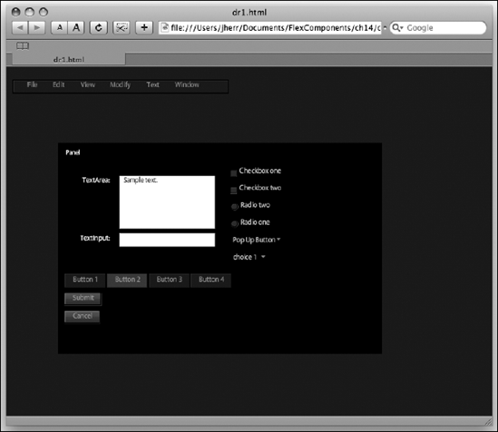
The Darke Nite skin (http://fleksray.org/Flex_skin.html#Darke%20Nite) has a kind of wondrous night feel to it. It's very easy to use, as you can see in the following application code:
<?xml version="1.0" encoding="utf-8"?>
<mx:Application xmlns:mx="http://www.adobe.com/2006/mxml"
   layout="absolute" width="1024" height="680"
   backgroundImage="dark_nite.jpg">

<mx:Style source="flex_skins.css"/>

...

</mx:Application>
All we need to do is set the background image and include the flex_skins.css file. You can see the result in Figure 14-3.
I really like this skin. It's easy to use, has a nice, consistent look, and doesn't change the control scheme too much. You could argue that it's too dark, but everything has its time and place.
In fact, you could go even a little darker with the Darkroom skin (http://www.scalenine.com/themes/darkroom/darkroom.html), which was inspired by Adobe's Darkroom imaging product. As with the Darke Nite skin, using the Dark Room skin is very easy, as shown in the following updated application code:
<?xml version="1.0" encoding="utf-8"?>
<mx:Application xmlns:mx="http://www.adobe.com/2006/mxml"
  layout="absolute" backgroundGradientColors="[#222222, #222222]">

<mx:Style source="style/darkroom.css"/>

...

</mx:Application>
The only modifications to the application were the change to the background gradient colors and the addition of the CSS source. The result can be seen in Figure 14-4.
Dark, stark, and very sleek. This is the kind of skin that you can use if you are looking for something avant-garde.
The Flekistral skin (http://fleksray.org/Flex_skin.html#Flekristal) has a decidedly more upbeat feel. The updated application to use this skin is shown here:
<?xml version="1.0" encoding="utf-8"?>
<mx:Application xmlns:mx="http://www.adobe.com/2006/mxml"
  layout="absolute" width="800" height="600"
  backgroundImage="backgrounds/palmleaf.jpg">

<mx:Style source="flekristal.css"/>

...

</mx:Application>
There are quite a few backgrounds packaged with this skin download. To start out, I picked the palmleaf.jpg background. The result is shown in Figure 14-5.
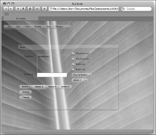
I certainly like the bevels on the buttons. That's very nice. Plus the use of a serif font for the text is a nice change from the ordinary.
The application shown next is another background for the Flekistral skin:
<?xml version="1.0" encoding="utf-8"?>
<mx:Application xmlns:mx="http://www.adobe.com/2006/mxml"
  layout="absolute" width="800" height="600"
  backgroundImage="backgrounds/space2.jpg">

<mx:Style source="flekristal.css"/>

...

</mx:Application>
This one is kind of spacey. It's shown in Figure 14-6.
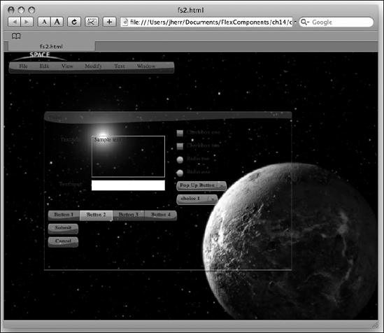
This might be a little too much, but it would probably be good for a kiosk of a space and science museum.
The Obsidian skin (http://www.scalenine.com/themes/obsidian/obsidian.html) is a very nice dark-themed design with some glossy button effects. Following is the application code to use this skin:
<?xml version="1.0" encoding="utf-8"?>
<mx:Application xmlns:mx="http://www.adobe.com/2006/mxml"
  layout="absolute" width="800" height="600">

<mx:Style source="obsidian.css"/>

...

</mx:Application>
All that we needed to do for this skin was to add the CSS file included with the download. The results can be seen in Figure 14-7.
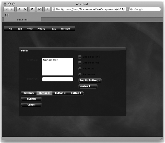
I really like the look of this skin. It's very clean. It's a little too dark in this example, but that could easily be cleaned up with a few well-placed applications of some white or light gray background.
The OS X skin (http://weblogs.macromedia.com/mc/archives/2006/05/mac_os_x-lookin.html) attempts to put a Mac OS X look and feel onto Flex applications. The updated application code to use this skin is shown here:
<?xml version="1.0" encoding="utf-8"?>
<mx:Application xmlns:mx=http://www.adobe.com/2006/mxml
  layout="absolute" width="800" height="600">

<mx:Style source="OSX.css"/>

...

</mx:Application>
As with some of the other skins, this one is very easy to use. You only need to add a reference to the CSS file. The result is shown in Figure 14-8.
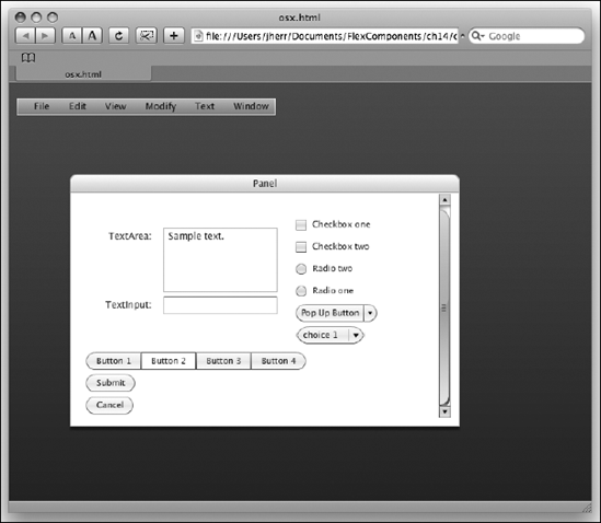
A few things need some cleanup, like the skin on the ComboBox that clips where the top of the button meets the bottom of the button.
The final skin I will show off is the Treasure Map skin (http://www.adobe.com/cfusion/exchange/index.cfm?event=extensionDetail&loc=en_us&extid=1268018) from the Flex Exchange graphics section. This one is a fancy skin that overhauls a lot of the interface with big fonts and updated panels. Following is the complete application code that demonstrates the Treasure Map skin:
<?xml version="1.0" encoding="utf-8"?>
<mx:Application xmlns:mx="http://www.adobe.com/2006/mxml"
  xmlns:ext="nl.wv.extenders.panel.*"
  layout="absolute" width="800" height="600">

<mx:Style source="treasuremap.css"/>

<ext:SuperPanel x="30" y="50" width="343" height="298"
  title="Controls" layout="absolute">
<mx:TextInput width="150" top="60" left="30" />
<mx:CheckBox label="Checkbox one" top="90" left="30" />
<mx:RadioButton label="Radio two" groupName="radiogroup1"
  top="150" left="30" />
<mx:Button label="Submit" top="210" left="30" />
</ext:SuperPanel>

</mx:Application>
In this case, the fonts and controls were just too big to show them all.
When we launch this application from Flex Builder 3, we see something like Figure 14-9.
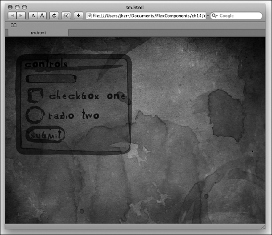
It may not be for every application, but it does show you just how far you can take the reskinning of the Flex controls.
There are lots of things you can do with Flex skinning. The Flex Builder 3 IDE makes it fairly easy to develop skins. And you can use these skins as starting points for developing new skins of your own. If you do develop a new skin and want to publicize it, I recommend using the ScaleNine site (http://scalenine.com). That site is the Flex developer's best resource for finding new skins to use.
In the next chapter, I discuss how to create your own Flex components.