
Chapter 2: Light, Shadow, and Color
Sharpen your awareness
PHOTOGRAPHERS ARE OBSERVERS. Their ability to analyze light conditions is one profound difference that sets them apart from snap shooters. By definition, a snapshot is a hurried shot fired with little aim or preparation. Snap shooters go willy-nilly into every photo situation without taking time to consider the all-important interplay of light and subject. They point the camera in the general direction of a subject, click off a shot, and move on. Unfortunately, their lack of attention to detail shows in the results. Their pictures usually feature confusing composition and harsh or indifferent light. It’s pure luck if one of their snapshots happens to turn out well.
Of course, everyone can use a little bit of luck, but it’s best not to rely on it for success. As the saying goes, “Luck favors the well-prepared.” That preparation includes sharpening your awareness of light and how it interacts with the subject. Being acutely sentient of your surroundings at all times is part of the photographer’s job description.
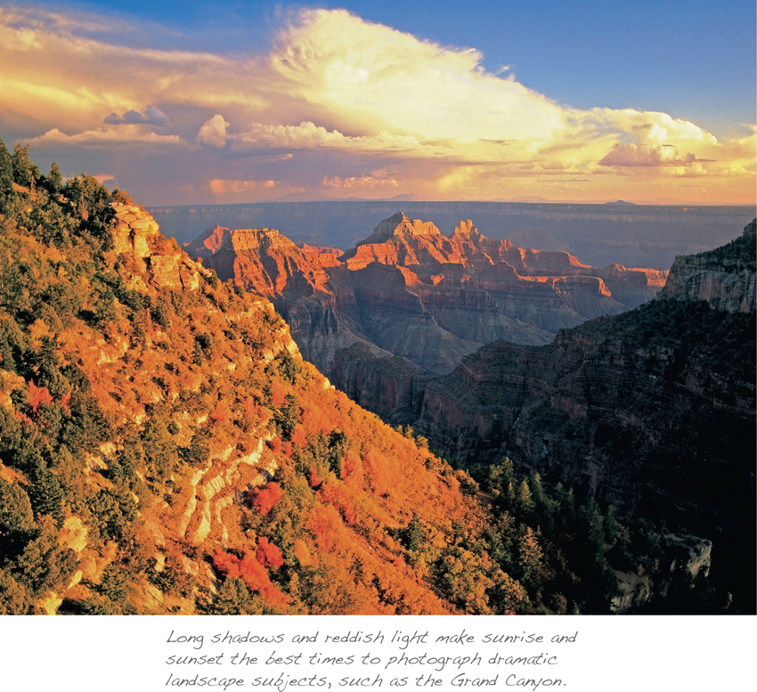
Because not much can be done to control the light outdoors, photographers strive to always put themselves in situations favorable to good lighting conditions. Usually, that means being on location during sunrise and sunset hours to take advantage of the low, warm tones of first and last light. It can be the most rewarding time of day. Photographers call it “prime” or “sweet” light, when the sun is only a few degrees above the horizon. At these times of the day, sunlight carries with it a lot of extra color that enhances everything it touches.
During morning’s first minutes after sunrise and evening’s last minutes before sunset, the sun’s light passes through more of the earth’s atmosphere than at any other time of day. The combination of airborne dust, pollution, and moisture acts like a giant diffuser to soften the sun’s light, filtering it toward the red or warm end of the spectrum. Because daytime activities and winds stir up a lot of extra particulates in the atmosphere, and they tend to settle during the calm of nighttime, sunset hues are usually warmer and more diffuse than the purer light at sunrise.
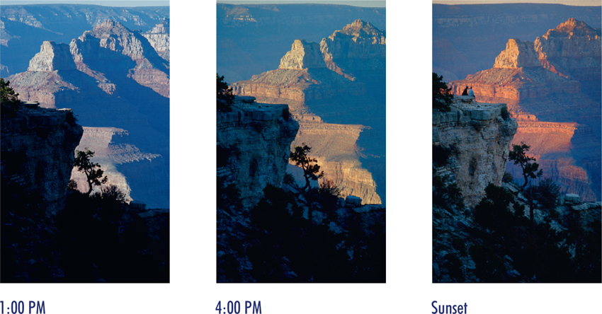
Morning and evening also provide the strongest directional light of the day, creating long shadows that add drama to a scene and make subjects appear more three-dimensional. Low cross light raking over the landscape at right angles accentuates the form and texture of everything in its path. With only a few minutes of prime light in which to work, you must move quickly to capture outdoor subjects while light conditions are optimal.
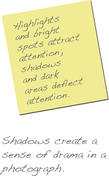
Light creates highlights and shadows of varying intensity all around us, and in a photograph they can become powerful controllers over the sequence of a viewer’s eye movement. We’ve already seen how bright spots can affect the flow of a composition by attracting attention. Shadows have the opposite effect, allowing the viewer’s eye to skip easily past darker areas of a composition where texture and detail are muted. They serve as an important ingredient in the recipe for control of eye movement. Highlights and shadows must be accounted for in the same way as any three-dimensional object in your composition.
Assignment: Awareness
You can train yourself to become a keen observer by developing your consciousness of light and shadow. A good exercise to hone your awareness is studying the light in images you see in magazines, books, and galleries. Consider the light’s source, direction, and intensity, and pay particular attention to the way photographers use the light’s best qualities to favor their subjects. When touring art exhibits, make it a point to look specifically at the quality of light that artists create in their paintings. As you go about your daily routine, take time to observe the different ways light and shadows play on common, everyday objects. Awareness and recognition of the quality of light around you should become second nature. Once it clicks in, you probably won’t be able to turn it off.
As discussed earlier, the photographic sequence normally begins by finding a subject, then watching and waiting for the light to reach peak enhancement before tripping the shutter. But photography doesn’t always have to be subject driven. Being cognizant of the way good light quality can flatter any subject is the best way to develop your awareness. The beauty of light can transform even the most ordinary objects, so sometimes it’s good practice to turn the equation around and let the light be your motivation. If dramatic light presents itself, seek out subjects that are elevated in stature by the flattering light conditions. It’s a great way to test your newly heightened awareness of light. When the prevailing light—not the subject—becomes your first consideration for making a photograph, you’ve got it figured out.
BEST LIGHT OF THE DAY
Working in the light that occurs early in the morning and late in the afternoon will have immediate positive impact on your photography. Rising early for the best light of the day costs you only a bit of sleep, but the benefits are worth the price. Sunlight is softened and warmed as it passes through long, dense swaths of the earth’s atmosphere. Low angles of the sun’s rays at sunrise and sunset also provide the strongest directional light of the day. Position your camera to take full advantage of the long rays raking across the landscape at right angles. Directional light accentuates a subject’s form and texture by casting highlights on one side and shadows on the other for a three-dimensional effect. But prime light is fleeting, so be prepared to make compositional decisions quickly. This is a time when familiarity with your equipment pays dividends.
Make the light work for you
Once you’ve determined the main subject as the starting point for a photograph, your next consideration is how to skillfully work the prevailing light conditions into your composition. Light is an integral part of the composition—as important as the subject itself—so make it a priority in your assessment of the scene. Start with a close inspection of your subject with the naked eye. Pay particular attention to how the prevailing light conditions play upon it.
Does the light complement the subject, or does it interfere with your ability to show off the subject’s best attributes? To give any subject the prominence it deserves and make it the focal point of the composition, the prevailing light should always favor your subject.
As implied earlier, the prime light of sunrise and sunset is often the best light of the day in terms of quality, color, and direction. But there are no absolutes regarding light. Optimal light varies with each situation and subject matter, and it’s up to the photographer to decide when the most appropriate light is striking the subject. You need not become an expert in the physics of light, but awareness is key in anticipating the optimal moment to trip the shutter.
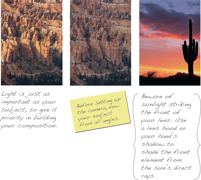
Your subject might be bathed in golden sunset light with dramatic highlights and shadows accentuating its form and texture; if overcast conditions prevail, soft, flat light will be evenly spread over the subject’s surface with no apparent shadows; or it may be backlit, appearing as a shadowy silhouette. The lighting possibilities are endless, and you must decide which lighting best portrays your subject. If possible, take a 360-degree walk around the subject, viewing it from all angles. This helps you find the precise spot that makes best use of the prevailing light on your subject, and it’s the best camera position from which to start building your composition.
The way your subject is illuminated plays a huge role in the narrative presented in your photographs. Light sets a tone and creates a mood. If your aim is to inform the viewer about your subject, strong directional light that reveals all its detail is best suited to the task. If the story is one of mystery, light and shadow effects that obscure the subject will leave more to the imagination. Light holds the power to elevate a subject, express a mood, and affect the way people respond to your photographs, so be certain it is consistent with the narrative.
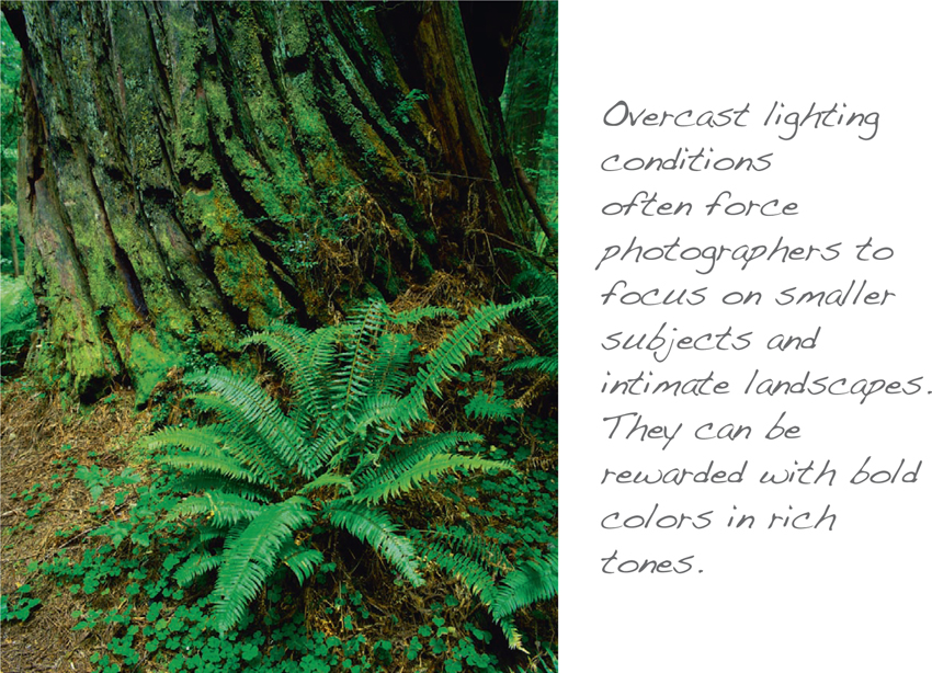
Of course, nature does not always present beautiful prime light. Clouds and weather can get in the way. Overcast, hazy, or foggy conditions will soften and diffuse the light, robbing your surroundings of shadows. But good photographers adapt. On dull, overcast days, point your camera down toward intimate landscapes or close-up subjects that benefit from soft, even light. When a storm moves in, turn the camera skyward to take advantage of the dramatic play of light unfolding above the landscape.
We’ve looked at the positive effects of working in prime light. Now, let’s examine the creative use of other types of light.
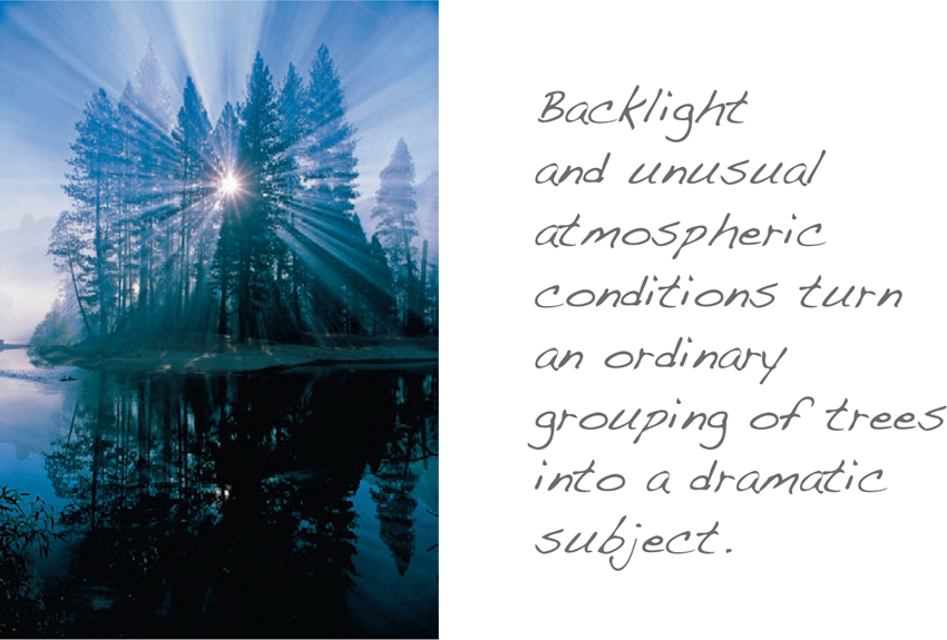
Backlight
Budding photographers learn from the start that front-lighting their subjects usually rewards them with safe and satisfactory exposures. The problem is, it’s not very creative, and it tends to flatten the subject, voiding any textural interest. Safe and satisfactory is just not good enough—we want the “wow” factor. One way of defeating the hardness of direct sunlight is to backlight the subject.
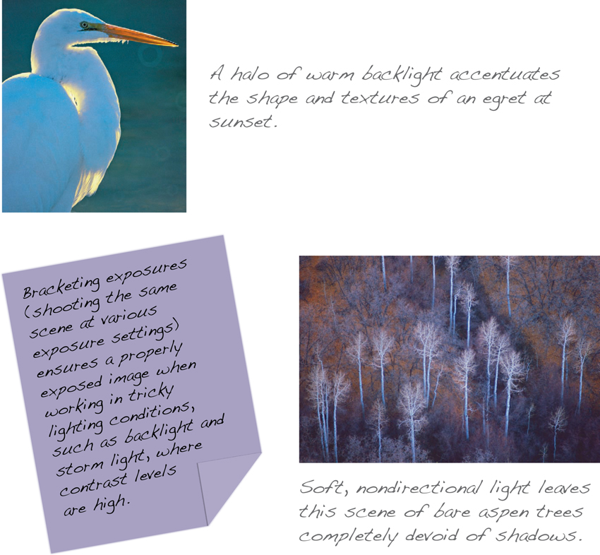
Light coming from behind the subject can help to create more interesting visual and graphic effects. Backlighting produces strong separation between subject and background by creating a rim of light or “halo” effect around the subject. Use this type of lighting to emphasize the shapes of subjects. Backlight also is best for capturing the translucent quality of flower petals and foliage, such as colorful autumn leaves. And backlight can be used to silhouette a subject, producing images with strong graphic qualities.
When utilizing backlight, beware of sunlight striking the front of the lens. Use a lens hood or the shadow from your hand to shield the front element of the lens from direct rays of the sun.
This prevents unwanted haze and lens flare in the photograph.
Because backlighting can trick the camera light meter’s exposure settings, it’s a good idea to bracket exposures to ensure properly exposed highlights and shadows. Exposure compensation settings also allow you to override the meter and lighten or darken the scene to suit your vision. And another way to achieve just the right amount of shadow detail on a backlit subject calls for the use of flash or a small solar reflector focusing light on the front of it. If a silhouette effect is desirable, no shadow detail is necessary.
Soft light
Overcast conditions provide soft, diffused light that spreads evenly over the landscape with no discernable direction. Without strong highlights and shadows, it’s nearly impossible to construct a dramatic composition. An overcast sky doesn’t necessarily mean that you have to put away your camera for the day, but it does force you to adjust your photographic strategy. These are good times to focus attention on smaller subjects or work on close-up or macro techniques.
Soft light is usually nondirectional, making it acceptable for portraits and other situations where “contrasty” light is not aesthetically pleasing or complementary to the subject. Photographing under soft lighting conditions often enriches subtle hues and emboldens primary colors.
But beware of heavy overcast or dark clouds where minimal light will mute the colors and soften the details of your subjects. Under these circumstances, it may be better to wait it out, giving the clouds a chance to clear.
Storm light
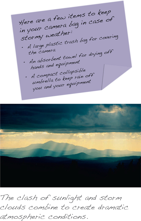
The lighting condition that excites many nature and outdoor photographers the most is storm light. Photographers are weather watchers who keep up with the latest forecasts and storm reports. They know that weather creates unique moods and dramatic conditions. They relish the buildup and break of a storm and scoff at the hazards to capture awe-inspiring images of weather’s spectacular fury and theatrical light. For them, there is no such thing as bad weather.
STORM WARNING!
One strong word of warning about working in stormy conditions, and this cannot be overemphasized: Lightning is unpredictable and must be treated with the utmost respect. Always seek safe shelter immediately when lightning storms approach. A ramada or other roofed enclosure won’t provide safe haven from lightning if it’s not properly grounded. It’s far better to miss a great shot than to suffer the tragic effects of a lightning strike.
When the leading and trailing edges of a brooding storm clash with the sun, the light display can be magical. Most modern photographic equipment can tolerate brief exposure to moisture, but be sure to pack a towel, a large plastic bag, and a collapsible umbrella in your photo bag in case you and your camera gear need protection from a determined downpour. Once the storm has arrived and weather is socked in with diminished light and rainy or snowy conditions, photography can be futile. Most photographers pack up and stay warm and dry until the storm breaks and the trailing edge arrives, when it’s time again to turn their eyes skyward.
Exposures can be tricky when bright shafts of sunlight pierce through dark storm clouds. The contrast level between highlights and shadows makes it difficult to get a pleasing exposure. In these cases, you can accurately capture the brightest high-lights by simply underexposing the scene by two stops to get saturated color and rich black clouds. Again, bracketing your exposures ensures that you will get the best saturation level and gives you more options when editing later.
Midday light
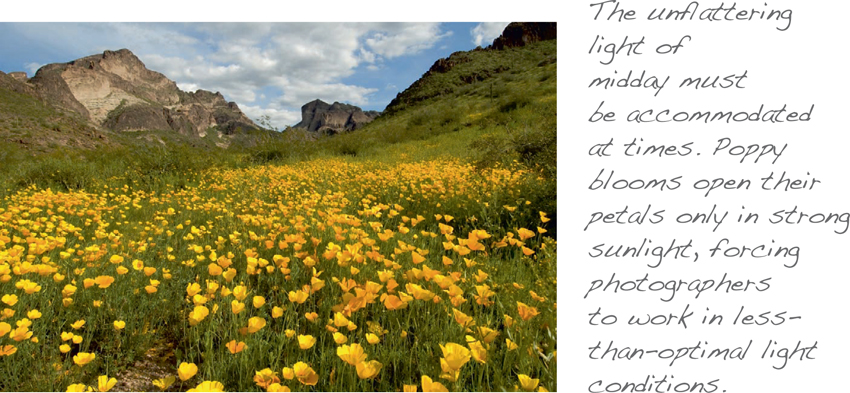
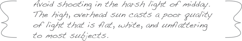
Unfortunately, we can’t always be in the right place at the right time to capture the prime light. Travel itineraries and other factors occasionally force us to work in less than optimal lighting conditions. Typically, the high, overhead sun of midday is the worst light of the day. The flat, pure-white light at high noon is harsh and “contrasty,” washing out colors and robbing your subjects of their three-dimensional qualities. As we’ve seen, it’s the added color in light that enhances any object. When that color is not present, it’s tough to make good images.
Typically, photographers spend middays eating lunch, napping, or scouting locations for their sunset shoot. But if your only opportunity to photograph the Grand Canyon presents itself at lunchtime, you’ll have to make the most of a bad lighting situation. It’s challenging, if not impossible, to make good photographs under such conditions. Adding a warming polarizing filter on your lens can improve the situation to a small degree. It will reduce some of the bright reflections and enrich the colors of your subjects a bit. If given no other options, look for the boldest shadows you can find and try to emphasize them in your composition. Remember, shadows add drama and dimension.
Avoid midday light when photographing people. It is most unflattering for portraits, as it casts deep, ugly shadows around the eye sockets and under the nose and chin. If your portrait can’t wait until the sun gets lower, move to a place with open shade. Another alternative is use of a flash attachment or reflector to soften the offending facial shadows.
Assignment: Experiment
A photographer’s education is a lifelong work in progress. As with any craft, we must pay our dues and learn by doing. The late, great photojournalist Henri Cartier-Bresson famously said, “Your first ten thousand photographs are your worst.”
By no means are all photographs intended to be “art.” Many have been shot purely for the purpose of experimentation, just as fine artists have drawn study sketches before painting a grand masterpiece. It’s the best way to figure out what works and what needs work. Learning from mistakes helps you refine your approach, and you’ll be better equipped to handle similar situations when they arise in the future.
One of digital photography’s greatest advantages is economic. You can shoot as many experimental shots as you like without having to pay extra for every exposure, as we did back in the days of film. Experimentation costs nothing but time, so don’t be shy about trying something new or different simply as a deliberate exercise for your own edification. Learning the nuances of light and how it affects the overall presentation in a photograph is part of your ongoing education. The only way to learn how light reacts in various situations is to get out and shoot, and then evaluate your results.
Many people use the small LCD display on the back of the camera to evaluate and edit their images. Don’t join them. The small screen is fine for a quick check of basic compositional elements, but don’t use the LCD to make critical decisions. It’s best to view your images on a calibrated computer monitor where you can scrutinize them in detail at a larger size. Sometimes a composition that seems so perfect on location doesn’t look that good when we get back home and view it again with a critical eye. But the upside of experimentation is unlimited. It familiarizes you with the steps of the process, corrects mistakes, and speeds you through your first ten thousand photographs.
What is color?
A brief primer in the properties of color will help you understand its effects on composition, although it’s pointless to try to apply any rules here. You don’t always get to choose the colors you work with in a photograph, so it’s ultimately up to you and your own color sensibilities to incorporate them in ways that you deem appropriate under the circumstances. But color is a vitally important element in photography, so a little background on the inherent characteristics of certain colors is beneficial.
Color is its own justification. It not only makes the photograph better, but at times it makes the photograph. It has the curious power to make viewers identify with a scene, even if they’ve never been there before. And color can induce the same emotional response in many people. The purple in a photograph of a sunset will make almost everyone think of a particular, spectacular sunset they once saw, even though it was quite a different purple and in quite another place.
There has been a tremendous amount of research on the many ways color affects humans. Color’s psychological effects are hard to measure, but each of us has color preferences that affect our moods. Some studies suggest that men and women respond to colors differently. Personal reactions aside, some human emotions seem to be generally assigned to certain colors. They can evoke feelings of strength, melancholy, arousal, or joy.
Reactions to some colors also can be influenced by cultural values or regional tastes. For instance, green is regarded as potent and robust in arid countries; white is more highly regarded in Asia than the West; and yellow has an unusually high value in Thailand, more than anywhere else. But human beings seem to be very much alike when it comes to our perceptions and responses to other colors. Gray is typically regarded as weak, whereas red is almost universally seen as active and powerful. Have you ever heard a man’s red necktie referred to as a “power tie?” Blue is accepted as a soothing color by almost everyone around the globe. Those perceptions definitely affect the way we respond to colors in a photograph or painting.
GLOSSARY OF COLOR TERMS
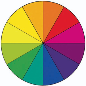
Analogous colors – Colors next to each other on the color wheel. Also referred to as harmonious colors.
Complementary colors – Colors opposite each other on the color wheel. Also referred to as contrasting colors.
Value or tone – Brightness or darkness of a color.
Color relationship – The way colors affect each other in a scene.
Hue – The quality that distinguishes one color from another.
Intensity – Saturation level of a color.
Monochromatic color – Predomination of one color in a photograph with variations only in the values of that color.
Cool color – Includes greens, blues, and violets.
Warm color – Includes yellows, oranges, and reds.
In a sense, color and photography were meant for each other. The vivid red of a cactus blossom and the bright yellow of an aspen leaf owe their richness to the absorption and reflection of light. At its most basic level, photography is the gathering of light in a scene that is then assigned to the pixels of a digital file. Every light source, be it the sun, a fluorescent tube, or a campfire, casts its own color bias on the surrounding area, affecting the apparent color of everything it illuminates. So the answer to the question “What is color?” lies in the nature of light itself.
The most spectacular evidence of the existence of color in light is a rainbow—that spectrum of colors separated by the refraction of sunlight through raindrops. The addition, subtraction, and mixing of the rainbow’s three primary colors (red, green, and blue) creates the entire color palette of light in seemingly unlimited permutations.
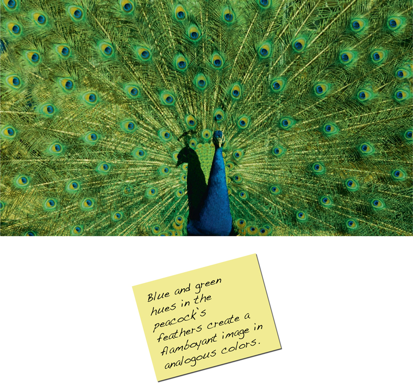
Analogous versus complementary color
Contrast in black-and-white photography simply refers to the relative difference between the highlights and shadows in a scene. But in color photography, while light and shadow remain important, the relationship and intensity of colors become integral elements of composition.
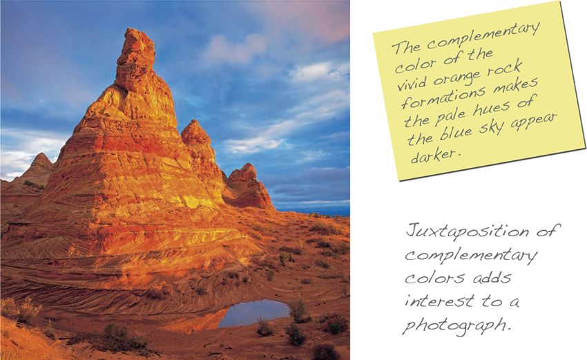
It’s difficult to generalize about the merits of a particular color scheme. There are, however, objective characteristics of analogous colors versus those of complementary colors. Analogous colors are close to each other in value, intensity, and hue and often are referred to as harmonious. Complementary colors, on the other hand, are in sharp contrast with each other by exhibiting wider-ranging color value, intensity, and hue. Juxtaposing complementary colors creates a clashing vibrancy that differs markedly from the more placid, harmonic appearance of analogous colors.
Complementary colors are those directly opposite one another on the color wheel. When placed side by side, complementary colors intensify each other, making the colors seem more vibrant. Reddish and yellowish hues are often described as warm, suggesting an association with candles, lanterns, and fires. Bluish and greenish hues are considered cool, reminiscent of overcast days and verdant forests.
Warm/cool combinations can add another level of interest to any composition. Research shows that when asked to judge the pleasantness of pairs of colors, people overwhelmingly prefer the commingling of complementary colors. And we have a marked preference for color pairings with the widest contrast differences between them in value and intensity. Although the primary colors of red and green clearly complement each other, they don’t exhibit the sharp contrast of blue against yellow. The balancing of bold complementary colors in a photograph can shake up our expectations and achieve striking effects.
Quite a different mood can be established just as easily by incorporating only analogous colors. Colors that are in harmony with each other are grouped closely together on the color wheel and use only a small portion of the color palette, usually consisting of two colors in unsaturated hues. In the absence of aggressive color, however, it is easier to appreciate fine subtleties between similar hues. Compositions that contain only analogous greens, blues, and purples will have a soothing effect, whereas photographs containing harmonic reds, yellows, and oranges can be energizing.
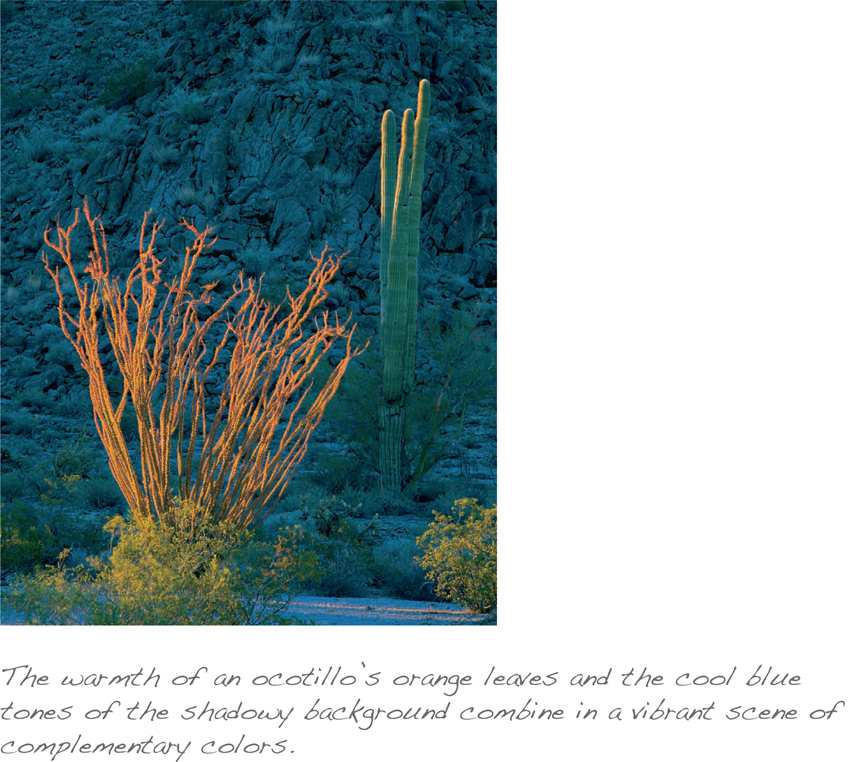
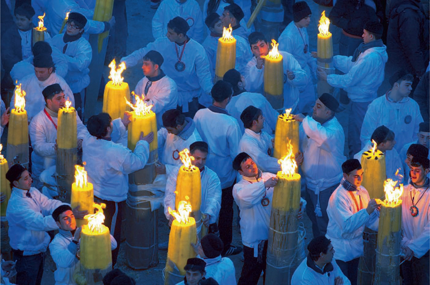
Complementary Colors
The contrast of complementary colors sets up this dramatic street scene of acolytes lighting candles at the Feast of St. Agatha in Sicily. In the gloaming of twilight, there was no direct sunlight on the subjects. The scene is colored only by the bluish cast of light being reflected off the dome of the sky. The acolytes’ pure white surplices took on the color of the prevailing light to create a cool background color contrasted against the warmth of candlelight. The tranquility of soft blue is balanced with the aggressiveness of bright yellow.
Color context
The perception of color in a photograph often depends on its context. An object’s color properties will be influenced by its relationships with neighboring colors, and our judgment of hue may be altered by the juxtaposition of certain colors. For instance, a pale color may seem darker in a scene dominated by lighter colors or a vivid color may make the color next to it appear complementary even if it’s not. A saturated red will induce a blue-green tint in neighboring colors, for example.
Color need not monopolize a scene to gain attention. Often, the vitality of color depends more on placement than size. Some of the most striking color photographs can turn a small spot of intense color into the focal point of the composition simply by surrounding it in gently harmonious hues.
Most colors look their brightest against a neutral background.
This is particularly true of reds and yellows when played against grays and tans, often giving a three-dimensional effect and turning a drab scene into a splash of color. When sunlight picks out a bright color against a dark, shadowy area, the effect can be doubly dramatic.
Incorporate these color fundamentals in your photographs, but be aware of the effects they have on other elements in your compositions. Adding more color isn’t necessarily better. A yellow object may pull attention too strongly or have a jarring influence on an otherwise harmonious scene. In a completely different setting, that same yellow object may be just the focal point your composition needs. Being keenly aware of color’s potential impact on a composition will help you utilize it to its best advantage or avoid it completely, if appropriate.
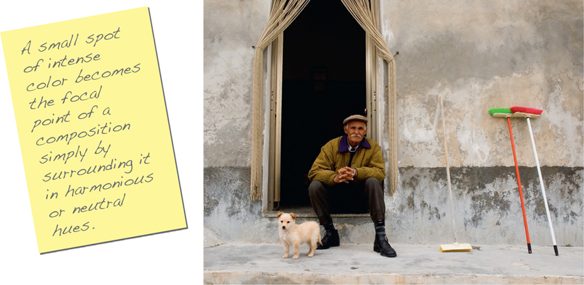
Splash of Color
The primary colors of the two brooms on the right side of this scene come as a complete surprise, almost glowing out of the otherwise monochromatic surroundings. With only neutral hues of gray, tan, and brown to compete for attention, the relatively small brooms become a focal point in the composition and a counterpoint to the man and his dog.
Assignment: Color
With all the vivid colors in our world, the human brain seeks the balance of mid-gray. Each complementary pair of colors combines to make gray. Because we’ve learned that red and green are complementary, try staring at a red apple for about 15 seconds, and then quickly shift your eyes to a blank sheet of white paper. For a brief instant, your eyes see the image of a green apple because your brain, while staring at the red apple, automatically supplied the green to restore the mid-gray balance. For another color exercise, pick a favorite color and spend a day photographing this color everywhere you encounter it. Look for your color’s complementary and analogous colors to pair with it. Experiment with the concepts of dominance, balance, and proportion to see how your color reacts in different situations. The more you understand about the properties of color, the better equipped you’ll be to artfully incorporate it into your images.