

A very innovative feature to Blend and Silverlight 4 is SketchFlow prototyping. There are three major goals of SketchFlow prototyping:
Quickly experimenting with a dynamic UI
Communicating design intent
Delivering compelling proposals to clients quickly and cost-effectively
SketchFlow prototyping is a way for you to create an interactive version of an application that is meant to demonstrate the intended interaction, design intent, and screenflow. This SketchFlow prototype can then be delivered to the client for immediate feedback that can be integrated directly into the prototype and seen by the developer. This prototype can be made very quickly and easily in Blend 4 and thus is cost-effective. This prototype is then used by the designers and developers as a roadmap for the application. Further, assets and/or functionality created in the prototype can be used in the actual application. To better illustrate what SketchFlow prototyping is, I lead you through an exercise that will show you how to build an application prototype. With that, let's fire up Blend 4 and create a new SketchFlow prototype for a web application for a shopping web site.
Open Blend.
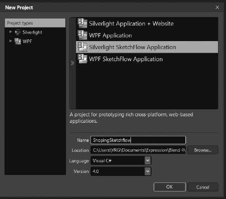
Click File

Select Silverlight SketchFlow Application.
Name the project
ShoppingSketchflow, as I have done in Figure 16-1.
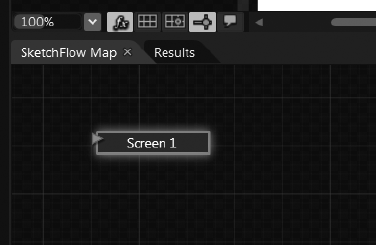
Notice at the bottom of Blend next to the Results panel you see a new panel called SketchFlow Map (see Figure 16-2). If you don't see this panel, you can click Window
Double-click the
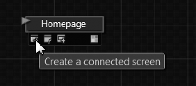
Screen1tile in the SketchFlow Map and rename itHomepage. You will see thatScreen1will be renamed in your Project panel as well.Hold your mouse cursor over
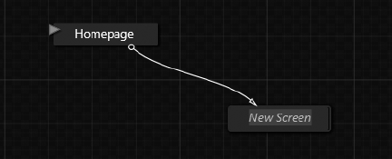
Homepagein SketchFlow Map until you see a drawer slide out. When it does, place your mouse cursor over the farthest left icon. This icon is the "Create a connected screen" icon shown in Figure 16-3. Click and drag this to create a new Screen connected to theHomepage.Once you create a new Screen (see Figure 16-4), you can name it
ShopForBooks.Repeat this and name the new Screen
ShopForMusic.Repeat this and name the new Screen
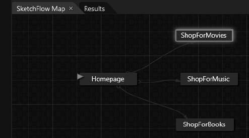
ShopForMoviesso that your SketchFlow Map looks like what I have in Figure 16-5.Now draw a new Screen from
ShopForMoviescalledCheckOut.Hold your mouse over
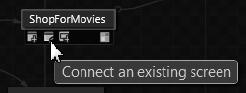
ShopForMusicuntil the drawer slides out and place your mouse cursor over the icon that is second from the left. This is the "Connect an existing screen" icon shown in Figure 16-6. Drag this to theCheckoutScreen so that it too is now connected toCheckout.Repeat the last step so that
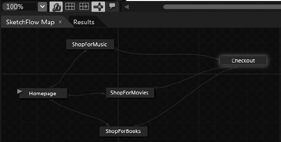
ShopForBooks, ShopForMovies, andShopForMusicare all connected toCheckout, as in Figure 16-7.
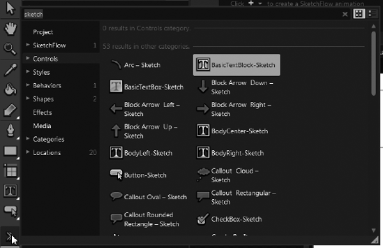
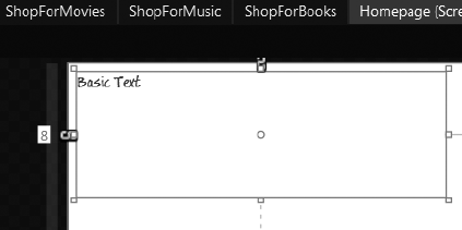
Now that we have the structure of the SketchFlow down, it is time to start adding some visuals. SketchFlow applications are meant to be design-less, but we still need something to convey the idea of what the final application will do. For this reason, we keep our visuals very simple and without final design. We are going to start off with a TextBlock on each page saying what that page is. We are going to use a BasicTextBlock-Sketch Style for our TextBlock. Double-click the Homepage Screen to start editing it and you can then click the Asset Library and type Sketch to find the BasicTextBlock-Sketch Style, as I am doing in Figure 16-8.
With this new Style selected, draw a
TextBlockout on theHomepageScreen, as I have done in Figure 16-9.Change the Text to read Welcome.
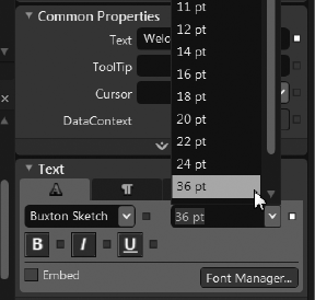
With the
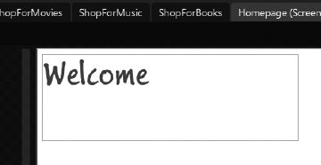
TextBlockstill selected, go to the Text bucket of the Properties panel and change the font size to 36, as I am doing in Figure 16-10.You should now have something like I have in Figure 16-11.
Now with the
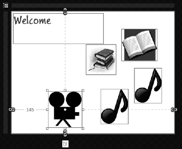
TextBlockstill selected press Control+C to copy it and paste in aTextBlockfor each page and change the text to the corresponding page. For example, theShopForBooks TextBlockshould read Shop for Books, and so on.Now go to the
Homepageand add suitable images (I found mine on the internet) for a book, a musical note, and a movie camera to give the idea that theHomepagewill have visual indicators of what can be found inside this site. You can see myhomepagein Figure 16-12.Note
You can easily right-click an image in your web browser and left-click copy and switch over to Blend and hit Control+V to paste that image right onto the artboard.
Note
To find images like I have in Figure 16-11, Google movie camera and then click the Images link. This lets you to find a large variety of different iconography to use in your SketchFlow application. Remember that this is just a mock-up, so none of the art will be final.
Now Copy and paste the movie camera in the
ShopForMoviesScreen.Copy and paste the musical note image into the
ShopForMusicscreen.Copy and paste the books image into the
ShopForBooksscreen.
Now that you have set up the visuals for all of your Screens, you can move on and make a navigation Component Screen.
Now that we have all the Screens set up, and they all have some visuals, we need a way for users of your SketchFlow application to get from one Screen to the next. We can do this quickly and easily by adding a Component Screen. Let's do that now.
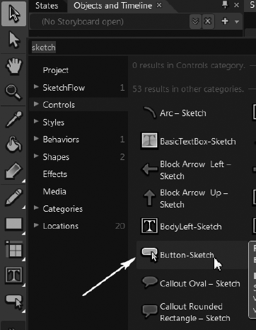
Click the Asset Library and type Sketch again (if it's not still there from the last time) and locate the
Button-Sketch, as I am doing in Figure 16-13.On the
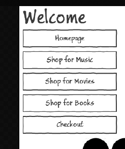
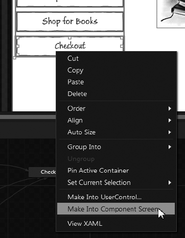
Homepagedraw aButtonfor each page and label it, as I have done in Figure 16-14.Hold down Control and click each of the
Buttons so they are all selected.Right-click and left-click Make Into Component Screen, as I am doing in Figure 16-15.
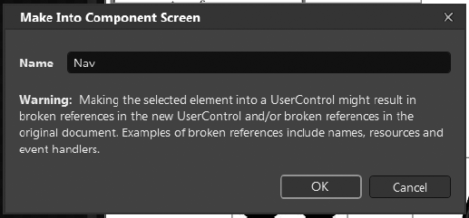
When the Make Into Component Screen dialog box appears, name it
Navand click OK, as I am doing in Figure 16-16.When Blend creates the
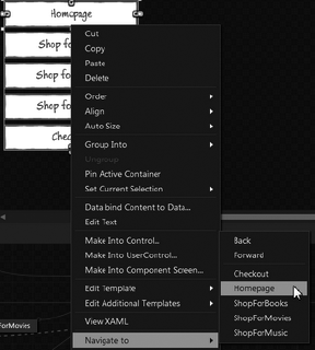
NavComponent Screen for you, right-clickHomepageand click Navigate ToRepeat this for each button—for example, the
ShopForMusic Buttonshould navigate to theShopForMusicScreen, and so on.
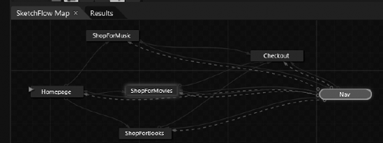
If you look at your Navigation Map you will see there is now a green tile for Nav. It is green to represent the fact that it is a Component Screen and not a regular screen, which is blue. You can see that the Component Screen has blue arrows, meaning that you can get to any of the Screens from the Component Screen—but notice that only one screen, the Homepage Screen, has a green line coming from the Component Screen. This is because all the other Screens don't have the Nav Component Screen on them. We need to change this now:
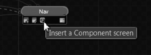
Hold your mouse cursor over the Nav Component Screen until its drawer slides out and place ther cursor over the third icon from the left (shown in Figure 16-18). This is the "Insert a Component screen" icon. Click and draw a connection to each of the existing screens (except the Homepage Screen, which is already connected).
Your SketchFlow Map should now look like what I have in Figure 16-19.
If you look at each of the pages you will see they do in fact have the Nav Component Screen on them. They need to be positioned so that they are directly under the TextBlock for the page. Adjust each page's Nav Component Screen now. Once you have done that, press F5 to compile and run the application and use the navigation Component Screen to move around the different pages. Pretty cool!
We now have the start of an interactive SketchFlow application. Next we need to add some content to one of the pages. I figure we will start with the ShopForMusic page. On this page we are going to add a mock-up song that shoppers can purchase. When they do purchase the song, we are going to use the Visual State Manager to show a dialog box that thanks the shopper for purchasing the song. They then have the option of going to the Checkout page or to continue shopping. Let's add that functionality now:
Go to the
ShopForMusicpage by double-clicking it in the SketchFlow Map.Add another note image (I found mine on the Internet).
Add some Sketch
TextBlocksfor a fake song and a fake artist.Add a fake price
TextBlock.Add a Sketch
Buttonthat reads Buy Now, as I have done in Figure 16-20.Next draw a
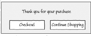
Rectangleout for what is to be the background for the dialog box.Add text that thanks the shopper for the purchase and a couple of
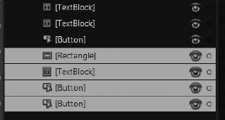
Buttons that give them the option to continue shopping or to check out, as I have done in Figure 16-21.Press and hold Control and click all the elements that make up the fake dialog box in the Objects and Timeline panel, as I have done in Figure 16-22.
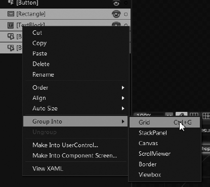
Next right-click the objects in the Objects and Timeline panel and left-click Group Into
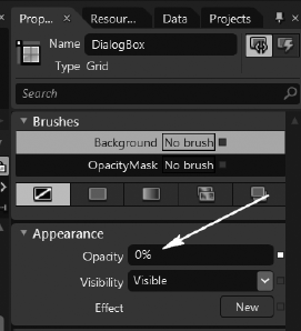
With the
DialogBoxGrid still selected, change the Opacity to 0% in the Appearance bucket of the Properties panel, as I have done in Figure 16-24. Then in the Common Properties bucket uncheckIsHitTestVisible. This will make the dialog box invisible and not able to be clicked. This is the default state of the dialog box.Note
In addition to giving the
DialogBoxGrid an Opacity of 0% we also set itsIsHitTestVisibleproperty to false. We do this so that when theDialogBoxis not showing it doesn't interfere with other objects in the application.

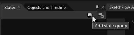
Now that the fake dialog box is no longer visible or hittest visible, we can go ahead and add the Visual State Group to make it visible and able to be clicked when the user clicks the Buy Now Button; this is common functionality in many shopping applications.
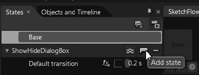
In the States panel click the "Add state group" button, as I am doing in Figure 16-25.
Name the new Visual State Group
ShowHideDialogBoxand give it a default transition time of 0.2 seconds.Click the "Add state" icon, as I am doing in Figure 16-26.
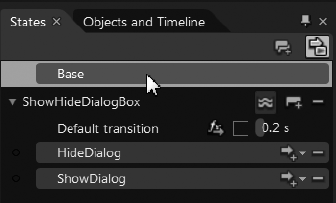
Name the new State
HideDialog.Add another State called
ShowDialog.Set the Opacity on the
DialogBoxGrid to 100% in the Appearance bucket of the Properties panel and check theIsHitTestVisibleproperty in the Common Properties bucket. This will allow theDialogBoxto be clicked once again.Click on the Base State so that you are no longer recording any Visual States, as I have done in Figure 16-27.
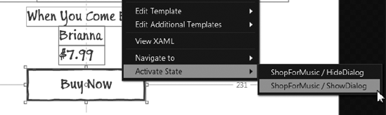
Now we have the Visual States we need to actually hook them up to do something. Specifically, we want the Buy Now buttons to activate the ShowDialog state so that the DialogBox will appear and be able to be clicked.
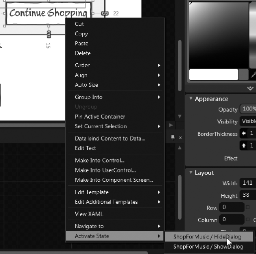
Right-click the Buy Now
Buttonand left-click Activate StateChange the Opacity of the
DialogBoxGrid to 100% so we can see it to work on it. We will change its default state back to 0% Opacity before we run the application.
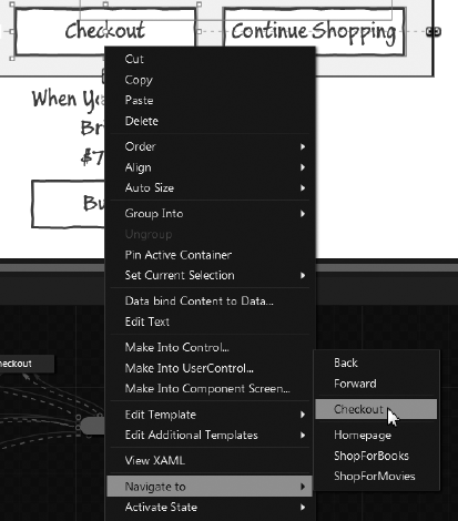
At this point we have the DialogBox Grid appearing when we click the Buy Now Button. We also need to make the DialogBox disappear when the user clicks the Continue Shopping Button in the DialogBox or navigate to the Checkout Screen if the user clicks the Checkout Button also contained in the DialogBox Grid. Let's do that now!
Right-click the Checkout
Buttonand left-click on Navigate toRight-click the Continue Shopping
Buttonand left-click on Activate StateChange the
DialogBoxGrid Opacity back to 0%.
Now press F5 to run the application and navigate to the Shop for Music page and click the Buy Now Button. Notice how your dialog box appears. If you click Continue Shopping it will just disappear but if you click Checkout it will actually navigate to the Checkout Screen. Pretty cool, huh? So, now you have an interactive SketchFlow application that has different screens and even a partially functional Shop for Music Screen. I challenge you to go ahead and add a fake Movie to the Shop for Movies page, and a fake Book to the Shop for Books page. And then add an interactive dialog box like we added to the Shop for Music Screen.
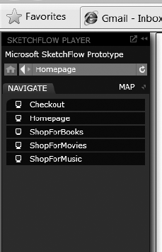
The SketchFlow Player shown in Figure 16-31 is what the users see when they run your SketchFlow application. It is here that they can navigate the different Screens. They can also make annotations to give you, the developer, feedback on the application. To show you better, let's add some annotations that we can then load up and view as the developer.
Press F5 to run the application.
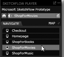
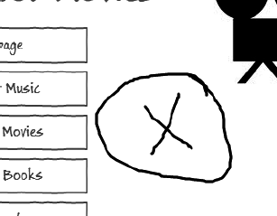
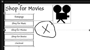
Click the
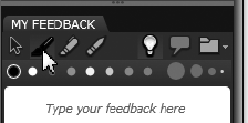
ShopForMoviesScreen, as I am doing in Figure 16-32.Click the Enable Ink Feedback icon, as I am doing in Figure 16-33.
Draw a circle with an X, as I have done in Figure 16-34.
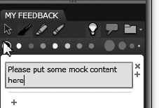
Click the feedback area and type a message to the developer, as I have done in Figure 16-35.
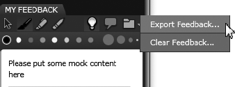
Click the Feedback Options icon and click Export Feedback, as I am doing in Figure 16-36.
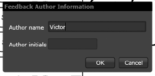
Enter your name in the Feedback Author Information dialog box, as I have done in Figure 16-37 and click OK.
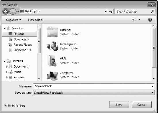
Give the Feedback a name of
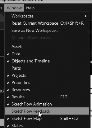
MyFeedBack, as I have done in Figure 16-38, and click OK.Switch back to Blend and click Window
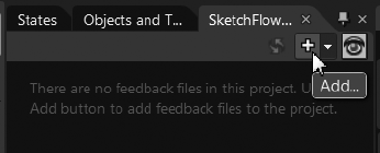
When the SketchFlow Feedback panel appears, click the Add Feedback icon, as I am doing in Figure 16-40.
You can then see the Feedback that you entered when you were viewing the site in the browser (see Figure 16-41).
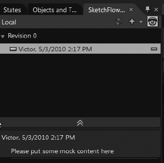
Moreover, the developer can see the ink revisions made by the client (see Figure 16-42).
As you can see, this is a feature that will quickly help the client and the developer communicate changes that should be made to the SketchFlow application.
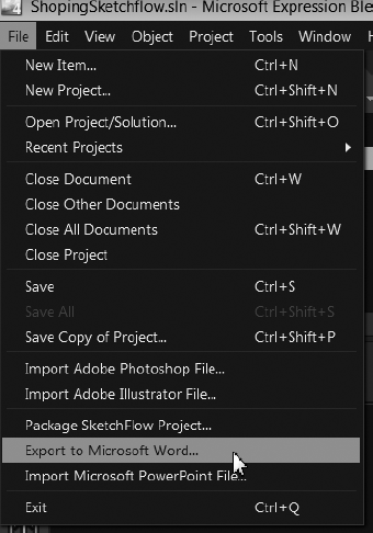
Once your SketchFlow is complete, and all the Screens are signed off on, then it is time to build the real application. SketchFlow has a very handy feature whereby you can create a document that will serve as the development guide to the team that is going to build the real application. Let's go ahead and create the documentation for our SketchFlow application.
Go to File
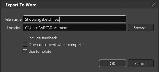
When the Export to Word dialog box appears, check "Include feedback" and "Open document when complete," as I have done in Figure 16-44, and click OK.
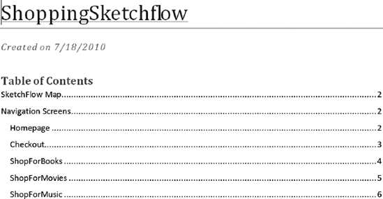
When the Word document opens (see Figure 16-45) you will see that there is a very thorough document that tells you about all of the different Screens, the Visual States, a SketchFlow Map, and even the Feedback we entered earlier. This is not exactly as complete as a wireframe document that is given to developers before they are about to build a piece of software, but it is an amazingly wonderful start.
My project can be found on the download page on the Friends of ED web site, and here: http://windowspresentationfoundation.com/Blend4Book/ShopingSketchflow.zip
My SketchFlow Word document, from Figure 16-45, can be found here: http://windowspresentationfoundation.com/Blend4Book/ShopingSketchflow.doc. To watch a video tutorial on how to create a Sketchflow Prototype application navigate to: http://www.windowspresentationfoundation.com/?p=116.
In this chapter you learned about SketchFlow Prototyping and why it is used. You then made your own SketchFlow application complete with different Screens, a Component Screen, and even a Visual State Group to show and hide a fake dialog box. You then learned how easy it is to give feedback as a client and then load that feedback right into Blend as a developer. Finally, you learned how to easily create a Word document from your SketchFlow application that can be used as the basis for wireframes to help developers actually develop your SketchFlow into a real piece of software. In the next chapter I talk about some of the new features in Silverlight 4 that I haven't covered yet.