

Undoubtedly the most popular and most used Silverlight layout element is the Grid. In fact, when you first create a new Silverlight application, Visual Studio 2010 automatically puts in a Grid layout element for you. You can see the code here:
<UserControl x:Class="LayoutControlsProject.MainPage"
    xmlns="http://schemas.microsoft.com/winfx/2006/xaml/presentation"
    xmlns:x="http://schemas.microsoft.com/winfx/2006/xaml"
    xmlns:d="http://schemas.microsoft.com/expression/blend/2008"
    xmlns:mc="http://schemas.openxmlformats.org/markup-compatibility/2006"
    mc:Ignorable="d"
    d:DesignHeight="300" d:DesignWidth="400">
    <Grid x:Name="LayoutRoot" Background="White">

    </Grid>
</UserControl>
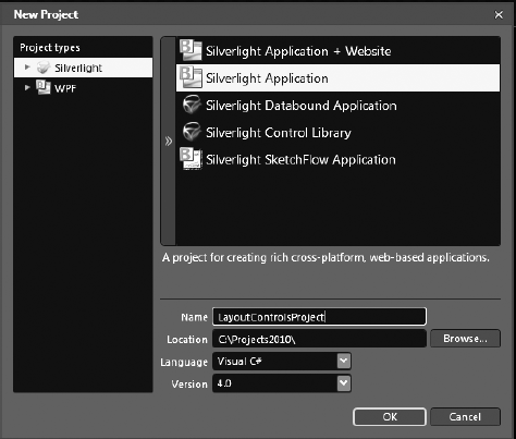
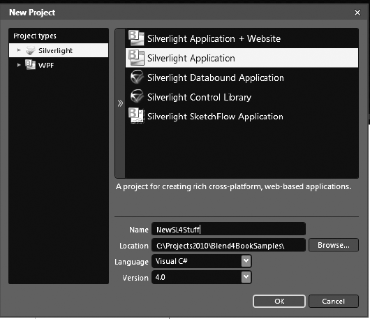
This does not mean that you can't add other layout elements; in fact, layout elements are meant to have other layout elements placed inside of them. Which one you choose depends on how you want to display your content. A Grid is very much like an HTML table, in that you can define Rows and Columns and then place content inside those Rows and Columns. This is a good time to create a new Silverlight Application project in Blend 4. To do that, first open Blend, create a new Silverlight Application project, and call it LayoutControlsProject, as shown in Figure 4-1. Click OK.
Notice in the XAML that Blend has created a Grid by default.
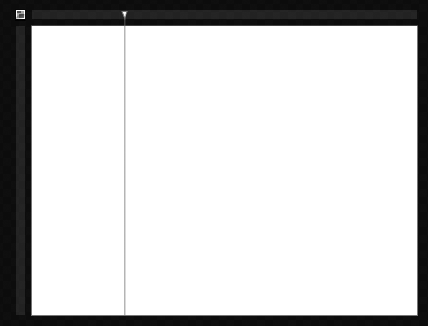
Notice around your main Grid there is a blue bar at the top and on the left. These are where you add RowDefinitions and ColumnDefinitions. When you place your cursor over the top bar, a yellow line is drawn from the top of your Grid to the bottom. If you click the blue bar, the line becomes blue and does not go away when you move your mouse off it, because you have just created a new ColumnDefinition (see Figure 4-2).
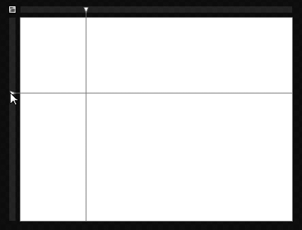
If you place your mouse cursor on the blue bar to the left, you will see that it too draws a yellow line, but this line is horizontal. If you click the blue bar, the yellow line becomes blue and permanent, and a Row is created, as shown in Figure 4-3.
If you switch over to XAML view or just look at the XAML in Split view, you'll see that Blend has created ColumnDefinitions and RowDefinitions. You can see the code here:
<Grid.RowDefinitions>
  <RowDefinition Height="0.37*"/>
  <RowDefinition Height="0.63*"/>
</Grid.RowDefinitions>
<Grid.ColumnDefinitions>
  <ColumnDefinition Width="0.24*"/>
  <ColumnDefinition Width="0.76*"/>
</Grid.ColumnDefinitions>
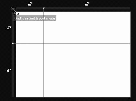
Notice that the Columns and Rows have Height and Width values. If you hard-code the Height and Width values, it means that your Grid cannot scale to accommodate for content placed inside it. For this reason, it is good practice to not hard-code these values, and instead take full advantage of the way Silverlight's powerful layout engine can position objects automatically. Blend has placed Height and Width values in for you because your Grid is in Canvas Layout mode as opposed to Grid Layout mode. The Blend team created Canvas Layout mode to make it easier for designers not experienced with layout panels to get started. Fortunately for you, you are getting started with me, and I am going to teach you about the slightly more complex Grid Layout mode. At the very top left of the Grid, you can see a little button that if clicked will change the Grid's mode to Grid Layout mode, as shown in Figure 4-4.
Note
A freshly installed Blend will default to Grid Layout mode. However, if your last project had a Layout mode of Canvas, your new projects will default to this.
Now you will see little lock icons appear where the blue Row and Column lines are. These little lock icons allow you to lock the height of a Row or the width of a Column; click one of the lock icons so that it turns to a "locked" State. If you look at the XAML code, you will see that the RowDefinitions and ColumnDefinitions still have Height and Width values with an asterisk after them. If the Row or Column's lock icon is not locked, these values can change depending on the size of the content that they display or by the size of the application window. If you lock one of the icons by clicking it, the asterisk disappears and the lock icon appears locked. Now, if the content dynamically changes or the size of the application window changes, the locked Column or Row will not change.
Now that you have Rows and Columns, what can you do with them? Well, you can add controls into the Grid and then specify in the XAML what Row and Column they should be in. Here's how:
Select the TextBlock tool from the toolbar.
Draw a
TextBlockon the workspace.Set the text to be
Row0Column0.Now if you look at the XAML, you will see something that looks like this:
<TextBlock Margin="23,37,21.072,51.112" Text="Row 0 Column 0"
TextWrapping="Wrap"/>
You can see that the control does not specify what
RoworColumnit's in. If you don't specify aColumnorRow, Blend will automatically place your content intoRow 0andColumn 0. So, now you'll alter the code to hard-code theTextBlockto be inRow 0andColumn 0.Change your code so that it resembles the following:
<TextBlock Margin="23,37,21,51" Text="Row 0 column 0"
TextWrapping="Wrap" Grid.Column="0" Grid.Row="0"/>
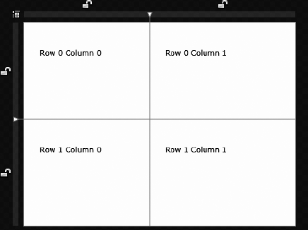
Now copy this XAML and paste it four times, changing the values for the text as well as the
Grid.ColumnandGrid.Rowso that your code looks like this:<TextBlock Margin="23,37,21,51" Text="Row 0 Column 0" TextWrapping="Wrap" Grid.Column="0" Grid.Row="0"/> <TextBlock Margin="23,37,21,51" Text="Row 0 Column 1" TextWrapping="Wrap" Grid.Column="1" Grid.Row="0"/> <TextBlock Margin="23,37,21,51" Text="Row 1 Column 0" TextWrapping="Wrap" Grid.Column="0" Grid.Row="1"/> <TextBlock Margin="23,37,21,51" Text="Row 1 Column 1" TextWrapping="Wrap" Grid.Column="1" Grid.Row="1"/>
Click the Design tab in Blend; you will see that your
TextBlocks all place themselves into their correctRowsandColumns. Your project should look like Figure 4-5.
Another interesting thing about the Grid is that it positions its content using margins. Basically, margins determine distance from the boundaries of the Grid, or the boundaries of the Grid cell if the element is inside a Grid cell.
Say, for example, you have a Rectangle control inside a Grid, and its VerticalAlignment is set to Top and its HorizontalAlignment is set to Left. If you give the Rectangle control a Margin property of "10,10,0,0", the Rectangle will be 10 pixels from the left and 10 pixels from the top, as the values for Margin set the left, top, right, and bottom distances in that order. Conversely, if you set the Rectangle's HorizontalAlignment to Right, and its VerticalAlignment to Bottom, and then give it a Margin property of "0,0,10,10", the Rectangle control will be 10 pixels from the right and 10 pixels from the bottom.
The next layout element I want to talk about is the Canvas. This is one of my personal favorites because it allows the user to specify absolute positioning of its children. The Canvas will never change the position of child elements in it, and I find this very useful. To see how the Canvas works, you have to make some changes to the project:
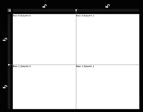
In Blend, change the XAML so that
MainPageis now 600×600 (to give you some breathing room).Change each of the
TextBlocks to have aWidthof150and aHeightof20.Move each of the
TextBlocks up to the top left of its cell.Your project should look something like Figure 4-6.
Click and hold down the Grid tool on the toolbar until the other layout element options become visible and select the Canvas layout element.
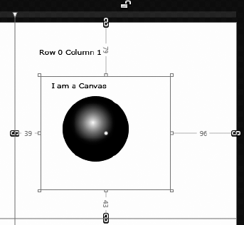
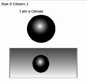
In the Row 0 Column 1 cell, draw a Canvas. With the Selection tool, click the new Canvas in the Objects and Timeline panel so that it has a blue line around it indicating it is selected.
Now you can add some content to your Canvas because when a layout control has a blue line around it, anything drawn in the workspace will go into it. Add some content now by following these steps:
Select the Ellipse tool from the toolbar.
Hold down Shift and draw an
Ellipsein the Row 0 Column 1 cell.With the new
Ellipseselected, change the Fill to a gradient in the Brushes section of the Properties panel.Change the gradient to a radial gradient and adjust the colors and gradient with the Brush Transform tool until you have something like what you see in Figure 4-7.
Select the TextBlock tool from the toolbar.
Draw out a
TextBlockin your new Canvas.Change the text to read I am a Canvas.
If you look at the XAML, you will see the new Canvas inside your main Grid, and inside the Canvas you will see the Ellipse and the TextBlock. The interesting thing to see here is that similar to the Grid, the Canvas will give the elements a default position if one is not explicitly set. However unlike the Grid you don't have to create Rows/Columns, and the position in the canvas is fixed (it cannot be altered by horizontal or vertical alignment). The properties such as Grid.Row, Canvas.Left, and Canvas.Top are examples of AttachedProperties.
An AttachedProperty is a property that is exposed by one element and can be set by another element. In the preceding example, the AttachedProperty of Canvas.Left is exposed by the parent Canvas and can be set by the child (in the preceding case, the Rectangle).
Note
In the preceding example child elements are setting AttachedPropertys on their parent elements. It should be noted that a parent/child relationship is not required for one element to set AttachedPropertys on another element.
Let's now move on to another very useful layout element called the StackPanel.
A StackPanel is another layout element, and its claim to fame is that it will position content inside of it for you in a stacking manner (horizontally or vertically). This is different from the Grid or Canvas, which rely on the developer to set the relative or absolute positioning of child objects. Here you'll create a StackPanel and see exactly how it does this:
Select the StackPanel tool from the toolbar.
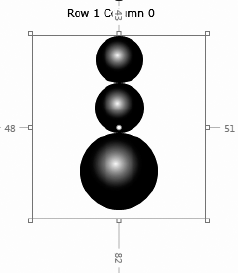
In Row 1 Column 0, draw out a StackPanel.
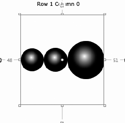
Select the Ellipse tool again from the toolbar.
Draw three
Ellipseswith fixedHeights andWidths and no margins in the newly created StackPanel. Here's the resulting XAML that Blend created:<StackPanel HorizontalAlignment="Left" Margin="101,39,0,139" Width="195"> <Ellipse Fill="#FFF4F4F5" Height="65" Stroke="Black" HorizontalAlignment="Left" Width="83"/> <Ellipse Fill="#FFF4F4F5" Height="68" Stroke="Black" Width="100" HorizontalAlignment="Left"/> <Ellipse Fill="#FFF4F4F5" Height="95" Stroke="Black" HorizontalAlignment="Left" Width="104"/> </StackPanel>
Notice that the StackPanel arranges your three Ellipses vertically inside of it (see Figure 4-8).
You can override the way the StackPanel stacks its content by changing values in the XAML or by changing the Orientation property from Vertical to Horizontal in the Layout section of the Properties panel. Do that now, and you will see that the StackPanel changes from displaying its content from vertically to horizontally, as shown in Figure 4-9.
Note
I set each Ellipse to have a HorizontalAlignment of Center. If I hadn't done this, they would have been aligned to the left by default.
Let's keep going and explore the next layout element in Silverlight, the Border.
The Border is a very simple layout element that allows you to draw a Stroke around another element and then give it a Background or an actual border. The Border layout element can only have one child element, and that content can be either left, right, top, bottom, or center aligned. These properties can be set manually in the XAML, or in Blend in the Layout section of the Properties panel. Try making a Border element now:
Select the Border tool from the toolbar.
In Row 0 Column 1, draw a Border.
Copy the
Ellipseinside your Canvas into the new Border.Change the HorizontalAlignment property in the Layout section of the Properties panel to see how the child object is affected.
Change the VerticalAlignment property in the Layout section of the Properties panel to see how the child object is affected.
Change the Background of the border to a gradient in the Brushes section of the Properties panel.
Use the Brush Transform tool to adjust the gradient to go from top to bottom.
Select the BorderBrush property in the Brushes section of the Properties panel and select a solid color; I chose green.
In the Appearance section of the Properties panel, give the Border a BorderThickness of 3 for the left and right and 1 for the top and bottom.
Your Border should look something like that shown in Figure 4-10.
Oftentimes in Silverlight we have collections of data that need to be displayed. For example, we could have a collection of strings (a string of characters such as "Hello," "World," and "Silverlight." To better demonstrate this, I'll show you how to do the following:
Create a new Silverlight project called
ListBoxSample.Create sample data in Blend.
Populate the sample data.
Add a
ListBoxitem control to the project.Bind the
ListBoxto the sample data.
With that, let's forge ahead and create the new Silverlight project:
In Blend, create a new project by clicking File

Select Silverlight Application.
Name the project
ListBoxSample.Click OK.
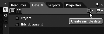
Click the Data tab and click the Create Sample Data button, as shown in Figure 4-11.
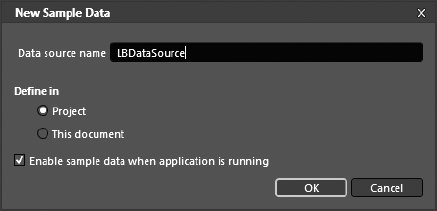
Click New Sample Data.
When the New Sample Data dialog box pops up, give the data source a name of
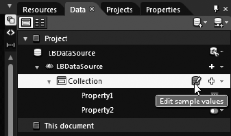
LBDataSourceand then click OK, as shown in Figure 4-12.On the Data tab, click the little arrow next to LBDataSource and then click Collection.
Click the Edit sample values button, as shown in Figure 4-13.
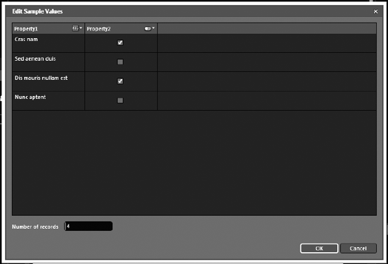
When the Edit Sample Values dialog box appears, change the number of records to 4, as shown in Figure 4-14.
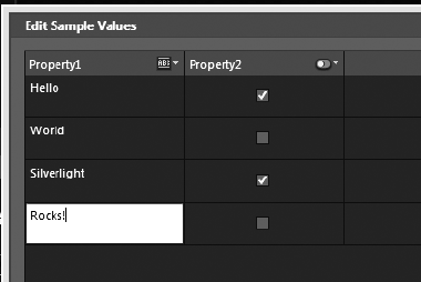
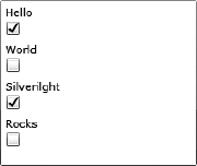
Now double-click each sample value for
Property1, change them to Hello, World, Silverlight, and Rocks, as shown in Figure 4-15, and then click OK.
At this point, you have a collection of strings. Now all you need to do is bind this collection to an item control. Luckily, Blend has made this very easy to do. Let's do it now:
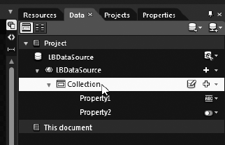
On the Data tab, make sure the arrow next to the LBDataSource is turned down; click and hold Collection and start to drag it, as shown in Figure 4-16.
Drag the collection to the Objects and Timeline panel and drop it onto
LayoutRoot, as shown in Figure 4-17.
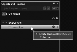
Notice how when you drag it over the LayoutRoot in the Objects and Timeline panel, you get a message telling you that Blend is going to add a ListBox with an ItemsSource set to your collection. Also notice that when you drop the collection onto the LayoutRoot, it automatically creates a ListBox in the workspace and sets its ItemsSource to your collection. You should have what is shown in Figure 4-18.
At this point, you should adequately understand item controls. So, with that, let's move ahead and discuss the final controls that we'll explore in this chapter: input controls.
Software applications by default are developed to interact with their users. HTML applications, for example, have user input controls such as text fields, buttons, radio buttons, and check boxes, just to name a few. Silverlight is no different in that it, too, has user input controls that have the ability to gather information from the user. In fact, all the HTML controls that I just named are included in Silverlight. You may recall that I mentioned in the preceding section that a ListBox is an item control. Interestingly, a ListBox is also an input control as well. If you were to run the ListBox application you created in the last section, you would notice that you can click any of the items (Hello, World, and so on) and they would become highlighted. The code-behind could then react to your selection, thus making it an input control. So, let's make a new sample Silverlight application called InputControlProject and make some input controls.
In Blend, create a new Silverlight application called
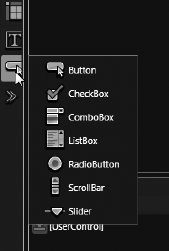
InputControlProject.On the toolbar, hold down the Button tool until you see a list of the other input controls, as shown in Figure 4-19.
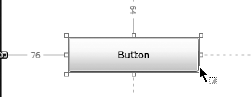
Start by adding the most common of all input controls, the
Buttoncontrol.Once you have selected the
Buttoncontrol, draw aButtonin the workspace, as shown in Figure 4-20.
Repeat this process for the CheckBox, RadioButton, and Slider controls, so that you have something that looks like Figure 4-21.
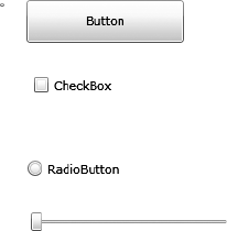
Now you have made four user input controls that can react to user interaction. We are going to be seeing a lot more of these and other input controls as we progress through the book, so we won't wire them up at this stage. Just know that these are a few of the built-in Silverlight input controls and that they can alter the application when interacted with.
The recent release of Silverlight 4 saw a host of new controls, such as the Viewbox, the RichTextBox, the improved DataGrid, and even a new property for controls called FlowDirection. In this section I discuss each as well as do some hands-on experimentation.
The Viewbox is a very cool tool that has existed for a long time in Silverlight's big brother Windows Presentation Foundation (WPF) and is a very handy content control. Why, you ask? The Viewbox, like the Border, can contain only one child element, which is usually another content control that can hold many child elements. The difference is that when a Viewbox is scaled, its child elements scale or shrink and grow with the Viewbox. This is not true for other content controls and makes the Viewbox very handy in certain situations. To help you understand this control a little better, go ahead and create a new project in Blend called NewSL4Stuff, as I am doing in Figure 4-22.
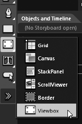
From the toolbar hold down the Content Control button until you see the other Content controls appear and click the Viewbox control, as I am doing in Figure 4-23.
Draw a
Viewboxon the artboard, as I have done in Figure 4-24.Now select the Ellipse tool and make certain the
Viewboxis selected (highlighted) in the Objects and Timeline panel and draw anEllipseinside theViewbox, as I have done in Figure 4-25.

Notice that when you were drawing the Ellipse it was trying to snap to the edges of your Viewbox. This is because a Viewbox's child element will try to fill up as much of the Viewbox as possible. Now use your selection tool and grab the top left corner of the Viewbox and make it bigger. Notice how its child element gets bigger as well. Now make the Viewbox smaller and see how its child element gets smaller too. This example is a very simple exercise, but what if you were to make the child element a Grid or Canvas and put a lot of child elements inside of it—would everything scale? Yes it would. Say, for example, you need to design a very complex icon. You can, and should use the Zoom tool. Even with the artboard at full zoom, it is difficult to do very small icons. What you could do is design it at a larger size and scale it down by placing it into a ViewBox. Give it a try and then we can move on and talk about the RichTextBox.
The RichTextBox allows you as a Silverlight 4 developer to display editable documents in a very rich way, almost like a PDF. In a RichTextBox you can not only have paragraphs with bold, underline, and italics but you can have other non-text items such as Buttons, Hyperlinks, Images, and much more. This is very handy when developing a newspaper-like application with lots of images, links, and text.
To create a RichTextBox click the XAML button in Blend and paste the following code inside the parent Grid named LayoutRoot:
<RichTextBox
TextWrapping="Wrap"
IsReadOnly="False">
<Paragraph>
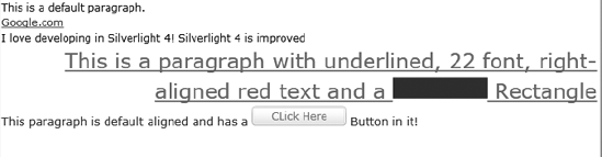
This is a default paragraph.
</Paragraph>
<Paragraph>
<Hyperlink
NavigateUri="http://www.google.com"
TargetName="">Google.com</Hyperlink>
</Paragraph>
<Paragraph>
<Run
Text="I love developing in Silverlight 4!" />
<Run >Silverlight 4 is improved</Run>
</Paragraph>
<Paragraph
FontSize="22"
TextAlignment="Right"
Foreground="Red">
This is a paragraph with underlined, 22 font,
right-aligned red text
and a
<InlineUIContainer>
<Rectangle
Fill="Blue"
Width="100"
Height="22" />
</InlineUIContainer>
Rectangle
</Paragraph>
<Paragraph
FontSize="12"
Foreground="Blue">
This paragraph is default aligned and has a
<InlineUIContainer>
<Button Height="20" Width="100" Content="CLick Here"></Button>
</InlineUIContainer>
Button in it!
</Paragraph></RichTextBox>You should see something like what I have in Figure 4-26.
Notice that the RichTextBox declaration has an IsReadOnly property that is set to False. This means that when you are running this application you can edit the RichTextBox. Notice that when you run it in edit mode you cannot interact with the Buttons or Hyperlinks. Set IsReadOnly to True and you will be able to interact with those elements. Set the IsReadOnly property to True and then run the application and click on the Google link. Notice how it takes you to Google. Very cool! You may also code against the inline elements such as Buttons or even change the RichTextBox in code-behind.
The FlowDirection property now gives you support for bi-directional support for both Text and Content controls. This is very helpful for developing controls that contain items with text written in languages such as Arabic. To show you this, let's switch over to our Silverlight project and create a real-world example of when we would use FlowDirection.
Note
You will not find this property in Blend's Properties panel because the Blend designer does not support RTL (Right-To-Left) FlowDirection, and for this reason the Blend team has chosen not to show it. So, if you change the FlowDirection and don't see it snap to RTL in Blend, don't think you are crazy—you will see it when your application runs.
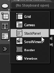
From the toolbar hold down the Content Control tool, and when StackPanel is shown click it, as I am doing in Figure 4-27.
Draw a StackPanel on the artboard and give it a black background, as I have done in Figure 4-28.
Select the new StackPanel and double-click the TextBlock tool to add a
TextBlockinside the StackPanel; give it a foreground color of white. Do this again so you have twoTextBlocks, as I have in Figure 4-29.Now double-click the first
TextBlockto edit theTextand type in Silverlight Rocks!Double-click the second
TextBlockto edit theTextand paste in


Although this looks quite cool, it is quite incorrect because Arabic is written and read from right to left—not left to right, as English is. We can correct this by giving the second TextBlock a FlowDirection of RightToLeft. See my code:
<TextBlock FlowDirection="RightToLeft" TextWrapping="Wrap" Text= "Silveright!" Foreground="White"/>
You should have what I have in Figure 4-31.

Figure 4.31. Your second TextBlock is now able to be read from right to left and is correct for the Arabic language.
As I mention earlier, this property applies to content controls as well as Text controls. For example, if we were to put a FlowDirection property of RightToLeft on the parent StackPanel, all of its children would inherit that property and thus all be aligned right. Try adding that property to the StackPanel, and you should see what I have in Figure 4-32.

Data Binding is an easy way for Silverlight controls to bind to data. That data can be either a set of predefined data or data of another object. For example, if you had a String property named Foo with a value of Silverlight Rocks you could, in XAML Data Bind a TextBlock's Text value to the value of Foo, and the TextBlock would read Silverlight Rocks. Further, if the TextBlock had a Binding mode set to TwoWay, then if the TextBlock's value were to change, Foo would change as well. Silverlight 4 has improved Data Binding in a few ways:
Now in Silverlight 4 you can bind to properties on a DependencyObject and not just on FrameworkElements. What, you ask is a DependencyObject? A DependencyObject is the base class of several important Silverlight classes such as UIElements, Styles, Resource Dictionaries, and Transformations. So now you can bind a Framework Element's X position in a TranslateTransform transformation to the value of a Slider. This will allow you to move the Slider and change the position of the FrameworkElement. Prior to Silverlight 4 this was not possible.
If a Silverlight entity implements the IDataErrorInfo interface and then is involved in a binding operation, it validates the bound properties and can then notify the UI of any binding errors and if the NotifyOnValidationError property is set to True, any error messages can be displayed. Basically this gives developers a way to know when binding errors have occurred via asynchronous server-side validation errors.
Silverlight 4 now allows you to tell the bound object how to display its data. For example, say you are binding to a Date object and want a particular format for that date, now you can simply set your binding expression to this:
<TextBox Text="{Binding Path=PublishedDate, Mode=OneWay, StringFormat='MM-dd-yyyy'}"/>This will format your date to this format: 01-24-10 and override the default format of the Date object. Prior to Silverlight 4 the object would have to be manipulated in code-behind prior to populating the TextBlock.
You can now set a FallbackValue for a binding expression. If the binding fails for any reason, what will be displayed is the FallbackValue. Example:
<TextBox Text="{Binding Path=SomeBindingValue, Mode=TwoWay, FallbackValue=N/A}" />TargetNullValue allows you to set a value if the binding expression encounters a null value. Example:
<TextBox Text="{Binding Path=QuantityOnHand, Mode=TwoWay, TargetNullValue=0}" />Content or layout controls allow you to easily place content into your applications. You have gone through each of the major layout elements and actually created them with hands-on exercises. You also learned that each layout element has its own special ability:
The Grid allows you to declare
Rows andColumns so that you can then position objects precisely within that Grid.The Canvas allows you to specify where the content inside of it is placed by using the
Canvas.Top, Canvas.Left, Canvas.Right, andCanvas.Bottomproperties.The StackPanel positions its content automatically, but you can specify whether the content is stacked horizontally or vertically.
The Border simply allows you to draw a
Strokearound the content placed inside of it, as well as aBackground.
You also learned about item controls such as a ListBox. You even learned how to create sample data and then bind a ListBox's ItemsSource to it. This will prove very handy for testing when you start making your own data-driven Silverlight applications.
Finally, you learned about some new features of Silverlight 4. These are by no means all of the new features; features that are new to Silverlight 4 and not discussed in this chapter will be discussed in detail elsewhere in the book. In the next chapter I delve into the world of Silverlight animation and talk about how to accomplish it with timed Storyboards.