
Chapter 5
EXPLORING FUNDAMENTAL CONCEPTS OF CSS
By now, you should have a solid understanding of how to create web pages using HTML or XHTML markup. You should understand how to encode semantic meaning into your page content. You should be familiar with the concept of page elements and how these elements can be nested inside one another to give a page an orderly structure. Finally, you should also understand the basics of how a web browser interprets your (X)HTML source code and determines its rendering. All of these topics were covered in the previous chapter, and all the concepts in this chapter will build on them.
In this chapter, you'll take a much closer look at how the web browser actually displays elements inside its window, and we'll discuss the specifics of how you can control this behavior. Of course, this means you're going to dive into the world of Cascading Style Sheets (CSS). Before you get carried away writing code, however, we'll first explain where CSS came from and why it's such a powerful tool for web designers.
The origins and evolution of Cascading Style Sheets
Many web designers are surprised to learn that style sheets have existed in some form or another since the inception of HTML's ancestor, the Standard Generalized Markup Language (SGML), back in the 1970s. This is because even before the Web was born, documents marked up in SGML needed some way to encode formatting information in addition to their semantic meaning. In the early days of HTML, both this visual formatting information (called presentational style) as well as the semantic meaning were encoded directly inside the markup of each element. Over time, as discussed in earlier chapters of this book, this proved problematic for many reasons.
It was clear that the Web needed a better way to encode formatting information both to ease the development and maintenance of content already published on the Web as well as to increase the capabilities of web browsers. What you know today as Cascading Style Sheets was first formalized in 1994 by the joint efforts of Bert Bos and Håkon Wium Lie, two developers involved in the World Wide Web Consortium's (W3C's) presentational style debates. Together with the support of the W3C's HTML editorial review board, the CSS level 1 (more simply called CSS1) specification was officially published at the end of 1996.
Even then, CSS boasted some special features that made it especially well suited as a generalized presentation language. For example, CSS was not limited to applying stylistic information to web pages marked up in HTML. It could be just as easily applied to any other markup language. Today, CSS can be applied to such XML dialects as SVG (a markup language for describing vector-based artwork) and XUL (a cross-platform user interface language). Indeed, it's this ability to separate the information about specific content from the information about how that content is displayed that gives CSS its power.
Another advantage that CSS held over other display languages was its ability to apply multiple style sheets to a single document. This allowed one document to "inherit" the declarations of all the styles in each style sheet it referenced, each successive style sheet "cascading" on top of the others. This cascading effect—the fact that later declarations about certain styles could overrule earlier declarations about the same styles—is part of what gave CSS its name. Later in this chapter, you'll see how this capability directly benefits web developers like you.
Best of all, CSS had an incredibly simple syntax that made extensive use of English keywords. This makes it easy to read and understand. For the same reason, as you'll see here, it's also easy to learn.
Even though the benefits of CSS were very quickly realized by the W3C and it took only another two years for CSS level 2 (CSS2) to become an official Recommendation in 1998, it wasn't until very recently that reliable, widespread support for CSS in web browsers have given it a prominent place in the tool sets of web designers and developers. We know what you're thinking: if CSS was this good this fast, why did it take so long to make it into mainstream web browsers?
For many years after the original release of CSS, it was difficult for web developers to make full use of this technology. Thanks to competition between the major browser vendors to one-up each other on features, differing opinions regarding what the standards should actually be, and in the worst cases the complete failure to even approach support for said standards, it became nearly impossible for a professional web developer to be able to rely on the use of CSS for web design. At the time, web developers used a patchwork of techniques that relied upon nested table layouts, presentational HTML markup, and the implementation of proprietary browser features that required developers to write browser-specific code or else completely abandon support for certain browsers.
Eventually, with the numbers of different browsers on the Web rising and the seemingly endless browser wars causing developers even more grief, it was the release of Internet Explorer 5.0 for Mac OS 9 on March 27, 2000, that finally gave everyone a way to move toward standards compliance. Specifically, the new version of the web browser from Microsoft, written partly under the direction of Tantek Çelic, implemented a rendering engine (called Tasman) that provided a means for web developers to explicitly choose one of a number of possible "rendering modes." Developers writing new code that conformed to the W3C's published standards could then switch the web browser into a "standards rendering mode." Older pages that would likely be incompatible with standards mode, however, would use a different rendering mode that became widely known as quirks mode.
The new browser set a new precedent, one that emphasized standards while simultaneously show-casing new capabilities. Web developers started to develop for the new browser and over time grew more insistent on the use of standards-based code in the industry. Web standards evangelists such as Jeffrey Zeldman, Molly Holzschlag, and Eric Meyer—who each pressured browser manufacturers to increase their support for web standards and CSS in particular—began making headway. At the same time, web developers such as Peter-Paul Koch were calling for greater compatibility between differing browsers' implementations of JavaScript, and usability experts such as Jakob Nielsen and accessibility experts such as Joe Clark each made strong cases for web standards in their respective areas. Slowly, the tables began to turn.
Work on CSS level 3, which began immediately after the release of CSS level 2 in 1998, is still ongoing as of this writing. Thankfully, the push toward standards in the web development community and the support of this movement by large businesses that have reaped economic benefits from these standards makes the future of CSS seem very bright. Increasingly widespread support for CSS in all kinds of network-enabled devices is also pushing the language to ever-greater heights. These days, CSS can be used to control not only the visual presentation of content in a web page but all sorts of other things, such as the rate that text on a page should be read aloud by screen readers.
How CSS works
To a lot of people, CSS often looks like magic. Admittedly, it's not easy to wrap your head around the idea that with two simple text files, one with HTML markup (that gives a page's content meaning and structure) and a completely separate one with CSS rules (that define the layout and presentation of this content), you can end up with a visual display that looks nothing like the original. How can a humble text file full of CSS rules change so much about a web page so dramatically? Let's find out.
Default browser styles
A style sheet is actually a pretty simple construct. Like (X)HTML markup, a style sheet is just a plain-text file, but unlike markup it contains no content of its own. A CSS style sheet is always applied to the content of some other document. It's this other content that the CSS declarations affect. By itself, a CSS file can't do anything.
Recall that in the previous chapter you developed a web page for Papa Pepperoncini's Pizza restaurant using XHTML markup. You'll use the content of that page and apply the styles to it. Right now, that web page looks rather plain—but it's not entirely devoid of formatting, as shown in Figure 5-1.
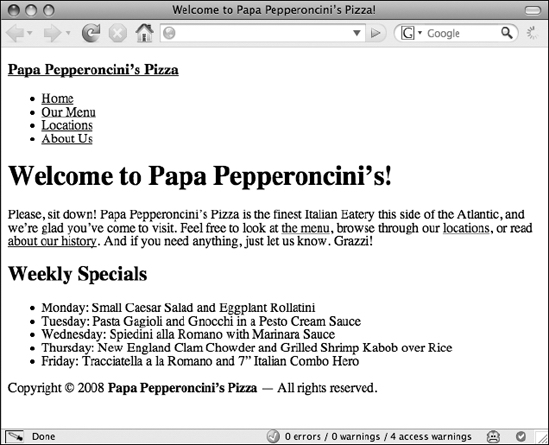
Figure 5-1. Content displayed with only simple, default presentation styles
As you can see, you have a link at the top of the page ("Papa Pepperoncini's Pizza"), and the text of this link is blue and underlined. Beneath that, you have a list of links, with each list item clearly displaying a bullet point. Then you have the text of a large headline, much larger than the rest of the text on the page. You also have a paragraph of text that has a decent amount of whitespace between itself and the headlines that surround it. The same is true of the rest of the elements of the page.
So if this is the page supposedly without any styling information, how come the page is showing off some smarts about how you might envision these elements to look? In fact, it's not your page at all but rather a style sheet that is built right into the web browser. Using the excellent Web Developer Toolbar add-on for the Firefox web browser (discussed in more detail in Chapter 8), you can disable these built-in styles. Figure 5-2 shows how the web page really looks with no style sheets at all, not even the browser's built-in one.
As you can see from this example, most of the styling is now gone. The links are still blue, and the headlines are still bold, but that's about all that remains. The important thing to understand from this example is that when you begin to add your own styling information to your web pages, you're actually overriding styles that already exist in a style sheet that's baked right into your visitor's web browser.
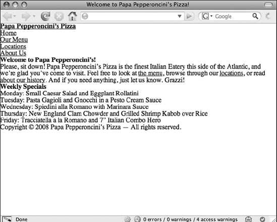
Figure 5-2. Papa Pepperoncini's Pizza web page with Firefox's built-in style sheet disabled
Unfortunately, not all web browsers come with the same style sheet baked into them, which means that different browsers will display the same elements in different ways unless you define your own rules and override all the default ones.
Even though Cascading Style Sheets brings with it incredible flexibility of presentation, the style sheets themselves must be constructed in a certain way, just like the XHTML page you created in the previous chapter had to be written using restricted syntax and grammars. We'll use the default browser styles you just discovered to explain the syntax CSS uses and to show how style sheets are constructed.
Anatomy of a CSS style sheet
A single CSS style sheet can contain a theoretically endless amount of presentational information. This information is organized into a sequence of statements, each of which specifies one rule (sometimes also called a ruleset). Rules do all of the heavy lifting in CSS; they determine what stylistic information to apply where. When you create a style sheet, you spend most of your time writing these rules.
Each of these rules can be expressed in plain English, and in fact you've already done so in the example of the default styles. For example, "A link's text should be blue and underlined" is something a CSS rule might specify. A following rule might specify that "Paragraphs should have a decent amount of whitespace between whatever is above and whatever is below it." In CSS, you might write these rules like this:
a:link {

    color: blue;

    text-decoration: underline;

}

p {

    margin-top: 25px;

    margin-bottom: 25px;

}
This snippet of CSS is, itself, a valid style sheet. If you apply these styles to a web page, all links will turn blue and will have underlined text, and all paragraphs will have exactly 25 pixels of spacing above and beneath them. Of course, that's already similar to how most browsers display links and paragraphs by default, so this isn't very exciting. However, what is exciting is that it's probably not very hard to figure out which parts you need to change to make all your links, say, green, and how to change the number of pixels above or below your paragraphs. For instance:
a:link {

    color: green;

    text-decoration: underline;

}

p {

    margin-top: 50px;

    margin-bottom: 50px;

}
Now all your links will be green and underlined, and each paragraph will have exactly 50 pixels of empty whitespace above and below it. With the previous example, it's also easy to see how to change the elements in your page to which the declared styles are applying. For example, instead of making links underlined and green, let's make your top headline element (<h1>) show up that way:
h1 {

    color: green;

    text-decoration: underline;

}

p {

    margin-top: 50px;

    margin-bottom: 50px;

}
Now, links will revert to showing up in whatever way the browser's default style sheet says they should appear, but your top-level headline will be green and underlined, as shown in Figure 5-3.

Figure 5-3. Overriding default styles for <h1> and <p> elements on a web page
You can even change all your headlines so that they look like your top-level headline. You simply add the other headline elements to the first rule, separating each element name with a comma:
h1, h2, h3, h4, h5, h6 {

    color: green;

    text-decoration: underline;

}

p {

    margin-top: 50px;

    margin-bottom: 50px;

}
This results in the appearance shown in Figure 5-4.
Figure 5-4. Specifying the same rule for all of your headlines
Wait a minute. This worked for two of your headlines, but not the one at the top of your page ("Papa Pepperoncini's Pizza"), which is still blue and underlined. Don't worry, it's not a mistake; it's CSS in action. So, what's going on here?
Recall that this headline is actually a link. You specified your XHTML for that headline like this:
<h3><a href="index.html">Papa Pepperoncini’s Pizza</a></h3>
The <h3> element's only content is itself another element, specifically the <a> (anchor) element. Additionally, recall that the web browser already has a default style for all links, specifically, that they should be blue and underlined. So, the web browser isn't actually ignoring you; it's just applying all the style rules it has loaded in all of its style sheets one after the other to your page elements. Since the <a> element is nested within the <h3> element, the text inside that headline is really a link, and since the browser has a rule specifying all links should be colored blue, that's what the browser has done.
To prove that this is indeed what is happening, add some more text to the headline element but not to the link:
<h3><a href="index.html">Papa Pepperoncini’s Pizza</a>
— The Best Pizza in Town!</h3>
Now, a reload of your web page shows you a blue link ("Papa Pepperoncini's Pizza") and a green headline ("— The Best Pizza in Town"), as shown in Figure 5-5.

Figure 5-5. The part of the headline not affected by the CSS rule for link styling is green just like the other headlines.
This example showcases the importance of understanding the markup underlying your page. If you don't understand the structure of your markup, you can't accurately determine what pieces of your page are which elements, and therefore you won't be able to understand how your style rules are getting applied to the page.
These examples also showcase a number of discrete chunks that compose a CSS rule. At the beginning of each line, you have a selector, which in these examples matched the element to which you were applying the rest of the rule. Changing the selector changed what element was selected by the rule. You could specify multiple elements as the target of a single rule by writing them in a comma-separated list.
After the selector, there was a chunk of text between open and closing curly braces ({ and }). These braces mark the beginning and end of a declaration block, similar to how XHTML elements have open and close tags. Inside the declaration block of your rule, you specified two individual declarations, although you could have specified any number of declarations (there is no limit to the number of declarations that can be written inside a declaration block). Each declaration ended with a semicolon (;).
In the case of the rule selecting (or targeting) the headlines, these declarations specified values for the color and text-decoration properties. The properties were separated from the values with colons (:). Inside the declaration block and between the two rules, all whitespace was ignored. Figure 5-6 details the syntax of a CSS rule.
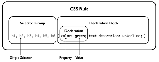
Figure 5-6. The components of a CSS rule
The CSS2 specification defines hundreds of properties for which you can set values. When it is finally implemented, CSS3 will add even more properties. Some properties can apply to every kind of element, such as headlines, links, paragraphs, tables, images, and so on. Other properties can apply only to certain kinds of elements, and they won't work if you apply them to others. Learning which properties you can apply to which elements and learning what kinds of values each property can set are part of the process of becoming proficient with CSS.
For now, let's be content with the knowledge that there is more to learn and move onward. Later in this book, you'll revisit the topic of CSS properties and values and examine what options CSS2 gives you. In the meantime, however, you'll learn more about how CSS can be integrated with a web page.
Applying styles to web page elements
So, you now understand what CSS is, you know what it looks like, and you know what it can do and how it does it. It's almost time to write some new CSS rules to make Papa Pepperoncini's Pizza page sparkle. But first, you need to figure out how to attach a CSS style sheet to an HTML or XHTML web page so that the styles you write will actually be shown.
You can apply CSS rules to page elements in three ways. You can embed a CSS rule directly into an element, you can embed a whole style sheet inside the HTML or XHTML page itself, or you can link a style sheet from an entirely separate file to your HTML or XHTML page. Let's examine all three possibilities in detail.
Inline styles
Perhaps the simplest and most familiar way of applying CSS styles to web page elements would be through the use of inline styles, or styles written directly into the element. Since an inline style by definition applies only to the element in which it is placed, there is no need to use a CSS selector in the rule, and since the style is already enclosed inside the element, a declaration block's curly braces aren't needed either. All you need to specify for an inline style to work is the property and value you want to set on the element.
Inline styles are written into the value of the style attribute of an element, like so:
<p style="color: purple;">Look ma, I’m purple!</p>
Naturally, inline styles don't give you much flexibility since they can't use the power of CSS selectors to target multiple elements of the same type on a page as your previous examples have done. Worse, inline styles embed presentational information directly into your document, which is exactly what CSS was developed to avoid. In general practice, inline styles really aren't a good solution for applying styles to elements.
Nevertheless, there are some cases where inline styles are useful. For instance, they make it easy to experiment with particular elements and to test what different values of different properties will do to an element. While you're learning about what CSS properties exist and what they can do, feel free to use inline styles to try them. In an actual project deliverable, however, you shouldn't leave any presentational data inside your markup, so you should pull these inline styles out and place them in either embedded style sheets or external style sheets.
Embedded style sheets
Embedding a CSS style sheet inside an HTML or XHTML file enables you to use every feature of CSS without limitation, but only with the single document that contains the embedded style sheet. By placing CSS rules in a <style> element, you're effectively creating a small area inside your markup where you can safely put CSS rules. When the browser encounters this special area, it stops interpreting your source code as (X)HTML markup and begins to interpret the code as CSS rules. Let's see how this might work in practice.
In your example web page for Papa Pepperoncini's Pizza, you have an XHTML document shell that looks like this:
<!DOCTYPE html PUBLIC "-//W3C//DTD XHTML 1.0 Strict//EN"
"http://www.w3.org/TR/xhtml1/DTD/xhtml1-strict.dtd">
<html xmlns="http://www.w3.org/1999/xhtml" xml:lang="en" lang="en">
<head>
<meta http-equiv="Content-Type" content="text/html; charset=utf-8"/>
<title>Welcome to Papa Pepperoncini’s Pizza</title>
</head>
<body>
<!-- XHTML content goes here -->
</body>
</html>
In this shell, you have two main elements nested within the root <html> element: <head> and <body>. The <body> is where your XHTML content goes. The <head>, you might remember, is where the majority of the metadata about your document goes. Since CSS defines the presentation of content, it's considered a form of this metadata, and you need to place it inside the <head> element. You do this by defining a <style> element and giving this element a type of text/css to specify to the browser what style language the content of the element contains. For CSS, you will always use the text/css type.
The document shell with an embedded style sheet would then look like this:
<!DOCTYPE html PUBLIC "-//W3C//DTD XHTML 1.0 Strict//EN"

    "http://www.w3.org/TR/xhtml1/DTD/xhtml1-strict.dtd">

<html xmlns="http://www.w3.org/1999/xhtml" xml:lang="en" lang="en">

<head>

    <meta http-equiv="Content-Type" content="text/html; charset=utf-8"/>

    <title>Welcome to Papa Pepperoncini's Pizza</title>

    <style type="text/css">

        /* CSS content goes here */

    </style>

</head>

<body>

    <!-- XHTML content goes here -->

</body>

</html>
You can embed as many style sheets as you like (or need) into a single document in this way. By way of example, let's split the rule where you specified two declarations to apply to the <h1> element earlier into two style sheets with one CSS rule each:
<!DOCTYPE html PUBLIC "-//W3C//DTD XHTML 1.0 Strict//EN"
"http://www.w3.org/TR/xhtml1/DTD/xhtml1-strict.dtd">
<html xmlns="http://www.w3.org/1999/xhtml" xml:lang="en" lang="en">
<head>
<meta http-equiv="Content-Type" content="text/html; charset=utf-8"/>
<title>Welcome to Papa Pepperoncini’s Pizza</title>
<style type="text/css">
h1 {
color: green;
}
</style>
<style type="text/css">
h1 {
text-decoration: underline;
}
</style>
</head>
<body>
<!-- XHTML content goes here -->
</body>
</html>
Placing CSS rules inside embedded style sheets in this manner clearly gives you more flexibility regarding what you'd like your CSS rules to accomplish, but it's still limited to applying the rules to a single page. The greatest benefits of CSS can be seen when you use a single style sheet to define the presentation not of a single web page but of an entire website that may have 10, 20, 100, 1,000, or more individual pages.
To accomplish this feat, you must completely separate the CSS styling from the HTML or XHTML markup by placing it into a separate file.
External style sheets
The most common—and most efficient—way to apply CSS to a web page and indeed to an entire website is via the use of entirely separate files that are linked to a web page with a special reference element, much like the way the <img> element references an external image file. These separate files with CSS rules in them are called external style sheets, because they are placed outside of any containing markup. Even though these CSS rules are separated from the actual web page document, they still behave the same way as if they were written in an embedded style sheet.
To reference an external style sheet from an HTML or XHTML page, you use the <link> element to—you guessed it—link your CSS file to your markup. Since you can link many different kinds of things into a web page, the link needs to be of a certain relationship, specifically, a style sheet relationship. This is specified in the rel attribute. Like an <img> element, you also need to tell the browser where to find this external style sheet. You can do this with the href attribute, and as you have probably already guessed, its value is any valid URL. Finally, just like an embedded style sheet, you need to tell the browser that this style sheet is written in CSS, so you specify a type of text/css.
All together, the <link> element might look like this:
<link rel="stylesheet" href="css/basic.css" type="text/css" />
This (empty) element specifies that an external CSS style sheet can be found inside the css folder and that its file name is basic.css. Inside the basic.css file, you simply write CSS rules as you normally would. Since this entire file is going to be interpreted by the browser as CSS, there's no need to enclose the CSS rules within a <style> element.
Web pages can be linked to any number of external style sheets. There's really no technical limit, although in practice the more CSS files you link to, the longer it will take for your browser to go and fetch all of them. Of course, the benefit of an external style sheet is that more than one web page can be linked to it, which means you can reuse the style rules you write for one web page across an unlimited number of other web pages. This is what makes CSS so outrageously scalable. It doesn't matter whether your site has one page or one million pages; as long as these pages have the basic elements that need to be styled in the same way, a single CSS file can be used to style them all.
Let's take Papa Pepperoncini's Pizza restaurant website as an example. Recall that your navigation menu for this website has four links in it:
<ul>

    <li><a href="index.html">Home</a></li>

    <li><a href="menu.html">Our Menu</a></li>

    <li><a href="locations.html">Locations</a></li>

    <li><a href="about.html">About Us</a></li>

</ul>
Each of these four pages will contain the same navigation menu, marked up in the same way. Thanks to this consistency and thanks to CSS's ability to create one set of rules that can be reused across any number of pages, you can write a set of rules that will style these links in any way you want, and then, merely by linking each of these four pages to the same external style sheet, the navigation menu's links on all of the pages will look the same.
Let's give each of the four links a nice teal color. Since these links are obviously a navigational element, let's also remove the underline from each of them. Finally, since you want them to stand out a little bit more prominently on your page, let's make them just a touch bigger than normal text. You can accomplish all of this with a single CSS rule that includes just three declarations:
ul a {

    color: teal;

    text-decoration: none;

    font-size: larger;

}
All you need to do is place this CSS rule into the basic.css file in your css folder and then link each web page you create to this external style sheet using the <link> element. As long as your markup remains consistent on all the pages you create for Papa Pepperoncini's Pizza restaurant website, the style rules you've just written for the main navigation will automatically be applied.
This method is obviously much better than having to write (or copy and paste) the same set of stylistic information to each of the four pages because it's faster to implement. It's also easier to maintain. Let's say that after you show Papa Pepperoncini your design concepts, he tells you that he thinks the navigation menu is too small. He wants to make all the navigation links across the entire site even bigger than they are. Since you've managed to successfully separate the main navigation links themselves from the visual style you've given them, this update isn't a problem. To accommodate Papa Pepperoncini's request, all you need to do is open your basic.css file and change your CSS rule, perhaps to something like this:
ul a {

    color: teal;

    text-decoration: none;

    font-size: xx-large;

}
Now, any web page that you've previously linked to this style sheet is instantly updated, just like that. But hold on, what is this ul a selector? Surely there's no ul a element, you might be saying to yourself, and of course (since element names in HTML or XHTML cannot contain spaces) you'd be correct. In fact, this is a new kind of CSS selector, one that targets anchors only when they are nested inside an unordered list.
More CSS selectors: targeting page elements with surgical precision
So far, you've seen how to apply CSS rules to specific types of page elements. Of course, specifying style rules based on element types is handy, but ultimately its usefulness goes only so far. For example, what if you wanted some links to look one way and some other links to look some other way. Obviously, basing all your styles solely on the element type (<a>, or anchor, in this case) isn't going to cut it. You need a more precise way to select elements. That's where the different kinds of CSS selectors step in to help you.
As you already know, CSS selectors allow you to target elements in your markup to which you want to apply certain styles. You already know how to use one kind of CSS selector, the type selector, which (as its name implies) selects elements based on their type (or name). For example, a selector that reads as h1 will apply to all <h1> elements. Similarly, a selector that reads as h1, h2, h3 will target all <h1>, <h2>, and <h3> elements in the page.
To be more precise, the type selectors that you have used so far are called simple selectors because they are, well, pretty simple. To construct more complex CSS selectors, you combine, or chain, multiple simple selectors together in specific ways. These more intricate patterns enable you to target elements on your page with surgical precision. Let's take a brief look at what other kinds of selectors you can avail yourself of when using CSS.
ID selectors
Another kind of simple selector is the ID selector. As you might expect, this selector targets an element whose id attribute has been given the specified value. For instance, on Papa Pepperoncini's page, you've previously defined a <div> element with an id of header to group all the elements that are part of the website's masthead:
<div id="header">
<h3><a href="index.html">Papa Pepperoncini’s Pizza</a></h3>
<ul>
<li><a href="index.html">Home</a></li>
<li><a href="menu.html">Our Menu</a></li>
<li><a href="locations.html">Locations</a></li>
<li><a href="about.html">About Us</a></li>
</ul>
</div>
Now, by using the ID selector, you can select this entire group of elements and, for instance, make all the text inside them bold and rendered in a specific font with a single CSS rule. You might think a nice, snazzy font like Zapfino would look nice, but since that font is not guaranteed to be installed on all (or even most) computers, you'll just say that any serif font will suffice in case that one is not available for some reason:
#header {

    font-weight: bold;

    font-family: Zapfino, serif;

}
ID selectors always begin with an octothorpe (#) and then are immediately followed by the id value of the element you want to target. In the previous example, since the <div> element's id attribute value was header, that's what goes after the octothorpe. This will have the same target as an ID selector that explicitly specifies the <div> element, like this:
div#header {

    font-weight: bold;

    font-family: Zapfino, serif;

}
However, the first selector is more generic. It doesn't care what type of element the header is, as long as that element has header as its id attribute value. The second selector does care, and it will target the header element only if that element is a <div>. Since id attribute values must be unique across a web page, most of the time you can be assured that these two selectors are entirely interchangeable. In some cases, however, you need the more specific selector to override another style. We'll cover selector specificity a little later in this chapter.
As you can see in Figure 5-7, both the third-level headline and the links in the main navigation list were affected by your CSS rule implicitly, since they are both contained within the header <div> (and because both the font-weight and font-family properties are inherited, a topic we'll cover in just a short while).

Figure 5-7. Using the ID selector applied CSS styles to a group of elements with a single rule
The important take-away from this example is that using the ID selector allows you to target elements that have been given a unique id value, and this is handy for applying styles to the groups of elements nested within that particular element.
Class selectors
Class selectors are yet another kind of simple selector. These selectors function in the same way as ID selectors, except instead of targeting elements with an ID value, they target elements that have been given a particular class value. In the previous chapter, you gave a class of feature to two <div> elements on your page.
<div class="feature" id="feature-1">

    <h1>Swingline Stapler</h1>

    <p>This workhorse stapler brings you a solid and consistent

            performance that makes it an industry standard. An

            all-metal die-cast base for years of durability.

            A performance-driven mechanism with an inner rail for

            long-term stapling integrity. Ease of use, refined design,

            time-tested features: exactly what you'd expect from

            America's #1 stapler.</p>

</div>

<div class="feature" id="feature-2">

    <h1>Black Standard Stapler</h1>

    <p>Not as exciting as the Swingline Stapler but a classic

            stapler nonetheless!</p>

</div>
Recall that you've grouped the headlines and paragraphs that relate to featured products into a logical grouping named feature. Now, using the CSS class selector, you can style all these features consistently throughout your entire website. Let's say each of them should be inside a 250-pixel box with a slim, 1-pixel-wide silver-lined border. Each of the squares should be spaced about 10 pixels apart, but they should line up with one another. Once again, all it takes is one single CSS rule to accomplish all of this:
.feature {

    width: 250px;

    height: 250px;

    border: 1px solid silver;

    padding: 15px;

    margin-right: 10px;

    margin-bottom: 10px;

    float: left;

}
Figure 5-8 shows the result. Like ID selectors, class selectors also begin with a special symbol, in this case a dot (.), and are then immediately followed by the class value of the element(s) you want to target.

Figure 5-8. A class selector used to style a group of similar page elements
The real magic, however, happens when you want to add feature boxes to your web page. Since you've already declared what a feature looks like, you merely need to add the marked-up content to your page and class it appropriately. The CSS rules you've already written will take care of the rest. Figure 5-9 shows the result with two additional <div> elements added to the XHTML markup and no changes to the CSS rule.
<div class="feature" id="feature-1">
<h1>Swingline Stapler</h1>
<p>This workhorse stapler brings you a solid and consistent
performance that makes it an industry standard. An
all-metal die-cast base for years of durability.
A performance-driven mechanism with an inner rail for
long-term stapling integrity. Ease of use, refined design,
time-tested features: exactly what you'd expect from
America's #1 stapler.</p>
</div>
<div class="feature" id="feature-2">
<h1>Bronze Stapler</h1>
<p>For the classiest look, go for the polished style of bronze.
With our Bronze Stapler, you can be assured of
reliability, quality without sacrificing looks! Our
patented bronze-casting technology ensures this
stapler will look fantastic on any wooden or metallic
surface.</p>
</div>
<div class="feature" id="feature-3">
<h1>Black Standard Stapler</h1>
<p>Not as exciting as the Swingline Stapler, but a classic
stapler nonetheless!</p>
</div>
<div class="feature" id="feature-4">
<h1>Silver Polished Stapler</h1>
<p>Nothing says productivity quite like the polished look of silver
and chrome. With our Silver Polished Stapler, we
guarantee you’ll enjoy paperwork again!</p>
</div>

Figure 5-9. Adding classed elements requires no additional styles.
This example highlights the importance of semantic markup. It's only thanks to the sound semantic markup that underpins your web pages that enabled you to leverage the benefits of CSS in this way.
Pseudo-class selectors
We introduced a pseudo-class silently way back when we began talking about the syntax of CSS rules. That rule looked like this:
a:link {

    color: blue;

    text-decoration: underline;

}
The selector in this instance is a:link. Here, the type selector is simply a, and the pseudo-class is :link. Pseudo-classes will be discussed in more detail in the next chapter, so for now it's simply important to be aware of their existence and to recognize them as another kind of simple CSS selector.
Yet more simple selectors
If you thought type, ID, class, and pseudo-class selectors weren't enough, there are still more kinds of simple selectors that we haven't touched upon. These include attribute selectors and the universal type selector. In fact, both the ID and class selectors are a shorthand form for an attribute selector (because they select elements based on a particular attribute value, such as ID or class). Since these two simple selectors are rarely used, they won't be discussed here.
Once again, the important point is that all of these kinds of simple selectors are merely building blocks for creating more complex patterns with which to target specific elements in a web page.
Descendant selectors
The other CSS selector we introduced earlier is known as a descendant selector. This selector consists of two type selectors separated by whitespace, and as its name also implies, it targets elements of the specified type that are descendants of another element of the specified type. CSS rules with descendant selectors look like this:
ul a {

    color: teal;

    text-decoration: none;

}
This CSS rule says, "Target all a elements that are nested within <ul> elements, color them teal, and remove any underline they may have." In this example, the whitespace in the CSS selector is called a combinator because it combines two simple selectors. You can use the whitespace combinator to chain any number of simple selectors together in order to create more complex descendant selectors. For example, if you wanted to select all links in a document that are inside paragraphs that were grouped with other elements inside <div> elements, you would use the following CSS selector:
div p a {

    color: teal;

    text-decoration: none;

}
Once again, this says, "Target all <a> elements that are nested within <p> elements, if those <p> elements are nested within <div> elements." So, the previous CSS rule would affect the links in a markup structure like this:
<div>

    <p><strong>We appreciate your

            <a href="buy.html">patronage</a></strong>, and encourage your

            <a href="contact.html">feedback</a>.</p>

</div>
However, such a CSS selector would not affect links in a markup structure like this:
<div>
<h3><a href="index.html">Papa Pepperoncini’s Pizza</a></h3>
</div>
Note that in the first example the selector matches both of the links even though one link is inside a <strong> element and one isn't. The descendant selector matches elements regardless of how deeply nested they are. Its only requirement is that the markup's tree structure matches the chain of simple selectors at any given point.
Child selectors
If you did want to target elements that are nested only one level down from another element (the child elements of that element), you could use the child selector to accomplish that. Like descendant selectors, child selectors are composed of at least two simple selectors and the greater-than symbol, which is the combinator. For example, to target all links that are placed directly inside list items (and are not nested inside any other element between the list item and themselves), you could use the following child selector:
li > a {... }
Note that any whitespace between the simple selectors and the combinators is ignored, unless the only combinator between simple selectors is, itself, whitespace (that is, a descendant combinator). That is to say that this CSS selector—which reads "li type selector, space, child combinator, space, a type selector"—is not a CSS selector with descendant combinators even though it includes spaces.
Unfortunately, Internet Explorer versions prior to version 7 don't support child selectors, so they aren't commonly used in CSS style sheets today except as a way to get around bugs in those browsers. The technique of hiding certain CSS declaration blocks from certain browsers behind specially crafted CSS selectors is called a CSS hack and is discussed further in the next chapter.
Adjacent sibling selectors
The final kind of combinator that CSS2 provides is the adjacent sibling selector. This selector is again composed of at least two simple selectors and a combinator, which in this case is the plus sign (+). This selector gives you the ability to select a specific element only if that element is a sibling of another specific element that comes immediately before it in the markup.
Recall that a nested element in your markup is called a child, and the element that it is nested within is called a parent. A sibling is thus an element that is also a child of this parent element.
For example, in the navigation menu for Papa Pepperoncini's Pizza website, all the list items are siblings because they are all children of the unordered list:
<ul>

        <li><a href="index.html">Home</a></li>

        <li><a href="menu.html">Our Menu</a></li>

        <li><a href="locations.html">Locations</a></li>

        <li><a href="about.html">About Us</a></li>

</ul>
Obviously, the unordered list is the parent of the list items. It is also the ancestor (grandparent) of the links. The links are themselves children of the list items, but none of the links is a sibling of any other links, because each has different parents (that just happen to all be list items).
In the previous list, each list item child follows another list item sibling except the first (which can't follow anything, since it is, of course, first). Using the adjacent sibling selector, you could write a rule to select all but the first list items in lists and make them just a bit smaller, like this:
li + li { font-size: x-small; }
If you used this CSS rule on Papa Pepperoncini's Pizza website, the navigation menu's Home link would be bigger than the rest of the links in the menu, as Figure 5-10 shows.
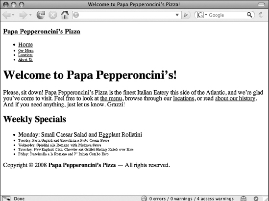
Figure 5-10. Using an adjacent sibling selector to de-emphasize related list items
In Figure 5-10, you can also see an unintended side effect of the previous CSS rule. Specifically, both of your lists, the main navigation menu and the list of weekly specials, have had the previous style rule applied to them. Thankfully, because you have well-structured markup, you can use a combination of all the different kinds of selectors you've just learned about to pinpoint the elements you'd like to style.
Combining multiple CSS selectors in a single rule
Now that you understand the building blocks of CSS selectors, what kinds of simple selectors are available to you, and how to chain them using specific combinators, you can take a quick look at a few complex examples. First, it's helpful to note that there is no law that says you can use only one kind of combinator in a CSS selector. This means you can use any combination of simple selectors and combinators to create arbitrarily complex selection patterns.
Let's amend the rule you used in the previous section so that it will apply only to the main navigation list. Currently, your rule looks like this:
li + li { font-size: x-small; }
It is affecting list items in every list on the entire page, and that's too broad for your tastes. So, let's narrow its subjects down to only the list items that are descended from the header <div>. To do this, you simply add an ID selector targeting the header <div> and use a descendant combinator to chain it to your existing selector. The new CSS rule looks like this:
#header li + li { font-size: x-small; }
This returns Papa Pepperoncini's list of weekly specials to the proper size. As another example, the following CSS selector is also perfectly valid:
#header li > a {... }
This selector is composed of three simple selectors and two combinators, and it says, "Target all <a> elements that are children of <li> elements, when those <li> elements are descended from an element with an id of header." Here are some more examples of complex selectors. See whether you can work out what they mean.
div#header h1 {... }

#specials .feature p {... }

.feature > h1 em {... }

.feature h1 + p {... }
As you can now see, CSS selectors give you enormous power to target the elements you want—and only the elements you want.
CSS inheritance: making the general case work in your favor
As we talked about earlier, using properly structured markup and identifying the groups of those elements using IDs and class names gives you the ability to apply certain styles to a big chunk of the elements in your web page using a single CSS rule. You've already seen one example of this in practice, where you styled all the text in Papa Pepperoncini's website header in one fell swoop. Recall that the XHTML markup you developed for the website header looks like this:
<div id="header">
<h3><a href="index.html">Papa Pepperoncini’s Pizza</a></h3>
<ul>
<li><a href="index.html">Home</a></li>
<li><a href="menu.html">Our Menu</a></li>
<li><a href="locations.html">Locations</a></li>
<li><a href="about.html">About Us</a></li>
</ul>
</div>
The CSS rule you used to style all the text in the header with a particular font was this one:
#header {

    font-weight: bold;

    font-family: Zapfino, serif;

}
As you can see, you never explicitly selected any of the links, list items, or headlines inside the header <div>. Nevertheless, the text of each of these elements has been given the style you declared in the CSS rule selecting the header <div>. How did this happen? It's not magic; it's another feature of the CSS specification that the designers of CSS were clever enough to create.
This behavior is called inheritance, so named because of the way child elements acquire certain CSS properties that their parents also have just by virtue of being that parent element's child. Another way to say this is that children inherit CSS properties from their parents and ancestors. This automatic inheritance saves web developers like you from the tedious task of explicitly defining CSS properties for every single element on a web page. Can you imagine what a nightmare that would be? There are 12 elements in just the previous HTML snippet! You'd be no better off with CSS than you were without it!
Another way to think about inheritance and how it works is to think of your XHTML elements as steps, each nested element another step down from its parent element. When you apply a CSS property to one of the steps, it "cascades down all the steps" beneath it and gets applied to those elements, too.
As we remarked earlier, some CSS properties display this inherited behavior, and others do not. As a general rule, most of the properties that replace HTML elements for styling (such as text properties like font and color) and that you've already seen used in this chapter, are inherited properties and behave in this way. However, a number of properties are not inherited because it would make little sense for them to be, such as width and height. These properties, and others that affect the layout of the web page (discussed later in this chapter), are specific to the elements on which they are applied.
CSS inheritance is ultimately a way to allow you to get the biggest effect with the least amount of work, but it's not too wide a brush. At any point, you can specify another, more specific CSS rule to override an earlier rule. For instance, using the previous example, you could give the text within the list a plainer font with the following CSS rule:
#header ul { font-family: Verdana, sans-serif; }
Doing this is like pouring a new CSS property on your steps at the point of the unordered list so that this new property cascades down on top of the one that was applied to the step above it, the header <div>.
The CSS cascade and rules of specificity
What happens when the declarations of two or more CSS rules conflict with one another? Far from being a one-off occurrence, these situations are actually at the core of how CSS works and are referred to as the cascade. Learning how the cascade works is fundamental to learning CSS.
The CSS cascade is just a fancy name given to a set of rules that define how conflicts among different CSS declarations should be resolved. These rules are based on the concept that more specific rules should override more general rules. Each CSS rule that applies to an element is examined and sorted based on its specificity. The most general rules are applied first, then the next most general rule, and so on, until the browser reaches the most specific rule, each successive rule overriding the previous rule's declarations for the element's properties.
So, what makes one CSS rule "more specific" than another? It depends on a number of factors, such as where it was written in the source code (its source order) and the specificity of the CSS selector used. (There are other things that determine the specificity of a rule, such as its origin and its weight, but these are advanced topics that you will not likely encounter in the day-to-day web development process.)
These days, a number of tools are available that can help you visualize the cascade. Adobe Dreamweaver is one such tool, which has a good visualization feature for specificity in its CSS panel, and the TopStyle and CSSEdit applications are also good tools to consider for getting on top of the cascade. Additionally, both the Firebug add-on for Firefox and the Element Inspector in Safari 3 can show you inheritance results and the cascade order, too. These two tools are especially convenient since they are embedded directly into their respective host browsers.
CSS selector specificity
The selector you use as part of your CSS rule determines a great deal about how specific your rule is. In most cases, it's really easy to determine which selectors are more specific than others, since CSS selectors translate to English quite easily. For example, it's easy to see that a selector with multiple combinators will be more specific than a selector without any of them. This:
#header a {... }
is more specific than this:
a {... }
because the first reads as "all links descended from the header," whereas the second simply says "all links." Clearly, links that are specifically inside the header are a more specific target than links that can be anywhere on a page.
As a general rule of thumb, the more simple selectors and combinators a CSS selector has, the more specific it is. Some simple selectors are more specific than others, however, and so are some combinators. For example, a type selector is more general than a class selector, which is more general than an ID selector.
If you think about it, this is all simply common sense at work. You can have <div> elements all over your page, but a much smaller number of them might be classed as "features," and only one of them might be given the feature-1 unique identifier. What this means is that given an element—for instance, <div class="feature" id="feature-1">—the following three CSS rules will all match, but the rule that uses the ID selector will actually be the one that the visitor sees applied.
.feature { color: green; }

#feature-1 { color: red; }

div { color: black; }
Of course, the result here is that this feature's text will be colored red. It doesn't matter in what order these three CSS rules are written down in the CSS file or even if they're not in the same style sheet at all. Since selector specificity is the primary sorting method the browser will use to determine the cascading order of an element's CSS properties, the most specific selector will always win.
Source order cascading
If two or more CSS rules conflict with one another but their selectors have an equal specificity, then their source order is used to determine which rule actually gets applied. This can often happen in complex style sheets that have many levels of cascading rules.
For instance, you may choose to make all the text in your feature boxes green by default, so you place the following CSS rule in an external style sheet:
.feature { color: green; }
You then link this style sheet to your web page, so the <head> portion of your document might look something like this:
<head>

    <title>Fantastic Staplers: Home Page</title>

    <link rel="stylesheet" type="text/css" href="css/global.css" />

</head>
Now, every page on your website that has been linked to this external style sheet will show feature boxes with green text. However, say that in the special Sales section of your website you want feature box text to be red, not green. How might you go about overriding the earlier rule you've written?
One possibility is to use a more specific CSS selector. For instance, perhaps each web page that is in the Sales section of your site has a <body> element with the id of sale-section. In that case, you can just add this rule anywhere in your style sheet:
#sale-section .feature { color: red; }
However, this requires changing the XHTML markup, even if only a little bit. There are some situations when this isn't possible or, more to the point, isn't advisable. Recall that CSS was invented to separate style from content, so it should be possible to make this change without affecting the XHTML content at all, and of course, it is. By adding a new style sheet to your page, re-declaring the feature box text as red, and inserting this new style sheet closer to the <body> element, you can use the CSS cascade's source order sorting to effect the change. Using this method, the <head> section of your document would now look something like this:
<head>

    <title>Fantastic Staplers: Sale Page</title>

    <link rel="stylesheet" type="text/css" href="css/global.css" />

    <style type="text/css">

        .feature { color: red; }

    </style>

</head>
Notice that this example is using an embedded style sheet to define the style sheet with the overriding rule, but it doesn't have to be an embedded style sheet. In fact, if the Sales section of your website is more than a single page, it behooves you to create a new external style sheet and link that in after the initial style sheet, like this:
<head>

    <title>Fantastic Staplers: Sale Page</title>

    <link rel="stylesheet" type="text/css" href="css/global.css" />

    <link rel="stylesheet" type="text/css" href="css/sale-section.css" />

</head>
In both examples, however, the concept is the same: style sheets defined further down the page (closer to the <body> element) will override ("cascade on top of") the styles defined further up the page (closer to the start of the <head> element) when the CSS rules that conflict have the same specificity.
It's also interesting to note that this is the same behavior you observed much earlier, when you overruled the browser's default styling with a style sheet of your own. Since the browser's default styles are defined "first" (they are at the earliest point of the cascade), any conflicting styles you define later overrule the browser's styling.
Visual rendering: document flow and the CSS box model
There are two final concepts to understand about CSS before you can honestly say that you know enough CSS to be dangerous. These are the CSS box model and how it relates to document flow. It's these two fundamental concepts that make designing for web pages radically different than designing for printed media. If you really want to become proficient with CSS-based designs, and especially if you're coming from a print design background, these are the concepts you absolutely need to nail.
Computer screens are not magazine pages, and at least for the foreseeable future, they won't ever be exactly like them. When you design for the printed page, you make certain assumptions about what kinds of designs might work based on facts that you understand about how printed media works. For example, you know that a standard printed page is a rectangle about 8.5 inches wide by 11 inches high, so you don't put a picture that is 10 inches wide or 13 inches high on the page because it just wouldn't fit. On the other hand, you know that you can put high-resolution images on the page because such images look really good when printed on paper (though they may not look so great on a computer monitor).
The web page, like the printed page, also has certain constraints, weaknesses, and advantages. For example, a web page can have a link or can change some of its content dynamically in response to user actions, such as hovering their cursor over a certain area. For obvious reasons, this is something a printed page couldn't dream of doing.
First, we'll quickly explain what document flow is. Then we'll briefly introduce the CSS box model. After that, we'll discuss how the two concepts are intricately related, and finally, we'll show you some of the ways that you can use CSS declarations to alter these two things at will.
What is document flow?
Document flow is a fundamental concept to CSS designers. In fact, the concept of document flow (or just flow for short) predates CSS considerably. So, what is it?
Document flow is a system by which a renderer (such as a web browser) lays out pieces of visible content on a screen so that they flow one after the other in predictable ways. Every element on a web page, every headline, every list item, every paragraph, and even every line of text and each individual character within every paragraph follow the rules of flow to determine where they end up on the screen.
For the most part, document flow just mimics what you would expect to see on a printed page. For example, while reading this book, you're looking at large chunks of text (paragraphs), each of which have a number of lines. These lines have printed characters on them that start from the left side and end at the right side. When you read the full paragraph, you're reading from the top-left corner of the paragraph, horizontally across each line, and ending at the bottom-right corner of the same paragraph.
This is the normal direction in which content flows in the English language. However, this is not true for all languages. Hebrew is an example of a language that reverses the direction of flow so that it begins from the top-right corner and ends at the bottom-left corner. Arabic does this, too. As described in the previous chapter, since web pages are really just long strings of sequential characters that a web browser sees one after the other, it needs some way to know how to order these characters and elements on the screen. It uses the rules of flow to do this.
It's easy enough to see how flow affects characters in a paragraph. Based on the language specified in the web page's <html> element, the web browser simply places the first character at either the top-left or top-right corner of the paragraph and then places each successive character it sees to the right or left of the one before it. Recall that your <html> element for Papa Pepperoncini's Pizza website began like this:
<html xmlns="http://www.w3.org/1999/xhtml" xml:lang="en" lang="en">
Since you've defined that this web page is written in English by specifying the xml:lang="en" and lang="en" attributes, the web browser will assume a normal flow for what is expected in English, specifically a direction of left-to-right text. If you're feeling experimental, go ahead and add the dir attribute with a value of rtl (short for right-to-left) to the <html> element, and you'll see that now every headline and paragraph is right-aligned (instead of how it was previously left-aligned) and the punctuation marks are all on the "wrong side" of the words.
So, parts of the rules of flow control things like the direction of text and where the beginning of an element's content should be placed, but as you'll see next, there's much more to flow than that.
What is the CSS box model?
You'll hear the term box used a lot when talking about CSS. The first question you need to ask yourself then is, quite obviously, what is a box?
In CSS, a box is simply a rectangular region that represents the physical space that a certain thing takes up. Typically, for web pages, this space is a group of pixels on a computer screen. For example, for every <p> element you define in your web page, you create a rectangle inside of which the content of that paragraph is displayed, or flows into. You can use tools such as Firebug or the Web Developer Toolbar add-on for Firefox to see these boxes, as shown in Figure 5-11.

Figure 5-11. Firebug highlights the CSS box of an element when you hover your cursor over it.
Notice how the CSS boxes of the paragraphs always extend to the paragraph's edges, even though the last line of text inside the paragraph may not. This is because it's not only XHTML elements like the <p> element that create CSS boxes. Indeed, everything on a web page that is visible creates a box of a certain type, including strings of text content.
However, not all CSS boxes are created equally. These characters inside paragraphs do not create the same kinds of boxes that the <p> element does. This is very deliberate, and as you're about to see, it's a very important distinction.
Inline-level vs. block-level boxes
The <p> elements create what are known as block-level boxes, whereas the strings of text within them create inline-level boxes. These two different kinds of CSS boxes flow onto the screen in very different ways.
Block-level boxes always flow onto the page one on top of another, like boxes (or bricks) in a vertical stack. Since paragraphs are declared by all web browsers' default style sheets to be block-level boxes, each time you define a new <p> element (and thereby generate a new block-level CSS box), the browser places that paragraph underneath any block-level boxes that came before it. This is why two paragraphs next to one another always create two distinct chunks of text, one atop the other, by default. Other elements that create block-level boxes are headlines, <div> elements, and lists (not list items, but the list items' containing elements, <ul>, <ol>, and <dl>).
Inline boxes are almost always inside some containing block-level box, but instead of flowing one after the other in a vertical stack like the way block-level boxes do, they flow one after the other horizontally. Each character of text (or glyph) that the browser sees is thus placed in the same horizontal line with any inline-level elements that came before it. It's only if there's not enough horizontal space for things to fit on the same line that inline-level boxes get bumped down to the next line. Some examples of web page elements that create inline-level boxes by default are images, links, and emphasized text (the <em> and <strong> elements, for instance).
Runs of text that aren't nested within any of these inline-level elements also create inline boxes implicitly. These implicit inline-level boxes are called anonymous inline boxes because they don't have an element that is specifically associated with them.
For instance, the following XHTML markup you used for the paragraph of text on Papa Pepperoncini's website footer creates two CSS boxes (not one), one of which is a block-level box and one of which is an inline-level box:
<p>Copyright © 2008 Papa Pepperoncini’s
Pizza — All rights reserved.</p>
The <p> element is the one that creates the block-level box. All the text inside the <p> element creates the anonymous inline-level box. If you then added another inline-level element into this paragraph, say a <strong> element for some additional emphasis on Papa Pepperoncini's name, you'd suddenly have four CSS boxes.
<p>Copyright © 2008 <strong>Papa Pepperoncini’s
Pizza</strong> — All rights reserved.</p>
In this paragraph, the <p> element still creates the block-level box, but the text "Copyright © 2008 " creates the first anonymous inline box. Next, the <strong> element creates a second inline-level box (whose contents is "Papa Pepperoncini's Pizza"). Finally, the text " — All rights reserved." creates the second anonymous inline-level box. So in total, one block-level box plus two anonymous inline boxes plus another (nonanonymous) inline-level box equals a total of four CSS boxes.
The kind of CSS box that an element generates (inline-level or block-level box, for example) can be controlled with CSS. Specifically, the value of an element's display property determines what kind of box it will generate. Here's an example of what the default CSS rules that web browsers use to make <p> elements block-level and <strong> elements inline-level might look like:
p { display: block; }

strong { display: inline; }
Of course, you can override these default styles and make any element generate any kind of box you want—something that was flat-out impossible before the advent of CSS. For example, you could add a CSS rule that makes <strong> elements generate block-level boxes instead of inline-level boxes, like this:
strong { display: block; }
If you add that CSS rule to the style sheets for Papa Pepperoncini's web pages, you'll see that you now have three lines of text inside the one paragraph and that the words "Papa Pepperoncini's Pizza" will be on their own line. This is because, as you now know, the rules of flow dictate that block-level boxes be stacked vertically. Since the <strong> element is now generating a block-level CSS box, it must be placed on its own line, so you end up splitting the footer sentence across three lines.
In this state, you still have four CSS boxes, but instead of having three inline boxes all within a block-level box, you now have two inline boxes and two block-level boxes. One of the block-level boxes (the one generated by the <strong> element) is overlapping the one generated by the <p> element. You can make this more obvious by adding background colors to your <p> and <strong> elements:
p { background-color: blue; }

strong {

    display: block;

    background-color: red;

}
In Figure 5-12, your three lines of text are now striped blue, red, and then blue again.
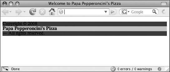
Figure 5-12. Background colors reveal that the paragraph has been split by the insertion of a new block-level box.
There's another thing worth pointing out about this picture, too. Notice that each stripe goes all the way to the edge of the browser window. At first, you might be tempted to assume that all CSS boxes are just always going to be as wide as they can be, but this is not true, and this fact highlights another important difference between inline-level and block-level boxes.
Block-level boxes that have no specific width declared (such as the ones generated by both your <p> and <strong> elements) do, indeed, grow as wide as they can, while still fitting inside their containing element's CSS box. In this case, all the block-level CSS boxes are as wide as the browser window, or viewport, because none of them has an explicit width, so they all grow to be as wide as they can be inside the web browser.
Inline-level boxes, however, grow only as wide as they need to be to make their content fit within them. Inline boxes are like shrink-wrap that surrounds whatever content they have. You can make this more obvious by giving a background color to your two remaining inline boxes.
First, since both of your remaining inline boxes are anonymous, you need to use an element you haven't seen before—the <span> element—so that you can target them with CSS. The <span> element is just like the <div> element except instead of generating a block-level box, by default it generates an inline-level box. The XHTML paragraph looks like this with the <span> elements added:
<p><span>Copyright © 2008 </span><strong>Papa Pepperoncini’s
Pizza</strong><span>— All rights reserved.</span></p>
The CSS now looks like this with the background colors applied to the <span> elements:
p { background-color: blue; }

span { background-color: green; }

strong {

    display: block;

    background-color: red;

}
Figure 5-13 shows the result.
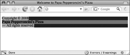
Figure 5-13. Four CSS boxes revealed using background colors. The inline-level boxes are shrink-wrapped to fit their contents, but the block-level boxes are as wide as their container lets them be.
The two inline-level boxes (colored green) shrink to the width of their content, but the block-level boxes (colored blue and red) extend to be as wide as they can.
Changing CSS box properties: the CSS box model explained
Every CSS box, whether inline-level or block-level, has four distinct areas within it. These are, from the "inside out," the content area, the padding area, the border area, and the margin area. The content area is one you are already familiar with. It is the rectangular area inside of which an element's content, whether plain text or other nested elements, is placed. The padding area is a transparent space around the content where only the background properties of an element (if any) will show. The border area frames the padding and the content, much like a picture frame. Finally, the margin area defines the amount of whitespace the CSS box should have around it.
Even though all of these areas always exist for all CSS boxes, much of the time, all of them except the content area is not shown because they have zero width and zero height. That is, they take up no space in the layout of a page whatsoever. However, with CSS, you can make each of these areas larger so that they will show up and thus affect the layout of the elements on your web page.
Firebug has a great Layout tab that lets you see exactly what the dimensions of each of these areas are for any given element. Let's start by examining the content area more closely and then do the same for each of the other three areas that the CSS box model defines.
Content area: defining the dimensions of content boxes
As you saw in the previous section, the content area of a CSS box behaves differently depending on the type of box being generated. For block-level boxes, the content area grows as wide as it can within the confines of its containing block or the browser viewport in the absence of such a container. For inline-level boxes, the content area shrinks so that it is only as wide as the widest part of its content. Both block-level and inline-level boxes grow as high as their tallest content, and no higher. This can be summed up in CSS with the following declarations:
width: auto; height: auto;
As you've probably guessed by now, changing the values of the width and height properties change the content area's width and height, respectively. Say, for instance, that you want the footer for Papa Pepperoncini's Pizza website to be exactly 300 pixels wide. No problem.
#footer { width: 300px; }
The width property (and any property that accepts a length value, such as the height property) can take as its value a number followed by an abbreviation (px in this example) that indicates the unit of measurement. The abbreviation px is short for pixels.
In this example, you're setting the width of the element with the ID of footer to exactly 300 pixels, no more and no less. Obviously, pixels make sense only for designs that are going to be displayed on a device that measures distances in pixels (like a computer monitor, and decidedly not a printed page). There are other length units that CSS will allow you to use, and we'll talk about one other unit a bit later.
So, with the earlier CSS rule applied to Papa Pepperoncini's footer, your footer text is now exactly 300 pixels wide all the time. Resizing the window will not change the width of your footer, and neither will adding more text content into it. The footer will remain at a fixed width because you've told it to do exactly that.
Note that even though this example appears to be using CSS inheritance, it's actually not. The <p> element inside the footer <div> still has a width value set to auto, since the width property is not inherited. However, since the <p> element is nested inside the footer <div> (the footer <div>'s CSS box is the paragraph element's containing block), and since the footer <div> is constrained to be only 300 pixels wide, the paragraph inside the footer can also be a maximum of only 300 pixels wide.
Since an inline-level box's width is defined by its content, the width property does not apply to these types of CSS boxes.
Padding area: giving backgrounds the floor
The padding area of a CSS box is the area immediately surrounding the content area. Padding is used to space the content of a box away from its edges. This helps a design look less cramped.
By default, most elements will not have any padding. The noteworthy exceptions are typically lists of some kind (unordered, ordered, or definition lists), whose child list item elements receive their indentation in some browsers through the application of a default padding value. (In other browsers, this same indentation effect is achieved with a default margin value. Margins are described later in the chapter.) In CSS, a box with no padding at all might be declared by using the following declaration:
padding: 0;
Notice that there is no unit abbreviation, such as px, after the 0 in the value of the padding property. Since 0 is the same value whether it is specified in pixels or in inches (or any other length unit), no unit abbreviation at all is needed.
Of course, all you need to do to give an element's box some visible padding area is to increase the amount from zero to some noticeable value. Let's give Papa Pepperoncini's footer 10 pixels of padding:
#footer {

    width: 300px;

    padding: 10px;

}
This change is subtle, but using Firebug you can clearly see that you now have 10 pixels of padding surrounding the content of the footer, as shown in Figure 5-14. Any background properties you specify on a box, such as a background color or background image, will "shine through" the invisible padding area because a box's backgrounds, unlike its contents, start at the edge between a box's padding and its border, not inside the box's content area.
You can see from this example that, in fact, you've applied 10 pixels of padding to all four sides of the content area. You have 10 pixels on the top, the right, the bottom, and the left sides of the footer <div>'s content. Also notice that the width of your content area is still 300 pixels, just as you left it.
The important thing to infer from this is that any space you give the padding, border, or margin areas of a CSS box get added to any size you might specify for the box's width (or height) property. In effect, your 300-pixel-wide CSS block-level box is now a 320-pixel-wide CSS box, because we've just added 10 pixels of padding to both the left and right sides of the box.

Figure 5-14. Firebug highlights different areas of a CSS box with different colors, making it plainly visible that your footer now has some padding applied to it.
With CSS, you have the flexibility to define different sizes for each of the four individual sides of a box. The padding property I used in the earlier CSS rule is just shorthand that expands to the following four declarations:
padding-top: 10px;

padding-right: 10px;

padding-bottom: 10px;

padding-left: 10px;
Every time you simply declare a value for a box's padding area with the padding property, you're really declaring each of those four specific padding properties with the same value applied to each property. CSS is full of shorthand properties like this, and it's important to be aware of them and what they expand to. When declaring rules generally, shorthand properties can save you quite a bit of typing (and quite a bit of bandwidth when downloading the finished CSS style sheet, too), but when you're declaring rules to override other rules, it pays to be as explicit as possible.
A CSS box's padding area behaves slightly differently based on whether the box is an inline-level box or a block-level box. The padding area of a block-level box behaves as you would expect, causing the content area to move both vertically and horizontally to accommodate the additional padding. However, while the horizontal padding of an inline box (that is, the right and left sides) behaves that way too, the vertical padding (the top and bottom sides) does not. Specifically, an inline box's vertical padding will increase the area available for the box's backgrounds, but no other boxes will be affected by the inline box's occupation of the additional space.
This is most easily illustrated with an example, so let's experiment with the introductory paragraph on Papa Pepperoncini's home page, since it's a paragraph that spans more than a single line. The XHTML for that paragraph looks like this:
<p>Please, sit down! Papa Pepperoncini’s Pizza is the finest
Italian Eatery this side of the Atlantic, and we’re glad
you’ve come to visit. Feel free to look at the menu,
browse through our your locations, or read about our history.
And if you need anything, just let us know. Grazzi!</p>
Now, let's use a <span> element to create an inline box that you can target somewhere in the middle of the paragraph:
<p>Please, sit down! Papa Pepperoncini’s Pizza is the finest
Italian Eatery this side of the Atlantic, and we’re
glad you’ve come to visit. <span>Feel free to look at
the menu </span>, browse through our locations, or read about
our history. And if you need anything, just let us know.
Grazzi!</p>
Finally, let's add a CSS rule to add a background color to the <span> element so you can easily see the content and padding areas of the inline box the element generates. You'll also increase the element's default amount of zero padding significantly. Figure 5-15 shows the result.
span {

    background-color: green;

    padding: 10px;

}
As you can see, the green background of the CSS box overflows beyond the confines of the line, sliding behind the line of text beneath it and obscuring the line of text above it. The vertical padding applies but does not affect the surrounding CSS boxes in any way. The text on either side of the green-colored inline box, however, is pushed 10 pixels further away, because the horizontal padding of the inline box does affect its surroundings.

Figure 5-15. The vertical padding of an inline box does not affect the layout of other boxes on the page.
Border area: drawing borders and outlines
The border area is, as its name implies, a space to define a border (or outline) for a CSS box. The edge between a box's padding and its border is where any background stops being visible. A CSS box's four borders (top, right, bottom, and left sides as usual) have a number of different possible looks. Let's use a border to outline the footer on Papa Pepperoncini's website.
#footer {

    width: 300px;

    padding: 10px;

    border: 1px solid black;

}
Figure 5-16 shows the result of this addition.

Figure 5-16. A border applied to a CSS box frames the padding and content areas of the box.
Borders behave in the same way as padding does. On a block-level box, all four sides affect their neighbors, but on an inline box, only the horizontal borders affect the layout of neighboring boxes.
The border property is another shorthand property. It sets a border width, style, and color for all four sides of a box. The example border declaration shown earlier expands to the following 12 declarations listed here, each of which can be set with a different value:
border-width-top: 1px;

border-width-right: 1px;

border-width-bottom: 1px;

border-width-left: 1px;

border-style-top: solid;

border-style-right: solid;

border-style-bottom: solid;

border-style-left: solid;

border-color-top: black;

border-color-right: black;

border-color-bottom: black;

border-color-left: black;
Borders have a lot of options, too many to go into at length in this chapter, so we encourage you to explore some of the other possible values for these properties on your own.
Margin area: defining whitespace and centering
The margin area of a CSS box defines whitespace that surrounds the box's other areas. Most of the spacing of elements on web pages is accomplished with clever combinations of margins and padding. Like the padding and border areas, CSS allows you to specify different amounts of whitespace (margin sizes) on each of the four sides of a CSS box, or you can use the margin shorthand property to set the margins of all four sides in one declaration.
Margins can be thought of as a way for an element's CSS box to invisibly "push against" any other boxes next to it in exactly the same way as you've seen happen with padding. Like padding and borders, all four sides of block-level box's margins affect the layout of its neighboring CSS boxes, but only the horizontal margins of an inline box do.
Typically, headlines, paragraphs, lists, and many other elements have a certain amount of vertical margins defined by the browser's default style sheet. This CSS rules could look like this:
h1, h2, h3, h4, h5, h6, p, ul, ol, dl { margin: 1em 0; }
The selector for this rule is simply a group of individual type selectors that matches all possible headline levels, paragraphs, unordered lists, ordered lists, and definition lists. The declaration uses the margin shorthand property. With two values, such as that shown earlier, the margin shorthand property expands to the following four CSS declarations:
margin-top: 1em;

margin-right: 0;

margin-bottom: 1em;

margin-left: 0;
That is, the first value sets the values for the vertical (top and bottom) sides, and the second value sets the values for the horizontal (right and left) sides.
The length unit being used here is an em. One em is the same length of whatever the length of the element's current font's lowercase letter m happens to be. Since the lowercase letter m is a different size in different fonts (and different font sizes), this unit is referred to as a relative length unit because the actual computed value is relative to another value that may change. Contrast this with an absolute length unit, such as pixels, which are always the same size no matter what. When working with text on a web page, it often pays to set sizes using a unit that is measured relative to a font size.
Why might the CSS rule for a margin use a relative unit that is defined by font sizes? If you think about it, the font size of an <h1> element is drastically different from the font size of an <h6> element and similarly different from the size of regular body text such as the contents of <p> elements. It makes sense, then, that the amount of whitespace (margins) on top of and below the CSS box for each of these elements is different.
It would look a little weird if you had a huge level-one headline but only had a few pixels distance between it and the introductory paragraph that came next, wouldn't it? Using relative units allows you to be consistent in your declarations and yet apply different actual values to CSS properties based on the values of other CSS properties. This is the basis for creating what is known as an elastic layout, an advanced implementation of designs that results in the ability to "zoom in" on a page by increasing the text size in the browser.
The margins of a box are also often used to center a block-level element horizontally within its containing block. Centering blocks is accomplished by setting both the right and left margins of the CSS box to the special value auto. You'll recall that this value simply means something like "automatically adjust this value based on the available space." Let's center the footer of Papa Pepperoncini's website as an example:
#footer {

    width: 300px;

    padding: 10px;

    border: 1px solid black;

    margin: 0 auto;

}
Again, the margin shorthand property is used to set the margins for all sides of the footer <div>. The vertical sides are both given margin values of 0 (meaning, no extra whitespace at all), and the horizontal sides are both set to auto. Figure 5-17 shows the result of adding the margin rule that centers the footer.

Figure 5-17. Block-level boxes are horizontally centered in the document flow by declaring a specific width and horizontal margins set to auto.
The footer is centered within the browser viewport because its right and left margins are each automatically adjusting their size to an equal share of the available horizontal space. To create available space in the first place, a width value other than the default of auto and less than the width of the footer's containing block (the browser window, in this case) must be specified so that the element appears centered in this way.
Margins have one other interesting property that can at first be confusing but quickly becomes indispensable. When the bottom margin of one element is directly next to the top margin of another with no intervening areas (no padding or border areas separating them), then the two margins combine to form a single margin equal to the size of the larger margin. This peculiar behavior, called collapsing margins, occurs only for vertical margins and never for horizontal ones.
This behavior is handy because it prevents you from needing to specify a multitude of additional CSS rules in the common case where two block-level boxes follow one another in the document flow, such as a sequence of multiple consecutive paragraphs. In that case, setting a top and bottom margin of, say 1em, on each paragraph will result in exactly 1em of whitespace between each paragraph (not 2em). If vertical margins didn't collapse, you'd instead have to specify something like 1em of bottom margin and zero top margin own every paragraph except the first in the series.
It can take a bit of time to get comfortable with the notion of declaring the sizes of what are essentially invisible areas of a page in order to define the layout of elements. This method of designing runs counter to the natural feel of directly manipulating the object itself. Nevertheless, you'll find that if you "go with the flow" of a web page, you'll end up creating designs that are far more flexible and far more maintainable.
Summary
This chapter covered an immense amount of technical material and a lot of theoretical ground. Don't feel discouraged if you think you may need to return to this chapter to get a handle on everything we've discussed. Thanks to its flexibility, power, and unfortunately spotty browser implementations, actually creating complex designs with CSS can be tricky, but knowing the foundations will prove invaluable just a short ways down the line.
In this chapter, we introduced the majority of foundational concepts that explain how CSS actually works inside the web browser, such as the cascade, inheritance, document flow, and the box model. We also introduced a great deal of practical information regarding how to use CSS, such as how to apply CSS styles to a web page by using external or embedded style sheets and individual inline styles. We also covered the syntax and terminology of CSS rules, distinguishing between properties, values, declarations, declaration blocks, selectors, and rules. We explored many possible CSS selectors and observed how you can have incredible flexibility over how you apply styles to elements by chaining simple selectors together with combinators. Finally, we introduced a plethora of CSS properties, including shorthand properties, that each changed the way an element is displayed visually.
Armed with this knowledge, you'll next take a look at a real design and dissect it to discover how it was implemented. You'll then use this experience to help you implement a simple design for Papa Pepperoncini's website. Along the way, we'll introduce you to some additional CSS concepts and properties that will give you yet another layer of appreciation for the power and flexibility of web standards.