
Chapter 8
TESTING, LAUNCHING, AND MAINTAINING
Test early and test often—these are words to live by in web projects. Testing your work can be a frightening, frustrating, and downright maddening experience. But the alternative—not testing—can be an even worse experience. The site that undergoes continual scrutiny and adjustment based on testing and feedback is a site that will differentiate itself greatly from the site that is launched and then left to stagnate. This is a step you will not want to leave out. Customer satisfaction means customer referrals in the future; ensuring the quality of your product helps reinforce your reputation as a professional and ensures that you stay happily employed.
The web development life cycle
When you publish new websites, you are giving rise to an entity that didn't exist before. Your site has life—certainly a measurable birth date. It is therefore helpful for you to consider the life cycle that this website will have and think about what will happen to this project before it goes live; how it will serve its functional purpose; how it will mature, refresh, and renew itself as time goes on; and finally how it will be retired and collecting on its 401k.
Considering the web development life cycle up front will help you plan contingencies, help you set goals and milestones, and help you to know what to expect for the future. These practices are the less geeky side of web development, entirely mundane and bureaucratic, and often the first things to be overlooked. And yet, simply following some of the basic premises of these guidelines can ensure that your website remains successful after launch and throughout the site's existence.
It is important when you are composing your project plan to bake in a periodic review of your work as a best practice. Think of it as a maintenance contract—it benefits the customer by making sure you as the site author remain engaged with your product, and it benefits you by ensuring that you know your live examples out there in the wild are lookin' good.
The initial step in adopting a web development life cycle is to begin constructing a plan. Writing this plan down helps you think things through, helps you plan for potential areas for concern, and gives you a road map to refer to as the project progresses. A plan can be as simple or as complex as the project requires, but one thing to remember is that if you want it to be effective, it needs to be readable. That means it needs to be concise and clear. Don't get deeply involved in lengthy process discussions where a sentence or two will suffice. Keep it high level, and leave the details to the trusted professionalism of those working on the project. And at the same time, don't leave out pieces of critical information that you or others will need to get to the next step.
An example of a workflow for a web development project plan might look something like this:
- Gather initial customer requirements.
- Research customer assumptions and market conditions.
- Write up recommendations.
- Test recommendations by gathering feedback from sample users.
- Design site information architecture.
- Test site architecture by gathering feedback from sample users.
- Develop an initial prototype.
- Test the prototype (user testing, browser testing, security testing, and so on).
- Make changes to the prototype.
- Test the changes (user testing, browser testing, security testing, and so on).
- Repeat steps 9 and 10 up until the final review date, adding features as you iterate.
- Conduct a final review with customer.
- Launch.
- Test the live site (user testing, browser testing, security testing, and so on) and continue revising.
As you can see, testing comes up a lot in this little example. Having testing cycles placed throughout your web development plan gives you the opportunity to evaluate your assumptions and refine your plans accordingly. Gathering feedback early from even a small sample of potential users can head off many problems before they have time to grow and become deeply rooted in your project. The longer you go down the wrong path, the harder and costlier it is going to be to correct the problem.
Publishing process
Before you begin your web project, it is a good idea to consider what your publishing process is going to be. On the one hand, you might build everything on your personal computer, upload the finished product to your web server, and be done with it. A more professional process establishes a three-tiered environment with a place for development, a place for testing, and a place to deploy your finished product. As the size and scope of projects increase, so does your need to maintain oversight over your files before they go live. Casually deploying your site on a shared hosting service may be perfectly adequate for your local underwater basket-weaving enthusiast's club website. But a major transaction-oriented web service such as a stock-trading operation is surely going to undergo phased development cycles and a careful quality assurance process before being deployed on a locked-down and robust server environment.
Using a three-tiered development environment is a standard pattern in the industry of web development. Many content management systems, code frameworks, and web development methodologies utilize the model of having a development-quality production environment in which to work. Take Ruby on Rails, for example: setting up your garden-variety Rails project by default immediately generates development, test, and production environments for you. Having a delineation between the development, test, and production environments gives you an opportunity to better organize your web development process, routinely pass your work through a place dedicated to the testing process, and keep live changes from occurring on the server before they have had an opportunity to be validated (see Figure 8-1).
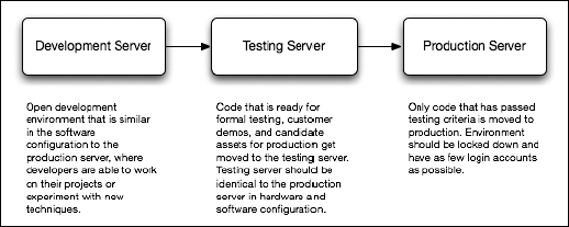
Figure 8-1. A typical three-tiered server model for web projects
Professional web development operations will typically have such a three-tiered environment in place. The development server is often a free-for-all—a place where the developer or development team can build away and experiment with ideas here and there. Although the development environment may be chaotic at times, especially in the area of file organization, the goal for such servers is to mimic as closely as possible what the server environment will be like in production. That means a similar edition of the web server, the same plug-ins, the same language support, the same operating system, similar directory structures, and so on. These environments may be vastly different from your local development machines, so it is good to have a playground to work in that has the same baseline configuration as what you can expect when going live.
Similar to a development server, the testing server strives to be as close a representation as possible of the production environment. This server, although probably behind a firewall or authentication mechanism, should be a mirror configuration of the production system. It should be set up with the same versions of operating system, web server, languages, frameworks, and the rest of it. The two should have similar security settings, similar directory structures, and even similar CPU and RAM levels.
The testing server is the place where you can stage versions of your code and hit your sites with everything you have: crippled web browsers, disabled JavaScript, screen or Braille readers, and that neighbor of yours down the block who still uses Netscape 4 on an old beige Mac G3 with a dial-up connection. Having a testing server environment is arguably the most important facet of the three-tiered server model, because it gives you a place to do your worst to a site without exposing it to the production world. You can perform security audits, capacity tests, usability tests, and quality assurance activities safely hidden from the judgmental eyes of the public.
In a production environment, the system should be locked down for security. Logins may be tightly controlled at this point, preferably with an automated process or with only a few select individuals able to move things to and from production. It is wise to pay attention to what makes it to production and to ensure that you have done an adequate level of testing of new code on the testing environment before going live.
A couple of major differences that may exist on a development server as opposed to a testing or production server might be in the area of directory index listings and server error messages. On a production machine, you would probably not want to allow the user to see the full output of error messages that exist because your database server is down. Similarly, a directory in the web server that is missing a directory index file such as index.html, index.php, or default.htm might show the site visitor a full listing of the directory contents, including any configuration files, archives, and outdated cruft that you may not want the whole world to see. These things, although extremely helpful in a development cycle, should be shut off completely in the production environment. Since the testing server is intended to test things as they would look in the real world before they go to the real world, it is probably best to disable these features here as well.
However you tailor your server infrastructure, be sure to consider carefully how things will move between each point. Keeping backups or using a version control system such as Subversion (http://subversion.tigris.org/) or Git (http://git.or.cz/) will help lessen the risk of realizing that some code changes that you just published are now causing major problems. You don't want to overwrite your only copies of the files on the server. Always leave yourself an escape exit, just in case.
Validating your code
As with any programming practice, your HTML, CSS, and JavaScript code should be well formed, it should use best practices, and it should be validated. Discussions about why you should validate your code have been frequent and ongoing since the beginning of the web standards movement. Suffice it to say, having valid code means your code has embraced the specification in question and adheres to its guidelines fully. This in turn gives your various user agents—be they web browsers, search engine spiders, web services, and the rest of it—a reliable format to expect. Knowing what to expect means they can in turn provide more consistent and functional interpretations of your site code and make better use of your data. Having valid code also means you are moving your web content one step closer to the semantic Web—a state where data contained on one site is interchangeable with data on the next site, and so on and so forth.
Having valid code is not rocket science. In fact, often the simpler your markup is, the greater the chance you have of passing validation. Having a well-formed, semantic, valid, and simple XHTML framework will give you a solid foundation for being successful in implementing an engaging CSS design and highly functional JavaScript behaviors. It is vastly easier to apply CSS and JavaScript to simple markup than it is to complex markup. Keep it simple!
The importance of DTDs
Before you can begin the process of validating your code, it is important to understand Document Type Declarations, often called doctypes or DTDs for short, which define what type of markup you are using. There are many flavors of HTML and XHTML, and the number of possible varieties of DTDs is unlimited when discussing XML. Web browsers use the presence of a valid DTD to enable "standards mode." In standards mode, the browser will attempt to render your web pages according to the established specifications and not to legacy quirks, at least to the best of its abilities.
To get a flavor for DTDs, try examining a live one in your web browser. The DTD for XHTML 1.0 Strict is as follows:
<!DOCTYPE html PUBLIC "-//W3C//DTD XHTML 1.0 Strict//EN"

        "http://www.w3.org/TR/xhtml1/DTD/xhtml1-strict.dtd">
If you point your browser to the indicated URL (http://www.w3.org/TR/xhtml1/DTD/xhtml1-strict.dtd), you will come across the XHTML 1.0 specification written in valid DTD syntax. Treated as XML, you could validate your XHTML 1.0 code in an SGML parser against these rules. In a pragmatic sense, you usually will be most concerned with the DTD's effect on enabling a consistent rendering mode for your web pages. Without a proper DTD, your code validator may make unexpected assumptions about what the intended flavor of markup was, or it may simply throw an error or ask for clarification.
For more information on standards mode, please see "Quirks mode and strict mode" at http://www.quirksmode.org/css/quirksmode.html.
For a good introduction to DTDs, we recommend pages 24 through 29 of Pro PHP XML and Web Services by Sas Jacobs (Apress, 2006).
Markup validation
In the discussion of markup validation, your first stop should be the W3C validator site at http://validator.w3.org/. This free resource will validate HTML, XML, and applications of XML such as SVG, MathML, and of course XHTML (see Figure 8-2).

Figure 8-2. The W3C Markup Validation Service
Once you've had a chance to familiarize yourself with the W3C's Markup Validation Service, give it a whirl. Try validating a live URL first and then perhaps an uploaded document, and finally copy and paste something in there. It allows input on all three fronts.
If you are not online, you can use several excellent tools that work equally well while connected to the World Wide Web or while disconnected in a commuter train traversing a long tunnel at the bottom of the San Francisco Bay.
Adobe Dreamweaver features a built-in code validation and tidying feature that is simple to access and use (see Figure 8-3). Choose File 
Validate Markup to pass the current web page or XML document to the validator.

Figure 8-3. Dreamweaver's built-in validation feature
Once you've run your test, you may choose to manually fix any code errors discovered. Or you may want to see how things go if you try to fix everything in one fell swoop. Yes, Dreamweaver has a command for that too. Select Commands Clean Up XHTML to get the dialog box shown in Figure 8-4.

Figure 8-4. Dreamweaver's Clean Up HTML/XHTML dialog box
Another excellent tool to investigate is HTML Tidy. HTML Tidy (we'll call it Tidy for short) is an open source project that you can find at http://tidy.sourceforge.net/. Tidy typically attempts to clean your code, tell you what happened during the process, and warn you of anything it was unable to fix (see Figure 8-5). Many code-editing tools have Tidy built in. For example, the excellent TextMate (http://www.macromates.com) editor for Mac OS X includes a Tidy command. Choose Bundles HTML Tidy or Bundles XML Tidy to clean up the document on which you're working.

Figure 8-5. Tidy is often included in code editors and provides feedback on errors as well as cleans up the code automatically.
CSS validation
CSS validation is a less critical issue for web developers. Historically, CSS has been less problematic than HTML, and there are numerous CSS tools and techniques that yield pretty good code, at least from a standards perspective.
Nevertheless, it is important to strive for valid code on all fronts, and CSS is no exception. Having a valid style sheet attached to your code helps ensure that future browser developments will continue to render your website as intended.
The W3C CSS validation service (http://jigsaw.w3.org/css-validator/) is likely the most popular tool for CSS validation. As input, it accepts links to URLs containing CSS files or HTML files with CSS embedded, file uploads, and direct input. It has been wrapped into many additional tools around the Web, including code editors such as TextMate, and into browser plug-ins such as the Web Developer Toolbar for Firefox.
JavaScript validation
The use of JavaScript in modern web development continues to gain in popularity. The language was arguably intended for lesser functionality than we are seeing today, with full-scale web apps that replace the functionality of programs you would normally find on the desktop.
With such increased complexity comes the need to follow standards-based processes, for the same reasons you do so with HTML and CSS. Ultimately you want to have well-formed, unobtrusive JavaScript to enhance the functionality of your carefully constructed web pages, and you want to have your JavaScript be maintainable over the long term.
JSLint is one such tool to help you with checking the construction of your JavaScript code. JSLint takes a stricter view of JavaScript than you may be used to, using a subset of the ECMAScript standard, and it steers the developer toward writing more efficient and cleaner code. JSLint is worthy of a bookmark in any web developer's browser: http://www.jslint.com/.
Browser add-ons and features
When it comes to web development plug-ins for our favorite web browser, we web developers have an embarrassment of riches. No discussion of web development tools would be complete without a mention of at least a few of these excellent tools:
- HTML Validator: When you are testing pages in a web browser, wouldn't it be spectacular if you could tell in a single glance whether the page was valid? Fortunately, such a tool does exist! Enter the HTML Validator plug-in for Firefox and Mozilla (http://users.skynet.be/mgueury/mozilla/). This free plug-in has to be one of the handiest tools for the standards-conscious web developer. The HTML Validator places a button in Firefox's status bar and instantly provides feedback on whether a page passes validation. In the preferences for this plug-in, you can enable the tool to automatically check WCAG priority levels as well, making it an exceptional tool for your testing process.
- Web Developer Toolbar: The Web Developer Toolbar for Firefox, Flock, and SeaMonkey adds a great list of commands and features that work to transform your web browser into a powerful web development tool. This tool contains commands to validate CSS, HTML, RSS feeds, and accessibility; options to disable things such as JavaScript or CSS; the ability to swap between the screen, handheld, and print media types for testing style sheet views; and options to clear out private data such as cache and authentication.
- Firebug: Firebug (http://getfirebug.com/) for Firefox picks up where the Web Developer Toolbar leaves off. Firebug gives web developers an incredibly powerful tool for (among other things) inspecting HTML and CSS, graphically examining network activity, inspecting the DOM, and debugging JavaScript. The JavaScript debugging features deserve special mention here, because Firebug features a full-featured JavaScript debugger with conditional breakpoints, a JavaScript console, and a DOM editor.
These are just a few of the browser enhancements and features that exist, and there are many more worth investigating. The Safari browser as of version 3.1 includes a new Develop menu (activated in Preferences), which gives you many great testing tools for disabling browser features, inspecting elements, and monitoring errors and network activity. Microsoft Internet Explorer has a developer toolbar available as well, and as of this writing, the Internet Explorer 8 project is working on a full-featured and integrated developer tools feature.
Browser testing
Beware of site owners that state "Only Internet Explorer users on Windows hit our site." This is essentially advertising that the developers didn't take the time or didn't care to make their work even minimally accessible. Or worse, sometimes a browser detection script will render a sad-faced message along the lines of "You must be using Internet Explorer 6 or newer to enter this site," which really only serves to turn business away. As of this writing in April 2008, Net Applications reports approximately 76 percent of the web browser market share as going to the Internet Explorer family of web browsers, about 17 percent going to Firefox and the related Mozilla crowd, 6 percent going to Safari, and the rest of the remaining couple of percentage points going to everything else. The Web continues to move toward a model of healthy biodiversity in the species of user agents encountered in the wild.
Testing your carefully designed CSS layouts and JavaScript behaviors in a wide variety of browsers is a critical step in deploying your code. Thankfully, the consensus among current browser vendors is to adhere to web standards, even though they all adhere in different ways. For the most part, you can expect that if you follow the CSS 2.1 and HTML 4.01 or higher markup recommendations and the ECMAScript standard of JavaScript and avoid proprietary extensions (or implement them in such a way that they fail over gracefully if not supported), then things should look pretty good across most browsers.
Yes, there will be exceptions. No browser has fully, perfectly implemented any of these specifications. Because of the nature of the specifications, there are some differences in interpretation. Most notably, Microsoft Internet Explorer 6 has the weakest support for CSS, but Internet Explorer 7 has cleaned up many of the CSS inconsistencies, and Internet Explorer 8 promises to resolve most JavaScript issues and to support the CSS 2.1 specification.
In addition to browser discrepancies, there will be OS-specific issues to contend with. Perhaps most notably, fonts will be a concern. The reason you need to list such an array of fonts in the font-family CSS rules is because you can never be sure whether font X is going to be installed on a given system. It may not be available; it may have been removed. Providing a font array gives you a reasonable list of best guesses to work with, and then you can always fall back to a default serif, sans-serif, or mono indicator as a worst-case scenario. You will also have to contend with various levels of text antialiasing, letter spacing, and font width discrepancies.
Testing environment
To test your site adequately, you need to define and establish the testing environment. For a professional office-based web development team, you might choose to set up a physical testing lab. This might be a room or a hallway with several machines of varying operating systems, configuration, and horsepower. You might have, for example, a modern Windows Vista machine installed with the latest version of Internet Explorer, Opera, and Firefox and a large display; a Windows 2000 system with Internet Explorer 6 and a smaller display; a Mac loaded with Safari and Firefox; and a Linux machine with Firefox, Konqueror, and Lynx.
The advantages of having a physical testing lab such as this is that you can really experience how the system will react as people bang around on the site. You might notice text getting clipped off, horizontal scroll bars appearing, and things just not working as you had expected them to work. You can move yourself from machine to machine in order to go through the routine of testing your site in each system. However, the disadvantages of such an environment are that, for starters, you have to maintain a bunch of systems. They take up space, generate heat, and suck up the ol' electricity. And you have to get up out of your chair and walk over there—not very convenient when you're deep in a coding trance or telecommuting.
Perhaps a more flexible environment would be to use virtualization to run multiple operating systems on your desktop. Products such as VMware and Parallels provide you with the ability to install and run several operating systems simultaneously on the same system and at fairly decent speeds these days. This is a popular solution for developers, because you can configure your systems in a very flexible manner—allocate some RAM here, install a few browsers there, launch Linux and Windows XP simultaneously from a MacBook Pro, and finish testing everything during your flight to Albuquerque just in time to make your presentation.
However, virtualization solutions require lots of extra disk space, RAM, and CPU resources. Many of the modern CPUs support virtualization natively, and you can load tons of RAM on most of the higher-end computers these days. If you can afford it, load it up. If you can't shell out those kinds of ducats, you might try a slightly more lightweight option.
If you are on an x86 CPU architecture and a flavor of Unix such as Linux, Mac OS X, or FreeBSD, you may be able to get by with using Wine. Wine (http://www.winehq.com/) is an open source implementation of the Windows API, allowing you to run Windows-only software such as Internet Explorer on your machine without having to purchase, or install, a full Windows system. This method has a bonus in that you can install multiple versions of Internet Explorer with ease. Crossover by CodeWeavers (http://www.codeweavers.com/) is an easy-to-install commercial version of Wine with some nice extra features. The drawback here is that, as of this writing, Internet Explorer 7 will not install in the Wine environment, and the Internet Explorer 8 beta doesn't even appear on the radar.
If you are using Windows, you might be able to get away with simply having a nice array of browsers installed for most of your basic testing. Firefox, Opera, and Safari are all available for Windows and have the same functionality, and you can get a fairly good idea of how things will work across platforms in these browsers. When using a platform-specific approach to testing, keep in mind that there will be occasional discrepancies on other operating systems.
The most lightweight option is using a web service such as Browsershots (http://browsershots.org/). Browsershots excels at giving you a massive set of options for testing your web designs. As of this writing, Browsershots features four operating systems (Linux, Windows, Mac, and FreeBSD) and dozens of browser choices up to and including Internet Explorer 8 and Firefox 3. If all you need to do is test visual design, this is a great way to go regardless of whether you're using a physical lab or virtual machines. The disadvantage is that you get only a screenshot, and if you are using the free version, you will have to wait a while for your jobs to finish and risk them timing out. You also will not have the ability to test forms and behaviors beyond the most basic display items, and you have to feed it one URL at a time.
If you plan on having mobile users, and you should, plan on adding some resources for mobile devices to your testing suite. Nothing beats having a few mobile phones and PDAs lying around. Opera is a popular browser for the mobile set, and it features a small-screen view command that renders things as they'd look on a mobile device, including a switch to the handheld style sheet if it exists (see Figure 8-6). The Web Developer Toolbar for Firefox also includes a menu option to switch rendering to the handheld style sheet for a nice quick preview.
Figure 8-6. Opera in small-screen mode for mobile devices
For Safari/WebKit testing in the iPhone, Android, and Nokia handsets that use it, you can expect it to have a fairly similar rendering behavior to the desktop version of Safari, unless you've done some specific targeting for the smaller screen sizes. Although nothing beats using the actual device, some decent simulators exist, including http://iphonetester.com and iPhoney (http://www.marketcircle.com/iphoney/).
In all cases for your mobile testing plans, remember that the user experience is quite different on an actual handset as compared to viewing these things in emulation from the comfort of your primary development machine; in addition, these devices have control mechanisms that are rare to absent in the desktop world. This includes features such as the iPhone-like touch screens, stylus-based tap screens such as the Treo, and your garden-variety flip-phone with navigation controlled by a rocker dial or the keypad.
Going back and forth fixing browser inconsistencies can be extremely time-consuming and can drive web developers to the brink of madness. It is therefore a good practice to find a testing order for the various browsers in your array and go through testing your designs in an order that warrants the least amount of back-and-forth bug fixing. Typically for us, that means going in descending order of standards compliance and feature support. A sample order might be as detailed in the following sections.
Firefox (Gecko)
With excellent CSS and JavaScript support, coupled with nearly ubiquitous access across operating systems, we generally regard Firefox as the best starting place for testing, and most people we've worked with agree on this point. The sentiment is that if you code your site to standards and get it going in Firefox, the rest of the browser fixes that cascade out of this starting point tend to be easier. Additionally, Firefox has a wonderful plug-in architecture that has been used to create some excellent web development tools, which were mentioned earlier. Many of us find that a good text editor and Firefox with such plug-ins are all we need for web development.
Firefox is based on the Gecko rendering engine. Gecko is used in several other web browsers such as Camino, SeaMonkey, Flock, and the now-discontinued Netscape Navigator.
Safari (WebKit)
As of version 3, Apple's Safari web browser is available for Mac OS and Windows. And because it has outstanding support for CSS, Safari makes a compelling second step for your testing cycle. WebKit is the underlying open source rendering engine that drives Safari. WebKit and Gecko have typically had good parity in CSS support, although you may find that some of the more advanced features such as text-shadow and the <canvas> tag that are implemented in Safari or WebKit nightly builds are not available yet in other browsers. Remember to adhere to the principles of graceful failover, and you should have little cause for concern.
WebKit is widely deployed in many other browsers and frameworks, including iCab, Adobe AIR, and OmniWeb. For mobile handsets, this platform is rapidly gaining in popularity: the Nokia Web Browser for S60, Google's Web Browser for Android, and of course the iPhone are all using WebKit by default.
Internet Explorer 8 (Trident)
As of this writing, Microsoft Internet Explorer 8 is in beta, and by the time you read this, it may very well already be in production. If we were betting folk, we'd bet that Internet Explorer 8 is going to quickly leapfrog Internet Explorer 6 and Internet Explorer 7 in terms of market share, thanks to its vastly improved support for web standards. Since it is too early to predict, we are placing Internet Explorer 8 at the third spot in the testing cycle just on principle, although if the final version delivers as much on web standards as Microsoft says it will, you may want to move this one up to the second spot. But then again, by the time Internet Explorer 8 is available, there will likely be new versions of Firefox and Safari with greater standards compliance, as well.
Opera
The Opera browser has excellent standards support, with some interesting additional features and a large presence in the mobile browser world. Its small-screen mode emulates handheld devices, has default support for the handheld media type for mobile devices, and includes Opera Show, which enables presentation-like functionality using the projection media type.
Using Opera's small-screen mode is excellent for getting an idea of how things are going to look in the palm of your hand, but remember that the proof is in the pudding. Until you see this in the actual mobile device in question, you won't really know what sorts of issues might arise in the areas of design and usability. If you have any intent to target handheld devices for your site, Opera is an essential tool.
Internet Explorer 7
Internet Explorer 7 improved CSS support in many areas, and those fixes are outlined on the IEBlog at http://blogs.msdn.com/ie/archive/2006/08/22/712830.aspx. Although this browser still doesn't adhere fully to W3C specifications, Internet Explorer 7 makes great improvements over the preceding version.
At this time, it is probably wise to mention the availability of conditional comments in the Internet Explorer line for versions 5 and newer. A conditional comment allows you to target a specific piece of HTML code to your audience based on some versions of Internet Explorer while hiding it from older versions. To show a linked style sheet to Internet Explorer 7 only, you might write the following:
<!--[if IE 7]>

<link rel="stylesheet" href="ie7.css" type="text/css"

      media="screen" title="IE7 Styles" charset="utf-8" />

<![endif]-->
Or suppose you wanted to hide it from Internet Explorer 7 but show everyone else a particular set of styles. In that case, place an exclamation point (aka the not operator) in front of IE:
<!--[if !IE 7]>

<link rel="stylesheet" href="not_ie7.css" type="text/css"

      media="screen" title="Not IE7 Styles" charset="utf-8" />

<![endif]-->
You can even use less than (lt), less than or equal to (lte), greater than (gt), and greater than or equal to (gte) operators, and (&), and or (|) operators. Here are a few more examples:
<!--[if lt IE 7]>

<link rel="stylesheet" href="less_than_ie7.css" type="text/css"

      media="screen" title="Styles for IE less than version 7" />

<![endif]-->


<!--[if gte IE 7]>

<link rel="stylesheet" href="greater_than_or_equal_to_ie7.css"

      type="text/css" media="screen"

      title="Styles for IE less than or equal to version 7" />

<![endif]-->


<!--[if (gte IE 5.5)&(lte IE 7) ]>

<link rel="stylesheet" href="ie_transition_styles.css" type="text/css"

      media="screen" title="Styles for IE versions from 5.5 and 7" />

<![endif]-->


<!--[if (gte IE 8)|(IE5)]>

<link rel="stylesheet" href="gte_ie8_or_ie5.css"

      type="text/css" media="screen"

      title="Styles for IE8 and greater, with a nod to IE5 for fun." />

<![endif]-->
For more information on conditional comments, check out the entry on the Microsoft Developer Network at http://msdn.microsoft.com/library/default.asp?url=/workshop/author/dhtml/overview/ccomment_ovw.asp, or visit Peter Paul Kotch's article on the subject at http://quirksmode.org/css/condcom.html.
Internet Explorer 6
OK, take a deep breath, because here we go. The bane of every web developer's existence in the modern era is Internet Explorer 6. Thankfully now that Internet Explorer 8 is in beta with its multiple web standards improvements, we can only hope that Internet Explorer 6 will become obsolete very soon.
Still, this is the dominant browser on the Internet as of this writing and the one that you need to make sure looks respectable for the sake of your customers. With Internet Explorer 6 controlling the largest chunk of market share, coupled with the large number of unsupported or broken CSS and JavaScript items, you will likely spend the majority of your time fixing Internet Explorer 6 inconsistencies in your project above all other browsers.
However, that's OK. You've gotten this far. Don't throw up your arms just because everything has been going so smoothly so far and all of a sudden the whole thing is broken in Internet Explorer 6. The issues you will encounter are largely known and well documented. Some of the excellent resources that cover browser compatibility issues include Position Is Everything (http://www.positioniseverything.net/) and QuirksMode (http://quirksmode.org/).
Mobile devices
In February 2008, Google announced at a conference in Barcelona that searches from the iPhone were 50 times greater in volume than searches coming from any other mobile device. The open source WebKit is available for mobile device manufacturers and is already used in the Nokia S60 platform and Google Android. Expect that more and more users will be showing up on your sites, and expect browser manufacturers to follow suit in improving usability.
The main browsers to pay attention to are of course Safari/WebKit, Opera Mobile, and Internet Explorer Mobile. You will also see Treo users on the Blazer browser, and expect to see Mozilla-based mobile clients appearing soon.
The trick with mobile devices is that, for the most part, users won't upgrade as often, if at all (iPhone users excepted). That means you may have some obsolete user agents appearing in this space. Don't expect things to be there that you might take for granted, such as fonts, plug-ins, and basic things such as RAM. Screen real estate will be limited and will vary wildly between browsers.
Different mobile browsers have different rules with regard to how they intend to handle things like CSS. For most mobile browsers, the handheld media type is supported. The notable exception is Safari/WebKit, which notably (and controversially) ignores the handheld media type and shows the screen media type instead. The Amazon Kindle simply disregards CSS altogether and shows the user raw HTML. If you expect a significant presence on mobile devices, and you should consider this as a growing trend, then expect to find an incredibly wide array of conflicting issues that will make designing for the desktop look like a walk in the park on a sunny spring day.
Text-only browsers
There is an argument to test your site in a text-only browser first, before you apply even so much as a stitch of CSS or JavaScript to your site, in order to experience the semantic structure and content format of your HTML code. If you have a solid markup foundation, then you can expect greater understanding of your content from site visitors, a greater life span from your code, and an easier time applying styles and behaviors as you go along.
The easiest way to examine your site this way is to disable styles and behaviors in the source code and see how things look. Comment out your links to your external CSS and JavaScript files as well as any such code embedded in the page and see what happens. However, it is important to note that every web browser comes with a certain default style sheet and will apply some basic formatting to features such as headings, paragraphs, list items, and inline elements such as <em> and <strong>. You can find a shortcut to achieve this sort of view in your web browsers in Firefox's Web Developer Toolbar extension. To disable JavaScript, choose Disable JavaScript All JavaScript. Then disable CSS by choosing CSS Disable Styles All Styles. Finally, you will want to disable images, so select Images Hide Images. The result is a good representation of your semantic document output.
Perhaps an even better method is to switch to a dedicated text-only web browser such as Lynx. Lynx is a command-line utility that has the capability to render text only; navigation is achieved via the keyboard. This represents a new usability challenge and removes the mouse from the equation. If things "look good" in Lynx—that is, things are readable and make sense—then you know that your document markup stands on its own.
Putting your site into Lynx also puts you into "machine mode," where you can start to visualize what the experience will be for a text-crawling search engine or a semantic web service (see Figure 8-7). Remember that some of your site visitors are machines—Google, Yahoo, and the rest of the search engines will show up to index your site content from time to time. Having a navigable and well-formed semantic structure to your markup that is free of presentational cruft means that search engines will have all the better time indexing and understanding your content.
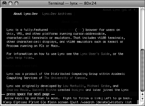
Figure 8-7. The Lynx web browser provides a text-only output and requires keyboard navigation.
Obsolete browsers
On those rare occasions when it is necessary, test your site in old versions of Internet Explorer 5 on Mac or Windows, Netscape Navigator 4, and the rest of it. If you have any users presenting these outdated browsers to your website, chances are the numbers will be miniscule. If you hide JavaScript and CSS from these folks and show obsolete browsers a text-only experience, we are willing to bet they will be plenty happy. If someone is still using one of these browsers, chances are they are used to sites breaking on them or locking them out, and they know they are on obsolete equipment and are really interested in just obtaining the content they need. In the rare case where the customer insists on it, work the additional testing into your timeline and budget.
Thoughts on browser testing
The issue of browser testing has been discussed and debated at length. It is an ongoing debate that will continue to evolve over time as browsers, operating systems, specifications, and user patterns change. Don't be afraid to modify, experiment with, and fine-tune whatever process you come up with—just be sure you do have a process and are in fact performing testing. For additional discussion on the subject, please visit the following articles:
- "Browser testing order" by Andy Clarke at http://www.stuffandnonsense.co.uk/archives/css_browser_testing_order.html. Andy covers a simple and pragmatic model for testing Cascading Style Sheets layouts in various modern browsers, with some good arguments about what to do with obsolete browsers such as Internet Explorer 5 on Mac and Internet Explorer 5.5 on Windows.
- "Browser testing CSS and JavaScript" by Roger Johannson at http://www.456bereastreet.com/archive/200702/browser_testing_css_and_javascript/. This is an excellent write-up building on Andy Clarke's post that includes JavaScript consideration.
- "W3C DOM Compatibility Tables" by Peter Paul Koch at http://www.quirksmode.org/dom/compatibility.html. PPK keeps an excellent resource for looking up DOM support between browsers.
- Position Is Everything by Big John and Holly Bergevin at http://www.positioniseverything.net. This site digs deep into many of the common CSS problems that are to be expected among the various browser editions.
Virtualization is a trend in computing that has been rapidly increasing in importance in recent years. For us as web developers, this affords us an opportunity to run multiple OS configurations on a single computer for testing purposes, each with widely varying environments. The improvements in virtualization over the past few years have been significant, giving you the ability to run virtual machines at near native speeds and with fairly seamless integration between environments.
Finally, screen width is an ongoing issue for web developers. Up until the iPhone was released, it was arguable that optimization for a layout to fit within an 800×600 screen was safe and 1024×768 optimization would not be unheard of. But now we are seeing an emerging trend for even smaller screens to appear at our sites by way of mobile devices, with the iPhone leading the charge. So, what are you to do now?
For the issue of screen optimization, the best way to make an informed decision is to know your site visitors. Running a log analysis tool or analytics program such as Mint (http://haveamint.com/), WebTrends (http://www.webtrends.com/), or Google Analytics (http://www.google.com/analytics/) can give you an excellent idea of how many of your visitors show up at the various resolutions. Ultimately the best solution is going to be the one that caters to the widest number of visitors, and going with flexible widths that scale down to almost arbitrarily small screen resolutions may make the point moot.
Security testing: how much is enough?
Although a discussion of how to perform an extensive security audit is beyond the scope of this book, the subject is worth a mention in the context of the testing process. Here is the one question every site developer needs to answer before dismissing security concerns entirely: does your site accept any form of user input in the shape of a form or a query string in a URL? If so, then you are exposed to vulnerabilities and should perform some level of security testing. Really, if your site does anything in the form of server-side processing, you have potential application-level exposure.
When dealing with any sort of exposure in the form of user input, there is a simple thing to remember: do not trust your users. Sorry, we know we'd all like to believe the better nature in humankind, but when it comes to web forms, it really seems to bring out the mischief in people. Quite a number of attacks could potentially arise simply by placing a single-field input form into a web page. And yes, even URL parameters should be considered user input. If your URL looks like this:
http://some.random.website.com/form?pageID=873
then right away you have alerted the public to the fact that you probably have a field in your database called pageID that accepts integers. What if someone types pageID=0? What if that page ID does not exist? Or worse, what if that is the admin page? If the site is coded well, it will display an error message—something along the lines of "page not found" or "access denied"—and we hope in a way that uses a more user-friendly language. In a worst-case scenario, it might display things you might not want the public to see, such as an administrator interface or a set of error messages giving away details about your site that you'd rather not divulge to the world. This is an overly simplistic case and far worse scenarios are possible, but this should get the point across.
So, what's a web developer to do if their own precious users cannot be trusted? We of course mean that in a figurative sense—we don't mean all users, just the one or two users who wish your website harm. The motivations for hacking a site are many, but they generally fall into these categories:
- Curiosity : This kind will rarely do any actual damage—they just want to see what would happen if they poke around a bit.
- Bragging rights and vandals : These folks will almost always leave you a little present in the form of an altered image, web page copy, or just missing files. They might be just looking for bragging rights whether they defaced your site or not, or they might be activists looking to publicize their cause at your website's expense.
- Theft, fraud, and espionage : These types typically have the goal of stealing information, manipulating records (such as academic grades or employment data), or stealing money.
The basic things to remember for any situation where your scripts take user input and have that affect how things operate with your site is to ensure that data is validated as it is entered and escaped as it is redisplayed to the browser and, where appropriate, that you properly authenticate and encrypt your transactions. For larger projects, you will likely want to hire a security professional to audit your site before going live and periodically thereafter as your site and known threats continue to evolve.
User testing
When you design websites, you need to do so with the needs and goals of the end users in mind. User testing is the process of determining whether your website is usable and makes sense to your potential and intended visitors. Early in your project, you should bounce ideas off potential persons who would use the site in question. You can do this as a formal survey with random sampling and scientific processes, or you can do this by grabbing some people you know and asking them some questions about your site or having them look at some sketches or diagrams. Don't wait: as soon as you have a set of initial requirements together, get some feedback.
Defining usability
When testing for usability, you are asking whether your site visitors and application users can get what they need out of the site. Can they find the information they need? Is it intuitive for them to find their way around the various parts of the site? Are they finding the things you want them to find? Do they get stuck anywhere, and can that particular area of concern be improved at all? Are you getting your message across? When designing your site, you are assuming you are addressing these needs. Now you need to test your assumptions and analyze the resulting data so that you can determine whether this effort has been successful.
Formal usability testing can be quite involved. Typically the usability team will requisition a special room equipped with eye-tracking equipment and video equipment for viewing and recording behavior, and they will hire a proctor to administer the test in a neutral and bias-free way. This can be expensive and often includes paying subjects for their time. Each subject is presented with a script or set of options or goals to try to accomplish during a fixed time period. Data from such exercises is analyzed and reviewed against the design objectives for the project, and recommendations are made as to how to improve the design or alter the project plan based on the findings. It's all very scientific and rational, and if you have the budget to perform such studies, it may well be worthwhile.
However, there is a not-so-well-kept industry secret that can achieve similar results with much less money and formality. Simply do informal testing with a few people off the street (or even people you know). Show them the part of the site you are working on, and have them use it while you watch. Give them some parameters: write up a script or set of tasks to accomplish, and have them talk through their experiences. Write down things as they talk, or grab an inexpensive video camcorder and tripod to record the event. For a fraction of the budget, you can come away with much of the benefit you'd get from a more expensive and formal usability study. As usability experts such as Steve Krug and Jakob Nielsen have argued in the past, you don't need a lot of subjects to get an adequate amount of feedback. Even just one test subject is better than performing no usability analysis at all, and Nielsen argues that five users per test is the practical upper limit of subjects for any given usability test (Alertbox, March 2000). If you do small usability tests frequently throughout the life cycle of your web project, you will come away with a far more refined product with a far greater chance of success than if you just build it and put it out there.
Accessibility testing
When launching a website into the public domain, you are opening up your business to a wide range of people out there on the Web. Some will be on Windows, some on Mac, and some on Linux. Some will be using desktop computers; others might be visiting on a handheld device such as a Blackberry or an iPhone. Perhaps most important, some of your users may require special preference settings or varying types of assistive technologies to overcome the disabilities they may live with. With adoption of solid accessibility guidelines in your web development practices, you can open your website's arms to the widest possible number of visitors and provide everyone with an enriching and informative experience.
Although accessibility may be considered a universal issue that covers browsers, devices, operating systems, and whatnot, we'll now take a moment to consider site visitors with disabilities and what that means for us as web designers and developers.
Disabilities come in many flavors, and the most obvious one for you to consider for the purposes of web development are the vision-impaired users. These users include the blind as well as those with color blindness and low vision (to the point where the issue is beyond the assistance of what corrective lenses could provide). Deafness is another consideration, especially obvious if your site content includes aural cues, audio clips, or video. Users with limited motor ability form another category for consideration—imagine the experience of trying to show up to work with your arm in a cast and not being able to grab the mouse or type beyond one-handed pecking at the keyboard. This group includes such users, users with neurological conditions that prevent proper hand and eye coordination or control, and amputees. Finally, we have the cognitive disabilities—those with learning disabilities such as memory problems, ADHD, and so on.
Accessibility recommendations: WCAG
In 1999, the W3C published a Recommendation entitled Web Content Accessibility Guidelines 1.0 (WCAG), which you can find at http://www.w3.org/TR/WAI-WEBCONTENT/. It gave developers a common set of guidelines to aim for when targeting accessibility and a benchmark to measure things by. The stated target for this document is for users with disabilities, but it also states that all user agents, including PDAs, text browsers, and mobile phones should benefit from following these practices.
The WCAG breaks down accessibility into three levels:
- Priority 1 covers items that must be met. Failure to do so means that there will be groups of users that will be unable to access your content.
- Priority 2 covers items that should be met. Meeting these guidelines will remove the most significant barriers for accessing your content.
- Priority 3 covers items that may be met. Although these items are optional in most cases, taking care of them means you've substantially eased accessibility for your content.
Each checkpoint in the WCAG document is assigned a priority—1, 2, or 3. For example, providing text equivalents for nontext elements such as alt text within your image tags would be a priority 1 checkpoint. Properly using heading tags such as <h1> and <h2> in a hierarchical fashion to denote document structure would be a priority 2 checkpoint. Expanding the full text representation of an acronym within the title attribute of a tag, such as <abbr title="Web Content Accessibility Guidelines">WCAG</abbr> would be considered a priority 3 checkpoint. It is recommended that you read the WCAG guidelines to become familiar with the concepts and keep the site bookmarked in your web browser for future reference.
Accessibility law
In the context of web accessibility, Section 508 refers to an amendment to the US Rehabilitation Act of 1973, which is legislation that expands the requirements for federal and related agencies to provide equal access to electronic resources to those with disabilities. All federal websites are potentially subject to this requirement, and many nonfederal organizations are subject to these policies as well. The law is designed to provide access for disabled employees as well as members of the public. Section 508 is one of the most often referred to legal precedents when discussing web accessibility law.
The W3C Web Accessibility Initiative maintains a list of laws broken down by country at http://www.w3.org/WAI/Policy/. Although it maintains that "this page is not a comprehensive or definitive resource for all applicable laws and policies regarding Web accessibility," it is a great place to start researching accessibility law in your country.
For your web project, be sure you understand what legal obligations you may have with regard to accessibility, and develop a process for checking your work to make sure you have everything covered.
Accessibility basics
To work toward an accessible web infrastructure, there are some basic guidelines to keep in mind:
Images Use the alt attribute to describe the image in question. The alt attribute descriptions should be concise and clear. For example, a photo of a grizzly bear might have the alt attribute "Photo of a grizzly bear catching salmon in a mountain stream". A logo image for a corporation might have the alt attribute "Acme Incorporated Corporate Logo". If you are able to use the <object> tag for images, you may provide information about the image between the <object> tags. For example:
<img src="lincoln.jpg" alt="Portrait of Abraham Lincoln." />
Or for example:
<object data="lincoln.jpg" type="image/gif" >

     Portrait of Abraham Lincoln.

</object>
Image maps If you are using image maps, be sure they are of the client-side variety and have text equivalent information for hotspots. You can do this by using the alt attribute within <area> tags, like this:
 <map id="labmap" name="labmap">

 <area shape="rect" coords="0,0,55,55" href="patients.html"

     alt="Patient Information" />

<area shape="rect" coords="60,60,100,100" href="doctors.html"

     alt="Doctor Information" />


</map>
Including text-based alternate links (for example, <a href="patients.html">Patients</a> | <a href="doctors.html">Doctors</a>) in context with these image map URLs would satisfy an optional but useful WAI priority 3 checkpoint.
Video Any video being served from your site should contain subtitles, include closed captioning, or have a text transcript.
Hyperlinks Ensure that the text you wrap inside your anchor tags makes sense for the target content. Avoid using text like "click here." Try to use descriptive title attributes as much as possible to provide additional information about the links. Most browsers will render a tooltip when using the mouse to hover over the link.
Tables You're using tables only for tabular data, right? Avoid using table layouts and instead ensure that your display layer is CSS-based. If for some reason you must, please do your vision-impaired site visitors a favor and make absolutely certain that an empty summary attribute is included in the table:
<table summary="">
Screen readers that encounter tables with empty summary attributes will skip going through the annoying process of announcing the table, giving your vision-impaired users a far smoother experience.
Tables when formed properly have constructs for great amounts of information. The <table> element allows for a summary attribute, which can be used to describe the basis for the data you are representing. The <caption> element provides a text caption for the table. The <th> element is provided to indicate table headings. Use these features for your accessibility advantage.
Here is an example of a simple well-formed table with accessible representations of the content:
<table summary="This table lists goldfish lengths for project 6.">

    <caption>Goldfish Lengths</caption>

    <tr>

<th>Fish ID</th>

<th>Length</th>

    </tr>

    <tr>

        <td>23</td>

        <td>321mm</td>

    </tr>

    <tr>

        <td>24</td>

        <td>402mm</td>

    </tr>

    <tr>

        <td>25</td>

        <td>376mm</td>

    </tr>

</table>
Document structure Use properly nested heading tags that denote the hierarchical structure of your content. An <h1> tag might represent a primary heading with possibly one or more subheadings represented by the <h2> element. In turn, an <h2> might have one or more subheadings represented by <h3> elements. But an <h3> would never appear higher up in the semantic hierarchy than an <h2> or an <h1>. Use paragraph tags to denote paragraphs and the appropriate lists (ordered, unordered, and definition) to denote the types of lists you are representing.
Each HTML tag was created to represent a specific type of content. Chances are, there is one available for the item you are trying to represent. Markup should as much as possible represent the semantic meaning of the content. Resist the urge to insert presentational markup and inline style information.
Graphs and charts These are usually images, but the information they contain is usually more complex than what a typical alt text description can provide. Use the longdesc attribute to point to a full-text description of the data represented within the graphic, as shown:
<img src="2007sales.gif" alt="2007 Sales Chart"

    longdesc="2007salesreport.html" />
The resulting page should be as many paragraphs as required to describe the data in your graphic in a way that adequately conveys the meaning of the data represented.
Unfortunately, many browsers do not support the longdesc attribute. In addition to using the longdesc attribute, provide a simple text-based hyperlink pointing to the same resource.
JavaScript Do not expect JavaScript to be available to all of your users. Use the Document Object Model to direct JavaScript behavior and externalize all your JavaScript in separate files. Make sure all intended behaviors have a graceful failover mechanism, such as directing the user to a standard HTML form with a submit button in lieu of an Ajax behavior.
For more information on best practices and useful techniques of using JavaScript against the Document Object Model, check out the excellent book by Jeremy Keith titled DOM Scripting (friends of ED, 2005; http://domscripting.com/book/).
Anything that requires a plug-in Adobe Flash is probably the most ubiquitous plug-in found in browsers today. Adobe currently claims 98 percent of U.S. web users have Flash enabled. But for that remaining 2 percent, and specifically those users who are unable to use Flash for whatever reason, there needs to be some consideration as to their user experience.
Flash is a best-case scenario. Flash has made great strides in accessibility features, but that still leaves some users out of the loop—either because the plug-in isn't available to them or because accessibility has not been implemented for the given SWF file. Other plug-ins have far slimmer market share, so as a general rule of thumb, you should never count on any given plug-in being available. Provide alternative text-based content for these instances.
PDF Adobe's Portable Document Format is excellent for providing accurate print-ready representations of your content. However, if you are wrapping up your content in PDF files when the text content of such could be represented in HTML, you are not doing your site visitors much of a favor. Provide PDF content in the context of being a printer-ready representation of an accessible HTML document.
For further reading on the issues concerning PDF and accessibility, please check out the A List Apart article "Facts and Opinions About PDF Accessibility" by Joe Clark at http://www.alistapart.com/articles/pdf_accessibility.
Frames Frames can complicate accessibility, and it is considered best to avoid them whenever possible. If you must use frames, use meaningful frame titles and a <noframes> content section for when this feature is unsupported. Support for frames is dropped in XHTML 1.1, so it may be best to just avoid frames altogether.
Valid markup Not all valid web pages are accessible, but all accessible web pages are valid. Be sure to strive for validity in your XHTML code and test validity regularly.
Assistive technologies
Making your website accessible to users who require assistive technologies is the right thing to do. Assistive technologies help certain types of users navigate your web content to retrieve the information they need and achieve the tasks they need to accomplish. This includes screen readers, Braille readers, text enlargers, alternatives to mouse input such as foot pedals, keyboards, eye motion trackers, and much more. For the purposes of this discussion, let's include providing subtitles and text transcripts as part of the assistive technologies discussion.
If you are really in tune with accessibility, you will test the user experience for yourself using some of various assistive technologies. Testing your sites in a text-only browser such as Lynx goes a long way, but there is really nothing like putting yourself in the driver's seat and feeling what it is really like to, oh, say complete one module of an online course in ancient Roman history using nothing but a screen reader and keyboard input. Try it once: turn on a screen reader. (JAWS allows an unlimited trial that can be used up to 40 minutes per session, and users of Mac OS X 10.4 and newer have a free excellent reader called VoiceOver as part of the Universal Access suite.) Turn off your computer screen, put on a blindfold, or turn out the lights. Unplug your mouse, and go! Try navigating a good site first, such as WebAIM (http://www.webaim.org/). Then hit something really bad—something, oh, circa the year 1999 or 2000 or so—a ripe example of table layouts, text baked right into images (no alt attributes of course!), plug-ins galore, and a side helping of invalid markup. Then let us know how it works out.
Now imagine having to put up with this every day. Imagine trying to attend college like this, trying to go to work, or just trying the simple act of going online to check e-mail or surf the Web. For sites that have horrific markup, it just doesn't work. This is the cyber equivalent of opening a business in a busy part of town and not building a wheelchair ramp.
Although it may be time-consuming and cost prohibitive to test every page of your site using these sorts of assistive technologies, it might be entirely feasible to just spot-check things here and there. If you are using a markup template that retains good control over how your XHTML foundation is constructed, then you should remain in good shape. At the very least, it wouldn't hurt to try this little experiment to gain some experience and appreciation for accessibility issues. Having this sort of experience helps you appreciate well-formed, semantic, accessible code so much more.
Accessibility checklist
To keep in step with whatever your legal, corporate, or project requirements may be, it is a good idea to develop a checklist against which to test your site. It does not have to be complicated—it could be anywhere from a formal checklist to a mental note if you feel that confident about your skills, but don't skip the step. A sample checklist for accessibility might look like this:
- Markup has been validated against the indicated DTD, Schema, or X/HTML specification indicated in the doctype.
- All nontext elements have text equivalents (
alttext for images,longdescfor charts, and so on). - JavaScript behaviors use DOM best practices, are unobtrusive, and fail over gracefully with alternative content or functionality.
- Plug-in-based content has alternative content provided.
- Video captions or text-based transcripts have been provided.
- Tables have summary content provided and are semantically constructed.
- The site is free of presentational markup, inline styles, and embedded behaviors.
- The site elements have proper hierarchical order and semantic representation of the content.
For things that might be fuzzy or not representable as absolutes, you might even rate the level of quality. For instance, you could say that the hierarchical and semantic document markup structure is rated "fair" but could be better. Record this as something to improve upon on at a later date.
Accessibility resources
The following are accessibility resources:
- WebAIM (http://www.webaim.org) is one of the finest resources for accessibility available today. WebAIM offers plenty of articles on accessibility issues, a site evaluation tool called WAVE at http://wave.webaim.org/, and professional services.
- The HiSoftware Cynthia Says Portal at http://www.cynthiasays.com/ is another great resource for learning about accessibility. The site allows you to test pages and generate reports using Section 508 or WCAG priority levels, and it offers a suite of commercial products that provide more extensive functionality.
- The U.S. Government has established a website covering the laws and applicability of Section 508, which can be found at http://www.section508.gov/. In addition to this resource, WebAIM has created a helpful checklist for evaluating your site for Section 508 compliance, which you can find at http://www.webaim.org/standards/508/checklist.
- The Web Accessibility Tools Consortium (WAT-C) maintains a list of free tools for developers to assist in producing accessible sites; you can find WAT-C at http://www.wat-c.org/.
- The WCAG Samurai (http://WCAGSamurai.org/) is a group of developers led by web accessibility guru Joe Clark that publishes corrections and extensions to the Web Content Accessibility Guidelines. The WCAG Samurai project was formed in response to a feeling that the WCAG 2.0 guidelines effort was not headed in the right direction, and it opts to publish errata for version 1.0 of the WCAG instead. It takes a decisive and opinionated stance on many of the issues, where the WCAG merely provides "recommendations." For background on this initiative, we recommend reading the A List Apart article titled "To Hell with WCAG 2," which you can find at http://alistapart.com/articles/tohellwithwcag2.
Launching your site: the big milestone
After you've thoroughly tested your site, there's only one thing left to do—launch it! And since we are discussing professional web development, you should think of the site launch as the most important milestone of your project. It is an event to be treated with some respect and care. All too often we see haphazard management of the launch process—just upload it and go. Are you sure everything is working? If something breaks during a particular release, are you going to shut users out of your site or otherwise alienate your customer base?
To avoid surprises, it is a good idea to come up with a production checklist—something to verify in your web development process that you have gone through at least a basic level of quality control and are confident that what you are about to launch is production quality. Here's the checklist we use:
- All copy has been approved by marketing.
- The site has been reviewed for branding and design.
- The site has passed in all required browser checks.
- All the required accessibility checkpoints have been reviewed and approved.
- All the markup and CSS passes W3C validation.
- The site has passed the required security evaluation.
- A backup of the old version has been made (or source code versioning has been verified).
- The customer has signed off on this release.
- All the documentation has been recorded and archived.
There—once you pass your production checklist, now you can flip the switch! Be aware that this is just a sample. Your checklist might be simpler or far more complex. Whatever meets your needs is best, just as long as you give some adequate consideration to the publishing process.
Having a production checklist works well with a three-tiered server environment as mentioned earlier. Once the site is approved, you might set up your process so that the production person—such as a capable server admin, knowledgeable developer, or just yourself putting on the appropriate hat—receives the production request, verifies that the checklist and any other required artifacts have been taken care of, and then proceeds to perform the launch.
Ongoing maintenance: beyond launch
Launching your site can sometimes feel anticlimactic. After you've done all this work building and testing and testing again, the final step after the customer signs off on it is really just to flip the switch in whatever publishing process you have established. But wait—what's next? You've built the best website you know how to build. You've tested it for validity, functionality, usability, and so on. Everything is perfect; how do you know it is going to stay that way? Enter the web development life cycle: plan periodic checks on your site.
When you launch a website, you are giving rise to a new entity on the Internet—something that people will continue to interact with on a daily basis—and you hope something that will grow over time. It is therefore a good practice to plan on how you will maintain this site ahead of time. Will you and your team check in on it from time to time? Will there be a site manager to continually review and maintain the content? Or have you designed the site so that the client can do all the maintenance, meaning that your role is over until there's a need to enhance or expand the site? In the last case, it might be a good idea to set an expiration date and plan for taking it down. This is especially important on intranet projects where outdated information can be left just sitting there getting indexed by search engines when such data has long outgrown its usefulness or has become an information security liability.
Embedding ownership of your work into your original proposal is perhaps the most important step to take in keeping up with your site. Even if it is just an annual review with a proposed recommendation write-up, you should always try to bake this into your proposals up front and plan on checking in from time to time.
Content management
Now the trick is that once you've launched your site, what is to stop the content owners (who know just enough HTML to be dangerous) from breaking your beautifully architected and well-formed markup? Chances are it is unlikely most of these sorts of folks are going to want to take the time to learn how to construct semantic markup and validate their code. The way to do this is to plan on implementing some sort of content management solution.
A good content management solution can help ease the entry of content into the ongoing management of a website, but it can also be used to set up constraints that enforce your information architecture and your markup design and keep things neat and tidy.
For static content websites, setting up the content owners with a tool such as Adobe Contribute can assist in achieving both aims of easing content management and controlling your source code. You can assign roles in Contribute that handle specific tasks—for example, a Contributor role for the majority of those who write or input copy, an Editor role for approving and publishing content, and an Administrator role with full access to architect and define how things work. The default roles are User and Administrator, with User having typical edit and publish access, and this may be just fine for many small to medium-sized projects. Role settings in Contribute allow for control over the types of files that can be edited, how styles are applied, and accessibility and markup controls. To administer roles in Contribute CS3, follow these steps:
- Choose
Contribute Administer Websites on MacorEdit Administer Websites on Windows, and elect the site you want to make changes to. - Select
Users and Rolesfrom the left menu. - Select the role you want to edit from the
Users who have connectedbox. The Users role might be a good place to start if you're using the default configuration. - Click the
Edit Role Settingsbutton. - In the resulting dialog box, set the options that make the best sense. For instance, you may want to ensure that your content editors don't touch your dynamic code, only use image assets already stored on the server, are prompted to enter
alttext for any images they insert, and use<em>and<strong>instead of the deprecated<b>and<i>tags, as shown in Figure 8-8.
The alternative to static content is serving your content via a database-driven system. There are dozens of viable options to choose from. Delving into the finite details for such systems is far beyond the scope of this book, but we'll highlight some of the basic things to be aware of.
Database-driven content management systems (CMSs) can be purchased, adapted from solutions in the open source community, or developed entirely from scratch. There are pros and cons to each.

Figure 8-8. Contribute gives you several options for controlling how content is edited by a site editor.
Purchased Commercial off-the-shelf (COTS) systems can be feature-rich and tie in with your existing enterprise infrastructure. They should have all the i's dotted and the t's crossed when it comes to enterprise requirements, and enterprise decision makers often seem to like the idea of a large corporate entity backing the software that is being deployed. On the downside, these systems can be bulky, can use proprietary and non-standards-compliant code, and can often be a bit behind the times in terms of modern features and functionality. And they can be expensive both to purchase and to maintain. Be sure to evaluate such systems with web standards in mind. If the product claims support for only a limited number of specific browsers and has no mention of standards compliance or accessibility, keep looking around. You don't want to shackle your customers to a particular platform for years to come and lock out their potential customers.
Open source This option has become much more popular for a number of reasons. Open source systems are free, they are fully featured, and they tend to be quite robust and effective. Blogs, wikis, and the rest of the buzzword-laden vectors of Web 2.0 are mostly just specialized variances of content management solutions, and in many ways this diversity addresses the specialization required when discussing CMS. There is no one-size-fits-all solution, and whatever you choose from the preexisting software world is going to mean some compromises to make with regard to your site.
Custom developed Custom CMS solutions are those that you or your development team create from scratch. The benefit here is that you can program things to work exactly the way you need them to—no extra cruft, no distracting features—and it fits your business needs as designed. And of course the obvious drawback is the effort required to develop such a system. If expertise in server-side languages such as PHP, Perl, or Ruby on Rails is lacking, then this is probably not going to be a cost-effective solution. (On the other hand, it is a great way to learn!) But if the requirements are simple, a custom solution might be a far better choice than trying to fit a square CMS peg into a round website infrastructure hole.
Summary
In this chapter, we discussed many issues relating to testing, publishing, and maintaining your websites in a development/test/production model. We talked about the idea of a website management life cycle and how engraving certain important issues can be better managed by baking these things right into the project plan. We discussed the importance of maintaining the validity of your code by keeping tabs on it throughout the project span and some of the tools out there that make the process of checking validation a simple task. You looked at testing your sites in different web browsers and examined some of the ways to ease the process of developing and testing your code across the vast array of user agents that your sites might encounter. We discussed how to test your design assumptions for usability with potential users. We got into some of the details of accessibility, including assistive technologies, the user experience for those with disabilities, and strategies for helping ensure your sites are open to the widest number of users. And finally, we discussed the launch process and keeping your sites in shape by developing maintenance plans and adopting a philosophy of continued improvement.
When it comes to testing and managing your work, the first step is to plan. Once you've made the conscious decision to do so, the next step is to act. Set yourself reminders and mark dates in your calendar when you need to take care of things so you don't forget. If you make sure you have provided for testing and maintenance in your development plans and follow through on these issues, you can be sure that the quality of your work will be greatly improved, and your customers and users will be thankful.
With the high level of importance we place on our online information resources, it is often surprising for web professionals to see what a low level of regard people have for the web profession outside of our industry. This is in part because of the wonderful simplicity and low learning curve of HTML, coupled with the prevalence of WYSIWYG web production tools that completely shield the amateur from the responsibility or understanding of what semantic, accessible web page creation is all about. Their only goal is to copy and paste information into the thing, publish it, and be done with it. But what you pay for is what you get. To produce quality web infrastructures, the process itself must be nobly regarded.
The cyclical process of testing and revising your work should be a basic premise for every professional web developer. Although all of the recommendations outlined in this chapter may be more trouble than they are worth for many cases, adopting even just some of these premises will be beneficial to your web development process and will yield a higher quality of work. Don't leave things to chance-take some care in how you produce code, assign some level of quality control to your work, and treat it with some reverence and care.