CHAPTER 5
Vagueness and Ambiguity
In the previous chapter, we discussed how the role of semantics informs graphical presentation, making information easier to understand. Functionally aesthetic charts take categories, place, time, and numbers, weaving patterns and stories in creative ways. Data often loses precision when interacting in the real world. Most of the things around us have boundaries that are only vaguely defined; a tall person means different things to different people, for example.
So why is all this relevant to visual analysis and the data driving the analysis? Understanding language goes hand in hand with the ability to integrate complex contextual information into an effective visualization and being able to converse with the data interactively, a term we call analytical conversation. It also helps us think about ways to create artifacts that support and manage how we converse with machines as we see and understand data. We will circle back to this during the course of the book, especially as we go into intent in Part C.
How Tall Is Tall?
Language can be vague, as its interpretation depends on the context and our inability to precisely determine the boundaries of vaguely defined concepts (Kessler & Kuhn, 2014). One of the most prevalent kinds of vague language involves the use of adjectives. These vague concepts that include adjectives appear throughout language and are expressed on a spectrum of concreteness, from “tallest” to “cheap” to “safe,” as illustrated in Figure 5.1. Research from linguistics says that people deliberately use imprecise language as a way to better communicate (van Deemter, 2010). They do this for many reasons—to avoid error, because of the absence of a mutually understood metric, to reduce cognitive effort, or because precision may not be relevant.
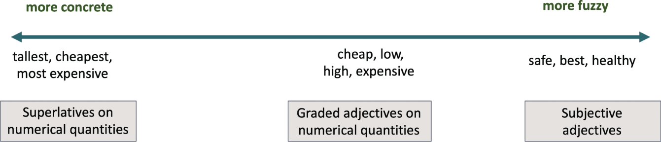
FIGURE 5.1 Vague concepts can be interpreted along a spectrum from concrete to fuzzy.
Let's take the concept of “tall.” What counts as a tall basketball player is different from what counts as a tall kindergarten student, which differs again from what counts as a tall glass. Some humans are definitely not tall, like actor Danny DeVito, who stands at 4′10″, while Serbian professional basketball player Boban Marjanović is definitely tall at 7′4″. A height of 5′10″ is almost definitely tall for a woman in the United States but might be a borderline case for men. “Tall” is not the sort of quality for which there are definite criteria that sort the world into “tall” things and “not tall” things. In other words, “tall” is vague.
This fuzziness in language permeates into how we ask questions about our data. Studies from cognitive linguistics (Schmidt et al., 2009; Solt & Gotzner, 2012; Qinq & Franke, 2014) show that human judgments of these vague adjectives vary depending on the data distribution of a set of presented data items. In these studies, crowd worker participants were shown bars of differing heights, presented in random order. They were asked to mark which items were considered “tall.” Viewers were quite sensitive to the distribution of the relative sizes of the items, how many appear in plateaus adjacent to one another, and if the relative values formed a convex or a concave shape when placed in sorted order.
A study by Hearst et al. (2019) wanted to probe further into the boundaries of what an appropriate visualization would be for responding to queries that contain these vague, imprecise concepts. The study showed the participants different visualization views for the question “Which of my grocery expenses” followed by one of the following: “is the highest this month?” or “are the highest this month?” or “are high this month?” Figure 5.2 shows the three data shapes used in the study with multiple top k bars highlighted.
- Shape 1: A roughly exponential drop-off. The first three items were marked as tall by nearly all participants, with the rest marked not-tall.
- Shape 2: A roughly inverse exponential curve. No clear visual markers as to where to distinguish between tall and not-tall.
- Shape 3: Plateaus. A first plateau of items followed by an 80% drop to a second plateau of items, followed by a 65% drop.
Participants showed a strong preference to highlight the top k bars in the charts as opposed to filtering to those top bars. They also chose multiple highlighted bars for the superlative questions, i.e., “are the highest” and “is the highest.”
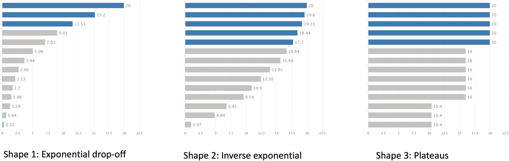
FIGURE 5.2 The stimuli shapes used in understanding how to represent vague concepts for visual analysis
Other vague forms of analytical questions occur when people talk about place. Places may be referred to using colloquial or local names (e.g., “in the city” versus the surrounding suburbs) or cultural nicknames (e.g., “the Big Apple” for New York City). Once these places are disambiguated, there is still the issue that people often think in terms of vague spatial concepts rather than absolutes. It is more natural to use fuzzy spatial terms, such as “restaurants near me” as opposed to “restaurants within 1.5 miles.”
Natural language interface tools for visual analysis need to constantly address these vague questions that people type or say to them. Eviza (Setlur et al., 2016) was a research prototype that supported vague queries in the context of a visualization. Figure 5.3 shows a map of earthquake data in the United States. Here, the map shows marks selected in response to the user's query “Find large earthquakes near California.” Eviza finds two ambiguities in the query: “large” and “near,”’ which are fuzzy terms for size and distance. The system semantically associates the size descriptor “large” to an attribute, and “magnitude” with values 5 and more, while “near” is a 100-mile radius around the border of California. Now you may ask, “Hmm, earthquakes are scary, and I prefer associating large to be 4 or more.” To handle this subjectivity, two ambiguity widgets are added to the interface to allow the user to modify these settings. We will discuss more about repair and refinement as a natural part of language and communication a bit later in this chapter.
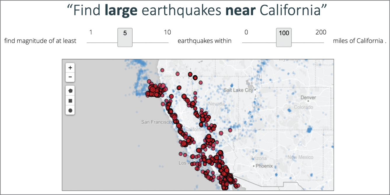
FIGURE 5.3 Eviza's interface shows a map of earthquake data in the United States.
The semantics of place is a common notion prevalent during information seeking activities with queries such as “show me the best coffee places around here” or “what is the cost of living in the midwest?”
Research in geographic information science (Goodchild, 2011; Gao et al., 2017; McKenzie & Hu, 2017; Adams & McKenzie, 2012) discusses how people form regions in their minds, reflecting informal ways to identify and organize places like “Midwest.” These places can be subjective and allude to different meanings for different people, often depending on the context and the nature of the inquiry.
Hopefully by now you are starting to appreciate that ambiguity is present at many levels and in many forms. Visual analysis tools such as Tableau create visualizations automatically based on the data attributes of interest, allowing users to ask questions interactively through the visualizations. However, the user's mental model may not operate at the same level as the tool. Let's take an example: say I'm in Sales and I'm interested in looking at the revenue for San Francisco and Seattle in 2020. How should we answer this question? Should we show the total San Francisco revenue over all years versus Seattle in 2020 or the more likely comparison of both cities in 2020? Even if we ignore the potential ambiguity of the language, there are several possible ambiguous visual representations:
- A bar chart with aggregate information

- A stacked bar chart

- Two bar charts, one for each city
- A multi-line chart with a line for each city
- Two separate line charts, one for each city
Each representation has its pros and cons and will depend on the task and message. As you mull over these multiple possibilities, we've started to get into the language and design space of concepts that are ambiguous. Let's explore that crossroad.
Spicy or Hot—What's the Difference?
A concept, term, or phrase is ambiguous if it has more than one meaning. Take “hot,” for example. One meaning of “hot” has to do with temperature, and in this sense, “hot” can be associated with other temperature-related concepts such as “warm” and “cold.” If you've been to an Indian or Thai restaurant, “hot” is a term used to indicate the level of spiciness when ordering food. Figure 5.4 shows an assortment of dishes that are part of an Indian thali. Another meaning of “hot” has to do with fashion and social attractiveness. And there are other senses of hot as well, as in “his hot temper prevents him from making any progress in a very pressured situation.”

FIGURE 5.4 An Indian thali of dishes that can be both “spicy hot” and “temperature hot”
Joe Gough/Adobe Stock
In a particular context, the meaning of an ambiguous term may become clear. Knowing the semantics of your data helps with sensible data transformations. Take the column of date string birthdays on the left in Figure 5.5. At first glance, they look like dates. But hold on—what is the date format for these strings? The United States uses a date format in which the month goes first, then the day, followed by the year. Since the month is the middle-sized unit in the date, this format is called middle-endian. The vast majority of European countries, on the other hand, format dates with day, followed by month, and then year, called the little-endian method. The term endianness came from Jonathan Swift's famous book Gulliver's Travels. One of the stories involves a political faction called Big Endians, people who liked to crack their eggs at the large end. The Lilliputian king considered this method too primitive and required his subjects, the Little Endians, to break their eggs at the small end. But the Big Endians rebelled. And, somehow, some way, this is how we got the names for date formats; the system, itself, being called endianness.
Now, back to the example—how do we know the endianness of the date strings? If you look carefully, the second row has the value 4-15-08. We know that there are no months beyond 12, so this is a middle-endian format (mm-dd-yyyy). Rather than looking at one single row, looking at the entire column as context can help resolve ambiguity in the date formats.
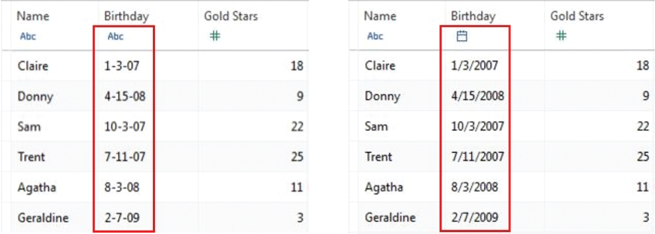
FIGURE 5.5 Transforming ambiguous birthday strings into precise date types
The simple premise of using context to help clarify and come up with reasonable assumptions has also found its way into automation and sensible defaults in visual analysis tools, such as Tableau (Wesley et al., 2018). Another example is around place ambiguity for geocoding place strings. Take a look at the cities in Table 5.1. Where would you think Paris is located based on the domain of the data?
And in case you are wondering about Table 5.1, there indeed happens to be a Paris in Texas.
TABLE 5.1 A sample data table. Where in the world is Paris?
| City | Sales |
|---|---|
| Austin | $912,791 |
| Dallas | $1,281,047 |
| Houston | $1,568,974 |
| Paris | $645,335 |
| San Antonio | $1,426,697 |
Clarification, Repair, and Refinement
“Context is king” as we navigate this complex and often confusing world of information vagueness and ambiguity. Beyond context, we do use other tools to engage as we converse with people. We clarify by asking follow-up questions if we do not understand what someone is saying. We repair and refine what we just said to make ourselves clearer and more articulate. We point at objects, gesturing toward things to make the conversation more enriching. The next time you visit a coffee shop, just observe human communication in action as people chat over cups of coffee.
Conversational repair is the process people use to detect and resolve problems in communicating, receiving, and understanding. Through repair, participants in social interaction display how they establish and maintain communication and mutual understanding. Language interpretation formalizes multiple levels of repair, from monitoring and evaluating various benchmarks of accuracy to proper ways to intervene and seek clarification.
The Colonomos model (2015) for simultaneous interpretation takes into account the mood, intent, setting, and register of the speaker. It analyzes the source message against these factors and others as the production message starts getting built. Remember, this planning is happening while the source is still speaking or signing. Interpreting isn't about word for word but meaning for meaning with sensitivity to other factors such as register and setting that would affect the message. A 5-year-old child would present very differently than a 79-year-old in register, tone, word choice, and mood. In fact, a computer also presents differently. As interpreters construct the message, they are continuously evaluating what they have produced versus what the source states. Some repairs are added on within the interpretation, adding nuance a language may seek throughout the arc of the rendition, or stopping the process and intervening. Repair is critical to providing an effective interpretation. We argue that repair provides a crucial theoretical interface as we explore diverse approaches to enabling analytical conversation between people and data.
Pointing is a common gesture used to clarify or repair a message. Yet not all pointing is the same. Pronouns in signed languages rely on a sophisticated system of pointing. There are grammatical rules about where signed pronouns, or referents, can be placed and how verbs and deictic references must agree. In a study of pointing (Fenlon et al., 2019), formation features of signed points from British Sign Language (BSL) favored the 1-handshape and a single hand, while spoken language gestures tended to use both hands to create full-hand (B-handshape) references. Durations of points were shorter for signers and far more systematic. The grammar around pointing made the signed points far less vague.
With vagueness and ambiguity prevalent in language and communication, understanding and interpreting what someone means is always a challenging problem. When constructing interactive charts and dashboards, it is important to make thoughtful defaults and assumptions about the intended message to the reader. Similar to human language, it is equally important to make provisions for repair and refinement during the interaction experience. Some of these provisions are showing filter controls and widgets, as we saw in Figure 5.3, for a user to tweak and make adjustments to the visualization as they make sense of the data. Other scaffolds are clicking on marks, similar to deictic gestures from American Sign Language (ASL) and other forms of human communication to set the context for clarification.
Iconicity of Representation
In linguistics, iconicity is used when the form has direct ties to meaning or clear motivations in origin (Sandler & Lillo-Martin, 2006). In spoken language, onomatopoeia is an iconic representation of a sound, such as the whoosh of the wind or the cluck of a chicken. ASL uses space and the body rather than phonemes to create meaning, so iconicity is visual. Take a look at Figure 5.6. The three graphics illustrate two signs. On the left, the signer uses a 1-handshape against the palm of an open hand and moves the 1 up. On the right two frames, the signer uses a bent-handshape with an eye gaze and mouth morpheme “cha” to convey a concept.. What do you think these signs mean?
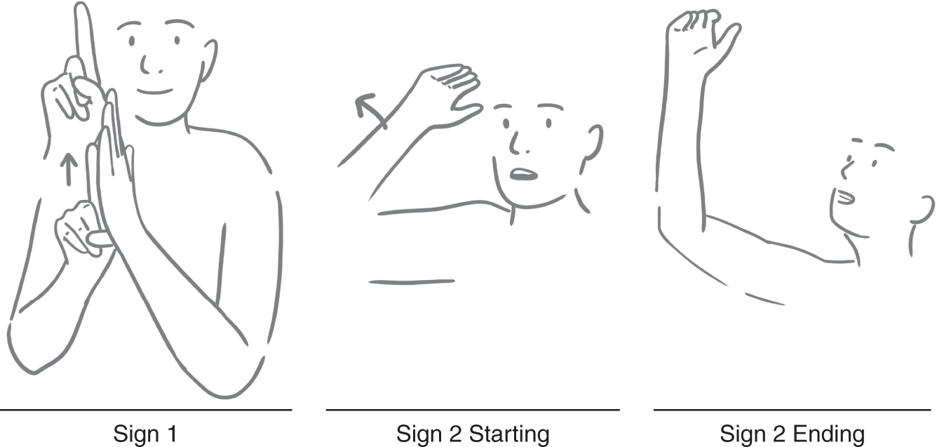
FIGURE 5.6 ASL signs drawn by Deaf graphic artist Brittany Castle
Both signs are used for “tall.” The first sign is fairly vague about how tall a person is. The second sign removes vagueness because of the additional grammatical elements that support it: eye gaze and lean are governed by grammar and the mouth morpheme affirms a very tall person. It's the myriad of elements, combined with the transparency of the sign. that reduces vagueness.
Communicating data through functionally aesthetic charts is not only about perception and precision but also understanding. The International System of Typographic Picture Education (ISOTYPE) was developed to bridge the gap between showing data in a way that's easy to read and at the same time easier to understand than abstract charts (Neurath, 2010). The ISOTYPE includes two ideas that nicely complement each other: a visual language for creating icons and the idea of using multiples to represent quantitative data (Haroz et al., 2015). By converting abstract information into something more concrete, ISOTYPES, when used effectively, is one way to engage with the reader and tell stories with data. Figure 5.7 shows the change in employment during the industrial revolution in England.
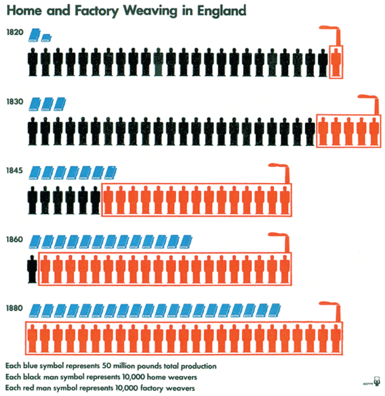
FIGURE 5.7 Home and factory weaving in England during the industrial revolution
In Figure 5.7, each figure stands for a multiple, in this case 10,000 workers, and each bale of textiles represents 50 million pounds of product. Notice how the red factories (with the little smokestacks) are swallowing up the home weavers over the course of time. What is interesting is that the net total number of workers (home and factory) stays roughly the same, while the amount of production (blue symbols) increases dramatically.
Charts also draw on iconicity to facilitate understanding and reduce vagueness depending on the task. As they grow more abstract, we rely more on inherent systems to clarify. The ISOTYPES use color and outline to call out the differences between weavers and shape and size to note differences in production and workers. These semantic elements, along with the text, reduce vagueness.
The Art of Chart
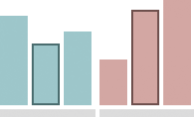
Let's look at purchasing books as an example, as shown in Table 5.2. In January, a customer bought 22 books; in February, they bought 4; in March, they bought 16; and then in April, they returned 3.
TABLE 5.2 Number of books purchased over the first four months
| Month | Books Purchased |
|---|---|
| January | 22 |
| February | 4 |
| March | 16 |
| April | −3 |
Table 5.2 relies on literacy and numeracy to provide a sense of purchase. While we know that the first column has the names of months, we don't know that the numbers in the second column, such as 22, are the number of books purchased just by viewing the numbers alone. We need to know the domain from where the numbers came. The column heading “Books Purchased” provides the required semantics for us to understand these numbers better. The number −3, however, adds complexity, which we'll see play out in the example representations.
We can visualize this in several ways, including leveraging ISOTYPES. In Figure 5.8, we can see the books organized by groups of 10, allowing easier tracking of numbers, much like tick marks. April's books are lighter and below the line, using both position and color to highlight a negative number.
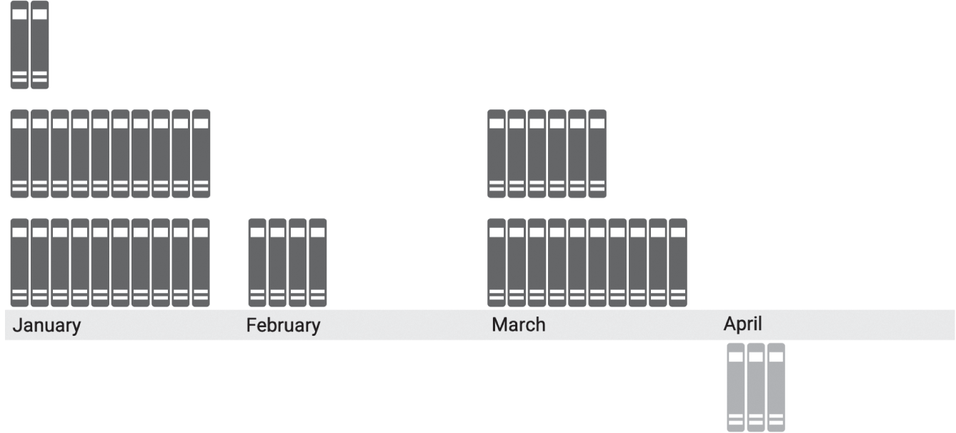
FIGURE 5.8 A graphic similar to the ISOTYPE charts
Stacking in groups allows us to clearly see the 22 the customer purchased in January, the 4 in February, and the 3 they returned in April. March requires us to work a bit more to determine that we have 16. We could further subgroup in 5s to make this task easier. Instead, we start pivoting from representations that favor numeracy and literacy to those that rely on seeing the larger visual pattern. We build stacks this time, which almost perfectly mirrors a bar chart. We get a better sense visually of the differing quantities of books purchased. The bar is fairly iconic as a representation of the data. We can easily see that there is a positive aesthetic quality to this visual representation that is connected to a literal stack of books, as demonstrated by Figure 5.9.
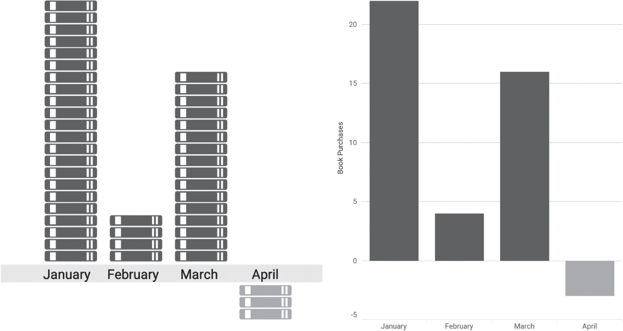
FIGURE 5.9 An iconic representation of stacked books and a bar chart
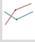
We start shifting the focus from the clearly defined groups of bars to the trend shown in Figure 5.10. First, we preserve the anchor to zero while shifting the focus of the representation to the pattern over time by using an area chart. The points represent the counts, and the shaded area helps draw attention to the pattern. We then further abstract the area chart into a line graph.
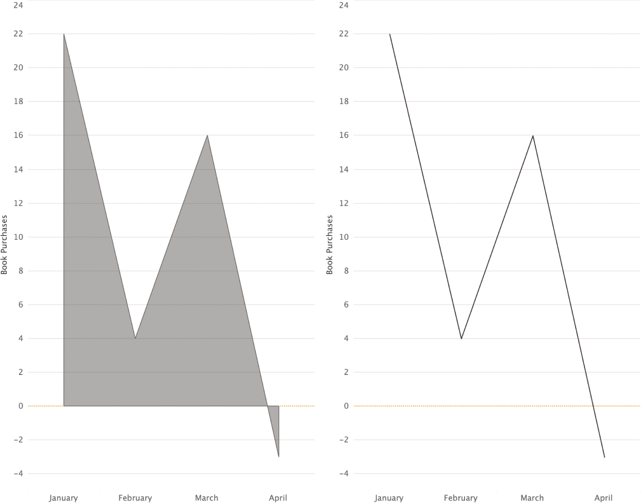
FIGURE 5.10 An area chart and line graph showing book purchasing trends
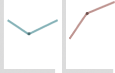
When we look at these charts in succession, we can see how the bar provides tangible stacks, the area turns into a mountain with points that climb and dive, and the line directs the most attention to the lightning bolt style pattern of purchases. The line is the most abstract representation of this data. Without a filled anchor to 0, the eye is drawn to the flow of the lines rather than the literal values. We can break the illusion by adding the books back into the picture, as shown in Figure 5.11.
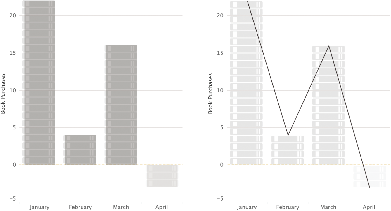
FIGURE 5.11 Breaking the illusion
Summary
The way charts are designed plays a large role in how they are later interpreted by others. Bar and line charts are often comfortable entry points in practice because they are tangible for newer chart readers. For example, vertical bars relate to our perception of physical objects standing adjacent on flat ground, while ropes, and seaweed floating in the ocean, relate to line charts. Refinement tools such as interactivity, tooltips, annotations, and icons help further reduce vagueness while allowing readers to better understand chart types. We explore how vagueness and abstraction intersect to affect data literacy in the next chapter.