
CHAPTER 7
Data Preparation
So far, we have seen semantics utilized within visualizations. These depictions rely on data that is ready to analyze. Drawing from the data literacy circle in the previous chapter (Figure 6.1), data preparation is a meaning-centered exercise to prepare, clean, and curate data. As we clean, we think about how the data should be structured to support the analysis: we make it taller or wider, thus giving it shape and defined fields. Whether it's from large transaction databases, JSON files downloaded from APIs, or CSV outputs from shared data repositories, defining useful data formats requires logic that often includes understanding what the data is intended to mean.
We all know the pains of poorly shaped data. During analysis, we spend our time creating calculations, building additional outside workflows, or sacrificing depth within the analysis. We may instead rely on writing to make the connections rather than the analysis itself. The connections must then be inferred rather than made tangible in the analysis. Poorly shaped data is the dresser that wobbles and ultimately breaks down. It is the chest of drawers where you slam your fingers over and over again and can't pinpoint why.
While preparation is invisible to those consuming visualizations, a well-shaped and cleaned dataset makes all the difference in analyzing the data. Data preparation is the back of the dresser and the interior supports. It holds everything together. A well-made dresser is stable, and the drawers slide out smoothly. The most elegant of dressers provide the right amount of tension in the rollers, so the drawer feels lightweight but doesn't fly out from the chest or crunch fingers. Data that is well prepared makes the analysis easier and allows a deeper exploration of patterns. It helps the analyst sift through the data with less friction. Data that is well crafted holds up to rigorous analysis and presentation. It removes the wall between us and the data and allows us to see the patterns.
Well-shaped data isn't only functional, it's also aesthetic. The fields are logically named. The dates are well formatted. The data itself is clean with nulls clearly understood. When the data is pulled into analysis tools, it is easy to create meaningful groupings. It leverages semantics to make data meaningful by following a system that is logical and natural to follow. In short, it is built to be functionally aesthetic from all angles.
Hairy Dates
One of the most common data preparation tasks users perform is parsing date strings into date representations. Dates can be constructed in a myriad of ways—March 9, 2021; 9 Mar 2021; 3/9/21; and 2021-3-9 to name a few. There can also be ambiguity in these representations as 3/9/21 could be either March 9, 2021, or September 3, 2021, as we discussed with these different endian formats in Chapter 5.
Many data preparation and visual analysis tools provide users with date parsing calculations to recast columns of strings or integers as dates or datetimes. A few months after Tableau released the DATEPARSE calculation to parse dates, the research team found that 15 percent of the user-authored date format strings that were extracted from Tableau Public were invalid (Wesley et al., 2018). Further, they found 744 distinct date and time formats that produced no errors for their associated columns in the data tables. Table 7.1 shows some examples. There are too many formats to manually check and validate. The researchers developed an automated way to cross-validate all these date formats from two different points of view: one focusing on pattern recognition while the other uses natural language grammar rules. They then applied these two complementary algorithms to the corpus of date string columns extracted from Tableau Public.
TABLE 7.1 Variations in date formats
| UCU Format | Example |
|---|---|
| EEE MMM dd HH:mm:ss zzz yyyy | Fri Apr 01 02:09:27 EDT 2011 |
| [dd/MMM/yyy:HH:mm:ss | [10/Aug/2014:09:30:40 |
| dd-MMM-yy hh.mm.ss.SSSSS a | 01-OCT-13 01.09.00.000000 PM |
| MM ‘'yyyy | 01 ‘2013 |
| MM/dd/yyyy - HH:mm | 03/09/2014 - 23:47 |
Dates have a semantic hierarchy of years, quarters, months, weeks, and days. We expect to be able to easily pull out these parts, along with additional tasks like identifying the day of week and time zone. Identifying these elements as dates allows greater expression of these elements. Dates can be localized to area, showing 9 March 2021 in the UK and March 9, 2021 in the US. They can be abridged to 3/9, for example, where the year is clearly understood.
Common Transformations
Date parsing represents one possible transformation. Field types, like parts of speech, classify elements into particular categories to clarify their use. Fields with clearly defined types adhere to a standard, perform efficiently when pulled into analysis tools, and provide analysts clues into how to use the data. For example, integers are a data type that can be aggregated, while text dimensions usually filter, frame the analysis, or set the level of detail. We are breaking up fields into their smallest building blocks of meaning. These building blocks create a system, allowing us greater expressivity and keeping us in the flow of analysis.
Common transformations include the following:
- Numbering unique rows with a row ID
- Validating uniqueness and deduplicating (see Figure 7.1)

FIGURE 7.1 Validating uniqueness to understand shape
- Filtering data (see Figure 7.2)

FIGURE 7.2 Filtering data
- Field formatting and typing (standardizing)
- Splitting to different tables (topic/context)
- Pivoting (up and down)
- Densifying (filling in semantic gaps, such as dates)
- Aggregating/summarizing
- Removing nulls
- Creating taxonomic structures or hierarchies
- Joining (intersections, see Figure 7.3)

FIGURE 7.3 Joining
- Unioning
- Parsing and extracting, such as through regular expressions (see Figure 7.4)
FIGURE 7.4 Parsing
Transforming data requires understanding the shape of it. Shape is determined by the grain, or what one row represents. A row might be a transaction, a patient, or a written language. Operations such as normalization reduce the data into meaningful unique elements across several tables. Details at one grain are not repeated, but are referenced through keys. This reduces redundancy and makes storage more efficient by using lookup keys. Analysis data sources may join the tables physically together to create a single view or use logical models to establish relationships. Logical models preserve the separate tables and do joins based on the analysis.
ScriptSource (www.scriptsource.org) provides a database of writing systems, shown partially in Figure 7.5. Elements captured include the name, unique code, family, type, direction, and a number of other dimensions useful for printing and writing. Altogether, the CSV export from the database contains 20 fields. The grain of the data is one row per writing system, identified by Script Name and Script Code. Some languages have more than one writing system and some scripts cover a vast number of languages. Script Code represents an optimal primary key, as it is unique, short, and sustainable when new rows get added. It is also useful for other tables we create.
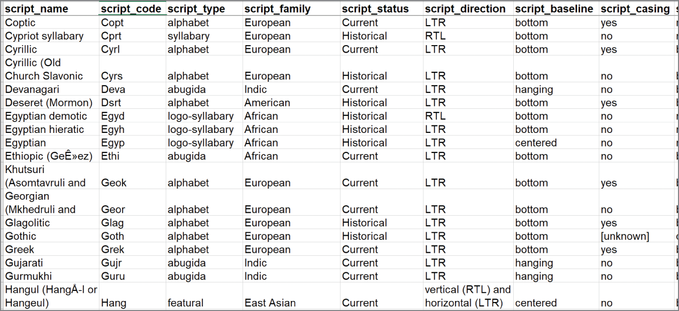
FIGURE 7.5 Partial view of ScriptSource data
Other details include direction of writing. A quick scan down the sample shows many LTR (left-to-right), writing systems with a few RTL (right-to-left) systems. Languages also can be written sometimes in multiple directions, which is documented in Script Direction with “and” separating the options. Hangul, Korea's writing system discussed in Chapter 6, located on the bottom row, can be written either vertically right to left or horizontally left to right. If we want to count the different allowable directions, this shape does not help us achieve that task. We'll want to create a separate table of writing directions that has one row for each writing direction for each language.
As we scan this data with an eye toward reshaping for analysis, we are searching for patterns in the data where reshaping will extend our analytical capabilities. Figure 7.6 shows an abbreviated abstraction of this process. Script Family creates a hierarchy related to language (first two tan boxes). We might sort the data in different ways or reorder columns to detect what elements repeat (yellow boxes in the third column). We might find data that needs to be parsed, split, and transformed to additional columns, such as writing direction (blue and dark brown). Columns such as Baseline, Complex Positioning, and four other columns contain Yes/No answers and may be more useful in a pivoted format (highlighted in rose pink).
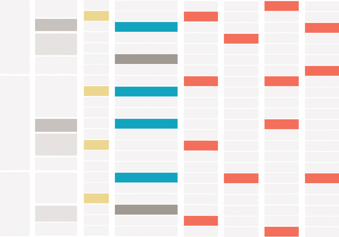
FIGURE 7.6 Abstract reshaping map
As we find the areas to transform, we start planning the rough shape we need and some of the transformations that we will need to do. We identify columns to select and shape separately, shown in Figure 7.7. ScriptSource also has a data dictionary online. Many of these columns contain information that clarifies abstract writing concepts or items that seem similar by field name (such as Baseline versus Complex Positioning). We can use the field definitions within the visualizations to provide greater clarity. Additional details on demand may help us with our analysis as well as help those who view it later.
Preparing data is an exercise in expression. We are moving data from a stored state from the database to an active one for analysis. It requires understanding how the analysis tool best works with data to achieve a given intent. The natural hierarchies and relationships within the data create allowable combinations. From the exercise earlier, we can see that data shape is quite malleable. As we begin shaping, we will want to preserve accuracy and support ease of understanding.
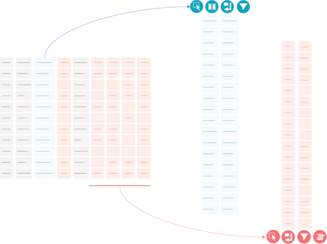
FIGURE 7.7 Abstracted data shaping diagram
Clarity in Conversation
While data values are concrete, the ways in which we shape for analysis increase the chances of vague table constructs. ScriptSource, for example, provides the output with one row per script. Understanding what one row represents in this model is reasonably clear. Our planned transformations add complexity:
- One table with 272 logged scripts
- One table with writing direction, adding an extra row to some scripts
- One table with up to 1,632 rows (6 feature types × 272 scripts)
While this arrangement allows certain analytical tasks to happen, it requires greater detail into what each table represents.
Shaping can be done in either a tangible manner or an abstract one. Excel allows reshaping to progressively happen through the analysis by creation of additional sheets, pivot tables, LOOKUPs, and other formulas. Each row of the data in Excel can clearly be seen. We could reshape the ScriptSource data by creating pivot tables and additional columns and even manually adding rows. Tools like Tableau Prep (www.tableau.com/products/prep) work to balance abstraction with multiple panes for tasks. The first pane provides a highly abstract layer for joins, unions, and pivots. The data profile pane allows for direct member editing, the creation of calculations, or other premade cleaning tasks. Programs like Alteryx (www.alteryx.com) are highly abstract but very visual. Users can program a variety of tasks using visual commands. Writing Structured Query Language (SQL) is the most abstract and relies on fluency to complete shaping and modeling.
Fields provide the basis for the analysis. We can take one field in the database and refactor it into seven fields that act as Boolean flags. As we decide what one row represents, we are structuring the types of conversations analysts and consumers can have. The fields affect what one row represents and how tall or wide the dataset is. Hierarchies and natural relationships affect the connections and layers available to clarifying, expanding, or contracting the analysis.
Field typing and renaming is a common exercise. It allows phone numbers, numerical IDs, and dates to be classified and formatted as such. Typing from preparation makes visualizing data easier and clearer. In addition to typing, clarifying field names helps those analyzing data or consuming premade visualization understand what the domain covers. If we sold 399 bottles of wine on March 9, we expect that number to hold regardless of whether we show each individual sale or aggregate the data to the types we've sold or summarized solely by day. The field type should make it clear that 399 is a count and the name of the field should lend some clue into the grain: daily_sales versus individual_sales. Some data shaping and analysis tools also allow data sources to be enriched with additional metadata, such as comments and synonyms for the field name.
Data shape affects the types of analyses that can be done. Dates across multiple columns may make it easy to count days between various events. Constructing a timeline, however, may be harder, unless all the dates are in one column. Data shape affects the types of conversations we can have with our data: it favors certain scripts and allows certain types of queries to be answered. It sets the context and defines the limits of what meaning can be extrapolated.
Shaping for Intent
The shape of the data affects what the visualization tool can reasonably interpret. The Sapir-Whorf hypothesis states, “The limits of language shape my reality” (Jannedy et al., 1994). As we work to make data both functional and aesthetic, we will keep the endpoint in mind. Good shape is defined by the analysis tool. Tableau Desktop (www.tableau.com/products/desktop), for example, allows tables to be related on a logical plane (multiple tables) in addition to being joined on a physical layer (a single view within the analysis). As we return to our ScriptSource example, we can plan for separate tables at different grains. Using Tableau's relationship model, we can have script direction exist as its own smaller table with one row per direction by script. Some languages may have several directions associated with them and have multiple rows.
A good shape for one platform may be a terrible shape for another. Certain shapes may also allow easier analysis for some tasks but increase complexity for others. Earlier, we identified high-level tasks we need for this dataset. Figure 7.8 shows a simplified data preparation workflow. It takes the main table and splits the workflow into three tables. In addition, the data dictionary is pulled in for all elements to provide additional descriptions for fields like Writing Direction, Script Type, and others. Tasks shown include selecting, splitting, joining, pivoting, filtering, calculating, and deduplicating.
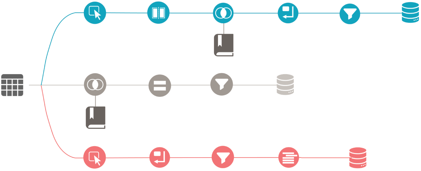
FIGURE 7.8 Simplified data prep flow
The outputs are in separate tables at different grains (Figure 7.9). The main table is at the same grain as the source table. The other tables are at lower grains, allowing a different type of analysis to be performed. Each table has a different shape. Table A is the widest table. Table B is the shortest, while Table C is tall and skinny.
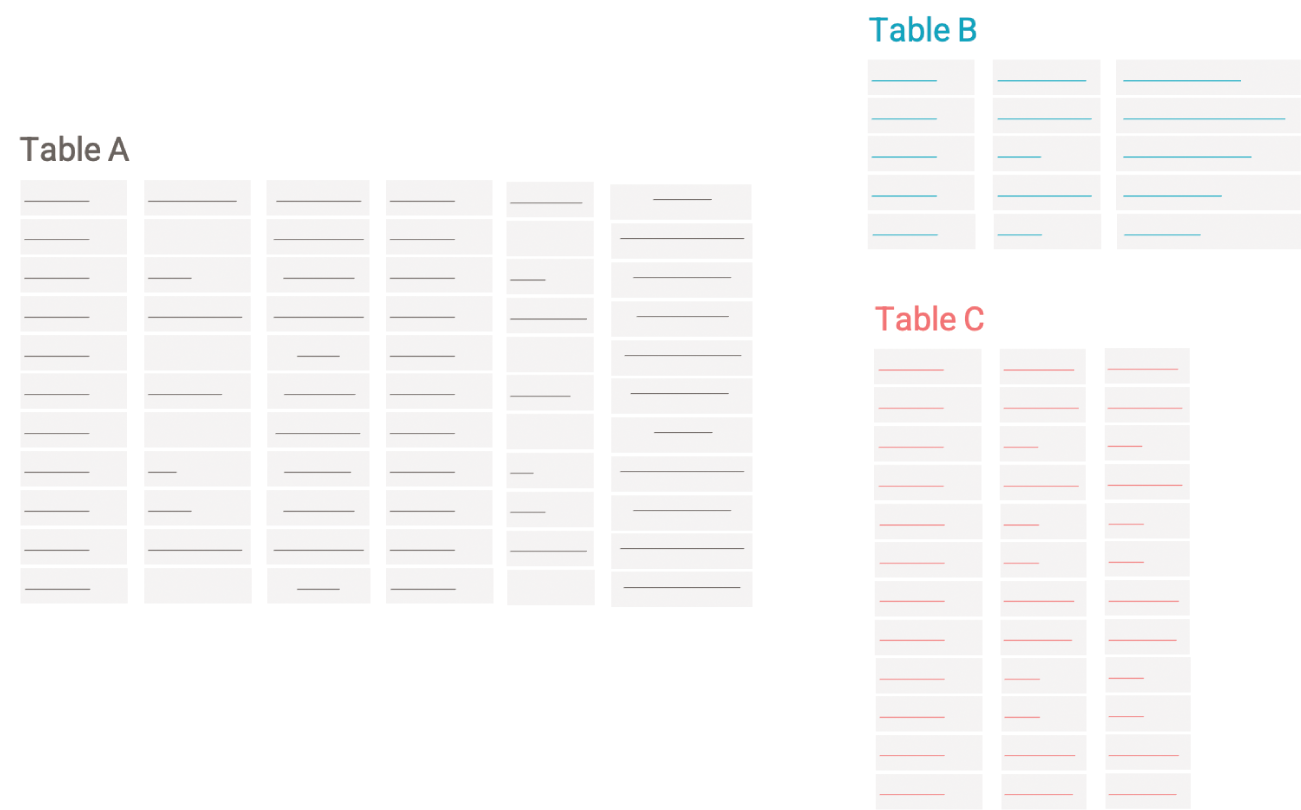
FIGURE 7.9 A relational model
Data preparation is a time-intensive endeavor. As we look into the future, research offers insight into how data might be shaped in easier ways by leveraging semantics. Looking at common tasks, we can see what we as humans can easily parse out but that computers, until now, have struggled to achieve.
Prepping for the Future
Understanding the semantics of the data and the context in which it will be used, provides techniques to help automate the data transformations that analysts need to do for their analytical workflows. Research has explored techniques to detect whether data attributes represent known semantic concepts such as person, place, dates, and time. Having a better understanding of the data provides unique opportunities to prepare the data for the real world. In recent years, the problem of automatically determining semantic properties in data has been steadily gaining attention among visualization, NLP, and AI researchers (Caveness et al., 2020; Chen et al., 2019; Hulsebos et al., 2019; Iida et al., 2021; Zhang et al., 2020).
Let's explore three examples: semantic joins, smart sorts, and column splits.
Semantic Joins
Join is a prevalent data operator used to combine records from two or more tables. Traditional join processing mostly relies on checking if attribute names exactly match. With the growing demand for ad hoc data analysis, there are an increasing number of scenarios where the desired join relationship is not an equi-join (i.e., a type of join that combines tables based on matching values in specified columns). For example, in Figure 7.10, a user may want to join one table having a country-name column with another table having a country-code column. Traditional equi-join cannot handle such joins automatically and the user typically has to manually find an intermediate mapping table in order to perform the desired join.
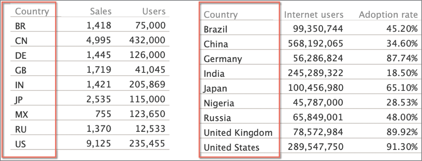
FIGURE 7.10 Semantic joining of country name and country code columns from two data tables
To address this problem, research has explored data-driven methods that determine the statistical correlation between two semantically related data columns (He et al., 2015). More sophisticated semantic joins have evolved over the years. For example, a user may want to join two tables, each having a currency column—USD and Euro. A semantic join can be suggested to the user where the currency in one table is converted to another based on the locale, the currency rate, and the time stamp of the data.
Smart Sorts
Another form of data transformations is smarter sorting. If you've taken a survey, you may see qualitative questions with answers ranging from “highly dissatisfied” to “highly satisfied.” These are called Likert scales. A system that can detect the data type could then sensibly sort the Likert scale values in their semantic logical order rather than an alphabetical order on text strings. This form of sorting enables a semantically resonant divergent color palette to be associated to each of the responses, with the most negative sentiment in a red hue and the most positive one in a blue hue, shown in Figure 7.11. These defaults support color cognition as described in Chapter 1 and map the semiotic properties of the data to meaningful color associations (from Chapter 4). Smarter sorts help reduce the workload for the user by reducing manual interventions during data preparation and chart creation.
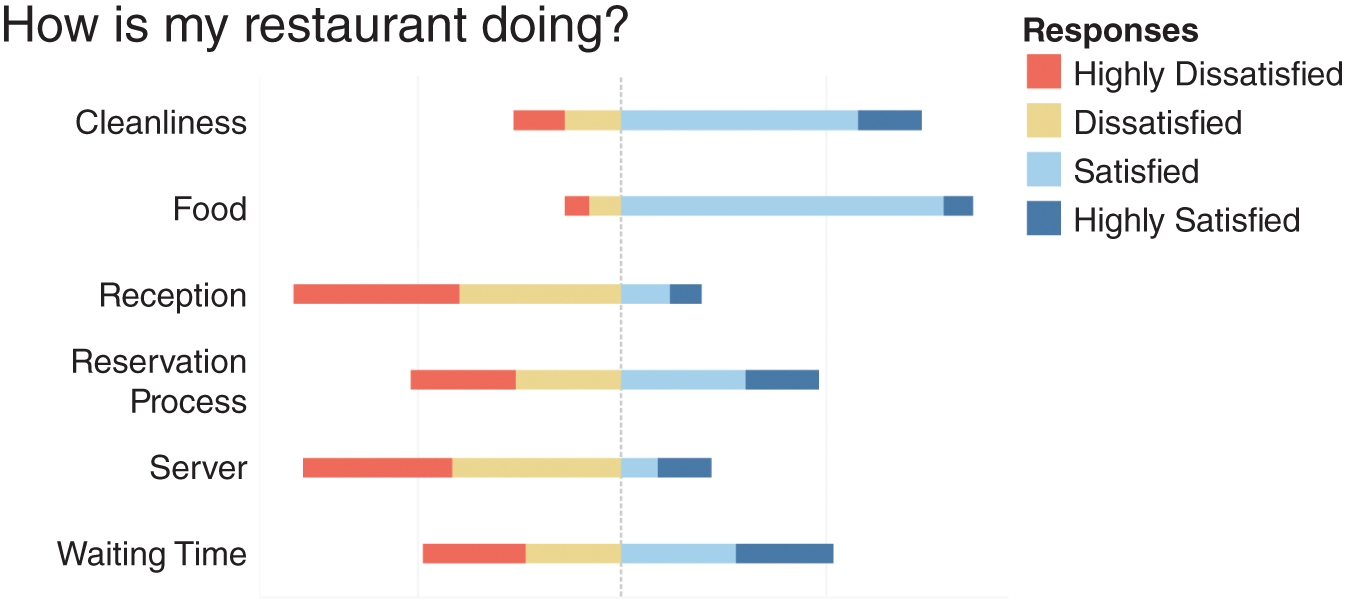
FIGURE 7.11 Automated sorting for Likert scales
Column Splits
For many data shaping recipes, a common step is to split the data from a single column into multiple columns. Data preparation tools provide various manual and semiautomatic methods for column splits based on character or pattern matching. However, knowing a bit more about the semantics of the data can enable delightful defaults in the data shaping process. Consider the example in Figure 7.12. You have a column of full names that you want to split into first and last names. A smart column split algorithm could detect that the strings are names based on access to an external corpus such as census data. Applying a split to Full Name not only splits the columns into two but provides sensible headers to the newly split columns. Rather than being called generically as Split Column 1 and Split Column 2, they are named First Name and Last Name respectively.
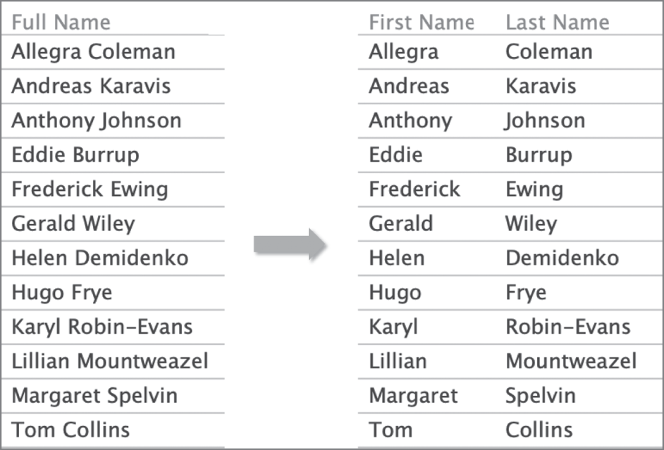
FIGURE 7.12 Column splitting
Data Enrichment
Enriching data with additional semantics provides a foundation for richer analytical inquiry. One common way of enriching data is by adding synonyms and other related concepts to the attributes in the data table. Knowledge corpora like a dictionary, thesaurus, or taxonomies derived from systems like Wolfram Alpha (www.wolframalpha.com) help support data enrichment.
Let's look at Table 7.2, which shows a sample dataset of houses for sale.
TABLE 7.2 Sample housing dataset
| Datetime | Price | Latitude | Longitude | area | #beds | Openhouse_time |
|---|---|---|---|---|---|---|
| 1/4/20 | 600000 | 38.8977 | 77.0365 | 5320 | 3 | 3:00 PM |
| … | … | … | … | … | … | … |
If we import this data into a natural language interface such as Tableau's Ask Data (Setlur et al., 2019), one can begin by asking a question, “What's the house cost in Palo Alto?” With access to a thesaurus, it would be pretty straightforward for the system to identify cost as a synonym for price. But we know that language is much more nuanced than that. We could then ask, “Show me the expensive houses.” If the interface has access to a dictionary, it can pull up the entry for expensive and determine that expensive is a descriptor for the attribute Price (Table 7.3). Further, the value for price falls in a high range and the system might pick a reasonable numerical range as part of its response. The answer may not be perfect and would depend on the user's intent and the context of the data. Also, the range for expensive is different for a house when compared to a bottle of wine. Geography can also play a role in perceptions of expense as well.
TABLE 7.3 Associating the Price attribute for defining the concept “expensive”
| Datetime | Price | Latitude | Longitude | area | #beds | Openhouse_time |
|---|---|---|---|---|---|---|
| 1/4/20 | 600000 | 38.8977 | 77.0365 | 5320 | 3 | 3:00 PM |
| … | … | … | … | … | … | … |
Moving on to a more complicated example, we may want to get more specific about the types of houses that we are interested in and ask, “Now, show me the large ones.” Looking at the definitions for large and one of the attributes in the table, area, there are some common concepts that are bolded in the definition for area.
Here, large refers to size, which can be measured as area, and the system can provide a reasonable response, similar to how it may handle expensive (Table 7.4).
TABLE 7.4 Associating the area attribute for defining the concept large
| Datetime | Price | Latitude | Longitude | area | #beds | Openhouse_time |
|---|---|---|---|---|---|---|
| 1/4/20 | 600000 | 38.8977 | 77.0365 | 5320 | 3 | 3:00 PM |
| … | … | … | … | … | … | … |
But there are limits to this approach where abbreviations or colloquial language such as sqft may not be found in a dictionary or a thesaurus. Language models and knowledge graphs created from unstructured, semi-structured, and structured data sources store information about the world, including abbreviations like sqft. These linguistic-based approaches have evolved to better handle the richness and ambiguity of concepts and their semantics. Encapsulating the rich semantic knowledge into a structured dataset provides a better understanding of the underlying data and, consequently, the ability to reason at a more abstract level. This deeper data understanding enables more sophisticated data preparation and analysis, including natural language interfaces, entity disambiguation, and entity resolution as well as ontology-based query answering, aspects of which we will cover in Part C, “Intent.”
Summary
Quite often, when we think of communicating information effectively, we focus on the representation of the data in a chart or other visual format. However, functionally aesthetic content is only as good as the data that feeds it; flawed data leads to flawed results. We hope that this chapter helps you appreciate the importance of data preparation. It is a meaning-centered activity that solidifies the foundation for analysis. Spending time preparing and enriching the data makes analysis easier. In the next chapter we will explore how meaningful data can help communicate patterns, relationships, and takeaways given the size and the context of the chart.