
At this point, you may feel that the application is lacking a certain appeal. The success of any application relies greatly on how the user interface looks. Just like how React Native borrows from React on the web, the same thing goes for styles. In this chapter, you will learn how React Native styles and lays out the components with React CSS.
We will cover the following topics:
- What is React CSS?
- Creating Style Sheets
- Extending the
SimpleButtonto include custom styles - An introduction to layout with Flexbox
- Styling the
NavigationBar - Styling the
NoteScreen
If you have any experience in writing CSS for a browser then you will feel comfortable with the styles in React Native. Although, instead of the browser's implementation of cascading styles, Facebook has developed a subset version of CSS in JavaScript. The benefit of this approach is that the designer can fully utilize features in JavaScript, such as variables and conditionals, which CSS does not support natively.
Style Sheet is the React Native abstraction to declare styles using object notation. The components can use any style, so if you find that you are not able to get the right look then refer to the React Native documentation on that component in its styles section.
When inserting styles, it is common to include only those styles that you need for that specific component. It is similar to how JSX combines the JavaScript logic and markup into a single component; we are also going to define our styles in the same file.
To create a Style Sheet, use the Stylesheet.create({..}) method by passing in an object of objects:
var styles = StyleSheet.create({
  myStyle: {
    backgroundColor: '#EEEEEE'
    color: 'black'
  }
});
This looks similar to CSS but it uses commas instead of semicolons.
Styles are declared to be inline on a component using the style prop:
// Using StyleSheet
<Component style={styles.myStyle} />
// Object
<Component style={{color: 'white'}} />
It is also possible to pass normal JavaScript objects to the style prop. This is generally not recommended, since the Style Sheet ensures that each style is immutable and only created once throughout the lifecycle.
Let's extend our SimpleButton component further to accept custom styles for the button background and text. In the render method, let's set the style attribute of the View and Text components from the props:
export default class SimpleButton extends React.Component {
  render () {
    return (
      <TouchableOpacity onPress={this.props.onPress}>
        <View style={this.props.style}>
          <Text style={this.props.textStyle}>{this.props.customText || 'Simple Button'}
          </Text>
        </View>
      </TouchableOpacity>
    );
  }
}

SimpleButton.propTypes = {
    onPress: React.PropTypes.func.isRequired,
    customText: React.PropTypes.string,
    style: View.propTypes.style,
    textStyle: Text.propTypes.style
};On the HomeScreen we are going to style the simpleButton component to draw the user's attention to the NoteScreen when there are no notes. We will start by adding it to the StyleSheet and defining some text styles:
var styles = StyleSheet.create({
  ...

  simpleButtonText: {
    color: 'white',
    fontWeight: 'bold',
    fontSize: 16
  }
});
Here, we want the text on the button to be bold, white in color, and with size 16. To style the button, we need to add another object to the StyleSheet called simpleButton and also define a background color; the simpleButton code is as follows:
var styles = StyleSheet.create({
  ...

  simpleButton: {
    backgroundColor: '#5B29C1',
  },
  simpleButtonText: {
    color: 'white',
    fontWeight: 'bold',
    fontSize: 16
  }
});
Let's see the output of the preceding command:

It's not that appealing yet; let's add some padding so that it's easier for the user to press the button:
paddingHorizontal: 20,
paddingVertical: 15,
React CSS does not have a shorthand notion, such as border: 1px solid #000. Instead each item is declared individually:
borderColor: '#48209A',
borderWidth: 1,
borderRadius: 4,
To add a drop shadow, we define each property similar to borders:
shadowColor: 'darkgrey',
    shadowOffset: {
        width: 1,
        height: 1
    },
    shadowOpacity: 0.8,
    shadowRadius: 1,
Notice how the shadow offset requires an object with width and height properties. Since we are dealing with JavaScript objects, this is a perfectly acceptable notation. Now, we include the SimpleButton component in our HomeScreen render method:
...
import SimpleButton from './SimpleButton';

export default class HomeScreen extends React.Component {
  render () {
    return (
      <View style={styles.container}>
        <Text style={styles.noNotesText}>You haven't created any notes!</Text>

        <SimpleButton
          onPress={() => this.props.navigator.push({
            name: 'createNote'
          })}
          customText="Create Note"
          style={styles.simpleButton}
          textStyle={styles.simpleButtonText}
        />
      </View>
    );
  }
}

var styles = StyleSheet.create({
  container: {
    flex: 1,
    justifyContent: 'center',
    alignItems: 'center',
  },
  noNotesText: {
    color: '#48209A',
    marginBottom: 10
  },
  simpleButton: {
    backgroundColor: '#5B29C1',
    borderColor: '#48209A',
    borderWidth: 1,
    borderRadius: 4,
    paddingHorizontal: 20,
    paddingVertical: 15,
    shadowColor: 'darkgrey',
    shadowOffset: {
        width: 1,
        height: 1
    },
    shadowOpacity: 0.8,
    shadowRadius: 1,
  },
  simpleButtonText: {
    color: 'white',
    fontWeight: 'bold',
    fontSize: 16
  }
});
Update the renderScene function of ReactNotes in index.ios.js and index.android.js to pass the navigator through the props to the HomeScreen:
class ReactNotes extends React.Component {
  renderScene (route, navigator) {
    switch (route.name) {
      case 'home':
        return (
          <HomeScreen navigator={navigator} />
        );
      case 'createNote':
        return (
          <NoteScreen />
        );
    }
  }

  ...

}
Let's see the output of the preceding command:
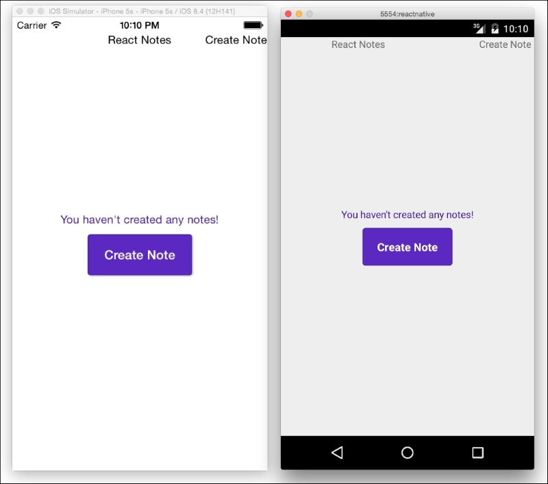
This is not too shabby for a typical call to action button. If you reload this in the simulator and press the button, it will still fade due to the TouchableOpacity feedback. For more information on React CSS or to contribute, visit the open source CSS-layout repository at https://github.com/facebook/css-layout.