
Chapter 7. Decorations: labels, arrows, and explanations
This chapter covers
- Understanding layers and locations on a graph
- Adding arrows, labels, and other decorations
- Providing explanations using a key
- Changing a graph’s overall appearance
Data alone doesn’t tell a story. To be useful, the data needs to be placed in context: you must tell the observer what the data is (such as position versus time, particle count versus scattering angle, stock price versus date, and so on) and what units the data is plotted in (centimeters or inches, seconds or minutes, dollars or Euros). No plot is complete without this information.
But you can do much more to make a graph useful and informative: you can add arrows and annotations on the graph to point out and explain interesting features. You may also want to provide special tic marks and labels to make quantitative information stand out more. Or you can change the size and shape of the entire graph to accommodate a specific data set.
In this chapter, we’ll discuss all the means that gnuplot offers to put ancillary information on a plot (in addition to the data). Because much of this material is quite dry, I’ve gathered the most important commands and options together in the next section. Unless you have specific requirements, this may be all you need to know right now—gnuplot is good at automatically doing the right thing in most situations.
7.1. Quick start: minimal context for data
For the sake of concreteness, let’s go back to the diffusion limited aggregation (DLA) example of section 1.1.2 and in particular figure 1.4. We’ll use this plot as our example throughout this section.
The absolute quickest way to add the most important contextual information to the plot is to give it a title, such as
set title"Run Time (in seconds) vs. Cluster Size (in thousands of particles)"
This tells the observer both what is plotted (computation time versus system size) as well as the relevant units (time is given in seconds, and particles are counted by thousands), conveniently packaged in a single command. This is the bare minimum.
The title is centered at the top of the graph (as in figure 7.1—you may want to go back to section 1.1.2 to learn about the context in which this example arose). With a little additional effort, you can put labels on the axes using the set xlabel and set ylabel commands. This frees up the title for contextual information about the data in the plot, like so:
set xlabel "Cluster size [thousands]" set ylabel "Running time [sec]" set title
Figure 7.1. Providing minimal context for a plot using a title and axes labels. See listing 7.1.

Finally, there’s the key (or legend), which relates line types to data sets. By default, it’s placed in the top-right corner of the graph, but this may not be suitable if it will interfere with data. You can change the position of the key using the keywords
left, right, top, bottom, center
in the set key command: for example, set key right center, to place the key vertically centered on the right side of the graph. The order of the keywords doesn’t matter, and if only one is given, all the other options retain their values. Finally, you can suppress the key using unset key.
You saw in section 2.1.2 how you can change the string describing the data set in the key using the title option to the plot command. To suppress an entry in the key, you can either use the notitle option or provide an empty title string. In the following command, the data curve has an entry in the key, but the fitted curve doesn’t:
plot [1:100][0.1:] "progress" u 1:2 title "Data" w p, (x/2.5)**3 notitle
Now let’s put all this together. The following listing summarizes the commands used to build figure 7.1.
Listing 7.1. Commands for figure 7.1 (file: progress.gp)
set xlabel "Cluster size [thousands]" set ylabel "Running time [seconds] set title
This concludes our quick start, and it may be all you need for now. The rest of this chapter discusses the miscellaneous options that are available if you aren’t happy with the defaults. But first I need to describe the different ways you can refer to a location on a plot.
Tip
You can use set xlabel and set ylabel to tell the viewer what quantities are plotted along the horizontal and vertical axes. The set title command is an easy way to add general context to a plot. And don’t forget the plot ... title "..." facility to add a meaningful string to the plot’s legend.
7.2. Understanding layers and locations
To add decorations to a plot, you must be able to tell gnuplot where on the graph the new elements should be placed. Two different concepts are involved. In the next section, I’ll explain how to specify positions laterally within the plane of the graph. Then, you’ll learn about the stacking order that enables you to place elements visually in the foreground or background relative to each other.
7.2.1. Locations
First, let’s establish some terminology. The entire area of the plot is referred to as the screen or the canvas. On the canvas is the graph, which is surrounded by a border (unless you explicitly turn off the border). The region outside the border is called the margin. All these are indicated in figure 7.2.
Figure 7.2. The parts of a gnuplot graph: canvas, borders, and margins

You can provide up to two different sets of axes for a plot. This is occasionally useful when comparing different data sets side by side: each data set can be presented with its own coordinate system in a single graph. The primary coordinate system (named first) is plotted along the bottom and left borders. The secondary coordinate system (second) is plotted along the top and right borders. By default, the secondary system isn’t shown; instead, the primary system is displayed on all four borders. (You’ll find more information on axes and coordinate systems in chapter 8.)
Now that you know what all parts of a graph are called, we can talk about the different ways to specify locations. Gnuplot uses five coordinate systems:
first, second, graph, screen, character
The first two refer to the coordinates of the plot itself. The third and fourth (graph and screen) refer to the graph area and the entire canvas, respectively, placing the origin (0,0) at the bottom-left corner and the point (1,1) in the top-right corner (see figure 7.2). Finally, the character system gives positions in character widths and heights from the origin (0,0) of the screen area. Obviously, positions in this last coordinate system depend on the font size of the default font for the current terminal.
Coordinates are given as pairs of numbers separated by a comma. As necessary, each number in this pair can be preceded by one of the five coordinate specifiers. The default is first, and if no coordinate system is given explicitly for y, the one for x is used for both values.[1]
Although it may seem weird to use different coordinate systems in the same coordinate pair, this feature is occasionally useful. For example, you can use the following command to place a vertical line at a fixed x location and let it extend over the full range of the graph, independent of the y range: set arrow from 1.25, graph 0 to 1.25, graph 1.
You’ll see many examples of coordinate specifications in the rest of this chapter.
7.2.2. Layers
Gnuplot draws graph elements onto the canvas in a well-defined sequence. You can use this stacking order to place some elements visually “in front of” or “behind” other elements.
Plot elements are organized into layers (see figure 7.3). Graph elements in a layer that’s closer to the front obscure elements in layers further back.
Figure 7.3. Stacking order of layers, front to back. Within each layer, objects are drawn first, followed by labels and arrows. Curves are drawn in the order in which they appear in the plot command.

Labels, arrows, and geometric shapes (objects) are organized in two layers, one of which is (visually) behind the plotted data; the other one is on the top of the visual stack. When creating a decoration, you can assign it to either of these two layers using the keywords front and back; the default is back. Within each layer, arrows are visually in front of labels, and geometric shapes are even further behind. As you’ll learn in the next section, each arrow (or label or object) has a numeric tag, and this tag is used to sort elements of the same type: arrows with lower tag numbers are drawn first, and all arrows are drawn before any text labels are drawn.
A special layer, identified using the keyword behind, resides at the bottom of the visual stack. Only objects (but no arrows or labels) can be added to this layer. You can use this layer to provide a visual background (such as a solid color or a color gradient) to the entire graph.
Data and functions are plotted in the order in which they appear in the plot command, left to right. This means elements specified later in the plot command appear in front of those given earlier.
Whereas the locations within the plane of the graph are essential when working with decorations, the stacking order becomes relevant only for complicated graphs consisting of many plot elements. For most day-to-day operations, you probably won’t need to concern yourself with it. But you have control over the visual stack for those special situations when you need it!
7.3. Additional graph elements: decorations
I use the term decorations for all additional graphical elements that can be placed on the graph but that don’t (primarily) represent data. The most important decorations are text labels, closely followed by arrows, but gnuplot can also draw rectangles, circles, ellipses, and polygons.
7.3.1. Common conventions
Labels, arrows, and objects share some conventions that apply to all of them equally. I’ll summarize these conventions here so I don’t need to repeat this information for each of the individual styles.
Creating decorations
All decorations are created using the set ... command (see chapter 5). It’s very important to remember that this command does not generate a replot event: the decorations won’t appear on the plot until the next plot, splot, replot, or refresh command has been issued!
Keep in mind that decorations aren’t taken into account by the autoscale feature, which automatically attempts to adjust the plot ranges in such a way as to display the relevant parts of the data. In other words, if a decoration (or part of it) falls outside the plot range (either explicitly given or automatically selected), it will not appear on the plot. (More on autoscaling in section 8.2.)
Tip
Decorations created with set ... won’t appear on the graph until the entire plot is redrawn through a plot, replot, or equivalent command.
Identifying Decorations with Tags
So that you can later refer to a specific object (such as an arrow or a text label), you can give the object a numeric tag: for instance, set arrow 3 .... Now you can make changes that apply only to this arrow by providing the tag in the next call to set arrow; or you can eliminate the arrow using unset arrow 3. Arrows, labels, and objects have separate counters.
If you omit the label, gnuplot will assign the next unused integer automatically (when using set ...) or apply the command to all instances of the object (when using unset ...). The command unset arrow, without an explicit tag, removes all arrows from the graph!
You can see all defined arrows, together with their location and appearance options, by using show arrow and including a tag (for example, show arrow 3 limits the command to the corresponding element). Labels and objects can be listed using equivalent commands. Because decorations are drawn onto the plot in the order of their tag number, you can control visual stacking through appropriately assigned tag numbers.
Tip
When you’re using gnuplot interactively, it’s usually a good idea to assign numeric tags explicitly and not rely on the automatically generated tags. Almost invariably, you’ll want to modify a graph element created earlier, and always using an explicit tag number ensures that you only edit the one element you intend to.
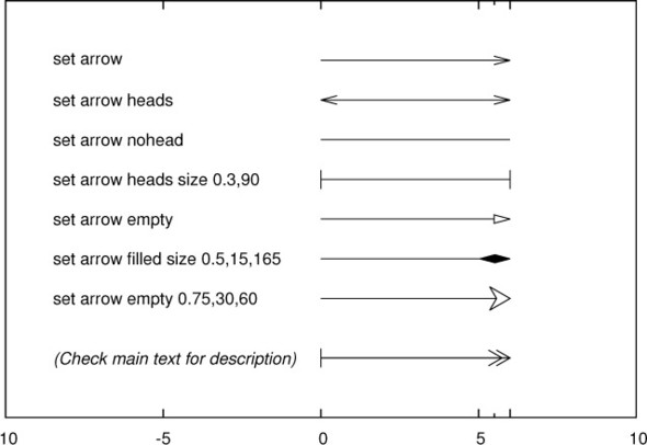
7.3.2. Arrows
Arrows are generated using the set arrow command, which has the following options:
set arrow [{idx:tag}] from {pos:from} to {pos:to}
set arrow [{idx:tag}] from {pos:from} rto {pos:offset}
set arrow [{idx:tag}] from {pos:from} length {pos:len} angle {flt:degrees}

set arrow [{idx:tag}] [ nohead | head | heads | backhead ]
                      [ size {flt:length} [,{flt:angle}] [,{flt:backangle}]
                        [fixed] ]
                      [ nofilled | empty | filled | noborder ]
                      [ front | back ]
                      [ lineoptions ]

set arrow [{idx:tag}] [ arrowstyle | as ] {idx:style}
Each arrow has a beginning and an end point. The starting point is always given explicitly, as a coordinate pair in any of gnuplot’s coordinate systems, but the end point can be given in three different ways (see the first three lines in the previous snippet):
- As an explicit end point coordinate using the to keyword. Example: set arrow from 0,0 to 2,1.
- As a relative offset from the starting point, using rto. The horizontal and vertical length of the offset are measured in units of the x and y axis, respectively.[2] Example: set arrow from 0,0 rto 2, 0 draws a horizontal arrow that is two x-axis units long.
For logarithmic coordinates, the relative offset is multiplicative, not additive.
- As a length and an angle. The length is measured in units of the horizontal axis but can be preceded by any of the permissible coordinate system specifiers. The angle is given in degrees and measured counterclockwise from the positive x axis. Example: set arrow from 0,0 length 2 angle 45.
Many aspects of the arrow’s appearance can be changed using the set arrow command. These specifications can be given either explicitly or by referencing a previously defined arrow style (using the arrowstyle keyword). In the next section, I’ll explain the different appearance options; we’ll come back to predefined styles in chapter 9.
Appearance options can be either specified separately or combined with the coordinates in a single call. The following two code snippets show two equivalent ways to define the same arrow:
set arrow 1 from 0,0 to 2,1
set arrow 1 nohead front

set arrow 1 from 0,0 to 2,1 nohead front
Customizing arrow appearance
You can customize the appearance of an arrow, in particular the size and shape of its head (or heads) and the look of its “backbone”:
- Heads— By default, a head is drawn at the destination endpoint. Heads can be suppressed entirely using nohead. The keyword heads draws heads at both ends; backheads draws only a single head at the start point.
- Head size and shape— You can change the size and shape of the head using the keyword size followed by the length and the angle at the arrow tip, and—optionally—the angle at the back of the head (see figure 7.4). Unless otherwise specified, the length is measured in units of the primary horizontal axis; this can be changed using any
of the coordinate system specifiers (see figure 7.2). All angles are measured in degrees; the back angle is ignored if the fill style is nofilled (which is the default).[3]The default values for the head size are size screen 0.0225,15,90. Using the screen coordinate system guarantees that the head size doesn’t change if the plot range does.
Figure 7.4. The parameters that control the shape of an arrowhead
By default, the size of the arrow head is reduced for very short arrows; this can be disabled using fixed immediately following the size.
- Head color and fill style— By default, arrow heads aren’t filled and the back angle is ignored. The keyword empty draws only the outline, filled draws the outline and fills it, and noborder draws the filled area but not the outline. This matters, because the outline extends, by one line width, beyond the end position of the arrow; hence you may need to suppress the outline. It also matters if you’re using a dashed line for the arrow and want to suppress a dashed outline for the head. You can’t choose the fill color separately from the outline color. If you want a red-filled arrow head with a black outline, you need to construct it from two arrows, one on top of the other.
- Layer assignment— Arrows can be assigned to the front or back layer.
- Line options— All available line options can be used. They apply to the arrow’s backbone and its head or outline.
Some examples of custom arrow heads are shown in figure 7.5.
Figure 7.5. Different arrow forms and the commands used to generate them. See listing 7.2 for the last one.
More tricks with arrows
The arrow facility is versatile and can be used for purposes other than placing explicit arrows on a plot. Here are some ideas:
- Because an arrow without a head is just a straight line, you can use set arrow ... to draw arbitrary straight lines on a plot. In particular, arrows can be used to draw vertical lines. (You don’t need arrows to draw horizontal lines, of course; it’s generally easier to use plot 1, -1 to draw horizontal lines at y = -1 and y = +1.)
- The ability to mix different coordinate systems in the same coordinate specification can come in handy in this context. For example, if you want to draw a vertical line at x = 0.5 from the lower to the upper boundary, you can say set arrow from 0.5, graph 0 to 0.5, graph 1 without having to worry about the exact values of the vertical plot range.
- You can use short arrows without heads to draw custom tic marks, if gnuplot’s built-in tic marks are insufficient (see chapter 8 for more information on tic marks).
- Arrows with customized heads can be used to indicate a scale or range on a graph—figure 7.8, later in the chapter, contains an arrow used for this purpose.
- You can generate an arrow with two different heads by generating two single-headed arrows back to back. You can also overlay arrows to generate more sophisticated effects. The following listing shows the commands used to generate the bottom arrow in figure 7.5.
Listing 7.2. Commands to generate the double-feathered arrow in figure 7.5
set arrow 1 from 0,-9 to 6,    -9 size 0.5,30
set arrow 2 from 0,-9 to 5.75, -9 size 0.5,30
set arrow 3 from 0,-9 to 1,    -9 backhead size 0.3,90
As you’ve seen, arrows are a versatile graph element. But more often than not, you’ll want to combine them with some textual explanation. That’s what labels are for.
7.3.3. Text labels
Text labels are a natural companion to arrows. The arrow shows the observer where to look, and the label explains what’s happening:
set label [{idx:tag}] [ "{str:text}" ] [ at {pos:location} ]
                      [ left | center | right ]
                      [ rotate [ by {int:degrees} ] | norotate ]
                      [ [no]boxed ]
                      [ front | back ]

                      [ point lt|pt {idx:pointtype}
                              | ps {flt:pointsize} | nopoint ]
                      [ offset {pos:off} ]
                      [ hypertext ]

                      [ noenhanced ]
                      [ font "{str:name}[,{int:size}]" ]
                      [ textcolor | tc [ {clr:colorspec}
                                       | lt {idx:type} | ls {idx:style} ] ]
The label text is typically a constant, but it can also be a string variable or any string-valued expression. To obtain a formatted string, the sprintf() and gprintf() functions are often useful. For example, to create a label (at the origin) showing the value of π, truncated to two digits, you can use set label at 0,0 sprintf( "%.2f", pi ). (See section 5.1 for more information about string operations, in particular table 5.1.)
By default, the text is placed flush left at the position specified by the at ... location. This can be changed using the left, center, and right keywords.
Gnuplot allows text to be rotated, but not all terminals support arbitrary angles. Use the test command to see what’s possible (see section 10.1.3). If the text hasn’t been rotated, you can draw a frame around it using boxed. The stacking order can be controlled with front and back, as for arrows.
Using point, you can place a symbol at the position specified with at; the text label is shifted relative to it. The point style and size of the symbol can be fixed using lt (line type), pt (point type), and ps (point size), and the offset can be customized using offset. The nopoint option suppresses the point.
The hypertext option creates a label that is visible only when the mouse hovers near the location of the label—specifically, near the symbol placed at the location of the label. (The hypertext option can only be used together with the point option.) The hypertext option isn’t available for all terminals. Currently, only the (interactive) wxt, qt, and windows terminals support it, as well as the (browser-based) svg and canvas terminals.
You can select the color of the text using textcolor (abbreviated tc), followed by either a color specification (see chapter 9) or the keyword linetype (lt) and the index of a predefined line type. In this case, the color of the line type is applied to the text.
Finally, you can choose a specific font using the font option. The keyword noenhanced suppresses the interpretation of enhanced-mode control characters in the text string, even if enhanced mode is active for the current terminal. (Read chapter 10 for an in-depth discussion of font selection and enhanced text mode.)
In addition to the fully general set label facility that I just described, gnuplot offers two specialized labeling commands: to add a label to any axis of the plot, or to add a title to the entire graph. Both provide convenient shortcuts for common situations.
Title
The title option is a label with some special defaults. For instance, it’s automatically placed centered at the top of the graph, and the top margin of the graph is adjusted accordingly.
The set title option takes the following arguments, which should be familiar from the discussion of set label:
set title [ "{str:text}" ] [ offset {pos:off} ]
          [ font "{str:name}[,{int:size}]" ][ noenhanced ]
          [ textcolor | tc [ {clr:colorspec}
                             | lt {idx:type} | ls {idx:style} ] ]
Only the behavior of the offset directive requires an explanation. It can be used to shift the title from its default position by a specified amount. What’s unusual is that by default, it interprets its argument as given in the character coordinate system. With this in mind, the following commands are entirely equivalent—both shift the title down by the height of a single character:
set title "..." offset 0,-1
set title "..." offset character 0,-1
Axis labels
The commands that place labels on the axes of a plot are also variants of the standard set label command. Because labels can be placed on any axis, there’s an entire family of related commands, all differentiated by prefixes (such as x and y), that indicate which axis a label belongs to. (We haven’t discussed these prefixes yet but will do so in chapter 8.) In the following syntax summary, the underscore (_) stands for any of the permissible prefixes:
set _label ["{str:text}"] [ offset {pos:offset} ]
                          [ rotate by {int:degrees} | parallel | norotate ]
                          [ font "{str:name}[,{int:size}]" ] [ noenhanced ]
                          [ textcolor | tc [ {clr:color}
                                      | lt {idx:type}
                                      | lt {idx:style} ] ]
The options are an almost strict subset of those available for the plain set label command. Check section 7.3.3 for details. The only new feature is the rotate parallel directive. It applies only to three-dimensional plots (see appendix C) and rotates each label such that it’s parallel to its axis (by default, the labels are printed horizontally in three-dimensional plots).
Finally, keep in mind that both set title and the axis label commands are merely standard text labels with some convenient defaults. If they don’t give you sufficient control to achieve the effect you’re looking for, you can always use explicit set label commands instead.
In addition to arrows and labels, which primarily are intended to add explanations to a graph, gnuplot also lets you place arbitrary graph objects on a plot. You do so using the set object command.
7.3.4. Shapes or objects
The set object ... facility can place a variety of geometrical objects on a graph, such as rectangles, circles, ellipses, and even arbitrary polygons. Shapes are different from other graphical elements described so far: they’re less suited to represent data, because their coordinates can’t be read from a file and instead must be set manually. Shapes also don’t add semantic information to a graph in the way arrows and labels do. They introduce functionality to gnuplot that you’d expect in a general-purpose drawing program rather than in a data-visualization tool—but here they are, in case that (special) need arises.
Because gnuplot’s shapes and objects are a bit outside this book’s primary goal (which is to help you understand data with graphs), I won’t discuss them much further, except for some cautionary notes. (See the standard reference documentation for details.)
All objects share a single tag counter, which is separate from the tag counters for arrows and labels; but keep in mind that there is no separate tag counter for (say) circles as opposed to rectangles. All shapes are of type object; the particular shape (whether circle, rectangle, ellipse, or polygon) is specified as a property of each individual object. For rectangles, you can define a global style using set style rectangle; the other shapes inherit properties from the global fill style, which is defined through set style fill. (See section 9.4 for information on global styles.) Finally, let me remind you that elements of type object are the only items that can be placed in the layer at the bottom of the visual stack (using the behind keyword). This can be useful to give a colored background to the entire graph. (Most contemporary terminals let you specify a background color, which may be a more convenient alternative, provided you want to give a single color to the entire canvas area.)
Arrows, labels, and objects are graphical elements that you can use to make graphs more interesting and more informative. But they aren’t the only elements that can go on a plot besides data, and they aren’t even the most useful ones. The single most useful element is probably the graph’s legend or key, which explains what all the lines and symbols on the plot stand for. Gnuplot’s set key facility is very powerful and therefore deserves a section by itself.
7.4. The graph’s legend or key
We all know the little boxes on maps that explain what the different symbols mean: thick red lines indicate highways, white is for country roads, and thin dashed lines mean unpaved gravel. (And the odd-looking symbol with a roof? Right: that’s an outhouse.) In gnuplot, this box is called the key.
The key (or legend) explains the meaning of each type of line or symbol placed on the plot. Because gnuplot generates a key automatically, it’s the most convenient way to provide this sort of explanation. On the other hand, relying on the key separates the information from the actual data. I therefore often find it preferable to place arrows and labels directly on the graph instead, to explain the meaning of each curve or data set. A separate key excels when there are so many curves that individual arrows and labels would clutter the graph.
As usual, almost anything about the key can be configured. All available options are summarized next:
set key [ on|off ] [ default ]

        [ [ at {pos:position} ]
          | [ inside | outside ] [ lmargin | rmargin | tmargin | bmargin ] ]
        [ left | right | center ] [ top | bottom | center ]

        [ vertical | horizontal ] [ Left | Right ]
        [ [no]reverse ] [ [no]invert ]
        [ maxrows [ auto | {int:rows} ] ] [ maxcols [ auto | {int:cols} ] ]

        [ [no]opaque ]
        [ samplen {flt:len} ] [ spacing {flt:factor} ]
        [ width {int:chars} ] [ height {int:chars} ]
        [ [no]title "{str:text}" ]
        [ [no]box [ lineoptions ] ]

        [ [no]enhanced ]
        [ font "str:font,int:size" ] [ textcolor | tc {clr:color} ]

        [ [no]autotitle [columnheader] ]
As you can see, there are a lot of sub-options! To make information easier to find, I’ve broken the following explanation into separate sections under their own headings.
7.4.1. Turning the key on and off
You can suppress the key using either of the following two commands:
set key off
unset key
The command set key on enables it again.
7.4.2. Placement
The key can be placed at any position on the canvas. The most straightforward (but not necessarily the most convenient) method is to fix a specific location using the at option. The location can be prefixed by any of the standard coordinate system prefixes. The keywords left, right, top, bottom, and center align the key relative to the specified position. For instance,
set key at 0,0 top left
places the top-left corner of the key at the origin of the coordinate system.
As usual, with great power comes great responsibility. When using the explicit at option, gnuplot doesn’t rearrange the plot in any way to make room for the key: you must do this explicitly. It’s usually more convenient to use the predefined keywords that place the key relative to the graph; when you use these keywords, the borders of the graph are automatically adjusted to make room for the key.
The keywords left, right, top, bottom, and center push the key into the desired position. You can place the key inside the plot using inside (this is the default) or on any one of the margins using lmargin, rmargin, tmargin, and bmargin (meaning the left, right, top, and bottom margin, respectively). You can also use combinations of position specifiers, such as set key top left. The effect of these options is cumulative, so the following two examples have the same effect:
set key bottom left
or
set key bottom
set key left
One surprising exception is that the keyword center by itself is interpreted as the center of the graph (both horizontally and vertically).
7.4.3. Layout
The samples in the key can be either stacked vertically or aligned horizontally using the vertical and horizontal keywords. The alignment of the labels within the key is controlled using the Left and Right options (note the capitals). The default is vertical Left.
Usually, the textual description of the line sample is to the left, with the line sample on the right. The keyword reverse interchanges this arrangement.
Entries in the key are made in the order in which the corresponding data sets occur in the plot command. If you want to sort entries in a specific way, you need to list the data sets in the appropriate order in the plot command. But you can invert the stacking order of the samples in the key using invert. This is mainly useful to force the ordering of labels in the key to match the order of box types in a stacked histogram (see section E.4).
In general, the key is built up in its primary direction as far as possible. Assuming that key entries are vertically stacked (which is the default), gnuplot will continue to add lines to the key and only begin a new column when there is no more vertical room on the graph. To change this behavior, use the maxrows keyword together with a numeric argument: gnuplot will create a new column in the key whenever the number of rows exceeds the specified value. The maxcols keyword has the equivalent effect with a key that is built up horizontally.
7.4.4. Appearance
By default, each entry in the key is created at the same time the corresponding line is drawn on the graph. Later plot elements may therefore obscure parts of the key. When the opaque keyword is given, the key is drawn after the graph is complete; moreover, the key area is cleared before the key is created.
The length of the line sample in the key can be controlled using samplen. The sample length is the sum of the tic length (see chapter 8) and the argument given to samplen times the character width. A negative argument to samplen suppresses the line sample.
The vertical spacing between lines in the key is controlled using spacing. The spacing is based on the product of the point size and the argument to spacing. This parameter does not influence the horizontal spacing between entries in horizontal mode.
You can give the entire key a title (which is placed at the top of the key) using the title option, and draw a frame around the key using box. In this case, you may need to adjust the size of the box using the width and height parameters. Both take the number of characters to be added to or subtracted from the calculated size of the key before the box is drawn. In particular, if any text label in the key contains control characters for enhanced text mode, the size of the autogenerated box may be incorrect.
Finally, you can adjust the appearance of the lines used to draw the box using the usual line options.
Enhanced text mode (see chapter 10) can be switched on or off for the key, independent from the terminal’s behavior. You can set the default font for the key by using the font keyword, but keep in mind that these settings can be overruled in the explanations (see the next section).
7.4.5. Explanations
The explanation is a bit of text that assigns a meaning to each line sample or symbol type included in the key. The string for the explanation can come from one of two places: the plot command or the data file. Let’s look at both methods.
Taking explanations from the plot command
Usually, the explanatory text is taken from the plot command, using the title keyword:
plot "data" u 1:2 title "Experiment" w l, sin(x) title "Theory" w l
If no explicit title is set in the plot command, by default gnuplot will generate a standard description based on the filename and the selection of columns plotted. If you don’t like this behavior, you can turn it off using set key noautotitle: now only curves with an explicit title keyword in the plot command will have an entry in the key. (The command set key autotitle restores the default behavior.)
There are two further ways to suppress parts or all of a key entry:
- If an empty string is given as argument to the title keyword, gnuplot will generate no key entry for the corresponding data set: neither a line sample nor an explanation will be shown.
- To generate a key entry consisting only of the line sample, without a visible explanation, use a string consisting only of whitespace as argument to the title keyword in the plot command.
Taking explanations from the data file
Instead of taking explanations for the key from the plot command, gnuplot can take them from the first non-comment line in the data file. This is the same information used in section 4.4.1 to identify a column in the using specification—now it’s used for the graph’s key, as well.
Although the strings used in the key always come from the first non-comment line in the data file, there are three ways to instruct gnuplot what to do:
- Globally, using set key autotitle columnhead
- As part of the plot command, via title columnhead
- To have maximum control, using the function columnheader() as part of an inline transformation in the using specification
Let’s look at an example. The next listing shows a data file that you’ve seen before (in listing 4.7). Note how the first line, containing the column headings (which will be used in the key of the plot), isn’t a comment line.
Listing 7.3. Data for figures 7.6 and 7.7 (file: grains)

You already know how to plot a file like this and generate proper key entries using explicit explanations in the plot command (technically, you need to use skip 1, because the first line isn’t commented out):
plot "grains" skip 1 u 1:2 t "Wheat" w lp, "" skip 1 u 1:3 t "Barley" w lp,
If you use global style settings instead, the plot command can be particularly simple (see figure 7.6):

Figure 7.6. Using set key autotitle columnhead, key entries are taken from the first non-comment line in the data file. See listing 7.3 for the data file.

Rather than use a global directive, you can tell gnuplot to take the explanation from the data file within the plot command. Doing so lets you modify the behavior on a case-by-case basis:

Using title columnhead as part of the plot command instructs gnuplot to take the explanation for that column from the header entry for the same column. If you want more control (for instance, because you want to specify a different column, or you’re applying an inline transformation that combines multiple columns), you can use the columnheader() function.[4] The argument to columnheader should evaluate to an integer, which is interpreted as a column number; the function returns the contents of the first non-comment line in this column as a string. This string can either be supplied to the title keyword in the plot directly or be part of a string expression. The next code snippet shows all these variants:
The columnheader() function is new. In previous versions of gnuplot, this effect was achieved by supplying the column number directly as an argument to the title keyword.

Note that the title can be taken from a different column than the data, which can be useful in combination with data transformations: commands such as plot "data" using 1:($2/$3) title columnhead(2) are legal.
The ability to take explanations directly from the data file is an interesting feature, adding significant convenience in particular when you’re including many data sets in a single plot. Nevertheless, I’m a bit uncomfortable with the way it mixes data and comments in the same file without an easy way to distinguish the two; files in this format are harder to use with data-processing filters or as input to other programs. (I’d probably have preferred to make the line containing the column heads a comment line and indicate its use as title information through a special marker, such as a doubled hash-mark or other comment character at the beginning of the line.) Judge for yourself.
Placing explanations on the graph
I quickly want to mention another new feature. Traditionally, explanations are visually grouped together to form the key. You can now also put some (or all) explanations onto the graph itself, either at the beginning or the end of the line they’re describing (see figure 7.7). To do so, include at beginning or at end after the title keyword in the plot command:

Figure 7.7. Explanations can be placed at the beginning or end of the curves rather than grouped together in a global key.

Notice that the explanation string may be missing, but the title keyword (or its abbreviated form t) must be present. Also keep in mind that you have no fine control over the placement of the explanation. Furthermore, gnuplot won’t adjust plot ranges automatically to make room for these labels: you have to do so yourself. If you want more control, use the set label facility (see section 7.3.3).
7.4.6. Default settings
Just to provide a reference, the default settings for the key are
set key on right top vertical Right noreverse noinvert autotitle
The previous command is equivalent to the much shorter
set key default
which can occasionally be helpful to restore sanity when you’re experimenting with key placement and layout.
Now that you’ve seen all the different graph elements you can use in a gnuplot figure, it’s time to put everything together and look at a worked example. That’s what we’ll do next.
7.5. Worked example: features of a spectrum
To demonstrate how to use all the features together, let’s study a more extensive example (see figure 7.8). The plot shows some experimental data, together with two theoretical curves that might explain the data from the experiment.
Figure 7.8. A complicated plot. See listing 7.4 for the commands used to generate it.

The folllowing listing gives the commands used to generate this graph, as they would be entered at the gnuplot prompt. Let’s step through them in detail—there is much to learn.
Listing 7.4. Commands for figure 7.8 (file: spectrum.gp)

The graph receives an overall title ![]() , and both axes are labeled
, and both axes are labeled ![]() . The key is moved to the top-left corner, so it doesn’t interfere with the data, and surrounded with a box
. The key is moved to the top-left corner, so it doesn’t interfere with the data, and surrounded with a box ![]() . The key gets its own title, which makes it necessary to increase its overall height a bit to give it a less crowded appearance.
. The key gets its own title, which makes it necessary to increase its overall height a bit to give it a less crowded appearance.
An arrow and a label are used to point out an oddity in the data ![]() . The label contains the Unicode character π (see the sidebar in section 5.1 for more information on Unicode and how to enter Unicode characters in gnuplot).
. The label contains the Unicode character π (see the sidebar in section 5.1 for more information on Unicode and how to enter Unicode characters in gnuplot).
An arrow without heads is used to create a dashed, vertical line ![]() . The dashed line shows the vertical asymptote as the data approaches the singularity at x=5. (Dash types will be introduced in section 9.2.2.)
. The dashed line shows the vertical asymptote as the data approaches the singularity at x=5. (Dash types will be introduced in section 9.2.2.)
The scale indicator is yet another creative use for an arrow, this time with two customized heads ![]() . This arrow doesn’t point out a feature in the graph, but gives an indication of scale. (“Full Width at Half Maximum” is
commonly used in spectroscopy to measure the width of a spectral line.) The label for this arrow contains an explicit line
break so that it spreads over two lines
. This arrow doesn’t point out a feature in the graph, but gives an indication of scale. (“Full Width at Half Maximum” is
commonly used in spectroscopy to measure the width of a spectral line.) The label for this arrow contains an explicit line
break so that it spreads over two lines ![]() . Remember from chapter 5 that escaped characters (such as
here) in double-quoted strings are interpreted as control characters. Finally, finally, the data is plotted
. Remember from chapter 5 that escaped characters (such as
here) in double-quoted strings are interpreted as control characters. Finally, finally, the data is plotted ![]() !
!
I hope this example gives you an idea how you can use decorations to improve your graphs. Arrows and labels can be used to explain data and point out specific features, but nothing prevents you from getting more creative.
7.6. Summary
This chapter explained techniques for putting additional, decorative graphical elements on a plot: things like arrows and text labels. Because it’s such an important tool to help a viewer understand a complicated graph, I spent a lot of time explaining how to customize and tweak the graph’s key or legend.
You also learned how to specify locations on a graph; I introduced the coordinate systems gnuplot uses for that purpose. I also discussed the layers that make up the graphical stacking order.
Decorative graphical elements (such as those in this chapter) are important, even though they don’t represent data. Through these additional decorations and text labels, a graph receives its semantics: only if there is text can an onlooker understand what the data shown in the graph means.
In the following chapter, we’ll look at the last important elements that give a plot context: the axes and their subdivisions and labels. Stay tuned.