
Chapter 14. Topics in graphical analysis
This chapter covers
- Techniques for time-series plots
- Techniques for multivariate data sets
- Techniques to improve visual perception
The previous chapter discussed some fundamental graphical methods that are very generally useful. In this chapter, I’ll select a few tasks that are more specific and explore them in greater depth.
Because of their immense practical importance, our first topic will be the handling of time series. In particular, you’ll see some clever ways to smooth a time series using only gnuplot commands. The next topic concerns multivariate data sets: data sets with more than two or three different attributes. A variety of techniques are available for such data, and some of gnuplot’s relatively new features facilitate the visual exploration of such data.
Next, we’ll discuss ways to enhance the visual perception of graphs. You can aid analysis and discovery by preparing graphs such that noteworthy features are more easily recognized. This topic isn’t frequently discussed, but some awareness of the issues involved can greatly improve your results.
14.1. Techniques for time-series plots
Time-series plots are probably the most common graph in practice: whenever you want to monitor a quantity, you’re dealing with a time-series plot of some form. This section introduces some operations that are frequently useful when dealing with time series and shows you how to coax gnuplot into performing those operations.
14.1.1. Plotting an Apache web server log
Technically, a discrete time series consists of measurements at equally spaced time intervals. The requirement that all time steps are of the same size is important: several time-series operations and transformations rely on this property.[1]
If observations occur asynchronously, so that the intervals are of varying sizes, the data is said to form a continuous time series. I recommend reserving the term time series for sets of equally spaced observations only, and speaking of an (asynchronous) event stream otherwise.
But raw data is frequently not of that form. Web server logs (and other event logs, generally) merely record the timestamp when an event occurred—they’re asynchronous. Turning this data into a (discrete) time series means counting the number of events per (equally sized) time interval.
In general, I strongly suggest that you do this kind of data munging outside of gnuplot, using the programming language of your choice. But in a pinch, it can be done with gnuplot. The following listing shows the beginning of an Apache web server log file (lines are truncated on the right).[2]
You can find the complete file at www.monitorware.com/en/logsamples/apache.php.
Listing 14.1. Part of a web server log; incomplete data for figure 14.1
64.242.88.10 - - [07/Mar/2004:16:05:49 -0800] "GET /twiki/bin/edit/Main/Doub
64.242.88.10 - - [07/Mar/2004:16:06:51 -0800] "GET /twiki/bin/rdiff/TWiki/Ne
64.242.88.10 - - [07/Mar/2004:16:10:02 -0800] "GET /mailman/listinfo/hsdivis
64.242.88.10 - - [07/Mar/2004:16:11:58 -0800] "GET /twiki/bin/view/TWiki/Wik
64.242.88.10 - - [07/Mar/2004:16:20:55 -0800] "GET /twiki/bin/view/Main/DCCA
...
The timestamp is in the fourth column, and gnuplot’s time-series mode is required to parse it properly. The timestamp must be truncated to the desired interval for the time series. Then the number of events in each interval must be counted. You can use smooth frequency (see section 3.5.3) for the latter. When truncating the timestamp, keep in mind that gnuplot treats it as a string, so you need to use string operations for all manipulations. The next listing truncates the timestamp to the hour: that is the step size of the resulting time series (see figure 14.1).
Figure 14.1. Web traffic (hits per hour). Compare listing 14.2.

Listing 14.2. Commands for figure 14.1 (file: access-log.gp)

Because this method relies on gnuplot’s timestamp parsing, it’s rather brittle and doesn’t deal well with missing or malformed entries in the log file. If you encounter such problems, it’s probably easiest to preprocess the raw data in a general programming language.
14.1.2. Smoothing and differencing
The transformation most frequently applied to a time series is probably some form of smoothing, to remove noise and bring out the underlying trend more clearly. Another often useful operation is the differencing of a time series, wherein the original data is replaced by the difference between any two consecutive observations. Using session variables and the comma operator, these tasks can be accomplished as part of a plot command.
Exponential Smoothing in Gnuplot
Probably the most familiar smoothing methods are the floating and trailing averages, which replace each data point with the average over some number of adjacent data points. In the first case, the averaging interval is symmetrical, which means the smoothed curve can never extend all the way to the most recent value in the time series; for this reason, the trailing average uses a one-sided interval. Both methods have some problems, not the least of which is that they need to keep track of all the data points in the averaging interval individually.
An often more favorable and much simpler smoothing method is known as exponential smoothing or the Holt-Winters method. It replaces each data point not with the average, but with the following quantity:
s[t] = a * x[t] + (1-a) * s[t-1]
Here, s[t] is the smoothed value at time step t, and it’s calculated as a mixture between the observed value x[t] at that time and the most recent smoothed value s[t-1]. The smoothing parameter a is a number between 0 and 1: the closer to 1, the less the data is smoothed.
Exponential smoothing can be implemented as an inline transformation in gnuplot:
s=0; a=0.5
plot "data" u 1:(s=a*$2 + (1-a)*s) w l
This works because the value of an assignment expression is the assigned value. It may be convenient to bundle the operation into a function, as in the following listing (also see figure 14.2).
Figure 14.2. A noisy time series and a smoothed trend line. The trend was calculated using single exponential smoothing: s=a*x + (1-a)*s, with a smoothing parameter of a = 0.5.

Listing 14.3. Single exponential smoothing: see figure 14.2 (file: smoothing.gp)
hw(x,a) = a*x + (1-a)*s
s=1; plot "unsmoothed" u 1:2 w l, "" u 1:(s=hw($2,0.2)) w l lw 2
It’s important that the variable s is initialized before the plot command. For best results, it should be initialized to a value that is similar to the first value in the data set.
Tip
Exponential smoothing is an exceedingly simple yet robust and versatile method to smooth a time series and bring out an underlying trend. It can be implemented using a convenient inline transformation in gnuplot. Don’t forget that the temporary variable must be initialized before invoking the plot command.
Double Exponential Smoothing
Single exponential smoothing (as in listing 14.3) works best for stationary time series that don’t exhibit a long-term trend. If a trend is present, the smoothed curve tends to lag behind and doesn’t constitute a good approximation to the raw data. For data sets that include a trend, it may therefore be necessary to use a smoothing scheme that explicitly includes a trend. One such method is double exponential smoothing:
s[t] = a*x[t] + (1-a)*(s[t-1] + u[t-1])
u[t] = b*(s[t] - s[t-1]) + (1-b)*u[t-1]
Here, s[t] is the smoothed value at time step t, and u[t] is the smoothed trend at the same time step. There are now two smoothing parameters, a and b, for the value and the trend, respectively. This method, too, can be implemented as an inline transformation in gnuplot:
a=0.5; b=0.5
s=0; u=0; q=0

plot "data" u 1:(s=a*$2+(1-a)*(s+u), u=b*(s-q)+(1-b)*u, q=s) w l
Obtaining a good approximation now requires finding suitable values for both smoothing parameters, a and b. This may involve a fair bit of trial-and-error experimentation!
Again, the formulas can be wrapped into a function:
hw2(x,a,b) = (s=a*x+(1-a)*(s+u), u=b*(s-q)+(1-b)*u, q=s)

s=0; u=0; q=0
plot "data" u 1:(s=hw2($2,0.5,0.5)) w l
Keep in mind that a gnuplot function doesn’t create a scope for local variables: all variables are global. The function finds the variables it writes to (such as s, u, and q) as session variables in the current gnuplot session. It’s a mistake to supply such variables as arguments to the function. But because the function expects to find these variables in the gnuplot session, it’s essential that the variables be created (that is, initialized) before the function is invoked.
Differencing a Time Series in Gnuplot
Another transformation that is often useful is to difference the time series. This amounts to replacing each entry in the series with the difference between two consecutive values; the resulting series is shorter by one record.
In gnuplot, this can be accomplished through an inline transformation as well:
u=0
plot "data" u 1:(v=$2-u, u=$2, v) w l
This works because gnuplot treats the comma (,) as an operator, similar to the way the C programming language does. It separates different expressions, evaluating each in turn (left to right), and returns the value of the last (rightmost) one.
Using the comma operator, it’s possible to define gnuplot functions comprising multiple statements. Traditionally, the body of a gnuplot function had to consist of a single expression, but the comma operator provides a way to circumvent this limitation. You saw an example in the previous section on double exponential smoothing, in the definition of the function hw2(x,a,b) = (s=a*x+(1-a)*(s+u), u=b*(s-q)+(1-b)*u, q=s).
Tip
The comma operator lets you combine multiple statements into a single expression. Statements are evaluated left to right, and the value of the rightmost statement is returned as the value of the entire expression.
14.1.3. Monitoring and control charts
One of the most common applications of time series and time-series graphs is the monitoring of a metric over time—usually to detect whether the observed system is behaving as expected. Two tasks commonly arise in such applications: data needs to be normalized, so that the behavior can be compared across different metrics. Additionally, there’s often an interest in identifying unexpected behavior, such as outliers and drifts. Let’s discuss them in turn.
Making Data Comparable
Imagine that you’re in charge of some operation. It may be a factory or production plant, it may be a data center, or it might even be a sales department. What matters is that you want to monitor the most relevant metrics constantly.
To keep things simple, let’s assume it’s a manufacturing operation where just three parameters really matter: overall productivity (units per hour), the completion time for each unit (in minutes), and the defect rate (the ratio of defective units to the total number of units produced). You might want to plot them together on a control chart so you can immediately see if one of them starts running out of the allowed zone. But most of all, you want to be able to compare them against each other: is one parameter consistently performing better than the others? Is one of the parameters on a slippery slope, getting worse and worse, relative to the others? And so forth.
A naive way to achieve this effect is to plot the three parameters in a single chart. The result is shown in figure 14.3 and is probably not what you want!
Figure 14.3. A control chart showing three very different quantities simultaneously. What’s wrong with this picture?

The problem is that the three parameters assume very different values: productivity is typically around 10,000 units per hour, assembly time is on the order of an hour, and the defect rate should be very, very small. Before you can compare them, you therefore need to normalize them.
Making metrics comparable by normalizing them usually involves two steps: first, they are shifted by subtracting a constant offset (such as a long-term average), and then they are rescaled by dividing them by their typical range of values (as expressed in the standard deviation, for example). The resulting normalized metrics are all centered on or near zero, and their fluctuations are of roughly unit size. (Also see figure 14.4.)
Figure 14.4. A control chart showing normalized metrics. The data is the same as in figure 14.3.

More generally, normalizing metrics always involves a linear transformation of the form
![]()
where m is a measure for the typical value of the metric in question, and s is a measure for the typical spread or range of values. If the metric is well-behaved, with relatively regular and symmetric fluctuations, then the mean and standard deviation are popular choices for m and s; but if the metric is strongly affected by outliers, then the median and the interquartile range may be more robust choices. Another possibility is to use the smallest possible value for m and the range between the greatest and the smallest value for s: the resulting normalized quantity isn’t centered on zero but is restricted to the unit interval.
Because normalization involves rescaling by the typical range of values, the resulting quantities are all dimensionless and are therefore directly comparable (in contrast to the original data, whose numerical values depended on the units of measure that were used).
Identifying Outliers
Identifying outliers is in some ways a complementary activity to normalizing data, because it amounts to finding data points that are different than the rest. When you’re dealing with time series, there is one additional issue: the baseline itself is changing constantly!
In the context of time-series analysis, an outlier is a data point that is further away from the trend than is typical. In the absence of other information about the data, the smoothed data is the best guess at the true trend, and is therefore used as a baseline.
Identifying outliers in a time series thus involves three steps:
1. Establish a baseline by finding a smooth trend for the time series.
2. Find the range of typical deviations of the raw data from the trend.
3. Tag as outliers those records that differ by more than the typical range from the trend.
Figure 14.5 shows the situation after the first step. The data consists of the daily number of calls made to a call center, and a trend has been added using single exponential smoothing:
s=0; a=0.25
plot "callcenter" u 1:2 w l, "" u 1:(s=a*$2+(1-a)*s) w l lt 3 lw 2
Figure 14.5. Number of daily calls to a call center. The figure shows the raw data and the smoothed trend line.

The next step involves finding the typical range of the fluctuations of the raw data around the trend. It can be found using the stats command:
s=0; a=0.25
stats "callcenter" u 1:(s=a*$2+(1-a)*s, $2-s)
It’s important that the last expression in the using expression is $2-s: this is the momentary deviation of the actual data from the smoothed trend. For simplicity, I used the standard deviation (as reported by stats) as a measure for the range—for this data set, it doesn’t differ much from the interquartile range. The value of the standard deviation is roughly 21, and I chose to label all records that differ by more than twice that as outliers.
Figure 14.6 shows the data together with the trend, as before. Outliers as identified by the foregoing procedure are marked with symbols, and the typical range of fluctuations is indicated using a grey band. The complete plot command is as follows:

Figure 14.6. Same data as in figure 14.5. In addition to the smoothed trend line, the region of normal fluctuations is indicated (shaded); outliers outside this region are indicated with symbols. (See the text for details.)

Cusum Plots
Occasionally, you may find yourself monitoring a quantity that has a well-defined target value (or setpoint in control-theory lingo): for instance, you may want to keep a power supply at a precisely determined temperature. In such cases, it’s essential to detect early whether the metric has drifted away from its setpoint. This may be difficult, because any noise in the data is likely to obscure a small but systematic change quite effectively. Consider figure 14.7. Would you say that the system has undergone any change from its setpoint at y=5 during the observed interval? (The horizontal lines at y=3 and y=7 are intended to indicate the permissible range for the observed metric.)
Figure 14.7. A control chart. The target value for the observed metric is 5. The horizontal lines indicate the permitted range around the setpoint.

The trick is to amplify the effect by keeping an accumulating sum of all deviations from the intended setpoint. As long as the system is centered on the correct value, the deviations will cancel each other out. But a persistent deviation, even if it’s small, will quickly lead to the build-up of noticeable error in the cumulative sum. Plotting this quantity in a cusum chart provides a low-tech yet remarkably sensitive diagnostic instrument to spot even small but persistent deviations from the setpoint.
In gnuplot, you can obtain a cusum chart through a simple inline transformation. I used the following commands to create figure 14.8, which clearly shows that something changed near time step 15:
setpoint = 5
s=0; plot [][-1:11] "cusum" u 1:2 w lp pt 7, "" u 1:(s=s+($2-setpoint)) w l
Figure 14.8. Same data as in figure 14.7, but shown together with the cumulative deviation from the intended setpoint of 5. The sudden and persistent increase in the cumulative error indicates that the system is shifted away from its target value—even though this isn’t immediately visible in the raw data.

In this case, the data has been created synthetically as Gaussian noise, with mean μ=5 and standard deviation σ=1 for the first 15 observations, but with mean μ=5.5 for the subsequent data points. Looking at the raw data in figure 14.7 doesn’t reveal this permanent shift; even comparison with the reference lines above and below doesn’t suggest any trouble. But the cumulative error in figure 14.8 is a dead giveaway!
When using cusum charts, the cumulative error shouldn’t be calculated “since the beginning of time.” Even when the system is perfectly centered on its setpoint, the cumulative error will exhibit arbitrarily large deviations in the long run. For this reason, the cumulative error should be reset frequently and calculated over only a relatively small number of recent observations (a few dozen).
14.1.4. Changing composition and stacked curves
As a final example of a time-series problem, let’s consider a situation where the composition of an aggregate changes over time, while at the same time, the magnitude of the entire aggregate also changes. The total human population, for example, changes over time—but so does its breakdown by continent. Representing both aspects (overall size and composition) simultaneously is a difficult problem. This section introduces four complementary solutions. This will also give me an opportunity to demonstrate gnuplot’s for and sum constructs. (See the next listing—multiplot mode will be discussed in section E.1.)
Listing 14.4. Commands for figure 14.9 (file: composition.gp)


Let’s consider a company that manufactures four products, numbered 1 through 4. The absolute weekly production numbers (in thousands of units) for each product separately are shown in figure 14.9, upper left. Such a plot makes it easy to follow the behavior of each product individually, but as the number of products grows, such a plot can become cluttered. Moreover, it isn’t easy to see how total production changes over time. You could add a curve, but it would obviously be on a very different scale than the individual contributions. Using a second vertical scale (one for the individual numbers and one for the totals) is possible but leads to even more clutter.
Figure 14.9. Four different ways to present changes in composition. Each line corresponds to the number of units produced for one of four different products. The top row shows absolute numbers of units produced; the bottom row shows fractions relative to total production. In the left column, each line is drawn separately; in the right column, the lines are stacked, giving a cumulative view into the data. See listing 14.4.

For these reasons, you occasionally see the data represented in a stacked plot, as in figure 14.9, upper right. Here, the numbers for all products have been stacked on top of one another, so that the curve for (say) product 2 represents the total manufactured output for products 1 and 2 combined. By construction, lines in such plots never cross, and hence the graphs always have a neat appearance—which makes them popular in general-interest publications. Nevertheless, they have significant problems. Only two curves are easy to interpret: the bottom one (product 1) and the top one (total production). It’s exceptionally hard in such a stacked graph to estimate how the contributions from the individual components change over time. For example, how much of the sudden increase in total production after week 130 is due to product 4? It’s basically impossible to tell from this graph—you have to go back to the previous panel. Similarly, from this graph, it isn’t easy to see that the double-hump configuration starting in week 100 is due exclusively to product 2. (Judging the distance between closely spaced curves that vary a lot over the plot range is exceptionally difficult—see section 14.3.2.)
If you’re interested in the relative changes in composition, then—following the principle to “plot what’s relevant”—you shouldn’t plot the absolute numbers but rather their fractional contribution to the total. That’s what the panel at bottom right in figure 14.9 does. This panel is also a stacked graph, but it shows the relative contribution of each component, not the absolute numbers. It shares with the previous panel that it’s guaranteed to look clean and that the individual contributions are hard to estimate. In addition, this diagram completely hides any information about total production. In particular, the dramatic increase toward the end of the observation time frame is invisible! Although diagrams of this form have a lot of intuitive appeal, they convey information poorly.
Finally, the panel at bottom left shows the relative contributions, separately for each component again. It shares with the first panel (top left) that it appears cluttered but that the information on individual products is easy to discern.
The appearance and information content of stacked graphs (like the ones on the right side of figure 14.9) depend strongly on the order in which the individual curves (here: product lines) are stacked. If there is some natural ordering, then such stacked graphs may, in fact, be the best way to represent the information. Figure 14.10 shows one such attempt. In this figure, the products have been ordered by their contribution to the total output, based on the (reasonable) assumption that products that contribute more are more important. It makes sense to include curves that show less variation and are flatter earlier in the graph, to retain a more stable baseline for the curves that are added later to the stack. For this reason, product 1 has been included before product 2, although it contributes overall slightly less: this way, the infamous double-hump affects fewer curves in the overall stack.
Figure 14.10. A stacked graph of absolute production numbers. The curves have been sorted in such a way that lines showing the smallest variation are lower in the stack, leading to a more stable baseline to which the subsequent products are added.

Because the components for figure 14.10 had to be picked individually, the sum facility was much less useful:
plot [0:150] "composition" u 1:5 t "Product 4" w l lt 4,"" u 1:($5+$2) t "1" w l lt 1,
Tip
Stacked graphs look appealing but often convey information poorly, unless you can find a natural order in which to add curves to the stack.
14.2. Graphical techniques for multivariate data sets
Data sets with more than two (or maybe three) columns are called multivariate data sets. In principle, the number of columns can be arbitrarily large. Multivariate data sets pose special challenges for graphical methods: it’s difficult to represent more than two dimensions in a necessarily flat graph!
There are basically two approaches to overcome the limitation posed by the two-dimensional nature of the canvas:
- Juxtapose several graphs, each representing only a small number of the available attributes.
- Use complex symbols or glyphs that convey information not only through their position on the graph, but also through their appearance (shape or color).
In this section, I’ll demonstrate some of the most common graphical techniques for multivariate data sets. My intent here is twofold: I want to describe these graphical methods, but I also want to show you how to realize them in gnuplot. Given that we’re dealing with a multivariate problem, this will be an exercise in the use of loops and multiplot mode![3]
This section uses several gnuplot features that are explained in appendix E.
14.2.1. Introduction
Our case study for exploring multivariate graphics is a data set describing the composition of a little more than 200 individual samples of glass.[4] The data set consists of 11 columns: the first is an integer to identify the record, followed by 9 columns of actual measurements, and finally a column that specifies the type of glass as an integer between 1 and 7.[5] Hence, this data set has 9 (or, if you count the glass type as well, 10) attributes. The data set is therefore neither particularly large nor excessively high-dimensional—it’s just the right size to introduce the topic.
This example comes from the “Glass Identification” data set, available from the UCI Machine Learning Repository at http://archive.ics.uci.edu/ml/datasets/Glass+Identification.
The measurements consist of the refractive index (RfIx) and the relative concentration of various chemical elements in each glass sample. The types of glass include two types each for building and vehicle windows, glass for containers, tableware, and headlamps.
The data file is comma-separated, so it’s necessary to use set datafile separator ','. The following listing does this and also includes a bunch of other definitions that will turn out to be useful. In all subsequent listings, this file with common definitions is loaded first.
Listing 14.5. Common definitions for the glass data set (file: glass.def)

14.2.2. Distribution of values by attribute
The first question concerns the distribution of values for the various attributes. The nine observed values are numerical, but the glass type is categorical—it can take on only seven distinct values. Figure 14.11 shows a histogram of the latter; the commands are in the next listing.
Figure 14.11. Number of data points for each type of glass. Compare listing 14.6.

Listing 14.6. Commands for figure 14.11 (file: glass1.gp )
load "glass.def"

set boxwid 1
set xtic format ""
set for[k=1:7] xtic add ( word(types,k) k )
plot data u 11:(1) smooth frequency w boxes
Clearly, window glass as used in buildings dominates this data set; moreover, there are no records in this data set of type 4 (vehicle windows of variety 2). For this reason, it’s important to fix the boxwidth: otherwise, the two adjacent boxes will extend to fill the gap.
Next let’s investigate the distribution of the nine numerical attributes. Keep in mind that, at this point, you have no idea what their numerical ranges are. That suggests box-and-whisker plots, because they don’t require any adjustable parameters. See figure 14.12 and the next listing.
Figure 14.12. Distribution of values for each attribute. Compare listing 14.7.

Listing 14.7. Commands for figure 14.12 (file: glass2.gp )

The graph is a bit cluttered, mostly because each panel requires its own set of tic marks. For this reason, individual tic marks are replaced with grey grid lines to provide a quieter visual appearance. Empty, instead of filled, circles are used for the outliers, because those are easier to distinguish when they overlap partially.
14.2.3. Distribution by level
It’s natural to ask whether different glass types can be distinguished by the observed properties of the sample. Figure 14.13 therefore investigates the distribution of values separately for each type of glass, which in the present case constitutes the level. (Also see the next listing.) The situation certainly isn’t as clear cut as in section E.2.2!
Figure 14.13. Distribution of values for each attribute, shown separately for each type of glass. The sequence of glass types is the same as in figure 14.11; type Vhcl2 is ignored because there are no records for it. Compare listing 14.8.

Listing 14.8. Commands for figure 14.13 (file: glass3.gp )
load "glass.def"

unset xtic; unset key

set multi layout 3,3 margin 0.075,0.99,0.015,0.975 spacing 0.055,0.035
do for[k=2:10] {
  set label word(names,k) at graph 0.95,0.9 right
  plot data u (1):k:(0.5):11 w boxplot pt 6
  unset label
}
unset multi
Sample Size in a Serial Box-and-Whisker Plot
Figure 14.13 is great to get an overall view, but a graph showing only a single attribute allows greater detail—see figure 14.14. An interesting question when looking at a serial box-and-whisker plot concerns the number of data points for each level: that would be good information to have in order to evaluate the relative importance of each level. One way to represent this quantity is via the width of the central box for each level, and that’s what’s done in figure 14.14.
Figure 14.14. Distribution of values for attribute Si, shown separately for each type of glass. The width of the central box is proportional to the number of data points for each level. Compare listing 14.9.

Gnuplot’s with boxplot style doesn’t support this feature out of the box, but because it does support level-specific boxwidths, you can accomplish this goal with a little effort. In the following listing, the stats command is used to count the number of records for each level. A string is built up holding all the counts as whitespace-separated tokens; the word function extracts the appropriate token when needed. (See section 11.1.2 for a more detailed discussion of this technique.)
Listing 14.9. Commands for figure 14.14 (file: glass4.gp)

14.2.4. Scatter-plot matrix
Box-and-whisker plots help us understand the distribution of data points for each attribute, but they tell us nothing about the relationships between different attributes. That’s what the scatter-plot matrix is for.
A scatter-plot matrix consists of scatter plots for all possible pairs of attributes in a data set. In the present case, there are nine numerical attributes, and hence the scatter-plot matrix forms a 9×9 array (see figure 14.15 and listing 14.10). You can inspect this collection of graphs for correlations between attributes. For example, the index of refraction grows quite regularly with the calcium (chemical symbol: Ca) content of the sample.
Figure 14.15. Scatter-plot matrix of all attributes, ignoring the type of glass. The upper half of the matrix shows individual points, and the lower half shows smeared-out and partially transparent symbols to facilitate the recognition of clusters. Compare listing 14.10.

The upper and lower half of a scatter-plot matrix aren’t independent; each pair of attributes appears twice, with the horizontal and vertical axes interchanged. For this reason, I use the bottom half of the array to visualize clusters of points. The symbols are larger than in the top half, but the color is so transparent as to be almost invisible. Only where many points overlap is the density high enough to form recognizable spots. (See section 9.1.2 for information about transparency and alpha shading.)
Listing 14.10. Commands for figure 14.15 (file: glass5.gp )
load "glass.def"

unset key; unset tics

set size square

set multi layout 9,9 margin 0.01,0.99,0.01,0.99 spacing 0.01
do for[i=2:10] {
  do for[j=2:10] {
    if( i!=j ) {
      if( i<j ) {
        plot data u i:j w p ps .25 pt 7
      } else {
        plot data u i:j w p ps .5 pt 7 lc rgb "#e60000ff"
      }
    } else {
      unset border
      set label word(names,i) at 0,0 center
      plot [-1:1][-1:1] 1/0
      unset label
      set border
    }
  }
}
unset multi
The command set size square ensures that each individual panel of the 9×9 matrix is square. For best results, you may want to make sure that the shape of the overall canvas forms a square as well, using set terminal ... size ... with your preferred terminal.
14.2.5. Parallel-coordinates plot
The scatter-plot matrix is a method to visualize the relationship between any two attributes, but it provides no help at all when it comes to relationships across more than two attributes at the same time. For that, we turn to parallel-coordinates plots. They’re formally introduced in section E.3, and there it’s also explained that gnuplot’s current implementation is subject to some limitations: in particular, the number of attributes is constrained to a small integer number. Among other things, you’ll now learn how to work around this issue.
The trick is to use multiplot mode (again)! Using multiplot mode, you can include as many attributes as desired by placing several graphs side by side, each of which doesn’t exceed the maximum number of columns supported (see listing 14.11).
Multiplot mode deals with the number of attributes; alpha shading is used to cope with the number of records. In the present case, the number of records is sufficiently high that lines obscure each other, making it impossible to discern any dominating structure in the graph. By using partially transparent lines, isolated lines fade into the background, but areas where lines cluster stand out strongly. (See figure 14.16.)
Figure 14.16. Parallel-coordinates plot of the entire glass data set. Because of the relatively large number of records, all lines are drawn partially transparent, so as not to obscure each other. To accommodate all attributes, this graph was composed using multiplot mode (see listing 14.11).

Listing 14.11. Commands for figure 14.16 (file: glass6.gp )

Highlighting a Subset of Records
It’s often desirable to highlight a subset of records in a parallel-coordinates plot, based on some condition. In figure E.12, records are highlighted based on their class. In the present case, all records are highlighted that belong to a particular cluster. If you examine figure 14.16, you’ll notice that there is a reasonably well-separated cluster of records with an intermediate concentration of Ca. In figure 14.17, those lines are highlighted, and you can observe two things: records with an intermediate Ca concentration tend to have an unusually high or low aluminum (symbol: Al) concentration. And they tend to correspond to glass made for lamps or tableware, but not for containers or windows. That’s an interesting finding.
Figure 14.17. Same as figure 14.16, but with a subset of records highlighted. Records with a Ca content between 9 and 10 have been selected for highlighting. Compare listing 14.12.

Highlighting makes use of data-dependent coloring (see section 9.1.5): an additional column is specified at the end of the using declaration, and its value is evaluated to the linetype to use. Listing 14.12 defines the function c() that selects the linetype, depending on whether the argument to the function falls into the desired numerical range. (Tic marks have been turned on for the attribute in question.)
Listing 14.12. Commands for figure 14.17 (file: glass7.gp )

The listing defines two line types in addition to the default: one for highlighting and one that is completely transparent and therefore invisible. Because it doesn’t obscure any of the existing graphical elements, it’s used for the records that aren’t selected for highlighting.
Further Suggestions
Figure 14.17 explores only one aspect of the data set; many similar clusters can be found and traced across all attributes. You can also do what I did in figure E.12 and highlight all records belonging to a particular type of glass. Does this reveal any interesting structure in the data set? Another possibility is to draw all lines belonging to the same type of glass in the same color, using six different colors simultaneously.
Another aspect affecting the appearance of a parallel-coordinates plot is the order or sequence in which attributes are plotted. In figures 14.16 and 14.17, I used the (arbitrary) arrangement of columns in the original data file, but different permutations may give quite different results. Unfortunately, gnuplot doesn’t make it easy to shuffle columns in a parallel-coordinates plot: you have to create different using declarations to rearrange attributes. Here are two permutations that you may want to try:
1,4,6,2,5,3,8,7,10,9,11
1,4,6,3,5,8,2,10,7,9,11
14.3. Visual perception
Even if you’ve found the most appropriate combination of quantities to look at, the amount of information you can extract from a graph still depends on the way the data is presented. The way people perceive a plot depends on the human, visual-psychological perception of it. To get the most out of a graph, you should therefore format it to improve the way it will be perceived.
Whether aware of it or not, in looking at a plot, humans always tend to engage in comparisons. Is this line longer than that? Is this part of the curve steeper than that? Is the area underneath this function larger than the area underneath that function? And so on.
To gain the maximum insight from a plot, you therefore want to find a representation of the data that facilitates such comparisons as much as possible. In this section, I give you some ideas for how this can be achieved.
14.3.1. Banking
The idea of banking (or banking to 45 degrees) was proposed by W. S. Cleveland, who demonstrated in a series of controlled experiments that our ability to compare angles is greatest for angles that are close to 45 degrees.[6] In other words, if you want to assess and compare the slopes of lines on a graph, you’ll do best if the graph is sized in such a way that most of the lines are roughly going diagonally across it.
See The Elements of Graphing Data by William S. Cleveland (Hobart Press, 1994) and references therein.
In a way, this is a confirmation of something you’ve probably been doing intuitively already. Whenever you’ve found yourself adjusting the plot ranges of a graph to get its aspect ratio right (as opposed to narrowing the plot ranges to zoom in on a region), you’ve probably been banking. Let’s consider an example: figure 14.18 shows the number of sunspots observed annually for the 300 years from 1700 to 2000.[7] The number of sunspots observed varies from year to year, following an irregular cycle of about 11 years.
The data was obtained from WDC-SILSO, Royal Observatory of Belgium, Brussels, www.sidc.be/silso/datafiles.
Figure 14.18. Annual sunspot numbers for the years 1700 through 2000. What can you say about the shape of the curve in this representation?

Because of the large number of cycles included in the graph, vertical (or almost vertical) line segments dominate the graph, making it hard to recognize the structure in the data. In figure 14.19, the plot range has been split into thirds, and each third is displayed in a separate panel. The aspect ratio of the panels has been chosen in such a way that the rising and falling edges of the curve are close to 45 degrees. The graphs alone (without the labels and decorations) can be created easily:
set multiplot layout 3,1 margins 0.1,0.95,0.1,0.95 spacing 0
plot [0:100] "sunspots" u ($1-1700):2 w l
plot [0:100] "sunspots" u ($1-1800):2 w l
plot [0:100] "sunspots" u ($1-1900):2 w l
unset multi
Figure 14.19. A different representation of the sunspot data from figure 14.18. The aspect ratio of each segment in the cut-and-stack plot is such that it banks lines to 45 degrees.
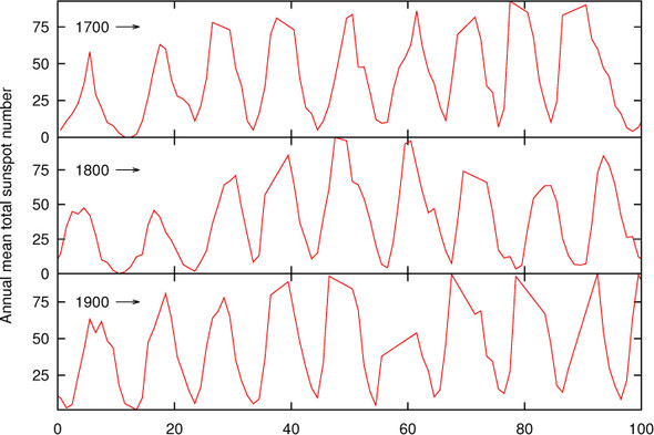
Now an interesting feature in the data can be recognized: the number of sunspots during each cycle rises quickly but tends to fall more slowly. (There’s the visual comparison I referred to earlier!) You wouldn’t have been able to see this from the representation of the data in figure 14.18.
Banking is a valuable tool. In particular, I find it helpful because it draws attention to the importance of the apparent slopes of lines on a graph. Nevertheless, it must be used with judgment and discretion. Taken by itself, it can lead to graphs with strongly skewed aspect ratios. Figure 14.19 is a good example: if the three segments hadn’t been stacked on top of each other, the resulting graph would have had a very awkward shape (extremely long and flat).
Tip
To improve the perception of slopes, choose the plot range and aspect ratio of your graphs such that most of the curves are at approximately 45 degrees to the horizontal. If necessary, chop up the data set into segments and arrange them in a cut-and-stack plot, to keep the overall aspect ratio of the plot at a convenient value.
14.3.2. Judging lengths and distances
Look at figure 14.20. It shows the flows to and from a storage tank as a function of time. For the time interval considered here, the inflows are always greater than the outflows, so the tank tends to fill up over time, but that’s not our concern right now. (Let’s say the tank is large enough.)
Figure 14.20. Inflow to and outflow from a storage tank. What’s the net flow to the tank?

Instead, let’s ask for the net inflow as a function of time—the inflow less the outflow at each moment. Could you draw it? Does it look at all like the graph in figure 14.21? In particular, does your graph contain the peak between 6 and 7 on the horizontal axis? How about the relative height of the peak?
Figure 14.21. Net flow to the storage tank. This is the difference between the inflow and the outflow (see figure 14.20).

This example shows how hard it is to estimate accurately the vertical distance between two curves with large slopes. The eye has a tendency to concentrate on the shortest distance between two curves, not on the vertical distance between them. The shortest distance is measured along a straight line perpendicular to the curves. For nearly horizontal curves, this is reasonably close to the vertical distance; but as the slopes become steeper, the difference becomes significant. (Because the net flow is the difference between the two flow rates at the same point in time, you’re looking specifically for the vertical distance between the two curves.)
You may also want to compare the observations made here with the discussion in section 14.1.4—the problems are similar. As a general rule, it’s difficult to estimate changes against a baseline that itself isn’t constant; and the more rapidly the baseline changes, the harder it is to use.
Tip
The eye has difficulty accurately judging the vertical distance between two curves with large slopes. If the nature of the difference between two quantities is important, then plot it explicitly. Don’t rely on observers to recognize it from the contributing components.
14.3.3. Plot ranges and whether to always include zero
Plots should have meaningful plot ranges, showing those parts of the data that the viewer is most likely going to be interested in at a reasonable resolution. It may not be possible to convey all the meaning appropriately with a single choice of plot ranges, so don’t be shy about showing two or more views of the same data set—for instance, an overview plot and a detailed close-up of only a small section of the entire data set.
A long-standing (and largely unfruitful) discussion concerns the question of whether zero should be included in the range of a graph. The answer is simple: it depends.
If you’re interested in the total value of a quantity, you probably want to include zero in your range. If you care only about the variation relative to some baseline other than zero, then don’t include zero.
Figure 14.22 demonstrates what I mean. Both panels of the graph show the same data. The main graph tells us that the total variation is small, compared to the overall value. The inset tells us that there has been a steady increase from left to right. Both views are valid, and each gives an answer to a different question.
Figure 14.22. Two different views of the same data set. The outer graph includes zero in the vertical plot range, and the inner graph displays only that part of the vertical axis that corresponds to data points. Both views are valid: the outer graph shows that the relative change in the data is small compared to its absolute value; the inner graph shows that the variation increases dramatically from left to right.

Plot ranges are a bit more of a concern when you need to compare several graphs against each other. In such a situation, all graphs should have the same scale to facilitate comparison; in fact, using different scales for different graphs is a guaranteed path to confusion (because the difference in scales will go unnoticed or be conveniently forgotten). And if one of the graphs legitimately includes zero, then all of them must do the same.
14.4. Summary
In this chapter, I chose three recurring topics and discussed them in greater depth. The first was the graphical analysis of time series; we paid particular attention to finding a smooth approximation to the raw data’s overall trend. I then described a variety of methods for the graphical treatment of multivariate data sets and how to realize them in gnuplot. Finally, I pointed out the importance of visual perception and described some ways to take advantage of it.