CHAPTER 2 WHEN A CHART HITS OUR EYES SOME SCIENCE OF HOW WE SEE
I’VE COMPARED THE PROCESS of learning dataviz to learning how to write and to learning a new language. Maybe the best analog, though, is music. Everyone hears music and forms opinions about it, and most do this without taking courses in music theory. We may sense something about the music we like—its “texture,” or that it sounds “brooding,” without knowing that we’re describing syncopation, or a minor key.
Similarly, everyone sees charts and decides whether they’re good or bad without a degree in visual perception theory. You may sense something about a chart you like—you may even be able to describe it as “clear” or “revealing” without understanding that you’re describing elementary encodings or perceptual salience.
If you wanted to compose, you might learn some music theory. Now that you’ve decided to make good charts, it’s helpful to learn a little bit about how we see. Unlike music, though, the theory of data visualization is new and changing. It draws on multiple disciplines, including perception science, neuroscience, and psychology.1 We’re not here to become experts in all this; you just need seven broadly applicable ideas to understand what we see when we see a chart.
SEVEN IDEAS TO KNOW
1. We don’t go in order. In the tacit contract between a reader and a writer, the writer agrees to use words to communicate. The words will be strung together as sentences, the sentences as paragraphs, and the paragraphs as stories that will be presented “in order,” which in the West means starting on the left, then moving left to right and top to bottom on the page. Different cultures read in different orders.2 In all cases, though, reading is done sequentially and at a reasonably even tempo.
With visualizations, no such contract exists between a producer and a consumer. We know that a reader often won’t start with the title at the top of a chart until well after she has started scanning the visual middle. She may jump around. She may read halfway across an axis and then move on to something else—or skip some parts of the chart entirely.
There’s an unspoken contract between writer and reader about how readers will proceed through text. No such contract exists with visualizations.
Pacing, too, is completely different. Reading a book is like running a marathon, taking a steady pace along a linear path. Parsing a chart is more like playing hockey, with fast bursts across space interspersed with intense action in concentrated zones. We go where our eyes are stimulated to go. There’s no agreed-upon convention.
The order in which people look at charts varies because of many variables: chart type, who’s looking, how much time they have, and more. Some research suggests that people with expertise in the subject matter of a chart or with practice using a certain chart type will read through it differently (and more efficiently) than others.3 Although the challenges of producing good visual communication—to achieve the proper focus and clarity—are in some ways no different from those of producing any other kind of communication, they’re in other ways more distinct and more difficult.
2. We see first what stands out. Our eyes go right to change and difference—peaks, valleys, intersections, dominant colors, outliers. Many successful charts—often the ones that please us the most and are shared and talked about—exploit this inclination by showing a single salient point so clearly that we feel we understand the chart’s meaning without even trying. Like this:
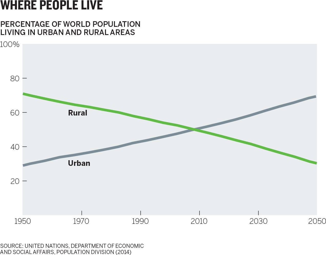
Here, the crossover is the inescapable visual your eyes can’t resist. You probably didn’t even read the axes before you began to know what this meant. Most likely you saw the crossover, then checked the labels, and glanced at the title, in roughly that order, nearly instantaneously, and you got the point: The world has flipped from mostly rural to mostly urban.
Note that you don’t choose this path. Your eyes and your brain always notice more dynamic visual information first and fastest. The implicit lesson is to make the idea you want people to see stand out. Conversely, make sure you’re not helping people see something that either doesn’t help convey your idea or actively fights against it.
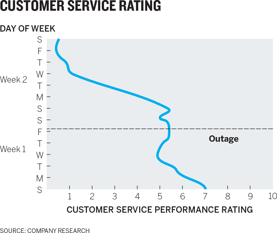
This is more easily illustrated with a slightly more complex chart. What are the first three things you see here?
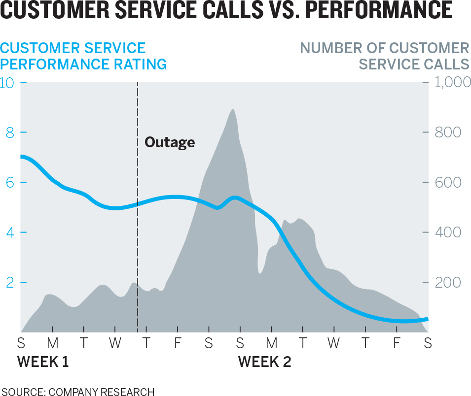
Without choosing to, most people will first see the blue line, the steep gray mountain, and the “outage” line. If the manager who presents this chart wants to communicate the relationship between an outage, customer service calls, and customer service performance, this chart rightly calls attention to those three points.
But what if he’s concerned that customer service’s issues are systemic rather than a result of the outage? What if he wants to convey to his boss that even after customer service calls returned to pre-outage levels, customer service performance continued to decline?
If we work at it, we can find that trend in the chart, but it’s not what we notice first. It doesn’t stand out. Our eyes have been drawn to something else. How might the manager make his idea what we see first?
Including the number of customer service calls in the first chart made our eyes go straight to data that this manager thinks is not the issue. His new chart (shown below) eliminates that, thereby removing a distracting message. The addition of the “service restored” marker provides important context that highlights the continuing downward trend even after that point. And we may not have noticed it before, but now we see that the downward trend started before the outage.

The capper is the new title: “Declining Call Center Performance.” Remember we don’t have an implicit contract with chart readers that they’ll start with the title. And despite their position, titles aren’t usually the first thing a chart reader sees. Rather, they’re clues to help us find the meaning that started to emerge when we looked at the picture. Here, the word declining confirms the chart’s message and purpose.
If this manager had given his boss the first chart, he’d have to fight her inclination to focus on what stands out in it—that peak in customer service calls—and get her to see the trend he cares about. Now he can start a conversation about performance overall.
3. We see only a few things at once. The more data that’s plotted in a visualization, the less individual data will matter to the viewer, and the more singular the chart’s meaning becomes. To build on the last example, to see a simple before-and-after representation of call center employees’ performance, the manager might produce a slope graph. In the top chart, he has plotted January and June ratings for a few dozen employees.

Despite the fact there are 60 or so data points plotted here for 30 or so variables, someone looking at this chart only sees one data point, a collective trend. “Things are going up.” It’s impossible to have a conversation about individuals or even subsets within this group with this chart. The boss sees only generally rising performance in a thick band.
But the manager knows his boss will be making decisions about individual employees’ performance. How few points of data should he show so that she can do that?
The threshold at which individual data points melt into aggregate trends is surprisingly low. It varies according to chart type and task. For example, experts think that we can’t distinguish more than eight colors at a time, at most.4 A good guide is that with more than five to ten variables, individual meaning begins to fade into the aggregate.
The manager’s boss can judge individuals’ work in the second chart, but even this hints at the limits of showing multiple individual data points together. It takes a moment to separate the pickup sticks before we can start to see a singular pattern in their performance. If the manager needs to convey the individual performance of hundreds of people, he has a challenge ahead of him with a slope graph. He may have to consider other techniques.
A bar chart is more effective than a slope or a trend in a line chart at getting us to focus on each discrete category of data—each bar. But even bars create singular shapes when enough of them are plotted and they’re snug against each other. What’s the first thing you see in the Plug-In Vehicles chart—30 plus separate values or a slope?
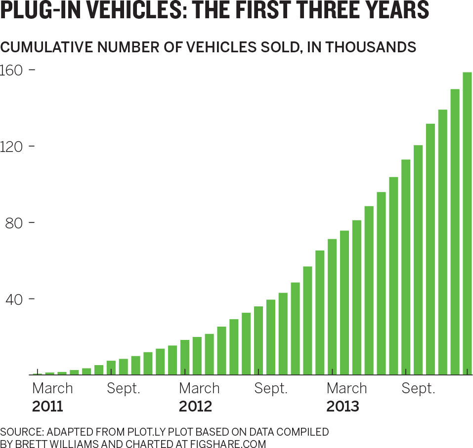
Again, if the point is the trend, this will do just fine (though since it is a trend, a line chart would work as well and avoid any confusion). But if we need to compare discrete values within this series for our discussion, or some subset of this data matters most, or there are other variables we need to make our point (such as, say, profit per vehicle), then we’re not there yet, because we still just see one overarching trend.
This melding into an aggregate becomes problematic when bars make us sense a trend when there isn’t one.

Here we clearly see a steeply declining trend; there’s no trend because each bar represents a different company, not the same value (units sold, dollars, etc.). Think of it this way: We see a trend, which means it could be a trend line, but that wouldn’t make sense. Kia’s sales don’t “go to” GMCs. They’re not connected. They’re discrete.
The previous examples examine generally well-constructed charts that create a single view in the mind because the mind can only process a few variables at once. But there’s another kind of bad complexity in which too much information doesn’t melt into a singular meaning; it just baffles us.
You’ve probably encountered such charts or made a few yourself. They use color, callouts, statistical labels, legends, and other devices to draw our attention in several directions at once. People find these charts taxing and frustrating. Sometimes people blame themselves for not getting meaning out of them, but it’s not them. It’s because we only see a few things at once.
The Most Common 311 Complaints chart plots 21 discrete categories across 24 tightly packed hours.
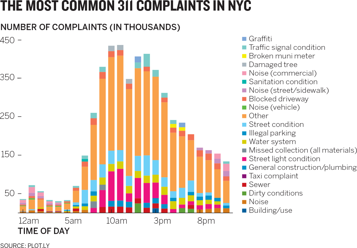
Some of the categories’ values are so small as to become barely distinguishable slivers. For example, try following changes to “illegal parking” over the course of the day. The color choices aren’t systematic—in fact, different complaints share like colors (“graffiti” and “damaged tree” look remarkably similar). The lengthy legend disconnects the y-axis values from the bars. And not every variable is found in every bar. What stands out here? We might argue that a general middle bump is discernible—that all the complexity forces us to look for something simpler and that’s what we can grab onto—but if that’s what needs to be shown, all those categories and colors are distracting from it.
In truth, this kind of chart is common, and I’ve seen and worked with much more challenging examples. Here’s a reproduction of a project I worked on. No need to belabor the point, just notice that as you look at it, your brain is working hard to make simple sense of a complex visual. (We fixed this—transformed it, really—in a matter of a couple of hours. More on the process we used to do that in the coming chapters.)
Bad complexity neither elucidates important salient points nor shows coherent broader trends. It will obfuscate, frustrate, tax the mind, and ultimately convey trendlessness and confusion to the viewer.
Good complexity, in contrast, emerges from visualizations that use more data than humans can reasonably process to form a few salient points. Here’s an extreme example:
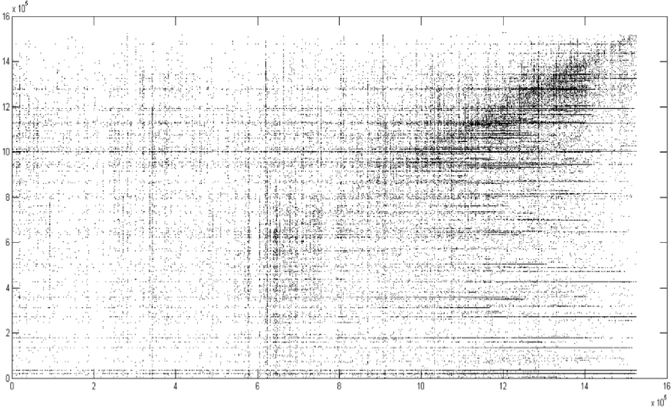
This is a scatter plot of 10 million data points that charts the social connections between stock traders on a social trading platform. Despite the overwhelming amount of data displayed, we see just a few things to focus on: the dense black spot, a correlative upward-right increase in density, and some striation, especially to the right.5 That’s all we can talk about here.
We can process these visualizations at the “blurry level,” as one researcher puts it, and estimate the values they represent reasonably well.6 When deeply complex charts work, we find them effective and beautiful, just as we find a symphony beautiful, which is another marvelously complex arrangement of millions of data points that we experience as a coherent whole.
4. We seek meaning and make connections. Once we see what stands out, we try to make sense of it immediately and incessantly. When you looked at the earlier complex scatter plot, you may have thought, Why is it smudged black in the top right? Sometimes we even vocalize the impulse to make meaning, with a “Hmmm,” or a “What’s that about?”
Even as we ask ourselves such questions, we’re generating a narrative. With the original Customer Service Calls chart, for example, it doesn’t take long to string the first three points we see into a simple story: An outage led to a spike in service calls and then a performance decline. With the Team Performance slope chart, we quickly translate the angle and density of the lines as Performance is improving in general, but most people are lower-performing to begin with.
Once again, we’re not choosing to do this. It’s what happens, automatically, when a chart hits our eyes. Understanding this will help you anticipate how people will automatically react and help you plan your visual in a way that honors and exploits how their minds work.
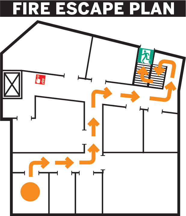
Seeking sense this way has obvious benefits. For one, we process visual information thousands of times more efficiently than we do text. Some of our processing is even “pre-attentive”—it happens before we’re aware we’ve done it—so we can grasp visual information more clearly with less effort. For example, imagine your office building is on fire. As smoke fills the room, you rush to the door, where you see this emergency exit placard.
In the room next to yours, someone rushes to the door and sees the Fire Escape Plan map instead. Who do you think makes it to the first exit faster?
The ability to find meaning so efficiently may be a blessing in a fire, but it can also lead us to construct false narratives from data visualizations. What if the customer service manager showed his boss the chart below comparing customer service ratings to revenue when she asked for some data to review the effect of the outage?

We can’t help making connections in what we’re presented with. Anything that stands out becomes part of the narrative we’re trying to form, so what’s presented becomes a crucial factor in the success of the chart—its ability to convey the idea the chart maker wants it to. The manager’s boss, seeking meaning, may reasonably conclude from this chart that revenue is steady despite the outage. The narrative she’s forming may convince her that she can deprioritize a proposed customer service overhaul. After all, revenue is unharmed.
But before she can do that, the manager shows her a chart from a previous outage that extends the length of time plotted.
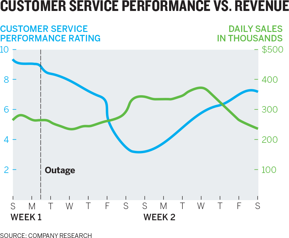
In this version she sees a different story: Revenue dropped, but not until nine or ten days after the outage.
Of course, correlation does not equal causation. Did the outage and customer service’s performance eventually affect revenue? Or was the drop related to something not included in the chart? The manager and his boss don’t know, but he, knowing that she will seek meaning and make connections, has produced a better chart with which to start the discussion. Good visual communication should be used not just to produce better answers but also to generate better conversations. In this case, the two can wait a few days to see whether revenue starts dropping.
This need to make sense of what we notice is so powerful that it extends to the subconscious. In the Top Performers chart below, the bold orange and blue headline is one of those instantly noticeable cues. It makes us immediately connect the colors to other like colors on the chart. Somehow, our brains say, they want me to put together “performers,” “rating,” and “B team.” And they want me to see “top,” “call volume,” and “A team” as connected. The colors mean something.
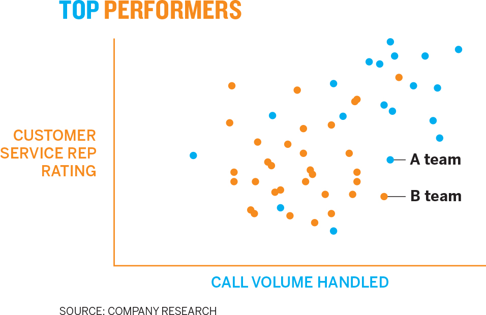
In fact, you can’t stop your mind from finding meaning in this. Research has shown that our visual system will subconsciously create cohesion among the orange items while tuning out other colors and information in order to increase its focus on the dominant color, in this case orange.7 Without realizing it, we’ve prioritized the color relationship over other information. That’s unfortunate, because the color connection here is meaningless—just a suboptimal design decision. In fact, the blue team is higher performing.
5. We rely on conventions and metaphors. It’s not just how we’re wired to see the world that defines how we see charts. It’s also how we’re taught to see the world. In this case, literally:
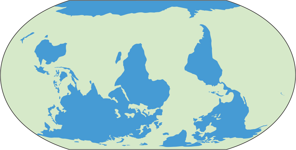
Is this map wrong? No. We think it’s “upside down” because we’ve learned that “north is up,” even though there is no up or down for a ball spinning around in space. You also may not have seen the world right away. In your mind, land is green and water is blue, even though that’s not actually true.
Likewise, the Customer Service Rating chart below is accurately plotted, but most of us would still say it’s “wrong” because time doesn’t go up. Once we look at the axes, we find ourselves doing some cognitive gymnastics, expending significant mental energy trying to twist the lines back into a form we’re used to seeing. You even may have tilted your head to the right in an effort to make the time axis horizontal, only to realize that even then, it’s still “backward” because time doesn’t go right to left.
In fact, time visualizations can move in any spatial direction and remain factually accurate. But we’ve learned to think of time as moving horizontally left to right on a page or a screen, and back to forward in three-dimensional space.
Moving time to the y-axis creates another perception problem. It generates a line that, literally, goes down as performance goes up. The highest performance is found at the lowest point. Again, that messes with our learned expectations: “High” performance shouldn’t be spatially “low.”
Conventions are a form of expectation, and our brains use experience and expectation as cognitive shortcuts so that we don’t have to process everything anew every time we see it. In fact, as the neuropsychiatrist Jon Lieff points out, “The over-arching analysis of visual signals depends on what is expected … the influence of the brain and expectation are far greater than the raw data.”8
The point here is don’t fight it. Your cognitive shortcuts, many developed culturally, are generally useful (though some do lead to bias; awareness of those situations and retraining the brain, and shifting the culture to eliminate those cognitive shortcuts, are essential). There are innumerable cognitive shortcuts we use when a chart hits our eyes: Up is usually good, down is bad. North is up, south is down. Researchers have found that we even connect those metaphors to value judgments.9 For example, because south is “down,” we think it’s easier to go in that direction than to go north, which requires us to go “up.”
Red is negative, green positive. But red sometimes also means “hot” or “active” (which can be thought of as positive), and in those cases, blue means “cold” or “inactive.” Blue is water. Green is land. Hierarchies move from the top down. Lighter color shades are “emptier” or lower than darker ones. Gray things are less important than color things. Steep curves mean volatility and flat lines seem steady, or safe. These are just a few of many heuristics we use every day.
Anytime conventions like these are flouted, confusion, uncertainty, and frustration will weaken a chart’s effectiveness. Some of the heuristics are so powerful and obvious that we rarely see them violated. Virtually no one maps the world “upside down.” Desert temperatures aren’t shown as a deep blue. Imagine a CEO announcing to her employees, “We’re going to take this company into the future!” as she points behind her.
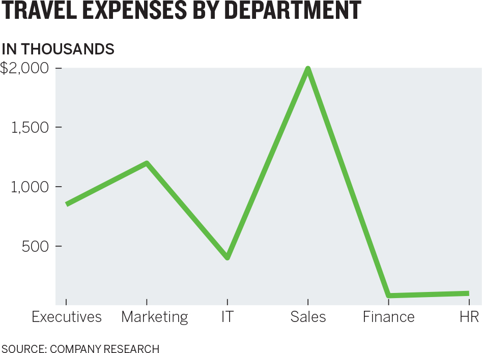
Or consider the Travel Expenses chart below. Conventionally, we connect data points only when there’s a relationship from one value to the next. But here each value is an unchanging category. “Sales” doesn’t change as a value; there’s no inherent connection between executives’ and marketing’s expenses. One value doesn’t go to the next as this line does. Each value here would be better served being plotted discretely, say, with a bar.
The real challenge with conventions comes from subtler violations of our expectations. Here’s a re-creation of a published chart I encountered:10
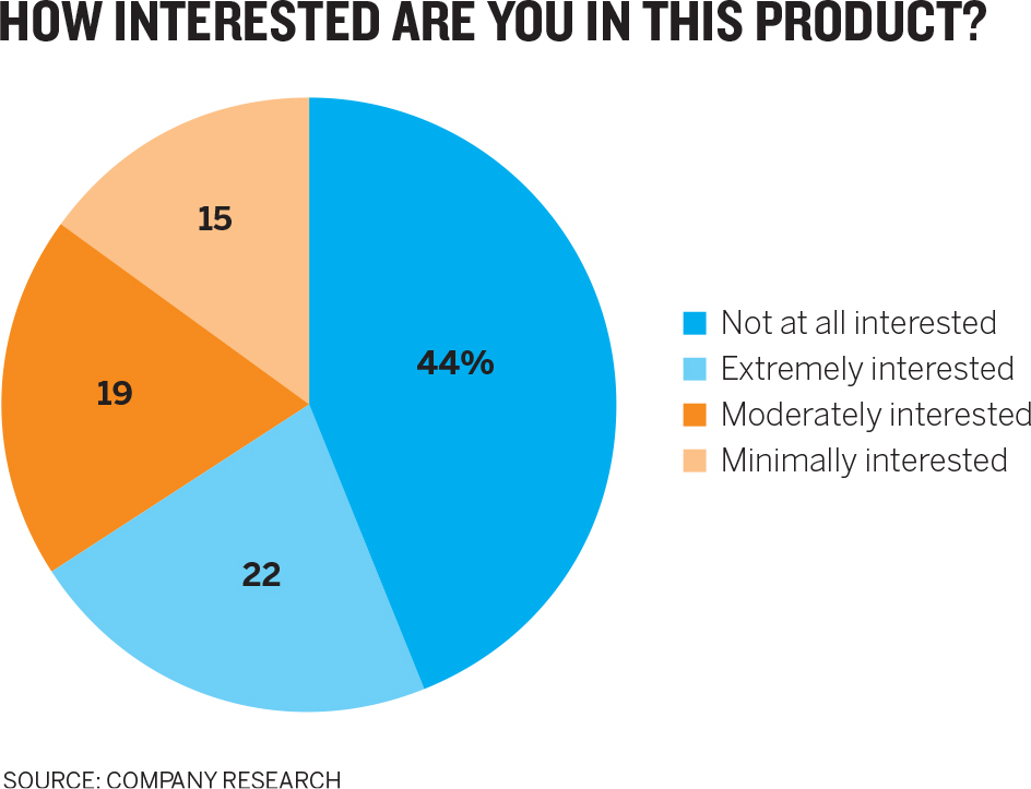
More is happening here than may first appear. Without thinking about it, we access three conventions in our minds to help explain the meaning of the chart:
- Like colors mean like items—the blue things go together.
- Color saturation indicates higher and lower values—lighter colors have lower values than darker ones.
- Categories are arranged and plotted from one extreme to another—we can read this in order from most to least interested.
We’re making meaning before we know it: There are two groups of people here with varying levels of interest, and the blue group is bigger than the orange group. But a closer look shows just how far off we are.
Like colors mean like items. You probably assumed that the blues are a pair and so are the oranges. But the key shows that the blue pieces represent diametrically opposed viewpoints (no interest, high interest), and the orange sections represent middle viewpoints (some interest, little interest). Our expectation is that “not at all” and “minimally” will be in one color because they represent the pessimists, while “moderately” and “extremely” describe another group, the optimists.
Color saturation indicates a progression of values. We expect light-color values to be lower than dark-color values, but here light blue has a higher value (22%) than dark orange (19%). If we match hues to actual numerical values, descending order should be rich blue, pale blue, rich orange, pale orange. Here the color groupings aren’t in order either. Optimists are pale blue and rich orange, while pessimists are rich blue and pale orange. The color differences provide no guidance here. They only generate confusion.
Categories are arranged and plotted from one extreme to another. Our minds want information to be arranged in order. But the key here lists categories “out of order.” If we think of “extremely interested” as category one and “not at all interested” as category four, then this key is arranged four, one, two, three.
What at first glance appeared to be a simple, well-constructed pie chart turns out to repeatedly disrupt our expectations, forcing us to reset them and think harder about what we’re looking at than we should have to. We can’t take advantage of the mental shortcuts that help us get to meaning more quickly. Instead, we have to parse.
To show just how much disrupting expectations can affect viewers’ ability to find meaning in a chart, look again at the pie chart for a few seconds and see if you can answer these two questions, and how quickly can you answer them:
- Which group makes up the majority, optimists or pessimists?
- Which single category represents the smallest proportion of people?
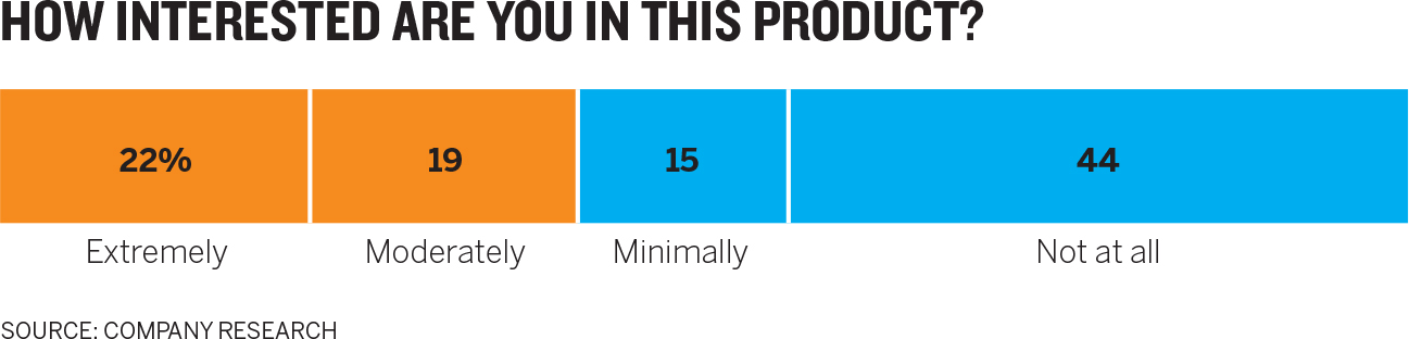
Now look at this version and see if it’s easier to answer those questions.
6. We sense statistical values in visuals. Another way to think of this visual perception principle is that we do math with our eyes. We can get a sense of correlation without knowing the actual values we’re looking at. Our ability to detect change in charts seems to follow a fundamental rule of sensory perception known as Weber’s law.
Weber’s law states that “a noticeable change in stimulus is a constant ratio of the original stimulus.”11 Imagine a perfectly black room. Light a match, and you’ll notice a big change in how bright the room is. But if you start with three lamps turned on, lighting a single match won’t make the room seem brighter, even though statistically it is. The more light you start with, the more light you need to add to notice a change in brightness.
The key to Weber’s law is that the relationship between starting state and new state is predictable and linear—twice as much original light means you need to generate twice as much new light to create a “just noticeable difference” or JND. We perceive change in the world in this linear way with light and color, scent, weight, sound, even taste.
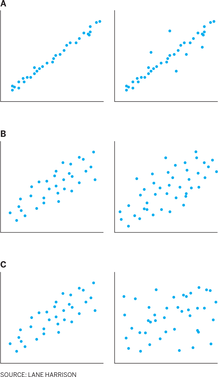
Researchers discovered that we perceive change in correlation in scatter plots the same way.12 For example, in scatter plot pair A below, with a tight correlation near 1, you notice a big change when just a few dots are moved. But pair B has a looser correlation around 0.5, so you don’t notice much change in correlation when the same number of dots as before are moved. To notice the change, you need to move twice as many dots, as shown in pair C.
More researchers have applied this to other types of charts as well. The implications are profound, for two reasons. First, if Weber’s law applies to an instance of higher-order thinking, not just fundamental physical stimuli like light, then maybe we’re not reading data at all, but rather doing something more fundamental in our brains with shape, angle, and space, which we then “calculate” visually to find correlation.
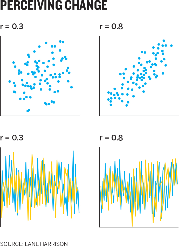
Second, although the relationship between perception and correlation is linear for all types of charts, the linear rate varies between chart types. As shown in the Perceiving Change chart, people see a difference between 0.3 and 0.8 correlations much more easily in a scatter plot than they do in, say, a line chart.13
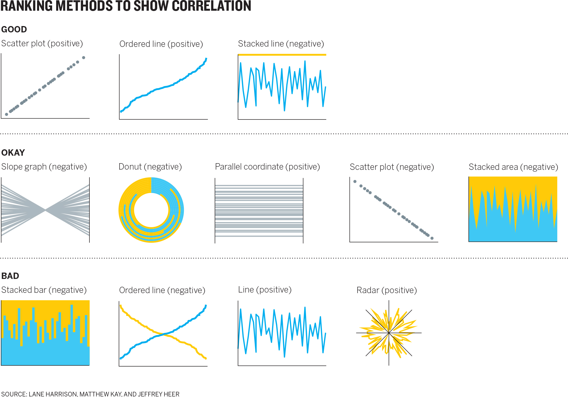
That means we can begin to measure and rank order the effectiveness of various chart types for showing correlation—which researchers have begun to do. Some of the results of this effort are found in the Ranking Methods matrix.14
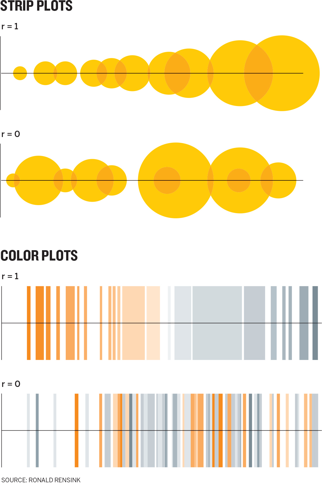
It also opens the possibility of more broadly being able to define what charts work best for what tasks. It could be that we’re underutilizing certain chart types. For example, researchers surprisingly find that we see correlation changes in strip plots and color plots, shown below, as well as or better than we do in scatter plots. This is a surprising result in a field where many believe in space über alles—that spatial relationships are the best way to plot data. Perhaps, as Cleveland and McGill said in their research cited in the last chapter, new procedures are being discovered, and old ones will be set aside.
7. We feel numbers. You may have noticed how these principles have moved from accessible ideas to esoteric ones. We started with the nearly self-evident notion that we see what stands out and moved all the way to an idea about how our eyes can do math with visuals.
Here, at the end, is the most abstruse idea of all: People feel data. They don’t just process statistics and come to rational conclusions. They form emotions about the data visualization. We are not informed by charts; we’re affected by them.
Researcher Helen Kennedy continues to do vanguard work on what she calls feeling numbers.15 She has found that what sticks with people about a chart is not just what it reports, but how it made the user feel. “They showed emotional reactions … to the data itself,” she recalled in a podcast. “They’d realize knife crime went up in their area and they’d feel scared.”16
What’s more, when Kennedy followed up with participants a month later, most could not recall specific data from the charts they looked at. “But they could remember the feeling they had,” she reports. “You know they’d say, ‘I remember feeling surprised that that number was higher than I expected.’ ”
Data visualizations are emotional experiences, and Kennedy believes it’s important to accept that and to change how we teach statistics and data visualization to accommodate the fact. This, she says, will make our “datafied times” more inclusive. “Privileging the rational over the emotional … also means privileging some groups over others. This is because certain groups (often white, middle-class men) are better equipped to understand mathematical and statistical information, not because they are more naturally capable of doing so, but because they are significantly better represented in maths, science, and computing subjects at school and beyond … Changing how we do statistical education might mean including previously excluded groups in understandings of data and in engagements in data-driven conversations and decision-making.”17
For our purposes, it’s important to remember that not only are you bound to make people feel something, but that feeling will be even more enduring than the data itself.
CREDIBILITY AT STAKE
Understanding what people see, and what their minds do when they set eyes on a chart, is the best way to guide you in deciding what to show and how to show it. The applicability of these tenets may not yet be perfectly clear, but you will find yourself returning to these ideas repeatedly in the coming chapters. As you hone your chart-making skills, you’ll see how understanding what happens to your audience when a chart hits their eyes guides you to certain solutions.
The stakes here may be higher than you suspect. Perceptual fluency research suggests that we make qualitative judgments about information based on its presentation.20 If something is hard to perceive, people not only struggle to find the right meaning, but judge it less favorably.
There’s a fine point here that mustn’t be lost: It’s not the chart that they’ll judge harshly if the meaning is hard to find; it’s the information itself. They’ll consider it less credible. The emotions they have about it (and will remember) will be more negative.
With that in mind, recall the chart there that was part of a transformation project I worked on.
The chart below is the same data represented on that previous chart, only now reimagined as a series of small multiples that can be navigated either horizontally or vertically.
How we made this transformation will be the subject of the coming chapters. For now, just think about what happens when these two charts hit your eyes. What do you feel? If you were presenting these charts, which do you think will earn you more credibility? If you were at a meeting where others were presenting these charts, which speaker is earning your trust? Which chart is more usable? Which will you remember?
This is the kind of transformation you’re after.
That’s enough theory to make you an amateur composer, and to know that if your charts don’t make what’s important stand out, if complex data doesn’t coalesce into a few clear ideas, if the information visualized fosters a false narrative, if unconventional visual techniques confuse your viewers, then you’ve promised music but delivered noise.
RECAP WHEN A CHART HITS OUR EYES
Unlike text, visual communication is governed less by an agreed-upon convention between “writer” and “reader” than by how our visual systems react to stimuli, often before we’re aware of it. And just as composers use music theory to create music that produces certain predictable effects on an audience, chart makers can use visual perception theory to make more-effective visualizations with similarly predictable effects.
Understanding these is crucial, because if users of your dataviz find it hard to understand, they will judge your data less credibly. Seven high-level, mostly agreed-upon principles can guide you:
1. We don’t go in order.
Visuals aren’t read in a predictable, linear way, as text is. Instead, we look first at the visual and then scan the chart for contextual clues about what is important.
What this means:
Whereas we write sequentially (in the West, left to right and top to bottom), we should “write” charts spatially, from the visual outward, using other elements to provide clues to the visual’s meaning.
2. We see first what stands out.
Our eyes go directly to change and difference, such as unique colors, steep curves, clusters, or outliers.
What this means:
Whatever stands out should match or support the idea being conveyed. If it doesn’t, it will distract from and fight for attention with the main idea.
3. We see only a few things at once.
The more data that’s plotted in a chart, the more singular the idea it conveys. If a visual contains dozens, hundreds, or thousands of plotted data points, people will see a forest instead of individual trees.
What this means:
If we need to focus on individual data points, we should plot as few as possible so that the visuals don’t disappear into an aggregate view.
4. We seek meaning and make connections.
Our minds incessantly try to assign meaning to a visual and make causal connections between the elements presented, regardless of whether any real connections exist.
What this means:
If visual elements are presented together, they should be related in a meaningful way; otherwise, viewers will construct false narratives about the relationships between them.
5. We rely on conventions and metaphors.
We use learned shortcuts to assign meaning to visual cues. For example, green is good and red is bad; north is up and south is down; time moves left to right in two dimensions or back to forward in three dimensions.
What this means:
Embrace deeply ingrained conventions and metaphors when creating visuals. Flouting them creates confusion, uncertainty, and frustration, which will weaken or eliminate a chart’s effectiveness.
6. We sense statistical values in visuals.
Our eyes are quite good at estimating changes to statistical information like correlation within a visual, and the ability for us to do this is predictable and measurable.
What this means:
Specific data points matter less in a visual than the overall sense of the data, and people are better at estimating values in visuals than we think. We can trust visuals to convey the data they need to.
7. We feel numbers.
People experience emotional reactions to charts, and those emotional reactions endure beyond the actual statistical information conveyed.
What this means:
When creating a chart, you’re not just informing minds but affecting hearts. As you’re making your chart, think about the emotions you want the audience to feel.