INTRODUCTION A NECESSARY CRAFT
“… for there is nothing either good or bad, but thinking makes it so.”
IN A WORLD governed by data, in knowledge economies where ideas are currency, visualization has emerged as our shared language. Charts, graphs, maps, diagrams, interactive visuals, dashboards—even animated GIFs and emojis—all transcend text, spoken languages, and cultures to help people understand one another and connect. This visual language is used everywhere in the world, every day.
Dashboard maps in car navigation systems help commuters avoid the thick red lines of heavy traffic and find the kelly green routes where traffic is light. Weather apps use iconography and rolling trend lines to make forecasts accessible at a glance. Real-time visualization of the markets is lifeblood for investors. Fitness-tracking apps default to simple charts that show steps taken, sleep patterns, eating habits, and more, some designed well enough to make sense on a watch face. Utility company bills include charts so consumers can compare their energy use with their neighbors’. Newspapers, magazines, and websites all use visualization to attract audiences and tell complex stories. Public debate is fueled by charts. The social web teems with data visualizations—some practical, some terrible, some rich with insight, some simply fun to look at—all vying to go viral. Until that metaphor stopped being cute, and a virus stopped the world. And then data visualization became crucial to understanding the demographics of a pandemic, the horrifying pain of exponential growth, and the efficacy of vaccines.
Sports broadcasts superimpose visual data on live action, from first-down lines on a football field to more-sophisticated pitch-sequence diagrams and spray charts that show a baseball’s trajectory and expose pitching and hitting trends. Behind the scenes, data analysis in sports has transformed the games and become a model industry for showing how effective visualization creates competitive advantages—literal winners and losers.
You may not notice all the ways in which dataviz has seeped into your daily life, but you have come to expect it. Even if you think you can’t speak this language, you hear it and understand it every day.


Data visualization is deeply embedded in our lives, from live sports broadcasts to weather apps to fitness apps to the news. We all “hear” and understand this visual language every day. Now we must learn to speak it.
It’s time to learn to speak it, too. Just as the consumerization of technology adoption and the widespread use of social media changed business, the ubiquity of dataviz in our lives is driving demand for good charts in unit meetings, sales presentations, customer research reports, consumer-facing advertising, performance reviews, entrepreneurs’ pitches, performance metrics dashboards, and the boardroom.1 Increasingly, when an executive sees a line chart that’s been spit out of Excel and pasted into a presentation, she wonders why it doesn’t look more like the simple, beautiful charts on her fitness-tracker app. When a manager spends time trying to parse pie charts and donut charts and multiple trend lines on a company dashboard, he wonders why they don’t look as nice or feel as easily understood as his weather app.
BUSINESS’S LINGUA FRANCA
Speaking this language requires us to adopt a new way of thinking—visual thinking—that is evolving quickly in business. Making good charts isn’t a special or a nice-to-have skill anymore; it’s a must-have skill. If all you ever do is click a button in Excel or Google Charts to generate a basic chart from some data set, you can be sure that some of your colleagues are doing more and getting noticed for it. No company today would hire a manager who can’t negotiate the basics of a spreadsheet; no company tomorrow will hire one who can’t think visually and produce good charts.
Dataviz has become a competitive imperative for companies. Those that don’t have a critical mass of managers capable of thinking visually will lag behind the ones that do. Vincent Lebunetel was the vice president of innovation at Carlson Wagonlit Travel, where he invested in hiring and training information designers. He’s now cofounder and CEO of an AI-driven skills planning and mapping company that helps HR predict and plan for the skills it needs. He says that business managers and leaders who can’t create clear visualizations are just less valuable: “If you’re not able to make your message simple and accessible, you probably don’t own your topic well enough. And visualization is probably the best way to help people grasp information efficiently.”
After a group at Accenture Technology Labs produced visualizations of NBA team shooting patterns that went viral, its consultants started asking the group for help producing charts that would produce a similar visceral reaction in their own clients.2 So Accenture built an online and in-person “visual literacy curriculum” for them. The VLC has been so effective internally that Accenture made the curriculum a client service and developed a visualization career track for its consultants.
Daryl Morey, the president of basketball operations for the NBA’s Philadelphia 76ers, puts it plainly: “Everyone in our business knows they need to visualize data, but it’s easy to do it poorly. We invest in it. We’re excited if we can use it right while they use it wrong.”
Sports in general—and basketball in particular—should serve as inspiration or a warning, depending on how you want to look at it. Over the past two decades in sports, the organizations that are best at using data win more. They see opportunities to exploit and hazards to avoid. They find novel solutions to problems, sometimes problems they didn’t know they had. Most teams in a sport have roughly the same access to data, so what are the best teams doing better? They’re using visualization to find the signals in the noise and then using it again to communicate their ideas clearly and effectively to decision makers. They’re winning with visualization.
WHAT’S A GOOD CHART?
The rise of visualization has generated numerous opinions about how to do it right—and harsh judgment of charts that get it wrong. Missing from most attempts to establish rules are an overarching view of what it means to think visually and a framework and repeatable process for constructing good charts.
To build fluency in this new language, to tap into this vehicle for professional growth, and to give your organization a competitive edge, you first need to recognize a good chart when you see one.
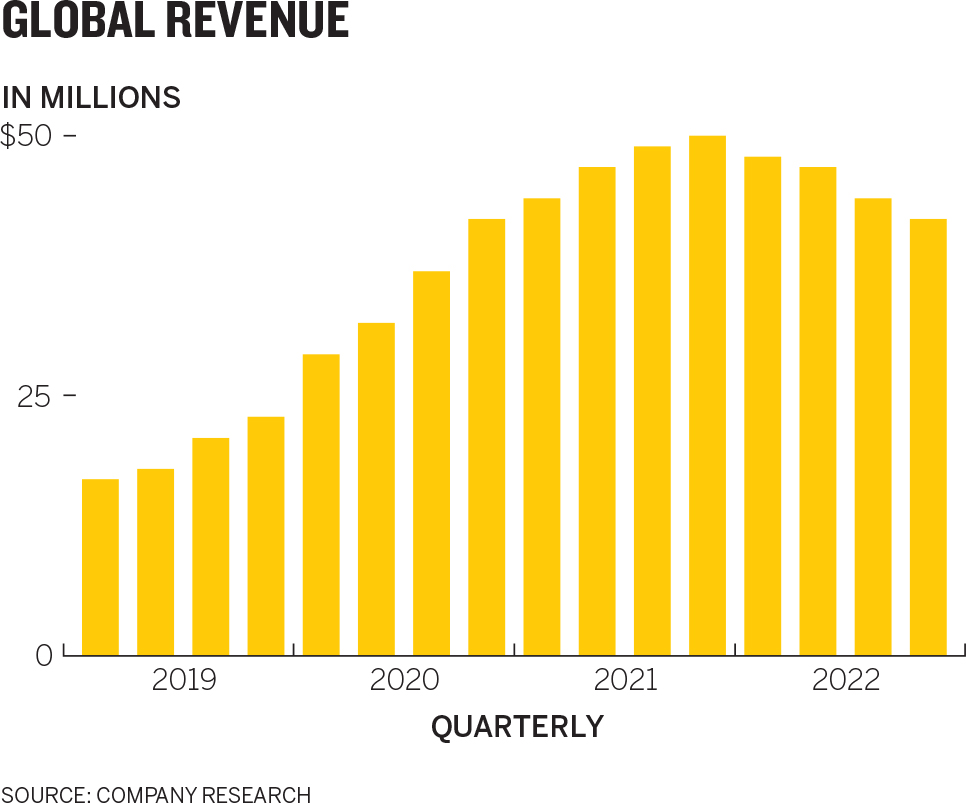
How about this Global Revenue chart? Is it a good chart?
Ultimately, when you create a visualization, that’s what you need to know. Is it good? Is it effective? Are you helping people see an idea and learn from it? Are you making your case?
So, is this one good?
It certainly looks smart. It’s labeled well. It eschews needless ornamentation. It uses color judiciously. And it tells a clear, simple story: After years of healthy growth, revenue peaked and then started to taper. If we held this chart up to the rules and principles proffered by data visualization experts and authors such as Edward Tufte, Stephen Few, and Dona Wong, it would probably pass most of their tests.3
But does that mean it’s good?

Data tools such as Excel can create charts instantly, but does that mean they’re good charts?
You might think it looks better than what you could produce quickly in an Excel doc or analytics package like Power BI or even a visualization tool like Tableau—some of managers’ go-to dataviz tools. You could turn a row of data into a chart there with a single click. And if you needed to present to the CEO, or to shareholders, you might play with some of Excel’s preset options to make it look fancier and more dynamic. Many people love the 3-D option; it seems to draw the eye. That seems like a good thing. So does that make a chart good?
These tools are right there with our data, and they’re very easy to use. But as dataviz becomes a thing, and we constantly encounter more well-designed, thoughtful, persuasive, and inspiring charts and graphs, we recognize that charts like these fall short, even if we can’t yet say exactly why. As most managers use it, Excel visualizes data cells automatically, unthinkingly. The result beats looking at a spreadsheet—but that’s a low bar.
So this chart isn’t as good as the first one, but the question remains: Is that first chart good?
The answer is that we don’t know. Without context, no one—not me, not you, not a professional designer or data scientist, not Tufte or Few or Wong—can say whether that chart is good. In the absence of context, a chart is neither good nor bad. It’s only well built or poorly built. To judge a chart’s value, you need to know more—much more—than whether you used the right chart type, picked good colors, or labeled axes correctly. Those things can help make charts good, but in the absence of context they’re academic considerations. It’s far more important to know Who will see this? What do they want? What do they need? What idea do I want to convey? What could I show? What should I show? Then, after all that, How will I show it?
If you’re presenting to the board, that simple bar chart may not be a good chart. The directors know the quarterly revenues; they’re going to tune you out, check their phones, or, worse, get annoyed that you’ve wasted their time. Maybe they’re looking for markets to invest in to reverse the revenue trend. In that case, a breakdown of changes in the global distribution of revenue might make a good chart:
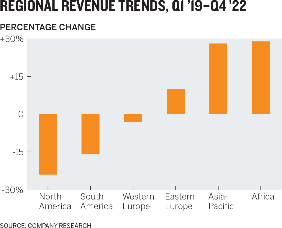
Same data set. Completely different chart.
If the boss has said, “Let’s talk about revenue trends in our next one-on-one,” this isn’t a bad chart per se, but it may be overkill. In that scenario, the time spent refining the chart to presentation-level refinement might be better used exploring ideas around the revenue data on a whiteboard, which has the advantage of being an interactive space, ready to be marked up with ideas about what you’d want to see in that space, such as comparison to competition or a proportional breakdown:

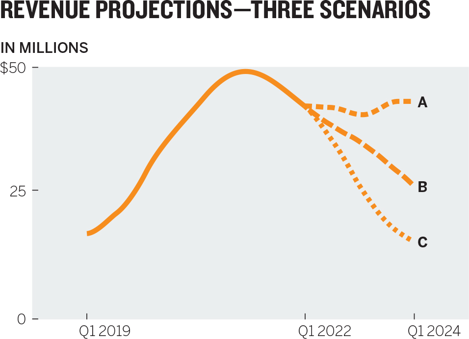
Then again, if it’s for a strategy off-site with the executive committee where future scenarios will be discussed, these probably aren’t good charts. How can you talk about the future with a chart that only shows the past? A good chart in that context would reflect multiple future scenarios, as seen on the Revenue Projections chart below.
Then again, if you’re meeting with a new manager who needs to understand basic facts about the company, then yes, the original chart is a good chart.
We could go on with this indefinitely. Just notice that we’re not changing our data so much as we are the view of it. Context is everything.
BEYOND RULES AND PLATITUDES
This simple example should liberate you from the idea that the value of a chart comes primarily from its execution (it doesn’t) and that its quality can be measured by how well it follows the rules of presentation (it can’t). Just as reading Strunk and White’s The Elements of Style doesn’t ensure you’ll write well, learning visual grammar doesn’t guarantee that you’ll create good charts.
In his excellent writing manual Style: Toward Clarity and Grace, Joseph M. Williams explains why grammar rule books fall short:
Telling me to “Be clear” is like telling me to “Hit the ball squarely.” I know that. What I don’t know is how to do it. To explain how to write clearly, I have to go beyond platitudes.
I want you to understand this matter—to understand why some prose seems clear, other prose not, and why two readers might disagree about it; why a passive verb can be a better choice than an active verb; why so many truisms about style are either incomplete or wrong. More important, I want that understanding to consist not of anecdotal bits and pieces, but of a coherent system of principles more useful than “Write short sentences.”4
What Williams says about writing is just as true for dataviz. You need to get beyond rules and understand what’s happening when you encounter visualization. Why do you like some charts and not others? Why do some seem clear, and others muddled?
How do you know, say, when to use a map instead of a line chart? One rule book for building charts states unequivocally, “No mapping unless geography is relevant.”5 That’s like telling you to “hit the ball squarely.” How do you know whether geography is relevant? What does relevant even mean? Geography could be considered the most relevant factor in your chart showing regional revenue growth for the board. Should you map it instead? Let’s take a look:
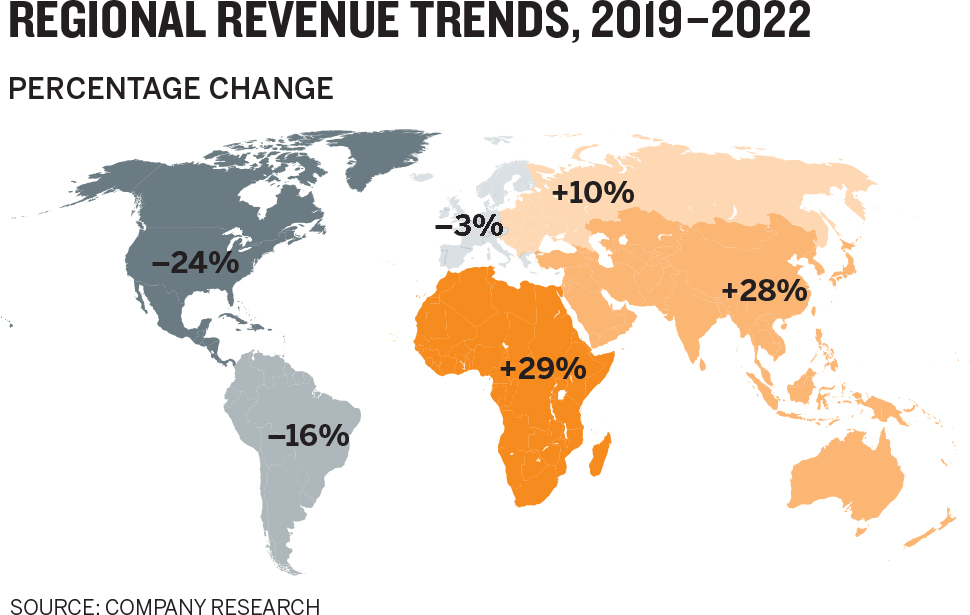
I could make a strong argument that this is not as good a chart for some of the contexts we shared above. Does the map make the point about regional revenues better than a chart does? Would it help you persuade the board that regional revenues matter? Are you even trying to do that? Would mapping this data geographically be worth the extra effort it takes to produce? These questions are seeking the context that simple rules can’t address.
My point here is not to suggest that rules for crafting good visualizations aren’t necessary or useful. They’re both. But rules are open to interpretation and sometimes arbitrary or even counterproductive when it comes to producing good visualizations. They’re for responding to context, not setting it.
Instead of worrying about whether a chart is “right” or “wrong,” focus on whether it’s good. You need, as Williams says, principles that help you understand why you’d choose a bar chart or a line chart, or no chart at all. A perfectly relevant visualization that breaks a few presentation rules is far more valuable—it’s better—than a perfectly executed, beautiful chart that contains the wrong data, communicates the wrong message, or fails to engage its audience. Even within the following pages, you will encounter charts that don’t slavishly follow the advice I’m giving for improving your data visualization. I will make any number of recommendations on color, labeling, axes, and so on and then you’ll see a chart that doesn’t follow that recommendation. For example, I suggest that chart titles can (and often should) be used to do more than just provide generic descriptions of the chart’s structure. And yet, I’ve put charts in this book with titles that only describe the structure. That’s okay. That particular recommendation is not a “rule.” And in those cases, it just wasn’t relevant to the context to do more with the title. You’re seeking relevance. The more relevant a data visualization is to its context, the more forgiving, to a point, we can be about its execution.
The charts you make should fall into the top-right zone in the Good Charts Matrix. Learning to think visually in order to produce good charts that fall in this range is the subject of this book.

THE COMPETITIVE IMPERATIVE
Three interrelated trends are driving the need to learn and practice visual thinking. The first is the permeation of visualization into our lives. The more-sophisticated, higher-quality dataviz in products and media we see now has raised expectations for the charts that others provide us, both in our consumer lives and in our business lives.
The second trend is data itself: both its sheer volume and the velocity at which it’s hurtling at us. So much information hitting us so fast demands a new way of communicating that simplifies and helps us cope.
At Boeing, for example, engineers wanted to increase the operational efficiency of the Osprey—a plane that takes off and lands like a helicopter. The plane’s sensors produce a terabyte of data to analyze on each takeoff and landing. Ten Osprey flights produce as much data as the entire print collection of the Library of Congress.6 The idea of scouring that data in any raw format is inconceivably absurd, but they tried—a team of five worked on it for seven months, looking without success for ways to improve efficiency.
Then Boeing switched to visual analysis to find signals in the noise. Within two weeks a pair of data scientists had identified inefficiencies and maintenance failures. But it wasn’t enough to find the signals; they had to communicate them to the decision makers. Their complex visualizations were translated into simpler ones for the management team, which approved changes to the Osprey’s maintenance code. Operations improved. “It’s hard to tell this kind of story,” says David Kasik, a technical fellow at Boeing who worked on the Osprey project. “Ultimately we have to provide a form for telling our story in a way that others can in fact comprehend.” That form is visual.
Do not presume that these are problems relegated to specialized, technical data like Boeing’s. Even common business data such as financials and marketing analytics, which companies generate as a matter of course, has become so deep and complex now that we humans can’t effectively deal with it in raw, nonvisual form.
The third trend: Everybody’s doing it. Historically, some technologies have enjoyed a democratizing moment, when the innovation becomes cheap enough to buy and easy enough to use that anyone can try it. Examples of this shift are legion. Synthesizers were once highly technical room-size machines that only a few people in the world could operate. Synthesizer pioneer Moog made it so anyone could use them—and they did. Professional music used to require a team of engineers and expensive studio space as table stakes. In the 2010s, the singer Billie Eilish built a Grammy-winning music career on a MacBook and a few hundred dollars in software. Aldus PageMaker, the first word processor, and hypertext markup language (HTML) each in its own way made everyone a potential publisher. Dan Bricklin, a cocreator of VisiCalc, the first spreadsheet, once said that his democratizing software “took 20 hours of work per week for some people and turned it out in 15 minutes and let them become much more creative.”7
When ownership of the technology suddenly shifts from a small group of experts to the masses, experimentation flourishes, for better and worse. (HTML led to garish GeoCities websites, but also to Google.) Dataviz is no different. What was once a niche discipline owned by a few highly skilled cartographers, data scientists, designers, programmers, and academics is now enjoying a noisy experimentation phase with the rest of us. For the first time, the tools used to visualize data are both affordable (sometimes free) and easy to use (sometimes drag-and-drop). Scores of websites have emerged that allow you to upload a data set and get bespoke visualizations kicked out in seconds. Many programs are aiming to become no less than the word processor of data visualization, guiding you to a good chart type and managing your “visual grammar” and design, the way Microsoft Word informs you that you’ve forgotten a comma or tells you to change the passive voice.
Meanwhile, vast reserves of the fuel that feeds visualization—data—have been made freely or cheaply available through the internet. It costs virtually nothing to try to visualize data, so millions are trying. But abundant raw material and drag-and-drop software can’t ensure good charts any more than a lot of dirt and a hoe can ensure a farm. Learning to think visually now will help managers use these burgeoning tools to their full potential.
A SIMPLE APPROACH TO AN ACCESSIBLE CRAFT
The best news of all is that this is not a hard language to learn, even if it seems intimidating. Mastering a simple process will have an outsize impact on the quality and effectiveness of your visual communication. You may have heard people refer to the “art” of visualization, or the “science” of it. A better term for what this book presents is craft, a word that suggests both art and science. Think of a cabinetmaker, who may understand some art and some science but who ultimately builds something functional.
An apprentice cabinetmaker might start learning his craft by understanding cabinets—their history, how people use them, the materials and tools needed to make them. Then he’d learn a system for building good cabinets, and he’d probably build a hell of a lot of them. He’d also install them and learn how cabinets work in different types of spaces and with different types of customers. Eventually his skills would be deep enough to add his own artistic and clever functional details.
Learning how to build good charts isn’t unlike learning how to build good cabinets, so this book will proceed in the same way. Part one—Understand—provides a brief history of visualization and a high-level summary of the art and science behind charts. It leans on (and sometimes also challenges) the wisdom of experts and academics in visual perception science, design thinking, and other fields to illuminate what visualization is and what happens when a chart hits our eyes. In addition to providing an intellectual foundation, this brief section should assuage your fears about learning a whole new discipline. You don’t have to become a professional designer or data scientist to reach a new level in your chart making.
With a foundation of knowledge in place, you can start making better charts. Part two—Create—is the practical core of the book. It lays out a simple framework for improving your charts. You’ll learn what tools and skills you must develop (or hire) to succeed with each of four basic types of visualization. You’ll learn how to think through what you want to show and then draft an approach. The process requires less effort than you might suspect. In as little as an hour, you can vastly improve those basic charts you’re used to spitting out of Excel. You may protest that because you’re not a visual learner by nature, this will be harder for you. That’s probably not true. Research suggests that although we clearly identify ourselves as either visual or verbal thinkers, that distinction may not exist.8 Research also shows that anyone can improve basic visual fluency, just as anyone can learn enough fundamentals to communicate in a new language without mastering it. This section will offer a framework for evaluating yours and others’ output to help you improve it. Learning this constructive criticism is meant to provide an antidote to the burgeoning and frankly intimidating chart criticism that’s carried out daily online and in Twitter feeds, wherein a community of dataviz enthusiasts takes it upon itself to judge visualizations publicly.9
Part three—Refine—turns to the important skill of rendering a soundly structured chart as a polished and artful visual, both impressive and persuasive. Rather than present a list of design dos and don’ts, it connects design techniques to the feelings they create. What techniques can you employ to make a chart feel clean, or so simple that viewers get it instantly? This section shows how to craft charts that don’t just convey some facts clearly but change minds and impel people to action. It also explores the limits of persuasion and why certain techniques can drift across a blurry line into dishonest manipulation. It looks into the role of visualization in understanding facts and truth—they are different—and why every chart is a manipulation and what that means to us as chart makers.
Finally, part four—The Last Mile—shows you how to operationalize your chart making for maximum value when it comes time to present your visual information. Too often, data visualization is left to individuals who happen to be holding the data, and who may or may not be equipped by themselves to produce good charts in a specific context. It wasn’t always this way, and it shouldn’t be now. In addition to sharing team designs and workflows, it will show you how to make charts even more effective by controlling how they’re presented and using storytelling to get your dataviz beyond eyes and into minds.
Good Charts is structured as a single argument, but each of its four parts can also stand alone as a reference for information and inspiration, depending on your specific need, and a brief recap of key concepts is included at the end of each chapter. When your challenge is an upcoming presentation that will include charts, dive right into the The Last Mile section. If you’re looking to think through some visual challenges with your team, use the Create section. I hope this book will become a well-worn, dog-eared companion.
Two final points: First, the subject of data itself—finding it, collecting it, structuring it, cleaning it, messing with it—fills entire books. To focus on the process of visualizing, I begin after the data has been collected and assume that readers understand and use spreadsheets and other data manipulation tools regularly. For more-complicated data analysis and manipulation, I recommend working with experts—we’ll discuss this in part four.
Second, most of the charts in this book, and their narrative context, are based on real-life situations and real data. In some cases, the data, the subject of a chart, names, or other attributes have been altered to protect identities and proprietary information.
A GOOD CHART
Before we get started, take inspiration from Catalin Ciobanu. Once, he was a physics PhD brand-new to the business world, hired as a manager at Carlson Wagonlit Travel, where he worked with Vincent Lebunetel. Later he cofounded an AI software company with Lebunetel and became its chief technology officer. As a physicist, Ciobanu had learned to think visually; analyzing the massive data sets physicists use demanded it. “I had used many visual tools for analysis in science,” he says, “and when I moved to business, I found everything based in Excel. I felt very limited in the amount of insights I could convey from this. Greatly limited.”
Ciobanu was preparing for an event in Paris at which he’d present data to clients regarding what Carlson Wagonlit was learning about business travel and stress. The clients, he knew, were well versed in the aggregate figures on travel spending and the stress of business travel. But Ciobanu wanted them to see more. “What I wanted to convey wasn’t in the Excel file,” he says. “I wanted to convey this idea that travel stress is personal. It’s about people.”
After thinking through his challenge, Ciobanu produced this scatter plot:

When he put this chart up during his presentation, its effect was immediate and visceral. The dots created a sense of individuality that a table of percentages or trend lines couldn’t. Ciobanu focused on individuality by plotting everyone, not categories of people combined in bars representing some aggregate level of travel frequency. “Every point here is somebody,” Ciobanu says. “We found ourselves talking about people, not chunks of data.” Even the title, with its use of who, stressed the humanness of the challenge.
On the spot, clients began forming new insights from this visualization. They had assumed that stress rose with frequency of travel along a steady slope—a positive correlation that goes up and to the right: As trips increase, stress increases. This chart, though, shows that stress can either increase or decrease with more-frequent travel. It normalizes and becomes more predictable. Infrequent travelers, though, show wild variability in the amount of stress they experience.
The client group eagerly discussed why that might be. Maybe some people who rarely travel view any trip as a treat and don’t let delays or cramped economy-class seating bother them. Or some travelers may have to coordinate home and work schedules while they’re away without executive assistance, creating the greater stress of holding down the fort while hitting the road. (Both these hypotheses were borne out by further research.) The clients discussed how programs and services could be adjusted on the basis of this one chart’s shape alone.
“The conversation got passionate,” Ciobanu remembers. “There were powerful outcomes in terms of re-sign rates and engagement.” His colleagues and bosses were impressed, too; he gained respect for his visualization. “Following this,” he says, “executives were coming to me asking me how we could show some data set of theirs or asking if I could help them make their charts better. Personally, this was one of those moments where I hit the mark.”
It was a good chart.