CHAPTER 3 TWO QUESTIONS ➔ FOUR TYPES A SIMPLE TYPOLOGY FOR CHART MAKING
IF A FRIEND SAID TO YOU, “Pack your bags, we’re going on a trip,” what would you do next? Here’s what you wouldn’t do: You wouldn’t say “Okay, great,” grab a suitcase, and start filling it with clothes. How could you? You have so many questions: Where are we going? For how long? How are we getting there? Why are we taking this trip? Where will we stay when we get there? You can’t pack until you know what you’re packing for.
But when it comes to dataviz, many of us follow our impulse to unthinkingly choose a chart type and click a button to create it. In some ways software has made it so easy to create any chart that we opt for that convenience over a more deliberate approach.
I’m advocating for a more deliberate approach that resists the impulse to “click-and-viz.” It starts with understanding what data visualization is—it’s actually not just one thing but a collection of activities— and the resources, skills, and mindset you’ll need to make good charts. This simple framework provides you with a foundation for building your charting skills. You’re going on a trip; this will make packing easier later on.
THE TWO QUESTIONS
To start thinking visually, consider two questions about the nature and purpose of your visualization:
- Is the information conceptual or data-driven?
- Am I declaring something or exploring something?
If you know, generally, the answers to these two questions, you can plan what resources and tools you’ll need and begin to define the type of visualization you may finally settle on using.

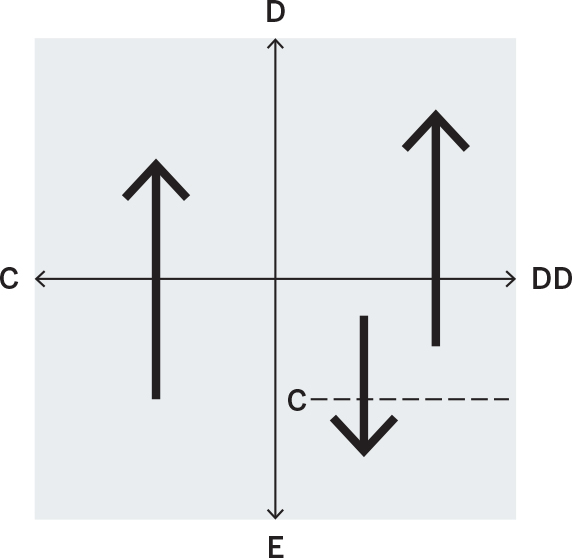
The first is the simpler of the two questions, and usually the answer is obvious. Either you’re visualizing concepts and qualitative information or you’re plotting data and information. But notice that the question is about the information itself, not the forms that might ultimately be used to show it.

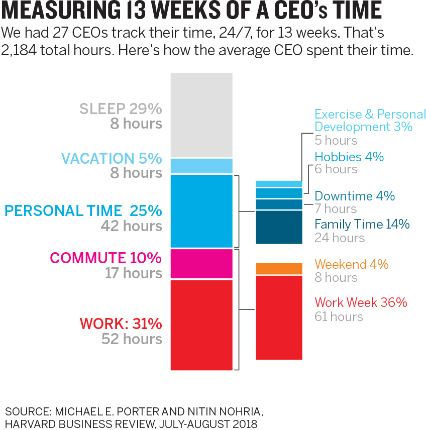

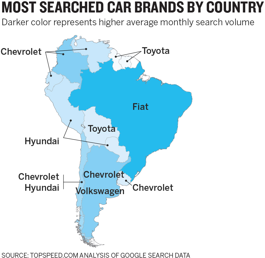
The first two examples above are clearly identifiable as a conceptual chart about the five forces of strategy and a data chart about time management. The chart with the axes and a line is actually conceptual, despite using a statistical form. Conversely, the map is just a map with some logos on it. And yet, it represents data. Sometimes a data-driven chart will take on a conceptual form, and vice versa. Make sure that when you answer this question, you’re thinking about the information, not the form.
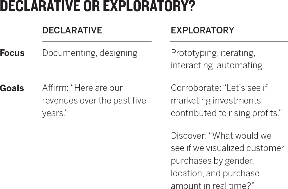
If the first question identifies what you have, the second question elicits what you’re doing. It’s a more complicated one to answer, because it’s not a binary proposition. Within this question, you could choose three broad categories of purpose—declarative, confirmatory, and exploratory—the second two of which are related.
Most often we work with declarative visualizations. These make a statement to an audience—usually in a formal setting—a presentation, a report, or a tweet. They tend to be well-designed, finished products. That doesn’t mean they’re unassailable. Declarative viz shouldn’t preclude conversation about the idea presented; a good one will generate discussion. Still, what you think of dataviz usually falls into this category. If you have a spreadsheet workbook full of sales data and you’re using that data to show quarterly sales or sales by region in a presentation—your purpose is declarative.
But let’s say your boss wants to understand why the sales team’s performance has been lagging lately. You suspect that seasonal cycles have caused the dip, but you’re not sure. Now your purpose is confirmatory, and you’ll dip into the same data to create visuals to learn whether or not your hypothesis holds. Charts used to confirm are less formal, and designed well enough to be interpreted, but they don’t always have to be presentation worthy. The audience is yourself or a small team, not others. If your hypothesis is confirmed, it may well lead to a declarative visualization you present to the boss, saying, “Here’s what’s happening to sales.” If it turns out that seasonality isn’t the culprit, you may form another hypothesis and do another round of confirmatory work.
Or maybe you don’t know what you’re looking for in the sales data. Instead, you want to mine this workbook to see what patterns, trends, and anomalies emerge. What will you see, for example, when you measure sales performance in relation to the size of the region a salesperson must manage? What happens if you compare seasonal trends in the Northern and Southern hemispheres? How does weather affect sales? This is exploratory work—rougher still in design, usually iterative, sometimes interactive. Most of us don’t do as much exploratory work as we do declarative and confirmatory; we should do more. It’s a kind of data brainstorming that can expose hidden insights waiting to be found. Big strategic questions—Why are revenues falling? Where can we find efficiencies? How do customers interact with us?—can benefit from exploratory viz. Once, a colleague wondered aloud about how often the high temperature was in the 70s in Boston. That led to several hours of exploratory visualization in which some insights about the weather in the city were uncovered.
Other ways to ask the purpose question that may help you organize your thinking: “Do I need to give the answers, to check my answers, or to look for answers?” Or “Am I presenting ideas, researching ideas, or seeking ideas?”
Answering these questions can help you anticipate the kind of work ahead of you. For example, as you move from the declarative toward exploratory, certainty about what you know tends to decrease, and the complexity of your information tends to increase. Also, when your purpose is declarative, you’re more likely to be able to work alone and quickly. As you move along the spectrum, you’re increasingly likely to work in a team, lean on experts, and invest much more time in the process.
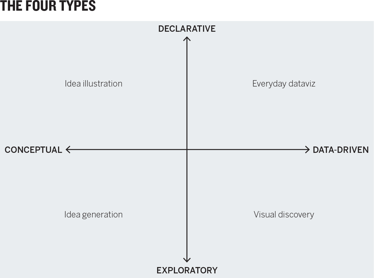
THE FOUR TYPES
The nature and purpose questions combine in a classic 2 × 2 matrix to create four potential types of visualizations that you’ll use.

Knowing which quadrant you’re working in will help you make good decisions about the forms you’ll use, the time you’ll need, and the skills you’ll call on. Let’s start at the top left of this 2 × 2 and proceed counterclockwise.
Idea illustration. We might call this the “consultants’ corner,” given that consultants can’t resist process diagrams, cycle diagrams, and other idea illustrations—sometimes to deleterious effect. (Gardiner Morse, a former editor at HBR, has coined a term for these sorts of overwrought diagrams: “crap circles.”1) But at their best, declarative, conceptual visualizations simplify complex ideas by drawing on people’s ability to understand metaphors (trees, bridges) and simple conventions (circles, hierarchies). Org charts, decision trees, and cycle diagrams are classic examples of idea illustration. So is the 2 × 2 that frames this chapter.
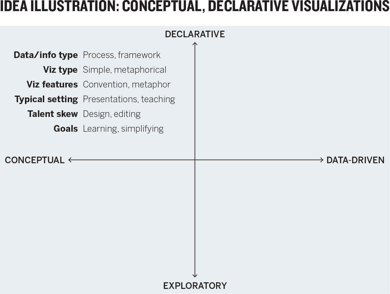
Idea illustrations demand clear and simple design, but they often lack it. They don’t face the constraints imposed by axes and accurately plotted data. Their reliance on metaphors invites unnecessary adornment aimed at reinforcing the metaphor. If your idea is “funneling customers,” for example, the impulse may be to show a literal funnel, but literalness can lead to unfortunate design decisions. Because the discipline and boundaries of data aren’t built into idea illustration, they must be self-imposed. Focus on clear communication, structure, and the logic of the ideas. The skills required here are similar to what a text editor brings to a manuscript, channeling the creative impulse into the clearest, simplest thing.
Say a company hires two consultants to help its R&D group find inspiration in other industries. They will use a technique called the pyramid search.2 But how does a pyramid search work? The consultants have to sell it to the company’s R&D leaders. They present something like this:
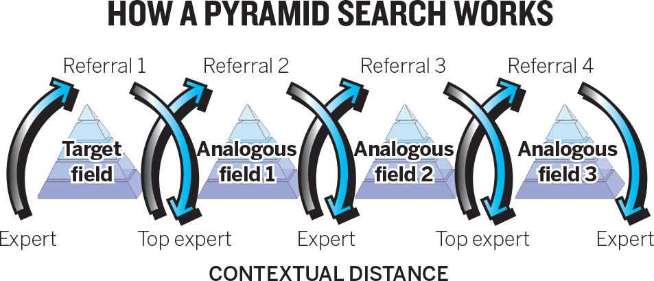
This idea illustration suffers from overdesign. The color gradient, arrows with drop shadows, and the sectioned, 3-D pyramids dominate, drawing our eyes away from the idea and toward the decoration. Stylization like this is a red flag. Additionally, the consultants haven’t effectively channeled the metaphor. They’re selling a pyramid search, but they present interlocking cycles; the pyramids are simply imagery doing little work. This is confusing. They have also put experts and top experts on the same plane (and the top experts are at the bottom of the diagram—another missed metaphor) instead of using height to convey relative status.
They’d be better off presenting something like this:
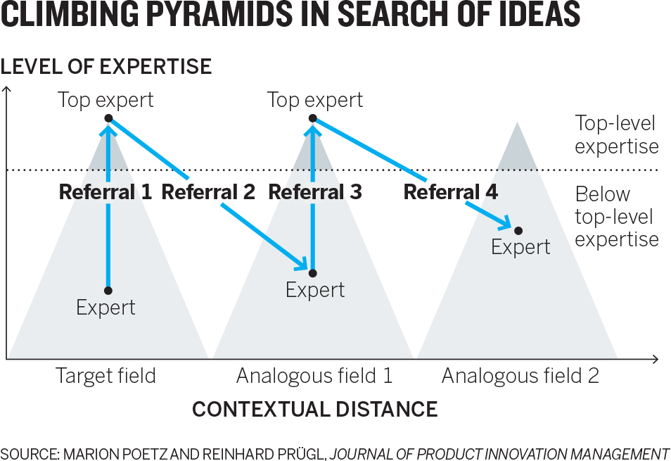
Here the pyramid metaphor fits the visual representation. What’s more, the axes use conventions that viewers can grasp immediately—near-to-far industries on the x-axis and low-to-high expertise on the y-axis. The pyramid shape itself serves a useful purpose, showing the relative rarity of top experts compared with lower-level ones. The title words help, too—climbing and pyramids both help us grasp the idea quickly. Finally, they don’t succumb to the temptation to decorate. The pyramids, for example, aren’t three-dimensional or sandstone-colored or placed against a photo of the desert.
Idea generation. For many people, this quadrant is the least intuitive. When would you ever produce nondata visuals to explore ideas? The very notion of clarifying complex concepts seems to run counter to exploration, in which ideas aren’t yet well defined. It differs in setting and media from the other three visualization types, and managers may not think of it as visualization, but they use it often. It happens at a whiteboard or, classically in entrepreneurial circles, on the back of a napkin.
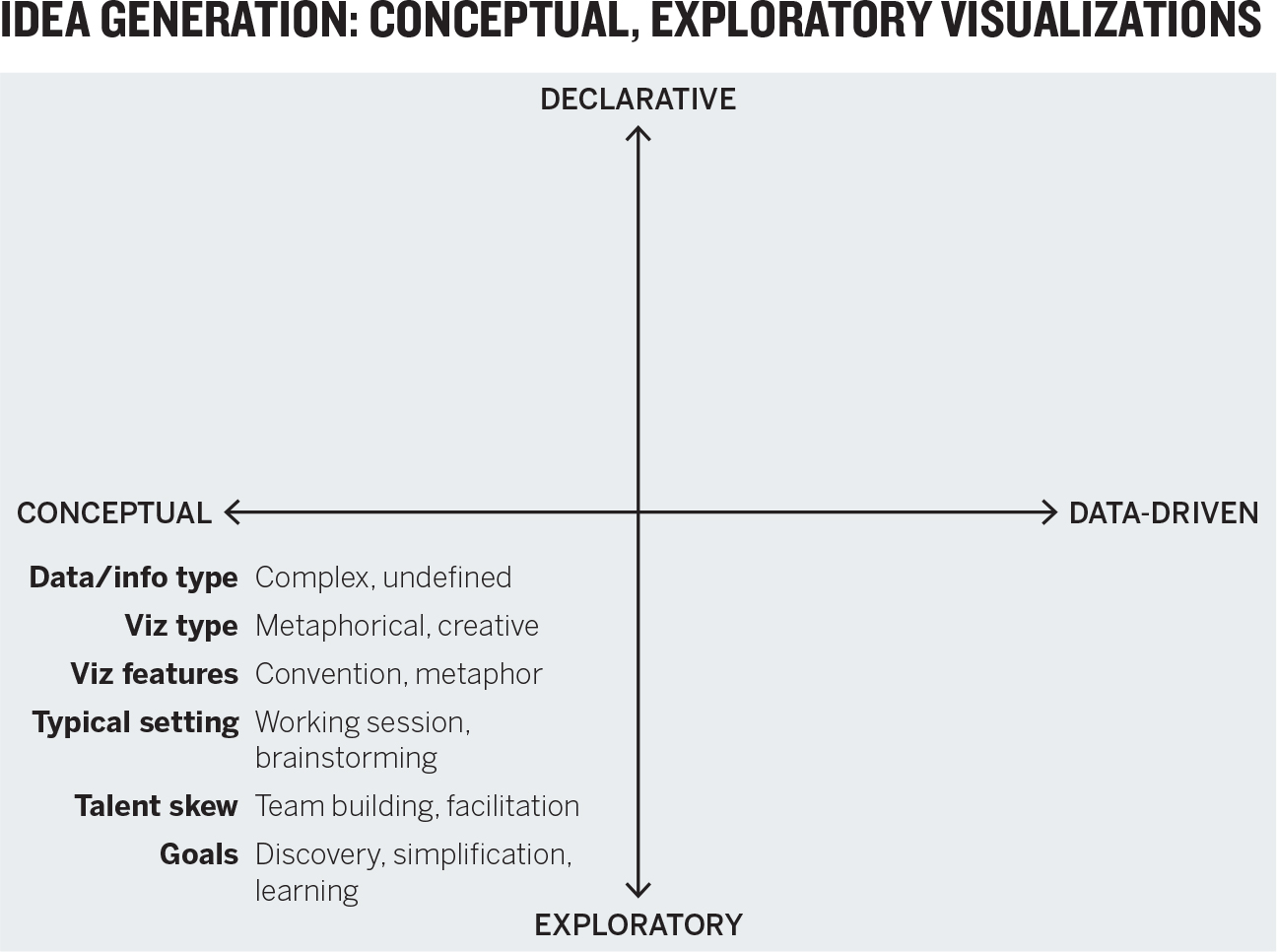
Like idea illustration, it relies on conceptual metaphors and conventions, but it takes place in more-informal settings, such as off-sites, strategy sessions, and early-phase innovation projects. It’s used to find answers to nondata challenges: restructuring an organization, coming up with a new business process, codifying a system for making decisions.
Idea exploration can be done alone, but it benefits from collaboration and borrows on design thinking processes: gathering as many diverse points of view and visual approaches as possible before homing in on one and refining it. Jon Kolko, the founder and director of Austin Center for Design and the author of Well-Designed: How to Use Empathy to Create Products People Love, fills his office with conceptual, exploratory visualizations strewn across whiteboard walls. “It’s our go-to method for thinking through complexity,” he says. “Sketching is this effort to work through ambiguity and muddiness and come to crispness.” Managers who are good at leading teams, facilitating brainstorming sessions, and capturing creative thinking will do well in this quadrant.
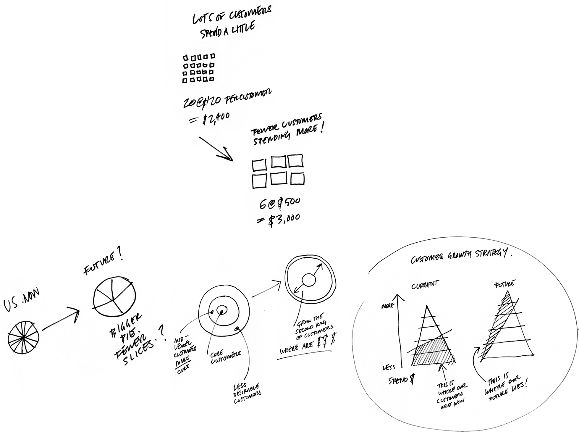
Suppose a marketing team is holding an off-site. The team members need to come up with a way to show executives their proposed strategy for going upmarket. An hour-long whiteboard session yields several approaches and ideas (none of which are erased) for showing their transition strategy. Ultimately, one approach gains purchase with the team, which thinks it best captures the key points of its strategy: get fewer customers to spend much more.
Below are rough sketches of a whiteboard at the end of the idea generation session. Of course, visuals that emerge from idea exploration will often become more formally designed for presentation.
Visual discovery. This is the most complicated category, because in truth it’s actually two categories. Remember that the purpose question led to three possible types of tasks: declarative, confirmatory, and exploratory. I left confirmatory out of the 2 × 2 to keep the basic framework simple and clear. Now, while we focus on this quadrant, I will add in that information, as seen on the second 2 × 2 below.

Note that confirmatory applies only to data-driven charts. A hypothesis can’t be confirmed or disproved without data. Also, the division is shown as a dotted line because it’s a soft distinction.

Confirmation is a kind of focused exploration, whereas true exploration is more open-ended. The bigger and more complex the data, and the less you know going in, the more exploratory the work. If confirmation is hiking a new trail, exploration is blazing one.
Visual confirmation. You’re answering one of two questions with this kind of project:
- Is what I suspect is true actually true?
- What are some other ways of looking at this idea?
In hypothesis setting and confirmation, the scope of the data is manageable, and the chart types you’re likely to use are more common ones—although when you’re trying to see things in new ways, you may venture into some less common types. Confirmation usually doesn’t happen in a formal setting; it’s the work you do to find the charts you want to create for presentations. That means your time will shift away from design and toward prototyping that allows you to iterate on the data and rapidly visualize and revisualize.
Suppose a manager in charge of travel services wants to research whether the plane tickets the company buys are worth the investment. She goes into her visual confirmation project hypothesizing that comfort increases with ticket cost. She pulls data on cost versus comfort for both economy and business class flights and quickly generates a scatter plot. She’s expecting to see correlation—dots splayed up and to the right.

Notice that the chart she creates is a prototype. The manager hasn’t spent much time refining the design or refining the axes and titles. It’s more important for her to see if her idea is right than to make it look great. Immediately she sees that the relationship between cost and her other variables is relatively weak. There is an upward trend in comfort on business class, but it’s not strong. She’s startled to find her hypothesis doesn’t hold. Higher cost of flights may not be worth it. So, she thinks about what other ideas to test before making any decisions.
Visual exploration. Exploratory, data-driven visualizations tend to be the province of data scientists and business intelligence analysts, although new tools have begun to engage more of us in visual exploration. It’s an exciting kind of visualization to try because it often produces insights that can’t be gleaned any other way.
Since we don’t know what we’re looking for, these visuals tend to be more inclusive in the data they plot. In extreme cases, this kind of project may combine multiple data sets or even dynamic, real-time data that is continuously updating. It may even venture beyond real-world data. David Sparks, a political scientist and statistical analyst who now works for the NBA’s Boston Celtics does visual exploration. But he refers to his work as “model visualization.” In Sparks’s world, data visualization focuses on real, existing data. Model visualization passes data through statistical models to see what would happen under certain circumstances.
Exploration lends itself to interactivity—allowing a manager to adjust parameters, inject data sources, and continually revisualize. Complex data sometimes also lends itself to specialized and unusual visualization types, such as force-directed network diagrams that show how networks cluster, or topographical plots that give a third dimension to data.
Function far outweighs form here: Software, programming, data management, and business intelligence skills are more crucial than the ability to create presentable charts. This quadrant is where a manager is most likely to call in experts and advanced tools to help create the visualizations.
A manager at a social media company has been asked to look for new markets for its technology. He wants to find opportunities that others won’t see. He connects with a data scientist who tells him how semantic analysis can be used to map thousands of companies in multiple industries according to the similarity of their text communications.
The manager loves the idea but can’t do it himself. He hires the data scientist, who develops and adjusts the data set with the manager until they can generate a rough visual that links companies that are similar according to semantic analysis; the more similar the companies, the “stronger” the link and the more closely they’re mapped. This results in this network diagram, which exposes easy-to-see industry clusters. The white space between proximate clusters represents opportunities to connect one industry to another, because although the data shows that those clusters are similar, no companies have yet emerged to fill the gap.3

The manager is not surprised when he immediately notices that social media and gaming don’t have much white space between them; he’s played games on Facebook. But he does see white space between social media and other industries, such as education and biofuels—potential new markets for his technology.
Everyday dataviz. These are the basic charts and graphs you normally spit out of an Excel spreadsheet and paste into a PowerPoint. They are most often simple forms, such as line charts, bar charts, pies, and scatter plots.
The key word here is simple. The data sets tend to be smaller and simpler. The visualization communicates a simple idea or message, charting no more than a few variables. And the goal is simple: Give people information based on data that is, for the most part, not up for debate.

Simplicity is primarily a design challenge achieved through clarity (more on this later). Clarity and consistency make everyday dataviz most effective in the setting where they’re typically used—a formal presentation or a document. Increasingly, this kind of data visualization is seen on social media or in the news, advertisements, sports broadcasts, and innumerable other settings. My car displays a real-time fuel-economy visualization!
In all these settings, time is constrained. People want to get to meaning quickly, and a poorly designed chart will waste that limited time by creating questions that either confuse the audience for the visualization or require the presenter to explain the structure of the visual or the information that’s meant to come to the fore. Ideally, you should be able to present an everyday dataviz without any explanation at all. If it can’t speak for itself, it has failed like a joke that needs explaining.
That’s not to say that declarative charts shouldn’t generate discussion. They should. But the discussion should be about the ideas in the chart, not the chart itself.
An HR vice president will be presenting to the rest of the executive committee about the company’s health-care costs. A key message she wants to convey is that the growth of these costs has slowed significantly, giving the company an opportunity to think about what additional services it might offer.
She’s read an online report about the slowing growth that includes a link to some government data. So she downloads the data and then clicks on the line chart option in Excel. She has her viz in a few seconds. But since this is for a presentation, she asks a designer colleague to add even more detail from the data set about GDP and recessions, to give a more comprehensive view of the data.
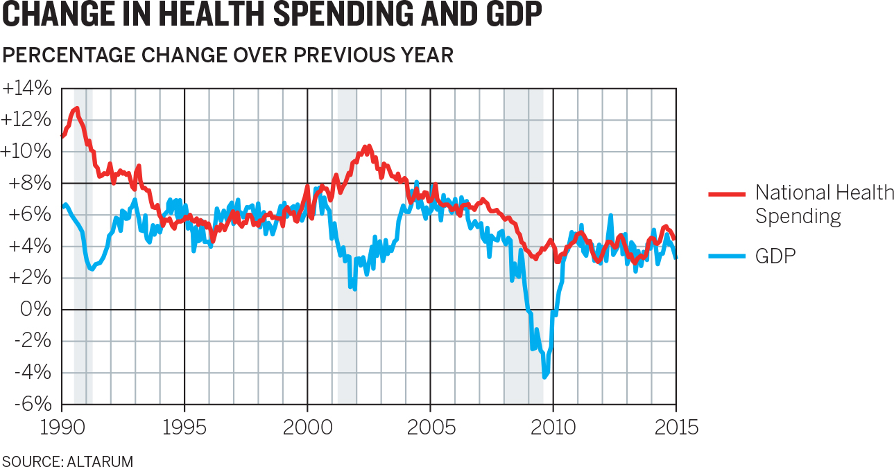
This is a well-designed, accurate chart, but it’s probably not the right one for this situation. The HR exec’s audience doesn’t need two decades’ worth of historical context to discuss the company’s strategy for employee benefits investments. The only point she needs to make is that cost increases have slowed over the past few years. Does that jump out here?
In general, charts that contain enough data to take minutes, not seconds, to digest will work better on paper or a personal screen, for an individual who’s not being asked to listen to a presentation while trying to take in so much information. Health-care policy makers, for example, might benefit from seeing this chart in advance of a policy hearing in which they’ll discuss these long trends.
But our exec needs something simpler for her context. From the same data set, she creates the Annual Growth chart below that gets to her point simply, clearly, and quickly.
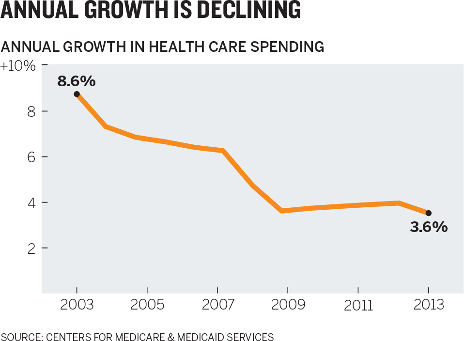
She won’t have to utter a word for the executive team to understand the trend. Clearly and without distractions, she has set the foundation for presenting her recommendations.
USE THE “FOUR TYPES” 2 × 2 MATRIX
The “four types” 2 × 2 is a useful framework. Just as you can layer many types of information over a basic road map—gas stations, traffic, weather—you can layer any number of ideas or pieces of information over the map of visualization types, to help you understand and plan the time, resources, and skills you’ll need. Here are five examples:
Usage frequency. Your numbers may vary. I’ve put in my own starting point. Most of us will spend the majority of our charting time with everyday dataviz. However, new software and online tools are making discovery and exploration much easier. I expect that number in the bottom right quadrant to grow.

Focus. For declarative work, focus on output—creating great visuals that will move others. For exploration, worry less about how your visualizations look and more about generating ideas and allowing you and your team to learn.

Skills. A project’s importance, complexity, and deadline will dictate whether skills should be developed or hired. You’re most likely to need to contract with others in the discovery quadrant and for crucial presentations, such as to the board. Idea exploration skills are worth developing whether or not they’re applied to visualization.
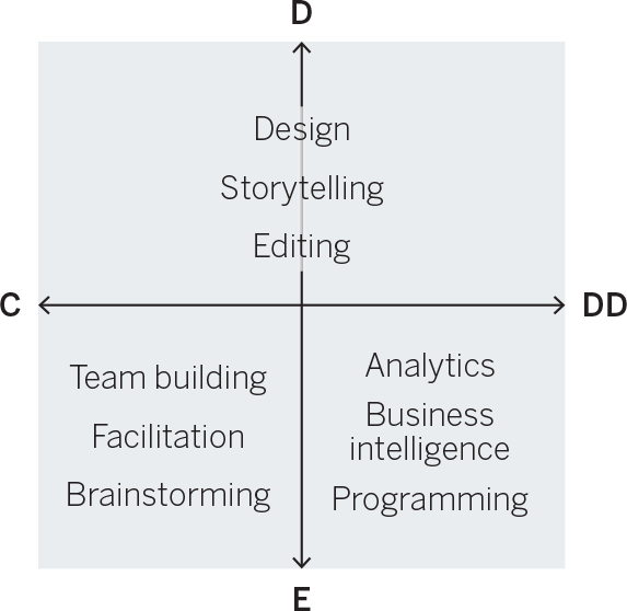
Media. In general, tools in the exploratory half enhance your ability to interact and iterate, whereas tools for declaratives support great design. But expect more good design to be built into exploratory software tools as they’re developed.

Workflows. Exploratory work often results in insights that you want to share in well-designed declarative charts for a broader audience. All the 2 × 2 idea illustrations in this chapter, for example, started as idea explorations before being designed for publication. Sometimes testing a hypothesis in confirmatory work will produce unexpected results that you can’t explain, and thus will send you into deeper exploration.
You can keep layering over the frame. You might, for example, add the names of colleagues you’ll call on when doing a certain type of visualization. You might add links to the software tools you use in the various quadrants, or links to courses you want to take to improve your skills with visualization.
Data visualization isn’t exactly one thing, but more a collection of related activities that vary with the task at hand. The skills you’ll call on, the tools you’ll use, and the media you’ll visualize with can vary significantly from quadrant to quadrant. What makes an idea illustration a good chart may be different from what makes an everyday dataviz a good chart.
Spending just a few minutes asking the two questions at the beginning of this chapter—Is the information conceptual or data-driven? and Am I declaring something or exploring something?—will prepare you to visualize well. You’ll have packed for the right trip.
RECAP TWO QUESTIONS ➔ FOUR TYPES
Visualization is a diverse craft. Different types require different skills and resources. Before making visuals, plan for them. Determine what skills and resources you’ll need by defining your visual communication generally as one of four kinds. You’ll put yourself in the right mindset for the project and save time by having planned ahead.
Answer two questions to learn which kind of visual communication you’re about to undertake:
1. Is my information conceptual or data-driven?
• Conceptual information is qualitative. Think of processes, hierarchies, cycles, and organization.
• Data-driven information is quantitative. Think of revenues, ratings, and percentages.
2. Are my visuals meant to be declarative or exploratory?
• A declarative purpose is to make a statement to an audience—to inform and affirm.
• An exploratory purpose is to look for new ideas—to seek and discover.
Match your answers to the type of visual communication shown in the four types 2 × 2 matrix:
Idea illustration
A visualization of an idea that’s not connected to statistical data. Often uses metaphors, such as trees, or processes, like cycles. Examples include organizational charts, process diagrams, and this 2 × 2 matrix itself.
Idea generation
Rapidly sketched concepts for visualizing ideas not connected to statistical data. Often done in groups as brainstorming sessions, on whiteboards, or, famously, on the back of a napkin.
Visual discovery
Visualization in which data is used to confirm hypotheses or find patterns and trends. Visual confirmation: the more declarative subset of visual discovery that is generated to test a hypothesis or look at data in a new way. It’s often done by an individual, usually with statistical software, such as Excel or any number of online tools. Visual exploration: the more exploratory portion of visual discovery, which uses data in its rawest form to see what patterns or trends emerge. Relies on large data sets and dynamic data sets that change often. Usually requires advanced software tools and data science or business analysis skills.
Everyday dataviz
Standard charts and graphs used to express an idea to an audience. Usually well designed and based on a manageable amount of data, and often used in a presentation setting.
You can use this 2 × 2 as a template to make notes about each type of visualization, the skills you want to build for developing them, the tools you’ll call on, and any other hints you’ll find useful whenever you start a visualization project. For example, here’s a version that provides reminders of what to think about for each type:
