Chapter 3
Choosing Chart Types
“Am I allowed to use pie charts?”
—Anonymous workshop attendee
the quote on the previous page is real, and it’s disappointing that anyone would feel such trepidation. It demonstrates how fraught choosing a chart type can become. We stress about making the right choice because we live in an age when charts draw comment and even derision on the social web. Just as the grammar police like to make fun of poor sentences, visual grammarians are ready to pounce when charts don’t meet their rules for proper chart making.
Forget all that. It’s destructive, not constructive, criticism. And although there are a few rules you should know and try to follow, most of them are actually just conventions. When it comes to choosing what kind of chart you’ll make, the ends ought to justify the means. If it clearly conveys the idea you want your audience to come away with, use it.
Is there a right and a wrong choice between the following charts?
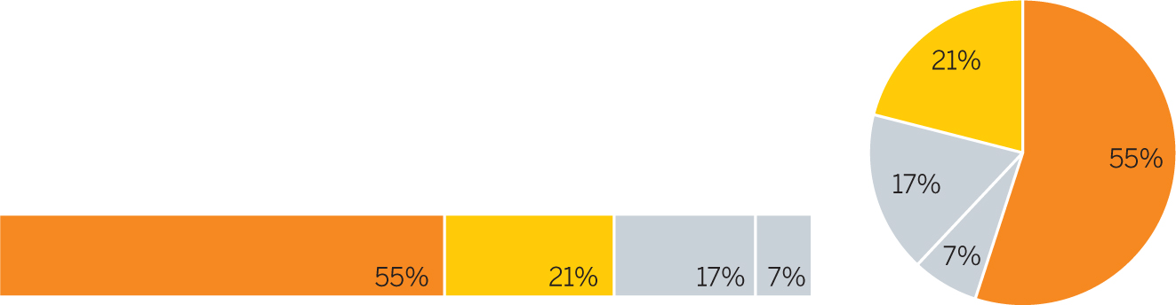
Most likely not. We could create contexts in which one version would be better than the other, but if the idea is to highlight the two large pieces, both are effective enough.
Follow these guidelines when considering chart type.
1 |
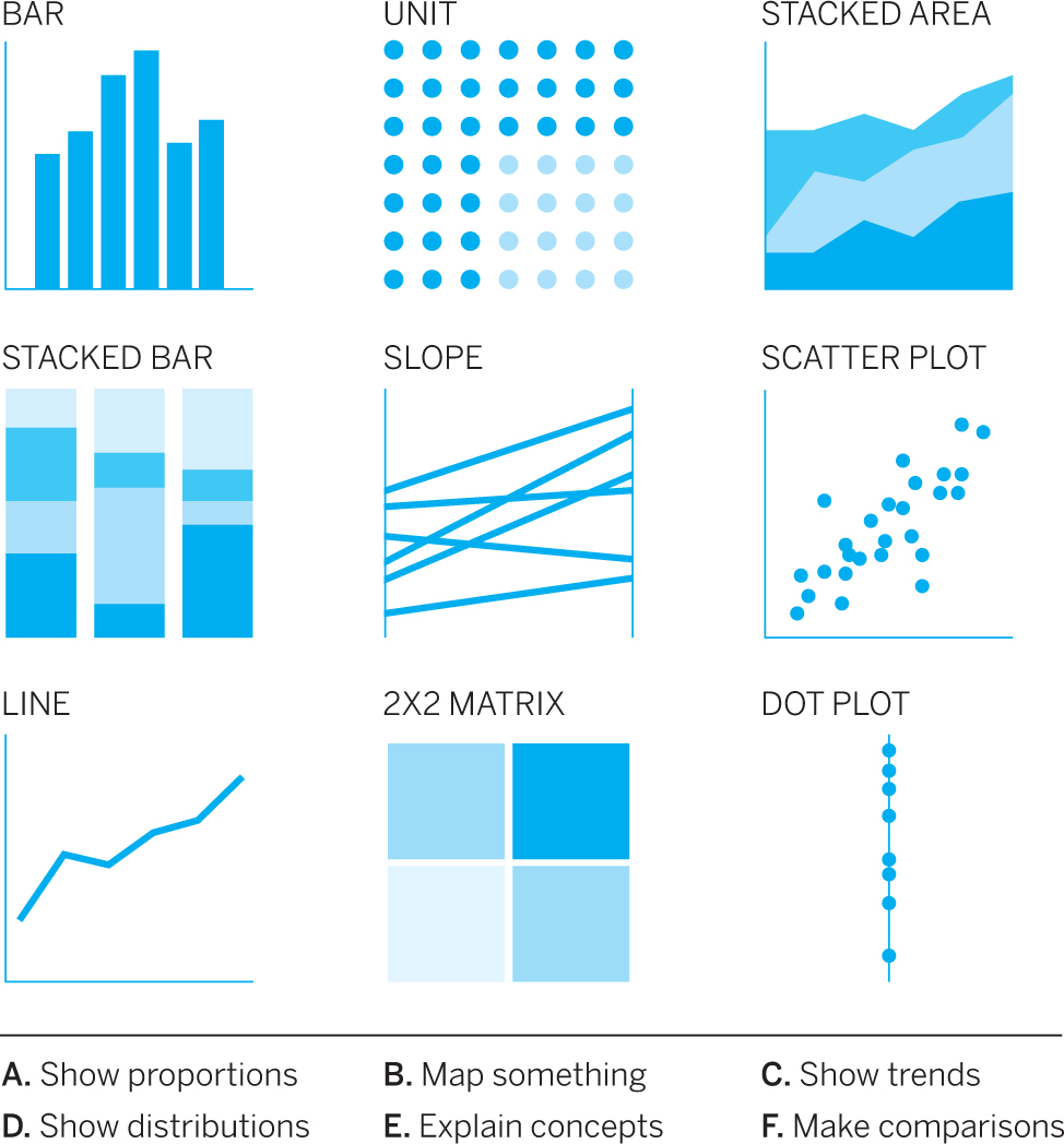
Know the basic categories. The simplest way to begin is to understand your intent. Are you:
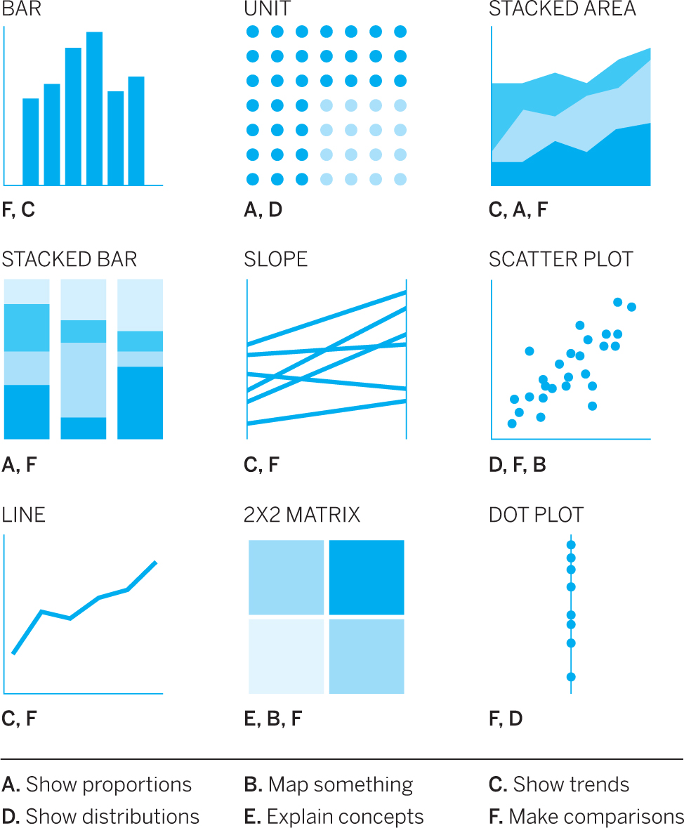
If you know the answer, you’ve already narrowed down your choices. For example, if you’re showing a proportion, you know that a line chart won’t work but a stacked area or a stacked bar might. Consult the chart selection tool in appendix B to see which types are most common for each of these tasks. Use that diagram as a starting point. You can also try other types that don’t appear there. Remember that some chart types can achieve multiple intents. Two stacked bars next to each other, for example, can make a proportional comparison. |
2 |
Listen to how you describe things. Find someone to chat with about your data and the idea you want to convey. Listen to your own words and jot some down—you might say something that describes the type of chart best suited to your data. You might hear yourself say, “The individual years don’t matter as much as the trend over the years.” You’ve just suggested a line chart that shows a trend instead of a bar chart that plots yearly values. Or you might say, “There was a huge gap between expectations and performance.” That could lead you to try a form that can literally show a huge gap, such as a dot plot. You’ll be surprised at how often words you use to describe your intent lead you directly to a chart type. To help you, I’ve included a glossary of types matched to some of the words associated with those approaches. See appendix C. |
3 |
Rely on your workhorses. Cleverness is overvalued, in life and in chart making. In an effort to be noticed, we sometimes try unusual chart forms, such as forced-directed networks or alluvials. They have a place in your toolbox, but don’t push it. Most dataviz challenges can be handled by three chart types and their variants:
Make sure you have a good reason to move beyond the basics. Understand that more-specialized and unusual chart types will require more effort on the part of your viewers. It may be helpful to give them an explanation of how it works or a simple prototype. |
4 |
Don’t forget tables. Sometimes all the individual data points in a set matter more than a trend or what comprises them. In such cases a table may be the best option. Tables may also work for very small sets of data—say, three points in two categories—when visualizing doesn’t elucidate any larger point and would take more time than it’s worth. Tables are, in a sense, visualizations: They use predictable proportions of horizontal and vertical space to make data more accessible. And they remain a powerful tool. |
5 |
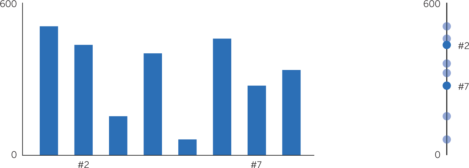
Bonus pro tip: Use one axis. One of my favorite chart types is the less common dot plot. It puts marks on a single axis (a variation is the bubble plot, which puts differently sized bubbles on one axis). Often a dot plot can replace a bar chart to great effect. When your main goal in a bar chart is to compare each variable with the others on the y-axis measurement, a dot plot may make that easier. Why? Because we don’t have to scan horizontal space to find the vertical difference between two bars. Try to see the difference in value between variables 2 and 7 in the bar chart and the dot plot:
The dot plot gives a more immediate sense of the difference. You can use one either horizontally or vertically, and it takes up minimal space. Give it a try. |
6 |
One more note: Good writers are great readers. Likewise, good chart makers are great chart consumers. Find inspiration in others’ visualizations. Any number of sources will provide endless examples. Subscribe to #dataviz on Twitter or r/dataisbeautiful on Reddit. Bookmark sites such as the Upshot from the New York Times and the Economist’s Graphic Detail blog. Subscribe to newsletters such as Best in Visual Storytelling. Mine them for what you like—and for what you don’t. Hold a constructive crit session on some of the charts you come across. (I outline a method for doing this in Good Charts.) Sketch alternative versions of others’ visualizations. The material is out there. Go get it. |
Choosing the right chart type is easier than you may think. Focus on bringing your idea forward, whatever type you choose. If it’s not working, try a different one. Stress less.
The following challenges are designed to develop skills in picking chart types. Focus mostly on ways to remove confusion and clutter, using the prompts with each chart. For these challenges, think about color, labels, standard conventions, and other considerations only as they relate to choosing chart types.
1. Match each chart intent to visual forms that are likely to represent it. (For help, consult the glossary of chart types in appendix A.)
2. Talking with a colleague about how you might visualize some data, you say, “It’s interesting to see how the components make up the total at any given point, but then also how those totals change over time. The shifting proportions say a lot about what’s happened.”
Highlight key words in this description and choose two chart types that might show what you described.
3. You have five minutes to present to the board. To show how the business has shifted from one revenue mix to another, you could use two stacked bars. But you’re thinking of using an alluvial diagram because it’s visually arresting and you want to impress the directors. Should you? Why or why not?
4. A slope graph connects two points to form a linear trend line, removing all data from between those two points. Which of these line graphs would be less appropriate to turn into a slope graph? Why?
5. A friend wants your help visualizing data. She says, “We’re trying to see if there’s some correlation between how much money people make and how much they donate. Just glancing at the data, I see a few who seem to give a higher proportion of their income to charity, but I don’t know if they’re outliers or there’s a cluster of them.”
Highlight the visual-related words you heard and say what type of chart you might steer her to.
6. Each of hundreds of entries in a data set includes the following information:
- • Name
- • Department
- • Location
- • Manager name
- • Direct reports’ names
- • Direct reports’ locations
- • Indirect reports’ names
- • Indirect reports’ locations
- • Indirect reports’ managers
- • Indirect reports’ departments
From this you want to create a visual of managerial structure. What chart type might work for you?
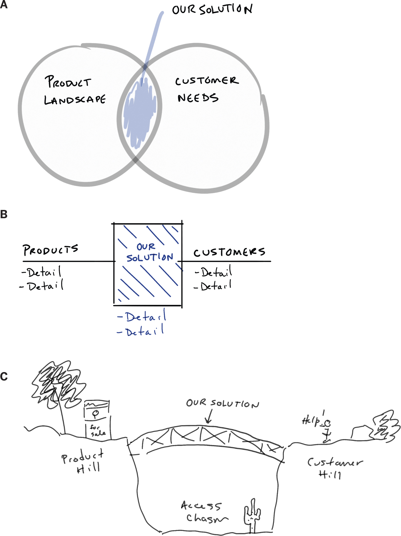
7. In a pitch to VCs, you want to show what you call “a huge chasm” in the market between products and customers’ access to them. Your solution, you say, is “the bridge” connecting customers to the products. Which of the following sketches might be a good start for visualizing your value proposition?
8. A simple data set shows the average number of hours spent in meetings per employee last year and this year at headquarters and in two satellite offices. How might you display this?
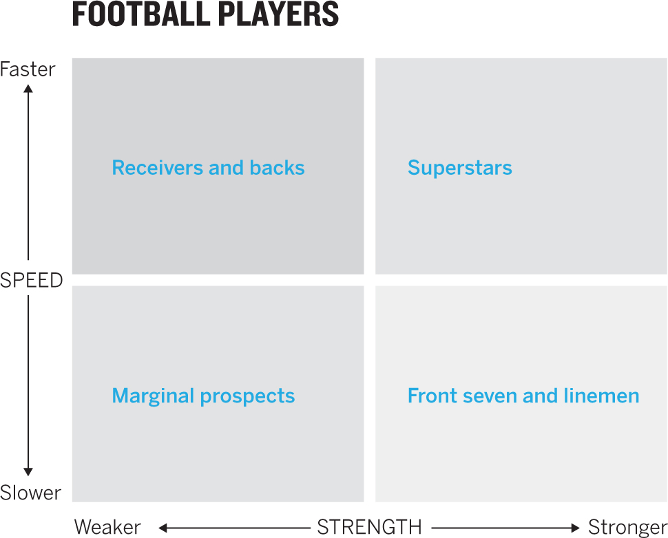
9. You want to categorize football players on two dimensions: speed and strength. Each player gets a score for each dimension. What would be a good chart type to map how the players compare with one another?
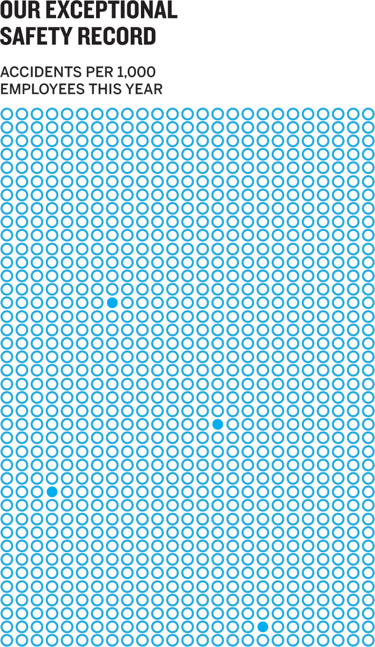
10. You want to convey how rare on-the-job accidents are in your factories—only 4 employees out of 1,000 have been injured in the past year. What type of visualization might powerfully convey this?
Discussion
1. Answers are shown below each chart. Consult the glossary in appendix A for more on each chart type shown here and for other types.
2. “It’s interesting to see how the components make up the total at any given point, but then also how those totals change over time. The shifting proportions say a lot about what’s happened.”
Chart type 1: Stacked area. It combines proportions to show both how components make up the total and the change over time of a line chart.
Chart type 2: Stacked bar series. If only certain points in time matter, you can place a series of stacked bars side by side as snapshots rather than using the continuous timeline of a stacked area chart.
3. The best answer is “It depends.” If the directors have seen alluvial diagrams before and know what to expect, that could be a captivating choice. But if they haven’t, it may cause more confusion than it’s worth. You’ll end up wasting precious time (you only have five minutes!) explaining how it works when you could be talking about ideas in stacked bars—a form they’re certain to be familiar with. Also, as with pie charts, the more variables you have, the more complex and less accessible alluvials become as section flows twist over one another. So proceed cautiously.
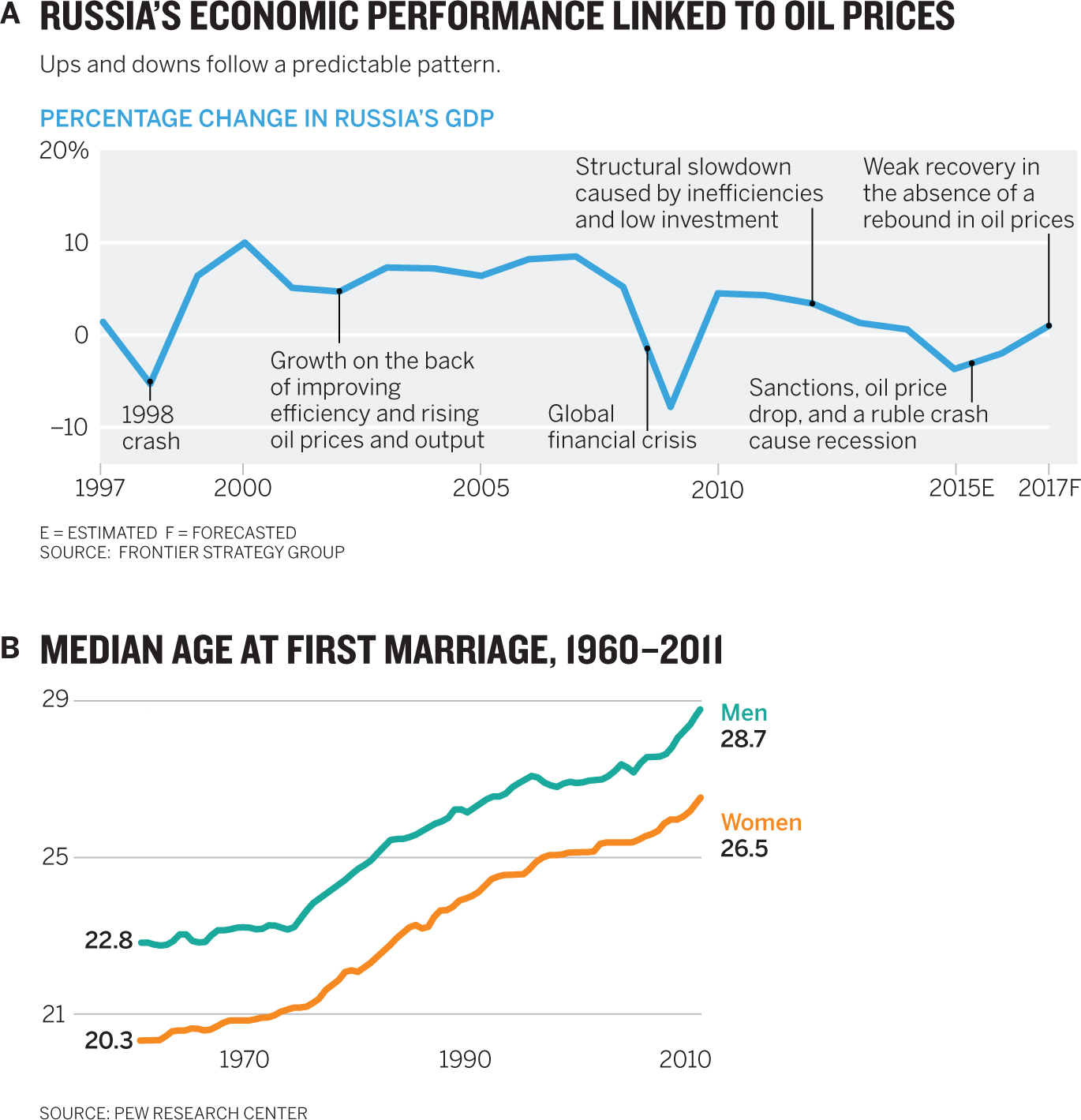
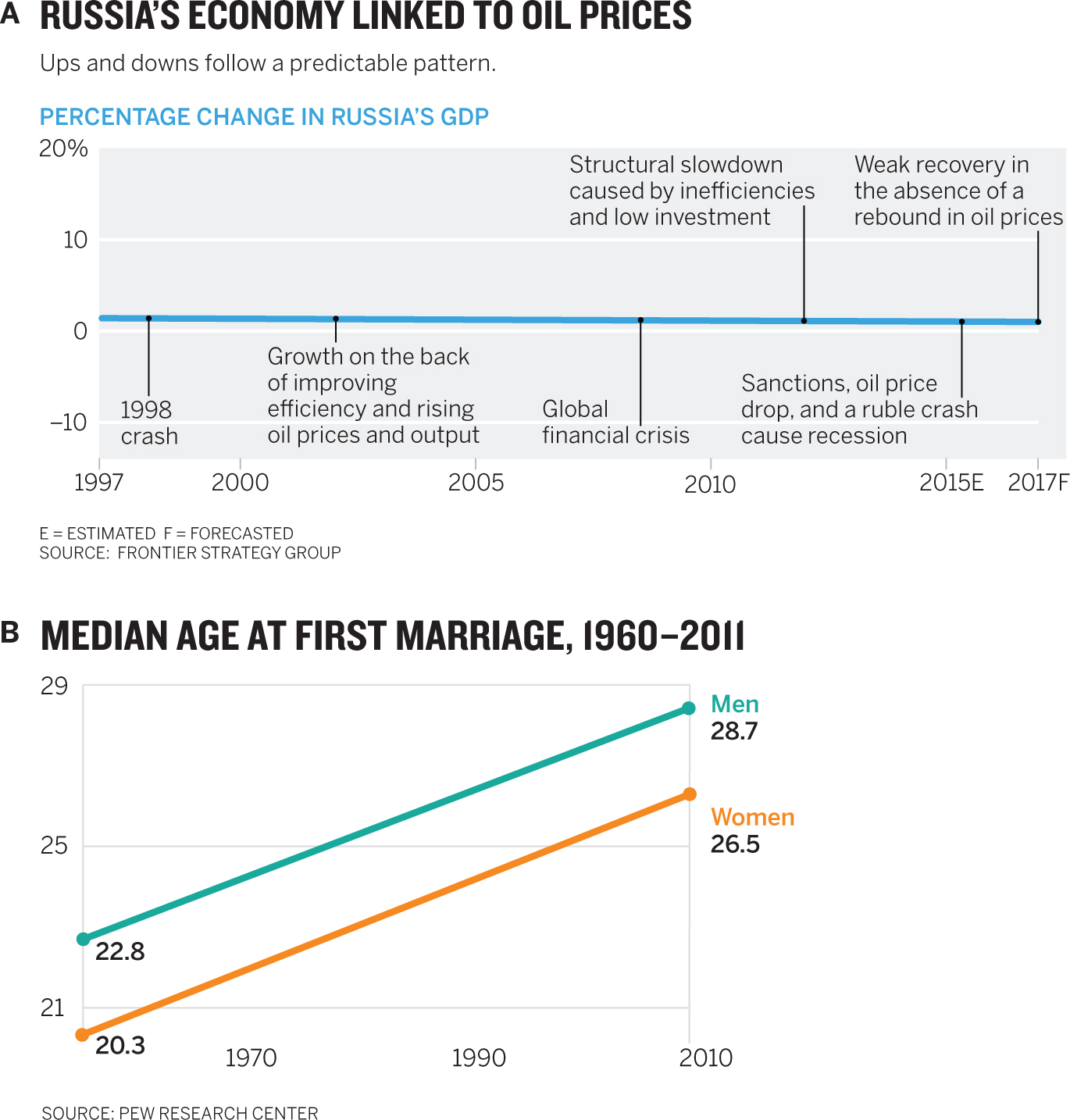
4. Answer: A. Slope graphs are beautifully simple, but they run the risk of hiding important variation and detail. In B, the marriage chart, the data is nearly linear. Simplifying it wouldn’t violate the spirit of the change. With A, however, a slope chart would obfuscate the most important change. Here is the oil chart as a slope chart, making the failed use case immediately clear.
5. “We’re trying to see if there’s some correlation between how much money people make and how much they donate. Just glancing at the data, I see a few who seem to give a higher proportion of their income to charity, but I don’t know if they’re outliers or there’s a cluster of them.”
You probably want to try a scatter plot here. Your friend suggested the axes: income and donation. By putting down many dots, you’d create clusters and outliers, and a correlation would be revealed if the scatter moved generally up and to the right—higher income equaling higher donations.
An alternative is a dot plot in which the axis is the ratio between giving and income: A person who gives $1,000 and makes $100,000 would be at 1% on the axis. One who gives $12,000 and makes $100,000 would be at 12% on the axis. And so forth. You would still see clusters and outliers—but if there were too many points to plot, it would be hard to sort out where the clusters were.
6. A network diagram might work well here. Network diagrams usually require special software and some extra configuration and design, lest they become rats’ nests of nodes and links. But when done well they can help in sorting complex networks, seeing clusters, and understanding intricacies. In this case using color on the nodes to represent departments and separating departments with space would help highlight which ones are highly interconnected and which are more isolated. It could expose silos in the organization.
7. Answer: B. Conceptual diagrams present their own challenges and pitfalls. Without data controlling the boundaries of a visual, we tend to get creative—often too creative—with metaphors to convey ideas. That’s the case here with C, an overdesigned approach that uses metaphors too literally. The idea we want to convey will be subsumed by the metaphor and the detailed decoration. This may look silly, but it’s incredibly common. A comes up short because it mixes metaphors. We want to convey the idea of a bridge or a connector, whereas a Venn diagram conveys overlap or commonality—hardly the same thing. B is clearly the most promising start: it shows a connector between two domains.
8. Try a table. With just six data points and no real need to focus on or compare any particular aspects of the data set, it’s the quickest and clearest approach. It might look something like this:
| LAST YEAR | THIS YEAR | |
| HQ | 510 | 570 |
| Satellite Office A | 325 | 295 |
| Satellite Office B | 300 | 210 |
9. Here’s a great opportunity to use a two-by-two. The crucial thing is the desire to categorize and map the players. A two-by-two, which crosses the two axes to create regions, is designed to categorize. The dots then map onto the categories. It might look something like this before the players are plotted:
10. A good choice here might be a unit chart. Unit charts use marks, usually dots, to represent some number of actual units. For example, one dot might equal $1,000, or one million widgets, or one death. The advantage of this is that it helps an audience make a stronger connection to a physical entity. Rather than representing a statistic, the unit represents the thing itself. A unit chart is also useful when statistics wouldn’t convey an idea well. For example, in this case 4 injuries out of 1,000 is 0.1%. That’s a hard value to represent visually other than with a unit chart. Now we not only get a sense of what 0.1% looks like but we see the injuries—and, more important, just how many employees weren’t injured:
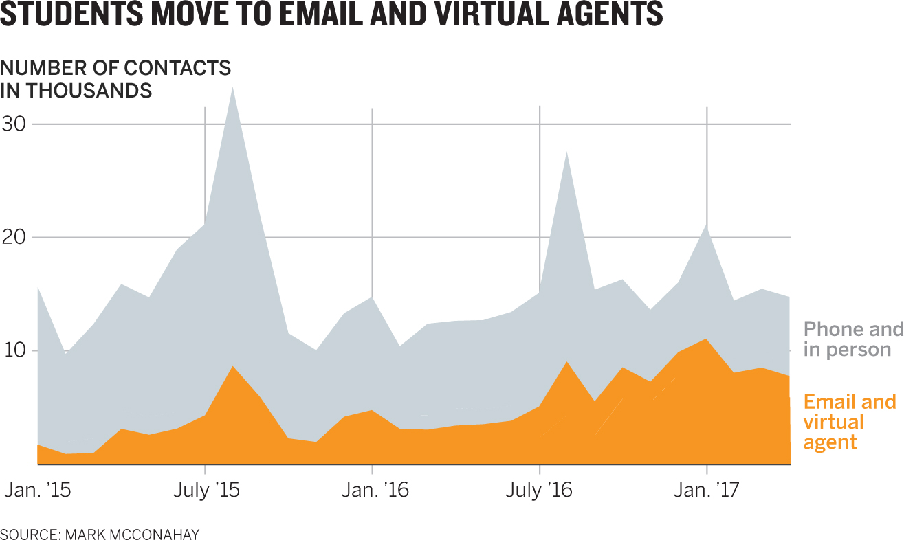
The Surprisingly Adaptable Line Chart
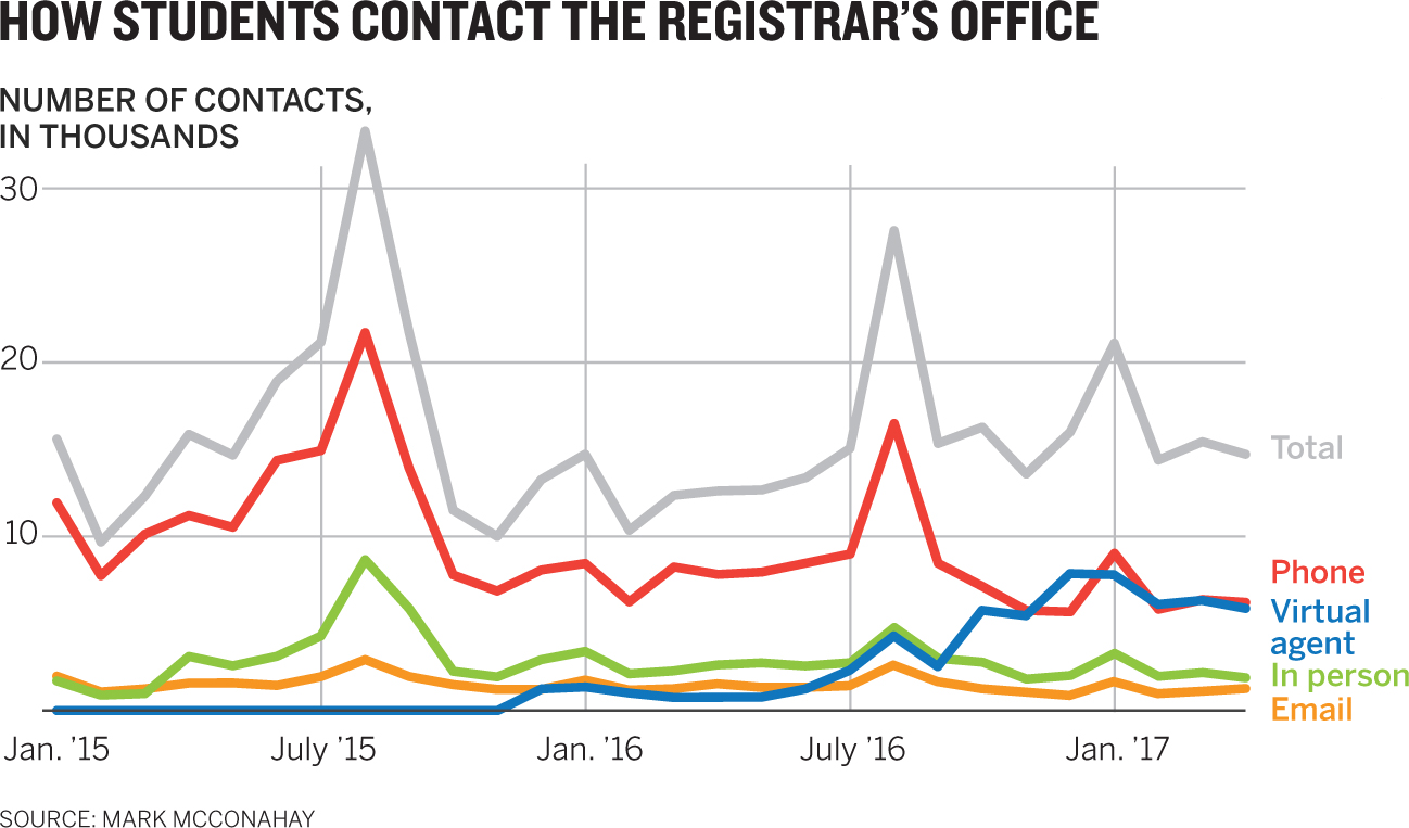
A chart type that works well in one context may not work as well in another. This dataviz is serviceable for showing how students contacted the central office at a university overall. But maybe we want to focus on something other than each trend line. Sometimes the best way to make your idea come forward isn’t to adjust the chart you have but to try a different chart altogether. Even for a simple data set like this, any number of types and variations on them can be deployed, depending on context. Each challenge here is to sketch an alternative chart type to the line chart above, based on the conversation snippet provided. It may be helpful to highlight visual words and clues in the conversations and to consult the appendixes, where you can find multiple chart types and a matrix that matches visual words to chart types. Let’s work on it.
- 1. “The total number of contacts is important, but it’s more important to me that they see how much of that total each category makes up. They’ll be able to see shares that make up the whole growing and shrinking over time.”
- 2. “Basically what matters to me is to show how much of the total activity is digital over time. Comparing how those two categories are growing against phone and in-person contacts will tell us where we’re going and where we should invest.”
- 3. “I’m worried they’ll get lost in all that trend data. Really we just want them to see snapshots of how the mix is changing. Where were we two years ago? Last year? And this year? If they can see those moments, they’ll get the idea of how the proportions are changing.”
- 4. “I think if we just give them a snapshot view of digital versus nondigital contacts, year over year, that’s enough to get the point across that digital is growing as a total share, and fast.”
- 5. “I want to see the trend line, but it’s really busy with all the seasonal spikes. I’d like a simpler view into the trend—is it flat or going up or going down?”
- 6. “When I analyze the data, I see a different trend than digital versus nondigital. I see that email and in-person contacts are flat, and it’s really about the rise of the virtual agent against phone contacts. To just juxtapose those two would really get people to see that new form of contact—virtual agents—shooting up.”
Discussion
The tools we use to make visualizations dissuade us from thinking about what chart type to use. They encourage the “click-and-viz” approach—try one or two until you find one you think works well enough. For example, the original chart looks like standard output from a spreadsheet or a data program. You may think there are no other ways to show this data that will improve on it. Following are six alternatives.
Your charts will improve immeasurably if you get past the click-and-viz impulse and mine your conversations for clues about great ways to make and refine them.
- 1. “The total number of contacts is important, but it’s more important to me that they see how much of that total each category makes up. They’ll be able to see shares that make up the whole growing and shrinking over time.”
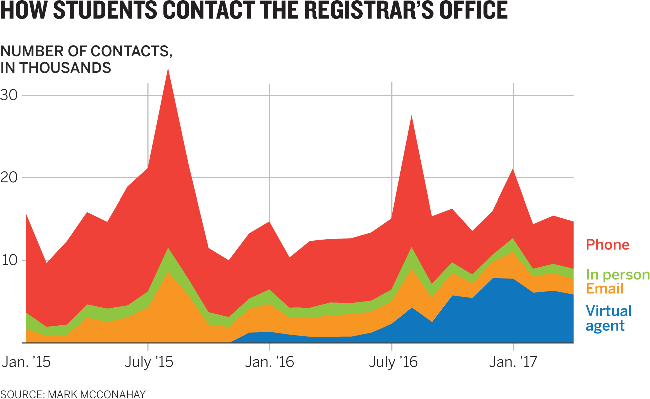
This conversation was packed with clues. The talk of parts making up the whole points toward proportional charts, and I considered pies and stacked bars. But neither of those would capture the “over time” as well as a stacked area chart could. This version has an advantage over the basic line chart: instead of plotting each value against the others in a way that clusters and tangles lines, we can plot it with the others so that they’re all discrete and don’t fight over space.
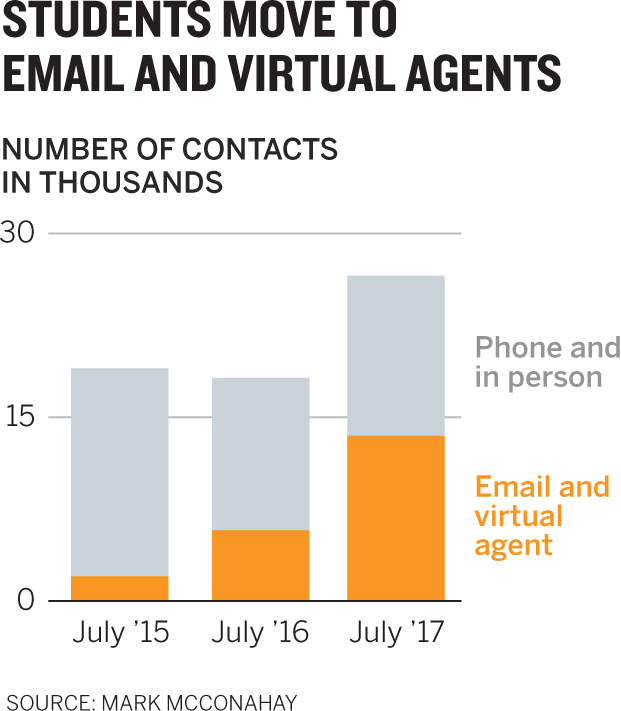
- 2. “Basically what matters to me is to show how much of the total activity is digital over time. Comparing how those two categories are growing against phone and in-person contacts will tell us where we’re going and where we should invest.”
How much . . . over time led me right to the stacked area chart again, because I knew we wanted to see a total. The decision to group the categories was dictated by the conversation in which digital mattered as a category that didn’t exist in the original data set. The focus seemed to be on highlighting digital, so I made its counterpart secondary gray. A line chart may also have worked here.
- 3. “I’m worried they’ll get lost in all that trend data. Really we just want them to see snapshots of how the mix is changing. Where were we two years ago? Last year? And this year? If they can see those moments, they’ll get the idea of how the proportions are changing.”
The speaker laid out her chart in the conversation. The words snapshots and moments led me away from trend lines. But what does she want snapshots of? She said it! Two years ago, last year, and this year. I heard proportions again, so I focused on pies or stacked bars. When left with that choice, I usually go with bars, especially if there are more than three variables contained within a proportion and more than one visual to display. Pies are harder to use than bars for making comparisons.
- 4. “I think if we just give them a snapshot view of digital versus non-digital contacts, year over year, that’s enough to get the point across that digital is growing as a total share, and fast.”
Once again, I heard snapshots, and that kept me away from trend lines. Total share leads to proportion forms. This version can easily be envisioned as a series of three very simple pies. Evaluating the differences among these variables wouldn’t be hampered by a circular form.
- 5. “I want to see the trend line, but it’s really busy with all the seasonal spikes. I’d like a simpler view into the trend—is it flat or going up or going down?”
Any time I hear simple and trend near each other, I think about slope charts. They’ve gained in popularity recently. They’re compact and elegant. They give a greater sense of change over time than bars do, without the noise of all the minor changes in short time spans in a more traditional line chart. But they conceal most of the data. I’m just linking points here. So you should be careful. If those seasonal spikes and many smaller dips and rises are important, a slope chart is a poor choice. Here the slope chart is the first version of this data in which the upward trajectory of virtual agents really stands out. It’s a powerfully direct message.
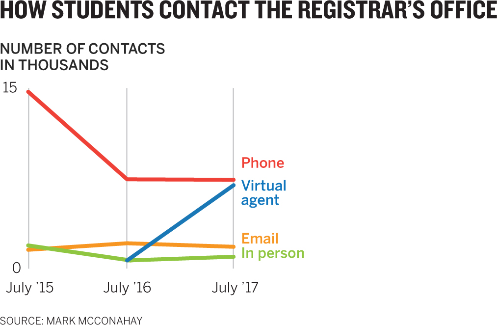
- 6. “When I analyze the data, I see a different trend than digital versus nondigital. I see email and in-person contacts are flat, and it’s really about the rise of the virtual agent against phone contacts. To just juxtapose those two would really get people to see that new form of contact—virtual agents—shooting up.”
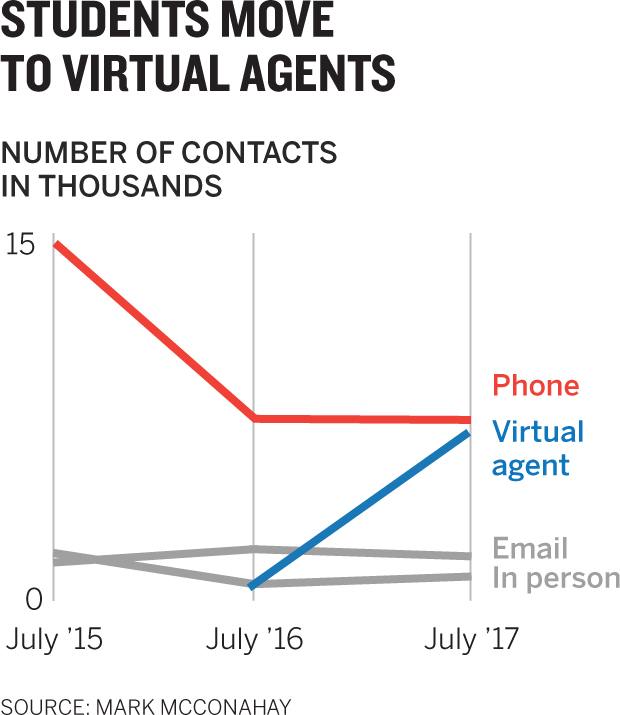
In this case all the language points to a comparison different from what you might have assumed until now was the valuable one. One small change to the previous version—using gray for the flat lines so that they recede—makes it impossible to miss this chart’s intent. You can even see that term shooting up reflected in the form I chose.
The Convoluted, Too Clever by Half Chart
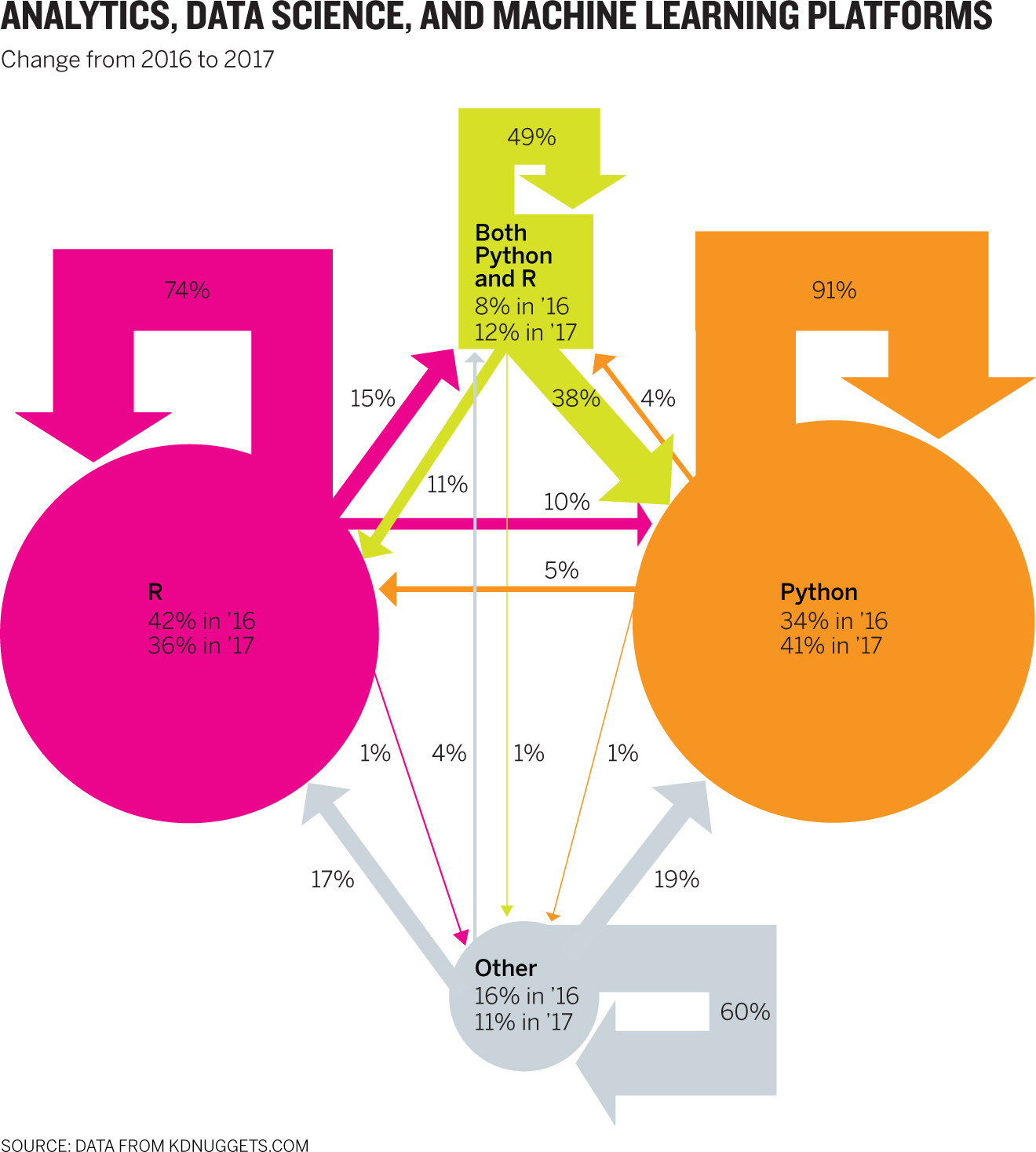
What do you see? I’ve heard everything from “padlocks” to “a map of a sewer system” to describe this chart (which is based on a real, published chart, in case you thought I was rigging the challenge with something absurd). Creativity with chart types can be a good thing, and it leads to incredible breakthroughs in understanding if we get it right. But creativity unchecked leads to forms utterly bereft of clarity, and while they may be eye-catching, they’re very hard to use. Form is leading function here. It’s clear that this chart maker had a plan, but it went awry in a tangle of arrows and labels. Let’s work on it.
- 1. Critique this chart. Understanding that it shows the proportion of people using each platform and the proportion of those who switched from one to the other, explain why you think it’s not as effective as it could be. Provide at least three examples.
- 2. Sketch at least three alternative approaches to charting this data. Choose whatever context you want to highlight.
Discussion
This chart maker was probably thinking about Sankey diagrams (see appendix A). Frustratingly, the visual obscures what is actually straightforward data. We have a year-over-year change of share for four variables and percentage transfers between them. That’s it. Why go to such knotty extremes to express it in this more complex way? Usually, to get attention. Initially drawing in an audience is not a trivial concern, and nothing does it faster than a dynamic, colorful data visualization that is unusual in appearance or form. But if it’s just eye candy—if it lacks the nutrition of a clear idea—it will leave us with a headache. A common chart type well designed will probably serve us better.
1. Critique 1: Unclear proportions. The two circles look proportional, but on the basis of which data—2016 or 2017? The arrows, too, are proportional, it turns out. The width of all the arrows of one color combined would create a 100% stacked bar chart. But those proportions aren’t proportional to the circles they shoot out from. And why is the “both” category square while the others are circles—because it comprises two other categories, so it’s dissimilar? We don’t know.
Critique 2: Vague labeling. I love minimal labeling, but this is too minimal. For example, what does 91% on the Python arrow represent? It doesn’t look like 91% of that circle. Connecting the labels to the arrows helps me understand that it’s a percentage transfer—but in fact that transfer is from 2016 values, which aren’t shown here! In other words, 91% of 2016 Python users used Python in 2017, but the arrow points back into the 2017 value represented by the circle. Confused? Can’t blame you.
Critique 3: A quiver of arrows. Once this form was chosen, crisscrossing arrows was an inevitable result. To follow one path requires concentration. The effort to keep most of the labels aligned here is actually impressive, but there’s no avoiding the complexity inherent in the form. It’s hard to see how transfers from one platform to others generally went.
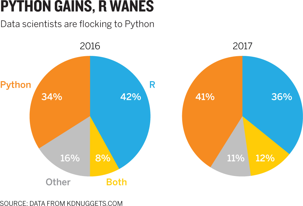
2. I tried six forms and seven charts for this data. Each has its merits and its downsides. I’ll discuss them here, working forward from what I think are the least effective.
Pie charts: This challenge effectively shows the limits of pie charts. A sameness to these two sets of proportions makes it hard to see change immediately, and change is all we care about in this context. If I didn’t put the percentage values in the pieces, it would be hard to even guesstimate just how much change is represented. What’s more, the headline suggests that the change within each platform is probably more important than the overall change between platforms. That is, Python’s gains are the cause, and a new set of proportions is the effect. You can probably do better than this.
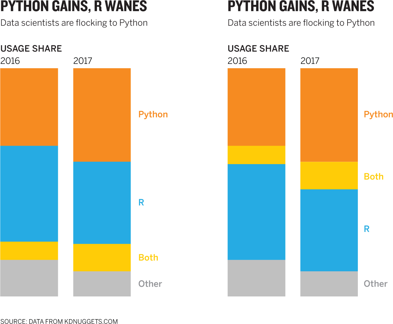
Stacked bars: Stacked bars are somewhat more effective than pie charts in making a middling change accessible. But when they’re used for comparison, as here, that change is easiest to spot in the top and bottom pieces, where starting points are shared. The middle pieces float on different starting points, making it somewhat harder to see the change. And, of course, this form still focuses first on the entire composition of platforms, not the change within each. I included two versions to show how one subtle change can improve the effect of the stacked bar. The second version groups the growing pieces together and the shrinking pieces together, giving a more immediate sense that Python and Both are encroaching on R and Other. However, it removes the easy comparison between Python and R, because they’re no longer adjacent. Which works best depends on the context. But if comparing Python with R is the context, I would argue that other forms work better than a stacked bar. If we want to see “growing versus shrinking platforms,” I like the second stacked bar here.
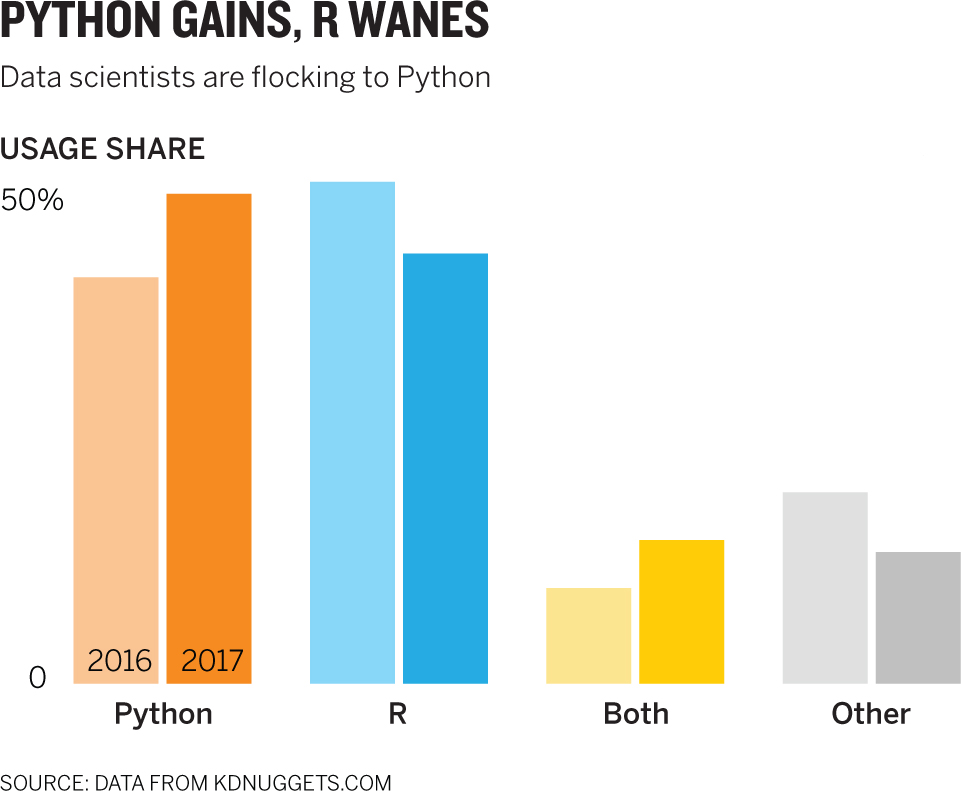
Bar chart: Where pies make it hard to compare one platform year to year, bars make it easy—at the expense of seeing the overall proportion of platforms being used. That might be OK. This is beautifully straightforward. I see that Python is higher than it was, and R is lower, and if that’s my context, as the headline suggests, I’ve hit on a good chart. The organization of the bars also has the neat effect of offsetting the two major groups from the two minor groups.
Slope chart: Although I’m plotting the exact same information I did in the bar chart, the lines communicate something different. The bars communicate a binary comparison of two points in time; the slopes suggest a directional trend over time. In the bars, R’s share dropped. Here, it’s going down. Notice the difference in those verb tenses: one is complete, and the other is ongoing. You can almost imagine the lines continuing on into the future. And the slopes show Python crossing over or passing R. In most other ways, this communicates the same idea the bar chart does, and it makes the “major players” and “minor players” distinction as well. If that’s our context, it would work well.
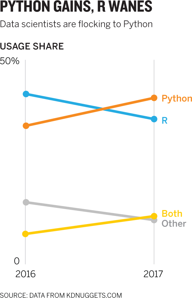
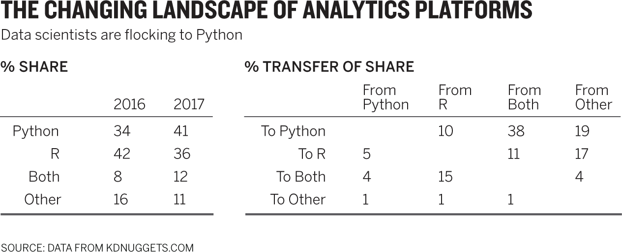
Table: None of the forms so far have shown how this reshaping of the proportions is happening—something the original chart attempted to show. In many contexts that would be the most crucial data—not that a change occurred, but who’s moving where. In trying to envision alternative forms for the original chart, I first deconstructed it into a data spreadsheet. I stared at it, thinking, This works. Why a table and not a visualization? First, there’s not that much data—20 points total in two clusters: shares and transfers. Second, it’s clear and comprehensive. If my audience has even a few minutes to spend with the data, I can give them all of it. If I were presenting in front of a room, I probably wouldn’t use this, because it would set the group off reading instead of listening to me. I could, however, present it and then use some kind of highlight to draw attention to one or two crucial points of focus.
Alluvial diagram: The following is my favorite expression of this data. I find this alluvial to be the best combination of comparing simple proportions (with the bars on each side) and effectively communicating transfers of value from one group to another (through the curves). The transfers are proportional to the total. The “arrows” (in this case, flows) do real work, giving a good sense of just how many people are leaving R for Python, or adding Python to R, and so forth. Also, although the curves crisscross, they have an orderliness that makes them easy to follow.
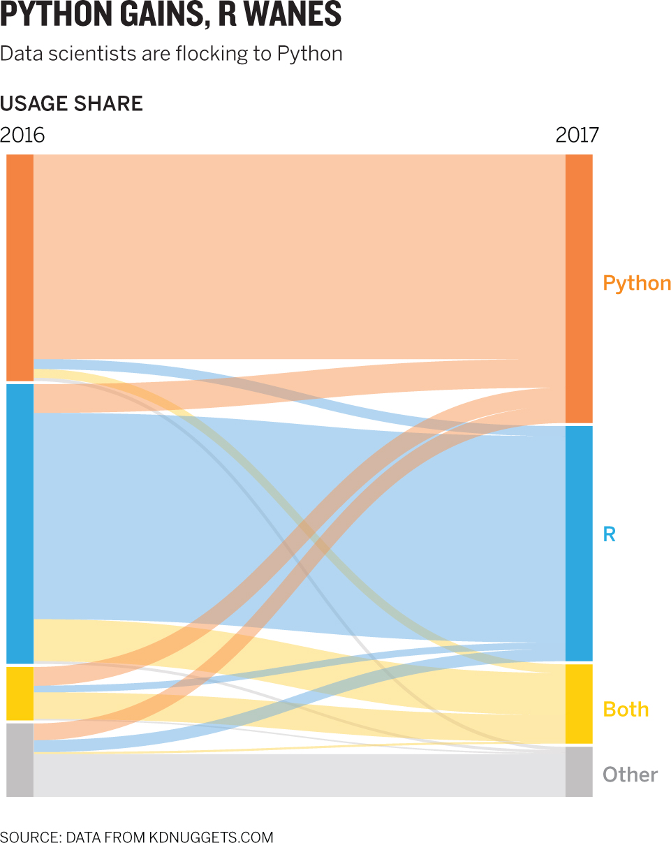
This is not a typical form. I arrived at it because of the sense of transfer in the original. If you hear words like flows and from here to there and flocking from . . . to, you might want to sketch an alluvial to see whether it will work. The tool used to create this is a simple one called Raw (rawgraphs.io), but other tools, including Plot.ly and Tableau, and programming libraries such as R and D3, can make alluvials as well. They are cousins of Sankey diagrams. Alluvials tend to have all flows connect through all steps, whereas Sankeys tend to show more-complex network flows with multiple termini.
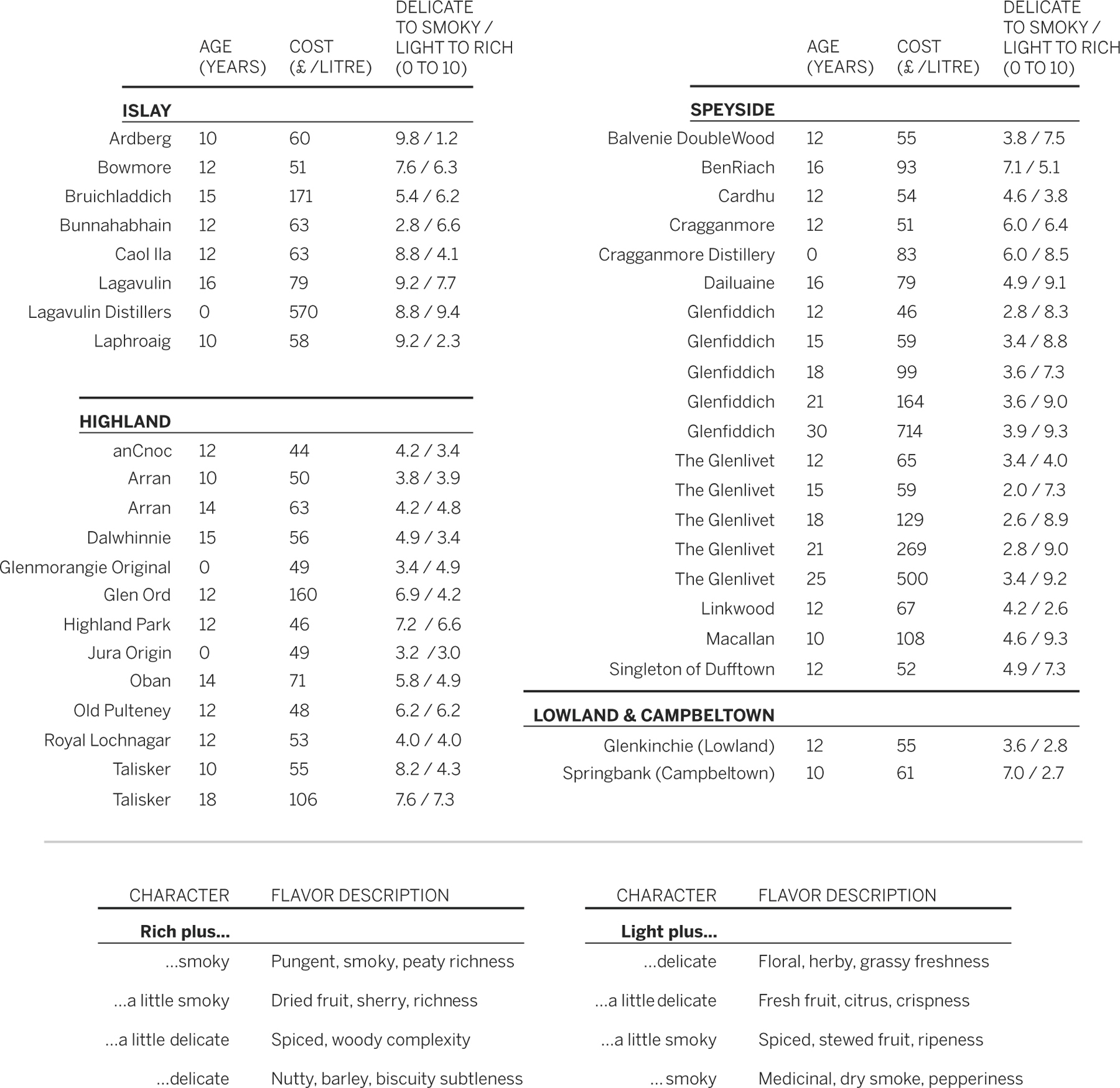
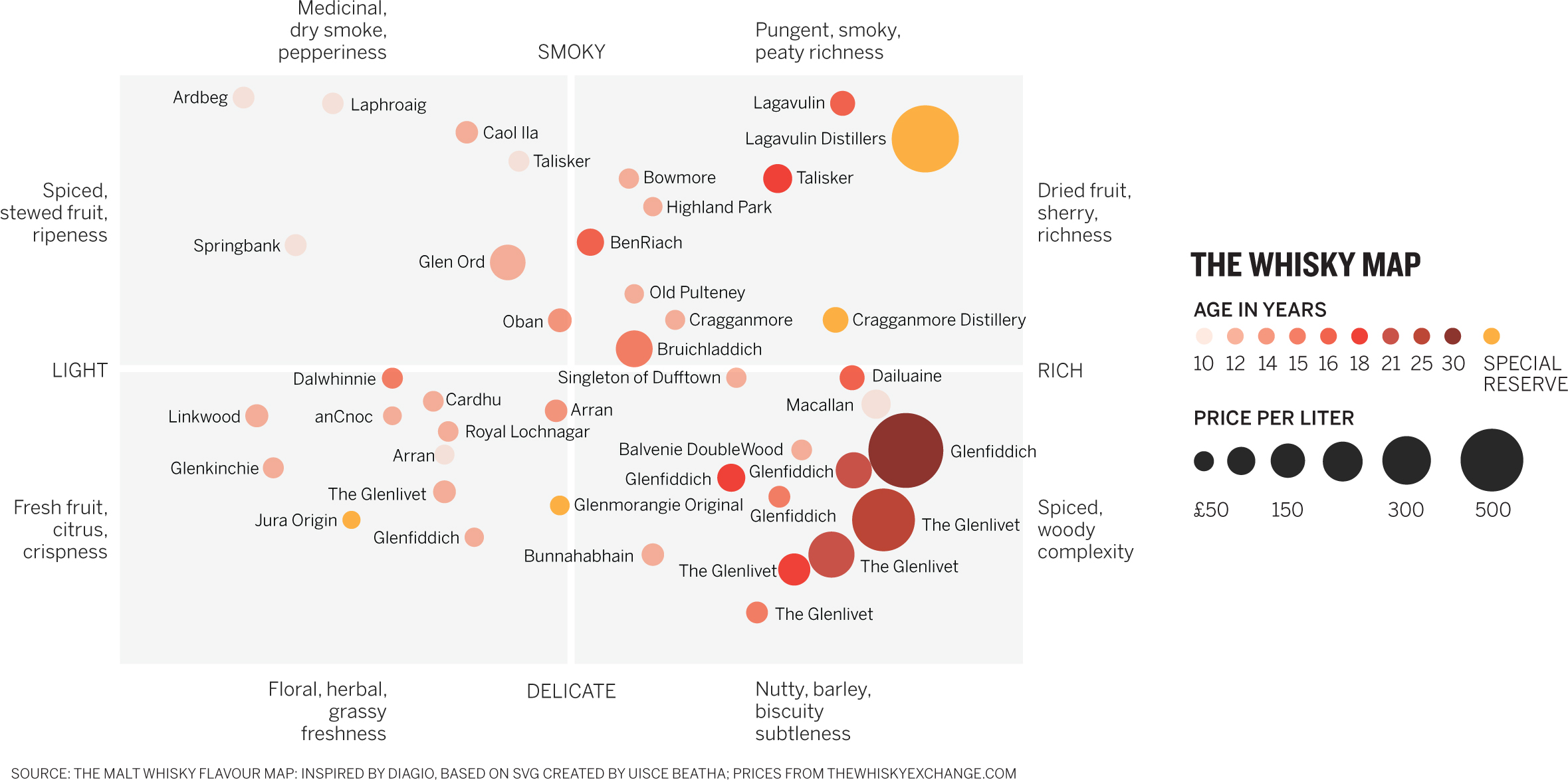
Sometimes we don’t start with a visual; we just have some data. These tables list whiskys and some of their key attributes. Now we need to turn the data into a visualization. That’s it. Let’s work on it.
Think about how the data is naturally organized and ways you might manipulate that organizing principle: Does the data lend itself to any particular form? A timeline? A map? A scatter plot? Then put the data aside and try to describe it to someone. Tell him or her what you’d like to show with it. Encourage questions. Listen for those keywords that may spark a visual approach. Then sketch what you come up with until you like the way you’re approaching the challenge. When you think you’ve got it, make a neat paper prototype that suggests what the final chart will look like, approximating real values, colors, and labels.
Next try the following challenges based on other people’s conversations. Read the conversations, highlight the key words and phrases, and sketch possible approaches according to what was said.
- 1. “The range of flavors for me was really interesting.”
“How so?”
“These descriptions like citrusy, peppery, biscuity, even medicinal—the range of flavors and how they interact is interesting.”
“But how do they interact?”
“That’s the thing. Everything is basically some cross between whether the whisky is light or rich and whether it’s delicate or smoky. If you know how those two things are interacting, you get all these regions of different flavor combinations.”
“So you can show which flavor profile a whisky has by knowing that?”
“Yeah, they have a score on each spectrum. But I think showing how the flavors interact, those descriptions, are most interesting. I mean, plotting them in the background might be nice, but I bet a lot of people don’t know how the flavor of whisky works. Just seeing those profiles mapped would be nice.”
- 2. “I’m fascinated by how regional whisky is.”
“How so?”
“Well, there are five pretty distinct regions, and I have no idea whether any one region is known for any particular flavor profile of whisky.”
“How would you figure that out?
“You could just plot them on one axis that shows the smoky-delicate score and one that shows the light-to-rich score and see where they fall.”
“So you’d see clusters if one region had one profile?”
“Exactly. Only problem is, there are a lot to plot.”
“So?”
“I think it might get busy. It might be easier to read if I did just one at a time.”
- 3. “Wow, the price range of whisky is all over the place. I wonder if the expensive ones have any particular flavor profile.”
“What’s expensive?”
“Some cost hundreds of pounds per liter. Most are clustered in the 50-to-100-pound price range, but a few are way more than that on the list I have.”
“Why would some cost so much more?”
“I think it’s to do with age, and probably reputation. I don’t know.”
“Could you add age to the mix? See whether older ones cost more?”
“I like that. Age versus price.”
“Or age versus flavor profile? Do older whiskys tend to settle into a certain type of flavor?”
“Maybe I could do all three? Age, price, and flavor?”
- 4. “There are a lot of interesting variables here, but I want to focus on simple comparisons.”
“Why?”
“I think in this case, for this audience, making one comparison at a time will work better. I don’t want them sitting there trying to figure out three or four variables at a time during the presentation. I just want to be able to show ‘this versus that’ and ‘that versus this’ over and over.”
“So, like, price versus age. Smokiness versus region. So on.”
“Exactly. Nice and simple. One at a time.”
Discussion
I hope this was as much fun for you as it was for me. I tended to focus on one particular form for most of it—a 2x2 scatter plot—but I hope and expect that many of you found other ways into this visual challenge. For me, it was hard not to focus on the two “axes” of flavor in whisky as my core structure—though you’ll see that in at least one challenge, I got away from that. I tried to escape the 2x2s, but that kept making things complicated, because I knew I’d then have to express the scores for each taste dimension separately. For example, if I chose a bar chart, each whisky would need a bar for the smoky scale and one for the rich scale.
- 1. “The range of flavors for me was really interesting.”
“How so?”
“These descriptions like citrusy, peppery, biscuity, even medicinal—the range of flavors and how they interact is interesting.”
“But how do they interact?”
“That’s the thing. Everything is basically some cross between whether the whisky is light or rich and whether it’s delicate or smoky. If you know how those two things are interacting, you get all these regions of different flavor combinations.”
“So you can show which flavor profile a whisky has by knowing that?”
“Yeah, they have a score on each spectrum. But I think just showing how the flavors interact, those descriptions are most interesting. I mean, plotting them in the background might be nice, but I bet a lot of people don’t know how the flavor of whisky works. Just seeing those profiles mapped would be nice.”
Not all data visualizations focus on the data points. Here the conversation kept revolving around how these two scales interact, and the chart maker was focused on flavor descriptions. The two big clues here were cross between and regions. Once I decided not to plot specific whisky scores, I focused on a more general approach to mapping the flavors in sectors. Often with 2x2s, creating definitions for the quadrants helps set up a visual space before you plot data on it. In presentations especially, it can be useful to show the blank canvas before filling it. Here, as a visual flourish, I plotted the data lightly in the background. It could be viewed as merely decoration, but it also suggests that whiskys will be found all over this map.
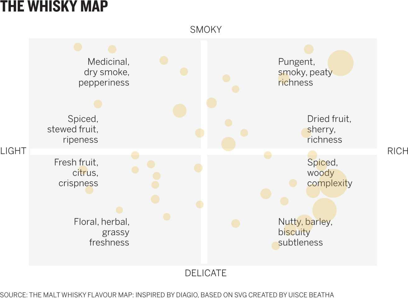
- 2. “I’m fascinated by how regional whisky is.”
“How so?”
“Well there are five pretty distinct regions and I have no idea whether any one region is known for any particular flavor profile of whisky.”
“How would you figure that out?
“You could just plot them on one axis that shows the smoky-delicate score and one that shows the light-to-rich score and see where they fall.”
“So you’d see clusters if one region had one profile?”
“Exactly. Only problem is, there are a lot to plot.”
“So?”
“I think it might get busy. It might be easier to read if I did just one at a time.”
Sketching this confirmed the busyness of plotting everything together, but using colors to code regions felt like a good approach, because there are only five, and only three have more than one data point. The map as a key adds a layer of geographical information that’s nice, but a simpler dot key would have been fine too.
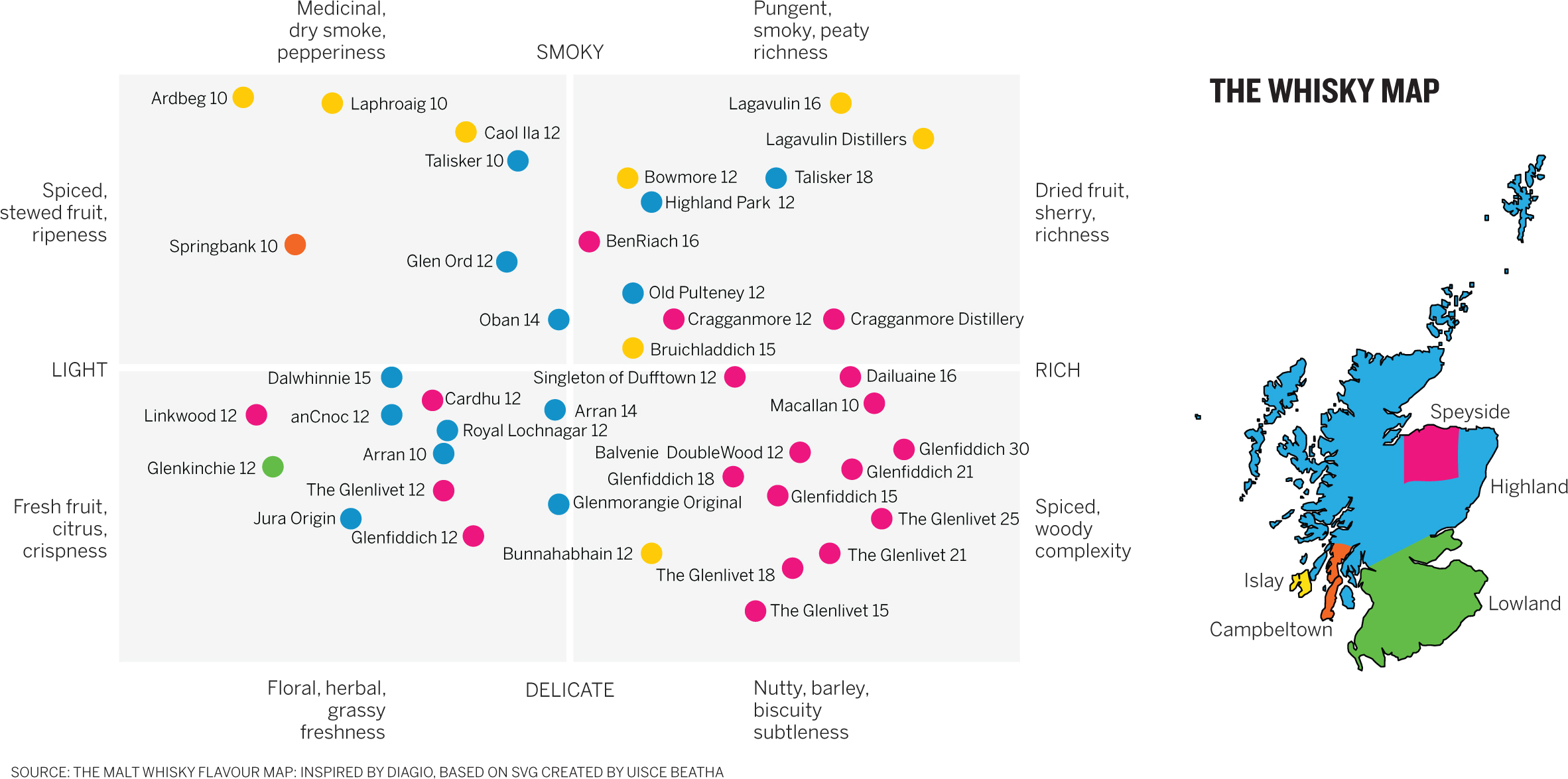
Although the color seems manageable, the labels are harder to sort here. When I heard one at a time, it turned my thoughts to small multiples—a powerful tool for reducing complexity. To use small multiples, you have to establish the structure once. I do that here with the big map. By pairing these dataviz, I can rely on using the main chart when I have time to spend with it—it’s not something you can glance at and get ideas from. But the small multiples work well to highlight the regional clusters mentioned. Without much work we can see that Islay whiskys are generally very smoky, Highlands run the gamut, and Speysides are rich.
The beauty of small multiples is that once you establish the structure, you can use them on any number of variables. You could repeat the form with price, age, or whatever other variable you wanted, and several will fit into a reasonable space.
- 3. “Wow, the price range of whisky is all over the place. I wonder if the expensive ones have any particular flavor profile.”
“What’s expensive?”
“Some cost hundreds of pounds per liter. Most are clustered in the 50-to-100-pound price range, but a few are way more than that on the list I have.”
“Why would some cost so much more?”
“I think it’s to do with age, and probably reputation. I don’t know.”
“Could you add age to the mix? See whether older ones cost more?”
“I like that. Age versus price.”
“Or age versus flavor profile? Do older whiskys tend to settle into a certain type of flavor?”
“Maybe I could do all three? Age, price, and flavor?”
This pushes the limits of complexity: the 2x2 includes four axes—smoky–delicate score, light–rich score, age, and price. I’ve used space, color, and size to encode data. That’s a lot. And yet we still can look quickly and see trends and ideas. It doesn’t take much work to see that expensive whiskys tend toward richness and tend to be older; the bubbles get bigger and darker as we move right. For the most part, expensive whiskys are rich and delicate.
Despite its complexity, this chart has that rare ability to give us an idea quickly but also allow us to spend time with it if we want to think more deeply about all that’s going on here. We’ve lost regional information, though, and if that’s important, we have to take another tack.
- 4. “There are a lot of interesting variables here, but I want to focus on simple comparisons.”
“Why?”
“I just think in this case, for this audience, making one comparison at a time will work better. I don’t want them sitting there trying to figure out three or four variables at a time during the presentation. I just want to be able to show ‘this versus that’ and ‘that versus this’ over and over.”
“So, like, price versus age. Smokiness versus region. So on.”
“Exactly. Nice and simple. One at a time.”
It was clear from this conversation that the depth and complexity of the previous efforts—while appropriate if the audience has time to spend with the chart—would not do for this presentation. The phrase one at a time and the description of this versus that imply any number of simple two-axis charts—bars, for example, would work well here. I chose the compact dot plot—all data plotted on one horizontal axis. Comparisons within the set are easy, because you need to measure only the distance between dots, not the difference in height between bars that may not be adjacent. And these comparisons are simple: region versus richness; age versus smokiness. You could do price versus age, price versus richness, and so forth.
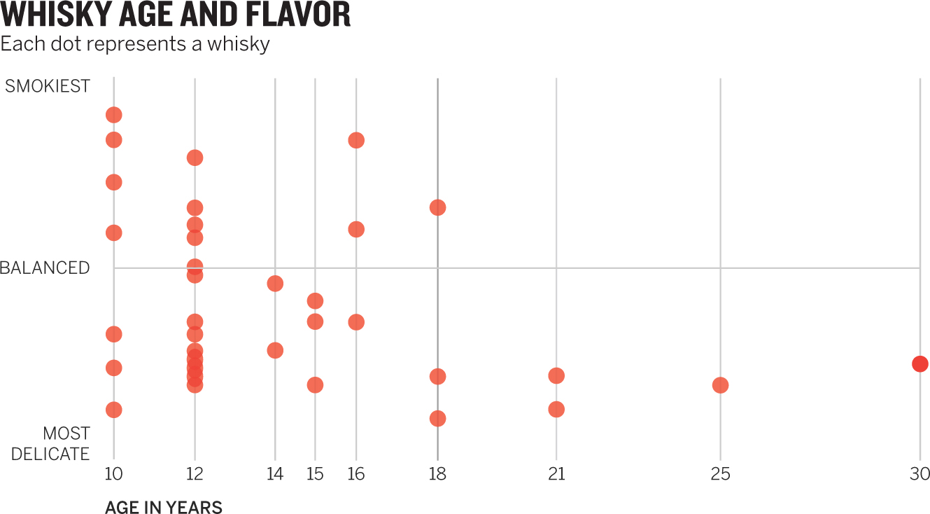
Stacking up the dot plots cleverly creates a sort of scatter plot. This is more immediately obvious on the age–smokiness chart, where we can look at whiskys of any age, or at all of them, and see that older whiskys aren’t smoky.
The dot plot is a powerful way to show simple comparisons. You could create as few or as many as you wanted here. But notice that I didn’t label individual points. That’s a weakness. A dot plot’s compactness means it isn’t conducive to comprehensive labeling. If it were important to show every brand of whisky, you’d have trouble doing that here. You might try a bar chart or something else. If you wanted to label a few points of particular interest, you could probably still use a dot plot.
It’s important to remember that even though this challenge started with lots of data points, it still came from just six variables, and yet I was able to stretch and twist it into several different forms and conjure still more forms I didn’t plot. I’m often amazed at how much variation is possible, just as, in music, a few chords can produce an endless number of tunes.