Chapter 7: Customizing Microsoft Lists Views
Similar to column formatting, Microsoft Lists allows you to tailor list views to your own business needs via custom formatting. This way, you can create unique business scenarios that can be filtered automatically with the click of a button.
In this chapter, you will learn how to take your lists to the next level by covering the following main topics:
- Understanding Microsoft Lists formatting
- Learning from examples
Technical requirements
You can find the code files present in this chapter on GitHub at https://github.com/PacktPublishing/Hands-On-Microsoft-Lists/tree/main/Chapter07.
Understanding Microsoft Lists view formatting
With Microsoft Lists, you can take customizations to the next level and format the entire view instead of just the columns.
View formatting supports the same formatting methods we saw in the Column formatting section of this book; that is, WYSIWYG and JSON formatting.
In this section, we will explain how to format a view in Microsoft Lists without having to explain the HTML and JSON syntax. If you need help remembering the options that are available for formatting, please check out the Column formatting section of this book.
How to format a list view
Before we start exploring the more technical areas of view formatting, you must know how to format a view.
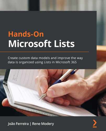
To gain access to the customization interface, do the following:
- Open your list.
- Click the View selection option.
- From the View selection menu, click on Format current view:
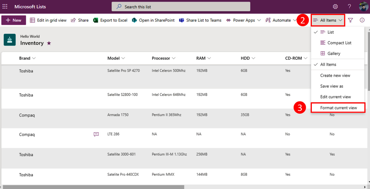
Figure 7.1 – Microsoft Lists view formatting
- Upon clicking the format view, the customization pane will open, which contains the options that are available for the current view type.
WYSIWYG formatting options
Like column formatting, view formatting also includes a WYSIWYG design mode that allows you to format your view and see your changes in real time.
The following table shows the available formatting options for the default list layouts:

Alternating row styles
The alternating row styles allow you to define a background color and text styles for the odd rows so that they are different to the even rows. To format your view with alternating row styles, do the following:
- Select Alternating row styles from the list of available options.
- Click the Edit row styles link:
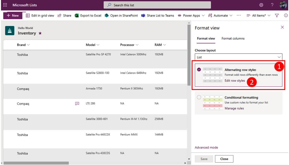
Figure 7.2 – Alternating row styles
- On Odd rows, click the Edit style button.
- Select the fill color for your row:
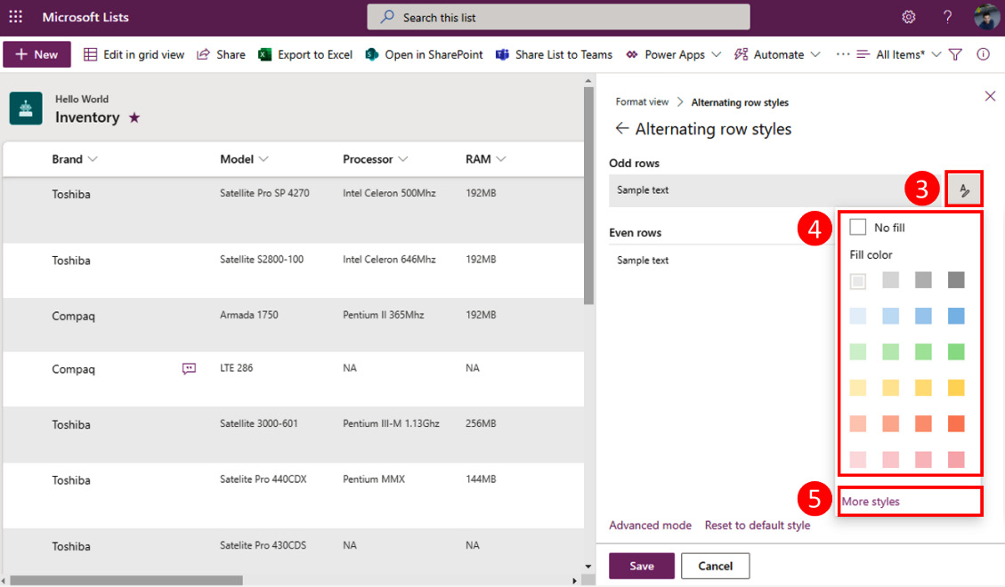
Figure 7.3 – Odd row configuration
- To format the text further, click on the More styles link. Here, you can format the font and the borders for your rows:
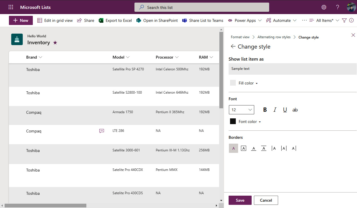
Figure 7.4 – Alternating rows advanced configuration
- Repeat steps 3 to 5 for Even rows.
Conditional formatting
Conditional formatting allows you to define conditions so that you can apply background colors and text formatting to your rows. To format your view with conditional formatting, do the following:
- Select Conditional formatting from the list of available options.
- Click the Manage rules link:
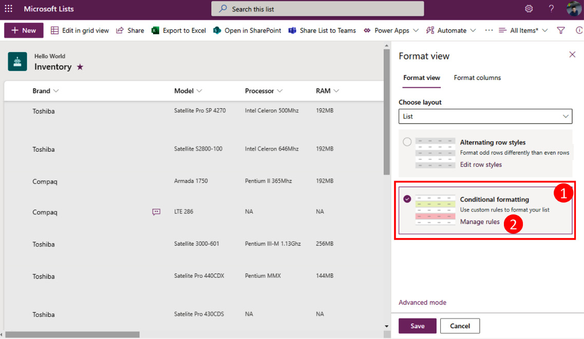
Figure 7.5 – List view conditional formatting
- If this is the first conditional formatting you are defining, by default, you will see a gray background for all the rows. This means that a custom condition hasn't been created yet. To modify it, click on … next to Show all values as.
- From the menu, click Edit rule:
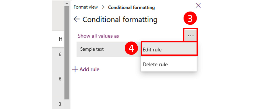
Figure 7.6 – Edit rule
- From the If dropdown, select the column you want to use to build your condition.
- Choose a comparison for the row.
- Define the value that will be compared.
- From the Show list item as section, click on the Edit style button.
- Select the color you want to apply from the list provided.
- To customize the row further, click on More styles:
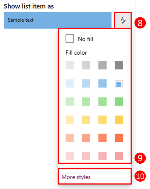
Figure 7.7 – Format row condition
- From the Change style pane for the row, you can define the fill color, format the font, and define borders around the row value:
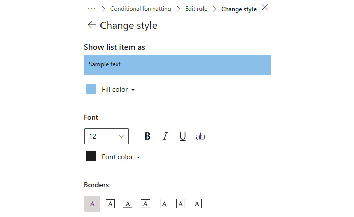
Figure 7.8 – Conditional view formatting advanced styles
- A formatted view can have multiple conditions applied to it. To create more conditions, click on the Add condition link.
- Define your new condition for the view by selecting the column to be used as a comparison, the comparison, and the value.
- While you are formatting the view, everything you do in the user interface is reflected immediately in the list. However, this is only published for others to see when you click the Save button:

Figure 7.9 – Conditional formatting – extra formatting and preview
- When formatting a view, you can apply multiple conditions that will be applied differently to each row. After saving the formatting, click Conditional formatting in the top breadcrumb:
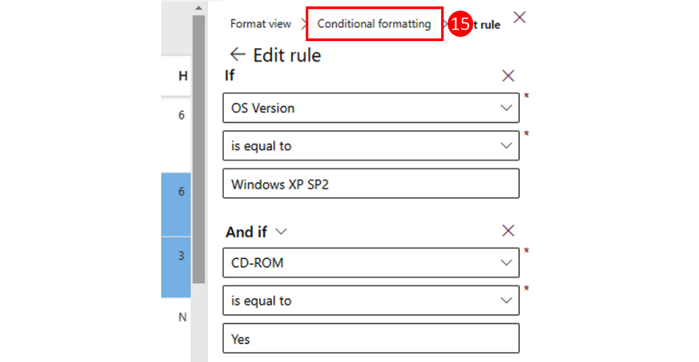
Figure 7.10 – Edit rule
- Repeat steps 4 to 14 to create your new condition.
- To view, edit, delete, or change the order of any existing conditional formatting, open the manage rules pane, as explained in step 15. Here, you will see all the rules that have been applied to the column.
- Click on … to open the context menu.
- Select the desired option:

Figure 7.11 – Managing conditional formatting
Card Designer
The Card Designer allows you to modify the card that's applied to the Gallery view. To select which columns must appear in the card, do the following:
- Select the Gallery layout.
- From the list of available options, select Card Designer.
- Click on Edit card:
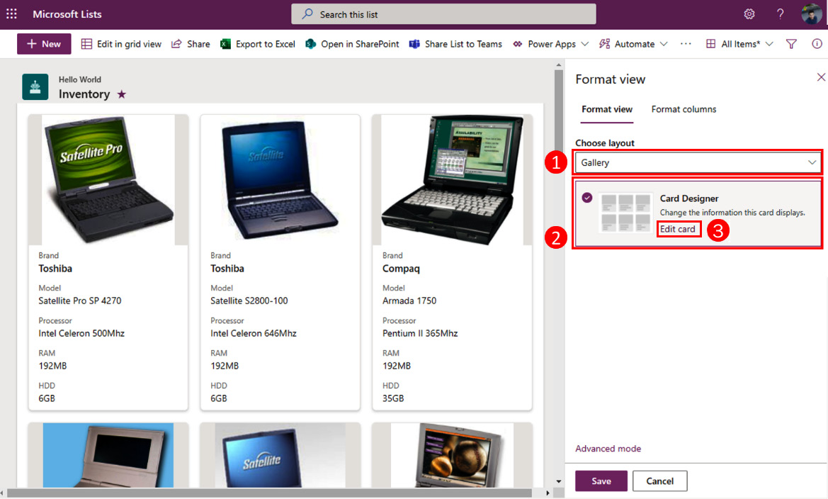
Figure 7.12 – Card Designer
- Select the columns you want to apply to the card. By default, the layout has six columns selected and displays a picture or person field as the first column if one is available.
- You can rearrange the position of your columns by clicking … and then choosing Move up or Move down.
- Once you have created your card, click Save to publish the view to all the users:
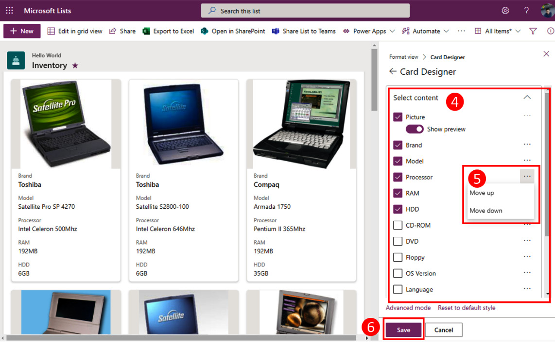
Figure 7.13 – Card Designer column selection
JSON formatting
JSON formatting allows you to customize views beyond what the design mode and the WYSIWYG interface allow you to do.
Before we start digging into the examples and into the more complex customizations, you must become familiar with the JSON properties that are specific to Microsoft Lists views, combined with the HTML and JSON properties we saw in the Column formatting section so that you can build list view custom layouts.
View formatting properties and attributes
As a combination of HTML and JSON, view formatting has its own properties that are used along with the HTML. The following table shows the specific properties you should use when formatting views:

Predefined CSS classes
When formatting a view, you can take advantage of the pre-existing CSS styles provided by Microsoft default classes. The following table shows the specific CSS classes that can be applied to the view formatting. These can then be complemented by the CSS classes we saw in the Column formatting section:

Special strings
Microsoft Lists view formatting makes use of special strings that will give you access to direct properties and values in the context of the view you are formatting. The following table shows all the available special strings. All the custom strings we saw in the Column formatting section can be used for view formatting:

How to create and apply your own JSON view formatting
Microsoft Lists advanced formatting includes the Monaco source code editor. By default, it will highlight your code, identify syntax errors in the JSON, and validate whether the properties you are using are allowed by the formatting schema.
Despite providing these features, there is one thing that the Monaco editor does not provide: the ability to save the formatting locally in a file. To avoid losing your customizations, we recommend that you use a source code editor such as Visual Studio Code. To get started, follow these steps:
- Download and install Visual Studio Code from the following link. It is available for Windows, macOS, and Linux: https://code.visualstudio.com/Download.
- Open Visual Studio Code. Then, click on File and then New File.
- Save the file with the .json extension.
- Start writing your view formatting. You will learn how to do this in the Learning from examples subsection:
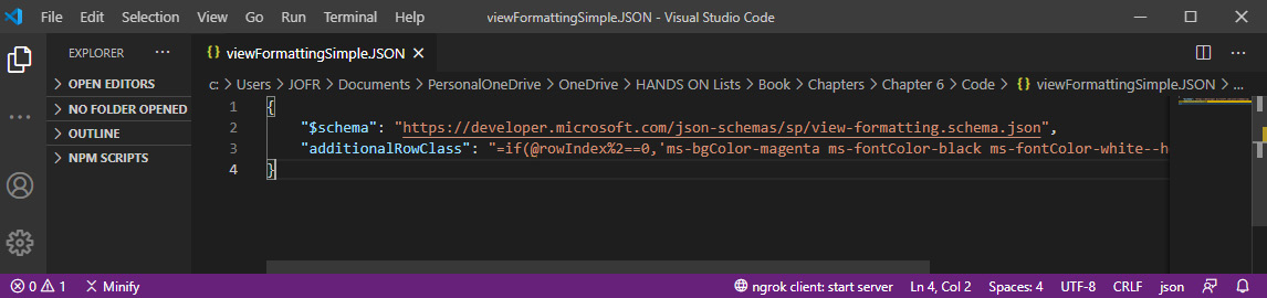
Figure 7.14 – Visual Studio Code – view formatting JSON
Once you have written the code, you need to add it to your list column by doing the following:
- Open the View formatting pane and click on Advanced mode, which is located at the bottom of the pane.
- Paste your code into the text box.
- Click on Preview to see how it will be applied before publishing it.
- If the formatting looks as expected, click Save:
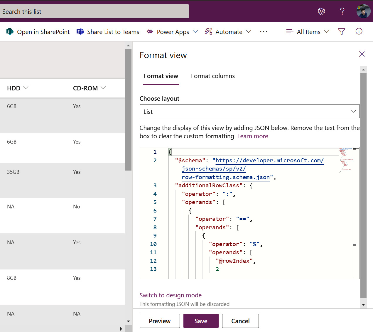
Figure 7.15 – View formatting custom code
Important
If you decide to use the Monaco editor exclusively, make sure you save a copy of your customizations. Clicking the Switch to design mode option will make any custom code disappear.
Learning from examples
Now that you have looked at the Microsoft List column formatting and view formatting schemas, it's time to start learning how to build your own JSON. There is nothing better than learning from real examples that are described and then exemplified.
Quick Tip
In the Microsoft 365 Patterns and Practices (PnP) open source repository, you can find numerous templates that you can use in your own lists or use as a starting point to build your own view formatting.
The column samples repository is available at https://github.com/pnp/sp-dev-list-formatting/tree/master/view-samples.
Conditional view formatting
One of the simplest view formattings you can do is create a custom alternate row formatting. The following code formats the even rows with a background color.
This example can also be achieved in design mode. However, by using JSON, you can customize it even further:
{
"$schema": "https://developer.microsoft.com/json- schemas/sp/view-formatting.schema.json",
"additionalRowClass": "=if(@rowIndex%2==0,'ms-bgColor- magenta ms-fontColor-black ms-fontColor-white--hover ms- bgColor-redDark--hover','')"
}
The following screenshot shows the result of applying the code to the view:
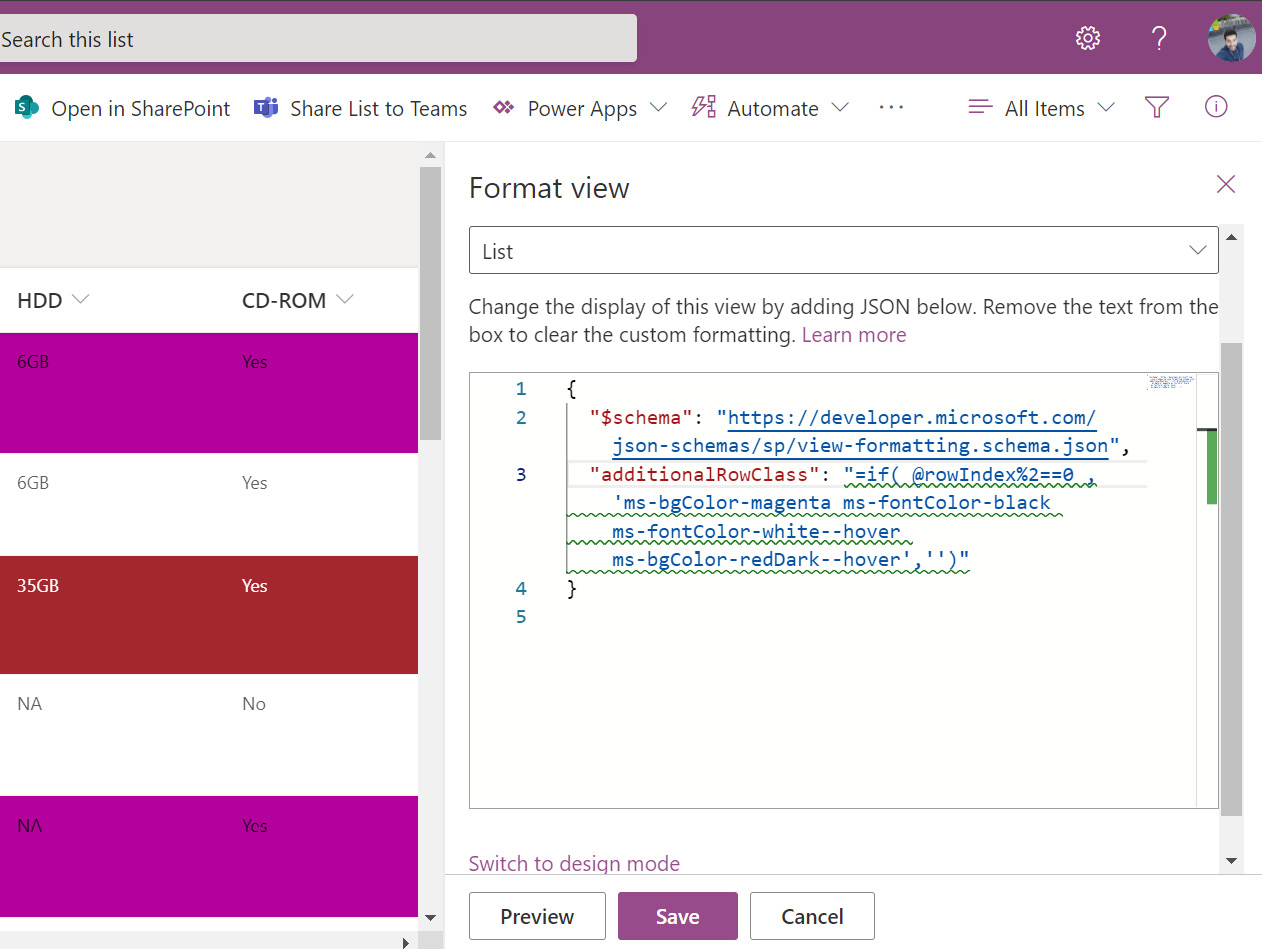
Figure 7.16 – Conditional view formatting
In this example, you can observe the following:
- How to access the index of a row using the custom @rowIndex string
- How to format a row conditionally
- How to apply background colors and text colors
- How to apply background colors and text colors on mouse hover
Tile layout
Tile layout formatting allows you to format each column row as a tile, which allows you to use any HTML structure to display the content.
Scenario
John has a Microsoft List connected to Microsoft Power Automate that's being used to store the daily forecast for the company's office locations. Inspired by the Microsoft Windows weather tiles, John has decided to format his list to display the weather information for each of the cities in tile format:

Figure 7.17 – Weather list
The following code snippet will transform the weather data stored in the list into a tile view:
{
"$schema": "https://developer.microsoft.com/json- schemas/sp/view-formatting.schema.json",
"hideSelection": true,
"width": "250",
"height": "250",
"formatter": {
"elmType": "div",
"children": [{
"elmType": "div",
"style": {
"display": "inline-block",
"min-width": "250px",
"min-height": "250px",
"margin-right": "10px",
"box-shadow": "2px 2px 4px darkgrey"
},
…
https://github.com/PacktPublishing/Hands-On-Microsoft-Lists/blob/main/Chapter07/weather.json
In this example, you can observe the following:
- How to define the height and width of a tile
- How to create a custom tile structure using the formatter property
- How to use custom CSS with the style property:

Figure 7.18 – Weather tile format
This example shows how flexible the tile layout can be and how it can be used as a starting point for other scenarios.
Formatting a view group header and footer
List views can be grouped and aggregated by the columns containing all the information that have the same value aggregate inside an accordion.
With view formatting, you can go a step further and also customize the headers and the footers of your groups, as shown in the following screenshot:
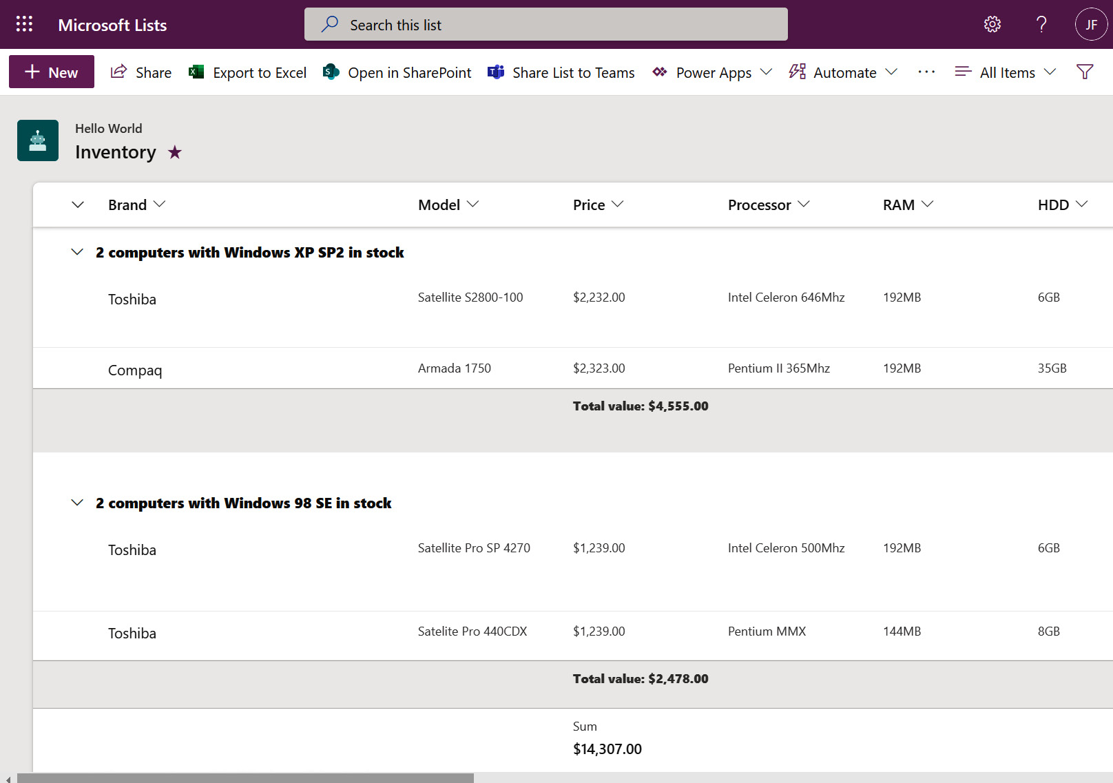
Figure 7.19 – Formatting a group view – before and after
In this example, you can observe the following:
- How to format the group header
- How to use the value from an aggregation in the header
- How to format the group footer:
{
"$schema": "https://developer.microsoft.com/json- schemas/sp/v2/row-formatting.schema.json",
"groupProps": {
"headerFormatter": {
"elmType": "div",
"style": {
"font-weight": "800"
},
"txtContent": "= @group.count + if(@group.count > '1', ' computers', ' computer') + ' with ' + @group.fieldData.displayValue + ' in stock'"
},
"footerFormatter": {
"elmType": "div",
"style": {
"font-weight": "800"
},
"txtContent": "= 'Total value: ' + @columnAggregate.value"
}
}
}
https://github.com/PacktPublishing/Hands-On-Microsoft-Lists/blob/main/Chapter07/groups.json
With that, we have learned how to format lists using column formatting and view formatting. Use the examples provided to get started and then adjust them to your own needs.
Summary
In this chapter, you learned how to customize a list view using the built-in tools and using a combination of JSON and HTML.
The JSON schema, which we covered in the column formatting and view formatting chapters of this book, is the foundation for making code customizations in Microsoft Lists. As we'll see in the next chapter, the same syntax can be reused to customize list forms.