


Networks for Operations Insight and the Network Health Dashboard
This chapter describes scenarios that are based on the Networks for Operations Insight feature, including integrated visualization of Network infrastructure with the Network Health Dashboard.
This chapter includes the following topics:
2.1 Networks for Operations Insight and Network Health Dashboard overview
IBM Networks for Operations Insight is an optional feature that can be added to a deployment of the base IBM Netcool Operations Insight solution. It provides service assurance in dynamic network infrastructures.
Networks for Operations Insight features the following capabilities:
•Network discovery
•Visualization
•Event correlation and root-cause analysis
•Configuration and Compliance Management
These capabilities provide service assurance in dynamic network infrastructures. The Networks for Operations Insight capability is provided by setting up the following products in Netcool Operations Insight:
•IBM Tivoli Network Manager
•IBM Tivoli Netcool Configuration Manager
•IBM Network Performance Insight
Network Health Dashboard is one of the main features that is provided by the Networks for Operations Insight solution. The Network Health Dashboard is available only with Network Manager as part of Netcool Operations Insight.
2.2 Scenario description
For more information about system components and default settings in the test environment, see Chapter 1, “IBM Netcool Operations Insight overview” on page 3.
Blue Bank & OmniFinance are large banking companies with an extensive network. They use several different vendors’ equipment across their widely distributed infrastructure.
By using the Network Health Dashboard, IT Operators or Subject Matter Experts (SME) can identify and troubleshoot network outages fast and resolve it quickly.
2.2.1 Business value
By using the Network Health Dashboard, IT Practitioners can perform the following tasks:
•View the state of network infrastructure in a single pane of glass
•View real-time monitoring and availability data
•Observe real-time Performance of best and worst performing devices
•Have an aggregated view of device configurations that were applied or not applied
•See real-time events in context
•Identify and troubleshoot network outages and issues and quickly resolve them
2.3 Scenario topology
For this scenario, we used the environment that is described in 1.4, “Our environment for the scenarios” on page 18.
2.4 Scenario steps
This section describes steps to use the Network Health Dashboard to quickly identify and resolve network outages or issues.
2.4.1 Administering the Network Health Dashboard
An IT administrator can configure how data is displayed and which data is displayed in the Network Health Dashboard. Device configuration change data can be displayed in the Configuration and Event Timeline if the integration with Netcool Configuration Manager is set up.
|
Tip: To fit the quantity of widgets onto a single window, a minimum resolution of 1536 x 864 is needed.
If the resolution is less than this minimum, scroll bars are seen on one or more of the widgets in the Network Health Dashboard.
|
|
More information: For more information about the integration with Netcool Configuration Manager, see the following topic in the Network Manager Knowledge Center:
For more information about the Integration of NPI into NOI, see this website:
|
Changing dashboard layout
The layout of the dashboard can be changed to the IT Administrator’s discretion. For example, widgets can be repositioned or resized.
|
More information: For more information about changing the dashboard content or layout, see the following topic in the Network Manager Knowledge Center:
|
Changing the refresh period for widgets on the Network Health Dashboard
The Network Manager widgets within the Network Health Dashboard update by default every 20 seconds. This update frequency can be changed by performing the following steps:
1. Edit the following configuration file:
$NMGUI_HOME/profile/etc/tnm//nethealth.properties.
2. Find the following line and update the refresh period to the wanted value in seconds:
nethealth.refresh.period=60
3. Save the file.
4. Close and reopen the Network Health Dashboard tab to affect the changes.
|
Note: The Event Viewer widget updates every 60 seconds by default.
|
Changing the colors that are associated with event severity values that are used in the Configuration and Event Timeline
The colors that are associated with event severity values that are used in the Configuration and Event Timeline can be changed by performing the following steps:
1. Edit the following configuration file:
$NMGUI_HOME/profile/etc/tnm/status.properties.
2. Find the properties status.color.background.severity_number, where severity_number corresponds to the severity number. For example, 5 corresponds to Critical severity.
3. Change the RGB values for the severity values, as wanted.
4. Save the file.
Disabling start of the Network View tab when selecting a network view in the Network Health Dashboard
When a user selects a network view in the Network Health Dashboard (called Network View) a second tab is opened by default, as shown in Figure 2-1. This tab contains a dashboard that consists of the Network Views GUI, Event Viewer, and Structure Browser. It also displays the selected network view.
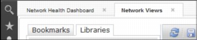
Figure 2-1 Network View Tab
If the network views are large, displaying this second tab can affect system performance. To avoid this performance affect, starting the Network View tab can be disabled by performing the following steps:
1. Edit the following configuration file:
$NMGUI_HOME/profile/etc/tnm/topoviz.properties.
2. Find the lines that are shown in Example 2-1.
Example 2-1 Excerpt from the $NMGUI_HOME/profile/etc/tnm/topoviz.properties file
# Defines whether the dashboard network view tree fires a launchPage event when the user clicks a view in the tree
topoviz.networkview.dashboardTree.launchpage.enabled=true
3. Set the property topoviz.networkview.dashboardTree.launchpage.enabled to false.
4. Save the file.
|
More information: For more information about troubleshooting the Network Health Dashboard, see the following topic in the IBM Knowledge Center:
|
2.4.2 Custom dashboards
Pages can be created that act as dashboards for displaying information about the status of parts of a network or edit dashboards, such as the Network Health Dashboard. Many widgets can be used for creating or modifying dashboards. The widgets are provided with Network Manager, Tivoli Netcool/OMNIbus Web GUI, and from other products that are deployed in the Dashboard Application Services Hub environment.
|
For more information: For more information about creating Custom Dashboards, see the following topic on the Networks for Operations Insight Knowledge Center:
For more information about creating and editing pages in the Dashboard Application Services Hub, see the following topic on the Network Manager Knowledge Center:
For more information about Dashboard Application Services Hub, see the Jazz for Service Management information center at this website:
|
2.4.3 Monitoring the Network Health Dashboard
The Network Health Dashboard can be monitored by selecting a network view within an area of responsibility, such as a geographical area, or a specific network service, and reviewing the data that appears in the other widgets on the dashboard.
If users set up a default network view bookmark that contains the network devices within an area of responsibility, these views appear in their network view tree within the dashboard.
Monitoring the Network Health Dashboard includes the following key steps:
Displaying device and interface availability in a network view
By using the Unavailable Resources widget, users can monitor within a selected network view the number of device and interface availability alerts that are open for more than a configurable amount of time. By default, this widget charts the number of device and interface availability alerts that were open for up to 10 minutes, for more than 10 minutes but less than one hour, and for more than one hour.
Complete the following steps to monitor the number of open device and interface availability alerts within a selected network view:
1. Click the Incident icon and select Network Availability → Network Health Dashboard.
2. In the Network Health Dashboard, select a network view from the network view tree in the Network Views window at the top left. The other widgets update to show information based on the network view that you selected.
The Unavailable Resources widget updates to show device and interface availability in the selected network view. A second tab, called Network View, opens. This tab contains a dashboard comprised of the Network Views GUI, Event Viewer, and Structure Browser, and it displays the selected network view. You can use this second tab to explore the topology of the network view that you are displaying in the Network Health Dashboard.
3. In the Unavailable Resources widget, to determine the number of unavailable devices and interface alerts, use the following sections of the chart and note the colors of the stacked bar segments and the number inside each segment. Click any one of the bars that are shown in Figure 2-2 to show the corresponding alerts for the devices and interfaces in the Event Viewer at the bottom of the Network Health Dashboard:
– SNMP Poll Fail
Uses color-coded stacked bars to display the number of SNMP Poll Fail alerts within the specified time frame.
– SNMP Link-State
Uses color-coded stacked bars to display the number of SNMP Link State alerts within the specified time frame.
– Interface Ping
Uses color-coded stacked bars to display the number of Interface Ping alerts within the specified time frame.
– Device Ping
Uses color-coded stacked bars to display the number of Device Ping alerts within the specified time frame.
|
Tips: Consider the following points:
•By default, all of the bars that are described in this section are configured to display. However, the Unavailable Resources widget can be configured to display specific bars only. For example, if the widget is configured to display only the Device Ping and the Interface Ping bars, only those bars are displayed in the widget.
•By default, the data in the Unavailable Resources widget is updated every 20 seconds.
|
Color coding of the stacked bars is shown in Figure 2-2.

Figure 2-2 Stacked bar color codes
Displaying overall network view availability
IT Operators and SMEs can monitor overall availability of chassis devices within a selected network view by using the Percentage Availability widget.
Complete the following steps to display the overall availability of chassis devices within a selected network view:
1. Click the Incident icon and select Network Availability → Network Health Dashboard.
2. In the Network Health Dashboard, select a network view from the network view tree in the Network Views at the top left. The other widgets update to show information that is based on the network view that you selected.
In particular, the Percentage Availability widget updates to show overall availability of chassis devices in network view. A second tab, called Network View, opens. This tab contains a dashboard that consists of the Network Views GUI, Event Viewer, and Structure Browser. It displays the selected network view. This second tab can also be used to explore the topology of the network view that is being displayed in the Network Health Dashboard.
The Percentage Availability widget (as shown in Figure 2-3) displays 24 individual hour bars. Each bar displays a value, which is an exponentially weighted moving average of ping results in the past hour (the bar appears on the completion of the hour only). The bar value represents a percentage availability rate rather than a total count within that hour. The color of the bar indicates the following percentage availability:
– Green: 80% or more
– Orange: Between 50% and 80%
– Red: Less than 50%

Figure 2-3 Percentage Availability widget
|
Tip: If the Percentage Availability widget is taking a long time to refresh, one possible solution is to increase the number of threads available for this widget. This solution is most suitable for customers with large networks. You can increase the number of threads available by performing the following steps:
1. Edit the following configuration file:
$NMGUI_HOME/profile/etc/tnm//nethealth.properties
2. Find the following lines:
## Widget thread count for availability widget
nethealth.threads.availability=5
3. Increase the value of the nethealth.threads.availability property. The maximum possible value is 10.
4. Save the file.
|
Displaying highest and lowest performers in a network view
The highest and lowest poll data metrics across all devices and interfaces within a selected network view can be monitored by using the Top Performers widget. Complete the following steps:
1. Click the Incident icon and select Network Availability → Network Health Dashboard.
2. In the Network Health Dashboard, select a network view from the network view tree in the Network Views at the top left. The other widgets update to show information that is based on the network view that is selected.
3. In the Top Performers widget (Figure 2-6 on page 34), select from the following controls to display chart, table, or trace data in the Top Performers widget, and how to display it:
– Metric
Select this drop-down list to display a selected set of poll data metrics. The metrics that are displayed in the drop-down list depend on which poll policies are enabled for the selected network view. Select one of these metrics to display associated data in the main part of the window. Figure 2-4 shows an example of metric drop-down choices.
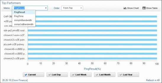
Figure 2-4 An example of metric drop-down choices
– Order
Select this drop-down list to display the statistic to apply to the selected poll data metric. The following statistics are available for all metrics (except the SnmpLinkStatus metric):
• From Top: Displays a bar chart or table that shows the 10 highest values for the selected metric. The devices or interfaces with these maximum values are listed in the bar chart or table.
• From Bottom: Displays a bar chart or table that shows the 10 lowest values for the selected metric. The devices or interfaces with these minimum values are listed in the bar chart or table.
The following statistics are available for the SnmpLinkStatus metric. In each case, a bar chart or table displays and shows devices for the selected statistic:
• Unavailable: This statistic displays by default. Devices with this statistic are problematic.
• Admin Down: Devices with this statistic are not problematic as Administrators change devices to this state.
• Available: Devices with this statistic are not problematic.
The widget lists devices or interfaces depending on which of the following metrics was selected:
• If the metric that was selected applies to a device, such as memoryUtilization, the top 10 list contains devices.
• If the metric that is selected applies to an interface, such as ifInDiscards, the top 10 list contains interfaces.
Figure 2-5 shows an example of Top Performer view with top 10 statistics within current time frame.
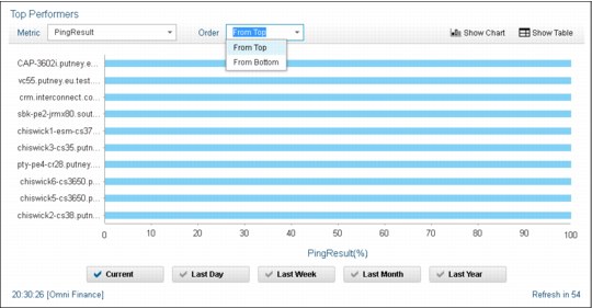
Figure 2-5 Example of Top Performer view with top 10 statistics within current time frame
– Show Chart
Displays a bar chart with up to the 10 highest or lowest values. Show Chart is the display option when the widget is first opened.
– Show Table
Displays a table of data that is associated with up to the 10 highest or lowest values. Figure 2-6 shows the Top Performers widget view.
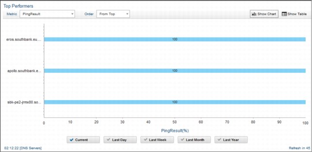
Figure 2-6 Example of a Top Performers widget view
– Define Filter
This button appears in Show Table mode only. Click this button to define a filter to apply to the Top Performers table data.
The main part of the window contains the data in one of the following formats:
– Chart
Bar chart with the 10 highest or lowest values. Click any bar in the chart to show a time trace for the corresponding device or interface.
– Table
Table of data that is associated with the 10 highest or lowest values. The table contains the following columns:
• Entity Name: Name of the device or interface.
• Show Trace: Click a link in one of the rows to show a time trace for the corresponding device or interface.
• Last Poll Time: Last time this entity was polled.
• Value: Value of the metric the last time this entity was polled.

Figure 2-7 Top Performers view with Show Table mode
– Trace
Time trace of the data for a single device or interface. Navigate within this trace by performing the following operations:
i. Zoom into the trace by moving your mouse wheel forward.
ii. Zoom out of the trace by moving your mouse wheel backward.
iii. Double-click to restore the normal zoom level.
iv. Click within the trace area for a movable vertical line that displays the exact value at any point in time.
Click one of the following buttons to specify the current or historical poll data to display in the main part of the window. This button updates the data regardless of which mode is presented: bar chart, table, or time trace.
|
Tip: If your administrator opted not to store poll data for any of the poll data metrics in the Metric drop-down list, historical poll data is not available when you click any of the following buttons:
•Last Day
•Last Week
•Last Month
•Last Year
|
– Current
Click this button to display current raw poll data. When in time trace mode, the time trace shows anything up to two hours of data, depending on the frequency of polling of the associated poll policy.
– Last Day
Click this button to show data based on a regularly calculated daily average.
In bar chart or table mode, the top 10 highest or lowest values are shown based on a daily exponentially weighted moving average (EWMA).
In time trace mode, a time trace of the last 24 hours is shown that is based on the average values.
In the Last Day section of the widget, EWMA values are calculated by default every 15 minutes and are based on the previous 15 minutes of raw poll data. The data that is presented in this section of the widget is then updated with the latest EWMA value every 15 minutes.
|
Last day or last 24 hours?: In the GUI, this metric is referred to as Last Day, but it is actually the last 24 hours. Similar logic is used for Last Week, Last Month, and Last Year, which is described next.
|
– Last Week
Click this button to show data based on a regularly calculated weekly average.
In bar chart or table mode, the top 10 highest or lowest values are shown based on a weekly EWMA.
In time trace mode, a time trace of the last seven days is shown, based on the average values.
In the Last Week section of the widget, EWMA values are calculated by default every 30 minutes and are based on the previous 30 minutes of raw poll data. The data that is presented in this section of the widget is then updated with the latest EWMA value every 30 minutes.
– Last Month
Click this button to show data that is based on a regularly calculated monthly average.
In bar chart or table mode, the top 10 highest or lowest values are shown based on a monthly EWMA.
In time trace mode, a time trace of the last 30 days is shown, based on the average values.
In the Last Month section of the widget EWMA values are calculated by default every two hours and are based on the previous two hours of raw poll data. The data that is presented in this section of the widget is then updated with the latest EWMA value every two hours.
– Last Year
Click this button to show data based on a regularly calculated yearly average.
In bar chart or table mode, the top 10 highest or lowest values are shown based on a yearly EWMA.
In time trace mode, a time trace of the last 365 days is shown, based on the average values.
In the Last Year section of the widget EWMA values are calculated by default every day and are based on the previous 24 hours of raw poll data. The data that is presented in this section of the widget is then updated with the latest EWMA value every day.
The Historical Polling Data for Top Performers with the Current option that is selected is shown in Figure 2-8 on page 37.
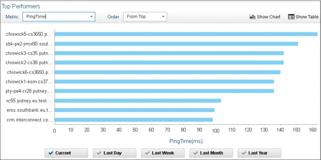
Figure 2-8 View current or Historical Polling Data for Top Performers
Displaying the Configuration and Event Timeline
A timeline can be displayed for all devices in a selected network view with device configuration changes and network alert data over a period of up to 24 hours by using the Configuration and Event Timeline widget. Correlation between device configuration changes and network alerts on this timeline can help identify where configuration changes might lead to network issues.
To display a timeline that shows device configuration changes and network alert data for all devices in a selected network view, complete the following steps:
1. Click the Incident icon and select Network Availability → Network Health Dashboard.
2. In the Network Health Dashboard, select a network view from the network view tree in the Network Views at the top left. The other widgets update to show information that is based on the network view that you selected. In particular, the Configuration and Event Timeline updates to show configuration change and event data for the selected network view.
In the Configuration and Event Timeline widget, configuration changes that are displayed in the Configuration and Event Timeline can be any of the changes that are described in “Changes that are managed by Netcool Configuration Manager” on page 37.
|
Tip: If Netcool Configuration Manager is not installed, no configuration data is displayed in the timeline.
|
Changes that are managed by Netcool Configuration Manager
The following changes are made under full Netcool Configuration Manager control. The timeline differentiates between scheduled or policy-based changes, which can be successful (Applied) or unsuccessful (Not Applied), and one-time changes made by using the IDT Audited terminal facility within Netcool Configuration Manager:
•Applied
A successful scheduled or policy-based set of device configuration changes that were made under the control of Netcool Configuration Manager.
•Not Applied
An unsuccessful scheduled or policy-based set of device configuration changes that were made under the control of Netcool Configuration Manager.
•IDT
Device configuration changes made by using the audited terminal facility within Netcool Configuration Manager that allows one-time command-line based configuration changes to devices.
•Unmanaged changes:
– OOBC
Out-of-band-change. Manual configuration change that was made to device where that change is outside of the control of Netcool Configuration Manager.
Events are displayed in the timeline as stacked bars, in which the color of each element in the stacked bar indicates the severity of the corresponding events. Move your mouse over the stacked bars to view a tooltip that lists the number of events at each severity level. The X-axis granularity for events and configuration changes varies depending on the time range that you select for the timeline.
The X-axis granularity in the Configuration and Event Timelines is listed in Table 2-1.
Table 2-1 X-axis granularity in the Configuration and Event Timelines
|
If you select this time range ...
|
Then, the X-axis granularity is ...
|
|
6 hours
|
15 minutes
|
|
12 hours
|
30 minutes
|
|
24 hours
|
1 hour
|
|
More information: For more information about the different types of configuration change, see the Netcool Configuration Manager knowledge center at this website:
|
Select from the following controls to define what data to display in the Configuration and Event Timeline:
– Time
Select the duration of the timeline:
• 6 Hours: Click to set a timeline duration of 6 hours.
• 12 Hours: Click to set a timeline duration of 12 hours.
• 24 Hours: Click to set a timeline duration of 24 hours.
– Events by Occurrence:
• First Occurrence: Click to display events on the timeline based on the first occurrence time of the events.
• Last Occurrence: Click to display events on the timeline based on the last occurrence time of the events.
– Show Table
Displays the configuration change data in tabular form. The table contains the following columns:
|
Note: If Netcool Configuration Manager is not installed, this button is not displayed.
|
• Number: Serial value that indicates the row number.
• Device: Host name or IP address of the affected device.
• Unit of Work (UoW): In the case of automated Netcool Configuration Manager configuration changes, the Netcool Configuration Manager UoW under which this configuration change was processed.
• Result: Indicates whether the change was successful.
• Start Time: The time at which the configuration change began.
• End Time: The time at which the configuration change completed.
• User: The user who applied the change.
• Description: Textual description that is associated with this change.
– Show Chart
Click this button to switch back to the default graph view.
|
Note: If Netcool Configuration Manager is not installed, this button is not displayed.
|
Use the sliders under the timeline to zoom in and out of the timeline. The legend under the timeline shows the colors that are used in the timeline to display the following items:
• Event severity values
• Configuration change types
If the integration with Netcool Configuration Manager was set up but there is a problem with data retrieval from Netcool Configuration Manager, the configuration change types that are shown in the legend are marked with an icon that indicates that the integration with Netcool Configuration Manager is set up but no configuration management data is available.
The Configuration and Event Timeline Filter creation window is shown in Figure 2-9 on page 40.

Figure 2-9 The Configuration and Event Timeline Filter creation window
2.4.4 Configuring the Network Health Dashboard for users
A user can configure the Network Health Dashboard to display the data as they want to see it.
This section describes the steps for the following processes:
Configuring the network view tree to display in the Network Health Dashboard
Users of the Network Health Dashboard can configure a default bookmark to limit the data that is displayed in the Network Health Dashboard to the network views within their area of responsibility.
The network views tree in the Network Health Dashboard automatically displays the network views in a user’s default network view bookmark. If there are no network views in the default bookmark, a message is displayed with a link to the Network Views GUI in which the user can add network views to the default bookmark. The network views that can be added to the default bookmark are displayed in the network tree within the Network Health Dashboard.
Complete the following steps:
1. Within the displayed message, click the link that is provided. The Network Views GUI opens in a second tab.
2. To add network views to a bookmark:
a. Click the Incident icon and select Network Availability → Network Views → Libraries.
b. Select a single network view:
i. From the network view library drop-down list that is above the network view tree, select the network view library that contains the network view to add to the bookmark.
ii. In the network view tree, browse to the wanted network view.
c. Right-click the wanted network view and click Add to Bookmark. An example is shown in Figure 2-10.

Figure 2-10 Adding Network Views to bookmarks for networks for Omnifinance
d. In the submenu, click the name of the bookmark to which to add the network view. Only the bookmarks that the user has permission to read and write to appear in the list. For example, to add the selected network views to a bookmark named Bookmark1, click Add to Bookmark → Bookmark1.
You can add the Network views to the bookmark by using one of the following methods:
• If the parent network view is selected, the parent network view and all of its child network views are added to the bookmark. If the parent network view is a dynamic network view, the views are added to or removed from the bookmark automatically as child network views are added to or removed from the parent following network discovery.
• If one or more child network views are selected (whether of a standard or dynamic parent network view), only the network views that are selected are added to the bookmark. In addition, individually selected child network views of dynamic parent network views are automatically removed from the bookmark if the child network view is removed following network discovery.
|
Note: Whichever view is added to a bookmark, the system automatically adds its parent, the parent’s parent, and so on, until it gets to the top of the tree. Manually added network views appear without an asterisk to the left of the view name. System-added network views appear with an asterisk to the left of the view name. For example, if a parent network view is added to the bookmark, the parent network view and all of its child network views are added to the bookmark.
If the parent network views were manually added, it appears without an asterisk. If the child network views were added by the system they appear with an asterisk.
|
The network views tree in the Network Health Dashboard displays the network views in your newly configured default bookmark.
3. To remove network views from a bookmark:
a. Click the Incident icon and select Network Availability → Network Views → Bookmarks.
b. Select a single network view:
iii. From the network view bookmarks drop-down list that is above the network view tree, select the network view bookmark that contains the network view to remove from the bookmark.
iv. In the network view bookmarks tree, browse to the wanted network view.
|
Note: Only network views from the bookmark that were manually added to the bookmark earlier can be removed. Consider the following points:
•The network views that can be removed appear without an asterisk to the left of the view name. These views are manually added views.
•The network views that cannot be removed appear with an asterisk to the left of the view name. These views were added by the system and are parents or children of manually added views.
|
c. Right-click the wanted network view and click Remove view from bookmark.
|
Note: A view can be removed only from a bookmark with read-write permission on that bookmark, or the user has the ncp_bookmark_admin role.
|
The selected view is removed from the bookmark.
|
Note: If a view is removed that is part of a hierarchy of other views that were previously added, that view is not physically removed from the tree. Instead, that view is marked with an asterisk (*).
|
Configuring the Unavailable Resources widget
Availability data can be displayed in the Network Health Dashboard by using the Unavailable Resources widget. IT Operators or SMEs can configure the widget to display availability data that is based on ping polls only, and not based on SNMP polls. They can also configure the time duration thresholds to apply to availability data displayed in this widget.
For example, by default the widget charts the number of device and interface availability alerts that were open for up to 10 minutes, more than 10 minutes, and more than one hour. These thresholds can be modified as needed.
To configure which availability data is displayed by the Unavailable Resources widget, complete the following steps:
1. Click the Incident icon and select Network Availability → Network Health Dashboard.
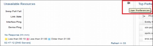
Figure 2-11 Unavailable Resources widget selection
To configure the Unavailable Resources widget, select the following options and the upper and lower field arrows (see the red box in Figure 2-13 on page 44) as applicable:
– Device
Configure which device alerts to monitor in the Unavailable Resources widget to retrieve information about device availability. By default, all of these options are selected.
– Device Ping
Select the option to monitor Default Chassis Ping alerts. Selecting this option causes the Unavailable Resources widget to provide an indication of the number of open device ICMP (ping) polling alerts.
– SNMP Poll Fail
Select this option to monitor SNMP Poll Fail alerts. Selecting this option causes the Unavailable Resources widget to provide an indication of the number of open SNMP Poll Fail alerts.
– Interface
Configure which interface alerts to monitor in the Unavailable Resources widget to retrieve information about interface availability. By default, all of these options are selected.
– Interface Ping
Select this option to monitor Default Interface Ping alerts. Selecting this option causes the Unavailable Resources widget to provide an indication of the number of open interface ICMP (ping) polling alerts.
– Link State
Select this option to monitor SNMP Link State alerts. Selecting this option causes the Unavailable Resources widget to provide an indication of the number of open SNMP Link State alerts.
– Thresholds:
• Upper
Specify an upper threshold in hours and minutes. By default, the upper threshold is set to one hour. This threshold causes the chart in the Unavailable Resources widget to update. When the amount of time that any availability alert in the selected network view remains open exceeds the one hour threshold, the relevant bar in the Unavailable Resources chart updates to show this unavailability as a blue color-coded bar section.
• Lower
Specify a lower threshold in hours and minutes. By default, the lower threshold is set to 10 minutes. This threshold causes the chart in the Unavailable Resources widget to update. When the amount of time that any availability alert in the selected network view remains open exceeds the 10-minute threshold, the relevant bar in the Unavailable Resources chart updates to show this unavailability as a as a pink color-coded bar section.
Figure 2-12 shows the Unavailable Resources Widget.

Figure 2-12 Configuring the Unavailable Resources Widget
Configuring the Configuration and Event Timeline
Event severity values can be configured to display on the Configuration and Event Timeline.
Complete the following steps to configure which event severity values to display on the Configuration and Event Timeline:
1. Click the Incident icon and select Network Availability → Network Health Dashboard.
2. In the Configuration and Event Timeline widget, click the User Preferences button, as shown in Figure 2-13.

Figure 2-13 Selecting the User Preferences button
3. To configure the Configuration and Event Timeline, use the following lists:
– Available Severities
By default, lists all event severity values. These event severity values are all displayed in the Configuration and Event Timeline.
To remove an item from this list, select the item and click the right-pointing arrow. You can select and move multiple values at the same time.
– Selected Severities
By default, no event severity values are displayed in this list. Move items from the Available Severities list to this list to show only those values in the Configuration and Event Timeline. For example, to show only Critical and Major in the Configuration and Event Timeline, move the Critical and Major items from the Available Severities list to the Selected Severities list.
To remove an item from this list, select the item and click the left-pointing arrow. You can select and move multiple values at the same time (see Figure 2-14).

Figure 2-14 Detailed Configuration and Event Timeline view
2.4.5 Scenario personas
The following personas are featured in this scenario:
•Annette: Annette is an IT Operator. In her role, she wants to quickly identify outages or incidents and resolve them fast.
•Brock: Brock is an IT Subject Matter Expert (SME). As a SME, he wants to increase efficiency and agility in the Operations Center (OC) by reducing noise, identifying problems faster, and issuing resolution with the power of automation and actionable insights.
2.4.6 Viewing the Network Health Dashboard
For the scenarios in the next sections, complete these initial steps:
1. Log in to the Dashboard Application Services Hub, as shown in Figure 2-15.
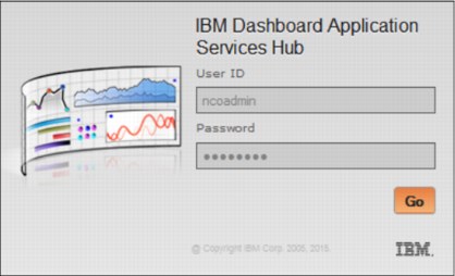
Figure 2-15 Log in prompt into Dashboard
2. To access the Network Health Dashboard, browse to Incident → Network Health Dashboard, as shown in Figure 2-16.
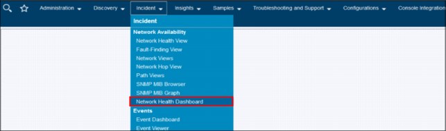
Figure 2-16 Accessing the Network Health Dashboard.
2.4.7 Scenario 1: IT Operator uses Network Health Dashboard and Runbook Automation and Alert Notification
In this scenario, an IT Operator uses Network Health Dashboard and Runbook Automation to be quickly notified of an outage and takes steps to resolve the outage.
This scenario features the following steps:
1. Annette, the IT Operator, receives alert notification of an outage. She receives the alert on her mobile device and then follows the link that is sent with the alert to login and view the alert details.
She can see the details of the incident, as shown in Figure 2-17.

Figure 2-17 Alert notifications received
2. Annette sees that multiple clients cannot access the Mobile Trade server. She can isolate the events and network details that are related to this Service by clicking Mobile Trade Server under the Network Views, as shown in Figure 2-18.

Figure 2-18 View Network events that are related to the Mobile Trade Server
3. Annette also finds a BIND (DNS) failure event on primary DNS Server.
In addition, Netcool Performance Insight (NPI) data shows a DNS traffic loss event on the Primary DNS server and a traffic increase event on Secondary DNS server, as shown in Figure 2-19.
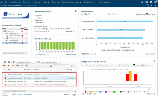
Figure 2-19 View events that are associated with the DNS Servers
4. Annette checks Wifi Access Infrastructure, Virtualized Infrastructure Utilization, WAN Gateway, and Service availability. All appear to be OK, as shown in Figure 2-20.

Figure 2-20 Verify network services that might be problematic
5. A Runbook ID that is associated with the DNS Service is shown automatically by the alert viewer, as shown in Figure 2-21. Annette concludes that the issue is DNS-related based on confirmation that there are no issues with Wifi Access infrastructure, Virtualized infrastructure Utilization, WAN Gateway, and Service Availability, coupled with Netcool Operations Insight having identified a BIND (DNS) Failure in Step 3.

Figure 2-21 Network Health Dashboard Events list show Runbook IDs that are associated with events
6. Annette starts the Runbook to restart Primary DNS, as shown in Figure 2-22.

Figure 2-22 Annette can start a Runbook that is associated with a particular event type
7. Annette runs the Runbook by following the steps to Restart the Primary DNS server. Because it was successful, she records that the Runbook works (see Figure 2-23).

Figure 2-23 Runbook to restart the Primary DNS Service executed successfully
|
More information: For more information about Runbook Automation, see this website:
|
8. Annette observes that the Secondary DNS server cannot resolve the IP of trade.bluebank.com, as seen in Figure 2-24.
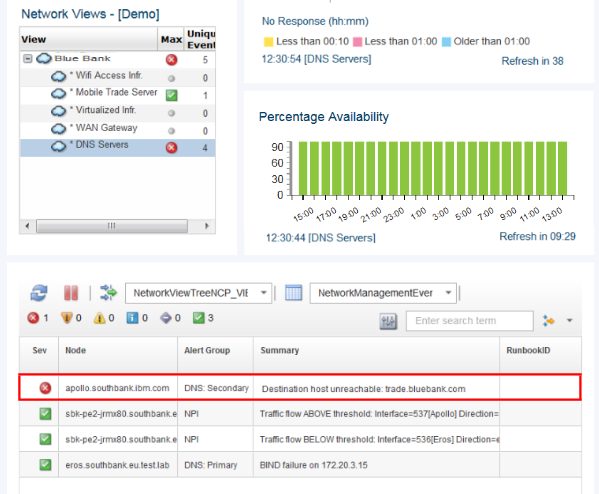
Figure 2-24 Secondary server cannot resolve the address of the Mobile Trade Server
9. Annette escalates the issue to Brock (the SME) by right-clicking the Event that is associated with the Secondary DNS server, and clicking Suppress/Escalate → Escalated-Level 3, as shown in Figure 2-25.

Figure 2-25 Escalating events by using the Network Health Dashboard
2.4.8 Scenario 2: IT SME using Network Health Dashboard
In this scenario, IT SME Brock uses the Network Health Dashboard to quickly resolve an escalated Event. Brock receives an escalated Alert Notification that Primary DNS is down from Annette (see 2.4.5, “Scenario personas” on page 45) and continues the problem determination process as described in the following process:
1. Brock logs in and brings up the Network Health Dashboard by clicking Incident → Network Health Dashboard, as shown in Figure 2-26.

Figure 2-26 Network View shows issues with the DNS Servers
Brock observes that the Secondary DNS server cannot resolve the internal web service.
2. Brock reviews the Network topology that is associated with the DNS Servers by double-clicking the DNS Servers line in the Network Views box (see Figure 2-27).
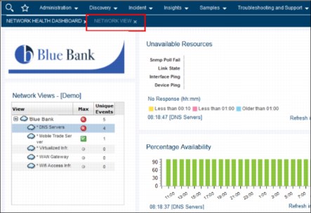
Figure 2-27 Network Views box
3. Brock clicks the Network View tab for the DNS network topology, as seen in Figure 2-28.

Figure 2-28 Network view of the Primary and Secondary DNS servers
4. Brock uses the nslookup tool to check the DNS configuration. He selects Webtools → Launch WebTools GUI, as shown in Figure 2-29.
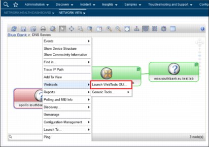
Figure 2-29 Starting the WebTools GUI by using Network View

Figure 2-30 Network Manager Webtools GUI that is used to start DNS lookups
6. Brock finds that the DNS configuration is out of synch between the primary and backup servers, as shown in Figure 2-31.
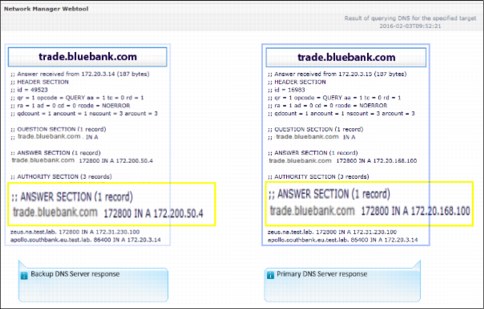
Figure 2-31 Primary and Secondary DNS servers are resolving the IP address
7. Brock reviews the network switch that is connected to the Secondary DNS server in the Network View to investigate the connectivity statistics of that server (see Figure 2-32).
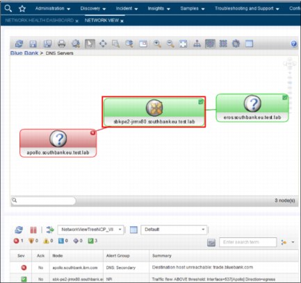
Figure 2-32 Reviewing the switch statistics of the Secondary DNS server port
8. Brock drills down to the Port where the Secondary DNS server is connected by clicking the Show Interfaces icon within the Structure Browser, as shown in Figure 2-33.

Figure 2-33 Selecting the Show Interfaces icon within the Structure Browser for the secondary DNS server’s switch
9. Brock identifies the specific switch port that the secondary DNS server is connected to and views the traffic for that port as provided from Netcool Performance Insight (NPI), as shown in Figure 2-34.
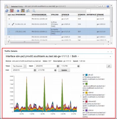
Figure 2-34 Port connecting the DNS server is identified by using the Structure Browser
10. By using Netcool Performance Insight (NPI) flow, Brock confirms that there is no DNS zone traffic to keep IP addresses synchronized between the Primary and Secondary DNS servers now. Instead, he sees traffic from the Secondary to Primary DNS but not from Primary to Secondary, as shown in Figure 2-35.

Figure 2-35 No DNS Zone traffic between Primary and Secondary DNS servers
11. Brock reviews traffic from one week ago and observes that DNS Zone traffic was flowing between Primary and Secondary DNS servers, as shown in Figure 2-36.

Figure 2-36 Reviewing traffic from one week previous
12. Within the Network View tab, Brock starts the Netcool Configuration Manager in the context of the Secondary DNS Server, as shown in Figure 2-37.
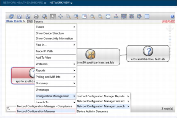
Figure 2-37 Starting Netcool Configuration Manager for the Secondary DNS Server
13. The Netcool Configuration Manager starts and Brock selects the Secondary DNS Server to review any changes that were made on it, as shown in Figure 2-38.

Figure 2-38 Changes that were made on the Secondary DNS Server
14. Brock verifies that the TCP port 53 is blocked on the server firewall. Then, by using the Netcool Configuration Manager, he starts a manual Change to reopen the port (see Figure 2-39).
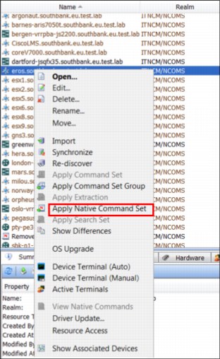
Figure 2-39 Applying a manual change in Netcool Configuration Manager
15. Brock selects the Native Command to remove the DNS (TCP port 53) block (see Figure 2-40).
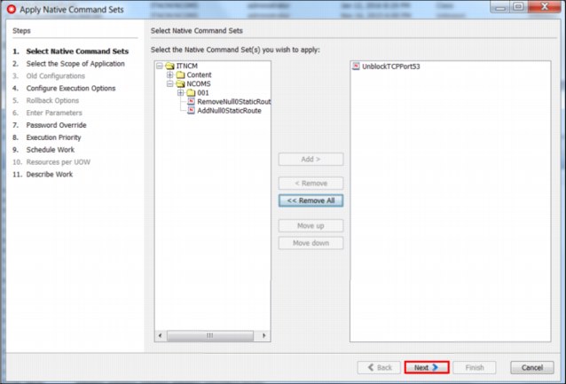
Figure 2-40 Implementing the change to unblock TCP port 53 on the Secondary DNS Server
16. Brock submits this UoW in the Netcool Configuration Manager. He receives confirmation that it was successfully run, as shown in Figure 2-41.
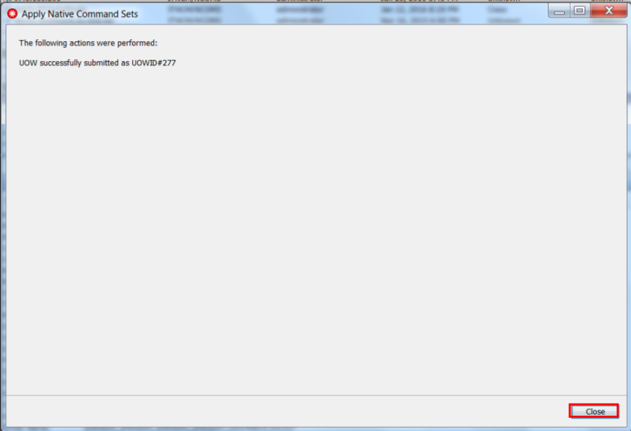
Figure 2-41 Netcool Configuration Manager Command Set applied successfully
17. By using the Network Health Dashboard, Brock verifies that DNS Network Operations are back to normal, as shown in Figure 2-42.
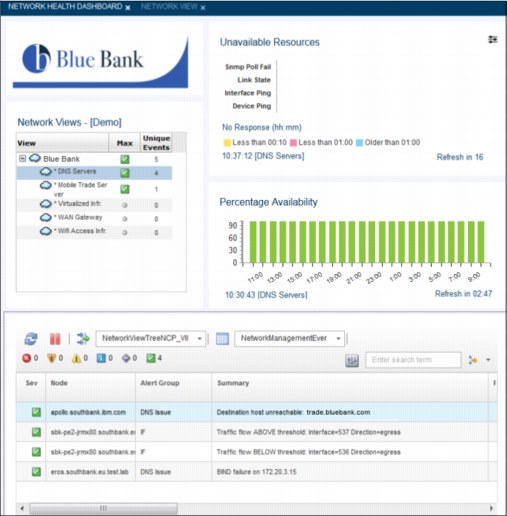
Figure 2-42 Confirmation that DNS Service is restored in a single view with Network Health Dashboard
2.5 Summary
As described in our scenarios, the Network Health Dashboard is a significant and beneficial new feature of Networks for Operations Insight. By using it, the IT Practitioner can have a single, consolidated view of IBM Tivoli Network Manager, IBM Tivoli Netcool Configuration Manager, IBM Network Performance Insight, and OMNIbus events.
When fully integrated, it can identify and troubleshoot network outages fast and resolve them quickly.
|
Note: For more information about the Network Health Dashboard configuration, see this website:
|
..................Content has been hidden....................
You can't read the all page of ebook, please click here login for view all page.