
Chapter 9. Probability and Statistics for SLIs and SLOs
You’ve identified some meaningful SLIs, and brought together stakeholders to build thoughtful SLOs from them. Once you collect some data from your system to help you set those targets, that should be it, right? But as you’ve seen, when measuring SLIs, you need to ensure you have data that can allow for multiple analyses and interpretations. The data in and of itself does not tell a complete story: how you analyze it is key to its usefulness. What’s more, systems change rapidly, so the SLOs you set could change as the systems themselves evolve. How do you determine the appropriate SLOs without being able to peer into the future?
This chapter is all about the interpretation of the data you’re collecting. Reliability is expensive, and figuring out the amount of reliability you need is crucial for making the most of your resources. An incorrect analysis doesn’t mean all your hard work has gone to waste, but it does mean you can’t be sure that the results support what you want to accomplish. Misinterpreting the data can mean triggering alerts unnecessarily, or worse, remaining blissfully unaware of underlying problems that will violate your SLOs and lead to customer dissatisfaction.
This chapter is broadly concerned with two difficult problems that arise when implementing SLIs and SLOs:
Figuring out what an SLO ought to be
Calculating the value of an SLI
The former arises when, for example, a new service is launching and the service owners need to figure out the theoretical maximum SLO they can be expected to provide. You can’t run a service with 99.9% availability if your critical runtime dependencies only provide 99% availability, unless you carefully architect around the deficiency.
Your service might also be a dependency itself. What latency guarantees should it offer if another service depends on it to meet its latency SLOs, given its usage patterns? What will happen to your latency if you change your service from sequential database calls to parallel? Is it worth pursuing?
The latter concern comes up when it comes time to act on the values of SLIs. Did I violate my SLOs this month? Am I violating my SLOs right now? What is my availability right now? What is my durability right now? Is my batch service receiving more traffic than I engineered for?
Answering these kinds of questions requires quantitative methods for dealing with uncertainty. The first set of questions, broadly speaking, are answered using techniques from probability, where we want to be able to discuss the likelihood of things that haven’t happened yet.
The second set will be addressed using statistics, where we want to analyze events that have already happened to draw inferences about quantities we can’t directly measure. Together, these techniques are a powerful tool for handling uncertainty and complexity.
For readers who aren’t well versed in probability and statistics, you don’t need to worry. We only scratch the surface here, but it will be enough for you to start your SLO journey, and will equip you to understand conversations around calculating SLOs happening outside the purview of this book. We’ll take you through the math you need to know, how it’s applied, and what the applications mean. (Alex introduced some of the concepts in Chapter 5, so if you haven’t read that yet, we’d recommend giving it a look first.)
This chapter is meant to serve as an introduction to some basic concepts in probability and (to a lesser extent) statistics. It is not, possibly, the most gentle introduction. We do not intend for readers, especially readers new to the subject, to understand everything on the first go. We honestly don’t expect most readers to read the whole chapter. Instead, let this chapter serve as a guide, pointing out interesting possibilities not explored elsewhere in this book. If it doesn’t speak to you, that’s fine. If it does, don’t worry if it takes a while to get through it. If you are intrigued by what you read, please keep going. If you are not, that’s fine too; you don’t need any of this. It’s just another tool in the bag.
Finally, there is some suggested further reading at the end, which we strongly recommend for anyone whose interest is piqued.
On Probability
The wonderful thing about computers is that whatever they can easily do once, they can easily do a couple of million times. The unfortunate thing about computers is that for any task of even mild sophistication it is unlikely that even a computer can perform it a couple of million times without fail.
As service owners who are also human, we don’t have the capacity to treat several million discrete events individually: the successes here, the failures there. What we do instead is acknowledge the uncertainty around the execution of the task; we talk about the probability that a task will succeed, or finish in a timely manner, or contain the answer we desire. When we express our service in SLIs, we are implicitly acknowledging the uncertain nature of the things we are trying to measure.
Probability is a way to measure uncertainty. If we were never uncertain about how our service would act, we could have SLOs like “all requests succeed”—but we’re actually uncertain about everything all the time, so instead we have SLOs like “99% of requests will succeed.” In doing so, however, we’re changing our focus from making statements about the events that occur to making statements about the processes that produce those events. The language of probability gives us a way to do this sensibly.
SLI Example: Availability
Let’s say you are the newest member of the data storage team at Catz, the largest and most brightly colored cat picture service company in the world.
Your team owns Dewclaw, which serves the thumbnails attached to each post. Dewclaw has a single customer (for now), the web frontend, which has a nonnegotiable availability SLO of four nines, or 99.99%. Unfortunately, it cannot offer even partial service—say, falling back on cute little stock cartoon cat images—without the thumbnails.
Your service is therefore a critical dependency, and your first project is to establish the SLOs Dewclaw needs to offer to ensure that you are reliable enough for your customer.
Catz has three data centers in different metropolitan areas: DC1, DC2, and DC3. Dewclaw currently only runs out of DC1. You conclude, correctly, that for the frontend to meet its four-nines SLO, you also need to offer a four-nines SLO. But you’re eyeing DC2 on the other coast.
If the frontend could first query DC1, and on failure automatically fail over to DC2, how much could you relax your SLO?
Sample spaces
To answer this question probabilistically we need to think about all the possible outcomes of a Dewclaw query. Since we are only considering availability, we can restrict ourselves to the cases where a response either is sufficient for the frontend (success), or is not (failure).
The set of these two states is called the sample space, and the sample space comprises all possible outcomes. Dewclaw has to respond with one of these (they are exhaustive), and every response is either one or the other (they are mutually exclusive). The queries that produce these responses are called events or trials.
Coin interlude
What we’re describing sounds a lot like a coin toss, where pass or fail depends on the flip of a coin. This is where we go mentally whenever we are looking at something that can have only two outcomes. The technical term for this is a Bernoulli trial, after one of the eight mathematicians of that name.
A Bernoulli trial must be a random experiment that has exactly two possible outcomes. The experiments are independent and do not affect one another, so the probability of success must be the same each and every time the experiment is conducted.
The sample space for a coin flip is , for heads or tails, whereas for Dewclaw it is , with for success and for failure.
If you flipped a coin to decide some question, you’d probably expect the probability of heads or tails to be about 50%. Mathematically, we say that the coin has a bias of .5. But we could have gone to a specialty store for a weighted coin that lands on heads just slightly more often—say, 60% of the time. In this case the coin has a bias of 0.6.
A Bernoulli trial is parameterized by some value, , which ranges from 0 to 1 and determines the outcome. A flipped coin will show heads with probability , and tails with probability . is the coin’s bias.
Let’s return to our example of queries. When we think about the response that a request will probably return, what we’re doing is assigning numbers to the elements of the sample space. In other words, we’re giving the probability of each response.
Table 9-1 shows what this looks like for a bias of .99.
| Outcome | Probability |
|---|---|
| Success | .99 |
| Failure | .01 |
Figure 9-1 illustrates another way of showing this.
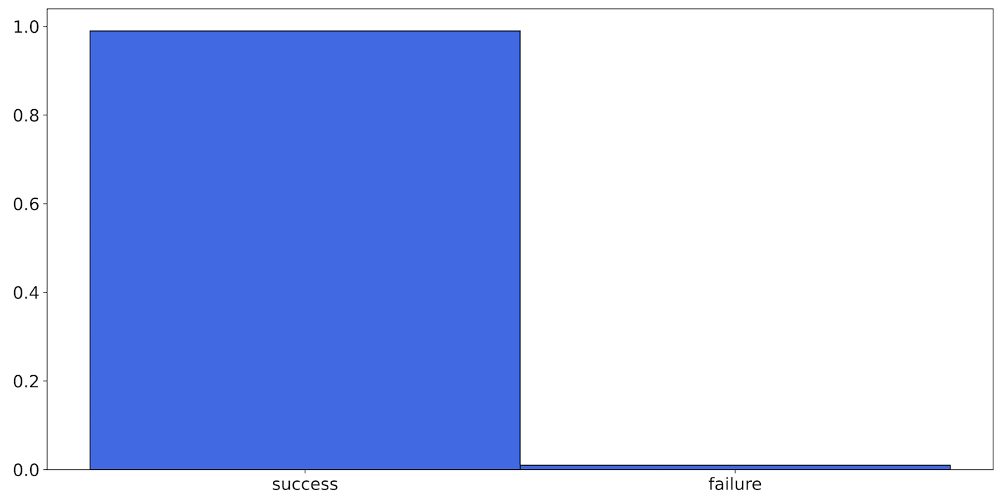
Figure 9-1. A histogram of the Bernoulli distribution with p = .99
This is a histogram. A histogram is a bar graph where each bar represents an element in the sample space and the height of each bar indicates the count of the number of events that resulted in that outcome. Note that for this example the order of the bars doesn’t matter, so it could also look like Figure 9-2.

Figure 9-2. An alternative visualization of Figure 9-1
This is because the elements of this sample space have no intrinsic ordering: success does not come before or after failure. The data values in the sample space are said to be categorical, since events get mapped to categories. Later we will look at sample spaces that have different kinds of data, including continuous values.
Dewclaw in a data center
In our example, when Dewclaw is only in DC1, a single query can only either succeed or fail. The sample space, which we’ll call , therefore contains only and . Because the frontend can only succeed if its query to Dewclaw succeeds, needs to be at least .9999.
Note
In fact, it needs to be strictly greater; between Dewclaw and the frontend sits the network, which can fail, and we might not be the frontend’s only critical runtime dependency. But for the sake of this example let’s pretend that we are and that the network is, hubristically, perfect.
So, the only way for Dewclaw to meet the frontend’s availability needs is to be at least as reliable as the frontend needs to be: .
Dewclaw in two data centers
If we add Dewclaw to DC2, now the frontend has a backup. It can send a query to the DC1 Dewclaw service (or, if the frontend is also running in DC2, to the DC2 Dewclaw), and after a failure it can attempt to query the other data center.
This expands the sample space. A trial, which corresponds to an RPC request, now has five potential outcomes, as shown in Table 9-2: success in DC1, success in DC2, failure in DC1 and success in DC2, failure in DC2 and success in DC1, or failure in both DC1 and DC2.
| DC1 | DC2 |
|---|---|
| Success | N/A (never sent) |
| N/A (never sent) | Success |
| Failure | Success |
| Success | Failure |
| Failure | Failure |
Or, .
In order for the frontend to succeed, we can return any of the entries in this sample space that aren’t the double failure.
Intuitively it might make sense that we have decreased the probability of a total failure: there are now four successful outcomes and still a single failure outcome. However, we don’t know the probabilities of the individual outcomes. The single failure outcome could have a higher probability than all four of the successful outcomes combined.
We don’t need to assign probabilities to every outcome in this space, though. Since we know that we want to avoid the double failure case, we just need to ensure that the probability of that outcome is less than 0.01%. Mathematically, .
The probability of this single event, , is the same as that of two independent trials both getting failures, . Because these trials are independent, the probability of both outcomes being true is the product of each outcome: . Since the probability for each trial is the same, the probability is simply . So requires , which requires .
This is remarkable! If Dewclaw is run in two data centers, each data center need only provide an SLO of 99% to ensure that the frontend can itself provide an SLO of 99.99%: Dewclaw can be less reliable than the services that depend on it by two orders of magnitude.
Independence
A lot of this analysis hinges on the assumption of independence. Trials are independent if the outcome of any one of them has no bearing on the outcome of any of the others.
In general, no trials are truly independent. Customers that receive errors tend to retry, services become overloaded, and bad software rollouts can have effects that violate our assumptions. We know of at least one durability event, in an otherwise extremely robust data storage system, that was caused by lightning.
But we have to start somewhere, and it may as well be here. No model you develop will be correct, and it’s important to keep that in mind. But that doesn’t mean it’s useless, and it can give you insight you wouldn’t otherwise have.
SLI Example: Low QPS
Back at Catz, you’ve been asked to help out with Batch, a new batch processing system that runs data query jobs on behalf of enterprise users.
Catz doesn’t have many enterprise users, so the expected load on Batch is about one request per minute. But it is extremely important that the requests Batch gets are successful: the SLO, set before your arrival, is 99.9%.
The problem is this: the convention at Catz for measuring availability is to take all requests received in the last five minutes, and report the ratio of successful requests to the total. This works well for Dewclaw, with tens of thousands of requests per second, but Batch gets one request a minute. With only five requests in the calculation period, even a single failure will drop your measured availability to 80% and violate your SLO.
This alarms you—you don’t want to cross your SLO by pure chance—but when you bring it up with your team, they assure you it’s fine. Batch, they say, might have a 99.9% availability SLO, but its actual availability is closer to 99.99%. Since it never gets close to the SLO, you can be confident that SLO violations indicate real service issues. Right?
We’ll start answering this by continuing with the coin toss analogy. Let’s take a look at what happens when we flip a coin with some bias less skewed than our claimed availability: say, . If we toss this coin 10 times and plot the result, we might see Figure 9-5.
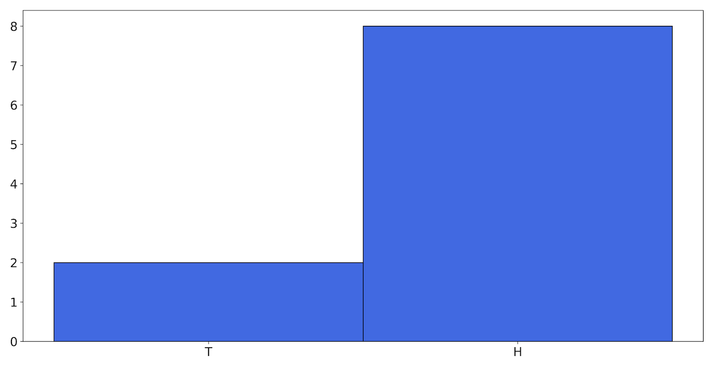
Figure 9-5. A histogram showing one possible outcome of flipping a coin 10 times
But we might perform the experiment and see the results in Figure 9-6 instead.

Figure 9-6. A histogram showing another possible outcome
Since a coin toss is an essentially random event, it is not impossible for us to get, by chance, a rare histogram. A third possibility could be what you see in Figure 9-7.

Figure 9-7. A third possible outcome: the coin came up heads every time
If we toss the coin more, eventually the skewed histograms will become extremely unlikely. As eventually climbs toward infinity, the probability of keeping an even slightly skewed histogram approaches zero. If we could toss our coin forever, the histograms we are likely to end up with would get closer and closer together until there’s only one familiar histogram left, as shown in Figure 9-8 (recall that in this example ).

Figure 9-8. The histogram that results from flipping the coin an infinite number of times with p = 0.6
This histogram has been normalized; the values now add up to 1. Since we’re dealing with an arbitrarily large number of coin flips, it becomes easier to work with histograms in this form. Now the height of each bar is also the probability of each outcome.
But this histogram doesn’t tell us anything we didn’t already know. It has heads at 60% and tails at 40%, but we knew that going in. What we’re more interested in is this: how rare it is to see a histogram of 10 flips with 0 tails?
As you’ve no doubt already put together, answering this kind of question would be valuable to us in determining whether or not the SLO violations from Batch indicate real service issues. So, we want some measure of how likely each possible histogram is. The good news is that we have that in the binomial distribution.
Each time we toss a coin we get a result, heads or tails, from the sample space. Let’s change our perspective slightly. Now, instead of working with a sample space of , let’s flip the coin 10 times and count the number of times we get heads.
We’ll count each group of 10 flips as a single trial—a binomial trial—that yields a result from the sample space . If we perform this experiment 10 times (flipping the coin 100 times), we might get a histogram like Figure 9-9.
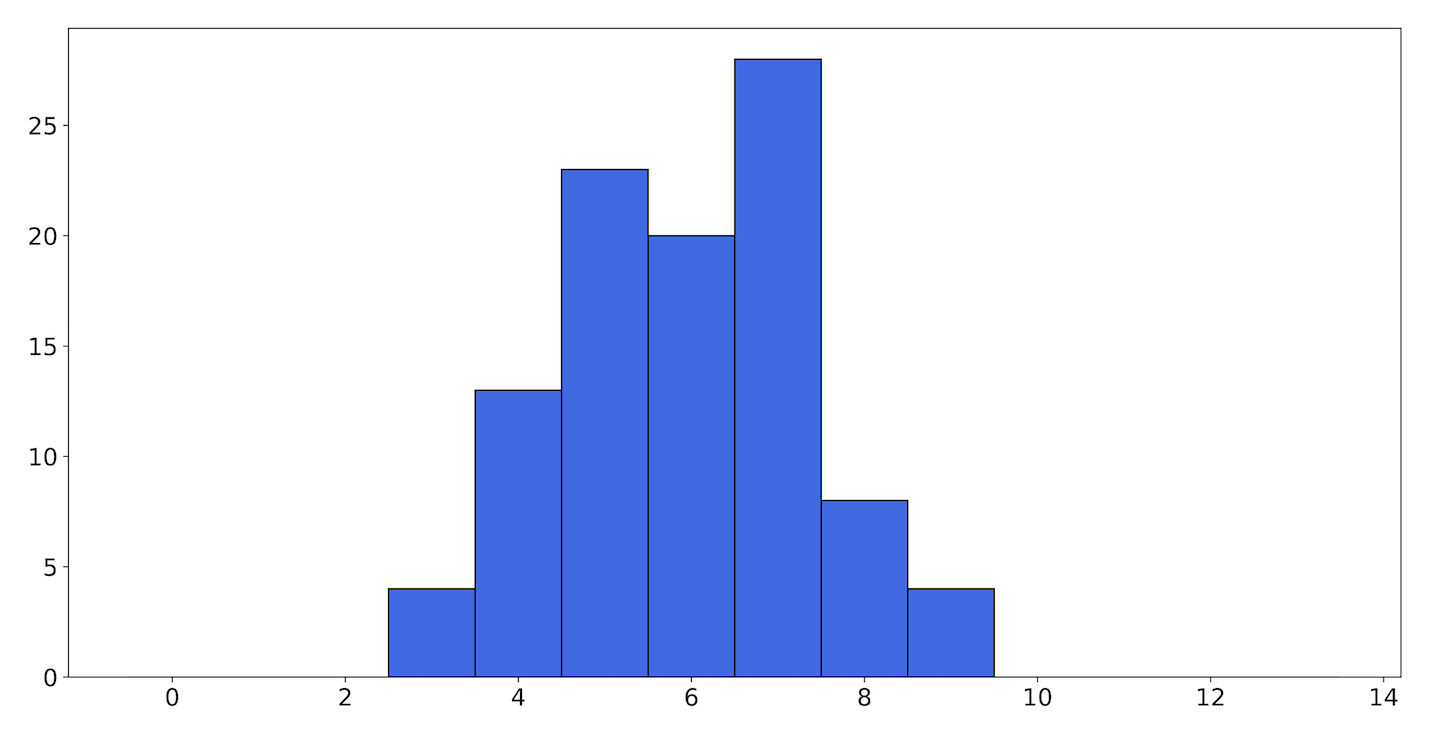
Figure 9-9. A histogram showing the outcome of counting the number of heads in 10 coin flips
Here, the height of bar 4 corresponds to the number of times we got 4 heads in 10 flips. (As a reminder, right now the coin we’re flipping has a bias of 0.6.) In this trial we mostly got heads 5–7 times, and rarely more than 9 or fewer than 3.
We generated the histograms we were looking at before by flipping a coin 10 times, and the heights of the bars reflected the relative probability of getting heads or tails in a single flip. We then took those 10-flip trials and performed those successively many times. The histogram produced from that exercise now gives us the relative probability of getting any one of the original histograms.
If we keep going, eventually that histogram will converge to Figure 9-10.
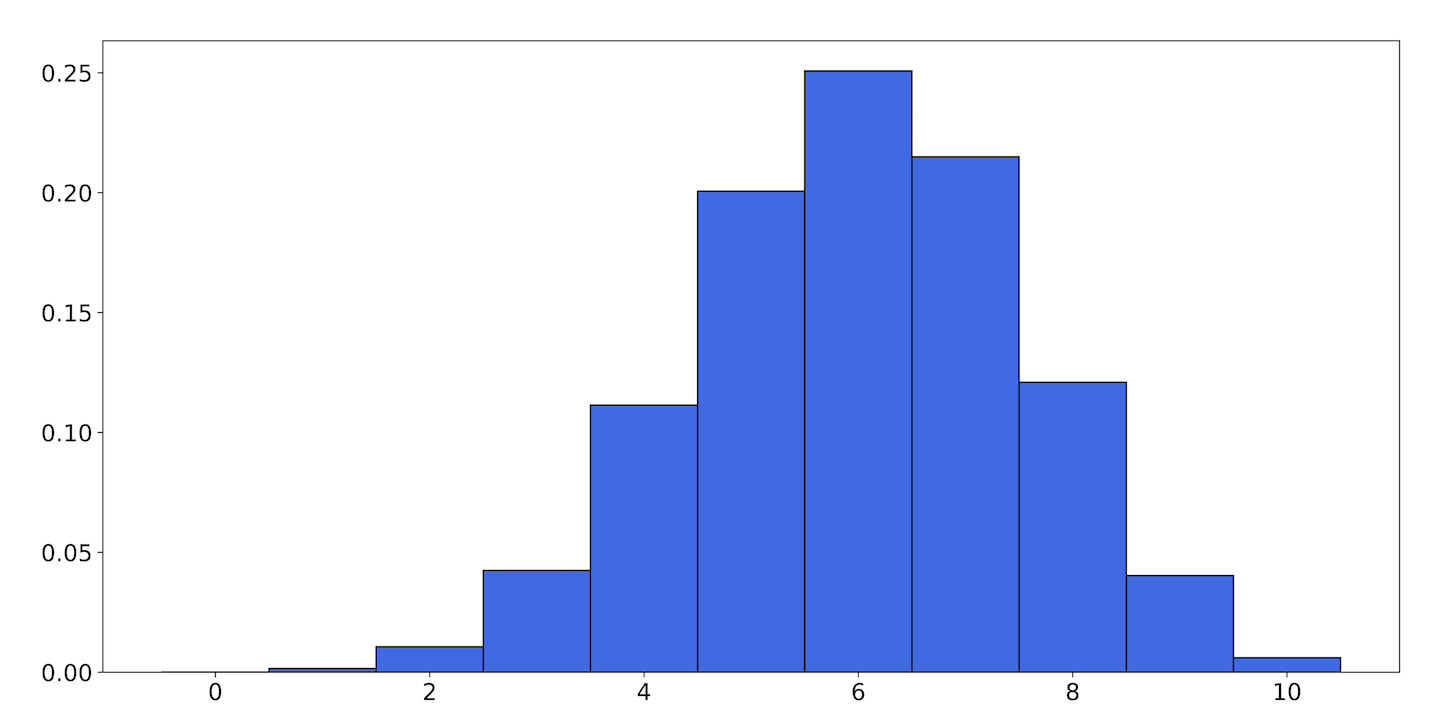
Figure 9-10. The binomial distribution with p = 0.6, n = 10
As expected with a coin that has a bias of 0.6, most of the time—but not all of the time!—flipping the coin 10 times, you’d get heads 6 of those times.
The histograms that the Bernoulli trials and the binomial trials ultimately converge to, when normalized to 1, are probability distributions.
In the same way that the Bernoulli distribution didn’t tell us anything more than we knew going in, the binomial distribution doesn’t give us any more information than the coin’s bias and the number of times we flipped it.
The binomial distribution is completely parametrized by , the parameter to the Bernoulli trial, and , the number of Bernoulli trials performed. But because the sample space is now much larger, we can learn things from it that we might not have such a great intuition for. For example, we can see that even though , the chance of actually getting exactly 6 heads in 10 flips is only .25. Three-quarters of the time, we’ll see some other value.
Since each bar in the binomial distribution assigns a probability to each element of the 11-element sample space , now we have a way of saying that one histogram is fairly likely, but that another histogram is actually very unlikely.
Remember that coin flips are independent. The side the coin lands on in one flip doesn’t affect the next flip. This is what lets us treat each individual flip as a Bernoulli trial with parameter . When we generalize to other binary events, we need to make sure we are talking about events that are likewise independent; if a failed RPC causes a client to hammer the service with retries, then we probably don’t have independent requests.
Often in modeling such problems you will have to assume that events are independent even when they really aren’t—for example, users who receive an error from a request might immediately issue the request again, receiving another error. But for the most part this is a good assumption to start with.
Now let’s try taking what we’ve learned to answer our original question: how often can you flip a coin of extreme bias before you land on tails?
Most of the named probability distributions you will encounter have mathematical formulae to map values from the sample space to probability distributions. When the sample space is discrete, these formulae—called probability mass functions (PMFs)—return the actual probability of each element of the sample space.
The PMF of the binomial distribution is as follows:
On the left side, is the probability of observing successes within trials, where the probability for each trial is . (Remember, a success case here is getting heads.) Now let’s tackle the right side. This looks complicated, but it can be broken down into three main parts.
The first is ; this is the binomial coefficient, pronounced choose , and represents the number of ways to choose items from a group of total items.
The classic example of this is you’re having a dinner party for yourself and three friends, Adora, Catra, and Scorpia. During dinner, how many different combinations of conversations could happen between exactly two friends?
The answer is six:
Yourself and Adora
Yourself and Catra
Yourself and Scorpia
Adora and Scorpia
Catra and Scorpia
Adora and Catra
That’s easy to do for small numbers. The formula for the binomial coefficient is:
So:
Any time or , the answer will be 1, because there is only one combination for using none or all of the items.
This corresponds to the number of combinations for which successes can exist in trials. Since we want to count all possible outcomes, we need to multiply by this factor.
The second part of the right side of the PMF of the binomial distribution is , which is the probability of successes. Since we assume all the trials are independent, the probability of successes is the probability of a single success multiplied by itself times.
Finally, the third part is , which is the probability that all of the rest of the trials failed, each with probability .
So, the PMF for the binomial distribution breaks down to:
Figure 9-11 is a histogram of the PMF with and .
It’s clear from this histogram that , getting 10 heads, is by far the most likely outcome. There is a tiny blip at , and smaller invisible blips down to zero. (If we do the math, we can see that for —that is, getting zero heads—the probability is .) This gives us a good picture of how unlikely seeing a single tails is at , but it still doesn’t answer our question.
For starters, it doesn’t give us a single number, which is what we’re looking for. But beyond that, it’s not clear how exactly to map our problem, which has two numbers (the probability of a Bernoulli trial, which we know, and the total number of trials we expect to perform before failure, which we want to find out), to the binomial distribution, which has three (, , and ).

Figure 9-11. The binomial distribution with p = .9999, n = 10
What the binomial distribution tells us is, given a bag of independent flips, what the chances are that of them are heads. But we don’t want a bag of where any one of them can be tails. These requests are arriving in order, one after another. We want to know how many have to pass before the first instance of tails.
There’s a distribution that’s very closely related to the binomial distribution, called the geometric distribution, which stops the trial as soon as we get our first failure:
This is the PMF for the number of times we need to flip a coin (or perform any Bernoulli trial) of bias before we succeed. represents a failure, and since out of trials there are of them, it is raised to that power. The th trial being a success, it is multiplied by . Finally, since the successful trial always happens at the end, we don’t need to compensate for all possible orderings, so it is not multiplied by a binomial coefficient.
The sample space of this distribution is all possible values of , from 1 to infinity. Each value of represents a number of times we flip a coin before we land on heads, and this function assigns each of those values a probability.
Let’s apply this to an example. If the chance of getting tails is 0.0001—that is, —what is the probability of getting tails for the first time on the 20th flip?
The equation then is . The probability is a tiny 0.00009981017.
As you can see, we could do this for any number of flips.
Note
Fun fact: For any geometric distribution, irrespective of the value of , will be the greatest, and implies . Even if the chance of getting tails is .0001, you’re more likely to get tails on the first flip than you are on any individual subsequent flip. This is related to the memorylessness of the process; once you’re 100 flips in, if you haven’t hit tails yet, you’re basically starting from 0. This is also related to the gambler’s fallacy.
We now need a way to turn that sample space into a single, representative number. Whoever in the back just shouted out, “Average them!” we like the way you think. Let’s explore that.
Expected value
A fundamental aspect of a probability distribution is its expected value. This is also called the average, mean, or expectation, and it denotes an important central tendency of the distribution: if a process follows a random distribution, then it is the value that, absent any other information, is the best guess as to what the output of that process will be.
The expected value is denoted and is given by the following equation (for discrete values in a sample space ; we’ll look at a continuous example later):
This is the sum of the values weighted by each value’s probability. For example, in the roll of a six-sided die, the probability of getting each face is 1 in 6, so the expected value is just the average of all the faces on the die. That is, for a six-sided die, the expected value is (1 + 2 + 3 + 4 + 5 + 6)/6 = 3.5, although no face actually has that value.
If you average the output of a random process over many successive trials, the values you get will approach the expected value of the distribution that describes your process. This is called the law of large numbers. So when we say that we receive a request on average once a minute, the best way to interpret that is that we have collected data for long enough that the ratio of requests to total minutes is very close to 1.
Note
It is possible to construct a process such that the sum in the preceding equation (or its continuous analogue, the integral, for continuous probability functions) does not converge to a finite value. These processes have no expected value. The Cauchy distribution is an example of a probability distribution with this property. If your process is described by a Cauchy distribution, you can expect to have extremely large outliers.
By the definition in our equation, the expected value of the geometric distribution is:
If you’ve studied calculus, you may recognize as the derivative, with respect to , of . Because is a probability we know that , and for any number the following equation holds:
Therefore, the sum of the derivatives equals the derivative of the sum (with ):
The full expression for the expected value is then:
With , the expected value for the number of requests before we are paged is 10,000—which maybe strikes you as obvious. If each request has a one ten-thousandth chance of failure, then it should take around 10,000 requests for us to see a failure.
Unfortunately, despite its name, the expected value of a distribution is not always a good description of the values that would come out of sampling from it. Or rather, it can sometimes fail to answer the question we’re actually posing.
If we flip a coin of bias , the expected value of 10,000 is calculated by multiplying each possible value of by the probability of that value, . But the geometric distribution gives a value to every positive integer . It’s not probable, but it’s possible to flip our coin a hundred thousand or a million times before we get tails, and this possibility is factored into the expected value of the distribution.
The values in a distribution that are extreme outliers make up what’s known as the tail of the distribution. Some distributions (such as the Gaussian distribution, also called the normal distribution) have light tails; the probabilities of seeing values far from the center of the distribution are so remote that they may as well be zero.
Other distributions (for example, the log-normal distribution) have heavy tails. In these distributions, extreme values are still rare, but they happen often enough that they shouldn’t be surprising. And some distributions, such as the Cauchy distribution, have such heavy tails that the expected value does not exist.
We’re not saying that there are some distributions where the expected value is meaningful, and others where it is meaningless. The expected value, when it exists, is always meaningful—but it doesn’t always mean what you might hope it does.
In the current case, a better estimator of what we want to know might be the median.
Median
The median, sometimes denoted , is another central tendency of a distribution. It is defined as the value that separates one half of the distribution from the other. Let’s consider if it would be a better answer to our question than the expected value.
Say we had a factory that produced bags of cookies, where each bag contains 10 cookies. However, a mechanical fault sometimes stops the bag line without stopping the cookie line, and as a result one out of every hundred bags ends up with a thousand cookies in it.
If you opened a random bag of cookies, how many would you anticipate seeing? Intuitively you’d probably see 10 cookies. Yes, some bags have a lot of cookies, but those are very rare. Most bags still have just 10 cookies.
The expected value of the number of cookies in a bag is:
Since the only nonzero probabilities are and :
So, the expected number of cookies in a bag is nearly 20! In this case, we would say that the expected value is not a good representation of the number of cookies in a random bag. This is because the expected value takes extreme outliers into account; the very rarity of those outliers is what makes the median (10 cookies) more attractive to us.
Jumping back to our coin example: the median of the geometric distribution is a more realistic value for how long it takes to get tails.
The equation for calculating the median of the geometric distribution is:
where is the probability. Half of the time, the coin will hit tails before even 7,000 flips, well short of the expected value of 10,000.
We break our SLO a lot, actually
For Batch, every query is a Bernoulli trial, and “99.99% availability” is conceptually the same as a coin with bias .
The preceding analysis therefore shows that a service that is 99.99% available can expect to see a failure after about 7,000 queries. Since this service will violate its SLO whenever the failure/total ratio is above 1/1,000, and you only have around 5 data points to go on (there being, on average, 5 requests in a 5-minute interval), a single failure will push availability below the SLO. Seven thousand minutes is roughly 114 hours. Even with a real availability of 99.99%, Batch can expect to see a false positive roughly once every five days.
What can you do?
It’s possible that a service with fewer than 1,500 calls in a day is not important enough to carry three nines. You could grab the SLO dial and twist it to the left. This is nice if you can get away with it, but if you could, you probably already would have. Batch’s SLO is 99.9%, and (kind of unfairly, you think) you can’t do anything about that here.
You could expand the window over which you calculate events. A 5-minute window only gets you 5 data points; a 2,000-minute window will give you space to have an occasional failure without going below the red line. But is this a good idea? That window is almost a day and a half long. If Batch collapses, how long will it take you to notice?
Note
You could write some probers. A prober is a piece of software that continually calls your service with known input and verifies the output. Probers provide much more benefit than simply increasing the number of calls, but you can use them to dial up the traffic as much as you care to. A problem with probers is that prober traffic is not always representative of customer traffic, and you risk drowning customer signals in prober noise. If your live traffic is failing because your customers are setting an RPC option that your probers don’t, you risk never seeing it. You can get around this by switching to per-customer SLOs, but then you’re back in the box you started in.
What you really want to do is somehow quantify the confidence you have in your measurement. If you have four successful requests and one failed request, you can’t immediately know if that’s because your service just took a hard stumble or if it’s because the request (and the on-call engineer) are just unlucky.
For this, we need a new technique.
On Statistics
We can use the techniques covered earlier to find out what means for our service. But how do we find ? We’re rarely given these parameters, and when we are (for example, when a hardware vendor tells us the mean time to failure of some part) we often don’t believe them.
If your SLOs are couched in terms of probability—which they usually are either directly, in terms of an availability ratio or some latency percentile, or indirectly, if for example your SLOs depend on traffic being well behaved, which you have defined in terms of some distribution or other—then statistical inference is a natural extension to measure the SLIs in the same language. Both sides fit together into the same model of (an aspect of) your service. But remember that it’s only a model.
Maximum Likelihood Estimation
We want to measure .
Well, really, we can’t measure . is not an observable quantity. We can measure the effects of , because sometimes requests will succeed, and sometimes they will fail, but we can only infer from these what might or might not be.
One method of inference is called maximum likelihood estimation (MLE). Say in a given period we receive four successes and a failure. Then the data (or evidence) is . In the section on probability—specifically on coin flips—we talked about the probability of getting some evidence given a specific value of .
The way we write this in mathematical notation is , which is read as “the probability of given .” If we know , we can calculate this as we did before with the binomial distribution. Say, if :
So, the probability of getting this evidence of four successes and one failure, given , is about 33%. If we run the same calculation with , we get about 41%. That is, the data we got is more likely if than if .
The goal of maximum likelihood estimation is to find the values of the parameters that maximize the likelihood of the data. To distinguish these, sometimes we give them little hats: .
First, we want a function that expresses the likelihood of the data. We have that already—it’s just the binomial density function:
If you took calculus, you may recall the method for maximizing functions: take the derivative and set it equal to zero.
Here is the derivative:
And setting the derivative of to zero, we can solve for :
Okay, this seems maybe a bit obvious. The value of that maximizes the data we saw is, well, the number of successes divided by the number of requests; exactly what we were already doing. But what’s valuable here is understanding how likely it is that that probability is the true probability. If our dataset is larger, this becomes clearer.
If, for example, we had a dataset with 500 data queries, then would be a better estimator of the true value of . Figure 9-12 is a graph of for a service that gets 4 successes out of 5 (solid line), and 400 out of 500 (dashed line). Both graphs reach their maximum at , but the likelihood of seeing the data falls off much more sharply away from that value when we have more data in total.
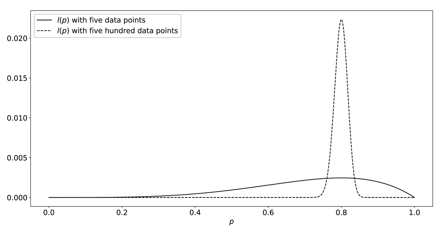
Figure 9-12. The likelihood functions l(p)—while the maximum value of each function occurs at p = 0.8, the function drops off much more sharply when it has more data
MLE doesn’t necessarily involve actually doing the calculus by hand. Often we don’t know the expression for the probability function, or it’s too complicated, or we have more than one variable to optimize. In these cases we can turn to other optimization methods, such as gradient descent, but in all cases the goal is the same: to find the values of the parameters that maximize the likelihood function, given some data.
Maximum a Posteriori
It might make intuitive sense to you why the likelihood function with 500 data points is more certain about the value of than the one with 5 data points. There’s a pretty good chance that you’d get 4 successes and 1 failure at or , but almost no chance you’d get 400 out of 500. It’s possible, but extremely unlikely. The more data points we have, the more closely the realistic values will be concentrated around the MLE.
What can we do? Well, we could use more data points. Two (real-world) solutions to this problem that we’ve seen are to increase the window size over which samples are collected, and to simply include artificial success data points.
At first both of these approaches might sound a little bizarre. The first one allows for past performance to play a role; however, it will also heavily weight the analysis over that previous period of, say, several hours or even days. The second one just uses made-up data. How can that possibly be sound?
When we specified the likelihood function , we specified it as the probability of the evidence given :
We then found the value that maximized this probability.
An alternative method is to consider the probability of given the evidence. This is called the maximum a posteriori (MAP) estimator. (A posteriori is a statistical—and philosophical—term that basically means knowledge augmented with evidence. It’s contrasted with a priori, which means knowledge untainted by evidence. This is also why two of the terms in Bayes’ theorem, which we explore in the next section, are called the prior and the posterior.)
Here we—in what is going to sound like a ridiculous tautology, but stick with us—maximize the probability of given the evidence:
What in the world, you sensibly ask, does this buy us? What is even different? To answer that we’ll take a quick (we promise) detour through Bayes’ theorem.
Bayes’ theorem
When we talk about the probabilities of two events, and , we often want to talk about the probability that both events happen. This is denoted . Let’s use an example here where is the event of eating dumplings, and is the event of ordering Chinese food. Now, what is the probability that you are eating dumplings and that you ordered Chinese food? Note that because both and have to be true, the order doesn’t matter: .
Now consider the probability of by itself, . This represents an upper bound on , since and cannot both be true more often than is true. So, . It’s the same story with . Therefore, the probability of you eating dumplings and ordering Chinese food cannot be higher than the probability of you ordering Chinese food.
Additionally, it’s possible that is true when is not. You could be eating dumplings, but not ordering Chinese food: if you’re eating khinkali, for instance, which are Georgian dumplings. So, we’ll want to restrict our consideration of to when is already true, and then we have the two conditions that must both be true: and .
This gives us the factorization law . This is true irrespective of whether and are independent or how they are distributed.
But since :
What we can see here is that the probability of you eating dumplings given that you ordered Chinese food is equal to the probability that you’re eating dumplings and you ordered Chinese food over the probability that you ordered Chinese food.
Besides making us hungry, the last equation, Bayes’ theorem, will help us use MAP. There’s a lot going on, but for the purposes of this section it tells us how to take a probability conditioned on one variable, , and cast it in terms of the other variable conditioned on the first, .
This is what we did previously:
In this equation, we are already familiar with , the likelihood. is called the prior probability (or just the prior), which represents the probability we assign to . is the evidence. is the posterior, the probability of our hypothesis given the evidence.
Instead of maximizing the likelihood, , we now consider maximizing . (What about ? We’re going to ignore it. Why? One, it is famously difficult to calculate, and two, it doesn’t depend on at all, so we maximize the whole thing only by maximizing the numerator.)
In order to do this we need . Now we are treating , the parameter of the binomial distribution, as a random number drawn from its own distribution. This means we don’t have a single number to calculate with, but an entire sample space of possible values we need to calculate over.
If, however, we have good reason to think some values of are more likely than others before we get any evidence, then this allows us to incorporate those prior beliefs into our calculations. If we do that, and do our calculations and maximize , we will have calculated the MAP estimator.
The relationship between MLE and MAP
If we have no idea what probability we could possibly assign to , a natural prior distribution to assign would give every element of the sample space (here the sample space is all the real numbers between 0 and 1) the same probability, akin to the sides of a (many-faceted) fair die. This makes a kind of sense, in that as we have no information that would allow us to give more weight to any specific values, we end up giving them all the same weight.
If we do this and calculate the maximum a posteriori value, we will find that it is equal to maximum likelihood estimate. It turns out that MLE is a special case of MAP where the prior distribution is uniform. Such a prior distribution is called an uninformative prior. MAP allows us to bias our inference in a rigorous way.
Using MAP
We can use MAP to calculate an estimator for that includes knowledge we might already have, such as “the last 600 requests were fine” and “it’s actually pretty unlikely that the whole system is down.” We’ve already discussed two ways to do this: extending the window and including artificial successes.
Adding artificial successes sounds ridiculous, but it’s actually the more straightforward option. MAP is subjective, and it corresponds to a prior that gives high credence to success. Extending the calculation window to, say, 2,000 minutes corresponds to a prior that consists of the previous 1,995 minutes. This is actually less reliable than a completely artificial prior, since after recovering from an outage you have a high degree of belief that your service is up again (after, say, 20 successful queries), but the period that your service spent down will be part of the prior.
In the case of Batch, the team is pretty sure that the service is at least 99.9% reliable. One of the ways to encode this (there are many) is to pretend the previous data points were 999 successes and a single failure. This gives us a prior for that looks like Figure 9-13.
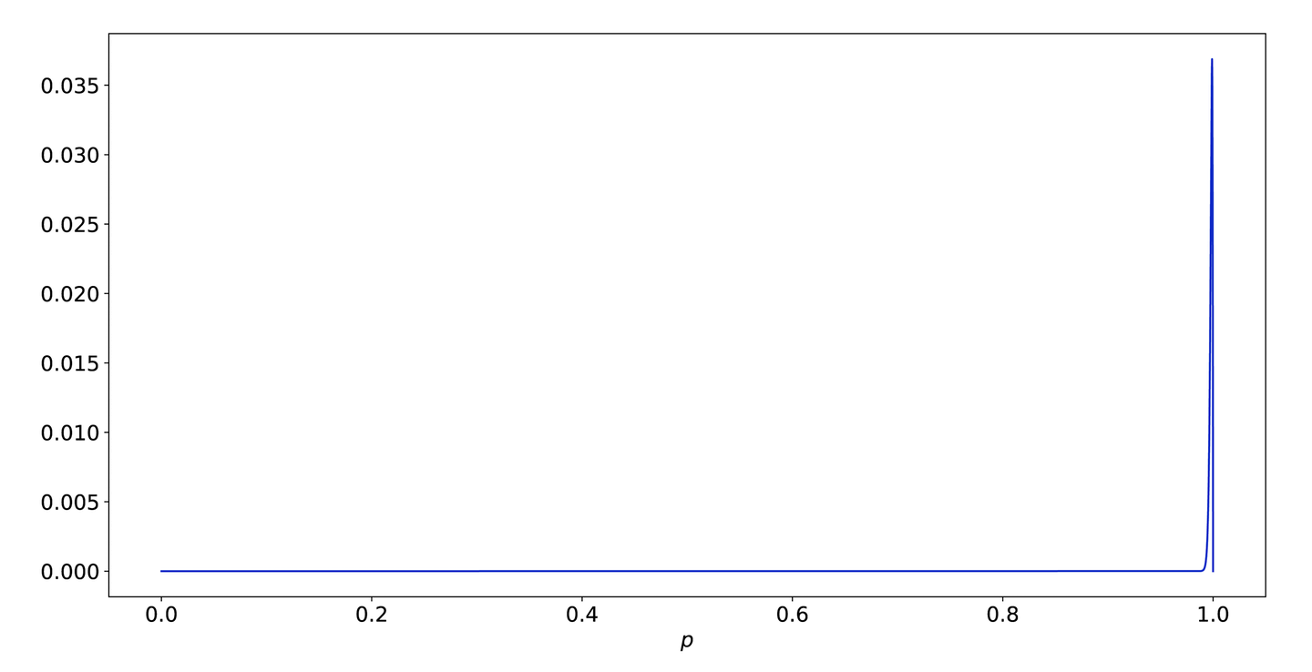
Figure 9-13. The likelihood function for 999 successes and 1 failure
This prior essentially only gives credence to a few values around .999. Figure 9-14 shows what it looks like if we zoom in on that space.
Most of the credible values for are between .994 and very close to 1. This means that it will take a significant amount of evidence to move our estimate of away from that region.
Using this prior, what is our MAP estimate for Batch’s single failure? 0.998.
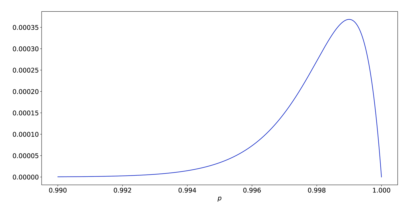
Figure 9-14. A closer look at the far right side of Figure 9-13
Because of our strong prior belief, a single failure only nudges us a little bit. In fact, our belief is so strong that even if we failed all five requests in a given window, our estimate would only go down to 99.4%! We definitely don’t want that; the system could be completely down and we would never page. Our prior gives too little weight to values below the SLO, as shown in Figure 9-15.
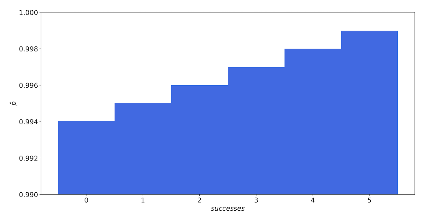
Figure 9-15. The MAP estimates of our service—even with five failures and no successes, our strong prior gives us an estimate of 99.4% availability.
The first thing we should investigate is how sure we are of this 99.9% figure. That’s actually a very confident number. It might be that really we’re not justified in assuming that.
But maybe we are. You have a teammate who’s been there since before the company was even founded, and she’s principal. Everyone looks up to her, and she’s got books on her desk with symbols you’ve never even seen, like , and she swears up and down that, when the system is in a steady state, it’s 99.9% reliable.
So.
When the system is in a steady state. We’ve baked an assumption into our prior, and we didn’t notice we were doing it. Our prior assumes that the system is always in the steady state, and gives no weight to the system’s being down. In fact, it gives zero weight to the possibility that the system is down (i.e., that ).
We can add this assumption into our model by creating two priors, and : the probability of given the system is up, and given the system is down. Then , where and are the relative weights of how often we believe the system is up and down.
We don’t have any data on that, and your teammate is doing the seven summits again so she’s no help, so we’ll give them equal weights, which is the same as saying “we don’t know.” As you can see in Figure 9-16, now flips between the up and down models after three failures in a five-minute window.

Figure 9-16. The MAP estimates of our service with the new prior—once there are fewer than three successes, the model places more likelihood on our availability being very close to zero
As we will explore in a later section, we may have more or fewer than five requests in a five-minute window. We can visualize the most likely request counts in a heatmap, as shown in Figure 9-17.

Figure 9-17. A heatmap showing the MAP estimates of our service over a range of success counts: the cells with light backgrounds are where the model estimates the service to be “up” and the cells with dark backgrounds are where it is “down”
Here, the total number of requests we see in a five-minute span is on the vertical axis, and the number of successes we see is on the horizontal access. The number in each box is the MAP estimator for . The dark squares denote where the model has decided that the service is hard down; the light squares indicate that the model still thinks the service is up.
“Now wait a minute,” you object, correctly. “This only pages when as many as half the sample requests fail?!” Well, yes. Again, this is an artifact of our frankly ridiculously confident prior. Choosing a good prior can be difficult. If you build a complicated model, you could end up in a situation where the result (the posterior) changes wildly depending on your choice of prior.
If we were implementing this in production, we would probably relax a little bit on that prior, and also extend the alerting window out to maybe 30 minutes. Figure 9-18 shows, under these conditions, the percentage of requests that must succeed, as a function of the total number of requests, in order for .
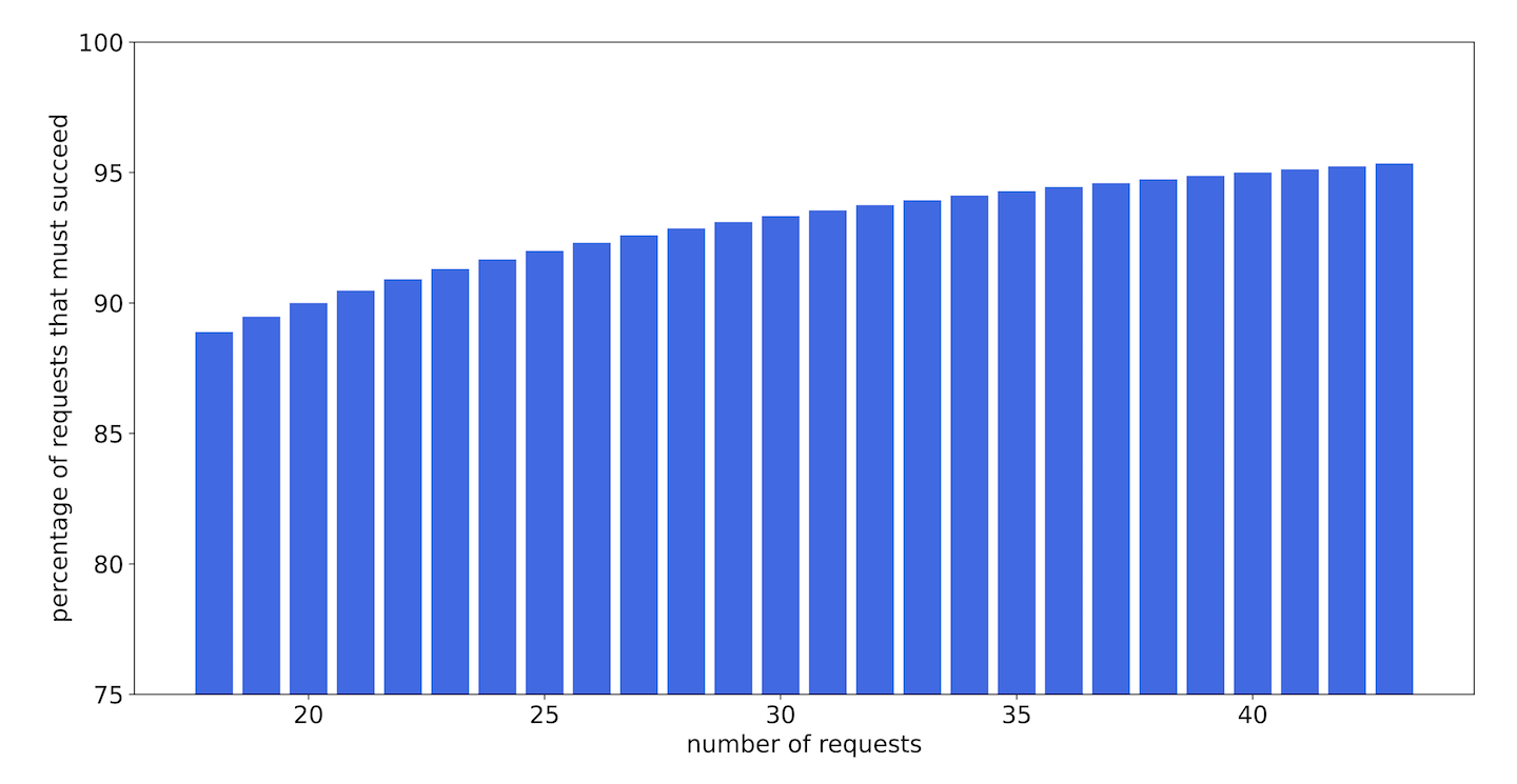
Figure 9-18. The percentage of requests that must succeed in order for the model to estimate that the service is up, as a function of the total number of requests
In fact, what this all boils down to is that we allow up to two missed requests in any 30-minute period, irrespective of the total request count. This gives us more leeway for error when the request count (and thus total information available) is low, but becomes more strict as the request count climbs.
This is a simple solution, and easy to implement, but it’s grounded in analysis. Is it a good solution? That depends on how Batch actually behaves. You are probably wondering what the odds are that you’ll end up regularly seeing failures but never tripping any alarms. The odds of seeing 3 failures in a 30-minute period when our reliability is above the SLO are quite small.
There are two important points here. The first is that we can make use of our expertise and our experience with a given system when interpreting measured quantities in a rigorous and mathematical way via a prior distribution. The second is that it can be fiendishly difficult to pick a good prior. If this were a real service, we would recommend hardcoding the alert threshold at two (or living with it at one) until you’re able to collect more data about how the service acts in production.
Bayesian Inference
While MAP allows us to use a prior distribution to incorporate information we already know (or we think we know) into our inferences, MAP and MLE are still what we call point estimators. When we maximize (in the case of MAP) or (in the case of MLE), we’re left with a single number, . This is the most likely value of given the data we have. What we don’t know is how certain we are about that value. The maximum likelihood estimate of for 1 failure out of 10 is the same as for 100 failures out of 1,000.
If, instead of finding the value of that maximizes the expression as we do in MAP, we look at the entire distribution , then we’ll have a complete picture of .
For example, consider a 30-minute window during which we see exactly 30 requests. If we see no failures, what might we say about ? The maximum likelihood estimate would give us . MAP might give us something else, but right now we’ll use the uninformative prior . Remember that this is a probability density; the probability density for all real numbers between 0 and 1. This assigns equal weight to all values.
But leaves out a lot of information. How much more likely is this value than any other value? Remember, with MAP we went from treating as a parameter to a function to a random value in its own right. It has a distribution. What is that distribution?
We can calculate it analytically with Bayes’ theorem:
This is the same method we used for MAP, except now we need to know the denominator. In general, with Bayesian inference, this is the tricky bit. It is not necessary if you only want to establish relative likelihood between different values of , but it is necessary if you want to calculate actual probabilities. The general form of is:
But this integral is often not directly computable. There are many techniques for numerical approximations, but we won’t go over them here. For this example we are in the lucky position that we can compute this integral. Since we’re using the binomial distribution to model :
Then, since :
If we think about this for a minute, it makes sense. There were 31 different numbers we could have gotten for success (0 through 30 inclusive), and we got one of them. Since we explicitly chose a prior to make them all equally likely, it makes sense that the probability of seeing what we saw is 1 in 31:
So for values of between 0 and 1. This is illustrated in Figure 9-19.
This is the posterior distribution. Like with the MLE, the value of that maximizes this function is 1, but now we can see how sharply that likelihood falls as moves away from 1. We can see visually that while is still reasonable, is probably not. Can we put quantitative bounds on this?

Figure 9-19. The posterior probability distribution for a service that saw no errors in 30 requests
The highest density interval
One thing we can do with this is calculate the highest density interval (HDI), the region of the state space that is the most likely. That is, as this is a graph of the probability density for , we can highlight those values that is most likely to be.
For example, the 95% HDI of the previous distribution is shown in Figure 9-20.

Figure 9-20. The 95% high density interval of our posterior distribution
The HDI is often also called the credible interval. This is named similarly to, and looks a lot like, the more famous confidence interval. There are actually some stark philosophical differences between the two, but we won’t get into those; for now, if you think of this as “there’s a 95% chance comes from this region” you’ll be okay.
HDIs can be a good way to quantify certain characteristics of a distribution. Specifically, the size of the interval denotes uncertainty in the inferred parameter.
Figure 9-20 is for 30 requests. If we had only 10, it would look like Figure 9-21. While the MLE and MAP estimates of these events are identical——the HDI reveals that our model is much more certain about as we feed it more data. With only 10 requests there is a wider range of credible values for . With 30 requests, that range is much smaller.

Figure 9-21. A 95% HDI for a posterior distribution with only 10 data points—the size of the interval (the number values along the x-axis that are within the interval) is much larger, reflecting the fact that we are less certain about the inferred value
Revisiting the Batch service, we can now calculate the posterior distributions for each of the likely numbers of requests, given one or two failed RPCs, as shown in Figure 9-22. We’ll do this using a completely flat prior.
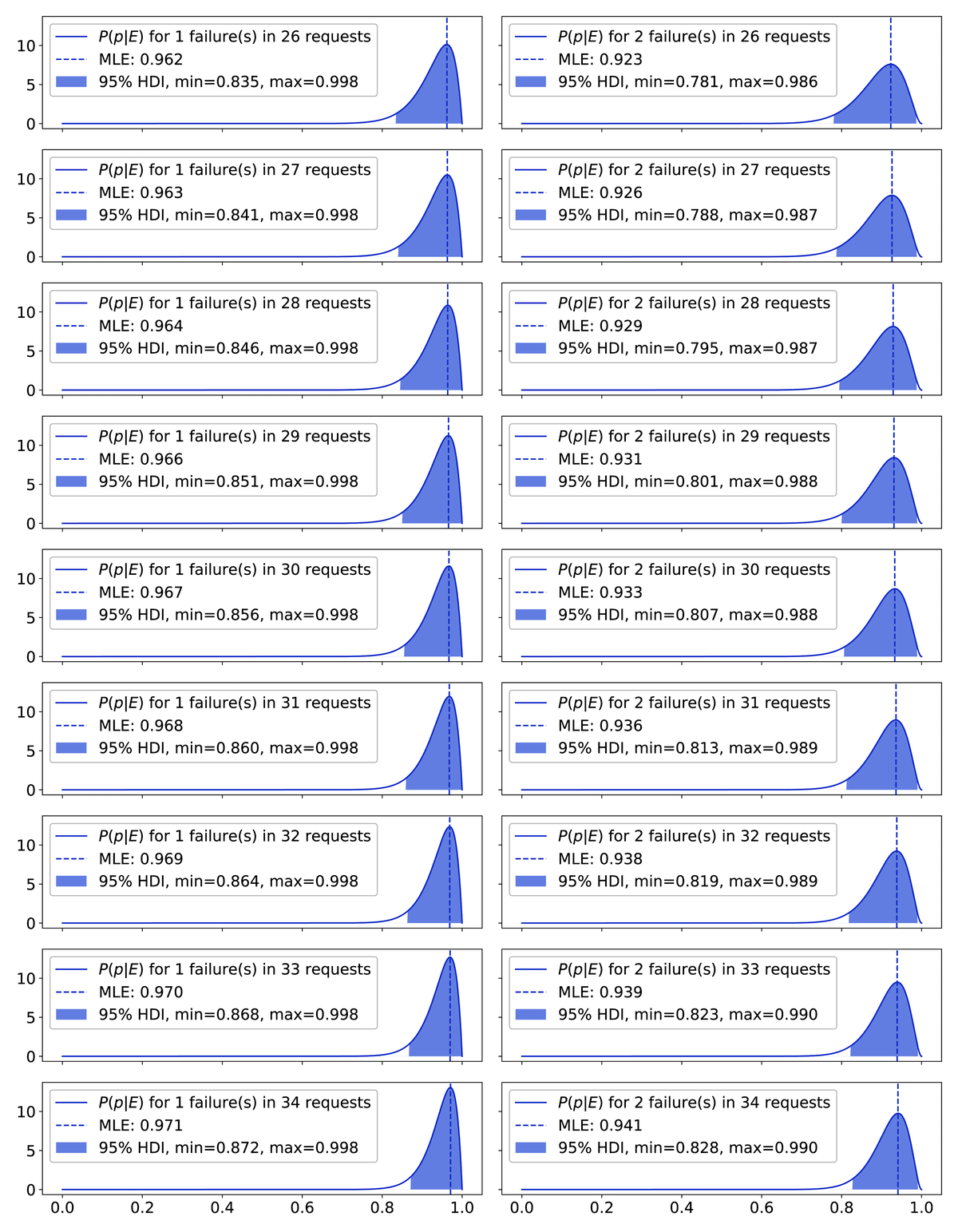
Figure 9-22. 95% HDIs for different numbers of total requests and either one (left) or two (right) failures: the HDIs get smaller as the total number of requests gets larger
This shows us that, even with a completely flat prior, the 95% HDI for a single failure still includes values of as high as . But the HDI for two failures will only include our SLO if we have 33 or more samples; that’s the 75th percentile of our sample count distribution.
SLI Example: Queueing Latency
When we introduced Batch, we said that it received a request on average about once a minute; then we went on to pretend we were getting a request once a minute every minute. But why should request patterns look like this? If anyone can send a request, how could requests possibly come at such regular intervals without some massive, coordinated effort by all parties involved to send requests at just the right time?
The answer, of course, is that they can’t: we papered over the complexities of the query arrival times. Since we were looking at time scales of hours and days, this felt pretty reasonable. But let’s take a closer look at what it means for something to happen ”on average” a given number of times in a given span of time.
Modeling events with the Poisson distribution
When it comes to the arrival times of requests, we can’t model those as Bernoulli trials. The number of requests that can arrive in any given moment is not limited to a binary outcome. The state space, which is the set of all possible configurations, is , and we need a new kind of distribution to handle it. The distribution we will use is the Poisson distribution.
For a service on the internet, we can’t in general assume that requests are independent. For example, if an RPC client is configured to retry a request on failure (whether or not there’s exponential backoff), then every failure will trigger a subsequent request. Or there might be an RPC argument that, when set, alerts other clients, which then causes activity from those clients.
Often, however, if we filter our data a bit and then step back and maybe squint a little, we can treat requests as if they are independent. No model will ever capture all the complexities of a system or offer perfect predictive power. But we only need the model to be good enough—while, of course, acknowledging that there is always a risk of model error. So, we often assume that requests are independent, and sometimes we get away with it.
If we have requests that arrive independently of one another, and we know the average timing even if we don’t know exactly when they happen, and requests can’t happen at once, then we have what’s called a Poisson process. The number of requests that arrive in a given span of time follows a Poisson distribution.
The Poisson distribution for requests that arrive on average once a minute looks like Figure 9-23.

Figure 9-23. The Poisson distribution with
Let’s break down how we got this graph. The PMF for a Poisson distribution is:
where is the number of events in an interval of time , and the average number of events is . The specific probabilities are listed in Table 9-3.
| k | Probability |
|---|---|
| 0 | 0.3678794412 |
| 1 | 0.3678794412 |
| 2 | 0.1839397206 |
| 3 | 0.0613132402 |
| 4 | 0.01532831005 |
| 5 | 0.00306566201 |
| 6 | 5.109436683E-4 |
| 7 | 7.299195261E-6 |
| 8 | 9.123994075E-6 |
| 9 | 1.01377712E-6 |
| 10 | 1.01377712E-7 |
The Poisson distribution is described by a single parameter, (pronounced “mu”), which is equal to the average number of requests (or other events) we expect to see in a minute (or other span of time). When we say requests arrive on average once a minute, we mean they arrive according to a Poisson distribution with .
In the PMF shown in Figure 9-23 we have a third parameter, . When we’re talking about a single unit of time (say, per minute) we can set minute. But if we want to convert between different durations (say, if we want to compute the PMF on five-minute intervals), then takes on different values.
Notice in Table 9-3 that a minute with zero arrivals is just as likely as a minute with a single arrival, but that there is a significant chance of seeing more than one arrival as well. This is why we stress that the arrivals are only on average one per minute.
Note
Sometimes the Poisson distribution is described by the average number of time intervals between events, instead of the average number of events per time interval. This is unfortunate and confusing and weird, but you get used to it. If you have a rate parameter in events per unit interval, and you want to express it in (lambda) unit intervals between events, then you can use the formula:
The Poisson distribution is a good way to model any sort of count-based data that shares the characteristics of the requests we have been talking about. That is, if events have the following properties, the time-bucketed event counts will be Poisson-distributed:
They occur zero, one, or more times per unit interval (the sample space is the nonnegative integers).
They are independent, so that one event doesn’t affect other events.
They arrive at some average rate that we call .
They arrive randomly.
The Poisson distribution can be used to model a large number of varied phenomena beyond RPC arrival times, including hardware failure, arrival times in a ticket queue, and SLO violations. Knowing this allows us to build systems that can anticipate these events, as well as to define SLOs around abnormal levels of events.
Variance, percentiles, and the cumulative distribution function
So, the number of requests Batch receives per hour is probably Poisson distributed. If you receive, on average, one request per hour, then often you will receive no requests within an hour, as we’ve seen, but sometimes you’ll get two or three requests.
Batch queries are expensive, and you’re trying to run lean, so you don’t have a lot of room for sudden bursts of traffic. Thus, a question you might want to answer is: what’s the highest number of requests we’re likely to receive in an hour? This has to do not so much with the average value, which is , as it does with the tendency of the data to deviate from that value. The tendency of a random variable to vary is called the variance, and it is defined as:
Note
This formula is true generally, not just of the Poisson distribution. Here, denotes any distribution mean. For distributions where the mean doesn’t exist, neither does the variance.
That is, the variance is the expected value of the square of the difference between the random variable and the mean. Unusually among distributions, the variance of the Poisson distribution is simply also . The larger the average number of events in a given time period grows, the greater the variation in that number also grows.
The variance is very closely related to another measure you may have heard of: the standard deviation, usually denoted (sigma). In fact, the standard deviation, which refers to the spread of a distribution from the mean, is simply the square root of the variance: . So for the Poisson distribution, and . This is what is meant when someone talks about six sigmas; they are referring to outliers that are six standard deviations away from the mean.
You might be most familiar with the idea of the standard deviation of a normal distribution, but it is a well-defined concept for any distribution that has a finite variance. It is simply the tendency of data to deviate from that distribution’s expected value.
So, if you don’t need to be too strict, you can pick a number of sigmas—three is nice—and rule out anything more than that. If you receive an average of requests an hour, each hour you’ll see between and , and only extremely rarely will you see anything outside that range.
But this might still leave you with some questions. Why did we pick three? What do we mean by extremely rarely?
We can be more exact in our estimations by considering the cumulative distribution function (CDF), which is defined as follows: for any probability distribution function , which gives the probability that some random variable is equal to the value , the CDF is the probability that some random variable is equal to or less than the value . Formally:
and:
Additionally, is (in the discrete case) given by:
This is probably not intuitive or obviously useful the first time you see it, so it may be helpful to look at some graphs. If the PMF of the Poisson distribution for looks like Figure 9-24, then the CDF of that distribution looks like Figure 9-25.
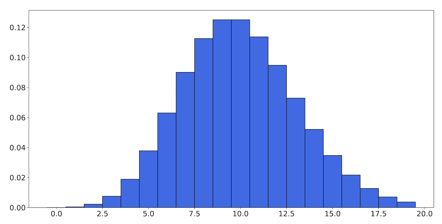
Figure 9-24. The PMF of the Poisson distribution with
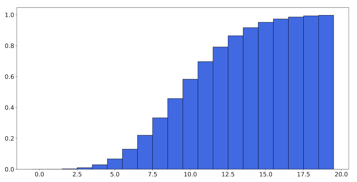
Figure 9-25. The CDF of the Poisson distribution with
The height of each bar in the CDF for is the sum of the heights for every bar in the PMF up to . Notice that the CDF never decreases with . This is universally true of every CDF and reflects the fact that as increases, any random number we generate is increasingly likely to be smaller than it. Also, the smallest value the CDF attains is 0, and the greatest value is 1. This is true because all probability distributions must add up to 1, so the sum must as well.
The CDF is integral in defining the quantile function, which allows us to talk about percentiles. If you look at the CDF in Figure 9-25, you can see that the graph only starts showing significant values at 3, and essentially levels off by 17. If you follow the height of the bars over to the label on the y-axis (or calculate it yourself), you will see that and . This is another way of saying that the 1st percentile of this distribution is 3, and the 99th percentile is 17.
The quantile function takes some value between 0 and 1 representing a probability, and tells us the value that corresponds to the quantile at that probability. In fact, the quantile function is the inverse of the CDF.
Now we can say more accurately what we mean by “likely to receive.” If the average number of requests per hour is 100, then the 95th percentile is 117.0. This means, in answer to the question of what the highest number of requests we’re likely to receive in an hour is, that we would expect to receive 117 or more requests only in 5 out of every 100 hours.
Batch Latency
In addition to availability, you want to be able to establish an SLO around job completion rate. Both synchronous RPCs and batch jobs tend to have the same general structure: a request is submitted, and it’s serviced by a worker if there is a worker available. If not, the request waits in a queue until a worker becomes available.
In the case of synchronous RPCs most of this happens on a scale too quick to be noticeable by humans until requests get particularly unlucky. The longest requests might stretch into the seconds, but the expected value of the request duration—the average amount of time a request takes—is usually too small for a human to notice or care about. This is one reason why latency SLOs tend only to bother themselves with some high percentile; it’s only at these large durations that users become severely impacted.
It’s tempting to do a similar thing with Batch: you could pick a large duration and call it the 99th percentile job completion rate. But for batch services, these “large durations” can be measured in hours. Instead, let’s take a closer look at what contributes to execution time to see if we can identify some better SLIs.
Queueing systems
The study of how work wends its way through complex systems is called queueing theory, and it gets a bit involved, but we can look at some simplified examples.
The arrival rate of requests to Batch is about once a minute; let’s call that . You’ve also been keeping tabs on the completion rate, which we’ll call . You don’t know what happens to the requests in between; you’re still new, and you’ve been up to your neck in math and haven’t had time to sit down and look at any of the code. You know that you need the arrival rate to be less than or equal to the completion rate, or else the system will fill up with work:
But you don’t need that to be true all the time. It’s fine if you accept six jobs in an hour and only complete four, as long as the long-run arrival rate is acceptable. But since you can’t directly affect the arrival rate (and in fact you probably appreciate it when your service sees more use), this represents a lower bound on what you can provide. Only if drops below for long enough will you need to provision more capacity (we’ll think more about what “long enough” means later in this section).
You can also measure the average amount of time a request spends in the system, . Once the system is in a steady state, the total number of requests in the system, , can be calculated via Little’s law:
This formula is correct regardless of the process by which requests arrive (whether it be Poisson or not) or how they are processed, as long as the system is in the steady state.
For now, let’s think about the relationship between the arrival rate, the completion rate, and the amount of time before customers get their answers, which is what they really care about.
The exponential distribution
The relationship between the rate of a Poisson process, , and the duration between the events that comprise the process is described by the exponential distribution. It looks like Figure 9-26.
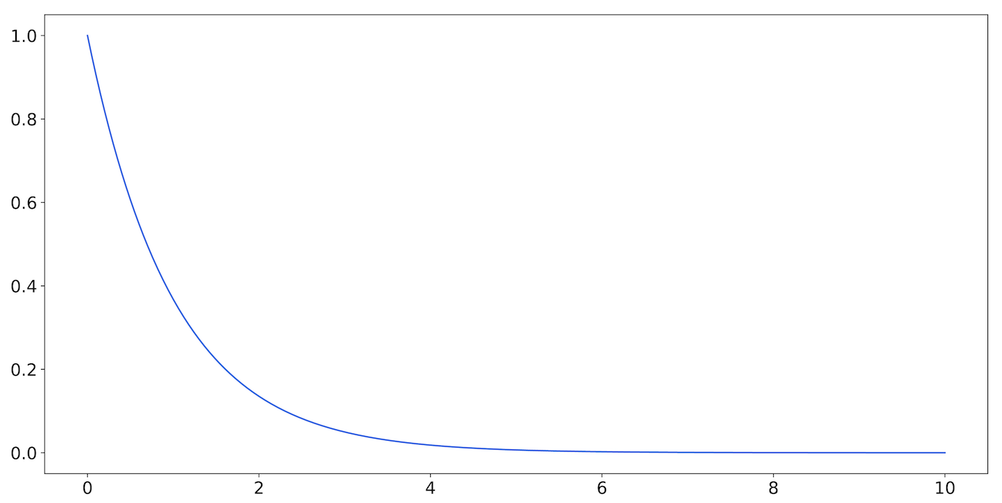
Figure 9-26. The exponential distribution with
The exponential distribution is our first example of a continuous probability distribution. Instead of a sample space consisting of a finite (or countably infinite) number of possibilities, now we have an (uncountably) infinite number of possibilities. When it describes a duration, it can produce a random result representing any positive length of time.
When the function representing the probability distribution is continuous, it is called a probability density function (PDF). Unlike in the probability mass function, no longer represents the probability that a random value is . Instead, it denotes the probability density at . Because the sample space is so large, we can’t really talk anymore about what the probability is that a random number will equal an element of the sample space. Instead, we talk about the probability that a value will lie within a given range.
For example, in Figure 9-27, the shaded area represents the probability that a value will fall between 1 and 3.
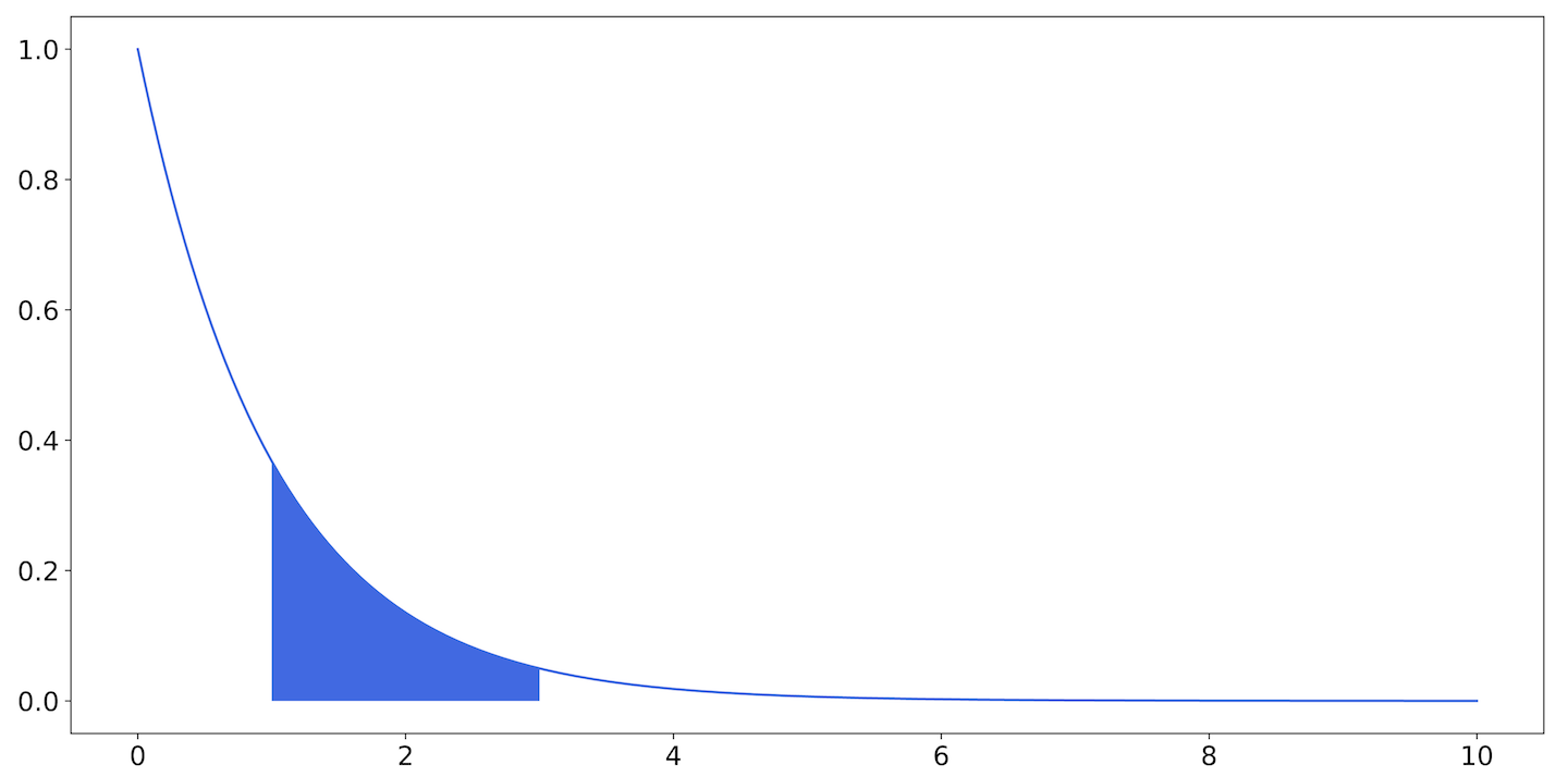
Figure 9-27. The exponential distribution: the area of the shaded region is the probability that a number drawn from this distribution will fall between 1 and 3
Like the Poisson distribution, the exponential distribution is described by the parameter , called the rate. The PDF for the exponential distribution is:
Here, is time, but we could use or represent some other exponentially distributed quantity. The semicolon indicates that while both and are parameters, usually we pick a single when we’re talking about all the possible s.
The value for is the same for the exponential and Poisson distributions. A Poisson process with parameter will have interevent times described by an exponential distribution with the same value of .
We know the arrival rate into Batch is one request per minute, on average. So we’d expect the mean of the exponential PDF also to be about one minute, and it turns out that this is true.
An important thing to note is that while the expected value of the distribution is one minute, more than half the interarrival times will be less than one minute. We can see that by looking at the CDF, shown in Figure 9-28.

Figure 9-28. The CDF of the exponential distribution with
Here, the dashed vertical line occurs at . Note that the two do not cross at ; they cross at .
Decreasing latency
After spending some time on the Batch team, you’ve become somewhat familiar with the inner workings of the service. Requests arrive at a load balancer and are placed in a queue. There is a worker service that watches the queue, pulls off tasks, and operates on them. Responses are written to a database, and clients can poll an RPC endpoint for the results.
This is what’s known as an M/M/1 queue, or, somewhat more vividly, as a birth-death process. Requests arrive according to some Poisson process (here, ) and are worked on according to some other Poisson process (say, ). Note that this is not ; this is the distribution of completion times once the request is being served, and not the distribution of requests exiting the system, which depends heavily on . We’ll call the mean arrival time, and the mean service time.
The first M in the name denotes that the arrival process is Markovian: its future states depend only on its current state, and not on any states prior to that. A Poisson process is a kind of Markov process. The second M denotes that the serving process is also Markovian. The 1 denotes the fact that there is a single server in this system.
So the first question we want to answer is, what is our expected latency? That is, we want to know the average latency (not the median or the 99th percentile). Of course, we could and should measure this, but we’re not doing this simply to have an idea of what the latency is right now. Rather, we want to have justifiable reasons for predicting how the latency will change as we change the system.
The average latency of a request in this system is:
What does this look like? When , the latency is essentially just , and the requests are completed almost as soon as they arrive. If the mean service time for a request were one second, then most requests would exit the system almost as soon as they entered.
When , then gets closer and closer to zero, and becomes arbitrarily large. If the mean service time were 55 seconds, and the mean arrival time is 60 seconds, then arrivals per second, completions per second of service time, and the mean latency of a request is , or 11 minutes.
Figure 9-29 shows a graph of mean latency as a function of .

Figure 9-29. Mean latency as approaches —as the average arrival time comes closer to the average service time, the latency grows severely
The ratio between the arrival rate and the service rate is usually denoted (rho). As Figure 9-29 shows, systems can be fairly insensitive to this quantity until they suddenly aren’t. It makes sense, then, as latency or usage increases, to spend resources on reducing the processing time of each request.
So far we’ve been looking at the mean latency of the system. What does the median do, or the 90-something percentiles?
For an M/M/1 queue the full distribution function of response time depends on how the queue is implemented. A last-in first-out (LIFO) queue, in which the requests that have just been received are the ones that are served first, has an exponential distribution. Since the mean of the exponential is also its parameter, the distribution function is:
Here, again, as gets large (or gets small), the mean gets very large, but now we can see what happens to the tail of the function as gets closer to 1. Let’s look at a graph of the 95th percentile, shown in Figure 9-30.
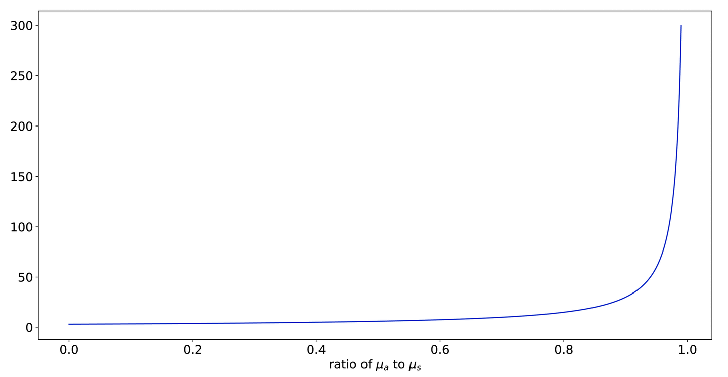
Figure 9-30. The 95th-percentile latency
This looks very similar to Figure 9-29. If we graph the two together, as in Figure 9-31, we can see that this function is strictly greater than the mean for all values of .
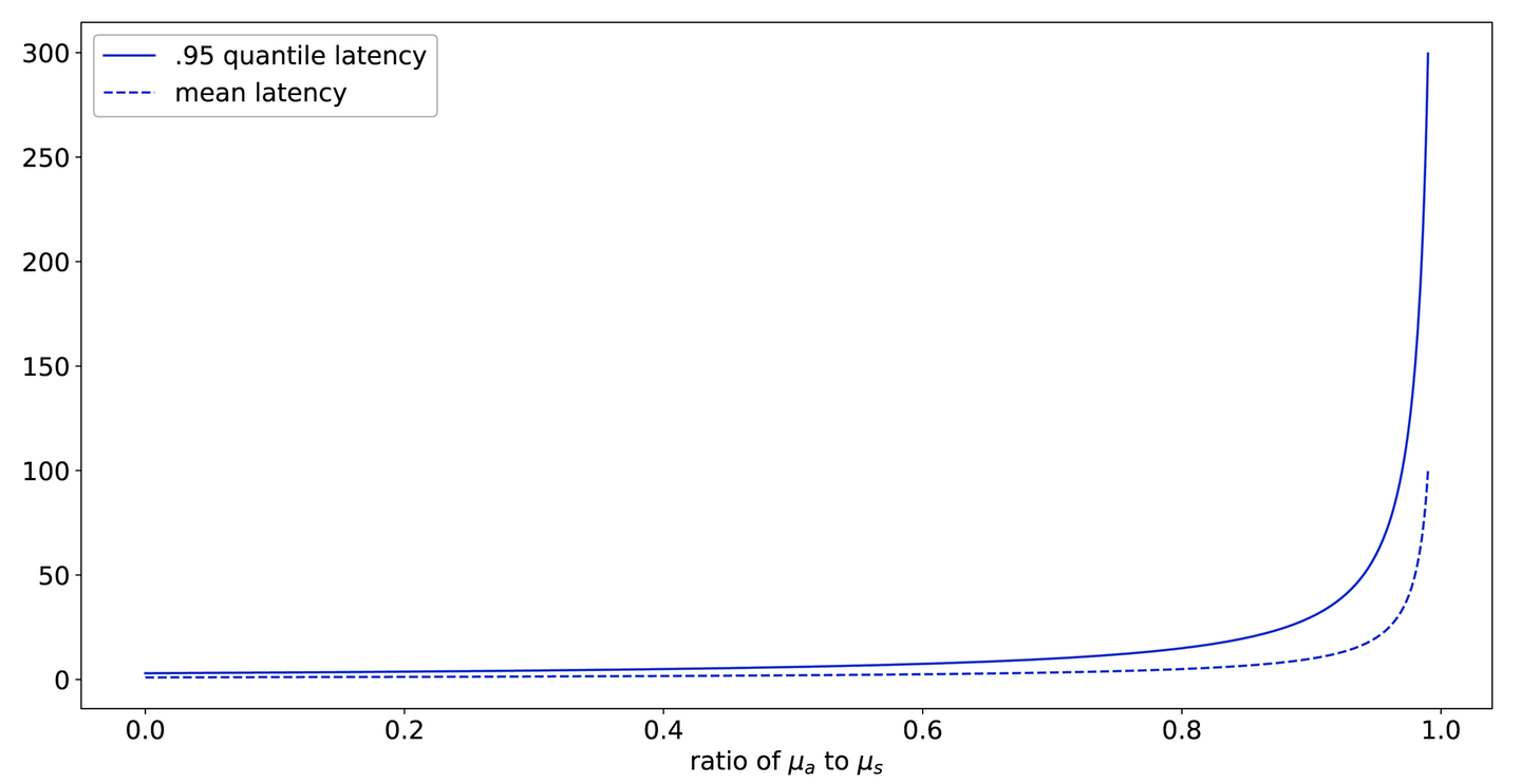
Figure 9-31. Figure 9-29 and Figure 9-30 superimposed
This shows one of the reasons that monitoring high percentiles is popular, even if they necessarily only affect a small portion of traffic: they are a good leading indicator that the system is moving away from its acceptable steady state.
But Batch probably won’t get a ton of use out of the 99th, or even the 95th, percentile. The 95th percentile only has a meaningful value in the presence of 19 other data points, which would take (on average) 20 minutes to collect. You’d do better to measure or .
Adding capacity
We’ve seen that reducing , the average time it takes to process a given request, can have a significant impact on service latency, especially as utilization increases. But what about just throwing more server processes at the problem?
A system with many workers is called an M/M/c queue; it’s governed by the same arrival and service characteristics, but it has an arbitrary number of servers to handle requests.
The equations describing the characteristics of these queues are a lot more involved. Not only does the completion rate increase from to , but the probability that a new request will have to wait for service decreases.
With just two workers, the mean latency as a function of becomes what you see in Figure 9-32.
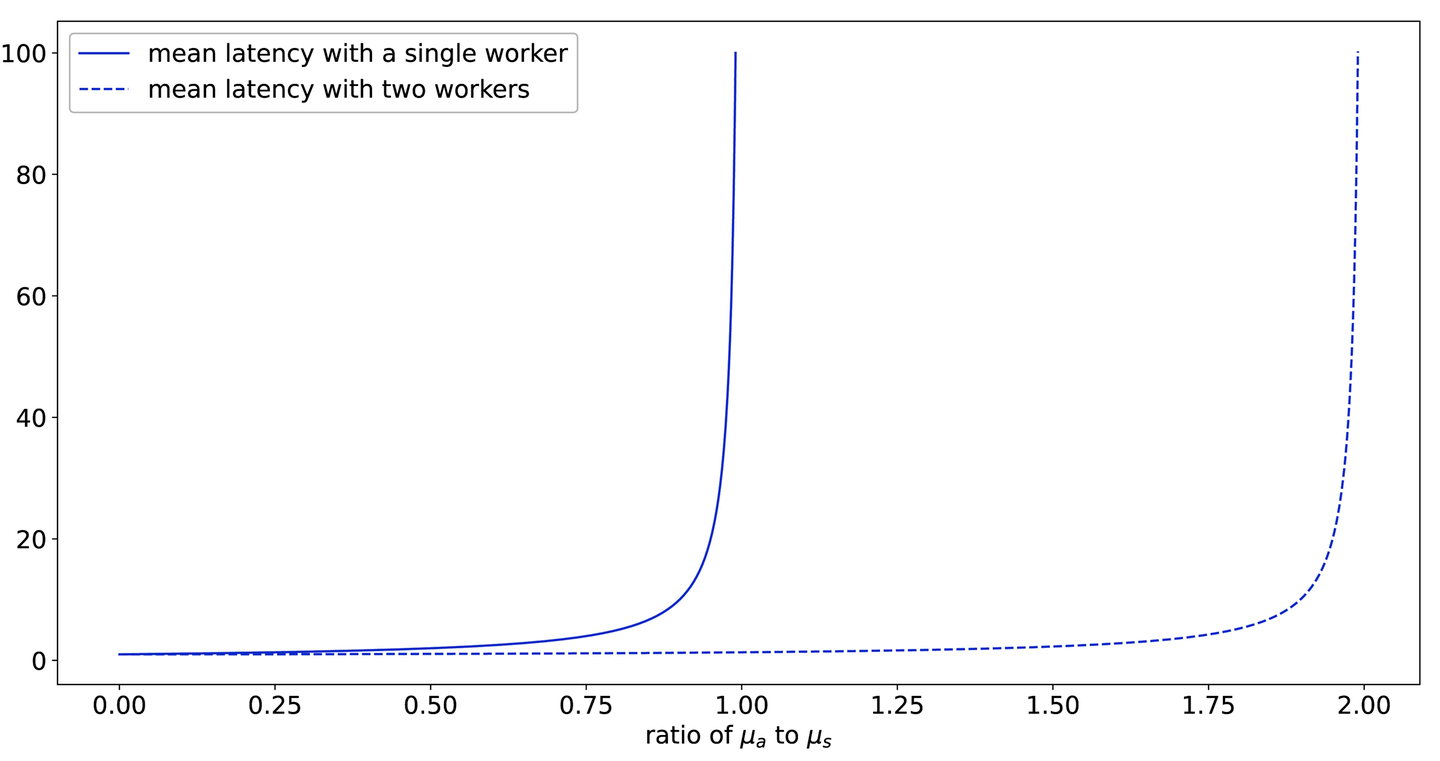
Figure 9-32. Mean latency as a function of utilization: with two workers we can (reasonably enough) absorb almost twice as much work before the latency increases wildly
Adding a second worker buys much more capacity! Of course, this is a somewhat idealized example. If both workers share resources (for example, if they both contend for network or disk access, or read from or write to the same database), then adding a second worker will reduce the service capacity for individual workers. But this kind of analysis can help you allocate resources when trying to determine the most beneficial places to spend them.
SLI Example: Durability
In this section we’ll use the techniques described thus far in the chapter to define and analyze a durability SLI, and we’ll look at how it changes as we change our replication model.
Availability and latency are probably the most common SLIs. They are convenient and (usually) easy to define and measure. Durability is not as easily understood, and possibly as a result is not as commonly measured. While availability for a storage service might be defined in terms of the ability of a client to receive data stored in the service at some moment, durability is the ability of the service to serve the data to the client at some point in the future.
Durability is tricky to measure. You can’t simply watch traffic as it goes by and infer your service’s durability from that. The events that comprise the durability SLI are not requests, or even successful data access events, but data loss events. And of course, in most systems any data loss event is considered unacceptable.
A service that receives 10,000 queries per second can return 1 error every second and still meet a 99.99% availability SLO. A service that loses 1 in 10,000 bytes will not be trusted again. This sets up a contradiction: we don’t want to lose data, but we can’t measure durability without seeing data loss.
To untangle this, first let’s give a specific, mathematical definition of durability. We’re going to start baking in assumptions as we do this, and we want to call those out.
There are many ways to define data durability, but we will use this one: the durability of the system is the expected value of the lifetime of a kilobyte of user data.
By defining durability in terms of the expected value, we get both an acknowledgement of its stochastic nature and an explicit formula (sort of) for calculating it. The definition of expected value for a continuous distribution is:
Where is the probability density function for some yet unspecified distribution.
Note
There’s another major benefit to using the expected value. is going to be a complicated function to define; even if we assume ideal behavior and exponential distributions (large assumptions in themselves), finding for even two disks is not the work of an afternoon. This is because combining these functions analytically gets intractable, and trying to simulate them with Monte Carlo methods, with the probabilities we’re working with, is infeasible. However, expected values can always be added together to get the expected value of their sum, and if they are independent, they can be multiplied to get the expected value of their products. This lets us apply the techniques we’ll use here. Unfortunately, we can lose a lot in the translation. Critically, the variance of our final distribution won’t be available from this analysis, so we won’t know how much deviation around the calculated mean we should expect. But what we can do is measure how our SLI changes as our system evolves. It will be very sensitive to the values we infer, and will change when those do.
Defining our SLI this way turns our problem into one of statistical inference. If we know then we know , which by definition is our SLI. How can we measure ? If we had millions of data points we could simply chuck them into a histogram, but of course we don’t, so we’ll make a second assumption: that data loss events such as hard drive failures follow a Poisson process.
Now, this isn’t true. But it might be close to true. It’s as good a place to start as any, until we get evidence to the contrary.
One of the reasons that the Poisson process is a good starting point is the sheer plethora of things that can cause data loss. Mechanical failure, software failure, firmware failure—the long-term survival of data is threatened by any one of these. But when there are multiple Poisson processes happening at once, their rate parameters can simply be added. If one hard drive class fails with rate , and a second class fails with rate , then hard drives will still fail in a Poisson process with rate .
This is particularly useful when modeling things like hard drives, which can be sensitive to manufacturing defects. It’s possible to get a bad batch of drives that are more likely to fail than their neighbors. But because Poisson rates are additive, this doesn’t invalidate the model.
Hard drives and other mechanical systems are also known to follow a so-called bathtub curve, where the failure rate for a unit starts out high but quickly falls (as those units prone to failure do fail and are removed), then rises again near the end of the unit’s lifetime, as it starts to succumb to wear.
We tend to model this by using a nonhomogeneous Poisson process, in which the parameter is allowed to change over time. If you do any of the follow-up reading, you will almost certainly see this described as “in which becomes .” This is shorthand for saying that , once a constant, is now a function of time and is allowed to vary. To avoid confusion, we will continue to just say , but understand that this quantity can now change over time.
We still have to measure somehow. Since it now varies with time, we can’t accumulate data forever. Events we measured weeks or even days ago may no longer be valid. So, we need to measure enough relevant events in a recent window to have a good estimate of , all without suffering actual data loss. We almost certainly do have durability events that don’t themselves result in data loss, but this depends heavily on the specific architecture of the system.
Let’s look at Dewclaw, the thumbnail service at Catz. When last we left our heroes, Dewclaw had just transitioned to serving out of two data centers, DC1 and DC2. Internally, users upload a thumbnail, and it’s replicated internally to three different machines.
Data replication is a subject that could and should fill a book all on its own, so for this example we’ll treat an idealized version of it. We’ll say that a new thumbnail lands on all three drives instantly, and that after a hard drive failure the thumbnail is replicated to a new drive after, on average, one hour.
These events—the hard drive failures—are what we need to measure to infer , and because the loss of a single drive doesn’t cause data loss we can get measurements without impacting customers.
In fact, this nicely illustrates one of the paradoxes of engineering that SLOs highlight: if a service is too reliable, failures become too rare to anticipate. Here, the more often hard drives fail, the better estimate we can get of hard drive failure rate. But we can compensate for this by realizing that we don’t need to measure itself; we only need an upper bound.
If we watch a population of a thousand hard drives for a month and see no failures, the maximum likelihood estimate for the failure rate is zero—but most people would intuitively push back on that. Using MAP or Bayesian inference, we could conclude that it is at most some value (depending on our prior), and let that be our estimate for .
With we can build . A single thumbnail lives on three hard drives, and whenever a thumbnail is in a degraded state (as in, is down to one or two hard drives), it is copied back to three drives after about an hour.
If images were only ever stored on one hard drive, would simply be the PDF for the exponential distribution:
Remember that the Poisson process and the exponential distribution are buddies; the times between the events of a Poisson process with rate (in which a higher number means more events) are exponentially distributed with rate (in which a higher number means less time between events).
The mean of this distribution—and thus our SLI—is . This is an estimate of the amount of time it takes to go from having a thumbnail on one hard drive to having a thumbnail on no hard drives.
If there are two hard drives, then in order to lose the thumbnail we have to lose either of those two drives, and then lose the second drive within an hour.
If our current estimate of drive failure is (say) 1,000,000 hours between failures, and our estimate of mean time to repair is 1 hour, then the probability we’ll fail before a repair can be made is just about one in a million. Now we can view advancing from having lost one disk to losing two disks as a Bernoulli trial with probability , and we know that the number of times we have to perform this trial before success is geometrically distributed with parameter .
(If a million hours sounds high, consider that most hard drives don’t actually fail. Remember, this is modeled as a Poisson process, and if the mean time to failure is a million hours, the variance on that is also a million hours. Most drives are fine, but this leaves plenty of room for drives to fail before anywhere near that amount of time has passed.)
The SLI for two disks as a function of the inferred value is:
Here, lambda is the parameter for the process that governs recovery. We can use this to estimate the effect of any work we plan on the durability SLI. For example, increasing by 1% (thus increasing the mean time to drive failure by 1%) increases by about 2%, while decreasing by 1% (thus decreasing the mean time to recovery by 1%) only increases by 1% (when and ).
If we finally take into account the third drive in our replication trio, the estimate of becomes:
If we calculate these expressions given our candidate values for and , we find that with two drives our expected durability is about 60,000 years. With three drives, it’s about 1.9 ✕ 1013 years. This is a significant improvement.
Of course, this can’t and doesn’t take into account all the other hugely complicated and important factors that are involved in safeguarding data. Numbers like 1013 are so fantastically big they approach meaninglessness.
You cannot and should not conclude from your analysis that you won’t see any data loss until the universe ends. That is not what this is for. Rather, this analysis gives you a way of turning data gathered from your system into a single metric, an SLI, that can also be used as a baseline against which to engineer additional protections.
If you run a thumbnail service on disks with no replication, you will probably lose data due to hard drive failure. If you run a thumbnail service on disks with triple replication, you probably won’t, but that doesn’t mean your data is therefore safe. You will probably lose data for some other reason (our money is on a software bug) unless you take pains to anticipate and mitigate those as well. It’s a lot of bases to cover, but that’s the job.
Further Reading
If you’re interested in learning more about the topics discussed in this chapter, here are a few recommendations for further exploration:
Data Analysis with Open Source Tools, by Philipp Janert (O’Reilly)
Practical Statistics for Data Scientists, by Peter Bruce and Andrew Bruce (O’Reilly)
Doing Bayesian Data Analysis, by John Kruschke (Academic Press)
Artificial Intelligence, A Modern Approach, by Stuart Russell and Peter Norvig (Pearson)—specifically, Part IV
Summary
This chapter gave a very brief, high-level overview of the ideas underlying probability and statistics and how they can be used to augment other approaches to defining and interpreting SLIs and SLOs. It is by no means comprehensive or complete.
The power of thinking in a probabilistic and statistical manner is that it allows verification of the gut feel that most team members will have developed around the behavior of the system. You can then try wielding the math and seeing what you can learn, even if you don’t change anything. The ability to use these techniques to provide values that plug into your existing frameworks is very powerful, and gives you a place to start discussing your current situation with teammates without needing them to do a calculus refresher.
At the same time, while models are helpful, they cannot be completely correct. This is exactly why they are models. It is important that after understanding some of these techniques you also take some time to understand the risks around model error. This is naturally only the tip of the iceberg on this subject.