Chapter 14. Geomapping
Bar charts, scatterplots, ring charts, and even force-directed graphs…Yeah, that’s all okay, you’re thinking, but get to the maps already!
JSON, Meet GeoJSON
We already met JSON, briefly, back in Chapters 3 and 5. Now meet GeoJSON, the JSON-based standard for encoding geodata for web applications. GeoJSON actually is not a totally different format, but just a very specific use of JSON.
Before you can generate a geographic map, you need to acquire the path data (the outlines) for the shapes you want to display. We’ll start with a common example, mapping US state boundaries. I’ve included a file us-states.json with the sample code. This file is taken directly from one of the D3 examples, and we owe Mike Bostock a word of thanks for generating this nice, clean file of state boundaries.
Opening us-states.json, you’ll see it looks something like this (reformatted and greatly abbreviated here):
{"type":"FeatureCollection","features":[{"type":"Feature","id":"01","properties":{"name":"Alabama"},"geometry":{"type":"Polygon","coordinates":[[[-87.359296,35.00118],[-85.606675,34.984749],[-85.431413,34.124869],[-85.184951,32.859696],[-85.069935,32.580372],[-84.960397,32.421541],[-85.004212,32.322956],[-84.889196,32.262709],[-85.058981,32.13674]…]]}},{"type":"Feature","id":"02","properties":{"name":"Alaska"},"geometry":{"type":"MultiPolygon","coordinates":[[[[-131.602021,55.117982],[-131.569159,55.28229],[-131.355558,55.183705],[-131.38842,55.01392],[-131.645836,55.035827],[-131.602021,55.117982]]],[[[-131.832052,55.42469],[-131.645836,55.304197],[-131.749898,55.128935],[-131.832052,55.189182],…]]]}},…
In typical GeoJSON style, we see, first of all, that this is all one giant object. (Curly brackets, remember?) That object has a type of FeatureCollection, followed by features, which is an array of individual Feature objects. Each one of these Features represents a US state. You can see each state’s name under properties.
But the real meat in any GeoJSON file is under geometry. This is where the feature’s type is specified, followed by the many coordinates that constitute the feature’s boundary. Within the coordinates are sets of longitude/latitude pairs, each one as a small, two-value array. This is the information that cartographers dedicate their lives to compiling and refining. We owe generations of explorers and researchers our gratitude for creating these sequences of tiny, yet extremely powerful, numbers.
It’s important to note that longitude is always listed first. Despite the cultural bias toward lat/lon, GeoJSON is a lon/lat world.
Also, in case your cartographic skills are a bit rusty, here’s how you can always remember which is which:
-
Longtiude is long. Therefore, longitudinal lines run vertically, as though hanging down from above.
-
Latitude is fatitude. Therefore, latitudinal lines run horizontally, as though wrapping around the Earth’s waist.
Longitude and latitude together constitute an enormous grid that encircles the whole globe. Conveniently for us, lon/lat can be easily converted to x/y values for screen display. In bar charts, we map data values to display values—numbers to rectangle heights. In geomapping, we also map data values to display values—lon/lat becomes x/y. Thinking in terms of x/y also makes it easier to get used to the uncomfortable order of longitude first, latitude second.
Tip
Get Lat+Lon is a great resource by Mike Migurski for double-checking coordinate values. Keep it open in a browser tab whenever you’re working on geomaps. You will reference it often.
Paths
We’ve got our geodata. Now get ready to rock.
First, we define our first geographic path generator:
//Define path generator, using the Albers USA projectionvarpath=d3.geoPath().projection(d3.geoAlbersUsa());
d3.geoPath() is a total lifesaver of a function. It does all the dirty work of translating that mess of GeoJSON coordinates into even messier messes of SVG path codes. All hail d3.geoPath()!
When defining our path generator, we have to specify a projection for it to use (d3.geoAlbersUsa(), in this case). More on projections in a moment.
Now we could paste all that GeoJSON directly into our HTML file, but ugh, so many coordinates and curly brackets—what a mess! It’s cleaner and more common to keep the geodata in a separate file and load it in using d3.json():
//Load in GeoJSON datad3.json("us-states.json",function(json){//Bind data and create one path per GeoJSON featuresvg.selectAll("path").data(json.features).enter().append("path").attr("d",path);});
d3.json() takes two arguments. First, it takes a string pointing to the path of the file to load in. Second, it takes a callback function that is fired when the JSON file has been loaded and parsed. (See “Handling Data-Loading Errors” for details on the callback function.) d3.json(), just like d3.csv(), is asynchronous, meaning it won’t prevent the rest of your code from running while the browser waits for that external file to load. For example, code placed after the callback function might be executed before the contents of the callback itself:
d3.json("someFile.json",function(json){//Put things here that depend on the JSON loading});//Only put things here that can operate independently of the JSONconsole.log("I like cats.");
So as a rule, when loading external datafiles, put the code that depends on that data within the callback function. (Or put the code into other custom functions, and then call those functions from within the callback.)
Back to the example. Finally, we bind the GeoJSON features to new path elements, creating one new path for each feature:
svg.selectAll("path").data(json.features).enter().append("path").attr("d",path);
Notice that last line, in which d (the path data attribute) is referred to our path generator, which magically takes the bound geodata and calculates all that crazy SVG code. The result is Figure 14-1.
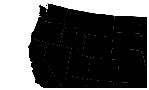
Figure 14-1. Our first view of GeoJSON data
A map! That was so easy! Check it out in 01_paths.html. The rest is just customization.
Tip
You can find all the horrifically nitty-gritty detail on paths, path generator options, and more in the d3-geo documentation.
Projections
As an astute observer, you noticed that our map isn’t quite showing us the entire United States. To correct this, we need to modify the projection being used.
What is a projection? Well, as an astute observer, you have also noticed that the globe is round, not flat. Round things are three-dimensional, and don’t take well to being represented on two-dimensional surfaces. A projection is an algorithm of compromise; it is the method by which 3D space is “projected” onto a 2D plane. (These compromises are beautifully illustrated—using D3, of course—in Michael Davis’s “The problem with maps”.)
We define D3 projections using a familiar structure:
varprojection=d3.geoAlbersUsa().translate([w/2,h/2]);
D3 has several built-in projections. Albers USA is a composite projection that nicely tucks Alaska and Hawaii beneath the Southwest. (You’ll see in a second.) Different projections support different options. The preceding code provides a translation value to geoAlbersUsa. You can see that we’re translating the projection to the center of the SVG image (half of its width and half of its height).
Now that our customized projection is stored in projection, we have to tell the path generator to reference it when generating all those paths:
varpath=d3.geoPath().projection(projection);
Tip
If you prefer more concise code, you can specify the projection within the constructor function, like so:
varpath=d3.geoPath(projection);
That is equivalent to the preceding code snippet. In the examples, I’ve chosen to write out .projection(projection) for clarity.
That gives us Figure 14-2. Getting there! See 02_projection.html for the working code.

Figure 14-2. The same GeoJSON data, but now with a centered projection
We can also add a scale() method to our projection in order to shrink things down a bit and achieve the result shown in Figure 14-3.
varprojection=d3.geoAlbersUsa().translate([w/2,h/2]).scale([500]);
The default scale value for geoAlbersUsa is 1,000. Anything smaller will shrink the map; anything larger will expand it.

Figure 14-3. The USA, scaled and centered within the image
Cool! See that working code in 03_scaled.html.
By adding a single style() statement, we could set the path’s fills to something less severe, like the blue shown in Figure 14-4.
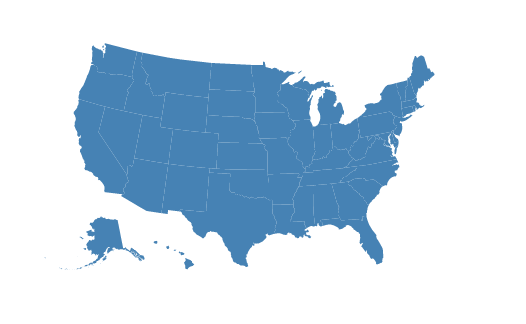
Figure 14-4. Now more blue-ish than black
See 04_fill.html for that. You could use the same technique to set stroke color and width, too.
Map projections are extremely powerful algorithms, and different projections are useful for different purposes and different parts of the world (near the poles, versus the equator, for example).
Thanks in large part to the tireless contributions of Jason Davies, D3 supports every obscure projection you could imagine. Feast your eyes on the dizzying array of supported projections in the d3-geo-projection documentation. You might also find Mike Bostock’s projection comparison demo useful. (Note that that demo uses an older version of D3, so its syntax won’t work with D3 4.x. Still, it’s a transfixing visual reference.)
Choropleth
Choro-what? This word, which can be difficult to pronounce, refers to a geomap with areas filled in with different values (light or dark) or colors to reflect associated data values. In the United States, so-called “red state, blue state” choropleth maps showing the Republican and Democratic leanings of each state are ubiquitous, especially around election time. But choropleths can be generated from any values, not just political ones.
These maps are also some of the most requested uses of D3. Although choropleths can be fantastically useful, keep in mind that they have some inherent perceptual limitations. Because they use area to encode values, large areas with low density (such as the state of Nevada) are overrepresented visually. A standard choropleth does not represent per-capita values fairly—Nevada is too big, and Delaware far too small. But they do retain the geography of a place, and—as maps—they look really, really cool. So let’s dive in. (You can follow along with 05_choropleth.html.)
First, I’ll set up a scale that can take data values as input, and will return colors. This is the heart of choropleth-style mapping:
varcolor=d3.scaleQuantize().range(["rgb(237,248,233)","rgb(186,228,179)","rgb(116,196,118)","rgb(49,163,84)","rgb(0,109,44)"]);
A quantize scale functions as a linear scale, but it outputs values from within a discrete range. These output values could be numbers, colors (as we’ve done here), or anything else you like. This is useful for sorting values into “buckets.” In this case, we’re using five buckets, but there could be as many as you like.
Notice I’ve specified an output range, but not an input domain. (I’m waiting until our data is loaded in to do that.) These particular colors are adapted from D3’s built-in d3-scale-chromatic color scales—a collection of perceptually optimized colors, selected by Cynthia Brewer, and based on her research. (If you haven’t seen ColorBrewer, you must go explore it right now.)
Next, we need to load in some data. I’ve provided a file us-ag-productivity.csv, which looks like this:
state,value
Alabama,1.1791
Arkansas,1.3705
Arizona,1.3847
California,1.7979
Colorado,1.0325
Connecticut,1.3209
Delaware,1.4345
…
This data, provided by the US Department of Agriculture, reports agricultural productivity by state during the year 2004. The units are relative to an arbitrary baseline of the productivity of the state of Alabama in 1996 (1.0), so greater values are more productive, and smaller values less so. (Find lots of open government datasets at data.gov.) I expect this data will give us a nice map of states’ agricultural productivity.
To load in the data, we use d3.csv():
d3.csv("us-ag-productivity.csv",function(data){…
Then, in the callback function, I want to set the color quantize scale’s input domain (before I forget!):
color.domain([d3.min(data,function(d){returnd.value;}),d3.max(data,function(d){returnd.value;})]);
This uses d3.min() and d3.max() to calculate and return the smallest and largest data values, so the scale’s domain is dynamically calculated.
Next, we load in the JSON geodata, as before. But what’s new here is I want to merge the agricultural data into the GeoJSON. Why? Because we can only bind one set of data to elements at a time. We definitely need the GeoJSON, from which the paths are generated, but we also need the new agricultural data. So if we can smush them into a single, monster array, then we can bind them to the new path elements all at the same time. (There are several approaches to this step; what follows is my preferred method.)
d3.json("us-states.json",function(json){//Merge the ag. data and GeoJSON//Loop through once for each ag. data valuefor(vari=0;i<data.length;i++){//Grab state namevardataState=data[i].state;//Grab data value, and convert from string to floatvardataValue=parseFloat(data[i].value);//Find the corresponding state inside the GeoJSONfor(varj=0;j<json.features.length;j++){varjsonState=json.features[j].properties.name;if(dataState==jsonState){//Copy the data value into the JSONjson.features[j].properties.value=dataValue;//Stop looking through the JSONbreak;}}}
Read through that closely. Basically, for each state, we are finding the GeoJSON element with the same name (e.g., “Colorado”). Then we take the state’s data value and tuck it in under json.features[j].properties.value, ensuring it will be bound to the element and available later, when we need it.
Lastly, we create the paths just as before, only we make our style() value dynamic:
svg.selectAll("path").data(json.features).enter().append("path").attr("d",path).style("fill",function(d){//Get data valuevarvalue=d.properties.value;if(value){//If value exists…returncolor(value);}else{//If value is undefined…return"#ccc";}});
Instead of "steelblue" for everyone, now each state path gets a different fill value. The trick is that we don’t have data for every state. The dataset we’re using doesn’t have information for Alaska, the District of Columbia, or Hawaii.
So to accommodate those exceptions, we include a little logic: an if() statement that checks to see whether or not the data value has been defined. If it exists, then we return color(value), meaning we pass the data value to our quantize scale, which returns a color. For undefined values, we set a default of light gray (#ccc).
Beautiful! Just look at the result in Figure 14-5. Check out the final code and try it yourself in 05_choropleth.html.

Figure 14-5. A choropleth map showing agricultural productivity by state
Adding Points
Wouldn’t it be nice to put some cities on this map, for context? Maybe it would be interesting or useful to see how many large, urban areas there are in the most (or least) agriculturally productive states. Again, let’s start by finding the data.
Fortunately, the US Census Bureau has us covered, once again. (Your tax dollars at work!) Here’s the start of a raw CSV dataset from the Census that shows “Annual Estimates of the Resident Population for Incorporated Places of 50,000 or More”.
GEO.id,GEO.id2,GEO.display-label,GC_RANK.target-geo-id…
Id,Id2,Geography,Target Geo Id,Target Geo Id2,Rank,Geography,Geography,"April …
0100000US,,United States,1620000US3651000,3651000,1,"United States - New York…
0100000US,,United States,1620000US0644000,0644000,2,"United States - Los Ang…
0100000US,,United States,1620000US1714000,1714000,3,"United States - Chicago…
0100000US,,United States,1620000US4835000,4835000,4,"United States - Houston…
0100000US,,United States,1620000US4260000,4260000,5,"United States - Philadel…
…
This is quite messy, and I don’t even need all this data. So I’ll open the CSV up in my favorite spreadsheet program and clean it up a bit, removing unneeded columns. (You could use Microsoft Excel, Apple Numbers, Google Sheets, or LibreOffice Calc. As you do, be warned that many GUIs will drop leading zeros for fields interpreted as numeric values. For example, the zip code 01063 could be misinterpreted as the number 1,063.) I’m also interested in only the largest 50 cities, so I’ll delete all the others. Exporting back to CSV, I now have this:
rank,place,population
1,New York,8550405
2,Los Angeles,3971883
3,Chicago,2720546
4,Houston,2296224
5,Philadelphia,1567442
…
This information is useful, but to place it on the map, I’m going to need the latitude and longitude coordinates for each of these places. Looking this up manually would take forever. Fortunately, we can use a geocoding service to speed things up. Geocoding is the process of taking place names, looking them up on a map (or in a database, really), and returning precise lat/lon coordinates. “Precise” might be a bit of an overstatement—the geocoder does the best job it can, but it will sometimes be forced to make assumptions given vague data. For example, if you specify “Paris,” it may assume you mean Paris, France, and not Paris, Texas.
Never Trust a Geocoder
Let me tell you a story.
In the first edition of this book, I wrote:
“It’s good practice to eyeball the geocoder’s output once you get it on the map, and manually adjust any erroneous coordinates (using Get Lat+Lon as a reference).”
I then proceeded to completely ignore my own advice, and published the map you are about to see with cities in completely wrong places. San Francisco on the Florida coast; it was a mess. But I hadn’t labeled the circles with their corresponding cities’ names, and I’ve never been to Florida, so hey, what do you expect?
Lesson learned: geocoders can save you a lot of time, but if accuracy matters even a little (such as to avoid potential public embarrassment), then please manually double-check all your values. Paid geocoding services may perform better than free ones for a reason. Some geocoders will output a certainty or precision value as well; this can give you a clue as to how confident the service is in its results.
Special thanks to Jeff Weiss for correcting all the coordinates, as now reflected in the second edition of us-cities.csv.
I’ll head over to my favorite batch geocoder, paste in the place names, and click start. A few minutes later, the geocoder spits out some more comma-separated values, including lat/lon pairs. I bring those back into my spreadsheet, and save out a new, unified CSV with coordinates (shown here after manual verification of values):
rank,place,population,lat,lon
1,New York,8550405,40.71455,-74.007124
2,Los Angeles,3971883,34.05349,-118.245319
3,Chicago,2720546,41.88415,-87.632409
4,Houston,2296224,29.76045,-95.369784
5,Philadelphia,1567442,39.95228,-75.162454
…
That was unbelievably easy. Ten years ago that step would have taken us hours of research and tedious data entry, not seconds of mindless copying-and-pasting. Now you see why we’re experiencing an explosion of online mapping.
Our data is ready, and we already know how to load it in:
d3.csv("us-cities.csv",function(data){//Do something…});
In the callback function, we can specify how to create a new circle element for each city, and then position each circle according to the corresponding city’s geo-coordinates:
svg.selectAll("circle").data(data).enter().append("circle").attr("cx",function(d){returnprojection([d.lon,d.lat])[0];}).attr("cy",function(d){returnprojection([d.lon,d.lat])[1];}).attr("r",5).style("fill","yellow").style("stroke","gray").style("stroke-width",0.25).style("opacity",0.75).append("title")//Simple tooltip.text(function(d){returnd.place+": Pop. "+formatAsThousands(d.population);});
The magic here is in those attr() statements that set the cx and cy values. You see, we can access the raw latitude and longitude values as d.lat and d.lon. But what we really need for positioning these circles are x/y screen coordinates, not geo-coordinates.
So we bring back our magical friend projection(), which is essentially a two-dimensional scale method. Scales take one number and return another. Projections take two numbers and return two. (Also, the behind-the-scenes math for projections is much more complex than the simple, linear scales.)
The map projection takes a two-value array as input, with longitude first (remember, it’s lon/lat, not lat/lon, in GeoJSON-ville). Then the projection returns a two-value array with x/y screen values. So, for cx, we use [0] to grab the first of those values, which is x. For cy, we use [1] to grab the second of those values, which is y. Make sense?
The resulting map in Figure 14-6 is pretty nice! Check out the code in 06_points.html.

Figure 14-6. The top 50 largest US cities, represented as cute little yellow dots
Yet these dots are all the same size. Let’s link the population data to circle size. Instead of a static area, we’ll reference the population value:
.attr("r",function(d){returnMath.sqrt(parseInt(d.population)*0.00004);})
Here we grab d.population, wrap it in parseInt() to convert it from a string to an integer, scale that value down by an arbitrary amount, and finally take the square root (to convert from an area value to a radius value). See the code in 07_points_sized.html.
As you can see in Figure 14-7, now the largest cities really stand out. The differences in city size are significant. Also, instead of multiplying by my magic number 0.00004, you could more properly use a custom D3 scale function. (I’ll leave that to you.)
Figure 14-7. Cities as dots, with area set by population
The point here is to see that we’ve successfully loaded and visualized two different datasets on a map. (Make that three, counting the geocoded coordinates we merged in!)
Take a break!
Seriously, we’ve just covered a lot. Please go for a short walk around the block, or at least stretch a bit. You’re going to need the mental break before making our map interactive.
Panning
Our maps so far have been static. If you want users to be able to move around your maps, you’ll need to implement panning.
You’ll remember that when we configured our projection, we specified a translation offset:
//Define map projectionvarprojection=d3.geoAlbersUsa().translate([w/2,h/2]).scale([500]);
The translation offset effectively “moves the map” up, down, left, or right. So to “pan” around the map, we need to modify the translation offset.
The main steps in panning are:
-
Get the current translation offset value
-
Decide which direction you want to move
-
Decide how far you want to move
-
Augment the offset value by that amount
-
Update the projection with the new offset value
-
Reproject all elements on the map (e.g., paths and circles)
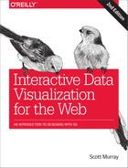
See all this magic happening in 08_pan.html. For this example, I’ve set the projection’s scale() value to 2,000, in effect “zooming in” to the center of the country, as you can see in Figure 14-8.

Figure 14-8. Pan example
How appropriate that our example on how to handle panning includes the Oklahoma panhandle. (Wow, I apologize; that was so bad, it may not even qualify as a pun.)
The four rectangles with arrows act as pan triggers for each of the cardinal directions: north, south, west, and east. Clicking the “east” button on the right edge results in the map being moved to the left, as shown in Figure 14-9.

Figure 14-9. Pan example, panned
Before we step through the code, take a moment to click these buttons, so you get a feel for how it works. Okay, ready?
After creating the map, I call the new function createPanButtons(), which both creates the new clickable buttons and defines the panning behavior attached to each.
Each button consists of a group, which itself contains a rect and a text element. Here’s the “north” button:
varnorth=svg.append("g").attr("class","pan")//All share the 'pan' class.attr("id","north");//The ID will tell us which direction to headnorth.append("rect").attr("x",0).attr("y",0).attr("width",w).attr("height",30);north.append("text").attr("x",w/2).attr("y",20).html("↑")
Nothing fancy here. I also included some CSS styling in the head of the document.
Once each of the four groups has been created, I bind the same behavior to each, to be triggered on click:
d3.selectAll(".pan").on("click",function(){//… Do stuff!});
Within that, we first get the current translation offset, decide how much to move, and decide which direction to move in. Remember, a translation offset is a two-digit array, like [250, 150]. Try logging out this value to the console whenever it changes, or just type projection.translate() in the console. Also, I’ve arbitrarily chosen 50 as a moveAmount. You may want this value to be larger or smaller, depending on the size and scale of your map, as well as what projection you’re using. (You may want to tweak this number until you find what feels right for your project.) Also, we grab the direction from the ID of each button element.
//Get current translation offsetvaroffset=projection.translate();//Set how much to move on each clickvarmoveAmount=50;//Which way are we headed?vardirection=d3.select(this).attr("id");
That’s all we need to know! Next, I use a switch statement to adjust either the x or y portion of the offset, depending on where we are trying to go. Note that, in this example, the map actually moves the opposite direction of the button’s name. That is, if you click “north,” the projection offset is actually moved “down” or “south.” The net effect is that the viewer’s perspective is moved “north.”
//Modify the offset, depending on the directionswitch(direction){case"north":offset[1]+=moveAmount;//Increase y offsetbreak;case"south":offset[1]-=moveAmount;//Decrease y offsetbreak;case"west":offset[0]+=moveAmount;//Increase x offsetbreak;case"east":offset[0]-=moveAmount;//Decrease x offsetbreak;default:break;}
The += and -= operators are shorthand for “add to the current value” or “subtract from the current value.” For example, if carrots == 5 but then you wrote carrots += 2, you’d end up with 7 carrots.
Now we can update the projection with the new offset:
//Update projection with new offsetprojection.translate(offset);
Finally, we reproject all path and circle elements. Remember, the path generator function is already tied to the projection, so calling path here essentially just recalculates all of those d values.
//Update all paths and circlessvg.selectAll("path").attr("d",path);svg.selectAll("circle").attr("cx",function(d){returnprojection([d.lon,d.lat])[0];}).attr("cy",function(d){returnprojection([d.lon,d.lat])[1];});
Try it out in 08_pan.html!
Transitioning the Map
“Not bad,” you say, “but it’s a bit jumpy.”
That makes sense, because we are modifying those attribute values immediately, and not over time. Lucky for us, adding two lines of code fixes this:
//Update all paths and circlessvg.selectAll("path").transition()// <-- New!.attr("d",path);svg.selectAll("circle").transition()// <-- New!.attr("cx",function(d){returnprojection([d.lon,d.lat])[0];}).attr("cy",function(d){returnprojection([d.lon,d.lat])[1];});
Try our 09_pan_transition.html and notice how nice it feels! Of course, you could configure these transitions further (with durations and easing), if you like.
Dragging the Map
“That’s cool,” you say, still unimpressed, “but I want to be able to drag the map to pan around.”
Sigh.
Okay, open 10_pan_draggable.html. At first glance, it looks the same, but notice how you can drag the map around with the mouse. Yay!
There are three main steps to get this working:
-
Group all “pan-able” elements into a single SVG
ggroup, for simplicity. -
Bind a
dragbehavior onto that group. -
Tell D3 what to do when dragging occurs.
Sounds reasonable. Let’s take these in order, first creating a new g group that I’ll call map:
//Create a container in which all pan-able elements will livevarmap=svg.append("g").attr("id","map").call(drag);//Bind the dragging behavior
Note we use call() to bind a new drag behavior, which I’ll define in a moment. Later in the code, when using selectAll/data/enter/append to create the new map elements, we update all references from the svg selection to the new map group. That is, svg.selectAll("path") becomes map.selectAll("path"), and likewise for the circles. The net effect is that now everything that appears on the map is contained in a g group. (Check the DOM inspector to verify this.)
Defining the drag behavior is easy!
//Then define the drag behaviorvardrag=d3.drag().on("drag",dragging);
D3’s drag behavior listens for dragging-related mouse and touch events, triggering one of three related events, when appropriate: start, drag, or end. (This is a massive timesaver, and I guarantee you would not enjoy taking this on yourself.)
In this example, we don’t need to do anything special on drag start or end; we are interested only in drag, which is triggered when something is, well, actively being dragged. The on() statement tells the drag behavior to call a new dragging function whenever this is the case. So, let’s define dragging:
//Define what to do when draggingvardragging=function(d){//Log out d3.event, so you can see all the goodies inside//console.log(d3.event);//Get the current (pre-dragging) translation offsetvaroffset=projection.translate();//Augment the offset, following the mouse movementoffset[0]+=d3.event.dx;offset[1]+=d3.event.dy;//Update projection with new offsetprojection.translate(offset);//Update all paths and circlessvg.selectAll("path").attr("d",path);svg.selectAll("circle").attr("cx",function(d){returnprojection([d.lon,d.lat])[0];}).attr("cy",function(d){returnprojection([d.lon,d.lat])[1];});}
The key to our success here is a magical object called d3.event, which D3 populates with pertinent information when an event is triggered—drag, in this case. Note that d3.event only exists in context, during an event; you can’t just summon it whenever you like, before or after an event (and that wouldn’t make sense, anyway). Uncomment the related line, then refresh and drag the map around to inspect the contents of d3.event, as in Figure 14-10.

Figure 14-10. Logging the contents of a d3.event
You can see by the name that this is a drag event (surprise!) that was triggered by a mouse. x and y represent the pointer’s coordinates relative to the enclosing container (map, for us). Note that my x/y values (580, 301) are actually outside the boundaries of the 500-by-300 SVG, because I grabbed hold of that map and just simply wouldn’t let go. If you need to know where the mouse (or finger) is, look at x and y.
dx and dy contain the amount of change in x/y-position since the preceding drag event. That is, dx/dy tell us how much dragging just occurred. That’s helpful, as we probably need to know how much dragging is going on, so we can pan the map by exactly the same amount. In this example, I moved the mouse 15 pixels horizontally and 18 pixels vertically.
The way I’ve accomplished this is to grab the projection’s current translate() value and store it in offset. I then add the dx/dy values to each respective offset value, then update the projection with the new offset. This effectively looks at where the map is now, then scooches it over a bit. Finally, we calculate new paths and a new position for each circle.
This approach to updating the map view is called reprojection. In this way, we “move” the map by changing the parameters of the projection, and then “reprojecting” all the map elements.
Border Problems
Try dragging to one of the country’s borders. Notice that dragging doesn’t work if you begin the drag in the whitespace beyond the paths and circles (such as in the Pacific or Atlantic Oceans, the Great Lakes, Canada, or Mexico). The sneaky solution is to create an invisible background rectangle within the map group (onto which drag behavior is bound).
//Create a new, invisible background rect to catch drag eventsmap.append("rect").attr("x",0).attr("y",0).attr("width",w).attr("height",h).attr("opacity",0);
The presence of this rect effectively ensures that the map group now covers the full surface area of the SVG. So even if there’s no visible map element present, the rect catches any mouse or touch events on behalf of the group. Of course, the edges of the map are obscured by our pan buttons, which are “in front” and thus intercept any such events before they could reach the map group.
Yet, we never reposition the rect, even when the rest of the map is moving, such as during dragging. We want this hidden rectangle to stay in place, to catch any future events. It is a little weird to have an element that triggers dragging yet never moves, and to have a group that consists of elements that all move together except for one, which always stays in place. Welcome to programming.
Test out 11_pan_draggable_bgrect.html, in which you can drag and pan to your heart’s content.
Zooming
While panning is essentially just a matter of shifting x/y coordinates, zooming is a bit more complicated. Fortunately, D3 has d3.zoom, a behavior parallel to d3.drag, but d3.zoom also tracks scroll wheel movement (and trackpad gestural equivalents) and double-clicks, commonly used to trigger zooming in. d3.zoom translates those inputs to trigger three different events: start, zoom, and end.
Note
d3.zoom isn’t just for geographic maps, although I’m introducing it in this chapter. The behavior can be used to facilitate panning and zooming for any chart type. See this example by Mike Bostock as well as several others in the D3 documentation.
A zoom d3.event differs somewhat from a drag d3.event. Let’s take a peek in Figure 14-11. (Feel free to play along by uncommenting the related line in 12_zoom.html, then refreshing and triggering a zoom event.)

Figure 14-11. Logging the contents of several very zoom-y events
A zoom event includes a type of zoom (duh!), a sourceEvent to tell you what triggered the zoom (a WheelEvent or, really, my trackpad gesture, in this case), and—most important for us—a transform object with three very special values: x, y, and k.
x and y report the amount of translation needed (for panning), while k is a scale factor. Taken together, these three values can be used to define any given pan-and-zoom “view” of your map. So, yes, d3.zoom can do everything d3.drag does, and more. For most purposes, if zooming is required, you can skip d3.drag and just let d3.zoom handle the dragging and zooming for you.
Another important difference between the two is that, while d3.drag merely reports values (such as x/y and dx/dy) when its events are triggered, the zoom behavior stores its transform values (x/y, k) on elements directly. Much like how data is bound to elements, the zoom’s transform values are also bound to elements, for later use.
To see what I mean, open 12_zoom.html in your browser. In the console, type map or d3.select("#map") to find our map g group. Several disclosure triangles later, you’ll see a __zoom property, which contains the transform values, as in Figure 14-12.

Figure 14-12. Exposing the sneakily hidden zoom transform values
Fortunately, there is an easier, proper way to retrieve those values for any given element: d3.zoomTransform(). Try typing d3.zoomTransform(map.node()) in the console. This grabs the map selection’s node (the g element itself) and then returns its associated transform value. In Figure 14-13, I’ve logged the value of d3.event.transform from the intial zoom event, and also keyed in d3.zoomTransform(map.node()) manually. You can see that they are the same values.

Figure 14-13. Transform values, retrieved two different ways
Why does zoom work this way? Well, in our example, we have only one “zoomable” element, the map group. But you could imagine a more complex interaction with multiple zoomable elements, each one maintaining its own separate zoom state, although using the same zoom behavior.
Let’s see how to use those transform values. In 12_zoom.html, I’ve renamed our dragging function to zooming:
//Define what to do when panning or zoomingvarzooming=function(d){//Log out d3.event.transform, so you can see all the goodies inside//console.log(d3.event.transform);//New offset arrayvaroffset=[d3.event.transform.x,d3.event.transform.y];//Calculate new scalevarnewScale=d3.event.transform.k*2000;//Update projection with new offset and scaleprojection.translate(offset).scale(newScale);//Update all paths and circlessvg.selectAll("path").attr("d",path);svg.selectAll("circle").attr("cx",function(d){returnprojection([d.lon,d.lat])[0];}).attr("cy",function(d){returnprojection([d.lon,d.lat])[1];});}
We use the x and y values to update the projection’s translate() value (easy!). But we also update the projection’s scale() at the same time. Remember, k is a scale factor, so it can be multiplied against your default scale, which, in our case, is the arbitrary number 2,000. Try zooming in and out while logging the transform values to get a feel for how k works.
Later in the code, I’ve replaced drag with zoom, and dragging with zooming:
//Then define the zoom behaviorvarzoom=d3.zoom().on("zoom",zooming);
As before, we are ignoring the start and end events. Here, whenever a zoom event is triggered, the zooming function defined earlier will be called.
Finally, we have to do a little extra legwork to set the initial view. Now that the zoom behavior is acting on the map, we need to ensure that the zoom state and the projection state are in sync. So instead of setting default translate() and scale() values on the projection, we define an initial transform manually, and let the zoom behavior (zooming) make any changes to the projection directly.
//The center of the country, roughlyvarcenter=projection([-97.0,39.0]);//Create a container in which all zoom-able elements will livevarmap=svg.append("g").attr("id","map").call(zoom)//Bind the zoom behavior.call(zoom.transform,d3.zoomIdentity//Then apply the initial transform.translate(w/2,h/2).scale(0.25).translate(-center[0],-center[1]));
The center here is based on arbitrary lon/lat values I selected manually (using Get Lat+Lon).
Then we call(zoom) to bind the zoom behavior to the map.
Lastly (surprise!) we do a special call() that applies an initial transform to the map. To do this, we pass in zoom.transform and d3.zoomIdentity with some translate and scale parameters. The values here are all arbitrary and based on what I felt would make a nice composition, as seen in Figure 14-14. Please tweak the values to see how it changes the default view.

Figure 14-14. The new, awe-inspiring default view
Try panning and zooming in and out in 12_zoom.html (Figure 14-15). It’s so smooth!
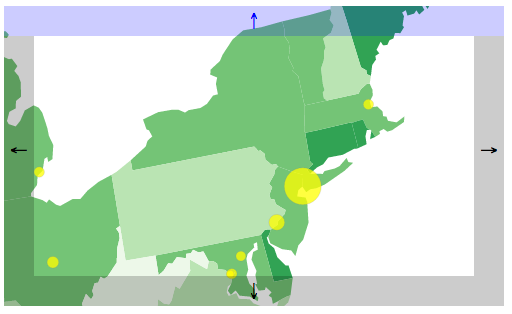
Figure 14-15. Special shout-out to all 8,550,405 residents of NYC
Fixing the Pan Buttons
There’s one problem. Now the pan buttons are broken. Try clicking them to pan a bit, then try dragging or zooming the map. You’ll notice an abrupt jump—not pretty! The problem is that the pan buttons are still manually adjusting the projection. But d3.zoom is in charge now, so everything has to go through the zoom behavior, to keep it all in sync.
I’ve fixed the issue in 13_zoom_pan_buttons_fixed.html. Note the changes in the createPanButtons function. Instead of getting and setting projection.translate() and then reprojecting all our paths and circles, we simply call translateBy(), passing in x/y values to specify how much movement we want to see in each direction.
//This triggers a zoom event, translating by x, ymap.transition().call(zoom.translateBy,x,y);
This transitions the entire map into place nicely. Note how the transition() part now lives before call(). Yes, this really is magic.
Finally, please test clicking the pan buttons, then using your mouse to zoom in and out of the map. It works!
Zoom-y Buttons
Why not make zoom buttons, too?
Open 14_zoom_with_buttons.html, which appears as shown in Figure 14-16.

Figure 14-16. Map, now with zoom-ier buttons
Note that clicking the +/- buttons zooms in or out on the center of the map, even if you’ve dragged, panned, or zoomed the map away from its starting position. Good stuff.
In the code, I made a new createZoomButtons() function, modeled after createPanButtons(). (Shocker!) You can read through the code on your own, but to summarize, this function:
-
Creates the buttons
-
Chooses a
scaleFactor, either 1.5 (if zooming in) or 0.75 (if zooming out) -
Calls the zoom function
scaleBy, passing inscaleFactoras a parameter
//This triggers a zoom event, scaling by 'scaleFactor'map.transition().call(zoom.scaleBy,scaleFactor);
Wow, that was almost too easy! (Emphasis on almost.)
Constraining Panning and Zooming
You may have noticed that your ability to pan and zoom is unlimited. That is, you could keep panning beyond the border and into empty whitespace forever, ye olde countrey ne’er to be seen againe. You could also zoom so far into Kansas farmland you’d never be able to dig your way out again. Or, worse, zoom out so far that those top 50 US cities begin to converge on a single point in space, as in Figure 14-17.
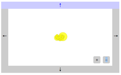
Figure 14-17. If this doesn’t remind you of Powers of Ten, by Charles and Ray Eames, please take 10 minutes to watch the film now.
Fortunately, we can restrict zooming and panning using scaleExtent() and translateExtent(), respectively. See this code in action in 15_extents.html, and note how D3 will no longer allow you to drift off into space or otherwise get too lost.
varzoom=d3.zoom().scaleExtent([0.2,2.0]).translateExtent([[-1200,-700],[1200,700]]).on("zoom",zooming);
scaleExtent takes two values: a minimum and a maximum for k. translateExtent takes two arrays of two values each: x1/y1 and x2/y2. Consider these the upper-left and lower-right corners of the invisible box in which your users are trapped. (This metaphor works best if your users are mimes.)
Of course, you can set the extent values to whatever feels right for your project, given the projection you’re using, the geographic data, your overall composition and UI, and the sort of interaction you want to enable. The values here are arbitrary, chosen by me because they worked for this example.
Note that translateBy() and scaleBy() respect the scale and translate extents, so our pan buttons, zoom buttons, and mouse/touch zoom gestures are all in agreement about what we’re allowed to do. However, be aware that if you set a transform explicitly—such as by using call(zoom.transform, d3.zoomIdentity…)—the scale and translate extents are not enforced. This can be useful if, say, you need to constrain user behavior, but also occasionally need to override those constraints programmatically.
Preset Views
In fact, setting the transform explicitly is what we’ll do next. I like to think of such pan-and-zoom combinations as “presets” for visualization. In 16_combo_zoom_pan.html, I’ve added two buttons, each of which triggers a preset view. See the new buttons in Figure 14-18.

Figure 14-18. Map with new preset buttons
See what the map looks like after clicking the “Pacific Northwest” button in Figure 14-19.

Figure 14-19. After clicking the “Pacific Northwest” button
Clicking “Reset” restores the original map view. Let’s look at the code for that button first:
//Bind 'Reset' button behaviord3.select("#reset").on("click",function(){map.transition().call(zoom.transform,d3.zoomIdentity//Same as the initial transform.translate(w/2,h/2).scale(0.25).translate(-center[0],-center[1]));});
For that, I just copied and pasted the code from when the map element was initially created. To minimize redundancy, you could instead store the d3.zoomIdentity object in a variable for reuse.
The “Pacific Northwest” button logic is the same, just with different values for the translate and scale parameters.
//Bind 'Pacific Northwest' button behaviord3.select("#pnw").on("click",function(){map.transition().call(zoom.transform,d3.zoomIdentity.translate(w/2,h/2).scale(0.9).translate(600,300));});
That’s all there is to it. Try adding your own buttons and adjusting the translate and scale values to make your own preset views.
Value Labels
Let’s conclude this mapping exercise with an example showing how to place labels on a map.
In Figure 14-20, you’ll see each state labeled with its 2004 agricultural productivity value—the numbers also encoded in the choropleth fills.

Figure 14-20. Data values, labeled
Open 17_labels.html for the code. I created all the new text elements in the usual way (selectAll/data/enter/append); what’s new here is how the labels are positioned:
//Create one label per statemap.selectAll("text").data(json.features).enter().append("text").attr("class","label").attr("x",function(d){returnpath.centroid(d)[0];}).attr("y",function(d){returnpath.centroid(d)[1];}).text(function(d){if(d.properties.value){returnformatDecimals(d.properties.value);};});
Note the use of path.centroid(d) to get x and y values. path references our geoPath generator, and centroid() is a special function to calculate and return the centroid—or “center of mass”—of the specified geographic (GeoJSON) feature. So, we pass in d, and the function evaluates each feature, returning an x/y pair of values for each. We use [0] to grab the first value for x, and [1] to grab the second value for y. Elsewhere, I applied the CSS rule text-anchor: middle, so in the end, each value label should be perfectly centered within its own state.
That’s the theory, anyway. Let’s zoom in a bit closer in Figure 14-21 to see.
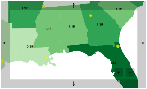
Figure 14-21. Exploring agricultural productivity values in the 2004 southeastern United States
Centroid-based label positioning works out well for boxy states like Mississippi (1.13), Alabama (1.18), and Georgia (1.39). But less regular forms may result in less-than-ideal positioning. Louisiana’s (0.99) L-shape shifts its centroid to the right, a bit too close to Mississippi. Florida’s (1.63) panhandle pulls its centroid to the west, so its value label is just dipping its toes into the Gulf of Mexico.
Still, centroid() is ridiculously useful for this purpose. Unless you’re willing to dive deep into map labeling theory, this approach will be just fine. (For a great explanation of this problem, read Vladimir Agafonkin’s “A New Algorithm for Finding a Visual Center of a Polygon”.)
Acquiring and Preparing Raw Geodata
Despite the impression left by the preceding examples, not every map is of the United States. The world encompasses so many more geographic features than US state outlines; there are other countries, along with their regions, states, provinces, counties, townships, census tracts, postal codes, and districts. On an even smaller scale, there are streets, roads, tracks, trails, and footpaths. The entire planet is fair game for representation on a map. (There’s no need to limit yourself to this planet, for that matter, although D3’s built-in projections are all understandably Earth-centric.)
Unfortunately, the messy nature of reality means that the task of preparing geodata can be far more complex than actually creating a map from that data. I’d like to provide a broad-strokes overview of the process here, although this summary certainly won’t anticipate every potential challenge you may face—from flawed data to obscure file formats and projections.
The essential steps for acquiring and preparing geodata for use with D3 are:
-
Find shapefiles
-
Choose a resolution
-
Simplify the shapes
-
Convert to GeoJSON
-
Choose a projection
You have lots of options and decisions to make at each step. Let’s look at each one in turn.
Find Shapefiles
Shapefiles predate the current explosion of online mapping and visualization. These are documents that essentially contain the same kind of information you could store in GeoJSON—boundaries of geographic areas, and points within those areas—but their contents are not plain text and, therefore, are very hard to read. The shapefile format grew out of the community of geographers, cartographers, and scientists using Geographic Information Systems (GIS) software. If you enjoy using expensive, proprietary GIS software or even the free and open source QGIS, then shapefiles are your best friends. But web browsers can’t make heads or tails of shapefiles, so, ultimately, we need to convert them to GeoJSON.
Assuming you can’t find a nice GeoJSON file describing your area of interest, you’ll have to hunt down a shapefile. Government websites are good sources, especially if you’re looking for data on a specific country or region. If given the option, choose data projected using the WGS84 coordinates system, for maximum compatibility with the examples that follow. Most US-based data will be use WGS84, but international or highly local shapefiles (such as for individual cities) may use other coordinates systems.
My favorite two sources are:
- Natural Earth
-
A massive collection of geographic data for both cultural/political and natural features, made available in the public domain. Mapping countries is highly political, and Natural Earth posts detailed notes explaining their design decisions.
- The United States Census
-
Boundary data for every US state, plus counties, roadways, water features, and so much more, also in the public domain.
Warning
Many sites that offer free “maps,” like Open Vector Maps, provide only images in Illustrator, SVG, or PDF formats. While these maps have their uses, they are preprojected and prerendered images—not raw geographic data. For our purposes, don’t settle for anything less than original shapefiles. (We can project and render our own maps from data, thank you very much.)
Choose a Resolution
Before you download, check the resolution of the data. All shapefiles are vector data (not bitmaps), so by resolution I don’t mean pixels—I mean the level of cartographic detail or granularity.
Natural Earth’s datasets come in three different resolutions, listed here from most detailed to least:
-
1:10,000,000
-
1:50,000,000
-
1:110,000,000
That is, in the highest resolution data, one unit of measurement in the file corresponds to 10 million such units in the actual, physical world. Or, to flip that around, every 10 million units in real life are simplified into one. So 10 million inches (158 miles) would translate to a single inch in data terms.
These resolution ratios can be written more simply as:
-
1:10m
-
1:50m
-
1:110m
For a low-detail (“zoomed out”) map of the world, the 1:110m resolution could work fine. But to show detailed outlines of a specific state, 1:10m will be better. If you’re mapping a very small (“zoomed in”) area, such as a specific city or even neighborhood, then you’ll need much higher-resolution data. (Try local state or city government websites for that information.)
Different sources will offer different resolutions. Many of the US Census shapefiles are available in these three scales:
-
1:500,000 (1:500k)
-
1:5,000,000 (1:5m)
-
1:20,000,000 (1:20m)
Choose a resolution, and download the file. Typically you’ll get a compressed ZIP file that contains several other files. As an example, I’m going to download Natural Earth’s 1:110m (low detail) ocean file.
Uncompressed, it contains these files:
ne_110m_ocean.dbf
ne_110m_ocean.prj
ne_110m_ocean.README.html
ne_110m_ocean.shp
ne_110m_ocean.shx
ne_110m_ocean.VERSION.txt
Wow, those are some funky extensions. We’re primarily interested in the file ending with .shp, but don’t delete the rest just yet.
Simplify the Shapes
Ideally, you can find shapefiles in exactly the resolution you need. But what if you can only find a super-high-resolution file, say at 1:100k? The size of the file might be huge. And now that you’re a JavaScript programmer, you’re really concerned about efficiency, remember? So there will be no sending multimegabyte geodata to the browser.
Fortunately, you can simplify those shapefiles, in effect converting them into lower-detail versions of themselves. The process of simplification is illustrated beautifully in this interactive piece by Mike Bostock. If you’d like to geek out a bit further (of course you do), explore Jason Davies’s interactive Line Simplification essay, which illustrates the challenges of designing a good algorithm.
There are lots of options for performing simplification. I’ll detail two: the easiest one, and a harder (but geekier) one.
MapShaper
MapShaper, by Matt Bloch, is excellent, easy to use, and indispensable. It lets you upload your own shapefile, and then drag sliders around to preview different levels of simplification. Typically, the trade-off is between detail and file size.
Drag files directly onto the window to add them. At a minimum, add your .shp file, as this includes all the geographic features. If you also have a .dbf, add that, too, as it contains important metadata, like country IDs and other feature identifiers.
Use Chrome to be able to export your simplified data. MapShaper can export to a new shapefile or directly to GeoJSON, saving you a step later. It also exports to TopoJSON (described next) and SVG—I suppose for when you’re not interested in the raw geographic data, but just want a preprojected, prerendered map ASAP. Note that MapShaper may assume the use of the WGS84 coordinates system. If your MapShaper export is coming out like gibberish, try using ogr2ogr to convert your data to use WGS84 (see “Convert to GeoJSON” below). See the discussion on this issue for details.
TopoJSON
TopoJSON refers to three different things: a file format, a command-line tool, and a JavaScript library, all of them by—ta-da!—our hero, Mike Bostock.
The TopoJSON file format, like GeoJSON, stores geographic features. Unlike GeoJSON, TopoJSON encodes topology, meaning that the adjacencies (relationships) between features are preserved. Picture California and Nevada, two neighboring states. In GeoJSON, those states would be captured as two independent features (shapes) that just happen to sit right next to each other—touching, in fact. This introduces some redundancy, as all of the points along the very long border between California and Nevada are actually stored twice: once for each state. Furthermore, GeoJSON has no formal knowledge of the relationship between these two states (i.e., that they are neighbors and share a border).
In a TopoJSON file, the California/Nevada border would be recorded only once, and the relationship between these two features is maintained. This can lead to massively smaller file sizes, and incidentally enables you to do some neat stuff that involves analyzing or manipulating the topology.
That said, the TopoJSON format can’t be rendered directly in the browser by D3; we still need GeoJSON for that. So the process of using TopoJSON looks something like this:
-
Convert geographic data (shapefile, GeoJSON, or otherwise) to TopoJSON, applying simplification or other transformations in the process.
-
Load TopoJSON into the client’s browser along with D3 and your project’s code.
-
Use the TopoJSON JavaScript library to convert back to GeoJSON, for rendering with D3 in the usual fashion.
So the trade-off for greater efficiency in file size is the requirement to load a little more JavaScript, in order to convert that data back to the (less-compact) GeoJSON. For point of comparison, the oceans data converted to GeoJSON without simplification is about 209 kilobytes; as TopoJSON, it’s only 49 kilobytes.
If you’re interested in TopoJSON, I strongly recommend reading through all four parts of Mike Bostock’s Command-Line Cartography series. Part 3 addresses TopoJSON specifically, but the other parts provide important context.
If you want to avoid the command line, Shan Carter’s The Distillery is a beautiful, frontend interface for uploading GeoJSON files and converting to TopoJSON. It can perform simplification during the conversion, and, like MapShaper, provides a nice visual preview. So you could convert your shapefile to GeoJSON first, then run it through The Distillery to get simplified TopoJSON. MapShaper now also exports directly to TopoJSON.
Incidentally, if you go the TopoJSON route and are making a map of world countries or US counties or states, Mr. Bostock has already kindly prepared the datafiles for you. See his world-atlas and us-atlas repositories.
Other simplification options
In case you’re averse to these options for some reason, you might like one of the following:
-
Experiment with the
-simplifyflag in theogr2ogrcommand-line tool introduced in the next section. -
If you’re comfortable using Python, try Mike Migurski’s Bloch, a Python implementation of Matt Bloch’s simplification algorithms.
-
Convert your shapefile to GeoJSON first, in all its richly detailed glory, and then use Max Ogden’s simplify-geojson, which takes GeoJSON as input (not shapefiles) and generates simplified GeoJSON.
Convert to GeoJSON
By now, you probably already have a GeoJSON file in front of you, generated as a by-product of the simplification process. In case you’re still staring at a raw shapefile, I want to share one more, very hairy method of doing the conversion. (Hey, you can’t say that I didn’t give you options.)
Please meet ogr2ogr, a command-line tool with a name about as friendly as an actual ogre. If you can get ogr2ogr running on your Mac, Unix, or Windows system, you will have access to a free and open source geodata conversion powerhouse. If your source shapefile uses an obscure projection, ogr2ogr may be your savior. The problem is that ogr2ogr depends on several other frameworks, libraries, and so on, so for it to work, they all have to be in place.
I won’t cover the intricacies of the installation here, but I’ll point you in the right direction. If you can get this installed properly, you earn +15 geek points. If you are willing to forego the points, you could try Ogre, a web-based client for ogr2ogr that requires no download or installation. Ogre doesn’t do everything that ogr2ogr does, but it should handle most shapefile-to-GeoJSON conversions with no issues.
To continue on the command-line route, your first step is to get the Geospatial Data Abstraction Library, or GDAL. The ogr2ogr utility is part of this package.
You also need GEOS, which cleverly stands for Geometry Engine, Open Source.
If you have a Windows or Unix/Linux machine, you can now have fun downloading the source and installing it by typing funny commands like build, make, and seriously why isn't this working omg please work this time or i will freak out.
I don’t remember the exact command names, but they are something like that. (On a serious note, if you get stuck on this step, be aware that there are literally entire other O’Reilly books on how to download and install software packages like this.)
If you’re on a Mac, and you happen to have both Xcode and Homebrew installed, then simply type brew install gdal into the terminal, and you’re done! (If you don’t have either of these amazing tools, they might be worth getting. Both tools are free, but could take some time and effort on your part to install. Xcode is a massive download from the App Store. Once you have Xcode, Homebrew can, in theory, be installed with a simple terminal command. In my experience, some troubleshooting was required to get it working.)
To Mac users without Xcode or Homebrew: you are very lucky that some kind soul has precompiled a friendly GUI installer, which installs GDAL, GEOS, and several other tools whose names you don’t really need to know. Look for the newest version of the “GDAL Complete” package. Review the GDAL README file closely. After installation, you won’t automatically be able to type ogr2ogr in a terminal window. You’ll need to add the GDAL programs to your shell path. The easiest way to do that is:
-
Open a new terminal window.
-
Type
nano .bash_profile. -
Paste in
export PATH=/Library/Frameworks/GDAL.framework/Programs:$PATHand then Control-X and Control-Y to save. -
Type
exitto end the session, then open a new terminal window and typeogr2ogrto see if it worked.
No matter what system you’re on, once all the tools are installed, open a new terminal window and navigate to whatever directory contains all the shapefiles (for example, cd ~/ocean_shapes/.) Then use the form:
ogr2ogr -f "GeoJSON" output.json filename.shp
This tells ogr2ogr to take filename, which should be a .shp file, convert it to GeoJSON, and finally save it as a file called output.json.
For my sample ocean datafile, using ogr2ogr looks like the following:
ogr2ogr -f "GeoJSON" output.json ne_110m_ocean.shp
Converting Coordinates Systems with ogr2ogr
As noted earlier, US-based data often uses the WGS84 coordinates system. Your data may use something else, especially if it involves another country (yes, there are other countries) or region (yes, those, too).
If your data uses another coordinates system, you may see garbage output or crazy lines once you get the GeoJSON into D3. Fortunately, ogr2ogr’s -t_srs flag can be used to convert coordinates systems before doing the GeoJSON export. In our example, you’d write:
ogr2ogr -f "GeoJSON" -t_srs crs:84
output.json filename.shp
Thanks to Michael Neutze for suggesting this important tip.
Type that in, and hopefully you see nothing at all.
So anticlimactic! I know, after the hours you spent hacking the command line to get the ol’ ogr installed, you were expecting a grandiose finale, or at least some sort of confirmation like “Conversion complete.”
But no, nothing happened at all, except for the appearance of a new file in the same directory called output.json.
Here’s the start of mine:
{"type":"FeatureCollection","features":[{"type":"Feature","properties":{"scalerank":0,"featurecla":"Ocean"},"geometry":{"type":"Polygon","coordinates":[[[49.110290527343778,41.28228759765625],[48.584472656250085,41.80889892578125],[47.492492675781335,42.9866943359375],[47.590881347656278,43.660278320312528],[46.682128906250028,44.609313964843807],[47.675903320312585,45.641479492187557],[48.645507812500085,45.806274414062557]…
Hey, finally, this is starting to look familiar!
Choose a Projection
Excitedly, now we copy our new GeoJSON into our D3 directory. I renamed my file oceans.json, copied an earlier map example, and in the D3 code, simply changed the reference from us-states.json to oceans.json, producing the result shown in Figure 14-22.

Figure 14-22. GeoJSON showing, um, the world’s oceans?
Blaaa! What is that?! Whatever it is, you can see it in 18_oceans.html.
Now I see the problem: not all projections will work for any given geometry. My earlier example used geoAlbersUsa, but that’s intended only for the US.
I’ll switch to geoMercator instead, but D3 has plenty of other projections built in, plus a raft of lesser-used projections. (See this image by Mike Bostock of every D3-supported map projection as of July 2016.) Choose whatever is most appropriate for your project, and note that different projections may support different parameters and methods than what we’ve seen so far in geoAlbersUsa.
Tip
Much has been written on how to choose the “best” projection for a given map. Michael Corey’s “Choosing the Right Map Projection” is a great place to start.
Besides changing geoAlbersUsa to geoMercator, I also adjusted the scale() value, so the whole world now fits within the image, as you can see in Figure 14-23.

Figure 14-23. GeoJSON of the world’s oceans, now properly projected
See the result in 19_mercator.html—oceanic GeoJSON paths, downloaded, parsed, and visualized. We did it!