Chapter 10: The Anatomy of a Plot
This is the first chapter of this book’s third part, Mastering Plot Customizations. These last few chapters will allow you to fully customize Julia’s plots – mainly via the Plots package. To customize our plots, we should first know the various parts that compose them. Those components can have different names and customization levels across plotting packages.
Therefore, this chapter will dissect figures from Plots, Makie, and Gadfly to understand their terminology. This will give us a glance into the customization opportunities of those elements. We will explore ways to customize those elements further in Chapter 12, Customizing Plot Attributes – Axes, Legends, and Colors.
In this chapter, we’re going to cover the following main topics:
- The anatomy of a Plots plot
- Knowing the components of Makie’s figures
- Exploring Gadfly’s customizable components
Technical requirements
You will need Julia, Pluto, and a web browser with an internet connection to run the code examples in this chapter. The corresponding Pluto notebooks and their HTML versions, along with their outputs, can be found in the Chapter10 folder of this book’s GitHub repository: https://github.com/PacktPublishing/Interactive-Visualization-and-Plotting-with-Julia.
The anatomy of a Plots plot
This section will describe the fundamental elements that build a figure from the Plots package. The main terminology will be helpful to us in future sections of this chapter, where we will expand on these concepts to understand Makie and Gadfly figures.
A plot from the Plots package has several components we can customize using attributes. We can think of a Plots figure as a plot that can contain subplots. Those subplots will have axes that define the plot area in which we can plot our series. We can customize each of those elements through different groups of attributes. Some attributes, especially background and foreground colors, pass their values across levels. For example, by default, the axis color, foreground_color_axis, matches the color defined for the subplot, foreground_color_subplot, which, in turn, matches the one defined for the plot through the foreground_color attribute.
Let’s explore the different parts that build a Plots figure using a Pluto notebook:
- Execute the following code in the first cell:
begin
using Plots
import Plots: mm
default(dpi=500)
end
The preceding code loads the Plots package and sets the default dpi to use. It also brings the millimeters, mm, unit into scope as this will be helpful later for defining the margin sizes. Let’s start exploring the axes.
- In a new cell, execute the following code:
plt_axes = plot()
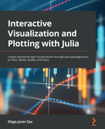
The preceding code creates an empty plot where only the axes are visible. The empty bidimensional plot has two axes, x and y, which define our coordinate system. By default, those axes go from 0.0 to 1.0, but we are free to change the axes limits using the lims plot attribute. The axes also have a scale. In this case, the plot has the default linear scale. The axes are essential as they give meaning to the position of our markers and lines in the plot. Therefore, we plot our data series in the plot area defined by the axes. Let’s annotate these axes to visualize their parts.
- Execute the following code in a new cell:
plot!(plt_axes,
xguide = "x axis guide (label)",
yguide = "y axis guide (label)",
lims = (0, 1),
ticks = 0:0.2:1,
minorticks = 2,
minorgrid = true)
The plot! function is modifying the plot stored in the plt_axes variable. It uses the guide attribute to assign the axis labels. Usually, we can prefix axis attributes with x, y, or z to indicate the axis we want to adjust. For example, xguide sets the guide or label for the x axis. After that, we used the lims attribute to specify the axis limits and ensure that the axes go from 0 to 1, independent of the data we plot.
Then, we determined the position of the axis ticks using the ticks attributes. The ticks are short lines perpendicular to the axis that determine the location of particular values, indicated using tick labels, in the axis. We can have smaller lines without labels showing some locations between ticks, known as minor ticks. The Plots package doesn’t show minor ticks by default, so we used the minorticks attribute to divide the space between ticks by 2.
Finally, as Plots doesn’t show the minor grid that corresponds to the minor ticks by default, we set the minorgrid attribute to true to see it. Now, let’s label some of these plot elements.
- Execute the following code in a new cell:
axis_annotations = [
(0.2, 0.2, ("tick and tick label", :bottom, 10)),
(0.5, 0.1, ("minor tick", :bottom, 10)),
(0.75, 0.3, ("x axis border (spine)",
:bottom, 10)),
(0.15, 0.75, ("grid", :right, :bottom, 10)),
(0.55, 0.65, ("minor grid", :left, :bottom, 10))]
The preceding code creates a vector of annotations that we will add to our plot in the next step. Each annotation tuple contains the x and y coordinates and a tuple with the annotation text and some arguments. Plots will pass those arguments to the font function to set the aspect of the annotation. In this case, we set the valign attribute to :bottom and pointsize to 10. Because Plots uses magic arguments, we didn’t need to write the names of the attributes.
- Run the following code in a new cell:
plot!(plt_axes,
[0.2, 0.2, NaN, 0.5, 0.5, NaN, 0.75, 0.75, NaN,
0.15, 0.2, NaN, 0.55, 0.5],
[0.2, 0.02, NaN, 0.1, 0.02, NaN, 0.3, 0.02, NaN,
0.75, 0.6, NaN, 0.65, 0.5],
arrow = arrow(:closed),
color = :black,
legend = false,
annotations = axis_annotations)
The preceding code modifies our plot by adding arrows with annotations. The first two vectors we pass as the second and third positional arguments are the x and y coordinates. The first coordinates are the origin of the arrow and the second are their destination; then, a NaN value separates the arrow segments. Then, we set the arrow attribute to arrow(:closed) to add the arrowheads. Finally, we set the annotations keyword argument using the vector defined in the previous step to add the annotation texts. The following diagram shows the plot that was created with the axis components annotated:
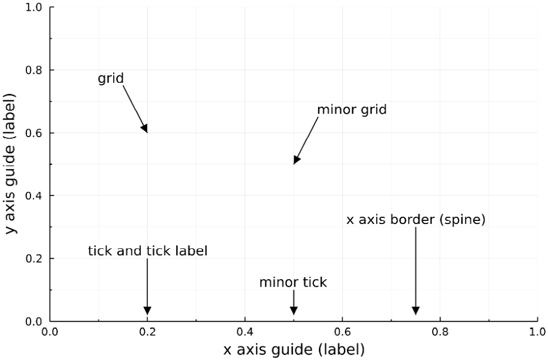
Figure 10.1 – The axes of a Plots figure
Here, we can see the different parts of the axes. The axes determine the space where we will plot our data. They use different components to help us determine positions in our coordinate system. The axis labels, or guides in Plots parlance, usually provide information about the data displayed in that dimension.
Then, the spines, or axis borders in Plots, highlight the axis directions and provide support for the ticks. The ticks and ticks labels allow us to identify particular values along the axis. The grid expands under the plot while following the ticks, enabling us to locate those positions in the plot space. Finally, we can have smaller ticks without labels, known as minor ticks, and their corresponding minor grid. Now that we have seen the parts that create Plots axes, let’s explore the ones that make a subplot.
- In a new cell, execute the following code:
x_values = 0:0.25:1
The preceding code creates the x coordinates for the points we will use as an example.
- Run the following code block in a new cell:
plt_subplot = scatter(x_values, x_values.^2,
zcolor = x_values, seriescolor = :grays,
title = "Title",
legendposition = (:topleft),
legend_title = "Legend title",
label = "label",
colorbar_title = "Color bar title",
leftmargin = 15mm,
annotation = (0.51, 0.26,
("annotation text", :bottom, :left, 10)))
Here, we created a scatter plot for this subplot example. We can think of the subplot as a single plot containing its axes. The marker fill color indicates the content of the x_values variable, as indicated using the zcolor attribute. We used the title attribute to set the subplot title. A subplot can have a legend; we used legendposition to determine its location and legend_title to add a legend title.
We indicated the label of each series using the label attribute. In cases like this, where we have a color gradient, we can have a color bar. The color bar, like the axes, has ticks and ticks labels to indicate the scale in the color gradient. We added a color bar title using the colorbar_title attribute. In this example, we modified the left margin of the leftmargin keyword argument; you can also adjust other subplot margins.
Finally, we added an annotation text using the annotations keyword argument, as seen in step 4 and step 5. Let’s add some annotations to highlight some of those elements.
- In a new cell, execute the following code block:
subplot_annotations = [
(0.95, 0.08, ("plot area", :right, 10)),
(0.90, 0.71, ("color bar tick and label",
:right, 10)),
(0.55, 0.93, ("legend", :left, 10))]
As demonstrated in Step 4, the preceding code defines the annotations we want to add to our subplot.
- In a new cell, execute the following code block:
plot!(plt_subplot,
[0.9, 1.0, NaN, 0.55, 0.40],
[0.71, 0.71, NaN, 0.93, 0.93],
label = nothing,
arrow = arrow(:closed),
color = :black,
background_color_inside = :gray95,
annotations = subplot_annotations)
The preceding code creates arrows and annotations, as demonstrated in Step 5. We also set the background color of the plot area to :gray95 using the background_color_inside attribute. The following diagram shows the final plot displaying the different components of a Plots subplot:
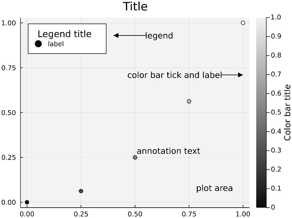
Figure 10.2 – The subplot components in a Plots figure
Here, we created one of the two subplots that will make up our figure. We have only added a subplot title to our subplot.
- In a new cell, run the following code:
subplot_b = plot(0:0.01:1, x -> x^2,
title = "Subplot title",
legend_position = :none)
Here, we created our second subplot and added a series to its axes. We have avoided showing the legend of the subplot by setting legend_position to :none.
- Run the following code in a new cell:
plt = plot(subplot_a, subplot_b,
plot_title = "Plot title",
plot_titlevspan = 0.1,
background_color_inside = :gray95,
background_color = :gray85,
layout = grid(1, 2, widths=[0.3, 0.7]))
Here, we used the plot function to create our plot, which contains multiple subplots. In this case, these are the two subplots we produced in the previous step. The plot_title attribute allows us to set the plot title, while plot_titlevspan indicates the fraction of the vertical space that the plot title will use.
Then, we set the background color inside and outside the plot area using the background_color_inside and background_color attributes, respectively. As a plot contains multiple subplots, it includes a layout to determine their sizes and positions. We can define it using the layout keyword argument. In this example, we used the grid function to create the grid layout to arrange the subplots. We will discuss this function in more detail in Chapter 11, Defining Plot Layouts to Create Figure Panels.
- In a new cell, run the following code:
lens!(plt, [0.0, 0.2], [0.0, 0.1],
background_color_inside = :gray95,
inset_subplots = (2,
bbox(0.25, 0.25, 0.35, 0.2)))
We can add inset or floating subplots inside a Plots plot. In this example, we used the lens function to add an inset plot to magnify a region of our subplot. The lens magnifies the rectangular area determined by the x and y intervals. We used two element vectors to indicate those intervals. Then, we used the inset_subplots attribute to determine the position and size of the floating plot. The first element of the tuple we used to set this attribute indicates the number of the parent subplot.
Here, for example, we added an inset subplot relative to the second subplot of our plot. Then, the second element of the tuple is the bounding box, bbox, which contains the plot area of the subplot. The two first floating points of the bbox function determine the location of the top-left point of our subplot. Those numbers indicate fractions in the x and y dimensions of the plot area of the parent subplot. 0.0, 0.0 is located at the top-left point in our subplot area. The last two floating-point numbers determine the inset plot’s width and height as a fraction of the parent plot area. We will discuss inset plots in more detail in Chapter 11, Defining Plot Layouts to Create Figure Panels.
- In a new cell, execute the following code:
plot_annotations = [
(0.15, 0.9, ("bounding box", :bottom, 10)),
(0.5, 0.85, ("inset subplot", :left, 10))]
The preceding code creates the annotation labels for our plot.
- Execute the following code in a new cell:
plot!(plt[2],
[0.15, 0.23, NaN, 0.5, 0.4],
[0.90, 0.77, NaN, 0.85, 0.77],
label = nothing,
arrow = arrow(:closed),
color = :black,
annotations = plot_annotations)
The preceding code adds the arrows and annotations to our second subplot, as indicated by plt[2]. The following diagram shows the plot that was created:
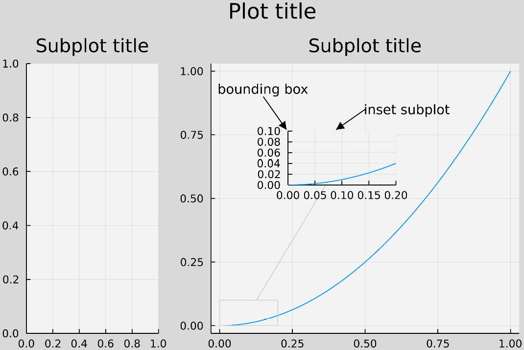
Figure 10.3 – Plots plot components
The preceding plot contains two subplots and a lens. The inset plots of the lens show a magnified region of our function near the origin. The first arrow indicates the point that determines the location of the bounding box of the inset subplot.
In this section, we learned about the main components of a Plots figure. In the next section, we will mention their Makie equivalents and discuss the differences.
Knowing the components of Makie’s figures
In Makie, we can think of the Figure object as the main plot element. It contains a GridLayout that will determine the location of the different plot components in the figure. Therefore, Makie’s Figure is similar to the plot object from Plots. The pieces we can arrange on GridLayout are called layoutables. We can find Axis, Label, Legend, and Colorbar among the many layoutables available. While Plots locates most of those elements in the subplots, Makie gives us the freedom to arrange them in Figure. We will learn more about how to place layoutables in Makie’s GridLayout in Chapter 11, Defining Plot Layouts to Create Figure Panels.
The Axis layoutable object contains the axes for our plot, and we plot our data in it. Makie axes components are similar to those of the Plots package, which we saw in the previous section. Axis objects include the spines and the decorations: the x- and y-axis labels, the ticks and grid, and the minor ticks and the minor grid. They can also have a title similar to the subplot title of Plots. To have a title for the whole figure, we need to use a Label object. Plots’ color bar title is named label in Makie parlance. The axis of the color bar is fully customizable in Makie; for example, we can modify their spines and ticks. We can also add high and low clip triangles at the extremes of the color bar.
Figure has its margins controlled by the amount of padding around the figure’s content. The spaces between the elements in the grid layout are the gaps: colgap and rowgap. Legends also have notable margin and padding attributes. The margin is the distance between the legend border or frame and the legend bounding box. Instead, the padding is the distance between the legend content and the legend border.
Let’s see an example of those Makie’s plot components using Pluto:
- Run the following code in the first cell of the notebook:
begin
import Pkg
Pkg.activate(temp=true)
Pkg.add(name="CairoMakie", version="0.8.8")
using CairoMakie
end
The preceding code installs and loads CairoMakie 0.8.8 in a temporal environment. Note that this cell can take some time to run and that the output that’s captured in Pluto’s log can be large.
- Execute the following code in a new cell:
begin
fig = Figure(fontsize=24)
axis = Axis(fig[1, 1])
plt = scatter!(axis, 1:10,
color = 1:10,
colorrange = (0.0, 10.0),
label = "Legend's label")
fig
end
Here, we used the Figure constructor to create an empty figure containing GridLayout. We populated the layout by adding an Axis object to the first grid cell. Then, we used the scatter! function to draw 10 points in our axes. This function returned the plot object; we will need it in future steps. We used the color and colorrange attributes to color the points according to a color gradient. We also labeled our series using the label attribute – the Legend constructor will need it.
- In a new cell, execute the following code:
begin
legend = Legend(fig[2, 1], axis,
"Legend's title",
tellheight=true, tellwidth=false)
cbar = Colorbar(fig[1, 2], plt,
label = "Colorbar's label (title)",
ticks = 0:1:10)
fig
end
Before we ran this cell, our Figure constructor only carried the Axis object. The preceding code adds a Legend object for the series in our axes. We placed the legend in GridLayout, just under our axis. The string in the third positional argument determines the legend’s title. We set the tellheight attribute to true so that the cell grid knows the height of the legend. We also set tellwidth to false to avoid the GridLayout column’s width from matching the legend’s width. Then, we added a Colorbar object to the right-hand side of our Figure constructor. We used the label attribute of the Colorbar constructor to set its title, and the ticks attribute to increase the number of color bar ticks.
- In a new cell, execute the following code:
begin
hidespines!(axis, :t, :r)
axis.xminorgridvisible = true
axis.yminorgridvisible = true
axis.xminorticksvisible = true
axis.yminorticksvisible = true
axis.title = "Axis' title"
axis.xlabel = "Axis' xlabel"
axis.ylabel = "Axis' ylabel"
fig
end
Here, we set some attributes for our Axis object. First, we hid the top and right spines that Makie shows by default using the hidespines! function. In particular, we made the minor grid and ticks for the x and y axes visible. Then, we set a title for the axes and a label for each axis. The following diagram shows the resulting plot:
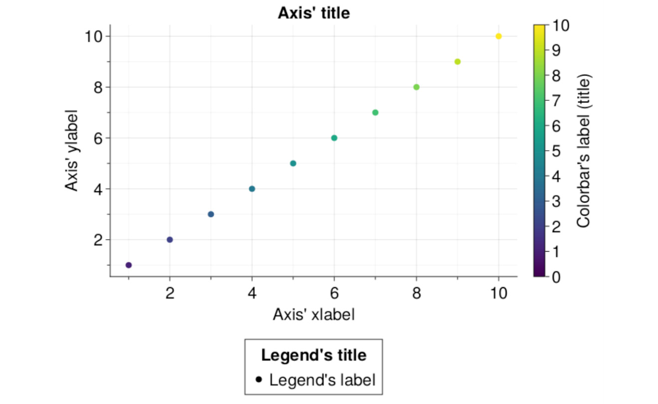
Figure 10.4 – Makie’s nomenclature
Now that we have seen the main similarities and differences between Plots and Makie figures, let’s compare the former and Gadfly.
Exploring Gadfly’s customizable components
This section will briefly mention the most notorious differences between Plots and Gadfly plot component nomenclature. In Chapter 5, Introducing the Grammar of Graphics, we described some components of a Gadfly figure. Here, we will highlight Guides, Coordinates, and Scales. Scales determines the scales used by the axes, color, sizes, shapes, and line styles. Coordinates chooses the coordinate system for our axes; however, in Gadfly 1.3, only cartesian coordinates are available.
Finally, Guides offers support for adding and customizing axes, annotations, titles, and keys. The keys generate the legends of the plot; we can have color, shape, and size keys. If the color scale is continuous, the color key will create a color bar rather than something similar to a Plots legend. Gadfly’s Guides will allow you to modify the axes ticks and labels and add rugs. These rugs are short lines that indicate the position in the axes where there is a data point.
Gadfly generally allows for fewer customization opportunities compared to Plots and Makie. Therefore, Gadfly needs fewer definitions for its plot components. However, as we can see, Gadfly names its elements similar to Plots, but it organizes them differently. We quickly discussed this organization here to allow you to find the attributes for customizing the components.
Summary
In this chapter, we learned about the main components of a figure from the Plots package. Then, we briefly extended that description to Makie and Gadfly figures. The knowledge we’ve acquired in this chapter will help us when we look for attributes to customize those elements. We also gained an idea about the place that the layout takes in Plots and Makie figures.
We will describe the layout capabilities of those packages in more detail in the next chapter.
Further reading
The knowledge you’ve acquired in this chapter will help you start exploring how to customize the plot components while following the documentation for Plots, Makie, and Gadfly. In the case of Plots and Makie, you can explore some of those attributes in Chapter 12, Customizing Plot Attributes – Axes, Legends, and Colors. For more information about the layout capabilities, please refer to Chapter 11, Defining Plot Layouts to Create Figure Panels.