
Now that you know that tables store data as records and queries show the records in a variety of ways, you should know that your database applications will not show tables or queries to users. All database applications use forms to create your database user interface.
Creating a Form
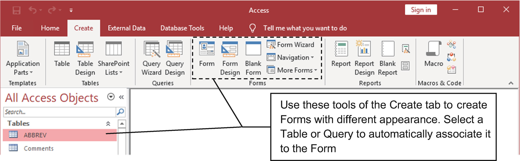
Use the tools in the Forms area of the Create tab to create a Form object. To automatically associate the object to a table or query, first select the desired data source in the Database window
Form tool : Enable this tool by first selecting a table or query in the Database window. The form will be created and shown using a Form view, and its appearance may vary according to the table relationships.
Form Design : Create a blank form and show it in Design view.
Blank Form : Create a blank form and show it in Layout view.
Form Wizard : Create forms using different types of presentation with the aid of a wizard.
Navigation : Create a form that uses a Navigation control to create a dashboard where you can show other database objects.
More Forms: Create forms with different types of presentations without using a wizard.
Since there are many ways to create a form, let’s begin by using the Form Wizard so you can better understand some layout differences among the different methods.
Using the Form Wizard to Create Forms
As with queries, you can create a form using the Form Wizard to help you learn the different ways to show record information to the users of your database application.
Since a form can show information from the records returned by any table or query saved in the database, this chapter uses the sr28_Forms.accdb nutrition file, because it has all the sr28.accdb tables plus all the queries created on sr28_Queries in Chapter 3.
Simple forms: These forms show records from a single table or query.
Forms with subforms: These forms show records from the “one” and “many” sides of any table relationship.
If you are already familiar with the Visual Basic for Application (VBA) interface and the UserForm object that it offers, it is important to notice that it is quite different from the Microsoft Access Form object. The Form object has an extensive set of properties and different behavior based on a number of events not available in the UserForm object.
Creating Simple Forms with the Form Wizard
To help you understand the different types of forms the Form Wizard can automatically create for you, this chapter will use the FOOTNOTE table because it has just five fields, allowing you compare them more easily with this chapter’s figures.
- 1.
Click the FOOTNOTE table in the Database window and then click the Form Wizard command in the Forms area of the Create tab to open the Form Wizard window (Figure 4-2).
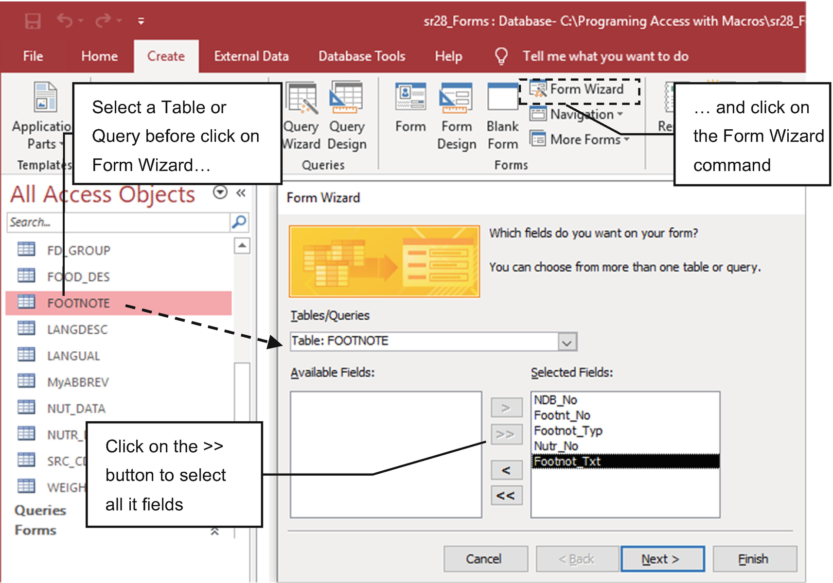
Select the FOOTNOTE table in the Database window and click the Form Wizard command on the Create tab to show the Form Wizard window
- 2.
In the Form Wizard window, click the >> button to add all the Available Fields list items to the Selected Fields list and click Next.
- 3.
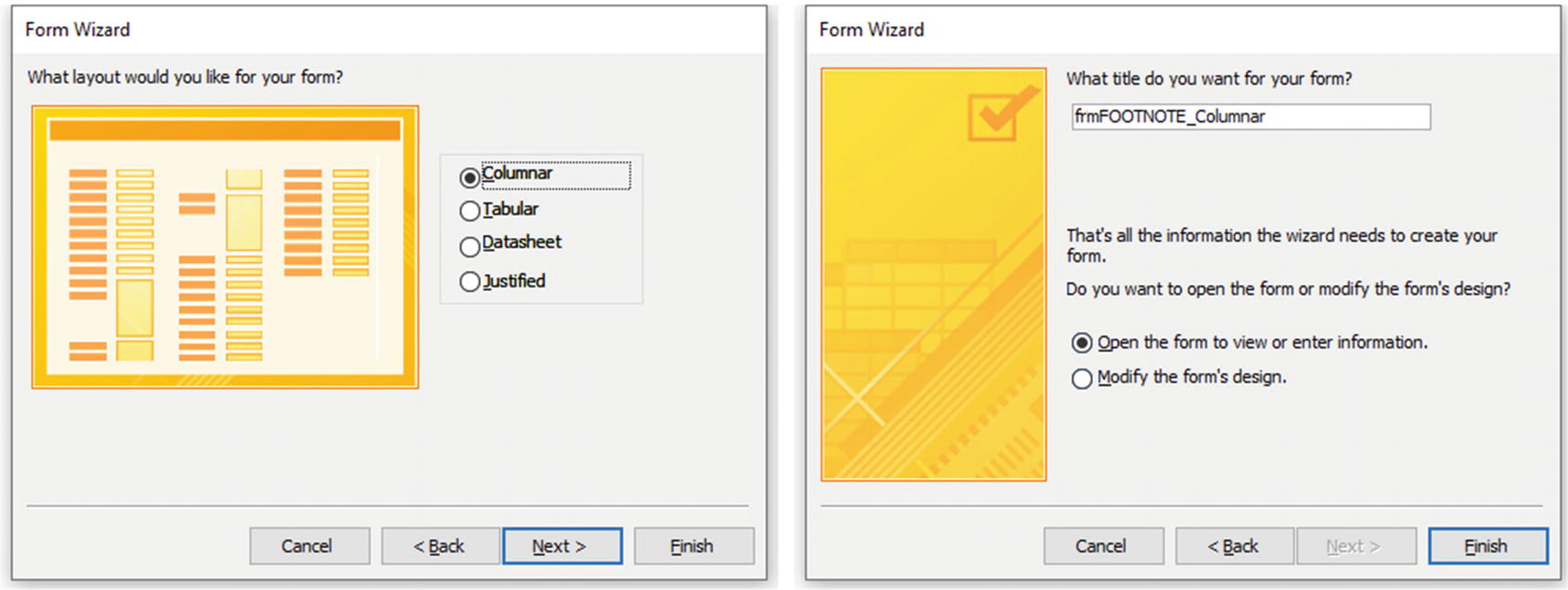
The Form Wizard will ask to select the form type you want to create: Columnar, Tabular, DataSheet, or Justified. Choose the desired form, and click Next.
Note These different types of forms will be discussed in this chapter. They differ in the way that they present record information (using a single or multiple records at a time) and how the controls are disposed of in the Form Detail section.
- 4.
The Form Wizard will show its last window with the default form name, the table, or the query name you selected in its first step.
Tip To follow this book’s naming convention rules, as defined in Chapter 1, always name forms with the “frm” prefix to easily distinguish them from tables or queries and other database objects.
- 5.
Define the form name and select whether the new form must be shown using Form or Design view (Figure 4-3).
In the second Form Wizard’s step, select the form type, and in its last step, accept or define the form name, choose to open the form on Form or Design view, and click Finish
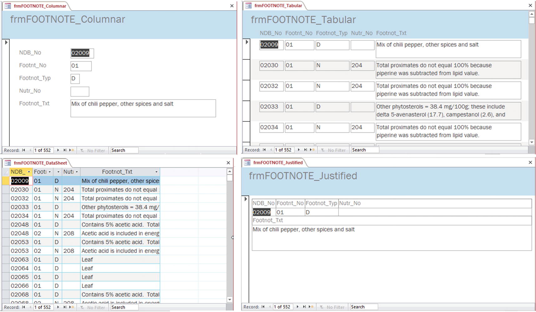
The four types of form you can create for the FOOTNOTE table using the Form Wizard
All four types of forms created by the Form Wizard can be found in the sr28_Formst Database window named as FOOTNOTE_<FormType>, where <FormType> is Columnar, Tabular, Datasheet, or Justified.
You can find all these forms created by the Form Wizard for the FOOTNOTE table in the sr28_Forms.accdb file that you can extract from Chapter04.zip.
The difference? Besides cosmetic changes on the field presentation and layout, two of them show one record at a time (frmFOOTNOTE_Columnar and frmFOOTNOTE_Justified), and the other two show many records at once—like tables and queries do (frmFOOTNOTE_Tabular and frmFOOTNOTE_Datasheet).
As you might suppose, they change a Form property to show one or many records at a time (the form’s Default View property).
Creating Simple Forms with the More Forms Command
Besides using the Form Wizard, you can create simple forms using the More Forms command in the Forms area of the Create tab.
This command does not offer a wizard where you can select which fields you want to appear on the form. It just creates the form in a single step.
Multiple Items: This is similar to the Tabular Form Wizard type (the difference is that it uses fields with the same height).
Datasheet: This is similar to the Datasheet Form Wizard type (the difference is that it shows columns with a better defined width).
Split Form: This is a form that is split in half by two parts: the top area shows a single record similar to the Columnar Form Wizard type, while the bottom part shows many records using the Datasheet view. Click a record on the bottom area to select it in the top area.
Modal Dialog: This allows you to create a floating, modal form that can be used to grab user attention. It does not show by default any record information: just OK and Cancel buttons.
A modal form is one that will keep the focus until it is closed (or hidden). It stops the workflow of the application, not allowing the user to do anything in the Access interface until it closes the form. A dialog form is one that has no sizeable border; no minimize, restore, and maximize buttons; and no form selector or navigation buttons.

Other types of simple forms you can create for the FOOTNOTE table using the More Forms option
You can find all the forms created by the More Forms command for the FOOTNOTE table in the sr28_Forms.accdb file that you can extract from Chapter04.zip.
Creating a Form/Subform with the Form Wizard
Up until now, you may be wondering if there are any differences between a simple form and a table or query Datasheet view besides the way the records are presented. The answer is yes, and you will see why later in this chapter.
But you can appreciate the real difference whenever you use the Form Wizard to create a form/subform that is capable of showing records from any two directed related tables that have referential integrity set between them using a one-to-many relationship.
Using the Form Wizard, you can create forms that automatically synchronize records of three cascading related tables—as long as they have referential integrity set on a one-to-many relationship.
Creating a Form with a One-Level Subform
Investigating the Relationships window shown in Figure 3-2, you will note that you can use the FOOD_DES and WEIGHT tables because they have a direct one-to-many relationship (each food item can have many different types of presentations according to the WEIGHT table records).
- 1.
Select the table that represent the “one” side of the relationship in the Database window (FOOD_DES) and click the Form Wizard command on the Create tab.
- 2.
On the Form Wizard’s first page, double-click the fields NDB_No, Long_Desc, and Refuse to add them to the Selected Fields list.
- 3.
Still on the first page, click the Table/Queries box to expand it, and select the WEIGHT table in the list.
- 4.
Double-click the fields Amount, Msre_Desc, and Gm_Wgt to also add them to the Selected Fields list.
- 5.
Click Next in the wizard to detect the direct relationship between these two tables and define how the form must group its records, using the “one” side (FOOD_DES) or the “many” side (WEIGHT).
- 6.
Keeps FOOD_DES selected (“one” side) and note that the wizard allows us to show the data in two different ways: using “Form with subform(s)” (one single form) or “Linked Forms” (two independent windows forms that synchronize its records).
Caution The Linked form proposed by the Form Wizard to show two different windows is not working well and will produce a “buggy” form. Later in this book, you will learn how to synchronize two forms using a simple macro.
- 7.
Keep the “Form with subform(s)” option selected and click Next. The wizard will show to present the data: using a Tabular or Datasheet view. Select Datasheet view to get a better subform view and click Next.
- 8.
The wizard will show the name of the two forms it will create: one for the “one” side (FOOD_DES) and another for the “many” side of the relationship (the WEIGHT subform, as shown in Figure 4-6).
Note Following the rules proposed in Chapter 1, prefix both form names with the “frm” tag.

Use the Form Wizard to select fields from any two directly related tables that have a one-to-many relationship with referential integrity imposed to automatically create a form/subform structure
- 9.
Keep “Open the form to view or enter information” selected and click Finish.

Using a form/subform strategy, you can show records from a one-to-many relationship using a single window
As Figure 4-7 shows, you will find frmFOOD_DES and the frmWEIGHT subform in the sr28_Forms.accdb file that you can extract from Chapter04.zip.
Creating a Form with a Two-Level Subform
Microsoft Access allows you to create up to two levels of subforms, which means that any subform can have its own subform to synchronize up to three tables at once using a single interface.
- 1.
Open the Form Wizard, and on its first page select the FD_GROUP table in the Table/Queries box. Select its Fd_GrpDesc field and click > to add it to the Selected Fields list.
- 2.
Still on the first wizard page, select the FOOD_DES table in the Table/Queries list, select the desired fields (NDB_No, Shrt_Desc and Refuse), and click > to add it to the Selected Fields list.
- 3.
Once more on the first wizard page, select the WEIGHT table in the Table/Queries box, select the desired fields (Amount, Msre_Desc, and Gm_Wgt), and click > to add it to the Selected Fields list (see Figure 4-8).
- 4.
Click Next. The wizard detects the direct relationship between these three tables and defines how the form must group its records (keep selected FD_GROUP and the “Form with subform(s)” option).
- 5.
Click Next and note that the wizard now offer two options to show the two subforms (one form for FD_DES and another for WEIGHT tables). Select Datasheet view on both options.
- 6.
Click Next, and the wizard will show the name of the three main forms it will create: one for FD_GROUP, one for FOOD_DES), and another for WEIGHT.
- 7.
Rename the forms by prefixing them with the “frm” tag (and eventually add a suffix to the ones the wizard warns it will overwrite, like the frmWEIGHT subform, created in the previous section; see Figure 4-6).
- 8.
Click Finish to make the Form Wizard create the form with its two subforms, each one having its own navigation buttons. Use the main form navigation buttons to show different food categories, and note how the food items of these categories are automatically synchronized and how the common measures of the selected food item are automatically shown in the second-level subform (Figure 4-9).
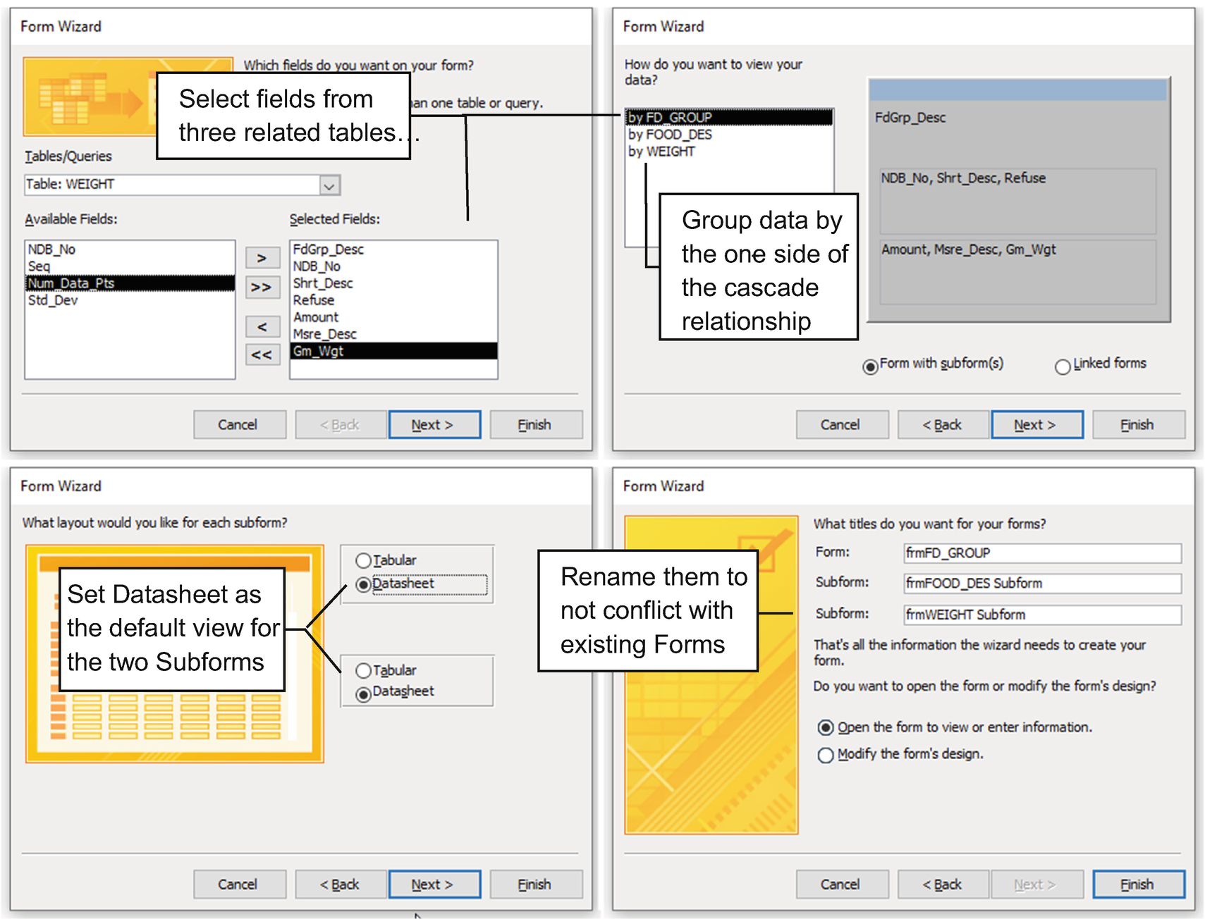
Using the Form Wizard, you can select fields from up to three related tables (with referential integrity imposing a cascading one-to-many relationship between them) to create a two subform-level main forms (always view the data by the table that has the “one” side of the cascade relationship)

Use the frmFD_GROUP form navigation buttons to change the food category, and note how the frmFOOD_DES subform automatically changes its records. Also note that the selected food item will automatically show its most popular common measures on the frmWEIGHT Subform2
As Figure 4-8 shows, you will find frmFD_GROUP, the frmFOOD_DES subform, and the frmWEIGHT subform inside the sr28_Forms.accdb file that you can extract from Chapter04.zip.
Although the Form Wizard created two subforms to represent the three tables’ cascade relationships, it does not create a subform with another subform inside it (frmFOOD_DES does not have a subform inside it). But this approach is perfectly possible to build using the form’s Design view.
Form view Properties
Form view: This shows record values and is the way the users of your application will see them.
Design view: This shows the form structures, where you can set form and control properties to build the user interface.
Layout view: This shows record values while allowing you to change most of the form (and control) properties on the run. It is great to do some fine-tuning of the interface.
Datasheet view: This shows record values using a datasheet like the one offered by a query to show its records.
- 1.
Double-click the form to open it in Form view.
- 2.
Right-click the form and select Open ➤ Design View or Layout View button.
- 3.
After a form is opened in Design view or Layout view, you can use the View command of the Form Design tab to select the desired view mode.
- 4.
Right-click the form title bar and select the desired view.
The next section will show how to use Form Design view to set Form properties.
Using Form Design View
Microsoft Access offers a nice and fast way to create forms for any table or query based on predefined templates, which can save time and also helps you to learn how a form works.
But for my taste—and I want to make it clear that this is a matter of taste—the forms automatically produced by the Form Wizard or More Forms tool are simply a standardized, clumsy, amateur way to produce a database interface.
If you need to create professional interfaces, you need to use the form design and create your own forms so they best translate your personalized way of producing software.
Because of this way of looking at software development and the many form format properties available that simply don’t work on anchored windows used by default on the Microsoft Access tabbed documents interface, from this point on this book will just use the alternative way of showing Microsoft Access objects, namely, using Overlapping Windows, as explained earlier in this book.
In the Chapter04.zip file, you will find the sr28_Forms_Overlapping.accdb database, which is a copy of the sr28_Forms.accdb database with the Overlapping Windows option set. This will be used from now on in this chapter.
To use this interface, select the Overlapping Windows option in the Current Database section of the File ➤ Options dialog box. Since this is a database preference, Microsoft Access will ask you to close and reopen the database before this option will take effect.
The Form Design Window
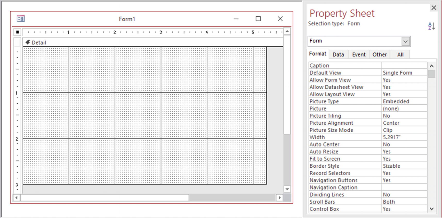
This is a default form design window, floating in the Microsoft Access interface after setting the Current Database ➤ Overlapping Window option
The first thing you’ll note is that it has a horizontal and a vertical ruler, a Detail section filled with lots of clumsy dots and lines, and a Property Sheet that uses five tabs to organize and show the many properties available to control a Form object.
The dots you see are the grid: a granulated way to automatically snap and align controls in the Detail section. Since to my taste it seems to pollute the screen—and make it somewhat difficult to show some figure details that will be used in this chapter—I will hide the window by right-clicking the Detail section and unchecking the Grid option.

A form in Design view, with the grid hidden and the Form Header and Footer sections
The form’s Detail section is used to put controls linked to the field records of the table or query used by the form, while the Form Header and Form Footer options are used to put unlinked controls (like command buttons). The Page Header and Page Footer are just used to put information that will be printed on a page whenever you print the Form Datasheet view—they are not shown on the screen (just in Print Preview).
You can change the height of the form sections by pointing the mouse to its bottom line and dragging it vertically.
Everything except the Datasheet view and the dialog forms created by the Form Wizard or More Forms tools shown in previous figures have the Form Header section showing, using a Label control to show the form name (with the Form Footer section reduced to zero).
Selecting the Form and Its Sections
You can set properties for both the form and each of its sections. Form properties relate to the way the entire form window behaves, while section properties relate just to that specific portion of the form.
- To select the form:
Click the small square positioned in the top-left corner of the form’s Design view.
Click the gray area that surrounds the Form section in Design view.
To select a section, click any section part not used by a control (the section background or its header).
Since the Form object and its sections have a lot of different properties, let’s explore some of them, comparing with the forms created by the Form Wizard or More Forms options, whenever possible.
Setting the Form’s Record Source
To define the records shown by a form and what a user can do with them, you need to select the Form object and use the Form Data tab’s Property Sheet.
Click the Record Source property arrow to expand its list and select the name of a table or query saved on the database (Figure 4-12).
Click the ellipsis button located to the right of Record Source property to show the form’s Query Builder window, where you can create a query, save it, or just store its SQL instruction on the form’s Record Source property.

Set the form’s Record Source property to associate it to a table, query, or SQL instruction. Use the ellipsis button to show a query Design view window, where you can create a query or type a SQL instruction
Adding Fields to the Form Detail Section
Once you set the form’s Record Source property, click the Add Existing Fields command in the Tools area of the Form Design tab to show the Field List window with all its fields returned by the table, query, or SQL instruction.
If the form uses a Crosstab query for its Record Source property, be advised that you must set the query’s Column Heads property to the field names returned by the query (for more details, see the “Setting Crosstab Column Heading Field Order” section of Chapter 3).
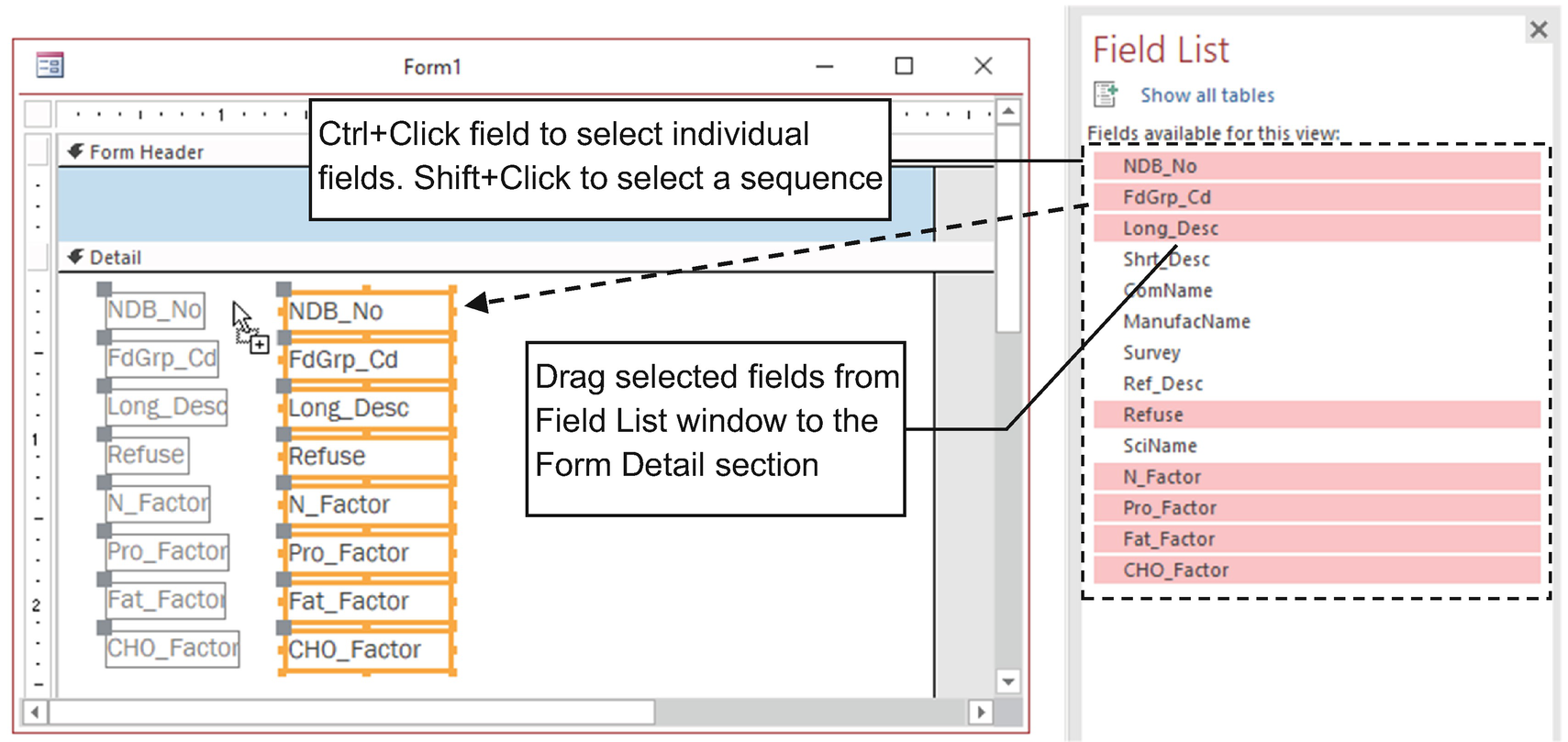
Click the Add Existing Fields tool to show the Field List window, and select and drag the desired fields to the form’s Detail section
This form is called Form1 in sr28_Forms_Overlapping.
The control used by a field can be changed according to the field data type. Yes/No fields will use a Check Box. Any field that has a Lookup property defined will use a Combo Box.
Form view: This is the default form view as the user will see it, showing all visible form sections. You cannot make design changes using this view. By default, it will show one record at a time—but you can change its default view to show many records at once.
Layout view: This is the same as the Form view, but you can make changes to the form structure (adding or removing fields and changing form/control properties as the form runs).
Datasheet view: This is an alternative view, similar to the table’s Design view. It shows many records at once.
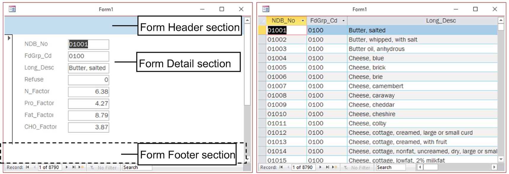
By default, any form can be shown using the Form or Datasheet view—as long as this form property is not disabled by user action. The Form Header/Footer will be shown just on the Form view. The Form and Page Header/Footer will be shown just on the form’s Datasheet view’s print preview
Form controls’ position and layout will be covered later in this chapter.
Using Layout View to Set Form Properties
The Form object has an extensive list of Data and Format properties that you can try more easily using Layout view, because it allows you to change form (and control) properties on the run.
- 1.
For the View command, select Layout View.
- 2.
Right-click the form detail section and choose Form Properties.
- 3.
On the form’s Property Sheet, select the Data or Format tab, change the desired property, and observe how the form behaves.
Some properties require that you close the form or show it in Design view before it can take effect.
Setting Form Data Properties
Besides setting the form’s Record Source property, you can customize how the records will be manipulated by the user by setting Form Data properties.
Form Data Properties
Form Data Property | Usage |
|---|---|
Record Source | Name of a table, query, or SQL instruction. |
Recordset Type | Type of recordset returned. Use Dynaset for read-write; use Snapshot for read-only records. |
Fetch Default | Indicates if Access uses the default field values for new records. |
Filter | Type of filter currently applied to form records (same as the SQL clause WHERE statement). |
Filter On Load | Type of filter applied to form records when the form loads. |
Order By | Defines the form record’s classification (discarding the table or query order). |
Order By On Load | Defines the form records’ classification when the form loads. |
Wait for Post Processing | Makes the form wait until macro processing on the form records is finished before processing the next form operation. |
Data Entry | The form is just used to insert new records. |
Allow Additions | Allows the form to insert new records. |
Allow Deletions | Allows the form to delete records. |
Allow Edits | Allows the form to edit record fields. |
Allow Filter | Allows a filter to be applied to the form records. |
Record Locks | Defines how the form will behave on a network whenever two users try to change the same record at the same time. |
Recordset Type: Set this to Snapshot to avoid any record change or, in other words, to make the form records read-only. The record fields cannot be changed, and a new record cannot be added.
Data Entry: Use this on forms designated to insert new data; the user will not be able to see existing records. It requires the property Allow Additions to be set to Yes. The user will be able to see the new records added to the form. When Data Entry is set to Yes, the form will jump to a new record, and its navigation buttons will show “Record 1 of 1.”
Allow Additions: Set this to No to avoid record insertions. When Allow Additions is set to No, the New Record button is disabled on the form navigation buttons.
Allow Deletions: Set this to No to avoid record deletions.
Allow Edits: Set this to No to avoid editing existing records. If Allow Additions is set to True, new records can be edited until they are saved in the table.

Using Layout view, you can set form properties while the form runs and watch the results. When Data Entry is set to Yes, the form allows new records
Setting Form Format Properties
All forms have an extensible list of Format properties that allow control over how the form window will behave. By correctly using the Format properties, you can improve the user experience with your database interface and create a different kind of form, which can be used both to show records and to produce the database interface.

Form elements that you can change by manipulating the Form Format properties
Main Form Properties Grouped by Property Sheet Tab
Tab | Property Name | Usage |
|---|---|---|
Format tab | Caption | Defines the text of the form’s title bar (or tab). This will receive the form name until filled. |
Default View | Defines how records will be shown. Single Form is set to one record at a time; Continuous Form is set to scrolling records (many at a time). Datasheet is set to Datasheet view. Split splits the form into two showing both a single form and a Datasheet view. | |
Allow Form view | Allows a form to be viewed using all its sections (Form Header, Form Detail, and Form Footer). | |
Allow Datasheet View | Allows a form to be viewed like a table’s Datasheet view. | |
Allow Layout View | Similar to Form view, allowing changes to some form and control Format properties while the form is running. | |
Width | Sets the form width (and all its sections). | |
Auto Center | Auto-centers the form on the screen when it is open. | |
Auto Resize | Auto-resizes the form to show all its sections (and to the width of the Detail section) when it is open. | |
Border Style | Defines the form border style. None means the form has no border; Thin sets it so the user can’t change the form size; Sizable sets it so the user can change the size; Dialog sets it so the form has a thin border and no Min and Max buttons. | |
Record Selectors | Shows/hides the record selector, which is used to select the current record for deletion. | |
Navigation Buttons | Shows/hides the navigation buttons at the window’s bottom. | |
Navigation Caption | Changes the navigation caption text. | |
Dividing Lines | Shows or hides a dividing line that separates the Form Header, Detail, and Footer sections. | |
Data tab | Scroll Bars | Shows/hides horizontal and vertical scroll bars. This appears automatically whenever the form content is too high or wide to the current window size. |
Control Box | Shows/hides the icon located in the top-left window corner (used to close, move, minimize, or maximize the window). | |
Close Button | Shows/hides the form’s close button (the X located in the window’s top-right corner). | |
Min Max Buttons | Shows/hides the Minimized, Restore, and Maximize window buttons in the window’s top-right corner. | |
Split Properties | Works with Default View set to Split to divide the form into two areas. You can set Split Form Orientation to a split position, Split Form Splitter Bar to Show/Hide, Split Form Datasheet to Read only/Read-write, Split From Printing to Form only/Datasheet only. | |
Record Source | Specifies an existing table or query name or sql instruction used to return form records. | |
Other tab | PopUp | Set to Yes to make the window float over the screen (outside the Microsoft Access interface). |
Modal | Set to Yes to make the form a modal window: one that stops all processing until it is closed. | |
Cycle | Determines the behavior of the Tab keys on the Detail controls. All Records means that by pressing Tab on the last field, the form advances to the next record. Current Record means to cycle the controls without leaving the current record. Current Pagekeeps the focus on the current website page controls. |
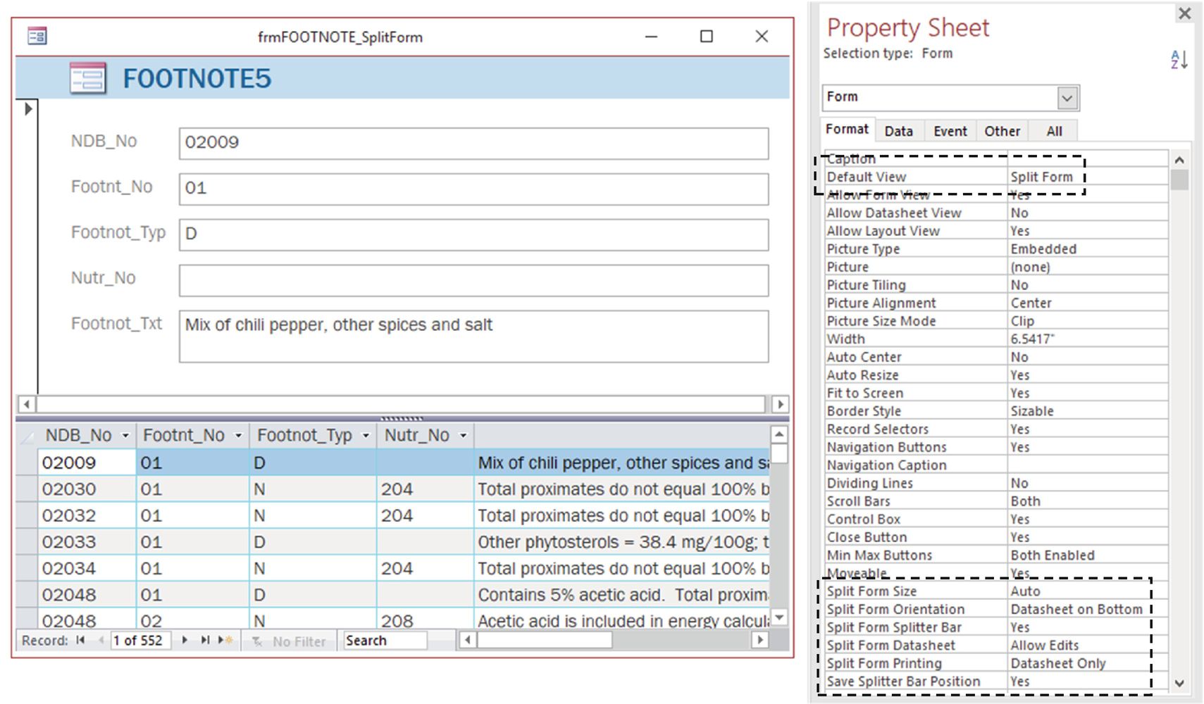
The frmFOOTNOTE_SplitForm created by the Form Wizard with properties Default View set to Split Form and Split Form Orientation set to Datasheet on Bottom. Other Split properties allow you to drag the splitter bar and edit records on the split form datasheet
frmFOOTNOTE_SplitForm also allows you to vertically drag the splitter bar and edit records on the datasheet because it has the properties Split Form Splitter Bar set to Yes and Split Form Datasheet set to Allow Edits.

frmModeDialog has a different behavior, not allowing the form to be resized, not allowing access to the Microsoft Access interface, and floating outside the Access window because it has the properties Border Style set to Dialog, Popup set to Yes, and Modal set to Yes
The other properties shown in Table 4-2 will be commented on in this book whenever a form needs to use them. For now, it is enough that you understand that they exist and what each one does.
Setting Form Section Properties
Besides setting properties associated to the data or format of the form window, you can also set properties for each form section.
- 1.
For the View command, select Layout View.
- 2.
In the Property Sheet, select the Detail, FormFooter, or FormHeader sections in the list.
- 3.
Use the section’s Format tab to change the desired property and observe how the form behaves.
Form Section Format Properties
Format Properties | Usage |
|---|---|
Visible | Shows or hides a section |
Height | Sets the section height (automatically set by dragging the section’s bottom border) |
Back Color | Sets the section background color |
Alternate Back Color | Sets the alternate Detail section background color |
Special Effect | Allows you to define the appearance of a section |
Auto Height | Automatically adjusts the section height when the controls are resized |
Can Grow | Automatically grows the section when a text box or subform control has the property Can Grow set to Yes |
Can Shrink | Automatically shrinks the section when a text box or subform control has the property Can Shrink set to Yes |
Display When | Allows you to define whether the section will show on the screen or when printing |
Keep Together | Forces Access to try to print a form section together on a single page |
Force New Page | Forces Access to begin the section printing on a new page |
New Row or Col | When printing forms, specifies if a new row or column must be inserted before, after, or before and after the section |
There are no Section Data properties—they are just associated to the form itself.
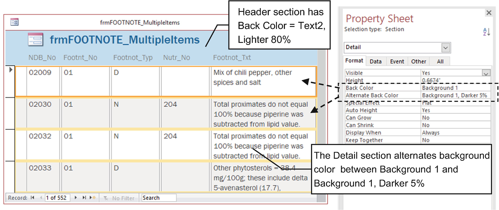
Use Section properties to change the section background colors and create a more distintive record presentation when Form Default View is set to Continuous or Datasheet
Since both fmrFOOTNOTE_Tabular and frmFOOTNOTE_MultipleItems have Default View set to Continuous to allow multiple records to display, they differ in the way they lay out the controls: frmFOOTNOTE_Tabular uses a loose design where controls can be dragged inside a detail section, while fmrFOOTNOTE_MultipleItems uses a table design that stitches controls to an invisible table grid, which can be manipulated using the Arrange group of the Form Design Tools tab on the Ribbon.
In the next sections, you will learn how to use form controls to give your database applications a more attractive layout.
Using Form Controls
Microsoft Access offers an impressive number of native controls that you can use to improve the user experience using your database applications, available in the controls list in the Controls area of the Form Design tab.
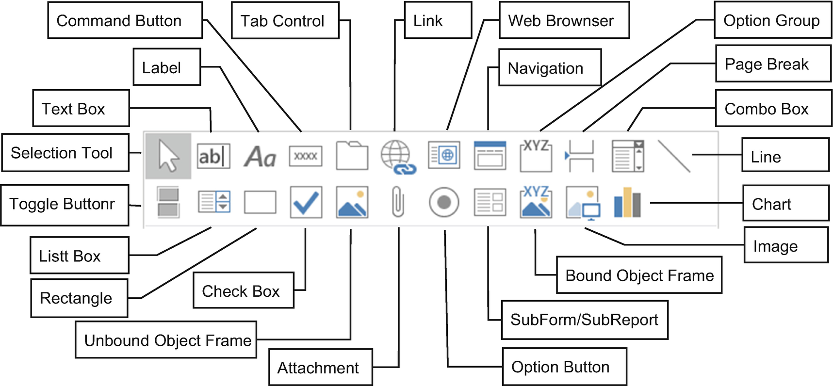
Microsoft Access 2019 native control types available to use on forms and reports
They vary so much to allow a user to be able to insert or select a variety of controls on the form interface.
Bound Controls
Microsoft Access Bound Controls Used on Forms and Reports
Tool | Control Name | Usage |
|---|---|---|
| Text Box | Allows any kind of information (text, number, dates, etc.) to be typed |
| Combo Box | Allows you to select an option from a drop-down multicolumn list |
| List Box | Allows you to select an option from a multicolumn list |
| Option Group | Holds a set of Option Buttons, Check Boxes, or Toggle Buttons that return the control value |
| Toggle Button | Inside an Option Group control, alternates between pressed and not pressed (used to select different options) |
| Check Box | Used alone to represent a binary option (check/uncheck) or inside an Option Group control to represent binary options |
| Option Button | Used inside an Option Group control, allows you to select an option from many |
| Attachment | Allows you to insert an external file to a field of the Attachment data type |
| Bound Object Frame | Shows an image or other object stored on a table field of the OLE object data type |
| SubForm/SubReport | Allows you to insert a form as a subform (or a report as a subreport) to represent a one-to-many relationship between tables in a single interface |
| Chart | Shows a dynamic chart on a form or report |
- 1.
Select the desired control on the Control list in the Controls area of the Form Design tab.
- 2.
Click the Add Existing Fields tool to show the Field List window with all the available fields.
- 3.
Select the field on the Field list that you want to bind to the control.
- 4.
Click the desired form section to add the control or drag the mouse to define the control size.
To insert a control bound to any the form’s Record Source field, show the Field List window, select the desired field, click the desired bound control, and drag the mouse to the form’s Detail section to define the control size
To unbind any control from a field, select the control in the form’s Design view, show the Property Sheet window’s Data tab, and delete the Control Source property value.
By clicking the Controls List arrow of the form’s Design tab, you will notice that it has the Use Control Wizard option selected by default. Some controls (such as Option Group, Combo Box, List Box, etc.) will automatically open the Form Wizard unless you deselect this option.
Unbound Controls
Microsoft Access Unbound Controls Used on Forms or Reports
Tool | Control Name | Usage |
|---|---|---|
| Label | Inserts static text on a form to inform the field name or content of a control bound to a form field |
| Command Button | Executes an action (macro or VBA procedure) |
| Tab Control | Allows you to create tabbed interfaces inside a form, with different pages, each one with its own set of controls |
| Link | Inserts a link to an external file or website on a form |
| Web Browser | Shows an Internet website inside a form or report |
| Navigation | Creates a dashboard from where you can open forms, queries, or reports |
| Page Break | Inserts a page break on a section when it is printed |
| Line | Draws a line on a form section |
| Rectangle | Draws a rectangle on a form section |
| Unbound Object Frame | Inserts an image or an object that is drawn at design time |
- 1.
Select the desired control from the Control list in the Controls area of the Form Design tab.
- 2.
Click the desired form section to insert the control or drag the mouse to define the control size (Figure 4-22).

To add an unbound control to a form, select the desired control in the controls list, make sure that no field is selected in the Field List window, and click and drag the mouse to the form’s Detail section
Many previous figures showed that whenever a control is added to a form section, it also receive an associated label to identify its content. The next section explores how to use this association, how to break it, and how to rebuild it.
The Label-Control Association
Whenever a Text Box (or any other bound control) is inserted on a form section, it automatically receives the companion of a Label control, positioned at its left side. This association is desired because the user can also select the control by clicking its Label control.
Both controls receive a default name, which is composed by the control class (Label, Text) and a form controls zero-based counter (the first control is zero). The first Text Box receives the name Text0, while the first Label control receives Label1. To set this association, the Text Box control’s Label Name property receives the Label control Name property, while the Label control Caption property receives the Text Box control’s Name property.

Each control inserted on a form section using Design or Layout view automatically receives a bound Label control, both having their own handles to position and size them on the form
- 1.
Point the mouse to the control (or Label) border and drag it to a new position to reposition both of them on the form section.
- 2.
Use the control (or Label) handle (top-left corner) to drag it and reposition it alone, without disturbing the position of the associated control.
- 3.
Use the small size handles located on the corners to size the control.
You can use the Label or Text Box control handle to reposition the controls near one another to make a better use of the form design.
Break and Rebuild a Label-Control Association
To break the association between a control and its label, click the label and delete it or cut it to the Clipboard. If you paste it again onto the form, the label will no longer be associated to its previous control.
- To rebuild any label-control association, you can do one of the following:
Set the Text Box control’s Label Name property on the Other tab to the name of an existing Label control.
- Cut and paste the Label control over an existing control.
- a.
Drag a new Label control to the Form section.
- b.
With the Label control selected, cut it to the Clipboard (Ctrl+X).
- c.
Select the control that must be associated to the label.
- d.
Paste the control in the Form section (Ctrl+V).
Since there are a lot of control types not counting the default label-control association, it is a good programming practice that you also use a naming convention rule to better identify the controls inserted on a form.
Naming Conventions Rules for Microsoft Access Controls
To follow “best programming practices,” keep following the Redick name convention rules proposed for naming Microsoft Access objects.
Begin with a three-letter small caps prefix that identifies the control type.
Use a name that identifies its content, beginning with a capital letter and with all other letters in small caps.
If it needs more than one word, the words must be concatenated with no space in between them, each one beginning with a capital letter.
Control Naming Conventions
Control Type | Prefix | Control Type | Prefix | ||
|---|---|---|---|---|---|
Bound controls | Text Box | txt | Unbound controls | Label | lbl |
Combo Box | cbo | Command Button | cmd | ||
List Box | lst | Tab Control | tab | ||
Option Group | grp | Link | lnk | ||
Toggle Button | tgl | Web Browser | web | ||
Check Box | chk | Navigation | nav | ||
Option Button | opt | Page Break | brk | ||
Attachment | att | Line | lin | ||
Bound Object Frame | bof | Rectangle | ret | ||
SubForm/SubReport | subFrm or subRpt | Unbound Object Frame | uof | ||
Chart | cht |
Now let’s see some properties available to most control types.
As with forms and sections, controls also have their own set of properties, many of them shared by most controls.
Double-click the control border.
Select the control and click the Property Sheet command of the form’s Design View tab.
The Property Sheet window will be shown with its combo box already indicating the selected control.
There are a set of common properties available to any control type, while each control can have specific properties to change its appearance and behavior. The next section will cover the common control properties, while the specific properties will be cited in each specific control section.
Common Control Properties
Microsoft Access Control Properties
Tab | Property | Usage |
|---|---|---|
Data Tab | Control Source | Name of the field to which the control is bound |
Default Value | Default value for new records | |
Validation Rule | Expression that specifies the values accepted by the control | |
Validation Text | Message text shown when Validation Rule is False | |
Enabled | Enables control to receive data | |
Locked | Blocks control from changing data, but allows the user to select its content |
Format Tab | Visible | Makes control visible or invisible |
Special Effect | Determines the control appearance by changing its border options from among Flat, Etched, Raised, Sunken, Shadowed, and Chiseled | |
Width | Control width | |
Height | Control height | |
Top | Position of control’s top-left corner | |
Left | Position of control’s left side |
Other Tab | Name | Defines control name |
Label Name | Name of the label associated to the control | |
Datasheet caption | Name used on the form’s Datasheet view column | |
ControlTip Text | Text on a floating tip that appears when you point the mouse to the control | |
Tab Index | 1 based; indicates the selection order of the controls on the form | |
Tab stop | Indicates whether the control receives the focus when the Tab key is pressed | |
StatusBar Text | Text that appears on the status bar when the control is selected | |
AutoTab | Selects the next control in the tab order whenever the current control is fulfilled |
In the next sections, you will learn about these properties (along with specific control properties) for the most used controls, beginning with the most popular of them: the Text Box.
Text Box Control
The Text Box is the most versatile control because it can receive any kind of information (text, number, date, logical, etc.). It is also the default control used to represent record data whenever a field name is dragged from the Field List window to a form section in Design or Layout view (see Figure 4-13).
Since it has lots of properties, let’s begin by studying some of them so you can understand how they can affect the appearance and functionality of a form.
Enabled and Locked Properties
All controls have the properties enabled (with the default value set to Yes) and locked (with the default value set to No), already cited in Table 4-7. By using both properties, you can create different types of formatting regarding the control change and its selection.
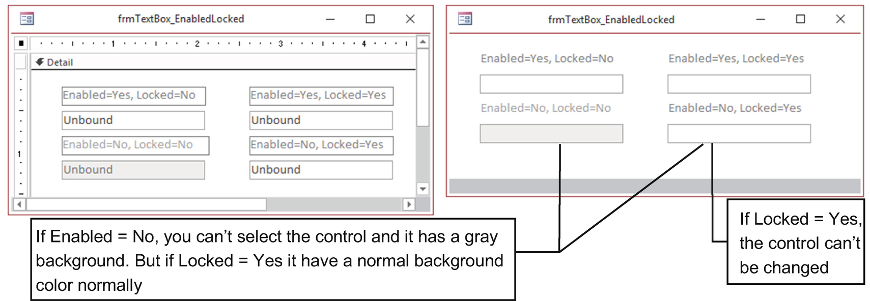
frmTextBox_EnableLocked uses four unbound Text Box bound controls that explore the usage of the control properties Enabled and Locked
Note that all Label controls were dragged by its handle to the top of the associated Text Box to make better use of the form’s Detail section space. Also, note that the first two Text Boxes (the ones with Enabled set to Yes) have the Control Tip property set (point the mouse to it and wait a second to see the floating tip).
Since the Enabled and Locked properties are common to all control types, any control will show the same behavior regarding its values.
The Text Box default behavior happens when Enabled is set to Yes and Locked is set to No, meaning that you can select and change it contents. When Enabled is set to No and Locked is set to No, the control becomes disabled and uses a light gray background color—you can’t select it or change its contents. When Enabled is set to Yes and Locked is set to Yes, the control can be selected, but its content can’t be changed. When Enabled is set to No and Locked is set to Yes, the control can’t be selected or changed, but it appears with the normal background color.
It opens centered in the Microsoft Access window (property Auto Center set to Yes).
It automatically fits the Detail section’s height and width (Auto Resize set to Yes).
It has a sizeable border (Border Style set to Sizable).
It shows a gray bar.
The gray bar that may appear on the bottom of a form window is probably due to a bug that appears when the property Scroll Bars is set to Both and the form window has enough horizontal and vertical space to show its Detail section.
It has a specific Tab order. Press the Tab key to cycle between the form’s Text Boxes (just the top two Text Box controls will react to the Tab key due to the bottom two having their property Enabled set to No).

frmTextBox_EnabledLocked uses the properties Auto Center set to Yes, Border Size set to Sizeable, and Scroll Bars set to Both. They make it appear centralized on the Access interface, and it can be redimensioned by dragging its borders
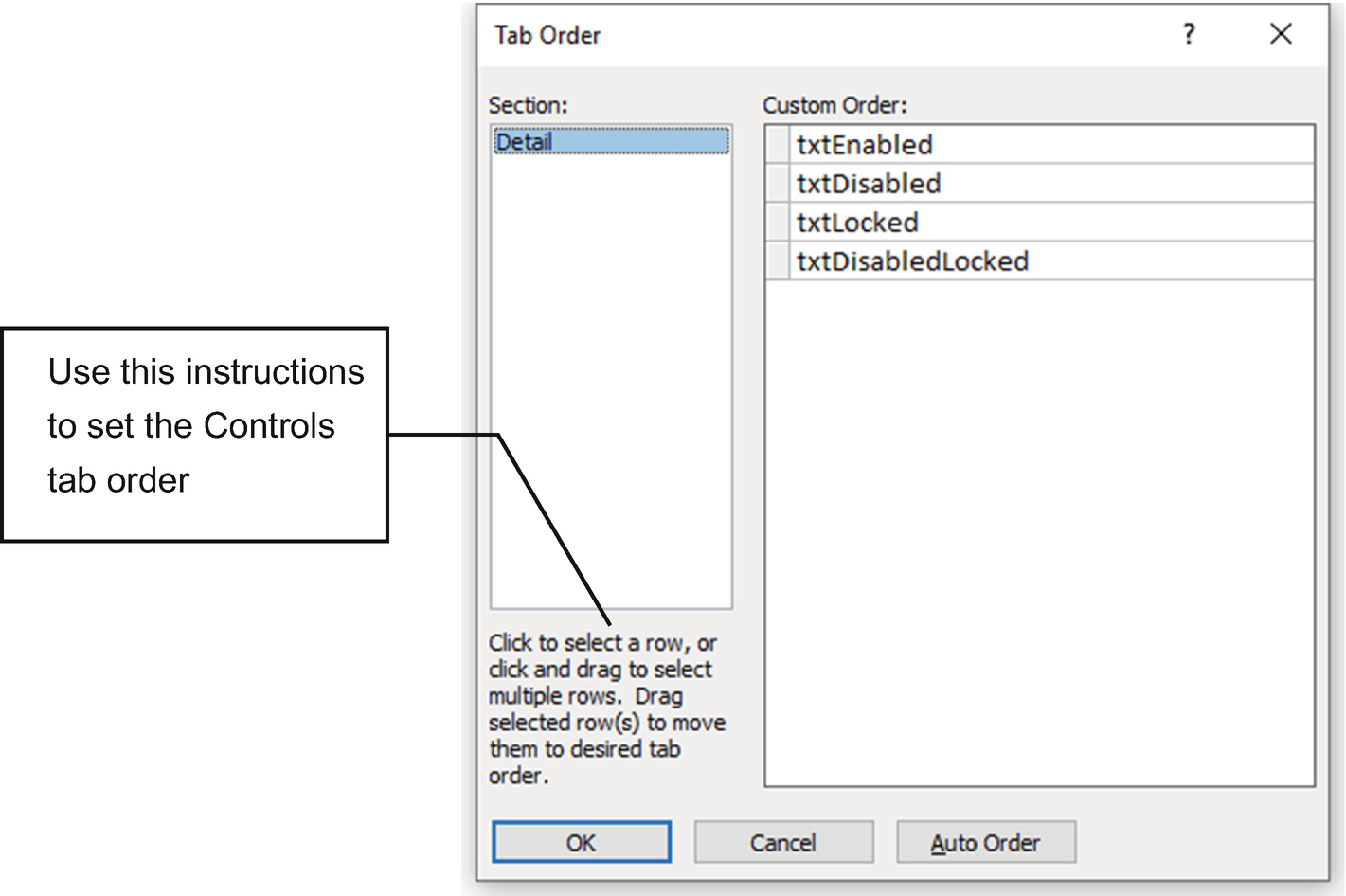
Use the Tab Order window to define the control’s Tab sequence by dragging them to the desired position. It will change its control’s Tab Index property
The Tab Index property will work only for controls whose property Tab Stop is set to Yes.
Now let’s explore other specific Text Box properties.
Specific Text Box Properties
Microsoft Access Text Box Control Properties
Tab | Property | Usage |
|---|---|---|
Format tab Tab | Format | Defines the format of the control content |
Decimal Places | Rounds number values to desired precision | |
Show Date Picker | Shows a calendar to select dates when Format is set to Date (or Control Source is set to a Date/Hour field data type) | |
Scroll Bars | Shows or hide a vertical and/or horizontal scroll bar | |
Line Spacing | Sets text line spacing | |
Can Grow | Allows the text box grow to show more content when the form is printed | |
Can Shrink | Allows the text box to shrink and hide its content when it has no text | |
Data /Other tab | Text Format | Offers two choices of text: Plain Text and Rich Text (allows formatting) |
Input Mask | Defines an input mask to better control what can be typed | |
Enter Key Behavior | Changes the Enter key behavior to move to the next field or insert a line break (the Enter character, ASCII code 13) on the Text Box content |
Use the Property Sheet’s Format tab to set how the value typed on the Text Box must appear whenever you press Enter. To get better control over what can be typed, use the Input Mask property in the Property Sheet’s Data tab.
The Format and Input Mask properties were already covered in the sections “Using an Input Mask for a Phone Number” and “Defining the Format Property for a Short Text field” of Chapter 2.
Show Date Picker and Input Mask Properties
The Text Box control can be optimized to receive valid dates using the Input Mask property or a Date Picker control to select it from a calendar—not both.
The property Show Date Picker is set to For Dates.
It is bound to a Date/Time field data type.
It is an unbound control with the property Format set to one of the default available date formats (General, Medium, Long, or Short Date formats).
It has no input mask.
Whenever these rules are followed, Microsoft Access will show a small calendar located at the control’s right corner, where the user can select the desired date.
By setting the Format property, the user can type (or select) a date using a short format (like mm-dd-yy) and show it in another way; Format set to Long Date spells both the weekday and month names for the selected date.
Using the Validation Rule and Validation Text properties, the control can also check whether the date selected is valid for the application (like a date equal or greater than system date). But be advised that whenever the Text Box control uses the property Validation Rule (and Validation Text) along with the properties Input Mask or Show Date Picker, in the case the user selects a date, it will no longer be able to delete it from the control. The Text Box will stuck firing the validation rule requiring a date selection.

When a Text Box control has Property Show Date Picker set to For Dates and no input mask, it automatically shows the Date Picker calendar to select a date. And if it has no validation rule, the Text Box content can be deleted
All four Text Box controls have the properties Format set to Long Date and Show Date Picker set to For Dates, but just the two Text Boxes at the bottom automatically show the Date Picker calendar when selected, because they have no input mask.
The Text Box controls at the left have no validation rule, allowing you to type and delete its content by pressing the Delete key.
But whenever you use the Validation Rule property (and Validation Text), the Text Box will no longer be able to allow you to delete its content, because by doing this it will break the validation rule.
Validation Rule = Year([txtDateOfBirth3]) > 1900
Validation Text = Year must be > 1900
The validation rule encloses the Text Box name in squared brackets to find its value on the form. Use the Expression Builder to help you create such an expression. It was already explained in section “Use the Expression Builder” of Chapter 3.
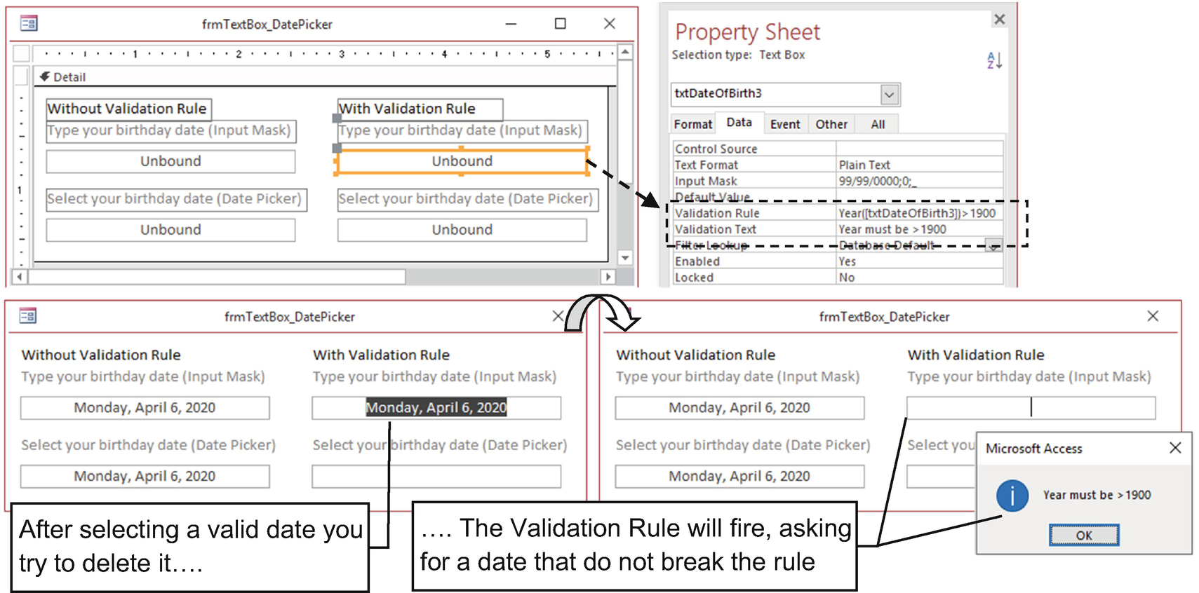
Whenever you use a validation rule, chances are that the control will ask for a value because an empty value breaks the rule
You may be tempted to create complex expressions using the logical OR operator to verify whether the control is not null (like setting Isnull([txtDateOfBirth3]) OR Year([txtDateOfBirth3]) > 1900). This will not work because Microsoft Access will evaluate both expressions before using the logical OR operator—and the second expression will always fail when the control is null). Try to use just a single expression (like Year([txtDateOfBirth3]) > 1900 that will work).
It is not centered on the screen (Auto Center set to No); it stores the screen position (the form’s Top and Left properties) from where it was last saved in the form’s Design view.
It automatically fits the Detail section’s height and width (Auto Resize set to Yes).
It has no sizeable border or maximize or minimize buttons (Border Style set to Dialog).
It has no dark gray bottom bar (Scroll Bars set to None).
It has Min Max buttons set to None.
It sets the tab order to first select the controls on the left and then on the right (from top bottom). See Figure 4-29.
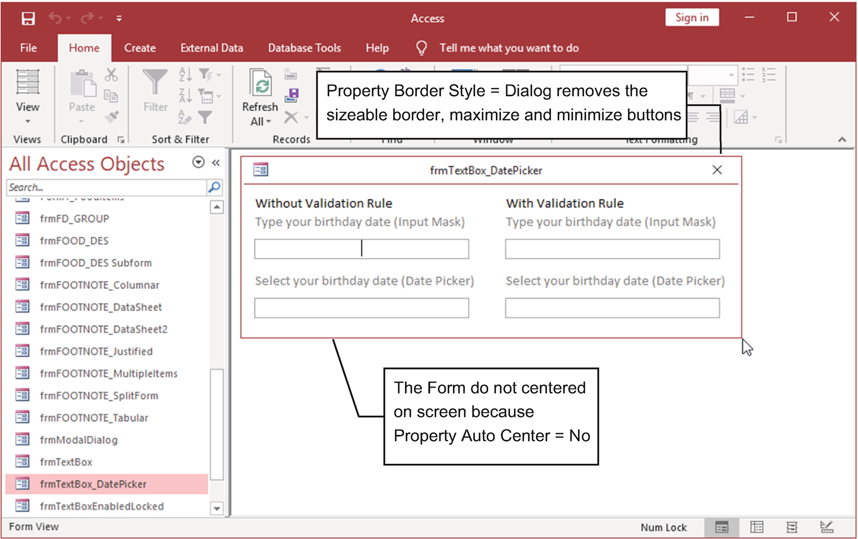
Whenever you set Border Style to Dialog, the form cannot be resized or show its minimize and maximize buttons. By setting Auto Center to No, it will use its Top and Left properties to open where it was last saved on the form’s Design view
Can Grow and Can Shrink Properties
Use the properties Can Grow and Can Shrink to allow a Text Box control to change its size to adjust its content whenever it is printed. They do not work on Form view or Layout view—just in Print Preview.
The property Can Grow makes the Text Box grow vertically to show more text lines, while the property Can Shrink makes it shrink up to the height defined on the form’s Design view.
Open frmTextBox_CanGrow in design mode to verify how the property works. It is linked to the query qryFoodItemsAZ, which shows food item names stored on table FOOD_DES ordered by the Food Name field (alias for the FOOD_DES Shrt_Desc field).
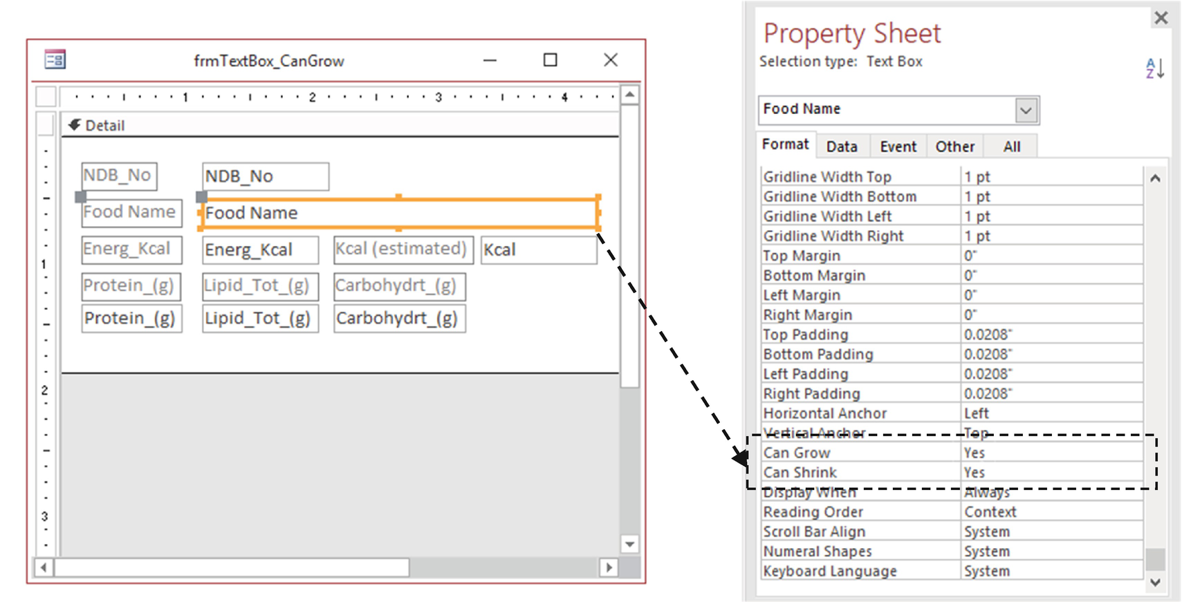
Use the property Can Grow to allow a Text Box to grow vertically whenever the form is on Print Preview mode
It was set to show continuous records (Default View set to Continuous Form).
It does not automatically fit the Detail section’s height and width. Instead, it has a Design view size defined to allow you to view two records at a time (two times the Detail section’s height, set by try-and-error alternating between Form and Design views), using the last Form Height and Width properties (Auto Resize set to No).
It is not centered on the screen (Auto Center set to No).
It shows just the vertical scroll bar (Scroll Bars set to Vertical Only).
The controls were manually aligned to give a better form layout (some Labels at the left, and others go at the top of their associated controls).
Its Detail Section property’s Alternate Background Color is set to Background 1, Darker 5% (which will allow alternate each record background color).

Use property Can Grow to allow the Text Box to change its height on Print Preview, whenever it needs more vertical space to show it content. The Food Name shown at the left in Form view mode grew in Print Preview mode (at right). Also, set the Detail Section property Keep Together to Yes so that information isn’t split between printed pages
Text Format and Enter Key Behavior Properties
Two Text Box properties allow you to change a Text Box to a small text processor: Text Format (Data tab) and Enter Key Behavior (Other tab).
When Text Format is set to Rich Text, the Text Box allows text formatting: you can set bold, underline, text color, paragraph formatting, etc. By setting Enter Key Behavior to New Line in Field, when pressing Enter on a Text Box, you do not move to the next control in the form’s Tab order. Instead, it inserts an Enter character (ASCII code 13) on the text, breaking it to a new paragraph.
But be advised that both properties insert hidden characters on the text that cannot be inserted on a Short Field data type. You will need a Long Text field data type to store these hidden characters and show the formatted text.
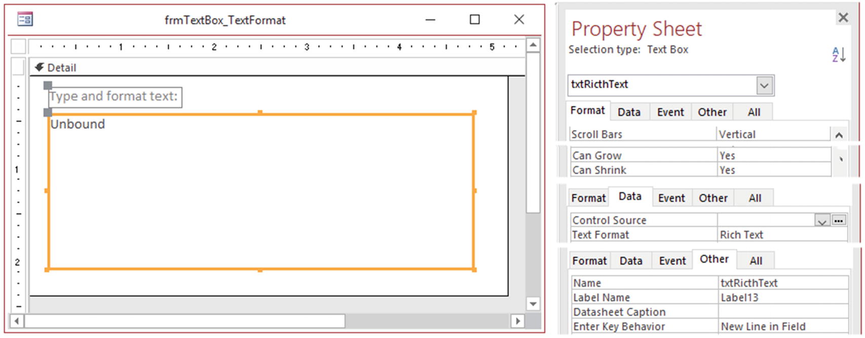
Whenever you set the properties Text Format to Rich Text and Enter Key Behavior to New Line in Fields, you can turn a single Text Box into a small text processor
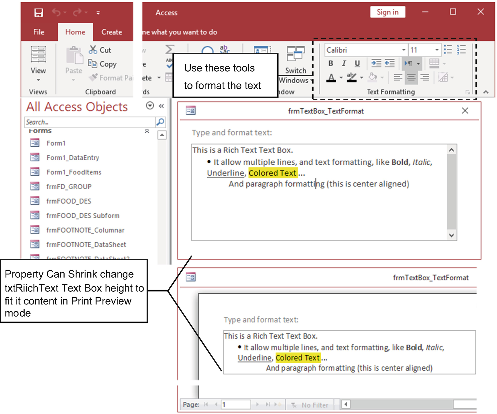
Show Form frmTextBox_TextFormat in Form Mode view and use the tools in the Text Formatting area of the Home tab to format the Text Box text. Use Print Preview mode to check how the Can Grow and Can Shrink properties act on the Text Box control
Not centered in the Microsoft Access window (Auto Center set to No).
No sizeable border or minimize or maximize buttons (Border Style set to Dialog).
Since it has no record source, it also has no navigation buttons or record selector because its properties’ navigation buttons and record selector was set to No).
It automatically resizes the Detail section’s height and width (Auto Resize set to Yes).
Input Mask Property for Password
Using the Input Mask property, you can turn the Text Box into a password collector, where everything that is type appears with an asterisk.
Such an approach is commonly used on a form employed to capture the username and password on most database applications. (I personally dislike applications that use this approach, unless it deals with very sensitive data—or the client who bought it asks for it.)
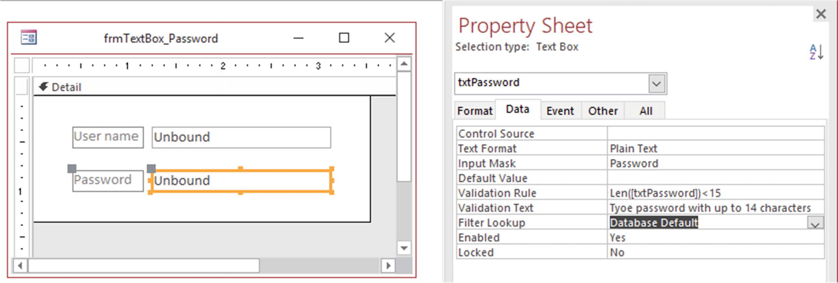
Show frmTextBox_Password in Design view and note that it has two Text Box controls (txtUserName and txtPassword). Both have Validation Rule and Validation Text properties to restrict the length of text that can be typed, and txtPassword has Input Mask set to Password (created by the Input Mask Wizard)
The LEN() Function
The LEN() function allows you to check the number of characters that was typed on any string value, like a control value or property.
String is a string expression between quotes or an expression that returns a string (like a variable name or property value). If the String argument contains Null, then Null will be returned.
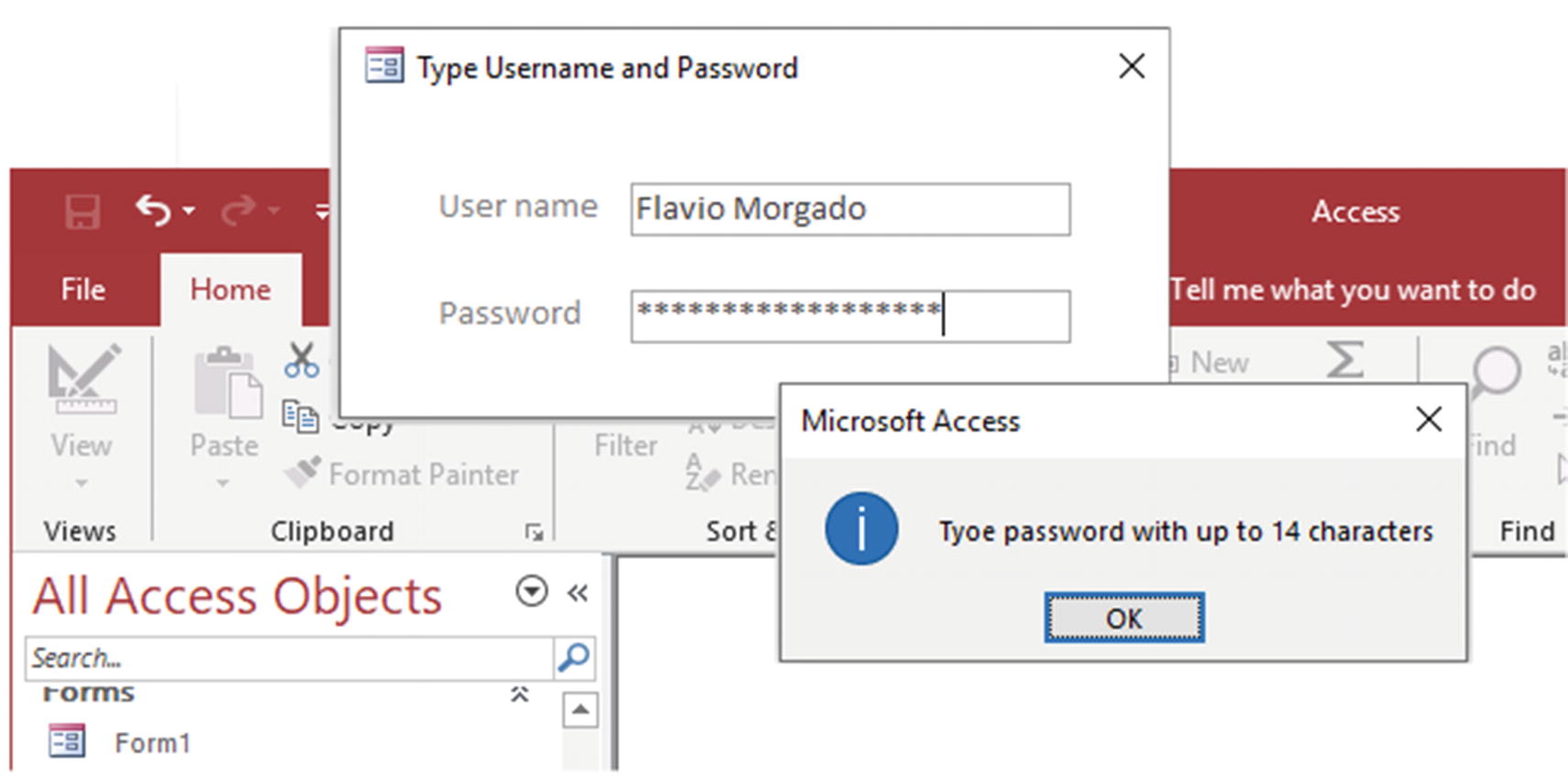
frmTextBox_Password uses a validation rule on both controls to restrict the length of the username and/or password. The txtPassword Text Box uses Input Mask set to Password to show asterisks to hide the password typed
Since both Text Boxes use the LEN() function (with the Control Name property between squared brackets as an argument) to limit the text amount, whenever you type and clear the text, when you try to leave the empty control, the validation rule will be broke, because the LEN() function can’t operate over a null Text Box.
It is horizontally centered in the Microsoft Access window, although the property Auto Center is set to Yes, because its Property PopUp is set to Yes.
No sizeable border, although its Border Style is set to Sizeable because its property Modal is set to Yes.
No minimize or maximize buttons (Min Max Buttons set to None)
Since it has no Record Source property, it also has no navigation buttons or record selector because its navigation buttons and record selector were set to No).
It automatically resize to the Detail section’s height and width (Auto Resize set to Yes).
It is modal to the Microsoft Access interface—you can’t use Access until it is closed (Modal set to Yes).
It can float outside the borders of the Microsoft Access interface (Pop Up set to Yes).
Control Source for Expressions and Aggregate Functions
The property Row Source of the Text Box control can also be used to calculate expressions that use a single field record value and to calculate the entire recordset used by the form, which is especially useful when Default View is set to Continuous Form.
If the expression is used in the Detail section, it will refer to the current record; but by putting it on the Form Footer section and using any of the aggregate functions (other than Group By, mentioned in Table 3-7 of Chapter 3), you can create a subtotal expression or statistic for all form records.
To show how it works, this section uses the WEIGHT table records to calculate the individual weight of each element of a food item’s common measure, by dividing Gm_Wgt by Amount and using the expressions inserted into the Text Box controls of the Form Detail and Footer sections.
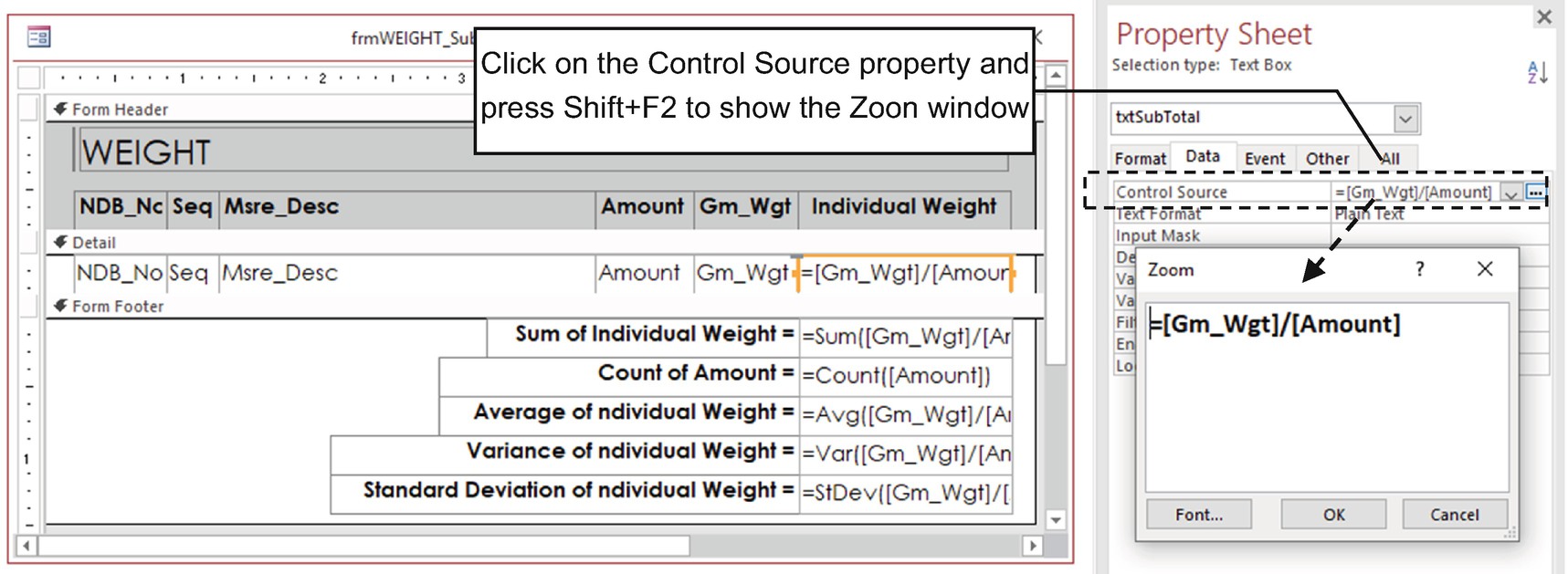
Use the Text Box’s Control Source property to build expressions that begin with an = character and relate to form controls. An expression inserted in the Detail section refers only to the current record. By putting it on the Form Footer section and using an aggregate function, it will relate to all currently viewed form records (by applying a filter to the form, it will recalculate all aggregate functions)
As Figure 4-36 shows, whenever the Control Source property is selected and you press Shift+F2, Access shows the Zoom window that will help you to build the desired expression.
All Text Box controls inserted in the Form Footer section have an aggregate function to calculate values that refer to all form records.
Access doesn’t accept the use of a Text Box control name that uses an expression as an argument to an aggregate function inserted on another Text Box control. For example, if txtSubTotal is inserted in the Detail section, use an expression such as =([Gm_Wgt]/[Amount], you can’t use it as an argument to an aggregate function such as =Sum(txtSubTotal) inserted on the Form Footer. Instead, use =Sum(([Gm_Wgt]/[Amount]).
The COUNT() aggregate function will discard all empty records—the ones that return a Null value.
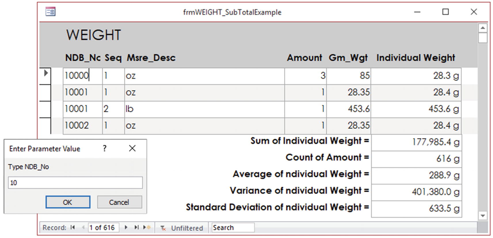
Since frmWEIGHT_SubTotalExample is bound to a dynamic query that uses the LIKE operator, whenever it opens, the Enter Parameter Value will ask for an NDB_No or any numeric sequence that begins a series of them (no value or * will return all WEIGHT records). The aggregate function in the Form Footer section will return statistics for all form records
Combo Box and List Box Controls
The Combo Box and List Box controls are used to limit what can be typed on a table field, although the Combo Box control can also be used as a superb search tool.
Both offer a multicolumn list, with the difference that the Combo Box is a Text Box with a drop-down list that allows you to type the information to be associated to the control value, while the List Box is a steady control that just allows clicking in one (or more) of its items to define its value.
The Combo Box is more economical regarding screen space, because it needs only one text row, while the List Box normally uses as many rows as you want, needing more vertical space in a Form Detail section.
Microsoft Access Combo Box and List Box Controls’ Properties
Tab | Property | Usage |
|---|---|---|
Format tab | Column Count | Indicates how many columns the control list will show. |
Column Widths | Sets each list column width in inches (separated by semicolons). | |
Column Head | Defines if the list will show a column title as its first item. | |
Separator Character | Indicates the separator character used for a value list. | |
List Rows | Combo Box only; sets the default number of items on the drop-down list. | |
Data tab | Row Source | Indicates the source for the items on the list: name of a table, query, or typed items separated by commas. |
Row Source Type | Defines the type of row source: Table/Query, Values List (for typed values), or Field List (used when Row Source is set to Table or Query). | |
Bound Column | Indicates which of the list columns will return the control value. | |
Limit To List | Combo Box only; indicates if the user can type an item outside of the list. | |
Allow Value List Edits | Allows you to right-click the list and choose Edit List Items in the shortcut menu to add, remove, or edit the items in the list. | |
List Items Edit Form | Name of the form to be opened whenever Allow Value List Edits is set to Yes. | |
Inherit List Values | When the control source is a lookup field, use its Control Source property to populate the list. This requires that Row Source Type is set to Value List. | |
Show Only Row Source Values | Defines whether the list can display values that aren’t specified by the Row Source property. |
These special properties control how the Combo Box and List Box controls show a list of items where the application user can select a value, which can come from a constant list of values or a list of records returned by a table or query.
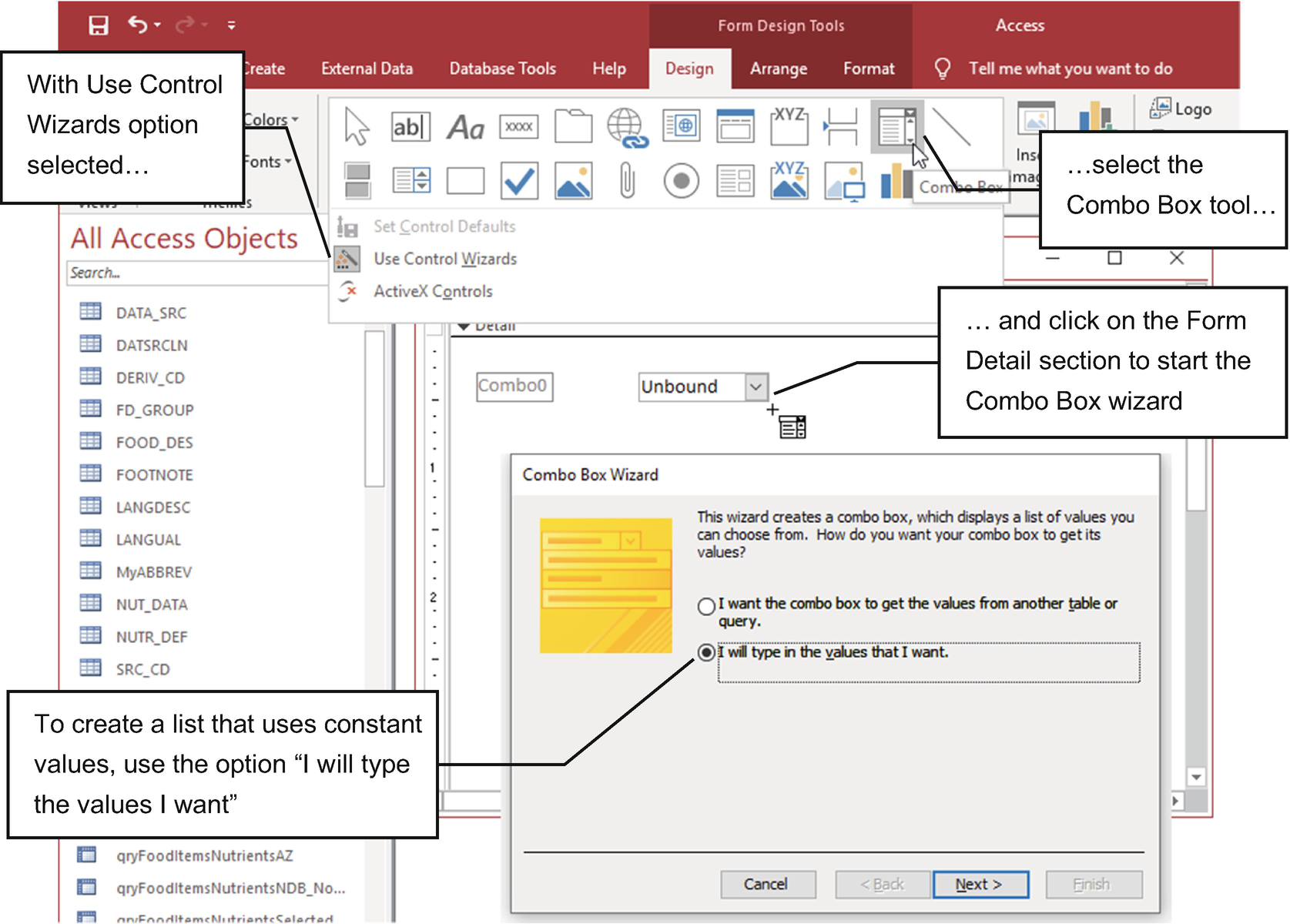
Whenever the Use Control Wizards option is selected in the controls list of the Form Design tab, when you select the Combo Box (or List Box) tool and click the Form Detail section, the wizard opens, asking from where the list options comes
Since the Combo Box Wizard performs different actions for these two types of lists, let’s begin by exploring how to create a Combo Box (or List Box) filled with a list of values.
Using the Combo Box Wizard with a List of Values
Consider, for instance, that you need to offer a form where the user must define a person’s civil status, which is supposed to be described with the words Single, Married, Divorced, and Widowed.
You will be surprised by how these words can vary on a database record whenever you offer a Text Box control to the user for this task: it is surely better to use a Combo Box or List Box from where the desired civil status can be selected.
Also, instead of creating a Civil Status field using a Short Text data type with eight characters (the length of the longest status, Divorced), you decide instead to represent the civil status in your database as a Number, using a Byte field (the smaller data type that uses just 8 bits), where 1 is set to Single, 2 is set to Married, 3 is set to Divorced, and 4 is set to Widowed.
For both strategies, a Combo Box or List Box must be the control of choice to guarantee that the correct civil status be set by the user. The first strategy (text insertion) will need a single-column list, while the second (number insertion using text selection) needs a two-column layout.
Creating a One-Column List of Values Combo Box
- 1.
Use the Form Design tool on the Create tab to create a new form in design mode.
- 2.
Select the Combo Box tool in the controls list of the Form Design tab and click the Form Detail section.
- 3.
Considering that the Use Control Wizards option is selected, the Combo Box Wizard will open, asking you to indicate from where the list options must come (Figure 4-38).
If you click Cancel to close the wizard, the control will be placed with default values in the form section. The only way to start the wizard again is by deleting the control and inserting another one.
- 4.
To create a Combo Box whose items come from a list of values, select the “I will type the values I want” option and click Next.
- 5.
The Combo Box Wizard will ask for the number of columns in the list and give you a table grid to type the list values. To create a single column list, keep “Number of columns” set to 1 and type in different rows the four possible options: Single, Married, Divorced, and Widowed (Figure 4-39).

For a Combo Box with a constant list of values, the second page of the wizard allows you to indicate the list’s number of columns and offer a place to type the list values
- 6.
Click Next, and the Combo Box Wizard will ask for the text you want to use on the Label control associated to the Combo Box. For this exercise, type Civil Status (Figure 4-40).
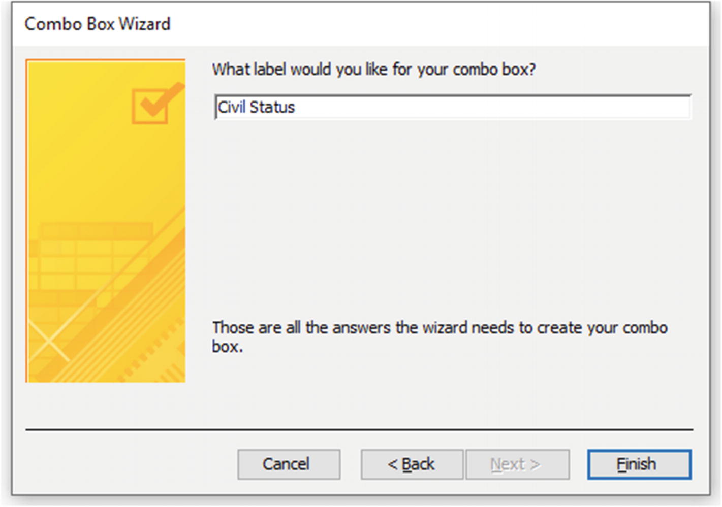
The last Combo Box Wizard page asks for the text that must be used by the Label associated to the Combo Box control. Type Civil Status and click Finish to create the control (Figure 4-39)
- 7.
Click Finish to create the control in the form’s Detail section and use the Property Sheet window to explore the control form and data properties.
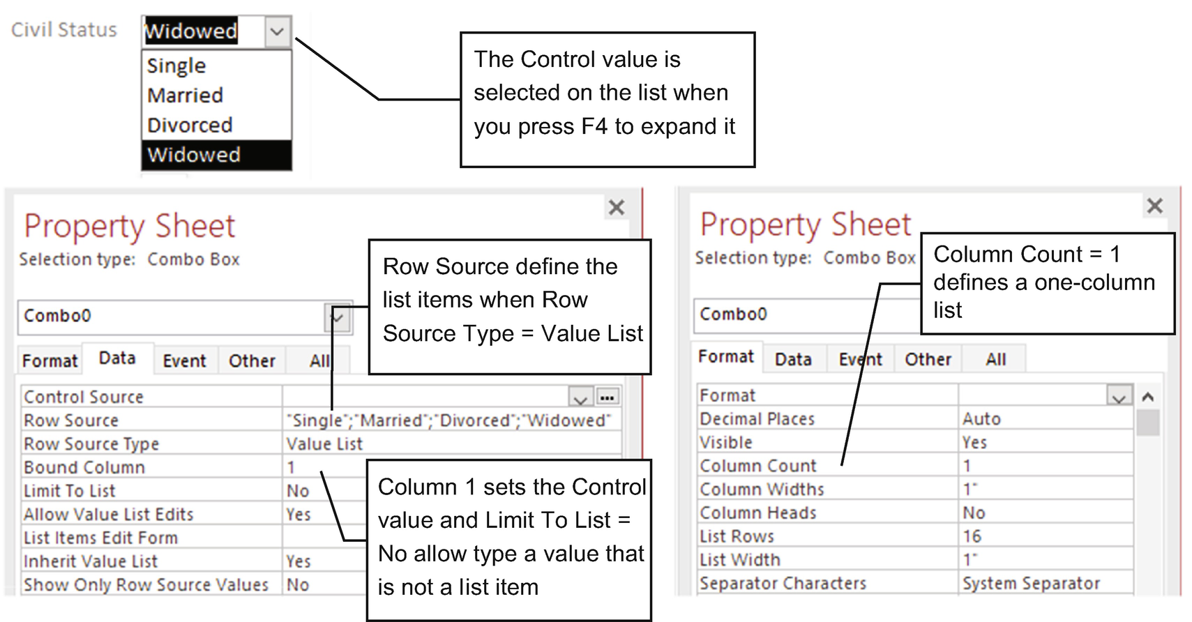
This is the Civil Status Combo Box created by the Combo Box Wizard that uses a one-column list filled with a constant list of values
Row Source = “Single”; “Married”; “Divorced”; “Widowed”
Row Source Type = Value List
Bound Column = 1
Column Count = 1
Limit To List = No
Allow Value List Edits = Yes
Column Widths = 1”
List Width = 1”
The property Limit to List being set to No indicates that the Combo Box allows the user to type a civil status not in the list—which may be nonsense. Setting the properties Column Widths, List Width, and Width to 1 sets the width of the first column, list width, and control width.

Whenever a Combo Box has just one column and the property Allow Value List Edits is set to Yes, you can right-click it and select the Edit List Items option to show the Edit List Items dialog box, where you can add, delete, or update the items on the list
Creating a Two-Column List of Values Combo Box
To continue this exercise, let’s consider the alternative where the civil status is stored on the database as Number, where 1 is set to Single, 2 is set to Married, 3 is set to Divorced, and 4 is set to Widowed.
- 1.
Click the Combo Box tool to select it and click an empty space of the form’s Detail section.
- 2.
On the first Combo Box Wizard page, select “I will type the values I want” and click Next.
- 3.
On the second Combo Box Wizard page, set “Number of columns” to 2, and on the table grid type into the Col1 column the civil status codes (the values 1, 2, 3 and 4, one per row) and in Col2 the CIVIL STATUS text (the values Single, Married, Divorced, and Widowed, as shown in Figure 4-43).

To create a Combo Box with a two-column list, set “Number of columns” to 2 on the second wizard page, type the civil status code on Col1, and type the civil status name on Col2
- 4.
Click Next, and the Combo Box Wizard will ask you to select which list column will return the Combo Box value. Select Col1 (the Civil Status code, as shown in Figure 4-44).

Whenever you set a Combo Box list with more than one column, the wizard will ask you to select which column will return the Combo Box value. Since we want to allow the user to select a civil status name and return a civil status code, select Col1
- 5.
Click Next to show the last Combo Box Wizard page, type again Civil Status for the text of the Label associated to the Combo Box, and click Finish to create the control.

This is the Civil Satus Combo Box created by the Combo Box Wizard that uses a two-column list filled with a pair of constant list values. The Row Source property intercalted each column (separated by a semicolon), row by row
Row Source = 1; “Single”; 2; “Married”; 3; “Divorced”; 4; “Widowed”
Row Source Type = Value List
Bound Column = 1
Column Count = 2
Limit To List = No
Allow Value List Edits = Yes
Column Widths = 1”; 1”
List Width = 2”
Although Limit to List is set to No and Allow Value List Edits is set to Yes, the list can’t be edited because it has two columns.
Column Widths is set to 1”, 1”, which defines two 1-inch columns, while List Width set to 2” sets the drop-down list width as the sum of each column width, which makes it double the control width (Width set to 1”).
The Combo Box Wizard that uses a two-column value list could do a better job. On the second page (where it asks for the column values), it could have a “Hide key column” option. On its third page (where it asks to select the column that returns the Combo Box value), it could have a “Hide key column” option, so the user can select a civil status expression while the control stores its code.

Use frmComboBoxListBox_ValueList to check how the wizard created both a Combo Box and a List Box using one or two columns. The Combo Box and List Box at the right allow you to select a civil status while storing a code as the control value
Combo Box or List Box with Hidden Bound Column
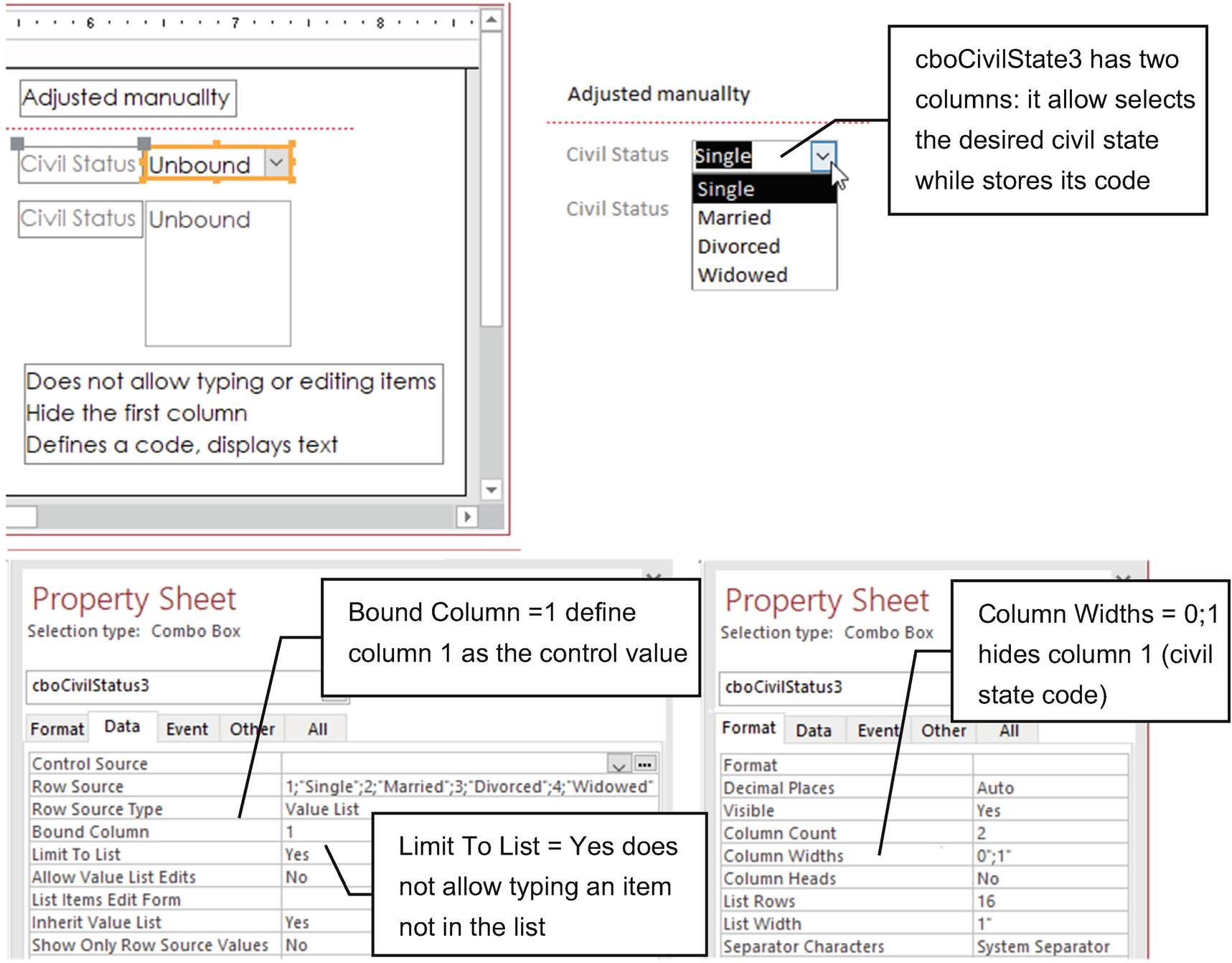
To use a two-column Combo Box or List Box control, where the user selects a list item while the control receives a hidden code, use Property Bound Column to indicate the column control value, and use Column Widths to hide the bound column
Using the Combo Box Wizard with a List of Records
By clicking the form’s Detail section, the wizard will offer two options, one to allow you to create a control to select a value from a table or from query records and the other to allow you to select it from a constant list of values (see Figure 4-38).
By clicking the Form Header section, besides the two basic options, the wizard will offer a third option that allows you use the control as a search tool.
Let’s begin by creating a Combo Box that allows you to show records from a table or query on the Form Detail section.
Creating a Two-Column List of Records Combo Box
Use the Relationships window of the sr28_Forms_Overlapping database to verify that the table’s FD_GROUP (food category records) and FOOD_DES (food item records) share a one-to-many relationship among their FdGrp_CD fields—each FOOD_DES record stores the FdGrp_CD primary key to set the food category association.

Use the Relationships window to find the related fields that are good candidates to use a Combo Box to best express the field value on the “many” side of the relationship
This one-to-many relationship is the classic case where a form can be used to create an interface where each FOOD_DES record uses a two-column Combo Box to represent the FdGrp_CD field showing the food category name, instead of its code.
- 1.
Use the Form Design tool on the Create tab to create a new form in design mode.
- 2.
Show the form’s Property Sheet, and on the Data tab, set Form Record Source to FOOD_DES.
- 3.
Click the Show Existing Fields tool of the Form Design tab to show the Field List window, press and hold the Ctrl key to click the NDB_No and Lng_Desc fields, and drag them to the Form Detail section.
- 4.
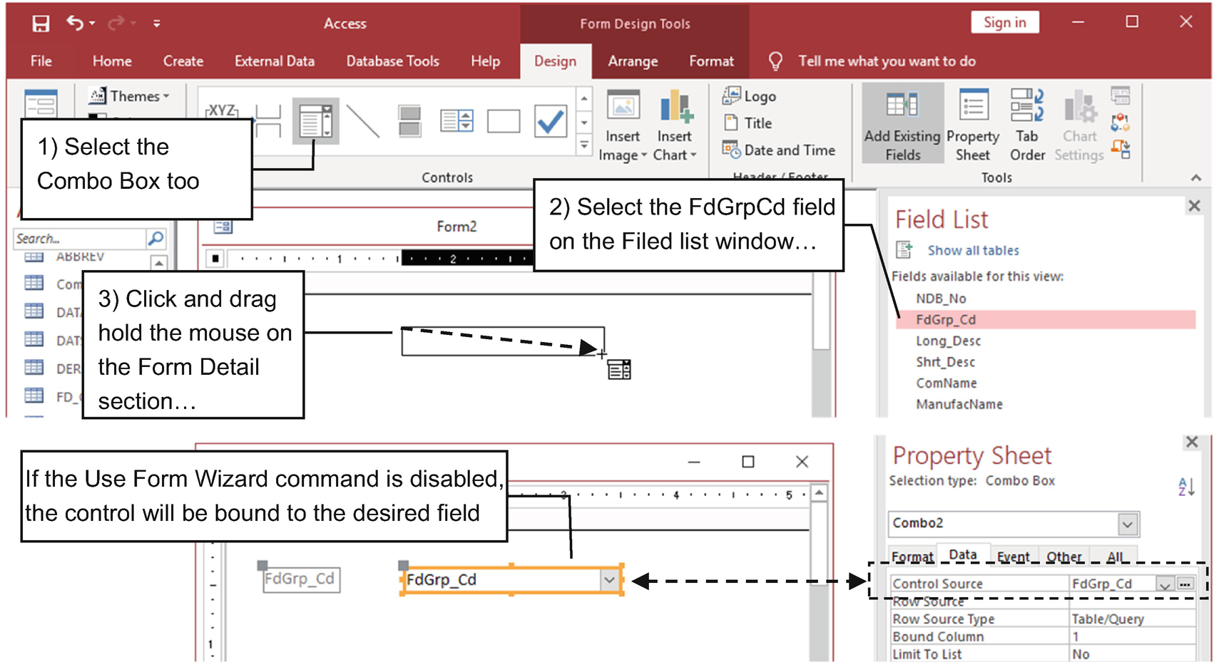
Select the Combo Box tool in the controls list of the Form Design tab, and click and drag the FdGrp_Cd field from the Field List window to the Form Detail section to fire the Combo Box Wizard (Figure 4-49).
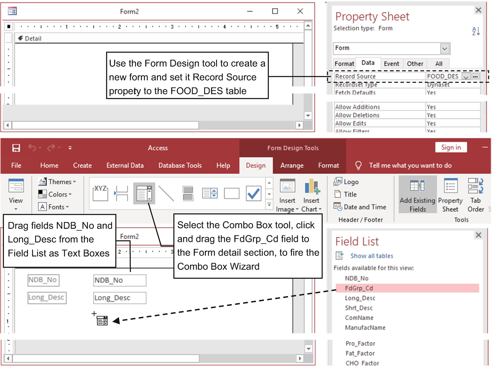
Create a new form whose Record Source is set to FOOD_DES, drag fields NDB_No and Long_Desc as Text Boxes, select the Combo Box tool, and click and drag the FdGrp_CD field to the Form Detail section to fire the Combo Box Wizard
- 5.
On the first Combo Box Wizard page, select the option “I want the Combo box to get the values from another table or query” and click Next.
- 6.
The wizard will ask you to select a table or query. Select the FD_GROUP table and click Next to show its fields (Figure 4-50).
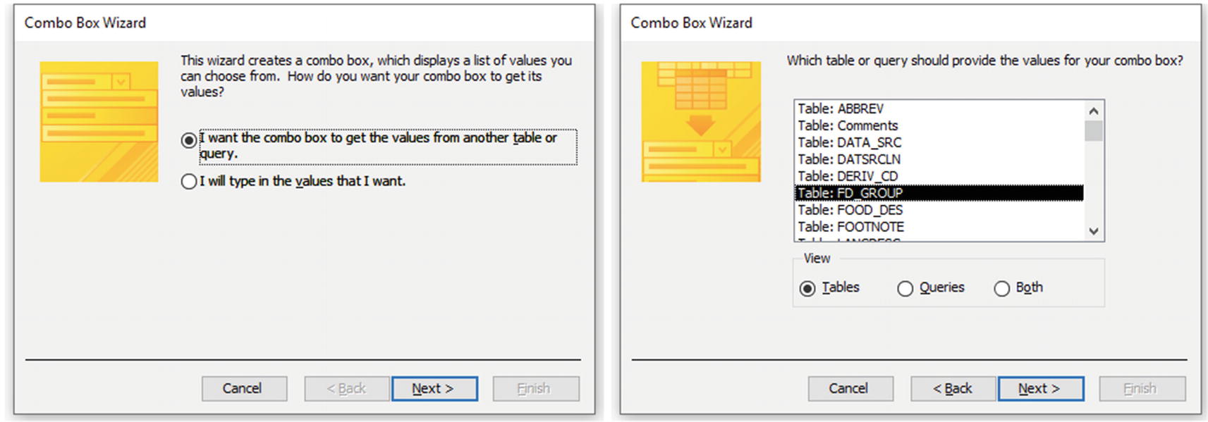
To fill a Combo Box list with records, select its first option on the Combo Box Wizard’s first page and then choose the table or query from where the records come. This figure shows how to select the FD_GROUP table as its row source
- 7.
Click the >> button to select both FD_GROUP Table fields (FdGrp_CD and FdGrp_Desc) and click Next.
- 8.
The Combo Box Wizard will ask if you want to sort the list items by one of the selected fields. Select FdGrp_Desc for Ascending, and click Next (Figure 4-51).
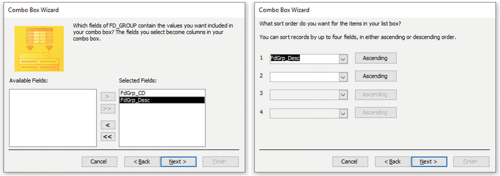
On the third wizard page, select the fields that must be on the list (FdGrp_CD and FdGrp_Desc), click Next, and choose FdGrp_Desc as the field used to sort the records
- 9.
The Combo Box Wizard will detect that you selected the table primary key (FdGrp_CD) and will use it as the control value, automatically hiding it on the list (checking the “Hide key column (recommended)” option). Click Next (Figure 4-52).
- 10.
The Combo Box Wizard will ask if the Combo Box value must be associated to a field, already selecting the FdGrp_Cd field (because it was preselected when the control was dragged). Click Next.
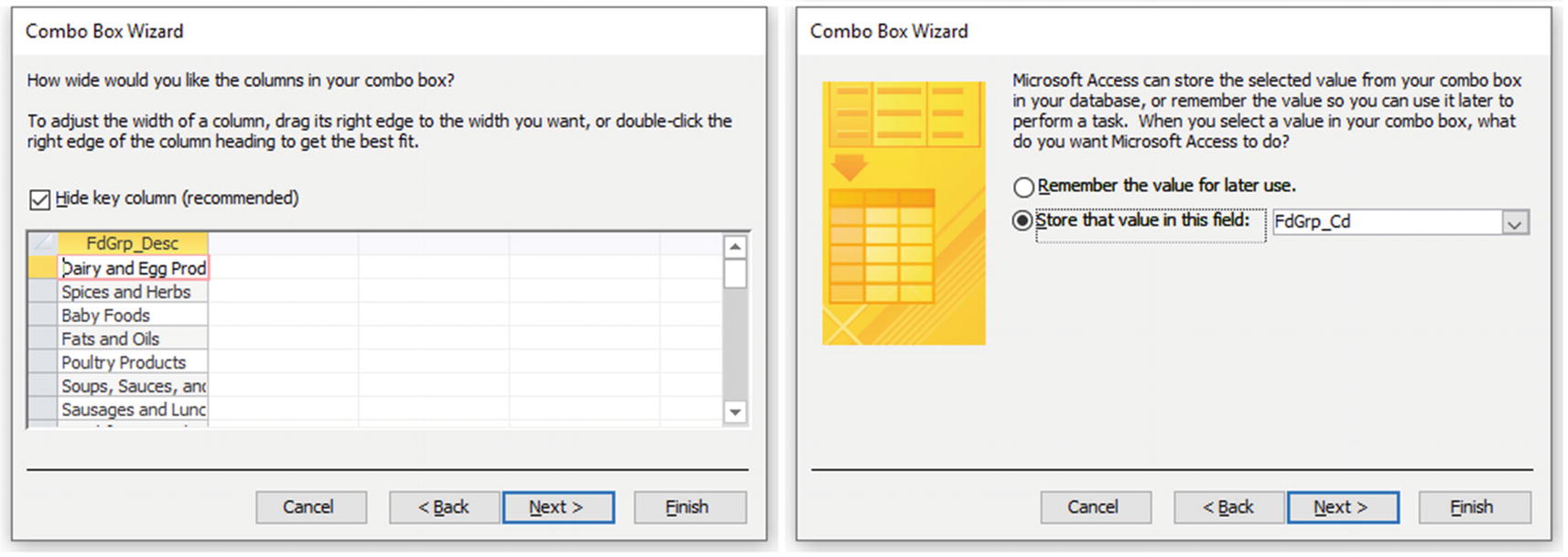
Since you selected the table primary key field (FdGrp_CD), on the fifth wizard page, check the “Hide key column (recommended)” option to hide it on the Combo Box list, and on the sixth page, it will automatically select the field that you dragged from the Field List window (FdGrp_Cd from FOOD_DES table) as the Control Source property
- 11.
Use the last Combo Box Wizard page to associate the Combo Box Label to the words Food Category (the wizard will propose using the field name), and click Finish to create the control in the form’s Detail section (Figure 4-53).
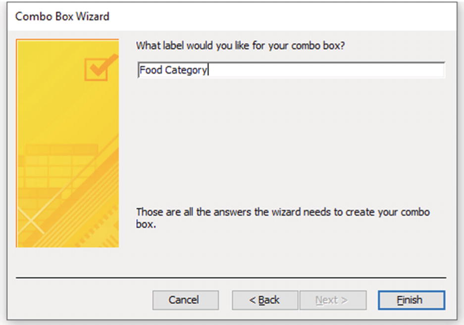
On the last wizard page, type Food Category as the caption for the Combo Box’s associated Label and click Finish to insert the control on the Form section

The Food Category Combo Box from frmComboBox_FOOD_DES uses the FD_GROUP table records to fill its list of items. Since both tables are related by the FdGrp_CD field, which is hidden from the first list column, the control can show the food category name instead of its code
Control Source = FdGrp_Cd
Row Source = SELECT [FD_GROUP].[FdGrp_CD], [FD_GROUP].[FdGrp_Desc] FROM FD_GROUP ORDER BY [FdGrp_Desc]
Row Source Type = Table/Query
Bound Column = 1
Column Count = 2
List Rows = 16
Limit To List = Yes
Column Widths = 0; 2.5”
List Width = 2.5”
Width = 2”
Locked = Yes
The Combo Box’s second column width was changed to 2.5 inches, as was its List Width setting (to allow you to select an item without truncating its text), while the control’s Width was set to 2 inches—which is enough to show the food category name.
It also has Locked set to Yes to allow the user to expand the list but not change its value so as not to ruin the Food Item and Food Category association.

Whenever Row Source Type is set to Table/Query, you can use the Row Source ellipsis to show the Query Builder window and see how the SQL instruction was created
The Query Builder is a modal window, meaning you can’t use the Access interface while it is opened.
Whenever Row Source Type is set to Table/Query, you can use the Row Source arrow to expand a list of database saved queries and select one to be used to fill the control list of items.
As a bonus, open frmComboBoxListBox_QueryRecords that has two columns of Combo Box and List Box controls produced by the wizard, all of them using the FD_GROUP table to fill its lists.
The Combo Box and List Box of the right column have Column Heads set to Yes to show the field names on its first row, and both have the first column unhidden using Property Control Width set to 0,5”, 1”.
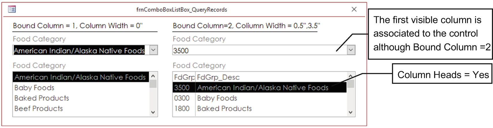
Use frmComboBoxListBox_QueryRecords to see how a two-column list works on the Combo Box and List Box controls when its first column is hidden or shown
The Check Box and Option Group Controls
The Check Box control is commonly used to set a Boolean option (True/False) in the user interface. It can be used alone in any form section to allow checking an interface option or, more rarely, inside an Option Group control to offer a multiple selection group of options. It can be used unbound or bound to any Yes/No or Number data type (although this will be a waste of bytes on database storage).
Be aware that the Check Box can be made a triple state control, as opposed to simply binary, by setting its Triple State property and allowing three different options: Null (no value, gray appearance), checked (True=-1), and unchecked (False set to 0).
It does not require a wizard to set it up: just select it in the controls list and click the Form section in the form’s Design view to draw a new Check Box control. If you want to create a multiselection group, draw a rectangle around the check box and use a Label control on its top to simulate this group.
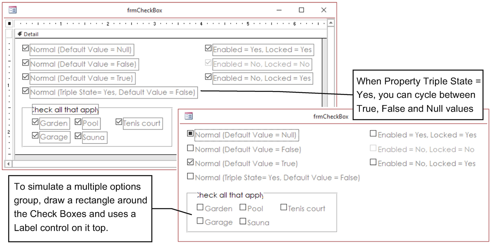
Use the Check Box control to allow the user to check an option on the interface. Since it is a triple state control, it can return True, False, or Null values (if bound to a table field with Triple State set to Yes, the data field must allow null values)
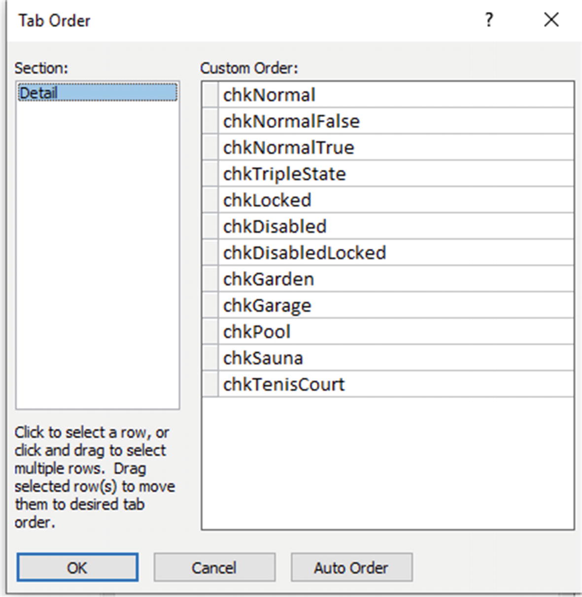
Use the Tab Order window to verify or change the control tab order of each section. By using the control naming conventions to clearly identify each control, it will be easier to set the corret tab order
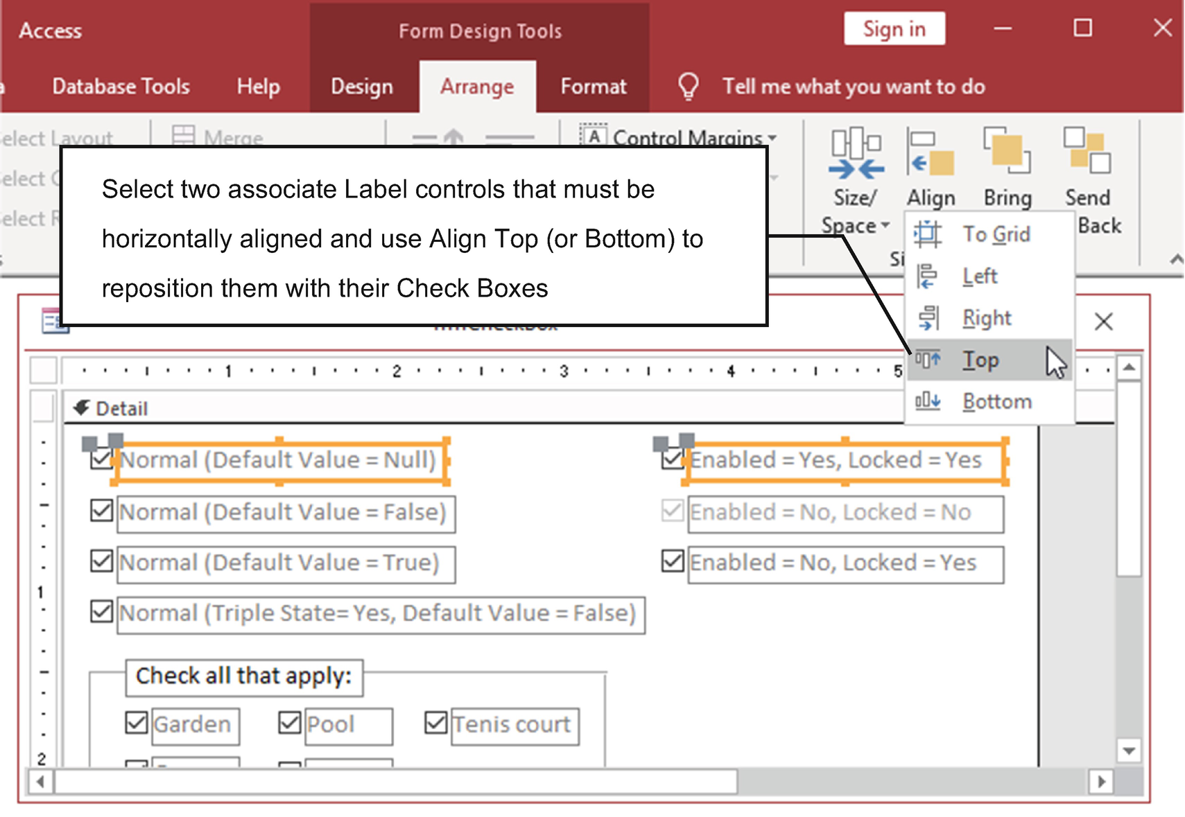
Use the form Design view’s Arrange tab commands to perfectly align, distribute, or size controls horizontally or vertically
After select the controls to distribute, align, or size, you can also right-click one of them and select the desired command on the context menu that appears.
Note that the first Check Box (chkNormal) is Null by default (it has a dark gray square), because its Default Value property was not defined. But whenever you click it, it will begin to cycle between True/False and will never be Null again (unless you use a macro). Only chkTripleState has its property Triple State set to Yes, allowing you to cycle among the three possible options.
Also note that a Locked Check Box can be selected, but its value cannot be changed. A disabled Check Box cannot be selected and is grayed out on the interface, and a disabled and locked Check Box is not grayed and cannot be selected.
Needless to say, form frmCheckBox has interface characteristics defined by its Format properties: no record selector, navigation button, or sizeable borders.
Option Group, Toggle Button, and Option Button Controls
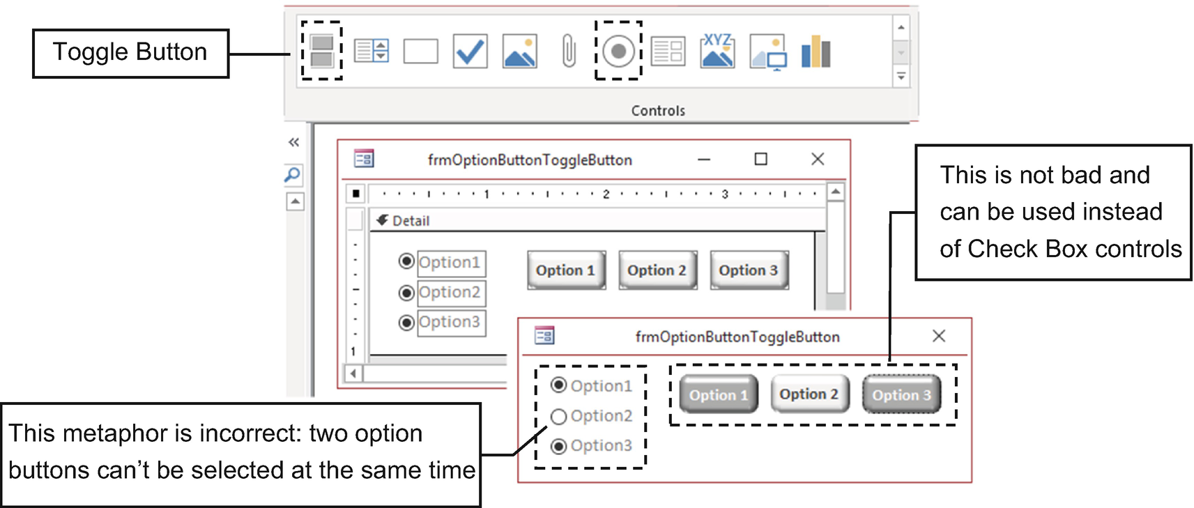
Never use Option Button controls alone in a form section to indicate options that the user must select. Although it will work as expected, the correct control for such a user interface is the Check Box
Whenever there is a need to create a mutually exclusive list of options, you must use the Option Group control because it manages the controls put inside it allowing just one to be selected at a time.
- 1.
Select the Option Group tool in the controls list of the form’s Design tab and click (or drag it) in the form’s Detail section.
- 2.
Supposing that the Use Control Wizards option is selected, the Option Group Wizard window will appear and ask on its first page for the name of the options you want to use. Click Next (this exercise uses the civil states as mutually exclusive options, as shown in Figure 4-61).
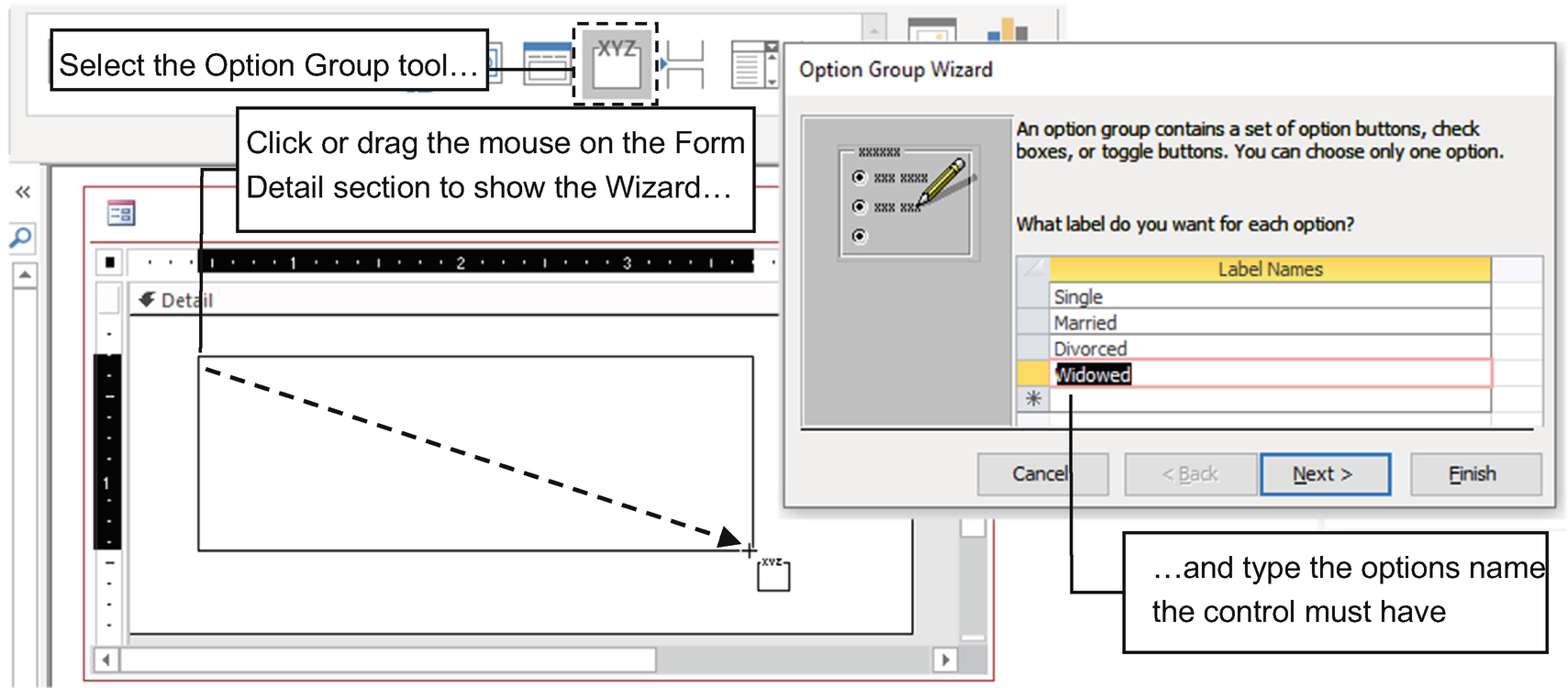
To create a mutually exclusive list of options to select a person’s civil state, select the Option Group tool, click the Form Detail section, and type the option names on the first Option Group Wizard page
- 3.
The second Option Group Wizard page will ask to select if the Option Group will have a default selected option, proposing the first of them as the default control value. Select the first option “Yes, the default option is “Single” and click Next.
- 4.
The third Option Group Wizard page will ask to attribute a value to each option, proposing a numbering sequence to each one (Single=1, Married=2, Divorced=3, and Widowed=4). Accept the proposed values and click Next.
- 5.
The fourth Option Group Wizard page will ask you which type of control you want to use to select the desired civil state option: Option Buttons (default), Check Boxes, or Toggle Buttons. It will also ask what appearance the control must have; click the option Etched (default), Flat, Raised, Shadowed, or Sunken to see how they will change the appearance of the Option Group control. Keep Option Buttons and Etched selected and click Next.
Attention Although the Option Group Wizard proposes the use of the Check Box control as an alternative to show mutually exclusive options, never use it for this type of option because it visually conflicts with the standard interface guidelines for software interface design.
- 6.
On the last Option Group Wizard page, define the control name by typing Civil State in the Text Box, and click Finish to insert the control on the form (Figure 4-62).
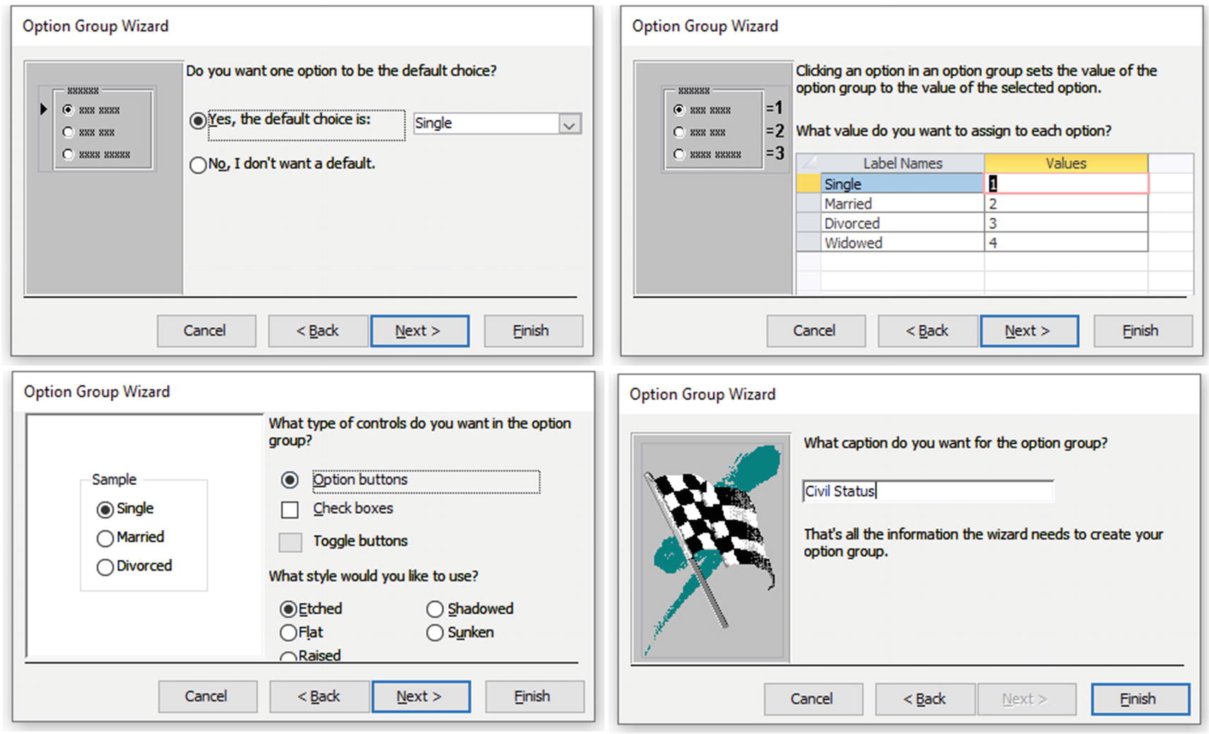
The Option Group Wizard asks you to create a mutually exclusive list of options. It asks for the option’s name, its associated value, the type of control and appearance, and the text to be used on the Label associated to the control
Option Value: This is changed on the first wizard page; define each control value, when selected, that in turn define the Option Group value.
Default Value: This defines the default option selected if it is set to any control Option value (leave this option empty or set it to a value different from any control’s Option value to make the Option Group appear unselected).
Style: This determines the control appearance by changing its border options. You can select from Flat, Etched, Raised, Sunken, Shadowed, and Chiseled.
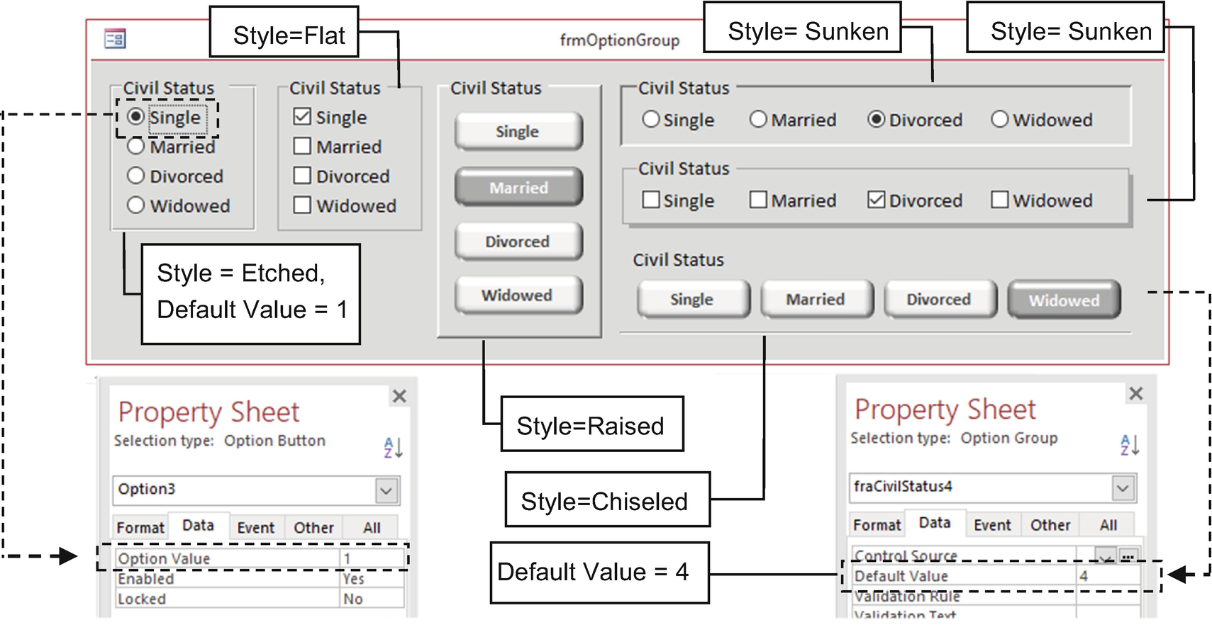
Use frmOptionGroup to see how the wizard sets the control’s Option value and to see how the Option Group Default Value and Style properties change their appearance (with variations on the type of control used by the group)
Microsoft Access 2019 uses by default a washed-out appearance with a white background selected for its Form Sections background. I have changed it to Background 2, Darker 5% (light gray) so you can better understand the difference between the control’s Style property (Etched, Flat, Raised, Sunken, Shadowed, and Chiseled), which also helps you better appreciate how the Toggle Button appears when it is selected/unselected.
The form also uses the proposed Check Box control for a mutually exclusive option such as the person’s civil state—which is considering an amateur approach to graphic interface design.
The Toggle Button was created in the first Microsoft Access version and has been kept as an interface control since then. It has no equivalence in the VBA Form interface and needs a gray background so it can better show how it performs when selected. The same is true for the Style property, available to all Microsoft Access controls.
The Civil Status Option Groups that use Check Box controls for mutually exclusive options are shown here just because the Option Group Wizard allows you to select them as an option. This design is inconsistent and must be certainly avoided when building database interfaces.
SubForm/SubReport Control
Source Object: This allows you to select the form name (or report) that must be shown by the control.
Link Master Fields: This indicates the field’s names on the master form whose values will be used to synchronize records on the child form.
Link Child Fields: This indicates the field’s names on the child form whose values matches the value of the Link Master Field on the master form.
If the Link Master Fields and Link Child Fields properties need to use more than one field to synchronize records on the master and child forms, separate the fields using semicolons on both properties. The fields don’t need to exist as controls on the form or subform, but they need to be in the table or query used for the Record Source property.
Take as an example frmFD_GROUP created by the Form Wizard and shown in Figure 4-9. It is a master form with two levels of subforms that show the relationships between food category, food item, and common measures.
The master form shows the food category, the first subform shows food item records related to the selected food category, and the second-level subform shows all food item common measures records.
Source Object = frmFOOD_DES Subform.
Link Master Fields = FdGrp_CD (field from FD_GROUP table)
Link Child Fields = FdGrp_Cd (field from FOOD_DES table)
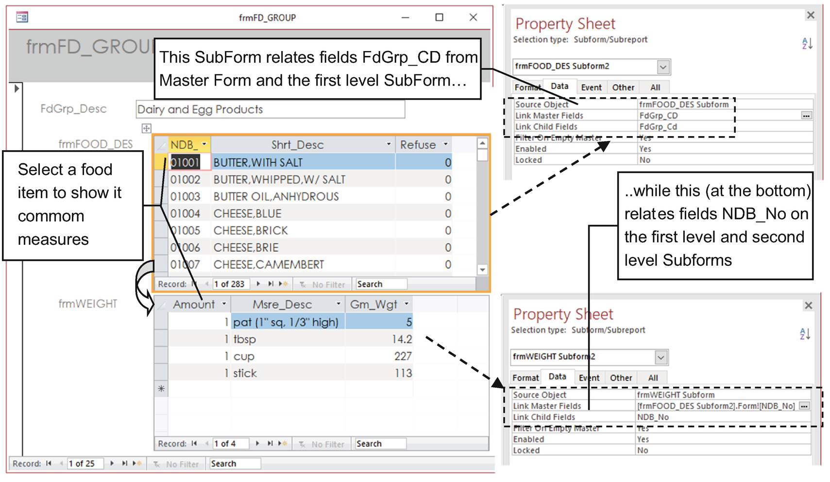
The SubForm control requires that the Link Master Fields and Link Child Fields properties use a field that exists on each form’s Record Source property and that has a relationship between the two tables
To synchronize the master form and SubForm control records, set properties Link Master Fields and Link Child Fields to the FdGrp_CD field—the one that relates to both tables (check the Relationships window to verify how tables FD_GROUP and FOOD_DES relate).
But the second-level SubForm control creates a different scenario. In this case, the master form is indeed a SubForm/SubReport control that holds a form inside it (food item names), while the child form is another SubForm/SubReport control (common measures). Whenever a food item is selected on the first subform, the other subform must show its common measures.
Source Object = frmWEIGH Subform
Link Master Fields = [frmFOOD_DES Subform].Form![NDB_No]
(field NDB_No from FOOD_DES table of frmFOOD_DES Subform)
Link Child Fields = NDB_No (field from WEIGHT table)
The [SubForm control name].Form! part of the syntax selects the form inside the SubForm control, while [Field Name] indicates the SubForm control that holds the field information required to synchronize records.
Now the Form.Parent! part of the syntax sets a reference to the form where the SubForm control was inserted, while [Control Name] indicates the master form control that holds the field information required to synchronize records.
The result is quite good for records synchronization, but from my point of view, the form frmFD_GROUP appearance falls short regarding the user interface.
For a database production application—one that expects to receive user input of new records—the navigation buttons used on the master form and each subform can eventually help, but there is no doubt that this pollutes the screen with too much information. But considering the sr28.accdb database, the information it holds must continue “as is,” with no record change or insertion. With this in mind, any form/subform interface can be improved by manually creating the form/subform interface, using other approach to show related records.
Manually Creating a Form/Subform Interface
By selecting the SubForm/SubReport control in the controls list, canceling the Form Wizard, and manually setting its Source Object, Link Master Fields, and Link Child Field properties
By dragging the desired form that must be used as a subform directly from the Database window to the desired master form section
- 1.
Open frmFOOD_DES_Continuous and note that it is a continuous form, showing many records at a time (Default View set to Continuous Form).
- 2.The frmFOOD_DES_Continuous form was created by the More Forms and Multiple Items tools and needs some changes to improve its appearance.
- a.
Set the Form Header BackGround Color to White.
- b.
The Form Header Label controls and Form Detail associated Text Box controls were resized to use the desired horizontal space.
- c.
Form Footer had its Height property changed to allow it to receive a SubForm/SubReport control.
- 3.
Select frmSubWeight in the Database window and drag it to the frmFOOD_DES_Continuous Form Footer section.
- 4.
Access will insert the SubForm/SubReport control and set its Source Object property to frmSubWeight, defining it as a subform, and will show a warning message telling that it will set the form’s Default View property to Single Form (Figure 4-65).
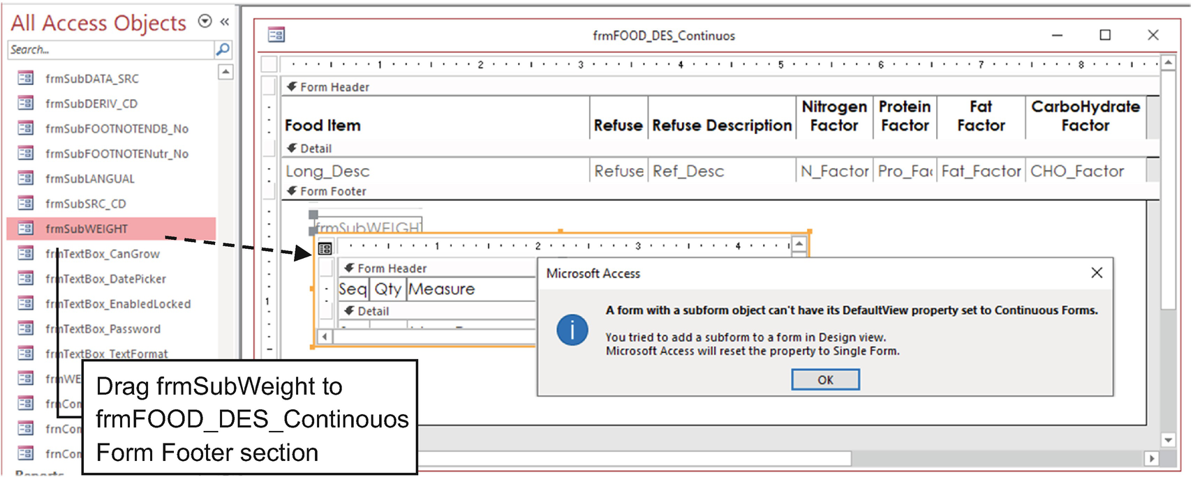
Drag any form from the Database window to insert it as a subform on another form section. If the destination form has Default View set to Continuous Form, Access will issue a message indicating that it will change Default View to Single Form
This message is acceptable whenever you try to insert the SubForm control in the Form Detail section, since Access can’t show a SubForm control using a continuous record view. But it’s clearly a (small) bug, because the Form Footer section doesn’t interfere with this way of showing records.
- 5.
Since the tables used for both forms are related by their NDB_No fields (check the Relationships window), Access will automatically set the SubForm control properties Link Master Fields and Link Child Fields to NDB_No field.
- 6.
Select the master form (click in the form’s top-left corner) and reset Default View to Continuous Form (Figure 4-66).
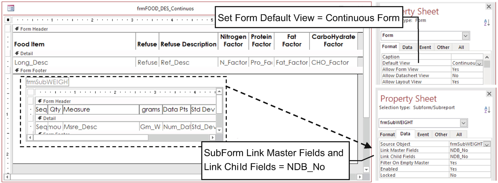
Whenever you drag a form from the Database window to any form section of a continuous form, Access will set its Defaut View to Single Form. Change it again to Continuous Form and note that it inserts a SubForm control and automatically set its Link Master Fields and Link Child fields to the fields that relate both forms’ Record Source properties
- 7.
Switch to Form view and note that frmFOOD_DES_Continuous is a continuous form with another continuous subform in its Form Footer section, automatically synchronizing its records (Figure 4-67).
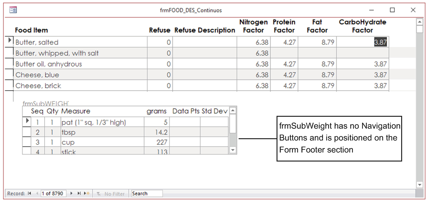
This figure shows that frmFOOD_DES_Continuous can have Default View set to Continuous Form and receive another continuous subform on its Form Footer section. Select any food item on the form to show its common measures on the subform
By tweaking some SubForm control Format properties, you can insert another SubForm control on its Form Footer to also show LANG_DESC table records synchronized with the selected food item.
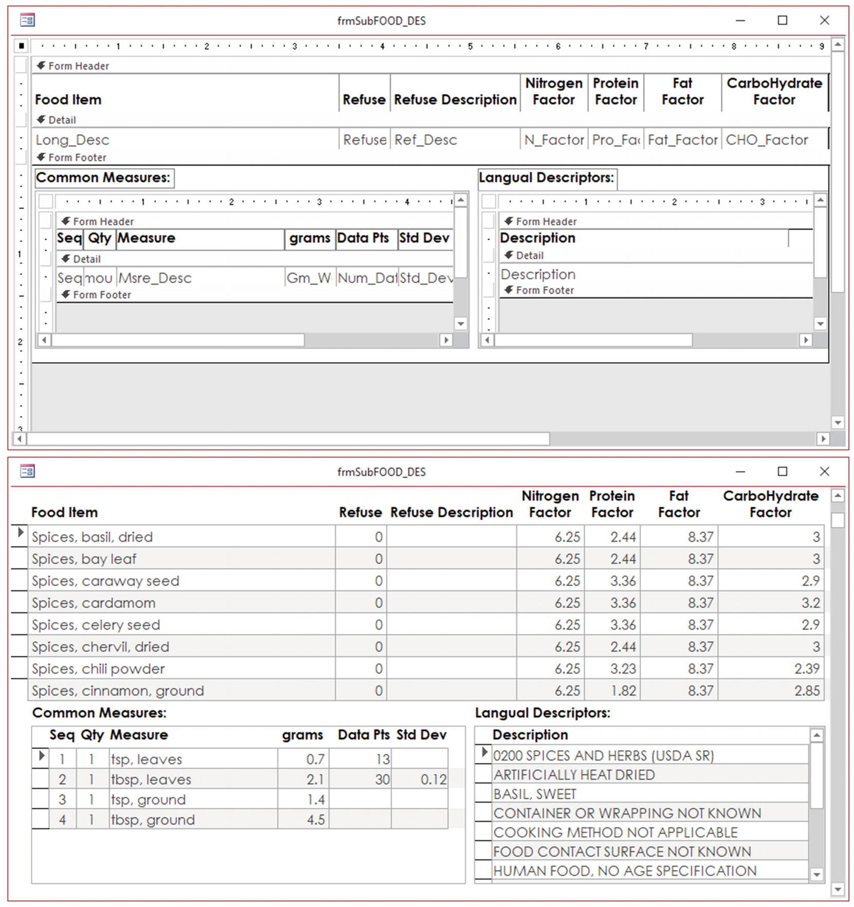
frmSubFOOD_DES is a continuous form that uses two SubForm/SubReport controls to show the “many” side records of two related tables. WEIGHT and LANGUAL (Record Source is set to qryLANGUAL and uses tables LANGUAL and LANG_DESC to show its records)
Although frmSubWEIGHT and frmSubLANG_DES were not built in this chapter, it is supposed that at this point of this chapter you can fully understand how each subform works by just opening them in the form’s Design view and investigating their properties.
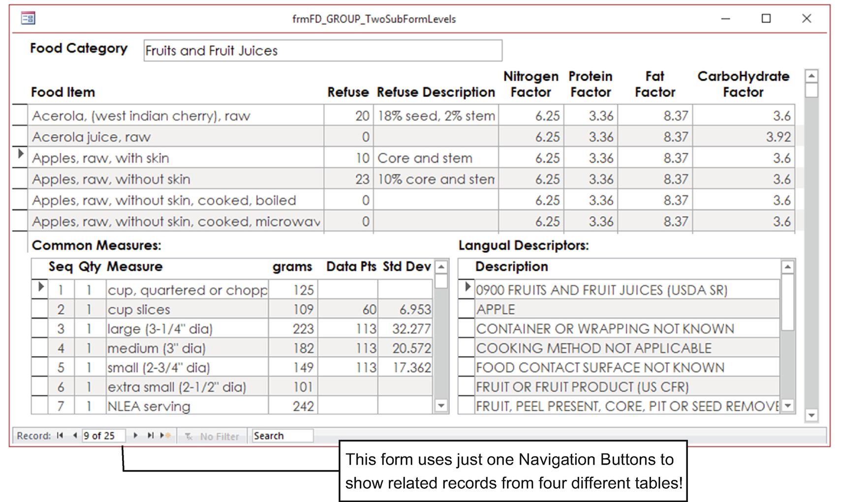
Form frmFD_GROUP_TwoSubFormLevels has a SubForm/SubReport control on its Form Footer section (frmSubFOOD_DES) that in turn has two SubForm/SubReport controls on its Form Footer section, creating two levels of subforms that easily synchronize records from four different database tables
Using Aggregate Functions in Forms and Subforms
Looking at Figure 4-67, some may argue that by removing the navigation buttons from the forms used on the SubForm/SubReport controls, there is a loss of record information. How many food items are there in each food category? How many common measures and Langual descriptors?
These are reasonable questions that can be solved using the COUNT() aggregate function that can operate on all records shown by a form, which is especially useful when this form has Default View set to Continuous Form (see the section “Control Source for Expressions and Aggregate Functions” earlier in this chapter).
Use as an argument any field on the form’s Record Source property that is guaranteed to be fulfilled for every record: the primary key field.
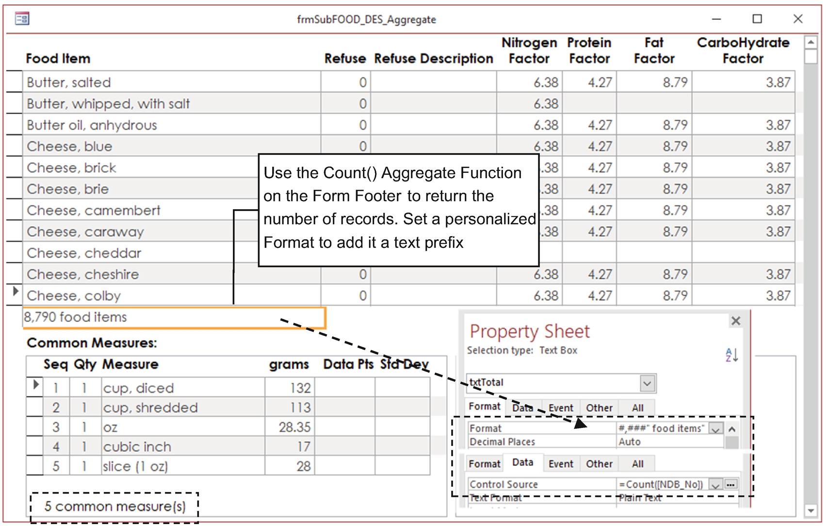
Whenever you want to use subforms without the navigation buttons, place a Text Box control on its form footer and use the COUNT() aggregate function to return how many records it has (using the Format property, you can add a text prefix or suffix)
You are invited to open frmSubFOOD_DES_Aggregate in Design view, select each subform to check its name, and study how each one works.
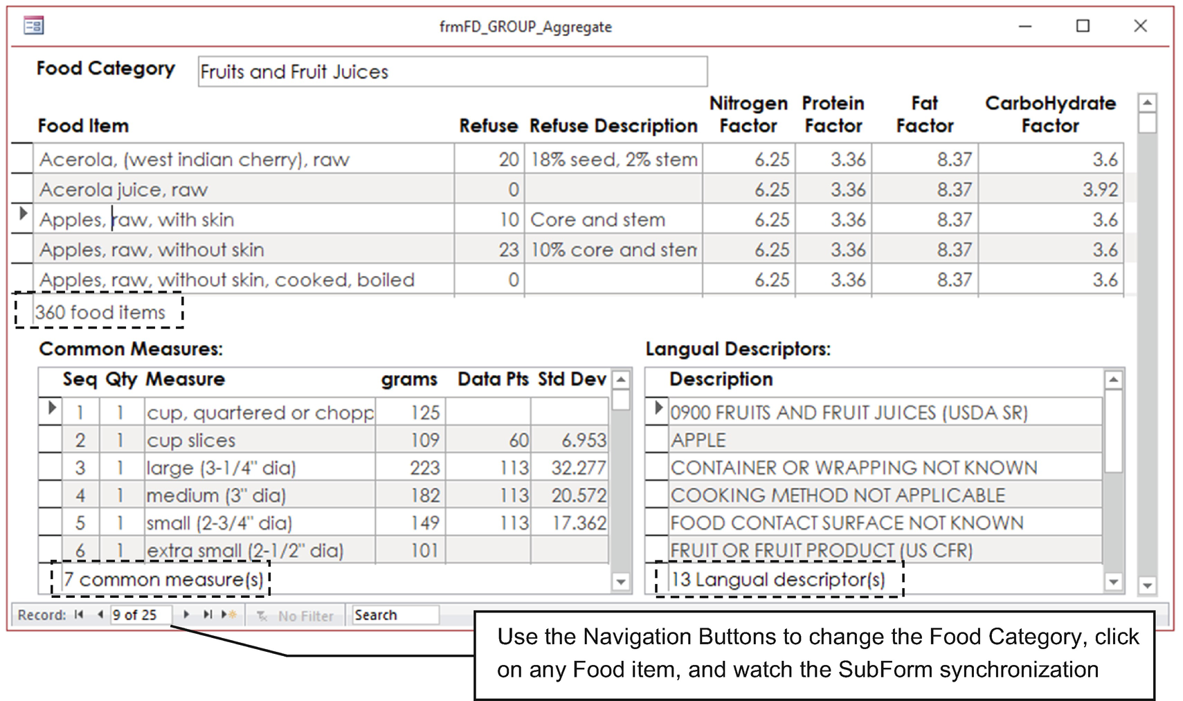
The frmFD_GROUP_Aggregate single form allows you to navigate by each food category while showing how many food items and respective common measures and Langual descriptors exist using a single window. And with no code! Quite nice, huh?
Chart Control and Chart Tool
The Chart control or the Insert Chart tool can be used to make a graphical presentation of a single record or query data. Both controls may need a single chapter—or a small book—to explore all its possibilities, but since there are lots of videos on the Internet about them, this section will focus on some issues that you need to know to produce the desired presentation on your forms and reports.
Microsoft Graph: Created with the Chart control, this is the traditional way of creating charts since Microsoft Access 2003.
Modern Charts: Created with the Insert Chart tool, this uses a new chart engine that creates charts closely related to the ones that Excel 2019 offers.
Link Master Fields: This indicates the control or field names in the form (separated by commas if more than one is needed) whose values must be used to filter the records that the chart plots.
Link Child Fields: This indicates field names in the chart query that must be used to synchronize with the form’s Link Master Field property.
As with the SubForm/SubReport tool, the names used by these properties don’t need to be on the chart as a control but must be present in the query or table used by the form or chart to bring the desired records.
The Chart control has an old and confusing wizard that may help you to create the chart, while the Insert Chart tool has none, so you must manually tweak many properties to produce the desired result.
The Chart control produces charts with an appearance that may seem older than the modern charts created by the Insert Chart tool.
The Chart control has many more customization options than the Insert Chart tool, which is still primitive in the way it allows the personalization of charts.
For an unknown reason, both the Chart control and the Insert Chart tool expects that the records data came from a Total query (although you can change it later by a Select query).
By default both chart types (and the Chart Wizard) expect to receive data on a row-by-row bases (series names are considered as field values). Only the Chart control allows the use of data on a column-by-column basis (series are considered as field names).
Calories Breakdown : A pie chart that shows the total percentage of calories that came from protein, fat, and carbohydrates on a food item (together they sum 100%).
%Daily Values : A column chart that states the percentage of protein, fat, and carbohydrates a food item needs to provide to fulfill a person’s daily ingestion need.
Creating a Pie Chart with the Chart Control
Every time you select the Chart tool and click a form section in Design view, Microsoft Access opens the Chart Wizard, no matter the state of the Use Control Wizards option. In other words, you can’t get rid of it to create your first chart.
Since the Chart Wizard expects to receive data on a row-by-row basis, there is a need to create a query that returns the desired nutrients (protein, fat, and carbohydrate) and the calories each one gives, using different rows for each nutrient record.
As cited earlier in the section “Using the Expression Builder” in Chapter 3, protein and carbohydrate have 4 calories per gram, while fat has 9 calories per gram.
- Since DRIs1 set adequate percent ranges for adults on the calorie intake from these nutrients, they can be used as a suffix to the nutrient names to give additional information on the chart.
Protein: 10%–35%
Carbohydrate: 45%–65%
Fat: 25%–35%
We can build such a query by inspecting the Relationships window and noting that we need to use the FOOD_DES table for nutrient codes (NDB_No) and names (Long_Des) and its related NUT_DATA table for nutrient amounts, using a criteria to return just the desired nutrient amounts by its Ntr_No code (Ntr_No).
To use such Ntr_No criteria, inspect the NUTR_DES table to find that for nutrient names Protein, Total_Lipid (fat), and Carbohydrate, by Difference, the desired Nutr_No codes are, respectively, 203, 204, and 205 (they are between double quotes because the NDB_No field has the Short Text data type).
The IIF() Function
The IIF() function , also known as “immediate IF,” is used to provide a logical test that can return one of two different values and can be used anywhere on an expression.
Expression: Required; is an expression or value that must be evaluated (0 is considered as False; any other value is considered as True)
True_value: Required; is a value or expression that is returned when Expression is evaluated to True
False_value: Required; is a value or expression that is returned when Expression is evaluated to False
Since the IIF() function is used on an expression, it always evaluates both True values and False values, although it returns just one of them. This may lead to unexpected errors, because if one of these arguments generates an error (like a zero division), IIF() will propagate such error.
Of course, you can nest another IIF() function inside the True_value or False_Value, something that can become difficult to follow according to the value that must be returned.
You’ll learn about the CHOOSE() function later in this book for a better alternative of nested IIF() functions.
It relates FOOD_DES and NUTR_DATA by its NDB_No field.
It uses In(“203”,”204”, “205”) on the Criteria option of the Ntr_No field from the NUTR_DATA table to select just the desired nutrients.
- It uses the IIF() function on the Nutrient column expression to return each nutrient name suffixed by the respective nutrient range (click the Nutrient column and press Shift+F2 to better see it in the Zoom window).Nutrient: IIf([Nutr_No]="203","Protein 10-35%", IIf([Nutr_No]="204","Fat 20-35%","Carbohydrate 45-65%"))
This expression uses two nested IIF() functions (also known as an immediate IF) to check the record Ntr_No value and return the desired nutrient name. The IIF() function needs three arguments, separated by commas, and has this syntax:
IIF(<Test>, <value for Test=True >, <value for Test=False>)
The first IIF(<Test>,…) verifies whether Ntr_No is set to 203, and if it’s True, it returns the argument when Test is set to True (“Protein 10-35%”), but if it’s False, it uses another (nested) IIF() function on the argument when Test is set to False to verify whether Ntr_No is set to 204. If it’s True, it returns Fat 20-35. If it’s False, it returns Carbohydrate 45-65%.
It is important to note that whenever you need to nest IIF() function to test n conditions, you will need n-1 nested IIF() functions, which can turn your expression into a mess. As an alternative, you can use the CHOOSE() function, which will be explained later in the chapter.
- It also uses the IIF() function to build this expression for its Calories column (to multiply the nutrient’s Ntr_Val field by the respective calories amount it has):Calories: [Nutr_Val]*IIf([Nutr_No] In ("203","204"),4,9)

The query qryFood_DES_ProtFatCHOCalories uses the FOOD_DES and NUTR_DATA tables to return three records for each food item (one record for each nutrient listed as Protein, Fat, and Carbohydrate). It uses the IIF() function to build the Nutrient and Calories fields
There is no need to calculate the percentage of calories that came from each of these three nutrients (by dividing each nutrient value by the sum of their values), because the Microsoft graph pie chart can automatically give this information by using data series values with the Percent option set.
- 1.
Use the form’s Design tool to create a new form.
- 2.
Set the form’s Record Source property to the FOOD_DES table, show the Field List window, and drag the fields NDB_No and Long_Desc to the form’s Detail section.
- 3.
Select the Chart tool in the controls list of the form’s Design tab and click the Form Detail section to start the Chart Wizard.
- 4.
On the first page of the Chart Wizard tool, select Queries in the View area, choose the qryFood_DES_ProtFatCHOCalories query in the list, and click Next to continue (Figure 4-73).

On a new form, whose Row Source is set to FOOD_DES, select the Chart tool, click the form’s detail section, and select qryFood_DES_ProtFatCHOCalories on the list
- 5.
The second Chart Wizard page asks which fields you want to use on the chart. Double-click the Nutrient and Calories fields (or select them and use the > button) to add them to the Fields to Chart list and click Next.
- 6.
The third Chart Wizard page asks which type of chart you want to create. Click the pie chart and click Next.
- 7.
The fourth Chart Wizard page asks how you want to use the selected fields, adequately proposing Nutrient as the series name (in the upper right of the chart preview) and SumOfCalories as the series values. Accept the default values and click Next.
Tip On this Chart Wizard page, you can drag the selected fields to the indicated positions of the chart preview. Double-click field SumOf Calories to change the aggregate function used to the Total field value (if any).
- 8.
The fifth Chart Wizard page will detect the fields used on the form’s Record Source property and in the query selected for the chart and, because they are related in the Relationships window, will propose them for the Chart control’s Link Master Fields and Link Child Field properties (it adequately proposes the NDB_No field for both properties). Click Next (Figure 4-74).
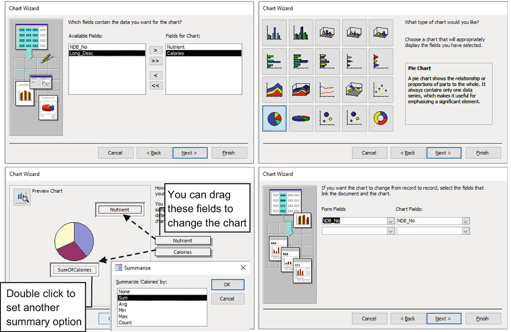
The Chart Wizard asks to define the fields used by the chart, the type of chart, how the selected fields will be used on the chart, and which fields must be used on its Link Master Fields (Form Fields) and Link Child Fields (Chart Fields) properties
- 9.
The last Chart Wizard page asks for a title to be used on your chart and if a legend must be exhibited. Type Calories Breakdown as the chart title, keep “Yes, display a legend selected,” and click Finish to close the wizard and insert the chart in the Detail section.

This is the pie chart created by the Chart Wizard and inserted in the form’s Detail section. Note that its Row Source property uses a Total query to show its data

Double-click the Chart control in Design mode to activate the Microsoft Graph applet and change any chart element. Right-click the pie chart, select Format Data Labels, and on the Data Labels tab, check the Percent option to change the calories values into % calories for Protein, Fat, and Carbohydrate
For the Chart control’s Row Source property, the Chart Wizard sets by default a Total Query SQL instruction and may define the Link Master Field and Link Child Fields properties. To use all the query records on the chart, remove both control properties, click the ellipsis at the right of the Chart control’s Row Source property to open the Query Design window, and change the Total query to a Select query.
This form is available as Form2 in the sr28_Forms_Overlapping.accdb file.
Customizing the Pie Chart
The Chart tool creates a Microsoft Graph OLE object in the form’s Detail section that is fully customizable.
Double-click the chart in the form’s design mode to use Object Linking and Embedding (OLE) to start the Microsoft Graph application and put the chart in Edit mode, where you can customize virtually any of its elements. Use the Microsoft Graph menu options or click the chart to select an option (such as legend, title, axis, series, pie slices, column bars, etc.). Double-click the selection to show the appropriate dialog box, where you can set it properties.
- 1.
Double-click the chart in the form’s Design view to start the Microsoft Graph applet.
- 2.
Right-click the pie chart and choose Format Data Series in the context menu to open the Format Data Series dialog box.
- 3.
Select the Data Labels tab, check the Percent check box, and click the Close button to add percent values to the chart.
Attention After adding data labels to the pie chart, it may shrink the chart. Click near the border of the chart until a dashed border appears; click it and drag its handles to enlarge the chart.
- 4.
Click any empty area of the form’s Detail section to close the Microsoft Graph application and update the chart.
By using this procedure, you can change the chart slices background and border colors, data label fonts, chart title format, legend format size and position, and more. Feel free to try the options until you feel comfortable with this powerful (and sometimes confusing) tool.
Figure 7-76 shows the frmFOOD_DES_Pie_Chart tool form with the Calories Breakdown pie chart using the Data Series Percent option to automatically calculate percent values, new colors associated to each of its slices, and its legend reformatted.
Creating a Column Chart with the Chart Control
According to what is currently proposed by the FDA for the daily values required of a nutrient, an adult needs to consume at least 50g of protein, 78g of total fat, and 275g of total carbohydrates.2
%Daily Value is the percent amount of a nutrient necessary to fulfill a daily diet. If 100g of food has 50g of protein, and the adult’s daily value for protein is 50g, it indicates that 100g of this food meets the required amount.
So, the %Daily Values chart requires a query similar to the one used for Calories Breakdown that calculates the %DV for any food item, dividing its Nutr_Val field from the NUTR_DATA table by the proposed FDA Daily Value for each nutrient. But in this case, we can use another powerful function to better select what value must be returned: the CHOOSE() function.
The CHOOSE() FUNCTION
The CHOOSE() function allows you to select a single value from a list of up to 100 different arguments, constituting a far better alternative than nesting IIF() functions.
Item_index: Required; this is an integer or expression that returns an integer value between 1 and the number of available items. If Item_Index is not an integer value, it will be rounded to the nearest integer.
Item_1, Item_2, Item_n: These are values or expressions that indicate all possible returned valued.
The CHOOSE() function checks the Item_Index value and returns the associated value on its list of choices. For example, if Item_index is set to 2, CHOOSE() will return Item_2 value. It will return NULL if Item_Index is less than 1 or greater than the number of choices listed.
Like IIF(), the CHOOSE() function evaluates every possible item before returning the desired value. If any of these items returns an error, this error will be propagated by the CHOOSE() function.
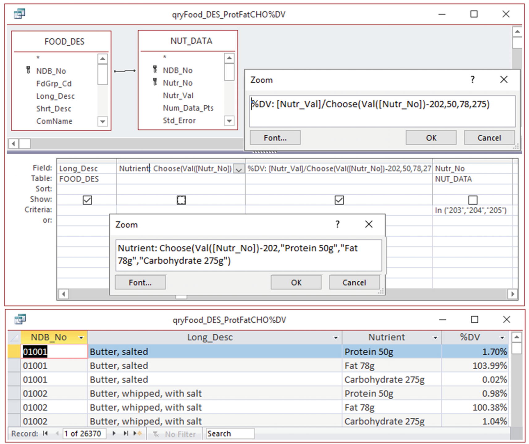
Query qryFOOD_DES_ProtFatCHO%DV uses the CHOOSE() function to build the Nutrition and %DV field expressions
The Query expressions use the VAL() function that converts a numeric string into a numeric value (the Nutr_No field has the Short Text data type). Since Nutr_No returns three consecutive values (203, 204, and 205), Val([Nutr_Val]) - 202 returns 1, 2, or 3, which allows you to compose the desired nutrient name or to divide Nutr_Val by the adequate daily value.
- 1.
Use the Form Design tool to create a new form and set its Record Source property to the FOOD_DES table, adding the fields NDB_No and Lng_Des to the form’s Detail section.
- 2.
Select the Chart tool on the controls list of the Form Design tab and click the form’s Detail section to start the Chart Wizard.
- 3.
On the first page of the Chart Wizard tool, select Queries in the View area, choose the qryFood_DES_ProtFatCHO%DV query on the list, and click Next to continue.
- 4.
On the second Chart Wizard page, double-click the fields Nutrient and %DV fields (or use the > button) to add them to the Fields for Chart list, and click Next.
- 5.
On the Third Chart Wizard page, select the first column chart and click Next.
- 6.
On the fourth Chart Wizard page, drag the Nutrient field from the X-Axis to the Series option and click Next (Figure 4-78).
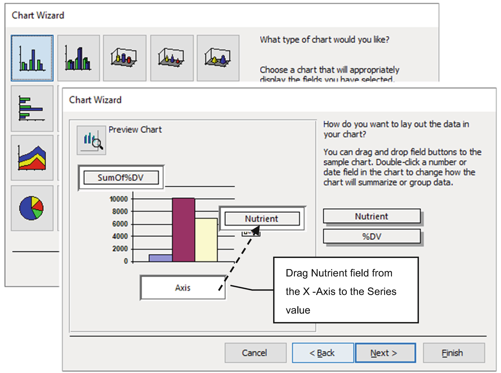
Select the first column chart, and when the Chart Wizard asks how to use the data on the chart, drag field Nutrient from the X-Axis to the Series area
- 7.
On the fifth Chart Wizard page, accept NDB_No as the fields used on the Form Record Source property and click Next.
- 8.
On the last Chart Wizard page, type %Daily Values for the chart title, keep the Yes, display a legend option selected, and click Finish to insert the chart on the Form Detail section (Figure 4-79).
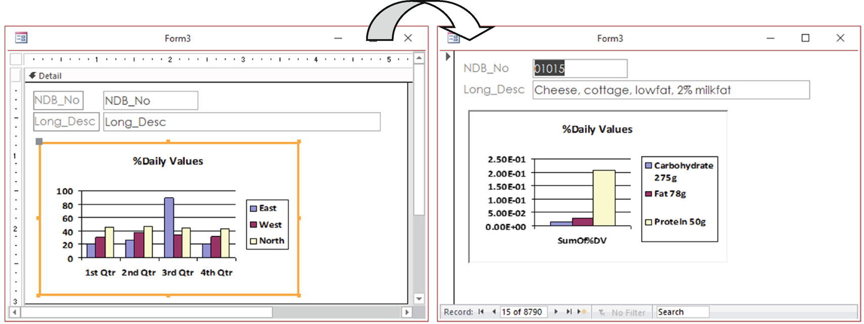
The Chart Wizard will create a generic column chart in the form’s Detail section while it is in Design view. Since the Link Master Fields and Link Child Fields properties were set to NDB_No, switch to Form view and use the navigation buttons to change the form record and note how the chart automatically updates
This form is available as Form3 in the sr28_Forms_Overlapping.accdb file.
Customizing the Column Chart
The Column chart created by the Chart Wizard has a standard appearance that can be improved by customizing many of its elements, which is made by double-clicking the Chart control in Design view to fire the Microsoft Graph applet and put the chart in Edit mode, where you can select the desired chart element and double-click it to change it as you like (almost the same way as when using Excel).
The legend was dragged to the bottom of the chart.
The Y-Axis Format was changed to Percent, with 0 decimals.
The Series Data labels Values was shown using Format Percent with two decimals (double-click each data series and use the Format Data Series dialog box).
The Series color was changed by clicking two times on the bar to select it and then double-clicking to change its border and background colors (this can also be done by double-clicking the associated small square on the chart legend).
The X-Axis title was removed (double-click the X-Axis and use the Font tab to apply a white font color—the same as chart background).
The default horizontal grid lines were removed (click them in the chart area and uncheck the Value Axis Grid line tool on the Chart toolbar or use the Chart ➤ Chart Options command to show the Chart Options dialog box).
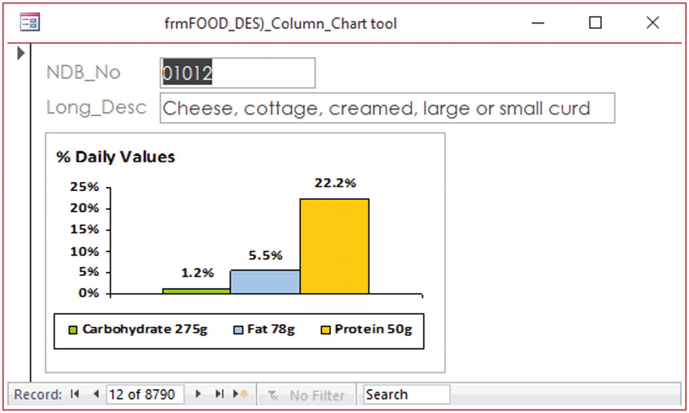
After creating a chart using the Chart Wizard, double-click the Chart control to show the Microsoft Graph applet and put the chart in Edit mode. Then select chart elements with the mouse and double-click them to change their settings (or use the menu commands available in the Microsoft Graph interface)
Whenever you use a Select query to create a column chart, which series values comes from different records grouped by a single record field (in this case the NDB_No field group different nutrients for the same food item), the Chart engine will not allow you to insert space between the bars chart because it considers them as a unit. To create a column chart that allows separate bars, use a Crosstab query (like qryFOOD_DES_ProtFatCHO%DV_Crosstab) where the field names define the chart series.
Creating a Modern Pie Chart with the Insert Chart Tool
The Insert Chart tool was designed by the Access Development team to somewhat approximate in the Microsoft Access interface what Excel has done since Microsoft Office 2007: a new interface to create and present charts.
“Modern charts” mainly use by default the Century Gothic font (instead of Arial used by the Chart control) and offer more color possibilities than the ones used by the Microsoft Graph applet. In other words, the Insert Chart tool creates a chart with a more modern appearance than the ones created by the Chart tool.
That said, the charts created with the Insert Chart tool are a totally different beast, with no Chart Wizard, using two different interfaces (the Chart Settings and Property Sheet windows). The Chart objects created are not intuitive (you can’t select chart elements on the control using the mouse or double-clicking) and lack lots of common personalization settings.
The pie charts created with the Insert Chart tool accept only queries whose series values are presented on a row-by-row basis, and there is no option to transform the data values to a percent of its total, like the Chart control does. You have to calculate the desired percent values using a query.
qryFOOD_DES_ProtFatCHOCalories to return nutrients and calories
qryFOOD_DES_TotalCalories, which is a Total query also based on qryFOOD_DESProtFatCHOCalories to return the sum of calories each nutrient has

To create a modern pie chart with the Inser Chart tool to show Calories Breakdown vbalues, the query must return records on a row-by-row basis and must calculate the %Calories each nutrient offers, since the Chart control doesn’t have this option
The Insert Chart option has no wizard to guide you, although the process is somewhat simplified after you are introduced to it.
- 1.
Use the Form Design tool to create a new form and set its Record Source property to the FOOD_DES table, adding fields NDB_No and Long_Des to the form’s Detail section.
- 2.
Click the Insert Chart tool on the form’s Design tab to expand it, select the pie chart, and click the form’s Detail section to insert a new modern Chart object and show the Chart Setting window with the data area selected (Figure 4-82).

Use the Insert Chart tool to select the pie chart and click the form’s Detail section to insert the Chart control and show the Chart Settings window
- 3.
Select query qryFOOD_DESProtFatCHO%Calories in the Data Source box of the Chart Settings window to expand its Axis (Category), Legend (Series), and Value (Y axis) options showing all the selected query fields.
- 4.Check these field names in the Chart Settings window to define the pie chart:
- a.
Axis (Category): Nutrient
- b.
Value (Y axis): Calories
Note The Chart Setting Legend (Series) option may be used whenever you want that the series name to come from a field different from the one selected on the Axis (Category) option.
- 5.
Click the Format option at the top of the Chart Settings window and check the Display Data Labels option.
- 6.
Show the Property Sheet window, select the Data tab, and click the ellipsis button to the right of the Link Master Fields (or Link Child Fields) property to show the Subform Filter Linker window where you will select the NDB_No field to allow a form record-by-record synchronization (Figure 4-83).
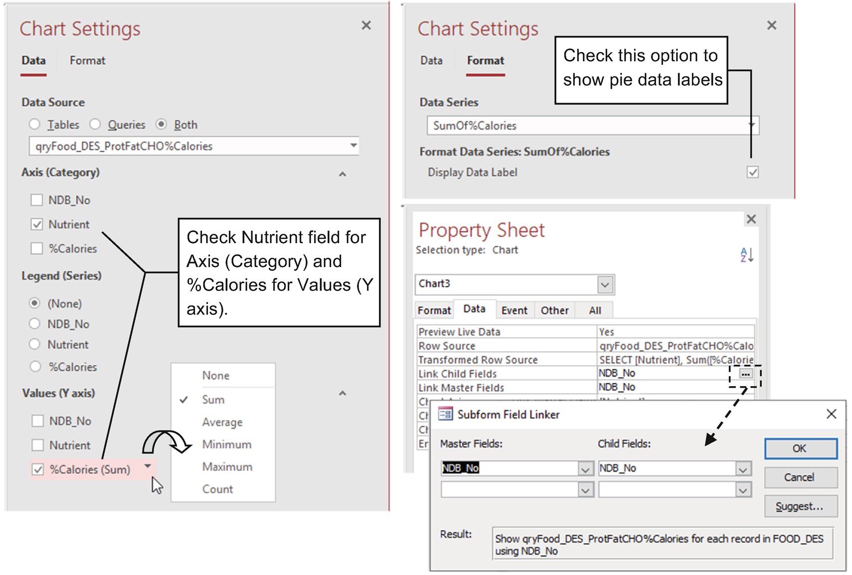
Use the Chart Settings window to select the fields that must be used on the Axis (Category), Legend (Series), and Values (Y axis) options. Show the Property Sheet window and manually set the Link Master Fields and Link Child Fields properties (click the elipsis to right of one of these properties to show the Subform Field Linker window)
The fields selected on the Values (Y axis) option will always be grouped by the SUM() function on a Total query created by the Chart Settings window (which is stored on the Transformed Row Source property in the Property Sheet window). To change the way the chart groups records (using all records with no grouping option), click the checked field arrow and select the desired group option.
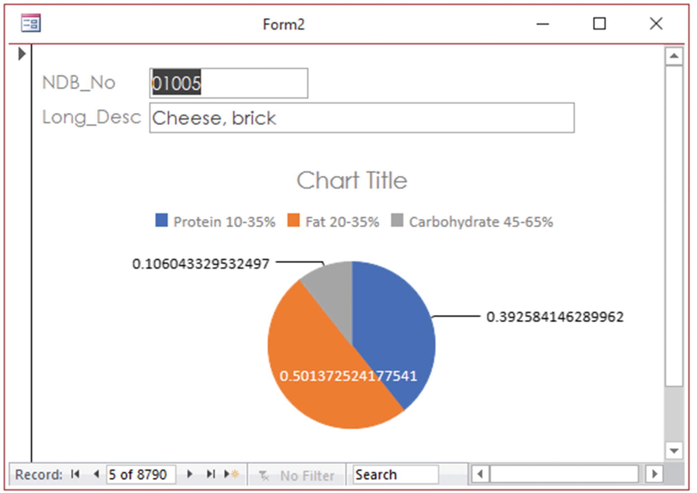
This is the modern pie chart created by the Insert Chart tool to show Calories Breakdown, with no personalization settings
Customizing the Modern Pie Chart
To customize the “modern” pie chart, you need to select the Chart control in Design view and use its Property Sheet to set some of its (many) properties to manually change the desired chart elements.
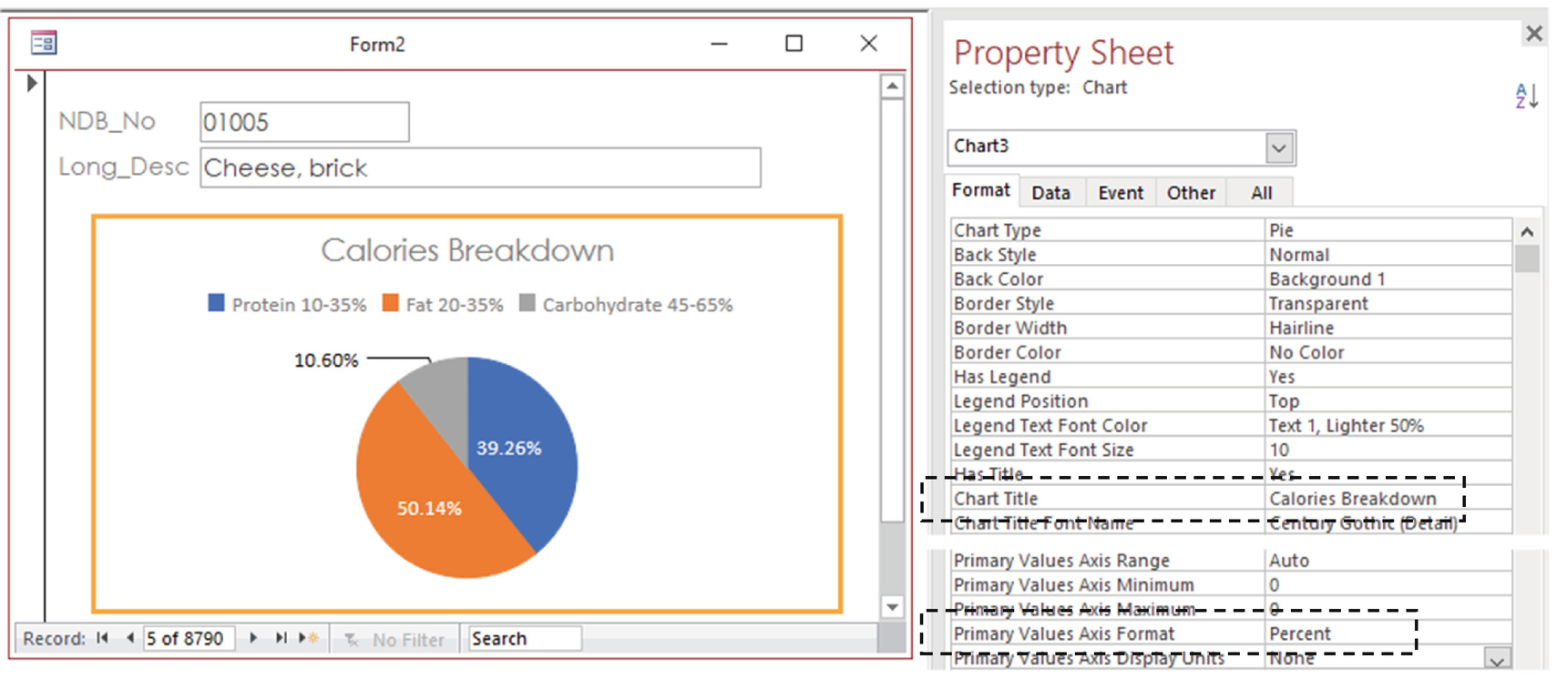
Change the Chart Title and Primary Values Axis Format properties to make the chart show a more consistent interface for Calories Breakdown
Since the pie chart has no axes, it seems inadequate that both interfaces (Chart Setting and Property Sheet) offer such settings for a pie chart—among many other properties that should be shown for this type of chart.
Creating a Column Clustered Chart with the Insert Chart Tool
Use the Clustered Column option of the Insert Chart ➤ Column tool to create the %Daily Values column chart.
Contrary to the limitations of the “modern” pie chart, the Clustered Column chart created with the Insert Chart tool accepts data on a row-by-row basis (a Select query where different field record values name the series) or on a column-by-column basis (a Crosstab query that uses just one record and uses its Field names to name the series).
- 1.
Create a new form, set Property Record Source to the FOOD_DES table, and add the fields NDB_No and Lng_Des to the form’s Detail section.
- 2.
Select Insert Chart ➤ Column ➤ Clustered Columns and click the Form Detail section to insert a new modern Chart object and show the Chart Settings window with the data area selected (Figure 4-86).
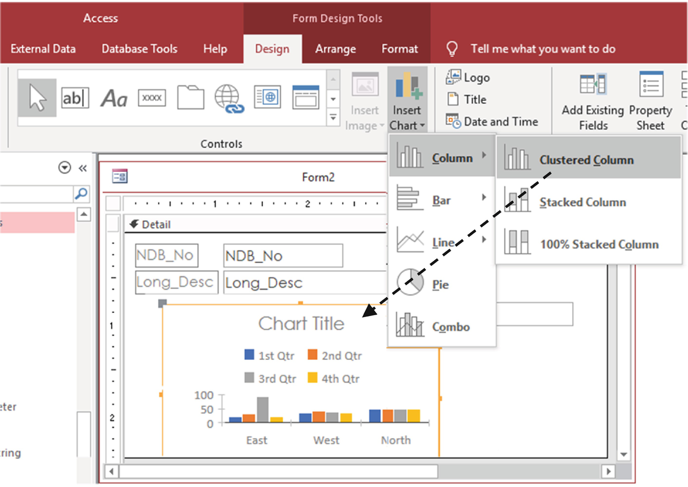
To create a “modern” %Daily Values column chart, use the Insert Chart, Column, of Custered Column options and click the Detail section
- 3.Set these options in the Chart Settings window’s Data area:
- a.
Set Data Source to qryFOOD_DES_ProtFatCHO%DV.
- b.
Set Legend to Nutrient.
- c.
Set Values (Y axis) to %DV (Sum).
- 4.
Select the Chart Settings window format, use the Data Series box to select each nutrient name (Carbohydrate 275g, Fat 78g, and Protein 50g), and check its Display Data Label option.
- 5.
Show the Property Sheet window, select the Data tab, and click the ellipsis button to the right of the Link Master Fields property to show the Subform Filter Linker window to automatically select the NDB_No field for record-by-record synchronization.
- 6.Select the Property Sheet Format tab and set these properties:
- a.
Set Chart Title to %Daily Values.
- b.
Set Primary Values Axis Format to Percent (Figure 4-87).

Set Data Souce to qryFOOD_DES_ProtFatCHO%DV, set Legend to Nutrient (to show the nutrient names on the Format, Data Series box), set Values (Y axis) to %DV (Sum), and then use Format, Data Series box to select each series and check its Display Data Label option. Use the Property Sheet to change the Chart Title and Primary Values Axis Format properties

This is a modern clustered column chart created with the Insert Chart tool that uses the Form and Chart NDB_No fields to synchronize chart values as the record changes
Although the records show nutrient names in Protein, Fat, Carbohydrate order, there is no means to avoid alphabetically sorting the data series names on a modern clustered column chart legend.
Open frmFOOD_DES_Chart, and note that it has pie and column charts created with the Chart control and Insert Chart tool. The two left charts were created using the Chart Wizard and had many of its properties changed to make them more similar to the ones created with the Insert Chart tool (on the right). The most notable difference is the color palette that is limited on the Chart tool.

Form frmFOO_DES_Chart shows that you can create charts with the Chart control that, after changing many of their properties, become similar to the ones with a “modern” appearance created with no effort with the Insert Chart tool
A Database in a Form
Can we put an entire database in a single form? We certainly can, but in most cases it can be inadequate, generating a messy, too complex interface for the user.
But considering that nowadays most users have big screens, and maybe even widescreen monitors, you can use all this screen space to show a lot of data at the same time.

This is frmSRDatabase that shows on a single screen all database tables, perfectly synchronized with the aid of the SubForm/SubReport controls and the Link Master Fields and Link Child Fields properties
frmSRDataBase is also available in the sr28_Forms_Overlapping database, along with all its subforms: frmSubDATA_SRC, frmSubDERIV_CD, frmSubFOOTNOTENDB_No, frmSubFOOTNOTENutr_No, frmSubLANGDESC_SubTotal, frmSubNUTR_DEF, frmSubSRC_CD, and frmSubWEIGHT_Subtotal.
Figure 4-90 was captured on a widescreen monitor, running at 1920 x 1080 resolution. If your monitor doesn’t have this resolution, you may see just part of the form but will be able to use its horizontal and vertical scrollbars to see all its content, which is also a learning process. You may plan ahead so your forms can appear as expected considering the resolution used by your users.It shows the “Spices, chili powder” food item (record 259) and has Selenium selected as nutrient—a combination of selected items that allow you to see that all subforms are correctly synchronizing the interface.
Form frmSRDatabase was built to show data—not to add new records. But with some small modifications and a better usage of the screen’s horizontal space, it could easily be changed to a production application, ready to receive new data on all its fields—as long as the final user uses a widescreen monitor.
It opens automatically whenever the database is opened, because its name was used to define the File, Options, Current Database, and Display Form options.
It uses two Combo Box controls to make a food item (on the main form) or nutrient name (on the subform) record search. Both controls were created using the Control Wizard by dragging a Combo Box to the Form Header section. They execute a simple macro on its After Update event to show the desired record that will be discussed in the next chapter.
How to use a Combo Box to make a database search will be explored in Chapter 5.
Summary
Microsoft Access has perhaps the best, easiest, and most capable form interface for creating graphic user interfaces.
It has a lot of functionality in its sections and ways of automatically showing records, an impressive set of useful properties, and a large set of controls you can use to create a modern, practical software interface for database applications.
In the next chapter, you will learn how to use macros to program Microsoft Access Forms and automate your database applications.