In this chapter you'll become acquainted with the graphical user interface (GUI) of Revit Architecture. We explain terminology, menu arrangements, tools, views, common commands, and the basics to get you up and running. Topics we'll cover include:
Overview of the Revit user interface
Modifying and personalizing the interface
Selecting objects and navigating views
Using keyboard shortcuts
Setting up your project environment
Revit file formats
In this section we look at how Revit appears when you first install it, and familiarize you with how the interface is organized. We explore the use of some standard-looking toolbars and menus, as well as some features that are unique to Revit. One of the things you'll notice from the beginning is that Revit is tailored for the architectural design community. The tools, commands, and objects that you use in Revit are based on tasks and requirements taken directly from the practice of architecture.
If you have used Revit in the past, you will notice that the user interface (UI) of Revit 2010 is dramatically different from that of its previous version. Revit, along with an entire family of Autodesk products, has moved to the "ribbon" paradigm, allowing both easier use of Revit itself and easier adoption of other relevant Autodesk products that today have similar user interfaces. For existing users, we will be calling out the location of certain commands that we believe are not obvious in their placement in the new "ribbonized" UI.
Note
Throughout this book, when we say Revit we're referring to Revit Architecture. It's simpler this way!
There are several ways to start Revit: by double-clicking the Revit icon that was automatically created on your desktop during installation, by going to C:Program FilesRevit Architecture 2010Program and double-clicking Revit.exe, or by double-clicking on any file with the .rvt extension.
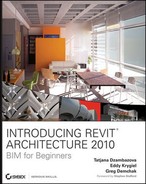
When you start Revit, you will see the screen that looks like Figure 2.1. (You might not see any project thumbnails as they only show once you start creating Revit projects or families.)
The start page, redesigned for Revit 2010, offers the following possibilities:
Project
Open a recent project (select one of the preview thumbnails)
Open any existing project (click the Open button)
Create a new project (click the New button)
Families
Open a recently created or modified family (select Open under Family)
Create a new family (click the New button)
Create a new Conceptual Mass (click the New Conceptual Mass option, which is new to Revit 2010)
Link to the Revit library on the Web (click the Web Library button)
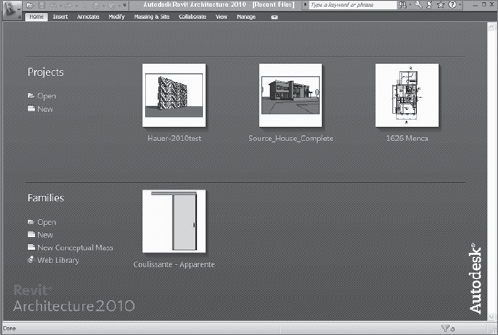
Once you click New Project, a fresh Revit project that looks like Figure 2.2 will open. (There may be slight differences depending on which language version of Revit you have installed.)
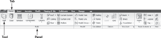
The Revit interface, new to Revit 2010, integrates the ribbon paradigm by grouping workflow-based functions and tools in separate ribbons and exposing only task-relevant options to the user. This saves workspace and makes the UI less overwhelming. Let's take a look at individual parts of the UI.
Revit's application frame has the following main zones:
- The Application Menu
The big purple R on top left of your screen (Figure 2.3) is what we will be referring to as the Application button or Application Menu. Clicking this button opens the Application Menu, which offers options for creating new projects or families; opening existing projects or families; saving; exporting the project in various CAD, schedule, and other formats; publishing and printing; and viewing licensing information. All of this will be extensively covered later in this book. In this chapter we will only enter into more detail about those features that will not be covered later in the book.
- Options button
At the bottom right when opening the Application Menu, you will also find the Options button, which hosts options for project settings (Figure 2.4). Located in various tabs are different settings that you can change to accommodate your decisions about file location selection, rendering path, the SteeringWheel and the View Cube, spelling, and macros, as well as some general settings such as username, intervals for saving reminders, and the application frame display theme.
- Title bar
The title bar is displayed at the top of the Revit application frame, as in other Windows applications. In the title bar (Figure 2.5), you see the version of Revit that you're running (Revit Architecture 2010) as well as the name of the project that is currently active. If a single view is open in the main view window, the name of that view is displayed after the filename. However, if more than one view is open in the View window, the view name is not shown.
The title bar in Figure 2.5 indicates that the version is Revit Architecture 2010, the name of the open file is
Source_House..., and the name of the active view is 3D View.- The Quick Access Toolbar
The Quick Access Toolbar (Figure 2.6) is new to Revit 2010 and is located to the left of the title bar. It enables quick access to most used commands such as open, save, undo/redo, switch to 3D view, and options for forcing synchronization of local files to the central file when in a worksharing environment.
You can add any tool from the Ribbon to the Quick Access Toolbar. To do that, right-click over any tool and select the Add to Quick Access Toolbar option. To remove the any tool from the Quick Access Toolbar, right-click the tool and select Remove from Quick Access Toolbar.
- Info Center
This is also new to the Revit 2010 interface. The Info Center toolbar (Figure 2.7) is located in the same zone as the title bar, to its far right.
Links to a variety of information sources are located in the Info Center bar. From left to right, the first thing you will see is a search field where you can type a term such as the name of a function or feature that you are searching for. Subscription Center links to the Subscription Center, where various benefits and services available to subscription users only are accessible. The Communication Center links to product updates and various product announcements. The Favorites button will link to topics you identify as your favorites throughout your work with Revit. To add topics to your Favorites, click the icon that appears next to the link on the Info Center Search results panel, Subscription Center panel, or Communication Center panel. The last button is the Help button, which links to the Revit Architecture Help directory.
- Ribbon
The newly introduced Ribbon (Figure 2.8) stores all Revit commands and tools necessary to create and edit your project information. The Ribbon displays automatically when you open a file or create a new project in Revit.
The Ribbon can be minimized for maximum use of the drawing area and has three different display settings accessible from the drop-down arrow at the far right of the tabs part of the ribbon:
Full Ribbon (displays the ribbon in all its glory)
Panel tiles (semi-minimized state of the Ribbon that only shows the panel and label tabs)
Tabs
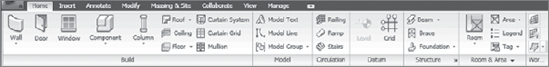
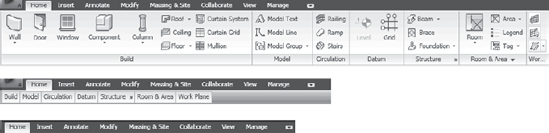
The Ribbon is organized in tabs that are themselves organized in panels. Each panel holds logically connected tools for executing a certain type of activity.
Figure 2.9 shows a tab (the Home tab). It has seven panels containing the creation tools for most modeling elements in Revit.
There are eight tabs in Revit:
- Home
The Home tab contains all tools necessary to build the 3D elements of a building model in Revit.
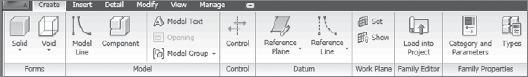
- Create
Available only in the Family Editor, the Create tab gives you a set of tools necessary to create a Revit family.
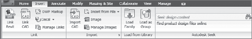
- Insert
Raster images and CAD files are often inserted in a Revit file for help or support or to provide additional information for your project. The Insert tab contains tools for importing and managing these files.
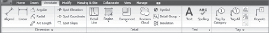
- Annotate
To describe or enhance the display of the building model, you often use 2D elements. The Annotate tab contains all the tools for adding 2D elements to a project.
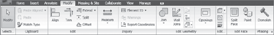
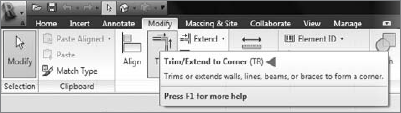
- Modify
Once created, all elements need to be changed or edited. The Modify tab contains a sub-set of editing tools. Other editing tools will become available to you whenever you select an element, at which point a specific contextual tab will appear.
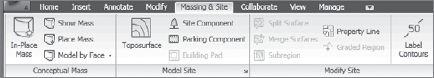
- Massing & Site
Creating and modifying conceptual mass studies is a way to start a project in Revit. You will find all conceptual massing tools under the Massing & Site tab.
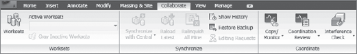
- Collaborate
It is rare that only one person works on a project. Tools that help users collaborate on the same project and manage that collaboration are found on the Collaborate tab.
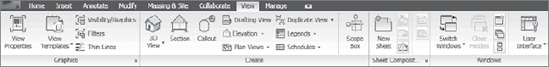
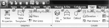
- View
A Revit project is described through many views that are different representations of the model database. Tools for creating and managing those views are located on the View tab.
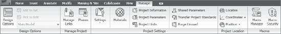
- Manage
Design options as well as many project-related settings and options are all located on the Manage tab.
Now we have covered almost everything you need to know about the ribbon interface of Revit. If you notice additional tabs on your Revit ribbon, you probably have installed some additional separately purchased add-ins.
- Expanded panels
These become accessible when you select the drop-down arrow at the bottom of a panel. When you expand the panel, additional tools and controls appear. To keep a panel expanded, click the push-pin icon in the bottom-left corner of the expanded panel.
- Dialog launchers
These allow you to open a dialog. A dialog-launcher arrow on the bottom of a panel opens a dialog to define settings or complete a task.
Revit 2010 will give you more control over personalizing and modifying the user interface. Let's take a look at what is possible.
The ribbon UI in Revit can be changed and customized per your needs. This feature is new in Revit 2010. A full customization of the UI is still not possible; however, you can make certain changes to it, such as modifying the panel order or moving a panel off the Ribbon to your desktop. Revit 2010 supports working across multiple monitors. Let's examine the changes you can make to the UI.
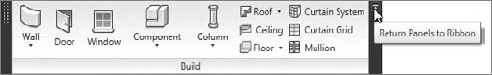
You can change the order of the panels within the tabs and also undock them from the Ribbon so they float in the workspace and are visible at all times (Figure 2.10). With multiple monitors, you can move these panels from screen to screen.
To modify the order of the panels in a tab, click over the title of the panel, hold the mouse button down, and move to another location.
You can place an undocked toolbar back in the Ribbon by hovering the mouse over the undocked, floating bar and clicking on the arrow at the top right of the dialog that opens. Doing so activates the Return Panels to Ribbon command (Figure 2.11).
Revit memorizes and stores all changes you make to the UI so that they are there each time you start Revit.
If you have played around with customization of the UI a little too much and want to revert to the default state of the Ribbon — the one you saw when you installed Revit — you can do so by deleting the file in which these changes have been recorded. The name of that file is UIState.dat and it is usually located as follows:
- Windows XP
C:Documents and Settings UserName Local SettingsApplication DataAutodeskRevitAutodesk Revit Architecture 2010- Windows Vista
C:UsersUserNameAppDataLocalAutodeskRevitAutodesk Revit Architecture 2010
Once you delete this file and restart Revit, you will see the standard UI setup.
As in previous releases of Revit, you can undock the Project Browser and make it float over the drawing area, as shown here:
Users with double screens can now place the Project Browser in the second screen. Revit 2010 will remember all changes made to the interface and will display them in the next launch of the application.
Keyboard shortcuts are the fastest way to work with Revit. The shortcuts assigned to the existing Revit commands are unfortunately not as obvious in the new UI as they were previously. You have to hover over a tool and wait for the tooltip to appear in order to see the assigned shortcut, which is described with two uppercase letters (Figure 2.12). To change the automatically assigned shortcuts, edit the KeyboardShortcuts.txt file located in Program FilesAutodesk Revit Architecture 2010. This location is unchanged from previous releases of Revit.
You will have to restart Revit after changing the keyboard shortcuts in the .txt file.
Revit 2010 introduced a new concept called Keytips. To display the keytips on the Quick Access Toolbar or the main toolbars, press the Alt key (Figure 2.13).
If you want to display the keytips for all the tools within a tab, after pressing the Alt key, click a letter that describes that tab (H for Home for example). This opens the Home tab and now the Keytips of all individual tools under the Home tab are displayed as well.
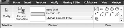
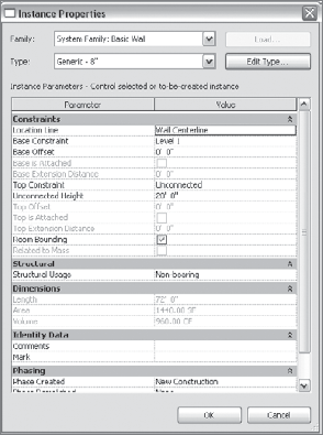
Figure 2.14. The Element Properties button and the Type Selector are crucial to the creation or modification of any element
When you use certain tools or select elements in Revit, a contextual ribbon tab displays that contains a set of tools relating only to that tool or element. The first panel of those tools is the Element tab, in which the Element Properties button and the Type Selector (which you access by clicking Change Element Type) are located (Figure 2.14).
The Element Properties button is located at the far left of the Elements tab and becomes active when you select an element or tool. Clicking this button opens the Instance Properties dialog box (Figure 2.15), where all instance and type parameters of selected elements are displayed and can be edited. You can also open this dialog box by right-clicking an element and selecting Element Properties from the context menu

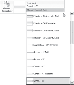
The Type Selector is located on the Element panel when creating or an element. Its contents change depending on the current function or selected elements. The Type Selector (Figure 2.16) is a drop-down list of element types available in the project. For example, if you select the Wall tool from the Home tab, the Type Selector that is invoked when you click the Change Element Type button shows you a list of all available types of walls in your project. If you select a wall from within the project (the drawing area) you are working on, the Type Selector displays the type of that wall and allows you to select a different wall type from the list. This works with just about any element you can select in Revit, and is an extremely powerful way to make easy and fast changes to the model.
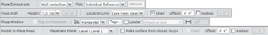
The Options bar changes depending on the type of element being created or selected and displays context-sensitive options relevant to that tool only. In Figure 2.17, you can see several states of the Options bar displayed when different elements or tools are being selected.
The status bar is located at the very bottom of the application window, on the far left. Here you will see helpful text that describes what you have selected and what you should do next when in a command. This information also includes the names of the family and type that you have selected or are hovering over. Whenever you aren't sure what your next step should be, look at the status bar. Figure 2.18 is an example of the status bar in action.
The Count Selection tool (Figure 2.19) is located on the far right in the same zone as the status bar. The Count Selection tool gives information about the number of Revit elements currently selected.
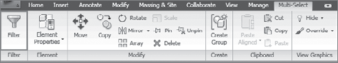
Figure 2.20. The Filter command appears in the ribbon when you select multiple elements of different categories
Clicking anywhere in the count box invokes the Selection Filter dialog box, where you can narrow down a selection if needed. You can also access the Count Selection tool by clicking the Filter button located in the ribbon under the Multi-Select tab. This Filter is activated automatically upon selection of multiple different elements (Figure 2.20).
Next to the Count Selection tool, you will find the Press & Drag check box. When this option is checked, you can drag an element without having to select it.
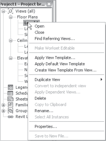
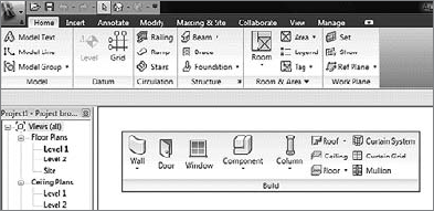
The Project Browser is the heart and soul of the Revit user interface (Figure 2.21). Imagine for a moment that your Revit project is actually a database. By looking at the database from different points of view, you generate floor plans, sections, schedule tables — or as they are called in Revit, "views" of the database. So, from the Project Browser you can navigate to all your views, create new views, access element properties, and place all forms of content in your project, ranging from linked Revit files to rendered images. Let's take a moment to explore the various parts of the Project Browser.
There are many types of views in which building information can be represented in Revit. These views are listed and organized in the Project Browser using a collapsible tree navigation framework. Types of views include plans, ceiling plans, sections, elevations, 3D views, animations, schedule tables, legends, and sheets. Once a view has been created, it can be duplicated to create a similar view and then modified to fit the requirements of various design deliverables. For example, you can create a plan view of a first floor of a building with furniture layout and then duplicate it to make an electric layout plan. Every view allows you to control which elements will be visible and how will they will be visible. Elements also have additional view-related parameters, such as scale, name, and visibility and graphics settings. You can access these properties by right-clicking on the view name in the Project Browser (Figure 2.21) and selecting Properties from the context menu.
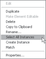
In the Project Browser, you can also see all the loaded families (library elements) in your project. Loaded means that they are a part of the project library, not necessarily that they have been used in the project. From here, you can drag and drop those families into the drawing area, query their properties, create new types of elements, and even select all instances of a given element in the model in order to perform wholesale changes. The right-click menu for families in the Project Browser (Figure 2.22) is different from that for views. Use the keyboard shortcut VP for quick access to View Properties.
Revit links are other Revit projects that are referenced (linked) into your current project. If they are present in a project, they are listed in the Project Browser. From here you can reload, unload, open, copy, and visually identify the links in your project (Figure 2.23).
Note
Using the Select All Instances command from the Families context menu in the Project Browser is a great way to instantly change all instances of a particular family from one type to another. For example, if you have placed a series of 2′ × 2′ (60 cm × 60 cm) windows in your project and need to swap them with windows of another size or type, you can click Select All Instances and choose a new size from the Type Selector. With that one click, you will change all the instances throughout the entire model.
To open views listed in the Project Browser, double-click the name of the view you wish to open. The name of the open and active view is displayed in bold letters in the Project Browser. The Project Browser makes navigating through a project easy — all views are at your fingertips and organized into familiar categories. We'll discuss views in more detail in Chapter 3.
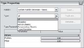
The Project Browser displays views in an organized tree structure that is predefined. The default organization shows views grouped by view type (plan views, ceiling plans, sections, and so on). Additional predefined organizations are also provided, and you can customize these to suit your specific needs. You can also create completely new view organizations in the Project Browser. When you right-click on the View All node in the Project Browser, the Type Properties dialog box appears. Under Type you can see the list of all predefined organizational types (Figure 2.24). Try them out — switch from one to another to notice the different organizations of the project that they offer. To explore how these are set up or to make your own Project Browser organization, click the Properties button and check out the rules used to structure views.
Exercise: Opening Views
To get a feel for how to use the Project Browser, follow these steps:
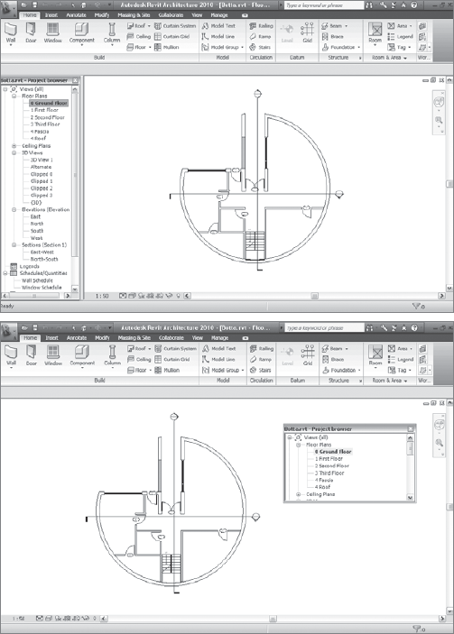
Open
Botta.rvtfrom the Chapter 2 folder on the book's companion web page,www.wiley.com/go/introducingrevit2010.You'll see a 3D axonometric view of the project you're viewing, as shown here:
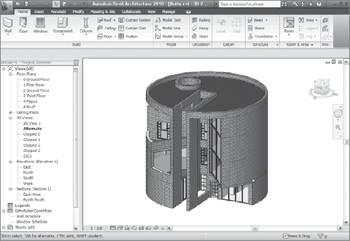
To see the plan views, double-click 0-Ground Floor in the Project Browser. The 0-Ground Floor name is now displayed in bold, indicating that it is the active view in the project.
Following the same logic, double-click 1 First Floor and 4 Roof Floor or any of the 3D views or elevations. Double-click the Wall Schedule to open a schedule view of all walls in the project. Or double-click the Sheet List to view the sheets prepared to be printed and sent out to the owner.
In Revit, all the documents you just opened are called views, and they show different representations of information from the underlying database of this building. You'll learn how to create and manage different views, and many other things about the Project Browser, in Chapter 3, "Views."
Close the file without saving.
The View window, or as users call it, the work space, is the area where the model is generated graphically. It's where all the action takes place. The View window can show just one view, or it can be tiled in several windows to arrange as many views as you need when working on a project (for example, you can split the view window into two windows — one showing a plan view and another showing a section view). One of the functions unique to Revit is that when you work in a window showing multiple views, whenever you modify or create an element in one view, all other views update concurrently, reflecting the change instantaneously and without any need for a manual refresh.
Getting Acquainted with the View Window
In this simple exercise, we are going to open a project file, open some common views, and then tile the views. When you select something, note how it gets selected in all views. This is a core concept when working in an integrated 3D model.
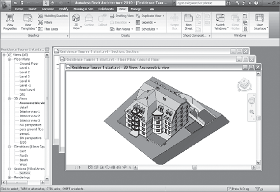
Open the file
Residence_Taurer_1.rvtat the book's companion web page.Open the plan view (ground floor), section view, and 3D axonometric view.
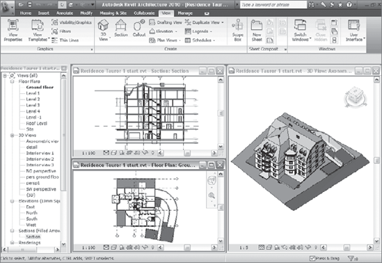
Select the View Tab and from the Windows panel, select the Tile Windows button

Select a wall — notice how it turns red (indicating selection) in all open views.
The View window shows three views: plan view (ground floor), section view, and a 3D axonometric view. Revit allows you to open and work in as many views as needed for clarity of the task. You can also simultaneously view changes taking place as the model is edited.
Figure 2.25 shows three open views that have been cascaded, stacking one view behind another. The Cascade Views button
Note
It's quite usual to open many views when working. So, how do you return to a single view window once you have opened and tiled several? To see just one view again, select the view and maximize it the way you would any window, using the control at the top right of the View window. Doing this, however, does not close all other views that were open — they are still open in the background and affect the performance of Revit. To make sure all open views are closed in the background, in the Manage tab from the Window panel select Close Hidden.
Notice that when you are working in multiple views, one of the title bars of the tiled views is highlighted while the others appear slightly greyed out. That highlighting denotes that this view is the active one. Any activity that you do (such as drawing, modifying, or deleting) takes place in the active view (Figure 2.26). Also, the name of the active view is displayed in the Project Browser in bold letters indicating which is the active view.
Note
While Revit allows you to open and work in as many views as you wish, you will need to be prudent about how you use this capability; having too many open views can affect Revit's overall performance (speed). The relationship between the number of views you can open and your performance will depend on the speed of your computer and the amount of RAM it has.
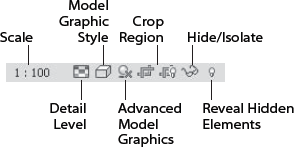
A view in Revit can be represented in many different scales, levels of detail, and model graphic styles. Shadows can be turned on and off, crop regions can be used to limit what portion of the model you wish to be visible, and the view can also hide elements and categories of elements. The View Control bar (Figure 2.27) contains shortcuts to many of the tools you'll use most often. The following sections look at some of these tools.
The first tool indicates the scale in which the drawing will be printed. Clicking the Scale tool gives you a standard set of scales to choose from. The scale of the view determines how big your drawing will be when printed and also creates a visual relationship between annotations and the model. Annotations are always shown in paper size, and the model adjusts its graphics according to the view scale. Put simply, a plan view at ¼″ = 1′–0″ (1:50) will be twice as large as a plan view at ⅛″= 1′–0″ (1:100) when printed, but in each view the text notes will be the same size.
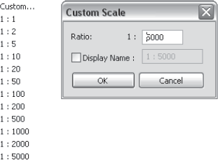
In Revit you can create your own custom scales. Revit will allow you to create scales up to 1:1, or 12′ = 1′. To do that, click the Scale button (the first one) on the View Control bar. In the drop-down menu, select Custom. A new Custom Scale dialog box opens (Figure 2.28). You can create your custom scale and assign a specific name to it. The name you give to the custom scale appears on the View Control bar, view title, or title block. If you do not give a specific name to the custom scale you create, then the numeric value of the scale is displayed.
Thin Line Mode
By default Revit displays real line weights of the model. Sometimes, though, this can make it hard to read the model, especially when working in high scales and zooming close to a detail. In such cases, for visual clarity, you can use the Thin Lines mode tool
Once active, this feature affects all views. As the following graphic demonstrates, when selected, Thin Lines mode displays all lines as being a single pixel wide, regardless of view scale. When this tool is deselected, the line thickness corresponds to the thickness you have assigned to the elements and shows how the drawings will look when printed.
Note that this command affects only how Revit appears in the screen views and not how Revit prints. Thin Lines mode is located in the View toolbar because it affects all views, not just the active view.
In Revit, some types of graphics are drawn independently of any zoom scale:
Reference planes
Work plane grids
Snap lines
Alignments
Selection bounding box
Group boundaries
Measure tool lines
These lines are drawn with a consistent screen-based line style.
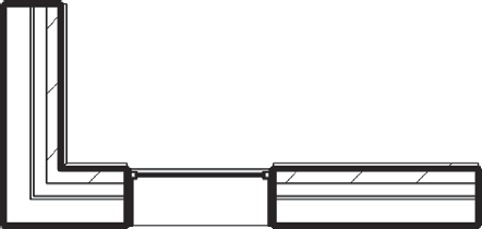
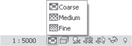
This icon indicates the level of detail assigned to the view. There are three levels of detail in Revit, as illustrated in Figure 2.29: Coarse, Medium, and Fine. You can select a level to show more or less information and detail in a view.
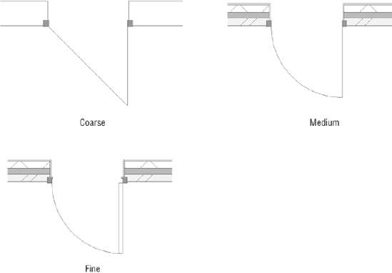
Depending on the type of drawing and where in the process your project is, you can use the detail level options to expose more or less information in your documents. At 1″=50′ (1:600 scale), for example, you may represent a wall as a solid fill, regardless of the number of layers in the wall construction. At ¼" =1′–0″ (1:50), you probably want to show the different layers of the wall assembly. The same applies to a door or window. A door is represented with different levels of abstraction depending on the scale. Figure 2.30 illustrates a standard door shown in three levels of detail.
When using a computer-aided design (CAD) system, you use separate blocks for each of these symbolic representations. In the case of a door, you would have to create three different symbols that are drawn in different levels of detail. In 2D CAD, you would also need separate symbols for the section and elevation of a door. In Revit, the door is modeled once and can be designed so that it can show itself in meaningful representations for different scales as well as view types. The trick is that it's always the same object — it's just showing different levels of information about itself.
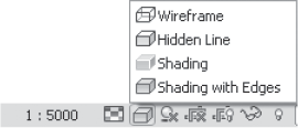
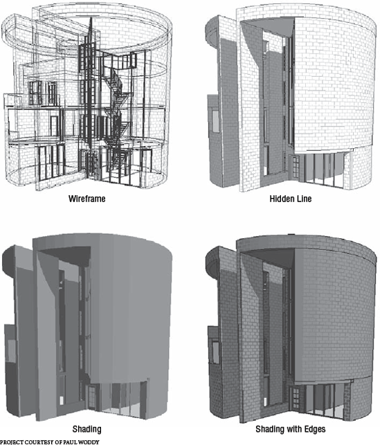
You may already be acquainted with this type of graphic display from using other design applications. The options shown in Figure 2.31 allow you to display the model in one of four modes: Wireframe, Hidden Line, Shading, and Shading with Edges. These are demonstrated in Figure 2.32.
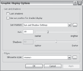
Graphic Display Options is a set of view options that let you control shadow and silhouette settings. Here you can fine-tune the sun angle, time of day, intensity, and other variables. The settings shown in Figure 2.33 let you add graphic embellishments, such as brightness of the sun, contrast of shadows, and style of silhouette outlines:
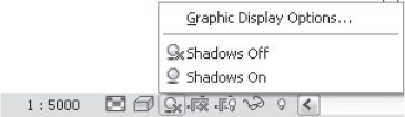
- Shadows and sun
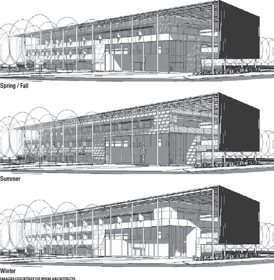
Shadows can be turned on or off using the button from the View bar. The location of the sun can be relative to your model (summer solstice) or relative to the view (sun from top right, for example). Using the Sun Position in the Graphic Display Options dialog box shown in Figure 2.34, you can create accurate sun-angle studies by locating the model on the earth and dialing in various times and dates. The controls become available from the Graphic Display Options dialog box whenever the Cast Shadows option is selected. You'll learn how to create sun studies in Chapter 8, "Preparing Docs for Clients." Some examples of sun studies are shown in Figure 2.35.
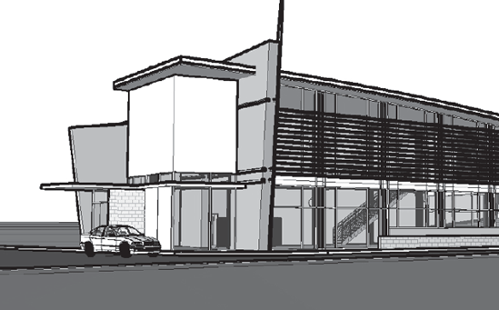
- Silhouette edges
Creating silhouette effects can give a nice artistic touch to your perspective or axonometric views, as shown in Figure 2.36. Silhouette edges can be applied only to the Hidden Line and Shading with Edges graphic styles.
Note
When creating a silhouette edge, you can use any line style as a silhouette edge style — those offered by Revit as well as custom-created lines. Should you wish to emphasize some corners more than others, you can additionally use the Linework tool and override different lines with stronger or weaker line types as a final touch on the final image.
The Crop Region tool allows you to limit what part of the model is visible. To better understand it, imagine that you have a piece of paper in which you have cut a rectangular hole and you are viewing the model through that hole. A crop region can be applied to all interactive views. The boundary of the region can be visible or invisible depending on how the view was generated. In sections and callout views, a crop region is automatically visible by default. Plan views, on the other hand, do not show their crop regions by default. The Crop Region tool is accessible from the View Control bar, as shown in Figure 2.37.
Some examples of crop regions are shown in Figure 2.38.
The Crop View toggle makes the crop region active and crops the view. Do Not Crop View keeps the crop boundary but it does not crop anything. (This is useful for the dependent views, which we will discuss later.)
You can toggle the visibility of the crop region (its boundary) using the Show/Don't Show Crop button. You'll notice a boundary around your model when the region is visible. You can change the size of this boundary by selecting it and dragging it with the blue arrows. The crop region can also be activated through View → Properties and is applicable in both 2D and 3D views.
Hiding and isolating elements is a useful way to work with a model when it starts to get more complex. These tools will help you isolate problems, and get clutter out of the way when you're working.
Temporary hide and isolate The Hide/Isolate tool in the View Control bar allows you to temporarily change the visibility of elements in a view. Please note the meaning of the word temporarily: it indicates that the view is in a temporary state, and this state will not be saved or printed. This temporary mode is useful in visually cluttered situations when you want to isolate an object in order to work undistracted and freely with it, or when you need to view a portion of the model without the presence of certain elements. This feature allows you to change the visibility of a view independent of object types.
To hide or isolate an element or an entire category of elements, first select the elements and choose among the options under the eyeglasses icon
Isolating an element isolates only the selected element in that view.
Hiding an element hides only the selected element in that view.
Isolate Category isolates the entire category in that view.
Hide Category hides the entire category in that view.
Once you've hidden an element, the eyeglasses icon turns cyan and a cyan border is drawn around the view, both indicating that something is temporarily hidden in this view. To reset the view to the normal state, select Reset Temporary Hide/Isolate. The temporary hide or isolate state is applied to one view only and is instantly lost when you press Esc, change a view, or reopen a project. The state isn't saved and is not printable.
The Apply Hide/Isolate to View option allows you to convert a temporarily hidden or isolated element into a permanently hidden element in the active view that saves and prints.
Permanent hide/isolate The permanent Hide/Isolate tools allows for elements to be hidden in a view that can be saved and printed.
There are two ways to permanently hide or isolate elements:
Convert a temporarily hidden or isolated element in a view to a permanent state using the Apply Hide/Isolate button.
Select an element in the drawing area, right-click, select Hide in View from the context menu, and choose Element or Category from the menu (shown in Figure 2.40).
Tools for Controlling the Display of Annotations in a Cropped View
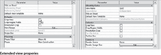
Note the difference between the two dialog boxes shown here. The first one is the View Properties dialog box of a 2D view; the second is for a 3D view. Some tools are specific to certain type of views. Let's review them.
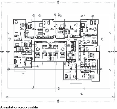
If you need to show only a portion of a floor plan that contains text, dimensions, and keynotes and use the Crop tool, it will crop the model elements but not the annotations. The Annotation Crop option makes the crop region aware of annotations as well as the model and lets you crop them with an additional crop region.
The Annotation Crop option is turned off by default. Select the View Properties button located in the Graphics panel of the View tab to enable it. This creates a second crop region in the same view. Note that the model and annotation crop are separately controlled, and you can change their extents using the blue arrows when the border of the crop is activated. This is shown by the outer dashed box. It is important to know that the annotation crop can never be smaller than the model crop. The offset between the annotation crop and model crop can be preset by selecting the crop region and clicking the Size button in the Options bar. This opens the Crop Region Size dialog box, where you can present the offset for the annotation crop.
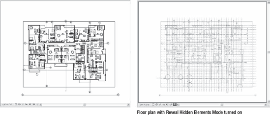
Reveal Hidden Elements Mode
When you're working in a team, some team members may hide certain elements in a view and leave them hidden when they leave the view. To make sure you can quickly assess what is going on and have an instant view of all the information you should, use the Reveal Hidden Elements Mode tool. This tool offers a special way to display the view: after activating the Reveal mode, the model will be represented as halftone, and hidden elements or categories will appear in a bold magenta color that pops out and indicates what has been hidden.
In this mode, the temporarily hidden elements and categories (if any) are represented with cyan and the permanently hidden elements with magenta, as shown in Figure 2.41. To indicate that you're in a Reveal mode, the drawing window has a magenta line around the drawing area. The lightbulb icon is changed as well and appears in a frame, "lit up."
Figure 2.41. Reveal Hidden Elements mode options in the View Control bar
Figure 2.42 shows a sample plan and the same plan with Reveal Hidden Elements Mode turned on. Unlike when using temporarily hidden elements, this mode allows you to add elements or categories to or remove them from the permanently hidden mode. To do this, select any element (regardless of its state), right-click, and select Hide or Unhide from the context menu. You can also use the Options bar to unhide elements or categories.
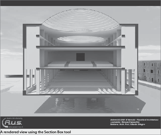
Controlling the Extent of a 3D View: Section Box
For 3D views, an additional cropping feature is available that allows you to crop the model with a 3D clipping box. This option, named Section Box, cuts through your model like a cake, vertically and horizontally, and is available in both axonometric and perspective (camera) views. This tool is effective for creating perspective sections that are highly informative, creative, and appealing, that shows what's going on in your model, or for isolating in 3D a portion of the model that you wish to indicate a detail solution for. To enable the Section Box tool, select the Section box option in the View Properties dialog box. If you orient the 3D view to another view (when in 3D view, right-click on the ViewCube, choose Orient to View, select another view), a section box will be turned on and automatically initialized.
Note that the grips that allow changing the extents of the section box are sometimes somewhat awkward to select. This often results in beginning users failing to notice that instead of moving the section box extents, they are actually moving a real element in the building model that basically changes the entire project. We recommend that beginning users be overly cautious and careful when changing the extents of the section box.
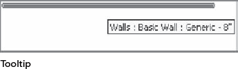
When you hover over an element in the view, Revit helps you identify that object with a tooltip. You can read the name of the object and the type of family to which it belongs. The same information is also displayed in the status bar.
Consistent with Microsoft conventions, tooltips also appear when hovering over any button in the UI, helping new users to identify what the button is used for.
Now that you are familiar with the interface, let's look at some common tools and how you will use them when working with Revit.

Right-clicking an object
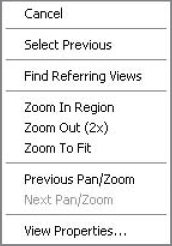
Anywhere in the free space of the View window, right-clicking opens a menu specific to the navigation of the particular view (Figure 2.44). Note the View Properties option. This is something you'll use regularly, and we'll go into more detail about its specific functions later in this chapter.
The basic navigation functions, Zoom, Pan and Scroll can be achieved through the use of combinations of the mouse and keyboard buttons or by using the steering wheels and the navigation cube. Here how this is done.
The scroll wheel can be rolled
- Zoom
Scrolling the mouse wheel while in a view invokes the Zoom command so you can zoom in and out, depending on the scrolling direction. Pressing the wheel while holding down the key (Ctrl+mouse wheel) also invokes Zoom but with a slightly smaller zoom factor.
- Pan
Moving the mouse while pressing and holding the mouse wheel invokes the Pan command.
- Spin
When in a 3D axonometric view, holding the Shift key with the mouse wheel pressed allows you to spin the entire model. When an element is selected, the model spins around that element.
These last three functionalities (Zoom, Pan, and Spin) are also available in the SteeringWheel and ViewCube tools.
A three-button scroll mouse is recommended for effective use and navigation in Revit, but you can achieve all of the needed behaviors with a two-button mouse as well. We will explain that and all navigation possibilities in this section.
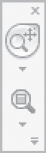
Whenever you open a 2D view in a project, you will see a floating palette located on the far right of the View window.
There are two tools in the floating palette when opening a 2D view: the Full Navigation wheel and the Zoom tool. Upon selection of the Full Navigation wheel, the SteeringWheel appears on the screen. It follows (travels with) the mouse to provide quick access to the navigation tools in the context of the work you do. When placed in 2D view, the wheel looks as shown in Figure 2.45 and offers three functionalities:
Note
For users accustomed to previous versions of Revit, note that there are hidden tools in the context (right-click) menu of the ViewCube.
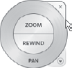
Zoom The Zoom option in the SteeringWheel has the following behavior:
When used in a 3D context, Zoom dollies the camera in and out.
When used in a 2D context, Zoom moves up and down, perpendicular to the view.
Pan Panning the view has several meanings. When used in a 3D context, Pan dollies the camera left and right. When used in a 2D context, Pan means one of two things:
When you use the 2D SteeringWheel in any 2D view, Pan means scroll.
When you are in a sheet view with an active 2D view, Pan allows you to scroll the sheet view on the sheet.
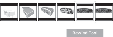
The Rewind History stack is view specific and is persistent for each view throughout the session, until the file is closed. It is a practical tool that allows you to go back to a previous camera state with one mouse click. Figure 2.46 shows the Rewind tool in process.
Here are general guidelines for all SteeringWheels:
Click a region of the SteeringWheel, keep the left button pressed, and move the mouse to navigate in the view.
Click the arrow or right-click the Navigation Wheel to access the context menu.
The SteeringWheel in 3D view looks slightly different, as shown on Figure 2.47. The wheel shown on the figure is the Full Navigation wheel. You can choose to have different versions of the navigation wheel by expanding the list that appears when you select the arrow below the wheel icon on the floating palette. You can set the default appearance of the SteeringWheels from the Application Menu by selecting the Options button and the SteeringWheels tab.
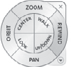
You will find additional tools in this wheel:
- Orbit
Replaces the old Spin command.
- Look
Replaces the old Turn command.
- Walk
Click and hold the left mouse button on this tool and start moving the mouse in a direction you wish to walk through the model. Using Ctrl+> and Ctrl+< lets you increase or decrease walk speed in Walk mode.
- Center
Lets you define a pivot point around which all other movements will be oriented.
- Top Down
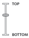
Click and drag this tool; it initiates a slider (Figure 2.48) that, when moved up or down, moves the view of the model in those directions.
There are additional settings in the floating palette of the SteeringWheels that let you define size or transparency. Expand the palette to view them all (Figure 2.49).
Note
Before you continue, try this behavior on any of the sample files you've used up to now. Open a 3D view, and using the mouse and keyboard combinations or the SteeringWheels, familiarize yourself with the navigation commands. You'll use them frequently throughout the model and documentation process.
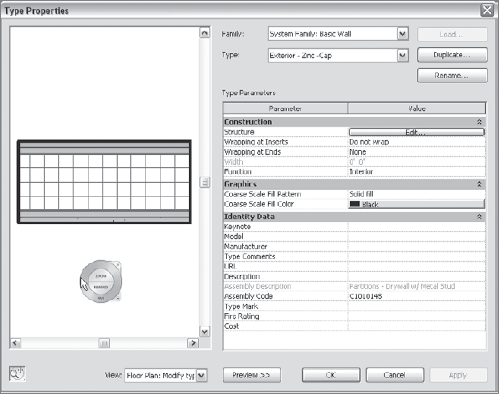
You will notice that the SteeringWheel will also be present in the preview window of the Type Properties dialog box of any element in Revit (Figure 2.50).
For even easier navigation in 3D views, there is another new navigation tool in Revit: the ViewCube (Figure 2.51).
The ViewCube tool allows for intuitive and easy navigation through 3D views. It appears in the top-right corner of all 3D views, both in the Revit project environment and in the Family Editor.

To use the ViewCube, click its icon to orient the view to a direction of your choice. To rotate the view, drag the ViewCube in one direction. The right-click menu of the ViewCube will let you reset the Home camera, reset the Front direction, lock to the current selection, and orient the current view to an existing view or a predefined standard direction. Right-click the ViewCube and click Properties to set the ViewCube properties. Figure 2.52 shows an example of the ViewCube reorienting a 3D view to Top.
Using the ViewCube you can with one click orient any 3D view into a Top view or Elevation view, as shown in Figure 2.53. Try this out! You will be surprised at the ease of use and the speed with which you can access specific views of your model.
Figure 2.53. The ViewCube in perspective view—dragging the corners of the ViewCube, you can easily orient the view in a direction of your choice
For previous users of Revit, it is important to mention that the ViewCube now has a context menu that contains many functions that were more obviously exposed in older versions of Revit UI but are hidden here. Right-click on the ViewCube to find the Orient to View or Orient to Direction tool as well as other view-related options.
To select an individual element, click on it. To select multiple elements, several options are available. The easiest way to select multiple elements is with a selection window. Depending on the direction that you drag the mouse, you can select different elements. If you are an AutoCAD user, this will be very familiar.
Dragging a selection window from left to right (Figure 2.54) while holding down the left mouse button results in the selection of only those elements that are entirely within the selection window.
Dragging the selection window from right to left (Figure 2.55) results in the selection of elements that intersect or are entirely within the selection window. Note that enabling the option Press + Drag at the bottom right of the application window lets you drag an element when you hold down the left mouse button while dragging. If you find that you accidentally drag an element when creating a window selection, deselect this option to avoid dragging elements.
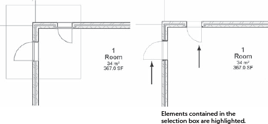
Figure 2.54. Left-to-right window selection on the left results in the selection shown on the image on the right side
To be more specific about what you want to select, you can select all elements of a particular type by using the right-click menu when an element is selected. Choose Select All Instances from the menu, and all elements in the model of that type will become selected. You can then make changes, delete all the elements, or swap the element with a new type.
You can also limit selection to categories by using the Filter tool, located in the Filter panel of the Mulit-Select tab. Once you've selected multiple elements of different categories, click the Filter button, which opens a dialog box that shows the selected categories. To deselect categories, uncheck them.
Many elements can be edited directly in the view using graphical controls. Let's take a look at these.
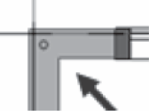
Many elements display blue grips when selected that allow you to modify their size or location. Selecting and dragging the grip provides a preview (like the one in Figure 2.56) of the final outcome prior to completing the drag operation.
For walls and lines, blue-filled grips are displayed at the ends of selected element in plan view, and along the ends, bottoms, and tops of selected walls in elevation and 3D views, where they're labeled as shape handles. You can click and drag these controls to resize an element, as shown in Figure 2.57.
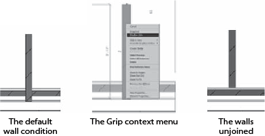
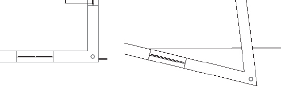
The blue grips also have additional functionality. With walls, by right-clicking and accessing the context menu, you can control the wall joins (the way the walls connect) by using the grips to disallow joins between two walls. By default, the walls join automatically, but this behavior may be undesirable in some conditions (see Figure 2.58).
When you select a chain of walls or lines (Figure 2.59), drag controls appear at the coincident endpoints; you can drag these to change the layout of the chain. Touching walls are selected at the same time, and the filled blue grip turns into an empty blue grip (see Figure 2.60).
Note
You can right-click the wall end controls and use the context menu to allow or disallow wall joins. Once a wall end join is disallowed, an icon shows up when that wall is selected, indicating that the end is disallowed. Clicking that icon reestablishes the join.
Each object, when selected, can be moved without invoking the Move command in the toolbars. When you move your mouse close to the element, a set of crosshairs appears. By clicking and holding the left mouse button, you can dynamically move the element selected.
Revit has many embedded help tools to make your life easier when creating or editing objects. One of these is the dashed blue line shown in Figure 2.61. This line displays each time a movement is constrained to a plane, as with walls and lines in plan views.
The line helps you maintain the same plane of the wall when extending it, without the necessity of holding down the Shift key or using any other auxiliary tool.
A similar dashed line helps you place a new element, similar to an adjacent one, by taking a reference from the nearby element. Figure 2.62 shows how placing new level lines in section or elevation references the start or end of an existing level line.
When you're drawing or editing elements, Revit lets you orient them with respect to other elements without changing coordinate systems. This is a neat advantage of Revit.
If you want to draw a wall parallel to another that is already drawn, Revit recognizes the angle of that wall and offers it as a constraint. This lets you draw the second element, keeping it parallel to the first wall during its creation (see Figure 2.63).
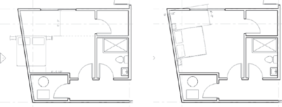
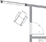
Using the spacebar also helps you orient elements during creation or while editing them. During placement, pressing the spacebar lets you rotate elements at 90-degree intervals. However, if you mouse over a nonorthogonal reference (such as the wall in Figure 2.64), the spacebar starts rotating the element, adding the angle for reference. For example, a bed placed next to a nonorthogonal wall can be quickly oriented to the angle of the wall. Just imagine how cool this is after all the trouble you may have had in the past defining locations!
You click a flip control
Swinging doors have two flip controls: Flip Facing (which controls whether the door swings in or out) and Flip Hand (which controls whether the door swings right or left, as shown in Figure 2.66).
The flip control applies not only during creation of an element but also when an element is edited later. Note that flip controls are displayed only when applicable: they don't appear for items that don't need to be flipped (a table, for example).
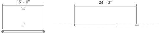
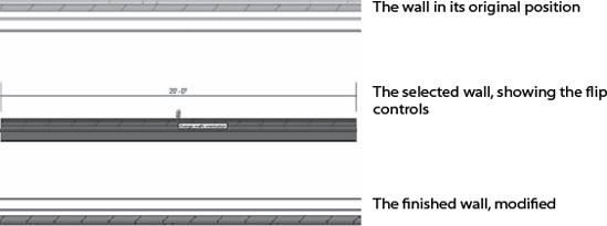
In Revit, dimensions are much more than static forms of documentation. They can be used to interactively adjust the model at any time. Temporary dimensions are displayed each time an object is selected, inserted, or edited. Revit allows you to type a value in the temporary dimension string that determines the position or size of an object. Permanent dimensions work the same way; you can edit the location of elements directly by changing dimensional values.
A wall 32′ (10m) long displays a 32′ (10 m) temporary dimension. However, if you enter a 20′ (6 m) dimension, the wall becomes 20′ (6 m) long (see Figure 2.67).
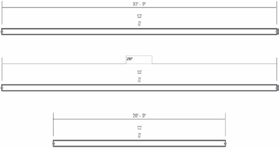
Figure 2.68. It is always the selected element that moves when you manipulate a distance using the temporary dimension
New Revit users are sometimes confused about which elements change or move when you use temporary dimensions. When you use temporary dimensions to change distances between elements, the selected element moves. If you select the wall on the right in Figure 2.68 and type a value in the temporary dimension area, the wall at the right moves, not the left one.
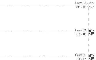
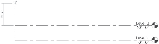
It works the same way for levels. If you need to modify the height between levels, select the level you wish to move, and modify the temporary dimension. Regardless of whether you're changing the upper dimension or the lower dimension, in each case Level 2 is modified, as shown in Figure 2.69.
Revit is one of the rare architectural authoring applications that allow you to embed your design intent in the form of locks and constraints that persist until you consciously remove them. Here are a few examples:
You can tell a door to be a certain distance from a wall so it fits a closet and lock that relationship so that when you move the wall or the door, that relationship is maintained.
You can space windows equidistant along an exterior wall so that even if you change the length of the façade, the windows keep their positions relative to the wall's length.
You can keep an exterior wall attached to the roof so that if you change the height of the roof, the walls also move, reflecting that change.
In the example in Figure 2.70, the door is constrained to a 1′–4″ (40 cm) distance from the wall to accommodate a cupboard. To constrain a distance, you set it by placing a dimension, selecting the dimension, and locking it with the Create or remove a constraint toggle. After having locked the door to the wall (Figure 2.71) at a distance of 1′–4″ (40 cm), if you move the wall in the drawing, the door will always move with it, retaining the locked distance.
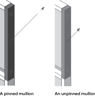
The Pin tool is another way to set a constraint for an element. In this case, the element is constrained not with respect to another element in the model but geospatially. You can pin your grid system so it doesn't move from its location or pin elements from an existing building so they aren't mistakenly modified while you're working on new additions. The Pin command appears under the Modify panel of the Modify tab whenever an element is selected

Pin also appears in element types like the predefined curtain walls shown in Figure 2.72. By default, the pins exist here because there are embedded rules in a type-based curtain wall that you don't want to inadvertently change. If, however, you consciously decide to change the type or a distance (like the space between the mullions), you can unlock the pin at any time by clicking it. This undoes the constraint and allows you to freely change the element from now on. Locked and unlocked pins in a curtain wall are shown in Figure 2.73.
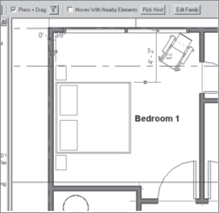
Another type of constraint is designed for logical relationships between elements. When furnishing a space, you probably want to align the bed or dresser with a wall. If you change your design, you want the furniture to follow the wall to the new location. For this purpose, Revit has a command called Move with Nearby Elements. When you select a furniture element, like the bed in Figure 2.74, this option appears on the Options bar. It lets you check a box to move the associated elements. By selecting this option, you create an invisible relationship between the bed and the wall so that each time you move the wall, the bed moves with it.
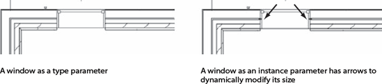
When elements appear with editable drag controls, these are considered instance parameters. This means you can modify the geometry on an instance-by-instance basis rather than change the definition of a type and have all occurrences of the type in the model update at once. Many elements in Revit are driven by type parameters, but this doesn't restrict making and using content that is more flexible and driven only at the individual instance level.
This type of instance-level behavior may be desirable for windows and doors. Once a window or door is placed in a wall, there seems to be no way to change its size aside from opening the properties of that object and changing type parameters. When you select a window, blue grip controls do not appear as they do when you select walls. You might wonder: why can I not drag windows and doors to be any width and height I want? Essentially, the dimensions of windows and doors are defined as type parameters by default, and Revit does not let you manipulate these dimensions on a per-instance basis. This is done intentionally, because you typically want to use a standard range of door sizes and keep this information stable and predictable. Nonetheless, it is possible to create windows and doors that vary in size and shape on a per-instance basis. Remember that Revit makes some assumptions about desired behavior, but in most cases it lets you move beyond the typical and not be hindered.
Should you want the ability to change the dimensions of windows and doors with direct editing (using the blue grips), you must change the parameters for width and height from type parameters to instance parameters. This can be done in the Family Editor with a few clicks. Note that this method of working takes away the advantage of having all windows and doors changed at once via a single parameter change. You also need to be careful not to create any odd custom sizes unintentionally. Figure 2.75 shows an example of a window as a type and an instance.
Revit comes with many predefined keyboard shortcuts that allow you to call certain Revit commands quickly. We talked about viewing and changing the automatically assigned keyboard shortcuts earlier in this chapter, in the section "Modifying and Personalizing the Interface." There are a few other keyboard shortcuts in Revit that you should know because they will help you achieve various goals:
- Tab
The Tab key is similar to the Cycle command you may know from AutoCAD. It allows you to cycle through various elements near the cursor when more than one is present. In Revit this can happen frequently, so get used to using this key. The Tab key is useful when you're dimensioning because it allows you to cycle through various references of the elements dimensioned (dimension to wall center instead of wall face; opening of a door instead of outer frame; and so on). The Tab key is also used to select chains of connected lines and walls.
- Shift+Tab
This shortcut reverses the default order in which the Tab command cycles.
- Ctrl
The Ctrl key is used to add multiple objects to a selection at the same time.
- Ctrl+Tab
This keyboard shortcut will cycle through open views. Use this to quickly move from view to view.
- Shift
Unlike Microsoft conventions, which use the Ctrl key to deselect, Revit uses the Shift key to deselect an element. For example, some elements in Revit are constrained to move horizontally or vertically only. Revit gives you visual clues indicating which way a selected element can move. You can remove this constraint by holding the Shift key while repositioning the element.
At the same time, some elements can move in any direction by default, but holding the Shift key while moving them constrains their direction. To illustrate, you can move a window freely in any direction in an elevation or a 3D view, but holding down the Shift key constrains the movement of the window so that it moves only horizontally. Likewise, you can normally move walls, lines, or gridlines freely in any direction, but the Shift key lets you constrain their movement to directions perpendicular to the wall or line.
- Delete
The Delete key is used to delete selected elements from the model. You can also use the Backspace key to delete elements.
- Undo and Redo
Commands can be undone and restored using Ctrl+Z (undo) and Ctrl+Y (redo). These shortcuts are standard in many Windows applications.
Multiple undo operations (Figure 2.76) can also be performed from the quick-access toolbar using the list of recent commands. Dragging the mouse down this list undoes all selected commands in one step.
- Spacebar
The spacebar is mostly used to cycle through rotation of an element during or after placement. For instance, when you set a door in a wall, you can use the spacebar to cycle through choices, including having the door open into or out of the room, and having it open from the left or right. The spacebar is also used to identify the direction in which walls will be placed and to edit their position after placement.
- F1
This is a quick way to call the Help function. (Revit's embedded help menus are getting better with each release!)
Now that you have an initial idea about the user interface and the tools available, let's look at how to predefine some settings in Revit. Many definitions and global settings are stored under the Settings menu. We'll cover some of the more important settings in this section.
Revit has its default units fairly well defined; however, local standards or various projects may ask for different ways of documenting length, area, and other measurements. From the Manage tab in the Project Settings panel, choose Project Units to open the dialog box shown in Figure 2.77, where you can set the measurement units, rounding convention (number of decimals), and suffixes for length, area, volume, and angle. You can also define the way you measure slopes — in rise or angle degrees — as well as the symbol used for the decimal division (point or comma).
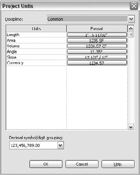
As a rule, you should define all your units prior to starting a project, but if necessary, you can change any of them on the fly later in the development of the project.
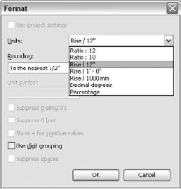
Various settings for slope are in the Format column in the Project Units dialog box accessible from the Manage tab in the Project Settings panel. You can control units, rounding, and digit grouping, as shown in Figure 2.78.
Ratio, rise, decimal degrees, and percentage are the available options for units.
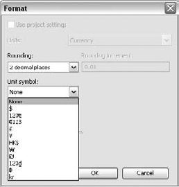
When making schedules, architects often have the need to add currency information when calculating cost, and this improvement accommodates that need. Currency formatting allows you to format costs using common currency symbols.
In the Format dialog box, you can choose any of the 10-plus major worldwide currencies, suppress trailing zeros, and decide to use grouping that replaces decimal symbol setting (comma separators in 1,234,567).
You will access the same settings when you make a cost schedule. You can access the Field Format setting on the Format tab of the schedule (Figure 2.79).
Suppressing zeros is often desirable. For example, if the value of a cost item is 2756.400, checking the suppressing trailing zeros will result in 2756.4. For drawings, you can suppress spaces — for example, in the value 1′ - 2″, the result is 1′–2″.
Digit grouping options set the separator, the decimal symbol, and how many digits to group by.
Note
By default, Revit inputs and displays in feet (U.S. imperial units) or millimeters (metric). To change the input value to something you may be more familiar with, go to the Manage tab and in the Project Settings panel, click the Project Units button. In the resulting dialog box, choose Length and change the setting to fractional inches. Click OK. Next, on the Annotate tab, choose any of the Dimension tools (Linear, let's say), and click the Element Properties button. In the Instance Properties dialog box, click Edit Type. Then, choose Units Format. Deselect the Use Project Settings option, and change the units to read Feet and Fractional Inches using the drop-down list at the top.
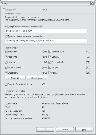
Snaps are a great help for precise placement and modification of elements. In Revit, you can define snaps by choosing the Manage tab, Project Settings panel and expand the Settings button to find the Snaps settings. In the resulting dialog box, you can turn the snaps on or off globally, set a variety of snap types, and specify the angular and length increments at which the system will snap. For the most part, these settings are adequate. Although they aren't represented in this dialog box (Figure 2.80), different graphics and tooltips for each snap type appear in the view when you're drawing.
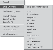
There is a Snap Overrides submenu available during creation of elements. Right-click when drawing a wall, and you can override any of the project definitions for Snap by choosing Snap Overrides and selecting the option you need. See Figure 2.81.
If an element you're drawing is part of a chain (connected lines or walls) and is a valid open loop, you can close it by selecting the Close command from the context menu: Snap Shortcuts → Close.
You can access the same function with the keyboard shortcut SZ.
Note
Revit has a limitation that you should be aware of: the system is preset to straighten out lines or walls drawn in small angles. This is helpful when creating new projects, but it can be an issue when you're working with existing projects, especially surveyed properties or old buildings. If you import a .dwg from such a project, Revit will automatically make something like a 0.00005-degree angle into a 0- or 90-degree angle, and this might affect the final precision of your outcome. To avoid surprises, be aware of this characteristic. Another helpful hint: Snap is on by default. If you are creating a project of an existing building and are drawing it directly in Revit, turning off Snap will be helpful; otherwise, Revit will force you to round angles to the first minimum snap angle defined.
Revit has a global setting for displaying line thicknesses on the screen and the printed page. Revit provides independent control over cut and projected line weights on a per-category basis, giving you a great deal of flexibility. For example, cut lines for walls are often represented with thicker lines than walls in elevation. You can choose from 16 preset line weights that range from very thin to very thick.
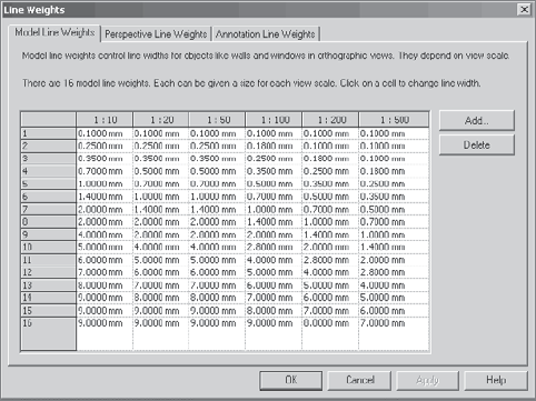
Revit does an excellent job of presetting these line weights to produce a good graphical display of your model on the printed page. We don't recommend manipulating the dialog box shown in Figure 2.82; however, if you're unhappy with the print quality of the line weights, you can access the values in this dialog box and make changes by selecting the Manage tab and in the Project Settings panel, click Settings and then click Line Weights.
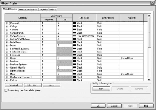
Line colors and styles are defined in the Object Styles dialog box (shown in Figure 2.83). To access this dialog box, select the Manage tab, and in the Project Settings panel click Settings and then click Object Styles. As you'll notice in the Object Styles dialog box, each Revit element has an assigned line weight number that corresponds to what is defined in the Line Weights dialog box. The line weights chosen for Projection (elevation) and Cut can vary depending on your requirements. You can also define line color and line pattern for each category here. We'll dig deeper into these settings in the next few chapters. Keep in mind that line weights do not adjust in direct proportion to scale; the results would not be desirable.
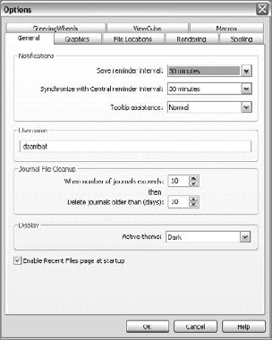
The Options button in previous versions of Revit was also located under Settings, but in the new Revit 2010 UI it has been moved to the Application Menu. In the Options dialog box you will find a variety of other options for using Revit (Figure 2.84).
The tabs for this function include the following:
- General
Here you can set your save-reminder intervals and your username. By default, your username is the same as your Windows login name.
- Graphics
This is where you can change some of the settings for your graphics card and the screen colors in Revit. As you may have noticed, Revit by default has a white screen with black lines (the inverse of AutoCAD). You can also specify selection and highlight colors, and enable anti-aliasing for 3D views.
- File Locations
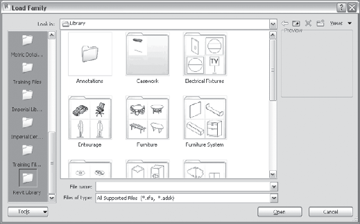
This tab stores the location of your default paths for templates, user files, and most important, paths to your family libraries. The path you defined for your Revit families is the one that you will be linked to when you choose the Load Family option, which becomes available upon selection or creation of any of the Revit elements (try Window as an example). You can add new links to personal library folders as well.
- Rendering
This tab shows you the default installation path to the new rendering library, used when you render views. This is also where you can add additional material libraries, as well as licensed ArchVision (photorealistic rendering entourage) content.
- Spelling
This tab allows you to specify various settings for automated spelling and indicate the dictionary that you want to be used. You can leave the default Revit dictionary or switch to a Microsoft Office dictionary, change the language settings, and add other dictionaries.
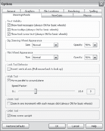
- SteeringWheels
This tab offers various controls over the visibility of the SteeringWheel, its size and opacity on the screen, and some additional settings, such as the Zoom and Orbit settings. You can also access these settings by clicking Options in the Wheel context menu (the Options dialog box opens with the SteeringWheels tab selected). You can adjust any of the parameters shown in Figure 2.85.
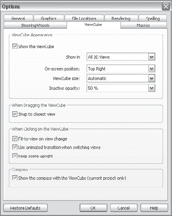
- ViewCube
This tab allows you to set the appearance of the ViewCube as well as some behavioral and scene settings, as shown in Figure 2.86.
There are five Revit-specific file formats:
RVT
RFA
RVG
RFT
RTE
Each Revit project is saved with the file extension .rvt. When you save a project using the .rvt extension, all project information is saved in that one file. This file includes all library components used in the project and imported DWG, DGN, or image files. Don't be too surprised to see the size of your project file grow significantly as you begin adding more details to the model. It isn't unusual for file sizes to exceed 50MB or even 100MB. If you want to share your project with another person or office, you won't need to send them any files other than your project *.rvt file.
Note
Note that all flavors of Revit (Revit Architecture, Revit MEP, and Revit Structure) use the same file format (.rvt).
Note
If you have linked files to a project, regardless of whether they are DWG or RVT files, you will need to send them along with the project if you are sending files.
The RFA file format is used for Revit library elements that can be loaded into a project. These are also referred to as families in the Project Browser. A small subset of loaded families is already available in the templates that come with Revit out of the box. Another, bigger library of loadable content has been provided with the standard Revit installation and is accessible from the Insert tab, Load Family button. These libraries are starting points, and represent only a small sampling of what is possible to create in Revit.
All these library elements have been created in a designated content-creation environment known as the Family Editor. The Family Editor comes along with the installation of Revit and is an integral part of it. You don't need any other software or knowledge of scripting or programming languages to build your own content in the Revit Family Editor. Once created, Revit families are loaded into a project, where you can edit and make modifications to them from within the project environment at any time, thus minimizing workflow interruptions.
Unless you changed the default installation, Revit installs all library objects in the folder C:Documents and SettingsAll UsersApplication DataAutodeskRevit Architecture 2010. This is the location of the default content that ships with Revit, and where the Load Family dialog box will take you (see Figure 2.87).
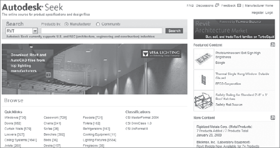
You can also browse for, and download content from, the Autodesk Seek website (Figure 2.88). Type in a search term in the Search field in the main toolbar and click the magnifying glass icon. You will be taken to a website where you can search for a wide range of content in various formats, including RFA files.
Revit families can be two-dimensional (2D) or three-dimensional (3D). Annotations and title blocks are obviously 2D, but you're welcome to create (or reuse from your CAD libraries) 2D symbols for real objects as well (toilets, furniture, and so on).
Note
Double-clicking an RFA file from Windows opens the family file in the Revit Family Editor.
The Revit Group file format was made obsolete with the Revit 2008 release. We mention it here, however, so that if you use a project created in an earlier release of Revit, you understand what to do with any .rvg file that is included.
To group elements together and repeat them throughout a project (imagine a table with chairs, or typical bathroom or hotel room fixtures), Revit has a tool called Model Group
Family template files are used to create custom families. The family templates are hard-coded in Revit. To see the full selection of available templates, from the Application Menu choose New → Family. The principle is simple: if you wish to create a new table design, you use the Furniture template; for a door, use the Door template. These templates have embedded behavior and intelligent parameters relevant to the type of object you're creating. For example, a template for creating a window has a different set of available parameters and behaviors than a template for creating a door. You can't create your own family template as you can a project template. If you cannot find an appropriate template for a new object you wish to create (a fireplace, for example), you should use the generic family or a more appropriate hosted family.
Templates are preconfigured empty drawings in which standard settings and content can be predefined so that each time you start a new project using that template, you have a predictable starting point that incorporates your office standards.
A template file allows many users working in the same company to start with a baseline set of graphic standards and a preloaded set of commonly used model and annotation elements. This is crucial for achieving a similar look and feel for all documents produced by your office. Architectural firms can have one office template or many different ones, depending on the type of job they're engaged in. For example, a residential template may have different content preloaded than a commercial template, but the annotation and line style standards may be identical. Templates allow this kind of flexibility when defining a starting point for any given project. From what we have heard and seen from many offices that have used Revit for some time already, they usually stick to one to three templates and use more only if the office is not focused on one type of job.
Here's what you can preset in a template:
Default title blocks used for your sheets
Loaded families
Line styles
Line weights
Line patterns
Fill patterns
Materials
Units
Snaps
Dimension styles
Temporary dimensions
Object styles
You define the location and selection of the default template in Revit From the Applications Menu, go to the Options dialog box, as discussed earlier in this chapter.
Only one template at a time can be set as a default template. If you've created a few templates and you want to start a new project using a template other than the default one, you can choose New → Project and select from the drop-down list or browse to another template. Revit includes a selection of preloaded templates, but in practice every office creates their own custom templates that will also appear in this list. Note that just clicking the New button instead of expanding it and choosing Project opens the default template and won't offer you the option of choosing or browsing to a different template file. Therefore, we suggest that at the beginning you click the arrow to expand the New button and choose Project, which will give you the template selection.
To create and save your own template, open any of the existing template files and save it as a new name. Next, modify the settings, units, fonts, and load library objects that you want to see each time you open a new project using that template. Starting a new project in Revit is easy. From the Application Menu, choose New → Project, and Revit will open a dialog box with the following options:
- Browse
From here, you can change the default template predefined in the Settings options and select another template.
- Project
This option is selected by default. It means you're starting a new project using one of the templates selected.
- Project Template
Choose this option if you want to create your own template. Under Create New, select Project Template, and under Template File, select the template that is most similar to what you want to create so that it serves as a basis for the new template. Make additional changes to that template, change settings, add or remove content, and save it under another name.