Overview of Mapping
There are two types of map support in JMP: one where a map shows the data (Graph Builder) and one where a map provides context for the data (Background Maps). You can also create your own maps.
Graph Builder
You can interact with Graph Builder to create compelling visualizations of your data. JMP includes graphical support to display analyses using background maps and shape files. You can add color and geographical boundaries to maps through the following zones:
• The Map Shape zone assigns geographical boundaries to a map based on variables in the data table. The map shape value determines the x and y axes.
Boundaries such as U.S. state names, Canadian provinces, and Japanese prefectures are installed with JMP. You can also create your own boundaries (geographical or otherwise) and specify them as a Map Role column property in the data table.
• The Color zone applies color based on a variable to geographical shapes.
• The Size element scales map shapes according to the size variable, minimizing distortion.
Background Maps
You can add background maps to any JMP graph through the Set Background Map window. You can use built-in background maps or connect to a Web Map Service (WMS) to display specialty maps like satellite images, radar images, or roadways. Right-click in a graph and select Background Map to choose from the following images and boundaries:
• Simple Earth and Detailed Earth maps are installed with JMP.
• NASA server provides maps using a WMS to show their most up-to-date maps.
• Web Map Service lets you enter the URL for a Web site that provides maps using the WMS protocol. You can also specify the map layer.
• Boundaries for various regions.
Example of Creating A Map in Graph Builder
This example uses the Crime.jmp sample data table, which contains data on crime rates for each US state.
1. Open the Crime.jmp sample data table (C:Program FilesSASJMP<Version Number>SamplesData).
2. Select Graph > Graph Builder.
3. Drag and drop State into the Map Shape zone.
4. Drag and drop Burglary into the Color zone.
Figure 14.2 Example of Burglary by State
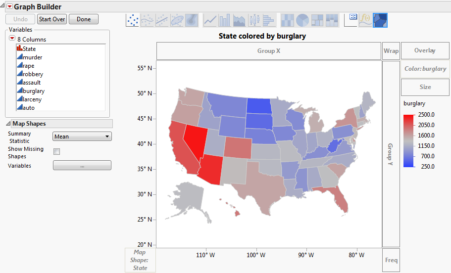
Note the following:
• The latitude and longitude appear on the Y and X axes.
• The legend shows the colors that correspond to the burglary rates. Since Burglary is a continuous variable, the colors are on a gradient.
• The map is projected so that relative areas are not distorted (the 49th parallel across the top of the US is not a straight line).
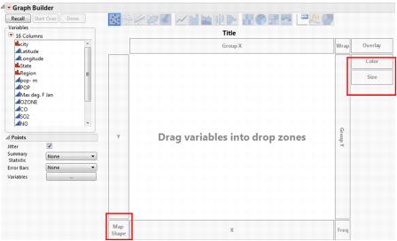
Graph Builder
Open a data table that contains geographic data. Launch Graph Builder by selecting Graph > Graph Builder. The primary element in the Graph Builder window is the graph area. The graph area contains drop zones (Map Shape, Color and Size), and you can drag and drop variables into the zones. From here you can map shapes for data tables that include place names.
Figure 14.3 The Graph Builder Window
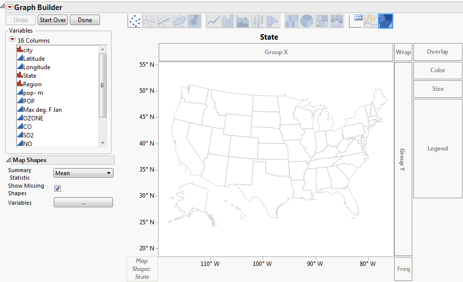
Map Shape
When a column contains the names of geographical regions (such as countries, regions, states, provinces, counties), you can assign the column to the Map Shape zone. When a variable is dropped in Map Shape, Graph Builder looks for map shapes that correspond to the values of the variable and draws the corresponding map. The variable can have a column property that tells JMP where to find the map data. If not, JMP looks through all known map files. If you have a variable in the Map Shape zone, the X and Y zones disappear. The Map Shape zone is positional and influences the types of graph elements that are available.
Figure 14.4 Example of Cities.jmp after Dragging State to Map Shape
For each map there are two .jmp files; one for the name data (one row per entity) and one for coordinate data (many rows per entity). They are paired via a naming convention; xxx-Name.jmp and xxx-XY.jmp, where "xxx" is some common prefix. Some examples of sample files that are shipped with the product are:
• World-Name.jmp
• World-XY.jmp
• US-State-Name.jmp
• US-State-XY.jmp
Map Name Files
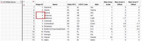
Each xxx-Name.jmp can contain any number of shape name columns, which are identified with a column property. Multiple name columns support localizations and alternate names styles (such as abbreviations), but a given graph usage uses only one column of names. The first column of the Name file must contain unique Shape ID numbers in ascending order.
Figure 14.5 Example of US-State-Name.jmp
Map XY Files
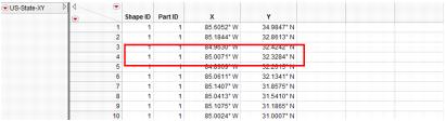
Each xxx-XY.jmp file has four columns. Each row is a coordinate in some shape. Each part is made of one or more shapes. Each shape is a closed polygon. The first column is the same Shape ID as in the xxx-Name file. The second column is the Part ID. The next two columns are X and Y.
Figure 14.6 Example of US-State-XY.jmp
Color
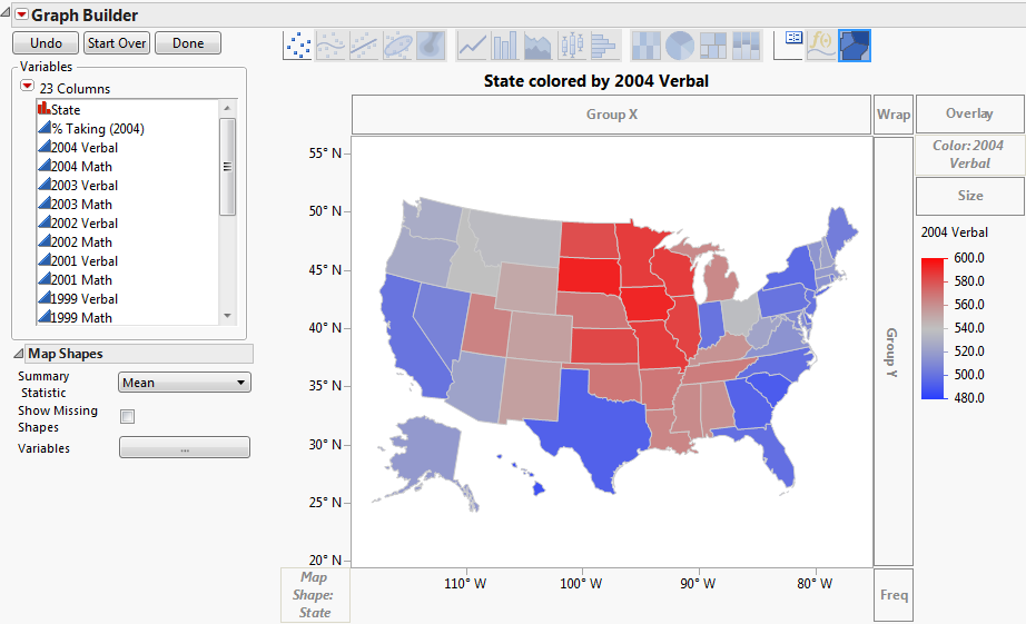
You can add color to geographic regions on a map to show statistical differences across geography. This type of map is called a choropleth map. Choropleth maps shade or give patterns to areas in proportion to the measurement of the statistical variable being displayed on the map. Such maps let you visualize differences across a geographic area. The Graph Builder platform lets you quickly create this type of map.
Drag a column containing geographic place-names, like countries, regions, states, or provinces, into the Map Shape zone and create a map. Then drag a column to the Color zone to color the map by that column. The categorical or continuous color theme selected in your Preferences is applied to each shape.
Figure 14.7 Example of SAT.jmp after Dragging 2004 Verbal to Color
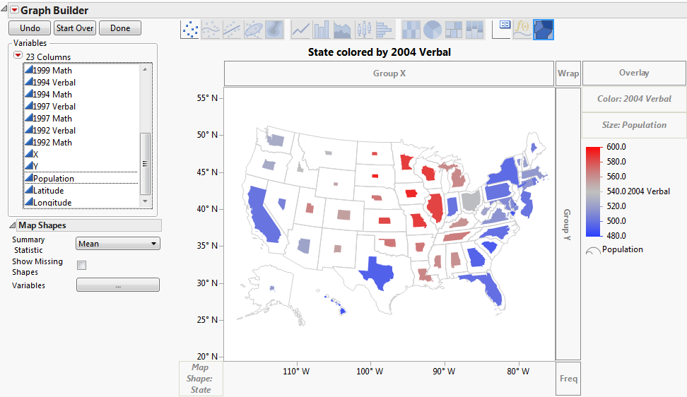
Size
Use the Size element to scale map shapes according to the size variable, minimizing distortion.
Figure 14.8 Example of SAT.jmp after Dragging Population to Size
Customizing Graphs
To change colors and transparency for a map, right-click on the color bar in the legend. The right-click options vary, depending on whether the color variable is continuous or categorical (nominal or ordinal). However, for both types of variables, you can change the transparency.
To change the transparency of a graph:
1. Right-click on the color of the variable level on the color bar that you want to change and select Transparency.
2. Specify the transparency between 0 (clear) and 1 (opaque).
3. Click OK.
You can also change the transparency of images (for example, Simple Earth and Detailed Earth). To set the transparency, right-click over the graph and select Customize.... This brings up the Customize Graph window, where you can select the Background Map and assign a value for transparency. A valid value for transparency goes from 0.0 (completely transparent) to 1.0 (completely opaque). Within Graph Builder, you can also right-click over the graph and select Graph > Transparency.
Categorical (nominal or ordinal) variables use a singular coloring system, where each level of the variable is colored differently.
To change the color of one of the variable levels:
1. Right-click on the color of the variable level that you want to change and select Fill Color.
2. Select the new color.
Continuous variables use a color gradient.
To change the color theme:
1. Right-click on the color bar and select Gradient.
2. In the Gradient Settings window, select a different Color Theme.
Graphs consist of markers, lines, text, and other graphical elements that you can customize. If you right-click an image, there are several options for working with the graph. The options differ based on what you clicked. For more information, see the “Graph Builder” chapter and Using JMP. Below are a few options.
Figure 14.9 Right-click Menu for Graphics

• Map Shapes:
‒ Change To: Caption Box - a summary statistic value for the data
‒ Summary Statistics - provides options for changing the statistic being plotted
‒ Show Missing Shapes - Shows or hides missing data from a map (turned off by default). Missing Shape means that there are some shape names that exist in the map file but not in the data table for analysis.
‒ Remove
• Customize - You can change the properties of the graph such as contents, grid lines, or reference lines. The graphical elements that you can customize differ for each graph. Select Background Map to change the transparency of a background map or Map Shape to change the line color, line style and width, fill color, missing shape fill or missing value fill. Click Help in the Customize Graph window for a more detailed explanation of the customize options.
Built-in Map Files
When you use the Map Shape zone, JMP searches through its built-in map files for matching names. Built-in map files normally include the following:
• Coastlines, world countries and regions
• States and counties in the United States
• First-level divisions for Canada, China, the United Kingdom, Spain, France, Italy, Japan, and Germany
JMP installs built-in map files in the following directory:
• Windows: C:Program FilesSASJMP<Version Number>Maps
• Macintosh: /Library/Application Support/JMP/<Version Number>/Maps
Each map consists of two JMP data tables with a common prefix. Each data table has the same base name with one of these two suffixes:
• -Name file that contains the unique names for the different regions
• -XY file that contains the latitude and longitude coordinates of the boundaries
The two files are implicitly linked by a Shape ID column. For example:
• The World-Name.jmp file contains the exact names and abbreviations for different countries and regions throughout the world
• The World-XY.jmp file contains the latitude and longitude numbers for each country, by Shape ID
Note: If JMP does not recognize the names in your data, check the built-in map files for the spelling that JMP recognizes. For example, United Kingdom is a country name, but not Great Britain.
Custom Map Files
You can create your own map files by following the same pattern as the built-in files. To add your own map files, you need two things: a series of XY coordinates for the vertices of the polygons that describe the shape, and a set of names for each polygon. Data and shape attributes are required to map custom shapes so you can add your own shapes to JMP. There are two common sources for data like this: ESRI shapefiles and SAS/GRAPH map data sets.
In order for JMP to automatically find your files, place them in the following directory:
• On Windows: C:Users<user name>AppDataLocalSASJMPMaps
• On Mac: /Users/<user name>/Library/Application Support/JMP/Maps
Or, you can link the map files to your data files explicitly with the Map Role column property.
Note the following when creating map files:
• Each set of map files that you create must contain a -Name file and a -XY file.
• The first column in both files must be the ascending, numeric Shape ID variable. The -Name file can contain any other columns. The shapes are built by rows. The XY coordinates have to go around the shape rather than just define the convex hull of the shape.
• For the Map Role column property, columns that are marked with the Shape Name Definition are searched for shape identification and must contain unique values.
• If you import an ESRI SHP file, it is opened in the correct format. -Name files commonly have a .dbf extension. For more information, see “ESRI® Shapefiles”.
• SAS/GRAPH software includes a number of map data sets that can be used with JMP. For more information, see “SAS/GRAPH® Map Data Sets”.
You might want to create choropleth maps of other non-geographic regions (for example, a floor of an office building). Simply, add the two shape files for your non-geographic space. If you do not have XY coordinates, but you do have a graphic image of the space, you can use the Custom Map Creator add-in for JMP. With this add-in, you can trace the outlines of the space and JMP creates the -XY and -Name files for you. You can download this add-in from the JMP File Exchange page.
Map Role
You can specify the attributes and properties of a column in a data table within the Column Info window in Column Properties. The Map Role property is set for a column like other column properties in the Column Info window. Figure 14.10 shows an example of the room/office column in the S4 Temps.jmp sample data table. See Using JMP for more information about Column Properties.
Figure 14.10 The Column Info Window
If you have created your own data table that contains boundary data (such as countries, regions, states, provinces, or counties) and you want to see a corresponding map in Graph Builder, use the Map Role property within Column Properties. Each pair of map files that you create must contain a -Name file and a -XY file.
Note the following:
• If the custom boundary files reside in the default custom maps directory, then you need to specify only the Map Role property in the -Name file.
• If the custom boundary files reside in an alternate location, specify the Map Role property in the -Name file and in the data table that you are analyzing.
• The columns that contain the Map Role property must contain the same boundary names, but the column names can be different.
To add the Map Role property into the -Name data table:
1. Right-click on the column containing the boundaries and select Column Properties > Map Role.
2. Select Shape Name Definition below Map Role.
3. Click OK.
4. Save the data table.
Figure 14.11 Shape Name Definition Example
To add the Map Role property into the data table that you are analyzing:
Note: Perform these steps only if your custom boundary files do not reside in the default custom maps directory.
1. Right-click on the column containing the boundaries and select Column Properties > Map Role.
2. Select Shape Name Use below Map Role.
3. Next to Map name data table, enter the relative, or absolute path to the -Name map data table.
If the map data table is in the same folder, enter only the filename. Quotes are not required when the path contains spaces.
4. Next to Shape definition column, enter the name of the column in the map data table whose values match those in the selected column.
5. Click OK.
6. Save the data table.
When you generate a graph in Graph Builder and assign the modified column to the Map Shape zone, your boundaries appear on the graph.
Figure 14.12 Shape Name Use Example
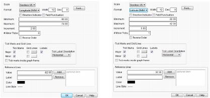
For numeric columns, the Format Menu appears in the Column Info window. Specify the format to tell JMP how to display numbers in the column. Latitude and Longitude for geographic maps are located under Format > Geographic when customizing axes and axes labels.
Geographic
Shows latitude and longitude number formatting for geographic maps. Latitude and longitude options include the following:
‒ DDD (degrees)
‒ DMM (degrees and minutes)
‒ DMS (degrees, minutes, and seconds)
In each format, the last field can have a fraction part. You can specify the direction with either a signed degree field or a direction suffix. To show a signed degree field, such as -59°00'00", deselect Direction Indicator. To show the direction suffix, such as 59°00'00" S, select Direction Indicator.
To use spaces as field separators, deselect Field Punctuation. To use degrees, minutes, and seconds symbols, select Field Punctuation.
ESRI® Shapefiles
The ESRI Shapefile (shapefile) is a geospatial vector data format for geographic information systems software. It is developed and regulated by ESRI as a specification among ESRI and other software products. Shapefiles spatially describe geometries (points, polylines, and polygons) that could represent data such as streams, rivers, and lakes. Shapefile is the standard for map data, and each map is actually a set of files with the same name and different extensions. JMP imports two of them:
• a main file (.shp)
• a dBase table (.dbf)
The main file contains sequences of points that make up polygons. When opened with JMP, a .shp file is imported as a JMP table which contains a Shape column to uniquely identify each geographic region, a Part column to indicate discontiguous regions, and the XY coordinates (in latitude and longitude degrees). The Shape column is added during import. You can add formatting and axis settings for the X and Y columns.
The dBase table should have an ID column that maps to the Shape column in the main file, plus any number of columns that provide common names or values to refer to the regions. Add the ID column manually after import.
Opening an .shp or a .dbf file in JMP opens the data as a JMP data table. For an .shp file, each coordinate point is a separate row. JMP only supports two-dimensional .shp files (no elevation information).
Shapefiles store geometrical data types such as points, lines, and polygons. But such data is of limited use without attributes to specify what they represent. Therefore, a table of records stores information for each shape in the shapefile. Shapes, combined with data attributes, create depictions about geographical data that can lead to effective evaluations.
To convert an ESRI shapefile to a JMP map file:
1. Open the .shp file in JMP.
2. Make sure that the Shape column is the first column in the .shp file. Add formatting and axis settings for the X and Y columns (optional). Graph Builder uses those settings for the X and Y axes.
3. Save the .shp file as a JMP data table to the Maps folder with a name that ends in -XY.jmp.
4. Open the .dbf file.
5. Add a Shape ID column as the first column in the table. This column should be the row numbers from 1 to n, the number of rows in the data table (Note - You can use Cols >New Column > Initialize Data > Sequence Data).
6. Assign the Map Role column property to any column that you use for place names in the Shape role of Graph Builder. To do this, right-click at the top of the column and select Column Properties > Map Role.
7. Select Shape Name Definition from the drop-down box in the property definition.
8. Save the table as a JMP data table with a name that matches the earlier table and that ends in -Name.jmp.
JMP looks for these files in two locations. One location is shared by all users on a machine. This location is:
• Windows: C:Program FilesSASJMP<Version Number>Maps
• Mac: /Library/Application Support/JMP/<Version Number>/Maps
The other location is specific for an individual user:
• On Windows: C:Users<user name>AppDataLocalSASJMPMaps
• On Mac: /Users/<user name>/Library/Application Support/JMP/Maps
SAS/GRAPH® Map Data Sets
SAS/GRAPH software includes a number of map data sets that can be converted for use with JMP. The data sets are in the Maps library. The traditional map data sets contain the XY coordinate data and the feature table contains the common place names. You need to convert both of these files to JMP data tables for use with JMP.
Most of the traditional map data sets have unprojected latitude and longitude variables in radians. The data sets can be used with JMP once they have been converted to degrees and the longitude variable has been adjusted for projection. The following is a DATA step that shows the conversion process for the Belize data set.
data WORK.BELIZE;
keep id segment x y;
rename segment=Part;
set maps.belize;
if x NE .;
if y NE .;
y=lat*(180/constant('pi'));
x=-long*(180/constant('pi'));
run;
You can now import the converted file and save it as Belize-XY.jmp.
The next step is to import the matching feature data set (in this case: MAPS.BELIZE2). After importing the feature data set, move the ID column to the first position in the data table. Then assign the Map Role column property to the columns that you use for place names in the Shape role of Graph Builder. To do this, right-click the top of the column and select Column Properties > Map Role. Then select Shape Name Definition from the drop-down box in the property definition. For MAPS.BELIZE2, use the IDNAME column. Save the feature data table as Belize-Name.jmp.
To convert SAS maps, download the SAS to JMP Map Converter add-in from the JMP File Exchange page. For each map, the add-in reads the data from the two SAS map tables, rearranges and formats the data and then places it into the two JMP map tables.
Background Maps
Adding map images and boundaries to graphs provides visual context to geospatial data. Affixing a background map generates an appealing map, providing your data a geographic context and giving you a whole new way to view your data. For example, you can add a map to a graph that displays an image of the U.S. Another option is displaying the boundaries for each state (when data includes the latitudes and longitudes for the U.S.). There are different types of background maps. Some maps are built into JMP and are delivered as part of the JMP install. Other maps are retrieved from an Internet source, and still other maps are user-defined.
The data should have latitudinal and longitudinal coordinates. Otherwise, the map has no meaning in the context of the data. The x and y axes also have range requirements based on the type of map. These requirements are described in the following sections. Simply plot longitude and latitude on the X and Y axes, and then right-click within the graph and select Graph > Background Map.
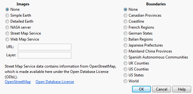
The Background Map window shows two columns of choices: Images and Boundaries. On the left of the window you can select from two built-in map images, or you can connect to a Web Map Service to retrieve a background image. On the right side of the window, you can select political boundaries for a number of regions.
Figure 14.13 Example of Background Map Options

|
Images
|
|
|
None
|
Removes the background map that you selected in the Images column.
|
|
Simple Earth
|
Shows a map of basic terrain.
|
|
Detailed Earth
|
Shows a high-resolution map with detailed terrain.
|
|
NASA Server
|
Shows a map from the NASA server. Requires an Internet connection.
|
|
Street Map Service
|
Shows a map with an appropriate amount of detail based on the display’s zoom level. This allows you to zoom down to the street level.
|
|
Web Map Service
|
Shows a map from the Uniform Resource Locator (URL) and the layer that you specify. Requires an Internet connection.
|
|
Boundaries
|
|
|
None
|
Removes the boundaries that you selected in the Boundaries column.
|
|
Boundaries for various regions
|
Shows borders for the map regions, such as Canadian provinces, U.S. counties, U.S. States, and world countries. The list varies based on your location. The maps that you created from ESRI shapefiles are also listed here.
|
Two tools are especially helpful when you are viewing a map:
• The grabber tool ( ) lets you scroll horizontally and vertically through a map.
• The magnifier tool ( ) lets you zoom in and out.
Images
Every flat map misrepresents the surface of the Earth in some way. Maps cannot match a globe in truly representing the surface of the entire Earth. A map projection is used to portray all or part of the round Earth on a flat surface. This cannot be done without some distortion. Every projection has its own set of advantages and disadvantages. A map can show one or more, but not all, of the following: true direction, distance, area, or shape. JMP employs a couple of projections (Albers Equal Area Conic and Kavrayskiy VII) for its maps. Within Images, you can select from two built-in map images, or you can connect to a Web Map Service to retrieve a background image.
Earth Images Installed with JMP
JMP provides two levels of earth imagery; simple and detailed. Both maps show features such as bodies of water and terrain. However, detailed maps show more precise terrain. And with detailed maps, you can zoom in farther, and the map features remain clear. Image maps are raster images. The maps wrap horizontally, so you continue to see map details as you scroll from left to right. The maps do not wrap vertically. Beyond the -90 and 90 y-axis range, a plain background appears instead of the map.
Figure 14.14 Examples of Simple and Detailed Maps
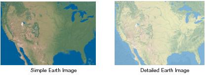
As its name suggests, Simple Earth is a relatively unadorned image of the earth’s geography. It does not show clouds or arctic ice, and it uses a green and brown color scheme for the land and a constant deep blue for water. Detailed Earth has a softer color scheme than Simple Earth, lighter greens and browns for the land, as well as variation in the blue for the water. Detailed Earth also has a slightly higher resolution than Simple Earth. The higher resolution lets you zoom into a graph further with Detailed Earth than with Simple Earth before the quality of the background image begins to blur.
Another feature of Simple Earth and Detailed Earth is the ability to wrap. The Earth is round, and when you cross 180° longitude, the Earth does not end. The longitudinal value continues from -180° and increases. The map wraps continuously in the horizontal direction, much as the Earth does. The background map does not wrap in the vertical direction.
Simple Earth and Detailed Earth both support a geodesic scaling. In Figure 14.14, the Earth appears as a rectangle, where the width is twice as wide as the height. If we were to take this rectangle and roll it up, we would have a cylinder. In reality, we know that the Earth does not form a cylinder, but rather a sphere. You can use a geodesic scaling, which transforms the map to a more realistic representation of the Earth. To use the geodesic scaling, change the type of scale on the axes.
To change the axes scale:
1. Right-click over the X or Y axis and then select Axis Settings….
2. Change the Scale to Geodesic or Geodesic US.
Figure 14.15 Y Axis Setting Window
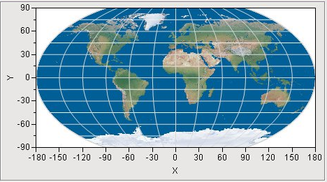
Both choices transform the map to a geodesic scaling. Use Geodesic US if you are viewing a map of the continental US and you want Alaska and Hawaii to be included in the map. It is important to note that you must set the scale to geodesic for both axes to get the transformation. You will not see a change in the map after setting only one of the axes. In the following figure, Simple Earth is used as the background map with the axes set to use a geodesic scale. The axes lines are turned on as well. Notice the longitudinal lines are now curved, instead of straight.
Figure 14.16 Simple Earth Background Map - Axes set to Geodesic Scale
Since Detailed and Simple Earth are built into JMP, these options work any time, without a network connection. However, these images might not be all that you want, or they might not be detailed at the resolution that you need. If this is the case, and if you have an Internet connection, you can connect to a Web Map Service to retrieve a map image that meets your needs.
Maps from the Internet
The National Aeronautics and Space Administration (NASA) and other organizations provide map image data using a protocol called Web Map Service (WMS). These maps have the advantage of showing the most up-to-date geographical information. However, the display of the maps can be slow depending on the response time of the server, and the sites can change or disappear at any time. An Internet connection is required to access the information.
Figure 14.17 Examples of NASA and WMS maps
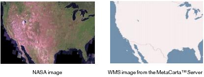
The NASA server provides maps for the entire Earth. The following figure displays the Earth using the NASA server as its source for the background map. It also has a boundary map turned on, to show the outlines of the countries.
Figure 14.18 NASA Server Map Example
Not only does this server cover the entire Earth, but you can also zoom in on a much smaller area of the Earth and still get a reasonable map. The following figure displays the Colorado River running through the Grand Canyon in Arizona. The Grand Canyon Village is visible in the bottom of the map.
Figure 14.19 NASA Server Map Example - Zoom in on Colorado
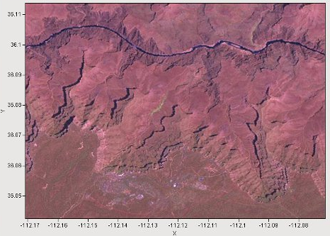
If you look at the axes values, you can see that the area is less than 1/10° by 1/10°. The Simple Earth and Detailed Earth background maps do not display that type of resolution. The NASA server provides a fairly detailed view of any land mass on Earth. Water, however, is simply filled in as black. The NASA server is free to access, but it is also limited in availability. If the server is temporarily unavailable or becomes overloaded with requests, it delivers an error message instead of the requested map.
Another Internet-based option for background maps is a Web Map Service (WMS). The WMS option enables you to specify any server that supports the WMS interface. The NASA server is an example of a WMS server, but we have provided the URL and a layer name for you. With the WMS option, you must know the URL to the WMS server and a layer name supported by the server. Most WMS servers support multiple layers. For example, one layer can show terrain, another layer can show roads, and still another layer can include water, such as rivers and lakes. By specifying the URL for the server and the layer, JMP can make a request to the server and then display the map that is returned.
Unlike with simple and detailed maps, WMS maps do not wrap. You can scroll horizontally and vertically. However, beyond the -180 to 180 (x axis) and -90 to 90 (y axis) ranges, a plain background appears instead of the map. The limits of the axes are used to define the limits of the map that is displayed.
In order to use the WMS option for a background map, you need to decide which WMS server to use. There are many WMS servers freely available from the Internet. Most of them provide maps only for a particular area of the world, and each of them supports their own layers. So you have to search for the appropriate WMS server for your particular situation.
You can search for WMS servers on the Internet using your favorite search engine. Once you find one, you need to discover the layers that it supports. For this, you can use the WMS Explorer add-in. The WMS Explorer add-in generates a list of all the layers available on a server. You can select a layer from the list to see what it looks like. You can download the WMS Explorer add-in from the JMP File Exchange page.
Note: To use the WMS Explorer add-in and the WMS background map capabilities of JMP, your computer must be connected to the Internet.
To locate a server, launch the add-in through the menu items Add-Ins > Map Images > WMS Explorer. The add-in presents a text box for entering the url of a known WMS server. Alternatively, you can make a selection from a drop-down list of pre-discovered WMS servers (the list can be out of date). After specifying a WMS server, select Get Layers. Using Get Layers is not necessary if selecting from the drop-down list or if clicking Enter after entering a URL. This sends a request to the WMS server for a list of layers that the server supports. The returned list appears in the list box on the left, labeled Layers. A map of the world appears as an outline in the graph to the right. Selecting a layer makes a request to the WMS server to return a map, using the specified layer, that represents the entire earth. Selecting a different layer generates a different map.
It is important to note that not all maps are generated to cover the entire earth (for example, some WMS servers might provide mapping data for a particular county, within a state). In that case, it is likely that selecting a layer will not generate any visible map. You might have to zoom in on the appropriate area before any image map is visible. The standard JMP toolbar is available in the add-in window and the zoom tool works just like it does in any JMP window.
The graph is a typical graph in JMP, which means that all the regular JMP controls are available to you. You can adjust the axes or use the zoom tool (found on the hidden menu bar) just as you would in JMP. You can also right-mouse-click to select Size/Scale > Size to Isometric to get your graph back into a proper aspect ratio. You can also select Background Map, where you can adjust the boundary map.
Once a desirable map is determined, note the URL in the text box at the top and the selected layer in the Layers list. This is the information that you need to enter in the background map window when WMS is selected as the type of image background map.
Because requests are being made to a server across the Internet, there are a number of conditions that can generate an error. WMS servers often have limited availability and sometimes are not available at all. Occasionally a WMS server might return a name of a layer that it no longer supports. In these types of cases (and others), a server usually returns an error message in lieu of a map. If that happens, the error message is displayed below the Layers list in an area labeled Errors.
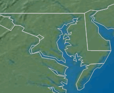
Boundaries
JMP can display boundaries (such as U.S. states or French region boundaries). These boundaries draw an outline around a defined area and can be displayed alone on a graph or combined with image data. Several boundaries are installed with JMP. Alternatively, you can create your own boundaries from ESRI shapefiles or from scratch. Because of this, the list of Boundaries that you see in the Set Background Map window can be different.
When you add shape files to the built-in locations in JMP, they are available not only for the Graph Builder platform, but also for the Boundaries option in the Background Map window. In this way, you can add more political boundaries for use with background maps. Boundary-style maps are vector-based shapes.
Figure 14.20 Example of U.S. State Boundaries
Add a Background Map and Boundaries
To add a background map and boundaries:
1. Right-click a blank area on the graph and select Background Map (or select Graph > Background Map in Graph Builder).
The Set Background Map window appears.
Figure 14.21 Set Background Map Window
2. To display a background, do one of the following:
‒ Select Simple Earth, Detailed Earth, NASA server, or Street Map Service in the Images column.
‒ Select Web Map Service and paste a WMS URL next to URL. Type the layer identifier next to Layer.
3. To display geographic borders on the map, select an option in the Boundaries column (If you installed your own boundary shapefiles, they are also listed in this column).
4. Click OK.
If the NASA map, Street Map, or WMS map does not appear after you add it, the map server might not be available. View the error log to verify the problem.
JSL Scripting
Background maps can be scripted in JSL. You can write a script that creates a graph, and then turns on the background map in the script. For more information about scripting, see the Scripting Guide.
To access the background map functionality through JSL, find an example in the Samples Data directory. For example, run JMP and open the sample data file called Hurricanes.jmp. Edit the script called Bubble Plot with Map. Look for the command in the script that begins with Background Map.
To figure out the correct parameters for the background map command, simply look at the background map window. The wording is the same as the JSL commands. To create a background map, simply use the command Background Map().
There are two types of background maps that you can specify: Images() and Boundaries(). Each of these then takes a parameter, which is the name of the map to use. The name is one of the maps listed in the window. For Images(), the choices are Simple Earth, Detailed Earth, NASA, Street Map Service, and Web Map Service. If you use Web Map Service, then there are two additional parameters: the WMS URL and the layer supported by the WMS server. For Boundaries(), the choices vary since boundaries can be user-defined. But a typical choice might be World.
To add a background map that uses the Detailed Earth imagery and World as a boundary, the command would look like this (spacing is not important):
Background Map ( Images ( "Detailed Earth" ), Boundaries ( "World" ) )
To change the script to use a WMS server, the command would look like this:
Background Map ( Images ( "Web Map Service", "http://land.visualiser.nt.gov.au/wms/wms", "NTLIS_Mapserver" ), Boundaries ( "World" ) )
You can also create your graph and add a background map through the user interface. Then from the red triangle menu use Script > Save Script to Script Window to see the script that is generated.
Figure 14.22 JSL Scripting Example
Examples of Creating Maps
The following are examples of creating and using maps to find and display patterns in your geographical data.
Louisiana Parishes Example
In this example you work with custom map files and then create custom maps in two different ways:
• Set up custom map files initially and save them in the predetermined location. JMP finds and uses them in the future with any appropriate data.
• Point to specific predefined map files directly from your data. This step might be required each time you want to specify custom maps.
Set Up Automatic Custom Maps
Suppose that you have downloaded ESRI shapefiles from the Internet and you want to use them as your map files in JMP. The shapefiles are named Parishes.shp and Parishes.dbf. These files contain coordinates and information about the parishes (or counties) of Louisiana.
Save the .shp file with the appropriate name and in the correct directory, as follows:
1. In JMP, open the Parishes.shp file from the following default location:
‒ On Windows: C:Program FilesSASJMP<Version Number>SamplesImport Data
‒ On Mac: /Library/Application Support/JMP/<Version Number>/Samples/Import Data
Note: If you cannot see the file, you might need to change the file type to All Files.
JMP opens the file as Parishes. The .shp file contains the x and y coordinates.
2. Save the Parishes file with the following name and extension: Parishes-XY.jmp. Save the file here:
‒ On Windows: C:Users<user name>AppDataLocalSASJMPMaps
‒ On Mac: /Users/<user name>/Library/Application Support/JMP/Maps
Note: If the Maps folder does not already exist, you need to create it.
3. Close the Parishes-XY.jmp file.
Perform the initial setup and save the .dbf file, as follows:
1. Open the Parishes.dbf file from the following default location:
‒ On Windows: C:Program FilesSASJMP<Version Number>SamplesImport Data
‒ On Mac: /Library/Application Support/JMP/<Version Number>/Samples/Import Data
Note: If you cannot see the file, you might need to change the file type to All Files.
JMP opens the file as Parishes. The .dbf file contains identifying information.
2. In the Parishes file, add a new column. Name it Shape ID. Drag and drop it to be the first column.
3. In the first three rows of the Shape ID column, type 1, 2, and 3 (Note - You can also use Cols > New Column > Initialize Data > Sequence Data).
4. Select all three cells, right-click, and select Fill > Continue sequence to end of table.
Figure 14.23 Shape ID Column in Parishes File
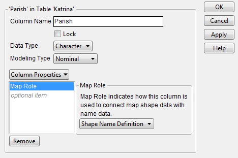
5. Right-click on the PARISH column and select Column Info.
6. Select Column Properties > Map Role.
7. Select Shape Name Definition.
8. Click OK.
9. Save the Parishes file with the following name and extension: Parishes-Name.jmp. Save the file here:
‒ On Windows: C:Users<user name>AppDataLocalSASJMPMaps
‒ On Mac: /Users/<user name>/Library/Application Support/JMP/Maps
10. Close the Parishes-Name.jmp file.
Once the map files have been set up, you can use them. The Katrina.jmp data table contains data on Hurricane Katrina’s impact by parish. You want to visually see how the population of the parishes changed after Hurricane Katrina. Proceed as follows:
11. Open the Katrina.jmp sample data table.
12. Select Graph > Graph Builder.
13. Drag and drop Parish into the Map Shape zone.
The map appears automatically, since you defined the Parish column using the custom map files.
14. Drag and drop Population into the Color zone.
15. Drag and drop Date into the Group X zone.
Figure 14.24 Population of Parishes Before and After Katrina
16. Select the Magnifier tool to zoom in on the Orleans parish.
Figure 14.25 Orleans Parish
You can clearly see the drop in population as a result of Hurricane Katrina. The population of the Orleans parish went from 437,186 in July 2005 to 158,353 in January 2006.
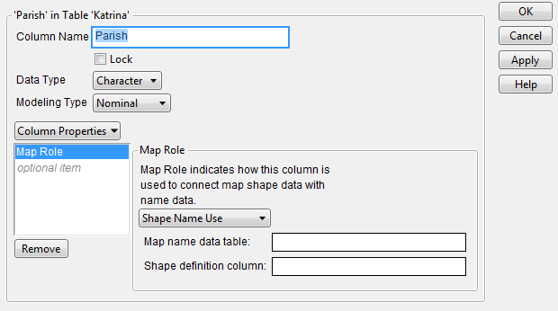
Point to Specific Map Files Directly from Your Data
As an example of pointing to specific map files directly from your data, say that you already have your custom map files and they are named appropriately. Your map files are US-MSA-Name.jmp and US-MSA-XY.jmp. They are saved in the sample data folder.
The PopulationByMSA.jmp data table contains population data from the years 2000 and 2010 for the metropolitan statistical areas (MSAs) of the United States. Set up the Map Role column property in the data table, as follows:
1. Open the PopulationByMSA.jmp sample data table.
2. Right-click on the Metropolitan Statistical Area column and select Column Info.
3. Select Column Properties > Map Role.
4. Select Shape Name Use.
5. Next to the Map name data table, enter the following path:
‒ On Windows: C:Program FilesSASJMP<Version Number>SamplesDataUS-MSA-Name.jmp
‒ On Mac: /Library/Application Support/JMP/<Version Number>/Samples/Data/US-MSA-Name.jmp
This tells JMP where the data tables containing the map information reside.
6. Next to the Shape definition column, type MSA_Name.
MSA_Name is the specific column within the US-MSA-Name.jmp data table that contains the unique names for each metropolitan statistical area. Notice that the MSA_Name column has the Shape Name Definition Map Role property assigned, as part of correctly defining the map files.
Note: Remember, the Shape ID column in the -Name data table maps to the Shape ID column in the -XY data table. This means that indicating where the -Name data table resides links it to the -XY data table, so that JMP has everything that it needs to create the map.
Figure 14.26 Map Role Column Property
7. Click OK.
Once the Map Role column property has been set up, you can perform your analysis. You want to visually see how the population has changed in the metropolitan statistical areas of the United States between the years 2000 and 2010.
1. Select Graph > Graph Builder.
2. Drag and drop Metropolitan Statistical Area into the Map Shape zone.
Since you have defined the Map Role column property on this column, the map appears.
3. Drag and drop Change in Population to the Color zone.
Figure 14.27 Change in Population for Metropolitan Statistical Areas
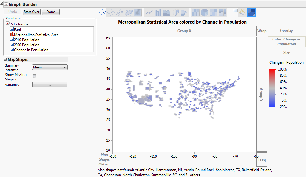
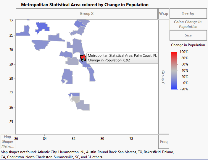
4. Select the Magnifier tool to zoom in on the state of Florida.
5. Select the Arrow tool and click on the red area.
Figure 14.28 Population Change of Palm Coast, Florida
6. Select the Magnifier tool and hold down the ALT key while clicking on the map to zoom out.
7. Select the Magnifier tool and zoom in on the state of Utah.
8. Select the Arrow tool and click on the area that is slightly red.
Figure 14.29 Population Change of St. George, Utah
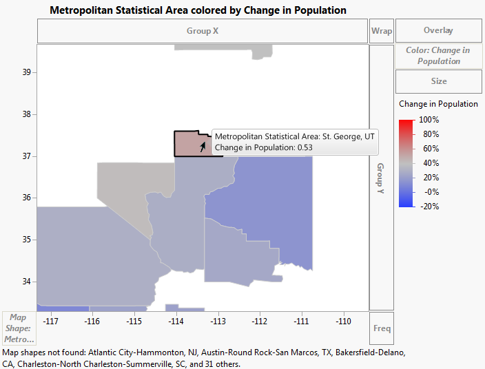
You can see that the areas of Palm Coast, Florida, and St. George, Utah had the most population change between 2000 and 2010. The Palm Coast area saw a population change of 92%, and the St. George area saw a population change of about 53%.
Hurricane Tracking Examples
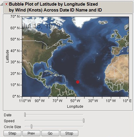
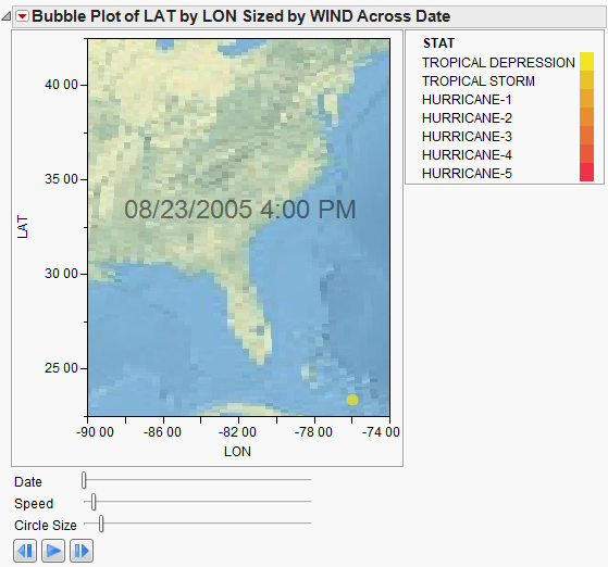
This example uses the Hurricanes.jmp sample data table, which contains data on hurricanes that have affected the east coast of the United States. Adding a background map helps you see the areas the hurricanes affected. A script has been developed for this example and is part of the data table.
1. Open the Hurricanes.jmp sample data table (C:Program FilesSASJMP<Version Number>SamplesData).
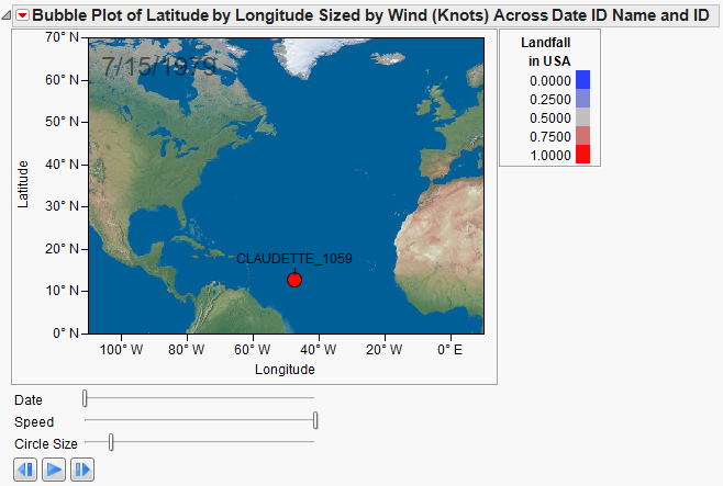
2. Run the Bubble Plot script (Bubble Plot > Run Script). The following image appears. The red dot shows the location of Hurricane Claudette on July 15, 1979. Click on the red dot to display the name of the hurricane. The date appears in the upper left corner of the window.
Figure 14.30 Bubble Plot of Hurricanes.jmp
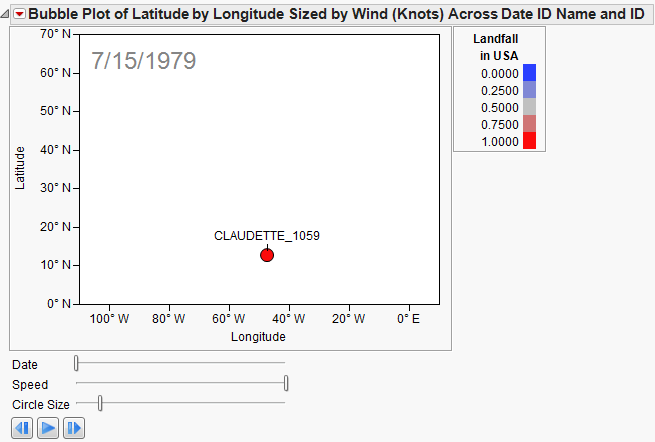
Note that even though the location of the hurricane is plotted, it does not really tell us where it is. The axes information is there (10° North latitude, 50° West longitude) but we need a little more context. It is most likely over the middle of the Atlantic, but is it over a small island? This could make a big difference, especially for the inhabitants of the small island. Obviously, a map in the background of our graph would add a good deal of information.
3. Right-click the map and select Background Map. The Set Background Map window appears.
Figure 14.31 Set Background Map Window
4. Select Simple Earth and click OK.
Figure 14.32 Bubble Plot of Hurricanes.jmp with Background Map
Now the coordinates make geographic sense. Click Run to view the animation of the hurricane data moving over the background map. Experiment with different options and view the displays. Adjust the axes or use the zoom tool to change what part of the world you are viewing. The map adjusts as the view does. You can also right-click the graph and select Size/Scale->Size to Isometric to get the aspect ratio of your graph to be proportional.
The next example uses the Katrina Data.jmp sample data table, which contains data on hurricane Katrina such as latitude, longitude, date, wind speed, pressure, and status. Adding a background map helps you see the path the hurricane took and impact that it had on land based on size and strength. A script has been developed for this example and is part of the data table.
1. Open the Katrina Data.jmp sample data table (C:Program FilesSASJMP<Version Number>SamplesData).
2. Select Graph > Bubble Plot.
3. Drag and drop LAT onto the Y axis.
4. Drag and drop LON onto the X axis.
5. Drag and drop Date onto Time.
6. Drag and drop WIND onto Sizes.
7. Drag and drop Stat onto Coloring.
Figure 14.33 Bubble Plot Setup of Katrina Data.jmp
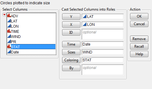
8. Click OK.
9. The following image appears. The yellow dot shows the location of Tropical Depression Katrina on August 23, 2005.
Figure 14.34 Bubble Plot of Katrina Data.jmp
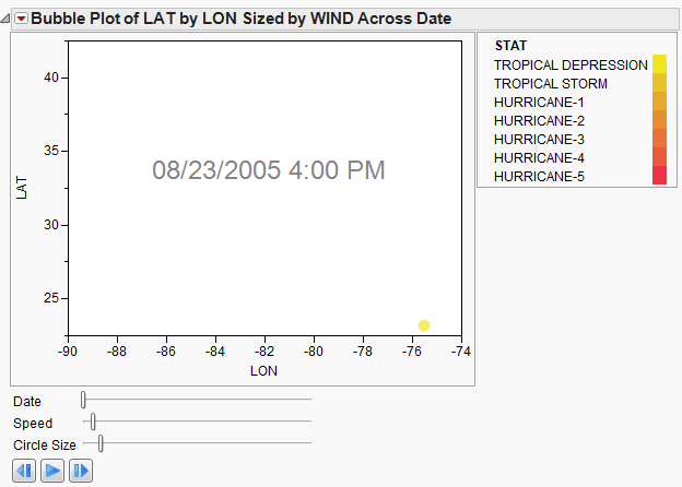
Note that even though the location of the storm is plotted, it does not really tell us where it is. To add more context, add a map in the background.
10. Right-click the graph and select Background Map. The Set Background Map window appears.
11. Select Detailed Earth and click OK.
Figure 14.35 Bubble Plot of Katrina Data.jmp with Background Map
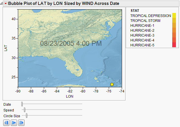
Now the coordinates make geographic sense. You can edit the axes and the size/scale to change the way the graph appears.
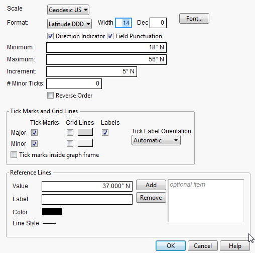
12. Right-click the X axis (LON) and select Axis Settings. The X Axis Specification window appears.
13. Select Scale > Geodesic US.
14. Select Format > Geographic > Longitude DMM.
15. Click OK.
16. Repeat the same for the Y axis (LAT) except select Format > Geographic > Latitude DMM.
Figure 14.36 X and Y Axes Specification Windows
17. Right-click the map and select Size/Scale > Size to Isometric.
Figure 14.37 Bubble Plot of Katrina Data.jmp with Background Map
Click Run to view the animation of the hurricane data moving over the background map. You can manipulate the speed and the bubble size. Experiment with different options and view the displays. Adjust the axes or use the zoom tool to change what part of the area you are viewing. Add boundaries to the states. The map adjusts as the view does.
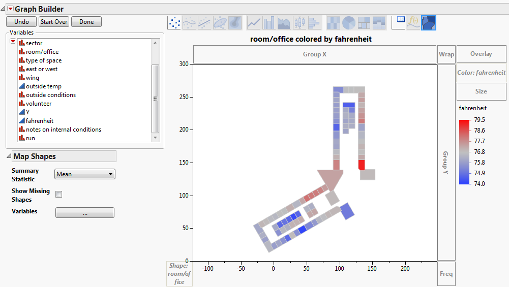
Office Temperature Study
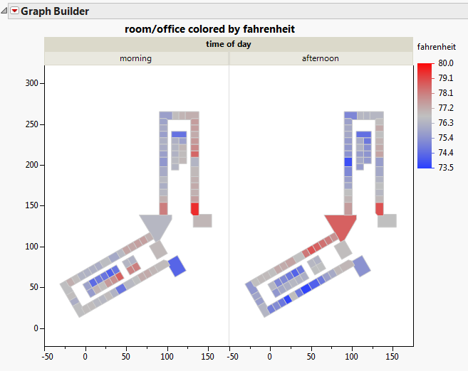
This example demonstrates the creation of a custom background map for an office temperature study and how JMP was used to visualize the results. Data was collected concerning office temperatures for a floor within a building. A map was created for the floor using the Custom Map Creator add-in from the JMP File Exchange. Using Graph Builder, the office temperature results were then analyzed visually.
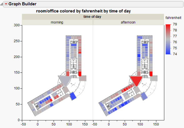
The map shown below is the floor, grouped by time of day, with color reflecting the Fahrenheit value. Exploring data visually in this way can give hints as to what factors are affecting office temperature. Looking at this map, it appears the offices on the east side of the building are warmer in the mornings than they are in the afternoons. On the western side of the building, the opposite appears to be true. From this visualization, we might expect that both of these variables are affecting office temperatures, or perhaps that the interaction between these terms is significant. Such visuals help guide decision-making during the analysis.
Figure 14.38 Room/Office Colored by Fahrenheit and Time of Day
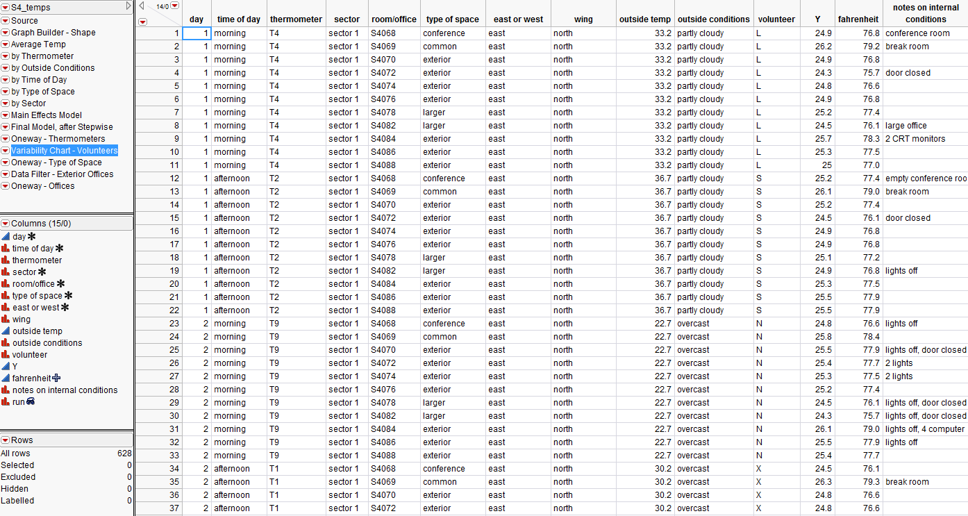
First, data was collected and input into a data table (S4 Temps.jmp). Note the Room/Office column. It contains the unique names for each office and was assigned the Map Role to correctly define the map files.
Figure 14.39 S4 Temps.jmp Data Table
Then, a map of the floor was created using the Custom Map Creator add-in. The add-in creates two tables to define the shapes; an XY table and a Name table. The instructions below describe how it was built.
To create a map of the floor:
1. Launch the add-in through the menu items Add-Ins > Map Shapes > Custom Map Creator. Two tables open in the background followed by the Custom Map Creator Window.
2. Drag a background image into the graph frame. An image of the floor plan was available.
3. Perform any resizing on the background image and graph the frame.
4. Name the table (for example, S4).
5. Click Next.
6. Name the shape that you are about to define. For this example, each office was individually named for the map (for example, S4001).
7. Within the graph frame, use your mouse to click all of the boundaries of the shape that you want to define. A line appears that connects all of the boundary points.
8. As soon as you finish defining the boundaries of the shape, click Next Shape. Continue adding shapes until you have completed the floor plan. Note that you do not need to connect the final boundary point; the add-in automatically does that for you when you click Next Shape.
9. The line size and color can be changed. In addition, checking Fill Shapes fills each shape with a random color.
10. Click Finish.
The custom map files were created and named appropriately. The map files are S4-Name.jmp and S4-XY.jmp and have been saved in the Samples Data folder.
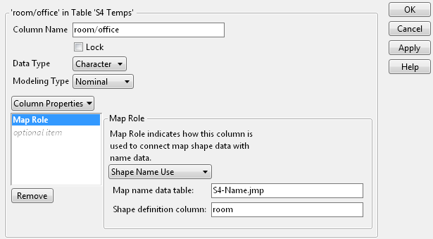
The S4 Temps.jmp data table contains office data over a three-day period. Set up the Map Role column property in the data table, as follows:
1. Open the S4 Temps.jmp sample data table.
2. Right-click on the Room/Office column and select Column Info.
3. Select Column Properties > Map Role.
4. Select Shape Name Use.
5. Next to Map name data table, enter the following path:
‒ On Windows: C:Program FilesSASJMP<Version Number>SamplesDataS4-Name.jmp
‒ On Mac: /Library/Application Support/JMP/<Version Number>/Samples/Data/S4-Name.jmp
This tells JMP where the data tables containing the map information reside.
6. Next to the Shape definition column, type room.
Room is the specific column within the S4-Name.jmp data table that contains the unique names for each office. Notice that the room column has the Shape Name Definition Map Role property assigned, as part of correctly defining the map files.
Note: Remember, the Shape ID column in the -Name data table maps to the Shape ID column in the -XY data table. This means that indicating where the -Name data table resides links it to the -XY data table, so that JMP has everything that it needs to create the map.
Figure 14.40 Map Role Column Property
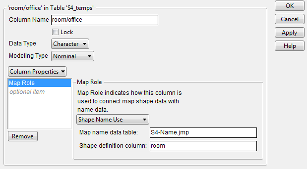
7. Click OK.
Once the Map Role column property has been set up, you can perform your analysis. You want to visually see the differences in office temperatures throughout the floor.
1. Select Graph > Graph Builder.
2. Drag and drop Room/Office into the Map Shape zone.
Since you have defined the Map Role column property on this column, the map appears.
3. Drag and drop Fahrenheit to the Color zone.
Figure 14.41 Room/Office Colored by Fahrenheit
4. Drag and drop Time of Day onto the graph.
Figure 14.42 Room/Office Colored by Fahrenheit and Time of Day
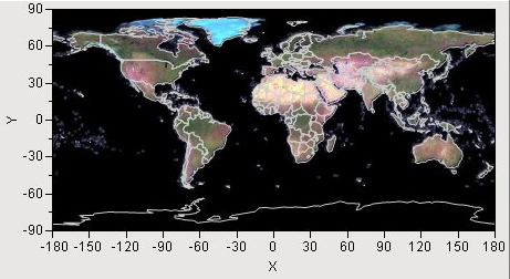
Note that only the offices that were part of the study and were created using the Custom Map Creator add-in are displayed. To add the entire floor plan image, the original floor plan graphic was dragged and dropped onto the Graph Builder window to create Figure 14.43.
Figure 14.43 Room/Office Colored by Fahrenheit and Time of Day
There are several scripts provided with the data table that you can run to view the various analysis and modeling that can be performed and visually displayed.
..................Content has been hidden....................
You can't read the all page of ebook, please click here login for view all page.