Overview of Oneway Analysis
A one-way analysis of variance tests for differences between group means. The total variability in the response is partitioned into two parts: within-group variability and between-group variability. If the between-group variability is large relative to the within-group variability, then the differences between the group means are considered to be significant.
Example of Oneway Analysis
This example uses the Analgesics.jmp sample data table. Thirty-three subjects were administered three different types of analgesics (A, B, and C). The subjects were asked to rate their pain levels on a sliding scale. You want to find out if the means for A, B, and C are significantly different.
1. Select Help > Sample Data Library and open Analgesics.jmp.
2. Select Analyze > Fit Y by X.
3. Select pain and click Y, Response.
4. Select drug and click X, Factor.
5. Click OK.
Figure 6.2 Example of Oneway Analysis
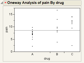
You notice that one drug (A) has consistently lower scores than the other drugs. You also notice that the x-axis ticks are unequally spaced. The length between the ticks is proportional to the number of scores (observations) for each drug.
Perform an analysis of variance on the data.
6. From the red triangle menu for Oneway Analysis, select Means/Anova.
Note: If the X factor has only two levels, the Means/Anova option appears as Means/Anova/Pooled t, and adds a pooled t-test report to the report window.
Figure 6.3 Example of the Means/Anova Option
Note the following observations:
• Mean diamonds representing confidence intervals appear.
‒ The line near the center of each diamond represents the group mean. At a glance, you can see that the mean for each drug looks significantly different.
‒ The vertical span of each diamond represents the 95% confidence interval for the mean of each group.
• The Summary of Fit table provides overall summary information about the analysis.
• The Analysis of Variance report shows the standard ANOVA information. You notice that the Prob > F (the p-value) is 0.0053, which supports your visual conclusion that there are significant differences between the drugs.
• The Means for Oneway Anova report shows the mean, sample size, and standard error for each level of the categorical factor.
Launch the Oneway Platform
You can perform a Oneway analysis using either the Fit Y by X platform or the Oneway platform. The two approaches are equivalent.
• To launch the Fit Y by X platform, select Analyze > Fit Y by X.
or
• To launch the Oneway platform, from the JMP Starter window, click on the Basic category and click Oneway.
Figure 6.4 The Oneway Launch Window
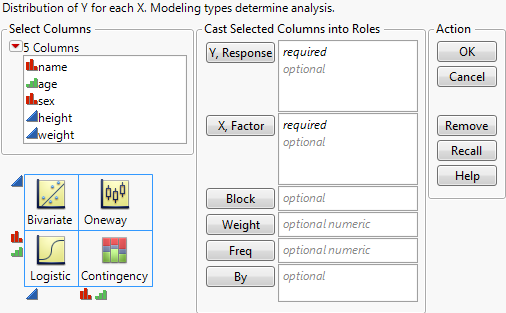
For more information about this launch window, see “Introduction to Fit Y by X” chapter.
After you click OK, the Oneway report window appears. See “The Oneway Plot”.
The Oneway Plot
The Oneway plot shows the response points for each X factor value. You can compare the distribution of the response across the levels of the X factor. The distinct values of X are sometimes called levels.
Replace variables in the plot in one of two ways: swap existing variables by dragging and dropping a variable from one axis to the other axis; or, click on a variable in the Columns panel of the associated data table and drag it onto an axis.
You can add reports, additional plots, and tests to the report window using the options in the red triangle menu for Oneway Analysis. See “Oneway Platform Options”.
To produce the plot shown in Figure 6.5, follow the instructions in “Example of Oneway Analysis”.
Figure 6.5 The Oneway Plot
Oneway Platform Options
Note: The Fit Group menu appears if you have specified multiple Y or X variables. Menu options allow you to arrange reports or order them by RSquare. See the Standard Least Squares chapter in the Fitting Linear Models book for more information.
When you select a platform option, objects might be added to the plot, and a report is added to the report window.
|
Platform Option
|
Object Added to Plot
|
Report Added to Report Window
|
|
Quantiles
|
Box plots
|
Quantiles report
|
|
Means/Anova
|
Mean diamonds
|
Oneway ANOVA reports
|
|
Means and Std Dev
|
Mean lines, error bars, and standard deviation lines
|
Means and Std Deviations report
|
|
Compare Means
|
Comparison circles
(except Nonparametric Multiple Comparisons option)
|
Means Comparison reports
|
The red triangle menu for Oneway Analysis provides the following options. Some options might not appear unless specific conditions are met.
Quantiles
Lists the following quantiles for each group:
‒ 0% (Minimum)
‒ 10%
‒ 25%
‒ 50% (Median)
‒ 75%
‒ 90%
‒ 100% (Maximum)
Activates Box Plots from the Display Options menu. See “Quantiles”.
Means/Anova
Fits means for each group and performs a one-way analysis of variance to test if there are differences among the means. Also gives the Welch test, which is an ANOVA test for comparing means when the variances within groups are not equal. See “Means/Anova and Means/Anova/Pooled t”.
If the X factor has two levels, the menu option changes to Means/Anova/Pooled t.
Means and Std Dev
Gives summary statistics for each group. The standard errors for the means use individual group standard deviations rather than the pooled estimate of the standard deviation.
The plot now contains mean lines, error bars, and standard deviation lines. For a brief description of these elements, see “Display Options”. For more details about these elements, see “Mean Lines, Error Bars, and Standard Deviation Lines”.
t test
Produces a t-test report assuming that the variances are not equal. See “The t-test Report”.
This option appears only if the X factor has two levels.
Analysis of Means Methods
Provides five commands for performing Analysis of Means (ANOM) procedures. There are commands for comparing means, variances, and ranges. See “Analysis of Means Methods”.
Compare Means
Provides multiple-comparison methods for comparing sets of group means. See “Compare Means”.
Nonparametric
Provides nonparametric comparisons of group locations. See “Nonparametric Tests”.
Unequal Variances
Performs four tests for equality of group variances. See “Unequal Variances”.
Equivalence Test
Tests that a difference is less than a threshold value. See “Equivalence Test”.
Robust
Provides two methods for reducing the influence of outliers on your data. See “Robust”.
Power
Provides calculations of statistical power and other details about a given hypothesis test. See “Power”.
The Power Details window and reports also appear within the Fit Model platform. For further discussion and examples of power calculations, see the Statistical Details appendix in the Fitting Linear Models book.
Set α Level
You can select an option from the most common alpha levels or specify any level with the Other selection. Changing the alpha level results in the following actions:
‒ recalculates confidence limits
‒ adjusts the mean diamonds on the plot (if they are showing)
‒ modifies the upper and lower confidence level values in reports
‒ changes the critical number and comparison circles for all Compare Means reports
‒ changes the critical number for all Nonparametric Multiple Comparison reports
Normal Quantile Plot
Provides the following options for plotting the quantiles of the data in each group:
‒ Plot Actual by Quantile generates a quantile plot with the response variable on the y-axis and quantiles on the x-axis. The plot shows quantiles computed within each level of the categorical X factor.
‒ Plot Quantile by Actual reverses the x- and y-axes.
‒ Line of Fit draws straight diagonal reference lines on the plot for each level of the X variable. This option is available only once you have created a plot (Actual by Quantile or Quantile by Actual).
CDF Plot
Plots the cumulative distribution function for all of the groups in the Oneway report. See “CDF Plot”.
Densities
Compares densities across groups. See “Densities”.
Matching Column
Specify a matching variable to perform a matching model analysis. Use this option when the data in your Oneway analysis comes from matched (paired) data, such as when observations in different groups come from the same subject.
The plot now contains matching lines that connect the matching points. See “Matching Column”.
Save
Saves the following quantities as new columns in the current data table:
‒ Save Residuals saves values computed as the response variable minus the mean of the response variable within each level of the factor variable.
‒ Save Standardized saves standardized values of the response variable computed within each level of the factor variable. This is the centered response divided by the standard deviation within each level.
‒ Save Normal Quantiles saves normal quantile values computed within each level of the categorical factor variable.
‒ Save Predicted saves the predicted mean of the response variable for each level of the factor variable.
Display Options
Adds or removes elements from the plot. See “Display Options”.
See the JMP Reports chapter in the Using JMP book for more information about the following options:
Redo
Contains options that enable you to repeat or relaunch the analysis. In platforms that support the feature, the Automatic Recalc option immediately reflects the changes that you make to the data table in the corresponding report window.
Save Script
Contains options that enable you to save a script that reproduces the report to several destinations.
Save By-Group Script
Contains options that enable you to save a script that reproduces the platform report for all levels of a By variable to several destinations. Available only when a By variable is specified in the launch window.
Display Options
Using Display Options, you can add or remove elements from a plot. Some options might not appear unless they are relevant.
All Graphs
Shows or hides all graphs.
Points
Shows or hides data points on the plot.
Box Plots
Shows or hides outlier box plots for each group. For an example, see “Conduct the Oneway Analysis”.
Mean Diamonds
Draws a horizontal line through the mean of each group proportional to its x-axis. The top and bottom points of the mean diamond show the upper and lower 95% confidence points for each group. See “Mean Diamonds and X-Axis Proportional”.
Mean Lines
Draws a line at the mean of each group. See “Mean Lines, Error Bars, and Standard Deviation Lines”.
Mean CI Lines
Draws lines at the upper and lower 95% confidence levels for each group.
Mean Error Bars
Identifies the mean of each group and shows error bars one standard error above and below the mean. See “Mean Lines, Error Bars, and Standard Deviation Lines”.
Grand Mean
Draws the overall mean of the Y variable on the plot.
Std Dev Lines
Shows lines one standard deviation above and below the mean of each group. See “Mean Lines, Error Bars, and Standard Deviation Lines”.
Comparison Circles
Shows or hides comparison circles. This option is available only when one of the Compare Means options is selected. See “Comparison Circles”. For an example, see “Conduct the Oneway Analysis”.
Connect Means
Connects the group means with a straight line.
Mean of Means
Draws a line at the mean of the group means.
X-Axis proportional
Makes the spacing on the x-axis proportional to the sample size of each level. See “Mean Diamonds and X-Axis Proportional”.
Points Spread
Spreads points over the width of the interval
Points Jittered
Adds small spaces between points that overlay on the same y value. The horizontal adjustment of points varies from 0.375 to 0.625 with a 4*(Uniform-0.5)5 distribution.
Matching Lines
(Only appears when the Matching Column option is selected.) Connects matching points.
Matching Dotted Lines
(Only appears when the Matching Column option is selected.) Draws dotted lines to connect cell means from missing cells in the table. The values used as the endpoints of the lines are obtained using a two-way ANOVA model.
Histograms
Draws side-by-side histograms to the right of the original plot.
Robust Mean Lines
(Appears only when a Robust option is selected.) Draws a line at the robust mean of each group.
Legend
Displays a legend for the Normal Quantile Plot, CDF Plot, and Densities options.
Quantiles
The Quantiles report lists selected percentiles for each level of the X factor variable. The median is the 50th percentile, and the 25th and 75th percentiles are called the quartiles.
The Quantiles option adds the following elements to the plot:
• the grand mean representing the overall mean of the Y variable
• outlier box plots summarizing the distribution of points at each factor level
Figure 6.6 Outlier Box Plot and Grand Mean
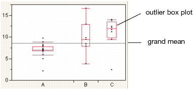
Note: To hide these elements, click the red triangle next to Oneway Analysis and select Display Options > Box Plots or Grand Mean.
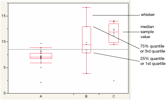
Outlier Box Plots
The outlier box plot is a graphical summary of the distribution of data. Note the following aspects about outlier box plots (see Figure 6.7):
• The horizontal line within the box represents the median sample value.
• The ends of the box represent the 75th and 25th quantiles, also expressed as the 3rd and 1st quartile, respectively.
• The difference between the 1st and 3rd quartiles is called the interquartile range.
• Each box has lines, sometimes called whiskers, that extend from each end. The whiskers extend from the ends of the box to the outermost data point that falls within the distances computed as follows:
3rd quartile + 1.5*(interquartile range)
1st quartile - 1.5*(interquartile range)
If the data points do not reach the computed ranges, then the whiskers are determined by the upper and lower data point values (not including outliers).
Figure 6.7 Examples of Outlier Box Plots
Means/Anova and Means/Anova/Pooled t
The Means/Anova option performs an analysis of variance. If the X factor contains exactly two levels, this option appears as Means/Anova/Pooled t. In addition to the other reports, a t-test report assuming pooled (or equal) variances appears.
Mean diamonds are added to the Oneway plot
Reports
See “The Summary of Fit Report”, “The Analysis of Variance Report”, “The Means for Oneway Anova Report”., “The t-test Report”, and “The Block Means Report”.
‒ The t-test report appears only if the Means/Anova/Pooled t option is selected.
‒ The Block Means report appears only if you have specified a Block variable in the launch window.
The Summary of Fit Report
The Summary of Fit report shows a summary for a one-way analysis of variance.
Rsquare
Measures the proportion of the variation accounted for by fitting means to each factor level. The remaining variation is attributed to random error. The R2 value is 1 if fitting the group means account for all the variation with no error. An R2 of 0 indicates that the fit serves no better as a prediction model than the overall response mean. For more information, see “Summary of Fit Report”.
R2 is also called the coefficient of determination.
Note: A low RSquare value suggests that there may be variables not in the model that account for the unexplained variation. However, if your data are subject to a large amount of inherent variation, even a useful ANOVA model may have a low RSquare value. Read the literature in your research area to learn about typical RSquare values.
Adj Rsquare
Adjusts R2 to make it more comparable over models with different numbers of parameters by using the degrees of freedom in its computation. For more information, see “Summary of Fit Report”.
Root Mean Square Error
Estimates the standard deviation of the random error. It is the square root of the mean square for Error found in the Analysis of Variance report.
Mean of Response
Overall mean (arithmetic average) of the response variable.
Observations (or Sum Wgts)
Number of observations used in estimating the fit. If weights are used, this is the sum of the weights. See “Summary of Fit Report”.
The t-test Report
Note: This option is applicable only for the Means/Anova/Pooled t option.
There are two types of t-Tests:
• Equal variances. If you select the Means/Anova/Pooled t option, a t-Test report appears. This t-Test assumes equal variances.
• Unequal variances. If you select the t-Test option from the red triangle menu, a t-Test report appears. This t-Test assumes unequal variances.
The t-test report contains the following columns:
t Test plot
Shows the sampling distribution of the difference in the means, assuming the null hypothesis is true. The vertical red line is the actual difference in the means. The shaded areas correspond to the p-values.
Difference
Shows the estimated difference between the two X levels. In the plots, the Difference value appears as a red line that compares the two levels.
Std Err Dif
Shows the standard error of the difference.
Upper CL Dif
Shows the upper confidence limit for the difference.
Lower CL Dif
Shows the lower confidence limit for the difference.
Confidence
Shows the level of confidence (1-alpha). To change the level of confidence, select a new alpha level from the Set α Level command from the platform red triangle menu.
t Ratio
Value of the t-statistic.
DF
The degrees of freedom used in the t-test.
Prob > |t|
The p-value associated with a two-tailed test.
Prob > t
The p-value associated with a lower-tailed test.
Prob < t
The p-value associated with an upper-tailed test.
The Analysis of Variance Report
The Analysis of Variance report partitions the total variation of a sample into two components. The ratio of the two mean squares forms the F ratio. If the probability associated with the F ratio is small, then the model is a better fit statistically than the overall response mean.
Note: If you specified a Block column, then the Analysis of Variance report includes the Block variable.
Source
Lists the three sources of variation, which are the model source, Error, and C. Total (corrected total).
DF
Records an associated degrees of freedom (DF for short) for each source of variation:
‒ The degrees of freedom for C. Total are N - 1, where N is the total number of observations used in the analysis.
‒ If the X factor has k levels, then the model has k - 1 degrees of freedom.
The Error degrees of freedom is the difference between the C. Total degrees of freedom and the Model degrees of freedom (in other words, N - k).
Sum of Squares
Records a sum of squares (SS for short) for each source of variation:
‒ The total (C. Total) sum of squares of each response from the overall response mean. The C. Total sum of squares is the base model used for comparison with all other models.
‒ The sum of squared distances from each point to its respective group mean. This is the remaining unexplained Error (residual) SS after fitting the analysis of variance model.
The total SS minus the error SS gives the sum of squares attributed to the model. This tells you how much of the total variation is explained by the model.
Mean Square
Is a sum of squares divided by its associated degrees of freedom:
‒ The Model mean square estimates the variance of the error, but only under the hypothesis that the group means are equal.
‒ The Error mean square estimates the variance of the error term independently of the model mean square and is unconditioned by any model hypothesis.
F Ratio
Model mean square divided by the error mean square. If the hypothesis that the group means are equal (there is no real difference between them) is true, then both the mean square for error and the mean square for model estimate the error variance. Their ratio has an F distribution. If the analysis of variance model results in a significant reduction of variation from the total, the F ratio is higher than expected.
Prob>F
Probability of obtaining (by chance alone) an F value greater than the one calculated if, in reality, there is no difference in the population group means. Observed significance probabilities of 0.05 or less are often considered evidence that there are differences in the group means.
The Means for Oneway Anova Report
The Means for Oneway Anova report summarizes response information for each level of the nominal or ordinal factor.
Level
Lists the levels of the X variable.
Number
Lists the number of observations in each group.
Mean
Lists the mean of each group.
Std Error
Lists the estimates of the standard deviations for the group means. This standard error is estimated assuming that the variance of the response is the same in each level. It is the root mean square error found in the Summary of Fit report divided by the square root of the number of values used to compute the group mean.
Lower 95% and Upper 95%
Lists the lower and upper 95% confidence interval for the group means.
The Block Means Report
If you have specified a Block variable on the launch window, the Means/Anova and Means/Anova/Pooled t commands produce a Block Means report. This report shows the means for each block and the number of observations in each block.
Mean Diamonds and X-Axis Proportional
A mean diamond illustrates a sample mean and confidence interval.
Figure 6.8 Examples of Mean Diamonds and X-Axis Proportional Options
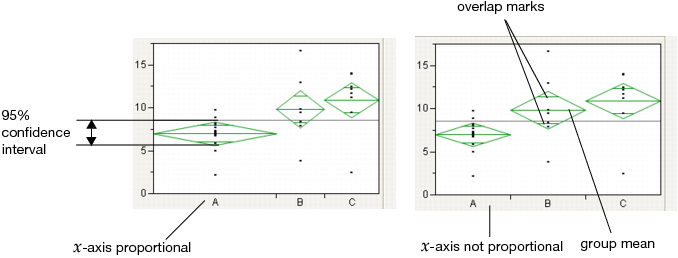
Note the following observations:
• The top and bottom of each diamond represent the (1-alpha)x100 confidence interval for each group. The confidence interval computation assumes that the variances are equal across observations. Therefore, the height of the diamond is proportional to the reciprocal of the square root of the number of observations in the group.
• If the X-Axis proportional option is selected, the horizontal extent of each group along the x-axis (the horizontal size of the diamond) is proportional to the sample size for each level of the X variable. Therefore, the narrower diamonds are usually taller, because fewer data points results in a wider confidence interval.
• The mean line across the middle of each diamond represents the group mean.
• Overlap marks appear as lines above and below the group mean. For groups with equal sample sizes, overlapping marks indicate that the two group means are not significantly different at the given confidence level. Overlap marks are computed as group mean ±  . Overlap marks in one diamond that are closer to the mean of another diamond than that diamond’s overlap marks indicate that those two groups are not different at the given confidence level.
• The mean diamonds automatically appear when you select the Means/Anova/Pooled t or Means/Anova option from the platform menu. However, you can show or hide them at any time by selecting Display Options > Mean Diamonds from the red triangle menu.
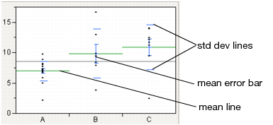
Mean Lines, Error Bars, and Standard Deviation Lines
Show mean lines by selecting Display Options > Mean Lines. Mean lines indicate the mean of the response for each level of the X variable.
Mean error bars and standard deviation lines appear when you select the Means and Std Dev option from the red triangle menu. See Figure 6.9. To turn each option on or off singly, select Display Options > Mean Error Bars or Std Dev Lines.
Figure 6.9 Mean Lines, Mean Error Bars, and Std Dev Lines
Analysis of Means Methods
Analysis of means (ANOM) methods compare means and variances and other measures of location and scale across several groups. You might want to use these methods under these circumstances:
• to test whether any of the group means are statistically different from the overall (sample) mean
• to test whether any of the group standard deviations are statistically different from the root mean square error (RMSE)
• to test whether any of the group ranges are statistically different from the overall mean of the ranges
Note: Within the Contingency platform, you can use the Analysis of Means for Proportions when the response has two categories. For details, see the “Contingency Analysis” chapter.
For a description of ANOM methods and to see how JMP implements ANOM, see the book by Nelson et al. (2005).
Analysis of Means for Location
You can test whether groups have a common mean or center value using the following options:
• ANOM
• ANOM with Transformed Ranks
ANOM
Use ANOM to compare group means to the overall mean. This method assumes that your data are approximately normally distributed. See “Example of an Analysis of Means Chart”.
ANOM with Transformed Ranks
This is the nonparametric version of the ANOM analysis. Use this method if your data is clearly non-normal and cannot be transformed to normality. ANOM with Transformed Ranks compares each group’s mean transformed rank to the overall mean transformed rank. The ANOM test involves applying the usual ANOM procedure and critical values to the transformed observations.
Transformed Ranks
Suppose that there are n observations. The transformed observations are computed as follows:
• Rank all observations from smallest to largest, accounting for ties. For tied observations, assign each one the average of the block of ranks that they share.
• Denote the ranks by R1, R2, ..., Rn.
• The transformed rank corresponding to the ith observations is:
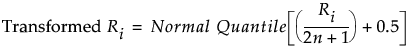
The ANOM procedure is applied to the values Transformed Ri. Since the ranks have a uniform distribution, the transformed ranks have a folded normal distribution. For details, see Nelson et al. (2005).
Analysis of Means for Scale
You can test for homogeneity of variation within groups using the following options:
• ANOM for Variances
• ANOM for Variances with Levene (ADM)
• ANOM for Ranges
ANOM for Variances
Use this method to compare group standard deviations (or variances) to the root mean square error (or mean square error). This method assumes that your data is approximately normally distributed. To use this method, each group must have at least four observations. For details about the ANOM for Variances test, see Wludyka and Nelson (1997) and Nelson et al. (2005). For an example, see “Example of an Analysis of Means for Variances Chart”.
ANOM for Variances with Levene (ADM)
This method provides a robust test that compares the group means of the absolute deviations from the median (ADM) to the overall mean ADM. Use ANOM for Variances with Levene (ADM) if you suspect that your data is non-normal and cannot be transformed to normality. ANOM for Variances with Levene (ADM) is a nonparametric analog of the ANOM for Variances analysis. For details about the ANOM for Variances with Levene (ADM) test, see Levene (1960) or Brown and Forsythe (1974).
ANOM for Ranges
Use this test to compare group ranges to the mean of the group ranges. This is a test for scale differences based on the range as the measure of spread. For details, see Wheeler (2003).
Note: ANOM for Ranges is available only for balanced designs and specific group sizes. See “Restrictions for ANOM for Ranges Test”.
Restrictions for ANOM for Ranges Test
Unlike the other ANOM decision limits, the decision limits for the ANOM for Ranges chart uses only tabled critical values. For this reason, ANOM for Ranges is available only for the following:
• groups of equal sizes
• groups specifically of the following sizes: 2–10, 12, 15, and 20
• number of groups between 2 and 30
• alpha levels of 0.10, 0.05, and 0.01
Analysis of Means Charts
Each Analysis of Means Methods option adds a chart to the report window that shows the following:
• an upper decision limit (UDL)
• a lower decision limit (LDL)
• a horizontal (center) line that falls between the decision limits and is positioned as follows:
‒ ANOM: the overall mean
‒ ANOM with Transformed Ranks: the overall mean of the transformed ranks
‒ ANOM for Variances: the root mean square error (or MSE when in variance scale)
‒ ANOM for Variances with Levene (ADM): the overall absolute deviation from the mean
‒ ANOM for Ranges: the mean of the group ranges
If a group’s plotted statistic falls outside of the decision limits, then the test indicates that there is a statistical difference between that group’s statistic and the overall average of the statistic for all the groups.
Analysis of Means Options
Each Analysis of Means Methods option adds an Analysis of Means red triangle menu to the report window.
Set Alpha Level
Select an option from the most common alpha levels or specify any level with the Other selection. Changing the alpha level modifies the upper and lower decision limits.
Note: For ANOM for Ranges, only the selections 0.10, 0.05, and 0.01 are available.
Show Summary Report
The reports are based on the Analysis of Means method:
‒ For ANOM, creates a report showing group means and decision limits.
‒ For ANOM with Transformed Ranks, creates a report showing group mean transformed ranks and decision limits.
‒ For ANOM for Variances, creates a report showing group standard deviations (or variances) and decision limits.
‒ For ANOM for Variances with Levene (ADM), creates a report showing group mean ADMs and decision limits.
‒ For ANOM for Ranges, creates a report showing group ranges and decision limits.
Graph in Variance Scale
(Only for ANOM for Variances) Changes the scale of the y-axis from standard deviations to variances.
Display Options
Display options include the following:
‒ Show Decision Limits shows or hides decision limit lines.
‒ Show Decision Limit Shading shows or hides decision limit shading.
‒ Show Center Line shows or hides the center line statistic.
‒ Point Options: Show Needles shows the needles. This is the default option. Show Connected Points shows a line connecting the means for each group. Show Only Points shows only the points representing the means for each group.
Compare Means
Note: Another method for comparing means is ANOM. See “Analysis of Means Methods”.
Use the Compare Means options to perform multiple comparisons of group means. All of these methods use pooled variance estimates for the means. Each Compare Means option adds comparison circles next to the plot and specific reports to the report window. For details about comparison circles, see “Using Comparison Circles”.
|
Option
|
Description
|
Nonparametric Menu Option
|
|
Each Pair, Student’s t
|
Computes individual pairwise comparisons using Student’s t-tests. If you make many pairwise tests, there is no protection across the inferences. Therefore, the alpha-size (Type I error rate) across the hypothesis tests is higher than that for individual tests. See “Each Pair, Student’s t”.
|
Nonparametric > Nonparametric Multiple Comparisons > Wilcoxon Each Pair
|
|
All Pairs, Tukey HSD
|
Shows a test that is sized for all differences among the means. This is the Tukey or Tukey-Kramer HSD (honestly significant difference) test. (Tukey 1953, Kramer 1956). This test is an exact alpha-level test if the sample sizes are the same, and conservative if the sample sizes are different (Hayter 1984). See “All Pairs, Tukey HSD”.
|
Nonparametric > Nonparametric Multiple Comparisons > Steel-Dwass All Pairs
|
|
With Best, Hsu MCB
|
Tests whether the means are less than the unknown maximum or greater than the unknown minimum. This is the Hsu MCB test (Hsu, 1996 and Hsu, 1981). See “With Best, Hsu MCB”.
|
none
|
|
With Control, Dunnett’s
|
Tests whether the means are different from the mean of a control group. This is Dunnett’s test (Dunnett 1955). See “With Control, Dunnett’s”.
|
Nonparametric > Nonparametric Multiple Comparisons > Steel With Control
|
Note: If you have specified a Block column, then the multiple comparison methods are performed on data that has been adjusted for the Block means.
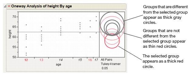
Using Comparison Circles
Each multiple comparison test begins with a comparison circles plot, which is a visual representation of group mean comparisons. Figure 6.10 shows the comparison circles for the All Pairs, Tukey HSD method. Other comparison tests lengthen or shorten the radii of the circles.
Figure 6.10 Visual Comparison of Group Means
Compare each pair of group means visually by examining the intersection of the comparison circles. The outside angle of intersection tells you whether the group means are significantly different. See Figure 6.11.
• Circles for means that are significantly different either do not intersect, or intersect slightly, so that the outside angle of intersection is less than 90 degrees.
• If the circles intersect by an angle of more than 90 degrees, or if they are nested, the means are not significantly different.
Figure 6.11 Angles of Intersection and Significance
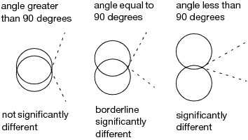
If the intersection angle is close to 90 degrees, you can verify whether the means are significantly different by clicking on the comparison circle to select it. See Figure 6.12. To deselect circles, click in the white space outside the circles.
Figure 6.12 Highlighting Comparison Circles
Each Pair, Student’s t
The Each Pair, Student’s t test shows the Student’s t-test for each pair of group levels and tests only individual comparisons.
All Pairs, Tukey HSD
The All Pairs, Tukey HSD test (also called Tukey-Kramer) protects the significance tests of all combinations of pairs, and the HSD intervals become greater than the Student’s t pairwise LSDs. Graphically, the comparison circles become larger and differences are less significant.
The q statistic is calculated as follows: q* = (1/sqrt(2)) * q where q is the required percentile of the studentized range distribution. For more details, see the description of the T statistic by Neter, Wasserman, and Kutner (1990).
With Best, Hsu MCB
The With Best, Hsu MCB test determines whether the mean for a given level exceeds the maximum mean of the remaining levels, or is smaller than the minimum mean of the remaining levels. See Hsu, 1996.
The quantiles for the Hsu MCB test vary by the level of the categorical variable. Unless the sample sizes are equal across levels, the comparison circle technique is not exact. The radius of a comparison circle is given by the standard error of the level multiplied by the largest quantile value. Use the p-values of the tests to obtain precise assessments of significant differences. See “Comparison with Max and Min”.
Note: Means that are not regarded as the maximum or the minimum by MCB are also the means that are not contained in the selected subset of Gupta (1965) of potential maximums or minimum means.
Confidence Quantile
This report gives the quantiles for each level of the categorical variable. These correspond to the specified value of Alpha.
Comparison with Max and Min
The report shows p-values for one-sided Dunnett tests. For each level other than the best, the p-value given is for a test that compares the mean of the sample best level to the mean of each remaining level treated as a control (potentially best) level. The p-value for the sample best level is obtained by comparing the mean of the second sample best level to the mean of the sample best level treated as a control.
The report shows three columns.
Level
The level of the categorical variable.
with Max p-Value
For each level of the categorical variable, this column gives a p-value for a test that the mean of that level exceeds the maximum mean of the remaining levels. Use the tests in this column to screen out levels whose means are significantly smaller than the (unknown) largest true mean.
with Min p-Value
For each level of the categorical variable, this column gives a p-value for a test that the mean of that level is smaller than the minimum mean of the remaining levels. Use the tests in this column to screen out levels whose means are significantly greater than the (unknown) smallest true mean.
LSD Threshold Matrix
The first report shown is for the maximum and the second is for the minimum.
For the maximum report, a column shows the row mean minus the column mean minus the LSD. If a value is positive, the row mean is significantly higher than the mean for the column, and the mean for the column is not the maximum.
For the minimum report, a column shows the row mean minus the column mean plus the LSD. If a value is negative, the row mean is significantly less than the mean for the column, and the mean for the column is not the minimum.
With Control, Dunnett’s
The With Control, Dunnett’s test compares a set of means against the mean of a control group. The LSDs that it produces are between the Student’s t and Tukey-Kramer LSDs, because they are sized to refrain from an intermediate number of comparisons.
In the Dunnett’s report, the  quantile appears, and can be used in a manner similar to a Student’s t-statistic. The LSD threshold matrix shows the absolute value of the difference minus the LSD. If a value is positive, its mean is more than the LSD apart from the control group mean and is therefore significantly different.
Compare Means Options
The Means Comparisons reports for all four tests contain a red triangle menu with customization options.
Difference Matrix
Shows a table of all differences of means.
Confidence Quantile
Shows the t-value or other corresponding quantiles used for confidence intervals.
LSD Threshold Matrix
Shows a matrix showing if a difference exceeds the least significant difference for all comparisons.
Connecting Letters Report
Shows the traditional letter-coded report where means that are not sharing a letter are significantly different.
Note: Not available for With Best, Hsu MCB and With Control, Dunnett’s.
Ordered Differences Report
Shows all the positive-side differences with their confidence interconfidence interval band overlaid on the plot. Confidence intervals that do not fully contain their corresponding bar are significantly different from each other.
Note: Not available for With Best, Hsu MCB and With Control, Dunnett’s.
Detailed Comparisons Report
Shows a detailed report for each comparison. Each section shows the difference between the levels, standard error and confidence intervals, t-ratios, p-values, and degrees of freedom. A plot illustrating the comparison appears on the right of each report.
Note: Not available for All Pairs, Tukey HSD, With Best, Hsu MCB, and With Control, Dunnett’s.
Nonparametric Tests
Nonparametric tests are useful when the usual analysis of variance assumption of normality is not viable. The Nonparametric option provides several methods for testing the hypothesis of equal means or medians across groups. Nonparametric multiple comparison procedures are also available to control the overall error rate for pairwise comparisons. Nonparametric tests use functions of the response ranks, called rank scores. See Hajek (1969) and SAS Institute (2008).
Note: If you specify a Block column, the nonparametric tests are conducted on data values that are centered using the block means.
Wilcoxon Test
Performs a test based on Wilcoxon rank scores. The Wilcoxon rank scores are the simple ranks of the data. The Wilcoxon test is the most powerful rank test for errors with logistic distributions. If the factor has more than two levels, the Kruskal-Wallis test is performed. For information about the report, see “The Wilcoxon, Median, and Van der Waerden Test Reports”. For an example, see “Example of the Nonparametric Wilcoxon Test”.
The Wilcoxon test is also called the Mann-Whitney test.
Median Test
Performs a test based on Median rank scores. The Median rank scores are either 1 or 0, depending on whether a rank is above or below the median rank. The Median test is the most powerful rank test for errors with double-exponential distributions. For information about the report, see “The Wilcoxon, Median, and Van der Waerden Test Reports”.
van der Waerden Test
Performs a test based on Van der Waerden rank scores. The Van der Waerden rank scores are the ranks of the data divided by one plus the number of observations transformed to a normal score by applying the inverse of the normal distribution function. The Van der Waerden test is the most powerful rank test for errors with normal distributions. For information about the report, see “The Wilcoxon, Median, and Van der Waerden Test Reports”.
Kolmogorov Smirnov Test
Performs a test based on the empirical distribution function, which tests whether the distribution of the response is the same across the groups. Both an approximate and an exact test are given. This test is available only when the X factor has two levels. For information about the report, see “Kolmogorov-Smirnov Two-Sample Test Report”.
Provides options for performing exact versions of the Wilcoxon, Median, van der Waerden, and Kolmogorov-Smirnov tests. These options are available only when the X factor has two levels. Results for both the approximate and the exact test are given.
For information about the report, see “ 2-Sample, Exact Test”. For an example involving the Wilcoxon Exact Test, see “Example of the Nonparametric Wilcoxon Test”.
The Wilcoxon, Median, and Van der Waerden Test Reports
For each test, the report shows the descriptive statistics followed by the test results. Test results appear in the 1-Way Test, ChiSquare Approximation report and, if the X variable has exactly two levels, a 2-Sample Test, Normal Approximation report also appears. The descriptive statistics are the following:
Level
The levels of X.
Count
The frequencies of each level.
Score Sum
The sum of the rank score for each level.
Expected Score
The expected score under the null hypothesis that there is no difference among class levels.
Score Mean
The mean rank score for each level.
(Mean-Mean0)/Std0
The standardized score. Mean0 is the mean score expected under the null hypothesis. Std0 is the standard deviation of the score sum expected under the null hypothesis. The null hypothesis is that the group means or medians are in the same location across groups.
2-Sample Test, Normal Approximation
When you have exactly two levels of X, a 2-Sample Test, Normal Approximation report appears. This report gives the following:
S
Gives the sum of the rank scores for the level with the smaller number of observations.
Z
Gives the test statistic for the normal approximation test. For details, see “Two-Sample Normal Approximations”.
Prob>|Z|
Gives the p-value, based on a standard normal distribution, for the normal approximation test.
1-Way Test, ChiSquare Approximation
This report gives results for a chi-square test for location. For details, see Conover (1999).
ChiSquare
Gives the values of the chi-square test statistic. For details, see “One-Way ChiSquare Approximations”.
DF
Gives the degrees of freedom for the test.
Prob>ChiSq
Gives the p-value for the test. The p-value is based on a ChiSquare distribution with degrees of freedom equal to the number of levels of X minus 1.
If your data are sparse, skewed, or heavily tied, exact tests might be more suitable than approximations based on asymptotic behavior. When you have exactly two levels of X, JMP computes test statistics for exact tests. Select Nonparametric > Exact Test and select the test of your choice. A 2-Sample: Exact Test report appears. This report gives the following:
S
Gives the sum of the rank scores for the observations in the smaller group. If the two levels of X have the same numbers of observations, then the value of S corresponds to the last level of X in the value ordering.
Prob£ S
Gives a one-sided p-value for the test.
Prob ≥ |S-Mean|
Gives a two-sided p-value for the test.
Kolmogorov-Smirnov Two-Sample Test Report
The Kolmogorov-Smirnov test is available only when X has exactly two levels. The report shows descriptive statistics followed by test results. The descriptive statistics are the following:
Level
The two levels of X.
Count
The frequencies of each level.
EDF at Maximum
For a level of X, gives the value of the empirical cumulative distribution function (EDF) for that level at the value of X for which the difference between the two EDFs is a maximum. For the row named Total, gives the value of the pooled EDF (the EDF for the entire data set) at the value of X for which the difference between the two EDFs is a maximum.
Deviation from Mean at Maximum
For each level, gives the value obtained as follows:
‒ Compute the difference between the EDF at Maximum for the given level and the EDF at maximum for the pooled data set (Total).
‒ Multiply this difference by the square root of the number of observations in that level, given as Count.
Kolmogorov-Smirnov Asymptotic Test
This report gives the details for the test.
KS
A Kolmogorov-Smirnov statistic computed as follows:
The formula uses the following notation:
‒ xj, j = 1, ..., n are the observations
‒ ni is the number of observations in the ith level of X
‒ F is the pooled cumulative empirical distribution function
‒ Fi is the cumulative empirical distribution function for the ith level of X
This version of the Kolmogorov-Smirnov statistic applies even when there are more than two levels of X. Note, however, that JMP only performs the Kolmogorov-Smirnov analysis when X has only two levels of X.
KSa
An asymptotic Kolmogorov-Smirnov statistic computed as  , where n is the total number of observations.
D=max|F1-F2|
The maximum absolute deviation between the EDFs for the two levels. This is the version of the Kolmogorov-Smirnov statistic typically used to compare two samples.
Prob > D
The p-value for the test. This is the probability that D exceeds the computed value under the null hypothesis of no difference between the levels.
D+ = max(F1-F2)
A one-sided test statistic for the alternative hypothesis that the level of the first group exceeds the level of the second group.
Prob > D+
The p-value for the test of D+.
D- = max(F2-F1)
A one-sided test statistic for the alternative hypothesis that the level of the second group exceeds the level of the first group
Prob > D-
The p-value for the test of D-.
For the Kolmogorov-Smirnov exact test, the report gives the same statistics as does the asymptotic test, but the p-values are computed to be exact.
Nonparametric Multiple Comparisons
This option provides several methods for performing nonparametric multiple comparisons. These tests are based on ranks and, except for the Wilcoxon Each Pair test, control for the overall experimentwise error rate. For details about these tests, see See Dunn (1964) and Hsu (1996). For information about the reports, see “Nonparametric Multiple Comparisons Procedures”.
For the Wilcoxon, Median, and Van der Waerden tests, if the X factor has more than two levels, a chi-square approximation to the one-way test is performed. If the X factor has two levels, a normal approximation to the two-sample test is performed, in addition to the chi-square approximation to the one-way test.
Tip: While Friedman’s test for nonparametric repeated measures ANOVA is not directly supported in JMP, it can be performed as follows: Calculate the ranks within each block. Define this new column to have an ordinal modeling type. Enter the ranks as Y in the Fit Y by X platform. Enter one of the effects as a blocking variable. Obtain Cochran-Mantel-Haenszel statistics.
Nonparametric Multiple Comparisons Procedures
Wilcoxon Each Pair
Performs the Wilcoxon test on each pair. This procedure does not control for the overall alpha level. This is the nonparametric version of the Each Pair, Student’s t option found on the Compare Means menu. See “Wilcoxon Each Pair, Steel-Dwass All Pairs, and Steel with Control”.
Steel-Dwass All Pairs
Performs the Steel-Dwass test on each pair. This is the nonparametric version of the All Pairs, Tukey HSD option found on the Compare Means menu. See “Wilcoxon Each Pair, Steel-Dwass All Pairs, and Steel with Control”.
Steel With Control
Compares each level to a control level. This is the nonparametric version of the With Control, Dunnett’s option found on the Compare Means menu. See “Wilcoxon Each Pair, Steel-Dwass All Pairs, and Steel with Control”.
Dunn With Control for Joint Ranks
Compares each level to a control level, similar to the Steel With Control option. The Dunn method computes ranks for all the data, not just the pair being compared. The reported p-Value reflects a Bonferroni adjustment. It is the unadjusted p-value multiplied by the number of comparisons. If the adjusted p-value exceeds 1, it is reported as 1. See “Dunn All Pairs for Joint Ranks and Dunn with Control for Joint Ranks”.
Dunn All Pairs for Joint Ranks
Performs a comparison of each pair, similar to the Steel-Dwass All Pairs option. The Dunn method computes ranks for all the data, not just the pair being compared. The reported p-value reflects a Bonferroni adjustment. It is the unadjusted p-value multiplied by the number of comparisons. If the adjusted p-value exceeds 1, it is reported as 1. See “Dunn All Pairs for Joint Ranks and Dunn with Control for Joint Ranks”.
Wilcoxon Each Pair, Steel-Dwass All Pairs, and Steel with Control
The reports for these multiple comparison procedures give test results and confidence intervals. For these tests, observations are ranked within the sample obtained by combining only the two levels used in a given comparison.
q*
The quantile used in computing the confidence intervals.
Alpha
The alpha level used in computing the confidence interval. You can change the confidence level by selecting the Set α Level option from the Oneway menu.
Level
The first level of the X variable used in the pairwise comparison.
- Level
The second level of the X variable used in the pairwise comparison.
Score Mean Difference
The mean of the rank score of the observations in the first level (Level) minus the mean of the rank scores of the observations in the second level (-Level), where a continuity correction is applied.
Denote the number of observations in the first level by n1 and the number in the second level by n2. The observations are ranked within the sample consisting of these two levels. Tied ranks are averaged. Denote the sum of the ranks for the first level by ScoreSum1 and for the second level by ScoreSum2.
If the difference in mean scores is positive, then the Score Mean Difference is given as follows:
Score Mean Difference = (ScoreSum1 - 0.5)/n1 - (ScoreSum2 + 0.5)/n2
If the difference in mean scores is negative, then the Score Mean Difference is given as follows:
Score Mean Difference = (ScoreSum1 + 0.5)/n1 - (ScoreSum2 -0.5)/n2
Std Error Dif
The standard error of the Score Mean Difference.
Z
The standardized test statistic, which has an asymptotic standard normal distribution under the null hypothesis of no difference in means.
p-Value
The p-value for the asymptotic test based on Z.
Hodges-Lehmann
The Hodges-Lehmann estimator of the location shift. All paired differences consisting of observations in the first level minus observations in the second level are constructed. The Hodges-Lehmann estimator is the median of these differences. The bar graph to the right of Upper CL shows the size of the Hodges-Lehmann estimate.
Lower CL
The lower confidence limit for the Hodges-Lehmann statistic.
Note: Not computed if group sample sizes are large enough to cause memory issues.
Upper CL
The upper confidence limit for the Hodges-Lehmann statistic.
Note: Not computed if group sample sizes are large enough to cause memory issues.
~Difference
A bar graph showing the size of the Hodges-Lehmann estimate for each comparison.
Dunn All Pairs for Joint Ranks and Dunn with Control for Joint Ranks
These comp are based on the rank of an observation in the entire data set. For the Dunn with Control for Joint Ranks tests, you must select a control level.
Level
The first level of the X variable used in the pairwise comparison.
- Level
he second level of the X variable used in the pairwise comparison.
Score Mean Difference
The mean of the rank score of the observations in the first level (Level) minus the mean of the rank scores of the observations in the second level (-Level), where a continuity correction is applied. The ranks are obtained by ranking the observations within the entire sample. Tied ranks are averaged. The continuity correction is described in “Score Mean Difference”.
Std Error Dif
The standard error of the Score Mean Difference.
Z
The standardized test statistic, which has an asymptotic standard normal distribution under the null hypothesis of no difference in means.
p-Value
The p-value for the asymptotic test based on Z.
Unequal Variances
When the variances across groups are not equal, the usual analysis of variance assumptions are not satisfied and the ANOVA F test is not valid. JMP provides four tests for equality of group variances and an ANOVA that is valid when the group sample variances are unequal. The concept behind the first three tests of equal variances is to perform an analysis of variance on a new response variable constructed to measure the spread in each group. The fourth test is Bartlett’s test, which is similar to the likelihood ratio test under normal distributions.
Note: Another method to test for unequal variances is ANOMV. See “Analysis of Means Methods”.
The following Tests for Equal Variances are available:
O’Brien
Constructs a dependent variable so that the group means of the new variable equal the group sample variances of the original response. An ANOVA on the O’Brien variable is actually an ANOVA on the group sample variances (O’Brien 1979, Olejnik, and Algina 1987).
Brown-Forsythe
Shows the F test from an ANOVA where the response is the absolute value of the difference of each observation and the group median (Brown and Forsythe 1974).
Levene
Shows the F test from an ANOVA where the response is the absolute value of the difference of each observation and the group mean (Levene 1960). The spread is measured as  (as opposed to the SAS default
  ).
).
Bartlett
Compares the weighted arithmetic average of the sample variances to the weighted geometric average of the sample variances. The geometric average is always less than or equal to the arithmetic average with equality holding only when all sample variances are equal. The more variation there is among the group variances, the more these two averages differ. A function of these two averages is created, which approximates a χ2-distribution (or, in fact, an F distribution under a certain formulation). Large values correspond to large values of the arithmetic or geometric ratio, and therefore to widely varying group variances. Dividing the Bartlett Chi-square test statistic by the degrees of freedom gives the F value shown in the table. Bartlett’s test is not very robust to violations of the normality assumption (Bartlett and Kendall 1946).
If there are only two groups tested, then a standard F test for unequal variances is also performed. The F test is the ratio of the larger to the smaller variance estimate. The p-value from the F distribution is doubled to make it a two-sided test.
Note: If you have specified a Block column, then the variance tests are performed on data after it has been adjusted for the Block means.
Tests That the Variances Are Equal Report
The Tests That the Variances Are Equal report shows the differences between group means to the grand mean and to the median, and gives a summary of testing procedures.
If the equal variances test reveals that the group variances are significantly different, use Welch’s test instead of the regular ANOVA test. The Welch statistic is based on the usual ANOVA F test. However, the means are weighted by the reciprocal of the group mean variances (Welch 1951; Brown and Forsythe 1974b; Asiribo, Osebekwin, and Gurland 1990). If there are only two levels, the Welch ANOVA is equivalent to an unequal variance t-test.
Description of the Variances Are Equal Report
Level
Lists the factor levels occurring in the data.
Count
Records the frequencies of each level.
Std Dev
Records the standard deviations of the response for each factor level. The standard deviations are equal to the means of the O’Brien variable. If a level occurs only once in the data, no standard deviation is calculated.
MeanAbsDif to Mean
Records the mean absolute difference of the response and group mean. The mean absolute differences are equal to the group means of the Levene variable.
MeanAbsDif to Median
Records the absolute difference of the response and group median. The mean absolute differences are equal to the group means of the Brown-Forsythe variable.
Test
Lists the names of the tests performed.
F Ratio
Records a calculated F statistic for each test. See “Tests That the Variances Are Equal Report”.
DFNum
Records the degrees of freedom in the numerator for each test. If a factor has k levels, the numerator has k - 1 degrees of freedom. Levels occurring only once in the data are not used in calculating test statistics for O’Brien, Brown-Forsythe, or Levene. The numerator degrees of freedom in this situation is the number of levels used in calculations minus one.
DFDen
Records the degrees of freedom used in the denominator for each test. For O’Brien, Brown-Forsythe, and Levene, a degree of freedom is subtracted for each factor level used in calculating the test statistic. If a factor has k levels, the denominator degrees of freedom is n - k.
p-Value
Probability of obtaining, by chance alone, an F value larger than the one calculated if in reality the variances are equal across all levels.
Description of the Welch’s Test Report
F Ratio
Shows the F test statistic for the equal variance test. See “Tests That the Variances Are Equal Report”.
DFNum
Records the degrees of freedom in the numerator of the test. If a factor has k levels, the numerator has k - 1 degrees of freedom. Levels occurring only once in the data are not used in calculating the Welch ANOVA. The numerator degrees of freedom in this situation is the number of levels used in calculations minus one.
DFDen
Records the degrees of freedom in the denominator of the test. See “Tests That the Variances Are Equal Report”.
Prob>F
Probability of obtaining, by chance alone, an F value larger than the one calculated if in reality the means are equal across all levels. Observed significance probabilities of 0.05 or less are considered evidence of unequal means across the levels.
t Test
Shows the relationship between the F ratio and the t Test. Calculated as the square root of the F ratio. Appears only if the X factor has two levels.
Equivalence Test
Equivalence tests assess whether there is a practical difference in means. You must pick a threshold difference for which smaller differences are considered practically equivalent. The most straightforward test to construct uses two one-sided t-tests from both sides of the difference interval. If both tests reject (or conclude that the difference in the means differs significantly from the threshold), then the groups are practically equivalent. The Equivalence Test option uses the Two One-Sided Tests (TOST) approach.
Robust
Outliers can lead to incorrect estimates and decisions. The Robust option provides two methods to reduce the influence of outliers in your data set: Robust Fit and Cauchy Fit.
Robust Fit
The Robust Fit option reduces the influence of outliers in the response variable. The Huber M-estimation method is used. Huber M-estimation finds parameter estimates that minimize the Huber loss function, which penalizes outliers. The Huber loss function increases as a quadratic for small errors and linearly for large errors. For more details about robust fitting, see Huber (1973) and Huber and Ronchetti (2009).
Cauchy Fit
The Cauchy fit option assumes that the errors have a Cauchy distribution. A Cauchy distribution has fatter tails than the normal distribution, resulting in a reduced emphasis on outliers. This option can be useful if you have a large proportion of outliers in your data. However, if your data are close to normal with only a few outliers, this option can lead to incorrect inferences. The Cauchy option estimates parameters using maximum likelihood and a Cauchy link function.
Power
The Power option calculates statistical power and other details about a given hypothesis test.
• LSV (the Least Significant Value) is the value of some parameter or function of parameters that would produce a certain p-value alpha. Said another way, you want to know how small an effect would be declared significant at some p-value alpha. The LSV provides a measuring stick for significance on the scale of the parameter, rather than on a probability scale. It shows how sensitive the design and data are.
• LSN (the Least Significant Number) is the total number of observations that would produce a specified p-value alpha given that the data has the same form. The LSN is defined as the number of observations needed to reduce the variance of the estimates enough to achieve a significant result with the given values of alpha, sigma, and delta (the significance level, the standard deviation of the error, and the effect size). If you need more data to achieve significance, the LSN helps tell you how many more. The LSN is the total number of observations that yields approximately 50% power.
• Power is the probability of getting significance (p-value < alpha) when a real difference exists between groups. It is a function of the sample size, the effect size, the standard deviation of the error, and the significance level. The power tells you how likely your experiment is to detect a difference (effect size), at a given alpha level.
Note: When there are only two groups in a one-way layout, the LSV computed by the power facility is the same as the least significant difference (LSD) shown in the multiple-comparison tables.
Power Details Window and Reports
The Power Details window and reports are the same as those in the general fitting platform launched by the Fit Model platform. For more details about power calculation, see the Statistical Details appendix in the Fitting Linear Models book.
For each of four columns Alpha, Sigma, Delta, and Number, fill in a single value, two values, or the start, stop, and increment for a sequence of values. See Figure 6.31. Power calculations are performed on all possible combinations of the values that you specify.
Alpha (α)
Significance level, between 0 and 1 (usually 0.05, 0.01, or 0.10). Initially, a value of 0.05 shows.
Sigma (σ)
Standard error of the residual error in the model. Initially, RMSE, the estimate from the square root of the mean square error is supplied here.
Delta (δ)
Raw effect size. For details about effect size computations, see the Standard Least Squares chapter in the Fitting Linear Models book. The first position is initially set to the square root of the sums of squares for the hypothesis divided by n; that is,  .
.
Number (n)
Total sample size across all groups. Initially, the actual sample size is put in the first position.
Solve for Power
Solves for the power (the probability of a significant result) as a function of all four values: α, σ, δ, and n.
Solve for Least Significant Number
Solves for the number of observations needed to achieve approximately 50% power given α, σ, and δ.
Solve for Least Significant Value
Solves for the value of the parameter or linear test that produces a p-value of α. This is a function of α, σ, n, and the standard error of the estimate. This feature is available only when the X factor has two levels and is usually used for individual parameters.
Adjusted Power and Confidence Interval
When you look at power retrospectively, you use estimates of the standard error and the test parameters.
‒ Adjusted power is the power calculated from a more unbiased estimate of the non-centrality parameter.
‒ The confidence interval for the adjusted power is based on the confidence interval for the non-centrality estimate.
Adjusted power and confidence limits are computed only for the original Delta, because that is where the random variation is.
• “Power”
Normal Quantile Plot
You can create two types of normal quantile plots:
• Plot Actual by Quantile creates a plot of the response values versus the normal quantile values. The quantiles are computed and plotted separately for each level of the X variable.
• Plot Quantile by Actual creates a plot of the normal quantile values versus the response values. The quantiles are computed and plotted separately for each level of the X variable.
The Line of Fit option shows or hides the lines of fit on the quantile plots.
CDF Plot
A CDF plot shows the cumulative distribution function for all of the groups in the Oneway report. CDF plots are useful if you want to compare the distributions of the response across levels of the X factor.
Densities
The Densities options provide several ways to compare the distribution and composition of the response across the levels of the X factor. There are three density options:
• Compare Densities shows a smooth curve estimating the density of each group. The smooth curve is the density estimate for each group.
• Composition of Densities shows the summed densities, weighted by each group’s counts. At each X value, the Composition of Densities plot shows how each group contributes to the total.
• Proportion of Densities shows the contribution of the group as a proportion of the total at each X level.
Matching Column
Use the Matching Column option to specify a matching (ID) variable for a matching model analysis. The Matching Column option addresses the case when the data in a one-way analysis come from matched (paired) data, such as when observations in different groups come from the same subject.
Note: A special case of matching leads to the paired t-test. The Matched Pairs platform handles this type of data, but the data must be organized with the pairs in different columns, not in different rows.
The Matching Column option performs two primary actions:
• It fits an additive model (using an iterative proportional fitting algorithm) that includes both the grouping variable (the X variable in the Fit Y by X analysis) and the matching variable that you select. The iterative proportional fitting algorithm makes a difference if there are hundreds of subjects, because the equivalent linear model would be very slow and would require huge memory resources.
• It draws lines between the points that match across the groups. If there are multiple observations with the same matching ID value, lines are drawn from the mean of the group of observations.
The Matching Column option automatically activates the Matching Lines option connecting the matching points. To turn the lines off, select Display Options > Matching Lines.
The Matching Fit report shows the effects with F tests. These are equivalent to the tests that you get with the Fit Model platform if you run two models, one with the interaction term and one without. If there are only two levels, then the F test is equivalent to the paired t-test.
Note: For details about the Fit Model platform, see the Model Specification chapter in the Fitting Linear Models book.
Additional Examples of the Oneway Platform
This section contains additional examples of selected options and reports in the Oneway platform.
Example of an Analysis of Means Chart
1. Select Help > Sample Data Library and open Analgesics.jmp.
2. Select Analyze > Fit Y by X.
3. Select pain and click Y, Response.
4. Select drug and click X, Factor.
5. Click OK.
6. From the red triangle menu, select Analysis of Means Methods > ANOM.
Figure 6.13 Example of Analysis of Means Chart
For the example in Figure 6.13, the means for drug A and C are statistically different from the overall mean. The drug A mean is lower and the drug C mean is higher. Note the decision limits for the drug types are not the same, due to different sample sizes.
Example of an Analysis of Means for Variances Chart
This example uses the Spring Data.jmp sample data table. Four different brands of springs were tested to see what weight is required to extend a spring 0.10 inches. Six springs of each brand were tested. The data was checked for normality, since the ANOMV test is not robust to non-normality. Examine the brands to determine whether the variability is significantly different between brands.
1. Select Help > Sample Data Library and open Spring Data.jmp.
2. Select Analyze > Fit Y by X.
3. Select Weight and click Y, Response.
4. Select Brand and click X, Factor.
5. Click OK.
6. From the red triangle menu, select Analysis of Means Methods > ANOM for Variances.
7. From the red triangle menu next to Analysis of Means for Variances, select Show Summary Report.
Figure 6.14 Example of Analysis of Means for Variances Chart
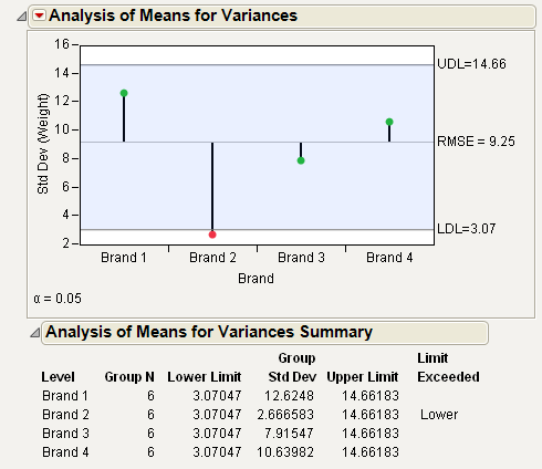
From Figure 6.14, notice that the standard deviation for Brand 2 exceeds the lower decision limit. Therefore, Brand 2 has significantly lower variance than the other brands.
Example of the Each Pair, Student’s t Test
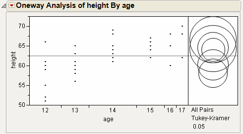
This example uses the Big Class.jmp sample data table. It shows a one-way layout of weight by age, and shows the group comparison using comparison circles that illustrate all possible t-tests.
1. Select Help > Sample Data Library and open Big Class.jmp.
2. Select Analyze > Fit Y by X.
3. Select weight and click Y, Response.
4. Select age and click X, Factor.
5. Click OK.
6. From the red triangle menu, select Compare Means > Each Pair, Student’s t.
Figure 6.15 Example of Each Pair, Student’s t Comparison Circles
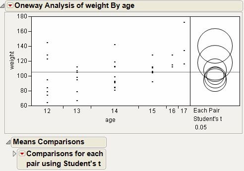
The means comparison method can be thought of as seeing if the actual difference in the means is greater than the difference that would be significant. This difference is called the LSD (least significant difference). The LSD term is used for Student’s t intervals and in context with intervals for other tests. In the comparison circles graph, the distance between the circles’ centers represent the actual difference. The LSD is what the distance would be if the circles intersected at right angles.
Figure 6.16 Example of Means Comparisons Report for Each Pair, Student’s t
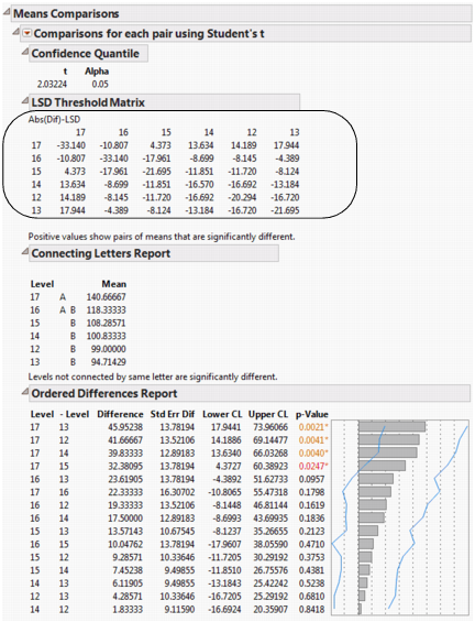
In Figure 6.16, the LSD threshold table shows the difference between the absolute difference in the means and the LSD (least significant difference). If the values are positive, the difference in the two means is larger than the LSD, and the two groups are significantly different.
Example of the All Pairs, Tukey HSD Test
1. Select Help > Sample Data Library and open Big Class.jmp.
2. Select Analyze > Fit Y by X.
3. Select weight and click Y, Response.
4. Select age and click X, Factor.
5. Click OK.
6. From the red triangle menu, select Compare Means > All Pairs, Tukey HSD.
Figure 6.17 Example of All Pairs, Tukey HSD Comparison Circles
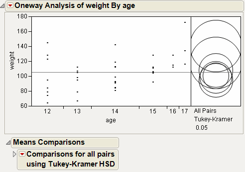
Figure 6.18 Example of Means Comparisons Report for All Pairs, Tukey HSD
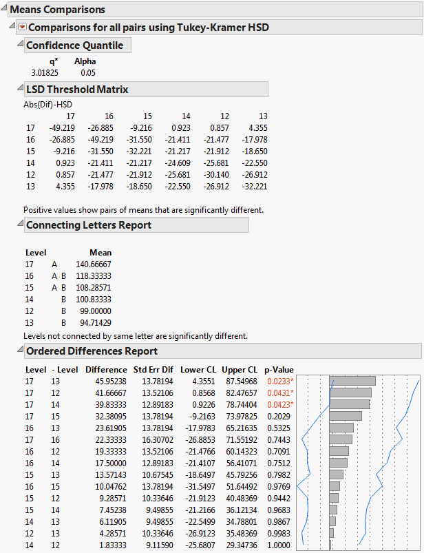
In Figure 6.18, the Tukey-Kramer HSD Threshold matrix shows the actual absolute difference in the means minus the HSD, which is the difference that would be significant. Pairs with a positive value are significantly different. The q* (appearing above the HSD Threshold Matrix table) is the quantile that is used to scale the HSDs. It has a computational role comparable to a Student’s t.
Example of the With Best, Hsu MCB Test
1. Select Help > Sample Data Library and open Big Class.jmp.
2. Select Analyze > Fit Y by X.
3. Select weight and click Y, Response.
4. Select age and click X, Factor.
5. Click OK.
6. From the red triangle menu, select Compare Means > With Best, Hsu MCB.
Figure 6.19 Examples of With Best, Hsu MCB Comparison Circles
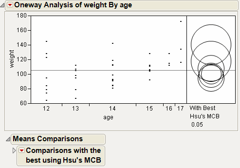
Figure 6.20 Example of Means Comparisons Report for With Best, Hsu MCB
The Comparison with Max and Min report compares the mean of each level to the maximum and the minimum of the means of the remaining levels. For example, the mean for age 15 differs significantly from the maximum of the means of the remaining levels. The mean for age 17 differs significantly from the minimum of the means of the remaining levels. The maximum mean could occur for age 16 or age 17, because neither mean differs significantly from the maximum mean. By the same reasoning, the minimum mean could correspond to any of the ages other than age 17.
Example of the With Control, Dunnett’s Test
1. Select Help > Sample Data Library and open Big Class.jmp.
2. Select Analyze > Fit Y by X.
3. Select weight and click Y, Response.
4. Select age and click X, Factor.
5. Click OK.
6. From the red triangle menu, select Compare Means > With Control, Dunnett’s.
7. Select the group to use as the control group. In this example, select age 12.
Alternatively, click on a row to highlight it in the scatterplot before selecting the Compare Means > With Control, Dunnett’s option. The test uses the selected row as the control group.
8. Click OK.
Figure 6.21 Example of With Control, Dunnett’s Comparison Circles
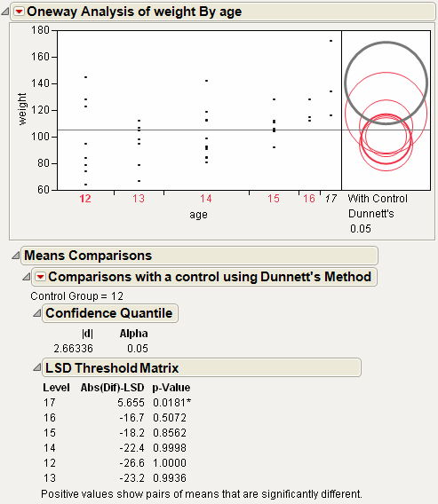
Using the comparison circles in Figure 6.21, you can conclude that level 17 is the only level that is significantly different from the control level of 12.
Example Contrasting All of the Compare Means Tests
1. Select Help > Sample Data Library and open Big Class.jmp.
2. Select Analyze > Fit Y by X.
3. Select weight and click Y, Response.
4. Select age and click X, Factor.
5. Click OK.
6. From the red triangle menu, select each one of the Compare Means options.
Although the four methods all test differences between group means, different results can occur. Figure 6.22 shows the comparison circles for all four tests, with the age 17 group as the control group.
Figure 6.22 Comparison Circles for Four Multiple Comparison Tests
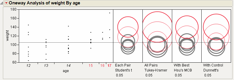
From Figure 6.22, notice that for the Student’s t and Hsu methods, age group 15 (the third circle from the top) is significantly different from the control group and appears gray. But, for the Tukey and Dunnett method, age group 15 is not significantly different, and appears red.
Example of the Nonparametric Wilcoxon Test
Suppose you want to test whether the mean profit earned by companies differs by type of company. In Companies.jmp, the data consist of various metrics on two types of companies, Pharmaceutical (12 companies) and Computer (20 companies).
1. Select Help > Sample Data Library and open Companies.jmp.
2. Select Analyze > Fit Y by X.
3. Select Profits ($M) and click Y, Response.
4. Select Type and click X, Factor.
5. Click OK.
6. From the red triangle menu, select Display Options > Box Plots.
Figure 6.23 Computer Company Profit Distribution
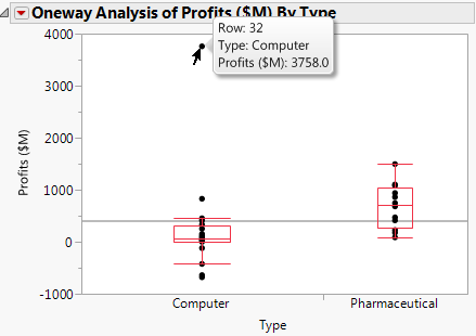
The box plots suggest that the distributions are not normal or even symmetric. There is a very large value for the company in row 32 that might affect parametric tests.
7. From the red triangle menu, select Means/ANOVA/Pooled t.
Figure 6.24 Company Analysis of Variance
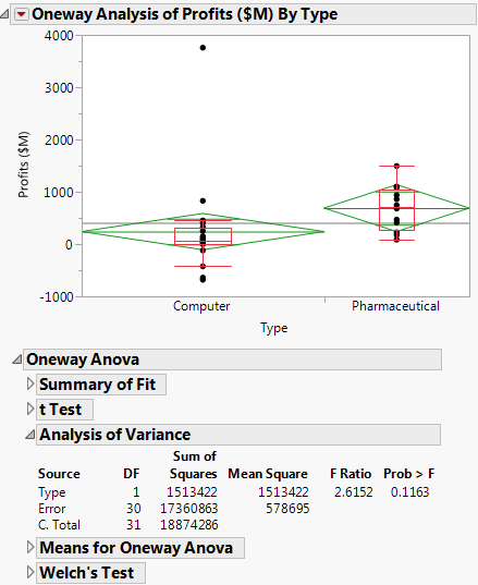
The F test shows no significance because the p-value is large (p = 0.1163). This might be due to the large value in row 32 and the possible violation of the normality assumption.
8. From the red triangle menu, select t Test.
Figure 6.25 t-Test Results
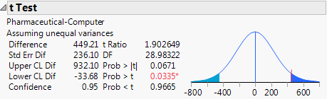
The Prob > |t| for a two-sided test is 0.0671. The t Test does not assume equal variances, but the unequal variances t-test is also a parametric test.
9. From the red triangle menu, select Nonparametric > Wilcoxon Test.
Figure 6.26 Wilcoxon Test Results
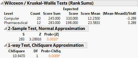
The Wilcoxon test is a nonparametric test. It is based on ranks and so is resistant to outliers. Also, it does not require normality.
Both the normal and the chi-square approximations for the Wilcoxon test statistic indicate significance at a p-value of 0.0010. You conclude that there is a significant difference in the location of the distributions, and conclude that mean profit differs based on company type.
The normal and chi-square tests are based on the asymptotic distributions of the test statistics. If you have JMP Pro, you can conduct an exact test.
10.  From the red triangle menu, select Nonparametric > Exact Test > Wilcoxon Exact Test.
Figure 6.27 Wilcoxon Exact Test Results
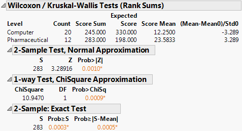
The observed value of the test statistic is S = 283. This is the sum of the midranks for the level of Type with the smaller sample size (pharmaceuticals). The probability of observing an absolute difference from the mean midrank that exceeds the absolute value of S minus the mean of the midranks is 0.0005. This is a two-sided test for a difference in location and supports rejecting the hypothesis that profits do not differ by type of company.
In this example, the nonparametric tests are more appropriate than the normality-based ANOVA test and the unequal variances t-test. The nonparametric tests are resistant to the large value in row 32 and do not require the underlying normality of Profits ($M) for each group.
Example of the Unequal Variances Option
Suppose you want to test whether two variances (males and females) are equal, instead of two means.
1. Select Help > Sample Data Library and open Big Class.jmp.
2. Select Analyze > Fit Y by X.
3. Select height and click Y, Response.
4. Select sex and click X, Factor.
5. Click OK.
6. From the red triangle menu, select Unequal Variances.
Figure 6.28 Example of the Unequal Variances Report
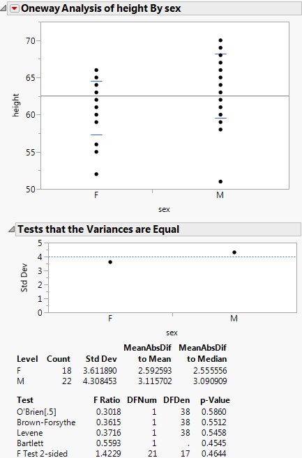
Since the p-value from the 2-sided F-Test is large, you cannot conclude that the variances are unequal.
Example of an Equivalence Test
This example uses the Big Class.jmp sample data table. Examine if the difference in height between males and females is less than 6 inches.
1. Select Help > Sample Data Library and open Big Class.jmp.
2. Select Analyze > Fit Y by X.
3. Select height and click Y, Response.
4. Select sex and click X, Factor.
5. Click OK.
6. From the red triangle menu, select Equivalence Test.
7. Type 6 as the difference considered practically zero.
8. Click OK.
Figure 6.29 Example of an Equivalence Test
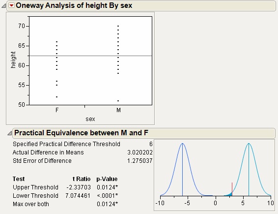
From Figure 6.29, notice the following:
• The test at the Upper Threshold is the lower one-tailed test for the null hypothesis that the mean difference is 6.
• The test at the Lower Threshold is the upper one-tailed test for the null hypothesis that the mean difference is -6.
• For both tests, the p-value is small. Therefore, you can conclude that the difference in population means is significantly located somewhere from 6 to -6. For your purposes, you can declare the means to be practically equivalent.
Example of the Robust Fit Option
The data in the Drug Toxicity.jmp sample data table shows the toxicity levels for three different formulations of a drug.
1. Select Help > Sample Data Library and open Drug Toxicity.jmp.
2. Select Analyze > Fit Y by X.
3. Select Toxicity and click Y, Response.
4. Select Formulation and click X, Factor.
5. Click OK.
6. From the red triangle menu, select Means/Anova.
7. From the red triangle menu, select Robust > Robust Fit.
Figure 6.30 Example of Robust Fit
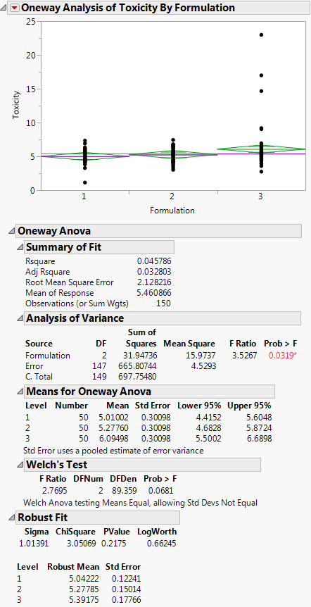
If you look at the standard Analysis of Variance report, you might wrongly conclude that there is a difference between the three formulations, since the p-value is 0.0319. However, when you look at the Robust Fit report, you would not conclude that the three formulations are significantly different, because the p-value there is 0.21755. It appears that the toxicity for a few of the observations is unusually high, creating the undue influence on the data.
Example of the Power Option
1. Select Help > Sample Data Library and open Typing Data.jmp.
2. Select Analyze > Fit Y by X.
3. Select speed and click Y, Response.
4. Select brand and click X, Factor.
5. Click OK.
6. From the red triangle menu, select Power.
7. Within the From row, type 2 for Delta (the third box) and type 11 for Number.
8. Within the To row, type 6 for Delta, and type 17 in the Number box.
9. Within the By row, type 2 for both Delta and Number.
10. Select the Solve for Power check box.
Figure 6.31 Example of the Power Details Window
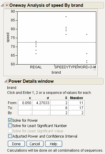
11. Click Done.
Note: The Done button remains dimmed until all of the necessary options are applied.
Power is computed for each combination of Delta and Number, and appears in the Power report.
To plot the Power values:
12. From the red triangle menu at the bottom of the report, select Power Plot.
Figure 6.32 Example of the Power Report
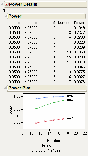
13. You might need to click and drag vertically on the Power axis to see all of the data in the plot.
Power is plotted for each combination of Delta and Number. As you might expect, the power rises for larger Number (sample sizes) values and for larger Delta values (difference in means).
Example of a Normal Quantile Plot
1. Select Help > Sample Data Library and open Big Class.jmp.
2. Select Analyze > Fit Y by X.
3. Select height and click Y, Response.
4. Select sex and click X, Factor.
5. Click OK.
6. From the red triangle menu, select Normal Quantile Plot > Plot Actual by Quantile.
Figure 6.33 Example of a Normal Quantile Plot
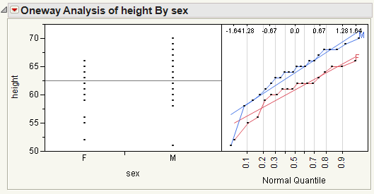
From Figure 6.33, notice the following:
• The Line of Fit appears by default.
• The data points track very closely to the line of fit, indicating a normal distribution.
Example of a CDF Plot
1. Select Help > Sample Data Library and open Analgesics.jmp.
2. Select Analyze > Fit Y by X.
3. Select pain and click Y, Response.
4. Select drug and click X, Factor.
5. Click OK.
6. From the red triangle menu, select CDF Plot.
Figure 6.34 Example of a CDF Plot
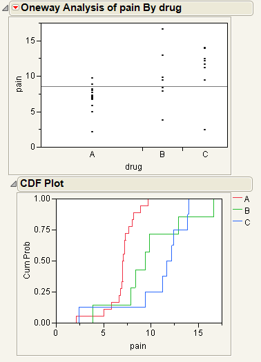
The levels of the X variables in the initial Oneway analysis appear in the CDF plot as different curves. The horizontal axis of the CDF plot uses the y value in the initial Oneway analysis.
Example of the Densities Options
1. Select Help > Sample Data Library and open Big Class.jmp.
2. Select Analyze > Fit Y by X.
3. Select height and click Y, Response.
4. Select sex and click X, Factor.
5. Click OK.
6. From the red triangle menu, select Densities > Compare Densities, Densities > Composition of Densities, and Densities > Proportion of Densities.
Figure 6.35 Example of the Densities Options
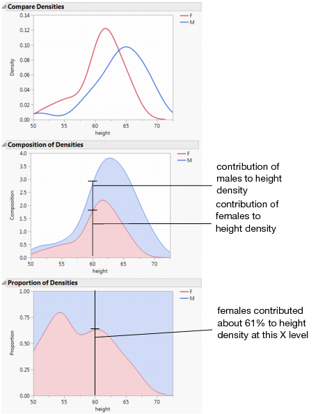
Example of the Matching Column Option
This example uses the Matching.jmp sample data table, which contains data on six animals and the miles that they travel during different seasons.
1. Select Help > Sample Data Library and open Matching.jmp.
2. Select Analyze > Fit Y by X.
3. Select miles and click Y, Response.
4. Select season and click X, Factor.
5. Click OK.
6. From the red triangle menu, select Matching Column.
7. Select subject as the matching column.
8. Click OK.
Figure 6.36 Example of the Matching Column Report
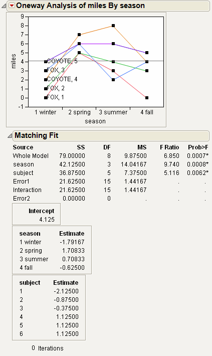
The plot graphs the miles traveled by season, with subject as the matching variable. The labels next to the first measurement for each subject on the graph are determined by the species and subject variables.
The Matching Fit report shows the season and subject effects with F tests. These are equivalent to the tests that you get with the Fit Model platform if you run two models, one with the interaction term and one without. If there are only two levels, then the F test is equivalent to the paired t-test.
Note: For details about the Fit Model platform, see the Model Specification chapter in the Fitting Linear Models book.
Example of Stacking Data for a Oneway Analysis
When your data are in a format other than a JMP data table, sometimes they are arranged so that a row contains information for multiple observations. To analyze the data in JMP, you must import the data and restructure it so that each row of the JMP data table contains information for a single observation. For example, suppose that your data are in a spreadsheet. The data for parts produced on three production lines are arranged in three sets of columns. In your JMP data table, you need to stack the data from the three production lines into a single set of columns so that each row represents the data for a single part.
Description and Goals
This example uses the file Fill Weights.xlsx, which contains the weights of cereal boxes randomly sampled from three different production lines. Figure 6.37 shows the format of the data.
• The ID columns contain an identifier for each cereal box that was measured.
• The Line columns contain the weights (in ounces) for boxes sampled from the corresponding production line.
Figure 6.37 Data Format
The target fill weight for the boxes is 12.5 ounces. Although you are interested in whether the three production lines are meeting the target, initially you want to see whether the three lines are achieving the same mean fill rate. You can use Oneway to test for differences among the mean fill weights.
To use the Oneway platform, you need to do the following:
1. Import the data into JMP. See “Import the Data”.
2. Reshape the data so that each row in the JMP data table reflects only a single observation. Reshaping the data requires that you stack the cereal box IDs, the line identifiers, and the weights into columns. See “Stack the Data”.
Import the Data
This example illustrates two ways to import data from Microsoft Excel into JMP. Select one method or explore both:
• Use the File > Open option to import data from a Microsoft Excel file using the Excel Import Wizard. See “Import the Data Using the Excel Import Wizard”. This method is convenient for any Excel file.
• Copy and paste data from Microsoft Excel into a new JMP data table. See “Copy and Paste the Data from Excel”. You can use this method with small data files.
For more information on how to import data from Microsoft Excel, see the Import Your Data chapter in the Using JMP book.
Import the Data Using the Excel Import Wizard
1. Select Help > Sample Data Library and open Fill Weights.xlsx located in the Samples/Import Data folder.
The file opens in the Excel Import Wizard.
2. Type 3 next to Column headers start on on row.
In the Excel file, row 1 contains information about the table and row 2 is blank. The column header information starts on row 3.
3. Type 2 for Number of rows with column headers.
In the Excel file, rows 3 and 4 both contain column header information.
4. Click Import.
Figure 6.38 JMP Table Created Using Excel Import Wizard
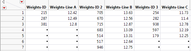
The data are placed in seven rows and multiple IDs appear in each row. For each of the three lines, there are an ID and Weight column, giving a total of six columns.
Notice that the “Weights” part of the ID column name is unnecessary and misleading. You could rename the columns now, but it will be more efficient to rename the columns after you stack the data.
5. Proceed to “Stack the Data”.
Copy and Paste the Data from Excel
1. Open Fill Weights.xlsx in Microsoft Excel.
2. Select the data inside the table but exclude the unnecessary “Weights” heading.
3. Right-click and select Copy.
4. In JMP, select File > New > Data Table.
5. Select Edit > Paste with Column Names.
The Edit > Paste with Column Names option is used when you have column names included in the selection on the clipboard.
Figure 6.39 JMP Table Created Using Paste with Column Names
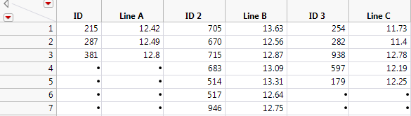
6. Proceed to “Stack the Data”.
Stack the Data
Use the Stack option to place one observation in each row of a new data table. For more information on the Stack option, see the Reshape Data chapter in the Using JMP book.
1. In the JMP data table, select Tables > Stack.
2. Select all six columns and click Stack Columns.
3. Select Multiple Series Stack.
You are stacking two series, ID and Line, so you do not change the Number of Series, which is set to 2 by default. The columns that contain the series are not contiguous. They alternate (ID, Line A, ID, Line B, ID, Line C). For this reason, you do not check Contiguous.
4. Deselect Stack By Row.
5. Select Eliminate Missing Rows.
6. Enter Stacked next to Output table name.
7. Click OK.
In the new data table, Data and Data 2 are columns containing the ID and Weight data.
8. Right-click the Label column heading and select Delete Columns.
The entries in the Label column were the column headings for the box IDs in the imported data table. These entries are not needed.
9. Rename each column by double-clicking on the column header. Change the column names as follows:
‒ Data to ID
‒ Label 2 to Line
‒ Data 2 to Weight
10. In the Columns panel, click on the icon to the left of ID and select Nominal.
Although ID is given as a number, it is an identifier and should be treated as nominal when modeling. This is not an issue in this example, but it is good practice to assign the appropriate modeling type to a column.
11. (Only applies if you imported the data from Excel using File > Open.) Do the following:
1. Click the Line column header to select the column and select Cols > Recode.
2. Change the values in the New Values column to match those in Figure 6.40 below.
Figure 6.40 Recode Column Values
3. Click Done > In place.
Your new data table is now properly structured for JMP analysis. Each row contains data for a single cereal box. The first column gives the box ID, the second gives the production line, and the third gives the weight of the box (Figure 6.41).
Figure 6.41 Recoded Data Table
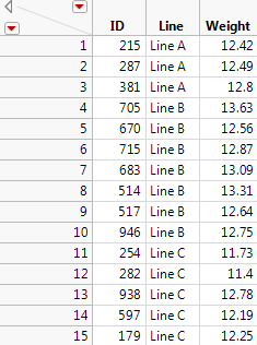
Conduct the Oneway Analysis
For this part of the example, you will:
• Conduct a Oneway Analysis of Variance to test for differences in the mean fill weights among the three production lines.
• Obtain Comparison Circles to explore which lines might differ.
• Label points by ID in case you want to reweigh or further examine their boxes.
Before beginning, verify that you are using the Stacked data table.
1. Select Analyze > Fit Y by X.
2. Select Weight and click Y, Response.
3. Select Line and click X, Factor.
4. Click OK.
5. From the red triangle menu, select Means/Anova.
The mean diamonds in the plot show 95% confidence intervals for the production line means. The points that fall outside the mean diamonds might seem like outliers, however they are not. To see this, add box plots to the plot.
6. From the red triangle menu, select Display Options > Box Plots.
All points fall within the box plots boundaries, therefore they are not outliers.
7. From the data table, in the Columns panel, right-click ID and select Label/Unlabel.
8. In the plot, hover over the points with your mouse to see their ID values, as well as their Line and Weight data. See Figure 6.42.
9. From the red triangle menu, select Compare Means > All Pairs, Tukey HSD.
Comparison circles appear in a panel to the right of the plot.
10. Click the bottom comparison circle.
Figure 6.42 Oneway Analysis of Weight by Line
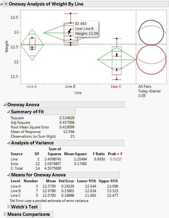
In the Analysis of Variance report, the p-value of 0.0102 provides evidence that the means are not all equal. In the plot, the comparison circle for Line C is selected and appears red (in JMP default colors). Since the circle for Line B appears as thick gray, the mean for Line C differs from the mean for Line B at the 0.05 significance level. The means for Lines A and B do not show a statistically significant difference.
The mean diamonds shown in the plot span 95% confidence intervals for the means. The numeric bounds for the 95% confidence intervals are given in the Means for Oneway ANOVA report. Both of these indicate that the confidence intervals for Lines B and C do not contain the target fill weight of 12.5: Line B appears to overfill and Line C appears to underfill. For these two production lines, the underlying causes that result in off-target fill weights must be addressed.
Statistical Details for the Oneway Platform
The following sections provide statistical details for selected options and reports.
Comparison Circles
One approach to comparing two means is to determine whether their actual difference is greater than their least significant difference (LSD). This least significant difference is a Student’s t-statistic multiplied by the standard error of the difference of the two means and is written as follows:
The standard error of the difference of two independent means is calculated from the following relationship:
When the means are un correlated, these quantities have the following relationship:
These squared values form a Pythagorean relationship, illustrated graphically by the right triangle shown in Figure 6.43.
Figure 6.43 Relationship of the Difference between Two Means
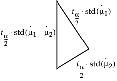
The hypotenuse of this triangle is a measuring stick for comparing means. The means are significantly different if and only if the actual difference is greater than the hypotenuse (LSD).
Suppose that you have two means that are exactly on the borderline, where the actual difference is the same as the least significant difference. Draw the triangle with vertices at the means measured on a vertical scale. Also, draw circles around each mean so that the diameter of each is equal to the confidence interval for that mean.
Figure 6.44 Geometric Relationship of t-test Statistics
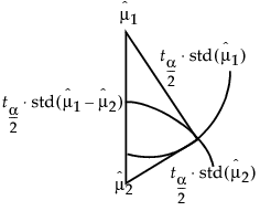
The radius of each circle is the length of the corresponding leg of the triangle, which is  .
.
The circles must intersect at the same right angle as the triangle legs, giving the following relationship:
• If the means differ exactly by their least significant difference, then the confidence interval circles around each mean intersect at a right angle. That is, the angle of the tangents is a right angle.
Now, consider the way that these circles must intersect if the means are different by greater than or less than the least significant difference:
• If the circles intersect so that the outside angle is greater than a right angle, then the means are not significantly different. If the circles intersect so that the outside angle is less than a right angle, then the means are significantly different. An outside angle of less than 90 degrees indicates that the means are farther apart than the least significant difference.
• If the circles do not intersect, then they are significantly different. If they nest, they are not significantly different. See Figure 6.11.
The same graphical technique works for many multiple-comparison tests, substituting a different probability quantile value for the Student’s t.
Power
To compute power, you make use of the noncentral F distribution. The formula (O’Brien and Lohr 1984) is given as follows:
Power = Prob(F > Fcrit, ν1, ν2, nc)
where:
• F is distributed as the noncentral 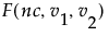 and
and 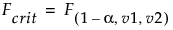 is the 1 - α quantile of the F distribution with ν1 and ν2 degrees of freedom.
• ν1 = r -1 is the numerator df.
• ν2 = r(n -1) is the denominator df.
• n is the number per group.
• r is the number of groups.
• nc = n(CSS)/σ2 is the non-centrality parameter.
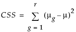 is the corrected sum of squares.
• μg is the mean of the gth group.
• μ is the overall mean.
• σ2 is estimated by the mean squared error (MSE).
Summary of Fit Report
Rsquare
Using quantities from the Analysis of Variance report for the model, the R2 for any continuous response fit is always calculated as follows:
Adj Rsquare
Adj Rsquare is a ratio of mean squares instead of sums of squares and is calculated as follows:
The mean square for Error is found in the Analysis of Variance report and the mean square for C. Total can be computed as the C. Total Sum of Squares divided by its respective degrees of freedom. See “The Analysis of Variance Report”.
Tests That the Variances Are Equal
F Ratio
O’Brien’s test constructs a dependent variable so that the group means of the new variable equal the group sample variances of the original response. The O’Brien variable is computed as follows:
where n represents the number of yijk observations.
Brown-Forsythe is the model F statistic from an ANOVA on  where
where  is the median response for the ith level.
The Levene F is the model F statistic from an ANOVA on  where
where  is the mean response for the ith level.
Bartlett’s test is calculated as follows:
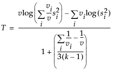 where
where and ni is the count on the ith level and si2 is the response sample variance on the ith level. The Bartlett statistic has a χ2-distribution. Dividing the Chi-square test statistic by the degrees of freedom results in the reported F value.
Welch’s Test F Ratio
The Welch’s Test F Ratio is computed as follows:
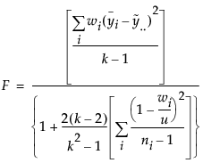 where
where  ,
,  ,
,and ni is the count on the ith level,  is the mean response for the ith level, and si2 is the response sample variance for the ith level.
Welch’s Test DF Den
The Welch approximation for the denominator degrees of freedom is as follows:
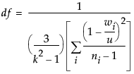
where wi, ni, and u are defined as in the F ratio formula.
Nonparametric Test Statistics
This section provides formulas for the test statistics used in the Wilcoxon, Median, and van der Waerden tests.
Notation
The tests are based on scores and use the following notation.
j = 1,...,n
The observations in the entire sample.
n1, n2, ..., nk
The numbers of observations in each of the k levels of X.
Rj
The midrank of the jth observation. The midrank is the observation’s rank if it is not tied and its average rank if it is tied.
α
A function of the midranks used to define scores for the various tests.
α(Rj)
The function α applied to the midrank of the jth observation.
The function α defines scores as follows:
Wilcoxon scores
Median scores
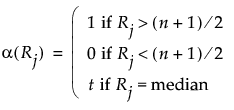
Let nt denote the number of observations tied at the median. Then nt is given by the following:
van der Waerden scores
Two-Sample Normal Approximations
Tests based on the normal approximation are given only when X has exactly two levels. The notation used in this section is defined in “Notation”. The statistics that appear in the Two-Sample Normal Approximation report are defined below.
S
The statistic S is the sum of the values α(Rj) for the observations in the smaller group. If the two levels of X have the same numbers of observations, then the value of S corresponds to the last level of X in the value ordering.
Z
The value of Z is given as follows:
Note: The Wilcoxon test adds a continuity correction. If (S - E(S)) is greater than zero, then 0.5 is subtracted from the numerator. If (S - E(S)) is less than zero, then 0.5 is added to the numerator.
E(S)
The expected value of S under the null hypothesis. Denote the number of observations in the smaller level, or in the last level in the value ordering if the two groups have the same number of observations, by nl:
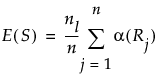
Var(S)
Define ave to be the average score across all observations. Then the variance of S is given as follows:
One-Way ChiSquare Approximations
Note: The ChiSquare test based on the Wilcoxon scores is knows as the Kruskal-Wallis test.
The notation used in this section is defined in “Notation”. The following quantities are used in calculating the ChiSquare statistic:
Ti
The total of the scores for the ith level of X.
E(Ti)
The expected value of the total score for level i under the null hypothesis of no difference in levels, given as follows:
Var(T)
Define ave to be the average score across all observations. Then the variance of T is given as follows:
The value of the test statistic is given below. This statistic is asymptotically ChiSquare on k - 1 degrees of freedom.
..................Content has been hidden....................
You can't read the all page of ebook, please click here login for view all page.