
Overview of Logistic Regression
Logistic regression has a long tradition with widely varying applications such as modeling dose-response data and purchase-choice data. Unfortunately, many introductory statistics courses do not cover this fairly simple method. Many texts in categorical statistics cover it (Agresti 1998), in addition to texts on logistic regression (Hosmer and Lemeshow 1989). Some analysts use the method with a different distribution function, the normal. In that case, it is called probit analysis. Some analysts use discriminant analysis instead of logistic regression because they prefer to think of the continuous variables as Ys and the categories as Xs and work backwards. However, discriminant analysis assumes that the continuous data are normally distributed random responses, rather than fixed regressors.
Simple logistic regression is a more graphical and simplified version of the general facility for categorical responses in the Fit Model platform. For examples of more complex logistic regression models, see the Logistic Regression chapter in the Fitting Linear Models book.
Nominal Logistic Regression
Nominal logistic regression estimates the probability of choosing one of the response levels as a smooth function of the x factor. The fitted probabilities must be between 0 and 1, and must sum to 1 across the response levels for a given factor value.
In a logistic probability plot, the y-axis represents probability. For k response levels, k - 1 smooth curves partition the total probability (which equals 1) among the response levels. The fitting principle for a logistic regression minimizes the sum of the negative natural logarithms of the probabilities fitted to the response events that occur (that is, maximum likelihood).
Ordinal Logistic Regression
When Y is ordinal, a modified version of logistic regression is used for fitting. The cumulative probability of being at or below each response level is modeled by a curve. The curves are the same for each level except that they are shifted to the right or left.
The ordinal logistic model fits a different intercept, but the same slope, for each of r - 1 cumulative logistic comparisons, where r is the number of response levels. Each parameter estimate can be examined and tested individually, although this is seldom of much interest.
The ordinal model is preferred to the nominal model when it is appropriate because it has fewer parameters to estimate. In fact, it is practical to fit ordinal responses with hundreds of response levels.
Example of Nominal Logistic Regression
This example uses the Penicillin.jmp sample data table. The data in this example comes from an experiment where 5 groups, each containing 12 rabbits, were injected with streptococcus bacteria. Once the rabbits were confirmed to have the bacteria in their system, they were given different doses of penicillin. You want to find out whether the natural log (In(dose)) of dosage amounts has any effect on whether the rabbits are cured.
1. Select Help > Sample Data Library and open Penicillin.jmp.
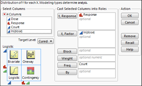
2. Select Analyze > Fit Y by X.
3. Select Response and click Y, Response.
4. Select In(Dose) and click X, Factor.
Notice that JMP automatically fills in Count for Freq. Count was previously assigned the role of Freq.
5. Click OK.
Figure 8.2 Example of Nominal Logistic Report
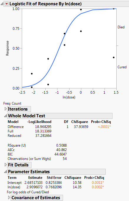
The plot shows the fitted model, which is the predicted probability of being cured, as a function of ln(dose). The p-value is significant, indicating that the dosage amounts have a significant effect on whether the rabbits are cured.
Launch the Logistic Platform
To perform a Logistic analysis, do the following:
1. Select Analyze > Fit Y by X.
2. Enter a nominal or ordinal column for Y, Response.
3. Enter a continuous column for X, factor.
The schematic indicates that you will be performing a logistic analysis.
Note: You can also launch a logistic analysis from the JMP Starter window. See “Launch Specific Analyses from the JMP Starter Window”.
Figure 8.3 Fit Y by X Logistic Launch Window
When the response is binary and has a nominal modeling type, a Target Level menu appears in the launch window. Use this menu to specify the level of the response whose probability you want to model.
For more information about the Fit Y by X launch window, see “Introduction to Fit Y by X” chapter.
After you click OK, the Logistic report appears. See “The Logistic Report”.
Data Structure
Your data can consist of unsummarized or summarized data:
Unsummarized data
There is one row for each observation containing its X value and its Y value.
Summarized data
Each row represents a set of observations with common X and Y values. The data table must contain a column that gives the counts for each row. Enter this column as Freq in the launch window.
The Logistic Report
To produce the plot shown in Figure 8.4, follow the instructions in “Example of Nominal Logistic Regression”.
Figure 8.4 Example of a Logistic Report
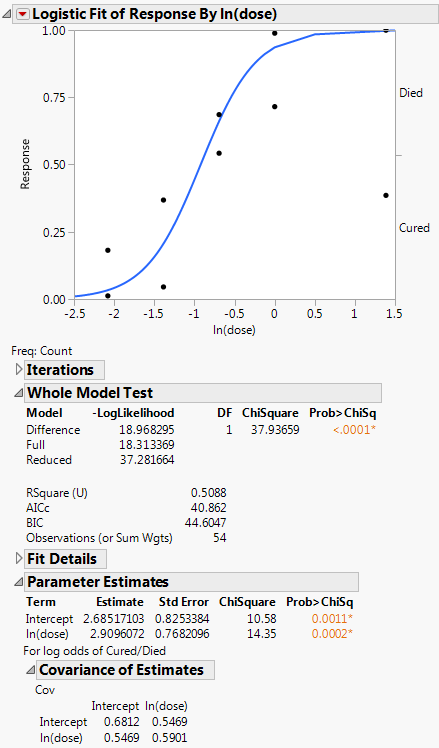
The Logistic report window contains the Logistic plot, the Iterations report, the Whole Model Test report, and the Parameter Estimates report.
Note: The red triangle menu provides more options that can add to the initial report window. See “Logistic Platform Options”.
Logistic Plot
The logistic probability plot gives a complete picture of what the logistic model is fitting. At each x value, the probability scale in the y direction is divided up (partitioned) into probabilities for each response category. The probabilities are measured as the vertical distance between the curves, with the total across all Y category probabilities summing to 1.
Replace variables in the plot in one of two ways: swap existing variables by dragging and dropping a variable from one axis to the other axis; or, click on a variable in the Columns panel of the associated data table and drag it onto an axis.
Iterations
The Iterations report shows each iteration and the evaluated criteria that determine whether the model has converged. Iterations appear only for nominal logistic regression.
Whole Model Test
The Whole Model Test report shows if the model fits better than constant response probabilities. This report is analogous to the Analysis of Variance report for a continuous response model. It is a specific likelihood ratio Chi-square test that evaluates how well the categorical model fits the data.
The negative sum of natural logs of the observed probabilities is called the negative log-likelihood (–LogLikelihood). The negative log-likelihood for categorical data plays the same role as sums of squares in continuous data: twice the difference in the negative log-likelihood from the model fitted by the data and the model with equal probabilities is a Chi-square statistic. This test statistic examines the hypothesis that the x variable has no effect on the responses.
Values of the RSquare (U) (sometimes denoted as R2) range from 0 to 1. High R2 values are indicative of a good model fit, and are rare in categorical models.
The Whole Model Test report contains the following columns:
Model
Sometimes called Source.
‒ The Reduced model only contains an intercept.
‒ The Full model contains all of the effects as well as the intercept.
‒ The Difference is the difference of the log-likelihoods of the full and reduced models.
DF
Records the degrees of freedom associated with the model.
–LogLikelihood
Measures variation, sometimes called uncertainty, in the sample.
Full (the full model) is the negative log-likelihood (or uncertainty) calculated after fitting the model. The fitting process involves predicting response rates with a linear model and a logistic response function. This value is minimized by the fitting process.
Reduced (the reduced model) is the negative log-likelihood (or uncertainty) for the case when the probabilities are estimated by fixed background rates. This is the background uncertainty when the model has no effects.
The difference of these two negative log-likelihoods is the reduction due to fitting the model. Two times this value is the likelihood ratio Chi-square test statistic.
For more information, see “Likelihood, AICc, and BIC” the Statistical Details appendix in the Fitting Linear Models book.
Chi-Square
The likelihood ratio Chi-square test of the hypothesis that the model fits no better than fixed response rates across the whole sample. It is twice the –LogLikelihood for the Difference Model. It is two times the difference of two negative log-likelihoods, one with whole-population response probabilities and one with each-population response rates. For more information, see “Whole Model Test Report”.
Prob>ChiSq
The observed significance probability, often called the p value, for the Chi-square test. It is the probability of getting, by chance alone, a Chi-square value greater than the one computed. Models are often judged significant if this probability is below 0.05.
RSquare (U)
The proportion of the total uncertainty that is attributed to the model fit, defined as the Difference negative log-likelihood value divided by the Reduced negative log-likelihood value. An RSquare (U) value of 1 indicates that the predicted probabilities for events that occur are equal to one: There is no uncertainty in predicted probabilities. Because certainty in the predicted probabilities is rare for logistic models, RSquare (U) tends to be small. For more information, see “Whole Model Test Report”.
Note: RSquare (U) is also know as McFadden’s pseudo R-square.
AICc
The corrected Akaike Information Criterion. See “Likelihood, AICc, and BIC” the Statistical Details appendix in the Fitting Linear Models book.
BIC
The Bayesian Information Criterion. See “Likelihood, AICc, and BIC” the Statistical Details appendix in the Fitting Linear Models book.
Observations
Sometimes called Sum Wgts. The total sample size used in computations. If you specified a Weight variable, this is the sum of the weights.
Measure
The available measures of fit are as follows:
Entropy RSquare
compares the log-likelihoods from the fitted model and the constant probability model.
Generalized RSquare
is a measure that can be applied to general regression models. It is based on the likelihood function L and is scaled to have a maximum value of 1. The Generalized RSquare measure simplifies to the traditional RSquare for continuous normal responses in the standard least squares setting. Generalized RSquare is also known as the Nagelkerke or Craig and Uhler R2, which is a normalized version of Cox and Snell’s pseudo R2. See Nagelkerke (1991).
Mean -Log p
is the average of -log(p), where p is the fitted probability associated with the event that occurred.
RMSE
is the root mean square error, where the differences are between the response and p (the fitted probability for the event that actually occurred).
Mean Abs Dev
is the average of the absolute values of the differences between the response and p (the fitted probability for the event that actually occurred).
Misclassification Rate
is the rate for which the response category with the highest fitted probability is not the observed category.
For Entropy RSquare and Generalized RSquare, values closer to 1 indicate a better fit. For Mean -Log p, RMSE, Mean Abs Dev, and Misclassification Rate, smaller values indicate a better fit.
Training
The value of the measure of fit.
Definition
The algebraic definition of the measure of fit.
Parameter Estimates
The nominal logistic model fits a parameter for the intercept and slope for each of  logistic comparisons, where k is the number of response levels. The Parameter Estimates report lists these estimates. Each parameter estimate can be examined and tested individually, although this is seldom of much interest.
Term
Lists each parameter in the logistic model. There is an intercept and a slope term for the factor at each level of the response variable, except the last level.
Estimate
Lists the parameter estimates given by the logistic model.
Std Error
Lists the standard error of each parameter estimate. They are used to compute the statistical tests that compare each term to zero.
Chi-Square
Lists the Wald tests for the hypotheses that each of the parameters is zero. The Wald Chi-square is computed as (Estimate/Std Error)2.
Prob>ChiSq
Lists the observed significance probabilities for the Chi-square tests.
Covariance of Estimates
Reports the estimated variances of the parameter estimates, and the estimated covariances between the parameter estimates. The square root of the variance estimates is the same as those given in the Std Error section.
Logistic Platform Options
Note: The Fit Group menu appears if you have specified multiple Y variables. Menu options allow you to arrange reports or order them by RSquare. See the Standard Least Squares chapter in the Fitting Linear Models book for more information.
Odds Ratios
Adds odds ratios to the Parameter Estimates report. For more details, see the Logistic Regression chapter in the Fitting Linear Models book.
This option is available only for a response with two levels.
Inverse Prediction
This option is available only for a response with two levels.
Logistic Plot
Shows or hides the logistic plot.
Plot Options
The Plot Options menu includes the following options:
Show Points
Toggles the points on or off.
Show Rate Curve
Is useful only if you have several points for each x-value. In these cases, you get reasonable estimates of the rate at each value, and compare this rate with the fitted logistic curve. To prevent too many degenerate points, usually at zero or one, JMP only shows the rate value if there are at least three points at the x-value.
Line Color
Enables you to pick the color of the plot curves.
ROC Curve
A Receiver Operating Characteristic curve is a plot of sensitivity by (1 – specificity) for each value of x. See “ROC Curves”.
Lift Curve
Produces a lift curve for the model. A lift curve shows the same information as a ROC curve, but in a way to dramatize the richness of the ordering at the beginning. The Y-axis shows the ratio of how rich that portion of the population is in the chosen response level compared to the rate of that response level as a whole. See the Logistic Regression chapter in the Fitting Linear Models book for details about lift curves.
Save Probability Formula
Creates new data table columns that contain formulas. See “Save Probability Formula”.
See the JMP Reports chapter in the Using JMP book for more information about the following options:
Redo
Contains options that enable you to repeat or relaunch the analysis. In platforms that support the feature, the Automatic Recalc option immediately reflects the changes that you make to the data table in the corresponding report window.
Save Script
Contains options that enable you to save a script that reproduces the report to several destinations.
Save By-Group Script
Contains options that enable you to save a script that reproduces the platform report for all levels of a By variable to several destinations. Available only when a By variable is specified in the launch window.
ROC Curves
Suppose you have an x value that is a diagnostic measurement and you want to determine a threshold value of x that indicates the following:
• A condition exists if the x value is greater than the threshold.
• A condition does not exist if the x value is less than the threshold.
For example, you could measure a blood component level as a diagnostic test to predict a type of cancer. Now consider the diagnostic test as you vary the threshold and, thus, cause more or fewer false positives and false negatives. You then plot those rates. The ideal is to have a very narrow range of x criterion values that best divides true negatives and true positives. The Receiver Operating Characteristic (ROC) curve shows how rapidly this transition happens, with the goal being to have diagnostics that maximize the area under the curve.
Two standard definitions used in medicine are as follows:
• Sensitivity, the probability that a given x value (a test or measure) correctly predicts an existing condition. For a given x, the probability of incorrectly predicting the existence of a condition is 1 – sensitivity.
• Specificity, the probability that a test correctly predicts that a condition does not exist.
A ROC curve is a plot of sensitivity by (1 – specificity) for each value of x. The area under the ROC curve is a common index used to summarize the information contained in the curve.
When you do a simple logistic regression with a binary outcome, there is a platform option to request a ROC curve for that analysis. After selecting the ROC Curve option, a window asks you to specify which level to use as positive.
If a test predicted perfectly, it would have a value above which the entire abnormal population would fall and below which all normal values would fall. It would be perfectly sensitive and then pass through the point (0,1) on the grid. The closer the ROC curve comes to this ideal point, the better its discriminating ability. A test with no predictive ability produces a curve that follows the diagonal of the grid (DeLong, et al. 1988).
The ROC curve is a graphical representation of the relationship between false-positive and true-positive rates. A standard way to evaluate the relationship is with the area under the curve, shown below the plot in the report. In the plot, a yellow line is drawn at a 45 degree angle tangent to the ROC Curve. This marks a good cutoff point under the assumption that false negatives and false positives have similar costs.
Save Probability Formula
The Save Probability Formula option creates new data table columns. These data table columns save the following:
• formulas for linear combinations (typically called logits) of the x factor
• prediction formulas for the response level probabilities
• a prediction formula that gives the most likely response
Inverse Prediction
Inverse prediction is the opposite of prediction. It is the prediction of x values from given y values. But in logistic regression, instead of a y value, you have the probability attributed to one of the Y levels. This feature only works when there are two response categories (a binary response).
The Fit Model platform also has an option that gives an inverse prediction with confidence limits. The Standard Least Squares chapter in the Fitting Linear Models book gives more information about inverse prediction.
Additional Examples of Logistic Regression
This section contains additional examples using logistic regression.
Example of Ordinal Logistic Regression
This example uses the AdverseR.jmp sample data table to illustrate an ordinal logistic regression. Suppose you want to model the severity of an adverse event as a function of treatment duration value.
1. Select Help > Sample Data Library and open AdverseR.jmp.
2. Right-click on the icon to the left of ADR SEVERITY and change the modeling type to ordinal.
3. Select Analyze > Fit Y by X.
4. Select ADR SEVERITY and click Y, Response.
5. Select ADR DURATION and click X, Factor.
6. Click OK.
Figure 8.5 Example of Ordinal Logistic Report
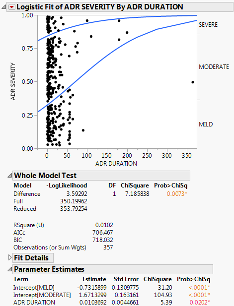
You interpret this report the same way as the nominal report. See “The Logistic Report”.
In the plot, markers for the data are drawn at their x-coordinate. When several data points appear at the same y position, the points are jittered. That is, small spaces appear between the data points so you can see each point more clearly.
Where there are many points, the curves are pushed apart. Where there are few to no points, the curves are close together. The data pushes the curves in that way because the criterion that is maximized is the product of the probabilities fitted by the model. The fit tries to avoid points attributed to have a small probability, which are points crowded by the curves of fit. See the Fitting Linear Models book for more information about computational details.
For details about the Whole Model Test report and the Parameter Estimates report, see “The Logistic Report”. In the Parameter Estimates report, an intercept parameter is estimated for every response level except the last, but there is only one slope parameter. The intercept parameters show the spacing of the response levels. They always increase monotonically.
Additional Example of a Logistic Plot
This example uses the Car Physical Data.jmp sample data table to show an additional example of a logistic plot. Suppose you want to use weight to predict car size (Type) for 116 cars. Car size can be one of the following, from smallest to largest: Sporty, Small, Compact, Medium, or Large.
1. Select Help > Sample Data Library and open Car Physical Data.jmp.
2. In the Columns panel, right-click on the icon to the left of Type, and select Ordinal.
3. Right-click on Type, and select Column Info.
4. From the Column Properties menu, select Value Ordering.
5. Move the data in the following top-down order: Sporty, Small, Compact, Medium, Large.
6. Click OK.
7. Select Analyze > Fit Y by X.
8. Select Type and click Y, Response.
9. Select Weight and click X, Factor.
10. Click OK.
The report window appears.
Figure 8.6 Example of Type by Weight Logistic Plot
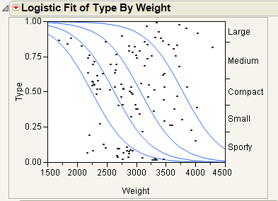
In Figure 8.6, note the following observations:
• The first (bottom) curve represents the probability that a car at a given weight is Sporty.
• The second curve represents the probability that a car is Small or Sporty. Looking only at the distance between the first and second curves corresponds to the probability of being Small.
• As you might expect, heavier cars are more likely to be Large.
• Markers for the data are drawn at their x-coordinate, with the y position jittered randomly within the range corresponding to the response category for that row.
If the x -variable has no effect on the response, then the fitted lines are horizontal and the probabilities are constant for each response across the continuous factor range. Figure 8.7 shows a logistic plot where Weight is not useful for predicting Type.
Figure 8.7 Examples of Sample Data Table and Logistic Plot Showing No y by x Relationship
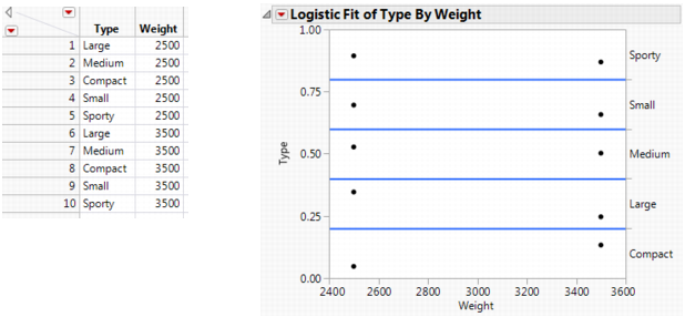
Note: To re-create the plots in Figure 8.7 and Figure 8.8, you must first create the data tables shown here, and then perform steps 7-10 at the beginning of this section.
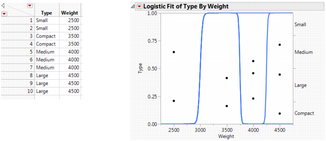
If the response is completely predicted by the value of the factor, then the logistic curves are effectively vertical. The prediction of a response is near certain (the probability is almost 1) at each of the factor levels. Figure 8.8 shows a logistic plot where Weight almost perfectly predicts Type.
Note: In this case, the parameter estimates become very large and are marked unstable in the regression report.
Figure 8.8 Examples of Sample Data Table and Logistic Plot Showing an Almost Perfect y by x Relationship
Example of ROC Curves
To demonstrate ROC curves, proceed as follows:
1. Select Help > Sample Data Library and open Penicillin.jmp.
2. Select Analyze > Fit Y by X.
3. Select Response and click Y, Response.
4. Select In(Dose) and click X, Factor.
Notice that JMP automatically fills in Count for Freq. Count was previously assigned the role of Freq.
5. Click OK.
6. From the red triangle menu, select ROC Curve.
7. Select Cured as the positive.
8. Click OK.
Note: This example shows a ROC Curve for a nominal response. For details about ordinal ROC curves, see the Partition chapter in the Predictive and Specialized Modeling book.
The results for the response by In(Dose) example are shown here. The ROC curve plots the probabilities described above, for predicting response. Note that in the ROC Table, the row with the highest Sens-(1-Spec) is marked with an asterisk.
Figure 8.9 Examples of ROC Curve and Table
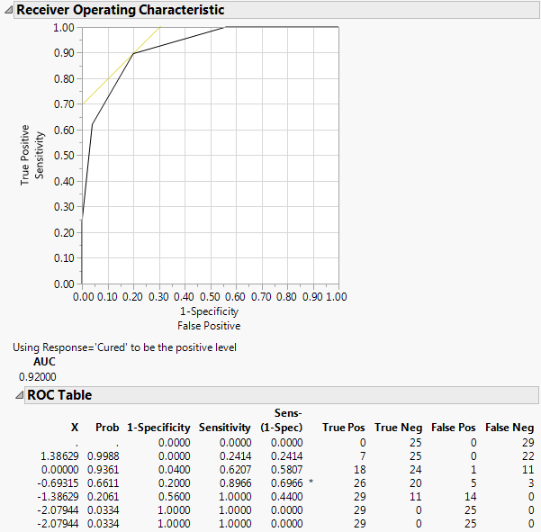
Since the ROC curve is well above a diagonal line, you conclude that the model has good predictive ability.
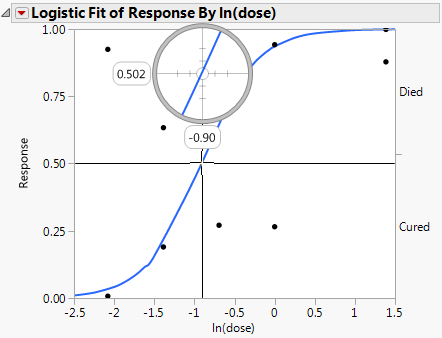
Example of Inverse Prediction Using the Crosshair Tool
In a study of rabbits who were given penicillin, you want to know what dose of penicillin results in a 0.5 probability of curing a rabbit. In this case, the inverse prediction for 0.5 is called the ED50, the effective dose corresponding to a 50% survival rate. Use the crosshair tool to visually approximate an inverse prediction.
To see which value of In(dose) is equally likely either to cure or to be lethal, proceed as follows:
1. Select Help > Sample Data Library and open Penicillin.jmp.
2. Select Analyze > Fit Y by X.
3. Select Response and click Y, Response.
4. Select In(Dose) and click X, Factor.
Notice that JMP automatically fills in Count for Freq. Count was previously assigned the role of Freq.
5. Click OK.
6. Click on the crosshairs tool.
7. Place the horizontal crosshair line at about 0.5 on the vertical (Response) probability axis.
8. Move the cross-hair intersection to the prediction line, and read the In(dose) value that shows on the horizontal axis.
In this example, a rabbit with a In(dose) of approximately -0.9 is equally likely to be cured as it is to die.
Figure 8.10 Example of Crosshair Tool on Logistic Plot
Example of Inverse Prediction Using the Inverse Prediction Option
If your response has exactly two levels, the Inverse Prediction option enables you to request an exact inverse prediction. You are given the x value corresponding to a given probability of the lower response category, as well as a confidence interval for that x value.
To use the Inverse Prediction option, proceed as follows:
1. Select Help > Sample Data Library and open Penicillin.jmp.
2. Select Analyze > Fit Y by X.
3. Select Response and click Y, Response.
4. Select In(Dose) and click X, Factor.
Notice that JMP automatically fills in Count for Freq. Count was previously assigned the role of Freq.
5. Click OK.
6. From the red triangle menu, select Inverse Prediction. See Figure 8.11.
7. Type 0.95 for the Confidence Level.
8. Select Two sided for the confidence interval.
9. Request the response probability of interest. Type 0.5 and 0.9 for this example, which indicates you are requesting the values for ln(Dose) that correspond to a 0.5 and 0.9 probability of being cured.
10. Click OK.
The Inverse Prediction plot appears.
Figure 8.11 Inverse Prediction Window
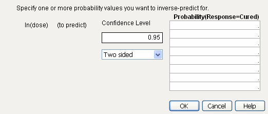
Figure 8.12 Example of Inverse Prediction Plot
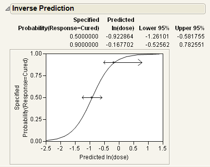
The estimates of the x values and the confidence intervals are shown in the report as well as in the probability plot. For example, the value of ln(Dose) that results in a 90% probability of being cured is estimated to be between -0.526 and 0.783.
Statistical Details for the Logistic Platform
Whole Model Test Report
Chi-Square
The Chi-Square statistic is sometimes denoted G2 and is written as follows:
where the summations are over all observations instead of all cells.
RSquare (U)
The ratio of this test statistic to the background log-likelihood is subtracted from 1 to calculate R2. More simply, RSquare (U) is computed as follows:
using quantities from the Whole Model Test report.
Note: RSquare (U) is also known as McFadden’s pseudo R-square.
..................Content has been hidden....................
You can't read the all page of ebook, please click here login for view all page.