Chapter 2: The Building Blocks of Responsive Design
There are two main building blocks at the heart of responsive web design: media queries and viewports.
Media queries represent the glue that joins a lot of other responsive concepts and tools together. They’re a simple but powerful concept, allowing you to detect device properties, define rules, and load different CSS properties based on them. For example, you can optimize a navigation menu for different devices, converting a full horizontal menu on desktop browsers to the “hamburger” menu often encountered on mobile devices.
Viewports are less complex, allowing you to define the size and scaling factor of a web page appropriately, no matter what the size of the device being used to view the page is. Without them, media queries would only be partially useful.
This chapter will introduce media queries first, and then show how you can make them work better for you by defining a viewport.
Media Types
You can invoke media query dependent styles in several ways, most commonly with the HTML link element linking to one or more CSS files, or from directly within a CSS file with @import.
In HTML, this example will load the style.css file if the query is true, which it will be on all device types:
<link rel="stylesheet" media="all" href="/style.css">
In the following example, @import does the same, but from within a CSS file:
@import url("/style.css") all;
In the example below, the @media CSS rule contains a specific set of selectors that will load if the query is true:
@media all {
    …
}
The all in these queries is the media type. There are four media types available (at the time of writing):
print: for print versions of pagesscreen: for computer, tablet and phone screensspeech: for screen readers that read pages to the userall: for all of the above
Adding a media type allows you to specify what types of devices the query applies to. These are broad and don’t allow for a lot of control. To target devices more specifically, you add expressions to these media types.
Creating a Query
Let’s try something more useful. The aside to the main content in RWDflix is designed to show announcements and news. Mobile and tablet visitors probably want to focus on watching shows and nothing else, so let’s hide this element for users of smaller screened devices.
Method Used in This Book
For the remainder of this chapter, I’ll use the @media method shown above for media queries. It’s a personal preference, and as an experiment, you might like to try rewriting the examples using other methods.
Remove the current aside CSS class and replace it with the following media queries:
@media screen and (min-width: 680px) {
    aside {
        width: 33%;
    }
}

@media screen and (max-width: 680px) {
    aside {
        display: none;
    }
}
This pair of media queries sets the aside element to a width of 33% if the screen is wider than 680px (by asking if the screen is at least 680px wide with min-width), and hides it if the screen is narrower than 680px (asking if the screen is at most 680px wide with max-width).

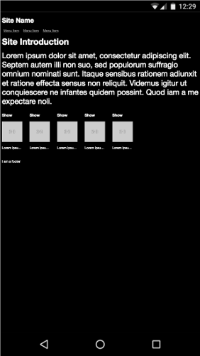
The aside element hidden on smaller screens
Next, make the TV listings fill the screen width when the aside isn’t showing:
section.showslisting {
    margin-bottom: 25px;
}

@media screen and (min-width: 680px) {
    section.showslisting {
        width: 66%;
    }
}

@media screen and (max-width: 680px) {
    section.showslisting {
        width: 100%;
    }
}
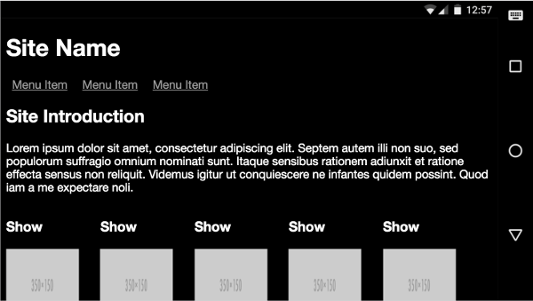
The main content now set to full width
If you resize the page in your desktop browser, you’ll see the aside appearing and disappearing as you widen and narrow the browser window, the main content adjusting appropriately.
You can use basic logic in your media queries. This allows you to combine multiple conditions. For example, you can use a logical AND:
@media only screen and (min-width: 640px) and (max-width: 1136px) {
    …
}
The code above will invoke the CSS styles within the query if a device’s screen width is between 640px and 1136px. The min-width property is the minimum width of the screen, and max-width the maximum.
For this media query to match, both conditions need to be true. It’s also possible to match queries if only one condition is true with a logical OR, which (confusingly) is represented with a comma. The query below will apply on screen or print devices:
@media only screen, print {
    …
}
You can also combine ANDs with ORs to make more complex queries. Here’s the current page rendered on a larger sized phone, but in landscape mode:

The current phone layout in landscape mode
In the screenshot above, the screen is 732px wide, which is above the 640px set above. Still, the aside doesn’t quite fit into the window, so let’s hide it if the screen size is below 640px, or if the device is in landscape mode:
@media screen and (max-width: 680px), screen and (orientation: landscape) and (max-width: 750px) {
    aside {
        display: none;
    }
}
And the corresponding media query for the listings section:
@media screen and (max-width: 680px), screen and (orientation: landscape) and (max-width: 750px) {
    section.showslisting {
        width: 100%;
    }
}
You’ll see that I added a max-width check, to show the aside on tablets in landscape mode, but also to show how you can combine logical checks together.
The aside removed from landscape device orientation
Logical Queries with Only and Not
You can also make precise media queries using only and not. For example, this media query will match devices that are at least 640px wide and exclude the print media type:
@media not print and (min-width: 640px) {
    …
}
In contrast, this query will only apply to screen devices that are at least 640px wide:
@media only screen and (min-width: 640px) {
    …
}
Query Features
The width and height queries we’ve looked at so far are some of the most widely used, but there are several other media features that are also useful for checking against device features. These include color capabilities, aspect ratio, orientation, resolution, and vendor-specific features for Mozilla-and WebKit-based browsers. Most of these accept min- and max- prefixes that work in a similar way to the dimension queries above.
aspect-ratio
The aspect-ratio feature allows you to check the ratio of horizontal pixels to vertical pixels, separated by a slash. For example:
@media screen and (min-aspect-ratio: 1/1) {
    …
}
The above rule will match a device where the screen’s width to height ratio is 1:1 or more, so square or landscape.
A common use for this would be to detect wider screens, useful when you’re displaying videos:
@media screen and (min-aspect-ratio: 16/9) {
    …
}
orientation
As shown earlier, this feature checks if the device is in landscape or portrait mode. For example:
@media all and (orientation: landscape) {
    …
}
And:
@media all and (orientation: portrait) {
    …
}
color
This feature checks if a device can support a certain bit-level of color. For example, this is how to check that a device supports at least 8-bits of color (that is, 256 colors):
@media all and (min-color: 8) {
    …
}
color-index
This plays a role similar to color, but lets you check for the number of colors instead of the bit-level:
@media all and (min-color-index: 256) {
    …
}
monochrome
Again, similar to color, monochrome lets you check for the levels of gray in a device:
@media all and (min-monochrome: 8) {
    …
}
resolution
This feature targets devices that have high-resolution screens:
@media all and (min-resolution: 120dpi) {
    …
}
scan
The scan media feature lets you check the scanning process of TVs, the options being interlace or progressive:
@media all and (scan: progressive) {
    …
}
grid
grid is used for checking if a device is a terminal-like device. This also includes older phones (that is, non-smartphones), accessible phones (for those with poor vision), and braille devices. It returns a boolean value if true:
@media grid {
    …
}
As you can see, through combinations of dimension-and feature-based queries, you can construct complex stylesheets to target a multitude of devices effectively with styles that work most efficiently for them. This is the main point of media queries: they allow you to selectively load CSS styles for particular device configurations.
Streamlining the Example App
Now that you have a basic understanding, let’s continue to build upon the media queries added earlier to make the example site tidier.
First, you can consolidate the queries already written, moving the classes into two groups of media queries:
/* Media Queries */
/*  For example, desktop devices */
@media screen and (min-width: 680px) {
    aside {
        width: 33%;
    }

    section.showslisting {
        width: 66%;
    }
}

/* For example, medium-width screens or smaller screens in landscape */
@media screen and (max-width: 680px), screen and (orientation: landscape) and (max-width: 750px) {
    aside {
        display: none;
    }

    section.showslisting {
        width: 100%;
    }
}
Much tidier! You can keep adding new styles for each query into these sections.
Let’s look back to our demo site specification outlined in Chapter 1 for what else needs to be optimized for each screen size. The next step will be hiding the TV show description on small screens, and shorten it on medium-sized screens.
It would be a lot easier to do this if the description text had a class, so add one to each instance of the p tag that contains the show description:
<section class="tvshow">
    <h3>Show</h3>
    <img src="http://placehold.it/350x150"
    class="thumbnail">
    <p class="showdescription">Lorem ipsum dolor sit amet,
    consectetur adipiscing elit.</p>
</section>
Let’s add new media queries to accommodate the various sizes we aim to support, and, in doing so, tidy up the existing ones.
The specific widths at which we want our design to reflow are known as breakpoints. The breakpoints we’ll add are not exhaustive: there’s a huge range of device sizes, and more are appearing all the time, so it’s futile to try to target each device with separate queries. A better approach is to assess the points at which your design needs to reflow, and then create media queries for those breakpoints. This is the beauty of responsive web design: you can ensure that each device will get an appropriate layout without having to design separately for each device.
Add the following breakpoints and refactor our existing styles into them:
Chapter2/demo_create/layout.css (excerpt)
/* Media Queries  */

/* For example, older phones */
@media only screen and (min-width: 320px) {
    aside {
        display: none;
    }

    section.showslisting {
        width: 100%;
    }

    .showdescription {
        display: none;
    }
}

/*  For example, newer phones */
@media only screen and (min-width: 480px) {
}

/*  For example, small computer screens and larger tablets */
@media only screen and (min-width: 768px) {
    .showdescription {
        text-overflow: ellipsis;
        display: block;
        white-space: nowrap;
        width: 100px;
        overflow: hidden;
    }
}

/*  For example, typical desktop monitors or larger tablet devices */
@media only screen and (min-width: 992px) {
    aside {
        width: 33%;
        display: block;
    }

    section.showslisting {
        width: 66%;
    }

    .showdescription {
        white-space: normal;
        width: 125px;
    }
}

/*Large Devices, for example large monitors and TVs */
@media only screen and (min-width: 1200px) {
}
The media queries should now be self-explanatory. They define queries for a selection of devices, defined using screen sizes. As the C in CSS implies, the media queries cascade: you can build upon styles defined in a breakpoint for a smaller device size and change the properties that are different.
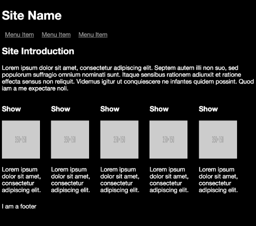
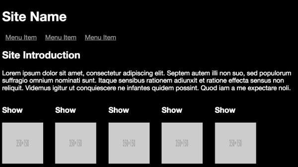
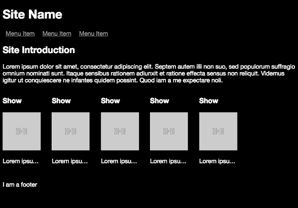
Notice that between the @media only screen and (min-width: 320px) breakpoint for smaller devices and the @media only screen and (min-width: 768px) breakpoint for medium-sized devices, all that changes is the showdescription class, showing text, but truncating it. Then in the @media only screen and (min-width: 992px) breakpoint for larger screens, all elements are revealed.

The layout generated by the small-screen breakpoint
The layout generated by the medium breakpoint

The layout generated by the medium to large breakpoint
Mobile First
In Chapter 1, I introduced the “mobile first” concept. Currently, the page works on different device sizes but is not mobile first, because the “default” styles—that is, those not inside media queries—are really designed for larger devices. So let’s do some rearranging and refactoring to make the design mobile first. This won’t involve too much work.
Make the following changes to the classes outside of the media queries:
aside {
    display: none;
}

section.showslisting {
    margin-bottom: 25px;
    width: 100%;
}

.showdescription {
    display: none;
}
You can now remove the corresponding classes from inside the @media only screen and (min-width: 320px) media query.
That’s it! In essence, all “mobile first” means is to make the default styles relevant to mobile devices and older browsers that don’t support media queries and add more specific styles (via media queries) from there.
There’s another, more hidden advantage to the mobile first approach. While all modern browsers now support media queries, some older versions (Internet Explorer 8, for example) don’t, and in this case, the default CSS styles will still be loaded.
The Viewport Meta Element
In the last section, I covered making the demo page mobile first with media queries. If you try the example in your desktop browser and resize the window, everything looks as you would expect. But if you try it in a mobile browser, or with an emulated mobile browser, you’ll probably see something like the screenshot below and be disappointed. Aren’t media queries supposed to make pages better in a mobile browser?
Mobile first with no viewport
Media queries allow us to set different styles for different screen sizes. So, if your desktop browser’s viewport is 1200px wide, any media query styles targeting that screen width will apply. If you’re on a mobile device with a viewport width of 320px, you'd expect that any styles targeting a 320px wide viewport would kick into action. But there's a very big catch. By default, many devices, such as mobile phones and tablets, act as if they have a wider screen than they really do.
To explain what’s going on here, let’s look at the iPhone, where this behavior originated. The first iPhone had a screen/viewport width of 320px. However, most websites designed for desktops were much wider than that. To avoid only seeing the top left corner of these sites on initial load, Apple developed the concept of a “virtual viewport” or “layout viewport”. Websites were loaded onto this much wider viewport, which was then scaled down to fit on the screen. So most sites got rendered on iPhones with tiny text that you had to zoom to be able to read.
Apple’s virtual viewport was set at 980px, so as long as a website was no wider than that, the whole layout would appear on screen. Any layouts wider than 980px would still be partly hidden off to the right, requiring sideways scrolling. And that's still the case today. The virtual viewport idea has been adopted by other device makers as well, though the default width varies.
When designing a responsive site, we really don’t want this default behavior on mobile devices. We want to know that the canvas we're working with is the actual screen area of each device. Fortunately, there's a simple way to tell these devices not to behave in the default way. All we need to do is add a special meta element to the head of each page. Here's a typical example:
<meta name="viewport" content="width=device-width, initial-scale=1">As a general rule, the line above is all you need to ensure your media queries do what you expect on mobile devices. The name attribute specifies that we’re targeting the virtual viewport, and the content attribute specifies how we want the device to behave. In the example above, we're specifying that the virtual viewport should match the actual width of the screen, and that there should be no zoom applied to the content.
With the viewport declaration in place, you can be sure that media queries targeting a device that’s 320px wide will actually be recognized by that device.
Let’s modify our demo site to add a viewport declaration. Add the following meta tag inside your current head element:
Chapter2/demo_viewport/index.html (excerpt)
<head>
    <meta charset="UTF-8">
    <title>App Name</title>
    <link rel="stylesheet" type="text/css" media="all"
    href="layout.css">
    <meta name="viewport" content="width=device-width,
    initial-scale=1.0">
</head>
Refresh the page:

Demo page with viewport
Much better!
The Viewport
Viewport is an old term in computer graphics to define the (typically rectangular) screen area used to render the elements that users see in a browser. When web browsing was limited to desktop browsers, the viewport still existed but was rarely changed by designers. With the increasing variety of browser dimensions, HTML5 introduced a viewport attribute to the meta element that allowed designers to set and manipulate this area.
The viewport meta element was initially proposed by Apple to set the initial state of the page to the correct size and was later introduced as part of the HTML5 standard.
Generally, you set the viewport to the width of the current device (with width=device-width) and leave the content unscaled (with initial-scale=1.0).
The width attribute is a pixel value, and the device-width constant detects the current device width, meaning you don’t need to handle the myriad sizes that may be available; the meta element will take care of it for you. The same applies for different screen orientations: changes between landscape and portrait are also handled for you. There’s still a lot more work needed to make a design fully responsive, but media queries plus this viewport setting give you a fantastic start.
Demo page with viewport
The content attribute of the tag also accepts standard methods for setting the width. For example:
<head>
    …
    <meta name="viewport" content="width=500,
    initial-scale=1.0">
    …
</head>
Which will result in:

Manually setting HTML width
This is still a better result than a page without the viewport, but as you can see, if the page content is wider than the width you define, it will continue anyway. One use case for setting a manual width is if you’re certain of screen dimensions, and certain that your page content will fit perfectly—for example, if you’re only targeting one device, like an eReader, or kiosk application.
There are other, less frequently used attributes for the viewport meta element that have limited use, but which you might need for more fine-grained control over your page layout:
minimum-scale: the minimum zoom level, or how much the user can zoom out.maximum-scale: the maximum zoom level, or how much the user can zoom in.user-scalable=no: disables zooming. While this has a limited number of use cases, it significantly reduces the accessibility of your page.
Any Queries?
The selective nature of media queries makes them an essential tool in your responsive toolbox, and in this chapter, we’ve learned how to create and use them.
Every modern browser now supports them, and they offer the potential to target any specific environments you need to design for.
In coming chapters, we’ll leverage the responsive foundation that media queries and the viewport offer to add polish and shine to our responsive designs.