Chapter 3: Better Responsive Structures with Grid Systems
So far, we’ve looked at the underlying principles of responsive design and the power of media queries to build page structures optimized for different devices. In this chapter, we’ll see how grid systems can supplement and even replace some of the techniques we’ve covered so far, providing more flexibility for how pages display across different devices.
While flexibility in design is endless in theory, a common design ethic in print and digital design has been to use loose horizontal and vertical grids for element layout. They help break up sections of a page into logical areas that are easier to manage, and our brains like to see items in a composition in predictable lines. Composition in artwork and photos is a long-standing field of study, and many of its theories continue into web design.
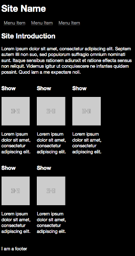
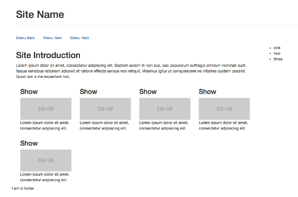
If you look at the current demo page on a desktop, it’s effectively a grid consisting of four rows and two columns:
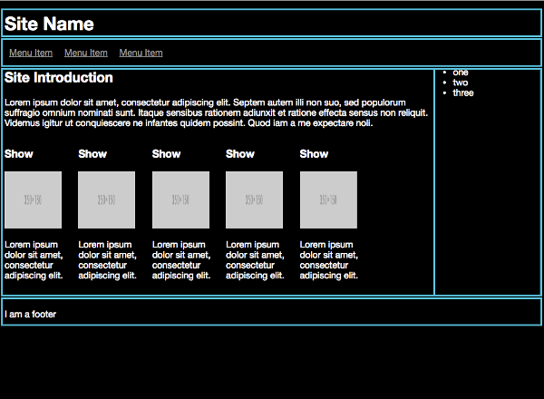
The initial page grid
When you resize the page, the media queries added in the last chapter take care of changing the row and column layouts to fit accordingly.
This is because the current layout is a simple example of what’s called a fluid grid. The main sections of the page have widths that are percentages of the viewport width, and thus will resize accordingly.
On a desktop, the main listing of the TV shows takes up 66% (or two thirds) of the web page, and the menu 33% (or one third).
Chapter3/start/layout.css (excerpt)
@media only screen and (min-width: 992px) {
    aside {
        width: 33%;
        display: block;
    }

    section.showslisting {
        width: 66%;
    }

    .showdescription {
        white-space: normal;
        width: 125px;
    }
}
The fluidity of the design can go further than this. Layouts inside a page area can also take up a percentage of the available space. For example, you could set the individual TV listings to have a flexible width:
section.tvshow {
    width: 20%;
    height: 150px;
    display: inline-block;
}
This means that each subsection will take up 20% of the main content area, no matter what the screen size is. This can start to get fiddly, and is more of an example to show that percentage-based sizes can go anywhere—on text and even media elements (both of which we’ll cover in later chapters).
While the current page layout is a grid, it could be better, with more meaningful class names and a better structure.
Create a new div element with a class of container that wraps all the current content within the body element:
Chapter3/vanilla_final/index.html (excerpt)
<body>
<div class="container">
    …
</div>
</body>
Add the following styles for this div to your stylesheet:
Chapter3/vanilla_final/layout.css (excerpt)
.container {
    width: 95%;
    margin-left: auto;
    margin-right: auto;
    max-width: 1180px;
}
The layout with the extra container
This is a common way to set up a containing element for page content. It sets a maximum width of 1180px, a width of 95% of the browser window, and centers the container in the window using the handy left and right auto margins.
Why 1180px?
Why is the max-width set to 1180px? This is an arbitrary value and based upon current trends in desktop screen sizes; it's added to make sure the page doesn't get too wide on giant screens. For a long time, it was 960px, reflecting that most screen widths were at most 1024px wide. As screen dimensions and resolutions have grown, this maximum width has become larger, but is still open to different opinions. Media queries (covered in Chapter 2) have made this maximum width less relevant than it used to be. For now, stick with this 1180px value.
Next, add a row class to the header, navigation, listings and footer elements. You can also now remove the left class from these elements, as you’ll consolidate its CSS properties:
<header class="row">
    …
</header>

<nav class="row">
    …
</nav>

<main class="row">
    …
</main>

<footer class="row">
    …
</footer>
And define the row CSS class:
.row {
    clear: both;
    float: left;
}
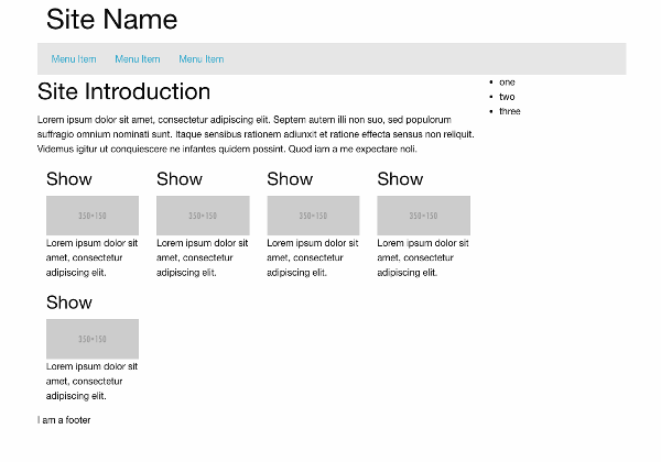
This row fills the width of the container and floats to the left, meaning that as a browser window resizes, it will flow with it, fixed to the left side. As you haven’t yet defined the columns in the rows, the aside menu is pushed to the bottom on larger screen sizes.
The new page structure
Now that everything horizontal on the page is in four rows, it’s time to define the columns inside the rows. Some of the rows are a single, fullwidth column, while others are subdivided.
To start afresh, remove the simpler percentage widths set earlier (from all media queries), so that you have the following:
@media only screen and (min-width: 320px) {
    aside {
        display: none;
    }

    section.showslisting {
    }

    .showdescription {
        display: none;
    }
}
…
@media only screen and (min-width: 992px) {
    aside {
        display: block;
    }

    section.showslisting {
    }

    .showdescription {
        white-space: normal;
        width: 125px;
    }
}
The page is no longer flowing so well at larger screen sizes, but you'll fix this soon.
What Is a Grid?
Before you restructure the page into a fluid grid, let’s take a quick aside to discuss what a grid is.
A grid is a series of columns and rows. But how many rows and columns do you need for your site? The number of rows is more clear: it’s as many as you need to fit your header, navigation, content, footer etc. What about columns? Well, as with other topics in this book (and technology generally), there are different opinions on this. It’s typically an even number, because this makes it easier to divide the page. Numbers divisible by three are most used. (If you’re interested in knowing why, the Wikipedia article on the golden ratio provides a nice explanation). Popular column values are 12, 16 and 24, but I’ll focus on the 12-column grid system here. 12 is popular, as it can be divided into a variety of commonly used sizes, such as a half, a third, and a quarter.
Creating Your Own Grid
You may be wondering how a 12-column layout helps you create a 3-column layout like our example page—and yes, it’s confusing at first.
The columns are more used as structural underpinnings, and through CSS you define how many columns you want your elements to span. To make this clearer, here’s an example of the 12-column 1180px grid:

A 12-column, 1180px grid
And here’s how the grid will represent this page (yes, grids within grids, or “nested grids”, are okay):
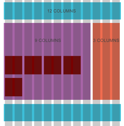
The page as a grid
You could set up all these columns and grids manually for each project, but it’s a much better idea to make something more usable and reusable. We’re going to create a lot of new styles and changes to our HTML and CSS files now. Then I’ll show easier ways to achieve the same result. Sometimes it’s a good idea to learn the hard way before knowing how to make it easier.
Set up the base styles for the columns and rows, and replace any existing matching classes:
Chapter3/vanilla_final/layout.css (excerpt)
.row,
.column {
    box-sizing: border-box;
}

.row:before,
.row:after {
    content: " ";
    display: table;
}

.row:after {
    clear: both;
}

.column {
    position: relative;
    float: left;
}

.column + .column {
    margin-left: 1.6%;
}
Using the Adjacent Sibling Selector
The adjacent sibling selector (+) above is a useful CSS trick that adds a margin only to the matching element following another matching element. In our case, it means that the first column won’t have a left margin.
The first step is to define the width of one column, not forgetting the margin between each column.
A single column width is equal to 100 (as we’re working with percentages) minus the margin value, multiplied by the number of columns minus 1 (you don’t need a left margin in the first column), all divided by the number of columns.
If you prefer to look at formulas:
SingleColumnWidth = (100 – (MarginValue * (NumberOfColumns – 1))) / NumberOfColumns
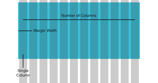
An explanation of the formula
This should give the nice, memorable result of 6.86666666667% … but don’t worry: a number like this is what’s expected, and after the initial setup, you won’t need to remember these values.
Next, apply this number into a new formula for each of the columns. You want to know the width values of column spans—that is, how to spread content across more than one column.
A column width is equal to the SingleColumnWidth value multiplied by the current column, added to the margin value multiplied by the number of columns minus 1.
Or as a formula:
ColumnWidth = (SingleColumnWidth * CurrentColumn) + (MarginValue * (CurrentColumn – 1))
As an example. here’s how to find the value required to span two columns:
(SingleColumnWidth * CurrentColumn)
6.86666666667 * 2 = 13.733333333

(CurrentColumn – 1)
2 - 1 = 1

(MarginValue * (CurrentColumn – 1))
1.6 * 1 = 1.6

(SingleColumnWidth * CurrentColumn) + (MarginValue * (CurrentColumn – 1))
13.733333333 + 1.6 = 15.333333333
This will result in the following column styles, with the column-n class representing the number of columns you want to span. Add these to layout.css:
Chapter3/vanilla_final/layout.css (excerpt)
.column-1 {
    width: 6.86666666667%;
}

.column-2 {
    width: 15.3333333333%;
}

.column-3 {
    width: 23.8%;
}

.column-4 {
    width: 32.2666666667%;
}

.column-5 {
    width: 40.7333333333%;
}

.column-6 {
    width: 49.2%;
}

.column-7 {
    width: 57.6666666667%;
}

.column-8 {
    width: 66.1333333333%;
}

.column-9 {
    width: 74.6%;
}

.column-10 {
    width: 83.0666666667%;
}

.column-11 {
    width: 91.5333333333%;
}

.column-12 {
    width: 100%;
}
Again, don’t worry about remembering what these values are. Once they’re defined, all that’s needed is to use the CSS class.
Saving Some Legwork
Now you want the header and nav bar to always take up 12 columns to better fit into the grid model, so let’s rearrange the header and navigation elements into rows and add appropriate column classes. These are the base column class and a column-12 class to fill 12 columns:
<header class="row">
    <h1 class="column column-12">Site Name</h1>
</header>
<nav class="row">
    <ul class="column column-12">
    <li><a href="#">Menu Item</a></li>
    <li><a href="#">Menu Item</a></li>
    <li><a href="#">Menu Item</a></li>
    </ul>
</nav>
The left content area needs to be nine columns wide, and the aside three columns, so add those classes:
<section class="showslisting column column-9">
    …
</section>

<aside class="column column-3">
    …
</aside>
Now add column classes to the TV shows inside the content area:
<section class="tvshow column column-2">
    …
</section>
In the tvshow class you can now remove the width and display properties and change the height to auto for more responsive magic:
section.tvshow {
    height: auto;
}
The page layout doesn’t look too much different from how it did before, but these crucial changes allow for increased flexibility. Want to make the TV show listings tighter? Then change the class to column-3.
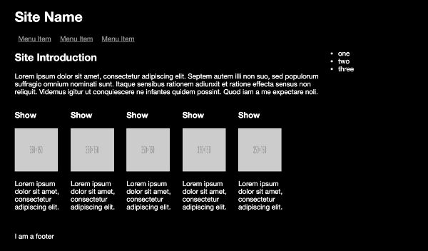
Want a wider aside menu? Change its class to column-4 and change the listings width class to column-8:
The page with a wider aside
As the browser window changes size, you’ll see page elements shrink and grow smoothly, perfect for responsive web design. But notice what happens when you get to a smaller screen size:
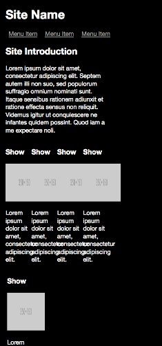
What happens on a smaller screen size
Not a great look: the TV show elements have become squashed. Some of this is due to the images not having reduced appropriately in size yet—a topic we’ll cover further in Chapter 5. This is also a problem with a fluid grid. In theory, what should happen at smaller screen sizes is that the main content column should instead fill 100% of the screen’s width, or the class should change to column-12 to fill the full width of the screen.
One solution is to override the percentage width of the column-8 class at relevant breakpoints. For example:
section.showslisting.column-8 {
    width: 100%;
}
…
@media only screen and (min-width: 992px) {
    …
    section.showslisting.column-8 {
        width: 66%;
    }
    …
}
But this is a poor solution, and you’ll soon lose track of what class equals what size.
You could change the class applied to the div with JavaScript, and in the past, this was a solution to the problem. But instead, I’ll show you some more modern (and better) options that will make the principle of grids more useful for responsive design.
Flexbox
While the “column method” above isn’t that hard to understand and implement, as your layouts become more complex you can start to introduce a lot of nested divs and CSS styles to support them. The example above used float to position page elements into the desired position. As the example was simple, it wasn’t too hard to achieve this, but as grids get more complex, especially nested grids, floats quickly become messy, and the solutions to cope with this aren’t ideal.
The CSS Flexible Box (“flexbox”) Layout Module is a recent part of the CSS spec and already enjoys good browser support. It was designed to provide a better and more modern solution for this type of layout, offering you specific functionality for the task.
After an initial page restructure and learning new concepts, you’ll find that using flexbox for your page components will drastically simplify your HTML structure and CSS classes.
Everything that you want flexbox to manage is contained within a “flex container”. Much like earlier examples, begin with the code from the start of this chapter and continue to use a containing div:
<div class="container">
    …
</div>
And the CSS for this container:
Chapter3/flexbox/layout.css (excerpt)
.container {
    display: flex;
    flex-flow: row wrap;
}
The display property is set to flex to enable flexbox layout. The flex-flow property is shorthand for two other properties.
The first of these properties is flex-direction, which defines how the individual items inside a flex container will be placed. The two most common values are row and column. Using row will place items horizontally (left to right or right to left, depending on your preference). And column works similarly, but instead places elements from top to bottom. You can reverse the direction by appending with -reverse.
The flex display mode is one-dimensional (running either horizontally or vertically) and will attempt to keep fitting items on one line. The flex-wrap property determines what will happen if the container can’t fit all items on one line. The items can be set to wrap to the next line or be forced into one line with nowrap.
Next, let’s handle the header, nav, and footer page elements, which fill the entire width of the page container. Replace any existing styles with the following:
Chapter3/flexbox/layout.css (excerpt)
header, nav, footer {
    flex: 1 100%;
}
flex is shorthand for three combined properties, in the following order:
flex-growdetermines how much space an item is allowed to use in a container, and the sizes are relative to each other. If every item in a container has aflex-growvalue of1, then each item is evenly distributed. If one item has a value of2, it will take up twice as much space as the other items.flex-shrinkdetermines whether or not an item can shrink to less than itsflex-growvalue, and if so, to which value. The default is1, so if you want to keep proportions no matter what, leave the value empty.flex-basisallows you to set a default item size before space is distributed, in any of the typical CSS sizing units.
Moving to the main content area, again replacing any existing styles, you can also remove any of the previous methods for resizing elements inside media queries:
Chapter3/flexbox/layout.css (excerpt)
main {
    flex-grow: 2;
    flex-basis: 66%;
}

aside {
    flex-grow: 1;
    flex-basis: 33%;
}
...
@media only screen and (min-width: 320px) {
    aside {
        display: none;
    }

    section.showslisting {
    }

    .showdescription {
        display: none;
    }
}
…
@media only screen and (min-width: 992px) {
    aside {
        display: block;
    }

    section.showslisting {
    }

    .showdescription {
        white-space: normal;
        width: 125px;
    }
}
Resize the page. Notice that you now have the same effect as with the first fluid grid example, but have removed a lot of CSS from the media queries. With one set of flex properties, the sizing of page elements is handled for us. All without the need for any JavaScript!
If you were to restructure the page, you could remove the flex-basis properties, but nesting flex containers with different row/column directions would involve further div elements, so weigh up your HTML complexity versus CSS complexity.
Next, here are the styles for the TV show listing:
Chapter3/flexbox/layout.css em>(excerpt)
section.showslisting {
    display: flex;
    flex-wrap: wrap;
    flex-direction: row;
    margin-bottom: 25px;
}

section.tvshow {
    width: 125px;
    height: auto;
}
This sets the showlistings section as another flex container that wraps any items that don’t fit onto one line—since, by default, flex will try to fit all items onto one line.
At this point, you can also delete the left class from your HTML and CSS, as it’s no longer needed.
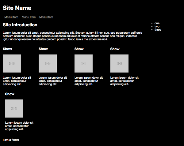
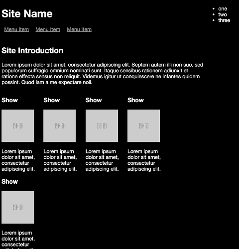
The final flexbox layout
One other cool flexbox trick is to set the order of elements using the order property, and a number that defines its position. For example, you could use the following to rearrange page elements on a mobile device:
nav { order: 1;}
header { order: 2;}
main { order: 3;}
footer { order: 4;}
Setting the order of page elements
But if you wanted to remove page elements, you’d still need to use media queries.
This has been a brief example of how to use flexbox, but as you can see, once you’ve restructured your page, flexbox handles a lot of the manual page reflowing work for you.
CSS Grid Layout
Complementary to flexbox is the CSS Grid Layout Module, which helps you define and lay out the regions of a page. In the past, the main option open to web developers for flexible (I use this term loosely) page layouts was using HTML tables to define page areas with rows and columns, but these were terrible for accessibility. The grid layout is something of a modern re-interpretation of that concept.
Browser Support for Grid Layout
Grid shipped for all the newest versions of the major browsers in early 2017, so a fallback strategy is required if your layouts need to be supported in older browsers. You can check online for details on which browser versions do and don’t support Grid.
Let’s try applying the grid layout to the demo site, starting with the code from the beginning of this chapter.
Again, make a container div inside the body to contain the layout:
…
<div class="container">
…
</div>
…
Move the aside from inside main to outside of it. This lets you treat it like a proper column in its own right:
Chapter3/grid/index.html (excerpt)
…
</main>
<aside class="left">
    <ul>
    <li>one</li>
    <li>two</li>
    <li>three</li>
    </ul>
</aside>
In the CSS, change the display type to grid:
.container {
    display: grid;
}
Now the grid display gets really cool. Add the following:
Chapter3/grid/layout.css (excerpt)
.container {
    display: grid;
    grid-template-columns: 66% 33%;
}
Removing Sizing Overrides
As with the flexbox layout, you can also take this opportunity to remove all the other sizing overrides in media queries.
And in one simple CSS property, you’ve removed the need for two of the CSS classes used so far. The grid-template-columns property gives you even more possibilities. For example:
- You can use any standard sizing unit for defining the column, including
autoto fill remaining space. - You can use
fr(“fractional units”) to let the grid proportionately fill space. So you could rewrite this grid asgrid-template-columns: 2fr 1fr;, which means that the first column will fill two-thirds of the space, and the second one third.
Great, but if you look at the demo site now, you’ll notice that the rows in the design that don’t have a 66/33 split don’t look right. This is because you also need to define the rows with similar syntax:
Chapter3/grid/layout.css (excerpt)
.container {
    display: grid;
    grid-template-columns: 66% 33%;
    grid-template-rows: 80px 80px auto 20px;
}
How Many Rows?
This is the first example where we’ve needed to explicitly define rows, and there are a couple of ways you could do it. I suggest that there are four rows: the title, the top menu, the introductory text and TV shows, and the footer. If you want to change these divisions (for example, splitting the description and TV shows), feel free to do so.
This syntax specifies a set height for three elements and then lets the remaining TV shows element fill the remaining empty space.
But again, if you load the page in the browser, little has changed. In fact, the footer has now jumped up the page. This is because there’s one more step needed—to add the sub-elements into the grid:
Sub-elements not yet added
The grid display layout has two interesting methods for defining where you can place an item.
- The first is similar to flexbox, allowing you to specify an order number.
- The second lets you place items at named locations. To use this method, you need to define what are called line names.
The code below sets the display style to grid, then defines the columns and rows you need. For the columns, this is a column named left that’s 66% of the page width, and a column named right that fills 33%. For the rows this defines three with a fixed height (header, main-nav and footer) and shows will automatically fill any remaining space.
.container {
    display: grid;
    grid-template-columns: [left] 66% [right] 33%;
    grid-template-rows: [header] 80px [main-nav] 40px [shows]
    auto [footer] 20px;
}
At this point, now you understand what’s going on, it’s time to make this mobile first. Change the current container class to the following:
.container {
    display: grid;
    grid-template-columns: [left] 100%;
    grid-template-rows: [header] 80px [main-nav] 40px [shows]
    auto [footer] 20px;
}
And for larger screen sizes:
@media only screen and (min-width: 992px) {
    .container {
    grid-template-columns: [left] 66% [right] 33%;
    }
    …
}
If you’ve ever created tables in a desktop publishing application (or remember using tables for layout in the dark days of web design), you’ll know that you need to define how an item “spans” across multiple cells or rows. The technique is the same with the grid display. Take the header as an example:
header {
    grid-column-start: left;
    grid-column-end: right;
    grid-row-start: header;
    grid-row-end: header;
}
This declaration block states that the column should start at the left and span all the way to the right, as well as span from the top to the bottom of that row.
The other page elements follow a similar pattern:
Chapter3/grid/layout.css (excerpt)
…
nav {
    grid-column-start: left;
    grid-column-end: right;
    grid-row-start: main-nav;
    grid-row-end: main-nav;
}
…
main {
    grid-column-start: left;
    grid-column-end: right;
    grid-row-start: shows;
    grid-row-end: shows;
}
…
footer {
    grid-column-start: left;
    grid-column-end: right;
    grid-row-start: footer;
    grid-row-end: footer;
}
…
@media only screen and (min-width: 992px) {
    …
    aside {
    display: block;
    grid-column-start: right;
    grid-column-end: right;
    grid-row-start: header;
    grid-row-end: header;
    }
}
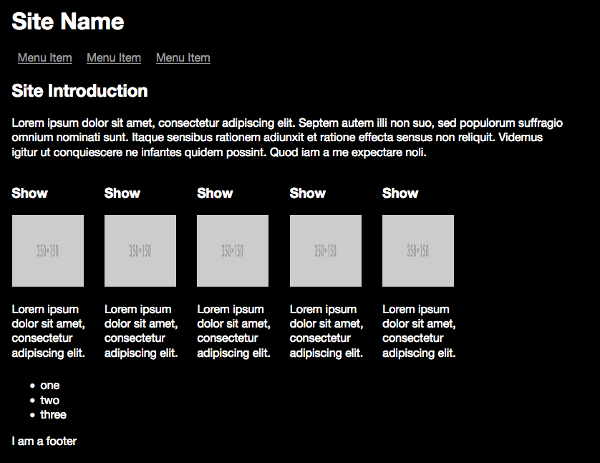
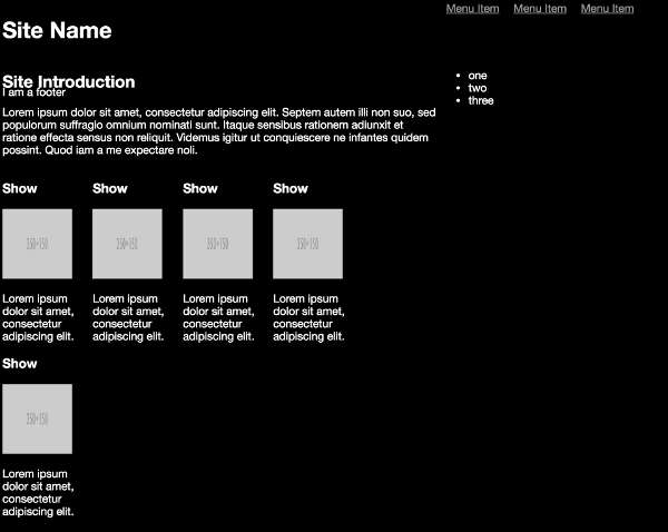
And now you have a grid defined. Initially, the syntax seems verbose, but it’s more human readable.
The final grid layout
There are lots of other grid layout features, including repeating layouts, nested grids, content alignment, and the ability to define margins and spacing in your grids. One final advantage of the grid display is that it also makes floating and clearing unnecessary, so remove the left class from the HTML and any clearing styles that were used.
Making Grids Easier with Frameworks
In many cases, creating a grid in the way described in this chapter isn’t too much work, but developers and designers like to reduce repetitive tasks as much as possible. A simple solution is to create your own grid system that works for you and reuse it across your projects. But of course, other developers and designers have thought the same thing and have provided their grid systems (or frameworks) on the internet. I’ll present two of the popular ones, but it’s a topic where opinions are many and change is rapid. My aim here is to show you how frameworks may be able to help you save time on repetitive tasks, rather than go into detail over which one is “better” (a decision you’ll have to make for yourself). Many of these frameworks supply more than responsive grids, providing other responsive elements such as fonts, icons, and reusable widgets. You may prefer one framework over another because it gives you better options for other aspects of your web pages.
Bootstrap
While not the first framework for responsive design, Bootstrap is the most widely used. You’ve probably seen it in action without realizing. Released in 2011 by Twitter, it uses a 12-column grid, offers flexbox layout, and has periodically had one of the most popular repositories on GitHub.
Popularity is Bootstrap’s biggest advantage and disadvantage. It’s easy to use, encourages positive layout and CSS practices, and has plenty of documentation and community help. But your site can easily end up looking a lot like every other Bootstrap-powered site.
Installing Bootstrap
The default download of Bootstrap can add a lot to the weight of your page, so I recommend you take a good look at the instructions to ensure you get a copy that’s best optimized for your use. For this example, I’ll use the CDN option, as it’s the simplest. If you want to follow along, add the lines provided on the Bootstrap page, and remove the link to the current CSS file.
You can find the simplified (no media queries) refactored index.html page here as an example. You’ve lost the custom font and background colors, which would be easy to re-add, but you have a responsive grid (Bootstrap also uses a 12-column grid) without too much effort, and that works in a similar way to our custom grid. Bootstrap also has a lot of other styles available for handling images, determining what grid elements to display at different grid sizes, and much, much more.
A Bootstrap example
If you’re interested in learning more about Bootstrap, I recommend SitePoint’s Jump Start Bootstrap.
Foundation
Foundation was created in 2011 by Zurb (an interactive design agency). It also offers a lot of features (including optional flexbox), has regular releases, and a good community, but is less widely used. It provides more flexibility to create layouts (based on a 12-column grid), but generally requires more classes and layout elements to achieve this.
Installing Foundation
Like Bootstrap, Foundation can add a lot of page weight, so make sure you download the best configuration for you.
Remove the current stylesheet and add links to the new stylesheets:
<link rel="stylesheet" href="foundation/css/foundation.css">
<link rel="stylesheet" href="foundation/css/app.css">
You can find the Foundation simplified (no media queries) refactored index.html file here as an example. Again, you’ve lost the custom colors that can be replaced, but you should be able to see the extra elements and classes you need to add.
A Foundation example
If you’re interested in learning more about Foundation, then I recommend SitePoint’s Jump Start Foundation.
What About the Demo App?
I’ve used sections of the demo app so far in examples for this chapter, but the rest of the book will not use any grid systems. This is for clarity, so you can more easily see the examples covering other topics without the grids getting in the way, but also to reduce compatibility issues with certain browsers.
As an exercise, try picking your favorite grid system from this chapter and rewriting future examples using it.
Wrap Up
Now you know how to make a page layout that can respond to any browser size and always fit proportionally. In the next chapter, we’ll look at making the content inside the layout responsive—because, without readable and presentable content on all devices, your work is not yet complete.