
Chapter 10: Building Gatsby Components
This chapter introduces the M component of the Jamstack; that is, Markup. Markup is most often used to render, or produce, the content that the end user will view in the browser, decorated with some formatting. Code modularity in Gatsby is achieved through the use of components, which are its building blocks. Each component building block that is built using JavaScript and JSX will accept input and return HTML and web content to the browser. In this chapter, we will learn how to create, edit, and extend these components – the building blocks of the site.
Components exist in several forms, so we will also look at how they can produce single pages, exist as page templates, and finally how page partials are structured and how the three differ from one another.
The main topics that we will cover in this chapter are the following:
- React components
- Understanding the types of components
Technical requirements
This chapter requires a terminal program and a source code editor program.
The code files for this chapter can be found at the following link: https://github.com/PacktPublishing/Jumpstart-Jamstack-Development/tree/chapter_ten.
React components
Gatsby uses React underneath, so it can take advantage of all that React has to offer. A React component is mostly a JavaScript function that returns something. By leveraging GraphQL, the developer can use Gatsby's source plugin to pass data into the page. Properties are usually sent into the component and then events are passed up. These patterns – props down, events up or data down, and actions up, are used in several JavaScript frameworks and are very easy to understand. Once a React component is created, it may be imported to another component for easy reuse.
Tag convention
As mentioned in the previous section, once a component is created, it can be invoked or used in Gatsby as if it was its own HTML tag, so its use is familiar to those who are familiar with working with HTML tags. This is useful for readability, since the output looks like HTML and not JavaScript code. The convention for working with React components is to encapsulate the name of the component in an HTML tag. It must begin with a capital letter.
To illustrate this concept, for example, if we have a component called books, we can include it in our project as follows:
<Books />
Let's start by looking at the various types of components used in Gatsby.
Understanding the types of components
There are three main types of Gatsby components used in this project: page components, templates, and partial components. Let's look at each type as they all serve a different purpose.
Gatsby page components
One of the simplest types of components used in Gatsby is a page component. Gatsby page components are used only once for single, unique pages, such as the index (home) page, 404 page, or an about us page, for example. This page will only be generated once.
Building and modifying Gatsby page components
As mentioned previously, pages are unique. By creating a page component and placing it in the /web/ src/pages folder, Gatsby will automatically generate the page.
The content of a code page in Gatsby can be as simple as the following example, which contains the entire page contents inside a string:
// Does not require React because there is no JSX
const AboutUsPage = () => (
`Who we are: .......`
)
export default AboutUspage
The following is a shorter way to write the preceding code:
const AboutUsPage = () => {
return `Who we are: .......`
}
Enhancing this example by using JSX would allow us to create the following example:
//Requires React because this example uses JSX tags.
import React from 'react'
const AboutUsPage = () => (
<html>
<body>
<h1>Who we are:</h1>
<p>.......</p>
</body>
</html>
)
export default AboutUsPage
If we were to name the file about-us.js and place it in the /web/src/page/ directory, then running Gatsby would display the following screenshot:

Figure 10.1 – Screenshot of the About Us page
This AboutUsPage example will be rendered in the browser as HTML.
Gatsby template components
Gatsby template components are, as the name implies, templates. These are used as a template for pages, such as articles, where certain parts of the page will be filled with unique content. These templates will be processed as many times as necessary to produce all the content needed.
Building and modifying template components
To illustrate this concept, we will create a template for the events on our website. The first file that we need to work with is /web/src/gatsby-node.js. This file contains the code used to display blog posts using a template.
At the bottom of the gatsby-node.js file, the relevant code is as follows:
exports.createPages = async ({graphql, actions}) => {
await createBlogPostPages(graphql, actions)}
We will now add another function to generate events sourced from Sanity through GraphQL:
exports.createPages = async ({graphql, actions}) => {
await createBlogPostPages(graphql, actions)
await createEventPages(graphql, actions)
}
Next, we'll copy the content of createBlogPostPages. The entire function should be copied. However, the middle of the function was omitted for space. Here is an excerpt:
async function createBlogPostPages (graphql, actions) {
const {createPage} = actions
const result = await graphql(`
…...
createPage({
path,
component:
require.resolve('./src/templates/blog-post.js'),
context: {id}
})
})
}
Here is the structure of the newly created createEventPages function:
async function createEventPages(graphql, actions) {
const {createPage} = actions
const result = await graphql(`
{
allSanityEvent {
...
}
}
`)
. . .
if (result.errors) throw result.errors
const eventEdges = (result.data.allSanityEvent || {}).edges || []
. . .
eventEdges
.forEach((edge, index) => {
....
}
Now, let's examine this code. An asynchronous function is created with the graphql and actions parameters. This will always return a promise:
async function createEventPages(graphql, actions) {
The createPage method is extracted as a constant, or destructured from actions:
const {createPage} = actions
The constant result is declared to hold the result of the GraphQL query. The JavaScript function will wait for this to complete before moving on. The query is enclosed in backtick operators (`):
const result = await graphql(`
{
The following lines are similar to the GraphQL query, which returns Gatsby's id and dataAndTime from allEvents via gatsby-source-sanity:
allSanityEvent {
edges {
node {
id
dateAndTime
}
}
}
}
`)
If there are any errors, throw an exception:
if (result.errors) throw result.errors
Next, we'll examine the following line of code:
const eventEdges = (result.data.allSanityEvent || {}).edges || []
Declare a constant named eventEdges and assign the results of the query's edges to it if they are not empty. Otherwise, if there are no results, then instantiate an empty array to eventEdges. Remember that the result of the GraphQL query is wrapped in data.
Iterate, or loop through (using forEach) all of the edges, using an edge variable for each single edge of the GraphQL query:
eventEdges
.forEach((edge, index) => {
Destructure id and dateAndTime from the edge's node object:
const {id, dateAndTime} = edge.node
Use the format function from date-fns, which is included in the Gatsby package.json file to format dateAndTime, which otherwise would print as 2020-04-10T15:30:00.000Z, into a more acceptable four-digit year, front slash, double-digit numeric month format, (YYYY/MM), assigning it to a constant named dateSegment:
const {format} = require('date-fns')
const dateSegment = format(dateAndTime, 'YYYY/MM')
Create the path that will actually be the single page's URL and be seen in the browser. Here, we are using Gatsby's ID, which is created, and not Sanity's ID, which can be accessed in the GraphQL query as _id:
const path = `/event/${dateSegment}/${id}/`
Here is an example of the URL path:
/event/2021/09/dd88fc6c-10c5-572e-8c58-696add54a14a/
Finally, the createPage function is called, passing in the path, specifying the event.js template file for each page, and passing in id as the context parameter:
createPage({
path,
component:
require.resolve('./src/templates/event.js'),
context: {id}
})
})
}
The contents of the event.js file will be used in the component attribute of the createPage method and will be resolved, combining the contents of the page and its template to produce a single page.
Building the event.js template
event.js is the template used for each individual event page, so let's look at how it is constructed:
- First, we need a few import statements to bring in the necessary features:
import React from 'react'
import {graphql} from 'gatsby'
import Container from '../components/container'
import GraphQLErrorList from '../components/graphql-error-list'
import Event from '../components/event'
import SEO from '../components/seo'
import Layout from '../containers/layout'
import {toPlainText} from '../lib/helpers'
- Next, we need to perform a GraphQL query to obtain each element of the page:
export const query = graphql`
query EventTemplateQuery($id: String!) {
event: sanityEvent(id: {eq: $id}) {
name
_rawBody
venue {
name
}
}
}
`
At a minimum, to produce the event's page, we need its name, _rawBody, and the name of the event's related venue.
- Next, EventTemplate is defined with props (properties) as its parameter and eventually exported:
const EventTemplate = props => {
...
}
export default EventTemplate
- Next, the data and errors (if present) objects are deconstructed from the props parameter. Then, if data is present, the event constant is instantiated to hold the data object's event:
const {data, errors} = props
const event = data && data.event
- Next, the Layout component is called inside the SEO component and the Event component. The error handling code has been removed to remove any distraction, but errors would be displayed here as well if they existed. The layout produces the page layout, tags, such as the header and footer, and provides a wrapper for the event:
return (
<Layout>
{event && <SEO title={event.name || 'Untitled'} />}
{event && <Event {...event} />}
</Layout>
)
Note
Notice how the JavaScript ES6 spread syntax is used to assign each of the Event object's values to separate values to be used with the Event component.
This Event tag represents an example of components that can be easily inserted into numerous contexts. In the following Figure 10.2, we see how an example event will be displayed on the page:

Figure 10.2 – An event
In the next section, we'll look at how an example in-page or partial component is constructed.
Gatsby partial components
Partials, as some frontend systems refer to them, are non-page components, such as a header or an element of a page that can be embedded and reused many times throughout the website.
Building and modifying Gatsby partial components
Gatsby partials have a format similar to other components. However, there are several differences. The main difference is that they are not complete pages, so they cannot be rendered as such. Also, they will be embedded in files by importing them.
Let's look at how a partial component file is constructed:
- First, a few import statements bring in a few libraries for added functionality and auxiliary:
import React from 'react'
import {buildImageObj} from '../lib/helpers'
import {imageUrlFor} from '../lib/image-url'
import PortableText from './portableText'
import Container from './container'
- To start, we will continue to use the cascading style sheet from the blog post:
import styles from './blog-post.module.css'
- Next, the Event function is defined and the properties of the single event are passed into the function through the props parameter. The function is exported at the end:
:
function Event (props) {
...
}
export default Event
The _rawBody, name, and venue objects are destructured from the props parameter as they are necessary for the page contents:
const {_rawBody, name, venue} = props
- Finally, the contents of the page are produced and returned:
return (
...
)
- An article tag is a standard semantic in HTML5 and here is used as the outermost tag, enclosing the contents:
<article className={styles.root}>
<Container>
<div className={styles.grid}>
<div className={styles.mainContent}>
- Here, we print the name of the event and the venue name, using dot notation, since the venue name is contained within the venue object. Note that the dynamic elements are enclosed in curly braces so as to be replaced with the actual values:
<h1 className={styles.name}>{name} @ {venue.name}
</h1>
- Finally, a trick is employed here to instruct Gatsby to display _rawBody if it exists using a logical and. The double ampersand is used to denote and. The format is if a and b. Here, if a is false, meaning that _rawBody has no contents, then the <PortableText> tag and its contents, _rawBody, will not be displayed.
PortableText is a component that converts Sanity's content, _rawBody, to React content so that it can be displayed properly:
{_rawBody && <PortableText blocks={_rawBody} />}
</div>
</div>
</Container>
</article>
The following diagram is an example of how the page will be displayed:
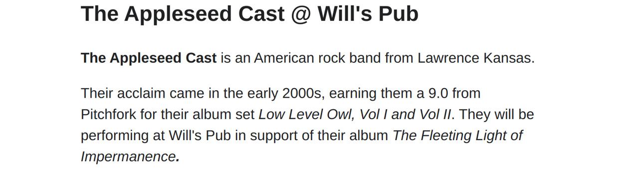
Figure 10.3 – An example Gatsby page
Summary
In this chapter, we learned about page, template, and partial components. The page component represents a unique page, a template is used to produce many similar types of pages, and partials are pieces of content that can be used within other pages. Each type of component used in Gatsby is based on React, so it reutilizes a robust JavaScript-based system. These components are the building blocks of Gatsby, so knowing how to create and work with them is essential to all Gatsby development.
In the next chapter, we will begin our journey into the A part of the Jamstack acronym – the API.