
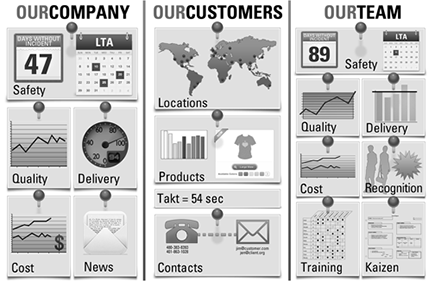
Figure 12-1: A display board.
Chapter 12
Perfection Tools
In This Chapter
![]() Understanding the power of standardized work
Understanding the power of standardized work
![]() Creating a visual environment
Creating a visual environment
![]() Identifying defects and variation
Identifying defects and variation
In a Lean environment, you compare everything to a standard and then work to improve it. You don’t change anything indiscriminately or “just do it” to improve performance. You use information, analysis, and visual tools to help you deliberately identify where waste and defects are cropping up.
Along with the customer and value-stream tools in Chapter 10, the flow and pull tools described in Chapter 11, and the management tools in Chapter 13, the perfection tools in this chapter make up the overall Lean toolbox. You need all of these tools to support Lean practices.
In this chapter, you discover first how to create standardized work — the foundation upon which activities and processes are built and the basis upon which improvements are made. Then, you organize kaizen events for continuous improvement. And finally, by using visual-management tools, you understand how to create a world where it’s possible to “manage by eye.” This includes the everyday statistical tools that help monitor and analyze the performance of the system. This is the part of the toolkit that enables you to strive for perfection.
Beginning with Standardized Work
Your pursuit of perfection begins with establishing standardized work, sometimes referred to as standard work or standard operations. Standardized work is the definition of consistent, predictable methods of doing things. Think of the checklist that a pilot performs before each flight as one example of standardized work. Standardized work provides the foundation for the implementation of many other Lean techniques and is also the launch point for improvement. It is not rigid, stagnant, unchanging policies and procedures that no one follows. Quite the opposite: It’s the work everyone follows.
Begin with the routine work tasks that most directly affect your ability to deliver to customer demand. Describe the work simply, yet in such a way that you can measure both the variability and waste in its operation. Your description should also enable you to apply methods and tools to continually improve performance over time. Repeat this process until you have standardized work for all activities.
 The best people to define standardized work are the people who actually do the work. Some requirements may be non-negotiable, like the use of safety equipment. Define what those requirements are and why they are not negotiable and then let the people go from there.
 Standardized work sets the foundation for improvement. To apply analysis and improvement tools, you must first characterize what you’re doing now — the current processes. You have to standardize processes to have a basis for measurement. You must establish a culture and mindset around defining, measuring, and following standardized work.
 Do you think that following something as simple as a checklist isn’t all that important? According to the World Health Organization, 234 million medical operations are performed globally each year, and at least half a million deaths per year would be preventable with effective implementation of the WHO Surgical Safety Checklist worldwide. Standardized work matters!
Guiding rules for standardized work
Five rules govern your approach to implementing standardized work. Follow these rules as you develop your standardized work practices:
![]() Adjust to human ease and effectiveness, not machine efficiency. The goal of standardized work is to help people be more safe and effective at what they do. Define work processes and procedures to optimize people — not machines. Machines are tools that assist people, not the other way around! By design, it is OK for a machine to wait on people. The limitations on machine capabilities should not control your implementation of standardized work.
Adjust to human ease and effectiveness, not machine efficiency. The goal of standardized work is to help people be more safe and effective at what they do. Define work processes and procedures to optimize people — not machines. Machines are tools that assist people, not the other way around! By design, it is OK for a machine to wait on people. The limitations on machine capabilities should not control your implementation of standardized work.
When people are waiting for machines, it is a visual signal that you have waste in that operation and can improve.
![]() Standardize all repetitive work. Standardize any and all work that’s performed repeatedly. Standardize both the easy stuff and the more difficult processes. You’ll receive the benefits from standardizing all processes.
Standardize all repetitive work. Standardize any and all work that’s performed repeatedly. Standardize both the easy stuff and the more difficult processes. You’ll receive the benefits from standardizing all processes.
The more you can repeat a process, the better you can standardize it and reap the benefits. Strive to look for what’s repetitive so that you can standardize it.
Do not standardize for standardizations sake. The goal is not the standard but operations that are safer, of high quality, more effective, and engage the minds of the people doing the operations.
![]() Keep equipment and systems in condition. Materials, computers, machines, and other systems support your work processes. Keep these in standard condition to ensure you’re producing both a high quality of output and an even flow of work. Breakdowns and lack of quality materials will disrupt your flow and impact product and service quality. Repair or upgrade substandard systems. See Chapter 11 for more on maintenance.
Keep equipment and systems in condition. Materials, computers, machines, and other systems support your work processes. Keep these in standard condition to ensure you’re producing both a high quality of output and an even flow of work. Breakdowns and lack of quality materials will disrupt your flow and impact product and service quality. Repair or upgrade substandard systems. See Chapter 11 for more on maintenance.
![]() Make standardized worksheets visible and accessible. People stray from performing to work standards. Everyone needs constant references and reminders. Keep standardized worksheets visible and readily accessible. Capture key metrics — and report deviations. Be certain that you’re making it easy to know when variations occur.
Make standardized worksheets visible and accessible. People stray from performing to work standards. Everyone needs constant references and reminders. Keep standardized worksheets visible and readily accessible. Capture key metrics — and report deviations. Be certain that you’re making it easy to know when variations occur.
![]() Revise regularly. Update and improve standardized work whenever you can. Jump on every chance to reduce variation, minimize inventory, improve workflow, and keep individual cycle times balanced with the overall takt time. Change the standard as often as necessary.
Revise regularly. Update and improve standardized work whenever you can. Jump on every chance to reduce variation, minimize inventory, improve workflow, and keep individual cycle times balanced with the overall takt time. Change the standard as often as necessary.
How will you respond when you see someone deviating from the standard? Your response will either build trust and collaboration, or create division. To build a culture of continuous improvement, the best way to address someone who is varying from the standard is to ask questions. Questions like “How have you improved the process with your method?” “What is your understanding of the standardized work for this process?” are better than, “Why aren’t you following standard operations?”
People will routinely find better ways than the standard. Don’t treat standardized work as the end in itself. Standardized work is the routine, but when you have an improvement to the standard, make the adjustments regularly through kaizen.
Implementing standardized work
Wherever possible, perform standardized work — tasks, activities, processes, and procedures — that you can conduct in a standard manner. It’s specific, documented, measurable, and repeatable. Standardized work can apply to a person working by herself, or a group of people working collaboratively. It can also include equipment and systems as well as human-to-machine interfaces. This standardization of work occurs not only in production or operations areas, but across the enterprise — in all functions and throughout all value streams.
To implement standardized work, follow this six-step process:
Step 1: Check equipment
Analyze your facilities, systems, and equipment to ensure that they’re in proper and sufficient condition to meet the needs of the process activities. Adjust and tune systems to maximize ease of use and effectiveness. This includes information systems and programs.
Step 2: Check time
Determine the initial cycle time for the work — how long it takes you or your team to complete a unit of work. Then, compare that cycle time to the takt time requirement — how long you should be taking, based on customer demand. When you have these two values, determine the difference. Are you high or low? Chances are that the work time is longer than the takt time. You must make adjustments to equalize them. Usually, this means adjusting the time it takes to complete a unit of work, rather than attempting to adjust the takt time. To reconcile work time-takt time discrepancies, perform the following analysis and improvement efforts:
![]() Analyze the workflow, sequencing, and organization of your internal process, and identify where you can gain speed and efficiencies.
Analyze the workflow, sequencing, and organization of your internal process, and identify where you can gain speed and efficiencies.
![]() Restructure your internal process as necessary so that your cycle time is in concert with the takt time.
Restructure your internal process as necessary so that your cycle time is in concert with the takt time.
![]() Institutionalize the new production times as part of the standardized work instructions.
Institutionalize the new production times as part of the standardized work instructions.
Step 3: Check work-in-process
Your next step is to minimize work-in-process (WIP), which is waste (muda) due to inventory. Examine your work module or area for ways to reduce the amount of inventory or WIP required. You want to define standardized work for all processes in such a way as to require minimal amounts of WIP. Be sure to establish the acceptable range for inventory levels.
Step 4: Post it
After you’ve verified your support systems, balanced your productivity rate with the takt time, and established the inventory range, baseline your process and issue standard instructions. Standardized work instructions can take nearly any form — as long as they’re precise, understandable, and measurable — and as long as they can be followed by the individuals performing the work.
Standard instructions can be printed on paper, read on a computer screen, printed on signs, or transmitted by any manner of communication — as long as it works. Examples of standard instructions include the following:
![]() Instruction sheets: Describe the procedures, including the organization, flow, and timing of the activities; the WIP range to maintain; and supporting equipment and environmental conditions, where applicable. Instruction sheets should be brief, easy to read, visible, and referenced.
Instruction sheets: Describe the procedures, including the organization, flow, and timing of the activities; the WIP range to maintain; and supporting equipment and environmental conditions, where applicable. Instruction sheets should be brief, easy to read, visible, and referenced.
![]() Operating manuals: Describe equipment, facilities, software programs, and other systems in terms of how they’re used in the process activity. Operating manuals should be developed as training and reference documents that are kept handy in the workplace.
Operating manuals: Describe equipment, facilities, software programs, and other systems in terms of how they’re used in the process activity. Operating manuals should be developed as training and reference documents that are kept handy in the workplace.
Poka-yoke (error-proof) your work instructions. Wherever possible, implement methods that help ensure people will follow the instructions properly; these methods should ensure that people will be prevented from not following the instructions, too.
Step 5: Monitor, measure, and manage
Congratulations — you’ve crossed the starting line! You’ve implemented a unit of standardized work and can now observe it in action. Actively monitor the activities and continuously measure performance of the work module. Regularly compare performance to standards, and strive to maintain performance to standard:
![]() For any variances you observe, where the work activity is not conforming to the standard instructions, identify and understand the cause and intervene to correct the deviations — and restore the activity to comply with the standard (or update the standard through kaizen).
For any variances you observe, where the work activity is not conforming to the standard instructions, identify and understand the cause and intervene to correct the deviations — and restore the activity to comply with the standard (or update the standard through kaizen).
![]() Seek to identify waste, and identify the cause of the nonconformance.
Seek to identify waste, and identify the cause of the nonconformance.
Step 6: Adjust and update
When a change is warranted, make it — and make it quickly. Making rapid and detailed revisions to standard should be a normal, routine process; make sure you can implement formal changes swiftly and easily, and introduce them into your environment smoothly. The rapid adjustment process is critical to continuous improvement. Condition your team to absorb regular updates.
Because you want everyone working to standard, the standards must always be right and proper — and this means your update process must be routine and smooth. If your standards are out of date, everyone will quickly conclude that it’s no longer necessary to work to standard, and you’ve lost the battle.
Updating standardized work is an integral part of kaizen! If you’re doing kaizen, you’d better be updating standards.
In a continuous improvement environment like Lean, standards aren’t written in stone — they’re made to be changed. This may not be the way you’ve worked in the past, so it may be a challenge to create this mindset. Develop a process for regularly modifying work standards. Be sure everyone in your organization understands and supports the modification process. Budget the time and effort for crafting and absorbing modifications into your operations planning. Make change routine!
Standardizing operations is one of the most important tools of a Lean enterprise. Standardizing work processes helps you to achieve a consistently high quality of product and services, performed by proud and productive workers, received by satisfied customers, within a safe environment and strong cost performance. Reducing variation in work processes (mura) leads to remarkable productivity improvements.
Improving with Kaizen
Kaizen is the act — and art — of continuous, incremental change and improvement. Kaizen tells you that even if something isn’t broken, it can and must be improved: Do it better and make it better. The continual, incremental changes of kaizen occur in all areas and at all levels — large and small, internal and external — in ways that improve the whole organization. Lean kaizen maintains the focus on customer value and the reduction of waste in the value stream. (Refer to Chapter 9 for an in-depth discussion and explanation of kaizen.)
Kaizen sees the enterprise through two lenses — setting new standards and maintaining existing standards. Kaizen maintenance is the act of establishing the policies and rules that help maintain the performance levels set by the present managerial and operating work standards. Kaizen improvement focuses you on the continuous improvement of existing standards and processes, as well as the innovation of new ones.
In all cases, kaizen requires you to apply training, materials, tools, and observation to improve and maintain standards on a continual basis.
The Lean culture is one of continuous improvement. This comes in the form of everyday improvements or special kaizen events — you need to incorporate both.
The kaizen event
The kaizen event — also known as a kaizen workshop or kaizen blitz — is your most powerful and effective tool for engaging everyone within a work module or process area to perform a focused improvement activity. A kaizen event is a complete run-through of the plan-do-check-act (PDCA) cycle, typically lasting three to five days. During the kaizen event, the team focuses on a specific area to find waste or other hindrances to value creation and remove them from the value stream. The improvement may be in safety, quality, changeover time, communications, organization — almost anything. Kaizen events are famous for requiring minimal investment and yielding great benefits.
One place to start is on the “bottleneck” operations — those that run at or near takt. When you improve your bottleneck operations, you improve your ability to deliver to your customer.
The kaizen project team halts its normal work completely and will not produce its regular product or perform its services while it’s participating in the kaizen event. You must perform the necessary advanced planning to ensure the customers and other business areas, are not unduly impacted while the improvements are discovered and implemented.
Organizing the improvement team
Everyone from the affected work group or process area is on the kaizen improvement team. Leave no one out — no one. In addition, involve members from support organizations, suppliers, and, of course, customers. To ensure maximum participation and contribution be sure to let everyone know why they are involved.
If you are conducting a kaizen event in a manufacturing area, you may want to include someone from design and development engineering. They will gain perspective from the environment and contribute insight to the team. If you are doing a kaizen event in the operating area of a hospital, include orderlies and maintenance personnel; they are integral to the changeover and can provide a unique perspective. It’s OK to involve someone not directly related to the focus of the event; they usually ask the best questions and provide an outsider’s perspective.
Have a Lean expert, or sensei, lead the kaizen event (See Chapter 5for more information.) The sensei not only understands the tools, but can explain how to apply them for maximum value. This expert leader also manages the event, monitors progress, and keeps everyone on track. The sensei, who has the Lean perspective, can answer questions and solve problems using Lean concepts.
Selecting the project
Begin a kaizen event by validating and analyzing the value-stream map and identifying the most significant problem areas. Employ both qualitative and quantitative measures to ferret out the data that highlights the key issues — being particularly responsive to direct customer feedback. Use the team’s experience to target waste areas for improvement. Select projects whose results will be highly visible to the customer and will make a significant impact on the value stream.
Random continuous improvement is a waste. Having a kaizen event so you can check a box is a waste of resources, and you risk demotivating people. Have a focus, like solving a customer issue, improving flow, increasing quality, reducing scrap, eliminating losses, or improving safety.
Many Lean companies have a suggestion program for identifying candidate projects. These are a prolific source for project ideas. The ideas can come from anywhere in the organization, but they usually come from within work groups.
Conducting the event
Focus the kaizen team on one area. If necessary, segment the group into several teams to attack different areas. Structure the workshop to follow the PDCA structure:
![]() During the plan phase, objectively describe the change you intend to make. Identify the processes you intend to change, and brainstorm improvement ideas. Define the steps needed to make the change, and form a prediction of the results of the change. Use data quality and analysis tools to support the plan development.
During the plan phase, objectively describe the change you intend to make. Identify the processes you intend to change, and brainstorm improvement ideas. Define the steps needed to make the change, and form a prediction of the results of the change. Use data quality and analysis tools to support the plan development.
![]() Use the do phase to implement the plan in a trial or prototype environment — on a small scale and under controlled conditions. Keep it small enough to conduct the test quickly, but large enough for the results to be statistically valid.
Use the do phase to implement the plan in a trial or prototype environment — on a small scale and under controlled conditions. Keep it small enough to conduct the test quickly, but large enough for the results to be statistically valid.
Lean is a visual process. Be sure to make drawings, take pictures and video, draw charts, and graph activities throughout the process. Because visuals are so communicative, they speed the kaizen event process and document the changes made.
![]() In the check or study phase, examine the results of your trial or prototype. Quantify the extent to which the changes you made improved the trial process, and extrapolate the results to predict the effects on the larger process.
In the check or study phase, examine the results of your trial or prototype. Quantify the extent to which the changes you made improved the trial process, and extrapolate the results to predict the effects on the larger process.
![]() In the act phase, implement the changes on the full scale of the process. Update the value stream map, standardized work and specifications, and verify process performance. Report out the results.
In the act phase, implement the changes on the full scale of the process. Update the value stream map, standardized work and specifications, and verify process performance. Report out the results.
Because the kaizen event is conducted within a week’s time, you will need to perform follow-up work to complete the change process. Track the completion of change items, and don’t hesitate to perform additional changes and updates as required. Follow-up items should be completed within 30 days of the event.
The kaizen event is one form of kaizen. Ideally, you also have everyday kaizen projects also occurring in your organization. (See Chapter 9 for more about kaizen.)
Seeing with Visual-Management Tools
If a picture is worth a thousand words, visual-management tools in action are worth a thousand minutes, a thousand steps, and many thousands of dollars! When you use visual management, you don’t waste time, energy, or effort looking for things, people, or defects. You can better see what’s happening and whether things are running according to plan or not.
Keep the visual management tools simple and standard. Make them sensory — color, lights, sound, visual cues, or space. The more senses you appeal to, the more quickly you can gain status information.
Use cartoon drawings. Whether creating visual aides, writing up an issue, or conveying safety information, simple cartoon drawings bridge any language or literacy gap. Lean companies frequently use simple cartoon drawings throughout documents, meetings, facilities, and operations.
Andon
An andon is an electronic information or signaling device that may include graphics, colored text, and maybe even audio. Andons are used throughout public and private environments to communicate important status and failure messages to employees and customers. Andon is focused in particular on informing when a process or product is in jeopardy of failure, or has failed. You know that little light that comes on your dashboard, warning you that you’re low on gas? That’s an andon.
In manufacturing environments, an andon can be as simple as a three-color signal board that indicates in-spec, near-limits, and out-of-limits conditions for a running process. In service environments, andon displays can indicate queues and customer wait times. Transaction andons can be computer programs that warn operators of imminent failure conditions in data processing systems or at interface points.
Consumer andons are increasing in popularity. Displays in airports indicate departure and boarding status. Freeway signs indicate accidents and backups. And then, of course, there’s that little dashboard light when you’re low on fuel.
Display boards
Display boards, or dashboards, communicate vital information about the customer, process performance, standardized work, kaizen improvements, or team status. Display boards serve as effective and useful communication centers.
Not to be confused with marketing devices for impressing customers, display boards don’t need to be too fancy — they just need to communicate. Display boards are operational nerve centers for the the organization, located where the action is. They can even be handmade and include data charts, photos of customer contacts or team members, and process data before and after kaizen improvements. Figure 12-1 shows an example display board.
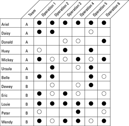
Cross-training charts
Ideally, everyone is trained to do every job according to the standardized work design. Cross-training charts track the team’s progress to this objective and identify people and their skills. In a cross-training chart like the one shown in Figure 12-2, all operations within a work module are listed across the top and each of the team members is listed by name along the left side.
When a team member is trained in a standard operation, a circle is placed at the intersection of his name and the operation. When she can competently perform the function according to the standardized work, the circle is filled in. Figure 12-2 is an example of a two-crew operation. On each team, at least one person can perform all the operations to the standard.
Cross-training charts are a powerful visual tool. At a glance you know:
![]() Who can fill in when others are absent, without risking performance
Who can fill in when others are absent, without risking performance
![]() Who is the most expert member of the team
Who is the most expert member of the team
![]() When untrained employees are performing operations
When untrained employees are performing operations
![]() Where the team is weak
Where the team is weak
Additionally, cross-training charts provide valuable information when creating training and development plans. Post your cross-training charts on your area display board.
Figure 12-2: A cross-training chart.
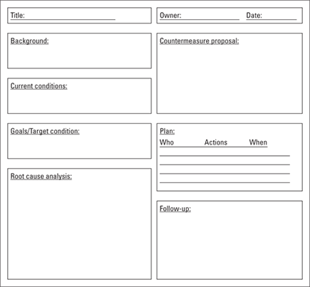
Resolving issues using A3
A3 is a single sheet issue resolution and planning document; it gets its name from the international A3 paper size (11” x 17” in the US system). The idea is that on one single sheet of paper, you have all of the information you really need about a situation. You design your A3 to fit your needs; however, a typical A3 include the following sections:
![]() Title
Title
![]() Owner of the issue and date of the document
Owner of the issue and date of the document
![]() “What is the problem?” — Background information
“What is the problem?” — Background information
![]() “What are the current situations related to this issue?” — Current conditions
“What are the current situations related to this issue?” — Current conditions
![]() “What do we want it to be?” — Target condition/Goals
“What do we want it to be?” — Target condition/Goals
![]() “What is the true cause of the issue?” — Root cause analysis
“What is the true cause of the issue?” — Root cause analysis
![]() “What are the actions to resolve this issue?” — Countermeasures to close gap or reach goal
“What are the actions to resolve this issue?” — Countermeasures to close gap or reach goal
![]() “What is our plan?” — Plan defining who, what, when, where, and how to measure and verify the implementation of the countermeasures
“What is our plan?” — Plan defining who, what, when, where, and how to measure and verify the implementation of the countermeasures
![]() “How will we track progress, share learnings, and handle issues during plan implementation?” — Follow-up actions to ensure the issue is resolved and doesn’t reoccur
“How will we track progress, share learnings, and handle issues during plan implementation?” — Follow-up actions to ensure the issue is resolved and doesn’t reoccur
Develop your A3 sheets from gemba (see Chapter 13); it’s the only way you can truly understand the real issue. Figure 12-3 shows one example of an A3 template.
Figure 12-3: Visual issue management using A3 reports.
Everyday Improvement Tools
The Lean toolkit contains yet another set of tools: tools for analyzing the data from processes, reducing variation (mura) and improving their internal performance. These quality tools are well-established and have been used in quality circles for decades. Systems like Total Quality Management (TQM) and Six Sigma also use these tools.
The beauty of the Lean everyday improvement tools is in how simple they are to use. They’re visual; they show you what you need to see. They don’t require advanced math or statistics to use and understand. They can be done by hand, on a calculator, or a computer. These tools can be used by everyone within the philosophy of kaizen for regular, continuous improvement. They support opinion with facts and data.
The 5 Whys
To seek out the cause of an issue or problem, you ask why it happened. But probing just one layer gets you to just the first cause of the problem. The root cause is usually much deeper. You have to keep probing. Noriaki Kano, creator of the Kano model, likens this to drilling down, “going an inch wide and a mile deep” to gain real understanding, rather than the superficial understanding gained from the converse — a mile wide and an inch deep.
The 5 Whys is a simple probing tool that helps you get to the root cause of a problem. At each level of explanation, keep asking “Why?” until you get to the true underlying reasons. You often have to ask at least five times.
Why five times? The number five is arbitrary. The point is not the number — it’s the probing. You may get to the bottom in 2, or it may take 10 or 20 or 50 times, depending on the complexity of your situation.
Never take the first answer as the true reason. Keep asking “Why?” until you’re satisfied that you’ve found the real root cause.
Consider this humorous example: The marble surface of the Washington Monument in the United States was disintegrating. That’s terrible! Let’s ask why:
![]() Why is the surface of the monument disintegrating?
Why is the surface of the monument disintegrating?
Answer: Extensive use of harsh cleaning chemicals have eroded the marble veneer.
![]() Why are we using such harsh chemicals?
Why are we using such harsh chemicals?
Answer: An inordinate number of pigeons collect around the monument, and they deposit high levels of pigeon poop on the marble surface.
![]() Why are there so many pigeons?
Why are there so many pigeons?
Answer: Pigeons eat spiders, and there are an unusually high numbers of spiders on the monument.
![]() Why are there so many spiders on the monument?
Why are there so many spiders on the monument?
Answer: Spiders eat gnats, and there’s a high gnat population at the monument.
![]() Why are there so many gnats?
Why are there so many gnats?
Answer: Gnats are most active at dusk and are attracted by bright lights. The National Park Service illuminates the monument at dusk, attracting the gnats, which increases the spider and, therefore, the pigeon population.
The solution? Adjust the timing and characteristics of the lighting.
At each level of this example, you could have stopped asking and begun treating the symptoms, never reaching the bottom and discovering the true cause. This example also illustrates that the fix to the real problem is often simpler and more straightforward than attacking the symptoms!
Probe deeply, but carefully. You’ll likely need to go to the next “Who?” in order to find someone with the expertise to answer the next “Why?” Also, examine the problem from different angles, because you may get different answers, depending on whom you ask.
The seven basic tools of quality
The quality toolbox contains many, many tools for analyzing and improving the quality of products and processes. Some of the more involved tools, such as analysis of variance (ANOVA) and process capability analysis, are powerful and important. However, you don’t use those advanced tools every day.
The basic everyday quality toolset consist of seven simple tools that anyone can use. These are long-standing tools that first appeared in the 1968 book by Dr. Kaoru Ishikawa (yes the same guy who created the Fishbone diagram) and have been used in quality circles for decades. If you apply these basic tools regularly, you’ll conquer the majority of your quality challenges.
In keeping with the philosophy of visual management, these tools are primarily graphical in nature. Graphical representations communicate more information than raw data and present the data in a form that often enables the problem to be obvious.
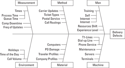
Tool #1: Fishbone diagrams : Cause and Effect
As you probe the nature of a problem and ask the 5 Whys, you’ll begin to paint a mental picture of which causes are affecting what outcomes. You represent this graphically in what’s known as a Cause-and-Effect (C&E) diagram — sometimes called a Fishbone diagram, after its graphical appearance.
 This diagram is sometimes known as an Ishikawa diagram, named after Kaoru Ishikawa, who first applied it in the shipyards of Kobe, Japan, in the 1940s.
The Fishbone diagram enables you to represent the influences and connections on a particular outcome. Figure 12-4 is a generalized Fishbone diagram that exemplifies the categories and subcategories that can make up the chain of causation.
A Fishbone diagram is simple to create and apply. You can draw one on a whiteboard or the back of a napkin. You simply identify the major categories of influence on an outcome. Within those categories, you indicate the causes and how they connect. You can immediately present a picture of all the causes and contributions to an outcome, and suggest the next level of probing and analysis.
Figure 12-4: The Cause-and-Effect (Fishbone) diagram.
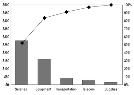
Tool #2: Pareto charts: Finding the significant few
A Pareto chart is a special type of bar chart where the values are arranged in descending order, with the largest contribution first. It is named after the Italian economist Vilfredo Pareto, who discovered the “80-20 rule,” now also known as the Pareto Principle (the principle that 20 percent of the causes are responsible for 80 percent of the outcomes). The Pareto chart is a fast and effective way to identify the significant few influences — and separate them from the many insignificant ones.
To make a Pareto chart, you simply stack up observations with the greatest values or impacts on the left, and observations with decreasing values onward to the right. Figure 12-5 is an example that shows categories of cost in an expenditure profile. From this chart, you can easily see the significance of each cost element to the total — and that salaries are the largest contributor, with equipment second, and everything else minor by comparison.
As shown in Figure 12-5, a Pareto chart shows both the absolute number as well as the percentage of contribution. The right vertical axis indicates percentage, and a line is plotted that depicts the cumulative percentage total, up to 100 percent with the last rightmost item. From the figure, you can quickly see that salaries and equipment combine to represent over 80 percent of the cost.
Figure 12-5: A Pareto chart.
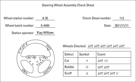
Tool #3: Check sheets: Capture and see
A check sheet is basically any standard way you can gather data and view an activity as it’s happening. The name comes from the historical use of a piece of paper or chart on which someone would indicate activity and check it as it was occurring. Figure 12-6 shows an example of a check sheet.
Police use “murder maps,” a form of a check sheet, to track where the murders or other crimes happen. Armed with this information, they can properly staff neighborhoods, create relationships with the neighbors and work to solve and prevent crime. This same idea can be used in any situation to visually identify defect patterns so that corrective and preventative actions can be taken.
You can set up check sheets for a variety of uses:
![]() Tallying: Simply count up the occurrences of an event, such as runners crossing the finish line.
Tallying: Simply count up the occurrences of an event, such as runners crossing the finish line.
![]() Defective items: Mark the occurrence of defects by category.
Defective items: Mark the occurrence of defects by category.
![]() Process distribution: Indicate the occurrence of an event by value. This will build a histogram.
Process distribution: Indicate the occurrence of an event by value. This will build a histogram.
![]() Location plot: Mark the location of an event on a graphical depiction.
Location plot: Mark the location of an event on a graphical depiction.
![]() Defective location plot: Mark the location of a defect.
Defective location plot: Mark the location of a defect.
![]() Causation: Indicate the likely cause of events as they occur.
Causation: Indicate the likely cause of events as they occur.
![]() Work sampling: Indicate how time is spent by category.
Work sampling: Indicate how time is spent by category.
Figure 12-6: A check sheet.
Tool #4: Scatter plots: Relationships at a glance
A scatter plot is the simplest of all plots — and yet, it’s also sometimes the most revealing. In a scatter plot, you graphically depict the relationship between two items or variables (see Figure 12-7).
Making a scatter plot is easy. Just draw and label a couple of axes and plot the data. Then sit back and look at it. What do you see? Is there a trend (known as correlation), or is it just random? Based on what you’re seeing, you can draw conclusions about what’s likely to occur next.
The scatter plot shows at a glance whether a relationship exists between the two variables, and what the nature of that relationship might be. The number of dots on the plot indicates how much data you’ve collected — the more data, the more valid the observations.
In this example, there’s an obvious correlation between year and local index. Further analyses would indicate the nature of that correlation.
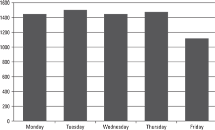
Tool #5: Graphs: Depicting the data
Using graphs is a great way to see the differences among items in a small set of related data. One popular type of graphs is the bar chart because they are easy to make and easy to read. Figure 12-8 shows an example of a bar chart.
Figure 12-7: A scatter plot.
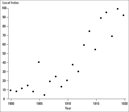
Figure 12-8: A bar chart of the daily attendance at the high school. Hmm — what’s up with Fridays?
Each entry is a count of the data for that category, and is displayed in a vertical column as a rectangular solid bar that is proportional to its value. A common variation on the bar chart is called a stacked bar chart, where two or more items that make up the value are displayed independently. Figure 12-9 contains a stacked bar chart.
Figure 12-9: A stacked bar chart. Looks like the girls were up to something!
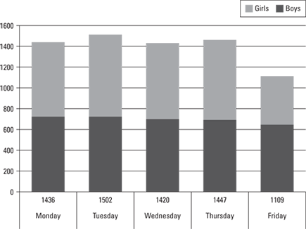
In a bar chart, you look at the tallest and shortest, to understand the range, and get a sense for the mean and the deviations. You look at the bars relative to one another, to get a sense of trends, correlations, or other relationships. From the bar chart, you’ll have a sense of what to examine or look for next. It turns out that that new vampire movie was released last Friday!
In addition to bar charts, other useful graphs include line graphs, circle graphs or pie charts, and pictorial graphs.
Tool #6: Histograms: Frequency of occurrence
A histogram is a type of bar chart that is organized to show counts of how frequently something occurs. In a histogram, each bar is of equal width and represents a fixed range of measurement. Over a period of time, you can easily see how the data is distributed (see Figure 12-10).
Histograms are enormously powerful ways to see how processes function and the degree of variation and other factors influencing performance.
Tool #7: Control charts: “Make it so”
The control chart (see Figure 12-11) is considered the single most important tool of statistical quality control. The control chart was developed not by Jean-Luc Picard, but by Dr. Walter Shewhart of Bell Labs in the 1920s as a statistical means for understanding manufacturing processes and improving their effectiveness. It serves as the basis for determining whether a process is in or out of statistical control.
Figure 12-10: The histogram on the left shows a “normal” distribution of data, whereas the histogram on the right depicts a non-normal two-peaked “bimodal” distribution.
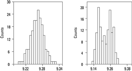
Figure 12-11: A control chart.
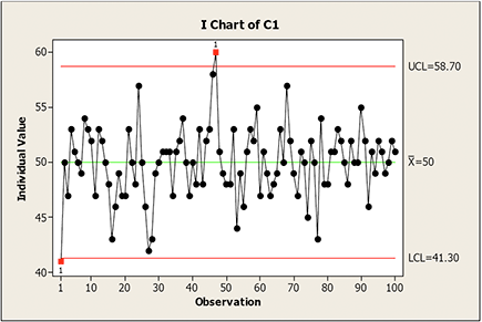
The control chart is a graphical display of the value of some process or quality characteristic over time. It displays the running value of the item, and usually includes the centerline target value as well as the upper and lower control limits.
Typically, as long as the sample values fall between the upper and lower control limits, the process is “in control.” However, if the distribution of values is systematic and non-random, this is an indication of a special cause of variation, indicating that the process is not in statistical control and should be examined further.
A collection of the sample values in the control chart over time will form a histogram, as well as permit statistical analysis of the variation in the performance of the quality characteristic.
Sometimes you’ll see stratification or even flowcharts or run charts substituted in place of the graphs listed as tool #5 of the seven basic tools of quality. Stratification is a technique for seeing patterns within data, such as data |by shift, population or environment; seeing patterns can help you identify correlation and causation. Flowcharts (see Figures 2-1 and 2-2) are a graphical model of a process in sequential order, beginning with the first step in a process and charting the tasks and steps through to the end. Run charts are time-based plots of a process characteristic over time; they look similar to control charts, but without the control limits; it’s the resulting value of the variable over time. These alternative quality tools might be just as applicable to your Lean project or initiative as the graph tools. Use the tools that are most appropriate to your situation for removing waste and adding customer value.
Using Qualitative Tools
After establishing the seven formal statistical tools of quality control (see previous section), the Japanese Union of Scientists and Engineers (JUSE) established the new seven tools — a set of qualitative tools. The new seven tools are just as important as the original seven tools. You likely use several of these tools already.
![]() Relations diagram – Use a Relations diagram when the interrelationships of a situation are complex. Draw and label boxes for every element of a problem, then draw arrows where one element influences another. Elements with the most outgoing arrows are root causes; the most incoming are outcomes.
Relations diagram – Use a Relations diagram when the interrelationships of a situation are complex. Draw and label boxes for every element of a problem, then draw arrows where one element influences another. Elements with the most outgoing arrows are root causes; the most incoming are outcomes.
![]() Affinity diagram – Collect ideas (usually on cards or Post-It stickies), identify natural relationships, and sort into groups for further review and analysis. Affinities are great inputs to Fishbone and C&E matrices.
Affinity diagram – Collect ideas (usually on cards or Post-It stickies), identify natural relationships, and sort into groups for further review and analysis. Affinities are great inputs to Fishbone and C&E matrices.
![]() Tree diagram – Divide a problem or idea into progressively smaller parts, until you have tasks that the team can execute to address the problem or issue. A tree diagram is similar to a work breakdown structure.
Tree diagram – Divide a problem or idea into progressively smaller parts, until you have tasks that the team can execute to address the problem or issue. A tree diagram is similar to a work breakdown structure.
![]() Matrix diagram – Compare alternatives in a matrix based on the relationships of criteria. Identify relationships with symbols and see what the resulting patterns imply.
Matrix diagram – Compare alternatives in a matrix based on the relationships of criteria. Identify relationships with symbols and see what the resulting patterns imply.
![]() Prioritization matrix – Establish a list of criteria in order of priority and compare a set of options according to the criteria.
Prioritization matrix – Establish a list of criteria in order of priority and compare a set of options according to the criteria.
![]() Process Decision Program chart (PDPC) – Using a tree diagram, identify potential risks for each activity and then identify one or more viable countermeasures for each risk.
Process Decision Program chart (PDPC) – Using a tree diagram, identify potential risks for each activity and then identify one or more viable countermeasures for each risk.
![]() Activity network (arrow diagram) – Similar to a PERT chart, map project or process tasks in required order with durations and resources, and connect them with arrows indicating the proper flow, indicating the project or process “critical path” and related dependencies.
Activity network (arrow diagram) – Similar to a PERT chart, map project or process tasks in required order with durations and resources, and connect them with arrows indicating the proper flow, indicating the project or process “critical path” and related dependencies.
These tools are especially good for qualitative analysis. The names may sound complicated, but they are easy to use. To see more examples, go to www.syque.com/quality_tools/toolbook/toolbook.htm.
..................Content has been hidden....................
You can't read the all page of ebook, please click here login for view all page.