
8. Decision Drivers
Retail Factors and Purchase Decision Types
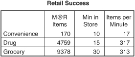
The retail store is a complex environment with thousands of messages presented in a confined space and in a compressed amount of time. As Figure 8.1 summarizes, the average shopper is presented with between 17 items per minute in relatively simple formats, such as a convenience store, and more than 300 items per minute in more complex environments such as grocery and chain drug stores. Confronted with an otherwise overwhelming amount of stimuli, shoppers necessarily employ a variety of coping mechanisms to effectively navigate their way through the store. Shoppers look for ways to simplify their trip and organize their experience. They seek out the marketing material that relates to their shopping mission and fits with the governing principles they believe are integral to this retailer (see Figure 8.1).1
Financial Impact of Presentation Optimization
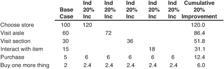
The financial impact of optimized performance is profound. Assume that 100 shoppers enter the store and 60 percent visit your aisle. Of these, half visit your section, and half of those visitors notice and interact with your product. Of these shoppers, one-third make a purchase and 40 percent purchase a related item.
If we improve our conversion by 20 percent at any single step along the process, we increase the total items purchased to 8.4. However, if we improve multiple areas simultaneously, the total rises to 18.4 items—more than double our base case (see Figure 8.2).
Figure 8.2 Cumulative Improvement Impact
Shaping shopper behavior breaks complex activity into component parts and looks at techniques for motivating the desired behavior at each step of the compound retailing equation to improve results. For retail marketing, shaping is driven by increasing impact and engagement at each step.
Retail Success
Despite this message complexity, the path to retail success amounts to a combination of traffic and transactions. Quite simply, if you are a retailer, you have two ways to generate growth:
• Increase the number of transactions by:
• Generating more visits from existing customers
• Attracting new customers
• Converting more visitors who do not buy
Or
• Increase the transaction size with:
• More items in the basket
• A richer mix of higher priced items
This dynamic is shown in Figure 8.3.
Figure 8.3 Retail Success Dynamic
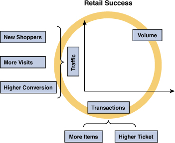
The dynamic can be expressed as an equation in which volume is driven by the interplay between traffic and transactions:
Traffic × Transaction Value
Traffic is defined as the number of shoppers times the number of visits per shopper divided by the shopper conversion rate. Transaction value is the number of items purchased times the average ticket value.
As the U.S. market continues to mature and major retailers exhaust the opportunities for physical expansion, same-store sales results will continue to be the key performance metric. Shopper intimacy provides shopper understanding. This understanding is the key to building greater value into our store offerings, and value drives growth:
![]()
Apply this formula to the shopper behavior motivators we previously discussed. It is clear that retail practitioners must deliver more against shoppers’ personal scorecards to capture a greater share of their spending.
Planned Versus Unplanned Purchases
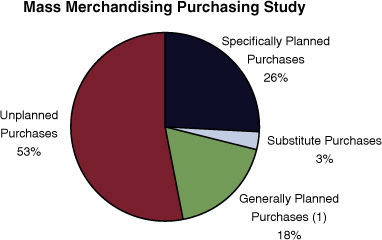
The number of final purchase decisions made in-store offers a clear indication of the importance of retail marketing material. In its ground-breaking purchasing habits research, POPAI established that, in general, 70 percent of purchase decisions are made in-store. This finding was substantiated by the mass merchandising purchasing study that found that 29 percent of purchases in their channel were preplanned, and 71 percent of decisions were made in-store. This study further refined the groupings into specifically planned purchases (26 percent), substitute purchases (3 percent), generally planned purchases (18 percent), and unplanned (53 percent) (see Figure 8.4).2
Figure 8.4 Purchase Decisions in Mass Merchandisers
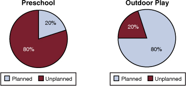
While at Mattel, we found that the percentage of planned purchases varied widely by category, with a low of less than 20 percent for preschool toys in which the extended family makes a substantial portion of purchases and the recipient exerts no power in the decision-making process. By contrast, in outdoor play equipment planned purchases exceeded 80 percent because of the myriad of issues associated with transportation, placement of items in the yard, relatively high price point, and so on (see Figure 8.5).
Figure 8.5 Planned Purchases for Preschool and Outdoor Play
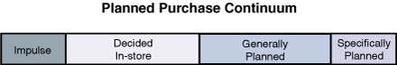
Our view is that purchase decisions made in-store operate on a continuum with purely impulse buys at one end and items without substitute at the other (see Figure 8.6). As we move through different retail channels and categories of goods, the percentage of planned and unplanned purchases will vary. What does not change is the dynamic in which some items have no substitute, some are preferred but can be traded out, some are generally planned, some are decided in-store, and some are purely impulse.
Detroit, in addition to being the home of the automotive industry, is also the birthplace of Vernor’s soda. In the area from Michigan through western Pennsylvania, drinking Vernor’s is almost a religion, with a seemingly never-ending stream of serving variations, including its use as a soft drink, a mixer for alcoholic drinks, a base for ice cream floats, and a magical elixir to ease ailments. For us, and the denizens of this trading area, no substitute for Vernor’s exists, and we move to other retail locations when it is delisted or out of stock. By contrast, for us, a cold bottle of water in a cooler at check-out represents an impulse purchase triggered by a recognition of our thirst in response to the cooler’s presence at a location where we generally relax a bit at the conclusion of our shopping mission.
Figure 8.6 Purchase Decision Continuum
Retail Success Drivers
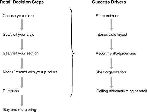
Store design and shopper navigation aids can play a key role in the shopping process. We can diagram the path to an eventual sale as a series of related actions that are the result of conscious and subconscious reactions that begin with the choice of store and reach its ultimate conclusion with the addition of one more item to the shopping basket. In the journey to sales success, the shopper must
• Choose your retail location.
• See and visit your aisle.
• See and visit your section.
• Notice and interact with your product.
• Then make a purchase decision.
To achieve real success in today’s competitive marketplace, we need the shopper to also add one more item to the basket. To fulfill her shopping objectives, she evaluates the store exterior, aisle design, assortment, shelf organization, and selling aids presented throughout the in-store experience (see Figure 8.7).
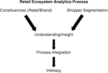
To optimize the shopper experience and the return on the marketing investment in the store, marketers must align the success drivers with the retail decision steps, utilizing a REAP approach in which all participants’ needs and desires are considered. Through this process we start with a consideration of the specific retailer as a unique environment and include the perspective of the personnel who play a critical role in executing and maintaining retail marketing programs. For retailers, these can include store operations, store managers, floor personnel, and others. For brands, internal constituencies might include the account management team, category management leads, or direct store delivery personnel.
Figure 8.7 Decision Steps and Drivers
Similarly, shoppers must be approached not as a uniform whole, but in as many meaningful segments as make sense for the marketing opportunity. The shopping process should be viewed through their unique eyes within the channel to develop insights, and these insights should routinely be incorporated into programs. The effectiveness of the programs must then be measured so that new insights can be developed resulting in the shopper intimacy we are all seeking (see Figure 8.8).
Retail Drivers—Store Exterior
Although store choice is impacted by a number of components outside of the store environment, the first physical presentation influencing store choice is the store exterior. In the days of the small town general store, it was enough to announce your presence. You were likely the only store in town, and most sales were assisted by the store clerk. It was assumed that the retailer would have all the items the market desired, and they received immediate feedback so that they knew whether gaps in the assortment existed. The market was largely captive, and fortunes rose and sank with that of the community served.
Figure 8.8 Retail Ecosystem Analytics Process (REAP)
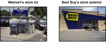
Today’s counterparts to the general store are the hypermarkets developed in Europe and in regional chains in the United States. For competitors such as Carrefour, Meijer, Walmart, and others, it is important to signal the ease of access to the tools you need to complete your shopping mission. Key factors can include availability of parking close to store entrances, the condition of the parking lot, shopping cart access, lighting, safety, and so on (see Figure 8.9). Compare the cluttered, cart-strewn Walmart entrance with the clean Best Buy store approach.
These factors and others help establish the store’s character and signal the type of shopping experience to expect. Because we know that we all seek and reward consistency, we often see the remaking of store exteriors coincident with a store reset. For instance, when our local Vons was converted to a “Lifestyle” store inside, the exterior was updated and softened with the addition of more natural materials, such as field stone, to complement the more natural product presentation and color palette inside. The changed exterior forcefully signaled that things were different and reinforced the experience inside the store (see Figure 8.10).
Figure 8.10 Vons’ Exterior Change

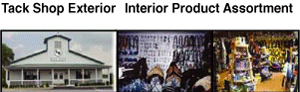
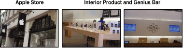
At the opposite end of the spectrum, an exterior can project a store’s character as a niche player, such as a tack shop servicing horse lovers or an Apple store for technology aficionados. In each case, the exterior foreshadows what will be found inside, with a bucolic barn-like presentation for the country-minded riding set and an ultra-cool sleek and minimalist facade for Apple. Swapping these exteriors would not work because the barn would not accurately presage technology, nor would Apple’s glass cube effectively signal riding equipment (see Figures 8.11 and 8.12).
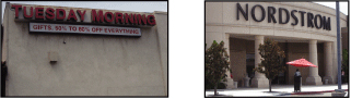
The store exterior can also signal an anticipated service level at both the low-end with the utilitarian entrance to a Tuesday Morning in stark contrast to Nordstrom’s formally elegant entrance supported with valet parking (see Figure 8.13).
Figure 8.13 Store Exterior Signaling Service Level
The use of store exterior extends beyond chain stores to individual proprietors. A walk down the Boulevard Saint Germain in Paris during the holiday season is enough to make one want to stop and shop at every boutique. The tastefully decorated storefronts create a warm reception and invite shoppers to linger, relax, and enter the store.
Retail Drivers—Color Palette
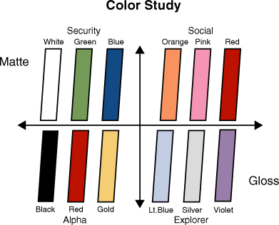
As shoppers approach and enter the store, they are immersed in the store’s color palette. Work completed by ShopConsult in Europe established the link between color palette and the mental states they trigger. Figure 8.14 breaks colors into four quadrants designated alpha, security, social, and explorer. At one extreme, matte colors signal security, whereas glossy presentations convey a sense of exploration. Alpha, leader responses are signaled by black, red and gold; security is conveyed with whites, green, and blues; our social impulses are triggered by oranges, pinks, and reds; and we connect with an explorer sensibility with light blues, silvers, and violets.3
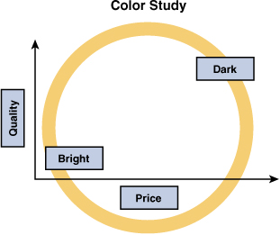
Color can also work as a marker for quality and price with bright colors in the lower quadrant and darker colors in the upper quadrant. With this understanding, it is not surprising that almost all premium cosmetic brands choose a high gloss for their retail presentations with colors from the alpha palette—Christian Dior and Chanel with glossy black, L’Oreal and Estee Lauder with high-gloss white and gold, and Elizabeth Arden with gloss red and white. The color palette simultaneously appeals to the targeted state of mind for their shoppers while establishing their quality level and pricing platform (see Figure 8.15).
When working with the chosen color palette, it is important to balance the weight of the execution. The pink in the Barbie packaging has a unique Pantone color assigned and is an integral part of the product’s trade dress protected by law. In the research lab, we observed that girls were initially excited by their exposure to the packaging color.
However, if they were left in a room that was predominantly Barbie pink for a long time, they slipped into a type of sensory overload that quickly led to exhaustion. It was important for Mattel to balance the presence of pink in the aisle in both packaging and merchandising so that the requisite excitement was created without overwhelming the shopper’s senses.
Retail Drivers—Store Layout/Navigation
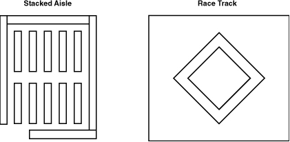
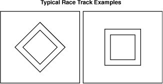
Having entered the store, shoppers begin to orient themselves and begin their shopping mission. They make a choice as to how to move through the store and which sections of the store to visit. In general, in large retail formats, they confront store designs that either feature stacked aisles running from front to back or race track configurations. The stacked aisle arrangement depicted in Figure 8.16 maximizes the amount of product that can be presented in the available floor space, whereas the race track design maximizes the distance traveled by shoppers.
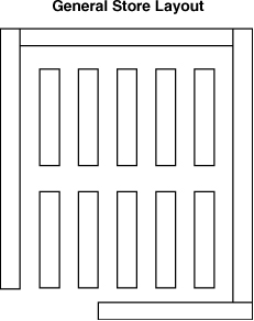
Returning to the example of the general store, in a shopping environment in which a clerk assisted in product selection and the choices were relatively narrow, access to product was the key success determinant and maximizing the items offered optimized the store’s success. Stores were characterized by a single entrance with the cash drawer at the front, and merchandise was densely packed with a uniform aisle width around the perimeter and within, as shown in Figure 8.17.
Figure 8.17 General Store Layout
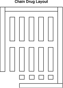
This remains the dominant layout for most chain drug stores. This channel predominantly presents a merchandise assortment that spans a wide variety of food and general merchandise in a compact footprint. They generally feature an anchor in one corner, such as a photo department. Recognizing the value of driving traffic through the store, they almost universally position the pharmacy in the rear of the store. In large stores, impulse items may be presented in free-standing displays across the front of the store; in smaller formats, the shopper transitions directly from the core merchandise area to the cash wraps. The density of the product offering in the available space dictates a layout in which SKU presentation is maximized, and these stores generally make extensive use of high gondolas (see Figure 8.18).
Figure 8.18 Chain Drug Store Layout
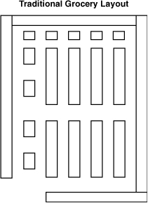
Traditionally, grocery stores also deal with high SKU counts in confined areas, offering roughly 45,000 SKUs in a mean store size of 47,500 square feet. The old-line traditional grocery store shown in Figure 8.19 was marked by a densely merchandised core of packaged items surrounded by a perimeter of dairy, meat, and fresh fruit and vegetables. Understanding the value of directing traffic flow throughout the store, grocers arranged their products so you had to travel to each corner of the store to fulfill a typical shopping trip that might include bread, butter, milk, fruits, vegetables, and meats. The resultant layout is similar to a general store with the addition of cases for meat in the rear of the store and fresh produce on one side. In their quest for efficiency, shoppers learned to navigate these stores by pushing their cart around the exterior and darting into selected core aisles, often without their shopping baskets.
Figure 8.19 Traditional Grocery Store Layout
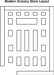
Although retailers have long realized the value of motivating shoppers to move throughout the store, thereby increasing their exposure to product choices and increasing the likelihood of an incremental item in the basket, they now also appreciate the role design can play in altering shoppers’ moods. Grocery market leaders now understand that store productivity is further enhanced by slowing shoppers down both mentally and physically, so they are in a more relaxed state when confronting product choices and marketing messages. As a supplement to their four-corner product placement strategy, these operators now create places to linger that fully engage the senses. In these stores, the perimeter is not an area to be traversed but a place to luxuriate in the sensuousness of food. These grocers present floral shops, bakeries, tea counters, artisanal cheese sections, olive bars, fresh nut roasters, and on and on (see Figure 8.20). In each case, our senses are appropriately engaged—we are shopping for food and the store becomes a celebration of food. Subconsciously, we slow a little, and the physical space creates an incentive to linger and explore versus traversing through the location on the way to the next item in our literal or mental shopping list.
Figure 8.20 Contemporary Supermarket Layout
As we move to general merchandisers, we see a dramatic shift away from the stacked aisles that typified general stores. Although the goal remains to expose shoppers to the maximum number of product choices, the tactical execution shifts. Instead of traveling around a perimeter of densely packed aisles, shoppers are now directed to travel along a “race track” around the store, as shown in Figure 8.21. The advantages of this approach include the orderliness of the path so that we intuitively accept the direction; the efficiency of the path in that we do not have to move through the entire store perimeter; and the flexibility of the navigation enabling multiple points of entry and departure. In some large retail formats, a center aisle may bisect the race track but, in general, it is difficult to crisscross through the store by traveling directly from one corner to the other and, even where it is possible, the path is not clear. In some retailers, the race track is kept clean of all interruptions so that shoppers can move unimpeded through their tasks, and attention is focused on the individual product sections. In other retailers, the “power aisle” is interrupted repeatedly with large product presentations supported with marketing at retail designed to move significant amounts of product.
Figure 8.21 Race Track Layouts
Regardless of the store layout chosen, the studies conducted by Paco Underhill and his associates at Envirosell have clearly shown us that we all follow a predictable pattern in addressing a new physical environment.4 Typically, we move through the first phase of the physical space and, after we have sufficiently entered the environment, we slow down and begin our mission. The process works in stores where we shop, theme parks where we go to escape, and trade shows where we look for ideas and to make business connections.
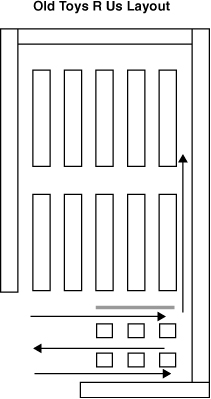
In retail stores, shopper orientation to the physical environment has the potential to create dead zones. Toys R Us offers a relevant case study of the issue and a successful solution to transforming a dead zone. Toys R Us was built on the grocery store/general store stacked aisle layout model. With a single entrance, the store directed shoppers to a cart pick-up location and then through an area in which party supplies were merchandised on the lower wall, and seasonal goods, promotions, and special values were presented in two display lanes down the center (see Figure 8.22). The thought was that shoppers would follow an “S” shaped pattern as they moved through the foyer filling their carts with the presented items on the way to their core mission (see arrows). The merchants were surprised when store observation revealed that shoppers picked up their carts and raced through one of the aisles hardly breaking their pace until they reached the store core.
Figure 8.22 Old Toys R Us Layout
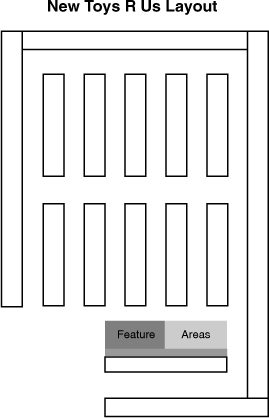
To make productive use of the selling space, Toys R Us accepted that shoppers would move through a corridor on their way to the store core. They moved the upper wall down to create a single aisle that was lined with the party supplies that were a destination product—if you had a party, you would stop or revisit the area to select the products you needed. They transformed the newly created space into two “feature area locations” (see Figure 8.23). These were stocked with topical products supporting the latest movie or product release or a key seasonal event such as Back to School. The product displays were supplemented with an aggressive retail marketing campaign so that shoppers were more likely to notice the goods. The result was that, as shoppers entered the core, they saw the displays, visited the areas, and purchased the products. What had been largely unproductive space became some of the most productive real estate in the store as the marketing presentation interrupted shopper’s thought pattern and caused them to mentally slow down.
Figure 8.23 New Toys R Us Layout
Retail Drivers—Assortment
The product presented within the store layout plays a vital role in supporting the store brand. The assortment can be broad or narrow across the categories presented, or it can be deep or shallow in the number of item choices within each category. Either way, the assortment must present a strong value to the shopper in meeting her needs for her chosen shopping occasion, and it must be consistent to support repeated visits.
Supercenters and pharmacies pursue different paths in presenting broad categories of goods—supercenters present a relatively deep selection, whereas drug stores have relatively narrow item options for noncore segments such as automotive or toys. The promise from each is convenience, but a supercenter is positioned as a destination for major shopping trips, whereas drug stores provide a fill-in function.
Merchandise specialists offer deep assortments in a narrow grouping of related categories. These can take multiple forms, such as the following:
• Category specialists such as Bed Bath & Beyond, Staples, or The Home Depot, each focusing on a functional category.
• Lifestyle retailers such as Zumiez for skateboarding, surfing, and snowboarding; Hot Topic for teenage goths, Twilight, and music fans; or Lush for hand-crafted bath items.
• Branded retailers whether narrowly centered on a market segment, such as Lush; or market segment, such as Abercrombie & Fitch; or broadly directed against a category, such as health and performance for Nike.
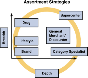
The differential strategies are roughly depicted in Figure 8.24. Extreme operators such as Aldi and warehouse clubs tighten their product offerings to a single option in many segments; that is, one size of Kellogg’s Corn Flakes or a single brand choice for plastic bags. They offset the narrowed selection with the perception of ultra value so that shoppers make a mental trade-off of savings against the limited selection. As we noted in our view of the market dynamics, the middle is an extremely difficult position to hold, and a premium is attached to clearly owning an assortment space.
Figure 8.24 Assortment Strategies
Retail Drivers—Adjacencies
Product assortment is the fundamental building block that often defines and always supports the store brand positioning to attract and retain a base of both dedicated and occasional shoppers. The organization of that assortment into logical adjacencies can influence the acceptance of the desired brand positioning by
• Intuitively meeting shopper’s needs and expectations
• Enhancing performance by:
• Raising the average shopping basket value
• Efficiently supporting the shopping process
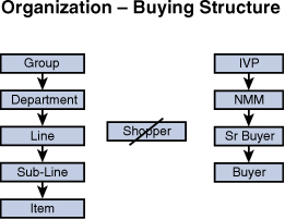
The operative organizing principle for virtually all retailers holds that items should be grouped into logical categories, with categories broken into meaningful sections and items rationally arranged within each category. When executed properly, we leverage the shopper’s need-state in the product section so that she increases her shopping basket size by making an incremental purchase related to the first selection. An example would be the location of mayonnaise, ketchup, mustard, and pickles in adjacent areas so that the purchase of one might trigger the purchase of other items that could be related to sandwich making. Sears defined the hierarchy as
Group → Department → Line → Sub-Line → Item
Although this process seems tremendously simple, it is often complicated by either an inability to clearly identify the logical home for an item or a lack of organizational focus on the shopper.
Examples of the first instance include a consideration of placing mixers such as ginger ale in the liquor aisle or the carbonated beverage aisle; the placement of isotonics with carbonated beverages or water; the location of popcorn in the salty snack or cracker areas. Adjacency decisions in each case can have a dramatic impact on sales. As we witnessed in the MARI studies, shoppers do not see products presented in areas where they do not expect to find them. By contrast, location in the proper section can significantly boost sales.
The second failure occurs when the buying structure does not align with the shopper’s expectation of where to find products. In the situation depicted in the Figure 8.25, the shopper focus is lost as buying assignments are made based on logical supplier relationships or the desired balancing of seasonal workloads. In these instances space is given to a vice president, who breaks it between the divisional merchandise managers, who divide it among their senior buyers, who then allocate to their buyers. It is easy to lose sight of the shopper experience as each level works with internal focal points on supplier and workload management.
Figure 8.25 Organizational Buying Structure
A real-world example presented itself in the case of the toy department at a major discounter. In working a category management analysis, we analyzed the departmental layout from the shopper perspective. Shoppers are in the market for preschool toys, defined by age, girl’s or boy’s toys delineated by gender, or family fun toys that were appropriate for both sexes and a wide range of ages. For example, if you shop for a girl, it is obviously easiest to move through all the options for girls and family fun, but you would have no interest in boys or preschool products. Defining each category by color, we discovered an extraordinarily inefficient departmental design in which colors were mixed, and shoppers needed to move throughout the entire department to consider all the options of interest to them (see Figure 8.26).
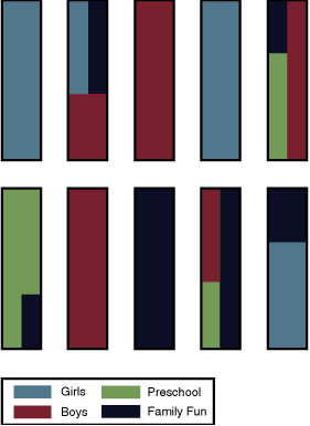
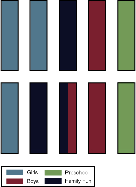
Without increasing the space for the department or any category or section, we suggested a more shopper-centric layout in which the boy’s products were adjacent to one another; all the girl’s products were in the same area; and the family fun section bridged the two areas. Shoppers only in the market for single-sex products could now easily move from their targeted section to the gender neutral area, and those who needed to shop the entire department could more easily consider their options. The result was increased sales productivity from an identical assortment. Significantly, the retailer also reaped major cost savings by reducing the number of sections that needed to move for each reset (see Figure 8.27).
A consideration of how to handle a major license at the retail level offers a second powerful lesson on the power of proper adjacencies. While at Sears, we secured a major license for Disney that had tremendous application to the toy department. The buying group developed scores of exclusive products, and the marketing group decided we should make a theatrical presentation in the stores and catalogs by grouping all the Disney-themed products together in a single section. The move was protested by a seasoned buyer who predicted that an out-of-category presentation of product would negatively affect sales. Emboldened by the success of the recently opened Disney stores, we ignored the warning and created the themed sections. The results were disastrous. As the veteran buyer had predicted, items with a long track record of consistent sales fell 20 percent, and the results were consistent in both retail and catalog. The following year, when we put the items back where the shopper expected to find them, sales returned to normal levels. Clearly, shoppers were in the market for a category of goods and made their selection from the proffered items; they were not in the market for a licensed toy in which they would make a choice between different expressions of that license.
Retail Drivers—Shelf Organization
With our adjacencies decided, we turn our attention to the physical arrangement of the product on shelf (planogram). As we consider planogram development, it is helpful to briefly revisit the academic research. Two key learnings from the research provide powerful insights that can be leveraged to optimize item presentation on the shelf:
• Our continual quest for establishing order in our physical world
• Our approach to shopping as a deselection process
Our brains are magnificently efficient at processing information and creating meaning from the stimuli with which we are presented. We subconsciously process clues and, if elements are missing, we “intuitively” fill in the blanks. This mental process occurs both verbally and visually.
Consider the following sentence:
“I wnt to th stre to by mlk and btter but cme bck wth beer.”
Even though the statement is missing eight critical vowels, few people have any issue with correctly interpreting the characters as the following sentence:
“I went to the store to buy milk and butter but came back with beer.”
The process happens extraordinarily quickly and without the application of conscious effort.
We apply the same type of processing to visual cues so that we “see” the four dots in Figure 8.28 as a square:5
Figure 8.28 Physical Arrangement Example

Similarly, just as most people connect the dots to form a square, we interpret Figure 8.29 as a circle by editing out the interruption.
Figure 8.29 Physical Arrangement Example

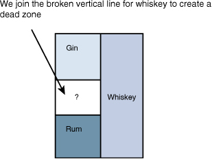
Our search for order and organization extends to planograms in-store. In the real-world example from Hugh Phillips, Ph.D., in Figure 8.30, the liquor department was organized with a gin section on the top two shelves, a rum section on the bottom two shelves, and a large whiskey assortment that extended vertically down all five shelves to the right of the other two sections and interrupted the gin and rum presentation on the middle shelf.6
Figure 8.30 Physical Arrangement Case Study
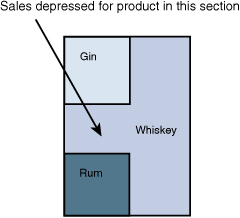
No matter which product was placed between the gin and the rum, sales were depressed in what became a dead zone. With a choice between right and left sections for whiskey, the dominant side wins, and we simply do not “see” the area that does not fit with the order we establish (see Figure 8.31).
Figure 8.31 Physical Arrangement Case Study
In the western world, we process information as we read, from left to right and top to bottom. We seek cues from our physical environment to establish order and subconsciously apply patterns to the cues presented to create our personal order. We edit out what doesn’t fit and do not see anything that conflicts with the order we impose on the retail presentation with which we are presented.
The second key piece of research deals with our deselective approach to shopping. In our quest for efficiency, we use patterns to subconsciously process information so that we can, in effect, parallel process data and multitask. In the store environment, we accomplish this by scanning the environment to locate broad clues for our desired product, applying our internalized patterns, so that we can then narrow our search on a particular area and then find the sought item.
Dr. Hugh Phillips describes the phenomenon as a macroscanning process, as shown in Figure 8.32. In the shopping environment, we move from subconscious to conscious processing as we begin browsing the store, and move through a deselection process that guides us to a section, an aisle, a shelf, and finally an item. Our processing moves from the general to the detailed as we increasingly sharpen our focus. When the first task is complete, we repeat as much of the process as necessary.7
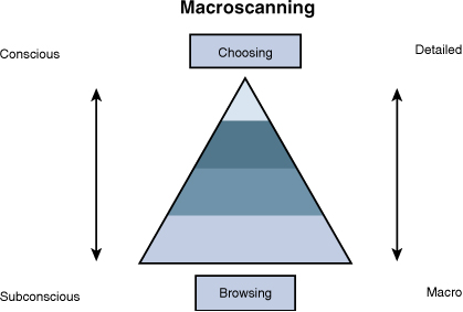
Several labs have consistently tracked the macroscanning process across multiple media. As shoppers, our utilization of this search function is also reinforced by eye-tracking studies performed in both North America and Europe. We scan a wide area so that we process key elements across multiple categories that might provide the cues that trigger our stored patterns. As we locate key elements, we move to a more detailed consideration in a “narrow” scan mode. The store data in our cognitive research section shows that attempting to deal with an entire store item by item would be overwhelming and consume more time and effort than practicable, so we take shortcuts. The easier we make the process, the more relaxed and less fatigued the shoppers will be. Relaxation and reduced fatigue translate directly into more sales.
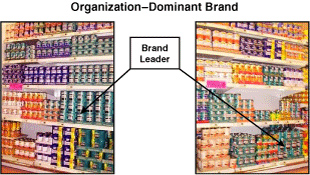
As we move through our macroscanning process, we search for signposts. These verbal and visual cues help us find our way to the things we want to consider in detail. We seek efficiency in our processing and look for the easiest path to complete our mission. In some cases, a unique packaging approach, such as the generalized shape of a ketchup bottle, provides the trigger for identifying the sought-after product grouping. For many categories or subcategories, the dominant brand often defines the category, providing both emotional and visual cues. In these cases, well-known brands and symbols provide effective signposts-so that a prominent display of these brands can increase total category sales by attracting increased attention. Conversely, a weaker presentation can depress sales.
In the United Kingdom, ShopConsult tracked the impact of shelf location on total category sales. The dominant brand of beans is highlighted in the Figure 8.33. When the brand was moved from waist to floor level, total category sales dropped 16 percent. With a weaker visual presentation of the dominant brand, fewer shoppers “saw” the section, and this decrease drove total sales down.8
Figure 8.33 Dominant Brand on Lowest Shelf
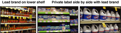
Understanding how shoppers use leading brands as signposts, we gain new insight into the MARI findings related to the height of the observed retail marketing material. Traditionally, retailers placed brands in the least desirable shelf location to maximize the visibility for high-margin private label items. The research suggests retailers are better served by moving key brands to more visible shelf locations and positioning alternative offerings side by side. In this manner shoppers can easily find the category (enhancing total sales), and the alternative product is more likely to be seen as attention starts to drift. Additionally, the retailer eases the shopper into a possible consideration of a value calculation and, by making shopping easier, reduces fatigue, increasing the likelihood that she buys an additional item (see Figure 8.34).
Figure 8.34 Dominant Brand Side by Side
Multiple eye-tracking studies conducted both in stores and under lab conditions show the importance of focusing attention. Whether studying our interaction with media at home or in retail stores, researchers consistently found that we initially direct our attention to the intended item but, if something else draws interest, our attention shifts. In Figure 8.35, the shopper located the Tylenol she sought on the shelf. Eye-tracking studies, as shown in Figure 8.35, reveal that when she found her desired product, she did not remain fixated on it but continued to move about the desired object in all directions.9
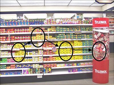
As Dr. Hugh Phillips observed in Figure 8.36, after locating the desired Tylenol, the shopper briefly considered analgesic options and then settled on the large dump display for Tylenol before finalizing her purchase. We screen out everything unrelated to our mission until we locate the item we seek and then our attention starts to drift. The key to optimizing sales is to assist in the efficient search for each subline or subcategory and then work to leverage the opening in our attention span to motivate an incremental purchase.
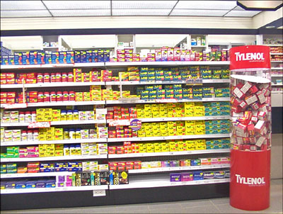
Figure 8.36 Shopper Focus-Natural Drift
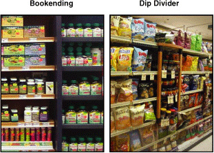
It is critical that we maintain clean lines and logical breaks in our product presentation. We know that shoppers search for recognizable patterns and impose an order on the shelf presentation if one does not logically exist. We can assist this process and hold the attention in the section by bookending a display with formal breaks. These can take the form of a special unit within the gondola run or a formal signage system that provides verbal and visual cues for shoppers. Similarly, we can create a section within a section, such as the dip treatment in Figure 8.37, which both divides two subcategories of salty snacks (kettle chips and healthy snacks) while drawing focused attention to an assortment of complementary dips.
Figure 8.37 Vertical Segmentation
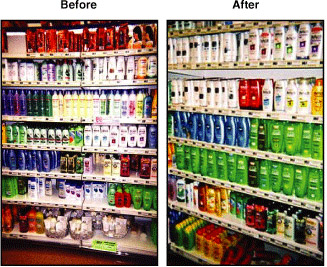
Another case study from Dr. Phillips shows the power of a planogram that properly focuses attention. In this case, nothing was changed between the two examples in Figure 8.38 except the physical alignment of the product. The items stayed the same, as did the facings and the marketing at retail support. Yet, by altering the presentation so that it was more visually pleasing and more “intuitive” to shop, sales increased 37 percent.10
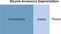
A case study from the bicycle accessories category at a major discounter provides another example of the significance of proper section organization. The placement of items on the shelf had been driven by the sales team located in the retailer’s city and led by the account executive.
Figure 8.38 Shelf Organization
This manufacturer dominated the section, and the retailer was happy to let them, as the category expert, drive the planogram. Unfortunately, the category team was fixated on maximizing the SKUs listed by cramming everything that could fit into the designated 16-foot section. The category team had a shelf section set up in their offices, and they would work for hours arranging and rearranging the product so that they could squeeze one more item on the peg board. The result was a total intermingling of unrelated products in a presentation with maximum product density and a complete lack of shopper focus.
Working with the headquarters marketing team, we addressed the product line in terms of a macro-sort. We defined three product groupings: safety, repair, and accessories. We arranged the products within each of these groupings and created a clean vertical break for each section. We arranged the products so that repair anchored one end of the display, accessories secured the opposite end, and safety was positioned in between (see Figure 8.39). The accessories and repair products were small and created a dense presentation; the safety products were large. By balancing the small products on either end with the large in between, we made the section feel less daunting. The accessories were “want” items approached casually, whereas the repair products were a “need” items. The repair items were also somewhat technical—the shopper had a problem to be solved and was on a hunt for a solution and would, therefore, be task focused. The helmets bridged shopping occasions as either a potential replacement purchase, or a related item purchase accompanying the acquisition of a new bike. By positioning the accessories adjacent to the helmets, we hoped to catch shoppers in a more relaxed browsing state while they were completing their total purchase.
The rationale to all the involved parties was that the real key was not how much went on the shelves, but how much moved off them. SKUs and facings were reduced to deliver a planogram that was cleaner and more focused. The program was tested against control stores and resulted in a doubling of sales.
Figure 8.39 Section Organization Case Study
Leveraging Related Items
An important part of the planogram consideration for bicycle accessories was leveraging the state of mind for a segment of the purchasers of safety products to create incremental sales. We know from the research that shoppers want meaningful retail conversations in a context that works for them as individuals. We wanted to structure our merchandise conversation with shoppers who were completing their purchase of a new bicycle so that it was easier for them to add a few more items to accessorize their new purchase while they were in a state of mind open to considering the additional items. The results clearly reinforced our contention that shoppers will reward marketers who assist them in making connections that make it easier to complete their shopping task.
Shopper Segmentation
Shoppers can be segmented in many ways:
• Age
• Sex
• Ethnicity
• Income
• Household size
• Children in home
• Type of trip
• Need state
• Frequency of store visit
• Dollar spend
The key is to understand the individual in our particular retail context so that we can better anticipate and serve her needs. Depending on audience characteristic at a particular time, a product may be classified as a need (planned list item) or want item (impulse product). As the bicycle accessory program shows, properly leveraging need products for greater impulse sales can dramatically improve results.
A need product is a driver for a shopping occasion—I need to go to the store because…. Often these products are decidedly unglamorous. Examples can include items that are almost always a need-based product, such as printer cartridges, wiper blades, or items in which the classification may vary between need and want depending on the audience or occasion, such as fresh coffee you “need” in the morning, but occasionally use as a self-reward in the afternoon. Need items drive lists which, in turn, motivate shopping trips. As such, they are the creators of the traffic that defines opportunity at retail.
Want products are the items that are not necessary to our primary mission. Often they are added on during the shopping trip. They are sometimes indulgences or provide immediate, psychic gratification, such as a high-definition television in the printer cartridge outlet, wheel covers or car accessories at the wiper blade store, or pastries with the fresh coffee. Want items leverage the opportunity provided by need traffic to build the shopping basket.
Campaigns to build the shopping basket are enhanced by reaching the shopper when she has moved from the macroscanning/browsing mode to a consideration of items for purchase. When she enters this mode and begins to scan across the item presentation, she is more easily reached, and she is reached most easily when the secondary item relates to the primary purchase. At times the connection is obvious, as with complementary products such as, hot dogs/buns or wine and meat. At other times the connection may have more to do with a need state for shoppers in-store. Thus, appetizer or dinner roll suggestions work well with the presentation of a holiday main course such as ham or turkey as shoppers look to round out their meal. Similarly, a co-location of diapers and beer works in convenience stores that are shopped mostly by men. The young father goes in to buy diapers and rewards himself with a six-pack of beer, or he goes to buy beer and attempts to endear himself to his spouse with the additional acquisition of diapers. Whether they are motivated by the specifics of the items, a shopping occasion, or the demographics of a targeted shopper group, the driver for increasing sales is reaching the shopper when she is open to suggestion. The success of our efforts is determined by their relevance, visibility, and execution as they relate to the shoppers in your store.
Shelf Alignment
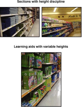
One final planogramming consideration is shelf height alignment. The more shoppers see, the more they will purchase, and a critical part of getting them to see more is to attract them from the perimeter or the race track into additional sections. From the previous examples, we have seen that shoppers react to an orderly presentation of product. Maintaining disciplined shelf heights creates a cleaner line that is easier for the shopper to process and invites more browsing down aisles.
Consider the three examples in Figure 8.40. The towels in the first picture are presented with a consistent shelf configuration and separated vertically by color, whereas the health and beauty section from a supermarket maintains shelf discipline even with items of vastly different sizes. By contrast, the learning aids in the toy department have different shelf heights every eight feet. The learning aids require more mental processing to shop.
Some retailers, such as Target, go to extraordinary lengths to maintain a single shelf height for an entire gondola run, even asking manufacturers to change packaging sizes. Others focus on the existing product attributes and position the shelves to maximize the items that can be presented.
Figure 8.40 Shelf Alignment Examples
Purchase Drivers—Overview
Purchase drivers are the specific tools we can employ to attract more shoppers and motivate them to engage with our products and then purchase them. The key to improved effectiveness lies in optimizing each step of the shopping process. We rely on five techniques to drive purchases. Retail marketing effectiveness comes from properly employing one or more of these elements in a time and manner that are relevant to the shopper:
• Access
• Ease of purchase
• Communication/education
• Involvement
As we work with each of these drivers, we try to inject emotional power into our campaigns and transform suboptimal legacy presentations into high-performing marketing and product offerings.
Visibility
Visibility relates to our ability to see items and their marketing support, either on-shelf or in a feature location. The research shows us that shopper engagement increases in relation to the relevance of the message, and that relevance includes both location and the information communicated so that visibility is a function of what, where, and how we receive communication.
After entering the store, shoppers orient themselves and map their visit. In smart retailers, marketing elements support this process. Marketing material designed to be read from 300 feet away attracts shoppers to the area; from a distance of 30 feet marketing material draw shoppers to the particular section; and marketing messages designed to be read from 3 feet away help close the sale.
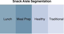
Frito-Lay drove category results by supporting this process. They created overhead signage to mark the aisle location and ensure that shoppers could find their products’ location in store. They then sorted their items into four shopper-focused groupings: lunch, meal preparation, healthy snacking, and traditional snacks (see Figure 8.41). They created logical groupings by usage occasion to make it easier for shoppers; they arranged the items to make it easy for the shopper fulfilling a primary purchase need to also consider a secondary purchase, such as meal preparation next to snacks, or meal preparation adjacent to healthy snacks as a reward, and so on. The total presentation package was supported with way-finding signage to locate the aisle, graphics overhead to trigger an emotional response, and section markers to quickly identify the location of the category for which shoppers were searching. When the shopper was in the right section, packaging and shelf signage closed the sale.
Figure 8.41 Snack Aisle Segmentation
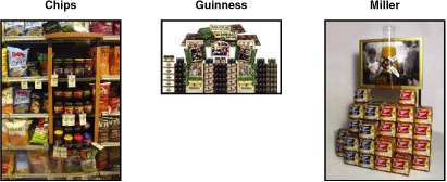
Out of the main aisle, increased visibility can be accomplished by linking with a related product. You can tie your product to an event with which your product shares a connection or other related products. The key is to position displays and marketing material in locations where shoppers are open to the products and messages proffered. Figure 8.42 shows related items such as an in-line presentation of chips and salsa, a Guinness tie-in with St. Patrick’s Day, and a bulk display that highlights the distinctive Miller bottle shape along with visuals that reinforce the enjoyment associated with consuming the beverage. Visibility improved results by increasing the number of shoppers who saw both the first item and related items.
Figure 8.42 Cross-Merchandising
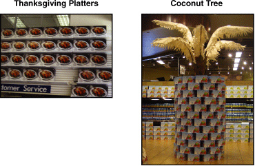
Other examples of properly using visibility as a driver include a gigantic billboard created with Thanksgiving serving platters at the entrance to a Bed, Bath, and Beyond, and a virtual coconut tree created with coconut water in Whole Foods (see Figure 8.43).
Figure 8.43 Product as Visual Billboard
Access
Greater access increases sales by simplifying the purchase process by making the product more widely available to shoppers in locations they expect to find it. In the convenience store study, researchers found that marketing for single-serve salty snacks was particularly effective at the food service counter. The shopper was open to the message offered as he decided on his meal purchase, and access to the product in this area naturally complemented the shopper’s orientation in this place, at this time. Similar phenomena are seen in large stores with cold beverage coolers at the front of the store, single-serve candy and gum packages at check-outs, or candy and popcorn offered in Blockbuster locations. In each case, access to product was increased to provide a complement to the experience, be it a meal, movie, or refreshment and reward at the end of a shopping journey.
Ease of Purchase
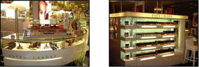
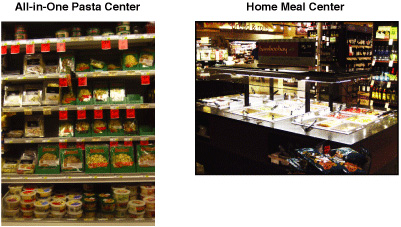
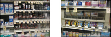
By making it easier to consummate a purchase, we increase sales. This can take the form of providing additional self-service options to make a quick purchase, grouping items so that a “complete purchase” can be made more efficiently, or removing impediments to purchase. In full-service retail, cosmetics had traditionally been sold through a counter with assistance provided by a sales clerk. Over the last ten years, a major trend was the introduction of open-sell product presentations, where shoppers could opt to make their selections by themselves and pay for the product (see Figure 8.44). By not requiring shoppers to work with a sales associate, sales were increased as shoppers gained direct product access. In a similar vein, supermarkets have created a profitable business segment in complete meal solution centers. Counter to the usual impulse to motivate shoppers to travel across the entire store, these presentations make it easy to put together a complete meal by visiting only one section of the store. These can be expressed in many forms, from all-in-one pasta centers to expanded hot food sections (see Figure 8.45). The converse is seen when theft deterrents are introduced at retail. Whether these are locked cases, pull tags, or interactive mechanisms that prevent shoplifters from emptying entire shelves of high-value products in one motion, the introduction of another step in the sales process, although it reduces shrinkage, uniformly decreases sales (see Figure 8.46).
Figure 8.44 Assisted Versus Open Sell
Education
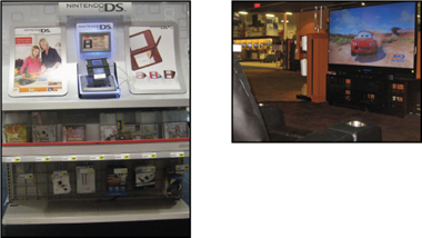
Education builds revenue by imparting essential information on considered purchases to interested shoppers. The chain drug study highlighted the positive impact of educational information on vitamin sales in that channel. Products that are complex or offer a variety of options benefit from providing succinct sales support information. The delivery mechanism may be simple signage, such as the definition of a good/better/best line structure, instructions on how to properly fit your child to the proper bicycle, or technical data to support your decision to purchase top-of-the-line audio equipment (see Figure 8.47). Alternately, the execution can be more complex, as in the interactive video program that supported the construction of a personalized DirecTV package created through a series of prompts delivered via a touch-screen kiosk (see Figure 8.48). The key is that it is appropriate to the category, contains the proper level of detail, and focuses on assisting or reinforcing shopper decisions.
Figure 8.47 Educational Information Example
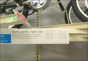
Figure 8.48 Interactive Example
Involvement
Involvement motivates increased shopper interaction with your product. It powerfully supports purchase decision-making by drawing shoppers into a meaningful experience with your product. Examples can include a product tester for fragrance or health and beauty products, a free make-up session with cosmetics, or try-me cut-outs in products on-shelf. They can also include more immersive experiences, such as a game trial in an interactive display, a musical instrument try-out room in Best Buy or Guitar Center, or a re-creation of a home environment for a high-end audio and video component trial (see Figure 8.49). The shopper accepts an opportunity to interact with the product and that interaction leads to an increased closure rate.
Figure 8.49 Involvement Examples
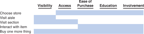
Shaping Opportunities
If we revisit the shopping process, we have four significant shaping opportunities to increase our effectiveness and improve our bottom line results. We can get more shoppers to visit our aisle and our section; we can get more people to interact with our item or message; we can convince more people to make an initial purchase; or we can get more people to buy one additional product. The purchase drivers improve results by assisting shoppers at key points in the process. Increased visibility helps interested shoppers see the aisle or section; access to product increases the likelihood of visiting the desired section and can influence the choice of shopping outlet; ease of purchase, education, and involvement each positively influence item interaction while also influencing store selection. All the purchase drivers increase the probability that shoppers will make an initial purchase or add one more item to their shopping basket. As we develop and consider the placement of retail marketing material, it is critical to remember that sales are driven with these five techniques applied from the shopper’s perspective (see Figure 8.50).
Figure 8.50 Purchase Driver Matrix
Emotional Power
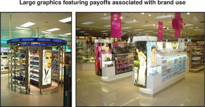
The academic research shows that we all process stimuli on multiple levels simultaneously. Emotion plays a powerful role in motivating purchase, and image size plays a significant part in activating the neuronal activity associated with emotions. The first set of images in Figure 8.51 shows an almost clinical approach to marketing support for the product on-shelf. Compare this with the second image set in Figure 8.52, which utilizes super-sized graphics to communicate the personal payoff we can achieve with use of the featured brands. The first works as a neutral presentation requiring engagement of the cerebral cortex, whereas the second works against the limbic center subconsciously. Emotional connections with brands pay benefits in both immediate sales and long-term brand equity.
Figure 8.51 Neutral Retail Marketing Support
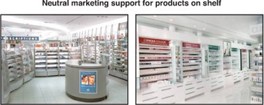
Figure 8.52 Retail Marketing with Graphic Appeal
Women respond to images that feature relaxation, friendship, and children; men respond to depictions of eroticism, violence, and performance.
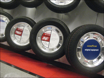
The application of a number of these tools is demonstrated in a case study from a regional chain of tire stores that was looking to upgrade its in-store presentation. Initially, the operators had paid little attention to their display of product because they believed they were a 100% assisted sale environment and that the salesperson would guide the shopper through the selection process. As a result, tires were randomly presented on the wall with private label items intermingled with branded offerings and no differentiation between light truck, passenger, or performance tires (see Figure 8.53).
Figure 8.53 Legacy Tire Presentation
Our study of behavior in-store showed that, although all sales were consummated with sales assistance, during peak periods shoppers had browsing time while waiting for salesperson availability. These browsers could not use their time productively and grew impatient with the wait. This lack of self-accessed information was particularly frustrating for nontechnical shoppers. Further, the conversion of sales was hampered by the physical product presentation requiring the shopping group to move randomly across the product display.
The solution involved four elements:
• Segmenting the assortment by category:
• Light truck
• Sport
• Passenger
• Separating brands from private label
• Communicating a defined line structure for private label lines
• Incorporating emotional triggers into the presentation
We repositioned the segments with performance product between passenger and light truck segments. Shoppers who owned either a light truck or passenger car were not interested in tires from the other segment. However, each group could consider a move to more aspirational performance products.
Within each segment, the brands and private label products were aligned in discrete areas. The private label products, which carried higher margins, were broken into a good/better/best line structure and supported with sales material that offered an explanation of the features and benefits each offered. The product and sales support were color-coded so that waiting shoppers could easily make the proper associations in-store.
Emotions were triggered with the product display and graphics. We created new fixtures that implied a sensation of movement by mimicking the position of a tire on the vehicle as it enters a turn. Large, lifestyle graphics were placed above each segment, evoking the safe transport of children for passenger tires, rugged off-road performance for light truck products, and high-speed action for the performance segment. Together, the product orientation on fixture and graphics sought to evoke the emotional connection between shoppers and their chosen vehicle to widen their purchase consideration.
The revised presentation worked against the key objectives of increasing total sales and margin by improving the closure rate and increasing the share for private label tires.
Practical Learnings
In addition to providing insights into human behavior as it applies to the shopping experience, our research and experience led us to develop ten pieces of learning that can be used in the development and execution of retail marketing programs.
Learning One: Distance Delivers Dollars
The amount of money spent in-store is directly related to the time spent in-store and distance covered while in-store. The more areas of the store shoppers visit, the more they will spend.
Learning Two: Shopper Direction Works
Shoppers overwhelmingly follow the shopping path created by retailers. The race track/periphery is visited by 80 percent of shoppers, whereas the traffic in internal aisles generally ranges from 13 to 30 percent.11 To maximize their efficiency, shoppers routinely walk through the periphery but often leave their carts at the top of internal aisles and then enter to pick up items. Shoppers recall with greater frequency and accuracy the location of items in the periphery, and promotion of one item can stimulate sales of an unrelated but nearby item due to the increased traffic and the shopper’s shift from browsing to purchasing mode.
Learning Three: Relaxation Raises Revenue
Shoppers see and process more products and their related retail marketing material when they are not pressed for time. As shoppers mentally slow down and begin to relax, their response to in-store promotions and the level of unplanned purchases increases. The phenomenon can be tracked in a differential response to marketing material by time of day related to an increased openness associated with a general reduction in time pressures and constraints.
Learning Four: Meaningful Cross-Merchandising Works
In-store navigation can be influenced by linking products in meaningful ways. The cross-category benefit is significant for complementary products such as hot dogs/buns or cake mix/frosting. Similarly benefits are also seen from linking products to related events whether it is seasonal (Easter) or an entertainment event (blockbuster movie release).
Learning Five: Beware Information Overload
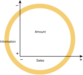
The amount of information presented in-store has a direct, inverse correlation with the shopper’s ability to process and retain that information so that the more data provided, the lower the impact of a particular piece of information. Numerous studies have shown that the amount of time shoppers spend reading marketing at retail messages negatively correlates to their basket size. Marketers must also balance the conclusions made with their messages: Explicit conclusions might minimize confusion but implicit conclusions can increase persuasion as shoppers take more ownership of the essence of the communication (see Figure 8.54).12
Learning Six: List Use Declining
Shoppers’ list use continues to decline. The average grocery shopping list has 20 items, with 75 percent of the items defined by category—not brand. When shopping baskets are compared with lists, only 43 percent of purchases were items on the list, indicating that 57 percent of purchases are unplanned for that shopping occasion.
Learning Seven: Context Influences Brand Perception
Brand value perceptions are affected by contextual factors in-store. Proximity or association with prestige brands can enhance the shopper’s evaluations for secondary brands; linking small brands with large brands provides a disproportionate percentage lift to the smaller partner. Mixing unrelated products or brands in a single presentation can lead to a lengthier mental processing by the shopper that detracts from brand image and reduces sales for the entire presentation.13
Learning Eight: Display Organization Shapes Perception
Display organization influences brand perceptions and the shopper’s impression of key purchase consideration attributes. For example, arranging wines by region lifts the importance of this factor in the choice of wine, so that items from prestigious regions increase at the expense of offerings from less prestigious areas.14
Learning Nine: Savings Message Impactful
The offering of comparative price information, such as the display of both regular and sale prices, drives sales results by accelerating the shopper’s decision-making. It increases shoppers’ value perception of the promoted item and decreases the search for additional price information and other data points.
Learning Ten: Marketing at Retail Activity Increases Sales
Properly executed programs increase sales independent of price discounts or other promotional activity. At the same time, marketing at retail activity for one brand can lower the movement of items without marketing support. As we have seen in other areas, overuse of any technique diminishes its effectiveness.15
Summary
We began by measuring what shoppers actually do in-store and then understanding why they behave that way by exploring the relevant academic research. By focusing on the steps in the shopping process and the proper application of retail drivers, we can significantly improve bottom-line results.
• Shoppers follow the path that marketers establish for them.
• As they move through the store, they “see” what is meaningful to them on this shopping trip.
• Shoppers reward marketers who minimize their need for mental processing by intuitively anticipating and meeting their shopping needs.
Shoppers punish marketers who require them to think too hard or process too much information in-store.
Endnotes
1. Doug Adams, “POP Measures Up: Learnings from the Supermarket Class of Trade,” Washington, D.C.: POPAI (2001), page 14; Doug Adams, “POPAI Convenience Channel Study,” (Washington, D.C.: POPAI (2002), page 15; Doug Adams, “POPAI Measuring At-Retail Advertising in Chain Drug Stores,” Washington, D.C., POPAI (2004), page 20.
2. “POPAI Mass Merchandising Purchase Study,” (1998), http://www.422business.com/html2/articles/199603/marchcon.htm
3. Christoph Haibock, NeuroMarketing at Retail (Dubai), 2005.
4. Paco Underhill Interview, 2009.
5. Hugh Phillips, http://www.instore-research.com/Images/PFB_Article_Trends.pdf, Present and Future of Merchandising, page 8.
6. Ibid., 8.
7. Hugh Phillips, The Power of Marketing at Retail, (Alexandria, VA: POPAI, 2008) page 42.
8. Christoph Haibock, NeuroMarketing at Retail, Dubai (2005).
9. Hugh Phillips, Shopper Psychology, St. Louis, MO, June (2007).
10. Hugh Phillips, http://www.instore-research.com/Images/Hugh%20PFB%20Presentation1.pdf, How We Shop, page 58.
11. Ibid., 39.
12. Ibid., 39.
13. Hugh Phillips, http://www.instore-research.com/Working%20Files/Unilever/Unilever%20Presentation.pdf, page 55.
14. Ibid., 55.
15. Ibid., 58.