This chapter will be mostly about discussions and demonstrations of basic data models used in ML. However, before I can get into the heart of data model operations, I need to show you how to install OpenCV 4 and the Seaborn software packages. Both these packages will be needed to properly support the running and visualization of the basic data models. These packages will also support other demonstrations presented in later book chapters.
Installing OpenCV 4
This section is about installing the open source OpenCV software package. I will be using OpenCV for various ML demonstrations including making use of the great variety of visualization utilities contained in the package. OpenCV version 4 is the latest one and is not yet available for direct download and installation from any of the popular repositories. It must be loaded in a source code format and built in place. The following instructions will do this task. It is important to precisely follow these instructions or else you will likely not be successful with the OpenCV install.
The first step is to install the CMake utility along with three other key utilities. Enter the following:
sudo apt-get install build-essential cmake unzip pkg-config
Next, install three imaging and video libraries that support the three most popular Image formats, jpeg, png, and tiff. Enter the following:
sudo apt-get install libjpeg-dev libpng-dev libtiff-dev
For successful execution of the preceding command, make sure apt-get is updated according to the following command:
sudo apt-get update
Now install three imaging utilities used for common video processing functions. Enter the following command. Similarly, make sure apt-get is updated.
sudo apt-get install libavcodec-dev libavformat-dev libswscale-dev
Next install two supplemental video processing libraries. Enter the following:
sudo apt-get install libxvidcore-dev libx264-dev
The next command installs the GTK library. GTK will be used to implement the OpenCV GUI backend. Enter the following:
sudo apt-get install libgtk2.0-dev
The next command reduces or eliminates undesired GTK warnings. The “*” in the command ensures that the proper modules supporting the ARM processor are loaded. Enter the following:
sudo apt-get install libcanberra-gtk*
The next two software packages are used for OpenCV numerical optimizations. Enter the following:
sudo apt-get install libatlas-base-dev gfortran
You will now be ready to download OpenCV 4 source code once all the preceding dependencies have been loaded.
Download OpenCV 4 source code
Ensure that you are in the virtual environment and also in the home directory prior to starting the download. Enter the following command to go to your home directory if you are not there:
cd ~
Next, use the wget command to download both the latest OpenCV and opencv_contrib modules. At the time of this writing, the latest version was 4.0.1. It will likely be different when you try this download. Simply substitute the latest version wherever you see a version entered in this discussion. The opencv_contrib module contains open source community contributed supplemental functions, which will be used in this book’s projects and demonstrations. Enter the following command to download the OpenCV zipped file from the GitHub web site:
wget -O opencv.zip https://github.com/opencv/opencv/archive/4.0.1.zip
Enter the following command to download the opencv_contrib zipped file from the GitHub web site:
wget -O opencv_contrib.zip https://github.com/opencv/opencv_contrib/archive/4.0.1.zip
The downloads will now have to be extracted and expanded using these commands:
unzip opencv.zip
unzip opencv_contrib.zip
Next, rename the newly generated directories to the following to ease the access to the OpenCV packages and functions and ensure that the directories are named as expected for CMake configuration file. Enter the following command:
mv opencv-4.0.1 opencv
mv opencv_contrib-4.0.1 opencv_contrib
You should be ready to start building the OpenCV package once the source code downloads have been completed.
Building the OpenCV software
You will need to ensure that the numpy library has been installed prior to commencing the build. I discussed installing numpy along with several other dependencies in Chapter 1. If you haven’t installed numpy yet, then it is easily installed using the following command:
pip install numpy
The next step set ups a directory where the build will take place. Create and change into the build directory by entering these commands:
cd ~/opencv
mkdir build
cd build
Upon completing the preceding commands, enter the following to run the CMake command with a number of build options. Note that “” symbol (backward slash) is required for the command-line interpreter (CLI) to recognize that a single command is spread over multiple lines. Don’t overlook the two periods at the tail end of the following complex command. Those periods indicate to the CLI to execute all that was entered before the periods.
cmake -D CMAKE_BUILD_TYPE=RELEASE
-D CMAKE_INSTALL_PREFIX=/usr/local
-D OPENCV_EXTRA_MODULES_PATH=~/opencv_contrib/modules
-D ENABLE_NEON=ON
-D ENABLE_VFPV3=ON
-D BUILD_TESTS=OFF
-D OPENCV_ENABLE_NONFREE=ON
-D INSTALL_PYTHON_EXAMPLES=OFF
-D BUILD_EXAMPLES=OFF ..
Note
The option OPENCV_ENABLE_NONFREE=ON ensures that all third-party functions are made available during the compilation step. The line
"Non-free algorithms: YES"
in Figure 2-1 results screen confirms that the condition was set.
Figure 2-1
Confirmation of non-free algorithms availability
Having the non-free algorithms available is applicable for non-commercial applications. If you are intending to develop an application for sale or licensing, then you must comply with any and all applicable licensing agreements. There are several patented algorithms contained in the OpenCV software package, which cannot be used for commercial development without paying royalty fees.
You should also confirm that the virtual environment points to the proper directories for both Python 3 and numpy. Figure 2-2 shows the correct directories within the cv virtual environment.
Figure 2-2
Confirmation for Python 3 and numpy directories within the py3cv4_1 virtual environment
The default disk swap size of 100 MB must be changed to 2048 MB to have a successful compilation. The swap space will be restored to the default value after the compilation is done. It is important to realize that swap size has a significant impact on the longevity of the micro SD card, which is used as the secondary memory storage for the RasPi. These cards have finite number of write operations before failing. The number of write operations dramatically increases with the swap size. It will be of no consequence to card life by changing the swap size for this one-time process. First use the nano editor to open the swap configuration file for editing as follows:
sudo nano /etc/dphys-swapfile
Next comment out the line CONF_SWAPSIZE=100 and add the line CONF_SWAPSIZE=2048. It is important to add the additional line, instead of just changing the 100 to 2048. You will undo the change after completing the compilation. The revised portion of the file is shown here:
# set size to absolute value, leaving empty (default) then uses computed value
# you most likely don't want this, unless you have a special disk situation
# CONF_SWAPSIZE=100
CONF_SWAPSIZE=2048
Note
Failing to change the swap size will likely cause the RasPi to “hang” during the compilation.
After making the edit, you will need to stop and start the swap service using these commands:
sudo /etc/init.d/dphys-swapfile stop
sudo /etc/init.d/dphys-swapfile start
This next step is the compilation from source code to binary. It will take approximately 1.5 hours using all four RasPi cores. You should be aware of an issue known as a race condition that can randomly occur when a specific core needs a resource currently in use by another core. The problem happens due to very tight timing issues where a using core cannot release a resource and a requesting core does not drop the request for that resource. The result is the processor simply hangs “forever.” A very bad situation. Fortunately, there is a solution of simply not requesting the forced use of four cores. I do not know how long a complete compilation would take, but suspect it would be at least 3 hours. The command to compile using four cores is
make -j4
The command to compile not using any specific number of cores is simply make.
There is a bit of good news, that is, if the initial compilation hangs while trying the -j4
option, you can redo the compilation using only the make command and the system will find and use all the code already compiled. This will considerably shorten the compile time. I know this is true because I experienced it. My first compilation hung at 100%. I restarted the compilation using only the make command, and it successfully completed in about 15 minutes. Figure 2-3 shows the screen after the success compilation.
Figure 2-3
Successful compilation
Finish the OpenCV 4 installation by entering these next commands:
sudo make install
sudo ldconfig
This is the last step which has some finishing and verification operations. First restore the swap size to the original 100 MB by uncommenting the line
CONF_SWAPSIZE=100
and commenting out the newly added line
# CONF_SWAPSIZE=2048
Next create a symbolic link to OpenCV so that it can be used by new Python scripts created in the virtual environment. Enter these commands:
cd ~/.virtualenvs/py3cv4_1/lib/python3.5/site-packages/
ln -s /usr/local/lib/python3.5/site-packages/cv2/python-3.5/cv2.cpython-35m-arm-linux-gnueabihf.so cv2.so
cd ~
Failure to create the symbol link will mean that you will not be able to access any OpenCV functions.
Finally, test your completed installation by entering these commands:
source ~/.profile
workon cv
python
>>> import cv2
>>> cv2.__version__
'4.0.1'
>>> exit()
The first two commands start the py3cv4_1 virtual environment. The next one starts the Python interpreter associated with this environment, which is Python 3. The next command imports OpenCV using the symbolic link you just created. This line should demonstrate to the importance of the symbolic link. The next command requests the OpenCV version, which is reported back as 4.0.1 as may be seen in the following line with the version request. The last command exits the Python interpreter. Figure 2-4 shows the py3cv4_1 version verification.
Figure 2-4
py3cv4_1 version verification
At this point, you should now have a fully operational OpenCV software package operating in a Python virtual environment. To exit OpenCV, simply close the terminal window.
Seaborn data visualization library
Visualizing the data, you will be using an important step when dealing with ML models as I discussed in the previous chapter. There are a number of useful Python compatible utilities and software packages, which will help you in accomplishing this task. Hopefully, you have already installed the Matplotlib library as part of the dependency load described in the previous chapter. The OpenCV package also contains useful visualization routines and algorithms. In this section I will introduce the Seaborn library, which is another useful data visualization tool and is considered a supplement to the data visualization functions in both Matplotlib and OpenCV.
Seaborn specifically targets statistical data visualization. It also works with a different set of parameters than the ones used with Matplotlib.
The first step required in this section is to install the Seaborn software package. That is easily accomplished by entering the following command:
pip install seaborn
Figure 2-5 shows the results of installing the Seaborn software package. You should notice from the figure that the Seaborn package requires a fair number of dependencies including numpy, Pandas, Matplotlib, scipy, kiwisolver, and several other Python utilities.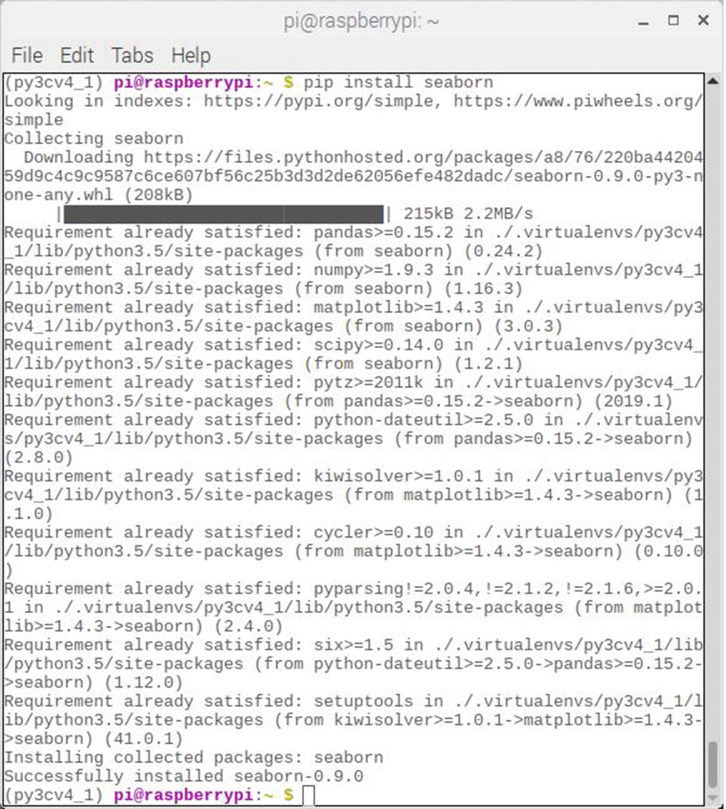
Figure 2-5
Seaborn package installation results
Once installed, I believe the easiest way to explain Seaborn is to use it to visualize the Iris dataset that was introduced in Chapter 1. One extremely convenient Seaborn feature is the immediate availability of a limited number of datasets contained in the package. The Iris dataset is one of those organic datasets (no pun intended). To use the Iris dataset, you just need to incorporate these statements in your script
import seaborn as sns
iris = sns.load_dataset("iris")
where sns is the reference to the Seaborn import.
There are 15 datasets available in the Seaborn package. These are listed as follows for your information:
- anscombe
- attention
- brain_networks
- car_crashes
- diamonds
- dots
- exercise
- flights
- fmri
- gammas
- iris
- mpg
- planets
- tips
- titanic
Judging from the titles, the Seaborn datasets are diverse and a bit unusual. They were apparently selected to demonstrate Seaborn package capabilities for analysis and visualization. I will use some of these datasets during the data model discussions, in addition to the Iris dataset.
Table 2-1 shows the first five records in the Iris dataset, which was generated by the following command:
iris.head()
Table 2-1
Head command results for the Iris dataset
Rec # | sepal_length | sepal_width | petal_length | petal_width | species |
|---|---|---|---|---|---|
0 | 5.1 | 3.5 | 1.4 | 0.2 | Setosa |
1 | 4.9 | 3.0 | 1.4 | 0.2 | Setosa |
2 | 4.7 | 3.2 | 1.3 | 0.2 | Setosa |
3 | 4.6 | 3.1 | 1.5 | 0.2 | Setosa |
4 | 5.0 | 3.6 | 1.4 | 0.2 | Setosa |
Data visualization is an important initial step when selecting an appropriate data model which best handles the dataset. Seaborn provides many ways of visualizing data to assist you in this critical task. I will be introducing a series of scripts that will help you visualize data. The multivariate Iris dataset will be used in all the following scripts.
Scatter plot
Starting the data visualization process with a scatter plot is probably the easiest way to approach the data visualization task. Scatter plots are simply two-dimensional or 2D plots using two dataset components that are plotted as coordinate pairs. The Seaborn package uses the jointplot method as the plotting function indicating the 2D nature of the plot. I used the following script which is named jointPlot.py to create the scatter plot for sepal length vs. petal height. This script is available from the book’s companion web site:
# Import the required libraries
import matplotlib.pyplot as plt
import seaborn as sns
# Load the Iris dataset
iris = sns.load_dataset("iris")
# Generate the scatter plot
sns.jointplot(x="sepal_length",y="sepal_width", data=iris,size=6)
# Display the plots
plt.show()
The script is run by entering
python jointPlot.py
Figure 2-6 shows the result of running this script.
Figure 2-6
Scatter plot for sepal length vs. sepal height (all species)
Looking at the figure, you can easily see that the data points are spread out through the plot, which indicates there is no strong relationship between these two dataset components. The histogram at the top for sepal length indicates a broad value spread as compared to the sepal width histogram on the right-hand side, which shows a peak mid-range value of approximately 3.0. Just be mindful that this plot covers all the Iris species and could conceivably be masking an existing data relationship for one or more individual species. Other visualization tools could unmask hidden relationships as you will shortly see.
Facet grid plot
A facet grid plot is a variant of the scatter plot just presented in the previous section. However, all the dataset components are clearly identified in a facet grid plot as opposed to being unclassified and ambiguous in a scatter plot. I used the following script which is named facetGridPlot.py to create the facet grid plot for sepal length vs. petal height. This script is available from the book’s companion web site:
# Import the required libraries
import matplotlib.pyplot as plt
import seaborn as sns
# Load the Iris dataset
iris = sns.load_dataset("iris")
# Generate the Facet Grid plot
sns.FacetGrid(iris,hue="species",size=6)
.map(plt.scatter,"sepal_length","sepal_width")
.add_legend()
# Display the plot
plt.show()
The script is run by entering
python facetGridPlot.py
Figure 2-7 shows the result of running this script.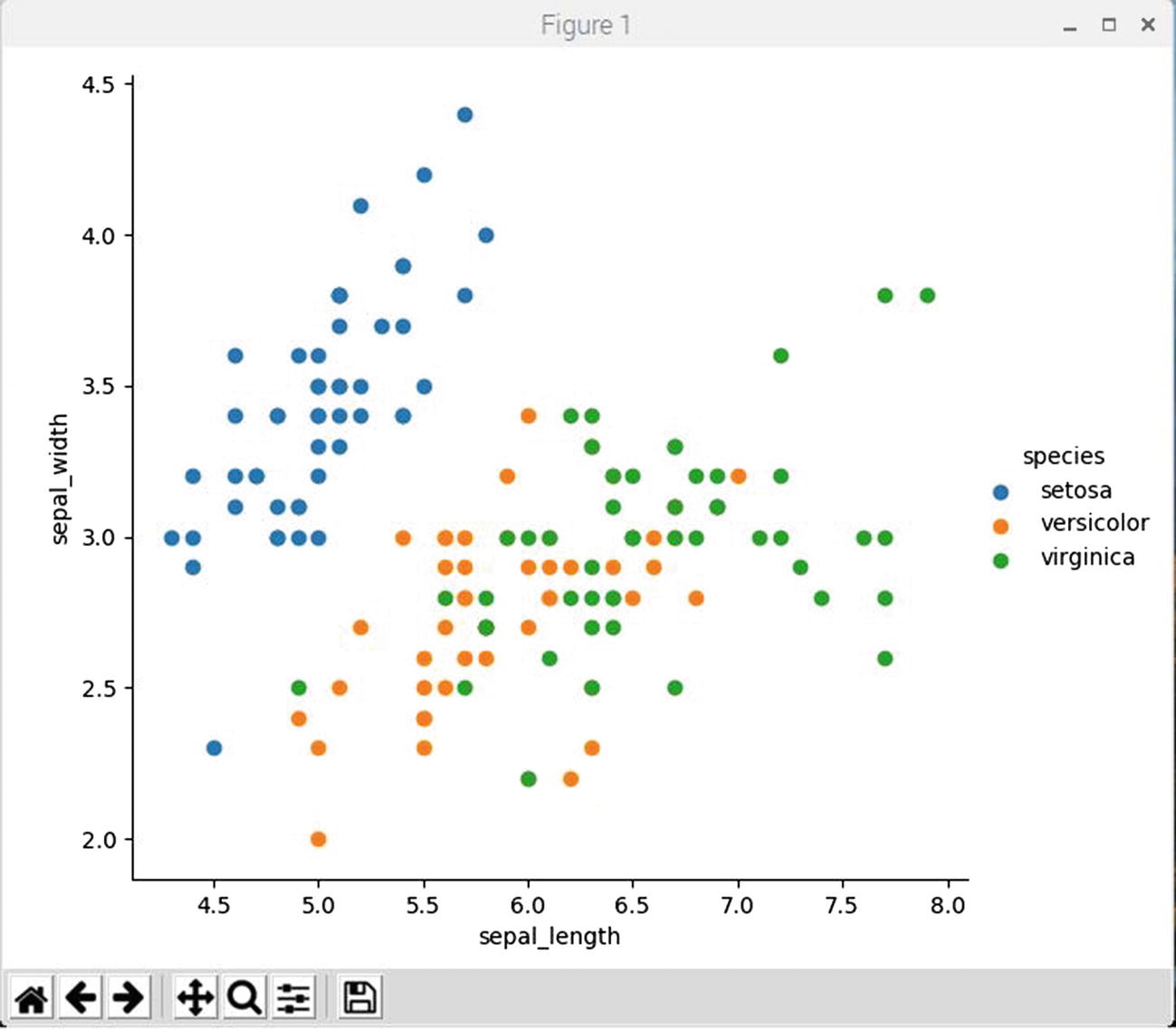
Figure 2-7
Facet grid plot for sepal length vs. sepal height
I do acknowledge that the grayscale figure will be hard to decipher in the published book, but you should be able to discern that a group of dots in the upper left-hand side of the plot appear to form a meaningful relationship, wherein a linear, sloped line could be drawn through the dot group to represent the relationship. These dots are all from the Iris Setosa species.
This same dot group was plotted in Figure 2-6, but there was not differentiation between the dots as regards to the species they represented and this relationship could not have been easily identified. Visualizing a probable relationship is an important first step in selecting an appropriate data model. In this case, using a linear regression (LR) model would be a good choice for this particular data sub-set. I will discuss the LR data model later in this chapter.
The remaining dots in Figure 2-7 belong to the remaining Iris species and do not appear to have any obvious visual relationships as far as I can determine. However, I am still proceeding to show you some additional plots which may help with the analysis.
Box plot
Box plots were first introduced in the previous chapter; however, I used the Matplotlib package to generate those plots. The following box plot was generated by a Seaborn method named boxplot. In reality, I suspect that the actual plot is likely created by the Matplotlib software because the Seaborn package has a strong linkage to Matplotlib.
I used the following script which is named boxPlot.py to create the box plot for all sepal length attribute for all of the Iris species. This script is available from the book’s companion web site:
# Import the required libraries
import matplotlib.pyplot as plt
import seaborn as sns
# Load the Iris dataset
iris = sns.load_dataset("iris")
# Generate the box plot
sns.boxplot(x="species",y="sepal_length", data=iris)
# Display the plot
plt.show()
The script is run by entering
python boxPlot.py
Figure 2-8 shows the result of running this script.
Figure 2-8
Box plot for sepal length for all Iris species
Box plots are inherently univariate in nature because they are created from only a single dataset dimension or 1D. Nonetheless, they provide important insights into the dataset attribute ranges, variances, and means. Box plots are useful to identify data outliers which can easily disrupt certain data models, which in turn can cause unpredictable and uncertain results from using those models with disruptive outliers inadvertently included as inputs.
Strip plot
A strip plot may be considered as augmented box plot because it includes an underlying box plot as well as shows the actual data points that go into creating that box plot. The data points would ordinarily be plotted along a single vertical line for each dataset class; however, the Seaborn stripplot method has a jitter option that randomly shifts the dots away from the vertical line. This random jitter does not affect the data display because the vertical axis is the only one used to identify a dot’s value. This concept should become clear after you study the example plot.
I used the following script which is named stripPlot.py to create the strip plot for all sepal length attribute for all of the Iris species. This script is available from the book’s companion web site:
# Import the required libraries
import matplotlib.pyplot as plt
import seaborn as sns
# Load the Iris dataset
iris = sns.load_dataset("iris")
# Generate the strip plot
ax = sns.boxplot(x="species",y="sepal_length", data=iris)
ax = sns.stripplot(x="species", y="sepal_length", data=iris, jitter=True, edgecolor="gray")
# Display the plot
plt.show()
The script is run by entering
python stripPlot.py
Figure 2-9 shows the result of running this script.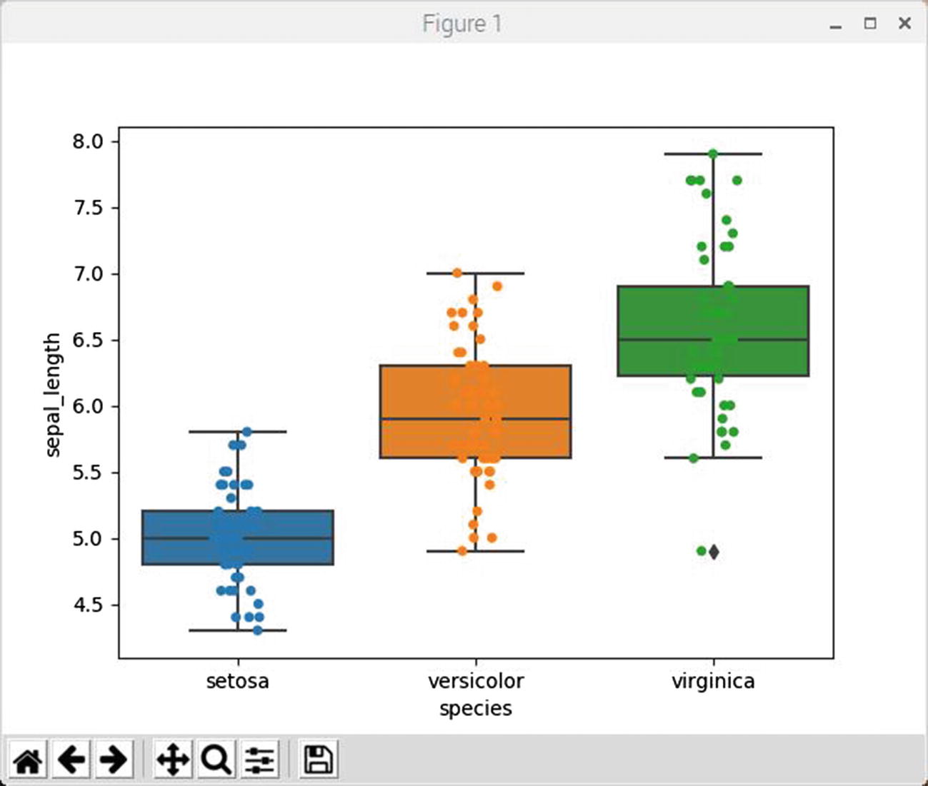
Figure 2-9
Strip plot for sepal length for all Iris species
My preceding comments regarding the box plot apply here. The strip plot just provides some additional insight regarding how the data points that go into creating the box plot are distributed throughout the recorded range of values.
Violin plot
A violin plot is similar to a box plot, except it has a rotated kernel density plot on each side of the vertical line that represents class data for the dataset. These kernel densities represent the probability density of data at different values and are smoothed by a kernel density estimator function. The curious name for this plot should be readily apparent after you examine the figure.
I used the following script which is named violinPlot.py to create the violin plot for all sepal length attribute for all of the Iris species. This script is available from the book’s companion web site:
# Import the required libraries
import matplotlib.pyplot as plt
import seaborn as sns
# Load the Iris dataset
iris = sns.load_dataset("iris")
# Generate the violin plot
sns.violinplot(x="species",y="sepal_length", data=iris, size=6)
# Display the plot
plt.show()
The script is run by entering
python violinPlot.py
Figure 2-10 shows the result of running this script.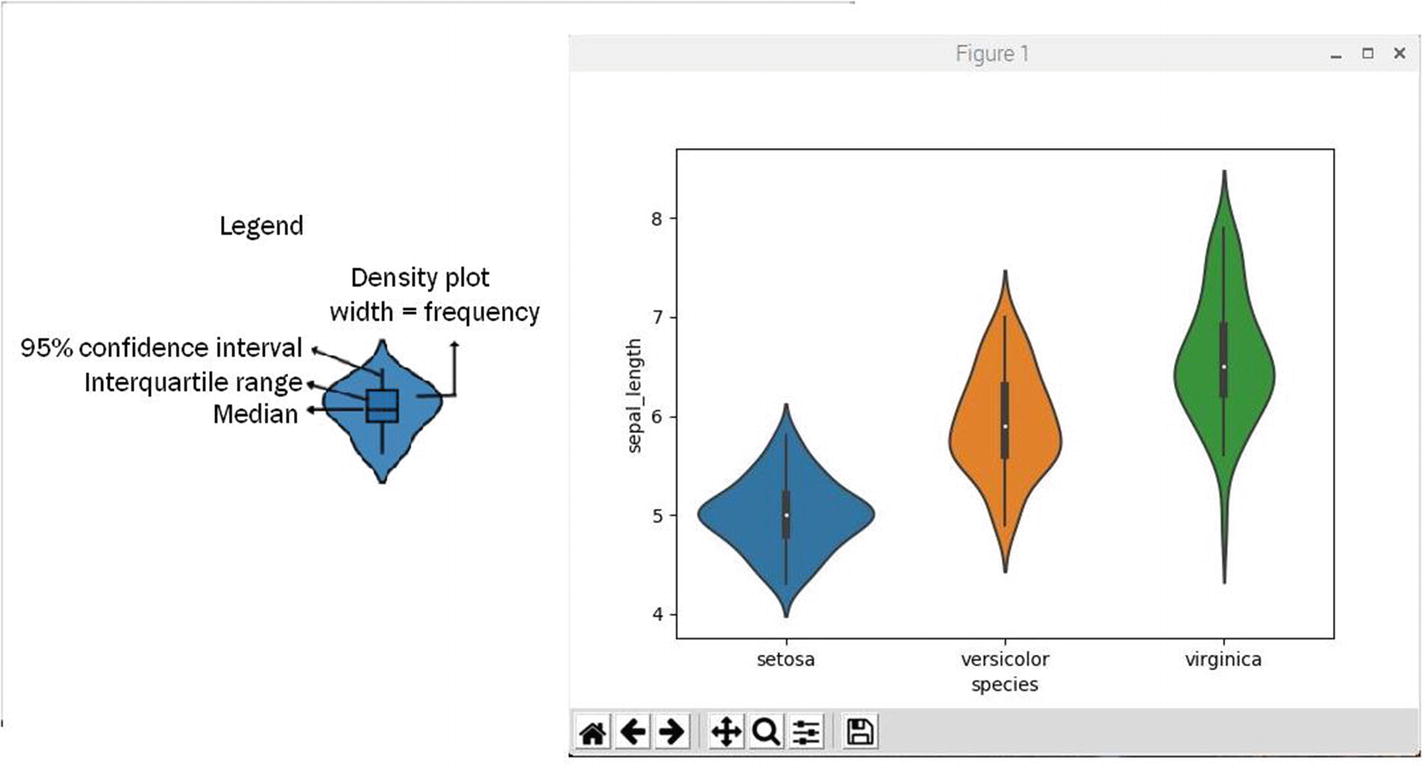
Figure 2-10
Violin plot for sepal length for all Iris species
Violin plots overcome a big problem inherent to box plots. Box plots can be misleading because they are not affected by the distribution of the original data. When the underlying dataset changes shape or essentially “morphs,” box plots can easily maintain their previous statistics including medians and ranges. Violin plots on the other hand will reflect any new shape or data distribution while still containing the same box plot statistics.
The “violin” shape of a violin plot comes from a class dataset’s density plot. The density plot is rotated 90° and is placed on both sides of the box plot, mirroring each other. Reading the violin shape is exactly how a density plot is interpreted. A thicker part means the values in that section of the violin plot have a higher frequency or probability of occurrence and the thinner part implies lower frequency or probability of occurrence.
Violin plots are relatively easy to read. The dot in the middle is the median. The box presents interquartile range. The whiskers show 95% confidence interval. The shape of the violin displays frequencies of values. The legend shown in Figure 2-10 points out these features.
KDE plot
A KDE plot shows only the dataset class density plots. KDE is short for kernel density estimators which are precisely the same plots used in violin plots. A KDE plot is most useful if you simply focus on the data distribution rather than data statistics as would be the case for box or violin plots.
I used the following script which is named kdePlot.py to create the KDE plot for all sepal length attribute for all of the Iris species. This script is available from the book’s companion web site:
# Import the required libraries
import matplotlib.pyplot as plt
import seaborn as sns
# Load the Iris dataset
iris = sns.load_dataset("iris")
# Generate the kde plot
sns.FacetGrid(iris,hue="species",size=6)
.map(sns.kdeplot,"sepal_length")
.add_legend()
# Display the plot
plt.show()
The script is run by entering
python kdePlot.py
Figure 2-11 shows the result of running this script.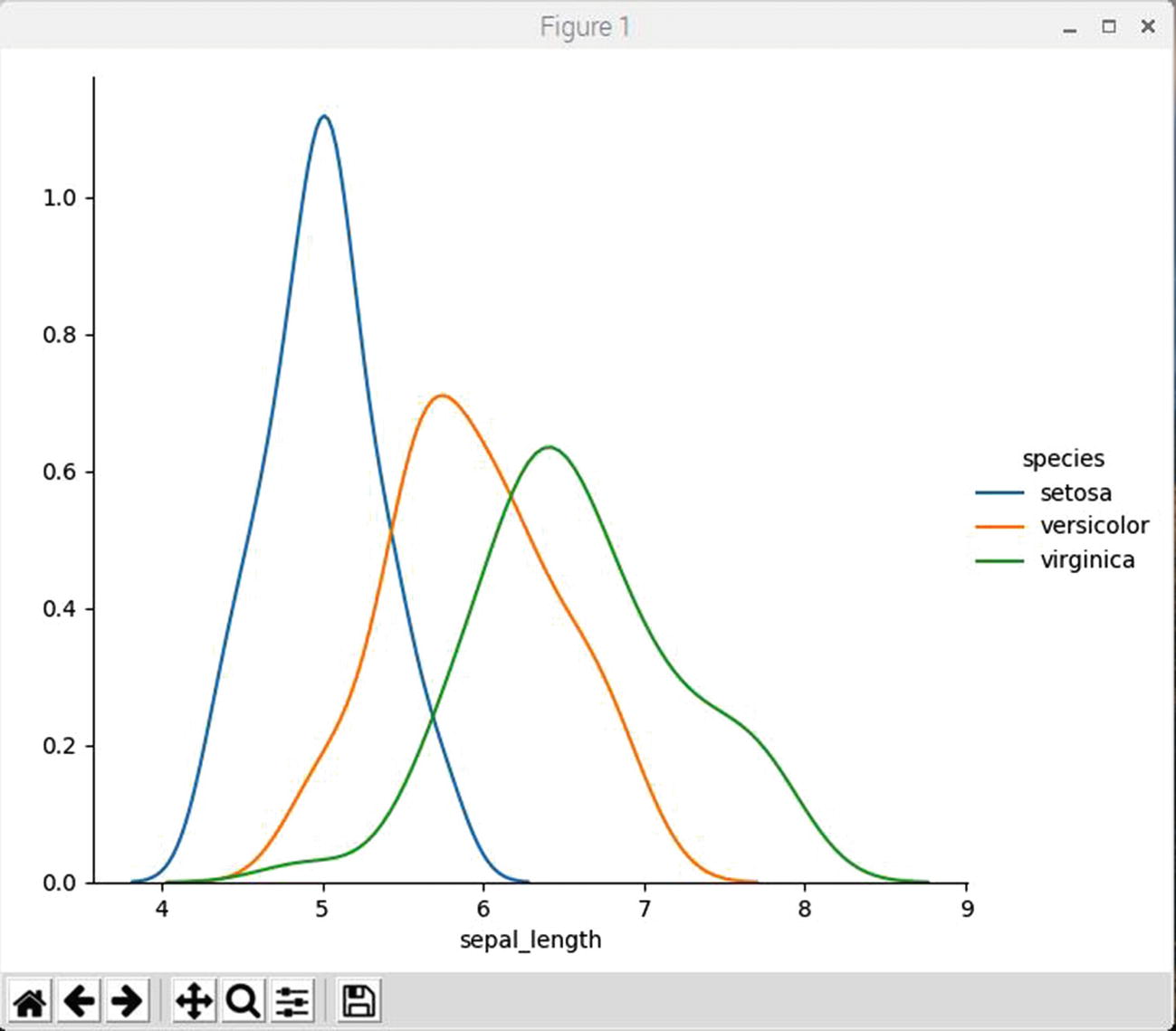
Figure 2-11
KDE plot for sepal length for all Iris species
The data distribution plot results were already discussed earlier.
Pair plots
Pair plots are created when joint plots are generalized to large dimension datasets. These plots are useful tools for exploring correlations between multidimensional data, because all data pair values are plotted against each other. Visualizing the Iris dataset multidimensional relationships is as easy as entering the following script, which I named pairPlot.py. This script is available from the book’s companion web site:
# Import the required libraries
import matplotlib.pyplot as plt
import seaborn as sns
# Load the Iris dataset
iris = sns.load_dataset("iris")
# Generate the pair plots
sns.pairplot(iris, hue="species", size=2.5)
# Display the plots
plt.show()
Figure 2-12 shows the results of running the preceding script.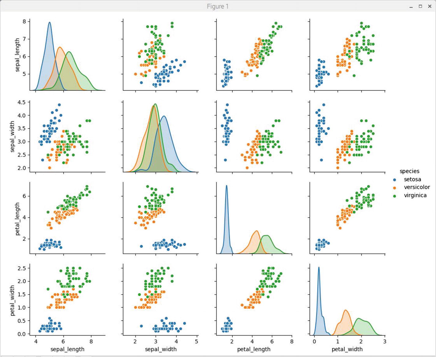
Figure 2-12
Iris dataset pair plots
At first glance, this pair plot figure seems to be the most comprehensive and complex plot shown to this point. Upon closer inspection, you will quickly realize that the individual plots shown in the figure are either facet grid or KDE plots, which have already been discussed. The plots on the major diagonal from top left to bottom right are all KDE plots for the same intersecting dataset classes. The non-intersecting plots, that is, those with different classes for the x and y axes, are all facet grid plots. Class attribute relationships should quickly become apparent to you as you inspect the individual plots. For example, the Setosa attributes are clearly set apart from the other species attributes in almost all pair plots. This would indicate that clustering data model may work very well in this situation. I believe spending significant time examining the pair plots will help you understand the underlying dataset to a great degree.
I believe it is an imperative that anyone actively involved with ML should be more than trivially acquainted with the underlying basic models that serve as a foundation for ML core concepts. I introduced six models in the previous chapter without delving into the details for these models. These models were (in alphabetical order)
- *Decision tree classifier
- *Gaussian Naive Bayesian
- *K-nearest neighbors classifier
- Linear discriminant analysis
- *Logistic regression
- Support vector machines
There are four more additional models, which will also be covered in this book:
- Learning vector quantization
- *Linear regression
- Bagging and random forests
- Principal component analysis
- (* Discussed in this chapter)
Experienced data scientist cannot tell you which of these ten models would be the best performer without trying different them all for a particular problem domain. While there are many other ML models and algorithms, these ten are generally considered to be the most popular ones. It would be wise to learn about and use these ten as a solid starting point for an ML education.
Underlying big principle
There is a common principle that underlies all supervised ML algorithms used in predictive modeling.
ML algorithms are best described as learning a target function f( ) that best maps input variable x to an output variable y or in equation form
y = f(x)
There is often a common problem where predictions are required for some y, given new input values for the input variable x. However, the function f(x) is unknown. If it was known, then the prediction would be said to be analytical and solved directly and there would be no need to “learn” it from data using ML algorithms.
Likely the most common type of ML problem is to learn the mapping y = f(x) to make predictions of y for a new x. This approach is formally known as predictive modeling or predictive analytics and the goal is to make accurate predictions.
I will start the data model review with probably the most common model ever used for predictions.
Linear regression
Linear regression (LR) is a method for predicting an output y given a value for an input variable x. The assumption behind this approach is that there must exist some linear relationship between x and y. This relationship expressed in mathematical terms is
where
b1 = slope of a straight line
b0 = y-axis intercept
e = estimation error
Figure 2-13 shows a simplified case with three data points and a straight line that best fits between all the points. The  points are the estimates created using the LR equation for a given xi. The ri values are the estimation errors between the true data point and the corresponding
  estimate.
Figure 2-13
Simple LR case example
The normal approach in creating an LR equation is to minimize the sum of all the ri errors. Different techniques can be used to learn the linear regression model from data, such as a linear algebra solution for ordinary least squares and using a gradient descent optimization.
Linear regression has been around for more than 200 years and has been extensively studied. Two useful rules of thumb when using this technique are to remove independent variables that are very similar and to remove any noise from the dataset. It is a quick and simple technique and a good first-try algorithm.
LR demonstration
The following Python script is named lrTest.py and is designed to create a pseudo-random set of points surrounding a sloped line with the underlying equation
The learn regression method contained in the scikit-learn package uses the pseudo-random dataset to recreate the underlying equation. This script is available from the book’s companion web site:
# Import required libraries
import matplotlib.pyplot as plt
import seaborn as sns
import numpy as np
from sklearn.linear_model import LinearRegression
# generate the random dataset
rng = np.random.RandomState(1)
x = 10*rng.rand(50)
y = 2*x -5 + rng.randn(50)
# Setup the LR model
model = LinearRegression(fit_intercept=True)
model.fit(x[:, np.newaxis], y)
# Generate the estimates
xfit = np.linspace(0, 10, 1000)
yfit = model.predict(xfit[:, np.newaxis])
# Display a plot with the random data points and best fit line
ax = plt.scatter(x,y)
ax = plt.plot(xfit, yfit)
plt.show()
# Display the LR coefficients
print("Model slope: ", model.coef_[0])
print("Model intercept: ", model.intercept_)
The script is run by entering
python lrTest.py

It should be readily apparent from viewing the figure that the best fit line is placed perfectly within the dataset as would be expected from the way the data was generated. This is a proper result because the sole purpose of this demonstration was to illustrate how a linear regression model worked.
Figure 2-15 shows the b0 and b1 coefficients that the LR model computed. They are extremely close to the true values of 2 and –5, respectively.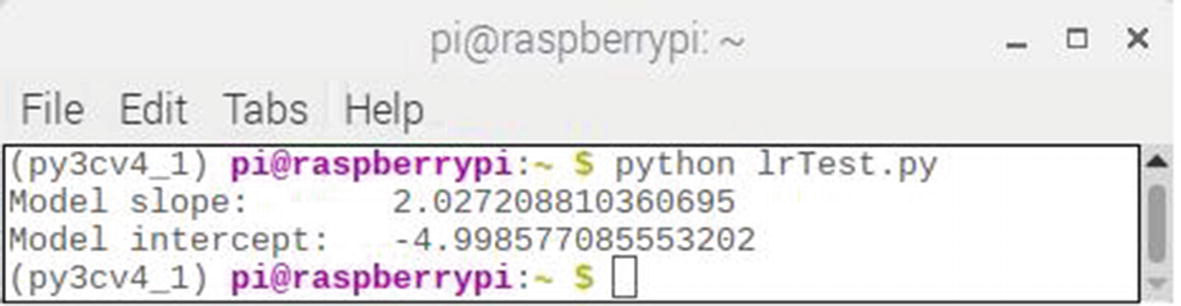
Figure 2-15
Computed LR coefficients
Logistic regression
Logistic regression (LogR) is often used for classification purposes. It differs from LR because the dependent variable (x) can only take on a limited number of values, whereas in LR the number of values is unlimited. This arises because logistic regression uses categories for the dependent variable. It becomes binary logistic regression when there are only two categories.
In LR, the output is the weighted sum of inputs. LogR is a generalization of LR in the sense that the weighted sum of inputs is not output directly, but passes through a function that maps any real input value to an output ranging between 0 and 1. In LR, an output can take on any value, but for LogR, the values must be between 0 and 1.
Figure 2-16 shows the function which maps the sum of weighted inputs. This is called the sigmoid function
and is also known as an activation function.
Figure 2-16
Sigmoid function
The figure shows that the output value (y) of the sigmoid function always lies between 0 and 1 and when x = 0, y= 0.5. In the case of two categories, if y >= 0.5, then it can be stated that Class 1 was detected; else, it must be Class 0.
Before I delve into the actual data model, it is important to review the two underlying assumptions that must be met for a logistic regression to be applied. These are
- The dependent variable must be categorical.
- The independent variables (features) must be independent.
I will be using Professor Andrew Ng’s dataset regarding admission to a university based on the results of two exam scores. The complete dataset consists of 100 records with two exam scores or marks ranging from 0 to 100. Each record also contains a 1 or 0, where 1 means the applicant was admitted and 0 the reverse. The objective for this data model is to predict based on two exam marks whether or not an applicant would be admitted. The raw data is taken from a CSV file named marks.txt, which is available from
https://github.com/animesh-agarwal/Machine-Learning/blob/master/LogisticRegression/data/marks.txt
The data is loaded into the following script as a DataFrame using Pandas software. The data is also split into admitted and non-admitted categories to help visualize the data and meet the categorical assumption. This script named logRTest.py was used to generate a plot of the original dataset. This script is available from the book’s companion web site:
# Import required libraries
import matplotlib.pyplot as plt
import pandas as pd
def load_data(path, header):
marks_df = pd.read_csv(path, header=header)
return marks_df
if __name__ == "__main__":
# load the data from the file
data = load_data("marks.txt", None)
# X = feature values, all the columns except the last column
X = data.iloc[:, :-1]
# y = target values, last column of the data frame
y = data.iloc[:, -1]
# Filter the applicants admitted
admitted = data.loc[y == 1]
# Filter the applicants not admitted
not_admitted = data.loc[y == 0]
# Display the dataset plot
plt.scatter(admitted.iloc[:, 0], admitted.iloc[:, 1], s=10, label="Admitted")
plt.scatter(not_admitted.iloc[:, 0], not_admitted.iloc[:, 1], s=10, label='Not Admitted')
plt.legend()
plt.show()
The script is run by entering
python logRTest.py
Figure 2-17 shows the result of running this script.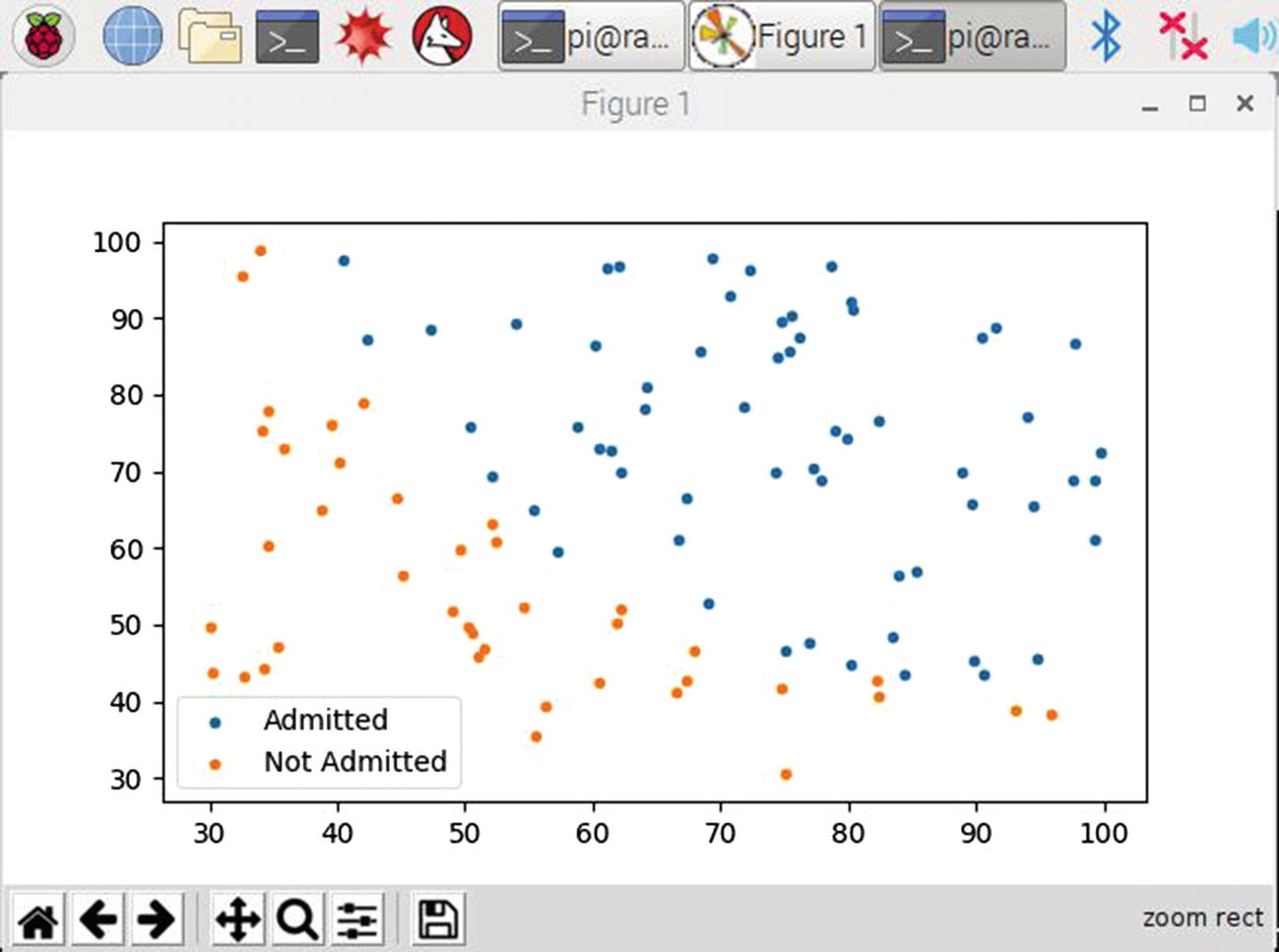
Figure 2-17
Results for the logRTest script
LogR model development
By examining this figure, you might be able to Image a straight line drawn from the upper left to the lower right, which would bisect the majority of the data points with admitted students to the right and non-admitted ones to the left. The problem becomes how to determine the coefficients for such a classifier line. LR cannot determine this line, but a LogR data model can.
At this point, I will attempt to explain how the LogR model was developed. However, I will of necessity omit much of the underlying mathematics because otherwise it will devolve this discussion into many fine-grain details that will distract from the main purpose of simply introducing the LogR data model. Rest assured that there are many good blogs and tutorials available, which explore LogR mathematical details.
The fundamental hypothesis for this LogR example is to determine the coefficients θi that “best fit” the following equation
where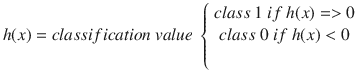
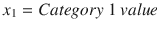
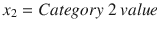
In this binary LogR example, x1 is the Exam 1 score (mark) and x2 is the Exam 2 score.
A cost function must be assigned to this hypothesis such that the gradient method can be applied to minimize the cost and subsequently determine the coefficients that are needed for a minimal cost solution. Without proof or a derivation, I will just present the cost function as shown in Figure 2-18.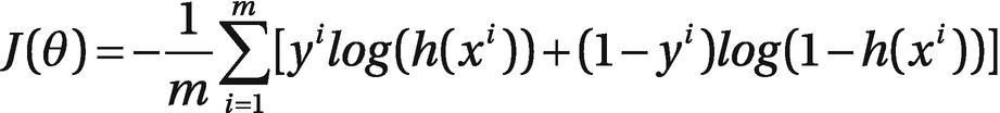
Figure 2-18
LogR cost function for the example problem
The cost for all the training examples denoted by J(θ) in the figure may be computed by taking the average over the cost of all 100 records in the training dataset.
LogR demonstration
The following script is named logRDemo.py and will compute the desired coefficients as described earlier. In addition, the script will plot the classifier line overlaid with the training dataset. Finally, the coefficients are displayed in order to obtain a usable classifier equation. I have included many comments within the script to help you understand what is happening with the code. This script is available from the book’s companion web site:
# Import required libraries
import numpy as np
import matplotlib.pyplot as plt
import pandas as pd
import scipy.optimize as so
def load_data(path, header):
# Load the CSV file into a panda dataframe
marks_df = pd.read_csv(path, header=header)
return marks_df
def sigmoid(x):
# Activation function
return 1/(1 + np.exp(-x))
def net_input(theta, x):
# Computes the weighted sum of inputs by a numpy dot product
return np.dot(x, theta)
def probability(theta, x):
# Returns the probability after Sigmoid function is applied
return sigmoid(net_input(theta, x))
def cost_function(theta, x, y):
# Computes the cost function
m = x.shape[0]
total_cost = -(1/m)*np.sum(y*np.log(probability(theta,x))+(1-y)*np.log(1-probability(theta,x)))
return total_cost
def gradient(theta, x, y):
#Computes the cost function gradient
m = x.shape[0]
return (1/m)*np.dot(x.T,sigmoid(net_input(theta,x))-y)
def fit(x, y, theta):
# The optimal coefficients are computed here
opt_weights = so.fmin_tnc(func=cost_function, x0=theta, fprime=gradient,args=(x,y.flatten()))
return opt_weights[0]
if __name__ == "__main__":
# Load the data from the file
data = load_data("marks.txt", None)
# X = feature values, all the columns except the last column
X = data.iloc[:, :-1]
# Save a copy for the output plot
X0 = X
# y = target values, last column of the data frame
y = data.iloc[:, -1]
# Save a copy for the output plot
y0 = y
X = np.c_[np.ones((X.shape[0], 1)), X]
y = y[:, np.newaxis]
theta = np.zeros((X.shape[1], 1))
parameters = fit(X, y, theta)
x_values = [np.min(X[:,1]-5), np.max(X[:,2] + 5)]
y_values = -(parameters[0] + np.dot(parameters[1], x_values)) / parameters[2]
# filter the admitted applicants
admitted = data.loc[y0 == 1]
# filter the non-admitted applicants
not_admitted = data.loc[y0 == 0]
# Plot the original dataset along with the classifier line
ax = plt.scatter(admitted.iloc[:, 0], admitted.iloc[:, 1], s=10, label="Admitted")
ax = plt.scatter(not_admitted.iloc[:, 0], not_admitted.iloc[:, 1], s=10, label='Not Admitted')
ax = plt.plot(x_values, y_values, label='Decision Boundary')
ax = plt.xlabel('Marks in 1st Exam')
ax = plt.ylabel('Marks in 2nd Exam')
ax = plt.legend()
plt.show()
print(parameters)
The script is run by entering
python logRDemo.py

The classifier line appears to be properly placed between the data points separating admitted students from non-admitted students. However, if you closely examine the classifier line, you find five admitted student data points to the left of the classifier line. These points will cause a false negative if the LogR classification model is used because students with those exam scores were refused admission, but should have been admitted. Similarly, there are six non-admitted students either on the line or to the right of the classifier line. These points will cause false positives if the LogR classification model is used because students with those exam scores were admitted, but should have been refused admission. In all, there are 11 either false negatives or false positives, which create an overall 89% accuracy for the LogR model. This is not terribly bad and likely could be improved by increasing the size of the training dataset.
Figure 2-20 shows the θi coefficients that the LogR model computed.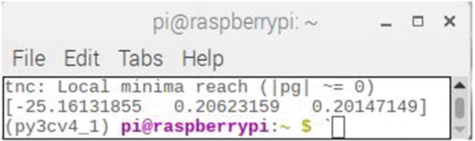
Figure 2-20
Computed LogR coefficients
The final LogR classifier equation using the computed θi coefficients is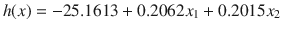
where
I tried a few random scores to test the classifier equation. The results are shown in Table 2-2.
Table 2-2
Random trials for LogR classifier equation
Exam 1 | Exam 2 | Classifier | Admitted | Not admitted |
|---|---|---|---|---|
40 | 60 | –4.825 | x | |
80 | 60 | 3.423 | x | |
50 | 60 | –2.763 | x | |
55 | 65 | –0.7245 | x | |
60 | 65 | 0.3065 | x | |
80 | 90 | 9.468 | x | |
70 | 75 | 4.4835 | x | |
60 | 65 | 0.3065 | x | |
60 | 75 | 2.3215 | x | |
60 | 60 | –0.701 | x | |
62 | 63 | 0.3159 | x | |
70 | 65 | 2.3685 | x | |
65 | 70 | 2.1345 | x | |
50 | 55 | –3.7705 | x | |
70 | 48 | –1.057 | x | |
56
| 59 | –1.7273 | x |
The last entry in the table is not random but instead is a false negative taken from the original dataset. I did this to illustrate a potential issue with relying solely on the classifier equation.
Naive Bayes
Naive Bayes is a classification algorithm for both two-class (binary) and multi-class classification problems. The technique best understands using binary or categorical input values.
It is called Naive Bayes because the calculation of the probabilities for each hypothesis is simplified to make their calculation possible. Rather than attempting to calculate the values of each attribute value P(d1, d2|h), they are assumed to be conditionally independent given a target data value and calculated as P(d1|h) * P(d2|h).
This is a very strong assumption which is not likely to hold for real-world data. This assumption is based on a supposition that class attributes do not interact. Nonetheless, this approach seems to perform well on data where the basic assumption does not hold.
Before jumping into a real-world demonstration, I believe it would be prudent to review some fundamental principles regarding Bayesian logic.
Brief review of the Bayes’ theorem
In a classification problem, a hypothesis (h) may be considered as a class to be assigned for each new data instance (d). An easy way to select the most probable hypothesis given the new data is to use any prior knowledge about the problem. Bayes’ theorem provides a method to calculate the probability of a hypothesis given the prior knowledge.
Bayes’ theorem is stated as
P(h|d) = (P(d|h) * P(h)) / P(d)
where
- P(h|d) is the probability of hypothesis h given the data d. This is called the posterior probability.
- P(d|h) is the probability of data d given that the hypothesis h was true.
- P(h) is the probability of hypothesis h being true (regardless of the data). This is called the prior probability of h.
- P(d) is the probability of the data (regardless of the hypothesis).
It is plain to observe that the goal is to calculate the posterior probability of P(h|d) from the prior probability P(h) with P(d) and P(d|h).
The hypothesis with the highest probability is selected after calculating the posterior probability for a number of different hypotheses. This selected h is the maximum probable hypothesis and is formally called the maximum a posteriori (MAP) hypothesis. It can be expressed in several forms as
MAP(h) = max(P(h|d))
or
MAP(h) = max((P(d|h) * P(h)) / P(d))
or
MAP(h) = max(P(d|h) * P(h))
The P(d) is a normalizing term which allows for the calculation of a normalized probability. It may be disregarded when only the most probable hypothesis is desired because this term is constant and only used for normalization, which leads to the last MAP equation shown earlier.
Further simplification is possible if there is an equal distribution of instances in each class in the training data. The probability of each class (P(h)) will be equal in this case. This would cause another constant term to be part of the MAP equation, and it too could be dropped leaving an ultimate equation of
MAP(h) = max(P(d|h))
Preparing data for use by the Naive Bayes model
Class and conditional probabilities are required to be calculated before applying the Naive Bayes model. Class probabilities are, as the name implies, the probabilities associated with each class in the training set. Conditional probabilities are those associated with each input data value for a given class.
Training is fast because only the probability of each class and the probability of each class given different input values are required to be calculated. There are no coefficients needed to be fitted by optimization procedures as was the case with the regression models.
The class probabilities are simply the frequency of instances that belong to each class divided by the total number of instances.
For example, in a binary classification problem, the probability of an instance belonging to class1 would be calculated as
P(class1) = count(class1) / (count(class0) + count(class1))
In the simplest case where each class had an equal number of instances, the probability for each class would be of 0.5 or 50%.
The conditional probabilities are the frequency of each attribute value for a given class value divided by the frequency of instances with that class value.
This next example should help clarify how the Naive Bayes model works.
Naive Bayes model example
The following is a training dataset of weather and a corresponding target variable “Play” (suggesting possibilities of playing).
Table 2-3 shows a record of weather conditions and the Play variable value.
Table 2-3
Weather/Play dataset
Weather | Play |
|---|---|
Sunny | No |
Overcast | Yes |
Rainy | Yes |
Sunny | Yes |
Sunny | Yes |
Overcast | Yes |
Rainy | No |
Rainy | No |
Sunny | Yes |
Rainy | Yes |
Sunny | No |
Overcast | Yes |
Overcast | Yes |
Rainy | No |
The first step is to convert the training dataset to a frequency table as shown in Table 2-4.
Table 2-4
Frequency table
Frequency table | ||
|---|---|---|
Weather
| No | Yes |
Overcast | 4 | |
Rainy | 3 | 2 |
Sunny | 2 | 3 |
Total | 5 | 9 |
The second step is to create a Likelihood table by finding the probabilities. For instance, overcast probability is 0.29 and the overall playing probability is 0.64 for all weather conditions. Table 2-5 shows the Likelihood table.
Table 2-5
Likelihood table
Likelihood table | ||||
|---|---|---|---|---|
Weather | No | Yes | Weatherprobabilities | |
Overcast | 4 | 4/14 | 0.29 | |
Rainy | 3 | 2 | 5/14 | 0.36 |
Sunny | 2 | 3 | 5/14 | 0.36 |
Total | 5 | 9 | ||
5/14 | 9/14 | |||
Playing probabilities
| 0.36 | 0.64 | ||
The next step is to use the Naive Bayesian equation to calculate the posterior probability for each class. The class with the highest posterior probability is the outcome of prediction.
Problem statement: Players will play if weather is sunny. Is this statement correct?
Solve this problem by using the method of posterior probability.
- P(Yes | Sunny) = P( Sunny | Yes) * P(Yes) / P (Sunny)
Substituting actual probabilities yields
- P (Sunny | Yes) = 3/9 = 0.33
- P(Sunny) = 5/14 = 0.36
- P(Yes)= 9/14 = 0.64
Therefore:
- P (Yes | Sunny) = 0.33 * 0.64 / 0.36 = 0.60
Next compute the posterior probability for the other Play class value of “No”.
- P(No | Sunny) = P( Sunny | No) * P(No) / P (Sunny)
Substituting actual probabilities yields
- P (Sunny | No) = 2/5 = 0.40
- P(Sunny) = 5/14 = 0.36
- P(No)= 5/14 = 0.36
Therefore:
- P (No | Sunny) = 0.40 * 0.36 / 0.36 = 0.40
The probability P(Yes | Sunny) is higher than the P(No | Sunny) and is the MAP or prediction. Note, you could have simply subtracted the P(Yes | Sunny) from 1.0 to obtain the complementary probability, which is always true for binary class values. However, that operation does not hold true for non-binary class value situations.
Pros and cons
The following are some pros and cons for using a Naive Bayes data model.
Pros:
- It is easy and fast to predict class value from a test dataset. It also performs well in multi-class predictions.
- When assumption of independence holds, a Naive Bayes classifier performs better compare to other models like logistic regression and less training data is needed.
- It performs well in case of categorical input variables compared to numerical variable(s). For numerical variables, a normal distribution is assumed, which is a strong assumption.
Cons:
- If a categorical variable has a category in the test dataset, which was not observed in training dataset, then the model will assign a 0 probability and will be unable to make a prediction. This case is often known as “zero frequency.” A smoothing technique called Laplace estimation is often used to resolve this issue.
- Naive Bayes is also known as a bad estimator, so probability outputs can be inaccurate.
- Another limitation of Naive Bayes is the assumption of independent predictors. In the real world, it is almost impossible that we get a set of predictors which are completely independent.
The scikit-learn library will be used shortly to build a Naive Bayes model in Python. There are three types of Naive Bayes model available from the scikit-learn library:
- Gaussian – It is used in classification and it assumes that features follow a normal distribution.
- Multinomial – It is used for discrete counts. Consider a text classification problem as a Bernoulli trial which is essentially “count how often a word occurs in the document.” It can be thought of as “number of times outcome number xi is observed over n trials.”
- Bernoulli – The Bernoulli model is useful if the feature vectors are binary (i.e., zeros and ones). One application would be text classification with “bag of words” model where the 1s and 0s are “word occurs in the document” and “word does not occur in the document,” respectively.
Based on your dataset, you can choose any of the preceding discussed models.
Gaussian Naive Bayes
Naive Bayes can be extended to real-valued attributes, most commonly by assuming a Gaussian distribution. This extension of Naive Bayes is called Gaussian Naive Bayes. Other functions can be used to estimate the distribution of the data, but the Gaussian or normal distribution is the easiest to work with because it only needs the mean and the standard deviation to be computed from the training data.
Mean and standard deviation values of each input variable (x) for each class value are computed using the following equations:
mean(x) = 1/n * sum(x)
standard deviation(x) = sqrt(1/n * sum(xi-mean(x)^2))
where
- n = number of instances
- x = values for input variables
Probabilities of new x values are calculated using the Gaussian probability density function (PDF). When making predictions, these parameters can be entered into the Gaussian PDF with a new input for the x variable and in the Gaussian PDF will provide an estimate of the probability of that new input value for that class.
pdf(x, mean, sd) = (1 / (sqrt(2 * PI) * sd)) * exp(-((x-mean^2)/(2*sd^2)))
Where pdf(x) is the Gaussian PDF, sqrt() is the square root, mean and sd are the mean and standard deviation, PI is the numerical constant, exp() is the numerical constant e or Euler’s number raised to power, and x is the value for the input variable.
The following demonstration uses the preceding equations, but they are an integral part of the software package and are separately invoked.
Gaussian Naive Bayes (GNB) demonstration
The following Python script is named gnbTest.py and uses the GNB model contained in the scikit-learn software package. A minimal training dataset is contained in the script to have the model “learn” and make a prediction. The dataset may be purely arbitrary, or it could actually represent real-world attributes depending if the data has been encoded. In any case, the predictor will function without any problem because it is based only on numerical data. It is always the user’s responsibility to decode the final results. This script is available from the book’s companion web site:
# Import Library of Gaussian Naive Bayes model
from sklearn.naive_bayes import GaussianNB
import numpy as np
# Assigning predictor and target variables
x= np.array([[-3,7],[1,5], [1,2], [-2,0], [2,3], [-4,0], [-1,1], [1,1], [-2,2], [2,7], [-4,1], [-2,7]])
y = np.array([3, 3, 3, 3, 4, 3, 3, 4, 3, 4, 4, 4])
# Create a Gaussian Classifier
model = GaussianNB()
# Train the model using the training sets
model.fit(x, y)
# Predict output
predicted= model.predict([[1,2],[3,4]])
print(predicted)
The script is run by entering
python gnbTest.py
Figure 2-21 shows the result of running this script.
Figure 2-21
Results for the gnbTest script
The final results show [3 4] as the prediction. As I mentioned earlier, what this means in the real world would depend on the way the dataset was originally encoded.
k-nearest neighbor (k-NN) model
I introduced the k-NN model in the previous chapter in the Iris demonstration – part 3. However, I didn’t mention two major drawbacks to using this model at that time. If neither of them is a problem, then a k-NN model should definitely be considered for use because it is a simple and robust classifier.
The first problem is the performance issue. Since it’s a lazy model, all the training data must be loaded and used to compute the Euclidean distances to all training samples. This can be done in a naive way or using more complex data structures such as k-d trees. In any case, it can be big performance hit when a large training set is involved.
The second problem is the distance metric. The basic k-NN model is used with Euclidean distance, which is a problematic distance metric when a high number of dimensions are involved. As the number of dimensions rises, the algorithm performs worst due to the fact that the distance measure becomes meaningless when the dimension of the data increases significantly. Another related issue is when noisy features are encountered. This problem happens because the model applies the same weight for all features, noise or not. In addition, the same weights are applied to all features, independent of their type, which could be categorical, numerical, or binary.
In summary, a k-NN model is usually a best choice if a system has to learn a sophisticated (i.e., non-linear) pattern with a small number of samples and dimensions.
KNN demonstration
This demonstration will use the automobile dataset from the UC Irvine Repository. The two required CSV data files along with the kNN.py class file may be downloaded from
https://github.com/amallia/kNN
Note
There is also a Jupyter notebook file available from this web site. This file will not be used because I provide a Python script in the following, which accomplishes the same functions as the notebook file.
The problem statement will be to predict the miles per gallon (mpg) of a car, given its displacement and horsepower. Each record in the dataset corresponds to a single car.
The kNN class file is listed in the following, which contains initialization, computation, and prediction functions. This script is named kNN.py and is available either from the listed web site or the book’s companion web site. I have added comments in the script listing to indicate what functions are being performed.
#!/usr/bin/env python
import math
import operator
class kNN(object):
# Initialization
def __init__(self, x, y, k, weighted=False):
assert (k <= len(x)
), "k cannot be greater than training_set length"
self.__x = x
self.__y = y
self.__k = k
self.__weighted = weighted
# Compute Euclidean distance
@staticmethod
def __euclidean_distance(x1, y1, x2, y2):
return math.sqrt((x1 - x2)**2 + (y1 - y2)**2)
# Compute the PDF
@staticmethod
def gaussian(dist, sigma=1):
return 1./(math.sqrt(2.*math.pi)*sigma)*math.exp(-dist**2/(2*sigma**2))
# Perform predictions
def predict(self, test_set):
predictions = []
for i, j in test_set.values:
distances = []
for idx, (l, m) in enumerate(self.__x.values):
dist = self.__euclidean_distance(i, j, l, m)
distances.append((self.__y[idx], dist))
distances.sort(key=operator.itemgetter(1))
v = 0
total_weight = 0
for i in range(self.__k):
weight = self.gaussian(distances[i][1])
if self.__weighted:
v += distances[i][0]*weight
else:
v += distances[i][0]
total_weight += weight
if self.__weighted:
predictions.append(v/total_weight)
else:
predictions.append(v/self.__k)
return predictions
The following script is named knnTest.py where a k-NN model is instantiated from the kNN class file. A series of predictions are made for k = 1, 3, and 20 for both non-weighted and weighted cases. The resultant errors are computed for all cases. This script is available from the book’s companion web site:
# Import required libraries
import pandas
from kNN import kNN
from sklearn.metrics import mean_squared_error
# Read the training CSV file
training_data = pandas.read_csv("auto_train.csv")
x = training_data.iloc[:,:-1]
y = training_data.iloc[:,-1]
# Read the test CSV file
test_data = pandas.read_csv("auto_test.csv")
x_test = test_data.iloc[:,:-1]
y_test = test_data.iloc[:,-1]
# Display the heads from each CSV file
print('Training data')
print(training_data.head())
print('Test data')
print(test_data.head())
# Compute errors for k = 1, 3, and 20 with no weighting
for k in [1, 3, 20]:
classifier = kNN(x,y,k)
pred_test = classifier.predict(x_test)
test_error = mean_squared_error(y_test, pred_test)
print('Test error with k={}: {}'.format(k, test_error * len(y_test)/2))
# Compute errors for k = 1, 3, and 20 with weighting
for k in [1, 3, 20]:
classifier = kNN(x,y,k,weighted=True)
pred_test = classifier.predict(x_test)
test_error = mean_squared_error(y_test, pred_test)
print('Test error with k={}: {}'.format(k, test_error * len(y_test)/2))
The script is run by entering
python knnTest.py
Figure 2-22 shows the result of running this script.
Figure 2-22
Results for the knnTest script
This figure shows the first five records from each of the CSV data files. The next three test error results are for the non-weighted prediction results for k equal to 1, 3, and 20, respectively. The last three test error results are for the weighted predictions for the same k values. Reviewing the error results reveals a slight reduction in error values as k is increased and even slightly lower error values for the cases when weighting is applied.
Decision tree classifier
This will be the last data model discussed in this chapter. The decision tree classifier data model is a clever solution for common business problems. For instance, if you are a bank loan manager, you might use this model to classify customers in safe or risky categories depending upon their financial and credit histories. Classification usually is done in two steps, the first being learning and the second being prediction. The model in the learning step is developed and tuned based solely on the available training data. The model is then used to predict future outcomes using the trained data and any appropriate hyper-parameters entered based on tuning and user experience.
Decision tree algorithm
A decision tree is a flowchart-like tree structure where an internal node represents a feature or attribute, a branch represents a decision rule, and every leaf node represents an outcome. The root node is the topmost node in a decision tree. The model learns to partition on the basis of attribute values. The tree is partitioned in a recursive manner naturally called recursive partitioning. This flowchart-like structure is a reasonable analogy to how humans perform a decision-making process. Visualizing this process with a flowchart diagram will help you understand this model. Figure 2-23 shows a portion of a generic decision tree.
Figure 2-23
Generic flowchart for a decision tree
One nice characteristic of the decision tree algorithm is that the decision-making logic can readily be known. This model is known as a white box machine learning algorithm. Compare this openness to a black box which is typical for an artificial neural network (ANN) where any decision-making logic is generally unfathomable. In addition, training times for decision tree algorithms are generally much faster than ANN. The decision tree algorithm is not dependent on any particular type of training data probability distribution, which makes it a non-parametric method. Consequently, decision tree algorithms can handle high-dimensional data with good accuracy.
A decision tree algorithm follows this simple three-step process:
- 1.Select the best attribute using attribute selection measures (ASM) to split the records.
- 2.Make that attribute a decision node and break the dataset into smaller sub-sets.
- 3.Start tree building by repeating this process recursively for each child until one of the following conditions remains:
- All the tuples belong to the same attribute value.
- There are no more remaining attributes.
- There are no more instances.
The ASM is heuristic for selecting the splitting criterion that partitions data in an optimal manner. ASM is also known as splitting rules because it helps determine breakpoints for tuples on a given node. ASM provides a rank to each feature or attribute by explaining the given dataset. The best scoring attribute will then be selected as the splitting attribute. In the case of a continuous-valued attribute, branch split points will also need to be defined.
The following aside provides a detailed discussion concerning information entropy, information gain, Gini index, and gain ratio. While not a prerequisite to running the decision tree demonstration, I would recommend that you take the time to read it. It will definitely improve your understanding on how this algorithm functions.
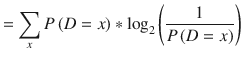
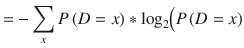
Information gain
Information gain measures how much “information” a feature gives us about a class. Any features that perfectly partitions should give maximal information. Likewise, unrelated features should provide no information. Information gain measures the reduction in entropy, where entropy is a measure of the purity or impurity present in an arbitrary collection of examples. A more formal entropy definition is
The measure of information entropy associated with each possible data value is computed by the negative logarithm of the probability mass function for the value.
Before jumping into the fine-grain details, it would be prudent to review some fundamental principles underlying information gain.
Split criterion
Suppose it is desired to split on the variable (?):
- 1 2 3 4 5 6 7 8
- y 0 0 0 1 1 1 1 1
If we split at ?1 < 3.5, we get an optimal split. If we split at ? < 4.5, we make a mistake or misclassification. The idea is to position the split at such point as to make the samples “pure” or homogeneous. Of course, there is the need to measure how the split functions and that is accomplished using an ASM of information gain, gain ratio, or Gini index. All of the preceding discussion is predicated upon knowing how to measure information. Accomplishing this is all based on the concept of information entropy which was introduced by Claude Shannon in his seminal 1948 paper “A Mathematical Theory of Communication.” Incidentally, Dr. Shannon is considered the “Father of Information Theory” due to his monumental contributions to this field.
Measuring information
Consider the bar shown in Figure 2-24 as an information source where regions are digitally encoded.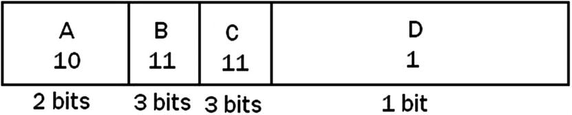
Figure 2-24
Digitally encoded information source
Larger regions in the figure are encoded with fewer bits, while smaller regions require more bits. The expected value for this information source is the sum of all the values of the product of the probability of a value and the value itself. In this example the expected value is computed as follows: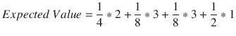
Each time a region in the figure was halved in size the number of bits went up by one. The probability also decreased by 0.5 when the size was halved. The conclusion to be drawn from this figure is that the information of a random event x is proportional to the logarithm (base 2) of the reciprocal of the event’s probability. In equation form, this is
In general, the expected information or “entropy” of a random variable is the same as the expected value with the value filled in with the information:
Properties of entropy
Entropy is maximized when the constituent elements are heterogeneous (impure):If 
then,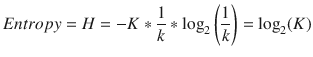
Conversely, entropy is minimized when elements are homogeneous (pure):
if pi = 1 or pi = 0
then,
With entropy defined as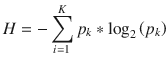
then any change in entropy is considered as information gain and is defined as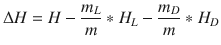
where ? is the total number of instances, with ?? instances belonging to class ?, where ? = 1, … , ?.
Information gain example
The following example may be considered as an extension of the example shown in the Naive Bayes section. Table 2-6 has several additional features, which will be computed in the decision whether or not to play given a certain set of conditions.
Table 2-6
Play decision
Outlook | Temperature | Humidity | Windy | Play |
|---|---|---|---|---|
Sunny | Hot | High | False | No |
Sunny | Hot | High | True | No |
Overcast | Hot | High | False | Yes |
Rainy | Mild | High | False | Yes |
Rainy | Cool | Normal | False | Yes |
Rainy | Cool | Normal | True | No |
Overcast | Cool | Normal | True | Yes |
Sunny | Mild | High | False | No |
Sunny | Cool | Normal | False | Yes |
Rainy | Mild | Normal | False | Yes |
Sunny | Mild | Normal | True | Yes |
Overcast | Mild | High | True | Yes |
Overcast | Hot | Normal | False | Yes |
Rainy | Mild | High | True | No |
The information value for the Play attribute is computed as follows:
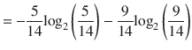

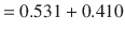

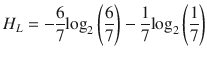
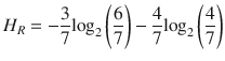
Now, consider the information gain when the Humidity attribute is selected.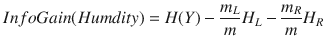
where
- m = number of Humidity examples
- mL = number of Humidity examples with value = Normal
- mR = number of Humidity examples with value = High
- HL = IV for Humidity examples with value = Normal
- HR = IV for Humidity examples with value = High
Substituting yields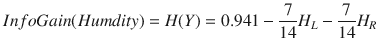


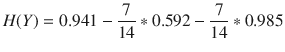

Performing the preceding computations for all of the remaining features yields
- Outlook = 0.247
- Temperature = 0.029
- Humidity = 0.152
- Windy = 0.048
The initial split will be done with Outlook feature because it has the highest information gain value in accordance with the ASM process.
The optimum split for the next level is shown in Figure 2-25 with the associated selected attributes and information gain for each split.
Figure 2-25
Next level splits with information gain values

Note that not all leaves need to be pure; sometimes similar (even identical) instances have different classes. Splitting stops when data cannot be split any further.
Gini index
The decision tree algorithm CART (classification and regression tree) uses the Gini method to create split points. The equation for computing the Gini index
is
where pi is the probability that a tuple in D belongs to class Ci.
The Gini index considers a binary split
for each attribute. You can compute a weighted sum of the impurity of each partition. If a binary split on attribute A partitions data D into D1 and D2, the Gini index of D is
In case of a discrete-valued attribute
, the sub-set that gives the minimum Gini index for that chosen is selected as a splitting attribute. In the case of continuous-valued attributes
, the strategy is to select each pair of adjacent values as a possible split point and the point with smaller Gini index chosen as the splitting point.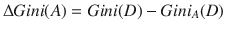
The attribute with minimum Gini index is chosen as the splitting attribute.
This index is maximized when elements are heterogeneous (impure).
If
then
Correspondingly, the index is minimized when elements are homogeneous (pure).
If
?? = 1 or ?? = 0
then
Gini = 1 − 1 − 0 = 0
Simple Gini index example
I will start with an arbitrary dataset
shown in Table 2-7 with five features, of which feature E is the predictive one. This feature has two classes, positive or negative. There happens to be an equal number of instances in each class just to simplify the computations.
Table 2-7
Arbitrary dataset
Index | A | B | C | D | E |
|---|---|---|---|---|---|
1 | 4.8 | 3.4 | 1.9 | 0.2 | positive |
2 | 5 | 3 | 1.6 | 1.2 | positive |
3 | 5 | 3.4 | 1.6 | 0.2 | positive |
4 | 5.2 | 3.5 | 1.5 | 0.2 | positive |
5 | 5.2 | 3.4 | 1.4 | 0.2 | positive |
6 | 4.7 | 3.2 | 1.6 | 0..2 | positive |
7 | 4.8 | 3.1 | 1.6 | 0.2 | positive |
8 | 5.4 | 3.4 | 1.5 | 0.4 | positive |
9 | 7 | 3.2 | 4.7 | 1.4 | negative
|
10 | 6.4 | 3.2 | 4.7 | 1.5 | negative |
11 | 6.9 | 3.1 | 4.9 | 1.5 | negative |
12 | 5.5 | 2.3 | 4 | 1.3 | negative |
13 | 6.5 | 2.8 | 4.6 | 1.5 | negative |
14 | 5.7 | 2.8 | 4.5 | 1.3 | negative |
15 | 6.3 | 3.3 | 4.7 | 1.6 | negative |
16 | 4.9 | 2.4 | 3.3 | 1 | negative
|
The first in calculating the Gini index is to choose some random values to categorize (initial split) for each feature or attribute
. The values chosen for this dataset are shown in Table 2-8.
Table 2-8
Initial split attribute values
A | B | C | D |
|---|---|---|---|
>= 5.0 | >= 3.0 | >= 4.2 | >= 1.4 |
< 5.0 | < 3.0 | < 4.2 | < 1.4 |
Computing the Gini index for attribute A:
- Value >= 5
- Number of instances = 12
- Number of instances >=5 and positive = 5
- Number of instances >= 5 and negative = 7
- Value: < 5
- Number of instances = 4
- Number of instances >=5 and positive = 3
- Number of instances >= 5 and negative = 1

Weighting and summing yields
Computing in a similar manner for the remaining attributes yields

The initial split point when using the Gini index will always be the minimum value. The final decision tree
based on the computed indices is shown in Figure 2-27.
Figure 2-27
Final decision tree for the simple Gini index example
Gain ratio
Gain ratio is a modification of information gain that reduces its bias on highly branching features. This algorithm takes into account the number and size of branches when choosing a feature. It does this by normalizing information gain by the “intrinsic information” of a split, which is defined as the information need to determine the branch to which an instance belongs. Information gain is positively biased for an attribute with many outcomes. This means that the information gain algorithm prefers an attribute with a large number of distinct values.
Intrinsic information
The intrinsic information represents the potential information generated by splitting the dataset into K partitions:
Partitions with high intrinsic information should be similar in size. Datasets with few partitions holding the majority of tuples have inherently low intrinsic information.
Definition of gain ratio
Gain ratio is defined as
The feature with the maximum gain ratio is selected as the splitting feature.
ID3 is the acronym for Iterative Dichotomiser 3 and is an algorithm invented by Ross Quinian to implement the gain ratio ASM. Ross later invented the C4.5 algorithm, which is an improvement over ID3 and is currently used in most machine learning systems using the gain ratio algorithm. It should be noted that the term SplitInfo is used in the C4.5 algorithm to represent IntrinsicInfo. Other than that ambiguity, the basic gain ratio algorithm is unchanged.
There will be no example presented for gain ratio simply because this aside is just too extensive and you likely have a pretty good understanding of the ASM process if you have read through to this ending.
Decision tree classifier demonstration with scikit-learn
This decision tree demonstration will use a classic dataset from the machine learning community called the Pima Indian Diabetes dataset
. The dataset may be downloaded in CSV format from
www.kaggle.com/uciml/pima-indians-diabetes-database#diabetes.csv
This dataset is originally from the National Institute of Diabetes and Digestive and Kidney Diseases. The objective of this demonstration is to diagnostically predict whether or not a patient has diabetes based on certain diagnostic measurements included in the dataset. Several constraints were placed on the selection of these instances from a larger database. In particular, all patients here are females at least 21 years old of Pima Indian heritage.
The downloaded CSV file is archived and must be extracted before being used. Furthermore, you must remove the first row from the file because it contains string column header descriptions. Keeping this row in place will cause the prediction function to fail because the string contents cannot be converted to a float type. I recommend using any spreadsheet application that can load the CSV file. I happened to use Microsoft’s Excel program, but any of the open source Linux applications will likely work.
I will develop the Python script in two stages while also discussing the underlying methodology regarding the decision tree classifier model. The first stage will load all the dependencies as well as the CSV file. The CSV file head information is also displayed to confirm a successful load. The second stage will be to build, train, and test the decision tree model.
The first step is to load the required libraries, which include the DecisionTreeClassifier data model from the sklearn software package. This data model uses the Gini ASM process by default, but this can be changed if another ASM process is desired.
# Load libraries
import pandas as pd
from sklearn.tree import DecisionTreeClassifier # Import Decision Tree Classifier
from sklearn.model_selection import train_test_split # Import train_test_split function
from sklearn import metrics #Import scikit-learn metrics module for accuracy calculation
col_names = ['pregnant', 'glucose', 'bp', 'skin', 'insulin', 'bmi', 'pedigree', 'age', 'label']
The next step is to load the required Pima Indian Diabetes dataset using Pandas’ read CSV function. Ensure the downloaded dataset is in the same current directory as the script.
# Load dataset
pima = pd.read_csv("diabetes.csv", header=None, names=col_names)
pima.head()
Figure 2-28 shows the CSV file head portion with the first five records.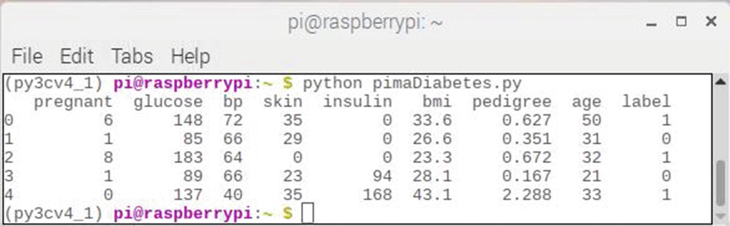
Figure 2-28
diabetes.csv head results
The next step is to divide the given columns into two types of variables dependent (target) and independent (feature).
#split dataset in features and target variable
feature_cols = ['pregnant', 'insulin', 'bmi', 'age','glucose','bp','pedigree']
X = pima[feature_cols] # Feature variables
y = pima.label # Target variable
Model performance requires the dataset to be divided into a training set and a test set. The dataset can be divided by using the function train_test_split()
. Three parameters, namely, features, target, and test_set size, must be passed to this method.
# Split dataset into training set and test set
# 70% training and 30% test
X_train, X_test, y_train, y_test = train_test_split(X, y, test_size=0.3, random_state=1)
The next step is to instantiate a decision tree data model from the sklearn software package. The model is named clf
and is readily trained using 70% of the training dataset split from the original dataset. Finally, a series of predictions are automatically made with the remaining 30% of the dataset using the model’s predict() method
.
In the test data stored in X_test, the labels are regarded as sample to be fed to the classifier in the predict() method. The sample is as given in the following data. It is invalid to feed it to the predict() method as it is string, not float. To remove it, the drop() function is used. This is the return result of X_txt.drop(0) and is what is fed to the predict () method.
['Pregnancies','Insulin','BMI','Age','Glucose','BloodPressure','DiabetesPedigreeFunction']
# Create Decision Tree classifer object
clf = DecisionTreeClassifier()
# Train Decision Tree Classifer
clf = clf.fit(X_train,y_train)
#Predict the response for test dataset
y_pred = clf.predict(X_test.drop(0))
The last step is to measure the overall accuracy of the prediction set. Accuracy is computed by comparing actual test set values vs. the predicted values. The metrics module from the scikit-learn package was used for this accuracy measurement.
Note that the y_test variable includes the label 'Outcome' which is string. To remove it, the drop() function is used.
# Model accuracy
print("Accuracy:",metrics.accuracy_score(y_test.drop(0), y_pred))
The final result is the following score:
Accuracy: 0.6753246753246753
The 67.5% is a reasonable accuracy score. However, it may be improved by tuning the hyper-parameters used by the decision tree algorithm, which I will demonstrate in later section.
The complete script listing is shown in the following and is named diabetesDT.py. It is available from the book’s companion web site.
# Load libraries
import pandas as pd
from sklearn.tree import DecisionTreeClassifier # Import Decision Tree Classifier
from sklearn.model_selection import train_test_split # Import train_test_split function
from sklearn import metrics #Import scikit-learn metrics module for accuracy calculation
col_names = ['pregnant', 'glucose', 'bp', 'skin', 'insulin', 'bmi', 'pedigree', 'age', 'label']
# Load dataset
pima = pd.read_csv("diabetes.csv", header=None, names=col_names)
print(pima.head())
#split dataset in features and target variable
feature_cols = ['pregnant', 'insulin', 'bmi', 'age', 'glucose', 'bp', 'pedigree']
X = pima[feature_cols] # Features
y = pima.label # Target variable
# Split dataset into training set and test set
# 70% training and 30% test
X_train, X_test, y_train, y_test = train_test_split(X, y, test_size=0.3, random_state=1)
# Create Decision Tree classifer object
clf = DecisionTreeClassifier()
# Train Decision Tree Classifer
clf = clf.fit(X_train,y_train)
#Predict the response for test dataset
y_pred = clf.predict(X_test.drop(0))
# Model accuracy
print("Accuracy:",metrics.accuracy_score(y_test.drop(0), y_pred))
Visualizing the decision tree
The scikit-learn’s export_graphviz function
can be used to display the decision tree. The pydotplus library is also needed for this display function. These libraries are installed using the following commands:
pip install graphviz
pip install pydotplus
sudo apt-get install python-pydot
The export_graphviz function
converts the final decision tree classifier file into what is known as a dot file. The pydotplus application then converts this dot file to a png-formatted file, which may be displayed using the system’s Image viewer application.
The following script is named diabetesDT.py and is available from the book’s companion web site:
# Load all required libraries
import pandas as pd
from sklearn.tree import DecisionTreeClassifier
from sklearn.model_selection import train_test_split
from sklearn.tree import export_graphviz
from sklearn.externals.six import StringIO
from sklearn import tree
import pydotplus
import collections
col_names = ['pregnant', 'glucose', 'bp', 'skin', 'insulin', 'bmi', 'pedigree', 'age', 'label']
# Load dataset
pima = pd.read_csv("diabetes.csv", header=None, names=col_names)
#split dataset in features and target variable
feature_cols = ['pregnant', 'insulin', 'bmi', 'age', 'glucose', 'bp', 'pedigree']
X = pima[feature_cols] # Features
y = pima.label # Target variable
# Split dataset into training set and test set
# 70% training and 30% test
X_train, X_test, y_train, y_test = train_test_split(X, y, test_size=0.3, random_state=1)
# Create Decision Tree classifer object
clf = DecisionTreeClassifier()
# Train Decision Tree Classifer
clf = clf.fit(X_train,y_train)
dot_data = tree.export_graphviz(clf, out_file=None, filled=True, rounded=True, special_characters=True, feature_names= feature_cols, class_names=['0','1'])
graph = pydotplus.graph_from_dot_data(dot_data)
colors = ('turquoise', 'orange')
edges = collections.defaultdict(list)
for edge in graph.get_edge_list():
edges[edge.get_source()].append(int(edge.get_destination()))
for edge in edges:
edges[edge].sort()
for i in range(2):
dest = graph.get_node(str(edges[edge][i]))[0]
dest.set_fillcolor(colors[i])
graph.write_png('tree.png')
You can generate the png tree Image by entering this command:
python diabetesDT.py
Be a bit patient because this command took about 20 seconds to complete. You will see nothing on the monitor screen other than the prompt reappearing after the script completes running. However, there will be a new Image named tree.png located in the home directory. Figure 2-29 shows this Image.
Figure 2-29
tree.png
I fully realize that it is impossible to read the extremely small text shown in the Image, which is why I enlarged a small portion of the Image. This portion is shown in Figure 2-30.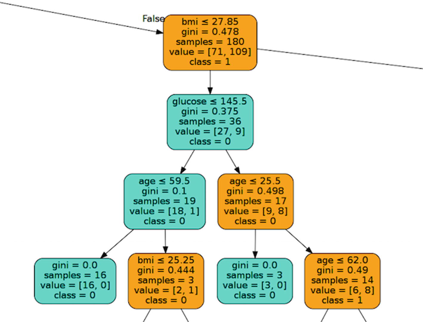
Figure 2-30
Enlarged portion of the tree Image
In this decision tree chart, each internal node has a decision rule that splits the data. Gini referred as Gini ratio measures the impurity of the node, which I discussed in the aside. A node is pure when all of its records belong to the same class. Such nodes are called leaf nodes.
The resultant tree created by this script is unpruned. This unpruned tree is essentially unexplainable and not easy to understand. I will discuss how to optimize it by pruning in the next section.
Optimizing a decision tree
There are three hyper-parameters available, which will allow for optimizing the performance of a decision tree classifier. These are
- criterion: optional (default=“gini”) or Choose attribute selection measure – This parameter allows the selection of different ASMs. Available criteria are “gini” for the Gini index and “entropy” for the information gain.
- splitter: string, optional (default=“best”) or Split Strategy – This parameter allows the selection of the split strategy. Available strategies are “best” to choose the best split and “random” to choose the best random split.
- max_depth: int or None, optional (default=None) or Maximum Depth of a Tree – This criterion sets the maximum depth of the tree. If None, then nodes are expanded until all the leaves contain less than min_samples_split samples. A higher value of maximum depth will likely cause overfitting, while a lower value may cause underfitting .
In scikit-learn, the optimization of decision tree classifier is done when the classifier is instantiated. The maximum depth of the tree is used for pre-pruning. The pimaDiabetes.py script was modified to limit the tree depth to 3 and the ASM was changed to entropy. The following code changes were made to the script to accomplish this optimization:
# Create Decision Tree classifer object
clf = DecisionTreeClassifier(criterion="entropy", max_depth=3)
This script was rerun, and new accuracy score of 0.7705627705627706 was obtained. This 77% score is better than the 67.5% score obtained when no performance arguments were entered.
The diabetesDT.py was also rerun with these new performance arguments. The tree diagram was relabeled tree1.png to differentiate from the initial version. Figure 2-31 shows the new tree diagram using the optimized hyper-parameters.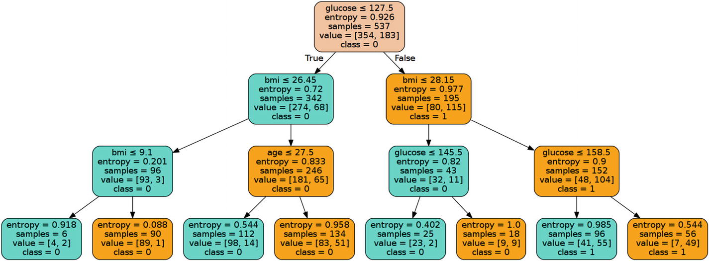
Figure 2-31
tree1.png
This pruned model is much less complex and easier to understand than the previous decision tree graph.
Pros and cons for decision trees
Pros
- Decision trees are easy to interpret and visualize.
- They can easily capture non-linear patterns.
- They require less data preprocessing from the user.
- They can be used for feature engineering such as predicting missing values suitable for variable selection.
- Decision trees have no assumptions about data distribution because they are non-parametric.
Cons
- They are sensitive to noisy data. They can easily overfit due to noisy data.
- Small variations (or variance) in data can result in a different decision tree.
- Decision trees can be biased with an imbalanced dataset. It is recommended that the dataset be balanced out before creating the decision tree.