
5
Adding Complex Form Interactions
It’s time to apply what you’ve learned to a more complicated HTML setup. In this chapter, we’ll test-drive a new component: AppointmentForm. It contains a select box, for selecting the service required, and a grid of radio buttons that form a calendar view for selecting the appointment time.
Combining both layout and form input, the code in this chapter shows how TDD gives you a structure for your work that makes even complicated scenarios straightforward: you will use your tests to grow the component into a component hierarchy, splitting out functionality from the main component as it begins to grow.
In this chapter, we will cover the following topics:
- Choosing a value from a select box
- Constructing a calendar view
- Test-driving radio button groups
- Reducing effort when constructing components
By the end of the chapter, you’ll have learned how to apply test-driven development to complex user input scenarios. These techniques will be useful for all kinds of form components, not just select boxes and radio buttons.
Technical requirements
The code files for this chapter can be found here: https://github.com/PacktPublishing/Mastering-React-Test-Driven-Development-Second-Edition/tree/main/Chapter05.
Choosing a value from a select box
Let’s start by creating a component for booking new appointments, named AppointmentForm.
The first field is a select box for choosing which service the customer requires: cut, color, blow-dry, and so on. Let’s create that now:
- Create a new file, test/AppointmentForm.test.js, with the following test and setup:
import React from "react";
import {
initializeReactContainer,
render,
field,
form,
} from "./reactTestExtensions";
import { AppointmentForm } from "../src/AppointmentForm";
describe("AppointmentForm", () => {
beforeEach(() => {
initializeReactContainer();
});
it("renders a form", () => {
render(<AppointmentForm />);
expect(form()).not.toBeNull();
});
});
- Make this test pass by implementing and creating a new file, src/AppointmentForm.js, as shown here:
import React from "react";
export const AppointmentForm = () => <form />;
- Create a nested describe block for the service field. We’ll jump to this right away because we know this form will have multiple fields:
describe("service field", () => {
});
- Add the following test to the describe block:
it("renders as a select box", () => {
render(<AppointmentForm />);
expect(field("service").not.toBeNull();
expect(field("service").tagName).toEqual("SELECT");
});
- To make this test pass, modify the AppointmentForm component, as follows:
export const AppointmentForm = () => (
<form
<select name="service" />
</form>
);
- Run the tests and ensure they are all passing.
With that, we’ve done the basic scaffolding for the new select box field so that it’s ready to be populated with option elements.
Providing select box options
Our salon provides a whole range of salon services. We should ensure that they are all listed in the app. We could start our test by defining our expectations, like this:
it("lists all salon services", () => {
  const selectableServices = [
    "Cut",
    "Blow-dry",
    "Cut & color",
    "Beard trim",
    "Cut & beard trim",
    "Extensions"
  ];
  ...
});
If we do this, we’ll end up repeating the same array of services in our test code and our production code. We can avoid that repetition by focusing our unit tests on the behavior of the select box rather than the static data that populates it: what should the select box do?
As it turns out, we can specify the functionality of our select box with just two items in our array. There’s another good reason for keeping it to just two, which is that keeping the array brief helps us focus the test on what’s important: the behavior, not the data.
That leaves the question, how do we use only two items in our test when we need six items for the production code?
We’ll do this by introducing a new prop, selectableServices, to AppointmentForm. Our tests can choose to specify a value if they need to. In our production code, we can specify a value for the component’s defaultProps.
defaultProps is a nifty mechanism that React offers for setting default prop values that will be used when required props are not explicitly provided.
For our tests that don’t care about the select box values, we can avoid passing the prop and ignore it entirely in the test. For the tests that do care, we can provide a short, two-item array for our tests.
How do we verify the real select box values?
Testing static data does happen, just not within our unit tests. One place this can be tested is within acceptance tests, which we’ll look at in Part 4, Behavior-Driven Development with Cucumber.
We’ll start with a test to ensure the first value is a blank entry. This is the value that’s initially selected when the user creates a new appointment: no option is selected. Let’s write that test now:
- Add the following test at the end of the AppointmentForm test suite. It specifies that the very first item in the select box is blank, meaning the user is not automatically assigned a choice from our list of services:
it("has a blank value as the first value", () => {
render(<AppointmentForm />);
const firstOption = field("service").childNodes[0];
expect(firstOption.value).toEqual("");
});
- Make that pass by adding a blank option element to the existing select element:
export const AppointmentForm = () => (
<form
<select name="service">
<option />
</select>
</form>
);
- Back in your tests, add this new helper just after the beforeEach block. We’ll make use of it in our next test to build an array of all the labels of the select box options:
const labelsOfAllOptions = (element) =>
Array.from(
element.childNodes,
(node) => node.textContent
);
- Add the following test. This makes use of a new prop, selectableServices, which is simply the array of available options:
it("lists all salon services", () => {
const services = ["Cut", "Blow-dry"];
render(
<AppointmentForm selectableServices={services} />
);
expect(
labelsOfAllOptions(field("service"))
).toEqual(expect.arrayContaining(services));
});
Choosing test data
I’ve used “real” data for my expected services: Cut and Blow-dry. It’s also fine to use non-real names such as Service A and Service B. Often, that can be more descriptive. Both are valid approaches.
- Let’s make this pass. Change the component definition, as follows:
export const AppointmentForm = ({
selectableServices
}) => (
<form>
<select name="service">
<option />
{selectableServices.map(s => (
<option key={s}>{s}</option>
))}
</select>
</form>
);
- Check that the latest test now passes. However, you will see that our earlier tests break because of the introduction of the new prop.
- We can make these tests pass again using defaultProps. Just below the definition of the AppointmentForm function in src/AppointmentForm.js, add the following:
AppointmentForm.defaultProps = {
selectableServices: [
"Cut",
"Blow-dry",
"Cut & color",
"Beard trim",
"Cut & beard trim",
"Extensions",
]
};
- Run your tests and verify they are passing.
That’s all there is to it. With that, we’ve learned how to define the behavior of our component using a short two-item array and saved the real data for defaultProps.
Preselecting a value
Let’s ensure that our component preselects the value that has already been saved if we’re editing an existing appointment:
- Define a findOption arrow function at the top of the describe block. This function searches the DOM tree for a particular text node:
const findOption = (selectBox, textContent) => {
const options = Array.from(selectBox.childNodes);
return options.find(
option => option.textContent === textContent
);
};
- In our next test, we can find that node and then check that it is selected:
it("pre-selects the existing value", () => {
const services = ["Cut", "Blow-dry"];
const appointment = { service: "Blow-dry" };
render(
<AppointmentForm
selectableServices={services}
original={appointment}
/>
);
const option = findOption(
field("service"),
"Blow-dry"
);
expect(option.selected).toBe(true);
});
- To make this pass, set the value property on the root select tag:
<select
name="service"
value={original.service}
readOnly>
Accessible rich internet applications (ARIA) labels
If you have experience with building React applications, you may be expecting to set the aria-label property on the select element. However, one of this chapter’s Exercises is to add a label element for this select box that will ensure an ARIA label is set implicitly by the browser.
- You’ll need to change your component props so that it includes the new service prop:
export const AppointmentForm = ({
original,
selectableServices
}) =>
- Run your tests. Although this test is now passing, you’ll find the previous tests are failing because the original prop has not been set. To fix them, first, define a new constant, blankAppointment, just above your beforeEach block. We’ll use this in each of the failing tests:
const blankAppointment = {
service: "",
};
- Update your previous tests so that they use this new constant as the value for the original prop. For example, the very first test for AppointmentForm will look as follows:
it("renders a form", () => {
render(
<AppointmentForm original={blankAppointment} />
);
expect(form()).not.toBeNull();
});
- Run the tests again with npm test; all your tests should be passing. (If they aren’t, go back and check that you’ve got an original prop value for each test.)
- Let’s finish with a small bit of refactoring. Your last two tests both have the same definition for services. Pull that out of each test, placing it above the definition of blankAppointment. Make sure that you delete that line from both tests:
describe("AppointmentForm", () => {
const blankAppointment = {
service: "",
};
const services = ["Cut", "Blow-dry"];
...
});
That completes this test, but there is still more functionality to add if we want a fully functional select box. Completing those tests is left as one of the Exercises at the end of this chapter. They work the same as the tests for the text boxes in CustomerForm.
If you compare our select box tests to those of the text box, you will see that it’s a similar pattern but with a couple of additional techniques: we used defaultProps to separate the definition of production data from test behavior, and we defined a couple of localized helper methods, labelsOfAllOptions and findOption, to help keep our tests short.
Let’s move on to the next item in our form: the time of the appointment.
Constructing a calendar view
In this section, we’ll learn how to use our existing helpers, such as element and elements, mixed with CSS selectors, to select specific elements we’re interested in within our HTML layout.
But first, let’s start with some planning.
We’d like AppointmentForm to display available time slots over the next 7 days as a grid, with columns representing days and rows representing 30-minute time slots, just like a standard calendar view. The user will be able to quickly find a time slot that works for them and then select the right radio button before submitting the form:

Figure 5.1 – The visual design of our calendar view
Here’s an example of the HTML structure that we’re aiming to build. We can use this as a guide as we write out our React component:
<table id="time-slots">
  <thead>
    <tr>
      <th></th>
      <th>Oct 11</th>
      <th>Oct 12</th>
      <th>Oct 13</th>
    </tr>
  </thead>
  <tbody>
    <tr>
      <th>9:00</th>
      <td>
        <input type="option" name="timeSlot" value="..." />
      </td>
    </tr>
    <!-- ... two more cells ... -->
  </tbody>
</table>
In the next few sections, we’ll test-drive the table element itself, then build a header column for times of the day, and then a header for days of the week.
Adding the table
Let’s begin by building table itself:
- Create a nested describe block with a new test at the bottom of test/AppointmentForm.test.js:
describe("time slot table", () => {
it("renders a table for time slots with an id", () => {
render(
<AppointmentForm original={blankAppointment} />
);
expect(
element("table#time-slots")
).not.toBeNull();
});
});
- You’ll need to pull the element helper into your imports:
import {
initializeReactContainer,
render,
field,
form,
element,
} from "./reactTestExtensions";
- To make that pass, move to src/AppointmentForm.js and define a new TimeSlotTable component, above the definition of AppointmentForm. We don’t need to mark this one as an export as it will only be referenced by AppointmentForm:
const TimeSlotTable = () => <table id="time-slots" />;
Why add an ID?
The ID is important because that’s what the application’s CSS uses to find the table element. Although it’s not covered in this book, if you’re using CSS and it defines selectors based on element IDs, then you should treat those IDs as a kind of technical specification that your code must satisfy. That’s why we write unit tests for them.
- Add this component to your AppointmentForm JSX, right at the bottom, just below the select tag:
<form>
...
<TimeSlotTable />
</form>;
Run the tests and verify that they are all passing.
That’s all there is to the table element. Now, let’s get some data into the first column.
Adding a header column
For the next test, we’ll test the left-hand header column that displays a list of times. We’ll introduce two new props, salonOpensAt and salonClosesAt, which inform the component of which time to show each day. Follow these steps:
- Add the following test:
it("renders a time slot for every half an hour between open and close times", () => {
render(
<AppointmentForm
original={blankAppointment}
salonOpensAt={9}
salonClosesAt={11}
/>
);
const timesOfDayHeadings = elements("tbody >* th");
expect(timesOfDayHeadings[0]).toContainText(
"09:00"
);
expect(timesOfDayHeadings[1]).toContainText(
"09:30"
);
expect(timesOfDayHeadings[3]).toContainText(
"10:30"
);
});
Asserting on array patterns
In this example, we are checking textContent on three array entries, even though there are four entries in the array.
Properties that are the same for all array entries only need to be tested on one entry. Properties that vary per entry, such as textContent, need to be tested on two or three entries, depending on how many you need to test a pattern.
For this test, I want to test that it starts and ends at the right time and that each time slot increases by 30 minutes. I can do that with assertions on array entries 0, 1, and 3.
This test “breaks” our rule of one expectation per test. However, in this scenario, I think it’s okay. An alternative approach might be to use the textOf helper instead.
- You’ll need to pull the elements helper into your imports:
import {
initializeReactContainer,
render,
field,
form,
element,
elements,
} from "./reactTestExtensions";
- To make this pass, add the following functions above the TimeSlotTable component. They calculate the list of daily time slots:
const timeIncrements = (
numTimes,
startTime,
increment
) =>
Array(numTimes)
.fill([startTime])
.reduce((acc, _, i) =>
acc.concat([startTime + i * increment])
);
const dailyTimeSlots = (
salonOpensAt,
salonClosesAt
) => {
const totalSlots =
(salonClosesAt – salonOpensAt) * 2;
const startTime = new Date()
.setHours(salonOpensAt, 0, 0, 0);
const increment = 30 * 60 * 1000;
return timeIncrements(
totalSlots,
startTime,
increment
);
};
- Define the toTimeValue function, as follows:
const toTimeValue = timestamp =>
new Date(timestamp).toTimeString().substring(0, 5);
- Now, you can make use of those two functions. Update TimeSlotTable so that it reads as follows:
const TimeSlotTable = ({
salonOpensAt,
salonClosesAt
}) => {
const timeSlots = dailyTimeSlots(
salonOpensAt,
salonClosesAt);
return (
<table id="time-slots">
<tbody>
{timeSlots.map(timeSlot => (
<tr key={timeSlot}>
<th>{toTimeValue(timeSlot)}</th>
</tr>
))}
</tbody>
</table>
);
};
- In the JSX for AppointmentForm, pass the salonOpensAt and salonClosesAt props to TimeSlotTable:
export const AppointmentForm = ({
original,
selectableServices,
service,
salonOpensAt,
salonClosesAt
}) => (
<form>
...
<TimeSlotTable
salonOpensAt={salonOpensAt}
salonClosesAt={salonClosesAt} />
</form>
);
- Fill in defaultProps for both salonOpensAt and salonsCloseAt:
AppointmentForm.defaultProps = {
salonOpensAt: 9,
salonClosesAt: 19,
selectableServices: [ ... ]
};
- Run the tests and make sure everything is passing.
That’s all there is to adding the left-hand side column of headings.
Adding a header row
Now, what about the column headings? In this section, we’ll create a new top row that contains these cells, making sure to leave an empty cell in the top-left corner, since the left column contains the time headings and not data. Follow these steps:
- Add the following test:
it("renders an empty cell at the start of the header row", () =>
render(
<AppointmentForm original={blankAppointment} />
);
const headerRow = element("thead > tr");
expect(headerRow.firstChild).toContainText("");
});
- Modify the table JSX so that it includes a new table row:
<table id="time-slots">
<thead>
<tr>
<th />
</tr>
</thead>
<tbody>
...
</tbody>
</table>
- For the rest of the header row, we’ll show the 7 days starting from today. AppointmentForm will need to take a new prop, today, which is the first day to display within the table. The value that’s assigned to that prop is stored in a variable named specificDate. This name has been chosen to highlight the fact that this chosen date affects the rendered day output, for example, "Sat 01":
it("renders a week of available dates", () => {
const specificDate = new Date(2018, 11, 1);
render(
<AppointmentForm
original={blankAppointment}
today={specificDate}
/>
);
const dates = elements(
"thead >* th:not(:first-child)"
);
expect(dates).toHaveLength(7);
expect(dates[0]).toContainText("Sat 01");
expect(dates[1]).toContainText("Sun 02");
expect(dates[6]).toContainText("Fri 07");
});
Why pass a date into the component?
When you’re testing a component that deals with dates and times, you almost always want a way to control the time values that the component will see, as we have in this test. You’ll rarely want to just use the real-world time because that can cause intermittent failures in the future. For example, your test may assume that a month has at least 30 days in the year, which is only true for 11 out of 12 months. It’s better to fix the month to a specific month rather than have an unexpected failure when February comes around.
For an in-depth discussion on this topic, take a look at https://reacttdd.com/controlling-time.
- To make that pass, first, create a function that lists the 7 days we’re after, in the same way we did with time slots. You can place this just after the toTimeValue function:
const weeklyDateValues = (startDate) => {
const midnight = startDate.setHours(0, 0, 0, 0);
const increment = 24 * 60 * 60 * 1000;
return timeIncrements(7, midnight, increment);
};
- Define the toShortDate function, which formats our date as a short string:
const toShortDate = (timestamp) => {
const [day, , dayOfMonth] = new Date(timestamp)
.toDateString()
.split(" ");
return `${day} ${dayOfMonth}`;
};
- Modify TimeSlotTable so that it takes the new today prop and uses the two new functions:
const TimeSlotTable = ({
salonOpensAt,
salonClosesAt,
today
}) => {
const dates = weeklyDateValues(today);
...
return (
<table id="time-slots">
<thead>
<tr>
<th />
{dates.map(d => (
<th key={d}>{toShortDate(d)}</th>
))}
</tr>
</thead>
...
</table>
)
};
- Within AppointmentForm, pass the today prop from AppointmentForm into TimeSlotTable:
export const AppointmentForm = ({
original,
selectableServices,
service,
salonOpensAt,
salonClosesAt,
today
}) => {
...
return <form>
<TimeSlotTable
...
salonOpensAt={salonOpensAt}
salonClosesAt={salonClosesAt}
today={today}
/>
</form>;
};
- Finally, add a defaultProp for today. Set it to the current date by calling the Date constructor:
AppointmentForm.defaultProps = {
today: new Date(),
...
}
- Run the tests. They should be all green.
With that, we’re done with our table layout. You’ve seen how to write tests that specify the table structure itself and fill in both a header column and a header row. In the next section, we’ll fill in the table cells with radio buttons.
Test-driving radio button groups
Now that we have our table with headings in place, it’s time to add radio buttons to each of the table cells. Not all cells will have radio buttons – only those that represent an available time slot will have a radio button.
This means we’ll need to pass in another new prop to AppointmentForm that will help us determine which time slots to show. This prop is availableTimeSlots, which is an array of objects that list times that are still available. Follow these steps:
- Add the following test, which establishes a value for the availableTimeSlots prop and then checks that radio buttons have been rendered for each of those slots:
it("renders radio buttons in the correct table cell positions", () => {
const oneDayInMs = 24 * 60 * 60 * 1000;
const today = new Date();
const tomorrow = new Date(
today.getTime() + oneDayInMs
);
const availableTimeSlots = [
{ startsAt: today.setHours(9, 0, 0, 0) },
{ startsAt: today.setHours(9, 30, 0, 0) },
{ startsAt: tomorrow.setHours(9, 30, 0, 0) },
];
render(
<AppointmentForm
original={blankAppointment}
availableTimeSlots={availableTimeSlots}
today={today}
/>
);
expect(cellsWithRadioButtons()).toEqual([0, 7, 8]);
});
- Notice that this test uses a cellsWithRadioButtons helper, which we need to define now. You can place this just above the test; there’s no need to move it to the extension’s module since it’s specific to this one component:
const cellsWithRadioButtons = () =>
elements("input[type=radio]").map((el) =>
elements("td").indexOf(el.parentNode)
);
- This test checks that there are radio buttons in the first two time slots for today. These will be in cells 0 and 7 since elements returns matching elements in page order. We can make this test pass very simply by adding the following to our AppointmentForm render method, just below th within each tr:
{timeSlots.map(timeSlot =>
<tr key={timeSlot}>
<th>{toTimeValue(timeSlot)}</th>
{dates.map(date => (
<td key={date}>
<input type="radio" />
</td>
))}
</tr>
)}
At this point, your test will be passing.
We didn’t need to use availableTimeSlots in our production code, even though our tests require it! Instead, we just put a radio button in every cell! This is obviously “broken.” However, if you think back to our rule of only ever implementing the simplest thing that will make the test pass, then it makes sense. What we need now is another test to prove the opposite – that certain radio buttons do not exist, given availableTimeSlots.
Hiding input controls
How can we get to the right implementation? We can do this by testing that having no available time slots renders no radio buttons at all:
- Add the following test:
it("does not render radio buttons for unavailable time slots", () => {
render(
<AppointmentForm
original={blankAppointment}
availableTimeSlots={[]}
/>
);
expect(
elements("input[type=radio]")
).toHaveLength(0);
});
- To make that pass, first, move to src/AppointmentForm.js and define the mergeDateAndTime function above the TimeSlotTable component. This takes the date from a column header, along with a time from a row header, and converts them into a timestamp that we can use to compare against the startsAt fields in availableTimeSlots:
const mergeDateAndTime = (date, timeSlot) => {
const time = new Date(timeSlot);
return new Date(date).setHours(
time.getHours(),
time.getMinutes(),
time.getSeconds(),
time.getMilliseconds()
);
};
- Update TimeSlotTable so that it takes the new availableTimeSlots prop:
const TimeSlotTable = ({
salonOpensAt,
salonClosesAt,
today,
availableTimeSlots
}) => {
...
};
- Replace the existing radio button element in TimeSlotTable with a JSX conditional:
{dates.map(date =>
<td key={date}>
{availableTimeSlots.some(availableTimeSlot =>
availableTimeSlot.startsAt === mergeDateAndTime(date, timeSlot)
)
? <input type="radio" />
: null
}
</td>
)}
- Also, update AppointmentForm so that it takes the new prop, and then pass it through to TimeSlotTable:
export const AppointmentForm = ({
original,
selectableServices,
service,
salonOpensAt,
salonClosesAt,
today,
availableTimeSlots
}) => {
...
return (
<form>
...
<TimeSlotTable
salonOpensAt={salonOpensAt}
salonClosesAt={salonClosesAt}
today={today}
availableTimeSlots={availableTimeSlots} />
</form>
);
};
- Although your test will now be passing, the rest will be failing: they need a value for the availableTimeSlots prop. To do that, first, add the following definitions to the top of AppointmentForm:
describe("AppointmentForm", () => {
const today = new Date();
const availableTimeSlots = [
{ startsAt: today.setHours(9, 0, 0, 0) },
{ startsAt: today.setHours(9, 30, 0, 0) },
];
- Go through each test and update each call to render to specify an availableTimeSlots prop with a value of availableTimeSlots. For example, the first test should have the following render call:
render(
<AppointmentForm
original={blankAppointment}
availableTimeSlots={availableTimeSlots}
/>
);
Handling sensible defaults for props
Adding a default value for a new prop in every single test is no one’s idea of fun. Later in this chapter you'll learn how to avoid prop explosion in your tests by introducing a testProps object to group sensible default prop values.
- Let’s continue with the next test. We must ensure each radio button has the correct value. We’ll use the startsAt value for each radio button’s value. Radio button values are strings, but the appointment object property, startsAt, is a number. We’ll use a standard library function, parseInt, to convert the button value back into a usable number:
it("sets radio button values to the startsAt value of the corresponding appointment", () => {
render(
<AppointmentForm
original={blankAppointment}
availableTimeSlots={availableTimeSlots}
today={today}
/>
);
const allRadioValues = elements(
"input[type=radio]"
).map(({ value }) => parseInt(value));
const allSlotTimes = availableTimeSlots.map(
({ startsAt }) => startsAt
);
expect(allRadioValues).toEqual(allSlotTimes);
});
Defining constants within tests
Sometimes, it’s preferable to keep constants within a test rather than pulling them out as helpers. In this case, these helpers are only used by this one test and are very specific in what they do. Keeping them inline helps you understand what the functions are doing without having to search through the file for the function definitions.
- In your production code, pull out the ternary that contained the original call to mergeDateAndTime into a new component. Take care to add the new name and value attributes to the input element:
const RadioButtonIfAvailable = ({
availableTimeSlots,
date,
timeSlot,
}) => {
const startsAt = mergeDateAndTime(date, timeSlot);
if (
availableTimeSlots.some(
(timeSlot) => timeSlot.startsAt === startsAt
)
) {
return (
<input
name="startsAt"
type="radio"
value={startsAt}
/>
);
}
return null;
};
The name property
Radio buttons with the same name attribute are part of the same group. Clicking one radio button will check that button and uncheck all others in the group.
- You can now use this within TimeSlotTable, replacing the existing ternary with an instance of this functional component. After this, your tests should be passing:
{dates.map(date =>
<td key={date}>
<RadioButtonIfAvailable
availableTimeSlots={availableTimeSlots}
date={date}
timeSlot={timeSlot}
/>
</td>
)}
Now that you’ve got the radio buttons displaying correctly, it’s time to give them some behavior.
Selecting a radio button in a group
Let’s see how we can use the checked property on the input element to ensure we set the right initial value for our radio button.
For this, we’ll use a helper called startsAtField that takes an index and returns the radio button at that position. To do that, the radio buttons must all be given the same name. This joins the radio button into a group, which means only one can be selected at a time. Follow these steps:
- Start by adding the startsAtField helper at the top of the time slot table’s describe block:
const startsAtField = (index) =>
elements("input[name=startsAt]")[index];
- Add the following test. It passes in an existing appointment with a startsAt value set to the second item in the availableTimeSlots list. Choosing the second item rather than the first isn’t strictly necessary (since the default will be for all radio buttons to be unchecked), but it can help highlight to future maintainers that a specific value has been chosen and is being checked:
it("pre-selects the existing value", () => {
const appointment = {
startsAt: availableTimeSlots[1].startsAt,
};
render(
<AppointmentForm
original={appointment}
availableTimeSlots={availableTimeSlots}
today={today}
/>
);
expect(startsAtField(1).checked).toEqual(true);
});
- To make that pass, first, add a new checkedTimeSlot prop to TimeSlotTable that has the value of the original startsAt value:
<TimeSlotTable
salonOpensAt={salonOpensAt}
salonClosesAt={salonClosesAt}
today={today
availableTimeSlots={availableTimeSlots}
checkedTimeSlot={appointment.startsAt}
/>
- Update TimeSlotTable so that it makes use of this new prop, passing it through to RadioButtonIfAvailable:
const TimeSlotTable = ({
...,
checkedTimeSlot,
}) => {
...
<RadioButtonIfAvailable
availableTimeSlots={availableTimeSlots}
date={date}
timeSlot={timeSlot}
checkedTimeSlot={checkedTimeSlot}
/>
...
};
- Now, you can make use of that in RadioButtonIfAvailable, setting the isChecked prop on the input element, as shown here. After this change, your test should be passing:
const RadioButtonIfAvailable = ({
...,
checkedTimeSlot,
}) => {
const startsAt = mergeDateAndTime(date, timeSlot);
if (
availableTimeSlots.some(
(a) => a.startsAt === startsAt
)
) {
const isChecked = startsAt === checkedTimeSlot;
return (
<input
name="startsAt"
type="radio"
value={startsAt}
checked={isChecked}
/>
);
}
return null;
};
That’s it for setting the initial value. Next, we’ll hook up the component with the onChange behavior.
Handling field changes through a component hierarchy
Throughout this chapter, we have slowly built up a component hierarchy: AppointmentForm renders a TimeSlotTable component that renders a bunch of RadioButtonIfAvailable components that may (or may not) render the radio button input elements.
The final challenge involves how to take an onChange event from the input element and pass it back up to AppointmentForm, which will control the appointment object.
The code in this section will make use of the useCallback hook. This is a form of performance optimization: we can’t write a test to specify that this behavior exists. A good rule of thumb is that if you’re passing functions through as props, then you should consider using useCallback.
The useCallback hook
The useCallback hook returns a memoized callback. This means you always get the same reference back each time it’s called, rather than a new constant with a new reference. Without this, child components that are passed the callback as a prop (such as TimeSlotTable) would re-render each time the parent re-renders, because the different reference would cause it to believe that a re-render was required.
Event handlers on input elements don’t need to use useCallback because event handler props are handled centrally; changes to those props do not require re-renders.
The second parameter to useCallback is the set of dependencies that will cause useCallback to update. In this case, it’s [], an empty array, because it isn’t dependent on any props or other functions that may change. Parameters to the function such as target don’t count, and setAppointment is a function that is guaranteed to remain constant across re-renders.
See the Further reading section at the end of this chapter for a link to more information on useCallback.
Since we haven’t done any work on submitting AppointmentForm yet, we need to start there. Let’s add a test for the form’s submit button:
- Add the following test to your AppointmentForm test suite, which tests for the presence of a submit button. This can go at the top of the test suite, just underneath the renders a form test:
it("renders a submit button", () => {
render(
<AppointmentForm original={blankAppointment} />
);
expect(submitButton()).not.toBeNull();
});
- You’ll also need to import the submitButton helper into your tests:
import {
initializeReactContainer,
render,
field,
form,
element,
elements,
submitButton,
} from "./reactTestExtensions";
- To make that pass, add the button at the bottom of your AppointmentForm:
<form>
...
<input type="submit" value="Add" />
</form>
- For the next test, let’s submit the form and check that we get the original startsAt value submitted back. We’ll use the same expect.hasAssertions technique that we saw in the previous chapter. The test verifies that the onSubmit prop was called with the original, unchanged startsAt value:
it("saves existing value when submitted", () => {
expect.hasAssertions();
const appointment = {
startsAt: availableTimeSlots[1].startsAt,
};
render(
<AppointmentForm
original={appointment}
availableTimeSlots={availableTimeSlots}
today={today}
onSubmit={({ startsAt }) =>
expect(startsAt).toEqual(
availableTimeSlots[1].startsAt
)
}
/>
);
click(submitButton());
});
- Since this test uses the click helper, you’ll need to import it:
import {
initializeReactContainer,
render,
field,
form,
element,
elements,
submitButton,
click,
} from "./reactTestExtensions";
- For this test, all we need is to get the form’s onSubmit event handler in place. At this stage, it will simply submit the original object without any registered changes. Update the AppointmentForm component, as shown here:
export const AppointmentForm = ({
...,
onSubmit,
}) => {
const handleSubmit = (event) => {
event.preventDefault();
onSubmit(original);
};
return (
<form onSubmit={handleSubmit}>
...
</form>
);
};
- With that test passing, let’s add the final test. This uses a click action rather than change, which we used for the text box and select box. We click on the desired radio button just as a user would:
it("saves new value when submitted", () => {
expect.hasAssertions();
const appointment = {
startsAt: availableTimeSlots[0].startsAt,
};
render(
<AppointmentForm
original={appointment}
availableTimeSlots={availableTimeSlots}
today={today}
onSubmit={({ startsAt }) =>
expect(startsAt).toEqual(
availableTimeSlots[1].startsAt
)
}
/>
);
click(startsAtField(1));
click(submitButton());
});
- Now, the fun begins. Let’s work from the top down: we’ll start by defining a new appointment state object, which we’ll then use in a new event handler that modifies the current appointment when a radio button is clicked. Move to src/AppointmentForm.js and update your React import so that it reads as follows:
import React, { useState, useCallback } from "react";
- Introduce a new appointment state object and update your checkedTimeSlot prop to use this object, rather than the original prop value:
export const AppointmentForm = ({
...
}) => {
const [appointment, setAppointment] =
useState(original);
...
return (
<form>
...
<TimeSlotTable
...
checkedTimeSlot={appointment.startsAt}
/>
...
</form>
);
};
- Update the handleSubmit function so that it uses appointment rather than original:
const handleSubmit = (event) => {
event.preventDefault();
onSubmit(appointment);
};
The call to preventDefault
I’m avoiding writing the test for preventDefault since we’ve covered it previously. In a real application, I would almost certainly add that test again.
- Now, it’s time for the new event handler. This is the one that makes use of useCallback so that we can safely pass it through to TimeSlotTable and beyond. Add the following definition just below the useState call you added in the previous step. The handler uses parseInt to convert between our radio button’s string value and the numeric timestamp value we’ll be storing:
const handleStartsAtChange = useCallback(
({ target: { value } }) =>
setAppointment((appointment) => ({
...appointment,
startsAt: parseInt(value),
})),
[]
);
- We’ve got to weave the event handler through to the input element, just like we did with checkedTimeSlot. Start by passing it into TimeSlotTable:
<TimeSlotTable
salonOpensAt={salonOpensAt}
salonClosesAt={salonClosesAt}
today={today}
availableTimeSlots={availableTimeSlots}
checkedTimeSlot={appointment.startsAt}
handleChange={handleStartsAtChange}
/>
- Then, update TimeSlotTable, taking that prop and passing it through to RadioButtonIfAvailable:
const TimeSlotTable = ({
...,
handleChange,
}) => {
...,
<RadioButtonIfAvailable
availableTimeSlots={availableTimeSlots}
date={date}
timeSlot={timeSlot}
checkedTimeSlot={checkedTimeSlot}
handleChange={handleChange}
/>
...
};
- Finally, in RadioButtonIfAvailable, remove the readOnly property on the input field and set onChange in its place:
const RadioButtonIfAvailable = ({
availableTimeSlots,
date,
timeSlot,
checkedTimeSlot,
handleChange
}) => {
...
return (
<input
name="startsAt"
type="radio"
value={startsAt}
checked={isChecked}
onChange={handleChange}
/>
);
...
};
At this point, your test should pass, and your time slot table should be fully functional.
This section has covered a great deal of code: conditionally rendering input elements, as well as details of radio button elements, such as giving a group name and using the onChecked prop, and then passing its onChange event through a hierarchy of components.
This is a good moment to manually test what you’ve built. You’ll need to update src/index.js so that it loads AppointmentForm, together with sample data. These changes are included in the Chapter05/Complete directory:
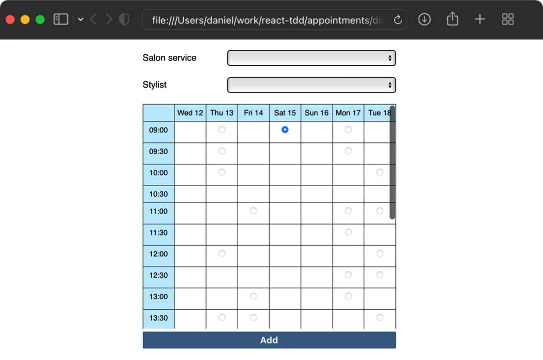
Figure 5.2 – AppointmentForm on show
You’ve now completed the work required to build the radio button table. Now it’s time to refactor.
Reducing effort when constructing components
Let’s look at a couple of simple ways to reduce the amount of time and code needed for test suites like the one we’ve just built: first, extracting builder functions, and second, extracting objects to store sensible defaults for our component props.
Extracting test data builders for time and date functions
You’ve already seen how we can extract reusable functions into namespaces of their own, such as the render, click, and element DOM functions. A special case of this is the builder function, which constructs objects that you’ll use in the Arrange and Act phases of your test.
The purpose of these functions is not just to remove duplication but also for simplification and to aid with comprehension.
We already have one candidate in our test suite, which is the following code:
const today = new Date();
today.setHours(9, 0, 0, 0);
We’ll update our test suite so that it uses a builder function called todayAt, which will save a bit of typing:
todayAt(9);
We’ll also extract the today value as a constant as we’ll also make use of that.
Builders for domain objects
Most often, you’ll create builder functions for the domain objects in your code base. In our case, that would be customer or appointment objects, or even the time slot objects with the single startsAt field. Our code base hasn’t progressed enough to warrant this, so we’ll start with builders for the Date objects that we’re using. We’ll write more builders later in this book.
Let’s get started:
- Create a new directory, test/builders. This is where all our builder functions will live.
- Create a new file, test/builders/time.js. This is where we’ll throw everything related to time.
- Add the following constant to your new file:
export const today = new Date();
- Back in test/AppointmentForm.test.js, add the following import, just below your other imports:
import { today } from "./builders/time";
- Delete the definition of the today constant in the test suite.
- In test/builders/time.js, add the following definition of todayAt. Notice that this does allow us to specify hours, minutes, seconds, and milliseconds if we so choose, but it has a default value of 0 for each if we don’t specify them. We’ll make use of this full form in one of the tests. We must also make a copy of the today constant by calling the date constructor. This ensures that we don’t unexpectedly modify the today constant on any callers of this function:
export const todayAt = (
hours,
minutes = 0,
seconds = 0,
milliseconds = 0
) =>
new Date(today).setHours(
hours,
minutes,
seconds,
milliseconds
);
Immutability of builder functions
If your namespaces use shared constant values, like we’re doing with today here, make sure your functions don’t inadvertently mutate them.
- Back in test/AppointmentForm.test.js, update your import so that it includes the new function:
import { today, todayAt } from "./builders/time";
- Time for a search and replace! Find all occurrences of the following:
today.setHours(9, 0, 0, 0)
Replace it with the following:
todayAt(9)
Replace it with the following:
todayAt(9, 30)
- Ensure your tests are still passing.
- Move these lines from the test suite into test/builders/time.js:
const oneDayInMs = 24 * 60 * 60 * 1000;
const tomorrow = new Date(
today.getTime() + oneDayInMs
);
- Rather than use the tomorrow constant directly, let’s write a tomorrowAt helper for that:
export const tomorrowAt = (
hours,
minutes = 0,
seconds = 0,
milliseconds = 0
) =>
new Date(tomorrow).setHours(
hours,
minutes,
seconds,
milliseconds
);
- Update your import so that it includes the new function:
import {
today,
todayAt,
tomorrowAt
} from "./builders/time";
- Delete the definitions of oneDayInMs and tomorrow from the test suite.
- Find the following expression:
tomorrow.setHours(9, 30, 0, 0)
Replace it with the following code:
tomorrowAt(9, 30)
- Run the tests again; they should be passing.
We’ll make use of these helpers again in Chapter 7, Testing useEffect and Mocking Components. However, there’s one more extraction we can do before we finish with this chapter.
Extracting a test props object
A test props object is an object that sets sensible defaults for props that you can use to reduce the size of your render statements. For example, look at the following render call:
render(
  <AppointmentForm
    original={blankAppointment}
    availableTimeSlots={availableTimeSlots}
    today={today}
  />
);
Depending on the test, some (or all) of these props may be irrelevant to the test. The original prop is necessary so that our render function doesn’t blow up when rendering existing field values. But if our test is checking that we show a label on the page, we don’t care about that – and that’s one reason we created the blankAppointment constant. Similarly, availableTimeSlots and the today prop may not be relevant to a test.
Not only that, but often, our components can end up needing a whole lot of props that are necessary for a test to function. This can end up making your tests extremely verbose.
Too many props?
The technique you’re about to see is one way of dealing with many required props. But having a lot of props (say, more than four or five) might be a hint that the design of your components can be improved. Can the props be joined into a complex type? Or should the component be split into two or more components?
This is another example of listening to your tests. If the tests are difficult to write, take a step back and look at your component design.
We can define an object named testProps that exists at the top of our describe block:
const testProps = {
  original: { ... },
  availableTimeSlots: [ ... ],
  today: ...
}
This can then be used in the render call, like this:
render(<AppointmentForm {...testProps} />);If the test does depend on a prop, such as if its expectation mentions part of the props value, then you shouldn’t rely on the hidden-away value in the testProps object. Those values are sensible defaults. The values in your test should be prominently displayed, as in this example:
const appointment = {
  ...blankAppointment,
  service: "Blow-dry"
};
render(
  <AppointmentForm {...testProps} original={appointment} />
);
const option = findOption(field("service"), "Blow-dry");
expect(option.selected).toBe(true);
Notice how the original prop is still included in the render call after testProps.
Sometimes, you’ll want to explicitly include a prop, even if the value is the same as the testProps value. That’s to highlight its use within the test. We’ll see an example of that in this section.
When to use an explicit prop
As a rule of thumb, if the prop is used in your test assertions, or if the prop’s value is crucial for the scenario the test is testing, then the prop should be included explicitly in the render call, even if its value is the same as the value defined in testProps.
Let’s update the AppointmentForm test suite so that it uses a testProps object:
- In your test suite, find the definitions for services, availableTimeSlots, and blankAppointment. These should be near the top.
- Add the following testProps definition just after the other definitions:
const testProps = {
today,
selectableServices: services,
availableTimeSlots,
original: blankAppointment,
};
- The first test in the suite looks like this:
it("renders a form", () => {
render(
<AppointmentForm
original={blankAppointment}
availableTimeSlots={availableTimeSlots}
/>
);
expect(form()).not.toBeNull();
});
This can be updated to look as follows:
it("renders a form", () => {
render(<AppointmentForm {...testProps} />);
expect(form()).not.toBeNull();
});
- The next two tests, renders a submit button and renders as a select box, can use the same change. Go ahead and do that now.
- Next up, we have the following test:
it("has a blank value as the first value", () => {
render(
<AppointmentForm
original={blankAppointment}
availableTimeSlots={availableTimeSlots}
/>
);
const firstOption = field("service").childNodes[0];
expect(firstOption.value).toEqual("");
});
Since this test depends on having a blank value passed in for the service field, let’s keep the original prop there:
it("has a blank value as the first value", () => {
render(
<AppointmentForm
{...testProps}
original={blankAppointment}
/>
);
const firstOption = field("service").childNodes[0];
expect(firstOption.value).toEqual("");
});
We’ve effectively hidden the availableTimeSlots property, which was noise before.
- Next, we have a test that makes use of selectableServices:
it("lists all salon services", () => {
const services = ["Cut", "Blow-dry"];
render(
<AppointmentForm
original={blankAppointment}
selectableServices={services}
availableTimeSlots={availableTimeSlots}
/>
);
expect(
labelsOfAllOptions(field("service"))
).toEqual(expect.arrayContaining(services));
});
This test uses the services constant in its expectation, so this is a sign that we need to keep that as an explicit prop. Change it so that it matches the following:
it("lists all salon services", () => {
const services = ["Cut", "Blow-dry"];
render(
<AppointmentForm
{...testProps}
selectableServices={services}
/>
);
expect(
labelsOfAllOptions(field("service"))
).toEqual(expect.arrayContaining(services));
});
- In the next test, it’s just availableTimeSlots that we can get rid of since both services and appointments are defined in the test itself:
it("pre-selects the existing value", () => {
const services = ["Cut", "Blow-dry"];
const appointment = { service: "Blow-dry" };
render(
<AppointmentForm
{...testProps}
original={appointment}
selectableServices={services}
/>
);
const option = findOption(
field("service"),
"Blow-dry"
);
expect(option.selected).toBe(true);
});
The remaining tests in this test suite are in the nested describe block for the time slot table. Updating this is left as an exercise for you.
You’ve now learned yet more ways to clean up your test suites: extracting test data builders and extracting a testProps object. Remember that using the testProps object isn’t always the right thing to do; it may be better to refactor your component so that it takes fewer props.
Summary
In this chapter, you learned how to use two types of HTML form elements: select boxes and radio buttons.
The component we’ve built has a decent amount of complexity, mainly due to the component hierarchy that’s used to display a calendar view, but also because of the date and time functions we’ve needed to help display that view.
That is about as complex as it gets: writing React component tests shouldn’t feel any more difficult than it has in this chapter.
Taking a moment to review our tests, the biggest issue we have is the use of expect.hasAssertions and the unusual Arrange-Assert-Act order. In Chapter 6, Exploring Test Doubles, we’ll discover how we can simplify these tests and get them back into Arrange-Act-Assert order.
Exercises
The following are some exercises for you to try out:
- Add a toBeElementWithTag matcher that replaces the two expectations in the renders as a select box test. It should be used like so:
expect(field("service")).toBeElementWithTag("select");
- Complete the remaining tests for the AppointmentForm select box:
- Renders a label
- Assigns an ID that matches the label ID
- Saves an existing value when submitted
- Saves a new value when submitted
These tests are practically the same as they were for CustomerForm, including the use of the change helper. If you want a challenge, you can try extracting these form test helpers into a module of their own that is shared between CustomerForm and AppointmentForm.
- Update the time slot table tests so that they use the testProps object.
- Update the AppointmentsDayView component so that it uses the todayAt builder, where appropriate.
- Add the ability to choose a stylist before choosing a time slot. This should be a select box that filters based on the service required, as not all stylists will be qualified to provide all services. You’ll need to decide on a suitable data structure to hold this data. Modify availableTimeSlots so that it lists which stylists are available at each time, and update the table to reflect which stylist has been chosen and their availability during the week.
Further reading
The useCallback hook is useful when you’re passing event handlers through a hierarchy of components. Take a look at the React documentation for tips on how to ensure correct usage: https://reactjs.org/docs/hooks-reference.html#usecallback.