
In this chapter, let us explore two important features of Angular Material. We will begin by looking at options for using icons in an application. Angular Material provides API, directives, and services to effectively download and show icons in an application. We will explore using SVGs and fonts for Icons.
Later in the chapter, we will explore ARIA, an important accessibility feature. Following ARIA standards, a web application will be easy to use for the visually impaired. Screen readers will make use of ARIA functionality in the web application for letting the differently abled use the app.
ngAria is an AngularJS module that provides accessibility features. Angular Material is highly dependent on this module and takes advantage of the features to the fullest.
Icons
Icons are widely used in web and mobile applications. Icons add visual clues on the screen and make the UI easily understandable. With an icon, users can instantly relate to the UI control. Many buttons or links show icons along with the title. Certain UI elements like tabs, icon buttons, and FAB controls may exclude text completely (possibly to save space on a smaller screen).
On a mobile screen, where the real estate needs to be used with austerity, icons become even more important. The rest of the chapter offers details on approaches to show icons in an Angular Material application. See Figure 10-1 for a set of Material Design icons shown on a page.

Figure 10-1. Material icons on a web page
Icon Fonts
It is one of the effective ways to show icons in an application. We could use font glyphs as icons in the Angular Material application. They help download fonts as a single unit, instead of downloading multiple images for each icon.
Using Material Design Icons (CDN Option)
To use Material Design icons as fonts, include the following style sheet in your project/page.
<link href="https://fonts.googleapis.com/icon?family=Material+Icons" rel="stylesheet">Use md-icondirective. Consider the following code. It uses the material-icons font set. The attribute md-font-setwith a value material-iconsspecifies the same. Outside Angular Material, if you noticed HTML elements using font-set, it needs a special code mapped to each icon. However, with the md-icon directive we use a friendly name to select an icon (among many icons available in the font file).
<md-icon md-font-set="material-icons" style="font-size:42px" >face</md-icon> Using Material Design Icons (with Files on Your Server )
As you might have also noticed, we are using CDN locations for style sheets and fonts. The preceding link element downloads the CSS, which in turn requests for font files.
If you prefer to render styles and fonts from your infrastructure rather than from the CDN, add the following styles to your project. This is copied from the previously mentioned material icons’ link element, https://fonts.googleapis.com/icon?family=Material+Icons .
Create a style sheet with the following styles.
@font-face {font-family: 'Material Icons';font-style: normal;font-weight: 400;src: local('Material Icons'), local('MaterialIcons-Regular'), url(your-url/your-font.woff2) format('woff2');}.material-icons {font-family: 'Material Icons';font-weight: normal;font-style: normal;font-size: 24px;line-height: 1;letter-spacing: normal;text-transform: none;display: inline-block;white-space: nowrap;word-wrap: normal;direction: ltr;-webkit-font-feature-settings: 'liga';-webkit-font-smoothing: antialiased;}
Notice the highlighted URL for font location. Preferably, use bower or npm to download Angular Material icons. Copy the WOFF2 file from the downloaded packages. The following is a bower install command for downloading the package.
bower install material-design-iconsUsing Custom Icons
As specified earlier, for Material Design icons, we get the friendly name for an icon out of the box. If we need to use custom icons, copy your font files in a folder. Use a style sheet with class names for each icon. The following is a sample.
.icon-home:before {content: "e900";}
Use Angular Material element/directive md-icon and reference the CSS class as a value for md-font-icon.
<md-icon md-font-icon="icon-home" style="font-size:42px" ></md-icon>Note
The style sheet referenced previously and the icons downloaded are from IcoMoon app: https://icomoon.io/app/#. You could select a subset of icons and download only the ones you need. It also creates a style sheet with classes and codes for icons out of the box.
Using SVGs for Icons
SVG are vector graphics, which do not lose quality as we scale the image/icon up or down. If we prefer to use SVGs for icons, we could do that using an attribute md-svg-src on md-icon element/directive. Consider the following code.
<md-icon md-svg-src="svg-icons/ic_alarm.svg" style="width:48px; height:48px; color:red" ></md-icon>Specify path to the SVG file on md-svg-src attribute. Consider using a custom CSS class or style to change the size and color of the icon. The sample has inline style for simplicity. However, a CSS class for all icons is preferable.
Note
You could change color and size for both SVGs and font icons.
Ensure that SVG file does not have fill property set. If we open the SVG in a text editor, should see an XML file with various details of the image. Ensure that you remove the fill property if you choose to control color from the HTML view.
We could download Material Design icons from the following URL: https://design.google.com/icons .
Angular Material Icon Sets
We could also use icon sets to preload SVGs up front. We could load an icon set as a default icon set. That means we could reference the SVG icons by name anywhere in the HTML templates.
Consider the following code.
angular.module("sampleApp", ["ngMaterial", "material.svgAssetsCache"]).config(function($mdIconProvider){$mdIconProvider.defaultIconSet('img/icons/sets/core-icons.svg', 24);});
In the sample, we are using icon sets pre-created and available on CDN. The CDN location used in the sample is https://s3-us-west-2.amazonaws.com/s.cdpn.io/t-114/svg-assets-cache.js. All the icons in the sample are packaged in AngularJS module material.svgAssetsCache. As we create the sample module, add this module as a dependency. (material.svgAssetsCache: review the preceding highlighted code).
In the config function which runs as we bootstrap the module, inject $mdIconProvider. Using an API defaultIconSet(), we could set a default iconset. In the sample, we are considering core-icons.svg as the default icon sets. This icon set is available in svg-assets-cache.js.
Notice the second parameter, 24. It is the default view box size, in pixels for the given icon set. A bigger number shows a bigger icon by default.
Use md-icon element/directive and md-svg-icon attribute to use an icon out of the default icon set.
<md-icon md-svg-icon="account-balance" style="width:48px; height:48px; color:red" ></md-icon>Similar to earlier examples, we are keeping style attributes as is, except that the way SVG file loads has changed. Instead of referencing the SVG file directly, we are using a friendly name referenced in the icon set. See Figure 10-2.
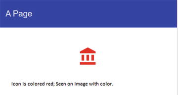
Figure 10-2. Account balance icon with styling applied
Additional Icon Sets
We could preload additional icon sets as well. Consider the following code .
angular.module("sampleApp", ["ngMaterial", "material.svgAssetsCache"]).config(function($mdIconProvider){$mdIconProvider.defaultIconSet('img/icons/sets/core-icons.svg', 24).iconSet('communication','img/icons/sets/communication-icons.svg',24);});
Here we used an API iconSet. It has an additional first parameter to name the icon set. In the sample, we are naming it communication. Consider the following HTML template.
<md-icon md-svg-icon="account-balance" style="width:48px; height:48px; color:red" ></md-icon><md-icon md-svg-icon="communication:business" style="width:48px; height:48px; color:red" ></md-icon>
Notice iconsetName:icon-name syntax (md-svg-icon=“communication:business”). As we are not loading the icon from default icon set, we identify the icon set that has the given icon named business. See Figure 10-3 for a page rendered using this approach.

Figure 10-3. Icon set sample
There is an alternative syntax to show an icon in the icon set. Consider the following.
<md-icon md-icon-set="communication" >business</md-icon>Specify the icon id as the value for md-icon element/directive. The icon set is provided through an attribute md-icon-set.
Preload Individual Icons
In the earlier section, we used $mdIconProvider to preload SVG icon sets . Using API provided by $mdIconProvider, we can load individual icons at the module bootstrap time. This helps preload all icons up front and the individual views load faster (when needed). Consider the following sample.
angular.module("sampleApp", ["ngMaterial", "material.svgAssetsCache"]).config(function($mdIconProvider){$mdIconProvider.icon('account-circle','svg-icons/ic_account_circle.svg');});
Here, an icon ic_account_circle.svg is preloaded in the config function. This function is called as the sampleApp module bootstraps. The icon is available with an id account-circle in the application.
Consider the following code. We could now use the icon in the HTML template (with the image provided to the icon API earlier).
<md-icon md-svg-icon='account-circle' ></md-icon>Font Sets
Similar to icon sets, we could also use font sets. By default, the font set 'angular material' is applied on the application. We could use a different font set as the default using $mdIconProvider and its API defaultFontSet().
Use the following.
$mdProvider.defaultFontSet('a-custom-font-set')We could also load other font sets using fontSet API.
$mdProvider.fontSet('another-font-set', 'font-class-name')While using another font set, in the HTML template specify the font set on md-icon directive.
<md-icon md-font-set="another-font-set" style="font-size:42px" >fontAlias</md-icon>Note
Consider using defaultViewBoxSize(aNumberValue) API with $mdIconProvider. It changes icons’ default view box size across the module. The value is in pixels.
md-icon directive internally uses a service $mdIcon. It is used for making an HTTP request for the icon and in turn cache it in the browser.
ARIA
ARIA is a W3C standard for allowing persons with disabilities access applications (especially web applications). AngularJS provides extensive support to ARIA through a module named ngAria. This module is a primary requirement of Angular Material. It is included as a module dependency with ngMaterial (Angular Material module). All directives and controls in Angular Material provide support for these features through ngAria.
If we get started with Angular Material using a package manager like npm, bower, or JSPM, ngAria is already downloaded. If we are using CDN, make sure to include the ngAria script. Consider the following URL. X.Y.Z are AngularJS versions.
//ajax.googleapis.com/ajax/libs/angularjs/X.Y.Z/angular-aria.jsARIA features are usable through screen readers for persons with disabilities. The screen reader will read description and state of the control aloud. ngAria integrates well with ngModel, ngChecked, ngValue, ngShow, and so on. This means that when a check box is selected/checked, the screen reader through the ARIA attribute could pick this state information.
Consider the following code sample.
<md-button ng-click="submitFunction()" aria-label="Submit customer form">Submit</md-button>We provide a description in aria-label attribute for screen readers. This should be done for all controls in the application.
For any control with label, screen reader can pick up the label text. Using aria-label, we can provide text that is more descriptive for screen readers. When there is no default label value, the ngAria API expects aria-label attribute on the control. If neither is on the control, it shows a warning in the browser (Figure 10-4).
Figure 10-4. Example browser warning
Tab Index: ngAria sets tab index on controls automatically. This will help the accessibility feature to move focus to the next control using the keyboard.
Hidden for accessibility features: Any control not visible on the screen will also automatically be hidden from ARIA features. It is achieved by automatically applying an attribute aria-hidden=“true”. However, for any reason if it does not hide automatically (possibly it is hidden by changing opacity, which the ARIA logic will not pick up) or a control needs to be excluded from accessibility features, use the aria-hidden attribute explicitly.
Summary
This chapter explores icons in a little more detail. Icons have been used in earlier chapters as well. Nevertheless, they were basic implementations. When we need a holistic strategy for using icons in the application, review the approaches in this chapter.
We could use icon fonts, which would allow downloading icons as a unit. It also provides great ease of use. Material Design provides many frequently used icons out of the box. Of course, you could create and use custom fonts. This chapter described ways to implement the same.
If you decide to use SVG icons, with icon sets, all the needed icons could be grouped into a single file. On the other hand, the API also supports loading individual SVG icons. Unless a very small number of icons are used in your application, creating an icon set is preferred.
The chapter later describes ARIA features; aria-label is almost always seen on many directives and controls of the Angular Material application. Take advantage of the simplicity of ngAria and make your application accessible for the differently abled.
For Material icons, see https://design.google.com/icons
For IcoMoon, see https://icomoon.io/app/#
For accessibility and ngAria documentation, see https://docs.angularjs.org/guide/accessibility and https://docs.angularjs.org/api/ngAria
For ARIA specification and documentation, see https://www.w3.org/TR/wai-aria/