
Most games, especially those that involve a lot of action, don't concern themselves with a high-level graphical interface. High-level elements are those you'd typically find in a data entry form, including text boxes, pull-down selection menus, and check boxes.
Instead, games are focused on more detailed graphics—stuff like backgrounds, animations, and sprites. This type of low-level graphics manipulation is discussed in the next chapter.
However, a game isn't all about action. Even the most graphically advanced game needs a start menu, or a form for the user to enter their name when she achieves a high score. When new levels are loaded, you might want to show players a gauge component to indicate how much has been downloaded so far. Players might also need choice components to select the difficulty of levels.
And so, high-level GUI components are important after all. Luckily, MIDP makes high-level GUIs extremely easy to implement.
This chapter will discuss the basics of Java GUI development as it pertains to game programming. The emphasis will be on graphics fundamentals, as well as the development of custom components for our applications to use. The key lies in the Screen class.
The javax.microedition.lcdui.Screen classis a superclass of all GUI components that can be put on a screen. Such components can also contain other components. The Screen class itself has methods to set and get the values of the title bar and ticker text. It usually has automatic component positioning and scolling mechanisms, so developers don't need to bother with such things.
NOTE
The layout policy in most devices is vertical. In forms, a new line is usually started for focusable items such as a TextField, DateField, Gauge, or ChoiceGroup. If the size of a form is greater than the size of the display, then the user will usually be able to scroll downward. There is usually no horizontal scrolling.
String items and images, which do not involve user interaction, behave differently than other widgets. Several strings, for example, are drawn horizontally unless the newline character (
) is embedded in the string. Content is wrapped (for text) or clipped (for images) to fit the width of the display.
The javax.microedition.lcdui.Form class is one of the most commonly used child classes of the Screen class. It is the only one that is a container in which developers can place different GUI objects.
Items that are placed in forms are descended from the javax.microedition.lcdui.Item class. The Form class is similar to the java.awt.Panel class in J2SE.
The Alert class is a special type of form used for notification purposes. Like the Form class, when an Alert is shown it occupies the complete screen.
The javax.microedition.lcdui.List class is a successor of the Screen class and is used to present a list of choices to the user. A list can be exclusive (acting like a set of radio buttons), multiple (acting like a set of check boxes), or implicit (acting like a selecting menu).
The user generally accesses an item in the list by using the up and down arrow keys to choose the item. The item can then be selected using the phone's main Select button.
Most of the behavior in a list is common with the class javax.microedition.lcdui.ChoiceGroup, and the common API is defined in the interface javax.microedition.lcdui.Choice.
When a list is present on the display, it also takes up the entire screen. Traversing a list or scrolling through its items does not trigger any application-visible events. The system only notifies the application when a list item is actually selected. The notification of the application is done within the commandAction() method. An example of the List class in action can be seen in Figure 13.1.
There are three types of lists:
IMPLICIT—. This list acts like a selection menu. When an item is selected, the application is immediately notified.EXCLUSIVE—. Acts like a set of radio buttons. The select operation changes the selected element in the list. The application, however, is not notified until the user explicitly triggers a command such asDone. You must be sure to add and handle this command.MULTIPLE—. Acts like a set of check boxes. The select operation toggles the selected state of the current element. The application is not notified.
IMPLICIT lists can be used to construct menus by treating each element like a logical command. In this case, no application-defined commands have to be created. The application just has to register a CommandListener that is called when a user selects an item.
For example, you might create an explicit list with three operations: Start Game, Quit Game, and Instructions. Start Game is considered the default operation.
Because the list is of type IMPLICIT, when a player selects a given command, the commandAction() method is called, and the SELECT_COMMAND parameter is passed in.
The javax.microedition.lcdui.Choice interface defines an API for a user interface component implementing a selection from a predefined number of choices. The UI components that implement Choice are List and ChoiceGroup.
Each element of a Choice is composed of a text string and an optional image. If the application provides an image, the implementation can choose to ignore the image if it exceeds the capacity of the device to display it. If the implementation displays the image, it will be displayed adjacent to the text string as a sort of icon, and the pair will be treated as a unit.
After a Choice object has been created, elements may be inserted, appended, and deleted, and each element's string part and image part can be obtained and set. Elements within a Choice object are referred to by their indexes, which are consecutive integers starting from zero.
There are three types of choices: IMPLICIT-CHOICE (valid only for lists), EXCLUSIVE-CHOICE, and MULTIPLE-CHOICE.
When a Choice is present on the display, the user can interact with it indefinitely. These traversing and scrolling operations do not cause application-visible events. The system notifies the application only when some application-defined command is fired, or when the selection state of a ChoiceGroup is changed. When a command is fired, a high-level event is delivered to the listener of the Screen.
The following important methods can be found in the javax.microedition.lcdui.Choice interface:
getString(int elementNum)—. Gets the text part of the element referenced byelementNumvalue.getImage(int elementNum)—. Gets the image part of the element referenced byelementNum.append(String stringPart, Image imagePart)—. Appends an element to the choice group. The added element will be the last element listed. The size of the group grows by one.insert(int elementNum, String stringPart, Image imagePart)—. Inserts an element into the choice just prior to the element specified. The group size grows by one.delete(int elementNum)—. Deletes the element referenced byelementNum. The group size shrinks by one.set(int elementNum, String stringPart, Image imagePart)—. Sets the element referenced byelementNumto the specified element, replacing the previous contents of the element.isSelected(int elementNum)—. Gets a Boolean value indicating whether this element is selected.getSelectedIndex()—. Returns the index number of an element in the choice that is selected.getSelectedFlags(boolean[] selectedArray)—. Queries the state of a choice and returns the state of all elements in the Boolean array calledselectedArray.setSelectedIndex(int elementNum, boolean selected)For
MULTIPLE, this method simply sets an individual element's selected state.For
EXCLUSIVE, this can be used only to select any element. In other words, the selected parameter must be true. When an element is selected, the previously selected element is deselected.For
IMPLICIT, this can be used only to select any element. The selected parameter must be true. When an element is selected, the previously selected element is deselected.setSelectedFlags (boolean[] selectedArray)—. Attempts to set the selected state of every element in theChoiceusing the Boolean array.
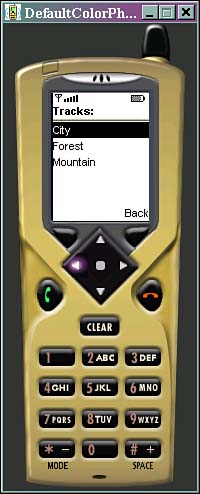
Lists can be used as menus and track/level selectors. Listing 13.1 shows an example menu. A car racing game can use this menu to select a type of track.
Example 13.1. Choosing a Track
import javax.microedition.lcdui.*;
import javax.microedition.midlet.*;

public class Tracks extends List
    implements CommandListener
{
  private MIDlet midlet;
  private GameCanvas nextForm;
  private Form previousForm;

  private Command backCommand = new
      Command("Back", Command.SCREEN, 1);

  private static String trackNames[] =
      {"City", "Forest", "Mountain"};

  private static int lengths[] =
      {1000, 1400, 800};

  public Tracks(MIDlet midlet, GameCanvas nextForm,
      Form previousForm)
  {
    super("Tracks:", List.IMPLICIT, trackNames, null);
    this.midlet = midlet;
    this.nextForm = nextForm;
    this.previousForm = previousForm;
    addCommand(backCommand);
    setCommandListener(this);
  }

  public void commandAction(Command c, Displayable s)
  {
    if (c.equals(List.SELECT_COMMAND))
    {
      int trackID = getSelectedIndex();
      nextForm.setLength(lengths[trackID]);
      nextForm.setSpeed(Float.createFloat(2, 400));
      nextForm.initEnemies();
      Display.getDisplay(midlet).setCurrent(nextForm);
      nextForm.start();
    }
    else if (c == backCommand)
    {
      Display.getDisplay(midlet).setCurrent(previousForm);
    }
  }
}
The application memorizes the previous and next form so that forward and backward navigation is available. All list options are passed as an array of strings. When the Select key is pressed, it invokes a special SELECT_COMMAND event. In the command listener, when the event is caught, the track's id is read from the list and the game is started (usually by starting a thread). The track is shown in Figure 13.2.
A javax.microedition.lcdui.TextBox class is another Screen class successor that allows the user to enter and edit text. It has a maximum size, which is the maximum number of characters that can be stored in the object at any time (its capacity). This limit is enforced when the TextBox's instance is constructed, when the user is editing text within, as well as when the application program calls methods that modify its contents. The maximum size is the maximum stored capacity, and is unrelated to the number of characters that can be displayed at any given time.
The text contained within a TextBox may be more than can be displayed at one time. If this is the case, the implementation will usually let the user scroll down through the box to view and edit any part of the text. This scrolling occurs transparently to the application.
Important methods are the following:
getString()—. Gets the contents of theTextBoxas a string value.setString(String text)—. Sets the contents of theTextBoxas a string value, replacing the previous contents.getChars(char[] data)—. Copies the contents of theTextBoxinto a character array starting at index zero. Array elements beyond the characters copied are left unchanged.setChars(char[] data, int offset, int length)—. Sets the contents of theTextBoxfrom a character array, replacing the previous contents. Characters are copied from the region of the data array starting at array index offset and running for length characters.insert(String src, int position)—. Inserts a string into the contents of theTextBox. The string is inserted just prior to the character indicated by the position parameter. The current size of the contents is increased by the number of inserted characters. The resulting string must fit within the current maximum capacity.insert(char[] data, int offset, int length, int position)—. Inserts a subrange of an array of characters into the contents of theTextBox.delete(int offset, int length)—. Deletes characters from theTextBox.getMaxSize()—. Returns the maximum size of characters that can be stored in thisTextBox.setMaxSize(int maxSize)—. Sets the maximum size (number of characters) that can be contained in thisTextBox. If the current contents of theTextBoxare larger thanmaxSize, the contents are truncated to fit.size()—. Gets the number of characters that are currently stored in thisTextBox.setConstraints(int constraints)—. Sets the input constraints of theTextBox.getConstraints()—. Gets the current input constraints of theTextBox.
The javax.microedition.lcdui.Item class is the big daddy of them all. Any user interface component that can be added onto a Form must derive from Item. All Item objects have a label field, which is a string that is attached to the item. The label is typically displayed near the component when it is displayed within a screen and has the following methods:
In some cases, when the user attempts to interact with the item, the system will switch to a system-generated screen where the actual interaction takes place. If this occurs, the label will generally be carried along and displayed within this new screen in order to provide the user with some context for the operation.
Sometimes it is useful to know if a user is selecting one of your items. You can have a form listen to a item by using the following static method:
Form.setItemStateListener(ItemStateListener)
When a user does something interesting with a user interface component, the listener's itemStateChanged(Item item) method will be triggered. Such changes include
Changing the set of selected values in a
ChoiceGroupAdjusting the value of an interactive
GaugeEntering a new value into a
TextFieldEntering a new
Dateinto aDateField
The listener is not called if the application (as opposed to the user) changes the value of an interactive item.
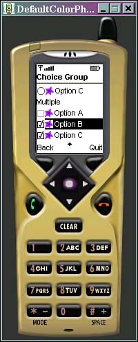
A javax.microedition.lcdui.ChoiceGroup is a group of selectable elements intended to be placed within a Form. The group may be created with a mode that requires a single choice to be made, or one that allows multiple choices.
Each device implementation is responsible for providing the graphical representation of these modes, and must provide visually different graphics for different modes. For example, some devices might use radio buttons for the single choice mode and check boxes for the multiple-choice mode. Choices implement the javax.microedition.lcdui.Choice interface and therefore have the same methods as lists.
A javax.microedition.lcdui.DateField is an editable component for presenting date and time information that can be placed into a Form.
You can create an instance to accept a given date, a given time, or both. This input mode configuration is accomplished by calling the DATE, TIME, or DATE_TIME static fields of this class. Figure 13.3, for example, shows a typical date and time selection screen.

Methods for manipulating the date and time include the following:
getDate()—. Returns the date value of this field. The returned value is null if the field value is not initialized. TheDateobject is constructed according to the rules of a locale-specific calendaring system and defined time zone. In theTIMEmode field, the date components are set to the zero epoch value of January 1st, 1970. If aDateobject presents time beyond one day from this zero epoch, then this field is in the not initialized state, and this method returns null. In theDATEmode field, the time component of the calendar is set to zero when constructing the date object.setDate(Date date)—. Sets a new value for this field. Null can be passed to set the field state to the not initialized state. The input mode of this field defines what components of the passedDateobject is used. InTIMEinput mode, the date components must be set to the zero epoch value of January 1st, 1970. If aDateobject presents time beyond one day from the zero epoch, then this field is in the not initialized state.In
TIMEinput mode, the date component of theDateobject is ignored, and the time component is used to the precision of minutes.In
DATEinput mode, the time component of theDateobject is ignored.In
DATE_TIMEinput mode, the date and time components ofDateare used, but only to the precision of minutes.getInputMode()—. Gets the input mode for this date field. Valid input modes areDATE,TIME, orDATE_TIME.setInputMode(int mode)—. Sets the input mode for this date field. Valid input modes areDATE,TIME, orDATE_TIME.setLabel(String label)—. Sets the label of theItem. If the label is null, it specifies that this item has no label.
Often times, it's a good idea to show a load bar to a user as a bunch of graphics or classes are loaded from the network or from storage memory. The javax.microedition.lcdui.Gauge class implements a bar graph display of a value intended for use in the form of a progress meter. Figure 13.4 shows a typical gauge.
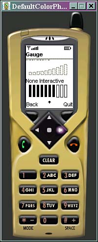
The values accepted by the Gauge object are small integers in the range zero through a maximum value established by the application. The application is expected to normalize its values into this range. The device is also expected to normalize this range into a smaller set of values for display purposes. Doing so will not change the actual value contained within the object. The range of values specified by the application may be larger than the number of distinct visual states possible on the device, so more than one value may have the same visual representation.
Applications can set or retrieve the Gauge's value at any time, regardless of the interaction mode. The user is prohibited from moving the value outside the established range. The expected behavior is that the application sets the initial value, then allows the user to modify the value thereafter. However, the application is not prohibited from modifying the value even while the user is interacting with it.
The Gauge class has the following important methods:
setValue(int value)—. Sets the current value of thisGaugeobject. If the value is less than zero, zero is used. If the current value is greater than the maximum value, the current value is set to be equal to the maximum value.setMaxValue(int maxValue)—. This sets the maximum value of thisGaugeobject. The new maximum value must be greater than zero, otherwise an exception is thrown. If the current value is greater than the new maximum value, the current value is set to be equal to the new maximum value.getMaxValue()—. Gets the maximum value of thisGaugeobject.isInteractive()—. Tells whether the user is allowed to change the value of theGauge.setLabel(String label)—. Sets the label of theItem. If the label is null, it specifies that this item has no label.
An example of a progress meter in use can be seen in Listing 13.2.
Example 13.2. The ProgressForm Example
import javax.microedition.lcdui.*;
import javax.microedition.midlet.*;

public class ProgressForm extends Form
implements CommandListener, Runnable
{
  private final int MAX = 10;

  private MIDlet midlet;
  private Form nextForm;
  private Gauge gauge;
  private StringItem label;
  private Command nextCommand = new
      Command("Next", Command.SCREEN, 1);

  public ProgressForm(MIDlet midlet, Form nextForm)
  {
    super("Loader");
    this.midlet = midlet;
    this.nextForm = nextForm;
    addCommand(nextCommand);
    setCommandListener(this);

    gauge = new Gauge("", false, MAX, 0);
    append(gauge);
  }

  public void commandAction(Command c, Displayable s)
  {
    if (c.equals(nextCommand))
    {
      Thread thread = new Thread(this);
      thread.start();
    }
  }

  public void run()
  {
    for (int i = 0; i < MAX; i++)
    {
      // Do something
      gauge.setValue(i + 1);
    }
    Display.getDisplay(midlet).setCurrent(nextForm);
  }
}
Progress meters are often used during the execution of segmented actions that are quite slow (for example, loading images and levels over the network). Users want some kind of feedback that showing that the device is not frozen. The value MAX should have the number of items to be done (such as number of images). When pressing the Next soft key, a new thread is invoked.
The javax.microedition.lcdui.StringItem class is a simple item that can contain a string. This is used to create a display-only text label. Both the label and the textual content of a StringItem can be modified by the application. The visual representation of the label may differ from that of the textual contents.
To manipulate a StringItem, use the following methods:
getText()—. Gets the text contents of theStringItem, or null if theStringItemis empty.setText(String text)—. Sets the text contents of theStringItem. If text is null, theStringItemis set to be empty.setLabel(String label)—. Sets the label of theItem. If the label is null, it specifies that this item has no label.
Similar to StringItem, the javax.microedition.lcdui.ImageItem class provides layout control when Image objects are added to a Form. Each ImageItem object contains a reference to an Image object. This image must be immutable. The value null may be specified for the image contents of an ImageItem. If this occurs (and if the label is also null), the ImageItem will occupy no space on the screen.
Each ImageItem object contains a layout field that is combined from the following values:
LAYOUT_DEFAULT—. Use the default formatting of the container of the image.LAYOUT_LEFT—. Image should be close to left edge of the drawing area.LAYOUT_RIGHT—. Image should be close to right edge of the drawing area.LAYOUT_NEWLINE_BEFORE—. A new line should be started before the image is drawn.LAYOUT_NEWLINE_AFTER—. A new line should be started after the image is drawn.
Because of device constraints such as limited screen size, the implementation might choose to ignore layout directions.
There are some implicit rules on how the layout directives can be combined:
LAYOUT_DEFAULTcannot not be combined with any other directive. In fact, any other value will overrideLAYOUT_DEFAULTbecause its value is0.LAYOUT_LEFT,LAYOUT_RIGHT, andLAYOUT_CENTERare meant to be mutually exclusive.It usually makes sense to combine
LAYOUT_LEFT,LAYOUT_RIGHT, andLAYOUT_CENTERwithLAYOUT_NEWLINE_BEFOREandLAYOUT_NEWLINE_AFTER.
Important methods within ImageItem are the following:
getImage()—. Gets the image contained within theImageItem, or returns null if there is no contained image.setImage(Image img)—. Sets the image object contained within theImageItem. The image must be immutable. Ifimgis null, theImageItemis set to be empty.getAltText()—. Gets the text string to be used if the image exceeds the device's capacity to display it.setAltText(String text)—. Sets the alternate text of theImageItem, or null if no alternate text is provided.getLayout()—. Gets the layout directives used for placing the image.setLabel(String label)—. Sets the label of theItem. If the label is null, it specifies that this item has no label.
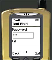
The javax.microedition.lcdui.TextField class is an editable text component that may be placed into a Form, as seen in Figure 13.5).
You can give a text field an initial value. It also has a maximum size, which is the maximum number of characters that can be stored in the object at any time. This limit is enforced when the TextField instance is constructed, when the user is editing text within the TextField, as well as when the application program calls methods on the TextField that modify its contents. The maximum size is the maximum stored capacity and is unrelated to the number of characters that may be displayed at any given time. The number of characters displayed and their arrangement into rows and columns are determined by the device.
The TextField shares the concept of input constraints with the TextBox object. The different constraints allow the application to request that the user's input be restricted in a variety of ways. The implementation is required to restrict the user's input as requested by the application. The following constants can be used to restrict the character set:
ANY—. The user is allowed to enter any type of text at all. This is the default.NUMERIC—. The user is allowed to enter only an integer value. The implementation must restrict the contents to consist of an optional minus sign followed by an optional string of numerals.PHONENUMBER—. The user is allowed to enter a phone number. The phone number is a special case, since a phone-based implementation may be linked to the native phone dialing application. The implementation might automatically start a phone dialer application that is initialized so that pressing a single key would be enough to make a call. The call must not be made automatically without requiring the user's confirmation. The exact set of characters allowed is specific to the device and to the device's network, and can include non-numeric characters.URL—. The user is allowed to enter a URL, such as http://www.yahoo.com.PASSWORD—. The text entered must be masked so that the characters typed are not visible. The actual contents of the text field are not affected, but each character is displayed using a mask character such as*. The character chosen as the mask character is implementation-dependent. This is useful for entering confidential information such as passwords or PINs. A password box is shown in Figure 13.5.CONSTRAINT_MASK—. The mask value for determining the constraint mode. The application should use the logicalANDoperation with a value returned bygetConstraints()andCONSTRAINT_MASKto retrieve the current constraint mode, as well as to remove any modifier flags such as thePASSWORDflag.
The implementation may provide special formatting for the value entered. For example, a PHONENUMBER field may be separated and punctuated as appropriate for the phone number conventions in use, grouping the digits into country code, area code, prefix, and so on. Note that in some networks a + prefix is part of the number, and is returned as a part of the string.
A special type of item that can be added to any screen is a ticker. The javax.microedition.lcdui.Ticker class implements a scrolling ticker-tape, which is a piece of text that runs continuously across the display. The direction and speed of scrolling are determined by the implementation. While animating, the ticker string scrolls continuously. That is, when the string finishes scrolling off the display, the ticker starts over at the beginning of the string.
There is no API provided for starting and stopping the ticker. The ticker always scrolls continuously. Some devices might automatically pause the scrolling for power consumption purposes; for example, if the user doesn't interact with the device for a certain period of time. The implementation should resume scrolling the ticker when the user interacts with the device again.
The same ticker can be shared by several Screen objects. This can be accomplished by calling the setTicker() method on all such screens. Typical usage is for an application to place the same ticker on all its screens. When the application switches between two screens that have the same ticker, a desirable effect is for the ticker to be displayed at the same location on the display and to continue scrolling its contents at the same position. This gives the illusion of the ticker being attached to the global display, instead of to each screen.
You can construct and add a ticker object as follows. Just drop the following code into any form class:
Ticker ticker = new Ticker("Please wait! Loading...");
setTicker(ticker);
If you want to extend the user interface further, you might want to check out some other toolkits.
A site called Trantor in Germany offers a package known as kAWT. Grab it from http://www.trantor.de/kawt/index.html.
kAWT is a lightweight version of Java's AWT, specially tailored for J2ME. There are versions for the Palm as well as for MIDP. It enables your MIDlets to use standard Java widgets such as panels and containers, and makes the MIDlet code truly upwardly compatible with applets. For example, a typical panel is shown in Figure 13.6.
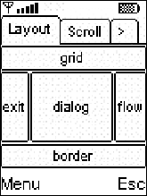
The only caveat is that kAWT will suck away an additional 27K or so of memory.
As you can see, a high-level user interface is pretty simple to throw together. Creating your game menus, load bars, alert boxes, input boxes, and other such interface items is really easy. Just create a quick Form, drop in the items you want, and off you go!
But obviously the real meat of a game is in the graphics. For that, you need to draw images directly onto the screen. The Canvas class is a special type of screen that makes this possible, and the next chapter has all the details you'll need….