Chapter 8
Building Desktop Applications with WPF
 Perform Screen Layout
Use Controls
Work with Data in the UI
Windows Presentation Foundation (WPF) is a .NET technology for building desktop applications. The result of building a WPF application is an *.exe file that you can run directly on your computer or deploy and run on any other computer that has .NET installed. With WPF, you can add a graphical user interface (GUI), pronounced “Gooey,” that makes it easier for users to work with your program. This chapter will show you how to lay out a screen in WPF and explain the controls, such as Button and TextBox, that you can place on the screen. You’ll also learn how to capture events off controls, allowing you to add code that runs based on user input. Since most applications work with data, this chapter builds on what you learned in Chapter 7 and shows how to bind data to controls in the GUI.
This chapter will show you how to build a WPF GUI with the VS Designer, but sometimes you must work at a lower level and manipulate the XAML, pronounced “Zammel,” that defines the GUI. XAML is an XML format that WPF and Silverlight use to define a GUI. There are two appendixes in this book that will help you get up to speed in XAML: Appendix A, “Introduction to XML,” and Appendix B, “Introduction to XAML.” If you aren’t familiar with XML, start with Appendix A. However, if you have a good grasp of basic XML syntax, go straight to Appendix B. I’ll try to explain WPF in a way that any XAML you see can be understood in its context, but you might want to review the appendixes to avoid any confusion. Once you’re familiar with XAML, you can return here and start with the next section, which explains how to start a WPF project.
Starting a WPF Project
In Chapter 5, you learned how to create and build projects. The example explained how to create a Console application. However, what you learned there is generally applicable to most other application types. This section builds upon what you already know about projects and explains what is unique to a WPF application. To get started, open the New Project window; select WPF Application; and fill in the project name, location, and solution name. I’m naming the examples in the chapter as MyShop to continue the idea of customers who buy products that started in Chapter 7 when discussing data. Figure 8-1 shows the new WPF application in VS, including a Toolbox, a Designer, and a Solution Explorer. The Toolbox contains controls, which are user interface (UI) elements, such as Button and Textbox, that you can drag and drop onto the Designer.
NOTE
There is another .NET technology, Windows Forms, for creating desktop applications. This book doesn’t discuss Windows Forms because it’s an older technology. The way forward for desktop application development is WPF, and the intention of this book is to help guide you in a direction most beneficial to you.
The Designer allows you to lay out the UI of the application; it is divided into Design on the top and XAML on the bottom. The Design surface allows you to visually work with controls and layouts of those controls. The XAML editor allows you to work with the XML representation of the controls on the design surface. The Design and XAML are interrelated because a change in one causes a change in the other. For example, if you add a Button to the Design, you’ll see the XML representation of that Button in the XAML.

Figure 8-1 A new WPF application project
Similarly, if you add a TextBox element to the XAML, you’ll see the visual representation of that TextBox in Design.
You have various controls for manipulating the windows. Both Design and XAML have zoom controls. The zoom tool on Design is a slider in the upper-left corner, and zoom for XAML is a drop-down control in the lower-left corner. You can also zoom by clicking either Design or XAML and moving the mouse wheel. At the upper right of the XAML editor (bottom right of the Design surface), you can switch between horizontal and vertical splits of the window or click the chevron to collapse the XML. The splitter icon below the chevron allows you to split the XAML editor into two if you drag it down. The up-down arrow between the Design and XAML tabs allows you to switch sides so that each panel shows where the other was. Locating the carat in the middle of the separator between Design and XAML allows you to resize each window.
Understanding Layout
A layout defines how you can position and size controls on a screen. WPF windows and controls have a Content (can occasionally be called something else) property that accepts a single control. In some cases, such as a Button control, the content can be text. However, many situations call for the ability to lay out multiple controls. This section concentrates on performing layout in windows, and a Window has a Content property that accepts only one control; that one control should be a layout control, which is the subject of this section.
WPF includes several layout controls, including Grid, StackPanel, DockPanel, WrapPanel, and Canvas. By default, VS will generate a window with a Grid as the layout control. However, you are free to replace the Grid with any other layout control that suits your needs. This section will show you how to use each of these controls.
Grid Layout
Whenever starting a new WPF project, VS adds a Grid. A Grid is a layout control that allows you to create a set of rows and columns that hold other controls. You can add rows and columns to a Grid through the Visual Designer by clicking in the middle of a window in design view. Figure 8-2 shows a column being added to a Grid.
The thin vertical line in the middle of the window is a new border between two columns. After clicking the window, you’ll see two thick borders on the left and top of the window. While you hover over the top border, VS draws a vertical line that moves left and right as you run your mouse along the top border. You can do the same with the left border, adding rows to the Grid. This is a very quick way to add rows and columns to a Grid.

Figure 8-2 Adding columns and rows to a Grid
The arrow in the Grid border allows you to reposition the column or row border. You can remove the column or row border by selecting the arrow in the Grid border and dragging the arrow off the window.
CAUTION
Don’t press the DELETE key when you have a border selected. You’ll accidentally delete your Grid, which you might have spent some time on. If you want to remove a column or row, grab the arrow for the border you want to remove and drag the border off the window.
Once you’ve created rows and columns, you can add further customizations that define how much space the column or row can take. There are three sizing customizations: fixed, weighted, and auto. To set each of these options, hover over the column or row border and VS will display a sizing panel, as shown over the left column design border in Figure 8-3.
The diamond icon on the left means fixed, where the size will stay the same. The asterisk icon in the middle is a weighted proportion, where the size stays the same in relation to the other columns. The rightmost icon is auto, meaning that the size will vary according to
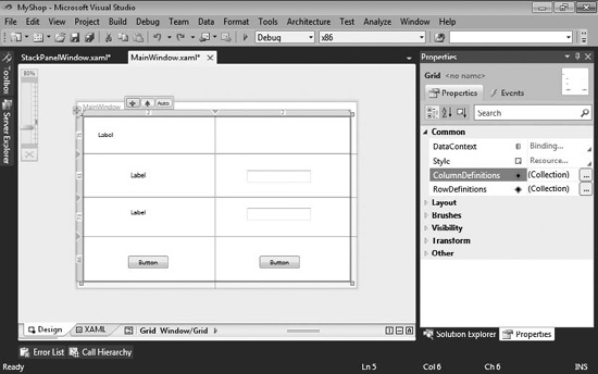
Figure 8-3 Column and row sizing options
whatever space remains after the other columns’ sizes are set. After you’ve added content to your Grid, you can use these sizing options to experiment with the layout that you want.
One thing to notice in Figure 8-3 is the number in the Grid border for each row and column. These numbers tell you the size in pixels for each row and column they appear upon.
Figure 8-3 also shows the Properties window on the right, where you can select and customize the Column and Row collections.
True to the purpose of the Grid, Figure 8-3 shows controls that have been added to the Grid, placed in each cell of the Grid. Another popular layout control is StackPanel, discussed next.
StackPanel Layout
The StackPanel is ideal for when you want to lay out controls each on top of the other, like a stack. You can use a StackPanel by dragging the StackPanel control from the Toolbox onto the design surface. If you want to use the StackPanel as your primary layout, you can
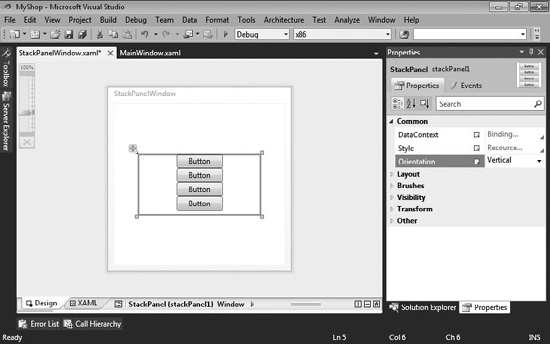
Figure 8-4 Using a StackPanel layout
select the grid, which is added by default to a new project, and delete the Grid. Figure 8-4 shows a StackPanel that contains multiple button controls.
In Figure 8-4, it doesn’t matter where you try to lay the buttons—the StackPanel will always lay them out one after the other. In addition to vertical layout, the StackPanel can lay out controls horizontally. Just change the Orientation property, shown in the Properties window in Figure 8-4, to Horizontal. Next, you’ll learn how to dock controls to the sides of a container.
DockPanel Layout
You’ve seen how VS allows you to dock windows within the borders of the application. This helps you organize your screen so that you can use many tools at one time. You can lay out your controls the same way with the DockPanel control.
Get started by dragging and dropping a DockPanel control from the Toolbox to the Window in the design surface. You might want to delete the default Grid first. Also, the DockPanel initializes with a Height and a Width, which you’ll probably want to remove by selecting the DockPanel, opening the Properties window, and clearing the Height and
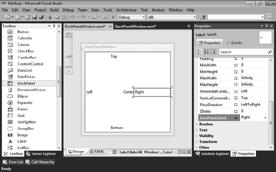
Figure 8-5 DockPanel layout
Width properties. Removing the Height and Width properties allows the DockPanel to expand and cover the entire window. Figure 8-5 shows a DockPanel with Label controls in each docking position.
Every time you drag and drop a control onto the design surface of a DockPanel, the control will take the center position by default. To specify where the control should dock, open the Properties window and set the DockLayout.Dock property. When you add a new control, the new control will become the center control and the other control will dock to the side of the DockPanel you specified in the Dock property. The next layout control is WrapPanel.
WrapPanel Layout
Whenever controls should naturally follow each other in sequence and continue wrapping on new lines, you can use a WrapPanel. Examples of when this is useful could be when adding controls that contain text and it’s useful to view the controls in sequence. Figure 8-6 shows several CheckBox controls in a WrapPanel.
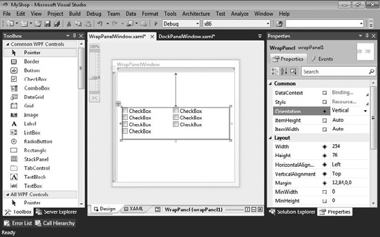
Figure 8-6 The WrapPanel Layout control
Figure 8-6 demonstrates how you can lay out a group of controls to fill an available space. In the case of the CheckBox controls, the Orientation of the WrapPanel is set to Vertical (the default is Horizontal). When the number of CheckBox controls fills the vertical column, remaining CheckBoxes wrap to the next column. Because the sizes of the CheckBox controls are the same, you have a uniform layout, which is easier than trying to do the same thing with a Grid or other layout control. The final layout control we’ll discuss is the Canvas, which is next.
Canvas Layout
There are times when you might want to perform explicit layout of controls. If you were building a diagramming application or a drawing program, or if you just wanted to explicitly specify the location of controls, the Canvas layout will work fine. Figure 8-7 shows some controls on a Canvas layout.
The Rectangle and Ellipse controls were dragged and dropped from the Toolbox onto the Canvas control. Notice the Canvas.Left, Canvas.Top, Width, and Height properties in the Properties window, demonstrating the absolute positioning of the selected Ellipse control.
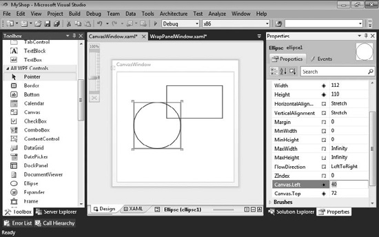
Figure 8-7 The Canvas Layout control
Now that you know how to use the layout controls, the next section takes a closer look at WPF controls in general, giving you tips on how to use them in your application.
Using WPF Controls
WPF includes many controls for helping you build user interfaces. This section groups the controls into categories, including text, selection, containers, information, shapes, and decorators. Data controls are excluded on purpose because the section following controls is “Working with Data in WPF.” Before diving into each control, let’s do an overview of the VS environment associated with control work.
Managing Windows for Controls
When working with controls, you’ll be working with four different windows: Toolbox, Solution Explorer, Designer, and Properties. You learned how to access each of these windows in earlier chapters; but as a convenience, Table 8-1 gives you a quick summary on how to open these windows.
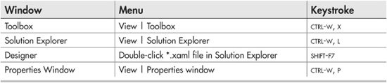
Table 8-1 Primary Windows for Working with Controls
You’ll find all of the available controls on the Toolbox, divided into panels where the top panel is Common WPF controls, which makes it easy to find the controls you use the most. The All WPF Controls tab includes the complete list of WPF controls.
You’ve seen how the Designer can be used in the preceding section, which discussed layout controls. You can open the Designer by double-clicking a *.xaml file in Solution Explorer. To add a control to the Designer, select the control in the Toolbox and drag the control onto the Designer. Figure 8-8 shows a Button that has been dragged and dropped onto the Designer.

Figure 8-8 Adding a control to the VS Designer
In Figure 8-8, you can see the Toolbox with the Button control selected. The Designer shows a Button control that has been dragged and dropped. In practice, you’ll be adding this control into some type of layout control so that you can position it appropriately on the screen.
Below the Designer, the Button control appears in the XAML for this window. If you are uncomfortable looking at XAML, you can review Appendix B as a refresher. The attributes of the Button control in the XAML match the properties in the Properties window.
TIP
It’s important to learn how to quickly build Uls using the Visual Designer because it enhances productivity. However, it’s also important to be able to read the XAML associated with a window because as you move beyond the beginner content of this book, you’ll find scenarios where the Designer alone might not allow you to control every nuance of your visual presentation. A good way to move forward is to experiment on your own by adding each of the controls from the Toolbox to the Designer and then examine the generated XAML.
Setting Properties
The Properties window shows all of the ways that you can configure a control. For button controls, you’ll want to change the Content property to make the text on the button make sense. In this example, we’ll imagine that the purpose of the button is to allow a user to create a new order for a customer. Therefore, set the Content property to New Order.
Handling Events
In addition to properties, you can handle control events via the Events tab at the top of the Properties window. Figure 8-9 shows the contents of the Events tab.
Controls have literally dozens of events that allow you to manage their behavior in the application. Some events, like Click, are commonly used, while other events, such as Drag Over, only support unique scenarios like drag and drop that you might not ever care about. To handle an event, you can double-click any of the events in the Properties window and VS will wire up that event to a handler method with a default name.
Since the Click event is so common, I’ll show how it works. You can implement a handler for the Click event by double-clicking the Click event in the Properties window Events tab. When you double-click, VS opens a file named MainWindow.xaml.cs, assuming the window you’re working with is named MainWindow.xaml. MainWindow.xaml.cs is called a code-behind file and is where you can add event handlers. VS also creates a skeleton method in MainWindow.xaml.cs that handles the Button Click event, shown in Listing 8-1.

Figure 8-9 The Properties window Events tab
TIP
Controls have default events. The significance of default events is that if you double-click the control in the Designer, VS will generate an event handler for the default event. To be more specific, consider the Button control whose default event is the Click event. If you double-click the Button control in the Designer, VS will generate an event handler for the Click event.
Listing 8-1 A WPF code-behind file
C#:
using System;
using System.Collections.Generic;
using System.Linq;
using System.Text;
using System.Windows;
using System.Windows.Controls;
using System.Windows.Data;
using System.Windows.Documents;
using System.Windows.Input;
using System.Windows.Media;
using System.Windows.Media.Imaging;

using System.Windows.Navigation;
using System.Windows.Shapes;

namespace ControlsCS
{
    /// <summary>
    /// Interaction logic for MainWindow.xaml
    /// </summary>
    public partial class MainWindow : Window
    {
        public MainWindow()
        {
            InitializeComponent();
        }

        private void button1_Click(object sender, RoutedEventArgs e)
        {

        }
       }
    }
 }
   VB:
 Class MainWindow

    Private Sub Button1_Click(
        ByVal sender As System.Object,
        ByVal e As System.Windows.RoutedEventArgs)
 Handles Button1.Click

     End Sub

 End Class
The Click event handler, just created, is the highlighted method, button1_Click (Button1_Click in VB), that you see in Listing 8-1. We covered delegates and events in Chapter 4, which you can review for a better understanding of how this method handles the Click event. Notice how the VB code shows another way to handle events in VB, by explicitly specifying Handles Button1.Click. Essentially, when a user clicks on the button named button1, this handler will be called. This illustrates the concept of event-driven programming, where you write handlers, such as button1_Click, that run code according to user actions. In addition to creating the event handler in the code-behind, VS adds the method name to the Click event on the Events tab in the Properties window, shown in Figure 8-9.
In addition to creating the handler method and assigning the method name in the Properties window, VS adds the method as an attribute to the Button control in the XAML, shown here. The XAML is independent of programming language and works the same regardless of whether you are coding in C# or VB:
<Button Content="Button" Height="23"
        HorizontalAlignment="Left" Margin="76,43,0,0"
        Name="button1" VerticalAlignment="Top" Width="75"
        Click="button1_Click" />
Notice the convention being used on the method name, controlName_Event. The controlName part comes from the name of the control, which is button1, and the event is the event being handled. The problem with this is that button1 isn’t meaningful and when you return to this code later, you’ll be confused by having methods named button1_Click, button2_Click, and so on. To fix the naming problem, you should name your controls properly before doing anything else with them.
To back out of this, go back to the Events tab of the Properties window. Remember to select the Button in the Designer. The top left of the Properties window contains the ID of the control, which you should change from button1 to a meaningful name. For example if the purpose of the button was to create a new order for a customer, you could name the button NewOrderButton. Then delete the event handler assigned to the Click event of the Button. Figure 8-10 shows these changes in the Properties window. Now the ID and event handler are more readable.
After the event handler is deleted and the control has a new ID, double-click the Click event again. VS will create a new event handler for you, shown here:
C#:
private void button1_Click(object sender, RoutedEventArgs e)
{

}

private void NewOrderButton_Click(object sender, RoutedEventArgs e)
{

}

Figure 8-10 Readable button ID and event handler name
VB:
Class MainWindow

    Private Sub Button1_Click(
        ByVal sender As System.Object,
        ByVal e As System.Windows.RoutedEventArgs)

    End Sub

    Private Sub NewOrderButton_Click(
        ByVal sender As System.Object,
        ByVal e As System.Windows.RoutedEventArgs) Handles
NewOrderButton.Click

    End Sub

    End class
The previous code shows both the old button1_Click (Button1_Click in VB) event handler and the new NewOrderButton_Click event handler. You might wonder why the button1_Click event handler wasn’t deleted when you deleted it from the Click event in the Properties window, but there’s a good reason for this. What if you had already written code in the event handler? VS leans toward the safe side and does not delete your code. Using the previous steps, you have both event handlers sitting side-by-side, which means that you can easily copy your code from button1_Click into NewOrderButton_Click and then delete the button1_Click event handler. So far, we haven’t written any code for the event handler, which you’ll learn about in the next section.
Coding Event Handlers
One of the tasks you might want to do when a user clicks a button is to open a new window. The first thing you’ll need to do is add a new window. To make this work, you would open Solution Explorer, right-click the project you’re working with, select Add | New Item, choose Window (WPF), name the window NewOrder.xaml, and click Add. This will create a new window open in the Designer.
TIP
The project’s Add | New Item context menu includes a Window entry, which can save a couple of clicks when creating a new window.
After the Designer loads, you can quickly open the code-behind by pressing F7. In the code-behind, you’ll see the following code:
C#:
public partial class NewOrder : Window
{
    public NewOrder()
    {
        InitializeComponent();
    }
 }
VB:
Public Class NewOrder

End Class
Notice that the class in this code is named NewOrder, illustrating that a window is just another class. As you know, you can instantiate classes and call their methods, which is the technique you’ll use to open this window from the NewOrder_Click event handler in the code-behind of the MainWindow window.
In practice, you’ll populate the NewOrder window with whatever controls you need to implement a new order. You would populate the window by dragging and dropping controls, just like the Button in this example. However, we’ll skip that task for now because the current focus is on adding code to the NewOrderButton_Click event handler so that you can learn how to code an event handler and open another window. Go back to the NewOrderButton_Click event handler in MainWindow.xaml.cs and add the following code:
C#:
private void NewOrderButton_Click(object sender, RoutedEventArgs e)
{
    NewOrder newOrd = new NewOrder();
    newOrd.Show();
}
VB:
    Private Sub NewOrderButton_Click(
        ByVal sender As System.Object,
        ByVal e As System.Windows.RoutedEventArgs)
Handles NewOrderButton.Click

        Dim newOrd As New NewOrder
        newOrd.Show()

   End Sub
Since NewOrder is a class, you can instantiate it as shown in the preceding code example. To open the window, call the Show method.
Now you have a WPF program that handles events and opens new windows. Press F5 to run the program. Click New Order and observe that the New Order window appears. The New Order window isn’t very useful because it lacks controls and data management. The next section shows you how to populate window controls with data.
Working with Data in WPF
This section builds upon what you learned in Chapter 7 by showing how to bind data to WPF controls. Binding is the process of populating and retrieving data to and from controls. You’ll learn how to show data in your user interface. The examples in the following sections show you how to perform create, read, update, and delete (CRUD) operations via WPF. You’ll first see how to insert data, using VS tools to construct a data entry screen. Then you’ll learn how to read, modify, and delete data through a DataGrid. We’ll start with single value binding. To make the examples more interesting, I added extra fields to the tables. You can review Chapter 7 to learn how to add fields to a database and create a LINQ to SQL entity model.
Setting Up a Data Source
Before you can bind to data in the window, you’ll need a data source to work with data. To get started, update the Order table, created in Chapter 7, so that it has the following fields:
OrderID, int, primary key, auto-increment
CustomerID, int
OrderDate, datetime
Location, varchar(50)
Amount, money
Then update the Customer table with the following fields:
CustomerID, int, primary key, auto-increment
Name, nvarchar(50)
Age, int
Birthday, datetime
Income, money
With the database updated, you can add a LINQ to SQL entity model to the project, using the same techniques described in Chapter 7.
To add the data source for binding, open the NewOrder window in the Designer, and select the Data | Add New Data Source menu, which opens the Choose A Data Source Type window, shown in Figure 8-11.
There are different ways to connect to a data source, including directly to the database, via a Web service, via an object, or through SharePoint. This book shows you how to use LINQ to SQL, which is connected by selecting Object and clicking Next, which shows the Select The Data Objects window in Figure 8-12.

Figure 8-11 Choosing a new data source
On the Select The Data Objects window, check the box next to each object you want to bind in your application. The example in this chapter uses Customer and Order objects, which you can see checked in Figure 8-12. Clicking Finish will configure the data source for use in the application. You can view data sources by selecting Data | Show Data Sources, shown in Figure 8-13.
The Data Sources window allows you to create controls on a form that are bound to each field of a data source. In the Data Sources window in Figure 8-13, you can see that both Customer and Object are listed with their fields. What is also evident is the icons associated with each field. The icons describe what type of control should be associated with each data field. For example, Name on Customer is a TextBox because it is nvarchar(50), but Birthday is a calendar because it is a datetime. If you don’t like a default control type for a field, you can change it by selecting the field and choosing another control type from the drop-down list, as shown in Figure 8-14.
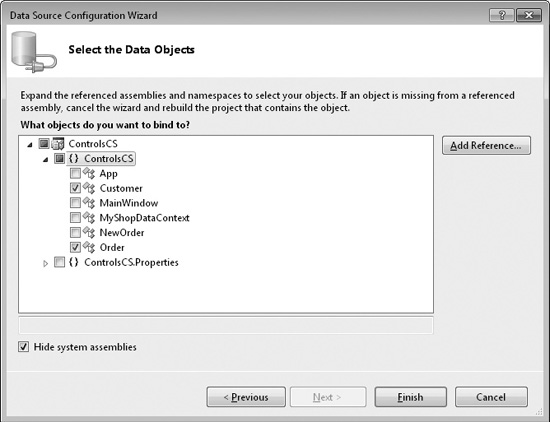
Figure 8-12 Selecting data objects

Figure 8-13 The Data Sources window
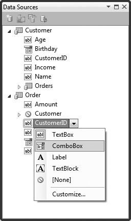
Figure 8-14 Changing the control type for a field
In Figure 8-14, the CustomerID is being changed to a ComboBox because it makes more sense to give the user the option of selecting a customer from a list for a new order, rather than typing in an ID number. Also, the object defaults to a Grid control, but in this first example, we only want to add a new order, meaning that the control type should be changed to Detail. To create a new order form with controls bound to order data, select the Order object in the Data Sources window and drag and drop the order onto the Designer of the NewOrder window. Figure 8-15 shows this new window.
Figure 8-15 shows how VS added a Grid layout with two columns and a row for each field in the Order table. As explained, the CustomerID is a ComboBox and the OrderDate is a calendar. VS was smart enough to put spaces between the words in the labels, too. VS didn’t put the Save button on the screen, which is something you would need to do to save the data. In addition to adding controls to the Designer, VS added the following CollectionViewSource control to the NewOrder window’s XAML:
<Window.Resources>
    <CollectionViewSource x:Key="orderViewSource"
    d:DesignSource="{d:DesignInstance my:Order, CreateList=True}" />
</Window.Resources>

Figure 8-15 Controls bound via a data source
This is another reason it’s important to be able to read the XAML for a window, so you can see how objects like this are added and configure them if you need to. In our case, we need to know the name of the CollectionViewSource, which is orderViewSource. We need to add an Order object to the CollectionViewSource so that the controls that are bound to it have a place to save data that the user enters. Press F7 to see the code that VS added to the Window Loaded event handler, as follows:
C#:
private void Window_Loaded(object sender, RoutedEventArgs e)
{
    System.Windows.Data.CollectionViewSource
    orderViewSource =
    ((System.Windows.Data.CollectionViewSource)
    (this.FindResource("orderViewSource")));
     // Load data by setting the
//CollectionViewSource.Source property:
    // orderViewSource.Source = [generic data source]
}
Private Sub Window_Loaded(
    ByVal sender As System.Object,
    ByVal e As System.Windows.RoutedEventArgs) Handles MyBase.Loaded

    Dim OrderViewSource As System.Windows.Data.CollectionViewSource
        = CType(Me.FindResource("OrderViewSource"),
          System.Windows.Data.CollectionViewSource)
    'Load data by setting the CollectionViewSource.Source property:
    'OrderViewSource.Source = [generic data source]
End Sub
The preceding skeleton code gets a reference to OrderViewSource, but that’s all. The commented portion of the code suggests how you might populate that control. However, we aren’t interested in populating OrderViewSource with data because the purpose of this screen is to insert a new record. Instead, the proper approach is to bind an empty object. Later, you’ll see how to pull the data from that object after the user fills in the form and clicks on the Save button. In addition to assigning a blank Order object to OrderViewSource, we need to populate the ComboBox that holds the list of customers and their IDs. The following code is a revision to the Window_Loaded event handler that assigns a blank Order object to the OrderViewSource and binds customers to the ComboBox holding customers:
C#:
private void Window_Loaded(object sender, RoutedEventArgs e)
{
    var orderViewSource =
        FindResource("orderViewSource") as CollectionViewSource;
    orderViewSource.Source =
        new List<Order>
        {
            new Order
            {
                OrderDate = DateTime.Now
            }
       };
   customerIDComboBox.ItemsSource =
        from cust in new MyShopDataContext().Customers
        select cust;
}
Private Sub Window_Loaded(
    ByVal sender As System.Object,
    ByVal e As System.Windows.RoutedEventArgs) Handles MyBase.Loaded

    Dim OrderViewSource As CollectionViewSource =
        CType(FindResource("OrderViewSource"), CollectionViewSource)
    OrderViewSource.Source =
        New List(Of Order) From
        {
            New Order With
            {
               .OrderDate = DateTime.Now
            }
        }
    CustomerIDComboBox.ItemsSource =
        From cust In New MyShopDataContext().Customers

End Sub
The previous re-write of Window_Loaded accomplishes two things: assigning an order to orderViewSource and populating customerIDComboBox with customers. The Order object assigned to the Source property of orderViewSource is empty, except assigning today’s date to OrderDate, demonstrating how you can set default values. When the user fills out the form on the page, WPF will populate this Order with data because it is data bound, through orderViewSource, to the controls on the screen. This section showed you how the data is assigned to the controls, but some controls require even more attention to ensure they display the data correctly. The next section expands upon what you must do to get the ComboBox to work.
Configuring a ComboBox
A couple of the particularly more complex controls to configure are ComboBox and ListBox. The reason is that they have a few different properties that must be set to ensure that whatever is selected can be read and correctly referenced back to the original data source. This section doesn’t try to teach you about WPF binding because there are entire books with multiple chapters related to the subject. Instead, you’ll learn an essential skill for helping you figure out how to set the right properties on a ComboBox control. In so doing, you’ll get a better feel for the features of VS that help you perform the task of setting up controls.
The previous example assigns the results of a LINQ query for Customer objects to the customerIDComboBox, but this is only the first step to getting the combo box to work properly; you must specify which property of Customer must display, which property of Customer maps to Order, and which property of Order to bind the selected item to. To do this binding, open the NewOrder.xaml file in the Designer, select the combo box, and set the properties as specified in Table 8-2.
The following XAML shows the results of the settings you should make in the Properties window, based on Table 8-2:
<ComboBox DisplayMemberPath="Name"
          SelectedValue="{Binding Path=CustomerID}"
          SelectedValuePath="CustomerID"
          Grid.Column="1" Grid.Row="1"
          Height="23" HorizontalAlignment="Left"
          Margin="3" Name="customerIDComboBox"
          VerticalAlignment="Center" Width="120">
</ComboBox>
DisplayMemberPath and SelectedValuePath are names of the properties from the Customer objects bound to the ComboBox. However, the SelectedValue syntax uses a binding expression, where Path identifies the property of the Order that will be assigned to with SelectedValuePath. The binding for SelectedValue is based on the Order object
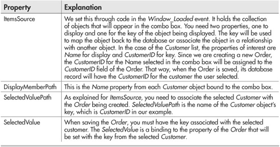
Table 8-2 ComboBox Properties for Data Binding
that was assigned to the Source property of the orderViewSource in Window_Loaded. Coming full circle, the orderViewSource is what the default binding of the containing Grid layout is based on; it was set when dragging and dropping the Order data source onto the Design surface.
Now you have an input form that displays data, allowing the user to enter new order information. After the user fills in the form, you need to save the data, which is discussed next.
Reading and Saving Data
Next, you’ll want to save the order when a user clicks Save. To do this, add a Button control to the form, set its Content property to Save, and set its Name property to SaveButton, which you learned how to do earlier in this chapter. Then double-click Save to create a Click event handler like this:
C#:
private void SaveButton_Click(object sender, RoutedEventArgs e)
{
    CollectionViewSource orderViewSource =
        FindResource("orderViewSource") as CollectionViewSource;

    List<Order> ordList =
        orderViewSource.Source as List<Order>;
    Order ord = ordList.FirstOrDefault();

    var ctx = new MyShopDataContext();

    ctx.Orders.InsertOnSubmit(ord);

    ctx.SubmitChanges();

    MessageBox.Show("Order Saved!");
}
VB:
Private Sub SaveButton_Click(
    ByVal sender As System.Object,
    ByVal e As System.Windows.RoutedEventArgs)
    Handles SaveButton.Click

    Dim OrderViewSource As CollectionViewSource =
        CType(FindResource("OrderViewSource"), CollectionViewSource)
    Dim ordList As List(Of Order)
    ordList = CType(OrderViewSource.Source, List(Of Order))
    Dim ord As Order
    ord = ordList.FirstOrDefault()

    Dim ctx As New MyShopDataContext

    ctx.Orders.InsertOnSubmit(ord)
    ctx.SubmitChanges()

    MessageBox.Show("Order Saved!")
End Sub
Before the SaveButton_Click event handler ends, it shows a message box to the user with a status message, Order Saved. The MessageBox class has several overloads of the Show method that allows you to specify buttons, icons, and more.
So far, you’ve learned how to create an input form for adding a new record to the database. The next section will build upon this by showing you how to view, modify, and delete records with the DataGrid.
Using the DataGrid
The DataGrid is the best option for working with data that must be shown with multiple rows and columns. This section will show you how to show, update, and delete items with a Grid. First, we’ll display orders.
We’ll build off the data source created in the previous example to show data in a Grid. First, you’ll need to open the Data Source window by selecting Data | Open Data Sources. The preceding section specified the CustomerID as a ComboBox. If you’re following along, you’ll want to change CustomerID to a TextBox by clicking on CustomerID for the Order object in the Data Sources window and selecting TextBox. Change the control type of Order from a form to a Grid by selecting the combo box for the Order object in the Data Sources window and selecting the DataGrid option. Open the MainWindow.xaml file in the Designer and drag and drop Order from the Data Sources window to the Designer. Remember there is a New Order button that you’ll want to move to the bottom of the form. Also, add another button, set its Name property to UpdateButton, and set its Content property to Update. Position the New Order and Update buttons at the bottom of the form. Resize and move controls and form so they look like Figure 8-16.
Just as with the form view in the preceding section, VS added a CollectionViewSource to the window when adding the Order to the Designer. The following Window_Loaded event handler provides the Order data to display in the Grid:
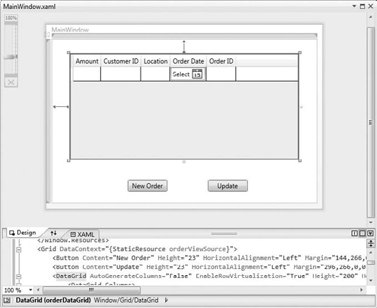
Figure 8-16 Displaying information in a Grid
C#:
private MyShopDataContext m_ctx = new MyShopDataContext();

private void Window_Loaded(object sender, RoutedEventArgs e)
{
    CollectionViewSource orderViewSource =
        FindResource("orderViewSource") as CollectionViewSource;

    orderViewSource.Source =
        from ord in m_ctx.Orders
        select ord;
}
VB:
Dim m_ctx As New MyShopDataContext

Private Sub Window_Loaded(
    ByVal sender As System.Object,
    ByVal e As System.Windows.RoutedEventArgs)
    Handles MyBase.Loaded
    Dim OrderViewSource As CollectionViewSource =
        CType(FindResource("OrderViewSource"), CollectionViewSource)

    OrderViewSource.Source =
        From ord In m_ctx.Orders
        Select ord

End Sub
This code loads orders into the Grid. Notice that the MyShopDataContext, m_ctx, is a field outside of the Window_Loaded method handler. It is raised to field level so that the same instance can be used in multiple methods. As you may notice from Figure 8-16, there is also an Update button on the form. Double-clicking the Update button produced the following Click event handler that saves changes, such as updates and deletes, to the Grid:
C#:
private void UpdateButton_Click(object sender, RoutedEventArgs e)
{
    m_ctx.SubmitChanges();

    MessageBox.Show("Updates and Deletes Saved!");
}
VB:
Private Sub UpdateButton_Click(
    ByVal sender As System.Object,
    ByVal e As System.Windows.RoutedEventArgs)
    Handles UpdateButton.Click

    m_ctx.SubmitChanges()

    MessageBox.Show("Updates and Deletes Saved!")

End Sub
When you run the program, you can add new rows, modify the cells of existing rows, or delete a row by selecting the row and pressing DELETE on the keyboard. After making changes to the Grid, click Update, which will call the previous UpdateButton_Click event handler.
To understand how this works, remember that the Window_Loaded event handler assigned a collection of Order objects to the CollectionViewSource, orderViewSource, which is data bound to the Grid. Each row of the Grid is bound to an instance of an Order object. Each Order object is part of the LINQ to SQL MyShopDataContext. Since we are using m_ctx, which is a field, both the Window_Loaded method and the UpdateButton_ Click method are using the same object instance. When making changes in the Grid, those changes are saved in the Order objects for the changed rows. The Order objects notify MyShopDataContext that they have changed, which is a service of LINQ to SQL. The UpdateButton_Click method uses m_ctx, which is the MyShopDataContext that knows about the changes to the Order objects. Calling SubmitChanges on m_ctx saves all changes to the database.
You might need to read the preceding paragraph more than one time to understand how this is working. If it’s still fuzzy, it might be helpful to review the language chapters earlier in this book to understand how objects are instantiated and used, and review Chapter 7 to ensure you understand the data manipulation picture.
Summary
While there is much more to learn about WPF, this is a beginner’s guide and intended to give you the essentials so that you can begin moving in the right direction. You should now be able to create a new WPF project. You learned about layout controls and how they allow you to manage how controls appear on your form. A section explains the windows involved in working with controls. While there are many controls you can use that ship with both WPF and many third-party products, remember that the concepts are relatively the same for using the controls: drag and drop, and configure properties. Most applications work with data, so this chapter builds upon what you know about LINQ to SQL and shows you how to apply this data management knowledge to create user interfaces that users can work with to manage their data.
This chapter introduces you to working with desktop applications, which are still very necessary and popular. However, a lot of today’s applications are written for the Internet. The next chapter shows you how to build Web applications with ASP.NET.