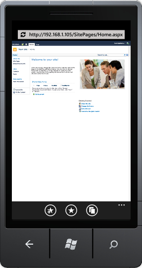
By default, Internet Explorer Mobile will attempt to display the entire width of the web page in the full viewable area of the screen. This results in an unreadable web page, meaning the first thing the viewer must do is a pinch zoom to scale the display enough to read the content.

This is a less than desirable user experience. Over the years, three main META tags have been used to identify a page as being "mobile friendly". All three of these META tags also indicate to search engines that the page has been designed with mobile browsers in mind. This may give your page an advantage in page ranking when someone is searching for your content from a mobile device.
Note
META tags are HTML elements that are inserted into the head of a web page. The three META tags described here all provide information to the browser about how to display the page content.
The first META tag used is the very simple HandheldFriendly. It has a content of either true or false. This tag was originally supported by the AvantGo mobile browser to identify pages that are optimized for viewing on Palm devices. Today, it is used by most mobile browsers to indicate that the content should be displayed without scaling.
<meta name="HandheldFriendly" content="true" />
When Microsoft started building Windows CE, the end user had an option in earlier versions of Internet Explorer Mobile to display a web page as one column, the desktop version, or a default mode.
- Default mode
- Narrows content width to reduce horizontal scrolling.
- Page display is reduced in height and width until content width fits on screen.
- In most cases, this forces the user to zoom in to read the content.
- One column
- Forced all content into a single column with no horizontal scrolling.
- Many sites looked strange with navigation and add content above the main content.
- For some sites, such as blogs, this was a decent solution.
- Desktop
- This mode attempts to display the content with no difference from what it would look like on a desktop version of Internet Explorer.
- A web developer can force this mode by using the
MobileOptimizedMETA tag.
The MobileOptimized META tag has a content that specifies the width for which the page was designed. If this width is smaller than the screen size, the content will be enlarged to fit the actual screen. If the width is larger than the screen size, desktop layout is used.
<meta name="MobileOptimized" content="480" />
Windows Phone 7 devices have a screen resolution of 480x800. If we use this META tag to specify the width of the content to force a desktop layout, it is suggested using one half of the actual website design width.
For example, if we use the fairly standard 960 pixel width, use a MobileOptimized META tag with content of 480 as displayed in the preceding code. This will result in about a 50% zoom on the content, which is still readable in most cases.
The viewport is a rectangular area where the browser lays out the content of the web page. This is a fairly easy concept to grasp on a desktop because the viewport is the same as the area inside the chrome of the browser. On a mobile device however, the viewport can be larger than the visible screen.
For Internet Explorer Mobile, the default viewport has a width of 1024 pixels. That means that IE Mobile will lay the page out the same, as if your screen was 1024 pixels wide by default. You can modify this by specifying a width in the same way that the MobileOptimized META tag specifies the width:
<meta name="viewport" content="width=480" />
The flexibility of this META tag is taken advantage of by most modern Smartphone browsers. Though, there are many properties we can set on this META tag, Internet Explorer Mobile supports the following:
width: Sets the horizontal size of theviewport. This value can be from 320 to 10,000 with 320 as the default setting.height: The vertical analogue of the width property which can be set anywhere from 480 to 10,000.user-scalable: A binary value with valid settings ofyesandno. This value indicates to the browser if the user is able to zoom in and out of the content.
Each of these properties is separated by a comma in the content value of the META tag. A complete example is as follows:
<meta name="viewport" content="width=480, height=800, user-scalable=yes" />
Note
There are other properties that can be set on the viewport META tag. Those are minimum-scale, maximum-scale, and initial-scale.
Also, width and height can use a special value of device-width and device-height, respectively, to set the actual pixel width and height of the device.
However, the Internet Explorer Mobile team discovered that by letting device-width be the actual device width (480px) a lot of websites broke. That is to say, they didn't look very good. The IE Mobile team decided that to preserve compatibility with existing mobile websites the special value of device-width for Internet Explorer Mobile for Windows Phone 7 would return the value of 320px.
Though, it doesn't matter in what order these META tags are placed on the page to Internet Explorer Mobile, viewport takes precedence over MobileOptimized, which in turn takes precedence over HandheldFriendly. For full compatibility with the full range of mobile browsers on the market, one should take care to put these tags in the order of precedence from lowest to highest, HandheldFriendly then MobileOptimized, and finally Viewport.
