
Chapter 5: Designing Your Application
In previous chapters, we learned all the basic WinUI and Windows App SDK building blocks, such as XAML resources, binding, dispatcher, and windows. However, these basic components aren't enough to create a real application. You also need to define the user experience and the navigation pattern you want to adopt, you must properly support themes, you need to define the UI so that it can be responsive and quickly adapt to different sizes and layouts, and much more.
In this chapter, we're going to put all the pieces we have learned together so that we can start building a real project and evolve it over time.
We're going to cover the following topics:
- Creating a responsive layout
- Supporting navigation
- Supporting Windows themes
- Creating animations
- Exploring the WinUI controls
Technical requirements
The code samples for the chapter can be found at the following URL:
Creating a responsive layout
One of the most powerful features of WinUI, compared to other Microsoft UI frameworks, such as WPF and Windows Forms, is the built-in support for responsive layouts. Even if WinUI applications are tailored mainly for desktop devices, there are many scenarios where it's important to let the application scale properly: big screens, monitors with high resolution, applications running in a smaller window, and so on. In these situations, your application must react accordingly, so that the content presented to the user can always be meaningful.
When building the layout of your application, there are some aspects that Windows will take care of for you, and some others that must be manually tweaked by the developer.
Let's start by analyzing the first category.
Using effective pixels
One of the biggest challenges when using technologies such as WPF or Windows Forms is that all the sizes you set are translated into screen pixels. For example, if you add a Rectangle control and you set its Width property to 400, this control will be rendered as it is. The challenge is that 400 can be a very small size on a 4K screen or a big size on a 720p screen. This approach makes it complex to build UIs that can easily scale regardless of the screen size and the resolution of the device.
WinUI makes scaling easier by adopting a technology called effective pixels, which is based on the concept of scaling factor. To understand it better, open your Windows Settings and move to the section called Display. Other than the resolution of your screen, you will find a setting called Scale, as highlighted in the following screenshot:

Figure 5.1 – The Scale option in the Windows 11 settings
Thanks to this setting, all the elements on the screen will be clear and easy to read even if you have a computer with a very high resolution. Without this setting, it would be impossible to effectively use the operating system on 2K or 4K monitors.
Effective pixels are based on this scaling factor. Let's take the following XAML snippet:
<Rectangle Width="400" />
In WinUI, this size will automatically be scaled based on the scaling factor set in Windows, which means that the percentage will be used as a multiplier to calculate the real pixels. For example, in the previous example (where the screen scale is set to 150%), the real pixels that the Rectangle control takes on the screen are 400 * 1.5. On a screen with a scale of 200%, the real pixels will be 400 * 2, and so on.
Effective pixels are powerful because they take into consideration not only the screen size and the resolution but also the viewing distance. For example, a TV screen, despite it usually being considered a big screen with, potentially, a very high resolution, uses a scaling factor that helps to make things bigger and easier to view and read, since it's a screen that is used at a longer viewing distance compared to a PC monitor.
Thanks to effective pixels, you don't have to worry that items on the screen (text, shapes, and controls) might look too small or too big for the user. Windows will always apply the proper scaling factor.
Adapting the UI
When it comes to building the UI of an application, the size of the items on the screen isn't the only thing you have to consider. The position of the elements on the screen can also be impacted by the size of the screen or the window. For example, consider the following screenshot of the Microsoft Store:

Figure 5.2 – A collection of apps and games highlighted in the Microsoft Store
As you can see, there are multiple collections of applications and games that are displayed with a UI that spans horizontally. This layout works well on a big screen or when the window is maximized, but it isn't very effective if the window is small. To mitigate these problems, you can adopt a responsive layout—the position and the layout of the elements placed on the screen can change based on the size of the window.
In Chapter 2, The Windows App SDK for a Windows Forms Developer, you learned about the concept of visual states and how, using VisualStateManager, you can transition the look and feel of a control from one state to another (for example, a Button control can become Pressed or Disabled and each of these states has a different aspect). This also makes this feature a good fit to build responsive UIs: we can define the different layouts as states and use VisualStateManager to transition from one to another when the size of the window changes. Let's take a look at the following code:
<Grid>
<VisualStateManager.VisualStateGroups>
<VisualStateGroup>
<VisualState x:Name="SmallWindow">
<Storyboard>
<ObjectAnimationUsingKeyFrames
Storyboard.TargetName="MyPanel"
Storyboard.TargetProperty=
"Orientation">
<DiscreteObjectKeyFrame KeyTime=
"0:0:0" Value="Vertical" />
</ObjectAnimationUsingKeyFrames>
</Storyboard>
</VisualState>
<VisualState x:Name="LargeWindow">
<Storyboard>
<ObjectAnimationUsingKeyFrames
Storyboard.TargetName="MyPanel"
Storyboard.TargetProperty=
"Orientation">
<DiscreteObjectKeyFrame
KeyTime="0:0:0" Value=
"Horizontal" />
</ObjectAnimationUsingKeyFrames>
</Storyboard>
</VisualState>
</VisualStateGroup>
</VisualStateManager.VisualStateGroups>
<StackPanel x:Name="MyPanel" HorizontalAlignment=
"Center" VerticalAlignment="Center">
<Button Content="Move window" Click=
"OnMoveWindow" />
<Button Content="Go to page 2"
Click="OnGoToSecondPage" />
</StackPanel>
</Grid>
This code defines, using VisualStateManager, two different states: one called SmallWindow, where the StackPanel container included in the page is set with vertical orientation, and one called LargeWindow, where instead, the orientation is set to horizontal.
This approach, however, is a little bit cumbersome for two reasons:
- Even if we're just changing the value of a control's property, we are forced to use a complex syntax that involves defining a Storyboard object despite the fact that we don't need a real animation; we're just changing the value of the property.
- We need to write some code to handle the transition from one state to another. Specifically, we have to subscribe to the SizeChanged event of the Page container and implement a similar event handler:
private void Page_SizeChanged(object sender,
SizeChangedEventArgs e)
{
if (e.NewSize.Width < 720)
{
VisualStateManager.GoToState(this,
"SmallWindow", true);
}
else
{
VisualStateManager.GoToState(this,
"LargeWindow", true);
}
}
WinUI makes VisualStateManager much easier to define, thanks to two new XAML features:
- A shorter syntax to define the value of a property in a specific state
- The AdaptiveTrigger class, which you can use to specify that one state should be automatically applied when the size of the window reaches a specific threshold
This is what the previous snippet looks like thanks to the WinUI implementation:
<Grid>
<VisualStateManager.VisualStateGroups>
<VisualStateGroup>
<VisualState x:Name="SmallWindow">
<VisualState.StateTriggers>
<AdaptiveTrigger MinWindowWidth="0"/>
</VisualState.StateTriggers>
<VisualState.Setters>
<Setter Target="MyPanel.Orientation"
Value="Vertical"/>
</VisualState.Setters>
</VisualState>
<VisualState x:Name="LargeWindow">
<VisualState.StateTriggers>
<AdaptiveTrigger MinWindowWidth="720"/>
</VisualState.StateTriggers>
<VisualState.Setters>
<Setter Target="MyPanel.Orientation"
Value="Horizontal"/>
</VisualState.Setters>
</VisualState>
</VisualStateGroup>
</VisualStateManager.VisualStateGroups>
<StackPanel x:Name="MyPanel" HorizontalAlignment=
"Center" VerticalAlignment="Center">
<Button Content="Move window" Click=
"OnMoveWindow" />
<Button Content="Go to page 2" Click=
"OnGoToSecondPage" />
</StackPanel>
</Grid>
The code is now simpler to write and read:
- To change the value of a property, we can just define a Setter object with, for Target, the name of the control followed by the name of the property (separated by a dot) and, for Value, the new value that it must assume.
- Inside the StateTriggers collection of VisualState, we use an AdaptiveTrigger object specifying what the window size is that will trigger that state. In the previous example, the SmallWindow state will be applied when the width of the window is between 0 and 720; the LargeWindow state, instead, will be applied when it's bigger than 720.
What makes adaptive triggers powerful is that, as we learned in the previous section, the MinWindowWidth and MinWindowHeight properties are expressed in effective pixels and not in real pixels. As such, they will always be proportional to the size and resolution of the screen.
Thanks to the new syntax to define a visual state, we can make the previous code even simpler:
<Grid>
<VisualStateManager.VisualStateGroups>
<VisualStateGroup>
<VisualState x:Name="SmallWindow">
<VisualState.StateTriggers>
<AdaptiveTrigger MinWindowWidth="0"/>
</VisualState.StateTriggers>
<VisualState.Setters>
<Setter Target="MyPanel.Orientation"
Value="Vertical"/>
</VisualState.Setters>
</VisualState>
<VisualState x:Name="LargeWindow">
<VisualState.StateTriggers>
<AdaptiveTrigger MinWindowWidth="720"/>
</VisualState.StateTriggers>
</VisualState>
</VisualStateGroup>
</VisualStateManager.VisualStateGroups>
<StackPanel x:Name="MyPanel" HorizontalAlignment=
"Center" VerticalAlignment="Center">
<Button Content="Move window" Click=
"OnMoveWindow" />
<Button Content="Go to page 2" Click=
"OnGoToSecondPage" />
</StackPanel>
</Grid>
Since if the size of the window is bigger than 720 we want to keep the default layout we have defined inside the StackPanel container, we can just add the AdaptiveTrigger control inside the StateTriggers collection of the LargeWindow state, but without specifying any Setter. This means that when the size of the window is bigger than 720, WinUI will revert the page to the default layout.
Note
At the time of writing, adaptive triggers are supported only inside a Page container. If you apply them directly to the Window object, they won't work.
Adaptive triggers are a great feature to build responsive layouts, but they aren't enough on their own. You need to make sure that you're building the layout of your page in the right way. Let's see the controls that you can use to achieve this goal.
Using the right controls to build a responsive layout
WinUI includes a wide range of controls that aren't visible on the screen, but they can be used to define the layout of the application. Grid, StackPanel, and Canvas are some good examples. Let's see the ones that enable you to create powerful responsive layouts.
Using the Grid control
The Grid control is, without any doubt, one of the most flexible layout controls available in WinUI. You can use it to create table layouts, in which you can place controls across multiple rows and columns. Let's take a look at the following code snippet:
<Grid>
<Grid.RowDefinitions>
<RowDefinition Height="100" />
<RowDefinition Height="200" />
</Grid.RowDefinitions>
<Grid.ColumnDefinitions>
<ColumnDefinition Width="300" />
<ColumnDefinition Width="500" />
</Grid.ColumnDefinitions>
<TextBlock Grid.Row="0" Grid.Column="0" Text="Hello
world!" />
<TextBlock Grid.Row="1" Grid.Column="1" Text="Hello
world again!" />
</Grid>
This XAML code creates a table with two rows and two columns, each of them with a fixed size. Controls inside the Grid container are placed in a specific cell by using the attached Grid.Row and Grid.Column properties, where 0 is the first cell. In the previous example, the first TextBlock is placed in the first cell and the second TextBlock in the last one.
Even if the previous example isn't fully responsive (since we have assigned a fixed size to the cells), it can still adapt well to the size of the screen since the values are expressed in effective pixels. But we can do more!
Let's see the following example:
<Grid>
<Grid.RowDefinitions>
<RowDefinition Height="Auto" />
<RowDefinition Height="200" />
</Grid.RowDefinitions>
<Grid.ColumnDefinitions>
<ColumnDefinition Width="Auto" />
<ColumnDefinition Width="500" />
</Grid.ColumnDefinitions>
<TextBlock Grid.Row="0" Grid.Column="0" Text="Hello
world!" />
<TextBlock Grid.Row="1" Grid.Column="1" Text="Hello
world again!" />
</Grid>
We have set one of the rows and one of the columns with Auto as the size. Thanks to this configuration, now the size of the cell will automatically adjust to the size of the controls that are placed within. This helps even more to build a responsive UI, since the layout can automatically adapt to the state of the controls on a page.
Last but not least, we have an even more powerful option to create responsive layouts with a Grid control: star sizing. Let's analyze the following example so that we can better understand what it means:
<Grid>
<Grid.RowDefinitions>
<RowDefinition Height="1*" />
<RowDefinition Height="2*" />
</Grid.RowDefinitions>
<Grid.ColumnDefinitions>
<ColumnDefinition Width="1*" />
<ColumnDefinition Width="1*" />
</Grid.ColumnDefinitions>
<TextBlock Grid.Row="0" Grid.Column="0" Text="Hello
world!" />
<TextBlock Grid.Row="1" Grid.Column="1" Text="Hello
world again!" />
</Grid>
Now we have changed the size of rows and columns using a number followed by a star. This means that we are creating a proportional layout. Look at the row definitions: the current configuration means that we are ideally splitting the page into three parts; the first row will always take 1/3 of the space, while the second one will take 2/3. The columns, instead, will be evenly distributed; each of them will take 50% of the page.
As you can imagine, this approach is a perfect fit for creating responsive layouts: regardless of the size of the screen or the window, the cells in the table will always keep the same proportion.
Like with a regular table, the Grid control can be used to create a more complex layout by enabling cells to span across multiple columns and rows, by using the RowSpan and ColumnSpan properties, as in the following example:
<Grid>
<Grid.RowDefinitions>
<RowDefinition Height="1*" />
<RowDefinition Height="2*" />
</Grid.RowDefinitions>
<Grid.ColumnDefinitions>
<ColumnDefinition Width="1*" />
<ColumnDefinition Width="1*" />
</Grid.ColumnDefinitions>
<TextBlock Grid.Row="0" Grid.Column="0"
Grid.ColumnSpan="2" Text="Hello world!" />
<TextBlock Grid.Row="1" Grid.Column="1" Text="Hello
world again!" />
</Grid>
In this case, the first TextBlock will span across the entire size of the first row, since the two columns will be merged into one.
Let's move on now to see another interesting control to create responsive layouts.
Using the VariableSizeWrapGrid control
VariableSizeWrapGrid is similar to the Grid control, except that children controls are automatically placed into multiple rows and columns based on the available space.
Let's take a look at the following code:
<VariableSizedWrapGrid Orientation="Horizontal"
MaximumRowsOrColumns="3" ItemHeight="200"
ItemWidth="200">
<Rectangle Fill="Red" />
<Rectangle Fill="Blue" />
<Rectangle Fill="Green" />
<Rectangle Fill="Yellow" />
</VariableSizedWrapGrid>
In this specific scenario, we are setting up VariableSizedWrapGrid so that it does the following:
- The wrapping will happen at the column level since we are setting the Orientation property to Horizontal.
- The maximum number of columns that each row will have is 3. If the Orientation property had been set to Vertical, this property would have represented the maximum number of rows.
- ItemWidth and ItemHeight are used to define the size of each cell.
The following screenshot shows the output of the previous code, using two different sizes of the window:
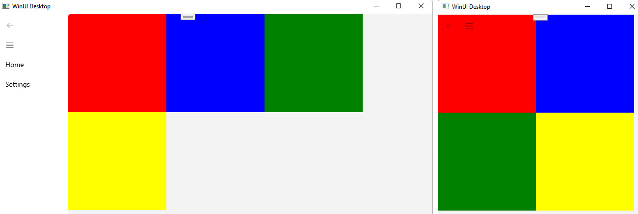
Figure 5.3 – The VariableSizeWrapGrid control in action
In the one on the left, we have enough space to display the full content, so the VariableSizeWrapGrid control will create the maximum number of columns allowed (in our case, three, since it's the value we have set for the MaximumRowsOrColumns property). On the right, instead, the size of the window is too small to host three columns, so the control will automatically wrap the other items in a new row.
The VariableSizeWrapGrid control is a great fit for building responsive desktop applications, since you can create layouts that quickly react to changes in the window's size.
Let's move on now to one more control, which might be new if you're coming from other XAML-based technologies, such as WPF.
Using the RelativePanel control
RelativePanel is a new control that has been added to WinUI to better support the creation of responsive layouts. Instead of placing child controls in a specific position, they are arranged based on the relationship with the panel itself or with other controls. Let's take a look at the following example:
<RelativePanel>
<StackPanel x:Name="InfoCard1" Style="{StaticResource
InfoCardStyle}">
<TextBlock Text="Customers" FontSize="28" />
<controls:DataGrid x:Name="dgCustomers" />
</StackPanel>
<StackPanel x:Name="InfoCard2" Style="{StaticResource
InfoCardStyle}" RelativePanel.RightOf="InfoCard1">
<TextBlock Text="Orders" FontSize="28" />
<controls:DataGrid x:Name="dgOrders" />
</StackPanel>
</RelativePanel>
This RelativePanel has two children controls: two StackPanel layouts, with a DataGrid control inside. Thanks to the attached properties exposed by the RelativePanel control, we can specify that the two children have a relationship: the second information card must be placed at the right of the first one. The code generates the following result:

Figure 5.4 – Two controls aligned using a RelativePanel relationship
This kind of relationship works great in combination with the AdaptiveTrigger feature we have previously explored. Thanks to a trigger, in fact, it's very easy to change the relationship between two or more controls when the size of the window changes. For example, our page might use the following implementation of VisualStateManager:
<VisualStateManager.VisualStateGroups>
<VisualStateGroup>
<VisualState x:Name="SmallWindow">
<VisualState.StateTriggers>
<AdaptiveTrigger MinWindowWidth="0"/>
</VisualState.StateTriggers>
<VisualState.Setters>
<Setter Target="InfoCard2.(RelativePanel
.Below)" Value="InfoCard1"/>
<Setter Target="InfoCard2.(RelativePanel
.AlignLeftWith)" Value="InfoCard1" />
</VisualState.Setters>
</VisualState>
<VisualState x:Name="LargeWindow">
<VisualState.StateTriggers>
<AdaptiveTrigger MinWindowWidth="720"/>
</VisualState.StateTriggers>
</VisualState>
</VisualStateGroup>
</VisualStateManager.VisualStateGroups>
When the window is smaller than 720 effective pixels, we change the relationship between the two StackPanel controls: InfoCard2, instead of being placed to the right of InfoCard1, is moved below and aligned to the left, which leads to the following result:

Figure 5.5 – When the size of the window changes, the two controls are rearranged by changing their relationship
This change makes the layout a good fit for scenarios when the application is used in a small window, since it keeps all the relevant content (the two info cards) visible.
RelativePanel supports the following properties to set up a relationship between controls:
- Above
- Below
- LeftOf
- RightOf
RelativePanel can also be used to create relationships between the controls and the panel itself, which is another great way to support adaptive layouts. Consider the following example:
<RelativePanel>
<StackPanel x:Name="InfoCard1" Style="{StaticResource
InfoCardStyle}" Width="300" Height="300"
RelativePanel.AlignHorizontalCenterWithPanel="True">
<TextBlock Text="Customers" FontSize="28" />
<controls:DataGrid x:Name="dgCustomers" />
</StackPanel>
</RelativePanel>
By setting the attached RelativePanel.AlignHorizontalCenterWithPanel property to true, the control will always be placed in the middle of the panel, regardless of the size of the window. Of course, you can also in this case use AdaptiveTrigger to change this behavior.
RelativePanel supports the following properties to manage the relationship of child controls with the panel:
- AlignBottomWithPanel
- AlignHorizontalCenterWithPanel
- AlignLeftWithPanel
- AlignRightWithPanel
- AlignVerticalCenterWithPanel
Let's end this section by taking a quick look at other types of layout controls.
Other layout controls available in WinUI
WinUI supports other controls to define the layout of a page. However, they aren't specific to building a responsive layout and, as such, we'll just briefly mention them:
- StackPanel: We have already seen this control in action in multiple examples. The goal of this control is to place the child controls one after the other. By default, they are aligned vertically, but you can also use it to align them horizontally by setting the Orientation property to Horizontal. This is shown in the following code:
<!-- the controls are placed one below the other -->
<StackPanel>
<TextBlock Text="This is a text" />
<TextBlock Text="This is another text" />
</StackPanel>
<!-- the controls are placed one right to
the other -->
<StackPanel Orientation="Horizontal">
<TextBlock Text="This is a text" />
<TextBlock Text="This is another text" />
</StackPanel>
- Canvas: This control can be used to position content in an absolute way. Every child control can be placed inside the Canvas container by specifying the distance from the top-left corner. This control should only be used in specific scenarios, since it isn't a good fit to create adaptive layouts. The following code shows how you can use the attached Canvas.Left and Canvas.Top properties to specify the position of a control inside the Canvas container:
<Canvas>
<TextBlock Text="This is a text" Canvas.Left="20"
Canvas.Top="50" />
</Canvas>
Now that we know which is the right way to build a responsive user experience, it's time to understand how we can better support it by providing the proper navigation experience.
Supporting navigation
When you start to build a real application, navigation is one of the first key topics you must address. Other than a very few specific scenarios, in most cases, the application you're going to build will have multiple screens. In WinUI, there are different containers for your layouts:
- Window: This is the main host of your application. Theoretically, a Window control can directly contain content, but it has a few limitations. It doesn't expose a DataContext, it doesn't expose life cycle events (such as Loaded), and it doesn't support navigation. As such, in real-world applications, the Window object acts just as the main container of your application.
- Page: The Page object is the most used container for the content of your application, since it supports features such as DataContext and life cycle events. A real-world application typically has multiple pages, and the user can navigate from one to another by using the navigation menu or performing specific actions (such as selecting an item from a list).
- Frame: The Frame object acts as a host for pages and enables navigation between one page to another.
Applications usually adopt the Window | Frame | Page hierarchy, implemented in the following way:
- Window hosts the navigation menu and a Frame object.
- When the application starts, Frame loads the main page of the application.
- When the user needs to move to a different page, Frame will take care of performing the navigation.
When you create a new WinUI application, you will already have a default Window, called MainWindow. Starting from there, you can create one or more pages by right-clicking on the project, choosing Add | New item, and selecting the Blank Page (WinUI 3) template. This is what the basic implementation of a page looks like:
<Page
x:Class="MyApplication.MyPage"
xmlns="http://schemas.microsoft.com/winfx/2006/xaml
/presentation"
xmlns:x="http://schemas.microsoft.com/winfx/2006/xaml"
xmlns:d="http://schemas.microsoft.com/expression/blend
/2008"
xmlns:mc="http://schemas.openxmlformats.org/markup-
compatibility/2006"
Background="{ThemeResource Application
PageBackgroundThemeBrush}">
<Grid>
<!-- the content of the page -->
</Grid>
</Page>
Let's learn now how we can implement a navigation menu in our application.
Implementing the NavigationMenu control
WinUI offers a powerful control to implement your navigation experience called NavigationMenu. The default navigation experience is enabled using the approach known as a hamburger menu (named for the resemblance of the button used to open the menu with a hamburger)—a collapsible menu that expands from one side of the screen to display the various sections where the user can navigate to. This control is typically included in the main window of your application, along with the frame that will host the pages. Let's see a basic implementation in XAML:
<Window>
<NavigationView>
<NavigationView.MenuItems>
<NavigationViewItem Content="Home" Icon="Home"
Tag="Home" />
<NavigationViewItem Content="Favorites"
Icon="Favorite" Tag="Favorite"/>
<NavigationViewItem Content="Messages"
Icon="Message" Tag="Messages" />
</NavigationView.MenuItems>
<Frame x:Name="ShellFrame" />
</NavigationView>
</Window>
The NavigationView control exposes a collection called MenuItems, which can host one or more NavigationViewItem controls. Each of them represents a section of your application the user can navigate to, which is identified by a Content property (the label) and an Icon property (which can be set using one of the built-in WinUI icons through the Microsoft.UI.Xaml.Controls.IconElement class).
One of the features that makes NavigationView so powerful is that it provides built-in support for responsive layouts. The control, in fact, will automatically be rendered in a different way based on the size of the screen, as you can see in the following screenshot:

Figure 5.6 – The NavigationView control in three different sizes
When the window is wide enough, the menu will always be visible and fully expanded; when the window is smaller, the menu will continue to appear, but only the icons will be visible; when the window is small, instead, the menu will completely disappear, and the user must tap on the button at the top to see it.
Now that we have learned the basics of the control, let's see how we can handle the navigation.
Handling the navigation
The NavigationMenu control exposes an event called ItemInvoked, which is triggered whenever the user selects one of the items in the menu. Inside this event handler, through the event arguments, you can get a reference to the selected NavigationViewItem object thanks to the InvokedItemContainer property, which you can use to understand where to redirect the user. A commonly used approach is to use the Tag property exposed by every XAML control to store a string that can help you to understand which is the selected item, as in the following sample:
<NavigationView ItemInvoked="NavigationView_ItemInvoked">
<NavigationView.MenuItems>
<NavigationViewItem Content="Home" Icon="Home"
Tag="Home" />
<NavigationViewItem Content="Favorites"
Icon="Favorite" Tag="Favorite"/>
<NavigationViewItem Content="Messages"
Icon="Message" Tag="Messages" />
</NavigationView.MenuItems>
<Frame x:Name="ShellFrame" />
</NavigationView>
Thanks to the Tag property, you can implement the ItemInvoked event in the following way:
private void NavigationView_ItemInvoked(NavigationView
sender, NavigationViewItemInvokedEventArgs args)
{
switch (args.InvokedItemContainer.Tag)
{
case "Home":
//navigate to home
break;
case "Favorite":
//navigate to favorites
break;
}
}
Now we have the basic infrastructure to manage the navigation. But how can we effectively trigger it? If you take a look at the previous XAML definition of the NavigationView control, you'll see that we have placed inside it a Frame control. As we learned at the beginning of the section, the Frame class is the basic building block to implement navigation, since it acts as a host for pages by providing the infrastructure required to navigate the user from one page to the other.
Let's assume that in our application we have added two new pages, HomePage and FavoritePage. This is how we can expand the previous code example to perform the navigation:
private void NavigationView_ItemInvoked(NavigationView
sender, NavigationViewItemInvokedEventArgs args)
{
switch (args.InvokedItemContainer.Tag)
{
case "Home":
ShellFrame.Navigate(typeof(HomePage));
break;
case "Favorite":
ShellFrame.Navigate(typeof(FavoritePage));
break;
}
}
The Frame class exposes a method called Navigate(), which accepts, as a parameter, the class type of the page we want to redirect the user to. Since we have assumed that the two pages are represented by the HomePage and FavoritePage classes, we use them in combination with the typeof() function to retrieve their type.
Implementing the navigation in our MainWindow class is easy since it's the one that is hosting both the NavigationView and Frame controls. As such, we can directly reference the Frame object to trigger the navigation when one of the menu items is selected. What if, instead, we need to trigger the navigation from a page? For example, one of your pages displays a list of items and when you select one of them, you want to redirect the user to another page with some details about the selected item. In this case, you can't directly use the Frame class, because it's defined in a different class (MainWindow).
If you have experience with the Universal Windows Platform (UWP), this is one of the areas where the Windows App SDK implementation requires a bit more work. In UWP applications, in fact, since there's a unique window shared across the whole application, the Page class offers a Frame property, which gives you easy access to the application's frame. As such, in the code-behind of every Page class, you can simply call Frame.Navigate() to redirect the user to a different page.
In WinUI desktop applications, instead, the Page class still has a Frame property, but it's not set (you will get a null reference if you try to use it). As such, we need to store somewhere a reference to the Frame object included in the MainWindow class, so that we can reuse it from every page of our application. The best place to do this is the App class, since it's a global singleton that can be accessed from every class of the application. Let's see the changes to make. As the first step, we must define in the App class a static property to host our Frame object. In the following example, we have called it ShellFrame:
public partial class App : Application
{
public Window m_window { get; set; }
public static Frame ShellFrame { get; set; }
public App()
{
this.InitializeComponent();
}
protected override void OnLaunched
(Microsoft.UI.Xaml.LaunchActivatedEventArgs args)
{
m_window = new MainWindow();
m_window.Activate();
}
}
Now we can move to the MainWindow class and, in the constructor, store inside the ShellFrame property that we have just created a reference to the Frame control included in MainWindow:
public sealed partial class MainWindow : Window
{
public MainWindow()
{
this.InitializeComponent();
App.ShellFrame = ShellFrame;
ShellFrame.Content = new HomePage();
}
}
We use the static property we have just defined in the App class to store a reference to our ShellFrame control. At the end, we trigger the navigation to the main page of our application (in the example, it's called HomePage).
Now that we have a reference to the frame stored in the App class, we can recall it on every page of our application to trigger a navigation. For example, let's say that our HomePage has a ListView control and when the user selects one item from the list, we trigger the navigation to another page. This is what the SelectionChanged event handler of the ListView control would look like:
private void lstPeople_ItemClick(object sender,
SelectionChangedEventArgs e)
{
App.ShellFrame.Navigate(typeof(DetailPage));
}
We use the same code as before to retrieve a reference to the App class and then, through the ShellFrame property, we invoke the Navigate() method.
Now that we have discovered how to enable the navigation from one page to another, a new question might arise: how can we manage the life cycle of a page through navigation? Let's learn more in the next section.
Supporting the page's life cycle
The Page class offers three methods that you can override to manage the life cycle of a page:
- OnNavigatedTo(), which is triggered when the user has just landed on the current page after a navigation. This is a great place to load the content you need to display on the page since, unlike the page's constructor, it supports performing asynchronous tasks.
- OnNavigatedFrom(), which is triggered when the user is navigating away from the current page to another page, immediately after the page has been unloaded. This is a great place to clean up content that you don't need to keep in memory anymore.
- OnNavigatingFrom(), which is also triggered when the user is navigating away from the current page to another page, but immediately before the page has been loaded.
The OnNavigatedTo() method is also important for another scenario. Let's consider again the example we saw in the previous section, in which the user selects an item from a list and is redirected to a detail page. That sample was missing an important implementation detail: we were redirecting the user to a detail page, but without any reference to which was the selected item. To support this scenario, the Navigate() method of the Frame class supports a second parameter to store the information we want to carry over to the destination page. Let's adjust the previous sample to cover this scenario:
private void lstPeople_ItemClick(object sender,
SelectionChangedEventArgs e)
{
Person selectedPerson = e.ClickedItem as Person;
App.ShellFrame.Navigate(typeof(DetailPage), selectedPerson);
(typeof(DetailPage), e.AddedItems[0]);
}
Other than the page where we want to redirect the user (DetailPage), we are adding as information the selected item from the ListView control, which is stored inside the AddedItems collection of the event arguments.
This information can be retrieved in the destination page thanks to the OnNavigatedTo() method, which includes a property called Parameter in the event arguments:
public sealed partial class MyPage : Page
{
protected override void OnNavigatedTo
(NavigationEventArgs e)
{
Person selectedPerson = e.Parameter as Person;
//do something with the selectedPerson object
}
}
Now we know exactly which item was selected by the user in the previous page and we can populate the content of the page in the proper way. The Navigate() method also supports another feature: page transitions. Let's learn more in the next section.
Supporting page transitions
The Navigate() method also supports a third parameter, which you can use to enable page transitions. These are special animations that you can use to create a smooth transition when the user moves from one page to another. WinUI supports the following transitions:
- Page refresh: This is a combination of a slide-up animation of the current content, followed by a fade-in animation for the incoming content. It's represented by the EntranceNavigationTransitionInfo class. However, this transition is applied by default, so you don't have to specify it if it's the one you want to implement.
- Drill: This is used mainly in master-detail scenarios. The user clicks on an item in a gallery and the animation helps to create a connection with the same item on the detail page. It's represented by the DrillInNavigationTransitionInfo class.
- None: In some scenarios, you might not want an animation at all. Since, by default, the page refresh animation is applied during navigation, you must explicitly disable it by using the SuppressNavigationTransitionInfo class.
To apply one of these transitions, you just need to pass a new instance of one of the preceding classes as the third parameter of the Navigate() method. For example, if you want to use a drill transition, you must use the following code:
private void OnGoToSecondPage(object sender,
RoutedEventArgs e)
{
App.ShellFrame.Navigate
(typeof(MySecondPage), null, new
DrillInNavigationTransitionInfo());
}
In the previous example, we didn't have the need to pass any parameter to the second page, so you can just use a null object as a second parameter.
Now we have almost completed the implementation of a full navigation system; however, we're still missing one important feature: backward navigation. So, let's check that out.
Managing backward navigation
Whenever you navigate from one page to another, Windows keeps track of the movement using a stack. This approach enables developers to easily redirect users to the page of your application they had previously visited.
Backward navigation can be easily implemented using the GoBack() method exposed by the Frame class, as in the following sample:
private void NavigationView_BackRequested(NavigationView
sender, NavigationViewBackRequestedEventArgs args)
{
if (ShellFrame.CanGoBack)
{
ShellFrame.GoBack();
}
}
The method can be paired, as in the previous sample, with the CanGoBack property, which tells you whether there is any page in the stack. This way, we are sure that we trigger backward navigation only if there's an actual page to redirect the user to.
The NavigationView control offers built-in support for backward navigation, by providing a back button integrated inside the UI. As a developer, you can intercept the selection of this button by subscribing to the BackRequested event handler and using the GoBack() method to redirect the user to the previous page. The NavigationView control also offers a property called IsBackEnabled, which you can use to enable or disable the built-in back button. By connecting it to the CanGoBack property of the Frame class, you can easily automatically disable the button if there are no pages in the stack, which helps to improve the experience since the user can immediately realize when they're not allowed to navigate back. You can achieve this goal easily thanks to binding, as in the following example:
<NavigationView
BackRequested="NavigationView_BackRequested"
ItemInvoked="NavigationShell_ItemInvoked"
IsBackEnabled="{x:Bind
ShellFrame.CanGoBack, Mode=OneWay}">
<NavigationView.MenuItems>
<NavigationViewItem Content="Home" Icon="Home"
Tag="Home" />
<NavigationViewItem Content="Favorites"
Icon="Favorite" Tag="Favorite"/>
<NavigationViewItem Content="Messages"
Icon="Message" Tag="Messages" />
</NavigationView.MenuItems>
<Frame x:Name="ShellFrame" />
</NavigationView>
Now that we have completed the implementation of the navigation experience, we can see a few more features that the NavigationView control enables to further customize it.
Adding sections to the footer
The NavigationView control supports adding menu items to the footer rather than at the top. It's a great fit for sections that shouldn't be the primary focus of the user, but they're important enough to be quickly accessible. These sections are defined in the same way as the primary ones, with the only difference being that they're added to a collection called FooterMenuItems, as in the following example:
<NavigationView>
<NavigationView.MenuItems>
<NavigationViewItem Content="Home" Icon="Home"
Tag="Home" />
<NavigationViewItem Content="Favorites"
Icon="Favorite" Tag="Favorite"/>
<NavigationViewItem Content="Messages"
Icon="Message" Tag="Messages" />
</NavigationView.MenuItems>
<NavigationView.FooterMenuItems>
<NavigationViewItem Content="Support" Icon="Help"
Tag="Support" />
<NavigationViewItem Content="Account"
Icon="Account" Tag="Account" />
</NavigationView.FooterMenuItems>
<Frame x:Name="ShellFrame" />
</NavigationView>
These sections are managed like the primary ones, so you will keep receiving the information about the selected item through the ItemInvoked event.
The menu items support having nested menu items as well, in case some sections of the application have a more complex navigation architecture. To support this feature, the NavigationViewItem control can host a MenuItems collection on its own, where you can store other NavigationViewItem controls, as in the following sample:
<NavigationView>
<NavigationView.MenuItems>
<NavigationViewItem Content="Home" Icon="Home"
Tag="Home" />
<NavigationViewItem Content="Favorites"
Icon="Favorite" Tag="Favorite"/>
<NavigationViewItem Content="Messages"
Icon="Message" Tag="Messages">
<NavigationViewItem.MenuItems>
<NavigationViewItem Content="Inbox"
Icon="Mail" Tag="Inbox" />
<NavigationViewItem Content="Sent"
Icon="MailReply" Tag="Sent" />
</NavigationViewItem.MenuItems>
</NavigationViewItem>
</NavigationView.MenuItems>
<Frame x:Name="ShellFrame" />
</NavigationView>
Also, in this case, the way you manage the selection of one of these sections doesn't change. You use the ItemInvoked event and, through the ItemInvokedContainer property of the event arguments, use the Tag property to understand where to redirect the user.
Lastly, NavigationMenu offers built-in support for a section that is very common among applications: settings. To enable it, you just need to set the IsSettingsVisible property to true, which will automatically enable a settings menu item in the footer:
<NavigationView IsSettingsVisible="True">
<!—navigationview implementation à
</NavigationView>
To understand whether the user has clicked on the Settings menu item, you can keep using the ItemInvoked event. However, this time, you must use the IsSettingsInvoked property exposed by the event argument to determine whether that's the case, as in the following example:
private void NavigationShell_ItemInvoked(NavigationView
sender, NavigationViewItemInvokedEventArgs args)
{
if (args.IsSettingsInvoked)
{
ShellFrame.Navigate(typeof(SettingsPage));
}
}
The following screenshot shows all the advanced features we have discussed so far (footer menu items, nested menu items, and settings) enabled in the NavigationView control:

Figure 5.7 – A NavigationView control with footer menu items, nested menu items, and settings enabled
As a developer, however, you might prefer other ways to organize the menu of your application. Let's see them.
Displaying a menu at the top
In some cases, you might prefer to have a more traditional menu at the top of the screen, rather than using the hamburger menu approach we have adopted so far. The NavigationView control supports this approach thanks to the PaneDisplayMode property, which you can use to customize the way the panel is displayed. By setting it to Top, you can change its look and feel, as in the following screenshot:

Figure 5.8 – A NavigationView control with PaneDisplayMode set to Top
The PaneDisplayMode property can also assume other values, such as Left, LeftCompact, or Minimal. These values can be used to force one of the display modes that, by default, is used to support adaptive layouts. For example, if you set it to Minimal, the menu will always be hidden, regardless of the window's size.
If you want to create a more traditional desktop experience, there's also another approach: using the MenuBar control, which enables the creation of top-level menus, with multiple submenus and options. Let's take a look at the following code:
<Window>
<Grid>
<Grid.RowDefinitions>
<RowDefinition Height="50" />
<RowDefinition Height="*" />
</Grid.RowDefinitions>
<MenuBar Grid.Row="0">
<MenuBar.Items>
<MenuBarItem Title="File">
<MenuBarItem.Items>
<MenuFlyoutSubItem Text="New">
<MenuFlyoutItem Text="New
document" />
<MenuFlyoutItem Text="New
project" />
</MenuFlyoutSubItem>
<MenuFlyoutItem Text="Save" />
<MenuFlyoutItem Text="Close" />
<MenuFlyoutSeparator />
<ToggleMenuFlyoutItem Text="Auto
save" />
</MenuBarItem.Items>
</MenuBarItem>
</MenuBar.Items>
</MenuBar>
<Frame x:Name="ShellFrame" Grid.Row="1" />
</Grid>
</Window>
The MenuBar control has an Items collection, which can host one or more MenuBarItem controls. Each of them represents a top-level menu. Each MenuBarItem control has an Items collection as well, which can host several types of controls, such as the following:
- MenuFlyoutItem, which represents a single entry in the menu
- MenuFlyoutSubItem, which can host multiple MenuFlyoutItem controls that will be displayed as a nested menu
- ToggleMenuFlyoutItem, which represents an option that you can enable or disable
- RadioMenuFlyoutItem, which represents a radio button that is included inside the menu
- MenuFlyoutSeparator, which you can use to separate different sections inside the same menu
The following screenshot shows how the previous XAML code is rendered in an application:

Figure 5.9 – A MenuBar control with various menus and options
To handle the selection, each MenuFlyoutItem control exposes a Click event that you can manage in code-behind. If you don't want to implement a different event handler for each menu item, you can use a generic event handler and, through the Tag property (like we did with the NavigationView control), identify which item was selected and act accordingly. For example, let's say that you configure the Tag properties of your MenuFlyoutItem controls in the following way:
<MenuBarItem Title="File">
<MenuBarItem.Items>
<MenuFlyoutItem Text="Save" Tag="Save"
Click="OnMenuItemSelected" />
<MenuFlyoutItem Text="Close" Tag="Close"
Click="OnMenuItemSelected"/>
</MenuBarItem.Items>
</MenuBarItem>
You can use this property in the OnMenuItemSelected event handler to detect which item was selected, as in the following code:
private void OnMenuItemSelected(object sender,
RoutedEventArgs e)
{
if (sender is MenuFlyoutItem menuItem)
{
switch (menuItem.Tag)
{
case "Save":
//code to save the file
break;
case "Close":
//code to close the file
break;
}
}
}
With this, we have completed our journey into the WinUI navigation system. Now we can move on to another important topic to build beautiful applications: themes.
Supporting Windows themes
In the modern tech ecosystem, one of the most common features included in every app or device is support for light and dark themes. This feature has become increasingly important not only to accommodate personal preferences but also to better support accessibility scenarios. Additionally, when you're using applications on battery-powered devices (such as a tablet or a phone), dark themes have a less significant impact on battery life, since they reduce the number of pixels that the screen must render.
Windows provides built-in support for themes and the user can set their preferences through the Settings app. Additionally, Windows provides a high-contrast theme, which is dedicated to people who have visual impairments.
By default, WinUI applications automatically follow the Windows theme, thanks to the built-in support provided by all the WinUI controls. If you add any standard control to a page, you will notice how its look and feel will automatically change when you switch from one theme to another, as you can observe in the following screenshot:

Figure 5.10 – The built-in WinUI controls automatically adapt to the Windows theme selected by the user
However, it's very common when you're building an application to not just rely on the default Windows look and feel, but to add your own branding and use different colors and styles. In these scenarios, there might be situations where a page looks perfectly fine with the light theme, but the content becomes unreadable when you switch to the dark theme (or the other way around). To manage these cases, WinUI supports the possibility to load a specific set of resources based on the current theme, thanks to the ThemedDictionaries collection exposed by the Resource dictionary class. Let's take a look at the following code, declared in the App.xaml file:
<Application>
<Application.Resources>
<ResourceDictionary>
<ResourceDictionary.ThemeDictionaries>
<ResourceDictionary x:Key="Light">
<Style x:Key="CustomButton"
TargetType="Button">
<Setter Property="Foreground"
Value="Black" />
<Setter Property="Background"
Value="Yellow"/>
</Style>
</ResourceDictionary>
<ResourceDictionary x:Key="Dark">
<Style x:Key="CustomButton"
TargetType="Button">
<Setter Property="Foreground"
Value="White" />
<Setter Property="Background"
Value="Green"/>
</Style>
</ResourceDictionary>
</ResourceDictionary.ThemeDictionaries>
</ResourceDictionary>
</Application.Resources>
</Application>
Inside the ThemeDictionaries collection, we have created two different dictionaries, identified by two different keys: Light and Dark. Inside them, we are defining a style that targets the Button control with the same name, CustomButton. However, the style configuration is different: in the case of the light theme, the button will have a yellow background with black text; in the case of the dark theme, the background will be green and the text white.
Now, we just need to apply our style to any Button control in the standard way:
<Button Content="Press the button" Style="{StaticResource
CustomButton}" />
WinUI will apply the proper CustomButton style based on the current theme, as you can see in the following screenshot:

Figure 5.11 – WinUI will pick the correct style based on the Windows theme
As we saw in Chapter 2, The Windows App SDK for a Windows Forms Developer, resources can be better organized thanks to Resource Dictionary files. You can use them in combination with themes simply by setting the Source property with the file path, as in the following sample:
<Application>
<Application.Resources>
<ResourceDictionary>
<ResourceDictionary.ThemeDictionaries>
<ResourceDictionary x:Key="Light"
Source="Resources/LightTheme.xaml" />
<ResourceDictionary x:Key="Dark"
Source="Resources/DarkTheme.xaml" />
</ResourceDictionary.ThemeDictionaries>
</ResourceDictionary>
</Application.Resources>
</Application>
There might be scenarios, however, in which you don't want to just adapt to the user's theme, but to force a specific one (either controlled by you as a developer or by the user). We'll learn about this opportunity in the next section.
Forcing a specific theme
If your application or a company has unique branding, it might happen that the color palette can't fit both dark and light themes well. In this case, you can force your application to always use a specific theme, regardless of the user's settings, by setting the RequestedTheme property in the App class, as in the following example:
<Application
x:Class="MyApplication.App"
xmlns="http://schemas.microsoft.com/winfx/2006/xaml
/presentation"
xmlns:x="http://schemas.microsoft.com/winfx/2006/xaml"
RequestedTheme="Dark">
</Application>
In the previous example, WinUI will always apply the dark theme to all the built-in controls, even if the user has applied the light theme in Windows.
Another option is to give users the choice of the theme at the app level, so that they can set a different theme than the Windows one. Also, in this case, you can use the RequestedTheme property, however not on the App class but on the main window of the application. Dynamically changing the RequestedTheme property at the App level, in fact, isn't supported.
To achieve this goal, an approach that is easy to implement is to change the code of the App class so that the MainWindow object is exposed as a static property, as in the following example:
public partial class App : Application
{
public static Window AppWindow { get; set; }
public App()
{
this.InitializeComponent();
}
protected override void OnLaunched(Microsoft.UI.Xaml
.LaunchActivatedEventArgs args)
{
MainWindow = new MainWindow();
MainWindow.Activate();
}
}
Now, in any page or class of your application, you can call the following code to apply a different theme (in this example, the dark one):
private void ChangeTheme()
{
if (App.MainWindow.Content is FrameworkElement
rootElement)
{
rootElement.RequestedTheme = ElementTheme.Dark;
}
}
If you want to provide such a feature in your application, you might want to use another markup expression provided by XAML called ThemeResource to apply styles and resources, instead of the usual StaticResource one. ThemeResource works like StaticResource (so it follows the same resource lookup principles), but it can dynamically react to changes. A resource assigned with the StaticResource markup expression, instead, is evaluated only once when the control gets rendered; if the resource changes at runtime, the update won't be visible until you restart the application.
For instance, the Button control we previously used in our examples will look like this now:
<Button Content="Press the button" Style="{ThemeResource
CustomButton}" />
Thanks to this change, now if you use the previous code to switch the theme at runtime, Button will automatically be rendered again, this time using the CustomButton style defined for the dark theme.
Note
This feature is supported only when it's used inside a Page container. If you try to change the theme at runtime directly inside a Window object, all the themed resources will change, but the background of the application will stay the same.
Now that we have added support for themes, let's see how we can improve the UI of our application even further by integrating animations.
Creating animations
Animations are one of the most powerful ways to create a sense of smoothness in your applications. Animations shouldn't be abused, and you should use them carefully, to avoid overloading your applications with effects that, in the end, will just slow down the user workflow. However, when they are used in the right way, they can really enhance the user experience and make your application stand out from the others.
In Chapter 2, The Windows App SDK for a Windows Forms Developer, we have already seen a way to implement animations using storyboards. WinUI still supports storyboards, but it also includes a new and powerful animation engine, called Composition APIs. These APIs interact with a special layer called the visual layer, which is placed between the XAML layer and the native DirectX one, and gives you much more power compared to traditional animations. Animations executed on this visual layer, in fact, don't run on the UI thread, but on an independent thread at 60 FPS. Moreover, they give you the opportunity to apply effects and motions that aren't available with the traditional Storyboard approach. At the heart of this feature, there's the concept of Visual, which enables the interoperability between XAML and the visual layer.
Composition APIs can be quite complex to master. Even if they abstract many of the concepts, you're still working with the UI layer closer to the native one. For this reason, Microsoft has included inside the Windows Community Toolkit a set of helpers that can help you implement powerful animations. As such, the first step is to install the toolkit inside your WinUI application. Right-click on your project, choose Manage NuGet Packages, and look and install the package with the CommunityToolkit.WinUI.UI.Animations identifier. Now we can start exploring a few of these utilities.
Creating animations in C#
The Windows Community Toolkit includes a powerful class called AnimationBuilder, which supports creating complex animations directly in C#. One of its key features is the ability to completely abstract the type of animation: with AnimationBuilder, you can define a single schedule that can include a mix of animations that run on the XAML layer and the composition layer.
Let's start with an example, which will help you to understand the basic structure of the AnimationBuilder class:
AnimationBuilder.Create()
.Opacity(from: 0, to: 1)
.RotationInDegrees(from: 30, to: 0)
.Start(MyButton);
You start by creating a new AnimationBuilder() object thanks to the Create() method. Then, using fluent syntax, you can define one or more animations that you want to execute among the available ones. These animations can affect a control's size, scale, position, opacity, rotation, and many more. In the previous example, you can see two animations: the first one changes the opacity, while the second one applies a rotation. In both cases, we specify two properties (from and to) to define the starting and ending values of the property. At the end, we call the Start() method passing a reference to the control that we want to animate.
Similar to the Storyboard control, by default the XAML framework will automatically generate all the frames of the animations with the default settings (the standard duration is 400 milliseconds). However, if you want, you can use more properties to further customize the animation, as in the following example:
await AnimationBuilder.Create()
.Opacity(from: 0,
to: 1,
duration: TimeSpan.FromSeconds(3),
repeat: RepeatOption.Forever)
.RotationInDegrees(from: 30, to: 0)
.StartAsync(MyButton);
In this case, other than setting the starting and ending values, we also define the duration (3 seconds) and that we want to repeat the animation in a loop. This example also gives us the opportunity to showcase another powerful feature of the AnimationBuilder class: you can execute the animation asynchronously, by using the StartAsync() method to trigger it.
Exactly like with the Storyboard object, you can also use AnimationBuilder to create animations with a custom timeline, by manually specifying the keyframes, as in the following sample:
AnimationBuilder.Create()
.Opacity().NormalizedKeyFrames(x =>
x.KeyFrame(0.0, 0)
.KeyFrame(0.5, 0.5)
.KeyFrame(1.0, 1))
.Start(MyButton);
The goal is achieved with the NormalizedKeyFrames() method, in which you can use a lambda expression to specify one or more KeyFrame() methods. For each of them, you can specify the timing of the frame and the value that the property must assume at that time.
Creating animations in XAML
There are many reasons to prefer creating the animations directly in XAML. For example, if you're adopting the MVVM pattern, defining the animations in XAML helps to keep the UI layer clearly separated from the business logic.
The Windows Community Toolkit supports the AnimationSet control, which you can use to express AnimationBuilder animations in XAML rather than in C#. Let's take a look at the following sample:
<Button>
<animations:Explicit.Animations>
<animations:AnimationSet x:Name="FadeInAnimation">
<animations:OpacityAnimation From="0" To="1" />
<animations:RotationAnimation From="30"
To="0" />
</animations:AnimationSet>
</animations:Explicit.Animations>
</Button>
As a first step, we must declare the animations namespace in our Page, as in the following example:
<Page
xmlns:animations="using:CommunityToolkit.WinUI
.UI.Animations">
<!—- page content -->
</Page>
Inside the control, we have defined an AnimationSet object inside the Explicit.Animations collection, where we can store one or more animations we want to apply. In the previous code snippet, we recreated the same motion that we have previously seen in C#: we applied to the Button control two animations, the first one changing the opacity from 0 to 1, and the other one the rotation from 30 to 0.
Like in the case of AnimationBuilder, also in this case, the animation will run with the default settings, with a duration of 400 milliseconds. If we want to customize its behavior, we can wrap the animations inside an AnimationScope object, as in the following example:
<Button>
<animations:Explicit.Animations>
<animations:AnimationSet x:Name="FadeInAnimation">
<animations:AnimationScope Duration="0:0:3"
Delay="0:0:1">
<animations:OpacityAnimation From="0"
To="1" />
<animations:RotationAnimation From="30"
To="0" />
</animations:AnimationScope>
</animations:AnimationSet>
</animations:Explicit.Animations>
</Button>
Both the OpacityAnimation and RotationAnimation objects are declared as children of the AnimationScope object, which will make them run for 3 seconds, with an initial delay of 1 second.
As with AnimationBuilder, with AnimationSet we can also manually define the pace of the animation by manually setting the keyframes, as in the following example:
<Button>
<animations:Explicit.Animations>
<animations:AnimationSet
x:Name="KeyframeFadeInAnimation">
<animations:AnimationScope Duration="0:0:3"
Delay="0:0:1" EasingMode="EaseIn">
<animations:OpacityAnimation>
<animations:ScalarKeyFrame Key="0"
Value="0" />
<animations:ScalarKeyFrame Key="0.3"
Value="0.2" />
<animations:ScalarKeyFrame Key="0.8"
Value="0.5" />
<animations:ScalarKeyFrame Key="1"
Value="1" />
</animations:OpacityAnimation>
<animations:RotationAnimation From="30"
To="0" />
</animations:AnimationScope>
</animations:AnimationSet>
</animations:Explicit.Animations>
</Button>
The CommunityToolkit.WinUI.UI.Animations namespace offers multiple types of keyframe objects, based on the property type. In this case, since we're changing the Opacity value (which is a number), we use the ScalarKeyFrame object.
Now that we have defined an AnimationSet object, how can we run it? The simplest way is by assigning a name to the animation through the x:Name property, so that we can trigger it in code using the Start() or StartAsync() methods, as in the following sample:
private void OnStartAnimation(object sender,
RoutedEventArgs e)
{
MyAnimationSet.Start();
}
However, there's a better way! The previous approach, in fact, partially ruins our goal of keeping the whole animation definition in XAML since, at the end, we have to write some code in the code-behind class to trigger it. Thanks to a XAML feature called Behaviors, we can implement the same approach in XAML. Behaviors, in fact, is a special XAML object that you can use to perform actions in XAML that otherwise would need to be declared in code.
Before seeing it in action, however, we need to install another package from NuGet, called CommunityToolkit.WinUI.UI.Behaviors.
Once you have installed it, you must add a few additional namespaces:
<Page
xmlns:controls="using:CommunityToolkit
.WinUI.UI.Controls"
xmlns:animations="using:CommunityToolkit
.WinUI.UI.Animations"
xmlns:interactivity="using:Microsoft
.Xaml.Interactivity"
xmlns:core="using:Microsoft.Xaml
.Interactions.Core"
xmlns:behaviors="using:CommunityToolkit
.WinUI.UI.Behaviors">
<!—- page content -->
</Page>
Now we can add the following code to our Button definition:
<Button x:Name="MyButton" Content="Press the button"
Click="OnGoToSecondPage">
<interactivity:Interaction.Behaviors>
<core:EventTriggerBehavior EventName="Click">
<behaviors:StartAnimationAction
Animation="{x:Bind StandardFadeInAnimation}" />
</core:EventTriggerBehavior>
</interactivity:Interaction.Behaviors>
<animations:Explicit.Animations>
<animations:AnimationSet x:Name="FadeInAnimation">
<animations:OpacityAnimation From="0" To="1" />
<animations:RotationAnimation From="30"
To="0" />
</animations:AnimationSet>
</animations:Explicit.Animations>
</Button>
When we define a behavior, we specify two things:
- The trigger, which is the event that will execute the behavior
- The action that we want to perform when the behavior is executed
In this example, the trigger is implemented by the EventTriggerBehavior class, which we can use to manage events directly in XAML. We are using the EventName property to subscribe to the Click event of the button. The action, instead, is implemented by the StartAnimationAction class, which, as the name says, we can use to start an animation. Through binding, we connect the Animation property with the AnimationSet object we have defined just below the behavior.
Now, when you click on the button, the animation will start, recreating the same behavior we have seen before, but without needing to write any C# code.
Composition APIs include not only animations but also special effects. In the next section, we're going to learn how to apply and animate them.
Applying effects and animating them
The composition layer also gives you access to many powerful effects that you can apply to any control on the screen. They are all rendered using Composition APIs, maximizing performance and quality. However, the code required to set up one of these effects is a bit complicated and it must be declared in the code-behind. When we are working with the UI layer, instead, we have seen with Behaviors how it's much more convenient to keep everything in XAML.
Thanks to the Windows Community Toolkit, we have access to a series of controls that we can use to apply these effects easily through the concept of Visual Factory, which enables us to apply an effect directly to any UIElement control (which is the base class all the WinUI controls derive from).
To enable these effects, we first have to install another NuGet package into our project, identified by the name CommunityToolkit.WinUI.UI.Media. Now we can declare the following namespace in Page:
<Page xmlns:media="using:CommunityToolkit.WinUI.UI.Media">
<!-- page content -->
</Page>
Thanks to this namespace, we can set up a pipeline to apply one or more effects directly to a control, as in the following example:
<Image Width="400" Source="Assets/MicrosoftLogo.png">
<media:UIElementExtensions.VisualFactory>
<media:PipelineVisualFactory
Source="{media:BackdropSource}">
<media:BlurEffect x:Name="ImageBlurEffect"
Amount="32" IsAnimatable="True"/>
</media:PipelineVisualFactory>
</media:UIElementExtensions.VisualFactory>
</Image>
First, we declare a UIElementExtensions.VisualFactory property as a child of the control we want to apply the effect to, in this case, an Image one that displays the Microsoft logo. Inside the VisualFactory object, we add a PipelineVisualFactory object, which we can use to create a pipeline of effects, empowering us to apply multiple effects at once. In the previous example, we're just assigning a single one, a BlurEffect object. Using the Amount property, we can customize the effect by setting the blur intensity.
In the following screenshot, you can see the result with and without the effect:

Figure 5.12 – A blur effect applied to an Image control
As already mentioned, the PipelineVisualFactory collection can support more than one effect. For example, the following code shows how, other than the blur effect, you can also apply a sepia and a grayscale filter:
<Image Width="400" Source="Assets/MicrosoftLogo.png">
<media:UIElementExtensions.VisualFactory>
<media:PipelineVisualFactory
Source="{media:BackdropSource}">
<media:BlurEffect x:Name="ImageBlurEffect"
Amount="12" IsAnimatable="True"/>
<media:SepiaEffect Intensity="15" />
<media:GrayscaleEffect />
</media:PipelineVisualFactory>
</media:UIElementExtensions.VisualFactory>
</Image>
Inside the CommunityToolkit.WinUI.UI.Media namespace, you will find many other available effects, such as Invert, Opacity, Saturation, and Tint.
You might have noticed how BlurEffect has a property called IsAnimatable set to True. This is another one of the powerful features supported by the Windows Community Toolkit. These effects, coming from the CommunityToolkit.WinUI.UI.Media namespace, in fact, can be animated as well by using an AnimationSet object. Let's take a look at the following sample, which puts together a few of the concepts we have learned so far:
<Image Width="600" Source="Assets/MicrosoftLogo.png">
<interactivity:Interaction.Behaviors>
<core:EventTriggerBehavior EventName="Tapped">
<behaviors:StartAnimationAction
Animation="{x:Bind MyAnimationSet}" />
</core:EventTriggerBehavior>
</interactivity:Interaction.Behaviors>
<media:UIElementExtensions.VisualFactory>
<media:PipelineVisualFactory
Source="{media:BackdropSource}">
<media:BlurEffect x:Name="ImageBlurEffect"
Amount="32" IsAnimatable="True"/>
<media:SepiaEffect Intensity="15" />
<media:GrayscaleEffect />
</media:PipelineVisualFactory>
</media:UIElementExtensions.VisualFactory>
<animations:Explicit.Animations>
<animations:AnimationSet x:Name="MyAnimationSet">
<animations:ScaleAnimation From="2" To="1"/>
<animations:BlurEffectAnimation From="32"
To="0" Target="{x:Bind ImageBlurEffect}"/>
</animations:AnimationSet>
</animations:Explicit.Animations>
</Image>
From the preceding code, we observe the following:
- We have a behavior like the one we've already seen in a previous sample, which we can use to start an animation when an event is triggered (in this case, Tapped, which means that the user has clicked on the image).
- The second part should be familiar as well: it's a PipelineVisualFactory, object, which applies a series of effects to our image control.
- The last part is new, but still familiar: we have created an AnimationSet, object, which is going to animate a few properties of our control. In this case, we're applying a traditional animation (ScaleAnimation, to change the scale of the control from 2 to 1) and an effect animation (BlurEffectAnimation, which is going to change the Amount property of our ImageBlurEffect object from 32 to 0) at the same time.
- The final effect is that when the user clicks on our image, the blur effect will fade away and the image will return clearly visible.
Always remember to set the IsAnimatable property on the effect you want to animate; otherwise, the animation won't work.
Connected animations
Connected animations are another powerful feature provided by the composition layer that helps to stay focused on the selected item while transitioning from one page to another. Connected animations start with one element on one page and they finish on the same element, but on another page. Think, for example, of a photo gallery, with a series of thumbnails. When you click on one of the photos, you can use a connected animation to transition from the thumbnail on the gallery page to the bigger photo on the detail page, helping the user to focus on what's important (the photo, in this case).
This is another feature that requires quite a bit of code to be implemented but, thanks to the Windows Community Toolkit, we can easily set it up directly in XAML. Let's see an example of our first page:
<Page xmlns:animations="using:CommunityToolkit.WinUI.
UI.Animations">
<StackPanel>
<Image Height="100" Width="100"
Source="Assets/MicrosoftLogo.png"
VerticalAlignment="Center" HorizontalAlignment=
"Center" animations:Connected.Key="item" />
<Button Content="Go to page 2"
Click="OnGoToSecondPage" />
</StackPanel>
</Page>
The page contains an Image control and a Button control, with an event handler that triggers the navigation to another page of the application (using the APIs we have learned how to use in this chapter). However, the Image control has something special: an attached property called Connected.Key, which is part of the CommunityToolkit.WinUI.UI.Animations namespace. Take note of the value we have assigned to this property, which is item.
Let's now see the content of the second page:
<Page xmlns:animations="using:CommunityToolkit.
WinUI.UI.Animations">
<StackPanel Orientation="Horizontal">
<Image x:Name="HeroElement" Height="300"
Width="300" Source="Assets/MicrosoftLogo.png"
animations:Connected.Key="item" VerticalAlignment=
"Top" />
<StackPanel x:Name="HeroDetailsElement"
Margin="20,0"
VerticalAlignment="Top" MaxWidth="500"
animations:Connected.AnchorElement="{x:Bind
HeroElement}">
<TextBlock Text="This is the title"
FontSize="50" /</TextBlock>
<TextBlock Text="This is the description" />
</StackPanel>
</StackPanel>
</Page>
The first thing to highlight is that this second page has the exact same control as we have seen on the first page: an Image control that renders the Microsoft logo, only at a bigger size. Notice also how we are using the same Connected.Key property, with the same value we have assigned on the first page, item. This is the key feature to enable connected animations; since we have set the Connected.Key property with the same value in both controls, WinUI will apply a transition animation between the two during the navigation.
We can also anchor other elements to the animation so that they will be included in the transition as well. In the previous snippet, you can see how the second page, other than the bigger image, also has a StackPanel container called HeroDetailsElement, which includes some information about the image. By binding the Connected.AnchorElement property with Image, the two sections of the page will be part of the same connected animation.
One of the most common scenarios for using connected animations is a master-detail scenario: the user selects an item from a collection and moves to a detail page. Let's see how to implement it.
Using a connected animation in a master-detail scenario
Connected animations are especially effective when they are used in a master-detail scenario, since they can help the user to focus on the selected item during the transition. The Windows Community Toolkit offers a few attached properties that we can use to easily implement this scenario. Let's see an example of the master page:
<GridView x:Name="lstPeople"
SelectionMode="None"
animations:Connected.ListItemElementName="ItemPhoto"
animations:Connected.ListItemKey="listItem"
IsItemClickEnabled="True"
ItemClick="lstPeople_ItemClick">
<GridView.ItemTemplate>
<DataTemplate x:DataType="local:Person">
<StackPanel>
<Image x:Name="ItemPhoto" Height="100"
Width="100" Source="{x:Bind Photo}" />
<TextBlock Text="{x:Bind Name}" />
<TextBlock Text="{x:Bind Surname}"/>
</StackPanel>
</DataTemplate>
</GridView.ItemTemplate>
</GridView>
We are using a GridView control to display a collection of people. Each of them is represented with a DataTemplate object that displays the photo, the name, and the surname. Compared to a traditional collection, we have added two extra properties:
- Connected.ListItemElementName, which contains the name of the control in the template that we want to use as main driver of the animation; in this case, it's ItemPhoto. The same element will also be displayed on the detail page, where the transition will happen.
- Connected.ListItemKey, which contains a unique key that we're going to reuse on the second page to connect the elements.
In this GridView control, we have subscribed to the ItemClick event, which is triggered when one of the items is selected. The event handler simply takes care of redirecting the user to the detail page, using the navigation approach we have learned about in this chapter:
private void lstPeople_ItemClick(object sender,
ItemClickEventArgs e)
{
App.ShellFrame.Navigate
{
Person person = e.ClickedItem as Person;
(typeof(DetailPage), Person, new
SuppressNavigationTransitionInfo());
}
As an extra parameter for the Navigate() method (other than the type of the detail page), we are passing the selected item (stored in the ClickedItem property of the event arguments) and a SuppressNavigationTransitionInfo object to disable the transition (since we're already using a connected animation).
Let's now take a look at the XAML layout of the detail page:
<Page xmlns:animations="using:CommunityToolkit
.WinUI.UI.Animations">
<StackPanel Orientation="Horizontal">
<StackPanel x:Name="HeroDetailsElement"
Margin="20,0"
VerticalAlignment="Top" MaxWidth="500"
animations:Connected.AnchorElement="{x:Bind
HeroElement}">
<TextBlock Text="{x:Bind Person.Name}"
FontSize="50" />
<TextBlock Text="{x:Bind Person.Age}" />
</StackPanel>
<Image x:Name="HeroElement" Height="300"
Width="300" Source="{x:Bind Person.Photo}"
animations:Connected.Key="listItem"
VerticalAlignment="Top" />
</StackPanel>
</Page>
The code here is the same as the first scenario we explored around connected animations. By using the Connected.Key property, we assign to the destination control the same key we have defined on the master page (in this example, it's listItem). Also, in this case, we can use Connected.AnchorElement to anchor other controls to the main animation.
Let's now explore one last feature to enable animations, animated icons.
Using animated icons
One of the newest features introduced in WinUI is the AnimatedIcon control, which you can set as content of other controls (such as a Button control) to render an icon that is automatically animated when the user interacts with it. For example, this is how you can define a back button that animates the back arrow when the user clicks on it:
<Button>
<AnimatedIcon>
<AnimatedIcon.Source>
<animatedvisuals:AnimatedBackVisualSource/>
</AnimatedIcon.Source>
</AnimatedIcon>
</Button>
The AnimatedIcon control requires a Source property, which is the animation to display. WinUI provides many built-in animations inside the Microsoft.UI.Xaml.Controls.AnimatedVisuals namespace, which you must declare in your XAML page:
<Page
xmlns:animatedvisuals="using:Microsoft.UI.Xaml.
Controls.AnimatedVisuals">
The one we have used, called AnimatedBackVisualSource, will automatically render an animated back button. Inside the namespace (which is documented at https://docs.microsoft.com/en-us/windows/winui/api/microsoft.ui.xaml.controls.animatedvisuals?view=winui-3.0), you can also find classes to render a search icon (AnimatedFindVisualSource), a settings icon (AnimatedSettingsVisualSource), or a navigation menu (AnimatedGlobalNavigationButtonVisualSource).
Based on the Windows version or on the configuration of the computer, animations might not be supported. In this case, you can specify a property called FallbackIconSource, which you can use to display a static alternative. Let's take a look at the following example:
<Button>
<AnimatedIcon>
<AnimatedIcon.Source>
<animatedvisuals:AnimatedBackVisualSource/>
</AnimatedIcon.Source>
<AnimatedIcon.FallbackIconSource>
<SymbolIconSource Symbol="Back"/>
</AnimatedIcon.FallbackIconSource>
</AnimatedIcon>
</Button>
We are using a SymbolIconSource object as a fallback. If animations aren't supported, the Button control will be rendered with a static back icon.
Lastly, if you want to build your own custom animation, you can use LottieGen, which is a tool that is able to generate a WinUI component starting from an animation created with Adobe After Effects. You can learn more at https://docs.microsoft.com/en-us/windows/apps/design/controls/animated-icon#use-lottie-to-create-animated-content-for-an-animatedicon.
In this chapter, we have explored a few of the available options, but the Windows Community Toolkit includes many other helpers to create animations and make your application even more beautiful. Here are a few examples:
- Implicit animations, which you can use to create animations that are automatically triggered when a specific event happens (such as the control being rendered or a control's property changing). These animations are a great companion of responsive layouts, since you can animate controls on the screen as they are reorganized on the screen when the size of the window changes. You can learn more at https://docs.microsoft.com/en-us/windows/communitytoolkit/animations/implicitanimationset.
- Expression builder, which gives you the option to create complex animations, backed up by mathematical expressions, in a type-safe mode with C#. You can learn more at https://docs.microsoft.com/en-us/windows/communitytoolkit/animations/expressions.
- FadeHeader, which you can use to implement a page header that automatically fades away when you scroll down the content of the page. You can learn more at https://docs.microsoft.com/en-us/windows/communitytoolkit/animations/fadeheader.
- Lottie, which is a library to render Adobe After Effects animations in your application. You can learn more at https://docs.microsoft.com/en-us/windows/communitytoolkit/animations/lottie.
We have completed our overview of the powerful animation system offered by WinUI. Let's wrap up the chapter by taking a quick peek at the controls we can use to build our applications.
Exploring the WinUI controls
WinUI comes with a wide range of built-in controls to support a lot of scenarios: data input, animations, user interaction, and so on. Before starting to create complex applications, it's important to know what WinUI has to offer so that you can always choose the best control for the scenario you're looking to implement.
A great starting point to explore all the controls and features included in WinUI is the XAML Controls Gallery, which you can download from the Microsoft Store at https://www.microsoft.com/store/productId/9MSVH128X2ZT:

Figure 5.13 – The XAML Controls Gallery application
This application is a great companion for developers: other than highlighting all the available controls, you can also find many code examples and links to the documentation. Additionally, the whole source code of the project is available at https://github.com/microsoft/xaml-controls-gallery/, so you can recreate all the examples in your application.
If you need even more flexibility, however, there are many other libraries that you can use to enhance your Windows application. We have already mentioned the Windows Community Toolkit multiple times in this chapter to introduce more helpers and services. However, the toolkit also provides a set of additional controls, including a really important one when it comes to building enterprise applications: DataGrid. The DataGrid control is a highly effective way to display data through tables that can be deeply customized, both by the developer and the user. You can reorder columns, apply filters, provide inline editing capabilities, and do many more things, as you can see in the following screenshot taken from the Windows Community Toolkit sample app:

Figure 5.14 – The Windows Community Toolkit sample application
Similar to the XAML Controls Gallery application, you can use the Windows Community Toolkit sample application to explore all the controls, helpers, and services provided by the library. This application can be downloaded from the Microsoft Store as well, using this link: https://www.microsoft.com/store/productId/9NBLGGH4TLCQ.
In the end, you can also rely on partners to enrich your development experiences. Companies such as Syncfusion, Telerik, DevExpress, and GrapeCity offer commercial libraries with hundreds of extra controls to create forms, barcode readers, and charts.
There are no limits to the UI features that you can enable in your applications thanks to the WinUI extensibility!
Summary
In the initial chapters of this book, we learned about many key concepts that are essential to building an application: from XAML properties to data binding, managing the application's life cycle to customizing windows. However, in most cases, the basic concepts aren't enough to build real-world applications. In this chapter, we started to learn about a few of the topics that are critical to turning your application from a simple prototype to a real one. We first learned how to build a responsive layout, which is essential in today's world where applications can run on a wide range of devices, with different resolutions, screen sizes, and formats. Then we explored the navigation concept, which is critical to building complex applications that are made up of multiple sections and contents.
Later, we moved on to theming support, which is another important requirement in the modern world: enabling users to choose a light or dark theme is not only a matter of preference but also a way to better support accessibility and optimize power consumption.
At the end, we explored the complex but powerful world of animations enabled by the XAML visual layer and the Composition APIs. Thanks to the Windows Community Toolkit, we can integrate motion and effects in an easier way than relying on the native APIs included in WinUI.
In the next chapter, we'll continue our journey in learning how to build real-world applications by adopting techniques such as the MVVM pattern and dependency injection, which we can use to improve testability, reliability, and maintainability.
Questions
- Canvas is a great control to use when you're building responsive layouts. True or false?
- When you implement a NavigationView control, you must manually manage its look and feel when the size of the window changes. True or false?
- What's the name of the layer that enables us to run powerful animations at 60 FPS?