
Painting from photographs is convenient, but nothing can compare to painting from life. When painting outdoors, the light changes quickly, affecting colors and cast shadows, so you need to focus on capturing the mood and recording the basic shapes of a scene. Don’t try to render every detail; you don’t even need to complete the entire painting on site. For example, for this painting of a New England seaside, artist John Loughlin concentrated on sketching the shapes of the clouds and the changes in value throughout the scene’s dramatic skyline while he was on site. Then he filled in his outlines with various vibrant colors back in his studio.
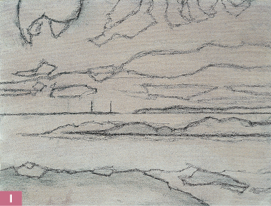
Step One I begin by covering the canvas with a very light wash of cobalt blue and burnt sienna thinned with turpentine. I use vine charcoal pencil and approach my sketch as a basic outline for where I want to place the colors. I concentrate on capturing the areas where the values change throughout the sky, outlining the shapes of the clouds. Next I indicate the two distant lighthouses on the horizon. Then I block in the dark, large shapes in the landscape, lightly shading these areas with the side of the charcoal.
Dark Values
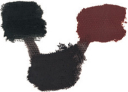
black and Mars violet
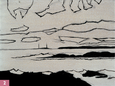
Step Two Once I’m happy with my sketch, I retrace the outline of each shape with a small round brush and a thin mixture of black and Mars violet. Then I apply all my darkest values. At this stage, I’m still working on my underpainting, filling in the rocks in the foreground and the rest of the land in the distance. Even though the rocks appear to be pure black, I add Mars violet to the mixture to keep the color from becoming too inky and flat.
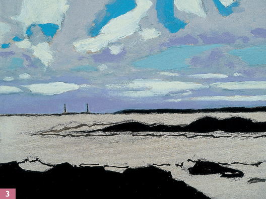
Step Three Now I paint the sky with a mix of cobalt violet and white, stroking horizontally with a small filbert bristle brush. I mix cerulean blue, viridian green, and white for the lower patches of blue sky and create the brighter blue patches of the upper sky with cobalt blue, a very small amount of phthalo blue, and white. For the grays in the upper part of the sky, I mix cobalt violet and white. Then I block in the clouds with a mix of white and Naples yellow light.
Upper Sky

cobalt blue and cobalt violet
cobalt blue and white
Lower Sky

viridian green and cerulean blue
Horizon
cobalt violet and white
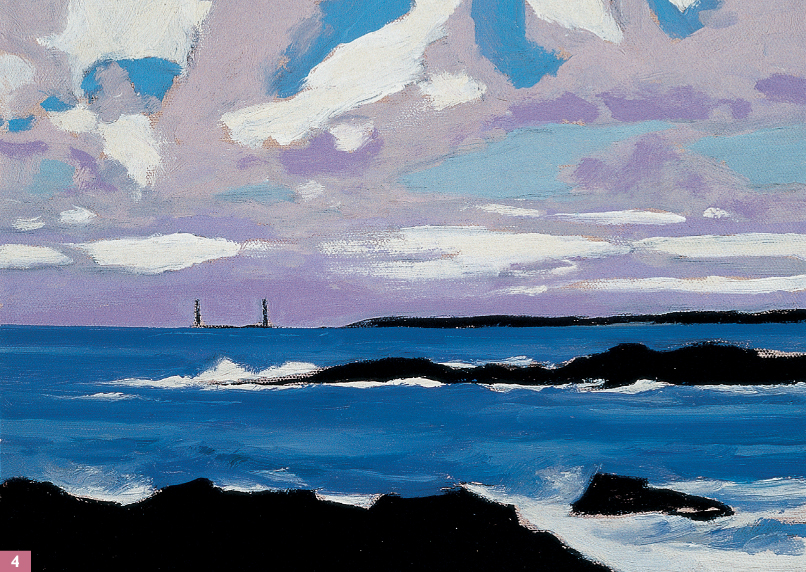
Step Four Now I block in the ocean, covering most of the water area with a mixture of viridian green, phthalo blue, and cobalt violet. I add a few dark patches of cobalt blue, cobalt violet, and viridian green. To suggest movement in the water, I add light blue streaks of a cobalt blue and white mixture. I paint the surf around the distant headland and foreground using pure white, varying between thick and thin brushstrokes to create a realistic impression of texture and motion in the tide.
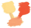
Naples yellow light and yellow ochre
Distant Highlights

Naples yellow light and cadmium orange barium
Step Five Now I add highlights and details to the rocks and distant land forms. With a mixture of Naples yellow light and yellow ochre, I work in the lighter textures of the foreground areas. Then I mix Naples yellow light and cadmium orange barium for the highlights of the middle ground and the land in the background. I lighten the farthest plane of land significantly to emphasize the sun’s high midday position and the illuminated horizon.
Step Six When I step back and assess the painting, I decide to adjust some of the colors. Although I’m happy with the colors I chose in the sky, I want to sharpen the contrast by changing some of the values. I deepen the darkest values by adding more pigment, and I add more white to the lightest values. I also decide some of the values in the ocean are too light and that the surf needs to be brighter, so I add deeper shades of the ocean mixes and then brighten the surf with pure white.
When painting on location, a viewfinder can be an invaluable tool. Consisting of two L-shaped frames, a viewfinder helps you zero in on one section of a scene and block out any unnecessary elements. It also helps establish which format will make the most effective composition. You can buy one, make your own out of cardboard, or even use your thumbs and forefingers. Hold the viewfinder up and look through the opening at the scene in front of you. Bring it closer to you or hold it farther away; turn it sideways and move it around. Then choose the view you like best.
Photo by Tom Swimm
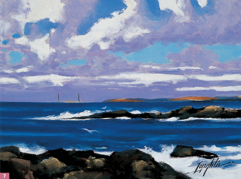
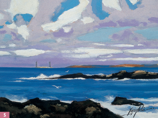
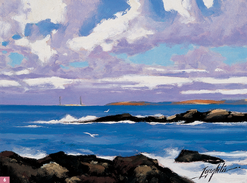
Step Seven For the finishing touches, I use my small bristle filbert to add a little more detail to the distant headland and in the foreground. For the details in the distance, I use Naples yellow light with a touch of cadmium orange. I mix Naples yellow light, yellow ochre, burnt sienna, and black and lightly brush on some final touches of texture to the foreground.