
Chapter 5: Composing Photographs
From a Snapshot to a Fine Portrait
Focus on Feeling
Keeping It Simple
Framing the Image
Parents as Props
The Rule of Thirds
Using Lines
Breaking the Rules
Composition refers to the arrangement of the elements in a photograph to create a pleasing whole. At its very essence, composition is a decision about what to include and, just as important, what to leave out of any given photograph. The human eye appreciates order of some sort and visual paths to follow. As a photographer, your decisions about composition can help lead your viewer’s eye to what is most important in your photograph.
Composition in photography is perhaps the most subjective element of all. For some photographers, composition is unconscious or second nature; their sense of balance and emphasis comes naturally. Other photographers come from an art or painting background and can apply their experience with basic composition and graphic elements. Even if you don’t have an art background, you can study and learn composition. It will take a great deal of observation and developing your eye. Learning some basic guidelines will help you simplify and improve your photography immediately. When you have a firm grasp of the guidelines you will be able to bend them a little, maybe even break a rule or two.
Start paying attention to the work of other photographers and painters. Where do your eyes land first? Was that the intention of the photographer, or was it an accident or a lack of attention to detail? The most common mistakes that amateur photographers make are not honing in on the subject and allowing distracting elements in the environment to lead the eye away from the most important elements in the photograph. Keep an eye out for clutter!
Once composition rules are learned, they needn’t be adhered to rigidly. Applying elements of a balanced and dynamic composition can enhance your vision, but you must have the courage to choose what works best for you. Composition becomes another tool for expressing what you see and feel.
From a Snapshot to a Fine Portrait
A photograph that reveals even one element of thoughtful composition can stand out in the crowds of snapshots filling up computers, hard drives, and online galleries. And why is that? What is the difference between a snapshot and a portrait? While many other factors, such as lighting or background, are relevant, the greatest difference between a snapshot and a portrait is how the image is composed. The point of composition in portrait photography of children is to draw the viewer’s eye naturally to the child — plain and simple. Beyond that, you can use composition to create a feeling or tell a story. What often differentiates a snapshot from a fine portrait is that a snapshot includes too much information, or has too much clutter.
Painters don’t have to worry about an errant garden hose in the background, or a palm tree growing out of their subject’s head; if these types of objects appear in a scene, painters simply leave them out. Our cameras, however, capture everything we point them at. And because amateur photographers are more often concerned with capturing the subject, they often neglect to notice that they have also captured distracting elements in the background of their photos.
Before you even hold your camera up to your eye, take a good look at the background. Make it right before you take your exposure and don’t rely on fixing it later in an image-editing software program. This is the habit of a good photographer. If what you are seeing through your viewfinder isn’t pleasing, move around the subject and watch for changes in light and composition until you get the portrait you want. Finding the best light and composition will vastly improve your photograph.
“I have noticed that in photographic portraits, the artist’s feelings about the subject shine through. Often the beauty and prejudices of the photographer show more in the photo than the subject itself.” ~Eve Schell, author
Focus on Feeling
A good place to start when you are learning composition is with a feeling. What do you feel about this child you are photographing? What do you want to convey about his or her personality?
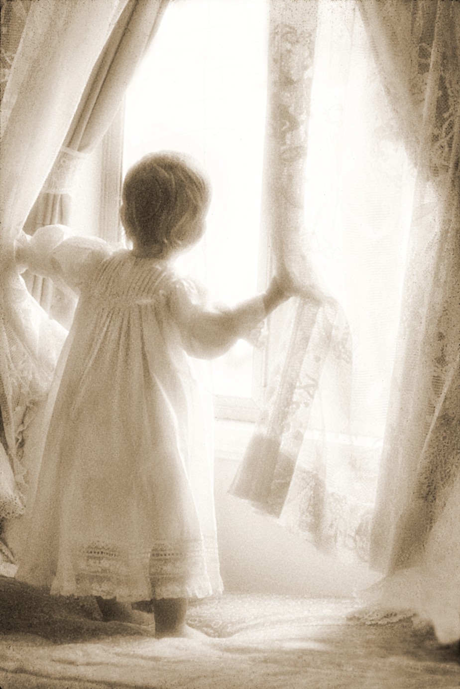
Are you trying to convey a message that is bigger than just this child, a feeling about childhood in general? Is it the word wonder that inspires you when photographing a baby peering through the window, as in 5-1? Sometimes starting with a word in your mind allows you to make a choice about what you include or exclude from the frame.
Once you have an idea about the feeling you want to convey, many of the decisions about composition will flow from that initial idea.
5-1
ABOUT THIS PHOTO I captured this spontaneous moment soon after the mom left the room to answer the telephone. At the time, I was using Fujicolor 1600 film to add grain to add a painterly effect. Taken at ISO 400, f/4, and 1/125 second. ©Ginny Felch / www.photographingchildren.com
Keeping It Simple
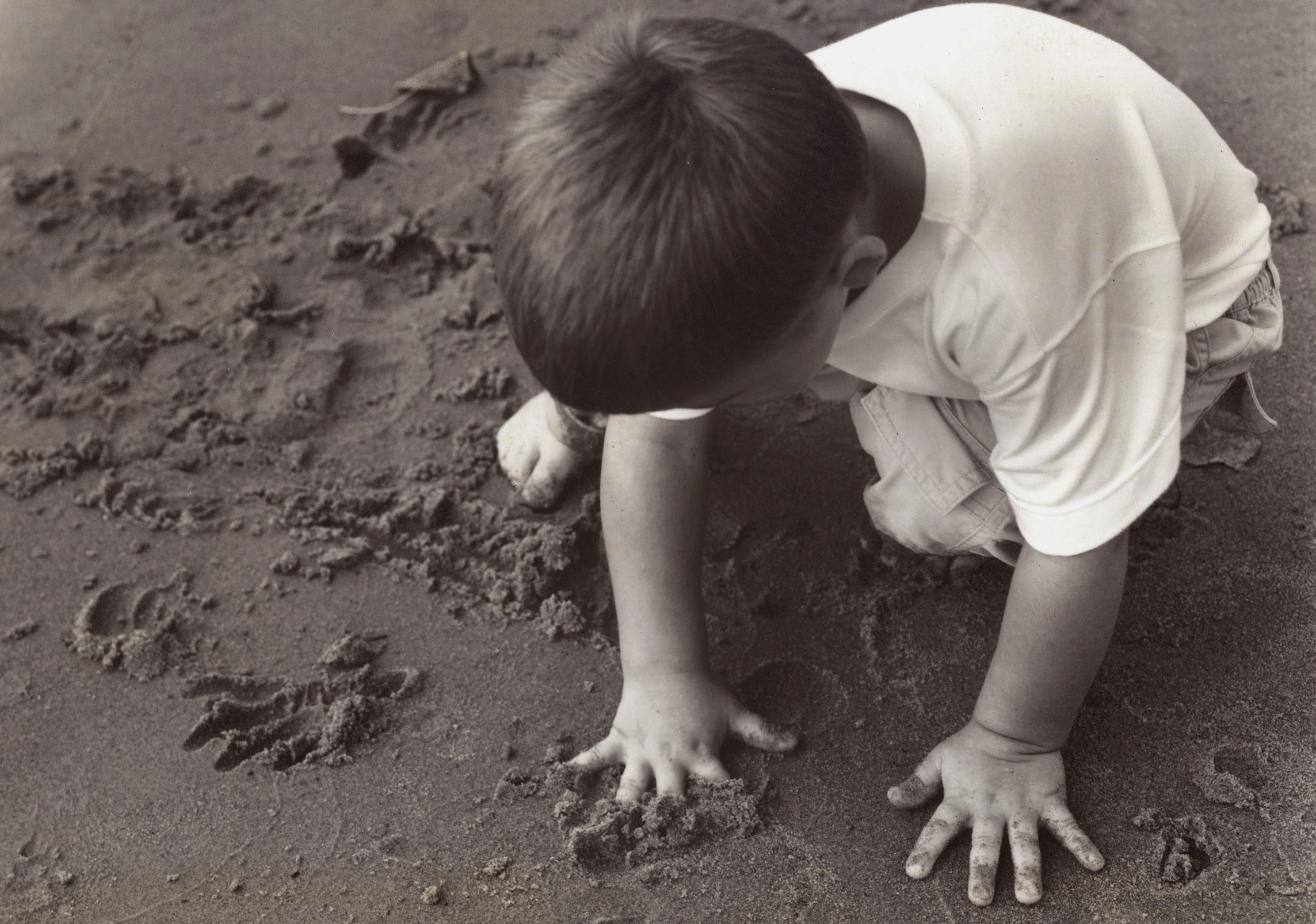
Anne Geddes, a photographer famous for her photograph of babies as flowers, said, “The hardest thing in photography is to create a simple image.” Keeping it simple means showing only what tells the story and nothing else. A good starting place for learning to keep it simple is to get close to your subject — really, really close. Zoom in and get just the face or the bits and pieces that tell the story. In 5-2, a photo of a newborn baby, there is no doubt what the subject of this photo is. This photo could be titled “New” because it highlights features that are unique to a newborn baby: the curled-up body, the wrinkles on the hands and toes.

5-2
ABOUT THIS PHOTO Zooming in close and getting just pieces of your subject can sometimes tell a larger story about miracles and new life. Taken at ISO 320, f/3.2, and 1/250 second. ©Stacy Wasmuth / www.bluecandyphotography.com
A good photographic practice is to check the four edges of your viewfinder before you click the shutter every time. Do you see anything in the background that is detracting from your subject? Does it look like something is growing out of your subject’s head? Changing your position or the position of your subject might be all that’s needed to simplify the background and improve your photograph.
Watch your backgrounds
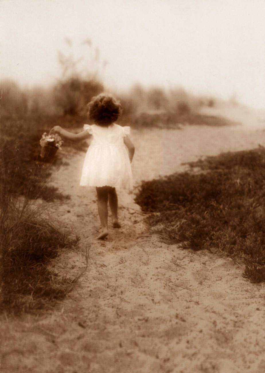
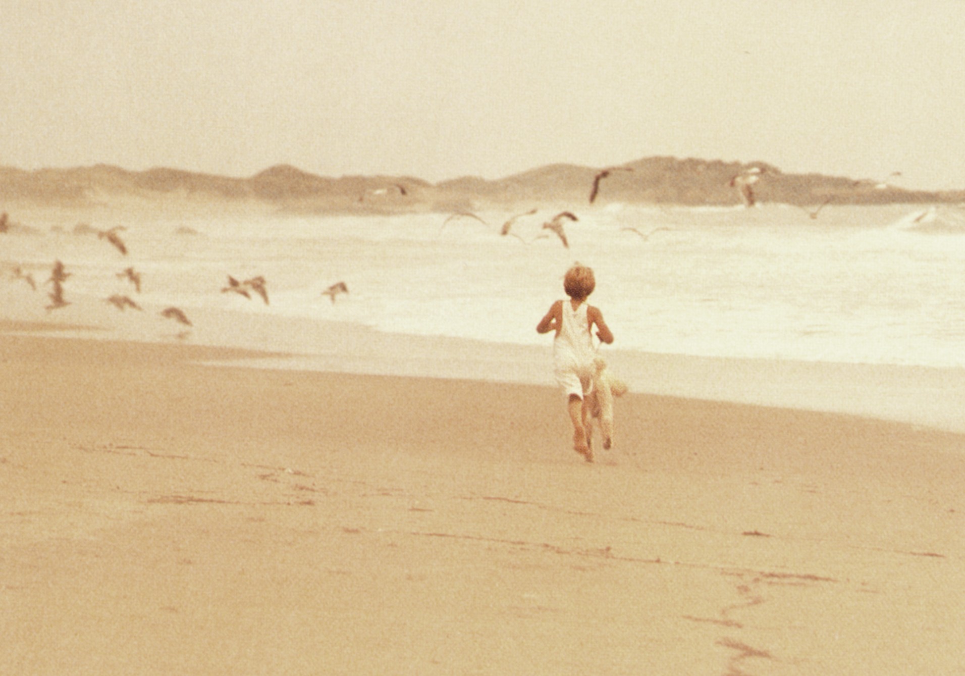
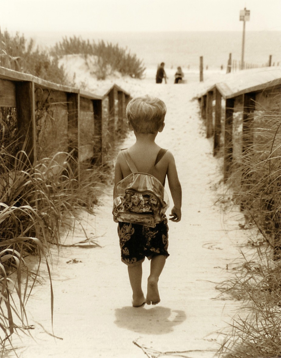
You know the expression about real estate: “Location, location, location!” Well, part of your quest is indeed to find a location that is free from distracting elements, as in 5-3.
5-3
ABOUT THIS PHOTO This simple composition of a little girl walking up a foggy dune path toward the sea resonates with the idyllic nature of quintessential childhood. I was inspired by my own summers at Cape Cod as a child. Taken at ISO 200, f/4, and 1/250 second using 1600 Fujicolor film (changed to sepia in post production). ©Ginny Felch / www.photographingchildren.com
The worst distractions in any image can most commonly be found in the background, behind your subject. When you first start out, it’s easy to become so focused on the child that you don’t even see what is behind him or her that might be distracting from the subject.
Distracting items such as tree branches going in awkward directions, bright splotchy leaves or holes of sunlight, fences, flowers, poles, furniture, and so on, can combine to clutter up an otherwise beautiful portrait.
The photo of a young family at the beach in winter in 5-4 is a perfect example of watching your background. The photographer has been careful to isolate the family against the dunes, sky, and sea, which combined create a perfect pastel hue that offsets the rich winter colors of the family’s clothing.
When it comes to backgrounds, watch out for dark things in light places and light things in dark places. Squinting while looking at the background immediately isolates distracting bright or dark spots. Watch especially for bright or dark spots directly behind and around your subjects that can take the eye away from your intended focus.
Using negative space
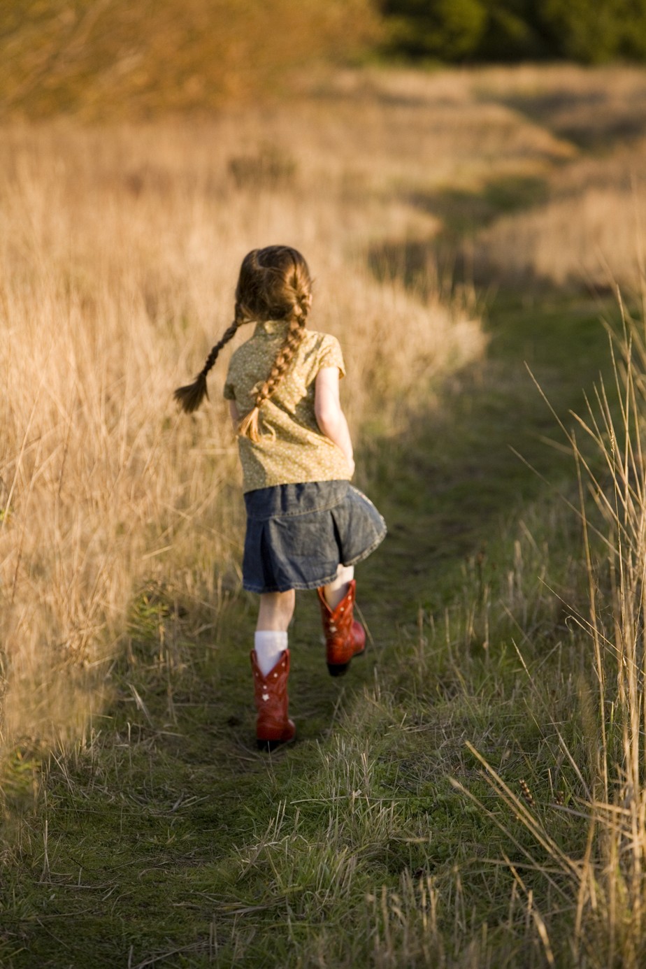
Including negative space (space in your image where the subject doesn’t appear) in a composition makes great use of the concept of simplicity, and also enhances the story. A little girl standing in the lower corner of expansive grass or a beach might look hopeful, mysterious, or even lonely. Be certain you are telling the story you want. Of course, you can leave the interpretation to the eyes and heart of the viewer, but you can shape the reactions with your compositions.
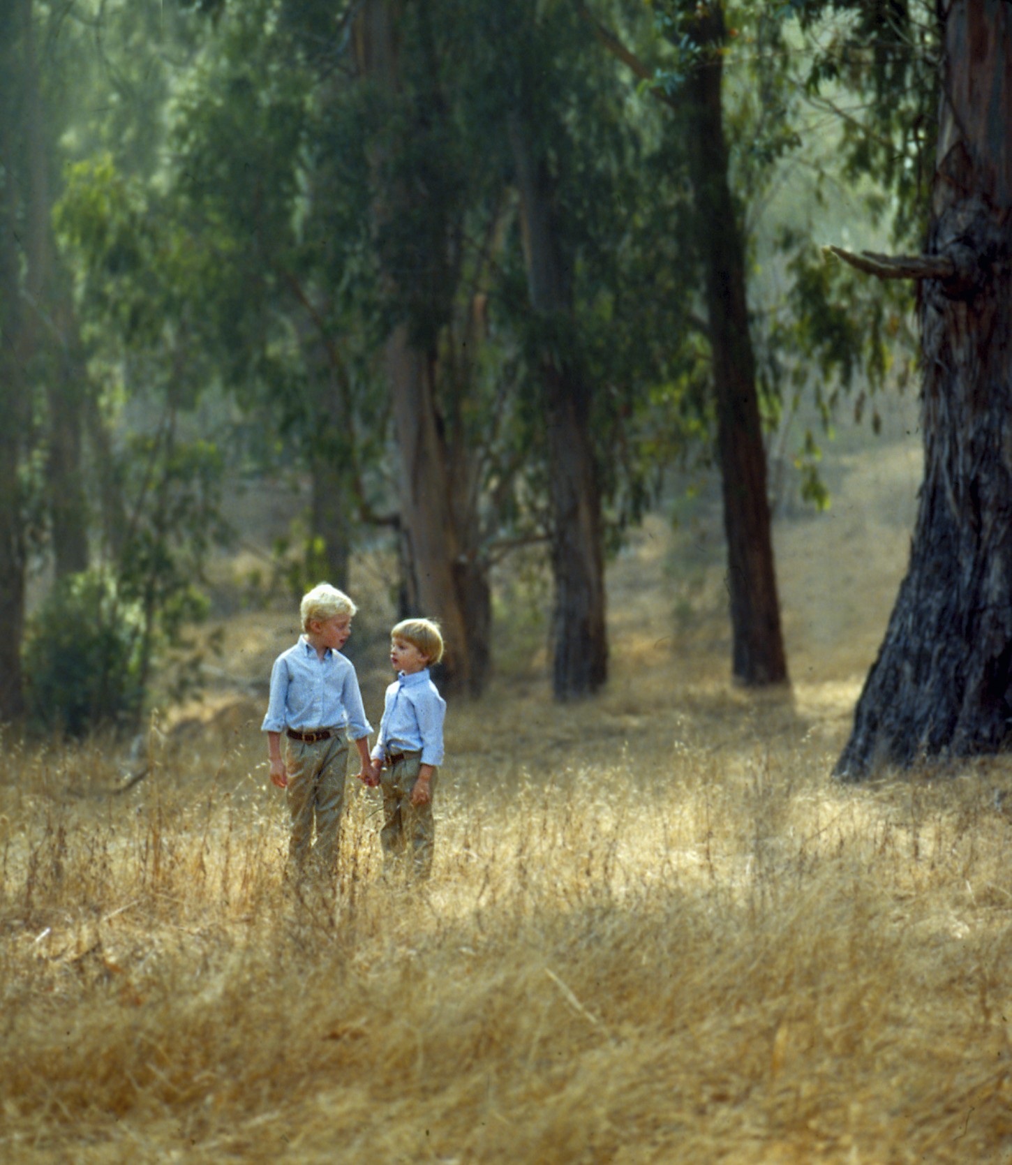
Negative space can emphasize the child, as in 5-5, or it can give a child space to roam, as in 5-6. Negative space works kind of like a wall with only one picture hanging on it; you can’t help but notice that one picture. Using negative space in the composition of a photograph simplifies the composition and draws your attention to the child.

5-4
ABOUT THIS PHOTO Isolating this family against pastel dunes and the seashore simplifies the background and allows your eye to concentrate on the interaction of the family. Taken at ISO 200, f/5.6, and 1/125 second. ©Zofia Waig / www.zofiafoto.com
Framing the Image
Even though digital editing makes it easier to crop and remove clutter in the background, it is a much better practice to learn to crop in the camera by intentionally framing the image to begin with, rather than relying on cropping later. It is good training in observation to look carefully through the lens, create a pleasing composition, and to keep an eye out for hot spots (bright highlights such as shiny leaves, or other distractions and clutter). If after you zoom the lens in and out and walk around the subject if necessary, you still can’t avoid certain obstacles, consider using some of the techniques discussed in Chapter 2 for throwing the background out of focus by adjusting the depth of field. If all else fails, you might be able to remove any remaining distractions in post-production.

5-5
ABOUT THIS PHOTO Placing the child slightly off center in a very simple background holds the viewer’s attention on this lovely angel child. Taken at ISO 500, f/2.8, and 1/200 second. © Leah Profancik / www.leahprofancik.com
5-6
ABOUT THIS PHOTO I love the glowing afternoon light haloing the boys’ heads as they walk along in the meadow by the redwoods, setting them apart from the background and drawing in the viewer’s eye. Taken at ISO 400, f/5.6, and 1/60 second. © Ginny Felch / www.photographingchildren.com
General framing guidelines
Learning to frame your images while you are capturing them will improve your sense of composition immediately. You can benefit from the experience of photographers who have gone before you and made all the mistakes. The following are some tried and true guidelines for framing your photo when working with children:
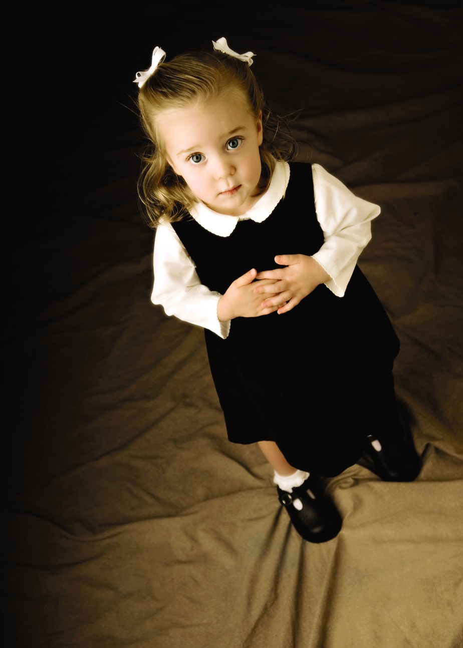
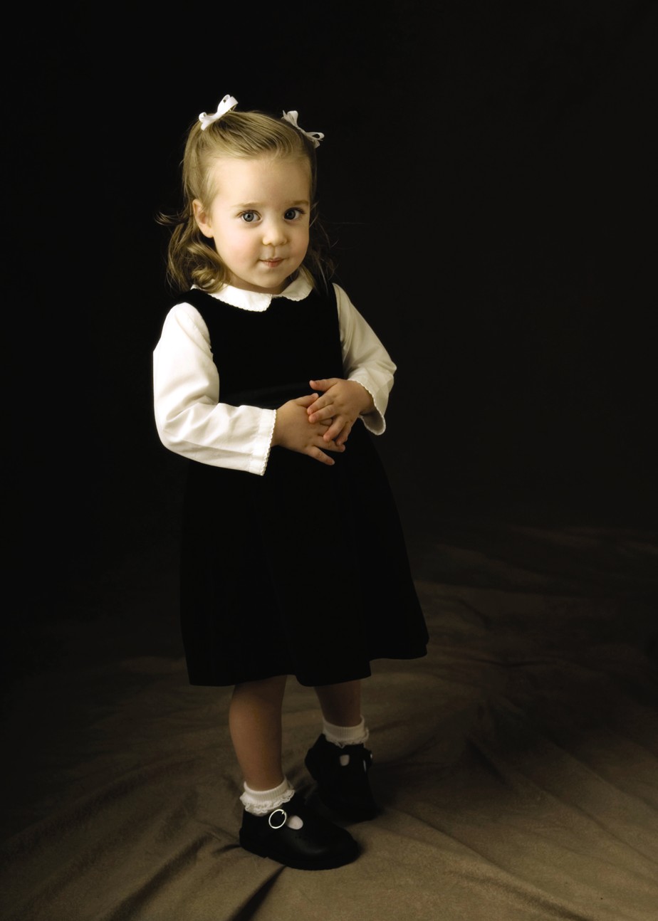
• Hold the camera at the child’s eye level. This means you may need to stoop, bend, or kneel. Not only does this make the child feel more comfortable, but it creates a much more pleasing image because this angle helps eliminate lens distortion (also known as big head, little feet syndrome, demonstrated by 5-7), while at the same time imparting a sense of dignity and respect to children, as in 5-8, who are often photographed from above. If you are fortunate to have a newer camera with displays that swivel, take advantage of not having the camera between your face and the child. That might improve the “connection” with the subject.
The environment where you choose to photograph can dramatically affect the style of your photography. Different styles are explored in Chapter 6.
5-7
ABOUT THIS PHOTO This is how children are often photographed: from a standing position, looking down on them. This angle makes heads appear larger and feet tiny. Taken at ISO 100, f/2.8, and 1/250 second. ©Allison Tyler Jones / www.atjphoto.com
5-8
ABOUT THIS PHOTO Photographing a child straight on requires you to position the camera at the child’s waist height, but the results are worth it. The proportions of the child’s body are correct, and there is a sense of dignity that is lacking in 5-7. Taken at ISO 100, f/2.8, and 1/250 second. ©Allison Tyler Jones / www.atjphoto.com
• Never crop at the hands or feet. Either crop in close to the head and shoulders, move out and crop below the hands, or back off completely and include the whole body. Cropping at the joints (wrists, ankles, hips, or knees) generally makes for an awkward-looking photograph. Children’s hands and feet are sweet and should be included if possible. There are more examples of better cropping in Chapter 10.
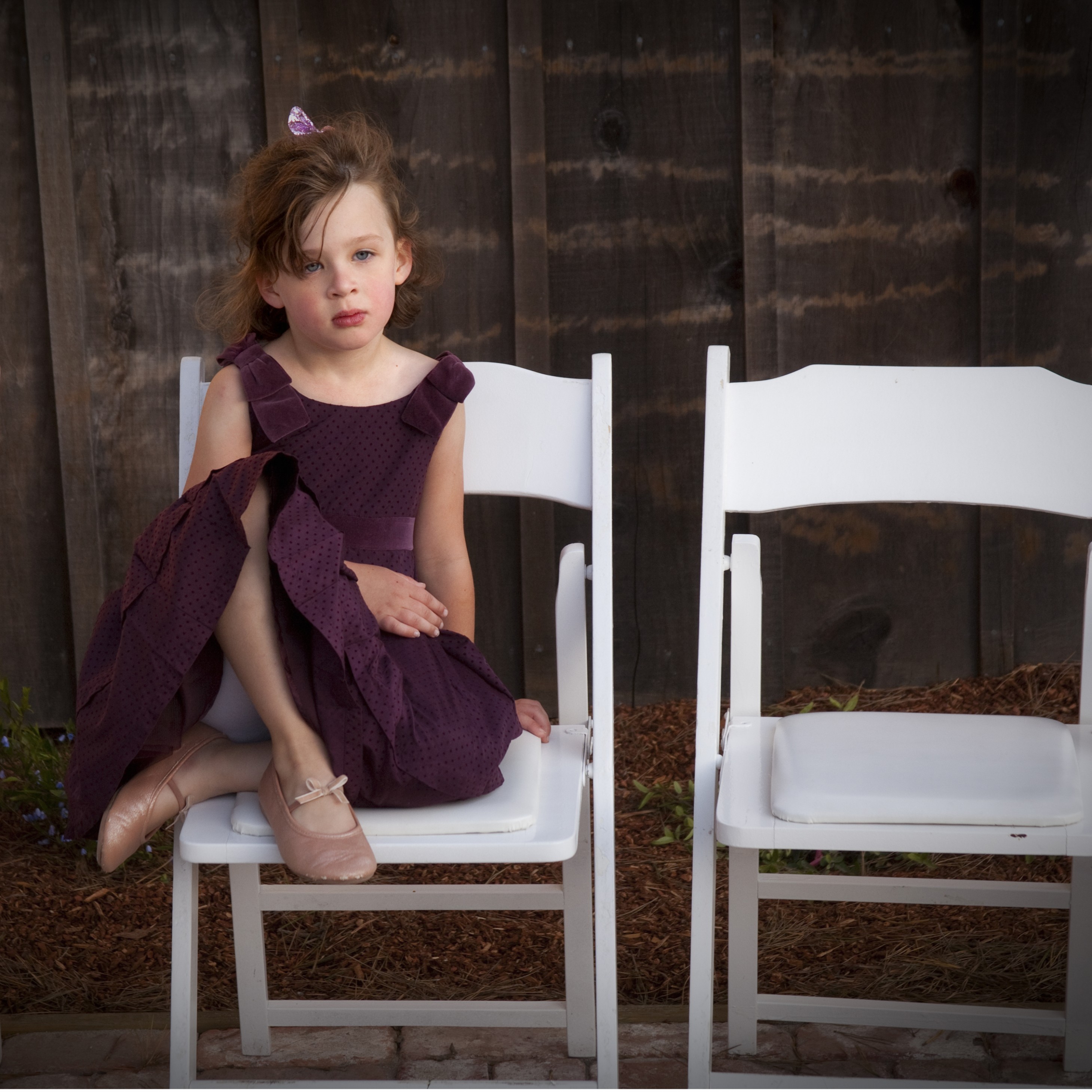
• As a general rule, don’t place your subject in the very center of the photograph. Refer to the general composition guidelines discussed later in the chapter in the section on the Rule of Thirds. Exceptions to this are frequently made, but it is all too common for beginners to place the subject right smack in the middle of the frame.
• Leave plenty of growing room around the child in the image, above the head or in the foreground. It is comforting visually to create a sense of space.
“Kids: They dance before they learn there is anything that isn’t music.” ~William Stafford
• If a horizon line is visible, be sure it is straight. This is one of the most common errors photographers make, particularly at the beach. The exception would be, of course, if you choose a slanted horizon for a contemporary composition.
• Look carefully to see whether distracting elements are in the background. Look for hot spots, trees growing out of heads, wires, and so on; if you see distracting elements, move around until they are gone if possible or crop in close to simplify the image.
• If you are photographing children in profile, try to leave more space in front of their line of vision, as though they have some space to look into. This also applies to photos of children walking across the horizon line; give them space to walk into.
A well-composed photograph is one in which every element has earned a right to be included.
Frames within the frame
Employing simplicity in the design of a child’s portrait includes using certain strong elements, such as archways, windows, and doorways, to literally frame your subject within the frame of your viewfinder. Remember, all design elements should lead to, illuminate, or enhance your subjects. Finding appealing frames in the environment to highlight an important part of your image can hold the viewer’s attention.
“To take photographs is to hold one’s breath when all faculties converge in the face of fleeing reality. It is at that moment that mastering an image becomes a physical and intellectual joy.” ~Henri Cartier-Bresson
Check your camera manual to see if your camera has custom LCD display settings. Many dSLRs allow you to select a grid in your viewfinder, which is a helpful aid when you are practicing the Rule of Thirds in your own composition.
Arbors, gates, curving trees, and foliage can create a natural vignette to surround and showcase your subject as well. If the background is generally light, a darker shape that subtly or distinctly surrounds the subject can be extremely effective. Consider the pleasing shapes in the environment that you can use as a frame, particularly circles, ovals, squares, and rectangles.
Paying attention to what is beyond, behind, or surrounding your subject can make a world of difference in adding drama and focus to your photographs. Your eyes become trained to notice these elements as you pay attention and observe. After you become more experienced and spontaneous, you can take chances with new locations that you haven’t previewed. Many children’s photographers use the same locations over and over because it is safe, and it is easy to understand why: There is already so much unpredictability when working with children. However, the more experienced and observant you are, the more you can take the risk of exploring new territory, with the possibility of great serendipity. This results in great leaps and bounds creatively.
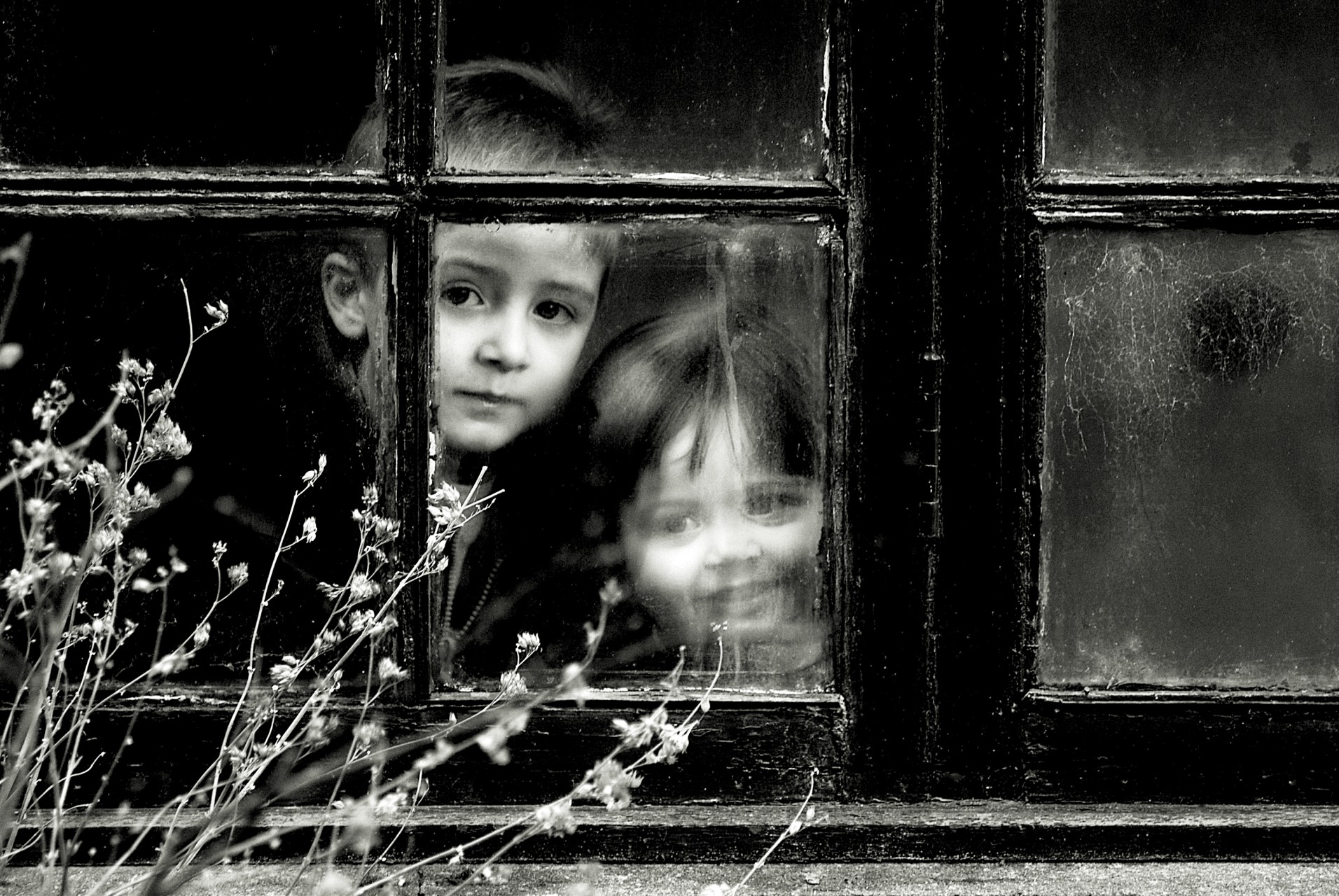
Psychologically, framing can make a statement as well. A bold or rugged rectangular frame adds strength and structure to the image, as in 5-9 and 5-10. Making these choices carefully and thoughtfully will result in making stronger images that leave no doubt as to what you’re trying to say.

5-9
ABOUT THIS PHOTO The vivid adobe winery window frames this little boy perfectly and even adds a bit of color to his cheeks. I love the way he found a comfortable and natural position. Taken at ISO 400, f/4.5, and 1/200 second. ©Ginny Felch / www.photographingchildren.com
5-10
ABOUT THIS PHOTO The bold and dramatic framing of two children seen peeking through a window pane provides a dynamic photograph. Keeping them relatively small in the composition with the angle of the weeds pointing towards the subjects helps to keep the viewer’s eyes in just the right place. Taken at ISO 400, f/2.8, and 1/125 second. ©Ken Sharp / www.kensharp.com
Discovering the Golden Rectangle: Divine Proportion
Another interesting compositional shape or formula is the golden rectangle, Golden Ratio, or divine proportion. This concept dates back to the ancient Greeks. If you think of the shape of the nautilus shell, with the outward spiraling-shape within the space of a rectangle, you might begin to comprehend the Golden Ratio. You might also find it inspiring to do a web search for Henri Cartier-Bresson and browse through his images. Try this exercise: Observe the direction of your glance as you scan the compositions. I found it rather breathtaking to see his consistent use of divine proportion.
“When you are dealing with a child, keep all your wits about you, and sit on the floor.” ~Austin O’Malley
Parents as Props
Adding parents to the photograph can help your composition in a variety of ways. It allows the child to feel more comfortable while being photographed and adds a storytelling element to your image, as in 5-11. Having one of the parents hold a newborn tenderly can make a photography session go smoothly, as in 5-12.

5-11
ABOUT THIS PHOTO You don’t need to see the whole parent to know that this is an image about a family. Use the height difference of adults and children to your advantage and frame a toddler using the legs of her parents as a backdrop. Taken at ISO 500, f/2.0, and 1/250 second. ©Leah Profancik / www.leahprofancik.com

5-12
ABOUT THIS PHOTO Such tenderness and security are evoked as the dad cradles his newborn. The father’s arms frame the baby, and also provide a diagonal lead-in to the baby’s face. Taken at ISO 500, f/5.6, and 1/60 second. ©Theresa Smerud / www.theresasmerud.com
The Rule of Thirds
For centuries, artists and architects have been guided by the Rule of Thirds, which is thought to have derived from the Greek Golden Ratio. The Rule of Thirds is just a technique for learning to position the elements within a photograph in a pleasing way, which is a great starting point when learning about composition.
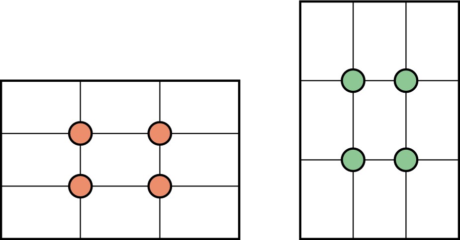
The Rule of Thirds, as applied in photographic terms, takes into account that the format of a camera’s viewfinder is usually rectangular in shape and that placing your subject in certain areas of that area can make the difference between an average or a dynamic photo. You can use this screen horizontally (landscape) or vertically (portrait), as in 5-13. Divide the viewfinder into thirds both horizontally and vertically (see 5-14). The points where these lines intersect are points where you can place your subject or parts of your subject to create tension, energy, and interest.
Often, one of the first things you hear as a photographer is, “Don’t center your subject.” Or, “Don’t center your horizon.” Try centering a few photos and then retake them using the Rule of Thirds.
5-13
ABOUT THIS FIGURE The diagram shows the Rule of Thirds so that you can see where the lines intersect. Those intersections are where you want to place your subjects in this kind of composition. The circles indicate placement possibilities.
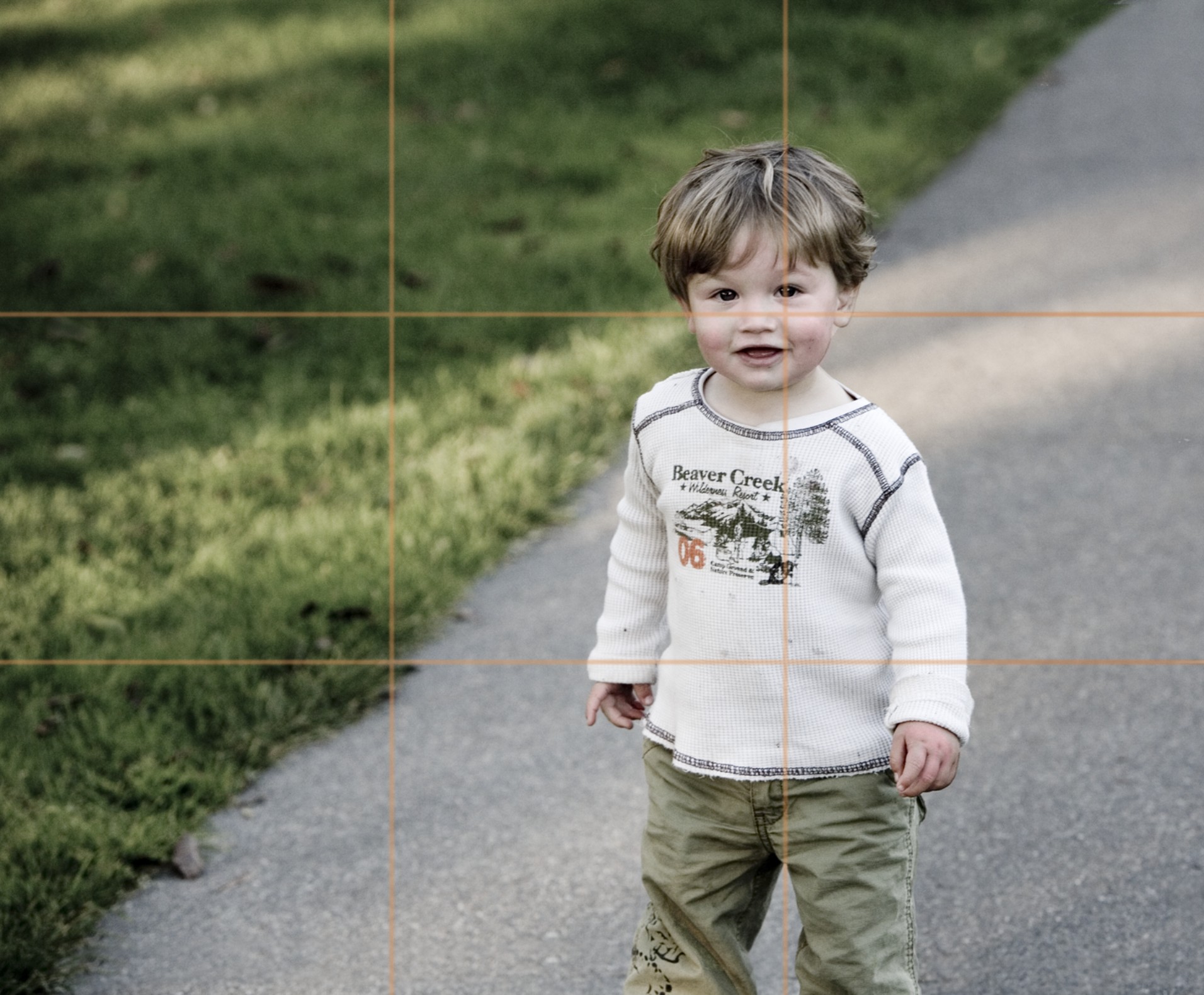
5-14
ABOUT THIS PHOTO This bright and expressive child comes right to you on the diagonal path; notice the diagram showing that I placed his head in one of the four points of interest. Taken at ISO 800, f/5.0, and 1/400 second. ©Ginny Felch / www.photographingchildren.com
Once you compare them, it becomes clear that centering the subject often creates a static effect — think twice before using that composition.
These guidelines are a wonderful starting point to start thinking about composition and noticing where the eye flows. The way to find your own signature, to express your own vision, is to decide every time you click the shutter what it is you feel and how you want to reveal it. Remember, these are merely guidelines to teach a technique.
• Rule of Thirds in the environment. The easiest way to begin using the Rule of Thirds is in an environmental shot. It is easy to place your subject in the upper or lower third of the picture and let the environment help tell the story, as I did in 5-15.
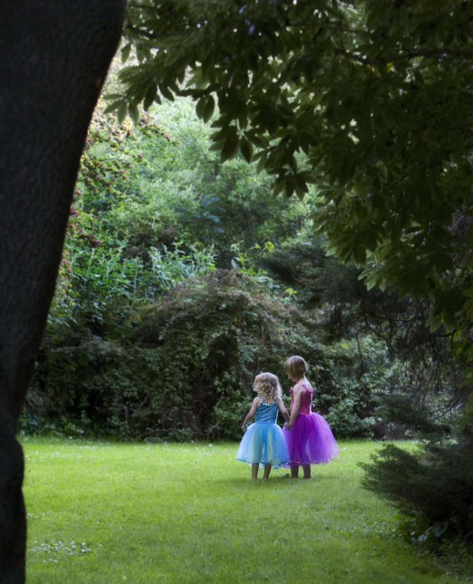
5-15
ABOUT THIS PHOTO A warm afternoon in the redwoods provided the perfect setting to create a pictorial image of two friends planning a little performance. This location reminded me of my native New England. I placed the little ballerinas in the lower third, giving them the attention they fully deserve. Taken at ISO 1250, f/4.0, and 1/125 second. ©Ginny Felch / www.photographingchildren.com
• Rule of Thirds in a headshot. What if you favor close-ups? How does the Rule of Thirds apply then? You can immediately see the impact the Rule of Thirds can have on a simple headshot by comparing 5-16 and 5-17. In 5-17 the placement of the boy’s eyes is more dynamic, keeping your attention longer.

5-16
ABOUT THIS PHOTO When photographing a close-up of a child’s face it is best not to have the child’s eyes at dead center, which makes the forehead appear too large and gives a static appearance to the image. Taken at ISO 400, f/2.8, and 1/125 second. ©Allison Tyler Jones / www.atjphoto.com

5-17
ABOUT THIS PHOTO Placing the eyes of your subject in the upper third of the frame creates a more dynamic composition. Taken at ISO 400, f/2.8, and 1/125 second. ©Allison Tyler Jones / www.atjphoto.com
Using Lines
Lines are everywhere, from the curves of a child’s profile to the lines in the horizon or a pathway through the woods. Learning to see lines and shapes when creating images can open a whole new way of photographing your subject, allowing you to direct the attention of the viewer exactly where you want it to be.
Parallel lines
A useful visual dynamic in composition is learning to see parallel lines in your photographs. This is particularly useful in nature or landscape portraits, where visual lines are often formed by horizontal planes created by land and sky. A literal translation of this dynamic would be a view of the beach, in which the sand might form one line, the dark and textured water forms the second line, and the sky forms the third parallel line. You don’t always have to think in thirds, but the composition can be more pleasing, less static, and more balanced if you use parallel lines in uneven numbers.
In general, seeing and using parallel lines, both horizontal and vertical, make for dynamic compositions.
After you become used to seeing the Rule of Thirds proportions in a landscape, start to evaluate and plan how you might use this knowledge in a portrait. You can actually use the spaces between the lines to frame the subject(s). You want to be careful not to have one of the lines running through a child’s head, for example.
In 5-18, my son, Zach and his dog, Brandy, are running on the beach, and although the lines aren’t straight, a sense of direction and framing still exist in the lines created by the sky, the beach, and the sand. I intentionally clicked the shutter when I felt that his head and body would be nicely set apart by the white foam of the sea. The fact that the line of the beach is not straight creates a nice directional line that leads to the subjects. However, notice that the horizon line is straight. The footprints in the foreground show direction as well as add nicely to the texture. You can see here how successfully the composition sets up the story of the photograph.
This image was the first time I ever attempted high-key photography. Proving that things don’t always go smoothly, the dog soon ran into the water and came out looking like a drowned rat. Also, Zach was very unhappy wearing his OshKosh overalls, so I actually paid him a dollar.
5-18
ABOUT THIS PHOTO This photograph of my son, Zach running with his dog shows the horizontal parallel lines presented by the beach, sea, and sky. His placement was chosen so he would stand out. Taken at ISO 200, f/16, and 1/250 second. ©Ginny Felch / www.photographingchildren.com
“There is a garden in every childhood, an enchanted place where colors are brighter, the air softer, and the morning more fragrant than ever again.” ~Elizabeth Lawrence
Trees, columns, and other vertical and parallel objects can give a sense of balance in a photograph. Vertical parallel lines can lend solidity to a photographic composition and suggest stability.
Diagonal lines
Another commonly used principle of design is the diagonal lead-in line. This diagonal can come from such things as a shadow, path, road, swath of light, fence, lined-up objects, and so on, and it can occur anywhere in the photograph that effectively points toward the subject.
Use of diagonals can draw the viewer’s eye just where you wish. The diagonal lead-in provided by the light coming through the door adds great energy and direction to the young skateboarder in 5-19. You can also see how the vertical lines of the barn door strongly frame the child.
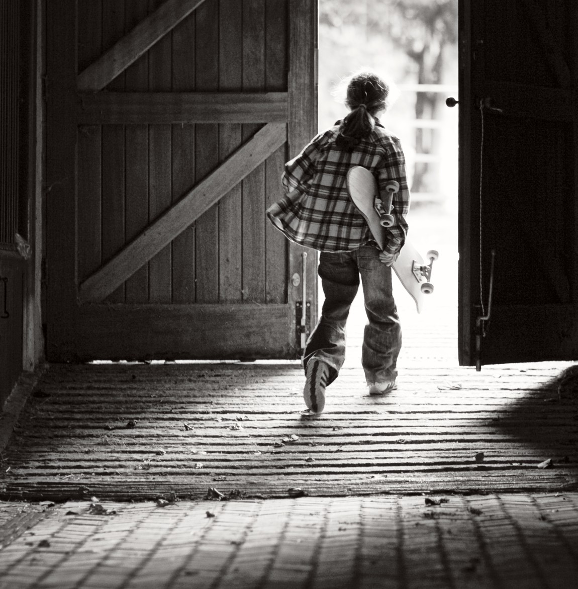
5-19
ABOUT THIS PHOTO The diagonal light shaft coming from the door, widening in the lower left corner creates a strong diagonal line, which directs the viewer’s eye right to the exiting skateboarder. Taken at ISO 400, f/1.8 , and 1/160 second. ©Doreen Kilfeather / www.dkilfeatherphotography.com
The diagonal can be taken into consideration in posing children or families. For example, legs or arms can be used as a diagonal leading line. Using walls and walkways, as in 5-20 and 5-21, can lead the viewer’s eye to your intended subject.
Taking just a second to see the lines in your surroundings can make an enormous difference in the dynamics of your photographs. If you have children walking on a path, you can always move slightly until the path runs diagonally in your viewing screen.

5-20
ABOUT THIS PHOTO The photographer used the brick pattern on the side of an abandoned building to draw the viewer’s eye directly to the little boy. The big wall also provides a sense of scale. Taken at ISO 200, f/5.6, and 1/320 second. ©Jeffrey Woods / www.jwportraitlife.com

5-21
ABOUT THIS PHOTO A very fashionable little miss is brought right to us at the bottom of a lovely C-curve in the road. Taken at ISO 400, f/1.4, and 1/8000 second. ©Jen Carver / www.jencarverphotography.com
“We find delight in the beauty and happiness of children that makes the heart too big for the body.” ~Ralph Waldo Emerson
Converging Lines
Converging lines play a similar role in composition to diagonal lines in terms of a powerful lead-in to the subject. These lines are even more commanding, because two diagonal lines come together at one point, giving you direction to the subject. You can see a great example in 5-22, where the lines of the path on the beach frame this playful child who seems to know just where he is going.
5-22
ABOUT THIS PHOTO The converging lines of the fence and placement of the little boy lead you to his destination, the beach. Taken at ISO 400, f/4, and 1/250 second (sepia toned in post-production). ©Heather Jacks / www.heatherjacksphotography.com
S- and C-curves
Straight lines are just one way to add impact to a photograph. Exploring curving lines is one more way to explore lines in your work. Although the diagonal leading line is more direct and perhaps more powerful, a curve is a subtle and gracious way to direct the eye. S-curves and c-curves are very graceful and beautiful compositional elements and can often be found in the environment as well as in the body, posture, or face of the child you are photographing.
Photographing children on curved paths, as in 5-23, can give a sense of freedom adventure, beauty, forward movement, and direction. It offers a way for the viewer to visually enter and leave an image in a pleasing way. Curves can be found on curved beaches, rivers, paths, roads, and so on. They create a sweeping movement toward your subjects if you set them up to do so. You can find a location in just the right light for optimizing the appearance of the curve and have the child just start walking in one direction or another. As she walks, you start to see where the positioning becomes a powerful visual and click the shutter. It becomes a wonderful opportunity for free movement and very spontaneous poses.
5-23
ABOUT THIS PHOTO Daisy skips along the coastal path, which forms a wavy S-curve. I placed her in the foreground and left space above her giving her lots of room to move. Taken at ISO 400, f/5.6, and 1/250 second. ©Ginny Felch / www.photographingchildren.com
Curves are naturally pleasing compositions for creating stunning children’s portraits, but curves like those in 5-24, the subtle but strong curve of a father’s arm, and 5-25, the line of handprints in the sand, are not always easy to find, so keep your eye out for possibilities.
Curves in the bodies of your subjects can be hard to see when you are actually taking the photo, but sometimes you’ll get lucky and see it after the photo has been taken. Learn to see the curves in the stance of a little ballerina with her hand on her hip or the curve of a sleeping baby’s cheek.

5-24
ABOUT THIS PHOTO The strong curve of the dad’s arm gives a sense of security and connection, framing the sleeping baby. I think that this image has the feeling of a cozy nest. Taken at ISO 400, f/4, and 1/125 second. ©Ginny Felch / www.photographingchildren.com
5-25
ABOUT THIS PHOTO The curved shape of the prints in the sand swirl your eyes to the boy’s hands and then up to his shirt and head. Taken at ISO 400, f/4, and 1/250 second. ©Theresa Smerud / www.theresasmerud.com
Breaking the Rules
There is a common and ironic secret that wise photographers hold: You will need to master the rules so that you know when you are breaking them. Studying and learning to apply the rules correctly give you the confidence to stray from the path when the creative urge strikes. You will also sharpen your observational skills, which is a skill all good photographers must have.
It is unfortunate that many photographers have painstakingly learned the rules only to turn out photograph after photograph that adheres to the rules yet leaves the viewer cold. So learn the rules and then take some chances. You’ll make a lot of mistakes along the way, but those mistakes often teach you more than your successes ever do. You can create unique styles by playing with the rules and seeing how they work for you.
As you go through the process of learning the rules and looking more analytically at images, you begin to develop an eye for composition. Once you’ve seen a horizontal line running through a child’s head in one of your photos, you’ll never again look through your lens and allow that to happen. A lot of practice and a little patience helps you learn from your mistakes.
And, by learning from your mistakes, you can be bolder and take more risks. For example, observe the composition in 5-26. This image has an unconventional composition, yet it is a very powerful and amusing image.

5-26
ABOUT THIS PHOTO What a photograph of this agile little boy showing off his Spidey abilities. The strong composition employs framing, and his head is placed in a place of impact. Taken at ISO 500, f/2.0, and 1/80 second. ©Marianne Drenthe / www.marmaladephotography.com
Many professional photographers would say that no image is ever really final. They gather inspiration by continuing to critique, to edit, and to look through the lens or at an image with a new eye. After years of practice and a lot of trial and error, accomplished photographers look through the lens with confidence in their eye and skill. They have learned what works for them, and they can spend their time pursuing more creative images rather than worrying about the rules or techniques.
The conscientious choice to break rules that you have learned is a creative choice, as in 5-27. You make this choice perhaps without even thinking of the rules. You click the shutter at the right moment for you, and you love what you see. It might have the subject centered, or it might show the child with a big cheesy grin. The expression might be extraordinary and the lighting only adequate, but somehow it works.

5-27
ABOUT THIS PHOTO As he keeps an eye on his baby son, this father has a masculine pose that exquisitely breaks all the rules with a powerful result. Taken at ISO 200, f/4.5, and 1/60 second. ©Leslie Chapman
How often have you been in a situation where you just miss a shot because the light disappears or the child moves? When you take children’s portraits, so much is out of control and unpredictable in even the best of circumstances. If you stay open, ready, flexible, and patient, you will be graced with happy accidents, as in the image in 5-28.
Don’t be discouraged. Keep your eye to the viewfinder and stay open and spontaneous; those happy accidents may result in some of your favorite images. Learning composition in photography can and should be a lifelong endeavor and an extraordinary path to follow.

5-28
ABOUT THIS PHOTO This shot could never have been planned, but the photographer recorded a riotous moment in a toddler’s day. Taken at ISO 100, f/1.2, and 1/800 second. ©Scarlett Photography / www.photographybyscarlett.com
Assignment
Delivering Your Subject
Choose one of the elements from the chapter (for example, C-curve, S-curve, diagonal leading line, Rule of Thirds) and create a strong composition using this element. Be sure that the child, or children, as subject is delivered to the viewer.
This photographer took great advantage of both the Rule of Thirds and negative space to create a contemporary and spontaneous image. This photograph also uses leading lines to great effect. Taken at ISO 200, f/8.0, and 1/800 second using highly creative post-processing (see Chapter 11 for ideas).

©Valeria Spring / www.theredballoonphotography.com
Remember to visit www.pwsbooks.com after you complete this assignment and share your favorite photo! It’s a community of enthusiastic photographers and a great place to view what other readers have created. You can also post comments, read encouraging suggestions, and get feedback.
©Wendi Hiller / www.wendihillerphotography.com