In this chapter, you will learn to fill a selection with color, a pattern, or imagery; apply a stroke to a selection or a layer; adjust a color image using the Hue/Saturation, Color Balance, Variations, Curves, and Levels commands; use the Color Sampler tool to get multiple color readouts; change colors using the Replace Color command; strip color from a layer; saturate or desaturate colors using the Sponge tool; use a neutral color layer to heighten color; tint a grayscale image; and create and print spot color channels.
Note: Make sure your monitor is calibrated before performing color adjustments! See pages 38–41.
Every Image > Adjustments submenu dialog box has a Preview box. Changes preview in the image or selection when Preview is checked ![]() .
.

![]() Your changes will preview in the image window or a selection when Preview is checked.
Your changes will preview in the image window or a selection when Preview is checked.
Tip
While a dialog box is open, you can Ctrl-Spacebar-click/Cmd-Spacebar-click to zoom in; or hold down Spacebar, then Alt-click/Option-click to zoom out; or press Spacebar to move the image around in the image window.
In addition to the standard method for applying Adjustments submenu commands, many of those commands can also be applied via an adjustment layer ![]() . Unlike the standard method, which affects only the currently active layer, the adjustment layer affects all the currently visible layers below it. The adjustment layer, however, doesn’t actually change pixels until it’s merged with the layer below it. Adjustment layers are used in this chapter, but to learn how to create and use them, follow the instructions on pages 166–169. Similarly, you can use a fill layer to apply a solid color, gradient, or pattern (see page 146).
. Unlike the standard method, which affects only the currently active layer, the adjustment layer affects all the currently visible layers below it. The adjustment layer, however, doesn’t actually change pixels until it’s merged with the layer below it. Adjustment layers are used in this chapter, but to learn how to create and use them, follow the instructions on pages 166–169. Similarly, you can use a fill layer to apply a solid color, gradient, or pattern (see page 146).

You can use the Save command in the Levels, Curves, Replace Color, Selective Color, Hue/Saturation, Channel Mixer, or Variations dialog box to save color adjustment settings. You can then apply them to another layer or to another image via the Load button in the same dialog box. And for even more efficiency, any Adjustments submenu command can be recorded and applied via an action.
Some of the Adjustments submenu commands, such as Variations, Color Balance, and Brightness/Contrast, produce broad, overall changes. Other commands, such as Levels, Curves, Hue/Saturation, Replace Color, Selective Color, and Channel Mixer, offer more control, but are a little trickier to use. Which command you decide to use will depend on the kind of imagery you’re working with and whether it will be color separated or output online. For example, a color cast (e.g., too much blue or too much magenta) will be most noticeable in flesh tones, so this kind of imagery would require careful color adjustment.
Tip
To restore the original settings to any Adjustments submenu dialog box while it’s still open, Alt-click/Option-click Reset.
To fill with a flat Foreground or Background color, choose that color from the Color or Swatches palette.
or
To fill with history, click in the box next to a state on the History palette to establish a source for the History Brush.
or
To tile an area using a pattern preset, you don’t need to do anything. Or if you’d like to create a custom pattern now, select an area on a layer in any open image using the Rectangular Marquee tool (no feathering)
 , choose Edit > Define Pattern, enter a Name, then Deselect (Ctrl-D/Cmd-D).
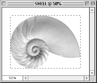 Select an area to use as a tile for a pattern.
Choose a layer. To fill only nontransparent areas on the layer, click the “Lock Transparent pixels” button
 on the Layers palette (the button will darken); or to fill the entire layer, turn that option off.
To restrict the fill area, create a selection using any selection method (no feathering).
Choose Edit > Fill (Shift-Backspace/Shift-Delete).
From the Use pop-up menu, choose what you want to fill the selection or layer with:

 Choose options in the Fill dialog box.
Foreground Color, Background Color, Black, 50% Gray, or White.
Pattern; click the Custom Pattern picker arrowhead, then choose a pattern from the picker.
History to fill the selection or layer with imagery from the active layer at the state that you chose as a source.
Choose a blending Mode and an Opacity percentage.
Optional: If you forgot to click the “Lock transparent pixels” button on the Layers palette, you can check Preserve Transparency here instead.
Click OK
–. The tile used as a fill pattern in another image
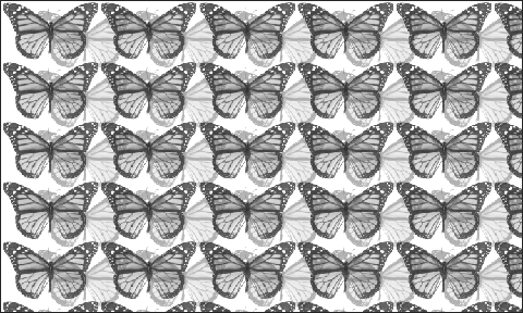 To produce this image, the pattern layer was duplicated, the opacity of the duplicate was lowered to 43%, its blending mode was changed to Multiply, and the duplicate layer was offset from the original.
Tip
If you dislike the new fill color, choose Edit > Undo now so it won’t blend with your next color or mode choice.
Tip
To fill a layer using a layer effect, double-click next to the layer name, then, in Layer Style, click Color Overlay, Gradient Overlay, or Pattern Overlay. The gradient picker is accessible in the Gradient Overlay pane, the pattern picker in the Pattern Overlay pane. Adjust the settings, then click OK. You can apply one, two, or all three of the Overlay effects to the same layer (see pages 254–255).
Optional: If you’d rather choose a stroke color using the Color palette or Swatches palette than with the Color Picker, do so now. If you want to use the Color Picker, you can access it when you get to the Stroke dialog box (step 5).
Choose a layer. If you don’t want the stroke to extend into transparent areas on the layer, click the “Lock transparent pixels” button
on the Layers palette; and for step 6, below, don’t click the Location: Outside option.Optional: Select an area on the layer.
Choose Edit > Stroke.
Enter a Width (1–250 pixels)
. Choose options in the Stroke dialog box.
If you didn’t choose a stroke color for step 1, click the Color swatch, then choose a color from the Color Picker.
Click Location: Inside, Center, or Outside for the position of the stroke on the edge of the selection or layer imagery.
Choose a blending Mode and an Opacity.
Click OK
.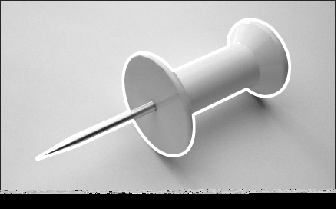 A white stroke was applied to the pushpin.
Choose a layer. Optional: Select an area of the layer to recolor only that area.
Choose Image > Adjustments > Hue/Saturation (Ctrl-U/Cmd-U).
or
Create an adjustment layer by choosing Hue/Saturation from the “Create new fill or adjustment layer” pop-up menu
 at the bottom of the Layers palette.
From the Edit pop-up menu, choose Master to adjust all the image colors at once or choose a preset range to adjust only colors within that range
.
Make sure Preview is checked.
Do any of the following:
Move the Hue slider
to the left or the right to shift colors to another part of the color bar.Move the Saturation slider to the left to decrease saturation or to the right to increase saturation.
To lighten the image or layer, move the Lightness slider to the right. To darken the image or layer, move it to the left.
When a color range is chosen from the Edit pop-up menu (step 3), the adjustment slider and color selection droppers become available
 . You can use the adjustment slider to narrow or widen the range of colors that the Hue, Saturation, and Lightness sliders will affect. By default, the slider covers 90° of the color bar, the areas to the left and right of the vertical bars (the fall-off) each occupy 30°, and the center area between the vertical bars (the color range) occupies 30°.
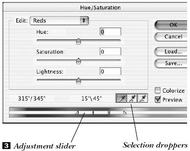
Do any of the following to the adjustment slider:
Drag the center area to move the whole slider, as is, to a new spot on the color bar and shift it into a different color range
. The Edit pop-up menu will update to reflect your new color range choice.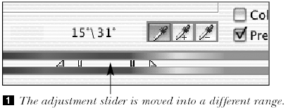
Drag either or both of the vertical white bars on the slider to narrow or expand the range. Narrowing the range increases the fall-off area, and vice versa
.
Drag either or both of the areas outside the vertical bars to widen or narrow that range without altering the fall-off area
.
Drag the outer triangles on the slider to change how much of the current range falls off into adjacent colors
 . Drag outward to increase the fall-off or inward to decrease it. Note: A very short fall-off may produce dithering in the image.
Ctrl-drag/Cmd-drag either color bar to adjust where colors are visible on the bar
 . Colors wrap from one edge to the other. This won’t affect the actual image.
 Ctrl-drag/Cmd-drag to change where colors display on the color bars.
If you alter the slider for any of the six preset color ranges, then that current color adjustment will become the new listing on the Edit pop-up menu. If, for example, you move the preset Reds range slider so it enters the Yellows range, then the menu will list Yellows and Yellows 2, and will no longer list Reds, since the Yellows range now includes Reds.
Click a color in the image window—related colors will be adjusted. Or use the Add to Sample eyedropper
 or Subtract from Sample
  eyedropper to add to or subtract from any current color range by clicking on the image.
Click OK.
Instead of using the Eyedropper tool to get a color readout from one spot, you can use the Color Sampler tool to place up to four color readout markers, called color samplers, on an image. As you perform color and shade adjustments, before and after color breakdown readouts will display on the Info palette. You can also add color samplers while a color adjustment dialog box is open (Shift-click on the image). Color samplers save with the file in which they’re created.
Choose the Color Sampler tool (I or Shift-I).

Click up to four locations on the image to position color samplers
.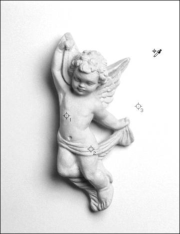 Click on an image with the Color Sampler tool to create up to four sampler locations.
Note: If you choose a tool other than the Color Sampler, Eyedropper, or a painting or editing tool, the samplers will disappear from view. To redisplay them, choose one of the above-mentioned tools or open a dialog box from the Adjustments submenu. To deliberately hide them, choose Color Samplers from the Info palette menu to uncheck that command.
Tip
Color samplers gather data from the topmost visible layer that contains pixels in the spot where the sampler is located. If you hide a layer from which a sampler is reading, the sampler will then read from the next layer down that contains visible pixels in that spot. The Info palette will update if you hide a layer from which it was reading sampler data.
The Info palette displays before-adjustment (and after-adjustment) color breakdowns of the pixel or pixel area under each color sampler ![]() . The size of the sample area depends on which Sample Size setting is chosen on the Color Sampler options bar
. The size of the sample area depends on which Sample Size setting is chosen on the Color Sampler options bar ![]() . Choose Point Sample to sample only the pixel under the pointer; choose 3 by 3 Average or 5 by 5 Average to sample an average color from a 3- or 5-pixel-square area. If you change the Sample Size for the Color Sampler tool, that setting will also change for the Eyedropper, and vice versa.
. Choose Point Sample to sample only the pixel under the pointer; choose 3 by 3 Average or 5 by 5 Average to sample an average color from a 3- or 5-pixel-square area. If you change the Sample Size for the Color Sampler tool, that setting will also change for the Eyedropper, and vice versa.

![]() The four color sampler readouts appear at the bottom of the Info palette.
The four color sampler readouts appear at the bottom of the Info palette.
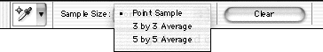
![]() Choose a Sample Size from the Color Sampler tool options bar.
Choose a Sample Size from the Color Sampler tool options bar.
To choose a color model (Grayscale, RGB Color, etc.) for a section of the Info palette, click the tiny arrowhead next to a dropper icon on the palette, then choose from the pop-up menu ![]() . Actual Color is the image’s current color mode; Proof Color is the current color profile mode chosen in View > Proof Setup; and Total Ink is the total percentage of CMYK under the pointer based on the current settings in CMYK Setup. The model you choose for the Info palette doesn’t have to match the current image mode. You can also choose a color model in the Info Options dialog box (choose Palette Options from the Info palette menu).
. Actual Color is the image’s current color mode; Proof Color is the current color profile mode chosen in View > Proof Setup; and Total Ink is the total percentage of CMYK under the pointer based on the current settings in CMYK Setup. The model you choose for the Info palette doesn’t have to match the current image mode. You can also choose a color model in the Info Options dialog box (choose Palette Options from the Info palette menu).

![]() A different color model can be chosen for each color sampler.
A different color model can be chosen for each color sampler.
Choose the Color Sampler tool, ![]() then Alt-click/Option-click a sampler (the pointer will become a scissors icon) or drag the sampler out of the image window. That sampler’s readout area will be removed from the Info palette, and the remaining samplers will be renumbered automatically.
then Alt-click/Option-click a sampler (the pointer will become a scissors icon) or drag the sampler out of the image window. That sampler’s readout area will be removed from the Info palette, and the remaining samplers will be renumbered automatically.
or
Choose the Eyedropper tool, ![]() then Alt-Shift-click/Option-Shift-click a sampler.
then Alt-Shift-click/Option-Shift-click a sampler.
Use the Replace Color command to change colors in an image without having to first select them.
Optional: For an RGB image, choose View > Proof Setup > Working CMYK to see a soft proof of the actual image and modifications to it in CMYK color. (The Sample swatch in the Replace Color dialog box will continue to display in RGB.) You can choose this command even while the dialog box is open.
Choose a layer.
Optional: Create a selection to restrict color replacement to that area.
Choose Image > Adjustments > Replace Color.
Click the color you want to replace either in the preview window in the Replace Color dialog box or in the image window
.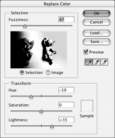 The white areas in the preview window are the areas that will be modified.
Tip
Initially, the preview window will be solid black. Click the Selection button to preview the selection in the preview window, or click the Image button to display the entire image (Mac OS: press Control to toggle between the two display modes). If your image extends beyond the edges of your monitor, click Image so you’ll be able to sample from the entire image preview with the eyedropper.
Optional: Move the Fuzziness slider to the right to add related colors to the selection.
or
Shift-click in the preview window or image window to add other color areas to the selection. Or choose the
eyedropper and click without holding down Shift.or
With the first eyedropper chosen, Alt-click/Option-click in the preview window or image window to subtract color areas from the selection.
or
Choose the
eyedropper, then click without holding down Shift.Move the Hue, Saturation, or Lightness sliders to change the selected colors (only the Lightness slider will be available for a Grayscale image). The Sample swatch will change as you move the sliders.
The Transform sliders will stay in their current positions even if you click on a different area of the image.
Click OK
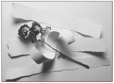
–.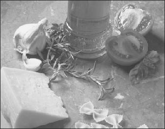 The original image
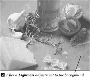
Tip
The Sample swatch color from the Replace Color dialog box will also display in the currently active square on the Color palette, and the Color palette sliders will reflect its individual components. If the gamut alarm displays, it means you have produced a non-printable color using the Transform sliders. Note also that the Transform sliders won’t change the amount of Black (K) in a color for an image in CMYK Color mode. That component is set by Photoshop’s Black Generation function.
Use the Desaturate command to strip color from a layer (convert it to grayscale) without having to change the color mode for the whole image.
Choose a layer or the Background.
Choose Image > Adjustments > Desaturate (Ctrl-Shift-U/Cmd-Shift-U).
Use the Color Balance dialog box to apply or correct a warm or cool cast in a layer’s highlights, midtones, or shadows. Color adjustments will be easier to see in an image that has a wide tonal range.
Make sure the composite color image is displayed (Ctrl-~/Cmd-~) (all the channels on the Channels palette should have eye icons, including the topmost one). To colorize a Grayscale image, first convert it to a color image mode.
Choose a layer.
Choose Image > Adjustments > Color Balance (Ctrl-B/Cmd-B).
or
Create an adjustment layer by choosing Color Balance from the “Create new fill or adjustment layer” pop-up menu
at the bottom of the Layers palette.At the bottom of the dialog box, click the tonal range you want to adjust: Shadows, Midtones, or Highlights
. First click Tone Balance: Shadows, Midtones, or Highlights, then move any of the sliders.
Optional: Check Preserve Luminosity to preserve brightness values.
Move a slider toward any color you want to add more of. Cool and warm colors are paired opposite each other. Pause to preview.
Optional: Repeat the previous step with any other Tone Balance button selected.
Click OK.
Hand tinting
![]() To tint small areas manually, use the Brush tool with the Airbrush button
To tint small areas manually, use the Brush tool with the Airbrush button ![]() pressed on the options bar, and a low Opacity.
pressed on the options bar, and a low Opacity.
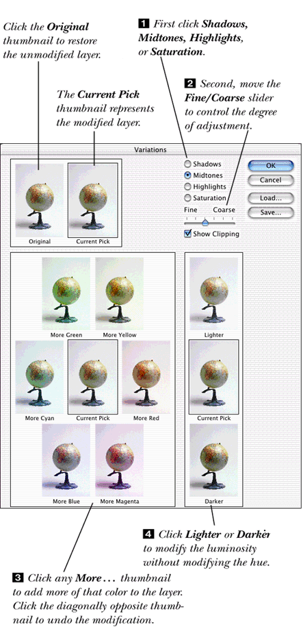
Thumbnail previews in the Variations dialog box represent how an image would look with various color adjustments. The Variations command can’t be used on an Indexed Color image. Note: To make more precise adjustments and preview the changes in the image window, use the Color Balance or Levels dialog box instead.
Choose a layer.
Choose Image > Adjustments > Variations.
Click Shadows, Midtones, or Highlights at the top right of the dialog box to modify only those areas
.
or
Click Saturation to adjust only saturation.
Position the Fine/Coarse slider to the right of center to make major adjustments or to the left of center to make minor adjustments
. Each notch to the right doubles the adjustment per click; each notch to the left halves the adjustment per click.Click any “More...” thumbnail to add more of that color to the layer
. To lessen the amount of a color, click its diagonally opposite color. As you do this, compare the Current Pick thumbnail, which represents the modified layer, with the Original thumbnail. Click the Original thumbnail to undo all the Variations adjustment(s).Optional: Click Lighter or Darker to change the luminosity without changing the hue
.Optional: If you chose to adjust Shadows, Highlights, or Saturation, and Show Clipping is checked, areas that will be converted to black or white will have neon highlights in the dialog box.
Optional: Repeat steps 3–6 with a different tonal range chosen.
Click OK.
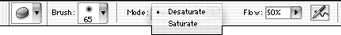
Use the Sponge tool to make color areas on the current layer more or less saturated. (The Sponge tool is also discussed on page 431, where it’s used to bring colors into the printable gamut.) This tool can’t be used on a Bitmap or Indexed Color image.
Double-click the Sponge tool (O or Shift-O).
 It’s on the pop-out menu with the Dodge and Burn tools.
On the Sponge tool options bar
: The Sponge tool options bar
 Click the Brush picker arrowhead, then click a brush. A soft brush will produce the smoothest result. You can also choose a brush from the Brushes palette.
and
Choose Mode: Desaturate or Saturate.
and
Choose a Flow percentage between 1% (low intensity) and 100% (high intensity). Try a lowish Flow percentage first (20%–30%) so the tool won’t saturate or desaturate areas too quickly. (Flow was called “Pressure” in Photoshop 6.)Choose a layer.
Stroke on any area of the layer
. Pause to allow the screen to redraw, if necessary. Stroke again to intensify the effect. Using the Sponge tool to desaturate colors in an image
Tip
If you Saturate or Desaturate an area too much, choose Edit > Undo or click an earlier state or snapshot on the History palette. Don’t try to use the tool with its opposite setting to fix it—the results will be uneven.
Tip
You can also adjust saturation in an image using the Image > Adjustments > Hue/Saturation or Replace Color command.
In this exercise, you’ll be painting shades of gray on a special neutral black or white layer in Color Dodge or Color Burn mode in order to heighten or lessen color in the underlying layer. You’re welcome to try out other layer modes.
Convert the image to RGB image mode, and activate the layer that you want to affect.
Alt-click/Option-click the “Create new layer” button
 on the Layers palette.
Type a name for the layer.
Choose a Mode. We chose Color Dodge mode for our illustration
, but you can choose any mode other than Normal, Dissolve, Hue, Saturation, Color, or Luminosity.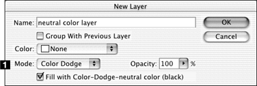
Check “Fill with [mode name]-neutral color [color name],” then click OK. Our layer was filled with black.
Choose the Brush tool (B or Shift-B),
 and choose a brush from the brush picker or Brushes palette.
Choose Grayscale Slider from the Color palette menu.
Paint with a 60–88 percent gray. You’ll actually be changing the neutral black on the layer. Areas you stroke over will become much lighter.
If you’re displeased with the results, paint over areas or fill the entire layer again with black to remove all the changes, and start over. Repainting or refilling with black will remove any existing editing effects, while preserving pixels in the underlying layers.
To heighten the color effect, you can choose another mode from the Layers palette. We chose Color Burn mode. Your image strokes will be silhouetted against black
–. The original image
 After painting on the Color Dodge mode layer, choosing Color Burn as the layer mode, and painting medium gray strokes on the Color Burn mode layer
 The original image
 After choosing Overlay mode, checking the “Fill with...” option for the neutral layer, and applying Dodge and Burn strokes to the neutral layer to heighten the highlights and shadows
Or to restore more of the original color, paint with a medium gray.
If you use the Levels or Curves command to make color or tonal adjustments, you should adjust the overall tone of the image first (the composite channel), and then adjust individual color channels, if necessary (a bit more cyan, a bit less magenta, etc.).
Display the Info palette.
Choose Image > Adjustments > Levels (Ctrl-L/Cmd-L).
or
Create an adjustment layer by choosing Levels from the “Create new fill or adjustment layer” pop-up menu
at the bottom of the Layers palette.Check Preview.
If there’s an obvious predominance of one color in the image (e.g., too much red or green), choose that channel from the Channel pop-up menu
.
Follow any of these steps for a CMYK Color image (the sliders will have the opposite effect in an RGB image!):
To increase the amount of that particular color, move the black or gray Input Levels slider to the right. The black triangle affects the shadows in the image, the gray triangle affects the midtones.
or
To decrease the amount of that color, move the gray or white Input Levels slider to the left. The white slider affects the highlights.
or
To tint the image with the chosen channel color, move the white Output Levels slider to the left. To lessen the chosen channel color, move the black Output Levels slider to the right. The Output sliders are particularly effective for adjusting skin tones in a photograph.
Repeat these steps for any other channels that need adjusting, bearing in mind that one channel adjustment may affect another.
Click OK.
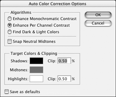
![]() The Auto Color Correction Options command can be used to automatically adjust the color, tonal range and contrast in an image and set target values for shadows, midtones, and highlights. We recommend using these auto correction options as a starting point for correcting an image.
The Auto Color Correction Options command can be used to automatically adjust the color, tonal range and contrast in an image and set target values for shadows, midtones, and highlights. We recommend using these auto correction options as a starting point for correcting an image.
With a pixel (non-vector) layer chosen, choose Image > Adjustments > Levels.
Click the Options button. Move the Auto Color Correction Options dialog box so you’ll be able to see the Levels histogram readjust as options are chosen.
Click an algorithm option to adjust color and tonal range (see the sidebar)
. The Auto Color Correction Options dialog box
Check Snap Neutral Midtones to automatically locate average colors that are very close to the neutral value in the image, then adjust each channel’s midpoint value to make those colors actually become neutral.
Optional: To alter the target value assigned to the shadow, midtone, and highlight areas of the image, click the respective swatch. In the Color Picker, drag the small circle up or down in the large square. Move the Color Picker so you’ll be able to see how the histogram (when the composite RGB or CMYK channel is displayed) shifts left or right, remapping image pixels to the current color choice. Click OK when done.
Click OK twice.
Tip
To view a channel’s adjustments, set the channel pop-up menu to an individual channel before clicking Options in step 2, above.
Using the Curves command, you can correct a picture’s highlights, quarter tones, midtones, three-quarter tones, or shadows separately. You can even use multiple adjustment layers to do this. Use one adjustment layer for the composite channel first and then use another one for each individual channel to fine-tune the color. And you can experiment with the layer opacity or use a layer mask to remove or lessen the effect in specific areas.
Optional: To adjust a combination of two or more channels at the same time, Shift-click those channel names on the Channels palette now. Note: You can’t do this for a Curves adjustment layer!
Choose Image menu > Adjustments > Curves (Ctrl-M/Cmd-M).
or
Create an adjustment layer by choosing Curves from the “Create new fill or adjustment layer” pop-up menu
at the bottom of the Layers palette.Move the pointer over the grid. The default Input and Output readouts in the lower-left corner of the dialog box are either the brightness values for RGB Color mode or the percentage values for CMYK Color mode. Click the gradient bar below the grid to switch between those two readouts.
Optional: Choose a Channel to adjust it separately. If you chose more than one channel in step 1, you can select that combo now (e.g., “RB” for the red and blue channels).
If the gradient on the gradient bar is white on the left side (for CMYK mode), drag the part of the curve you want to adjust upward to darken or downward to lighten
. (Click the double arrow in the middle of the gradient bar to reverse the curve.) Reverse this instruction for RGB mode.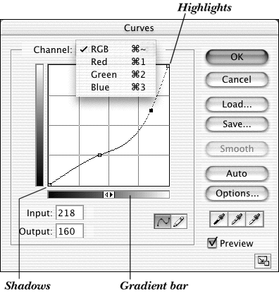
and/or
For more precise adjustments, click on the curve to create additional points (up to 14), then drag the segment between any pair of points to make subtle adjustments. (To remove a point, click on it and press Backspace/Delete; or Ctrl-click/Cmd-click on it.)
and/or
Move the extreme end of the curve to reduce absolute black to below 100%, or absolute white to above 0%.
Note: Once you’ve added a point, you can then enter numbers in the Input and/or Output fields for that point.
Click OK
–. The original image
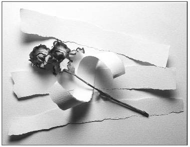 After a Curves adjustment
Tip
The Curves pencil tool tends to produce a bumpy curve, resulting in sharp color transition jumps.
Tip
For an image in RGB Color mode, click on the image to see that pixel’s placement on the curve. Ctrl-click/Cmd-click on the image to place that point on the curve. For a CMYK Color image, you can click an individual C, M, Y, or K channel to show that pixel’s value, but not on the composite CMYK channel.
Tip
Alt-click/Option-click the grid in the Curves dialog box to toggle between a 4 by 4 and 10 by 10 grid spacing.
Choose a layer in a color image. Layers below this layer will be affected by the adjustment layer you’re about to create.
Create an adjustment layer by choosing Hue/Saturation from the “Create new fill or adjustment layer” pop-up menu
at the bottom of the Layers palette.Move the Saturation slider all the way to the left (to –100)
.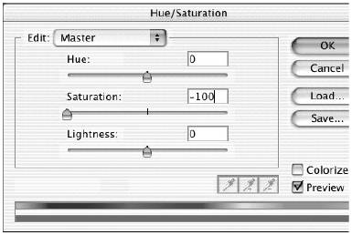 In the Hue/Saturation dialog box, move the Saturation slider all the way to the left to remove color from the layer.
Click OK.
Set the Foreground color to black.
With the adjustment layer chosen, paint across the image where you want to restore the original colors from the underlying layers
. Paint with white to restore grayscale areas.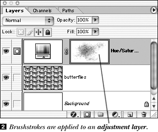
You can also restack a layer above the adjustment layer to fully restore that layer’s color.
Tip
Choose any of the following mode and opacity combinations for the adjustment layer:
Dissolve with a 40%–50% Opacity to restore color with a chalky texture.
Multiply with a 100% Opacity to restore subtle color in the darker areas of the image.
Color Dodge to lighten and intensify color or Color Burn to darken and intensify color.
A spot color can be placed in its own separate channel. Then when the image is color separated, this spot color channel will appear on its own plate.
Display the Channels palette, and drag it away from the Layers palette so you can see both palettes at once.
Choose New Spot Channel from the Channels palette menu.
Click the Color swatch,
and if necessary, click Custom to open the Custom Colors dialog box.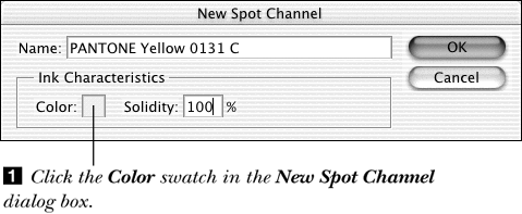
Choose a Pantone or other spot color matching system name from the Book pop-up menu, choose a color, then click OK.
Optional: To change the way color in the spot channel displays on screen, enter a new Ink Characteristics: Solidity percentage. At 100%, it will display as a solid color; at a lower percentage, it will appear more transparent (as a preview for, say, a spot color varnish).
Click OK. The name of the color you chose will be listed next to the spot channel name on the Channels palette
. Any stroke that is applied or image element that is created while the spot color channel is active will appear in that color (see the following page).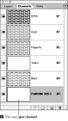
Create a spot color channel (instructions on the previous page).
Double-click the spot color channel name, enter 100 as the Solidity value, then click OK.
Choose the Brush tool. (The Color palette will display in grayscale mode while the spot color channel is active.) Choose black as the Foreground color.
On the Brush tool options bar, choose Normal as the painting Mode and choose an Opacity percentage to establish the tint percentage for the spot color ink on the spot color plate.
Make sure the spot color channel is still active, then paint on the image.
When the eye icon is present for both the spot color channel and the topmost (composite) channel on the Channels palette, the spot channel is displayed along with the other image layers. To display the spot channel by itself, hide the composite channel by clicking its eye icon.
If you want to know the opacity of a spot color area, choose the spot color channel, choose Actual Color mode for the readout on the Info palette, move the pointer over the image, and then note the K (grayscale percentage) on the Info palette.
When a spot color channel is active, the thumbnail for the most recently active layer will have a black border and edits will affect only the spot channel. If you click the topmost (composite) channel on the Channels palette, edits will now affect the most recently active layer, not the spot channel.
To add type to a spot color channel, see page 335.
If a color image with a spot color channel (or an image in Duotone mode), is converted to Multichannel mode, any spot colors in the image (or duotone) will be placed in separate spot channel(s). Preexisting spot channels, if any, will remain after the conversion. To tint an entire image with a spot color, convert the image to Duotone mode and specify the desired spot color as the monotone color (see page 427).
To export a file that contains spot channels, save it in the DCS 2.0 format (make sure Spot Colors is checked in the options pane). Each spot channel will be preserved as a separate file, along with the composite DCS file. Also, let Photoshop assign the spot channel name for you. Then other applications will recognize it as a spot color. The Photoshop PDF format also supports spot colors.
Spot channel colors overprint all other image colors. The stacking order of spot color channels on the Channels palette controls the order in which spot colors overprint each other. To prevent a spot color from overprinting, you must manually knock out (delete) any areas from other channels that fall beneath the spot color shapes (read more about this in the Photoshop documentation). Talk with your print shop, though, to see if this step is necessary.
Choosing Merge Spot Channel (Channels palette menu) merges the spot color into the existing color channels and flattens all layers, so you can then print a composite (single-page) proof on a color printer. If you don’t merge spot channels, they will print as separate pages. Merging a spot color channel into the other color channels changes the actual spot color, because CMYK inks can’t exactly replicate spot color inks. When a spot color channel is merged into other color channels, its Solidity value determines the tint percentage of merged spot color. The lower the Solidity, the more transparent the newly merged color will be. All image layers are flattened when spot channels are merged.
Tip
Use the Solidity option in the Spot Channel Options dialog box to produce an on-screen simulation of the ink opacity for the spot plate. For an opaque ink, such as a metallic ink, use 100% Solidity. For a transparent, clear varnish, use 0% Solidity.
Double-click an alpha channel on the Channels palette.
Choose Color Indicates: Spot Color
.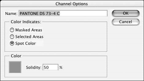 Choose Color Indicates: Spot Color in the Channel Options dialog box.
Click the Color swatch, click Custom, if necessary, to open the Custom Colors dialog box, choose a spot color, then click OK.
Click OK. Former non-white (black or gray) areas on the channel will now display in the chosen spot color.