
- 1.
Create a JavaScript file, router.js, in the root directory. For a TS file, we will use router.tsx.
- 2.
Use the Route from react-router-dom to define the path and component associated with the path, for example:
- 3.
Wrap all the Route that we created inside the Switch from react-router-dom, for example:
- 4.
Navigate successfully to any page using the Link from react-router-dom, for example:
Along the way, we will learn how to use our preferred design library in the application we are building, which is Material-UI.
We will also touch on lazy loading or code-splitting our component to speed up initial loading time and improve user experience. In many relatively small React SPAs (single-page applications), the concept of code-splitting may not be necessary or may not have that much impact on performance. However, if we have a huge application with, let’s say, an admin dashboard as well as a customer portal, it is not a good idea to try to load the complete application at initial loading times.
Why React Router?
React Router is a dynamic routing library for React. It is composed of the following packages: react-router, react-router-dom, and react-router-native. The core is the react-router, while the other two are environment specific. React-router-dom is for web apps, and react-router-native is for mobile apps using React Native.
It is compostable.
It is easy to add links to the web page.
It can add routing to several different pages on SPAs.
It conditionally renders components based on the route from the URL.
Why Material-UI?
One of the fundamental reasons for using a UI library is that it saves us time styling our app. We don’t need to reinvent the wheel, and we can just use something readily available, and more importantly, it’s already battle-tested by the community.
Choosing a UI design depends on your project specifications, of course. Still, usually, I’d look first at the most recommended and popular among other developers, like in the case of Material-UI. Again, I’d look at the active contributors on GitHub, contributors helping to maintain the project. In npmjs.com, Material-UI has about 1.4 million weekly downloads.
There’s also a higher chance that any issues you might encounter in your applications have already been resolved and documented on Stack Overflow or other sites.
Other top UI designs worth checking out include Ant Design and React-Bootstrap. We would talk more about styling React components in later chapters.
Getting Started
Let’s start building our React Router navigation for our application. First, let’s make a few edits to some default files, and let’s build it up again in a step-by-step process.
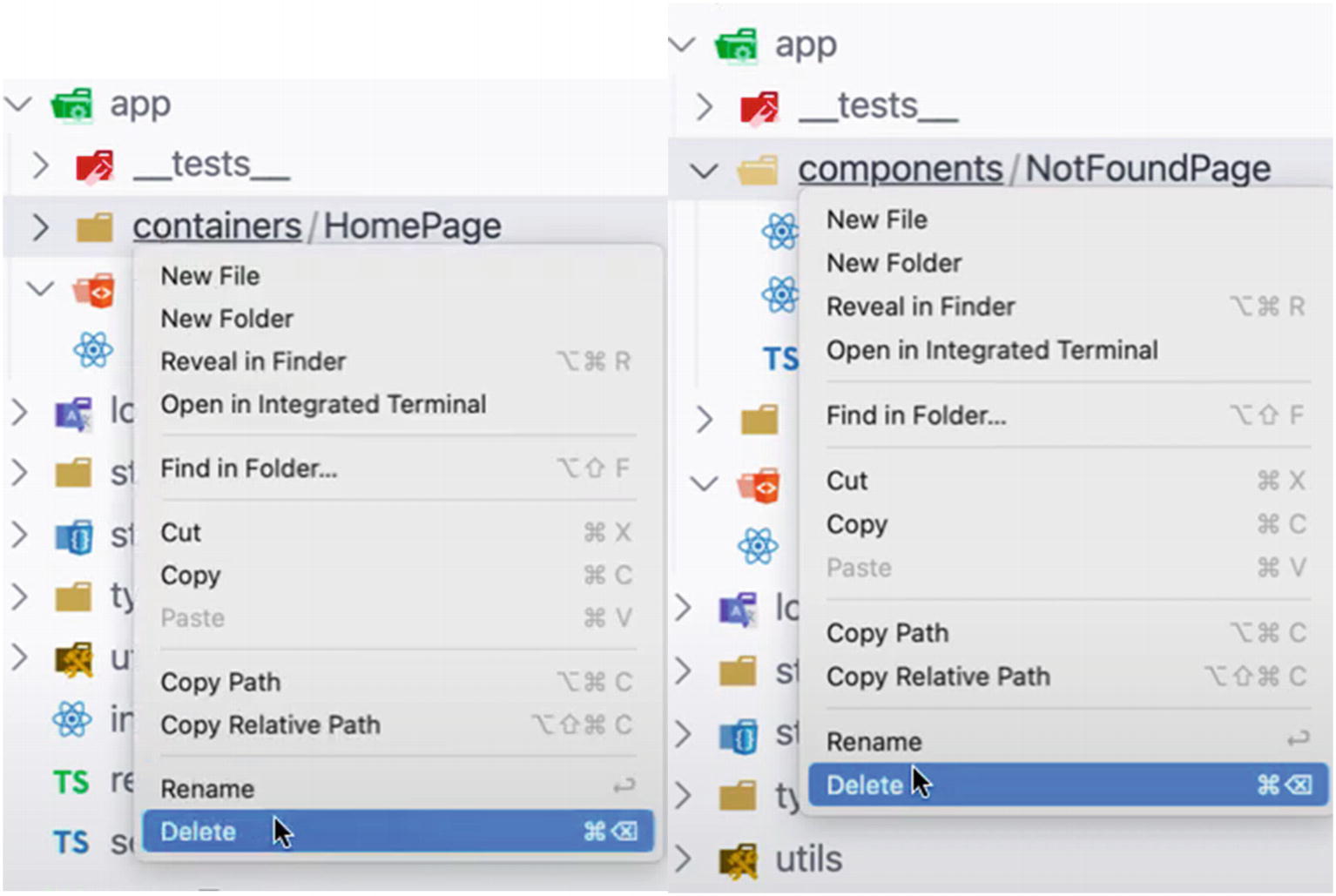
Deleting folders: containers and components
Updating index.tsx

New folder structure
Open the file Home.tsx and type the snippet rafce (short for react arrow function export component) if you’re using VS Code. In WebStorm, the snippet is rsc (short for React stateless component without prop types and ES6 module system).
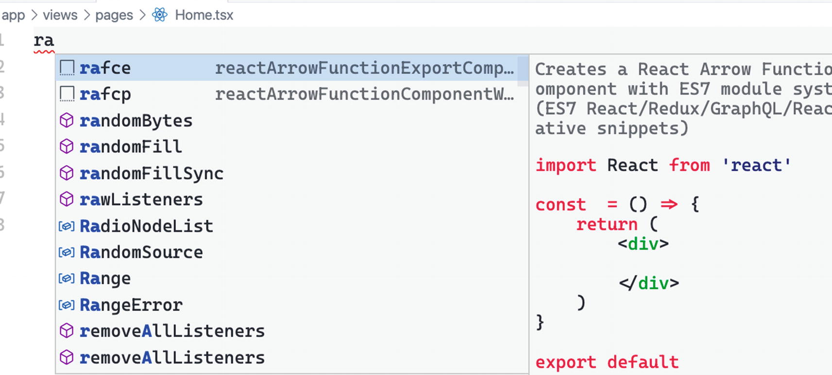
Typing the rafce snippet, short for react arrow function export component
Adding h1 Heading to the Home Page
Adding the Home Component to routes.tsx
When you run the app and go to your default localhost:3000, you should see the rendered page.

Rendering the Home Page to the UI
What did we do here? We’ve shown a straightforward way of navigating our app using React Router.
Next, let’s create another file and name it material-buttons.tsx, and the path shall look like this: app/components/material-buttons.tsx.
Here we’ll render some buttons in the UI. We will use the design coming from Material-UI that we’ve imported earlier. Go to the website of Material-UI, specifically the Button component.

Using the Material-UI Button component
Choose the Contained Buttons design. Make sure to choose the TypeScript option and copy the complete source code and paste it in our material-buttons.tsx file .
Rename the file from ContainedButtons to MaterialButtons.
Copying the Material-UI Button Component
Rendering the Material-UI Button component
Now that we have a proof of concept that we can use the Material-UI library in our design, we can look to configuring a router and then navigation.
But first, let’s quickly recap the React Router installation.
Basics Recap
With the installation of react-router-dom as part of our boilerplate, we gained access to the following three components in our index.tsx: <BrowserRouter>, <Route>, and <Switch>.
Open your index.tsx file, and let’s discuss each one:
<BrowserRouter> is the base configuration. It wraps the other components and keeps them in sync with the URL.
<Switch> is the dynamic part of the web application. As the name suggests, it will change or dynamically switch based on the URL. The Switch component makes sure that the first Route child component that matches the URL location will render.
<Route> needs a “path prop” and is rendered when it gets the matched or exact URL path.
Now let’s see how we navigate the URL paths in our application to get from one component to the next.
React-router-dom allows us a few ways of changing paths, including the most common one called the <Link> tag, which we would be using a lot here in our app. For a cleaner code and for separation of concerns, we shall create a new file in the app directory and name it routes.tsx.
Creating routes.tsx
Our Route path will likely become more extended, so instead of building all the routes in our app/index.tsx file, we will create a new file and name it routes.tsx .
Moving Switch and Route Components to routes.tsx
Using the Routes in index.tsx
Let’s create another view page and name it AboutPage.tsx under the path views/pages. Add an <h1>This is the About Page</h1>.
Creating AboutPage and Adding h1 Heading
Check your localhost:3000/about to see if it’s still working.
When building an application, I usually gather the requirements before writing any code. I always check whether I need to create a dashboard for the application or an admin dashboard. As much as possible, we make the routing first and determine if there are nested routes or not.
Now we can navigate the URL paths in our application. The first task is to build a dashboard.
Building a Dashboard
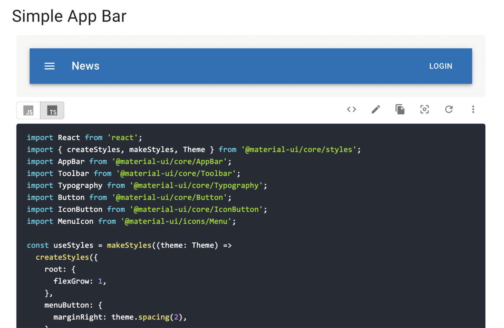
Screenshot of Simple App Bar at the Material-UI website
Navigation Bar
The navbar component is what we place on top of the app and allows us to switch between different pages such as Home, About, Login, etc.
Create a new file under the folder components and name it navigation-bar.tsx.
Paste the source code that you grabbed from Material-UI Simple App Bar (see Figure 5-8). Don’t forget to change the default filename from ButtonAppBar to NavigationBar.
At this point, let’s just delete the file material-buttons.tsx since we don’t need it anymore. We just created it to quickly show how we can use the Material-UI designs in our component pages.
Using the NavigationBar in index.tsx

Showing the NavigationBar at the browser
We will discuss in detail the various React styling methods in the following few chapters. But in the meantime, I just want to point out that the styling solution of Material-UI comes from many other styling libraries, such as styled-components.
At its core, Material-UI uses CSS-in-JS that works at runtime and server-side. We will talk more about CSS-in-JS in a later chapter.
In my opinion, Material-UI is one of the best styling libraries, especially for React apps. The components are reusable, fast, and declarative. On its GitHub, it also has over 63K stars, which means I’m not alone, in my opinion.
Adding Navigation Links
Let’s add some buttons and navigation links in our navigation bar and name them as follows – <Home> <About> <Dashboard> – as shown in Listing 5-9.
We will discuss in detail later in this chapter the different navigation paths we can use for our React app, but for now, let’s build our components first.
Adding Navigation Links to the navbar
While at it, replace the word “News” with LOGO because that’s where we’re going to put our icon logo later.
Adding a link Style Object
As you can see in Listing 5-11, we can now use it in our button navigation links using the reserved React word <className>.
Adding the Navigation Links and CSS Class Objects in the NavigationBar
Using Backticks for Two or More CSS Class Objects
Make sure to clean up any unused or grayed-out imported libraries.
Next, let’s add another component under views/pages and name it NotFoundPage.tsx.
Creating a 404 Not Found Page
Navigating React Router: <Redirect >
In our routes.tsx, let’s add <Redirect />, which is fortunately already built into the react-router-dom.
There are many use cases for redirecting our user to a particular page. In general, we use <Redirect /> if we need to change the URL path without the user having to click a link to that path.
When the user is accessing a restricted page.
When the user is accessing a page that is not found or no longer exists.
When the user typed an incorrect path into the address bar (typo error!).
A successful login has occurred, and the user is now being directed to the home page or dashboard.
Before we wrap up this section, let’s just put a bit of styling on our pages, especially paddings and margins.
Adding the Container-Style Class Component

Using Container from Material-UI
But don’t worry too much about the specific styling for these pages. We’re just showing you the easy convenience of using Material-UI to style our app.
Remember that this book’s primary goals are to guide you to build an enterprise-level app and give you an idea of how developers develop their apps similarly. In the end, you still decide on how you will make your app based on your specific requirements.
So what about the dashboard? Let’s build that up now.
Creating the Dashboard Layout
In the app folder, create a folder named layouts, and after which, make a subfolder and call it dashboard-layout.
In the dashboard-layout folder, create the file dashboard-sidebar-navigation.tsx.
The path is app ➤ layouts ➤ dashboard-layout ➤ dashboard-sidebar-navigation.tsx.
Importing Libraries to dashboard-sidebar-navigation.tsx
Okay, let’s briefly explain a couple of the unfamiliar libraries we imported here before we proceed. We will start with the long-overdue <Link> from react-router-dom and the other ways of navigating paths in our app.
Navigating Path: <Link>
The <Link> from react-router-dom allows users to navigate the application and have pages re-rendered without a refresh. It allows for a declarative and easy navigation path around our app.
to: string: Created by concatenating the location’s pathname, search, and hash properties. For example: <Link to="/products/?sort=name" />.
to: object: This can be any of the following props: pathname, search, hash, and state.
replace: bool: When true, clicking the link replaces the current entry in the history stack instead of adding a new one. For example: <Link to="/products" replace />.
to: function: The current location is passed as an argument, and location representation should be returned as an object or string. For example:
React Hook: useRouteMatch
useRouteMatch is a Hook that we typically need when we are using <Route>. useRouteMatch allows us to access to a <match> object and use it inside the component; so instead of rendering a <Route>, just use useRouteMatch.
Creating the DashboardSidebarNavigation Component
We’re using styling from Material-UI Drawer and Toolbar and using the <Link> component as our navigation path.
Styling the dashboard-sidebar-navigation Using Material-UI
Creating the Dashboard Component
Dashboard Component
So what’s going on here? We have the main Dashboard component and its children props, which are the main content pages. The children props have routers for users to navigate successfully from one view or page to another.
Bear in mind that the children parameter in the Dashboard is the entry point for React components. For example, if we pass a Button component in the Dashboard, it will be rendered beside the DashboardSidebarNavigation component.
We now have a reusable layout of the Dashboard that contains a DashboardSidebarNavigation.
As for the <Grid>, it is used for the positioning of the layouts. The grid’s responsive layout, which is based on a 12-column grid layout, is quite powerful because it can adapt to any screen size and orientation.
Now that we already have the layout, the next step is to create a dashboard default component, which is the first thing that users will see in the Dashboard.
In views, create a new dashboard folder, and inside that create two new files: dashboard-default-content.tsx and settings-and-privacy.tsx.
Type in the snippet “rafce” to create a stateless arrow component and return an <h1> with the title heading the same as the component’s name. See the following sample.
Creating the DashboardDefaultContent Component
Creating the SettingsAndPrivacy Component
For now, we’re just setting up the Dashboard and navigation without the styling because we just want to show a proof of concept that we’re able to navigate successfully from one page to the next.
Now, let’s define the path in our routes.tsx. But in this case, we will be using render props.
Render Props
On the website www.reactjs.org, the term render props refers to “a technique for sharing code between React components using a prop whose value is a function.”
Okay, simply, it means that our Route component has a render prop that takes a function as a value. The Route component then uses that function to render whatever the function provides – in our case, the Dashboard.
Using the Render Props in routes.tsx
In the React Router library, the <Route /> carries the behavior of navigating to different views or pages. It renders the component when the path matches.
Next, let’s update the dashboard-sidebar-navigation.tsx to add the settings and privacy button and a logout button.
Importing the Material-UI Components to dashboard-sidebar-navigation.tsx
The additional styling components for the dashboard sidebar navigation are as shown in Listing 5-22.
Additional Components and Styling for dashboard-sidebar-navigation.tsx
If you click the Dashboard button in our UI, you should be able to see the following additional components:
settings and privacy
logout
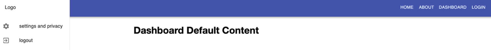
Dashboard Default Content UI
If you click settings and privacy, you should successfully navigate to that page. The same goes for when you click Home, About, or Login – the last one is currently just a 404 page because we haven’t built that one yet. Also, logout, for now, is just basically refreshing the page.
Going into React.lazy( )
But wait. We’re not done yet. We can still improve our route navigation. And we can do this with the help of lazy loading, which is one of the most effective ways to speed up our bundles’ loading times.
So what is lazy loading?
The concept of lazy loading is easy to understand. It is merely rendering first what is essential to the user interface while quietly loading nonessential sections or items as needed.
Lazy loading in React is a relatively new feature that was released in version 16.6.0. It has come about as applications have become more complex, powerful, and massive, leading to increased loading times and negatively impacting the user experience.
And as a best practice, we should always need to consider users, including those using mobile data and slow Internet connection.
React.lazy(), which is now fully integrated into the core React library, has replaced a third-party library react-loadable.
But use react-loadable for server-side code-splitting since React.lazy () and Suspense are not yet available for server-side rendering.
React lazy loading allows us to load components slowly or gradually using code-splitting without installing additional libraries. This approach enables us to render the necessary or only critical interface items at initial loading times while lazily and quietly unrolling the other sections as needed.
According to the official React docs, the best way to do code-splitting in our React app is through the dynamic import () syntax. Eager loading is the default behavior of our web app, meaning if you download all the page resources, for example, the Home Page, then everything will be downloaded in one go.
The potential problem with this is that it can create a bottleneck if the application is huge – hence, we need to do code-splitting.
Showing Eager Loading vs. Lazy Loading
Note that components created using React.lazy() need to be wrapped in React.Suspense, so let’s review that now.
React Suspense
Suspense acts like placeholder content while the lazy components are loaded. Note that we can wrap several lazy components at various hierarchy levels with just a single Suspense component.
A little caveat: In the official React docs, Suspense is still an experimental API and could still undergo some changes until such time when the React team says it’s fully complete for production-ready work.
However, this notice, which has been on for a couple of years, has not deterred React developers from using React.lazy() and Suspense in big applications or production-level apps.
Tip: For the best user experience, wrap your lazy component in an error boundary <ErrorBoundary /> if it fails to load.
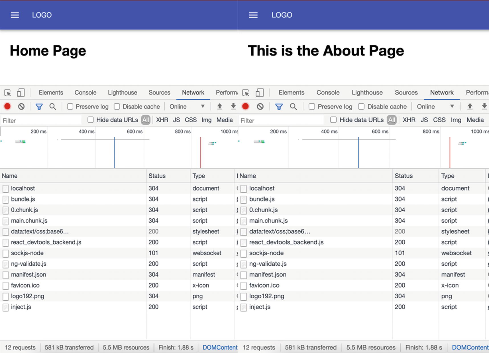
A screenshot of eager loading of the Home Page and About Page in DevTools
You’ll see that ALL components are loaded even at the app’s initial loading. This means that even if you navigate from the Home Page to the About Page, nothing new is added.
So now, let’s see the difference between a component that is eager loading and one that is lazy loading.
Eager Loading vs. Lazy Loading
Now, let’s compare a component that is wrapped in lazy loading against an eager loading component.
But before we can compare the two components, we need to wrap our lazy component with React Suspense. So let’s do that now.
Lazy Loading the Components About and Dashboard for Comparison

Failed to Compile React Suspense
This is because Suspense requires the property “fallback.”
React looks up the tree, encounters the first <Suspense> component, and renders its fallback.
Using the Suspense Prop fallback
Okay, that should make our Suspense component working now. You can also lazy load the settings and privacy, but make sure to leave the Home Page on eager loading so we can see the comparison.

Eager loading of the Home Page at initial loading time

Lazy loading the About Page

Lazy loading the Dashboard
The highlighted portion was the only thing loaded when we navigated from the About Page to the Dashboard page.
You might think that the file and time to load may be insignificant or small, but imagine if your app already got massive lines of codes and you’ve got 50 pages or more. Your user, especially on a mobile app or a slow Internet connection, would feel it.
Summary
I hope by now you have a fair idea of how client-side routing works in general and how to implement routing in React using the React Router library. We’ve also touched on how to use lazy loading in our app to turbo-charge our initial loading times with the end goal of improving user experience.
In the next chapter, we will tackle writing local states, sending HTTP requests, and using ApexCharts.