Devlin Basilan Duldulao1 and Ruby Jane Leyva Cabagnot1
(1)
Oslo, Norway
This chapter will update our React application to the latest current version (as of this writing) in the first quarter of 2021 and then make our application mobile-friendly. It will ensure that our application can also perform well on a small screen such as that of a mobile device or a tablet.
Mobile-friendly apps is another term for responsive design or adaptive design apps. In short, the display page is automatically adjusted based on the size of the device screen.
Getting Started
Let’s go to the package.json, and to use the latest version available for each library we are using, we need to use a VS Code extension called Version Lens. We installed this in a previous chapter, but feel free to install it now if you have not done so.
Figure 16-1
Using Version Lens
So how to check the latest version of each library we are using? Open the package.json and click the V icon that you see in the upper-right corner, as shown in Figure 16-2.
Figure 16-2
Version Lens library
Updating a Package Library Safely
We are going to do a safe upgrade of React and of the libraries we are using. To upgrade, just click the up arrow sign, as shown in Figure 16-3.
Figure 16-3
Safe update of libraries
The latest version of date-io/moment is 2.10.8, a major version update from the 1.3.13 version we are using. We are NOT going to update this because the major version means there are potentially breaking changes. The 1.3.13 is the version that is compatible with the Calendar component that we are using here.
Be careful of breaking changes when upgrading to a major version. Minor version and patch upgrades are usually okay.
Upgrade all the minor versions and patches in your app using Version Lens, or if you want to be sure, compare your versions first with the ones we have at the time of this writing. You can check out the package.json in my GitHub:
We updated the minor versions and patches in this app, including the following major versions, as shown in Listing 16-1.
//major versions that were updated
@types/react
@types/react-dom
concurrently
prettier
react
react-dom
react-test-renderer
sanitize.css
ts-node
typescript
Listing 16-1
Updated Major Versions
Okay, after doing that, we need to delete the package-lock.json and the Node modules. And then do
npm install
npm start:fullstack
If you encounter a problem or an error after running the npm start:fullstack, check your version of NPM. At this time of writing, we are using NPM version 6 because there’s a compatibility problem with version 7.
Speaking of versions, one of the more noticeable changes in React 17 is that you don’t need to explicitly type import React from 'react' when creating a component. Try to delete one of the components and see if it’s still working. At the moment, though, I would not recommend deleting it yet because some React developers might not be familiar with this change. I’m just mentioning it so you won’t get confused if you see components with the explicitly written import React statement.
Besides, the snippets we used in VS Code or WebStorm still automatically include the import React statement. Nevertheless, we need to upgrade to React 17 in preparation for the upcoming features in React.
Once you have checked that your app is still working, we can now start to make our app mobile-friendly.
Updating the HomePage
Let’s start with the Home Page component and make it responsive. We will need style components from Material-UI Core and also the Page template we created, as shown in Listing 16-2.
Listing 16-2 Making the Home Page Mobile-Friendly
import React from 'react';
import { Box, Container, Typography, useMediaQuery } from '@material-ui/core';
useMediaQuery: A CSS media query Hook for React. It will detect if the browser is small, like a mobile app or a tablet browser. We are setting the max-width to 650 pixels, and if it is below that, we are setting it to mobileDevice.
We have the Page template and the Container and Box from Material-UI in the return elements.
height: We are setting the height to the following: if it’s a mobile device, then set the height to 50 vh (view height) or 50 percent of the browser’s size; otherwise, the height is 100 vh.
typography: If a mobile device is detected, the size is h4; otherwise, set it to h1.
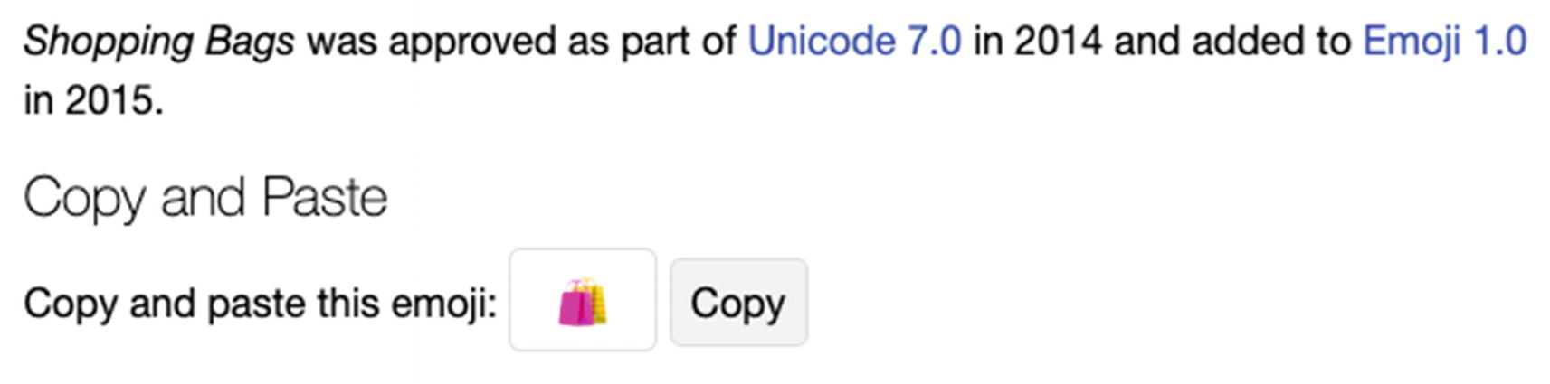
We are also using a shopping bag emoji here. And to get that kind of emojis and just straight away copy-paste it to your code, go to this website emojipedia.org. Search for “shopping bag” and copy and paste this emoji to your code.
Figure 16-4
Emojis from emojipedia.org
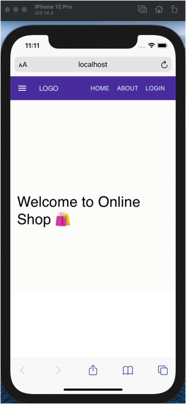
Refresh your browser and drag the window to make it smaller. You can also check it from a Simulator if you’re using Mac or Android Studio on Windows.
Figure 16-5
Mobile screenshot of the Home Page using MediaQuery
Updating the About Page
Next, let’s update the About Page component. We would be doing pretty much the same thing here, as shown in Listing 16-3.
Listing 16-3 Making the About Page Mobile-Friendly
import React from 'react';
import { Box, Container, Typography, useMediaQuery } from '@material-ui/core';
To test it, just go to a localhost page that does not exist, for example, “localhost:3000/not-found,” as shown in Figure 16-7.
Figure 16-7
Making the Not Found Page mobile-friendly
Making the Navbar Mobile-Friendly
We will need to make the dashboard sidebar navigation mobile-friendly. In Figure 16-8, you’ll note that the sidebar navigation is taking up more than 50 percent of the screen size.
Figure 16-8
Mobile screenshot of the UI before using media query
Let’s go to the navigation-bar.tsx, and we will incorporate the useMediaQuery, as shown in Listing 16-5.
//add the useMediaQuery
import { AppBar, Toolbar, Button, useMediaQuery, colors, } from '@material-ui/core';
Importing useMediaQuery in dashboard-sidebar-navigation
But we are not done yet. If you look at the app in your Simulator or a mobile device, there’s only a slight change. The dashboard navigation is still not responsive, as shown in Figure 16-9, which shows the current state of the sidebar in a mobile device.
Figure 16-9
Mobile screenshot of the UI using media query
There are several ways we could do to make the navigation bar responsive. First, remove the entire sidebar navigation on a mobile device and create a drop-down menu list or a burger menu in the upper-right corner, as shown in Figure 16-10.
Figure 16-10
Drop-down menu list
Another way is to shrink the dashboard sidebar navigation. We will do the second option.
Making the Dashboard Sidebar Navigation Mobile-Friendly
Go to dashboard-sidebar-navigation.tsx and add useMediaQuery from Material-UI Core, as shown in Listing 16-6.
Then we will change the profile.name. We will not display the avatar if it’s on a mobile screen. We created another drawer container for the mobile or smaller screen, as shown in Listing 16-8.
Now recheck your mobile screen. It should be mobile-friendly now, as shown in Figure 16-11.
Figure 16-11
Mobile friendly dashboard
FOR YOUR ACTIVITY
The mobile screen is now mobile-friendly. However, there’s still room for improvement. For your activity
1.
With useMediaQuery Hooks, adjust the ample space between the navigation bar and the dashboard pages’ content when viewing them on a mobile device.
2.
Figure 16-12 is a screenshot of the Dashboard (L) and the Dashboard Calendar (R).
Figure 16-12
Screenshot of the Dashboard (L) and the Dashboard Calendar (R)
Summary
To summarize, we updated our React application to the latest current version (as of this writing) in the first quarter of 2021. We then made our application mobile-friendly with the help of media query Hooks.
In the next chapter, we will tackle the various popular styling methods for React components.


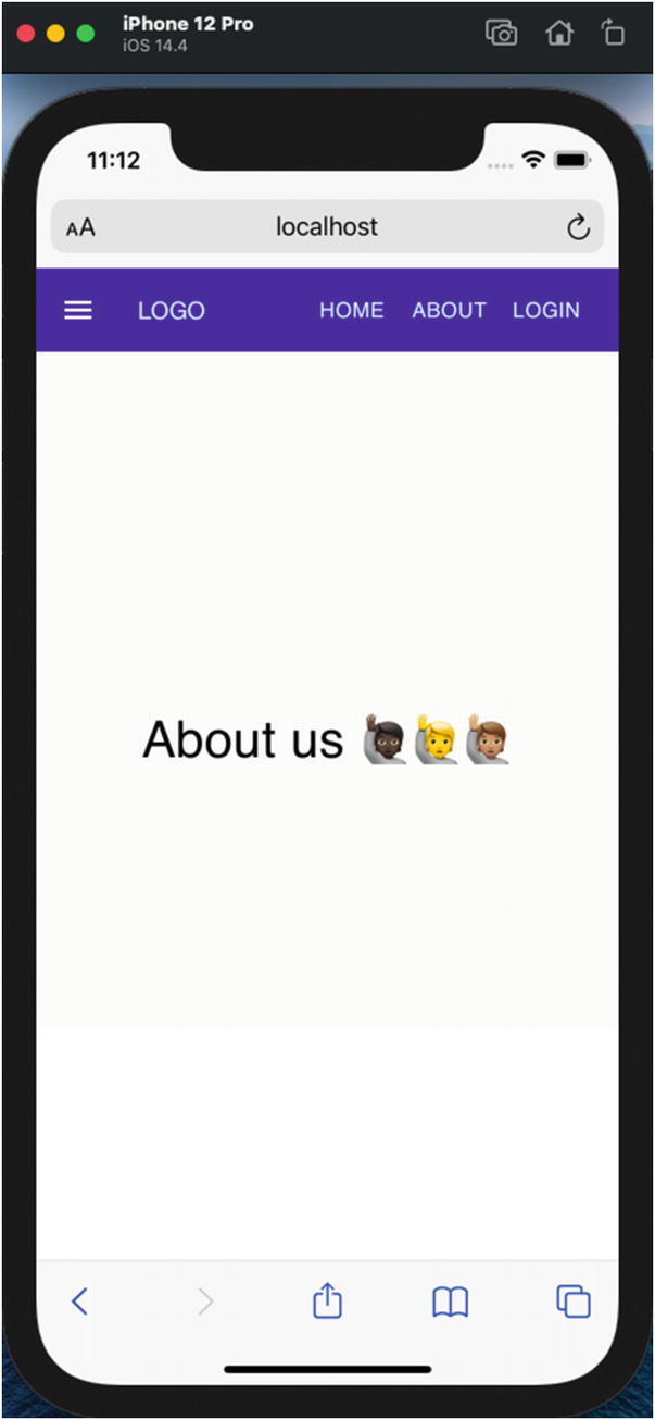

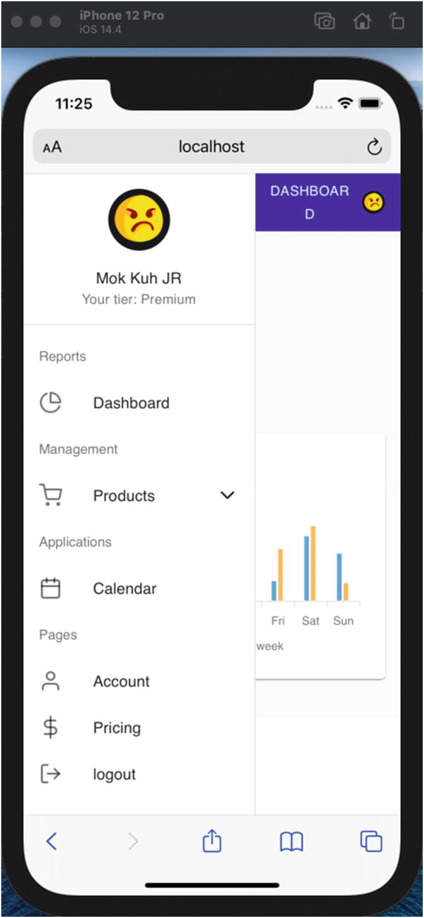
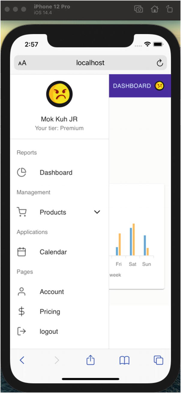


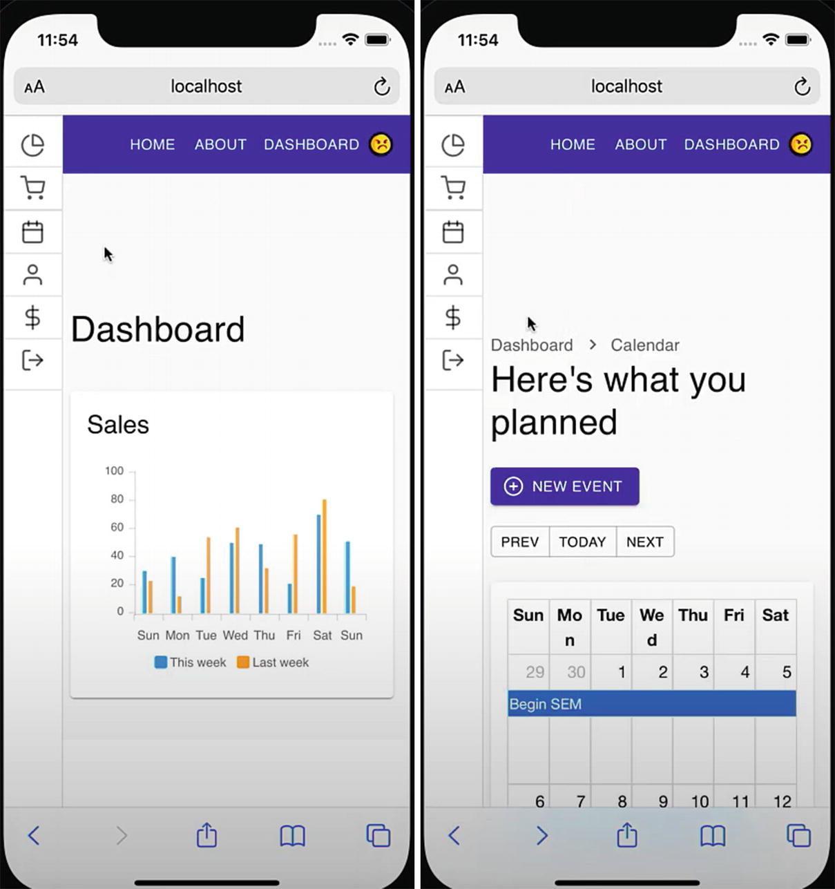 Figure 16-12