© The Author(s), under exclusive license to APress Media, LLC, part of Springer Nature 2021
D. B. Duldulao, R. J. L. CabagnotPractical Enterprise Reacthttps://doi.org/10.1007/978-1-4842-6975-6_6

6. Writing Local States, Sending HTTP Requests, and ApexCharts

Devlin Basilan Duldulao1   and Ruby Jane Leyva Cabagnot1
(1)
Oslo, Norway
 

In the previous chapter, we tackled navigation using react-router. Now, we’ll be writing local states, sending HTTP requests using Axios, and installing ApexCharts to help us create an interactive chart in our app.

HTTP requests are essential parts of any web app communicating with a back-end server; meanwhile, a local state in React, as the name suggests, is handled locally or in isolation within a component. Any change in the state must be set or the state will be re-rendered using the setState function.

Axios and Fetch API are two of the most popular methods of how we can consume REST APIs. Axios is a promise-based HTTP client, while Fetch API is native to JavaScript and a built-in HTTP client in modern browsers.

In this chapter, we will do our best to stay organized and DRY (short for Don’t Repeat Yourself) using Axios for API requests. The DRY concept in programming is the process of abstraction to avoid repetition of code. Since, technically, we don’t have a back-end server, we will also create a fake Rest API using a JSON server.

ApexCharts is an open source charting library that we will be using to create modern-looking and interactive visualizations for our web page.

But before we start writing local states and sending HTTP requests, we will do some refactoring in our compiler options in TypeScript.

This is more for our personal preferences when using TypeScript in our application. Yes, we love the type safety features that TypeScript gives us that JavaScript cannot; however, we also do not want to lose the flexibility that JavaScript provides when developing our application. In short, we want the best of both worlds.

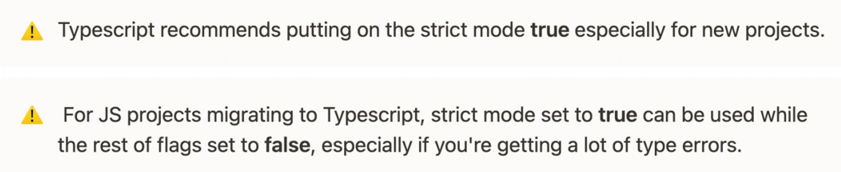
It is up to you whether you will opt out of the default strict type-checking options in TypeScript or not. There are two ways we can go about it.

Strict Type-Checking Options in TypeScript

As mentioned, there are two ways on how we personally use or set the type-checking options in TypeScript in our application.

The first one is to set or change the value to “false.” And to do this, in your project app, open the tsconfig.json file and look under the “compilerOptions”. Set the strict value flag to false.
{
  "compilerOptions": {
    "target": "es5",
    "lib": ["dom", "dom.iterable", "esnext"],
    "allowJs": true,
    "skipLibCheck": true,
    "esModuleInterop": true,
    "allowSyntheticDefaultImports": true,
    "strict": false,
    "forceConsistentCasingInFileNames": true,
    "module": "esnext",
    "moduleResolution": "node",
    "resolveJsonModule": true,
    "isolatedModules": true,
    "noEmit": true,
    "noFallthroughCasesInSwitch": true,
    "jsx": "react",
    "baseUrl": "./src"
  },
  "include": ["src"]
}
Listing 6-1

tsconfig.json File

By default, the strict mode in the compilerOptions in tsconfig.json is set to true. It means all codes or files in the application will be validated or type-checked using the strict mode.

You can check out www.typescriptlang.org/tsconfig for more tsconfig reference.

But Figure 6-1 is a brief description of the type-check flags.
../images/506956_1_En_6_Chapter/506956_1_En_6_Fig1_HTML.jpg
Figure 6-1

Type-checking option flags

The second way is to sometimes opt out of the type-checking options in TypeScript and to allow the default value of strict, which is true, but add the following to the compilerOptions :
"noImplicitAny": false,
"strictNullChecks": false,
    ...
    "strict": true
TypeScript Tips
../images/506956_1_En_6_Chapter/506956_1_En_6_Figa_HTML.jpg

Adding Fake Data Using json-server

The main benefit of using our own fake REST API is decoupling the front-end and back-end development work. If separate teams were working on the front end and the back end, the teams would only need to discuss and agree on JSON structures before they can work independently on their ends.

On the front end, using fake data can speed up the development process; no need to wait for the back end to finish building the real APIs.

And the setup? It lets us serve JSON from our file system through a local server.

Let’s go to our package.json file to check on our json-server as a devDependency:
"devDependencies":{
"concurrently": "5.3.0",
"cypress": "6.0.0",
"json-server": "0.16.3",
"json-server-auth": "2.0.2" } }

Json-server is a fake Node.js server that gets scaffolded just by running the json-server. In npmjs.com, json-server is described as getting a “full fake REST API with zero coding in less than 30 seconds.” And yes, based on experience, it does its job quite well.

Let’s run it to test. Add the following code to your script:
"backend": "json-server --watch db.json --port 5000 --delay=1000"

In the terminal, run $ npm run backend.
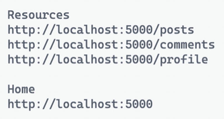
You’ll see the following resource endpoints.
../images/506956_1_En_6_Chapter/506956_1_En_6_Fig2_HTML.jpg
Figure 6-2

Default endpoints

Let’s check the http://localhost:5000/posts. It’s formatted that way because of the JSONView Chrome extension that was installed. It reformats JSON response in the browser instead of one long line of string, much like Prettier in our editor. This extension is also available in the Firefox browser.
../images/506956_1_En_6_Chapter/506956_1_En_6_Fig3_HTML.jpg
Figure 6-3

Rendering the localhost:5000/posts

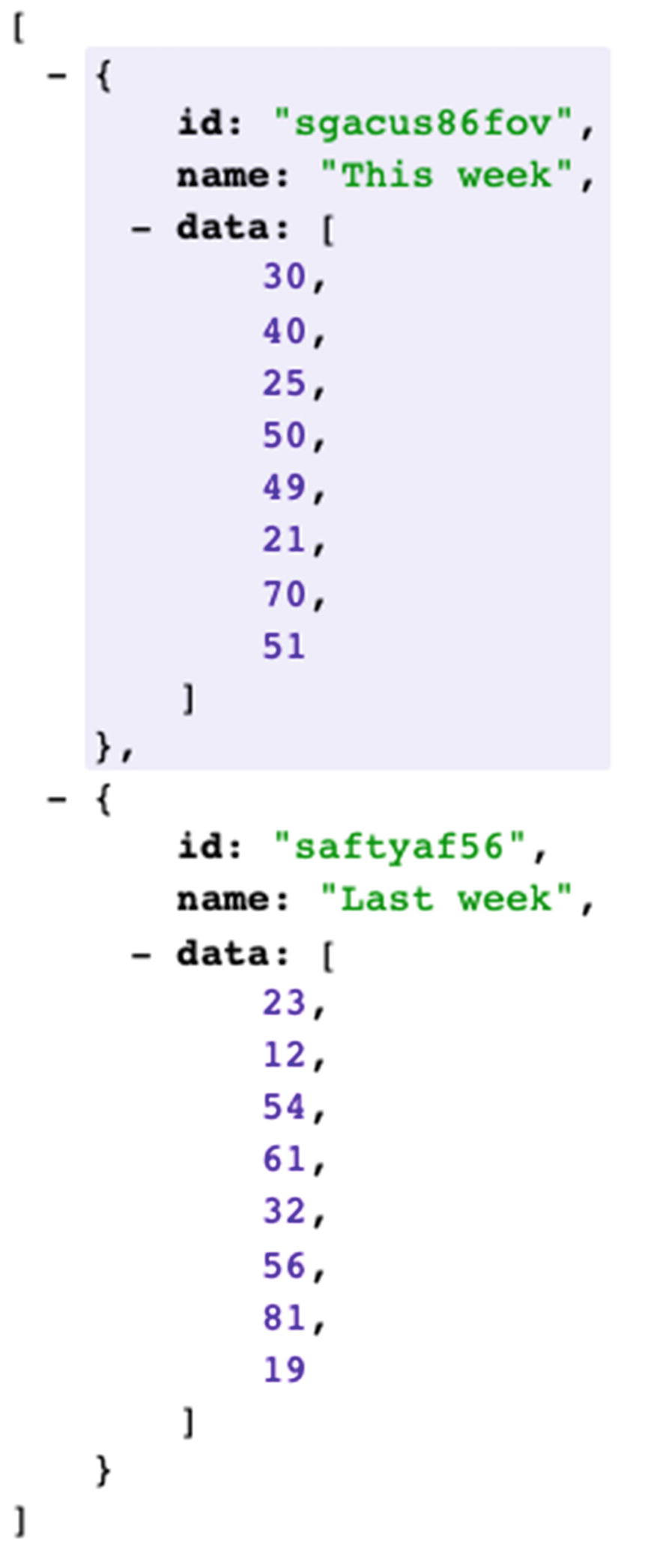
Now, let’s go back to our project; you’ll notice that a new file called db.json has been auto-generated for us in the root directory. Open it, and you’ll see the sample endpoints.

Now that we’ve seen that it is working, let’s replace the auto-generated endpoints with our own fake data. Copy the following data.
{
  "sales": [
    {
      "id": "sgacus86fov",
      "name": "This week",
      "data": [30, 40, 25, 50, 49, 21, 70, 51]
    },
    {
      "id": "saftyaf56",
      "name": "Last week",
      "data": [23, 12, 54, 61, 32, 56, 81, 19]
    }
  ]
}
Listing 6-2

db.json Server Fake Data

Listing 6-2 has the endpoint “sales”, and it has two objects, namely, "This week" and "Last week". It has unique data for us to get a specific object from the array. Let’s try if localhost:5000/sales is going to work. In our local browser, you should see the response like in Figure 6-4 .
../images/506956_1_En_6_Chapter/506956_1_En_6_Fig4_HTML.jpg
Figure 6-4

Rendering data

Sending HTTP Requests Using Axios

Creating an instance of axios is extremely useful when building complex or large applications, especially when we need to integrate with multiple APIs. Implementing the default Axios instance can be cumbersome at times or would mean duplicating code throughout our app.

Some examples of when you might implement instances:
  • Building a full URL from a path

  • Assigning default headers

  • Caching

  • Global handling of network errors

  • Setting the Authorization header on requests automatically

  • Normalizing and managing error responses

  • Converting the request and response body

  • Refreshing access tokens and retrying requests

  • Setting a custom instance

Now that we have that, let’s create our axios configuration. Create a new file called axios.ts. The file path is src/api/axios.ts.
import axios from 'axios';
/*create an instance of axios with a default base URI when sending HTTP requests*/
/*JSON Server has CORS Policy by default*/
const api = axios.create({ baseURL: 'http://localhost:5000/', });
 export default api;
 export const EndPoints = { sales: 'sales', };
Listing 6-3

axios.ts

We import axios from axios, and we’re using the create function of axios, which will create an instance of axios and put in our variable called api.

Within the instance api, there’s an option to pass an object of our configuration.

Currently, our default configuration is the localhost:5000/. The localhost:5000 as the baseURL is the default URL for any HTTP request within axios. Basically, it is the consistent or permanent part of the web address.

Creating a baseURL in one location offers us the ability to edit it easily as needed and be DRY in our app development. We don’t need to type repeatedly the baseURL of our API every time we create an HTTP request.

We just need to pass the endpoint (i.e., sales) of the api. See the sample in Figure 6-5. This will also help us avoid committing typo errors when typing our endpoints.
../images/506956_1_En_6_Chapter/506956_1_En_6_Fig5_HTML.jpg
Figure 6-5

How to use the api endpoints

There are a lot of options you can use inside our axios object. We get this built-in IntelliSense because axios was built using TypeScript.
../images/506956_1_En_6_Chapter/506956_1_En_6_Fig6_HTML.jpg
Figure 6-6

Option configurations for the axios object

Okay, we’re done with that for now. We’ll keep on updating our axios file as we create more endpoints.

Shaping the Object

In TypeScript, we pass data through object types, whereas in JavaScript, we group and represent data through objects. Simply put, types let us know what an item looks like: string, number, boolean, array, function, etc.

Recall the two approaches to shaping our object in TypeScript: interface and type alias. They are more or less the same; it is just a matter of preference what you choose.

Since we’re using TypeScript, we need to define the shape or type of our object. First, create a new file and name it sale-type.ts.
src/models/sale-type.ts
Listing 6-4

Creating the Shape or Model of Our Object

Our sale object’s shape or model has type string and data of type array of numbers:
//type alias
type SaleType = {
  name: string;
  data: number[];
}

Making Requests with Axios

Before we proceed, let’s review a little what axios is. Axios is a promise-based HTTP client for the browser and Node.js. It allows us to intercept and cancel requests and provides a built-in feature called client-side protection against cross-site request forgery.

Let’s create a new file and name it saleService.ts:
src/services/saleService.ts
We’ll import our recently created file api/axios, the endpoints from TypeScript configuration, and the model sale-type.
import api, { EndPoints } from 'api/axios';
import { SaleType } from 'models/sale-type';
export async function getSalesAxios() {
  return await api.get<SaleType[]>(EndPoints.sales);
}
/* Other commonly-used api methods:
  api.post
  api.put
  api.delete
  api.patch
*/
/* The < > bracket here is a Generic type that Typescript adapted from OOP.
   It means that the return value of the getSalesAxios is an array of SaleType.
   This would likewise help us with the TypeScript intell-sense when using it.
*/
Listing 6-5

Sending Http Requests

The async-await just means that the axios function is promise-based.

Now, let’s test our api.get request.

Go to src/app/views/dashboard/dashboard-default-content.tsx.

We will do additional magic here, and for that, we’ll use the lifecycle Hook useEffect from React.

Import the named component from React.

Again, useEffect is a lifecycle Hook that runs after a React component is rendered. Inside this hook, we will invoke the getSalesAxios().

Make sure to import the component from services/saleService.
import React, {useEffect} from 'react';
import { getSalesAxios } from 'services/saleService';
const DashboardDefaultContent = () => {
  useEffect(() => {
  //code to run after render goes here
    getSalesAxios();
  }, []);  //ß empty array means to ‘run once’
  return (
    <div>
      <h1>Dashboard Default Content</h1>
    </div>
  );
};
export default DashboardDefaultContent;
Listing 6-6

Calling the getSalesAxios in DashboardDefaultContent

Tips

Pass an empty array [ ] in the useEffect as a second argument to limit its run or to run the useEffect only once, after the first render.

Next, open two terminals and do the following:
$ npm run start
$ npm run backend

Refresh our browser at localhost:3000/ and open the Chrome DevTools and make sure you are at the Network tab and XHR. We’re doing all these so-called baby-step processes on how I build an application.

Try to execute the low-level hanging fruit first, maybe write a lot of proof of concept, or check at the DevTools if everything is firing the way it should be.

Anyway, in your browser, click the Menu tab ➤ Dashboard.

Observe your Chrome DevTools; you should see the Response Method: Get and Status Code: 200 OK.

Click the Response tab to see the sale object data from the json-server.

So now we are confident that the UI is receiving data from the json-server. We sent the HTTP request and received JSON response from the json-server.

BUT since we might need to wrap the getSalesAxios in an async-await, we will invoke it outside of the useEffect.

We’ll deal with the useEffect() in a short while.
../images/506956_1_En_6_Chapter/506956_1_En_6_Fig7_HTML.jpg
Figure 6-7

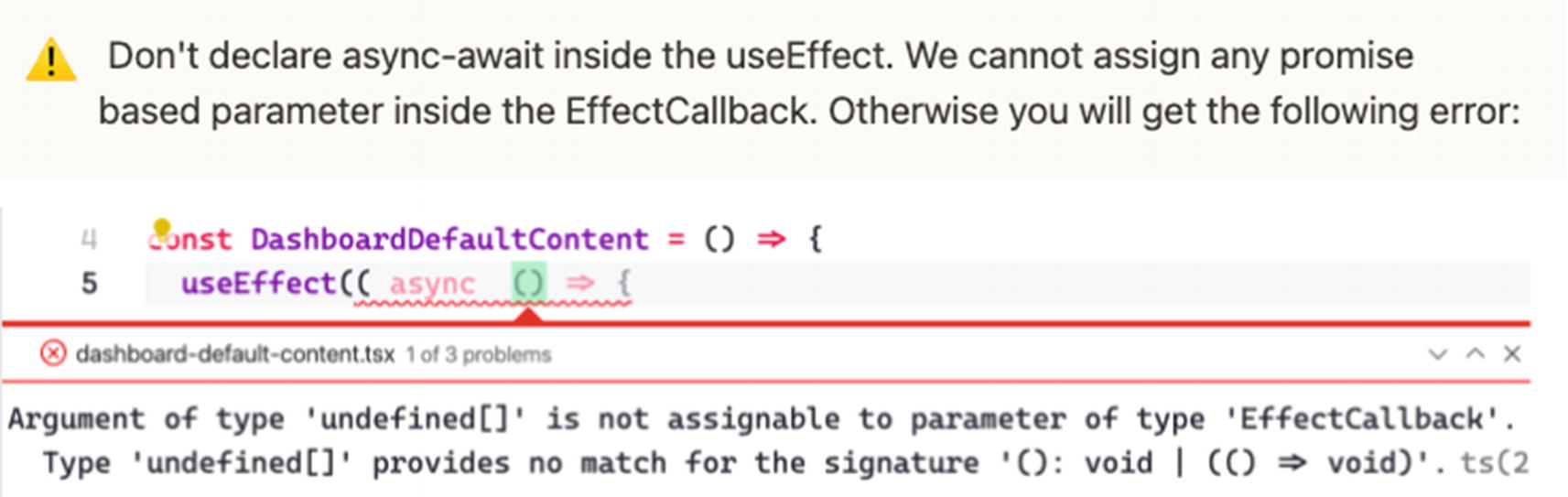
Showing an error when using async inside the EffectCallback

So let’s create an awaitable function outside the useEffect and name it fetchSales.
const fetchSales = async () => {
    const data = await getSalesAxios();
    console.log(data);
  }
Listing 6-7

Creating the fetchSales Function

We deconstructed the response to get just the data property and named it “data.”

Next, make sure to call the newly created function inside the useEffect. This is what I meant when I said we’ll be using the useEffect() in a short while.
const DashboardDefaultContent = () => {
  useEffect(() => {
    fetchSales();
  }, []);
Listing 6-8

Calling fetchSales in useEffect

Refresh the browser and make sure to open the Chrome DevTools again, and you should get a response from the json-server successfully.

Now that we know that we can retrieve data from the json-server, the next thing to do is create a local state using useState in the DashboardDefaultContent.

Add the component useState from React.

Don’t forget to import also the getSalesAxios from the folder services/saleService.
import { SaleType } from 'models/sale-type';
import React, { useEffect, useState } from 'react';
import { getSalesAxios } from 'services/saleService';
const DashboardDefaultContent = () => {
const [sales, setSales] = useState<SaleType[]>([]);
Listing 6-9

Creating a Local State

How do we update the value or data of the setSales?

In our fetchSales component, let’s call setSales and pass the data with the same type of object in our useState.
const fetchSales = async () => {
    const { data } = await getSalesAxios();
    console.log(data);  // ← to check in the console if we are successfully getting the data
    setSales(data);
  };
Listing 6-10

Updating the Data of setSales

Okay, like I said before, I will often do this little proof of concept before I proceed.

Let’s check if we’re really passing data to the setSales. Inside our HTML, type an h2 header and render the length of the sales array.
return (
    <div>
      <h1>Dashboard Default Content</h1>
      <h2>{sales.length}</h2>
    </div>
  );
};
Listing 6-11

Rendering the setSales

When you check the browser, you should see 2 because our sales array contains two objects. Go to Chrome DevToolsNetwork to see the objects.

Now that we know that it’s working, the next plan is to improve the Dashboard Default Content.

In the components folder, let’s create a template for the web page. The template page will contain the set padding, spacing, and other styling to be applied to every page in our app.

The file path is src ➤ app ➤ components ➤ pages.tsx.

Import the following components:
import React,{ forwardRef, HTMLProps, ReactNode }from 'react'
import { Helmet } from 'react-helmet-async';

Let’s review some of the components here.

Forwarding Refs: This is adding a reference to the HTML. In reactjs.org, it says that it is a technique for automatically passing a ref through a component to one of its children, such as forwarding refs to DOM components or forwarding refs to higher-order components (HOCs).

Helmet: To add some tagging and allow us to build an SEO-friendly application.

Next, we’ll define our typings or type definition in Listing 6-12.
type Props = {
  children?: ReactNode;
  title?: string;
} & HTMLProps<HTMLDivElement>;
Listing 6-12

Defining the Type Alias

We’re making our prop children of type ReactNode and prop title of type string, both nullable by appending ?. We’re also using HTMLProps of type HTMLDivElement.

And here’s our Page component, which would be a reusable template for all our web pages.
const Page = forwardRef<HTMLDivElement, Props>(
  ({ children, title = '', ...rest }, ref) => {
    return (
      <div ref={ref as any} {...rest}>
        <Helmet>
          <title>{title}</title>
        </Helmet>
        {children}
      </div>
    );
  },
);
export default Page;
Listing 6-13

Creating a Reusable Page Component

That’s done for now.

Let’s go back to our DashboardDefaultContent component and add more styling to the Dashboard.

Add the following styling component to the DashboardDefaultContent.

The styling includes chart styling theme for charts, background colors, data tables, legends, stroke them tooltip, x-axis and y-axis, etc. You can read more about this on the Material-UI website. It’s a bit long, so just bear with me:
const useStyles = makeStyles(() => ({
  root: {
    minHeight: '100%',
  },
}));
const getChartStyling = (theme: Theme) => ({
  chart: {
    background: theme.palette.background.paper,
    toolbar: {
      show: false,
    },
  },
  colors: ['#13affe', '#fbab49'],
  dataLabels: {
    enabled: false,
  },
  grid: {
    borderColor: theme.palette.divider,
    yaxis: {
      lines: {
        show: false,
      },
    },
  },
  legend: {
    show: true,
    labels: {
      colors: theme.palette.text.secondary,
    },
  },
  plotOptions: {
    bar: {
      columnWidth: '40%',
    },
  },
  stroke: {
    show: true,
    width: 2,
    colors: ['transparent'],
  },
  theme: {
    mode: theme.palette.type,
  },
  tooltip: {
    theme: theme.palette.type,
  },
  xaxis: {
    axisBorder: {
      show: true,
      color: theme.palette.divider,
    },
    axisTicks: {
      show: true,
      color: theme.palette.divider,
    },
    categories: ['Sun', 'Mon', 'Tue', 'Wed', 'Thu', 'Fri', 'Sat', 'Sun'],
    labels: {
      style: {
        colors: theme.palette.text.secondary,
      },
    },
  },
  yaxis: {
    axisBorder: {
      show: true,
      color: theme.palette.divider,
    },
    axisTicks: {
      show: true,
      color: theme.palette.divider,
    },
    labels: {
      style: {
        colors: theme.palette.text.secondary,
      },
    },
  },
});
To use it in our React component, we need to import Theme and makeStyles from Material-UI:
import { Theme } from '@material-ui/core/styles';
import { makeStyles } from '@material-ui/styles';
Then, let’s create two variables inside the DashboardDefaultContent – classes and theme – and assign useStyles and useTheme styles , respectively.
const DashboardDefaultContent = () => {
  const classes = useStyles();
  const theme = useTheme();
  const [sales, setSales] = useState<SaleType[]>([]);
  useEffect(() => {
    fetchSales();
  }, []);
  const fetchSales = async () => {
    const { data } = await getSalesAxios();
    setSales(data);
  };
Listing 6-14

Adding useStyles and useTheme

After setting all that up, the next thing we need to do is install ApexCharts.

Installing ApexCharts

ApexCharts is an open source and modern JS charting library for building interactive charts and visualizations using APIs. Various modern browsers support it. Let’s install that:
npm install react-apexcharts apexcharts
Go back to the DashboardDefaultContent and import ApexCharts and some other style components from the Material-UI Core library.
import chart from 'react-apexcharts';
import {
  Box,
  Card,
  CardContent,
  Container,
  Grid,
  Typography,
  useTheme,
} from '@material-ui/core';
Listing 6-15

Importing Additional Material-UI Components

Now that that’s done, we’ll add the Page component we’ve created earlier:
import Page from 'app/components/page';
Use the Page component and the chart we’ve created. Replace the return <div> header in the Page component with the following code.
<Page className={classes.root} title="Dashboard">
      <Container maxWidth={'sm'}>
        <Typography variant="h4" color="textPrimary">
          Dashboard
        </Typography>
        <Box my={5}>
          <Grid container spacing={3}>
            <Grid item xs={12}>
              <Card>
                <CardContent>
        <Typography variant="h5"  color="textPrimary">
                    Sales
                  </Typography>
                  <Chart
                    options={getChartStyling(theme)}
                    series={sales}
                    type="bar"
                    height={'100%'}
                  />
                </CardContent>
              </Card>
            </Grid>
          </Grid>
        </Box>
      </Container>
Listing 6-16

Updating the Page Component

So we’re reusing the Page component and giving it the title “Dashboard.” The Container, along with other style components, sets the look and feel of the DashboardDefaultContent page.

Run the application, and you should see these changes in the browser.
../images/506956_1_En_6_Chapter/506956_1_En_6_Fig8_HTML.jpg
Figure 6-8

Rendering the updated Page component

There’s still a long way to go, but we’re getting there to complete our Dashboard page.

Before that, go to srcindex.ts, and delete the <React.StrictMode> so we don’t get unnecessary warnings and errors while developing our application:
const ConnectedApp = ({ Component }: Props) => (
  <Provider store={store}>
    <HelmetProvider>
        <Component />
    </HelmetProvider>
  </Provider>
);
Next, open the file src/app/index.tsx and remove the <NavigationBar/> because we will replace it with a new layout component:
export function App() {
  return (
    <BrowserRouter>
      <Helmet
        titleTemplate="%s - React Boilerplate"
        defaultTitle="React Boilerplate"
      >
        <meta name="description" content="A React Boilerplate application" />
      </Helmet>
      <NavigationBar />
      <Container>
        <Routes />
      </Container>
      <GlobalStyle />
    </BrowserRouter>
  );
}

Creating the Main Layout

Inside the layouts directory, let’s create a new folder and name it main-layout. Under the main-layout directory, create its index.tsx file. The following is the file path.
src ➤ app ➤ layouts ➤ main-layout ➤ index.tsx
Listing 6-17

Creating a New Main-Layout Component Page

Copy the following code to the index.tsx :
import React, { ReactNode } from 'react';
import { makeStyles } from '@material-ui/core';
import NavigationBar from './navigation-bar';
type Props = {
  children?: ReactNode;
};
const MainLayout = ({ children }: Props) => {
  const classes = useStyles();
  return (
      <NavigationBar />
      <div className={classes.root}>
        <div className={classes.wrapper}>
          <div className={classes.contentContainer}>
            <div className={classes.content}>{children}</div>
          </div>
        </div>
      </div>
  );
};
const useStyles = makeStyles(theme => ({
  root: {
    backgroundColor: theme.palette.background.default,
    display: 'flex',
    height: '100%',
    overflow: 'hidden',
    width: '100%',
  },
  wrapper: {
    display: 'flex',
    flex: '1 1 auto',
    overflow: 'hidden',
    paddingTop: 64,
  },
  contentContainer: {
    display: 'flex',
    flex: '1 1 auto',
    overflow: 'hidden',
  },
  content: {
    flex: '1 1 auto',
    height: '100%',
    overflow: 'auto',
  },
}));
export default MainLayout;

Before we run again or check the browser if everything is still working, we will do a minor folder restructuring.

Put the navigation-bar.tsx, which is inside the components folder, under the newly created main-layout folder.
../images/506956_1_En_6_Chapter/506956_1_En_6_Fig9_HTML.jpg
Figure 6-9

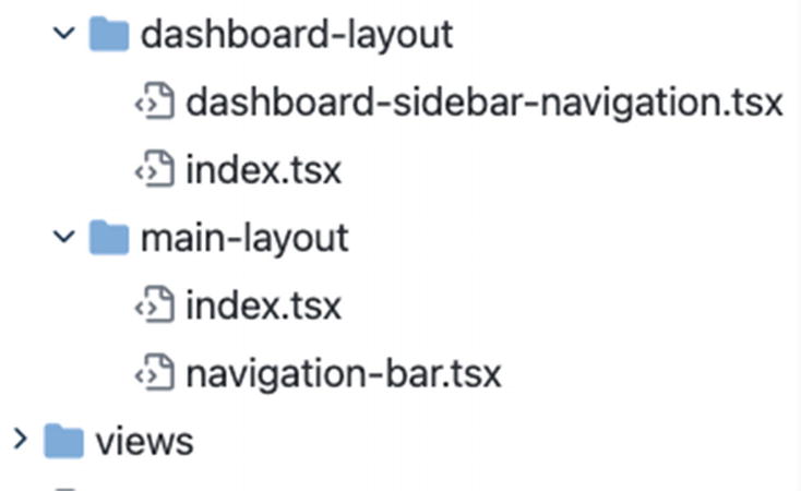
Moving the navigation-bar.tsx inside the main-layout folder

After doing that, go to the index.tsx of the app root folder:
Src ➤ app ➤ index.tsx
We will replace the <Container> with the <MainLayout> that we’ve just created. And don’t forget to import the named component.
...
import MainLayout from './layouts/main-layout';
...
      <MainLayout>
        <Routes />
      </MainLayout>
Listing 6-18

Using the MainLayout in the index.tsx of app

Refresh your browser at http://localhost:3000/dashboard, and you should notice some changes in the styling and spacing.
../images/506956_1_En_6_Chapter/506956_1_En_6_Fig10_HTML.jpg
Figure 6-10

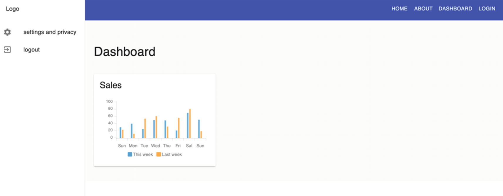
Rendering the updated MainLayout

Next, let’s go back to the index.tsx file of the dashboard-layout folder. We will add a few styling, including the spacing and layout. Let’s import the makeStyles from the Material-UI Core styles:
import {makeStyles} from '@material-ui/core/styles';
And then, add the following code for the styling.
const useStyles = makeStyles(theme => ({
  root: {
    display: 'flex',
    height: '100%',
    overflow: 'hidden',
    width: '100%',
  },
  wrapper: {
    display: 'flex',
    flex: '1 1 auto',
    overflow: 'hidden',
    paddingTop: 64,
    [theme.breakpoints.up('lg')]: {
      paddingLeft: 256,
    },
  },
  contentContainer: {
    display: 'flex',
    flex: '1 1 auto',
    overflow: 'hidden',
  },
  content: {
    flex: '1 1 auto',
    height: '100%',
    overflow: 'auto',
  },
}));
Listing 6-19

Adding Styling to the index.tsx of dashboard-layout

Next, add the useStyles and wrap the {children} in <div>.
const classes = useStyles()
...
<DashboardSidebarNavigation />{' '}
      <div className={classes.wrapper}>
        <div className={classes.contentContainer}>
          <div className={classes.content}>{children}</div>
        </div>
      </div>
Listing 6-20

Adding the useStyles Component to the index.tsx of the dashboard-layout

Check the Dashboard, and you should see a better and responsive layout.

Using React Feather Icons

Last but not least, we’ll add a menu in the sidebar dashboard. We’ll use the React Feather icons.

../images/506956_1_En_6_Chapter/506956_1_En_6_Figb_HTML.jpg

Install the React Feather library:
npm i react-feather
After installation, open the dashboard-sidebar-navigation.tsx and import the PieChart component from react-feather. We’ll just rename it as PieChartIcon. Another thing we need to import is the Divider and ListSubheader from Material-UI Core:
import { PieChart as PieChartIcon } from 'react-feather';
import { Divider, ListSubheader } from '@material-ui/core';
Right after the Logo and before the settings-and-privacy, add the following code.
<Link to={`${url}`} className={classes.logoWithLink}>
              Logo
            </Link>
          </Toolbar>
          <div className={classes.drawerContainer}>
            <List>
...
<ListSubheader>Reports</ListSubheader>
              <Link className={classes.link} to={`${url}`}>
                <ListItem button>
                  <ListItemIcon>
                    <PieChartIcon />
                  </ListItemIcon>
                  <ListItemText primary={'Dashboard'} />
                </ListItem>
              </Link>
...
<Link className={classes.link} to={`${url}/settings-and-privacy`}>
Listing 6-21

Updating the dashboard-sidebar-navigation.tsx

Refresh the browser to see changes, which should look as shown in Figure 6-11. Click the buttons to see if everything is working.
../images/506956_1_En_6_Chapter/506956_1_En_6_Fig11_HTML.jpg
Figure 6-11

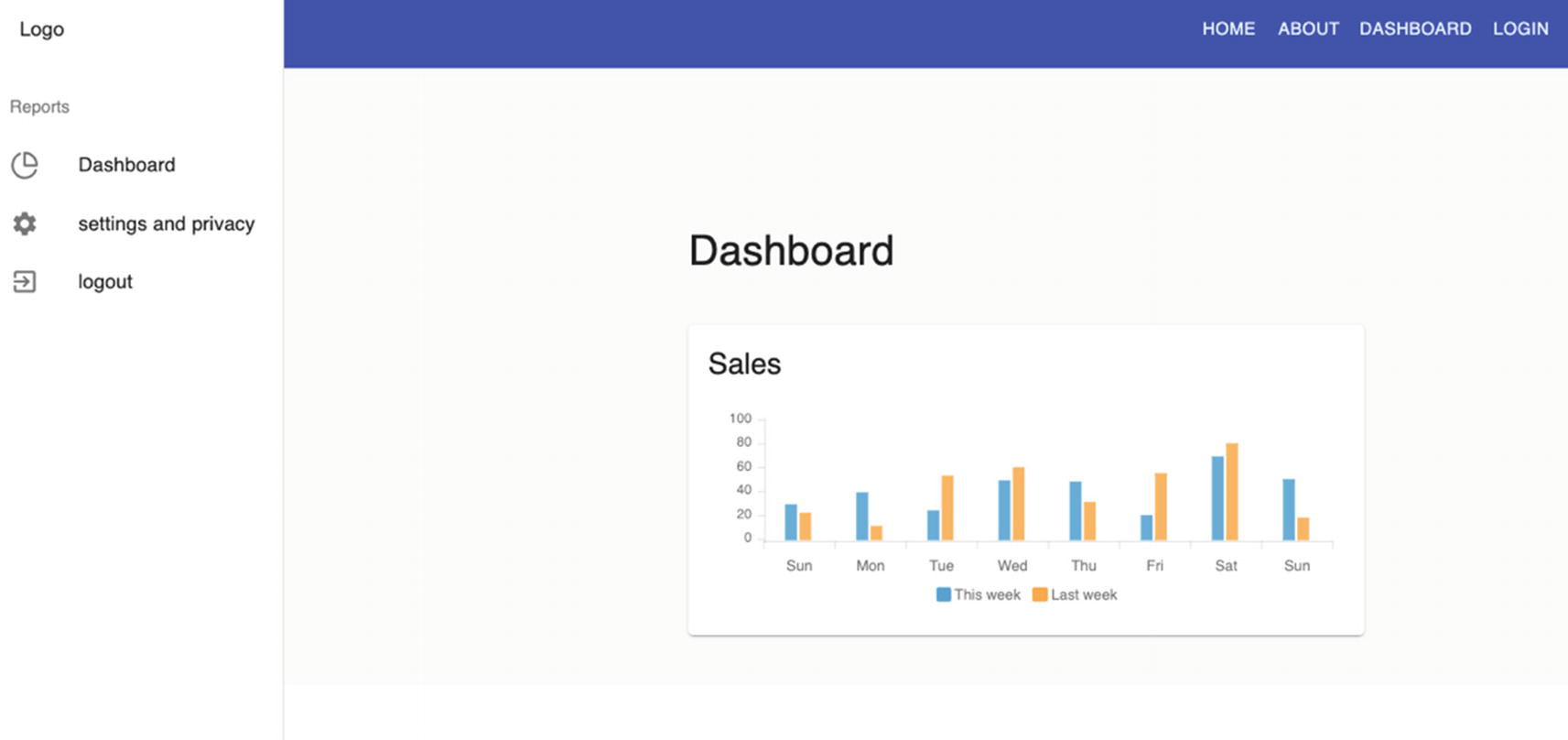
The UI after updating the dashboard-sidebar-navigation

Summary

We learned how to use local states, send HTTP requests while considering the DRY (Don’t Repeat Yourself) principle, and use the open source charting library called ApexCharts to create interactive visualizations for our app.

In the next chapter, we’ll go a little deeper into our app as we begin writing input forms using Formik and Yup validations on top of Material-UI’s data tables. Hopefully, we can bring all these components together and render them to the browser to see how everything works.

..................Content has been hidden....................

You can't read the all page of ebook, please click here login for view all page.
Reset
3.129.247.196