
You will have noticed by now that the UI components in Ext JS 4 have a common look and feel. The UI components appear with a tinge of light blue in color, by default. The buttons, panels, toolbars, grids, and so on have a uniform appearance. In our applications we may have to customize the appearance of these components. In a traditional UI-based application, this involves modifying the stylesheets of the components. You identify the CSS classes and id(s) of the UI components and start making changes to them.
Customizing the look and feel of the components by modifying their CSS properties, one by one, is an uphill task for a rich UI library like Ext JS 4. Identifying the CSS properties of each and every component that we use in our application and modifying them is very time consuming. In the process of doing this you may end up changing some of the fundamental properties of the UI components like borders, fonts, etc.
While Ext JS 4 provides placeholders for modifying the styles of components programmatically, it offers a much more sophisticated approach than merely changing the CSS properties. Ext JS 4 provides a rich set of extensible and customizable themes. The light blue-colored components belong to the classic theme. You can simply fork a theme and modify the common properties and change the complete look and feel of the components. Now, what's unique about this is that you will not modify the CSS files but work with a bunch of SASS files. You will learn about SASS in a short while.
Ext JS 4 provides a whole new set of tools to customize the look and feel of the application. In this chapter you will learn how to create custom themes for your application. I’ll also discuss the basic set of CSS properties of the UI components that can be used to customize them.
Styling
The UI components in Ext JS 4 provide a common set of attributes that can be used to style the components. Table 8-1 shows a list of some CSS attributes that are used while creating the UI components.
Table 8-1. Styling Attributes
| Attribute | Description |
|---|---|
| Style | Custom style object provided to the UI elements. |
| Cls | Used to specify additional CSS class to the component. |
| baseCls | The fundamental CSS class for the UI components. For example, the base CSS class for panel is x-panel and the base CSS class for button is x-btn. You have to be careful overriding this attribute. |
| componentCls | Very similar to the cls attribute in purpose. The cls attribute is used while creating instances of UI components, while componentCls is used to specify the CSS classes while defining custom UI classes. |
| bodyCls | This attribute is available for the container controls like Panel to specify the CSS class for the body region. |
Let’s write some code using the attributes listed in Table 8-1.
Listing 8-1 shows a simple component that uses the style attribute. The style attribute has some common CSS properties like background color, border width, etc.
Listing 8-1. Using the Style Attribute
Ext.create("Ext.Component", {
html: "Sample component",
style : {
  backgroundColor : "yellow",
  width : "100px",
  height : "40px",
  color: 'red',
  padding : "5px",
  borderWidth: "2px",
  borderStyle : "solid",
  borderColor : "black"
 },
});
The code fragment in Listing 8-1 shows an instance of a raw component class created using the style attribute. The code emits the following HTML snippet during runtime.
<div id="component-1009" class="x-component x-component-default" style="background-color:yellow;width:100px;height:40px;color:red;padding:5px;border-width:2px;border-style:solid;border-color:black;">Sample component</div>Let’s create an Ext.panel.Panel object with the CSS class mypanel as shown below.
 <style>
     .mypanel
     {
       border-width:thick;
       border-style:double;
       font-size:larger;
     }
  </style>
Listing 8-2 shows the Panel instance configured using the CSS class mypanel. You can configure the Panel using cls or bodyCls or baseCls.
Listing 8-2. A Panel With cls Attribute
Ext.create("Ext.panel.Panel", {
   title: "Custom panel",
   html: "Stylized",
   id : "pnl1",
   cls: "mypanel", //or baseCls : "mypanel"  or bodyCls: "mypanel"
});
Table 8-2 shows the generated HTML code based on the attributes used in Listing 8-2.
Table 8-2. Generated HTML Code for the Style Attributes
| Code | Generated HTML |
|---|---|
| cls : "mypanel" | <div id="pnl1" class="x-panel mypanel x-panel-default"> ...</div> |
| bodyCls : "mypanel" |
<div id="pnl1" class="x-panel x-panel-default"> <div id="pnl1_header">...</div> <div id="pnl1_body" class="x-panel-body mypanel x-panel-body-default">...</div> </div> |
| baseCls : "mypanel" |
<div id="pnl1" class=" mypanel "> <div id="pnl1_header" class=" mypanel-header ">...</div> <div id="pnl1_body" class="mypanel-body">...</div> </div> |
As shown in Table 8-2, configuring the CSS class mypanel in different ways generates different HTML code. Configuring the cls attribute adds mypanel to the existing class attribute of the generated HTML code. The bodyCls attribute just modifies the <div> element that represents the body of the panel. The interesting aspect is when you configure baseCls attribute. This attribute replaces the default look and feel of a panel and you may have to be careful in doing so.
As mentioned earlier, modifying the CSS properties of every control that we use in our application is a tedious task. You can customize the themes of the application and provide a uniform look and feel.
Let’s discuss the theming concepts in Ext JS 4 and find out how we can customize and build our own themes for the application.
Theming
Ext JS 4 applications use the classic blue theme by default. This theme contains a set of images and a CSS file decorated with the properties for the UI components. The theme can be found in the resources folder of the Ext JS 4 directory as shown in Figure 8-1. It contains a number of CSS files, but what we need is the ext-theme-classic-all.css file.
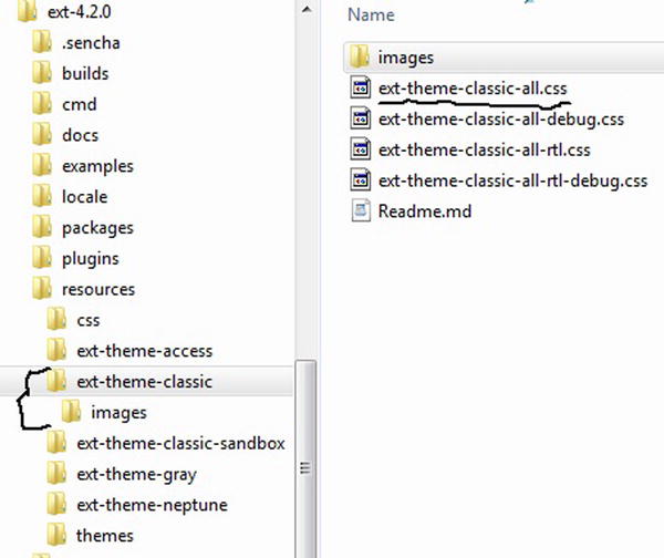
Figure 8-1. Classic blue theme folder
The ext-theme-classic-all.css file contains a complex set of CSS rules for the components. It’s really difficult to manually edit the properties if we have to customize it. Moreover this CSS file is programmatically generated and not handwritten.
The Ext JS 4 directory contains a folder called packages that contains the ext-theme-classic folder as shown in Figure 8-2. This folder is composed of SCSS files.
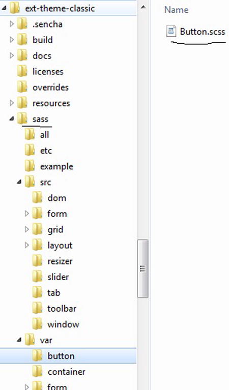
Figure 8-2. ext-theme-classic folder containing SCSS files
The ext-theme-classic folder contains a SASS folder that contains SCSS files. The SCSS files are executed by a Ruby program that produces the CSS files that you use in your Ext JS 4 application. Therefore, customizing the themes involves playing with the SCSS files.
Let’s briefly introduce Ruby, SASS, SCSS, and Compass before we proceed with creating custom themes.
- Ruby is an interpreted, dynamic, and agile programming language. The official site is http://www.ruby-lang.org/en/ . You’ll need to install a Ruby interpreter v1.9 or above, in your machine to work with the themes.
- SASS stands for Syntactically Awesome StyleSheets. The official site is http://sass-lang.com/ . It’s a style sheet language written in Ruby. You can create stylesheets using SASS syntax and generate CSS3 files by executing them. The SASS syntax provides support for declaring variables, mixins, inheritance, nested rules and so on.
- SCSS stands for Sassy StyleSheets. It’s an extension of SASS. It has certain modifications to the SASS syntax that make the code resemble CSS. You can create SCSS files and execute them to generate CSS3 files. In Ext JS 4 you will be working with SCSS files.
- Compass is an open source Ruby library that executes the SCSS files and generates well-formatted CSS files. The official site of Compass is http://compass-style.org/ .
Working with themes in Ext JS 4 involves working with the SCSS files provided and running them using Compass. Compass will execute the SCSS files and generate a compressed CSS file that can be included in our Ext JS 4 application.
If you are already wondering about the number of tools you may have to install to work with the themes, Sencha comes to your rescue with a command line tool called Sencha Cmd.
Sencha Cmd
Sencha Cmd is a command line tool provided by Sencha for creating, building, packaging, and deploying Sencha projects. You can create an Ext JS 4 project, package it, and deploy it to production using Sencha Cmd. You can download Sencha Cmd from http://www.sencha.com/products/sencha-cmd .
Sencha Cmd is also used to build custom themes. You can play with the SCSS files and run them using Sencha Cmd. Sencha Cmd internally uses the SASS and Compass libraries and generates CSS files. It is bundled with Compass and SASS libraries also known as gems in the Ruby world. Therefore, to work with themes in Ext JS 4, you just need to install Ruby and Sencha Cmd in your machine.
At the time of writing the latest version of Sencha Cmd is 3.1. You can download the executable and install it. After installation, open the command prompt and type sencha as shown in Figure 8-3.
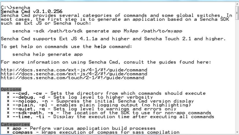
Figure 8-3. Sencha Cmd from Command prompt
I’ll explain how to use the commands in Sencha Cmd to generate themes and compile them to CSS files later in this chapter.
You will learn more about Sencha Cmd in Chapter 10, when we discuss packaging and optimizing Ext JS 4 applications.
Before we start customizing the Ext JS 4 themes by modifying the SCSS files you need to understand some of the basics of SASS syntax like declaring variables, defining mixins and including mixins. The complete language reference can be found at http://sass-lang.com/docs/yardoc/file.SASS_REFERENCE.html .
Variables
You can declare variables in SCSS with a dollar ($) prefix. Variables help us reuse the style properties. Say you want to generate the CSS content shown in Listing 8-3.
Listing 8-3. Sample CSS Style
.mypanel1 {
  color: yellow;
  background-color: red;
  height: 3px;
  width: 3px; }

.mypanel2 {
  color: red;
  background-color: yellow;
  height: 5px;
  width: 2px; }
You can generate the CSS data shown in Listing 8-3 by using the SCSS code shown in Listing 8-4.
Listing 8-4. SCSS With Variables
$color-yellow : yellow;
$color-red : red;
$width1 : 2px;
$width2 : 3px;
$height1 : 3px;
$heightt2 : 5px;

.mypanel1{
   color : $color-yellow;
   background-color:$color-red;
   height : $height1;
   width : $width2;
}
.mypanel2{
   color : $color-red;
   background-color:$color-yellow;
   height : $height2;
   width : $width1;
}
In Listing 8-4 we have declared variables $color-yellow, $color-red, $width1, $width2, $height1, and $height2. These variables are used in the classes mypanel1 and mypanel2. When the SCSS file is executed it generates the CSS files with each variable replaced by its values as shown in Listing 8-3.
Say you have stored the code in Listing 8-4 in panel.scss file. You want to use the override panel.scss and create a new SCSS file custom-panel.scss. In custom-panel.scss, you want to override the values of the $color-yellow and $color-red variables to a light yellow and light red color. You can create custom-panel.scss like this.
$color-yellow : #ffffcc;
$color-red : #ff0a0a;
@import "panel"
When the code in custom-panel.scss is executed, $color-yellow and $color-red are assigned the new values. As the panel.scss is imported, the $color-yellow and $color-red variables get reassigned to the original yellow and red values as defined in the panel.scss file. In order to make the variables use the overridden values, you have to modify the variables declaration in Listing 8-4 like this.
$color-yellow : yellow !default;
$color-red : red !default;
The !default flag added to the variables indicate that the variables will be initialized only if they haven’t been yet. In our example, as these variables get initialized in custom-panel.scss they are not re-initialized later. Running the custom-panel.scss will give you the CSS code shown in Listing 8-3 with the modifications to the color properties as shown here.
.mypanel1 {
  color: #ffffcc;
  background-color: #ff0a0a;
  height: 3px;
  width: 3px; }

.mypanel2 {
  color: #ff0a0a;
  background-color: #ffffcc;
  height: 5px;
  width: 2px; }
Mixins
Mixins in SCSS are similar to the #define directives that are used in C programming language. They let you define and re-use a chunk of CSS code. You can define a mixin with a name and arguments using the following syntax.
@mixin nameOfTheMixin(comma separated arguments){
}
You can include the mixin using @include like this.
@include nameOfTheMixin(argument values);
Listing 8-5 shows the SCSS code for generating the CSS content shown in Listing 8-3.
Listing 8-5. SCSS Using Mixins
$color-yellow : yellow;
$color-red : red;
$width1 : 2px;
$width2 : 3px;
$height1 : 3px;
$heightt2 : 5px;

@mixin panel($classname,$color,$bgcolor,$height,$width){
  .#{$classname}{
     color : $color;
     background-color:$bgcolor;
     height : $height;
     width : $width;
  }
}

@include panel('mypanel1',$color-yellow,$color-red,$height1,$width2);
@include panel('mypanel2',$color-red,$color-yellow,$height2,$width1);
In the code snippet in Listing 8-5, we have a mixin called panel defined. We invoke the panel mixin using @include by passing the class name and the arguments. The variable $classname is accessed using #{}, which is called the interpolation syntax.
In Listing 8-5 you can modify the @include syntax to improve readability by specifying the name of the arguments while passing the values like this.
@include panel($classname:'mypanel1',
           $color:$color-yellow,
           $bgcolor:$color-red,
           $height:$height1,
           $width:$width2);

@include panel($classname:'mypanel2',
               $color:$color-red,
               $bgcolor:$color-yellow,
               $height:$height2,
               $width:$width1);
That concludes this brief explanation of the basics of the SASS language. If you have installed Ruby and Sencha Cmd, let’s start creating custom themes for our Ext JS 4 application.
Creating Custom Themes
As I said earlier, we are going to modify the SCSS files of the UI components and run them using Sencha Cmd, which will generate a CSS file. Modifying the SCSS files involves modifying the variables and including the mixins provided for the components. For instance if I have to modify the values for the SCSS variables for the Ext.button.Button class, you can create a Button.scss file in the button folder and provide values for the variables. You can get the variables list from the API documentation. Figure 8-4 shows the API documentation for the Button class, which has the CSS vars and mixins.
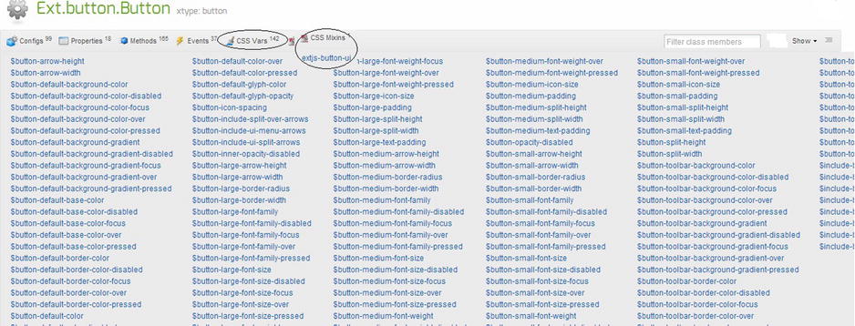
Figure 8-4. CSS vars and mixins for the Button class
Figure 8-4 shows the list of CSS vars and mixins of the Button class. All these variables have some default values that you can modify in the Button.scss file.
We know that all the UI components inherit from the Ext.Component class. Component.scss provides a global list of variables and mixins. The values of these variables can be changed, which will result in the change in the appearance of all the UI components. Figure 8-5 shows the list of CSS vars and mixins in the Component class. They are available in the documentation as Global_CSS.
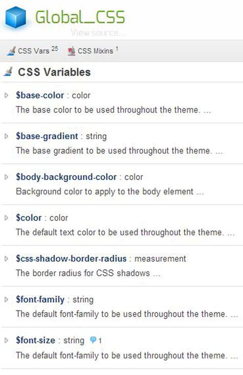
Figure 8-5. Global_CSS
Let’s create an Ext JS 4 application called ThemingAndStyling that uses the default classic theme. We will create a page that uses a Panel with a Textfield and Button. We’ll create a custom theme and use it in this application. Figure 8-6 shows the project structure.
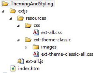
Figure 8-6. ThemingAndStyling application
The ext-all.css file just imports the ext-theme-classic-all.css file like this.
@import '../ext-theme-classic/ext-theme-classic-all.css';
Listing 8-6 shows the code in index.htm file. In this file we have included the ext-all.js and ext-all.css files.
Listing 8-6. index.htm
<!DOCTYPE html>
<html>
<head>
<link href="extjs/resources/css/ext-all.css" rel="stylesheet" type="text/css" />
<script src="extjs/ext-all.js"></script>
<script>
  Ext.onReady(function () {
    Ext.create("Ext.panel.Panel", {
      title: "Theme panel",
      items: [
               { xtype:"textfield",fieldLabel:"First name" },
               { xtype : "button",text:"Submit"}
      ],
      renderTo: Ext.getBody()
    });
 });
</script>
</head>
<body>
</body>
</html>
The code snippet in Listing 8-6 provides the output shown in Figure 8-7.
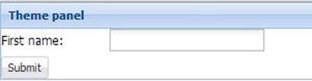
Figure 8-7. Output of index.htm that Uses Classic Theme
Let’s create a custom theme and play with the options available. We’ll use the Sencha Cmd to generate a custom theme. Sencha Cmd provides commands for creating a workspace, project, themes, etc. You can create a workspace, then a project, and then generate a theme for the project. To keep things simple, we’ll focus on creating a custom theme and apply it to the ThemingAndStyling application that we have created.
Let’s generate a theme called my-theme1. Let’s open the command prompt and go to the Ext JS 4 directory and run the following command to generate the theme.
sencha generate theme my-theme1
Figure 8-8 shows the command run in the command prompt window.
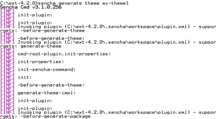
Figure 8-8. Generating my-theme1 from command prompt
In the Ext JS 4 directory, under the packages folder you will notice a folder called my-theme1 generated. The contents of the my-theme1 folder are shown in Figure 8-9.
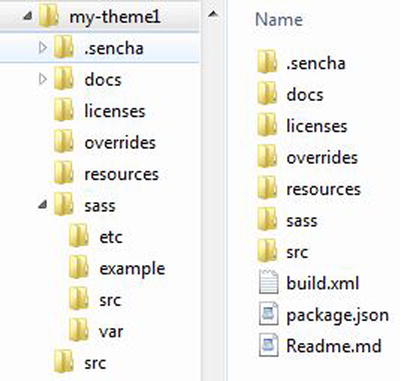
Figure 8-9. Contents of my-theme1 folder
As shown in Figure 8-9, what’s interesting and important is the sass folder. The sass folder contains various other folders where we’ll create the SCSS files.
- var folder will contain the definitions of the variables of the UI components
- src folder will contain the @include calls to the mixins and SASS rules.
- etc folder will contain additional SASS mixins and other utility functions.
The resources folder will contain the images that you want to use for the components.
The package.json file in my-theme1 folder serves as the manifest for the theme. It contains information like the name, version, base theme, etc. The contents of the package.json file are shown below.
{
    "name": "my-theme1",
    "type": "theme",
    "creator": "anonymous",
    "version": "1.0.0",
    "compatVersion": "1.0.0",
    "local": true,
    "requires": [],
    "extend": "ext-theme-classic"
}
As you will notice, the ext-theme-classic serves as the base theme for our my-theme1 theme.
Let’s start defining our SCSS files. Say we want to change the font size and font family of all the components. Let’s create a Component.scss file my-theme1/sass/var folder. We’ll use the CSS variables $font-size and $font-family as shown in Listing 8-7.
Listing 8-7. Component.scss File
$font-size:18px !default;
$font-family:Courier New !default;
Let’s build our theme now that’ll generate a modified CSS file using the SCSS file we’ve created. You can run the following command from the my-theme1 directory in the command prompt.
sencha package build
The build command will invoke the compass library and generate CSS files in the my-theme1/build/resources folder. Figure 8-10 shows the command prompt where we run the build command.
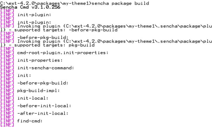
Figure 8-10. Building my-theme1
The CSS files and images are generated in the build/resources folder. The contents of my-theme1/build/resources are shown in Figure 8-11.
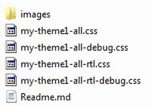
Figure 8-11. Contents of my-theme1/build/resources folder
As shown in Figure 8-11, we need to add the my-theme1-all.css file and the images folder in our ThemingAndStyling application. Let’s modify the ThemingAndStyling application to include my-theme1 as shown in Figure 8-12.
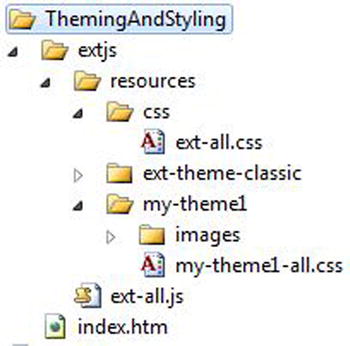
Figure 8-12. ThemingAndStyling application with my-theme1
We’ve created a my-theme1 folder in ThemingAndStyling/resources folder and included the my-theme1-all.css file and images folder. Let’s modify the ext-all.css to import the my-theme1-all.css file like this.
@import '../my-theme1/my-theme1-all.css';
Running index.htm will show you the output with modified font size and font family as shown in Figure 8-13.
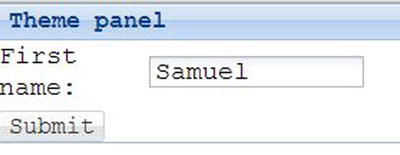
Figure 8-13. Output of index.htm that uses my-theme1
Let’s modify the style of the textfield. You can find out the CSS vars from the documentation for the Ext.form.field.Text class. In the my-theme1/sass/var folder let’s create a form/field folder and Text.scss in inside it. We’ll modify some CSS variables of the Text class as shown in Listing 8-8.
Listing 8-8. Text.scss
$form-field-border-style:groove !default;
$form-field-color:red !default;
$form-field-font-weight: italic !default;
$form-field-font-size: 12px !default;
$form-field-height: 16px !default;
We have modified the border style, color, textbox height, and the weight and size of the fonts. Build the my-theme1 package to produce a modified my-theme1-all.css file. You will get the output shown in Figure 8-14.
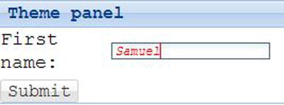
Figure 8-14. Output of index.htm with modified textfield theme
I’ve discussed modifying the Component class and Text class variables. Let’s include a mixin with custom values now. We’ll include the mixin for the Ext.panel.Panel class. The Panel class documentation shows that it has a CSS mixin extjs-panel-ui. Let’s include this mixin with default values. We’ll create a new panel ui style called ‘cool’. Let’s create a Panel.scss file in sass/src/panel folder. The contents of Panel.scss are shown in Listing 8-9.
Listing 8-9. Panel.scss
@include extjs-panel-ui(
    $ui-label: 'cool',
    $ui-border-color: black,
    $ui-border-width: 3px,
    $ui-border-radius: 3px,

    $ui-header-font-family: Times New Roman,
    $ui-header-font-size: 16px,
    $ui-header-font-weight: bold,
    $ui-header-color: white,
    $ui-header-background-color: black,

    $ui-header-border-color: black,
    $ui-header-border-width: 3px,
    $ui-header-padding: 2px,

    $ui-body-border-width: 5px,
    $ui-body-border-color: black,
    $ui-body-background-color: yellow
);
As shown in Listing 8-9, we include the extjs-panel-ui mixin by passing various arguments. We create a ui label called cool, as mentioned earlier. We have modified the background color and color of the header and body of the panel.
After running the sencha build command again and updating the my-theme1-all.css in our application, let’s make a change to the panel instance in index.htm. We will add a ui attribute to the code in Listing 8-6 like this.
Ext.create("Ext.panel.Panel", {
   title: "Theme panel",
   ui : "cool",
   items: [ ... ]
  ...
});
Executing the index.htm will produce an output with a modified look and feel of the panel as shown in Figure 8-15.
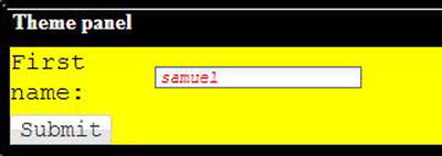
Figure 8-15. Output of index.htm with modified Panel panel theme
Summary
In this chapter, I explained the basic styling attributes of the UI components. You have configuration attributes like cls, bodyCls, baseCls, style, etc. to manipulate the style of the components. Ext JS 4 applications use ready-made themes, such as a classic theme which is the default. Working with themes in Ext JS 4 involves working with the SASS language. You can customize the themes by modifying the SCSS files and running them using the Sencha Cmd tool. Sencha Cmd executes the SCSS files and generates the CSS files. Modifying the SCSS files involves modifying the variables and including the mixins.
In the next chapter you will learn about MVC architecture in Ext JS 4. I’ll show you how to develop Ext JS 4 applications by applying the MVC architecture.