
In the first two chapters, we explored some issues with enterprise applications related to usability and how shortfalls in the usability of an application can ultimately decrease the productivity of end users. Oracle JET was outlined as a solution, and we have covered the basics of what makes up the Oracle JET toolkit.
Throughout the remainder of this book we will be building on the skills you have picked up from Chapter 2, to implement a functional application in JET. The application will be a support ticket system, which is often a system that people turn to when they are having difficulties with other systems or processes.
Support ticket systems for large companies can handle thousands of tickets a day, with many users and multiple levels of priorities, all at different stages in their support process. As users of a support ticket system are likely to be slightly more frustrated than average, it is important to get the user experience right. Waiting that few extra seconds for a support ticket to load, or difficulties finding tickets, could ultimately be the tipping point for losing business.
You will be building the application from the perspective of a user, and so that you are able to concentrate on Oracle JET, you will not have to worry about setting up a database or service layer. Instead, the book will provide mock data in the form of JSON payloads to get you started. You will, of course, be free to extend the application to include more functionality or write your own services to consume, if you desire.
This chapter will walk through the design for this system and includes low-fi mock-ups of how the system will look.
Scope
Before we delve into building the functionality of the system, we will first spend this chapter outlining the scope of the application. This will put you in a good position to begin setting up a JET application for the first time (in Chapter 4). Up until this point, you have been working with JSFiddle examples. Going forward you will be expected to scaffold your own JET application locally on your PC. Chapter-by-chapter versions of the code will be available on GitHub, if you get stuck.
The JSON data payloads for Chapter 3 will be made available on GitHub. Throughout the book, they will also be given at the start of the chapter in which they are used.
We can quickly get the front end up and running, without the need to worry about setting up services and database environments.
Front- and back-end developers can agree on the set structure of the end points up front, and the front-end developers can start building the UI straight away, instead of having to wait for the back-end developers to implement the service layer. This can greatly speed up the development process, and, provided the structure of the real end points matches the mock, they should be able to swap them over when the real ones are ready.
Mocking is great for unit testing. It can sometimes be really difficult to replicate some scenarios with the real data set. Mocking the data means you have full control and can mock out all scenarios in your testing.
Viewing list of tickets: Viewing the list of outstanding tickets for a user
Searching for tickets: Inline data searching to provide quick “as you type” searching, so users can get to their tickets faster
Viewing selected ticket: Viewing a ticket and all of its replies chronologically
Replying to existing tickets: A What You See Is What You Get (WYSIWYG) editor to reply to existing tickets
Creating new tickets: Using a WYSIWYG editor to create new tickets
Closing Tickets: Closing a ticket and specifying a reason why
Escalating ticket priority: Escalating the priority of a ticket after the ticket has been created
Rating tickets: Using one of the visualization components to rate tickets
Attachments: To aid with support for ticket resolution, users can attach files to tickets using the ojFilePicker component.
ojListView: www.oracle.com/webfolder/technetwork/jet/jsdocs/oj.ojListView.html
ojSwitcher: www.oracle.com/webfolder/technetwork/jet/jsdocs/oj.ojSwitcher.html
ojAvatar: www.oracle.com/webfolder/technetwork/jet/jsdocs/oj.ojAvatar.html
ojInputText: www.oracle.com/webfolder/technetwork/jet/jsdocs/oj.ojInputText.html
ojTabBar: www.oracle.com/webfolder/technetwork/jet/jsdocs/oj.ojTabBar.html
ojDialog: www.oracle.com/webfolder/technetwork/jet/jsdocs/oj.ojDialog.html
ojMessages: www.oracle.com/webfolder/technetwork/jet/jsdocs/oj.ojMessages.html
ojSelectOne: www.oracle.com/webfolder/technetwork/jet/jsdocs/oj.ojSelectOne.html
ojRatingGauge: www.oracle.com/webfolder/technetwork/jet/jsdocs/oj.ojRatingGauge.html
ojBindIf: www.oracle.com/webfolder/technetwork/jet/jsdocs/oj.ojBindIf.html
ojBindText : www.oracle.com/webfolder/technetwork/jet/jsdocs/oj.ojBindText.html
ojModule: www.oracle.com/webfolder/technetwork/jet/jsdocs/ojModule.html
ojConveyorBelt: www.oracle.com/webfolder/technetwork/jet/jsdocs/oj.ojConveyorBelt.html
ojButton: www.oracle.com/webfolder/technetwork/jet/jsdocs/oj.ojButton.html
ojLabel: www.oracle.com/webfolder/technetwork/jet/jsdocs/oj.ojLabel.html
ojFilePicker: www.oracle.com/webfolder/technetwork/jet/jsdocs/oj.ojFilePicker.html
Trumbowyg: Used for the text areas as a WYSIWYG editor
Jasmine / Karma: Used for unit testing the application
Signals: Used to send signal events between different modules
Page Skeleton
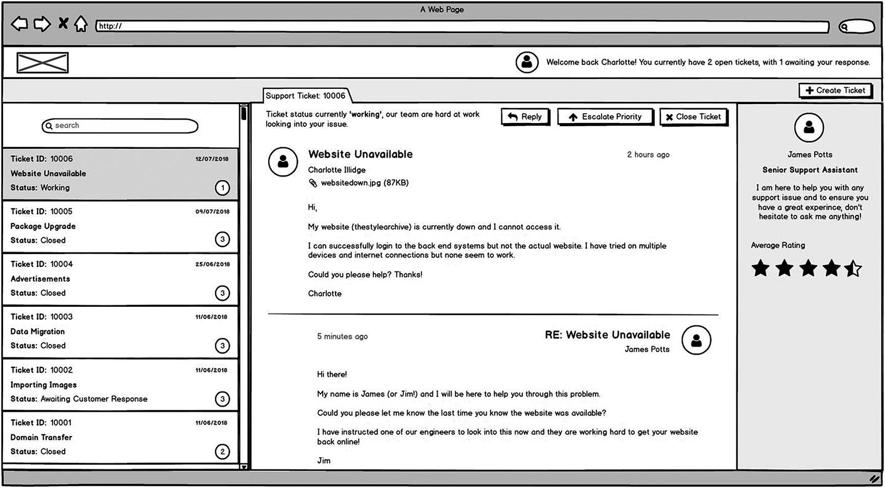
The layout of the application will follow a standard three-column application layout. The left-hand column will be used for viewing and filtering open tickets, and the main content area will show the selected ticket and all its information. The box in the main section on the right will contain metadata about the selected ticket, such as information on the person assigned to the ticket, any ticket history, and rating information.
There will be a total of two menu bars. The main menu bar will hold the application logo, main menu navigation, and user information. The second menu bar will hold ticket-related actions, such as adding a new ticket and the tabs of the open tickets.
Note that the logged-in user text at the top right is in a more natural language format. This has been added to keep with the theme of improving the user experience. A simple change such as using natural language, can make the application feel a little friendlier, which, in turn, will make the user feel happier. Natural language additions such as this work great if an application is looking to adopt some sort of AI interface too, such as integrating the Oracle Digital Assistant Service into the UI.

Skeleton of application mock-up
Ticket List

Ticket list mock-up
Viewing a Ticket
Selecting a ticket from the list will open the ticket in a new tab in the main content section. Each ticket will be assigned to a new tab, and the currently visible ticket will be highlighted in the list on the right-hand side.
The ticket view itself will show information about the current status of the ticket and options to escalate the priority of the ticket and close the ticket. Escalating the priority will move the ticket up one level, and users will be informed of this when they click the button. Before closing a ticket, users will be shown a pop-up asking them to confirm their action.
The first message displayed for a ticket will be the original support message raised by the customer; this will include the avatar of the user, the user’s full name, attachment (if available), and their message. Following the original message will be all the replies by both support representatives and the user, all in the same format. Any notes from the user will be displayed on the left-hand side, whereas the support representatives’ replies will be on the right. The amount of time since each note was posted is also shown.
View ticket mock-up
Replying to Tickets
At the bottom of each open ticket (see Figure 3-4), there will be a box in which users can reply, using a WYSIWYG editor. The editor will be implemented using a third-party plug-in. The idea here is not to have a rich editor that permits images, HTML, etc., just a simple editor that can handle line spaces and some basic formatting.
Users will be able to upload an attachment with their comment, such as an image to aid with the support incident.
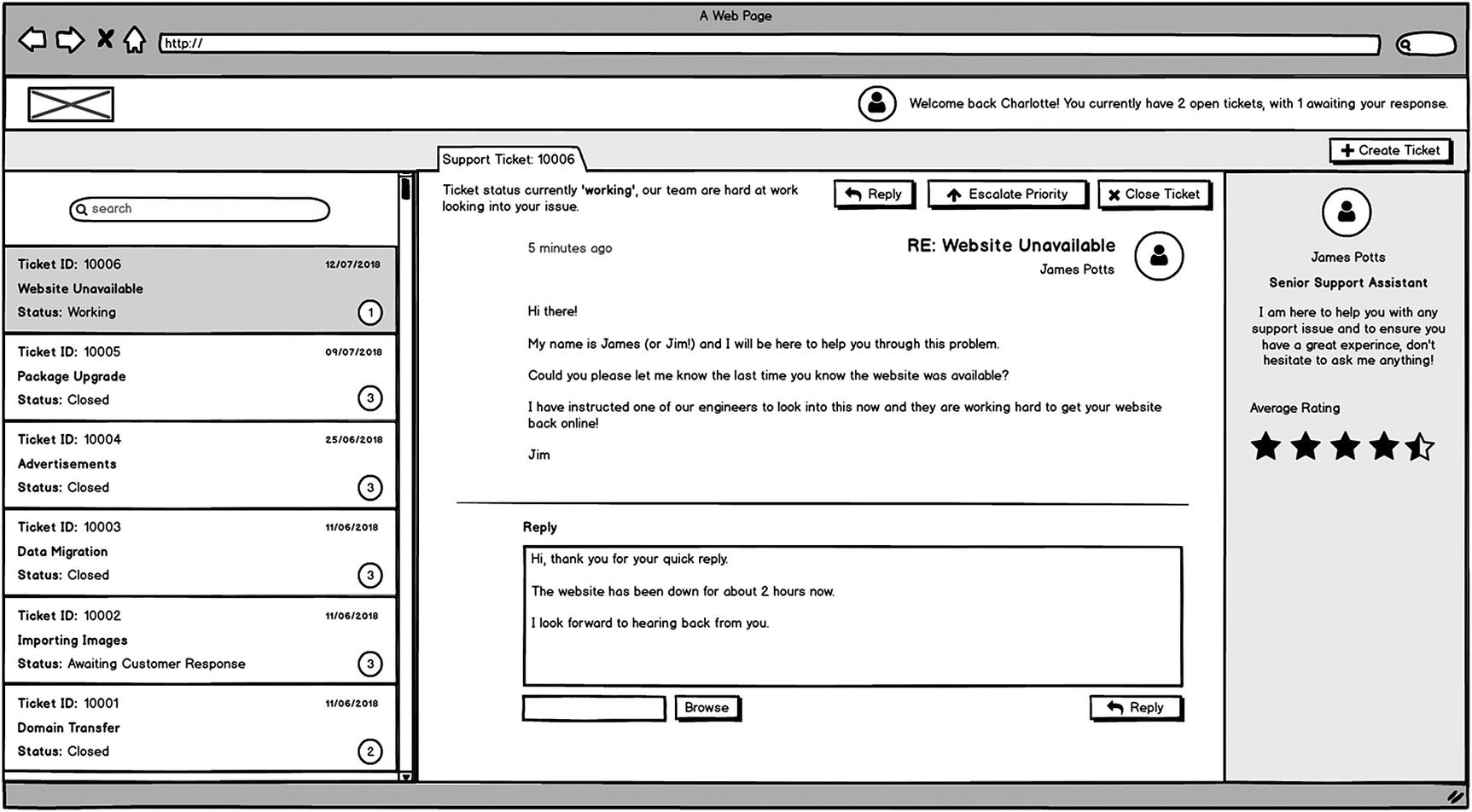
Ticket replying mock-up
Closing and Rating Tickets

Ticket buttons

Close ticket confirmation mock-up
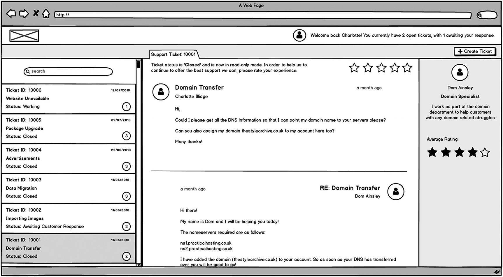
Rating a closed ticket
Creating a New Ticket
Title: The name of the ticket. Required field.
Priority: Drop-down limited to values between 1 and 5, 1 being the highest priority. Required field.
Issue Summary: A longer description to be used for detailing the issue. Required field.
Upload attachment: Option to upload an attachment to the ticket when it is first created. Not Required.
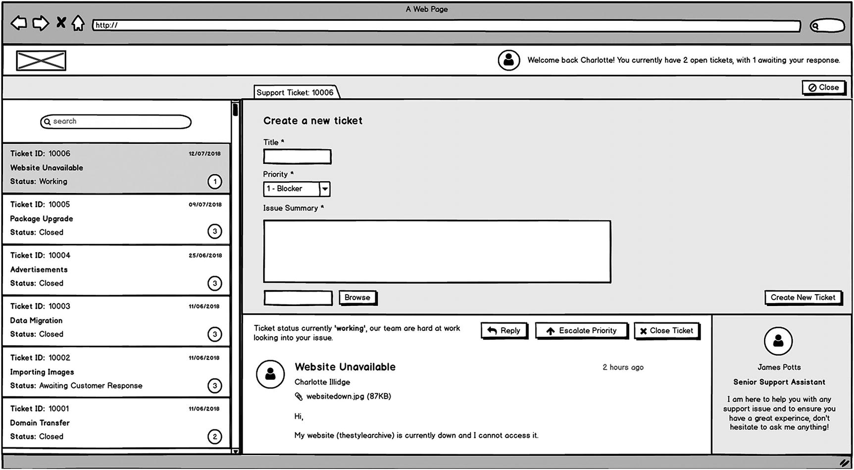
Create a new ticket dialog mock-up
Notifications
Notifications generated by the application will be shown in a box at the bottom right-hand corner of the screen. (See Figure 3-9). For example, if there is an error with the action a user is trying to perform, an error message will be shown. Success messages will also be displayed here, and the component we will use provides the means to easily set the type of notification.

Notifications mock-up
Searching for Tickets
As briefly mentioned, users will have the ability to quickly search for tickets using a “search as you type” search box at the top of the ticket list. Search as you type gives users a better experience. It is similar to autocomplete on Google, in that it will start returning results to the user almost instantly, meaning their item may appear before they even finish typing a word. Combine that with not having a search button to press, and the time and effort for a user to find what they are looking for is greatly reduced.

Searching mock-up
Summary
This chapter has provided an overview of the screens we will be building using the mock-ups provided, and it has also explored their functionality. Make sure that you have a good understanding of the expected functionality before moving on.